can you really re-use an I.O.D. paint inlay?

Now that I’ve been playing around with the I.O.D. paint inlays a bit more, I thought I’d share some of the results I’ve gotten while attempting a 2nd use.

After all, I know that many of you have shied away from purchasing them because they are really rather pricey compared to both transfers and stencils, particularly if you only get one use of each.  So if you’re splurging on one thinking that you’ll definitely get two (or even three) uses out of it, I want to make sure that your expectations are realistic.

First up, if you plan to save a paint inlay for a 2nd use, you’ll want to remove the wet carrier sheet from your first project gently, taking care not to tear it.  Then lay it out flat somewhere to dry back out.  Once dry, return it to the original packaging with the protective tissues that came with the original packaging in between the sheets.

The used paint inlay will have picked up some of the paint that it was used over, as you can see on the two sheets on the right, below …

For reference, the above photo shows an unused sheet of Rose Chintz, one that was used over Kudzu (the green) and one that was used over Sea Glass on the far right.

Here are the results of that first experiment.

The book on the top is the first use of the inlay, and for comparison, the book on the bottom is the 2nd use of the inlay that was used over the Sea Glass.  These books were both painted in Drop Cloth before adding the inlay.

As you can see, the result after applying the used inlay is noticeably more faded, like well worn chintz fabric that has been washed over and over.  I actually rather liked that result on the book.  I did expect to see a little of the Sea Glass color transferring back off that sheet and onto the book, but it definitely wasn’t noticeable.  Also, I should note that the inlay was a bit more flimsy the 2nd time around and I wasn’t able to remove it from the surface without tearing it, thus making it unusable for a third go around.

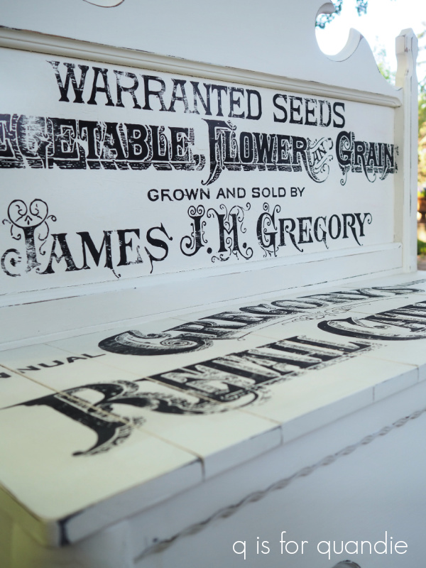
Flashing forward a few months after the book experiment, I used the Gregory’s Catalogue paint inlay on this bench

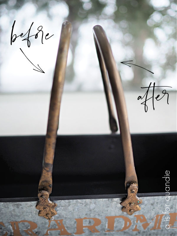
and then later I re-used just a small section of it on this wood tote.

As you can see in the photos, the first use of the inlay produced a black image, while the 2nd use of the inlay is somewhat faded resulting in more of a grey image.

Also, as I mentioned in that post, once again I was unable to save the paint inlay when I removed it from the tote because it tore quite easily after a 2nd use and thus did not come off in one piece.

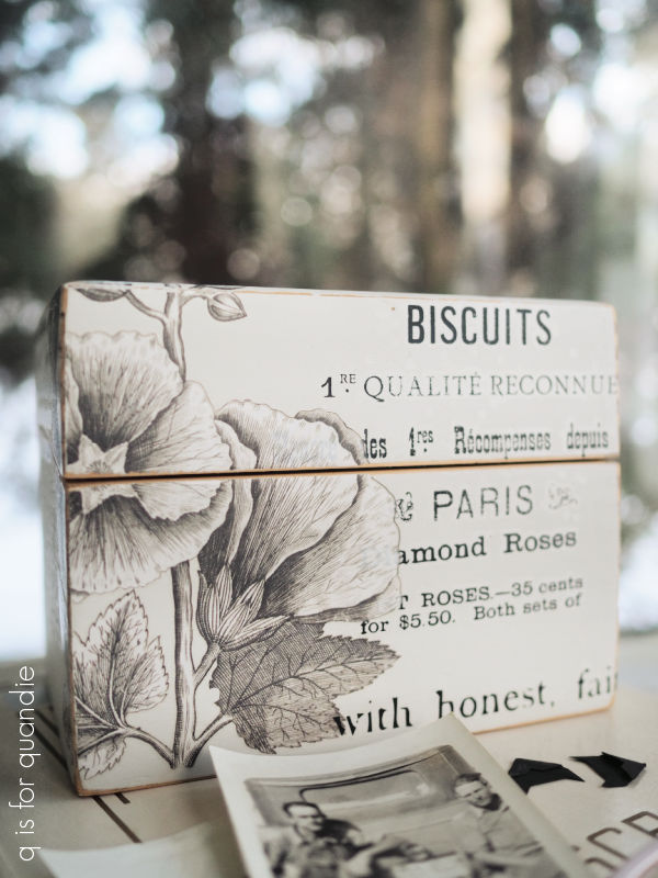
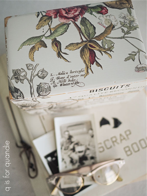
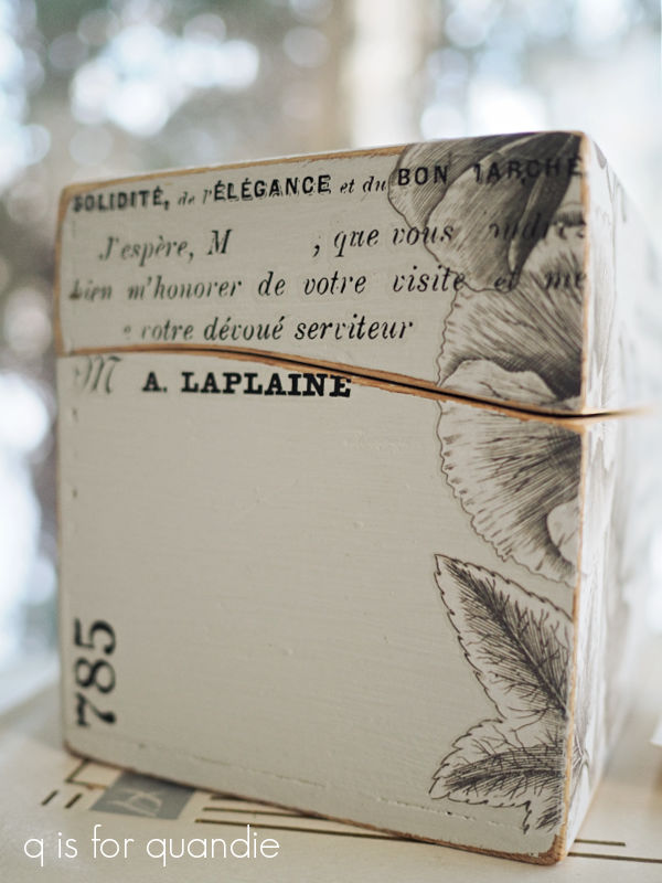
More recently, I decided to re-use some of the Rose Chintz over a darker color, Dixie Belle’s Kudzu.  This time I re-used the sheet that had been used over Kudzu once before.

Here are the results.

Again, I got a very faded 2nd use.  But since it’s over a dark color this time, the inlay is really rather hard to see.  This is probably not the look any of us are going for.  Therefore, I think it’s safe to say that you can’t count on re-using a paint inlay over a dark color.  You’ll want to stick to lighter colors for any repeat use.

The second problem I’ve run into when it comes to re-using an inlay is that I typically cut them up to fit the piece I’m using it on.

Now I’ve got an oddly shaped, used section of inlay.  I could only re-use this on something the same size or smaller, where I can trim it down again.  What I’m finding is that I have a pile of oddly shaped, used pieces of inlay that I may or may not be able to find a use for.

So that’s also something to keep in mind.

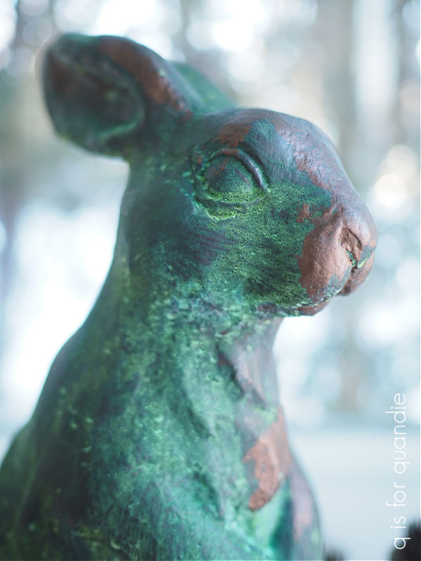
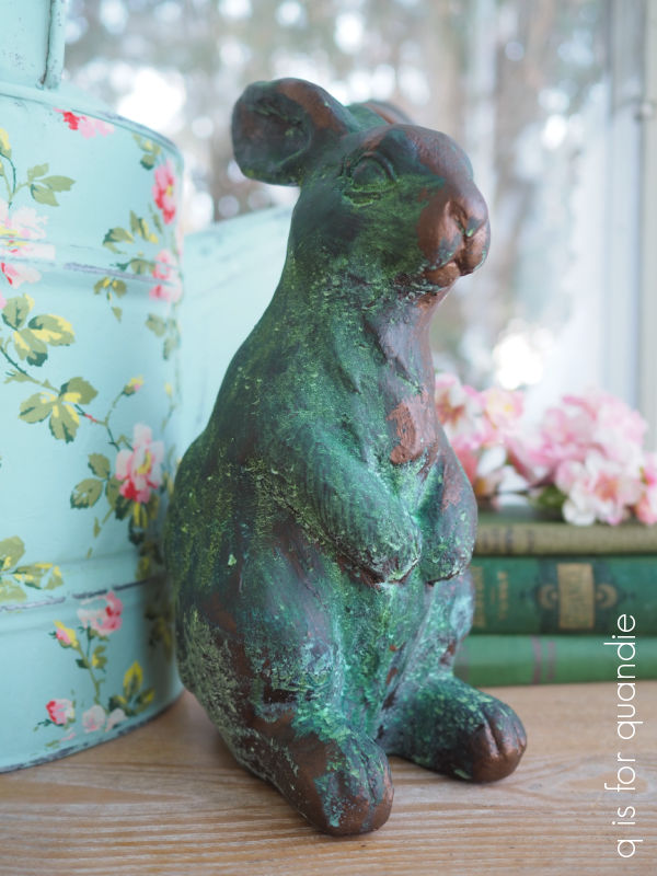
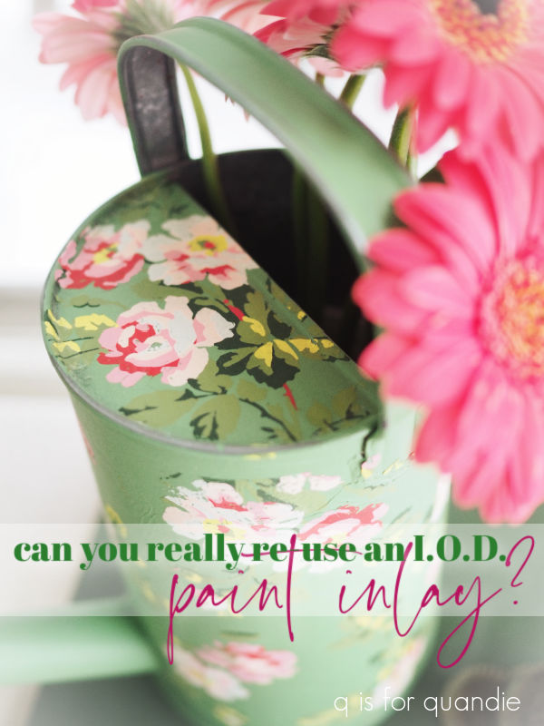
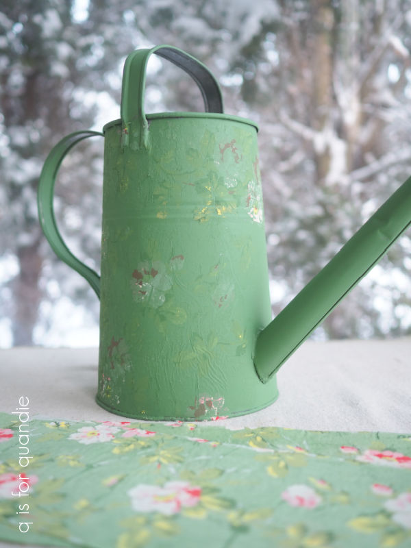
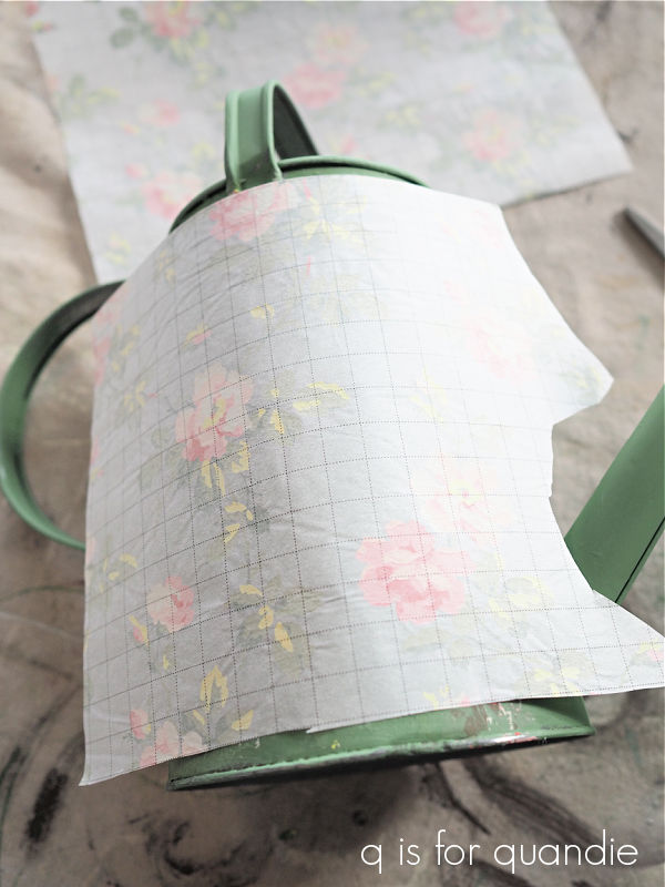
In the end, salvaging that watering can was easy enough.  I painted back over it with a fresh coat of Dixie Belle’s Kudzu and then applied a new section of the Rose Chintz inlay.

I have to admit, I think the Rose Chintz looks gorgeous over dark colors, including black.

I’m still willing to use it that way even if I have to use a brand new sheet each time.

To recap, you can’t always get a successful 2nd use out of a paint inlay, so keep that in mind when deciding whether or not to purchase one.  It may be a one time deal.  That being said, they really are fun to use once you get the hang of it (click here for my post with full step by step instructions on how to apply a paint inlay).

In fact, I’m just finishing up another piece with one of the newest I.O.D. paint inlays, so be sure to check back next week to see how it turned out.

In the meantime, have you tried re-using the paint inlays?  If so, leave a comment and let us know how that worked out for you.

stick with me.

You may remember that back in my library book review post, after seeing all of the gold leafing in Amy Howard’s book Rescue, Restore, Redecorate, I mentioned that there was a new product coming out from Dixie Belle that is similar to gold leafing.

Well, I went ahead and ordered some of the silver and some of the gold so that I could try this out.

To use this product you’ll need the Stick with Me Dixie Shine Glue, and one of the metallic foils that go with it.  Dixie Belle also recommends that you use their Finishing Pad to burnish the foil, but I simply used a microfiber cloth as I’ll explain in a minute.

I thought that those metal ceiling tin art pieces that I found while thrifting would make good guinea pigs for this process.

I had never used this product before, but I had a sneaking suspicion that I might need to have an undercoat color that I wouldn’t mind seeing through the gold here and there.

So my first step was to paint the ceiling tins in Dixie Belle’s Midnight Sky.  Then, I also painted over the stone tiles in the middle with their Drop Cloth.  I should note here that painting your surface first is not required, I did it for aesthetic reasons.

The following day I taped off the ceramic tile (center area), and then applied the Stick with Me glue to the metal ceiling tin (the black area) with a small brush.

I want to warn you guys that this stuff is super duper sticky.  And anything you get it on will also become super sticky.  For that reason I put some paper towels under my project so that I could just throw them away at the end.  I didn’t want this sticky stuff getting on the painting drop cloth that I use all the time.

Now you are supposed to wait about 15 minutes for the glue to dry and become transparent (naturally I jumped the gun a bit, but more on that in a minute).

Next up, cut strips of the foil to size and apply them to your surface shiny side up.

It’s OK if they overlap a bit.

Next you want to burnish (ie. rub with some pressure) the foil onto your surface.  As I mentioned earlier, Dixie Belle recommends using their Finishing Pad, but I simply used a microfiber cloth and that worked perfectly well too.  It does take a little bit of effort to make sure that you’ve rubbed firmly over the entire surface.  But once you think you’ve got it, you pull away the the backing paper and the gold foil is left behind.

Now, as I mentioned, I did not quite wait long enough on my first strip and as a result I didn’t get the greatest adherence.

I did better on the rest of the frame though.

It was easy enough to remedy that first side by applying more Stick with Me, giving it the full 15 minutes to set up and then applying more foil.

Also, as I suspected would be the case, I did not get 100% coverage over my very lumpy tin ceiling tile frame.  I was glad I had that black in the background.  That being said, you can also go back and press some of your remaining bits of gold foil into those spot to fill them in.

Also, as you can see, I got much better coverage on the smooth, straight areas.  Just something to keep in mind when using this product.

I have to say that the resulting  shiny gold was a bit bright for my taste.

You know I don’t like a lot of shine.  So I decided to experiment with ways to tone it down a tad.  I started by ‘glazing’ over it using DIY’s Dark & Decrepit.  I brushed it on, then wiped it back with a rag.  Once that dried, I also went over the frames with some dark wax.

That worked beautifully and gave me the more aged looking patina that I prefer.

I filled the center tiles using bits from a couple of different transfers.

The stuff in shades of grey is from Dixie Belle’s Vintage Post transfer, and the colored florals are from the I.O.D. Floral Anthology transfer.

These tiles look amazing against the dark grey walls in my living room in their new coats of gold.

The Dixie Shine is not quite the same as gold leaf.  The foil is not nearly as fragile as gold leafing and you don’t end up with flakes of gold everywhere after applying it.  The end result is quite shiny, but if (like me) you don’t like quite so much shine, you can easily remedy that with a dark glaze or wax.

I’m adding this post to my ‘how to‘ page, so you can easily find it there if you ever need to come back for a reminder on how to use Dixie Shine.

I’m also going to give one of you the chance to try the Dixie Shine.

I’ll be drawing one name at random to receive the Stick with Me glue, plus the gold and silver Dixie Shine foil.

The rules for today’s giveaway:  Simply leave a comment on this blog post (and please forgive me if I don’t respond to every one, but know that I read and appreciate all of them).

Your comment must be left on this blog post, not on Facebook or Instagram.  You are not required to follow my blog, or follow my Facebook or Instagram accounts, although it would be awesome if you did!

I will randomly draw the name of a winner for today’s prize from all of the comments left on this post by Sunday, March 26, 2023 at the stroke of midnight (U.S. Central time).

The fine print: no purchase necessary, you must be 18 years of age or older to win, void where prohibited by law, the number of eligible entries received determines the odds of winning, approximate retail value of prize is $55, if the prize is not claimed by Friday, March 31, 2023 another name will be drawn at random to win, blah, blah, blah.

Thank you to Dixie Belle Paint Co for providing their products that I’m giving away today.

the top heavy cupboard fix.

I promised I’d share what I ended up doing with that top heavy mini-cupboard.

If you’ll remember, I found it while thrifting a week or two ago.  I almost put it back on the shelf because I wasn’t sure it would be worth the effort to save it.  It had such a wonky, top heavy look.

In addition, what I didn’t show when I mentioned it last was that it was filled with gross contact paper.

I think yucky old drawer liner might be near the top of my list of things I really don’t like to deal with.  Right after smoky smells and mouse pee.  I mostly try to avoid old contact paper, but I completely draw the line at the other two!

Fortunately, the adhesive on the contact paper had really deteriorated, so it came off rather easily.

Next I had to deal with that top heavy look.

I asked you guys for suggestions, and several of you had some really good ones including just removing the door, or maybe moving the door to the bottom, or even flipping the cupboard upside down turning the top into the bottom and then cutting off the old legs and adding new ones.  I did pop it upside down to see how it would look and that might have been an option that worked well.

However, after consulting with my handyman Ken, we decided to remove the door and then cut back the top half of the cupboard so that it was stepped back rather than flush with the front.  If you look closely at the photo below, you can see where I marked the new measurement for Ken.

Ken simply used a jig saw to cut everything off beyond that 5″ mark.  Then he did his best to recreate the curved sides below the upper shelves.

I wanted to possibly re-use the door on the bottom section, but Ken felt it was too warped to use.  I suppose we could have added a new door, but in the end, I think it’s fine without a door.

After sanding and cleaning the piece, I painted the inner bits with Dixie Belle’s Kudzu, and the outer bits with their Drop Cloth.

I just love this combination of white and green, especially in springtime.  OK, well, spring is definitely not here yet, we still had some single digit temps last week while I was working on this one.  But surely it’s just around the corner, right?

Next I lined the shelves with that pretty gingham scrapbook paper you’ve been seeing me use a lot of recently.

Once again, I am totally kicking myself for putting the majority of my garden themed props out in the potting shed, including my green flower frogs.  There is still a 3′ bank of snow in front of the door.  So for now, I have to make do with my basic uncolored frogs.

Finally, I added a Classic Vintage Label transfer from re.design with prima to the ‘work surface’ before giving everything a coat of clear wax.  Well … not the paper of course, but all of the painted parts.  The paper, by the way, is not adhered.  It’s loose, so if someone wanted to switch it out for something else they could easily do so.

In addition to those frogs, I also staged this one up with the itsy bitsy dresser that I painted up a while back and few other bits and bobs.

Isn’t it sweet?

This little cupboard would be the perfect addition to a craft room, potting shed, desk top, etc, etc.

I think Ken and I did a good job of eliminating that wonky top-heavy look and giving this little cupboard a fresh new look with some paint, paper and a small transfer.  Ultimately, I’m glad I didn’t put this one back on the shelf at the thrift store.

What do you think?

The cupboard is for sale, so if you are local be sure to check out my ‘available for local sale‘ page for all of the details.

Thank you to Dixie Belle Paint Co for providing the paint used in this project.

open ’til dusk.

You may remember that I picked up this petite dresser while out thrifting a few weeks back.

It was a Goodwill find, and I mentioned that I don’t always like to buy furniture at the Goodwill because it’s usually in pretty rough shape.  And this piece was no exception.

The veneer was all chipped up around the edges of the drawers and the top of the dresser.  At some point, someone must have torn away the damaged bits and re-glued the veneer because despite the chips, what was left was held firmly in place.

There was also a hole in the bottom drawer, and there was a gap at the back of the top where there must have once been a mirror attached.

Finally, there was some pretty ugly wallpaper lining the drawers that had been seriously glued down.  Now this is the avocado green and harvest gold that I remember …

Pulling this stuff out was more trouble than I’d bargained for.  After pulling off the loose stuff, and scraping away at the rest, I still ended up with this …

What did they use to adhere this stuff, contact cement?

Finally I decided to just sand off what I could using my orbital sander.

And I still couldn’t get it all off.

So after Ken replaced the drawer bottom with the hole in it, I resorted to re-lining the drawers with some paper that I happened to have on hand with one main difference.  I did not glue mine down.  If some future owner wants to switch it out, it will be as easy as lifting it out of the drawer.

As for the outside of the dresser, I started with a good sanding and cleaning, then I painted it in two coats of Dixie Belle’s Midnight Sky.

Next I pulled out the Flower Market – Open Til Dusk stencil from Wallcutz.

If this looks familiar, it’s because it is the same general design as the Farmers Market stencil that I used last fall on this sign.

The stencil was a bit taller than the front of this dresser, so I decided to cut it down.  It would have been harder to get a nice, crisp result if I’d left the stencil whole.  So I trimmed off the top two lines of wording, and then applied the lower portion to my dresser front.

I first used Dixie Belle’s Putty to create a shadow for the word “FLOWER”.  Then, once that was dry, I moved the stencil up and to the right just a little bit and stenciled the little flourishes in Putty, and then the rest of the stencil in Dixie Belle’s Drop Cloth.

I used an artist’s brush to fill in the bridges on the lettering, and then added some dimension to the Putty colored flourishes with some dabs of Drop Cloth.

Finally, I decided to try adding the “Open Til Dusk” wording to the top of the dresser.

I placed it at the front because most people will put stuff on top of a dresser, so this way the wording will still show in front of any stuff.  After I got it on, I wasn’t entirely sure I liked it.  However, Mr. Q voted to keep it, so I went with it.

Let’s just talk for a minute about the bang for your buck with stencils.  I used the 18″ x 30″ version of the stencil on my dresser (this stencil comes in 8 different sizes ranging from 9″ x 15″ up to 21″ x 38″).  The size I used is priced at $25.95 (but FYI, there is a BOGO sale going on today at Wallcutz, so you could get two for the price of one, go check it out).  The beauty of stencils is that you can use them over and over and over.  You can mask off sections, and just use part of one.  For example, I could see using that “SEEDS – STEMS – BLOOMS” wording on something smaller.  You can re-arrange the layout by moving the stencil around.  And you can even cut a section off and use it separately like I did on this piece. And of course, you can use any color of paint you like with a stencil.  I especially like using them in white over black paint like I did on this piece.  If I just use this stencil 5 or 6 times, my cost per use is only going to be around $5.  That’s a total bargain in my book.  But in the end, even if I were to just use it once, it’s still cheaper than a transfer or a paint inlay.

As for the original wood knobs, I opted to just paint them in Midnight Sky and call it good.

They don’t completely disappear, especially the ones over the “F” and the “R”, but they mostly disappear.  I felt like trying to paint them to somehow match the stenciling would make them stand out even more.

By the way, remember those veneer chips I mentioned at the beginning of the post?  I could have taken the time to mitigate them by using some wood filler, but I didn’t bother.  I just painted right over them.  One’s eye is drawn to the stenciling and tends to completely ignore those flaws.

My handyman Ken helped with cutting down a board to fill in that gap at the back of the dresser where a mirror would have been.

It’s just a simple, plain board, but it finishes things off back there properly.

I went to Target and spent a bit of money on fresh flowers to stage this piece, but that’s OK because this post was sponsored by Wallcutz.  So I had a little bit of a budget for props.

The fresh flower display at my local Target was so adorable, with faux chalkboard signs showing the prices and that inspired me to do something similar with my staging.  Isn’t the color on those Gerbera Daisies gorgeous?

I mixed in a few of my faux flowers to fill out the scene.

At the beginning of this post I called this dresser ‘petite’.  That’s because it’s only about 27″ tall.  I think that makes it the perfect height to use as either a T.V. stand or as a nightstand alternative next to the bed.  It would also be the perfect size for a child’s room!

It was so much fun to give this little dresser a new life with some paint and a stencil!

What do you think of how it turned out?  Leave a comment and let me know.

This piece is for sale, so if you are local and have a spot for it, be sure to check out my ‘available for local sale‘ page for more details.

Thank you to Dixie Belle Paint Co for supplying the paint used in this project, and to Wallcutz for sponsoring this post and providing the stencil.


a march thrift haul.

Housekeeping item no. 1 – Congratulations to Marguerite.  I drew her name at random to win the Moody Blues giveaway.  Mr. Q sent it off in the post yesterday!

Housekeeping item no. 2 – Some nefarious person has created a fake profile on Instagram using my photo and the name ‘lindastrand1234’.  It is not me!  Do not be fooled.  Please note that my only profile on Instagram is qisforquandie!

OK, now on with today’s post!

I headed out for a bit more thrifting with my friend Sue last week.  Thrifting can really be hit or miss, and last week it was mostly a miss.

That’s about it for the smaller pieces.  Pretty blah, right?

I had to laugh at the reindeer candle holder.  He seems to be solid brass, but someone spray painted him brown.  Do you think they were trying to create a chocolate reindeer?  It really doesn’t seem to work in the same way as those chocolate bunnies.  Maybe because candlesticks made out of chocolate would probably be a bad idea.

I grabbed him because I thought it would be an interesting experiment to try and strip that spray paint back off.  And if that fails, I can always spray paint him gold.  Either way, I’ll hang onto him until the Christmas season.

Next up, these metal ceiling tile/ceramic tile thingies.

Again, I only grabbed these because I thought they might present the opportunity for a fun project.  I’m challenging myself to come up with a way to give these an updated look.  You’ll have to stay tuned for that one.

This next piece was a no-brainer for me.

I always grab these wooden totes when I see them.  They are so fun to makeover (take a look at a few I’ve done here, here and here).  This one will go into the stack of small projects for a snowy day (which we’ve had quite a few of lately).

Last up for the small items are these two galvanized pieces.

Let me ask you guys something here, do you think galvanized is on the way out?  Is it too closely associated with farmhouse style?

You may remember this galvanized tray that I thrifted quite some time ago …

I added that Vanilla Bean Farm wording to the front and took it to the shop, and there it sits.  Not selling.

So I was hesitant to pick up these two galvanized pieces, even more so because they were both priced rather high for what they are.  I literally will be lucky if I can make more than a dollar or two re-selling them.  But as seems to be the theme in this post, I thought they would both make fun projects.

I have been having a lot of luck lately selling pieces that have the I.O.D. Rose Chintz paint inlay on them, so I decided to go that route with the first galvanized tote.

I painted it in Dixie Belle’s The Gulf, and then blended in just a little bit of their Sea Glass in the center to add some depth.  Then I applied the paint inlay (my how-to post on this process can be found here).  Once dry, I sprayed it with a matte sealer to keep the inlay from smearing.  Then I sanded it very lightly and gave it a final coat of clear wax.

I painted directly over the galvanized metal without any sort of primer.  I find that chalk style paint does a very good job of sticking to galvanized metal like this as long as there isn’t a shiny topcoat on the metal.  I did wonder if the process of pulling off the paint inlay backing sheet would pull off any of the paint and there was just one small spot where that happened.

I’m OK with a little chipping, but if you’re not you may want to apply a coat of Dixie Belle’s Slick Stick before your first coat of paint over galvanized metal.

Next up is the galvanized container with the brass handles.  I actually picked this one up because I was looking for something to hold the amber bottles that I shared a little while back.

I was hoping they would all fit in this galvanized container, but it’s only big enough for three of them.  Nonetheless, I decided to do it up for that purpose.  I started by cleaning it, of course.  Then I painted the inside in Dixie Belle’s Anchor because it was a little stained and grungy looking.

Next I wanted to clean up those handles a bit.  I suppose I could have tried polishing them with some brass cleaner, but instead I decided to add some of Dixie Belle’s Gilding Wax in Bronze.

It was just enough to freshen them up a bit.

Next I added some sections of the gold Somewhere in France transfer from re.design with prima to the front …

and back …

The gold over the galvanized metal is pretty subtle, but I think it adds just a little something extra.

In addition to that meager pile of small items, I also picked up this kid sized cupboard.

I have to say, I put this in the cart and pushed it around a bit, then I almost took it back out of the cart because I just wasn’t sure I wanted to tackle it.  But it was only $6.99, so I figured if nothing else it would be yet another interesting experiment to see if I could improve upon it.  My biggest problem with it after the cherry red paint is that it looks so top heavy.  I’m really not at all sure how I’m going to solve that problem.  If anyone has any ideas, please share in the comments.

That brings me to my find of the day.

I dug that gold framed mirror out from behind a few other large mirrors.  I’d seen just the tip of it poking out.

Isn’t that lovely?  I think I’m probably going to hang onto this one.

What do you think?  Which item would have been your find of the day?  Leave a comment and let me know!

the biscuit box.

You might remember this simple wooden recipe box from one of my thrifting hauls in February.

There’s nothing particularly special about it.  I just really enjoy giving these small sorts of boxes a new look, so I tend to grab them when I see them (except apparently when I’m visiting my mom and don’t want to pack it in my suitcase, kind of regretting passing that one up now).

I gave it a light sanding with 220 grit, then I cleaned it and followed that up with two coats of Dixie Belle’s Sawmill Gravy.  Once the paint was dry, I sanded the edges to distress them a bit and then wiped away the dust.

Then came the fun part, pulling out all of my transfers and deciding what to use on this box.

Originally I was going to go with something more colorful, but I ended up picking out a subdued floral from I.O.D.’s Brocante transfer to begin with.

But before I applied that floral to the left side of the box, I filled in the other half of the front of the box with some wording from re.design with prima’s Paris Valley transfer and then layered the floral over it.

The Brocante floral went up and over to the top of the box.

Then I filled in the opposite corner with some of I.O.D.’s Floral Anthology transfer.

The transfers from the top and front of the box wrapped around to the sides a bit.

And I added a bit more to one of the sides using transfer scraps I had on hand.

Once again I didn’t bother to paint the interior this time around because it was in great condition.  I did line the box with some scrapbook paper though.

This size box is perfect for storing a pile of old black and white photos.

If you happen to have some that you need to protect from the elements a bit.

II think the box itself has that old sepia/black and white sort of look, with just a touch of hand-tinting on the top, don’t you?

By the way, here’s a follow up on the bleed-thru boxes that I shared back in early February.

The majority of you suggested that I go ahead and try to sell them ‘as is’, so I did.  I’m happy to report that they both sold.

I do want to be careful to note here that I wouldn’t recommend trying to sell furniture with bleed-thru though.  If you have stains or wood tannins bleeding through your paint on furniture, you should that Dixie Belle B.O.S.S. out and seal your piece and then paint it again.

Also, as I noted in that post, it was the final clear flat coat that drew those wood tannins through the paint.  So this time around I opted to topcoat the biscuit box with clear wax, although I don’t think this box would have been a bleeder anyway.  Still, better safe than sorry, right?

In the meantime, how do you like the biscuit box?  I plan to take this one into the shop, unless one of you locals wants to snatch it up first.  If so, be sure to check out my ‘available for local sale‘ page for more details.

Thank you to Dixie Belle Paint Co for supplying the paint used for this project.

the fresh flower market case.

Sometime last summer I came across this wooden case at a garage sale.

I have to admit, I walked away from it at first thinking it was too big and cumbersome, and it felt a bit too utilitarian for my tastes.  But then I realized that of course I could change that last part with some paint, and maybe a stencil or some transfers.  So I went back and grabbed it.

Here’s what the inside looked like initially.

The whole thing looks very much homemade.  I do wonder what it was made for, a ventriloquist’s dummy?  an accordion?  a secret stash of gold bouillon?  Hopefully it wasn’t anything creepy, like that time I accidentally bought an embalming table at an auction.  It’s made out of solid wood, so it is rather heavy for toting things around.  Any of you have any ideas about its original purpose?

After scuff sanding and cleaning the case inside and out, I painted the inside in Dixie Belle’s Collard Greens, and the outside in their Drop Cloth.  Next I added some sections from the I.O.D. Wall Flower transfer to the inside lid.

I think the florals in this transfer have that look of old 1940’s wallpaper.

I also added some pieces of the Wall Flower transfer to the front of the case, and then I pulled out a new stencil from Wallcutz called Fresh Flower Market.

I couldn’t quite fit the entire thing on my case, so I masked off those trim lines around the outside as well as the bottom line of wording using painters tape.  I then stenciled the word “MARKET” in Dixie Belle’s Collard Greens, and the rest of the wording in their Holy Guacamole.

I used a small artist’s brush to fill in the bridges on my stencil, and I think that really made the cursive font of ‘fresh flower’ work better.

For a final little touch, I added one of the bees from the I.O.D. Brocante transfer near the handle of the case.

You can’t have a flower market without bees, right?

With it’s fresh new interior, this wooden case could be used to store all kinds of things.  Maybe your spare linens, or your heavy winter sweaters?  Or even your ventriloquist’s dummy.

Or, you could just simply use it as décor.

It would be sweet just hanging out in your foyer, or on a protected porch.  It would also be perfect in your potting shed …

assuming you can get to it.

Earlier this year when I was planning for this project, I thought I’d be able to photograph the finished case out in the potting shed.  But then we got a lot of snow, and then we got a lot more snow, and then earlier this week we got another 7″ more.  I basically can’t get to the potting shed at this point.

Well … I could if I was willing to trudge through a couple feet of snow, and then shovel away the giant pile that fell off the roof and is now blocking the door.  But I’m not.

This was a bit of a tactical error on my part since most of my garden themed photo props are out there too.  I sure do hope spring is just around the corner.

In the meantime … an indoor photo shoot it is.

What do you think?  What would you use this case for?

The fresh flower market case is for sale, check out my ‘available for local sale‘ page for more details.

Thank you to Dixie Belle Paint Co for providing the paint, and to Wallcutz for providing the stencil used for this project and sponsoring this blog post.

another library book review.

It’s time for another installment of ‘book reviews from mom’s library’!

If you’ve followed me for long, you may remember that last year I borrowed a bunch of decorating books from my mom’s library while I was out visiting her.  Then when I got home I reviewed them all in a blog post.

I was a little sad when I looked back at that photo from February 2022.  See that bougainvillea in the background?  This year it was killed by freezing temps.  Yep, Las Vegas has had a cold winter this year.

But anyway, back to the books.

When I came home from mom’s place last year, I was all fired up to renew my library card and check out the books that were available at my own local library.  As it turned out, the selection wasn’t nearly as good.  I’m guessing that my mom’s library has much better funding than mine and thus is able to purchase new books more often.

Sure enough, I found another nice pile of decorating books at mom’s library last month.

My sister was willing to play along and hold them up while I snapped some photos of them with Lake Mead in the background.  She’s really pretty good about humoring me when it comes to this sort of thing.

Let’s just start at the top of the pile and work our way down.

Rather than being strictly a decorating book, Rescue, Restore, Redecorate by Amy Howard is a ‘how-to’ book with lots of practical step by step instructions for using various products.  It was published in 2018, so it’s semi-recent.

I’m sure many of you are familiar with the Amy Howard brand of chalk paint and other products.  I have to admit, I was surprised to find that she never seemed to mention her own specific products throughout the book.  She mentions them in a generic sort of way, and they are shown in photos, but she never specifically tells you about them.  I wonder why that is?

She includes a lot of info on gold leafing.

I’ve never tried gold leafing, have you?  Lately I’ve been thinking about what new skills I could add to my repertoire, and I think I’m going to give gold leafing a try.  Coincidentally, Dixie Belle has just come out with their own gold, silver and copper leafing-ish product.

I’m not at all sure how it works, so I ordered some of the gold and silver so I can test it out and then share the results with you guys.  Be sure to stay tuned for that.

Amy Howard also has a project using a zinc antiquing solution in her book that is pretty cool.

She takes brand new looking metal and turns it into this …

I will note that I looked this product up on her website and the fine print says it only works on unfinished/uncoated galvanized sheet metal so that would be something to keep in mind if you are thinking about giving this a try.

The item that stole the show for me in this book was this painted stereo cabinet.

I absolutely loved that lime green!  If I’m brave enough, I may have to try that on something.

The next book in the pile is Rediscovered Treasures by Ellen Dyrop and Hanna Kristinsdóttir.

This is a translation of a book originally published in Norway in 2009, so it did feel a bit dated to me.  There were quite a few doilies.

They had a lot of small projects using vintage items though, which I always appreciate.

The next book in the pile is a Country Living book called Simple Sustainable Style and was published in 2012.

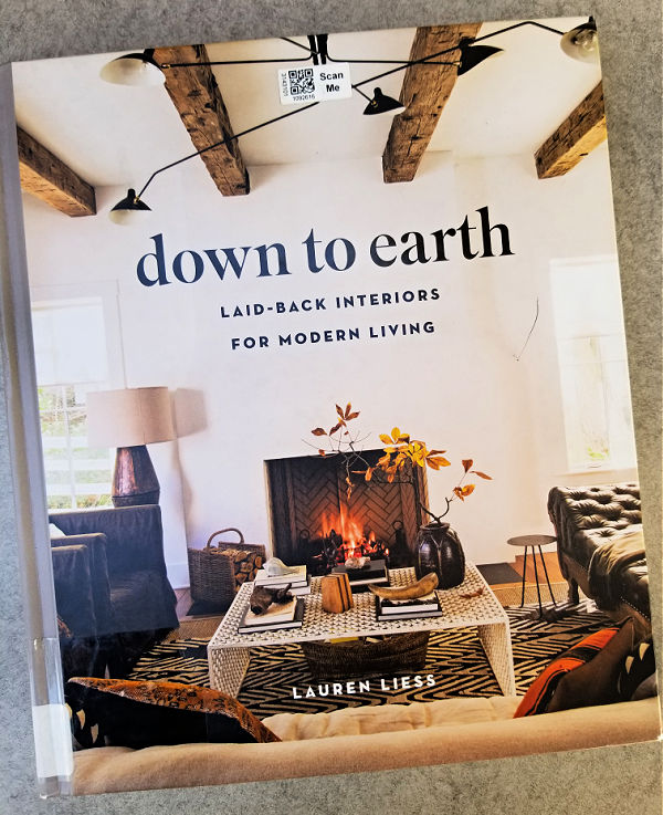
It’s written by the same authors as Restore, Recycle, Repurpose, the Country Living book that I reviewed after last year’s visit to my mom’s library.

Let me start by saying that I pretty much love every Country Living book that I’ve ever picked up.  My only complaint about them is that if you also get the magazine, you’ll likely have seen most of what is included in their books.  I especially ran into that with their Christmas at Home (published in 2018).

Although Simple Sustainable Style is somewhat dated, as evidenced by the wall mounted T.V. in this shot …

I think their style is fairly timeless.

And anyone who uses old toolboxes as décor gets a gold star from me!

The books seem to be getting newer as I near the bottom of the pile.  Home Stories by Kim Leggett was published in 2020.  Kim Leggett was also the author of City Farmhouse Style which a lot of you may be familiar with.

In a nutshell, I think ‘city farmhouse’ says it all about her style.  She uses farmhouse style vintage pieces, but pairs them with more modern pieces for an updated look.

Obviously anyone with a stack of vintage suitcases has me at hello, but see how she has added that modern round, black vase?  Just that small touch makes this feel more current to me.  I have to admit though, I really want to paint that dresser, how about you?

She’s got a touch of that ‘dark academia’ look that we’re hearing so much about lately too.

She also uses a mix of painted and un-painted pieces, and some fabulously chippy pieces too!

And who says chalkboards are passé?

There is also a seasonal section at the back of the book that I enjoyed.

I have to say, if I was going to purchase any of these books it would be this one.  This would be a good one to study for ways to update your vintage style.  In fact, I think I might just go ahead and order this one today!

The final book I’m reviewing today is Down to Earth by Lauren Liess, published in 2019.

This one also has an interesting mix of mid-mod and older vintage pieces.  It’s organized into sections by styles such as ‘cozy bohemian’, ‘timeless-ness’ and ‘vintage revival’ with tips for each on how to achieve the look.

There were some very interesting combinations of vintage and modern.

Much like with Kim Leggett’s book, I’m really vibing on this idea of using antiques in a more modern context.

One review I read of this book called it ‘elevated, yet accessible’, but I have to slightly disagree.  In fact, my one complaint about this book is that it didn’t feel accessible at all to me.

As much as I appreciate the stunning beauty of that room, I’m never going to have anything like that.  I felt that way about most of the interiors that were featured.

That being said, there were some ideas I could take away from some of the smaller vignettes like this one.

I don’t think I would spend the money to own this particular book, but it was a good one to check out from the library.

I hope you enjoyed this library book review, and you were able to take away some ideas from today’s post.  Leave me a comment and let me know if any of these books are favorites of yours!

hoppin’ down the bunny trail.

Throughout the year, I’ve been picking up cute bunnies whenever I see them at the thrift store or garage sales.  I’ve managed to accumulate a handful of them.

And now it’s time to pull them out and get them spruced up for the shop.

The galvanized bunny mold just needed a good cleaning, and some goof off to remove the residue left by the packing tape that was holding his two sides together.

Isn’t he sweet?

The copper mold bunnies also just needed a bit of cleaning.

Next up came the faux stone bunny.

I think he was supposed to look like he was carved out of granite, or something like that.  I’m not sure.  But in reality he is some sort of resin or other man made material.

I decided he could be improved with some of Dixie Belle’s Patina Paint.  I debated going rusty at first, but ultimately decided to go with the bronze paint paired with the green spray (you can find all of the details on using this product in this post).

The patina paints lend a very authentic looking faux finish, in my opinion.

I went ahead and added a couple of quick coats of Rustoleum’s matte clear coat to protect him from any excess handling.

Next up is the cute bunny pull toy.

I really didn’t like the heavy grain of the wood, or that particular shade of brown, so I gave him a paint job using Dixie Belle’s French Linen.  I followed that with a quick stencil job using a portion of one of JRV’s Crock Minis stencils and Dixie Belle’s Drop Cloth paint.

I also painted the wooden dowel handle to the pull toy in Drop Cloth.

While working on the rest of the bunnies, I also remembered that I had a trio of ceramic bunnies that my friend Sue found for me.

Normally this sort of thing is not my style at all.  But I’d seen a video … or maybe it was a blog post?  I really don’t remember … but I’d seen someone, somewhere, spray paint these in a chocolate brown to make faux chocolate bunnies.  So I thought I’d give it a shot.

Of course, when you live in Minnesota, it’s winter and you aren’t blessed with any sort of well-ventilated spray painting booth, you have to get creative.  So here’s what I do …

I rest a big flat piece of cardboard on a snowbank, spray quick, and then haul everything back inside to dry.  I had to do that about 4 times to get the bunnies fully coated on all sides.  But I made it work on a slightly warmish afternoon last week.  Well, OK, it was 37°, but hey, that’s above freezing.

My paint of choice for chocolate bunnies was this one …

It’s a paint and primer in one, and they say it will work on any surface.  Since I was painting glossy ceramic bunnies, I wanted to be sure it would stick.  It’s also has a satin finish rather than the matte finish that I usually prefer, and I think that makes these look more like glossy chocolate.

Yum!  Doesn’t he look delicious?

These would be great to incorporate into a tablescape for Easter when you don’t want anyone to eat the decorations!

Or you could just pop them into an Easter basket.

I’ll be hoppin’ on into the shop with these on Wednesday, hopefully there’s enough time left between now and Easter for all of these bunnies to find a good home.  And maybe I’ve inspired you to create some faux copper or chocolate bunnies of your own!

the moody blues.

I wonder how many of you are old enough to be Moody Blues fans, or to have played their albums over and over.  You know, back when we had record players and albums.  Oh boy, I’m probably really dating myself now.  Although now that I think about it, I probably listened to them on cassette tapes in my car more than on albums.

Once upon a time, in my wildest dreams.

Anyway, today’s post isn’t about music, it’s about the moodier shades of blue available from Dixie Belle Paint Co (and be sure to read to the end because I’m giving some away).  I’ve been using a few of them lately, so I thought it might be helpful to show you guys a comparison of their In the Navy, Bunker Hill Blue, Yankee Blue and Cobalt Blue.  Just in case you are struggling to pick one.

The darkest one is In the Navy.  This color is almost, but not quite, black.  I used quite a bit of this one for a while.  One of my all-time favorite pieces painted in this color was this linen press dresser.

I also painted a waterfall style desk with In the Navy.

Lately I’ve been using more of the next darkest shade, Bunker Hill Blue, most recently on this dresser.

I really like this shade on mid-mod pieces such as this dresser that was a curb-side find.

It looks gorgeous paired with gold hardware.

I’ve also been known to mix In the Navy with Bunker Hill Blue to tone down the Bunker Hill Blue just a tad, or brighten up the In the Navy, whichever way you want to look at it.

That’s what I did on this piece.

Well, to be perfectly honest, I only mixed them because I didn’t have enough Bunker Hill Blue at the time to paint the whole dresser so I stretched it by adding In the Navy.  But it ended up being a fantastic combo.

I haven’t used so much of the Yankee Blue.  This one is the lightest shade of these four colors, and has a bit more grey to it than the other three which becomes more obvious when you look at them all side by side.

Yankee Blue is actually one of the very first Dixie Belle colors I ever used when I paired it with Drop Cloth on this stool.

I’ve used it to create quite a few grain sack stripes since then, including the ones on this desk.

I also used it inside the drawers on that piece after blocking some ink stains using Dixie Belle’s B.O.S.S.

That brings me to the brightest of the four colors, and one I was only recently brave enough to use, Cobalt Blue.

It was gorgeous paired with the I.O.D. Rose Chintz paint inlay on this tackle box.

I’m not sure I’m quite ready to use it on a piece of furniture yet, but I could see mixing the Cobalt Blue with the Bunker Hill Blue to get something somewhere in between the two.

How about you, have you tried any of these colors yet?  And if so, do you have a favorite?

If not, now’s your chance.  I’m giving away a 16 oz. jar of each to one lucky winner.

And I’m even going to throw in a CD of the Very Best of The Moody Blues, just for fun.

The rules for today’s giveaway:  Simply leave a comment on this blog post (and please forgive me if I don’t respond to every one, but know that I read and appreciate all of them).

Your comment must be left on this blog post, not on Facebook or Instagram.  You are not required to follow my blog, or follow my Facebook or Instagram accounts, although it would be awesome if you did!

I will randomly draw the name of a winner for today’s prize from all of the comments left on this post by Friday, March 10, 2023 at the stroke of midnight (U.S. Central time).

The fine print: no purchase necessary, you must be 18 years of age or older to win, void where prohibited by law, the number of eligible entries received determines the odds of winning, approximate retail value of prize is $100, if the prize is not claimed by Friday, March 17, 2023 another name will be drawn at random to win, blah, blah, blah.

Thank you to Dixie Belle Paint Co for providing the paint included in today’s giveaway.