forget me not.

I pulled this galvanized box out of my stash the other day.

I thought I could dress it up with some paint and more of the new I.O.D. Lover of Flowers transfers.  I went through the transfers and decided the forget-me-nots would be lovely on it, so that led me to then chose Dixie Belle’s Serenity Silk paint for the box.

It’s a really lovely shade of blue-green that leans a little towards grey, and it works beautifully with the colors in the forget-me-nots.

I scuff sanded my box, then washed it up with Dawn dish soap and hot water.  The Silk paint then went on as smooth as … well … silk.

But I forgot one little, bitty thing.  The Silk paint is an acrylic paint.  And I find that it does not adhere to smooth metal as well as chalk paint.  It tends to be more prone to scratching, and more importantly, prone to pulling away from your surface when you try to apply a transfer.  You can see where that began to happen as I was applying the typography portion of the transfer …

There are a couple of things I could have done differently.  First up, I could have used the Bonding Boss first to improve the adhesion of my paint.  But I didn’t.  Second, I could have let my paint dry for at least 24 hours before adding the transfer.  But I didn’t.  Third, I could have just used a chalk paint since I was painting over a slick surface.  But, I didn’t do that either.

After struggling to get the first portion of the transfer down, and finding that my paint was pulling away.  I put everything aside and let my paint dry until the next day.  I was then able to carefully apply the rest of the transfer successfully.

I should point out that I purchased two sets of the Lover of Flowers transfer.  I knew I would be able to use it on lots of small projects, and I also knew that I.O.D. new releases tend to sell out quickly so I stocked up.

I used the forget-me-not poem from one set, and the floral swags from both sets to decorate this box.

I cut both of the swags apart to create one swag that was twice as wide.  I wanted to fill the entire space on the front of my box.

I finished up with a coat of clear wax over the entire box.  Although the Silk paint has a built in topcoat, the transfer does need to be sealed.

Although I originally just filled it with books for my photos, I also think it would make a great container for some flowering houseplants.

As a sidebar, the plant on the right is the Streptocarpus Ladyslippers™ Deep Blue Vein from my front window box that I decided to try overwintering in the house this year.  It has had lots of lush green foliage all winter, but it only recently started putting out blooms again.  On the right is a potted azalea that some friends gifted me with the other day.

I’m not going to keep this one though, I’ll be adding it to the pile of stuff I’ve set aside for a potential occasional sale this summer, unless one of you locals wants to snatch it up first!

preventing rusty bleed thru.

When I paint rusty toolboxes, I always try to mention that I start with a coat of Dixie Belle’s B.O.S.S. to prevent existing rust from bleeding through my paint.

Today I thought I’d elaborate on that a bit.

First up, let me start by saying that I used the word ‘prevent,’ but that might not be entirely precise.  I don’t want to say that the B.O.S.S. will completely eliminate any possibility of future rust bleed-thru.  However, it will definitely mitigate most of the problem.

Also, I should clarify that Dixie Belle has replaced the original B.O.S.S. (shown above) with their new Bonding Boss.  In addition to blocking stains and odors, the Bonding Boss also improves the adhesion of your paint.

But either of these products will work to reduce bleed thru, so if you have the older version you can continue to use it for this purpose.

This rusty, crusty metal tool caddy is a great example of what happens when you don’t use a blocking primer over rust.

It had been out in my stash for ages.  I’m not even sure how long, or where I picked it up.  As you can see, it started out with some pretty significant rust.

I’d pulled it out of the stash sometime last year thinking that I could paint it black and add the I.O.D. Rose Chintz paint inlay.  At the time I figured I didn’t need to worry about blocking the rust because it was going to be black, so it wouldn’t show too much (which I’m sure would not have worked out).  But for some reason, after I had it painted black, I really didn’t love it.  So I shoved it back in the ‘future project pile’.

Then I pulled it out again a few months later and decided to give it a coat of Dixie Belle’s Dried Sage.  Why?  I honestly don’t even remember.  But really, I didn’t love that color on it either, so back in the pile it went again.

I also had forgotten that I didn’t give this one a coat of B.O.S.S. to block the rust before adding the black paint.  So here we are another six months or so later, and now the rust had definitely bled thru both the coat of Midnight Sky, and two coats of Dried Sage.

Whoops!  Anyone who has experienced any kind of bleed thru knows that paint alone won’t block it, no matter how many coats you apply.

Just look at all of that rust coming through!

Fast forward to last week when I once again pulled it out of the pile.  This time I gave it not just one, but two coats of Dixie Belle’s B.O.S.S.  I’ll admit, unless a toolbox is especially rusty, I usually only give them one coat of B.O.S.S., but the instructions for this product do say to use two coats for the best results.  This is true if you’re trying to block other sorts of stains as well like tannin bleed thru, or the ink from a Sharpie.

So I gave it two coats, allowing both to dry fully before moving on to the next.  I then gave the final coat of B.O.S.S. 24 hours to dry fully

I followed that up with one of Dixie Belle’s new National Park Collection colors from their Silk line called Everglades.

It only took what I like to call one and a half coats of Everglades to get good coverage.  In other words, I painted one full coat of paint, and then just had to go back and touch up a couple of spots that needed a little bit more.

I know not everyone is going to love this sort of pea green color, but I am really drawn to it.  If you prefer a chalk style paint over an acrylic (the Silk is acrylic), then Dixie Belle’s Guacamole is a good option.

It’s not quite as bright as the Everglades, but it’s a fabulous avocado shade.

Once the Everglades was dry, I pulled out the Floral Anthology transfer from I.O.D. and added a few florals.

If you haven’t heard, I.O.D. has come out with some new designs for spring and I couldn’t stop myself from ordering a few of them.  So while I wait for those to arrive, I was trying to use up some of my older transfers.

I also added some wording from the Classic Vintage Labels transfer from re.design with prima.

The Dixie Belle Silk line of paint has a built in topcoat, so I didn’t need to add a topcoat to the paint.  However, the transfers do need a topcoat to protect them over time, so I added a coat of Dixie Belle’s clear wax over the entire caddy (yes, you can wax over the Silk paint).

So far, so good.  But I’ve only had this painted for about a week.

I definitely need to hang onto this tool caddy for a few months more to be sure that the rust really isn’t going to bleed thru.  So this one is now going into my newly created ‘stuff I’m accumulating for a potential occasional sale at my house’ pile.  I’ll keep you posted on the results, so be sure to stay tuned!

a bronze metal makeover.

Remember my bronze buddha from last year?

I took him from terra cotta to bronze using the Dixie Belle Patina Paint in Bronze with the green spray, and some Bronze gilding wax on the highlights.

I also added a few rusty spots to him using the Iron paint with the green spray.

I put him back in the garden and he stayed out there all year.  Then last week I whacked him with the hose while watering and broke his hand.  Ooops!

So after gluing his hand back on, I thought I’d share how well he weathered the third snowiest winter on record here in the Twin Cities.

Aside from a couple of spots on top of his head and that one spot on his face, he held up quite nicely.  Keep in mind that I did not use any sort of sealer over the patina paint.  Also, I was painting over an original paint on terra cotta that was failing.  So it’s not surprising that I had some problems.

But it was easy enough to fix.  I simply dabbed some Bronze paint over those spots, along with his repaired hand, and then sprayed them with the green spray.

I will say that the crack in his repaired hand sort of gathered the green spray and became a little more noticeable.

But really, if you didn’t know it was there I don’t think you’d notice it.

While I had the Bronze paint out, I decided to also spruce up my Chinese lantern.  You may not remember it, but I found this free at the curb during White Bear Lake’s Trash to Treasure day.

Sure, it was a little beat up.  And that piece in the middle has a big crack in it, but I just face that part to the back.

But after two years in the garden, the top was really starting to look a bit ratty.

And when you’re standing and looking down on the garden, the top is most of what you see.

You guys, it was so simple to give this a bronze medal metal winning makeover.  It literally took less than an hour.  I brushed the dirt off first, then painted a first layer of the Bronze paint.  It dried in no time because it was an absolute perfection of a day, 70 degrees and sunny with low humidity (and yes, I was working outside).

Once the first coat of paint was dry, I added a 2nd layer and while that was still wet I sprayed it with the green spray.  And ta da!

One thing I will note here is that the bronze patina develops much faster than the rusty iron patina.  Basically within about 15 minutes to half an hour.

In addition, maybe don’t follow my minimal prep example if you aren’t OK with potentially having to touch up your paint down the road.  I probably should have cleaned the lantern properly before painting, rather than just brushing off the loose dirt.  I also probably should have given it a base coat of either the Dixie Belle Prime Start or, since this isn’t metal, any chalk style paint would do.  That would have given the best results for long term adherence.

But I wasn’t concerned about that, as seen with my Buddha, I have no problem with coming back and touching up some spots every couple of years.

I’m also considering putting these items in the potting shed for the winter from now on.  After last winter when both of these were completely buried in snow for a couple of months, I’ve decided maybe they’d last longer if I store them for winter.

Before I go, you may be wondering why I chose the bronze finish for the lantern instead of my favorite rusty finish (using the Iron paint), and honestly it’s just because I already have quite a few rusty pieces in my garden including multiple pots, an iron bench and chair, and several rusty metal trellises.  So I needed to mix it up a bit.

Although a bronze medal is usually third place, I’d give the Bronze patina paint the silver medal in my line up of the patina paints.  So if you’re looking for a change of pace too, check out the Bronze!

Thank you to Dixie Belle Paint Co for providing all of their Patina Paint products for this makeover!

some ‘q tips’ on stenciling.

Have you ever checked out my ‘how to.’ page?  If you’re on a computer or tablet, you can find it up above, just under my header photo collage right after ‘available for local sale’.  If you’re on your phone, click on MENU in that same spot.  Or you can click here.

The ‘how to.’ page is where I keep all of my posts that go into specific detail on certain techniques or products such paint inlays, milk paint or how to remove paint from old drawer pulls.

I like having these ‘how to’ posts handy so that I can refer to them in future posts and I don’t have to outline all of the steps for particular techniques each time I use them.  That would get so boring for those of you who either already know how to use them, or really don’t care.

I hadn’t added to my ‘how to’ page in a while, but I recently added the post on how to use the Dixie Shine.  I’d also been thinking that I should add a post on stenciling techniques, so here it is.

I know that some people struggle to get a good result while stenciling.  This vintage suitcase that I picked up at the thrift store a few years ago is a rather dramatic example of a bad result.

I’m sure none of you have quite that much trouble, but you still may be able to use a few q tips on how to stencil.

Tip no. 1 – First and foremost, my number one tip is to use chalk paint for stenciling projects if possible.  This is one instance where a chalk style paint is going to be superior to an acrylic paint (such as Fusion or Dixie Belle’s Silk paint, or those little bottles of paint from the craft store).  The chalk paint has a rougher surface that doesn’t allow your paint to slide around as much as it can on the slicker acrylic paint.  In addition, chalk paint is thicker (less runny) than acrylic paints, so that also helps you avoid allowing your paint to bleed under the edges of your stencil.

Tip no. 2 – The second most important tip I can give you is to use a dry brush.  I can’t stress this enough, and this may be the biggest mistake most people make.  Just tap your brush very lightly into your paint, and then wipe most of that paint off on a paper towel.  Even if you aren’t getting perfect coverage with the first pass, you’re better off going over that with a very dry brush for a second coat rather than having too much paint on your brush.

Tip no. 3 – Use the right brush.  Your stenciling brush should have densely packed bristles and a flat end.  The Best Dang Brush from Dixie Belle is my current go-to brush for stenciling.

It’s a big one though, which works great for larger stencil projects but will require taping the edges on smaller projects like the one above.

I’ve seen a few people use sponge tipped applicators for stenciling, but I found that the application tends to look a bit sloppy when I’ve tried using one of those.

Tip no. 4 – Use an up and down, stippling motion with your brush.  This helps you avoid pushing paint under the stencil, thus creating a smudgy looking result.  I’ve seen so many YouTube tutorials where the person uses a swirling, circular sort of motion to apply the paint and I always cringe a little.  You may be able to get away with that technique if you’re using an adhesive stencil of some kind, like a silk screen stencil or a stencil that you cut out of adhesive vinyl on a Cricut machine.

But I say always stick with that up and down stippling motion to be on the safe side.

Tip no. 5 – So far I’ve only mentioned using a brush to stencil, and 99.9% of the time that is what I do.  However, you can use a roller, which can make things go faster with a larger stencil.

I like to use a small foam roller for stenciling larger, all over patterns such as the one on the Venetian velvet inspired gift wrap I made a few years back.

Do be sure to follow the same principle of off-loading some of your paint first when using a roller, and don’t press too hard.

Tip no. 6 – My next tip is to know your surface.  Part of the reason the stencil job on that vintage suitcase is so bad is because the surface of the case is very bumpy.  Even the most practiced stenciler is going to have a tough time with that.  The flatter the surface, the easier it is to get a crisp result.  That doesn’t mean you absolutely can’t stencil over an uneven surface, but it will be trickier.

My advice for stenciling over a bumped up area like on the piece above is to stencil lightly and cautiously over that area, then when you take the stencil away, go back and fill in by hand around those curves using a small brush.

Tip no. 7 – Fill in the bridges for a more hand-painted look.

Bridges are those spaces in the lettering in a stencil that hold the inner pieces of the stencil in place.  I like to go back in with a small artist’s brush and fill those in.

Of course, you don’t have to do that.  Sometimes you may want a more industrial looking result, in which case you should just leave the bridges unpainted.

Tip no. 8 – Add a shadow to wording to give your piece more dimension.  This is one of my favorite tips!  It’s so easy to do and adds so much.

Just start by placing your stencil slightly (about 1/8″) down and over to the left of center (or wherever you want your final stencil to go).  Stencil the darker shadow color.  Once that’s dry, just move your stencil up and to the right by that same 1/8″ and stencil again with your final color.  It’s a super simple technique that adds so much, but keep in mind that it works best with chunkier lettering.

Tip no. 9 – If you are new to stenciling and nervous about giving it a shot, practice on fabric first.

These inexpensive flour sack dish towels were a quick and easy stencil job.

As were these pillow covers.

When stenciling fabric, be sure to have a hard, flat surface beneath your fabric.  I placed a piece of thin hardboard inside the empty pillow cover to give me a nice firm surface to stencil on and also to prevent my paint from bleeding through to the back of the pillow case.

Brown craft paper is also a good choice for getting in some practice as a beginner.

Both of these surfaces have a lot of ‘tooth’ making it easier to get a crisp result.

I hope some of you will find these tips useful.  Stenciling is a great way to add some detail to a piece without breaking the budget.

Be sure to leave a comment if you have any questions about stenciling that I haven’t answered in this post.

can you really re-use an I.O.D. paint inlay?

Now that I’ve been playing around with the I.O.D. paint inlays a bit more, I thought I’d share some of the results I’ve gotten while attempting a 2nd use.

After all, I know that many of you have shied away from purchasing them because they are really rather pricey compared to both transfers and stencils, particularly if you only get one use of each.  So if you’re splurging on one thinking that you’ll definitely get two (or even three) uses out of it, I want to make sure that your expectations are realistic.

First up, if you plan to save a paint inlay for a 2nd use, you’ll want to remove the wet carrier sheet from your first project gently, taking care not to tear it.  Then lay it out flat somewhere to dry back out.  Once dry, return it to the original packaging with the protective tissues that came with the original packaging in between the sheets.

The used paint inlay will have picked up some of the paint that it was used over, as you can see on the two sheets on the right, below …

For reference, the above photo shows an unused sheet of Rose Chintz, one that was used over Kudzu (the green) and one that was used over Sea Glass on the far right.

Here are the results of that first experiment.

The book on the top is the first use of the inlay, and for comparison, the book on the bottom is the 2nd use of the inlay that was used over the Sea Glass.  These books were both painted in Drop Cloth before adding the inlay.

As you can see, the result after applying the used inlay is noticeably more faded, like well worn chintz fabric that has been washed over and over.  I actually rather liked that result on the book.  I did expect to see a little of the Sea Glass color transferring back off that sheet and onto the book, but it definitely wasn’t noticeable.  Also, I should note that the inlay was a bit more flimsy the 2nd time around and I wasn’t able to remove it from the surface without tearing it, thus making it unusable for a third go around.

Flashing forward a few months after the book experiment, I used the Gregory’s Catalogue paint inlay on this bench

and then later I re-used just a small section of it on this wood tote.

As you can see in the photos, the first use of the inlay produced a black image, while the 2nd use of the inlay is somewhat faded resulting in more of a grey image.

Also, as I mentioned in that post, once again I was unable to save the paint inlay when I removed it from the tote because it tore quite easily after a 2nd use and thus did not come off in one piece.

More recently, I decided to re-use some of the Rose Chintz over a darker color, Dixie Belle’s Kudzu.  This time I re-used the sheet that had been used over Kudzu once before.

Here are the results.

Again, I got a very faded 2nd use.  But since it’s over a dark color this time, the inlay is really rather hard to see.  This is probably not the look any of us are going for.  Therefore, I think it’s safe to say that you can’t count on re-using a paint inlay over a dark color.  You’ll want to stick to lighter colors for any repeat use.

The second problem I’ve run into when it comes to re-using an inlay is that I typically cut them up to fit the piece I’m using it on.

Now I’ve got an oddly shaped, used section of inlay.  I could only re-use this on something the same size or smaller, where I can trim it down again.  What I’m finding is that I have a pile of oddly shaped, used pieces of inlay that I may or may not be able to find a use for.

So that’s also something to keep in mind.

In the end, salvaging that watering can was easy enough.  I painted back over it with a fresh coat of Dixie Belle’s Kudzu and then applied a new section of the Rose Chintz inlay.

I have to admit, I think the Rose Chintz looks gorgeous over dark colors, including black.

I’m still willing to use it that way even if I have to use a brand new sheet each time.

To recap, you can’t always get a successful 2nd use out of a paint inlay, so keep that in mind when deciding whether or not to purchase one.  It may be a one time deal.  That being said, they really are fun to use once you get the hang of it (click here for my post with full step by step instructions on how to apply a paint inlay).

In fact, I’m just finishing up another piece with one of the newest I.O.D. paint inlays, so be sure to check back next week to see how it turned out.

In the meantime, have you tried re-using the paint inlays?  If so, leave a comment and let us know how that worked out for you.

stick with me.

You may remember that back in my library book review post, after seeing all of the gold leafing in Amy Howard’s book Rescue, Restore, Redecorate, I mentioned that there was a new product coming out from Dixie Belle that is similar to gold leafing.

Well, I went ahead and ordered some of the silver and some of the gold so that I could try this out.

To use this product you’ll need the Stick with Me Dixie Shine Glue, and one of the metallic foils that go with it.  Dixie Belle also recommends that you use their Finishing Pad to burnish the foil, but I simply used a microfiber cloth as I’ll explain in a minute.

I thought that those metal ceiling tin art pieces that I found while thrifting would make good guinea pigs for this process.

I had never used this product before, but I had a sneaking suspicion that I might need to have an undercoat color that I wouldn’t mind seeing through the gold here and there.

So my first step was to paint the ceiling tins in Dixie Belle’s Midnight Sky.  Then, I also painted over the stone tiles in the middle with their Drop Cloth.  I should note here that painting your surface first is not required, I did it for aesthetic reasons.

The following day I taped off the ceramic tile (center area), and then applied the Stick with Me glue to the metal ceiling tin (the black area) with a small brush.

I want to warn you guys that this stuff is super duper sticky.  And anything you get it on will also become super sticky.  For that reason I put some paper towels under my project so that I could just throw them away at the end.  I didn’t want this sticky stuff getting on the painting drop cloth that I use all the time.

Now you are supposed to wait about 15 minutes for the glue to dry and become transparent (naturally I jumped the gun a bit, but more on that in a minute).

Next up, cut strips of the foil to size and apply them to your surface shiny side up.

It’s OK if they overlap a bit.

Next you want to burnish (ie. rub with some pressure) the foil onto your surface.  As I mentioned earlier, Dixie Belle recommends using their Finishing Pad, but I simply used a microfiber cloth and that worked perfectly well too.  It does take a little bit of effort to make sure that you’ve rubbed firmly over the entire surface.  But once you think you’ve got it, you pull away the the backing paper and the gold foil is left behind.

Now, as I mentioned, I did not quite wait long enough on my first strip and as a result I didn’t get the greatest adherence.

I did better on the rest of the frame though.

It was easy enough to remedy that first side by applying more Stick with Me, giving it the full 15 minutes to set up and then applying more foil.

Also, as I suspected would be the case, I did not get 100% coverage over my very lumpy tin ceiling tile frame.  I was glad I had that black in the background.  That being said, you can also go back and press some of your remaining bits of gold foil into those spot to fill them in.

Also, as you can see, I got much better coverage on the smooth, straight areas.  Just something to keep in mind when using this product.

I have to say that the resulting  shiny gold was a bit bright for my taste.

You know I don’t like a lot of shine.  So I decided to experiment with ways to tone it down a tad.  I started by ‘glazing’ over it using DIY’s Dark & Decrepit.  I brushed it on, then wiped it back with a rag.  Once that dried, I also went over the frames with some dark wax.

That worked beautifully and gave me the more aged looking patina that I prefer.

I filled the center tiles using bits from a couple of different transfers.

The stuff in shades of grey is from Dixie Belle’s Vintage Post transfer, and the colored florals are from the I.O.D. Floral Anthology transfer.

These tiles look amazing against the dark grey walls in my living room in their new coats of gold.

The Dixie Shine is not quite the same as gold leaf.  The foil is not nearly as fragile as gold leafing and you don’t end up with flakes of gold everywhere after applying it.  The end result is quite shiny, but if (like me) you don’t like quite so much shine, you can easily remedy that with a dark glaze or wax.

I’m adding this post to my ‘how to‘ page, so you can easily find it there if you ever need to come back for a reminder on how to use Dixie Shine.

I’m also going to give one of you the chance to try the Dixie Shine.

I’ll be drawing one name at random to receive the Stick with Me glue, plus the gold and silver Dixie Shine foil.

The rules for today’s giveaway:  Simply leave a comment on this blog post (and please forgive me if I don’t respond to every one, but know that I read and appreciate all of them).

Your comment must be left on this blog post, not on Facebook or Instagram.  You are not required to follow my blog, or follow my Facebook or Instagram accounts, although it would be awesome if you did!

I will randomly draw the name of a winner for today’s prize from all of the comments left on this post by Sunday, March 26, 2023 at the stroke of midnight (U.S. Central time).

The fine print: no purchase necessary, you must be 18 years of age or older to win, void where prohibited by law, the number of eligible entries received determines the odds of winning, approximate retail value of prize is $55, if the prize is not claimed by Friday, March 31, 2023 another name will be drawn at random to win, blah, blah, blah.

Thank you to Dixie Belle Paint Co for providing their products that I’m giving away today.

sometimes size matters.

I hate to say it, but sometimes size really does matter.  Especially when it comes to using stencils.

I do most (all?) of my stenciling on vintage items, like this kid sized shovel …

or old wooden boxes.

Old doctor’s bags …

or vintage suitcases.

One of the things I often struggle with is finding the right size stencil to fit on my item.

This is especially a problem with the sleds.

Trying to find a stencil where the typography fits onto those narrow slats can be a real challenge.

My solution is to use bits and pieces of wording from various stencils for those.

I also often mask off stencils and use a smaller section of the stencil on something, like I did on this toy truck.

One of the reasons I really like wallcutz stencils is that you can order them in different sizes to fit your item.  I especially appreciate the larger sizes which work really well for turning headboards or foot boards into signs.

But I couldn’t find just the right thing from wallcutz to fit onto a vintage kid’s snow shovel that my friend Sue found for me.  I only had about 7″ square to work with.

I also looked through all of the stencils I already owned and none of them were quite right.  I debated using one of my mini stencils from JRV Stencils.  I really like the Kroger stencil, and that would have fit nicely.

But the theme wasn’t right for a snow shovel.

So I decided to head to Amazon and see what I could find that would fit.  There were lots of options for really small stencils that would fit a 3″ x 3″ wooden ornament, and I found a few stencils that I liked that were 8″ square, or 10″ square.  After a bit of time searching, I ended up finding a packet of 6″ x 6″ stencils that included one that said ‘let it snow’.

I did a little prep work on my shovel before stenciling.  I cleaned it well and then added a couple of coats of spray sealer to the blade.  It was pretty rusty and since I planned to use this as outside décor, I wanted to protect the remaining green paint.

I stenciled the design using Dixie Belle’s Drop Cloth.  Once it was done, I decided it needed just a little oomph of something to give it more depth so I added some shading free-hand using DB’s Putty.

I haven’t actually done it yet, but I plan to add a couple of coats of flat sealer to protect the stenciling too.

When I shared the first kid sized shovel I painted back in November, I mentioned that I had this second shovel that I planned to keep for myself.

For now I’ve staged it out on the deck, but I plan to find a spot where I can hang it from the handle … maybe on the potting shed.  Since this is more of a winter decoration, rather than strictly a Christmas decoration, I can certainly display it for several more months.  I think I’ll hang it in place of the Christmas themed sled that is currently hanging on the door.

What do you think?

the latest thing.

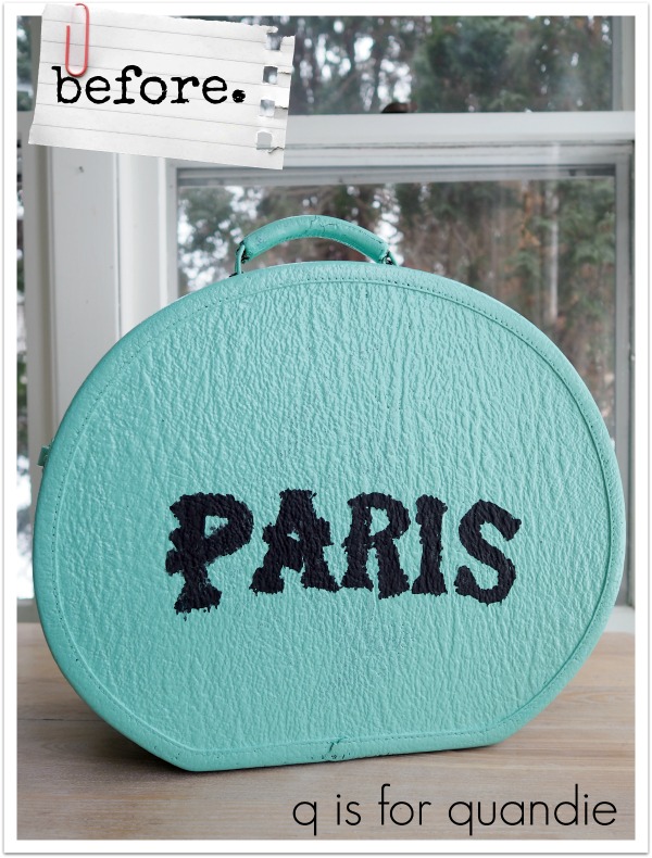
I must confess, I am rarely on top of the latest, newest thing out there.  I was one of the last ones to get a DVD player, an iPod, a cell phone, a digital camera and so on and so on.

But lately I’ve been seeing all kinds of YouTube videos about the new IOD product, paint inlays.

While out visiting my mom in Las Vegas, I popped into a shop called Bloom.  There are several Bloom locations in her area, but I went to the one in The District (I’ve also been to the one in Boulder City on previous visits).

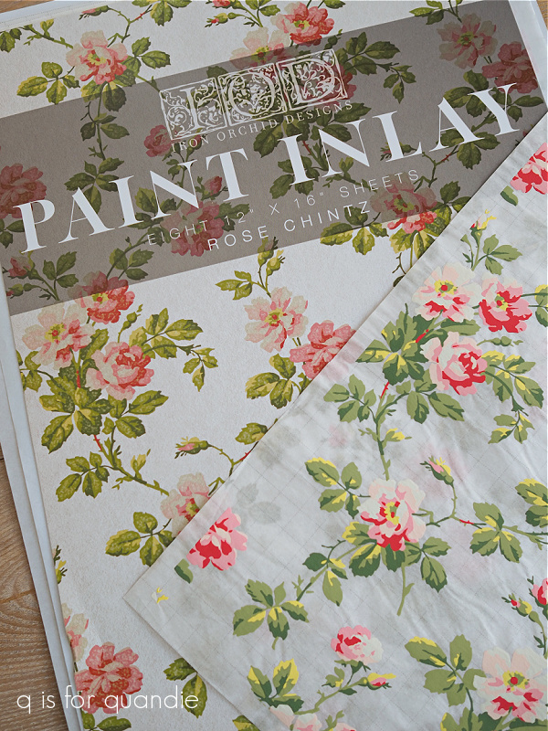
They just happen to be IOD stockists, although I will warn you now, don’t go in there expecting to see a large inventory of IOD products.  They had a handful of transfers, some of the molds (although none of the paper clay that I was hoping to find) and just a couple of the new paint inlays.  I would have loved to get the Grisaille Toile one, but they didn’t have that one.  They did however have the Rose Chintz.

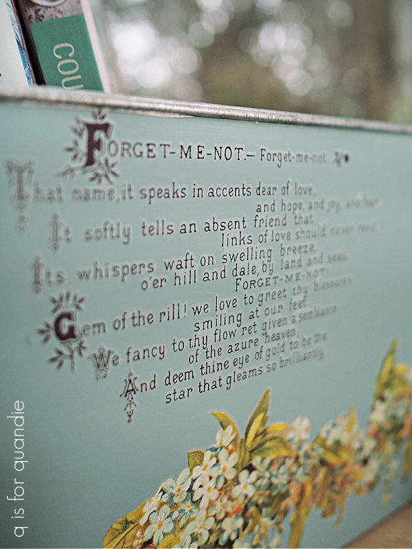
As I’ve mentioned previously, I’m still a sucker for Rachel Ashwell’s shabby chic style and this Rose Chintz falls right in line with that look.  So I couldn’t resist.

Now, before I go any further I want to address the elephant in the room.  These things are Pricey, with a capital “P”.  I paid $47.95 plus tax for one package that includes eight 12″ x 16″ sheets.  Ouch!

I know I’ll be able to get quite a few smaller projects out of one package of the sheets, but if you want to use these on a piece of furniture it could get expensive.  According to what I’ve seen online, you can get at least two and sometimes three uses out of a sheet before discarding it.  However, the look you get on the 2nd pass is not the same as the look you get from a fresh sheet.  In other words, you couldn’t really re-use them on the same piece of furniture and expect it to look uniform.  I’ll be experimenting with this going forward and I’ll keep you posted on the results.

As with any new technique or product, I highly recommend creating a test board first to avoid wasting too much of your very expensive product if you have a failure while learning.  As you’re about to see, paint inlays are nothing like transfers.  It’s a totally different process.

So, taking my own advice, I pulled out a small board that I use for lots of practices and gave it a shot.

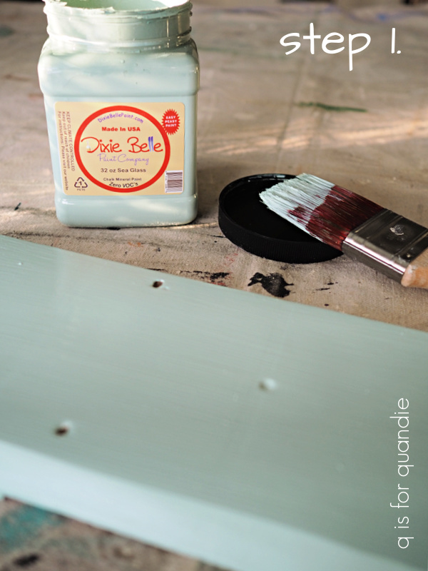
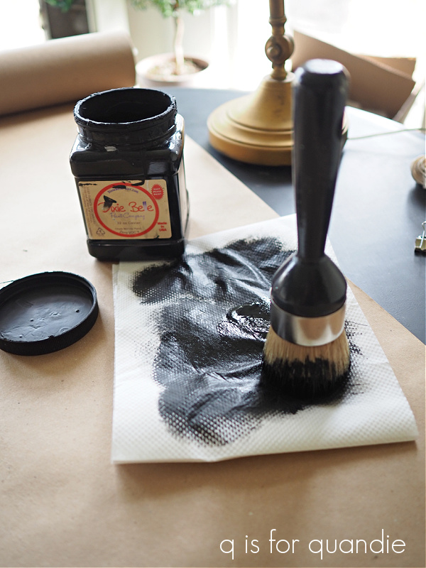
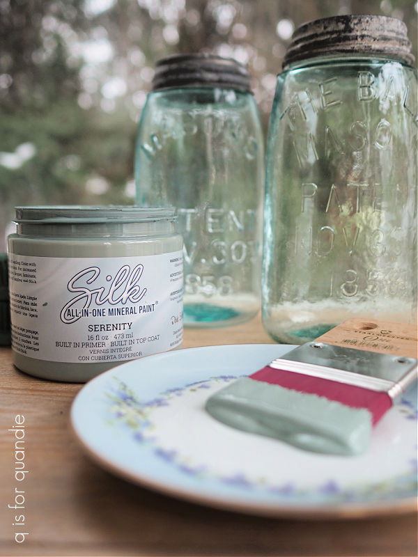
Step 1 – paint a first coat of your chosen paint color.  I should note here that this product is best used with chalk style paints only.  I used Dixie Belle’s Sea Glass.

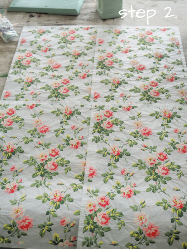
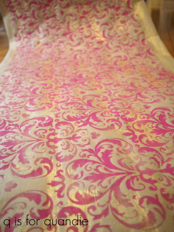
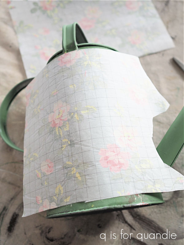
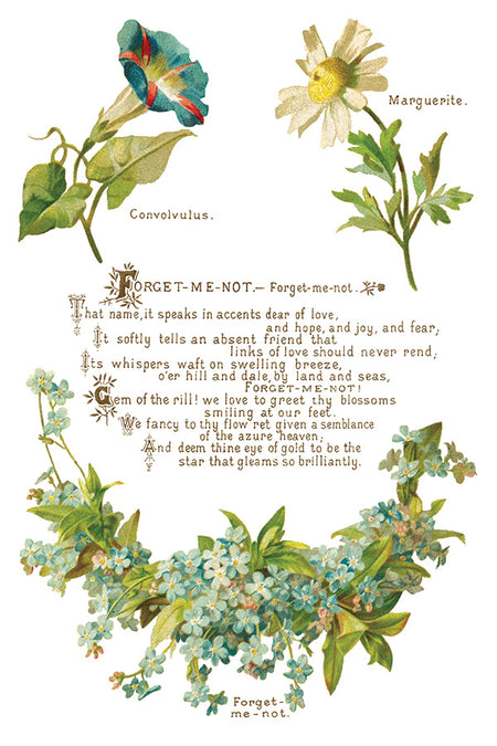
Step 2 – while your first coat of paint is drying, take the time to get the lay of the land with your paint inlays.  They all have a repeating pattern, sort of like wallpaper.  So all 8 sheets can create one large connected pattern.  What I discovered while trying to line up the Rose Chintz is that there are 4 sheets with one pattern, and 4 sheets with a 2nd pattern.  Those with the same pattern can be lined up going horizontally all the way across all four sheets.  Those with the 2nd pattern can be lined up below the first pattern, and also can go four across.  I hope that makes sense.

Step 3 – trim off the excess margin all around each sheet of the paint inlay.  This is mainly important if you are going to be lining up the sheets side by side (and if you don’t do it, just remember that the design does not go all the way to the edge of the paper), but I did it for my test project too.

Step 4 – dry fit the paint inlay to your project.  In my case, I was just using it on a small board, so I cut the sheet down to size.  I didn’t want to waste any of the excess, I can save that to use on another project.  If you are using multiple sheets on a larger surface, now is the time to make sure that you know what order they go in, and have them lined up and ready to go.

Step 5 – this isn’t really an official step in the process, but I recommend that at this point you have all of the items you’ll need at hand and ready to go.  You’re going to be working in wet paint, so you don’t want to dilly dally looking around for tools.  You will need your paint and brush, your paint inlay trimmed, cut to size and ready to go, a spray bottle of water (or a damp rag), and a paper towel.  You can also use a brayer, but that’s not an absolute requirement.

Step 6 – apply a generous, even coat of paint to the surface of your project.  Since my practice board is small, I could do the whole thing at once.  But if you’re working on a larger surface, it’s best to work in sections no bigger than the size of each sheet of the inlay.  While the paint is still wet, lay the paint inlay with the pattern side down onto the wet paint.  At this point you can either spritz the inlay with water and then use a brayer to press the inlay down, or you can use a damp cloth to press the inlay into your piece.  Make sure that the sheet is fully in contact with your paint.  You can blot away any excess water using the paper towel.

Step 7 – let it dry.  This is the easiest step.  Just let the paint and inlay dry.  You can tell that it’s drying because the sheet becomes more opaque when dry.  Once it is dry to the touch, you can move on to step 8.

Step 8 – once dry, it’s time to remove the paint inlay sheet from your surface.  Spritz it again with water.  The inlay becomes translucent again.  Let the water soak into the inlay paper for about 30 seconds or so, just long enough to soften up the paper backing.

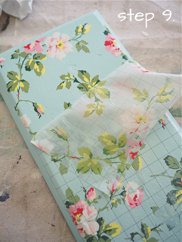
Step 9 – carefully peel away the inlay paper.  If you find that you can’t get the paper unstuck, you may need to dampen it a bit more.  Let the removed paper dry, and you can then use it again on another project.  FYI, the 2nd use will likely produce a more faded looking result.  In addition, you’ll see that the paper has taken away with it some of your base paint color, and that color may transfer to the next project somewhat as well.

As you can see in the photo below, places where the paper wrinkled will show as texture in your dried paint.  You can reduce that by getting the inlay nice and flat using the brayer in step 6 above.  Conversely, you can also leave more texture in the form of wrinkles if you like that look.

Step 10 – once you’ve peeled away the paper, simply let your piece dry thoroughly.

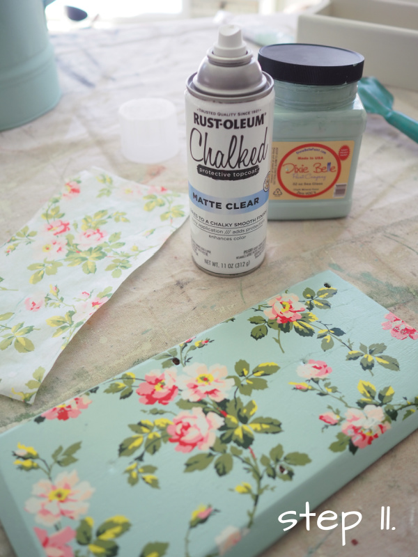
Step 11 – seal the inlay.  This is important!  It’s best to seal the inlay with a spray sealer of some kind.  The inlay paint is easily reactivated with water, or a water based sealer.  If you brush a water based sealer over it, or rub over it with wax, it may smear.  I say ‘better safe than sorry’, use a spray sealer.  I used the Rust-oleum Chalked protective topcoat in matte clear.

Once the topcoat is dry, you can sand to distress and then topcoat again with your finish of choice.  In my case, I sanded my board to distress the edges and also to knock back a little bit of the texture overall.  Then I added a coat of clear wax.
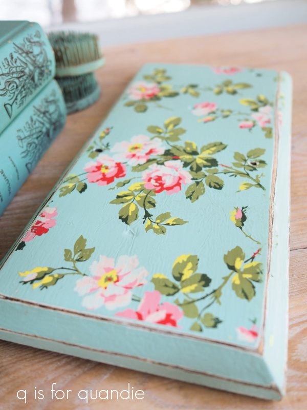
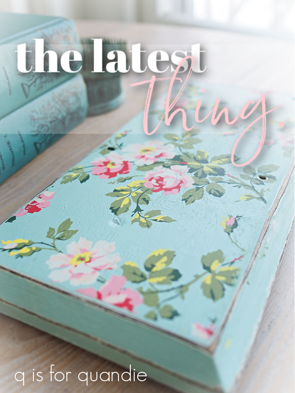
Isn’t that pretty?

I feel like the look is reminiscent of vintage wallpaper.  Mr. Q says the end result looks much more like a hand-painted design rather than a decal.  If you’re one of those people that just can’t live with the slight halo that comes with transfers (although that problem has really been minimized in more recently released transfers), you might really love paint inlays.  So far there are only three designs available, but I’m sure there will be more coming in the future (at least I hope so).

Be sure to pin this post so you can refer back to it when you get some paint inlays!

If you want more instruction on using this product in a video format, I recommend checking out this video from Lynne at ellen j goods.

I’ll be sharing a few more paint inlay projects over the coming week or two, so be sure to stay tuned for that!
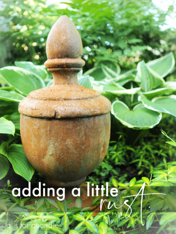
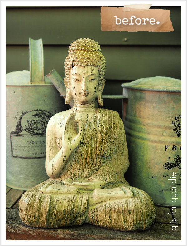
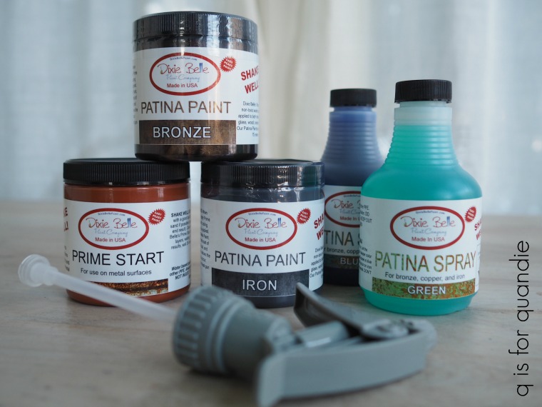
 

keep it clean.

A little while back Dixie Belle sent me some of their new silkscreen stencils from their Belles and Whistles line.

I’d never actually tried using a silkscreen stencil before, so I decided to do a little playing around with one this past weekend to see how I liked it.

I pulled out a little wooden bench that my picker found for me and gave it a coat of Dixie Belle’s French Linen, followed by taping off some grain sack style stripes and painting them in Drop Cloth.  Once all of that was dry, I sanded it down with some 220 grit sandpaper to smooth out the ridges left by the taped off lines and distress the edges.

Then I pulled out the Fresh Eggs stencil from the Farmhouse set and saw that it was going to fit on my bench perfectly.

Silkscreen stencils are a little different from typical reusable stencils.  First up, they are slightly sticky (on the sticky scale, I’d say they are sort of like a post it note) on the back and they come stuck to a backer sheet.  You’re going to need that backer sheet to store your stencil, so don’t toss it away when you peel it off for the first time.  They are also not rigid like a typical stencil and can be curved around an edge which could be a handy feature.

I peeled the stencil off its backer sheet and applied it to my bench.

A couple of things at this point.  First, you’ll see that I have yellow tape on the edges.  That’s not because I need it to hold the stencil in place, the stickiness has it firmly in place.  I added the tape because I used a large stencil brush and I didn’t want to get any stray paint over the edges of the stencil.

Second, I do kind of wish these weren’t made out of that darkish purple material.  It’s a little difficult to get your placement right because you can’t see through it terribly well.  I wonder if we can convince Dixie Belle to make them in a more transparent color.

Next up I grabbed my Dixie Belle paint in Gravel Road and applied the paint using my stencil brush.  I have to admit, I did that “wrong”.  It wasn’t until after I was done that I realized the little plastic thingie in the package was for applying the paint.

You can simply scrape the paint over the stencil using that bit of plastic (you know, as in ‘silk screening’).  Ooops!  Well, no worries, because my method worked beautifully too.  Clearly these silkscreen stencils are much more forgiving than traditional stencils.

The really great thing about using a silkscreen stencil is that you get a nice crisp result with very little effort.  No need to worry about getting too much paint on your brush and getting a sloppy, splotchy looking result.

So for those of you who struggle to get a crisp, clean edge with traditional stencils, a silkscreen stencil might be just the ticket.

Once the paint was dry, I sanded over the stencil to give it a more blended, faded appearance and then I coated the entire bench with some clear wax.

It seriously couldn’t have been any easier.  Recently someone asked me if the sticky stencil would pull off fresh paint, but I didn’t have any issues with that at all.  I don’t think it’s sticky enough to be a problem.

Now, here’s the kicker.  These silk screen stencils can only be re-used about 8 to 10 times, and then only if you wash the paint out of it after each use.  In other words, you have to keep it clean people.  I know myself well enough to know that I’m going to find that tricky.  I always intend to keep my stencils clean, and I always start out that way.  But two or three uses in I usually slack off.  We’ll see how many uses I can get out of this one before throwing in the towel.

So let’s recap the pros and cons of silkscreen stencils.

Cons:  You have to clean them, and even with dedicated cleaning they are only good for about 8 to 10 uses.  It’s difficult to see through the dark purple stencil material when placing the stencil.

Pros:  It’s much easier to get a crisp, clean result.  They can have a much higher level of detail than traditional stencils.  They don’t need to have those bridges in letters that you have to fill in later.  They are more flexible, so you could stencil around a corner.

I thought it might be fun to give away a couple silkscreen stencils so one of you can give them a try.

The rules:  Simply leave a comment on this blog post to be eligible to win.

Your comment must be left on this blog post, not on Facebook or Instagram.  You are not required to follow my blog, although it would be awesome if you did!

I will randomly draw the name of a winner for today’s prize from all of the comments left on this post by Wednesday, June 30, 2021 at the stroke of midnight (U.S. Central time).

The fine print: no purchase necessary, you must be 18 years of age or older to win, void where prohibited by law, the number of eligible entries received determines the odds of winning, approximate retail value of prize is $50, if the prize is not claimed by Friday, July 2, 2021 another name will be drawn at random to win, blah, blah, blah.

As always, thanks to Dixie Belle for providing the paint I used on this little bench as well as their silkscreen stencils.

stenciling gone bad.

You’ll remember that I picked up this already painted vintage suitcase while thrifting with my sister.

Before I say more, if by some crazy off-hand chance the person who painted this suitcase also reads my blog, then I apologize in advance for criticizing your work.  I’m hoping that the fact that this piece was donated to a thrift store means that the previous owner knew it was bad and just decided to unload it.  I hope it wasn’t a gift that someone ditched after receiving it.

When I saw this sitting there on the shelf I immediately thought to myself, I must rescue that suitcase from its bad stenciling job!

To be fair, I’ve shown you the worst of the stenciling in that ‘before’ shot above.  It’s also stenciled on the other side …

Slightly better, but still not good.

Mr. Q is always reminding me that I tend to make stuff look easy, and that for some people it’s not easy at all.  Maybe this is a good example of that.  Maybe the painter of this suitcase dove right in thinking ‘Q makes it look so easy, I’m sure I can just whip this up!’  So for those of you who also struggle with stenciling, I thought I’d share some tips for improving your odds for success.

No. 1 – First and foremost, pay attention to which items are good candidates for stenciling and which ones are not.  In this instance, the pebbled surface of this case will make it tough to get a clean result with a stencil no matter how good your skills.

No. 2 – It’s easier to get a crisp result if your surface has a little ‘tooth’ to it (tooth refers to the grain of your surface, it’s what allows paint to bind to the surface).  Slick, shiny surfaces like the semi-gloss aqua paint on this case have very little ‘tooth’ and will allow your paint to slid around a bit more.  A matte finish will work much better for stenciling, as will non-glossy fabric or paper.

No. 3 – Use a thick paint for the actual stenciling.  Dixie Belle paint straight out of the jar is perfect for stenciling.  I also use the cheap acrylic craft paint that you can buy at any craft store because it tends to be nice and thick.

No. 4 –  Use a proper stenciling brush.  It should have densely packed bristles that are a bit more stiff than your typical paint brush, but also have some flexibility.  I have used the inexpensive Martha Stewart brand stenciling brushes that you can find at Michaels, but you get what you pay for.  The ferrule has come unglued from the handle on most of mine (granted, they got A LOT of use).  The re.design with prima brushes are better quality, and I really love this large one for bigger stenciling jobs.

No. 5 – always, always, always off-load most of the paint on your brush before using it.  I know this feels wasteful because you’re leaving 75% of your paint behind on a paper towel, but trust me, it is crucial for a crisp result.  I probably should have made this tip no. 1 because it is definitely the mistake I make most frequently myself, especially when I’m feeling impatient.

In the end, if stenciling just isn’t your cup of tea, then my next piece of advice is to keep it simple and use a transfer instead.  That’s what I decided to do with this suitcase.

But first things first, I opened it up to look for hidden treasure.  I’m always hoping that I’ll find someone’s secret stash of cash, or maybe a long lost Van Gogh, inside a thrift store purchase.  So far no luck on that, but a girl can dream.

The lining of this case is actually in pretty good condition and kind of pretty.

The color isn’t really working with the aqua though, is it?

So as much as I love a good aqua, and as much as I loved it on this suitcase while it was closed, I felt like I needed to switch to a color that worked well with the lining.  I decided to stay neutral with Dixie Belle’s Drop Cloth.

Inevitably someone is now going to ask me for a tip on freshening up the smell of an old suitcase, and I have to admit that I don’t have one.  I’ve found that since they generally are stored closed up tight, over time the smell returns no matter what I’ve tried.  As a result, I use my old cases for looks only.  Or for storing things that won’t pick up the smell, like my vintage glass Christmas ornaments or craft supplies.  I would never store clothing or other fabric items inside.

Once the paint had dried overnight, I pulled out the Royal Burgundy transfer. If you’re keeping track at all, this will be the 3rd small project I’ve done with this one transfer.  I’ve already used it on a wooden jewelry box and a pair of ice skates.  I still have a pretty good sized chunk of it left after doing this suitcase as well.  Just something to keep in mind when looking at these larger transfers that are one solid design.  You can always break it up for smaller projects.

I did have to line up a seam to cover the whole top of the suitcase and I didn’t get it exactly perfect.

But I don’t think too many people are going to focus on that when looking at the bigger picture.

Also, if you’re wondering, I trimmed the transfer to fit the circular top before removing the backing paper and then applying the transfer.

I ended up painting the handle of the suitcase in Dixie Belle’s Putty for a little contrast.

  The Putty is an almost perfect match to the color of the background words on the transfer.

I wanted to add just a little something more, so I added the word ‘Beautiful’ from the Hopeful Wishes transfer.

You may have noticed that I sanded the edges and the handle to distress the paint job a bit.  You’re always going to see hints of previous paint jobs when you do this, and sure enough you get glimpses of the old aqua here and there.

I finished off the case with a coat of clear wax to give it that subtle patina that only wax can impart.

I think you’ll agree that this vintage suitcase has been rescued from a bad stenciling job.

As always, thank you to Dixie Belle Paint Co and re.design with prima for providing the supplies used for this suitcase makeover.

If you’re looking for Dixie Belle products you can find them here.

Both the Hopeful Wishes and the Royal Burgundy transfers are from re.design with prima.  If you’re looking for re.design with prima products you can find local retailers here, or online sources here.

And finally, if you are local and in need of a gorgeous vintage suitcase, I’ll be taking this one in to Reclaiming Beautiful this week.