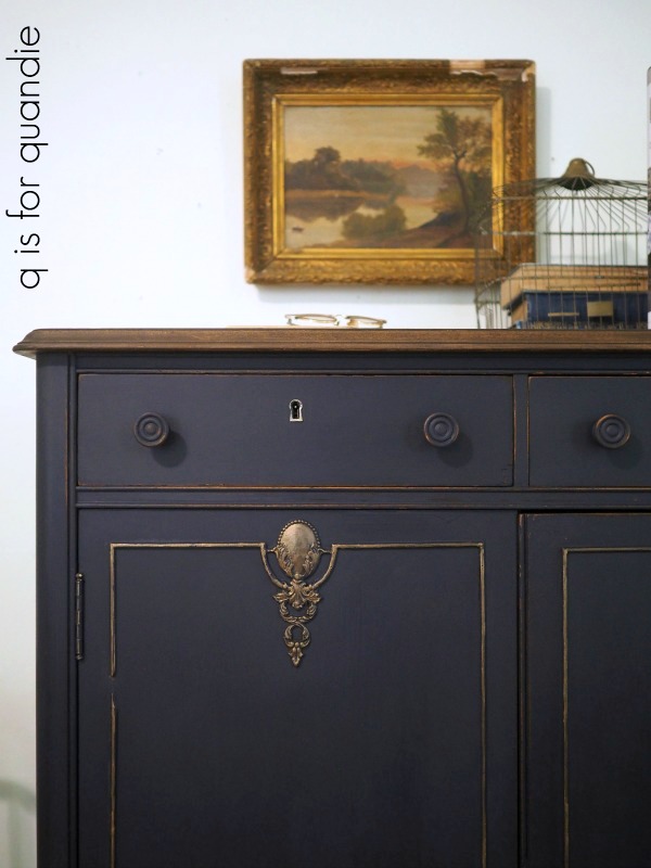
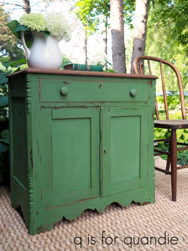
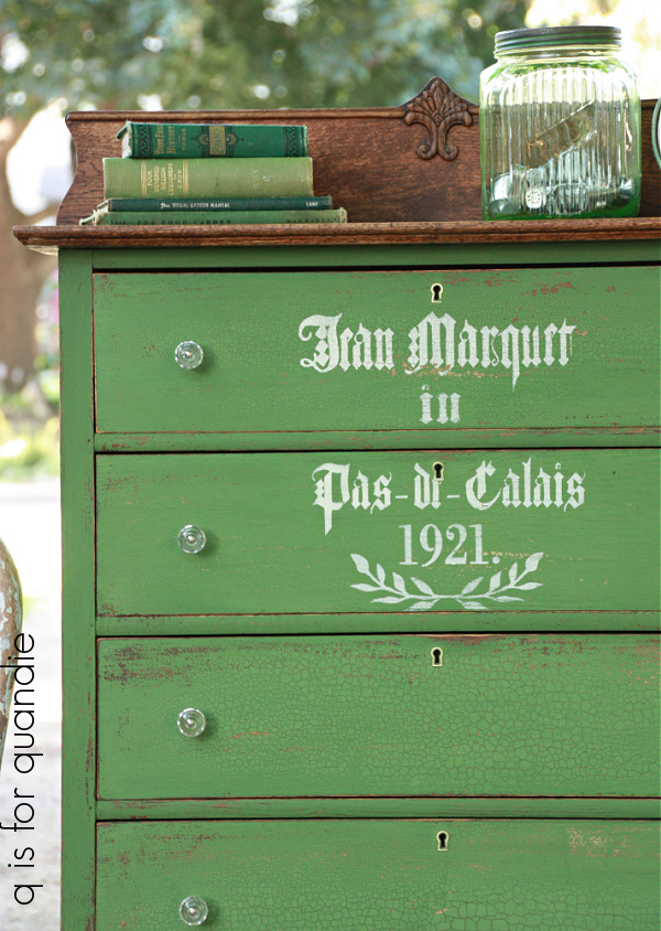
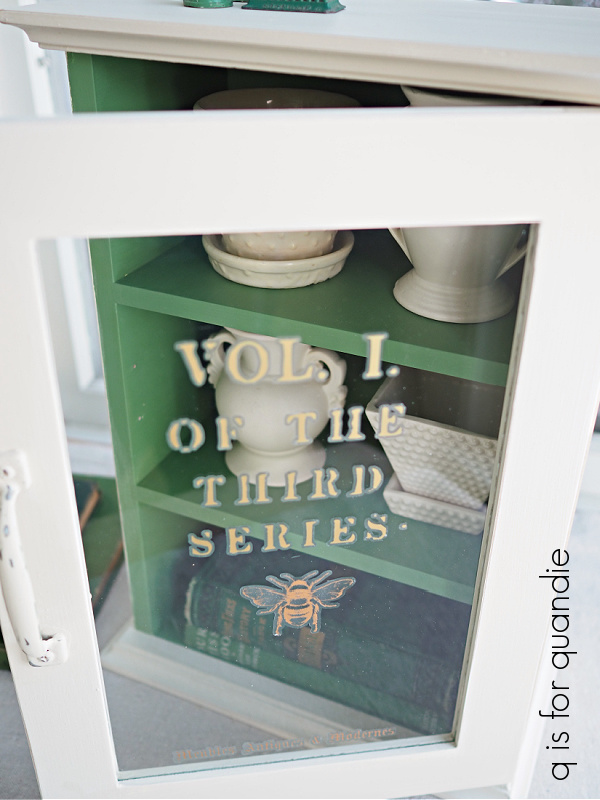
the moody blues.

I wonder how many of you are old enough to be Moody Blues fans, or to have played their albums over and over.  You know, back when we had record players and albums.  Oh boy, I’m probably really dating myself now.  Although now that I think about it, I probably listened to them on cassette tapes in my car more than on albums.

Once upon a time, in my wildest dreams.

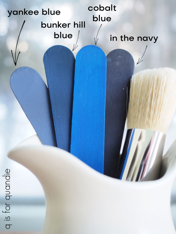
Anyway, today’s post isn’t about music, it’s about the moodier shades of blue available from Dixie Belle Paint Co (and be sure to read to the end because I’m giving some away).  I’ve been using a few of them lately, so I thought it might be helpful to show you guys a comparison of their In the Navy, Bunker Hill Blue, Yankee Blue and Cobalt Blue.  Just in case you are struggling to pick one.

The darkest one is In the Navy.  This color is almost, but not quite, black.  I used quite a bit of this one for a while.  One of my all-time favorite pieces painted in this color was this linen press dresser.

I also painted a waterfall style desk with In the Navy.

Lately I’ve been using more of the next darkest shade, Bunker Hill Blue, most recently on this dresser.

I really like this shade on mid-mod pieces such as this dresser that was a curb-side find.

It looks gorgeous paired with gold hardware.

I’ve also been known to mix In the Navy with Bunker Hill Blue to tone down the Bunker Hill Blue just a tad, or brighten up the In the Navy, whichever way you want to look at it.

That’s what I did on this piece.

Well, to be perfectly honest, I only mixed them because I didn’t have enough Bunker Hill Blue at the time to paint the whole dresser so I stretched it by adding In the Navy.  But it ended up being a fantastic combo.

I haven’t used so much of the Yankee Blue.  This one is the lightest shade of these four colors, and has a bit more grey to it than the other three which becomes more obvious when you look at them all side by side.

Yankee Blue is actually one of the very first Dixie Belle colors I ever used when I paired it with Drop Cloth on this stool.

I’ve used it to create quite a few grain sack stripes since then, including the ones on this desk.

I also used it inside the drawers on that piece after blocking some ink stains using Dixie Belle’s B.O.S.S.

That brings me to the brightest of the four colors, and one I was only recently brave enough to use, Cobalt Blue.

It was gorgeous paired with the I.O.D. Rose Chintz paint inlay on this tackle box.

I’m not sure I’m quite ready to use it on a piece of furniture yet, but I could see mixing the Cobalt Blue with the Bunker Hill Blue to get something somewhere in between the two.

How about you, have you tried any of these colors yet?  And if so, do you have a favorite?

If not, now’s your chance.  I’m giving away a 16 oz. jar of each to one lucky winner.

And I’m even going to throw in a CD of the Very Best of The Moody Blues, just for fun.

The rules for today’s giveaway:  Simply leave a comment on this blog post (and please forgive me if I don’t respond to every one, but know that I read and appreciate all of them).

Your comment must be left on this blog post, not on Facebook or Instagram.  You are not required to follow my blog, or follow my Facebook or Instagram accounts, although it would be awesome if you did!

I will randomly draw the name of a winner for today’s prize from all of the comments left on this post by Friday, March 10, 2023 at the stroke of midnight (U.S. Central time).

The fine print: no purchase necessary, you must be 18 years of age or older to win, void where prohibited by law, the number of eligible entries received determines the odds of winning, approximate retail value of prize is $100, if the prize is not claimed by Friday, March 17, 2023 another name will be drawn at random to win, blah, blah, blah.

Thank you to Dixie Belle Paint Co for providing the paint included in today’s giveaway.

the silky whites.

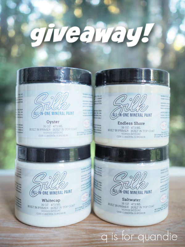
A long while back I shared a post comparing the various shades of Dixie Belle chalk style white paint, and at the time I promised to do the same with their Silk line of paint (be sure to read to the end, there is a giveaway!).

So, better late than never, here it is!

As a reminder, the Silk All-in-One Mineral paint has a built in primer and top coat.  It’s a one step product, just clean your piece first, then paint and you’re done.  Once caveat, if you’re painting a piece with serious bleed-thru using one of the white Silk paints, I would still prime with B.O.S.S.  The stain blocking abilities of this paint may not be enough for that situation.

There are 4 shades of white in the Silk paint line.  I was surprised by that since the entire line started with only 20 colors total (it now has 30 with the addition of the Desert Collection).  But now that I’ve done a little comparing, I get it.  And really, as a person who is fairly picky about shades of white, I really shouldn’t have been surprised at all that 20% of their first collection of colors were shades of white.

The shades of white in the Silk line are Endless Shore, Oyster, Saltwater and Whitecap.  At first glance it may appear as though there isn’t much difference between these colors.

But side by side, you can certainly see the differences between them.  The Oyster has the tiniest hint of grey in the background.  The Whitecap is the brightest white.  Dixie Belle calls Saltwater an off-white, it is a bit less bright white than the Whitecap, and definitely brighter than Endless Shore.  The Endless Shore is the color that comes closest to my favorite white ever, Drop Cloth, and is a very warm off-white.

I have to confess, I haven’t used much of the Silk whites.  That’s because I really LOVE my Dixie Belle Drop Cloth, so every time I go to paint something white I automatically grab that paint first.  However, there are certain applications where I prefer using a paint with a built in primer and top coat such as painting the insides of a bookshelf or cupboard (or toolbox), or painting pieces that I don’t want to distress.

The only example of an item painted in one of the Silk whites on my blog is this crate that I painted for the swanky swigs earlier this year.  It’s painted in Endless Shore.

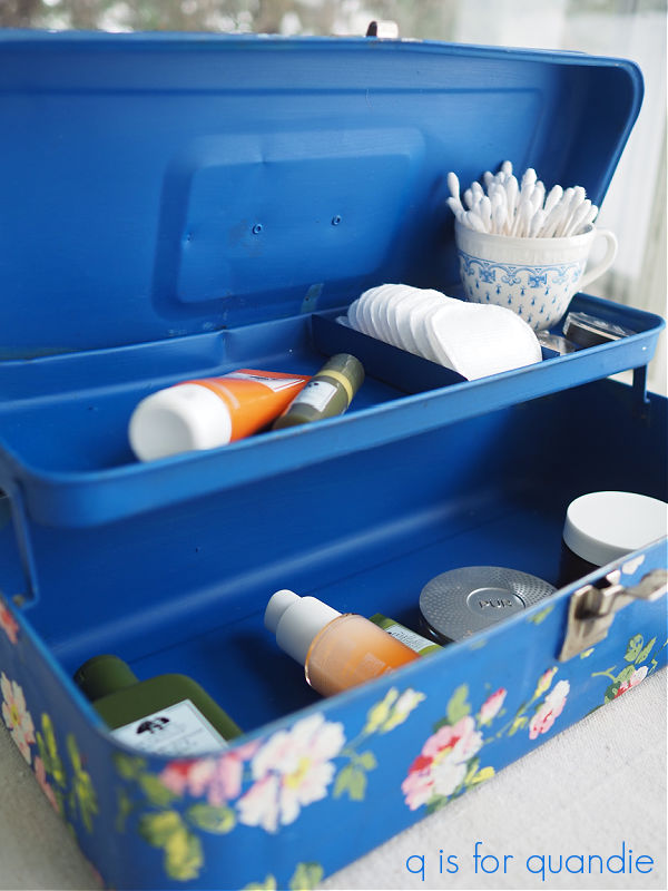
Another reason I haven’t really used much of the Silk whites is that I usually like to use this paint with its built in primer and top coat on the insides of things, and that’s where I tend to add a bold color.  Such as the Fiery Sky inside this toolbox …

Or the Mojave inside this washstand.

But I ordered up a couple jars of the Saltwater a while back and I plan to start using it to refresh the paint on various trim throughout our house.  I think this paint is going to be perfect for window trim and baseboards, and the Saltwater is a great match for the white on the trim in our house.  Painting trim feels like it should be a winter project to me.

The Silk paint would also be a great choice for bathroom or kitchen cabinets.  Another winter project I’m considering is painting the insides of our kitchen cabinets.  Although if I do that I may opt for a pretty pop of color.  Or it might even be fun to go dark … hmmm, I’ll have to give that some thought.

But in the meantime, today I’m going to give one of you the chance to try all four of the Dixie Belle Silk All-in-One Mineral paint whites for yourself.

The rules:  Simply leave a comment on this blog post to be eligible to win.

Your comment must be left on this blog post, not on Facebook or Instagram.  You are not required to follow my blog, although it would be awesome if you did!

I will randomly draw the name of one winner for all four paint colors from all of the comments left on this post by Friday, September 30, 2022 at the stroke of midnight (U.S. Central time).

The fine print: no purchase necessary, you must be 18 years of age or older to win, void where prohibited by law, the number of eligible entries received determines the odds of winning, approximate retail value of prize is $100, if the prize is not claimed by Friday, October 7, 2022 another name will be drawn at random to win, blah, blah, blah.

Best of luck to you!

Thank you to Dixie Belle Paint Co for providing their paint that I’m giving away today.

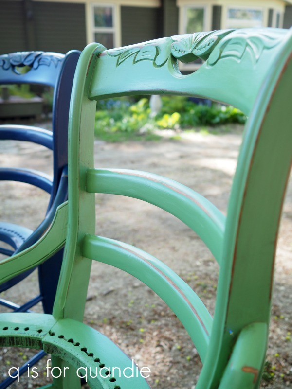
wearin’ the green.

In honor of St. Patty’s Day, and since green is one of my favorite colors, I thought I’d share some of my favorite pieces painted in verdant shades while I’m off enjoying my visit with my mom.

I think my all time favorite shade of green is In a Pickle from Sweet Pickens milk paint.

I absolutely LOVE this color.  Isn’t it gorgeous on this washstand?  Pieces in this color never sell quickly for me, but every once in a while I paint another piece in it just because I love it so much.  I always eventually find someone who loves it as much as I do though.  I remember this particular washstand sold to an artist who wanted it for her studio.

I also used In a Pickle on this dresser.

This one crackled in the most perfect way.  And again, it took longer than usual to sell but I did eventually find a buyer.

I have one more favorite piece with this particular paint, this farmhouse table.

I really kind of wish I’d hung onto this piece now.  I’d love to be using it as my own desk.  It’s a bit larger than the one I have now, and I do need a little bit more space.  I’m keeping an eye out for another one like it.

My second favorite shade of green is Fusion’s Park Bench.

I’ve painted so many mid-mod pieces in this color.  Since I don’t want the chippy look of milk paint on the mid-mod’s, the Park Bench is the perfect choice for them.

Unlike with the In a Pickle, the pieces I’ve painted in Park Bench just fly out the door.

Especially the credenza’s.

Adding gold hardware to this color is always a hit.

My latest favorite green is Dixie Belle’s Kudzu.  It was gorgeous on the interior of this little cabinet.

It made a fabulous planter chair.

And it was perfect on this painted toolbox.

I also love it with the Rose Chintz paint inlay from IOD over it.

I still have a mostly full jar of this paint, I’m just waiting for the perfect piece of furniture to come along to put it on.

My mom’s town usually has a parade on St. Patrick’s Day so maybe my sister and I will check that out today.  I hope you’re doing something fun today to celebrate too.  I don’t have any Irish ancestry (that I know of), but I can get behind any holiday that celebrates the color green, how about you?


shades of white.

Hey guys, tomorrow is Mr. Q’s birthday!  I thought maybe we could celebrate with a giveaway so be sure to read all the way to the end to get all the details on how to qualify for the giveaway.

Actually, the idea for this post has been brewing since way back in October when I compared the different shades of black Dixie Belle paint.

I think someone suggested that I do the same with shades of white at the time, and that sounded like a pretty good idea to me.

So I went to the Dixie Belle website to review all of the different shades of white, and guess what?  There are quite a few of them!  There are 4 in their chalk style paint line and 5 in their all-in-one Silk paint line.

That’s a lotta white.

So I’ve decided to break them down into separate posts (and separate giveaways).  Today I’m just focusing on the chalk style paint … and oh, not all 4 of the colors that Dixie Belle includes in their ‘white’ category.  I neglected to include Buttercream.  I think of that as more of a pale yellow or cream rather than a white, so I hope you’ll forgive me.

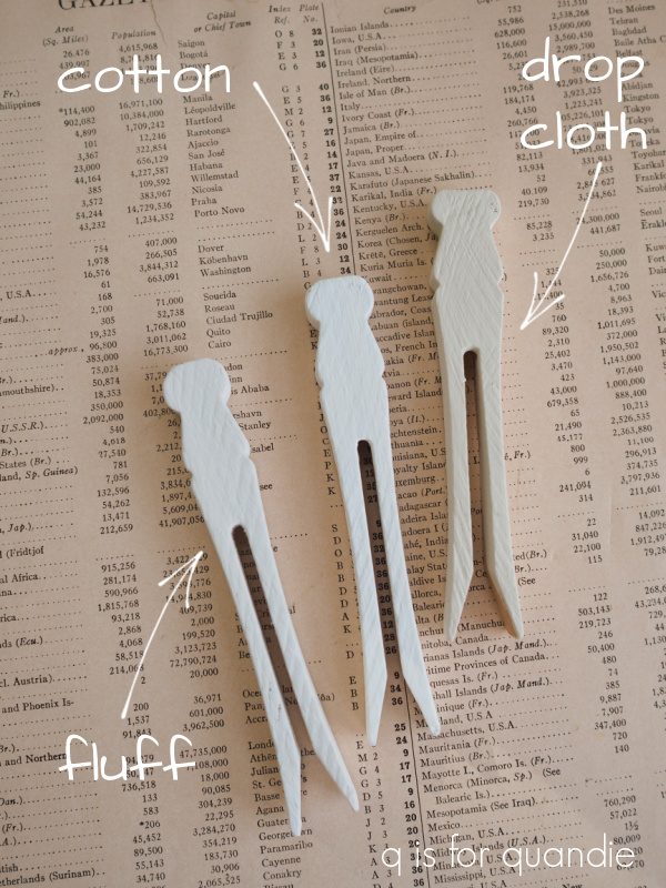
For today that leaves us with Fluff, Cotton, and Drop Cloth.

If you’ve been following me for any length of time, I think you know which is my favorite!

Drop Cloth!

I’ve used this color on a multitude of pieces.

Seriously.  I don’t think I could even begin to count all of the things I’ve painted in Drop Cloth.

Dixie Belle describes this color as “a stylish linen white with a touch of warmth,” and that pretty much nails it.  I really prefer working with a warm shade of white that you can bring into your home and it doesn’t instantly make all of the other white items look dull.

When standing alone, Drop Cloth reads as warm white to me.  It’s only when you put it right next to a bright white that it appears so much darker.

I am not a fan of a harsh, bright white and that brings me to the Cotton.  Dixie Belle has this to say about Cotton:  “Cotton is our purest white, perfect for a clean and classic look. This color is for anyone who wants to decorate their home with stark simplicity.”  Yep, that pretty much sums it up.

The fact that I’m not really a fan was readily apparent when I tried to find samples of my work in this color.  The best I can do is the table runner that I shared back at the end of December.

I ended up painting that swiss cross on the drop cloth in Cotton because my usual go-to white, Drop Cloth, was … well, duh!, the nearly the same color as the drop cloth itself (no wonder they named it that!).

I also used the Cotton on the Skate Rental sign that I shared last week, just to do the laces on the skates.

That brings us to Fluff.  Dixie Belle describes Fluff as “a serene, soft white with a slight gray undertone.”  Spot on again.  I have to say, if you are wondering what a color really looks like, read the description.  Many times the photos can be deceiving.  It’s so hard to get a color right on a computer screen.  But I find that Dixie Belle does a really good job of describing the colors.

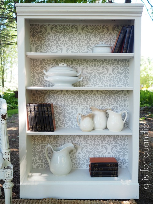
Once again, examples of Fluff are few and far between on my blog.  I did use it on this bookcase.

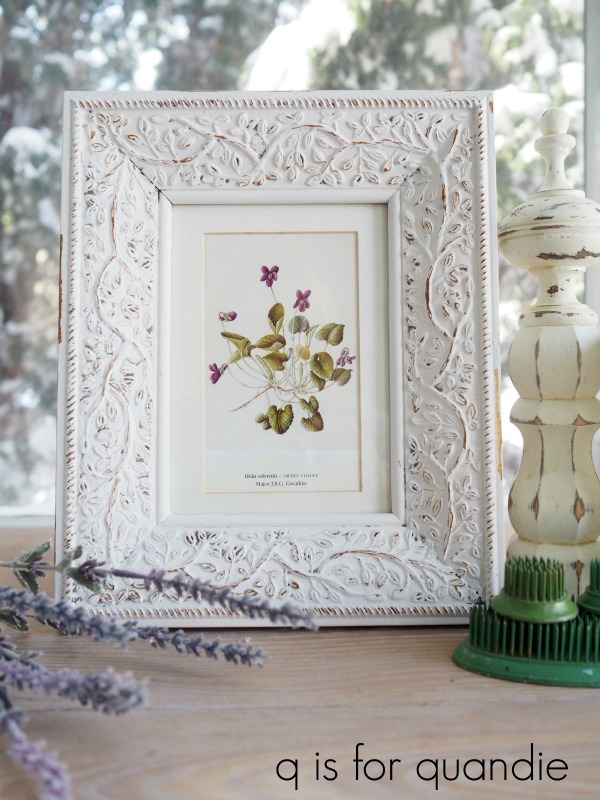
And here is Fluff on a picture frame.

It would be fair to say that when I want a whiter white than Drop Cloth, Fluff would be my choice.

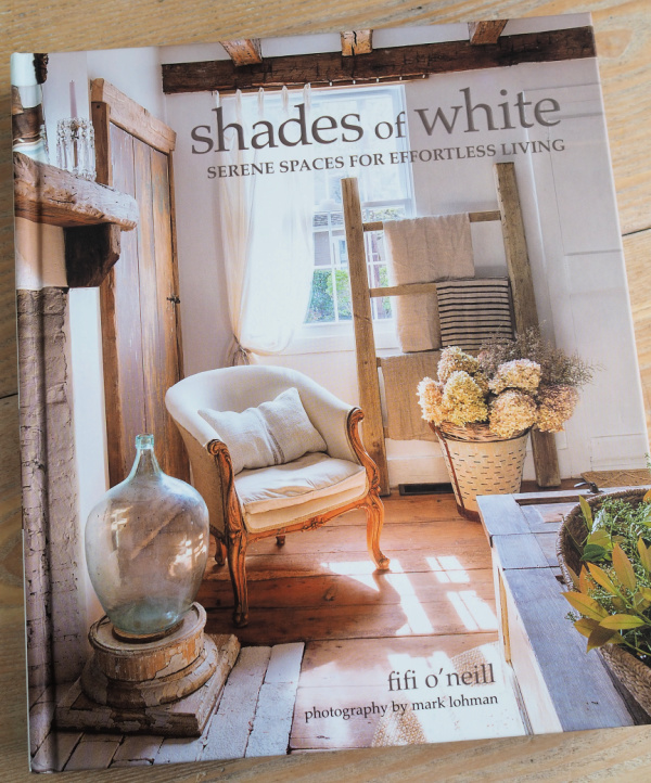
Speaking of Shades of White, have you seen Fifi O’Neill’s newest book by that name?

If you are a fan of decorating with white, vintage and pale wood tones, you will love this book.

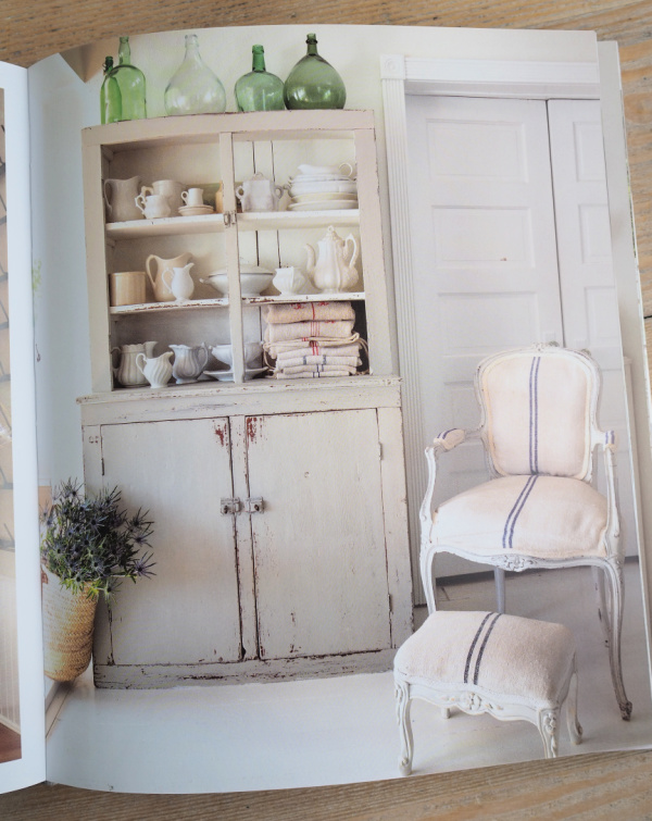
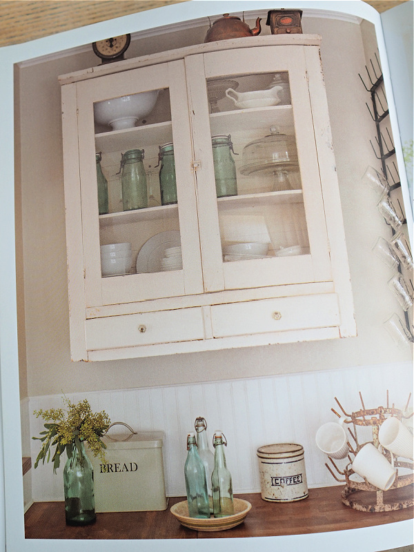
I’d say the trick to making a mostly white color scheme work is using varying shades of white such as white with the barest hint of grey like the cupboard above.  Or warm white walls with a brighter white beadboard wainscoting like shown below.

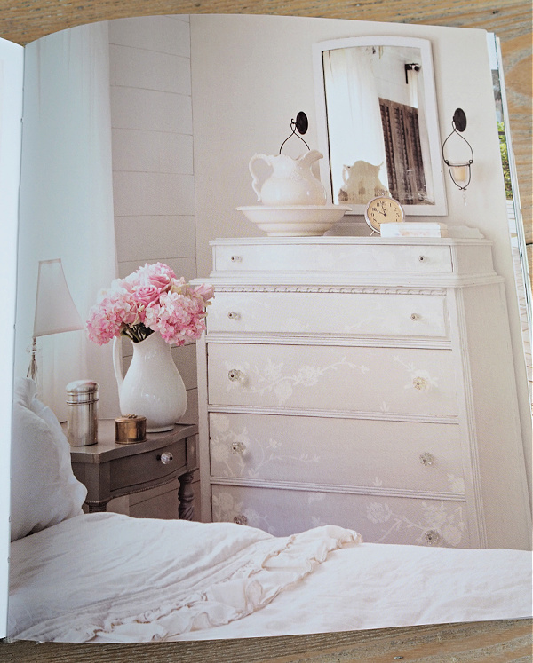
And of course I love the tone on tone look of this next dresser …

So, in other words, one can embrace all of the shades of white and allow them to mix together.

And that brings me to my giveaway!

The lucky winner of today’s giveaway will receive a copy of Shades of White, 16 oz. of Drop Cloth, Cotton and Fluff, and the medium oval paint brush from Dixie Belle.

The rules:  Simply leave a comment (if nothing else, wish Mr. Q a happy birthday) on this blog post to be eligible to win.

Your comment must be left on this blog post, not on Facebook or Instagram.  You are not required to follow my blog, although it would be awesome if you did!

I will randomly draw the name of a winner for today’s prize from all of the comments left on this post by Sunday, February 27, 2022 at the stroke of midnight (U.S. Central time).

The fine print: no purchase necessary, you must be 18 years of age or older to win, void where prohibited by law, the number of eligible entries received determines the odds of winning, approximate retail value of prize is $135, if the prize is not claimed by Friday, March 11, 2022 another name will be drawn at random to win, blah, blah, blah.

Thanks to Mr. Q for ordering the book for today’s giveaway from amazon.com, and thank you to Dixie Belle Paint Co for continuing to provide me with products that I can give away 😉  Good luck!

comparing shades of black.

After painting the spooky nightstand that I shared a while back, I had an idea that it would be worthwhile to compare the shades of black paint that are available from Dixie Belle Paint Co for you guys.  Be sure to read all the way to the end of this post because there’s a giveaway today too!

So, the thing is, much like with white paint, there are lots of options for black.

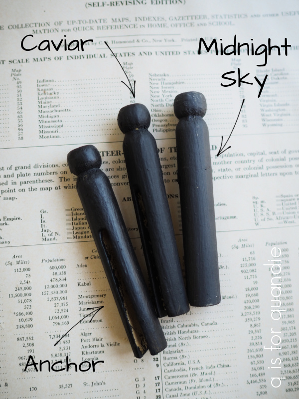
With the spooky nightstand, I painted it overall in Dixie Belle’s Midnight Sky chalk mineral paint, and then stenciled over that in Dixie Belle’s Anchor Silk All-in-One Paint thus making this piece a good representation of the difference between those two black paints.

There are two factors at work here; color and sheen.  The Midnight Sky is what I would call an off-black, it has a slightly more faded look than Dixie Belle’s Caviar.  In addition, the chalk mineral paint is very flat.  The Silk All-in-One Anchor paint is a little bit darker than Midnight Sky and has a bit more sheen, thus creating the look above when it’s stenciled over the Midnight Sky (the diamond pattern and the damask pattern).

Now, I know the differences between the three are pretty subtle, but I’m hoping you can see them here.

That’s paint only, no added topcoat.  The Anchor clearly has a bit more sheen than the other two, and the Caviar is a bit darker than the Midnight Sky.

When I first starting using Dixie Belle paint, I originally fell in love with the Caviar.

I used it on so many pieces!

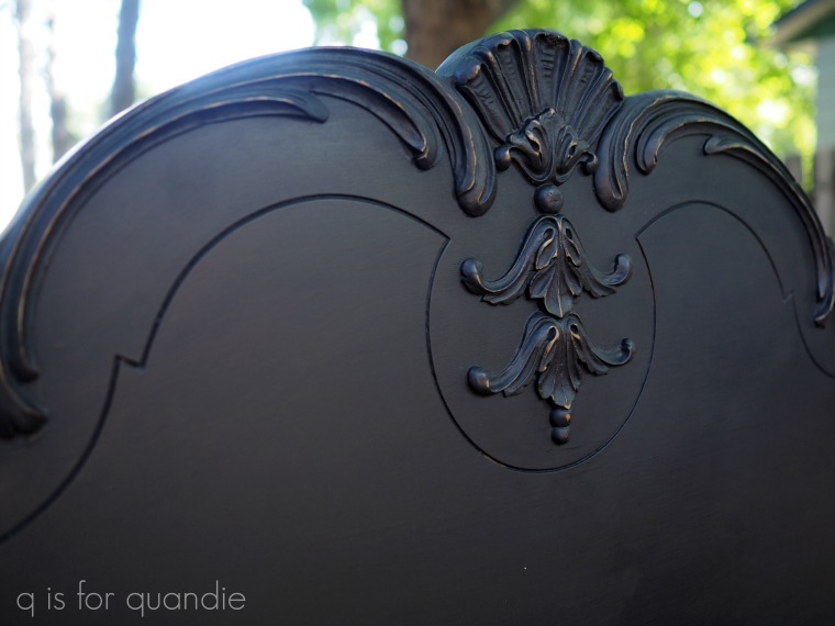
One of my favorites was this bed …

So gorgeous!

Caviar is a deep, rich black.

But then I discovered the Midnight Sky and I used it on my baby grand piano.  This is a slightly more faded version of black, still definitely black, but not quite as deep and dark as Caviar.

I feel like the Midnight Sky is just a tad more forgiving when it comes to dust and fingerprints.  My baby grand gets a fair amount of wear and tear because I basically use it as a workbench most of the time.  For that reason, I thought Midnight Sky would be a better choice for it.

I also used Midnight Sky on this Eastlake style bedroom set.

This shade of black is the perfect complement to brass or gold hardware.

This brings me to the new-ish Silk All-in-One black paint from Dixie Belle called Anchor.

First, to save you from the confusion that I experienced, I want to point out that the Silk color called Black Sands is not black, but a dark charcoal.I ordered it thinking it was black.  Even looking at it in the jar, you won’t immediately realize that it isn’t.  Now don’t get me wrong, I love the color.  It was perfect on this dresser

But it’s not black.

If you’re looking for a fabulous charcoal grey though, it’s perfect.  In fact I just ordered more of it to paint some wooden folding chairs for my porch.  I think it will be perfect on them.

But the Anchor is the true black in this line.  Aside from stenciling it on the spooky nightstand, I haven’t actually painted a full piece of furniture in this color so I don’t have a picture of one to share with you.  But I wanted to include it here in my line up anyway.  As you may already be aware, the Silk line is Dixie Belle’s version of a primer, paint and top coat all in one.

To recap, Caviar and Midnight Sky are more flat (but of course you can add sheen with a top coat).  Anchor has more sheen due to its built in top coat.  Midnight Sky is a faded black, while the other two are darker.

Now, please don’t read too much into the brush strokes in that Caviar example above.  I let my brush dry out, and then still tried to paint with clumpy bristles.  Rooky mistake, and something I would never do on a piece of furniture but this was just a practice board.

Now for the fun part.  I’m giving away a 16 oz size jar of all three of the Dixie Belle blacks, plus three of their brushes to use to apply them.  So one lucky winner can try out all three and decide which one is their favorite!

The rules:  Simply leave a comment on this blog post to be eligible to win.

Your comment must be left on this blog post, not on Facebook or Instagram.  You are not required to follow my blog, although it would be awesome if you did!

I will randomly draw the name of a winner for today’s prize from all of the comments left on this post by Sunday, October 31, 2021 at the stroke of midnight (U.S. Central time).

The fine print: no purchase necessary, you must be 18 years of age or older to win, void where prohibited by law, the number of eligible entries received determines the odds of winning, approximate retail value of prize is $140, if the prize is not claimed by Thursday, November 4, 2021 another name will be drawn at random to win, blah, blah, blah.

Thanks to Dixie Belle for providing the paint and brushes I am giving away today.  Good luck!

soldier blue.

As you’ll remember, a couple of the prize packages for my 12 days of giveaways included some Homestead House Milk Paint in a color called Soldier Blue.

I had never used this color before, and in fact never even really realized this color was available (see all of the Homestead House Milk Paint colors here).

Two things struck me.  First of all, it’s a gorgeous shade of blue.  Second, it’s pretty close to the 2020 Pantone Color of the Year, Classic Blue.  I knew I had to give it a try myself, so I mixed some up.

It looks a bit lighter as wet paint and I wasn’t sure I would get that gorgeous deep blue in the Homestead House photo.  But, as you know, paint always looks different once dry.  Especially milk paint.  Plus the top coat you use over milk paint can really change up the color.

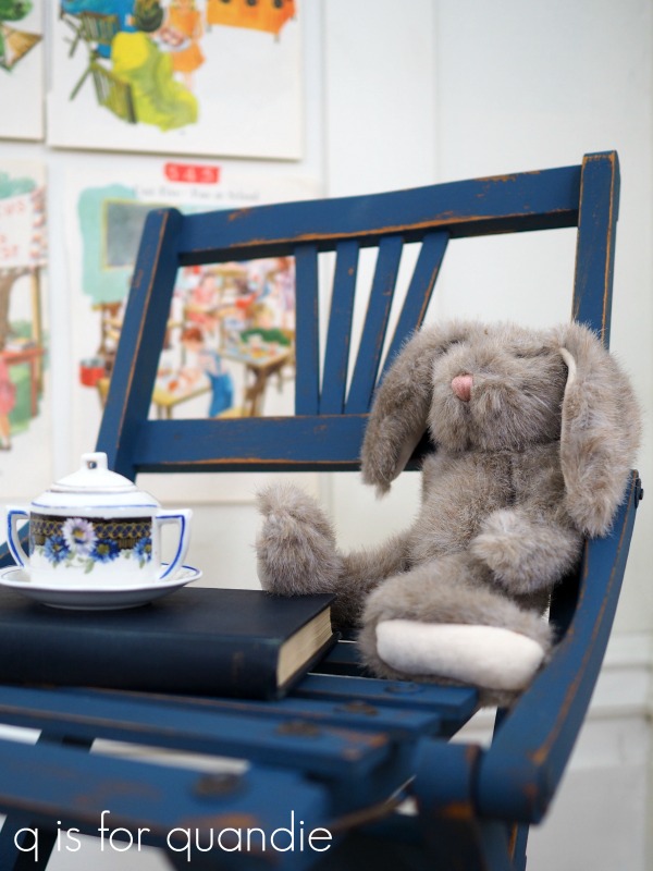
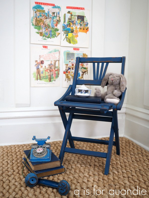
So I pulled out this adorable little vintage kid-size folding chair that my picker Sue found for me.

I knew painting all of those slats was going to be a pain.  It’s so challenging to avoid drips when you have this many surfaces going on.  But one of the things that I love about milk paint is that it’s super easy to sand off any drips one the paint is dry.  Much easier than with other types of paint.

All I did to prep this chair was wipe it down with a damp cloth.  I was hoping to get some chipping, and the previous finish was fairly worn off so I was willing to gamble on getting just the right amount of paint to stick.

I painted the chair with two coats of the Soldier Blue, then once dry I sanded it lightly to distress.  Sure enough, I got some awesome chipping.

I knew that using hemp oil as my top coat would give me the deepest version of this color, so I pulled out Dixie Belle’s Howdy Do! Hemp Seed Oil.  This is another new-ish product from Dixie Belle that came out around the same time as their Big Mama’s Butta.

I usually apply hemp oil with an inexpensive chip brush, and that definitely would have been the smarter/easier option for this chair.  But, I was too lazy to dig out a chip brush so I just used an old t-shirt.  Clearly this is another situation where I have to say, ‘do as I say, not as I do’.  It’s a little harder to get the oil applied in all of those crevices using a rag.  It would have been much easier to brush the oil on, and then wipe away the excess with a clean rag.
Keep in mind that hemp oil will not add much sheen (if any), and it will also produce the darkest version of the color of your milk paint.  In this case, it was the perfect choice and it really brought out the richness of the Soldier Blue.

I had the perfect little piece of vintage toy china to use for staging this chair.

Isn’t it sweet?  I found it at a garage sale last summer.  It’s only about 2.5″ tall.
Remember when Mr. Q and I cleaned out our attic while getting out the Christmas decorations?  I came across some old stuffed animals in a box and decided to hang onto a couple of them for staging kid’s stuff.

Mr. Bunny still looks pretty good after 20 years in the attic.

I’m loving this shade of blue.  Now I just need to find a bigger piece of furniture to use it on.

I’ve put it in the stash of stuff that I need to bring in to Reclaiming Beautiful (the shop where I sell on consignment).  I probably won’t get it in there until next week though.

  But in the meantime, how do you like the little Soldier Blue chair?

As always, thanks to Homestead House Milk Paint for providing the Soldier Blue Milk Paint and to Dixie Belle Paint Co for providing the Howdy Do! Hemp Oil used for this project.

a fan of aqua (pardon the pun).

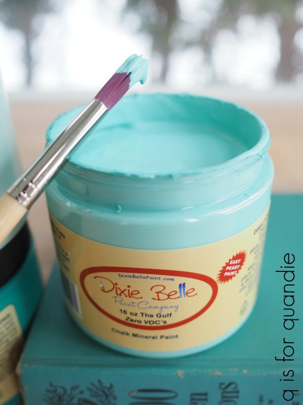
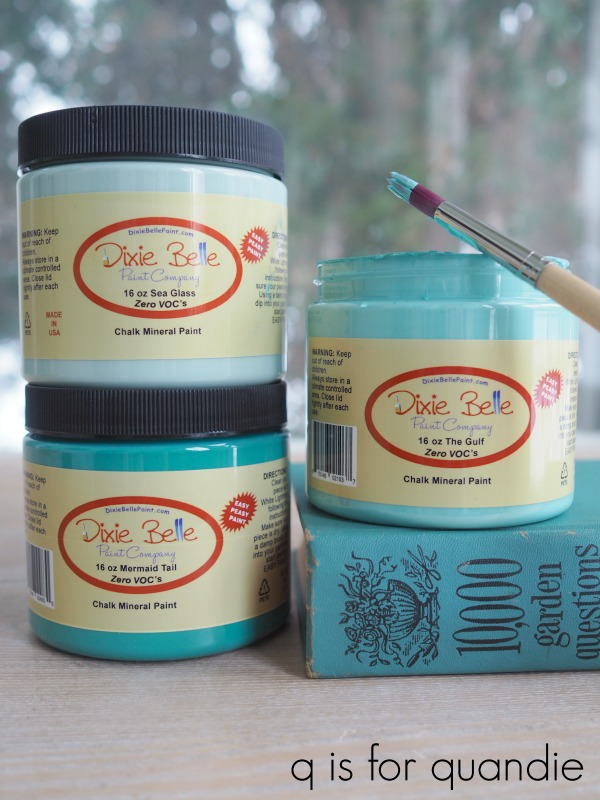
I shared this gorgeous aqua paint from Dixie Belle called The Gulf in Monday’s post.

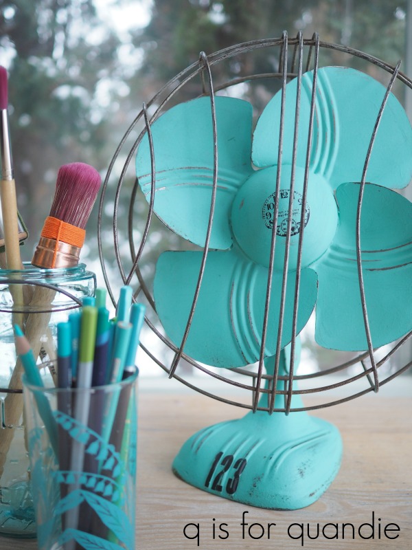
I’ve always been a big fan of aqua and I thought this shade would be perfect for a vintage fan that my friend/co-worker Jodie gave me.

Much like with toolboxes, I usually don’t like to paint over an authentically aged metal patina … except when they are this not so fabulous shade of brown.

Jodie had already removed the electrical cord from the fan.  I always do that too when I’m working with a piece with old wiring that doesn’t look safe.  I don’t want anyone to be tempted to plug it in.  This fan is for looks only.

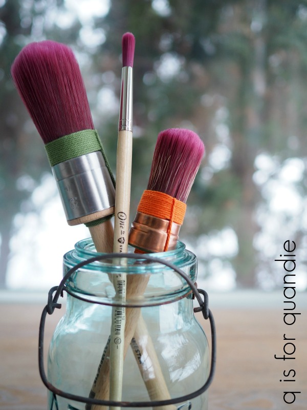
I was hoping to be able to temporarily remove the safety grill allowing me to easily paint the blades, but that proved to be impossible.  The nuts and bolts holding it in place probably hadn’t been moved in at least 50 to 60 years and they weren’t budging.  So instead, after wiping down all of the surfaces as well as I could, I pulled out a long, slender Staalmeester brush.

I was gifted these brushes by Loree from Homestead House Milk Paint/Fusion Mineral Paint.  I have to confess, they are so gorgeous that I’m afraid to even use them.  I don’t want to mess them up!  Is it wrong that I just want to display them like art in a pretty jar on my desk rather than actually paint with them?

I also have to confess that when I initially saw the long slender brush in the middle I thought to myself ‘this looks like an artist’s brush’ and I wondered if I’d ever find a use for it.

Sure enough, it came in handy almost immediately for painting the blades of this fan.

I was easily able to reach in between the wires of the guard with the brush to get to the blades, and the brush was slender enough that I didn’t have to work too hard to not get paint on the guard.

As you can see above, once the paint was dry I sanded everything including those ridges on the blades to produce some faux distressing.

To be honest, I’m still wondering if I should have just stopped there.  But I didn’t.  I also added a couple of Tim Holtz rub-on’s to the fan.

Should I have left it alone for a more authentic vintage vibe, or do you like it with more of a ‘altered art’ sort of look?

Once the rub-on’s were in place, I coated everything with some of that delicious new Fusion wax that is scented with essential oils.

How do you like this fan transformation?

As always, thank you to Dixie Belle Paint Co for providing the paint for this project, and to Loree at Homestead House Milk Paint/Fusion Mineral Paint for the brushes and the wax.

You can find Dixie Belle paint here.

And you can find the Staalmeester brushes here.

the aquas.

I recently ordered a few new-to-me Dixie Belle paint colors including two beautiful shades of aqua, The Gulf and Mermaid Tail.

 Plus I already had Sea Glass on hand, a lighter shade of aqua.

I painted a really pretty dressing table in this color in 2018.

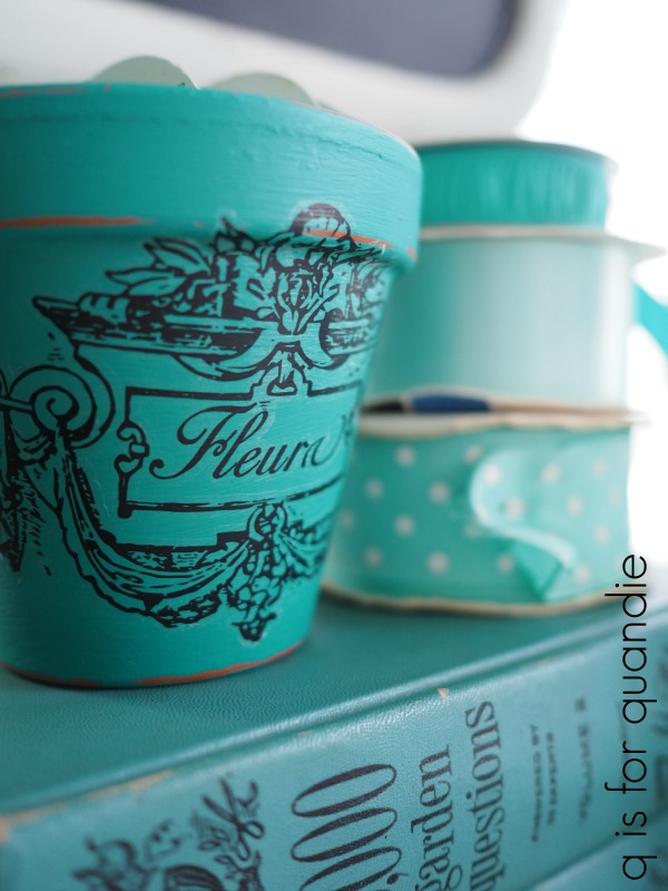
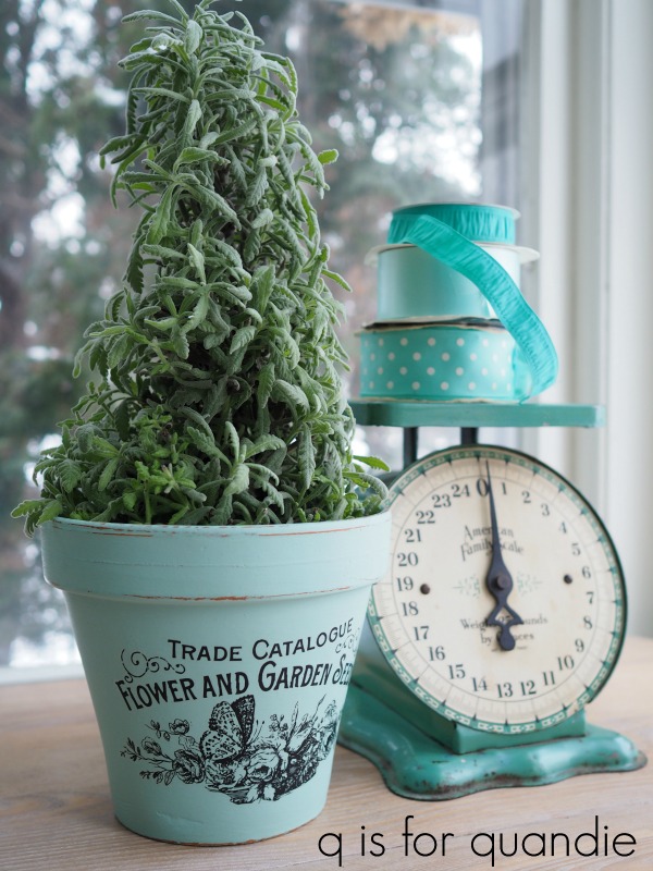
Anyway, I thought it would be fun to show a comparison of these three shades of aqua in case any of you are looking for a good aqua.  And what better way to do that than painting up some clay pots?

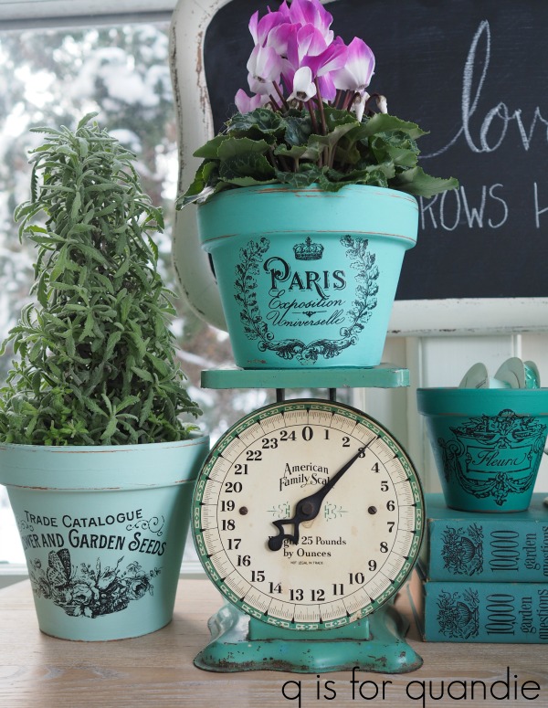
All three colors provided a perfect background for more of the Classic Vintage Labels from re.design with prima.

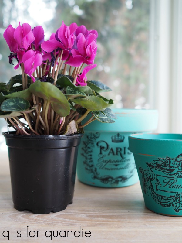
The Mermaids Tail is a deep, rich, teal …

The Gulf is a classic turquoise …

The Sea Glass is a pale, more subtle version of aqua.

So, what do you think?  Is there one of these colors that appeals to you more than the others?

Here are a few q-tips about painting and/or adding transfers to clay pots.  Always keep in mind that clay pots are porous, they are meant to allow water to seep through the clay.  Because of that, it’s never a good idea to plant something directly into a decorated clay pot unless you are prepared for the paint/transfer/whatever to break down.  Instead keep your plant in a plastic liner pot and remove it to water.

Let it drain, and then put it back in the decorative clay pot.
Keep in mind that adding a top coat to the outside of the pot won’t prevent water coming through from inside the pot and lifting your paint/transfer from behind it.  You could try sealing the pot both inside and out, but I think even the most durable top coat would break down over time with wet dirt up against it.

If you want to protect the outside of the pot since you’ll be handling it or water might occasionally get splashed on it, you can add a wax or water-based top coat of some kind like Dixie Belle’s Clear Coat or Miss Mustard Seed’s Tough Coat.  I added just a light coat of wax to these pots.

Finally, if you’re like me and you’re OK with replacing items like these after a shorter life-span, just go ahead and plant directly in them (or use them outdoors) and just plan on replacing them down the road.  After all, it’s always fun to make more, right?

While I had the aqua paint out, I painted a few more things too.  So stay tuned, we’re about to embark upon a week full of aqua.

As always, thank you to Dixie Belle Paint Co for providing the paint for this project, and to re.design with prima for providing the Classic Vintage Labels transfer.

You can find Dixie Belle paint here.

If you’re looking for re.design with prima products you can find local retailers here, or online sources here.

a Swedish (but slightly Norwegian) trunk.

Some of you might already be familiar with Goedele François.  Goedele is a blogger (check out her blog, Dala Muses, here), a business coach for creative entrepreneurs, a furniture painter and now a stencil designer!

Goedele recently released her own Dala Muses Nordic stencil collection.  Her stencil designs are influenced by Scandinavian folk art (read more details here) and were also inspired by her move to Sweden.  She now lives in the Swedish province of Dalarna, where the symbol of the Dala horse originated.

My paternal grandfather happened to be of Swedish decent and I still have the Dala horse that he gave me when I was a child.  My sister has one too.

So, when Goedele offered to send me one of her stencils to try out I chose the Dala Horse stencil.

I had the perfect project for it too.

This is a trunk that my sister uses as a bedside table (how many of you are noticing that I took this ‘before’ photo before I painted my living room?).

The trunk originally belonged to our maternal grandmother, so technically it’s Norwegian rather than Swedish.  It was not always painted black, my sister spray painted it about 40 years ago!

Unfortunately no one has retained any historical information about this trunk other than that it came from our grandmother’s attic.  My mom doesn’t recall anything about it at all.  So I have no idea how old it might actually be or who might have made it, which is a bit of a bummer.  I searched the inside and the bottom hoping to find some clues, like a signature or a written note, but no such luck.

Well, regardless, it was ready for a makeover.

I started by sanding it down thoroughly and then cleaning it well.  I decided to use milk paint this time because I think milk paint gives the most authentic looking aged finish.  Plus I had the perfect color for my sister, Miss Mustard Seeds Aviary.  However, I’ve had some super chippy experiences using milk paint over spray paint, so I added a little bonding agent to the mix this time.  My sister would be OK with a slightly chippy finish, but I don’t think she’d like a seriously chippy look.

The Aviary is a lovely smoky blue.  And lucky thing I added that bonding agent because even though I did’t see much chipping as the paint was drying, once I started sanding it smooth the next day I got a bit more chipping than I thought I would.

Especially on this lower corner which makes me suspect there was some kind of oily residue on this part of the trunk …

Had I not used the bonding agent this piece would have been over the top chippy.

Next I pulled out Goedele’s stencil.

As you can see, it’s a two-part-er.  One stencil is the body of the horse and the other is the detail of the saddle, etc.

I suggested to my sister that we use a warm white for the body because I thought it would stand out nicely against the smoky blue of the Aviary, and Debbie really wanted some traditional orange in there somewhere so I used orange for the details.  I used acrylic craft paint for both.

I wanted to line up three horses in a row across the front, all facing the same direction, mainly because I’m a fan of using odd numbers of things.  But Debbie vetoed that plan and said it was either one centered horse, or two.  So I went with two (I thought one would look rather lost all by himself) and turned the stencil over on the 2nd so that they are facing each other.

Once the stencil paint was dry I sanded over the horses lightly to give them a more distressed look.  Then I finished the entire trunk with Miss Mustard Seeds clear wax.  The next day I added a second coat of wax to just the top of the trunk for added durability.

So here’s some behind the scenes info.  When I stage pieces to take photos of them I often start out rather stumped.  For this trunk I just couldn’t imagine how I was going to stage it aside from adding the blue and yellow quilt and some vintage books.

I also knew I wanted to include my little Dala horse and I tried just placing him on top of the books, but that looked pretty silly.  That led me to bringing in this adorable kid sized chair …

and then adding a few other smaller details to the chair like this fun vintage card game …

It wasn’t until I’d taken quite a few photos already that I thought ‘hmmm, maybe I should get some shots with the trunk open’ …

I then added this beautiful vintage monogrammed tablecloth because that’s what you would pull out of a trunk like this, right?

Finally, I realized that I really preferred the look of the trunk open.

So I took a few more shots that way and they turned out to be my favorites.

We were planning on delivering the trunk back to my sister yesterday, but we had snow for most of the day so I opted to stay in.  We’re supposed to have more snow late tonight and into tomorrow, and again on Thursday … so, I’m not sure when I’m going to get this over to her.  But hopefully she’ll like it, and now this trunk will always remind her of our Swedish grandfather and our Norwegian grandmother.

Many thanks to Goedele for sending me the Dala Horse stencil.  You can check out Goedele’s Dala Muses Nordic stencil collection here.

Her stencils are available from selected paint retailers in Europe, but those of you in the U.S. and Canada can order directly from Goedele by emailing her.  Be sure to check out that link for more details.

Also, I’d like to once again thank Miss Mustard Seeds milk paint for providing the Aviary paint, bonding agent and clear wax used for this project.


that’s a wrap.

Happy New Year!

Where in the world did 2018 go?  It just flew by for me.  Overall it was an awesome year, except this last part got a little rocky.  I had some dental work done just a couple of weeks before Christmas and it was a rough recovery.  My body just doesn’t adjust well to having foreign objects installed (it was a crown, in case you are wondering what in the world I’m talking about).  I’m only just starting to feel more like myself again.  Have any of you had this experience with a crown?

It required four trips to the dentist, and I do not enjoy the dentist (even though my dentist and her assistant worked really hard to make me comfortable).  Honestly, the whole thing just threw me for a loop.  Mr. Q was concerned because I completely abandoned my paint brush during this time frame.  I find it difficult to be creative when I’m not feeling well, how about you?

Next time remind me not to schedule this sort of thing just before the holidays!

I’m starting to feel much better now though and I’m putting the whole experience behind me, along with the rest of 2018.  But before we move on, let’s take a look back at some of the projects that I shared with you here on the blog this past year.

Photo collages wrapping up your work for the year are all the rage on Instagram these days, so I thought it would be fun to create one myself for this blog post.  But as I started looking back through my 2018 posts I realized that I needed more than just one.  How about more like seven?

Starting with some of the pieces I did with Prima Marketing transfers …

In fact, I had so much fun using transfers during 2018 that I have to share a second collage of transfer projects.

I was going to do a collage with just pieces painted with Dixie Belle paint, but I soon realized I could do an entire collage of just those painted in Dixie Belle’s Caviar

This deep, rich black has turned out to be one of my favorite colors to work with.

Next, here are many of the mid-century modern pieces I painted last year.  It’s obvious that Fusion’s Park Bench (green) was my go-to paint for the mid-mods in 2018.

Those are four different dressers painted green, not just different shots of the same piece.  I also did a few dark grey pieces usually using Fusion’s Ash, but the one on the lower right is Dixie Belle’s Gravel Road.  Fusion’s English Rose is the perfect Millennial Pink for this style of furniture too.

And then there are the milk paint pieces from 2018 …

Hmmm, it would seem that I have a definite preference for using milk paint in shades of blue.

Next up are some of my favorite smaller projects that I did in 2018 …

Smaller projects like these are one of my favorite ways to try out new techniques or new paint colors.

And let’s not forget my favorite garage sale finds of 2018.

Is anyone else starting to experience garage sale withdrawal?  Spring is just around the corner, right?

Well, that’s a wrap on 2018.  If you’re looking for more details on any of the pieces of furniture featured in the photos above just visit my ‘fab furniture‘ page where you can see ‘before’ & ‘after’ photos with links to blog posts with all of the details.

I hope to have many more inspiring projects to share with you in 2019, and perhaps I’ll experiment with a couple of new products here and there too.  Be sure to stay tuned!