Today I’m celebrating my 12 year blogiversary (read to the end for my annual giveaway)!
Sometimes it feels like I’ve been doing this forever, while at the same time I can’t believe that 12 years have gone by since my first post.
In some ways, so many things have changed over the last decade or so. Not only have my blogging skills improved a bit, but my sister and niece moved here from New Jersey, and both Mr. Q and I retired from our day jobs.

I’ve also made quite a few changes to our house.
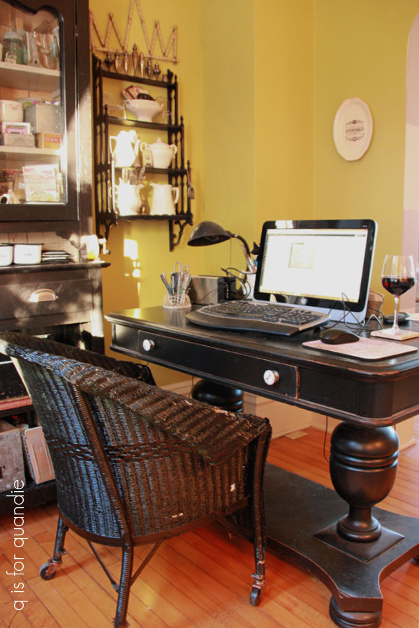
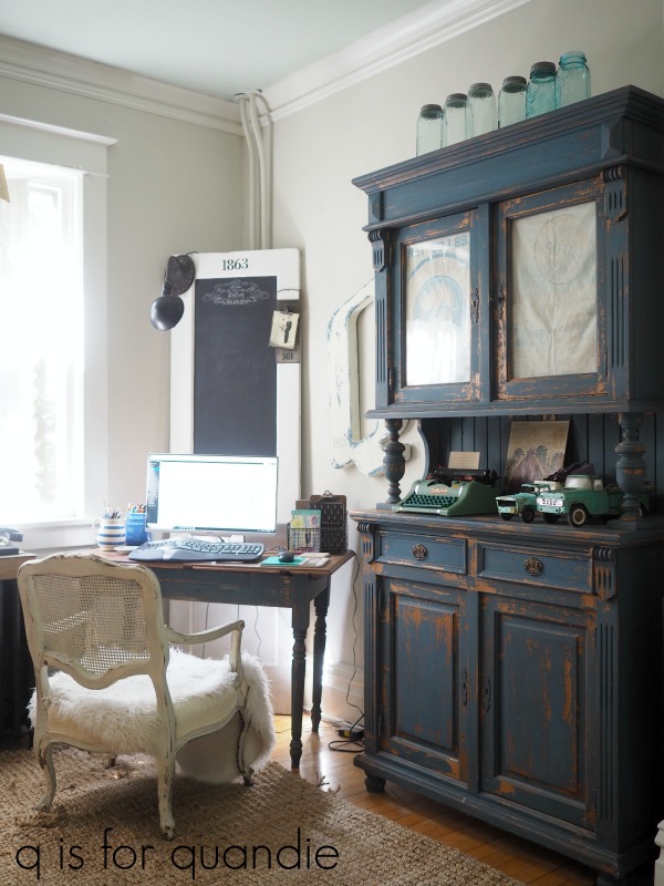
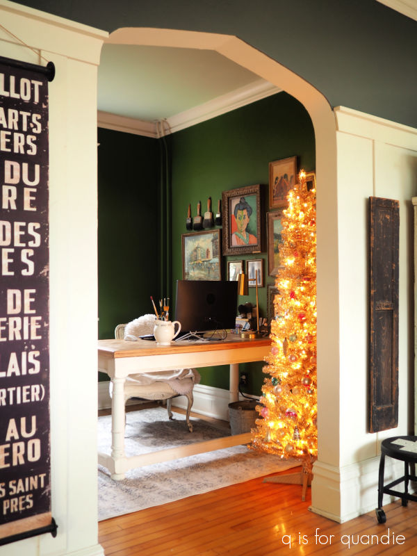
For example, the q branch (which is my home office where I write this blog) went from chartreuse …
to beige …
to deep green.
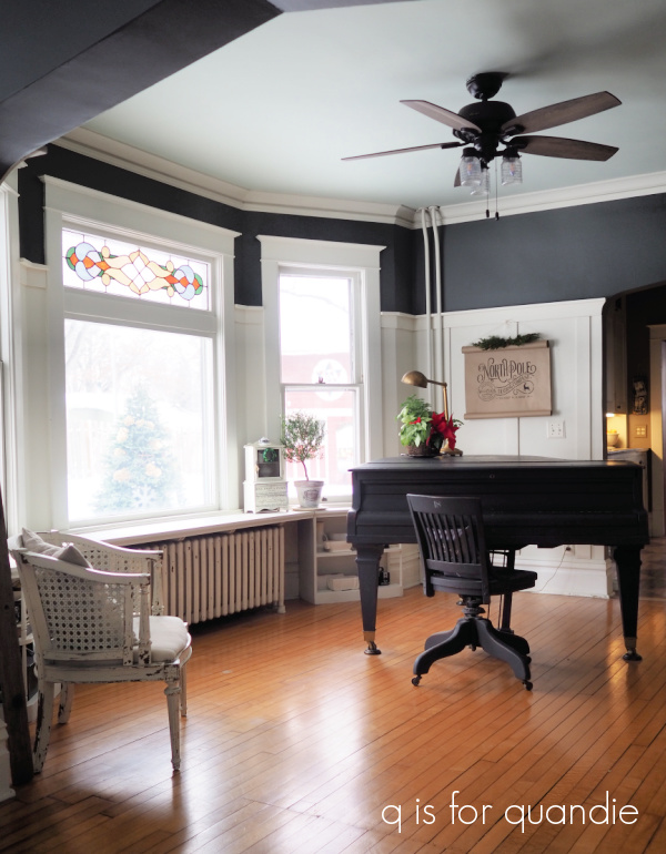
The piano room went from horizontal grey and white stripes …
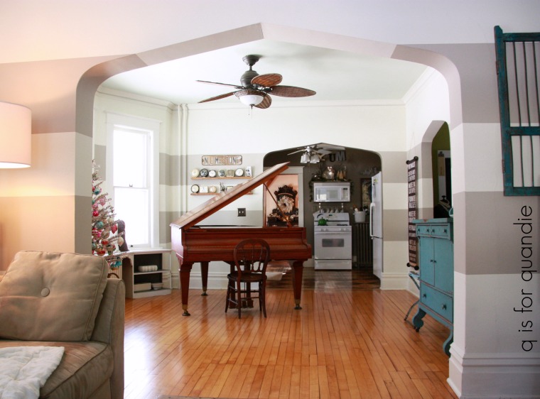
to faux board and batten paired with charcoal grey.
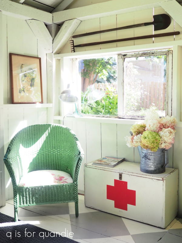
The potting shed went from shabby chic she shed …
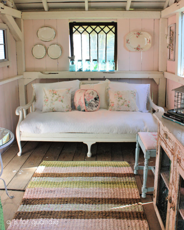
to photo cottage …
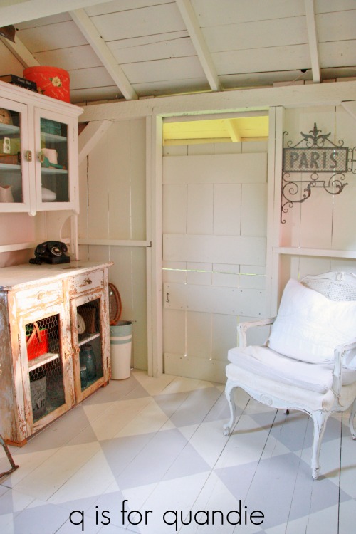
to potting shed.
But aside from all of those changes, in other ways I sometimes feel like I’m just doing the same ol’ thing.
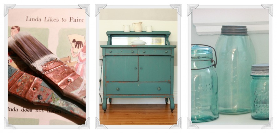
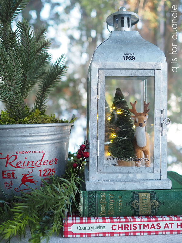
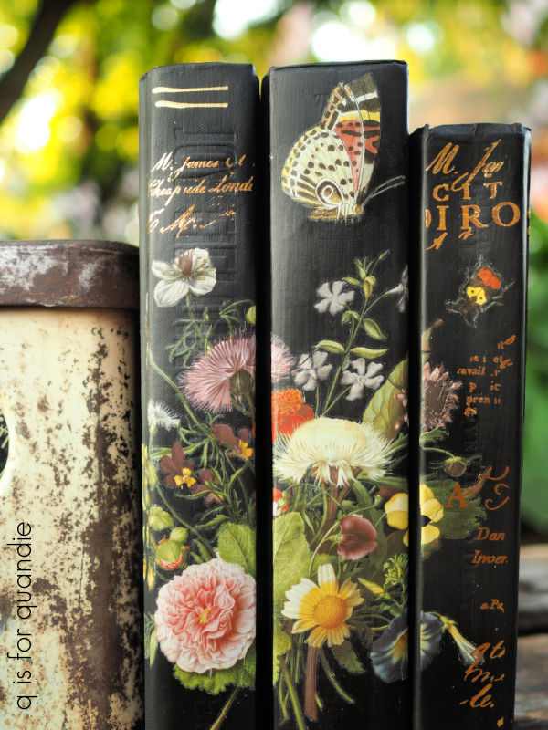
For example, my first post about painting books was way back in 2015.
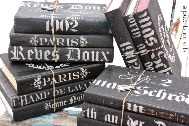
And I’m still painting books.
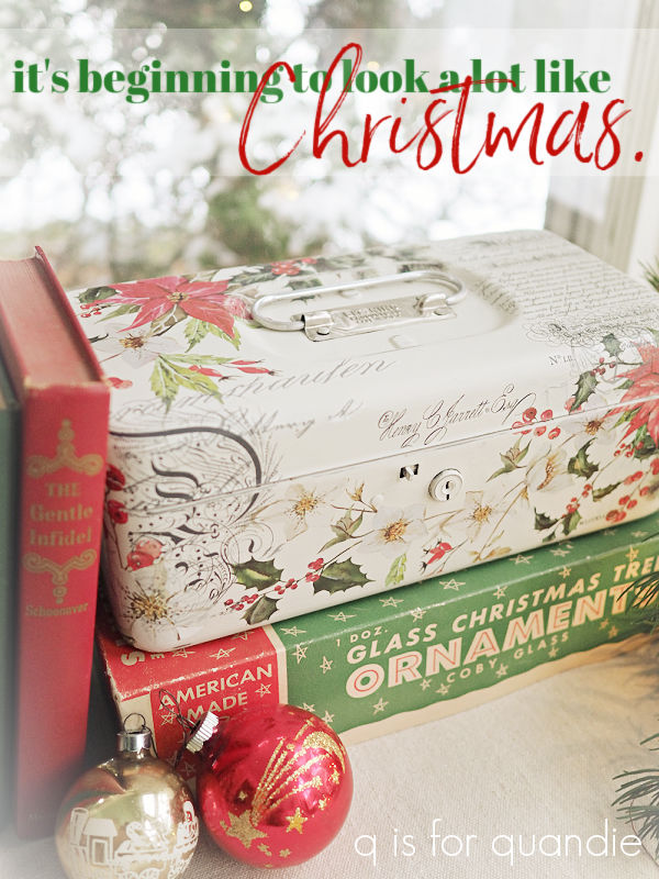
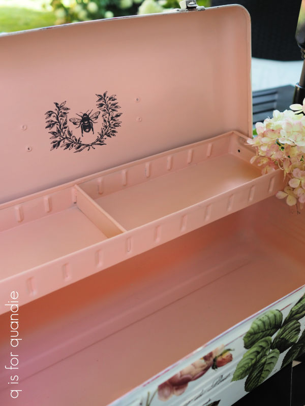
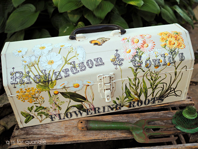
My first post about painting toolboxes also goes all the way back to 2015.
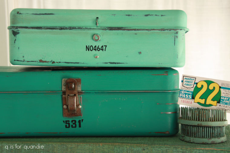
And I’m still painting toolboxes.
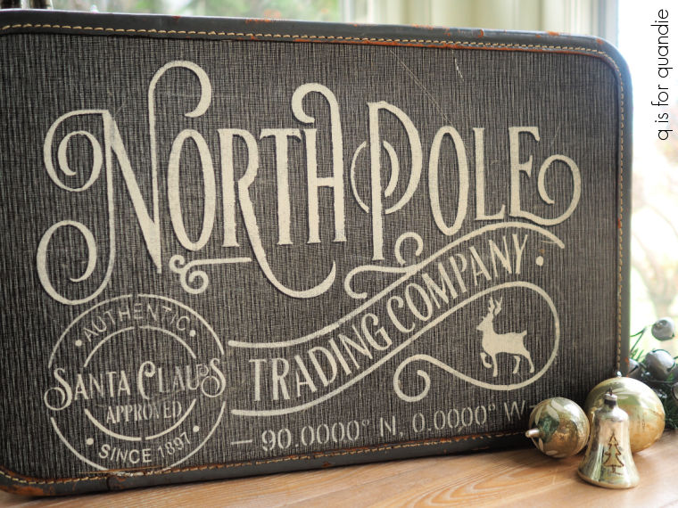
I also shared some stenciled suitcases back in 2014.
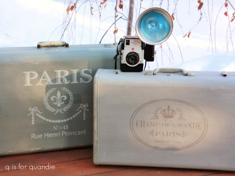
And I’m still stenciling suitcases.
I don’t know, am I still doing the same ol’ thing?
Or has my style changed enough that these things feel different? All three of these examples show how much my style has evolved, even if the items themselves are technically still ‘the same ol’ thing’.
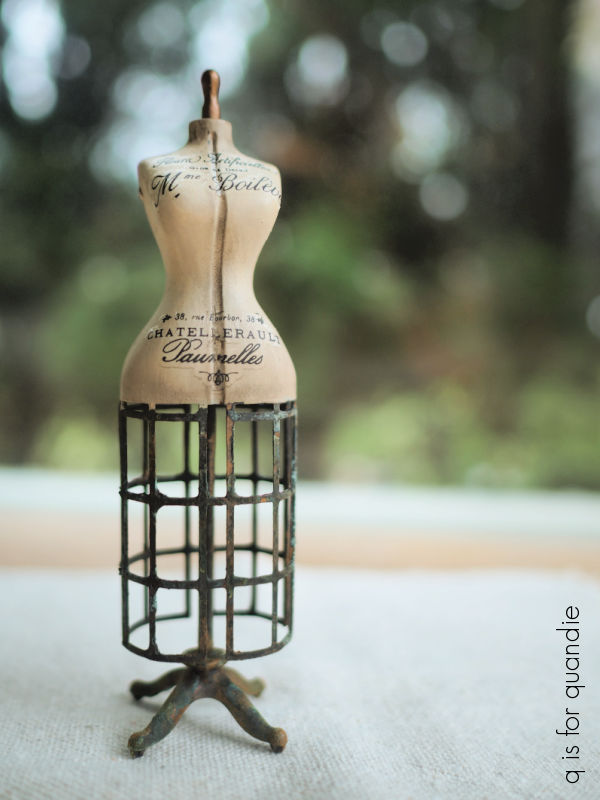
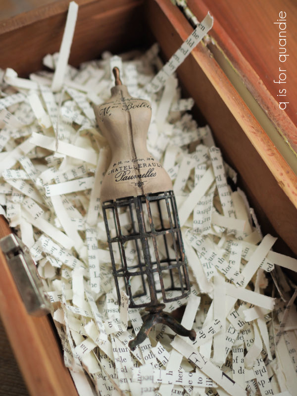
Last winter I did add something entirely new to the blog.
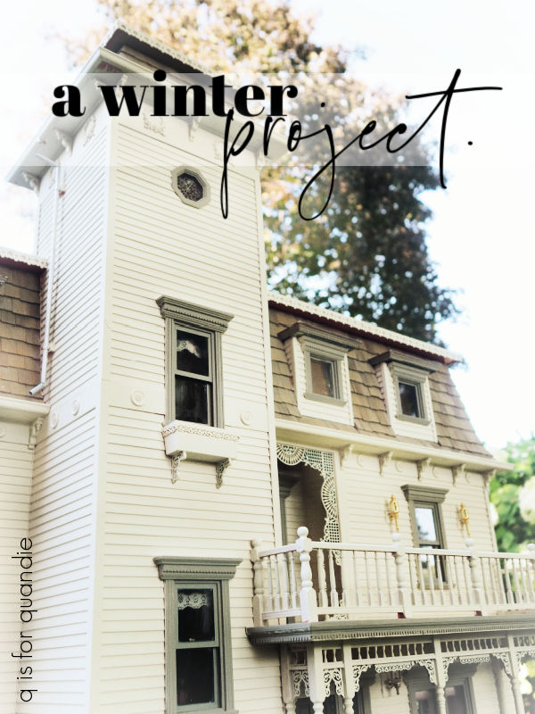
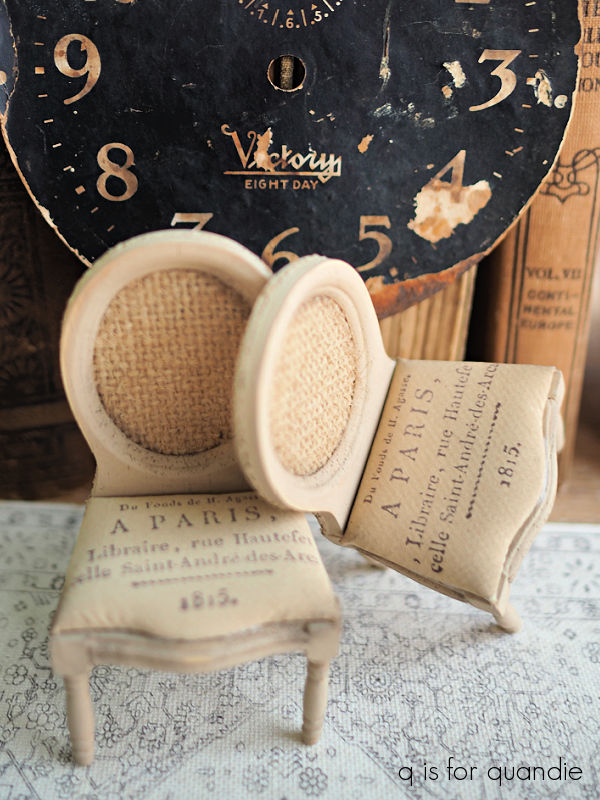
I gave my old dollhouse a total makeover.
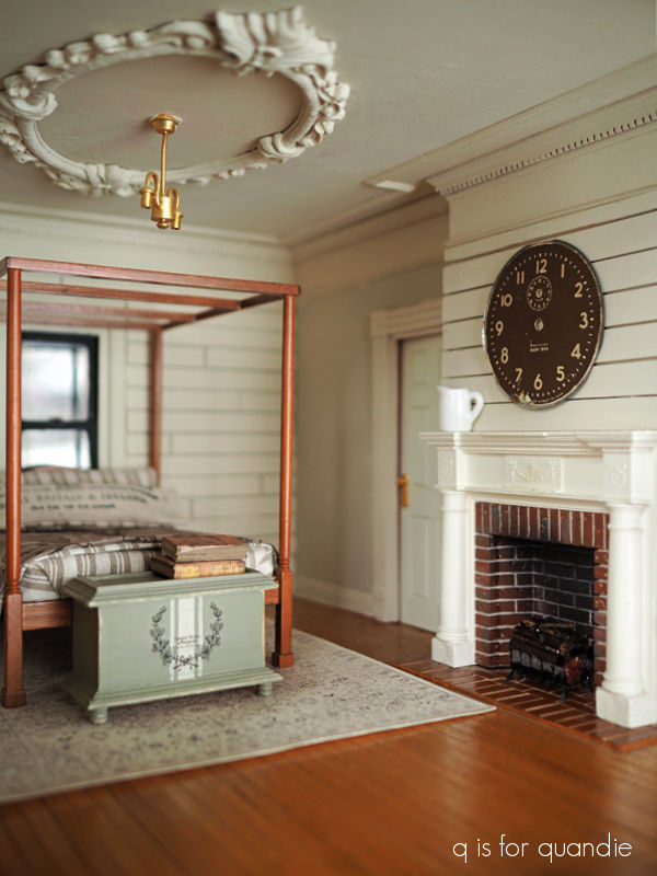
I had so much fun working on that project and it filled up many cold winter days (if you are viewing this on a desktop, you can look to the right side of the screen and under the word ‘sorted.’ you can click on the “mini’s” category to see all of my dollhouse posts).
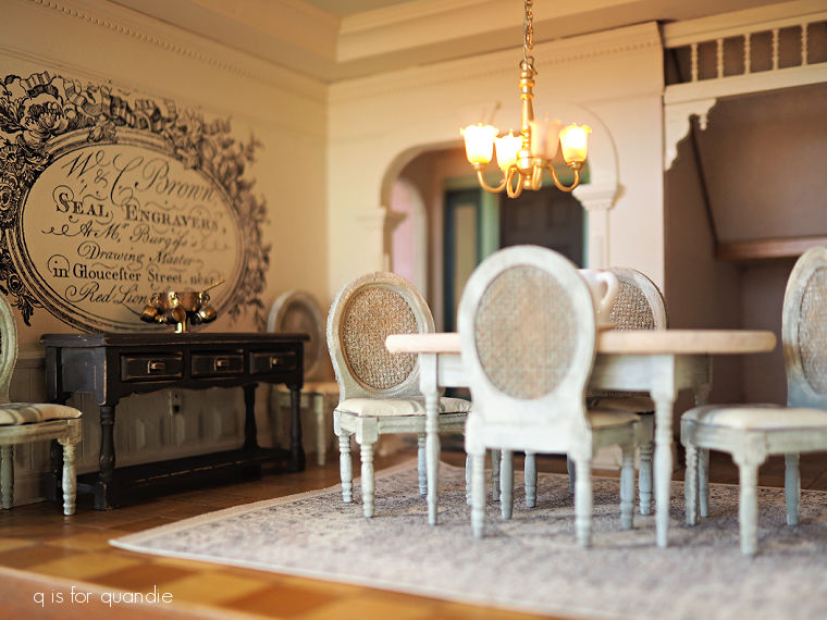
But the dollhouse is mostly done now, and I’m not sure if I’ll continue to do more miniatures or not.
I did briefly consider the idea of creating miniature furniture to sell.
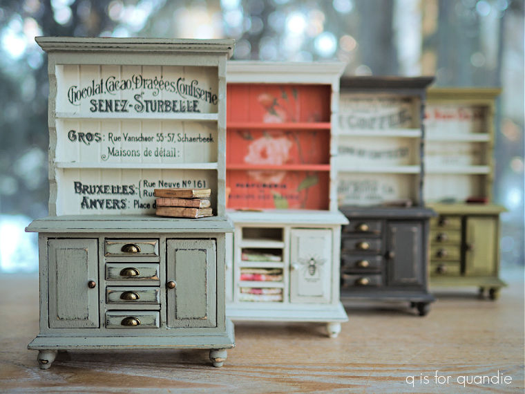
But that plan didn’t really go anywhere. I still have quite a few pieces for sale, check out my ‘miniatures for sale‘ tab if you want to check them out.
But despite a brief collaboration with Miniature Crush, and a few early sales, I ended up unable to find a market for my miniature pieces.
So currently I am rather unsure what projects will fill my days this coming winter, but I’m sure I’ll come up with something. It may end up being more of the same ol’ thing, but hopefully with enough of a twist to keep you interested.
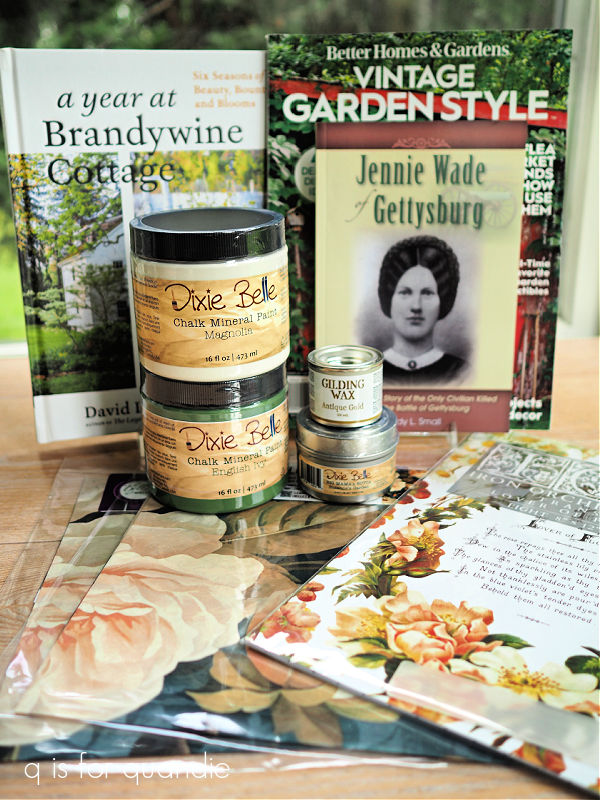
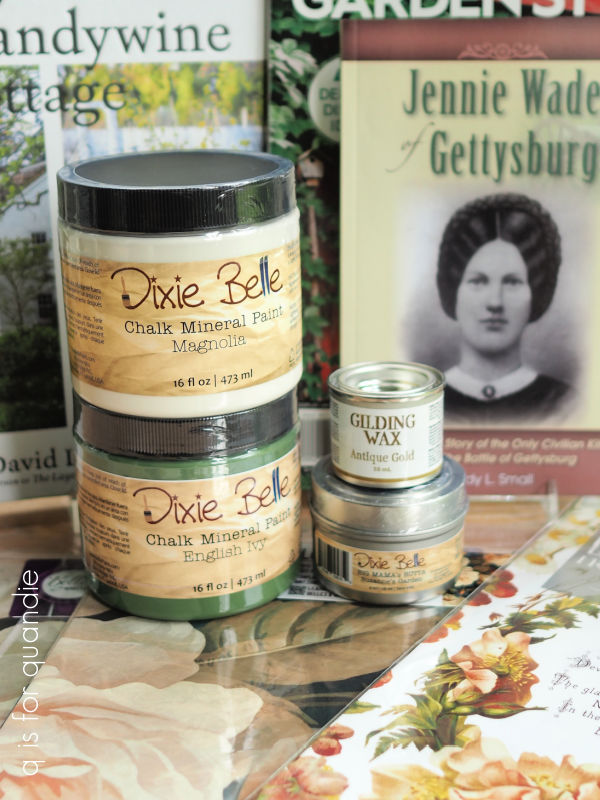
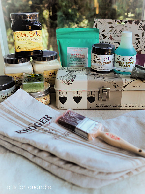
In the meantime, as is my blog tradition, I have a giveaway today to celebrate my blogiversary.
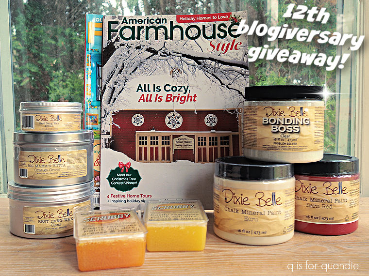
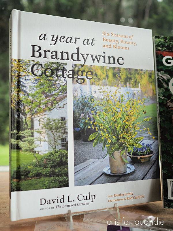
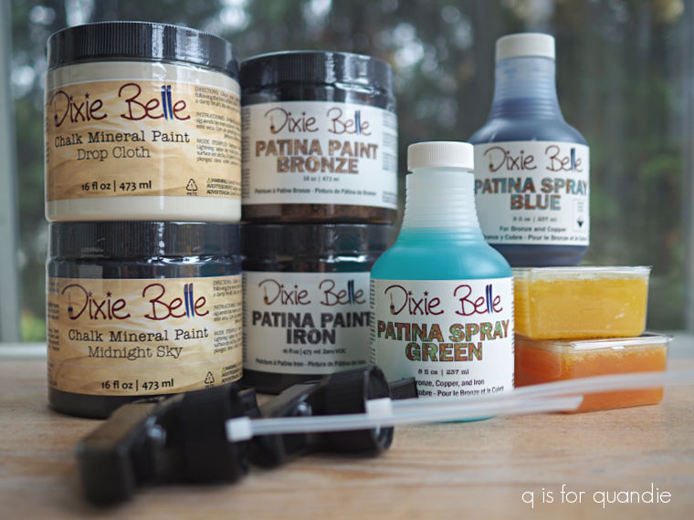
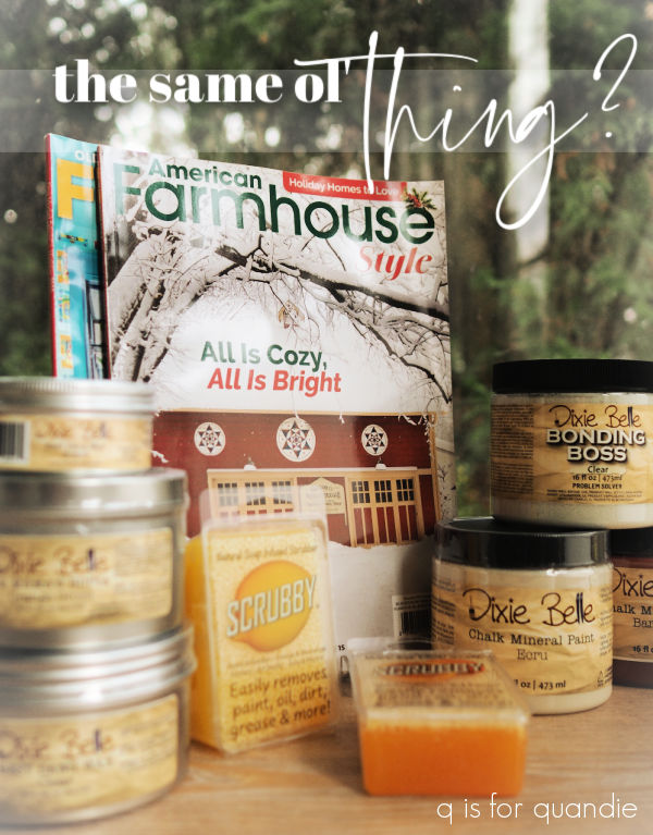
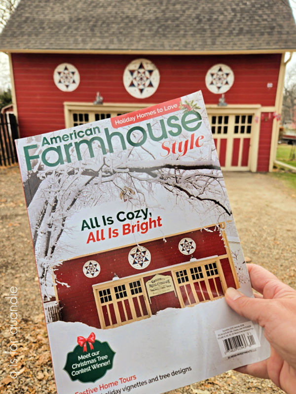
I’ve included both of the magazines that I was featured in recently, Flea Market Decor and American Farmhouse Style.
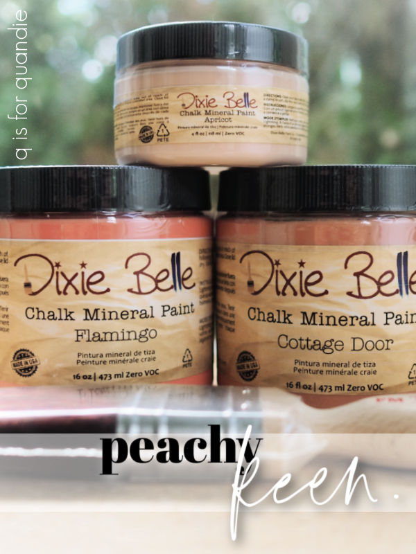
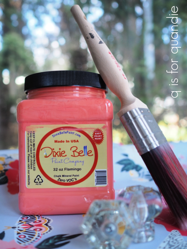
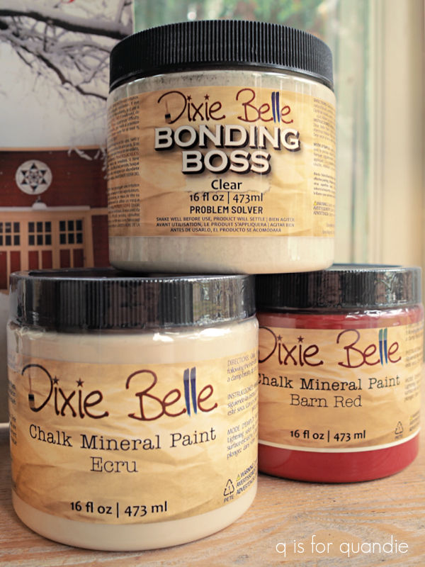
If you win you’ll also receive a couple of my favorite paint colors for this time of year, Ecru and Barn Red. You’ll also get the Clear Bonding Boss that I use on all of my toolboxes.
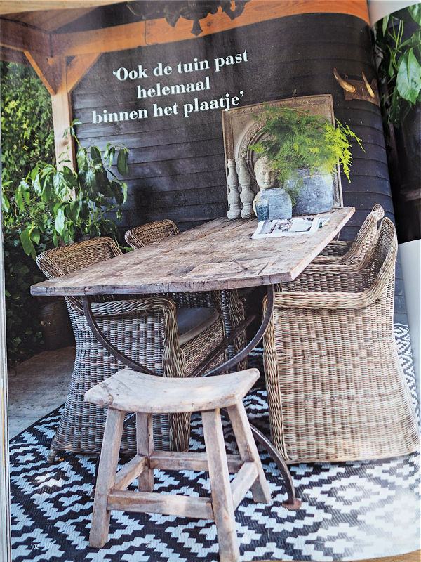
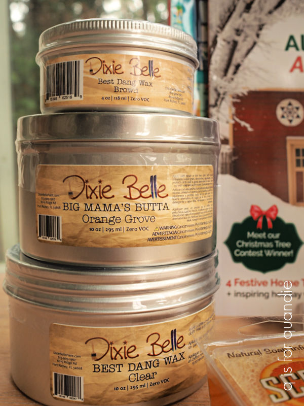
I’m also throwing in the clear wax that I use all the time, plus Big Mama’s Butta in the Orange Grove scent (my favorite of the scents) along with some brown wax. I like to mix these last two products together to create an easy to apply aging finish (you can see that result on the bar stools that I painted last summer).
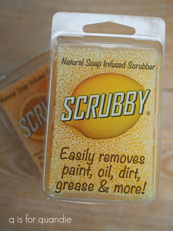
Finally, I’m also including two bars of Dixie Belle’s Scrubby Soap, one orange and one lemon.
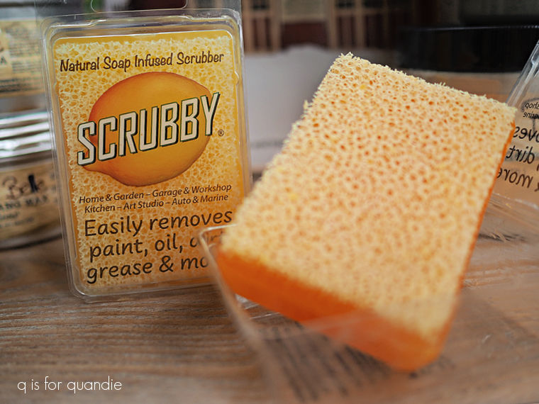
I love this stuff for both cleaning my paint brushes and cleaning paint off my hands … and maybe my arms, and on occasion possibly even my legs (I’m a messy painter). Not only does it work great, but it smells great too. I guess you could say that I’m a fan of citrus scents, both in Big Mama’s Butta and Scrubby Soap.
By the way, FYI, from now through December 1 if you buy 2 Scrubby Soaps from the Dixie Belle website, you get 1 free. They make awesome stocking stuffers for the painters/gardeners/mechanics in your life.
Oh, and hey, while we’re on the subject, Dixie Belle has a couple of other deals this weekend only.
The Black Friday Deal: Buy one, get one 50% off on Friday, Nov 28 from 12 a.m. through Saturday Nov 29 at 11:59 p.m.
The Cyber Monday Deal: Free shipping on orders over $99 from Monday, Dec 1 at 12 a.m.. through Tuesday, Dec 2 at 11:59 pm.
So be sure to check those out if you need to stock up.
Meanwhile, best of luck on today’s giveaway.
Here are the rules: Simply leave a comment on this blog post to have your name included in the random drawing.
Your comment must be left on this blog post, not on Facebook or Instagram.
Also please note that if you are leaving a comment for the first time I will have to approve it before you will see it on the blog (this is to reduce spam and/or inappropriate comments). Be patient because I’m heading to Mexico on Saturday and may not be getting to comments while away.
I will randomly draw the name of a winner for today’s prize from all of the comments left on this post by Sunday, December 7, 2025 at the stroke of midnight (U.S. Central time).
The fine print: no purchase necessary, you must be 18 years of age or older to win, void where prohibited by law, the number of eligible entries received determines the odds of winning, approximate retail value of prize is $200, if the prize is not claimed by Friday, December 19, 2025 another name will be drawn at random to win, yada, yada, yada.
Good luck!
Thank you to Dixie Belle Paint Co for all of their support over the years, and for supplying all of their items included in today’s giveaway.