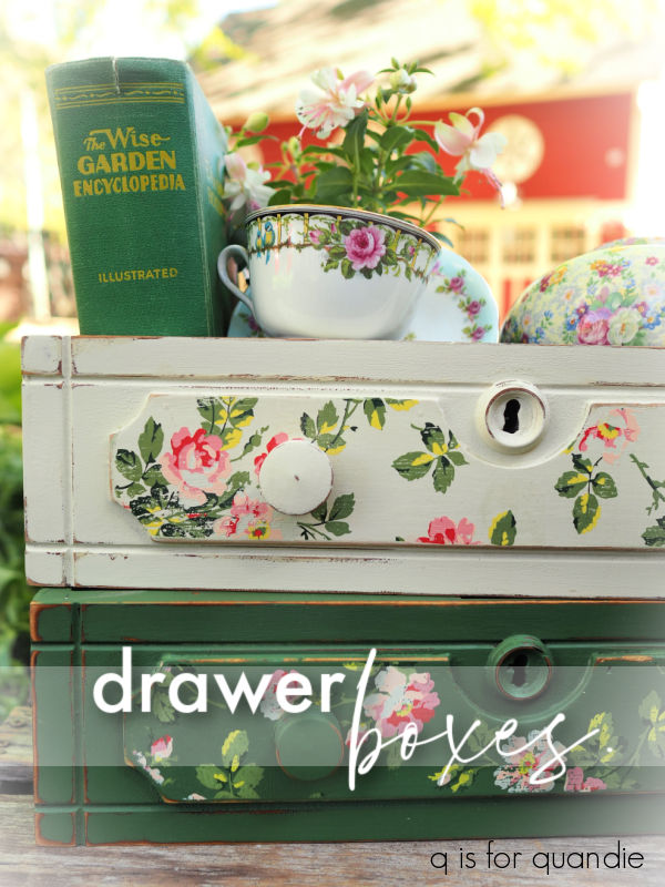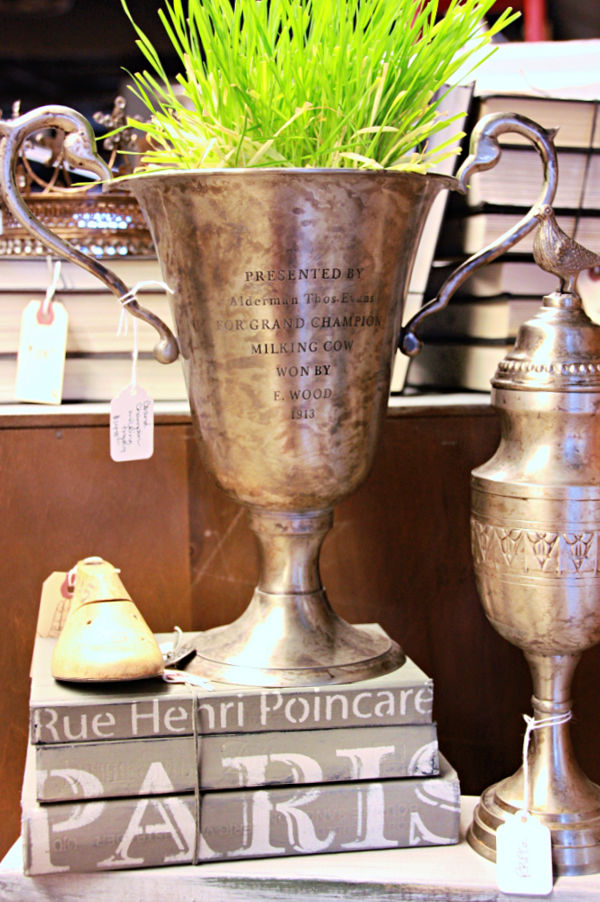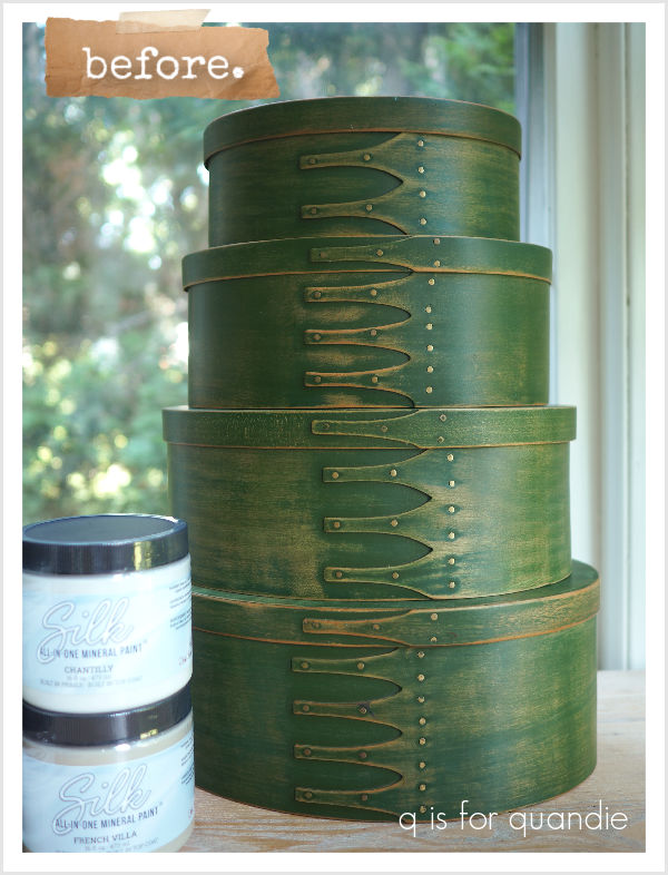
I’m super busy preparing for my upcoming Carriage House Sale this Thursday evening and Friday morning.
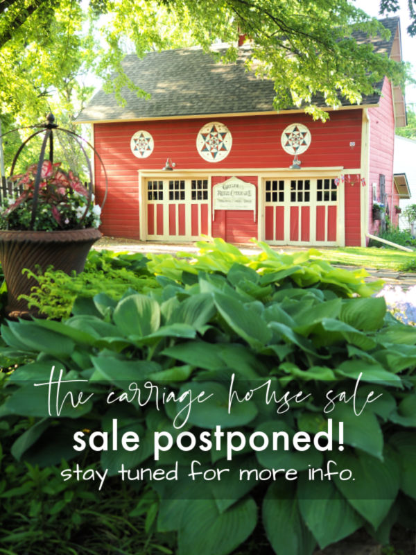
Naturally, the forecast calls for rain. We had barely any rain for the entire month of May, but all I had to do was plan my sale and suddenly rain is in the forecast almost every day this week. Argh!
Well, we’ve got a couple of tents and none of us will melt when we get wet, so the sale goes on rain or shine!
** UPDATE: due to the forecast of gusty winds and hail the sale has been postponed!
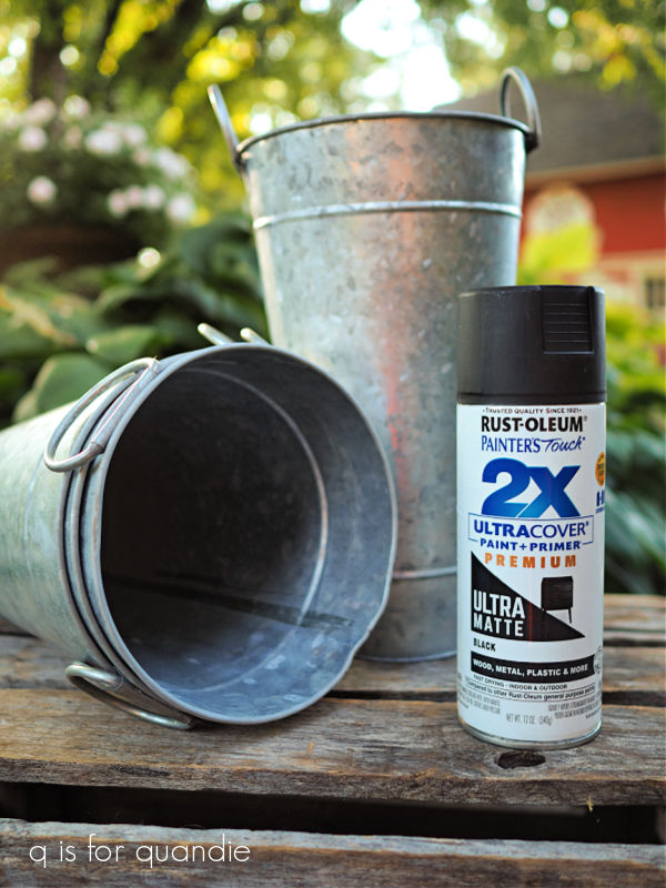
I’ve been trying to finish up a couple of last minute projects to include in the sale starting with this next item that one of Mr. Q’s coffee shop friends sent home with him for me last year (thank you for that Connie!).
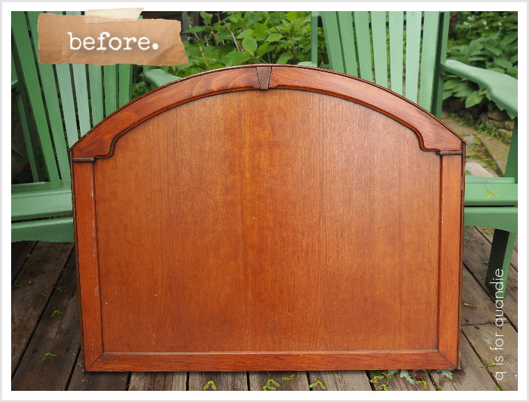
I’m not totally sure, but I think it was probably a headboard to a twin sized bed. Maybe? It seems a bit small for that, so maybe not? And, if I remember correctly, it was a curbside find (it was a while ago though, so I may be wrong about that too).
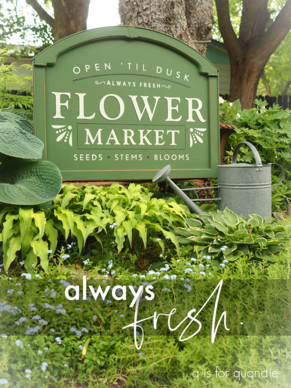
Anyway, it was about the perfect size for my Flower Market stencil so I decided to paint it up for my sale.
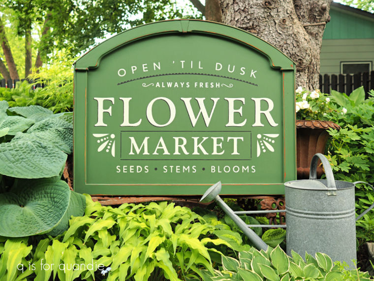
I didn’t do much prep work on this one aside from a quick scuff sanding followed by wiping away any dust with a damp rag. Then I gave it two coats of Dixie Belle’s English Ivy.
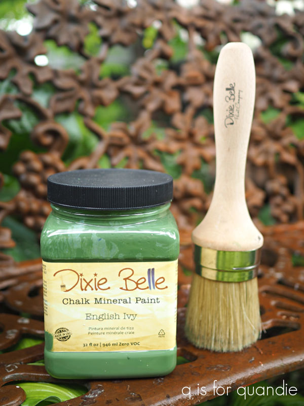
I just love this ‘always fresh’ shade of green, and I love using Dixie Belle’s Best Dang Brush for a large stenciling project like this one.
I first applied some portions of the stencil using Dixie Belle’s Coffee Bean. Once those were dry, I moved the stencil just a little bit over and up and stenciled some of it using Drop Cloth.
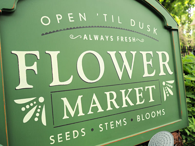
Stenciling the word “flower” in the dark brown of Coffee Bean, then moving the stencil ever so slightly up and over and stenciling again with the Drop Cloth is what creates that dark shadow that you can see just on the word “flower”.
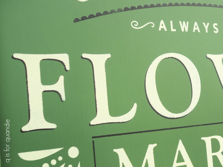
I think that effect adds so much dimension to a stenciled sign like this one.
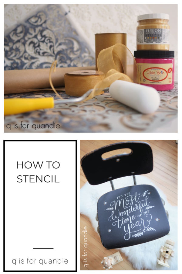
If you need some more stenciling tips, check out my how-to post here.
After sanding to distress the edges just a bit, I finished the sign by adding a coat of Dixie Belle’s clear wax over the whole thing.
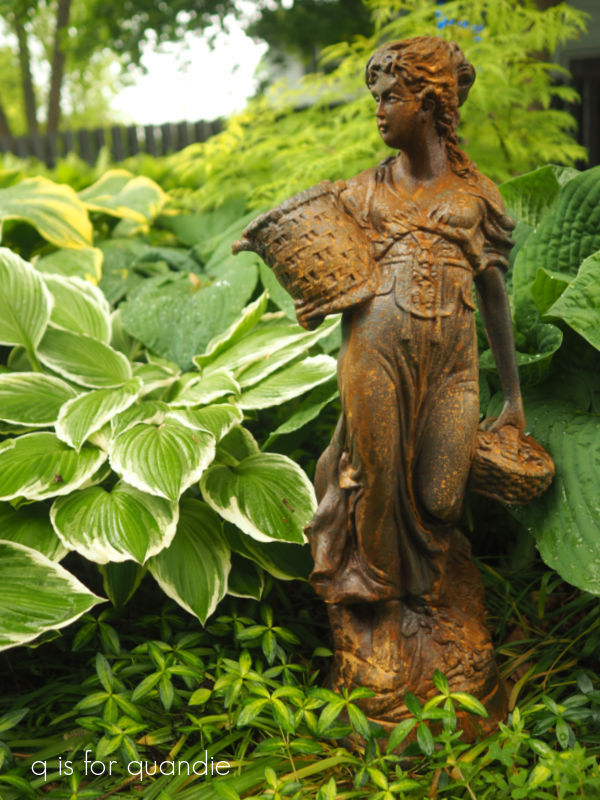
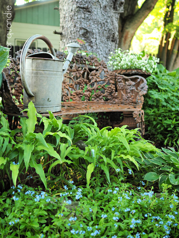
Then I propped it up on my rusty garden bench for a photo.
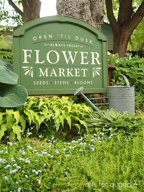
If any of you gardeners are curious, the lime green hosta in front of the sign is called Curly Fries. Just below that are Forget Me Nots. Unfortunately, I don’t remember the name of the hosta with the larger puckered leaves that is on the left. It sure is a nice one though.
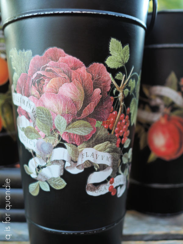
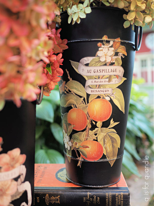
The sign, along with lots of other fun garden decor will be available at my upcoming sale unless someone local wants to snatch it up ahead of time. Be sure to check out my ‘available for local sale‘ page for more details.