

I wonder how many of you are old enough to be Moody Blues fans, or to have played their albums over and over. You know, back when we had record players and albums. Oh boy, I’m probably really dating myself now. Although now that I think about it, I probably listened to them on cassette tapes in my car more than on albums.
Once upon a time, in my wildest dreams.
Anyway, today’s post isn’t about music, it’s about the moodier shades of blue available from Dixie Belle Paint Co (and be sure to read to the end because I’m giving some away). I’ve been using a few of them lately, so I thought it might be helpful to show you guys a comparison of their In the Navy, Bunker Hill Blue, Yankee Blue and Cobalt Blue. Just in case you are struggling to pick one.
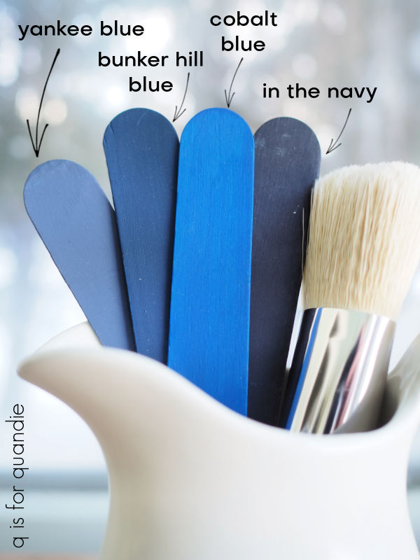
The darkest one is In the Navy. This color is almost, but not quite, black. I used quite a bit of this one for a while. One of my all-time favorite pieces painted in this color was this linen press dresser.
I also painted a waterfall style desk with In the Navy.

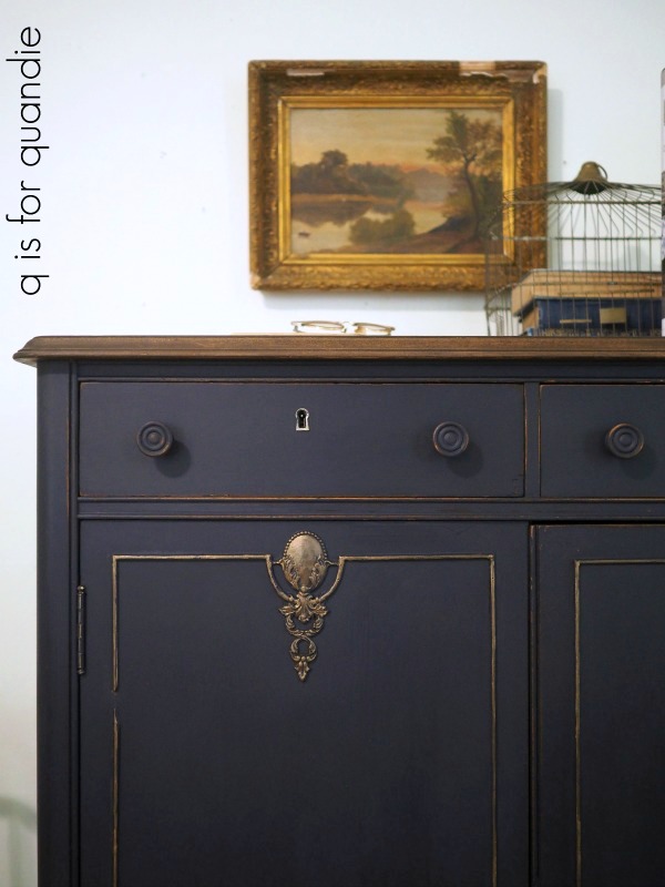
Lately I’ve been using more of the next darkest shade, Bunker Hill Blue, most recently on this dresser.

I really like this shade on mid-mod pieces such as this dresser that was a curb-side find.

It looks gorgeous paired with gold hardware.
I’ve also been known to mix In the Navy with Bunker Hill Blue to tone down the Bunker Hill Blue just a tad, or brighten up the In the Navy, whichever way you want to look at it.
That’s what I did on this piece.

Well, to be perfectly honest, I only mixed them because I didn’t have enough Bunker Hill Blue at the time to paint the whole dresser so I stretched it by adding In the Navy. But it ended up being a fantastic combo.
I haven’t used so much of the Yankee Blue. This one is the lightest shade of these four colors, and has a bit more grey to it than the other three which becomes more obvious when you look at them all side by side.

Yankee Blue is actually one of the very first Dixie Belle colors I ever used when I paired it with Drop Cloth on this stool.

I’ve used it to create quite a few grain sack stripes since then, including the ones on this desk.

I also used it inside the drawers on that piece after blocking some ink stains using Dixie Belle’s B.O.S.S.
That brings me to the brightest of the four colors, and one I was only recently brave enough to use, Cobalt Blue.
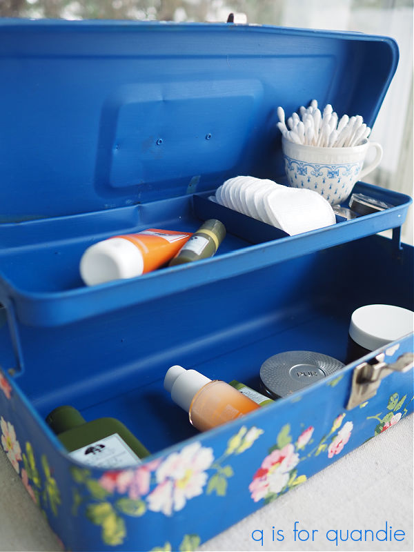
It was gorgeous paired with the I.O.D. Rose Chintz paint inlay on this tackle box.

I’m not sure I’m quite ready to use it on a piece of furniture yet, but I could see mixing the Cobalt Blue with the Bunker Hill Blue to get something somewhere in between the two.
How about you, have you tried any of these colors yet? And if so, do you have a favorite?
If not, now’s your chance. I’m giving away a 16 oz. jar of each to one lucky winner.

And I’m even going to throw in a CD of the Very Best of The Moody Blues, just for fun.
The rules for today’s giveaway: Simply leave a comment on this blog post (and please forgive me if I don’t respond to every one, but know that I read and appreciate all of them).
Your comment must be left on this blog post, not on Facebook or Instagram. You are not required to follow my blog, or follow my Facebook or Instagram accounts, although it would be awesome if you did!
I will randomly draw the name of a winner for today’s prize from all of the comments left on this post by Friday, March 10, 2023 at the stroke of midnight (U.S. Central time).
The fine print: no purchase necessary, you must be 18 years of age or older to win, void where prohibited by law, the number of eligible entries received determines the odds of winning, approximate retail value of prize is $100, if the prize is not claimed by Friday, March 17, 2023 another name will be drawn at random to win, blah, blah, blah.
Thank you to Dixie Belle Paint Co for providing the paint included in today’s giveaway.

I love your blog. You are so talented.
LikeLiked by 1 person
Wow, The Moody Blues. That really takes me back. Such great music back in the day. I love your post and comparison of the different blues. All are pretty! Thank you for all of your hard work!
LikeLiked by 1 person
I have a project that screams for Cobalt Blue . . . and I love the Moody Blues 🙂
LikeLike
I’m totally curious about your project now!
LikeLike
Well . . . I love your projects and your blog is one of my absolute favs. I have a ‘thing’ about old metal toolboxes and have a small pile to mimic your examples ‘when I have time’. I think it’s time! 🙂
LikeLike
Yep, it’s definitely time!
LikeLike
I am redoing a dry sink in Deep Sea and it’s so rich looking!
LikeLike
That is one of the Silk colors, and I didn’t include them here. The Silk shades of blue requires an entire post of their own!
LikeLike
Never tried Dixie Belle, would love to try these colors. Thank you Linda!
LikeLiked by 1 person
In the navy has been a favorite of mine, too. I’ve never tried the lighter blues. They’re sure beautiful though. It’s amazing how some shades just go with MCM pieces! Loved this post because it’s always fun to be reminded how gorgeous you’re older pieces were! 🙂
LikeLiked by 1 person
Love, love the combination of Yankee Blue with Drop Cloth!
LikeLiked by 1 person
Blue can be such a fun or dignified color!
LikeLiked by 1 person
So many pretty blues! Thanks for all the inspiration.
LikeLiked by 1 person
your blog is one of the few that i follow and i pin many of your projects. fingers crossed that i win the drawing!
LikeLiked by 1 person
I think In the Navy is my favorite of these blues, but I really like all of them! So nice to be able to look back at some of your fabulous projects. Can I also say how much I enjoy your blog not just because of your good writing and creativity, but because you don’t have a bunch of ads popping up, or a reminder to get your newsletter or a something moving (like a book by the blog’s author) that I get on other blogs I read. It is refreshing to not have to deal with all that! Thanks!
LikeLiked by 1 person
I have not used any of these particular blues, but they are wonderful and would totally use on some of my furniture projects! Bunker Hill and In the Navy would be the first I would try! Love all your furniture make-overs. Hoping for an early spring for you so you can get back to the big stuff 🙂
LikeLiked by 1 person
Thank you for your “blues” comparison and for showing us projects using those colors. I really enjoy your email posts!
LikeLiked by 1 person
I love the blue with the gold hardware, stunning. My favorite is the mix of cobalt and bunker on the tackle box, that whole project turned out gorgeous.
LikeLike
I’ve been using Dixie Belle paint a lot because of you:) I’d love to try the blue!
LikeLike
I love the Bunker Hill Blue… and the Moody Blues, too! One of the best concerts I ever attended was the Moody Blues at the Gorge in Washington years ago. Now I am dating myself, but a concert I will never forget 😉 It was awesome!
LikeLike