Good morning from the garden!
Before I get on with today’s post, I have to tell you all that I totally dodged a bullet in the garden this week. Storms blew through our area on Friday night, and some areas very near me (including my sister’s house) were hit with large hail. If you’d like to get an idea of how much damage some gardens saw, check out this video from Laurel Rose Gardens.
Fortunately I only got pea sized hail in my garden and it didn’t do any damage at all. Thank goodness.
Now on with our regularly scheduled programming.
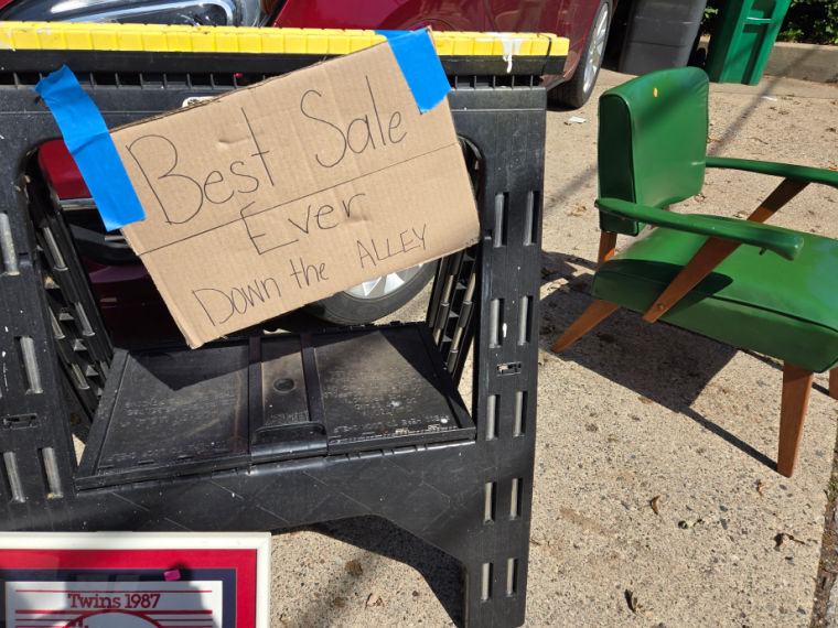
During the course of my recent occasional sale, I received quite a few compliments on my gardens. People especially loved the fairy garden.
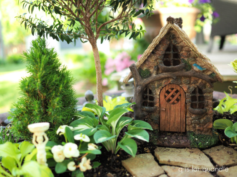
Everybody loves a good miniature, don’t they?
But my full sized gardens got a few compliments too.
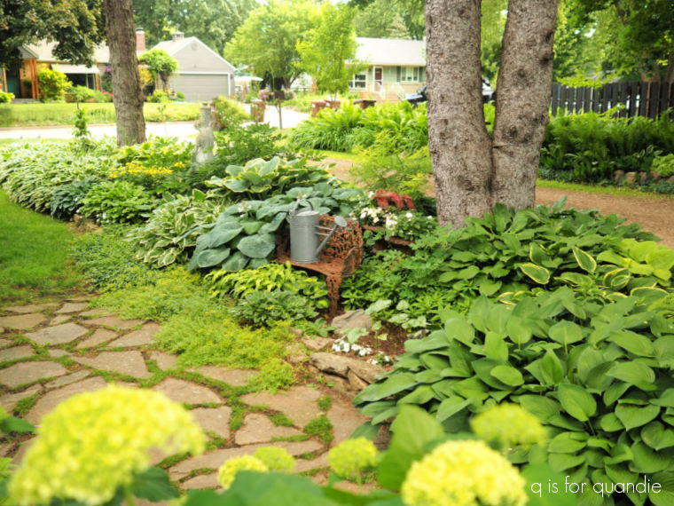
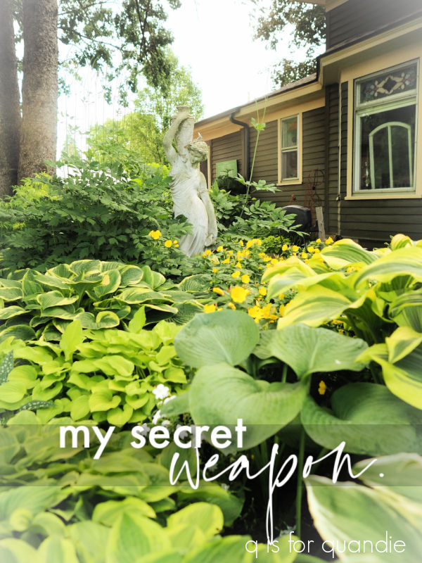
Someone asked me what my secret was for having such lush gardens, and I had to honestly say it just simply takes time.
I’ve been gardening in this space for 38 years. And really, it has taken that long for my gardens to look like they do now.
Of course, this isn’t the first year that they’ve looked good, but I bet it took at least 20 years or so before they really starting looking pretty good. It definitely does not happen overnight.
You know the old adage, the first year they sleep, the second year they creep, the third year they leap. But I would say it takes five years or more for most plants to really fill in nicely.
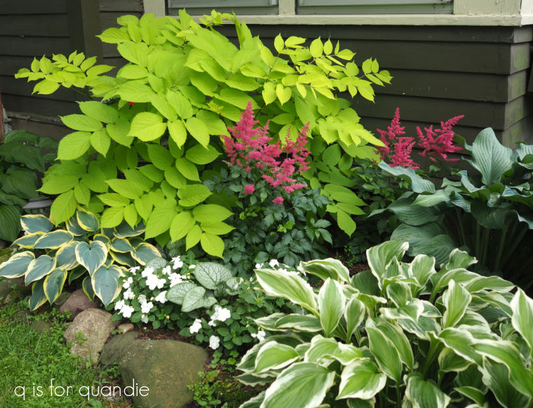
However, I must admit that the Sun King Aralia (a.k.a. Golden Japanese Spikenard) is an exception (the chartreuse shrub below).

I just planted that last year (replacing the previous one that died during the ‘bad winter’) and it has already filled in.
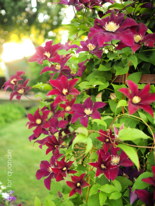
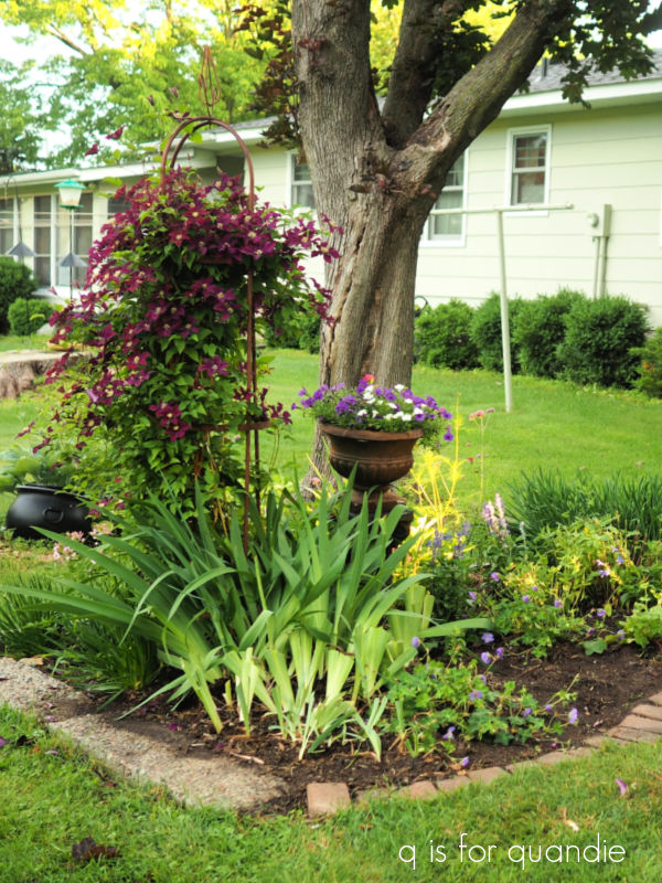
But most of my best looking plants have been around for a decade or more like this clematis.
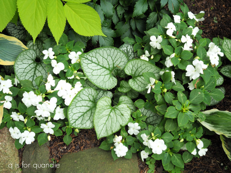
Not only does it take time for plants to get established and fill in, it also takes time to learn what plants perform well in your particular space. There are so many factors to consider; is it sunny or shady, what kind of soil do you have, how harsh are your winters, is it a protected spot, is it wet or dry, what about deer or rabbit pressure, and how about insects?
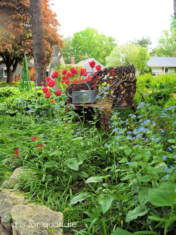
For example, I’ve given up on roses because I can’t deal with the Japanese beetle problem. I’ve also given up on tulips because the damn deer kept eating them.
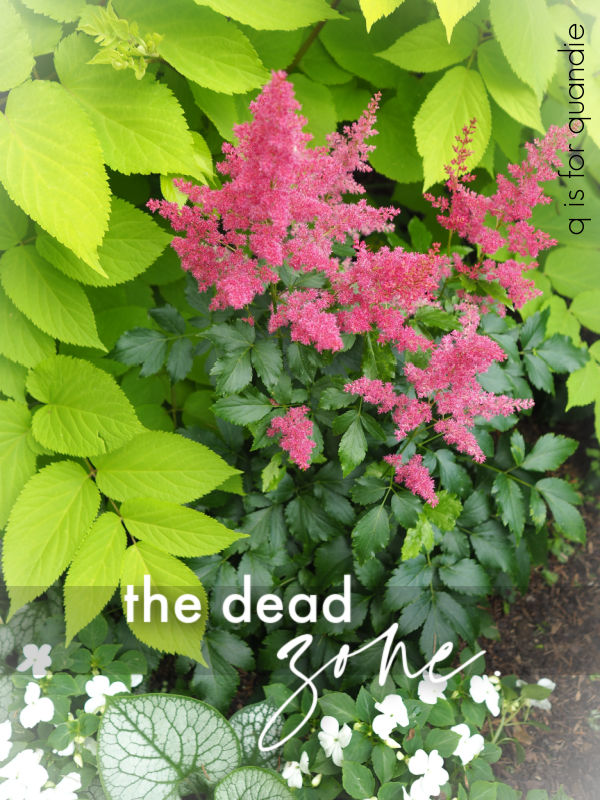
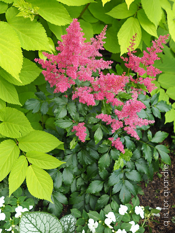
I tried growing fern leaf bleeding heart near one of my fountains and quickly realized that they hated being wet all the time whereas astilbes and hostas love it.
Speaking of astilbes, they are always categorized as a shade plant but in my garden they don’t perform at all in full shade. They need either morning or evening sun to bloom. They also need wet shade, not dry shade. They shrivel at the first sign of drought.

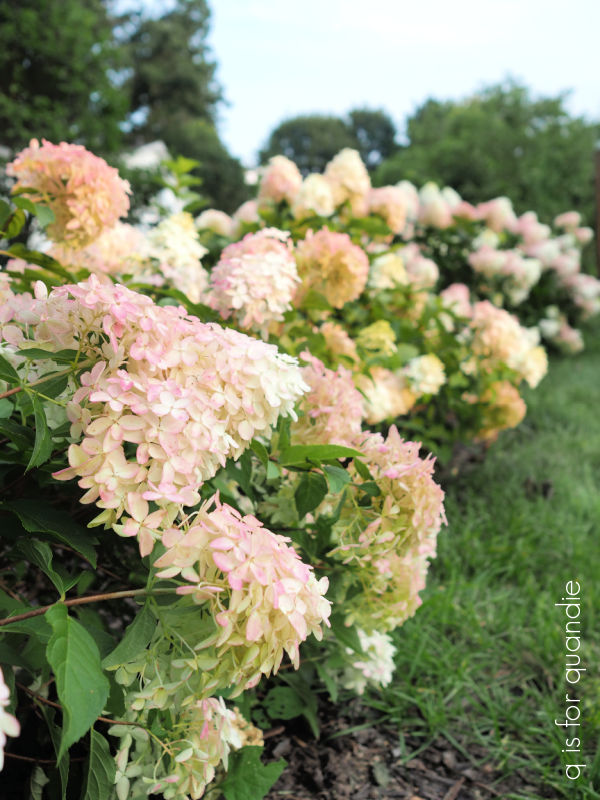
I also tried the Endless Summer macrophylla hydrangeas for years before realizing that they were never going to flower the way I wanted them to. I would only get 2 or 3 flowers every year. The paniculatas, like Limelight or Quick Fire Fab, work so much better for me.
Not only does it take time for plants to get established, and time to learn what works well in your garden, it also takes a fair amount of time to maintain a garden.
In my opinion, there really isn’t any such thing as a low-maintenance garden.
True, some gardens require more maintenance than others, but they all require a bit of work … especially in the spring and fall. But I am out in my garden pretty much every single day in the summer too.
I don’t have a ton of weeding to do since my gardens are really full. There isn’t a lot of room for weeds to take hold. I do get out in early spring and try to remove weeds and put down mulch (I like to use Espoma Land and Sea compost as mulch) before the plants fill in which also helps prevent weeds.
But there is a lot of other maintenance to do like deadheading, pruning, treating for pests if they become a problem (those darn earwigs!), pinching things back, and fertilizing annuals.
And then there is the dreaded dividing.
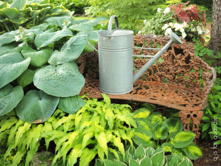
I have to admit, dividing established plants can be pretty back-breaking work. Especially ginormous hostas …
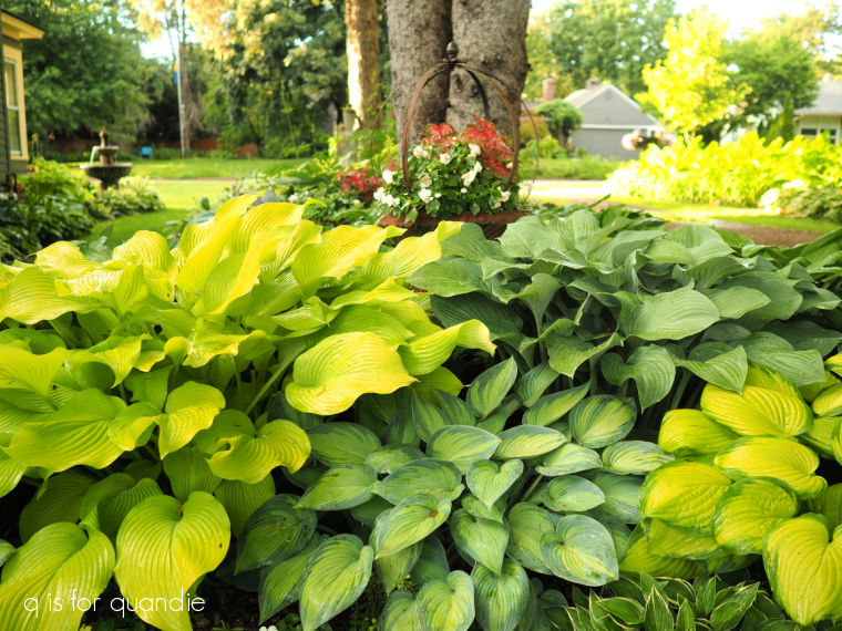
Which is why so many of mine go undivided. FYI, from left to right that is Sun Power, June, Krossa Regal (not 100% sure of that one) and Guacamole.
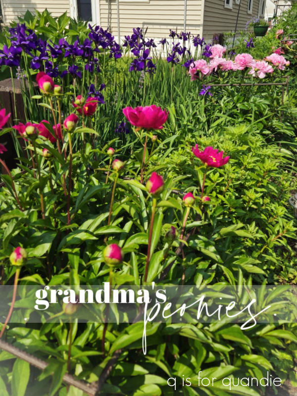
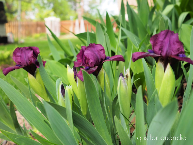
However, I did decide to tackle dividing my purple irises this past week. You may remember that I said they looked better than ever this year. Here they are in bloom a couple of weeks ago.
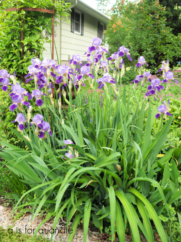
But they were really packed in there. Plus there was a huge daylily that was growing amongst them (and guess what, deer love chomping off daylily flower buds almost as much as they like tulips). I also have a short iris in there that has been almost totally taken over by other things. I really like this one, and it’s one of the earliest to bloom, so I wanted to give it more space to thrive.
So it was time.
It’s actually not that hard to dig up irises, they are very shallow rooted plants. But the problem with dividing irises is that the garden looks pretty ugly when you’re done.
They will recover, but it will take some time.
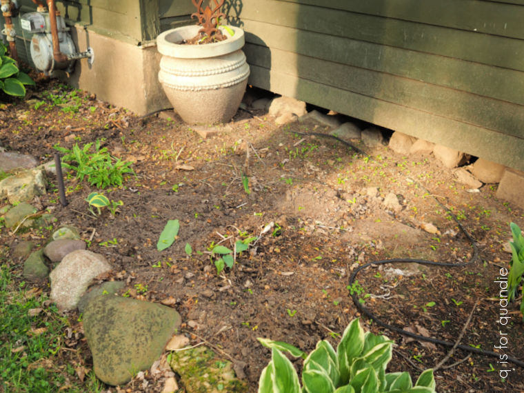
In this case, I also pulled out the hostas that were creating a front border in this section of the garden. As you’ll remember, my neighbor had a huge maple cut down and now this garden has far more sun than shade. As a result, those hostas were getting scorched.
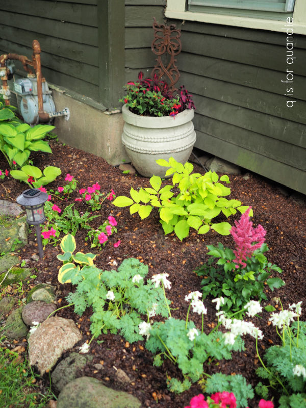
So out they came. I’m replacing them with Rozanne perennial geranium and Lady’s Mantle …
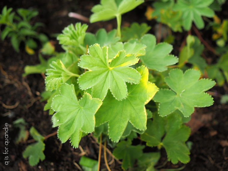
But it’s definitely going to take time for this section of the garden to fill in again and look good. Probably a couple of years at least. Plus, I’ve never tried Lady’s Mantle, so it remains to be seen whether or not it’s a good choice for my garden. Time will tell.
In the meantime, I’ll just focus on enjoying other areas in my garden that are still looking pretty good this year and thankfully haven’t been damaged by hail.
So now you know my secret weapon for creating a spectacular garden, time. Speaking of which, I need to go spend a little time in the garden right now. I hope you’re getting out in your garden today!