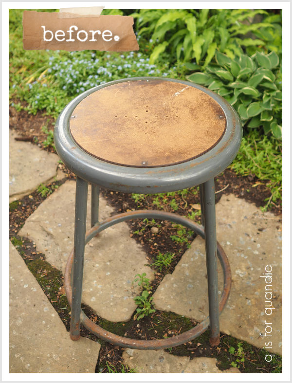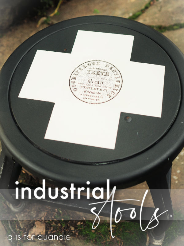
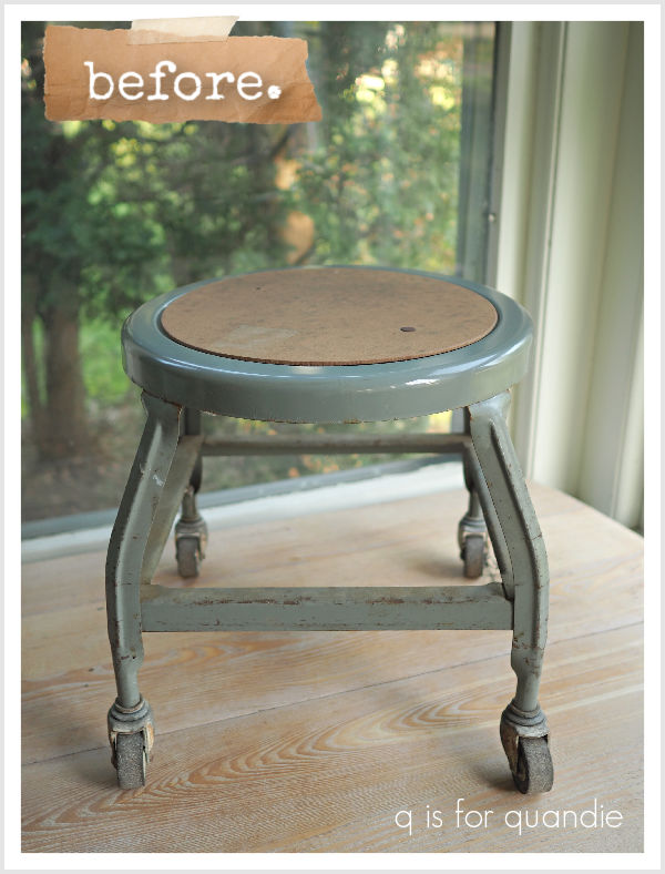
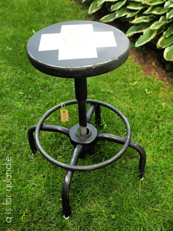
Earlier this year I purchased another short industrial wheeled stool at a garage sale.
You may remember that I painted a very similar stool back in February 2025 …
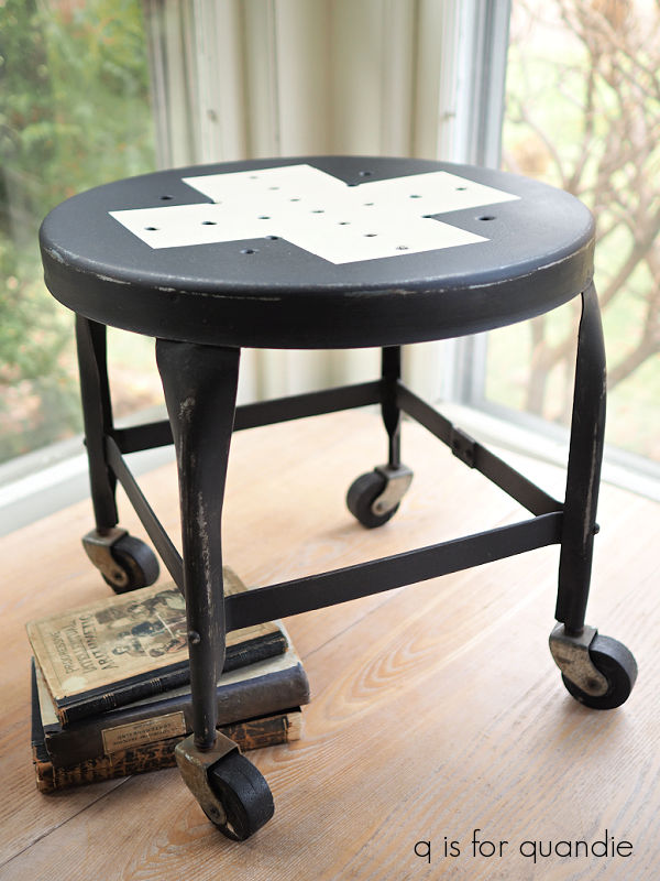
That first one has a simple Swiss cross in black and white, and I actually kept it for myself (which tends to be a rare thing indeed). It’s super handy for sitting on while cleaning out lower kitchen or q branch cupboards.
I painted a 2nd industrial stool back in July of last year.

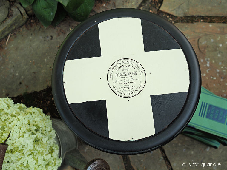
For this second version, I took it up a notch by adding an I.O.D. paint inlay in the center of the cross.
I liked the result so much that I decided to just repeat it on this newest find.
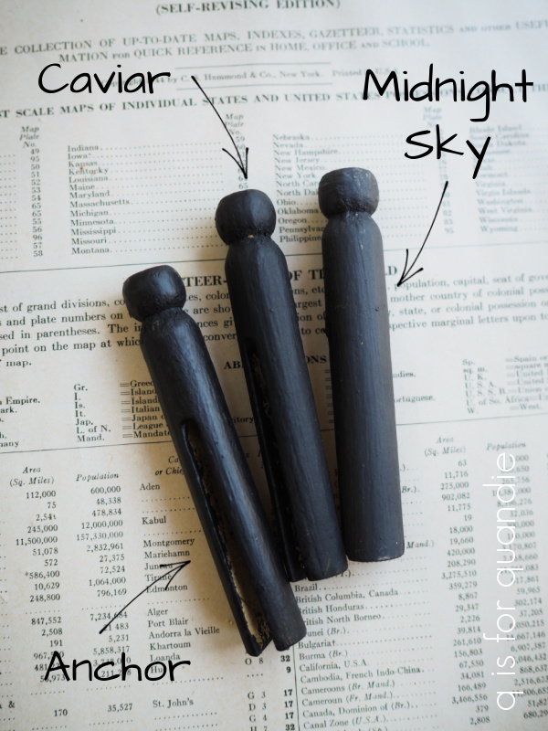
First after a good cleaning, I painted the stool in Dixie Belle’s Caviar. Then I taped off a cross and painted it in Drop Cloth.
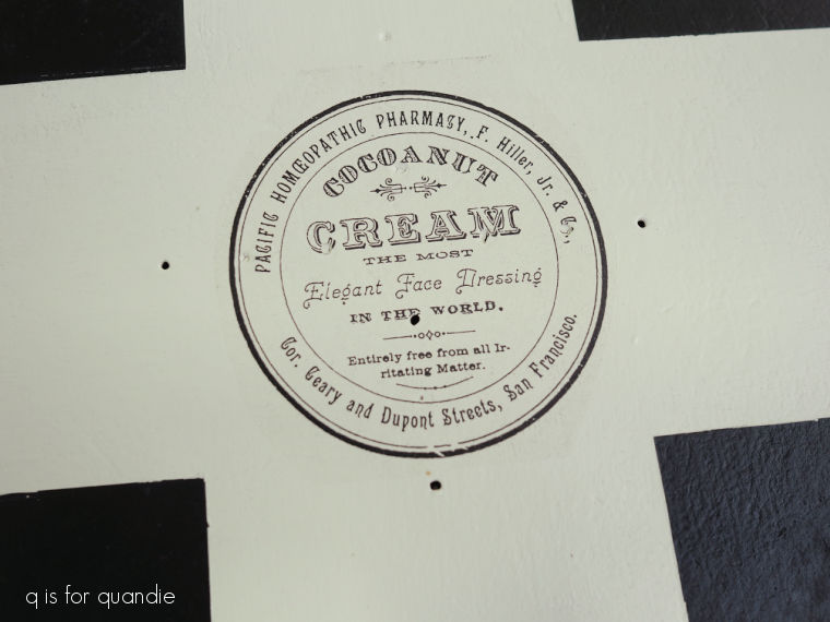
Before the 2nd coat of Drop Cloth was dry, I applied the I.O.D. paint inlay.
These particular circular designs are from their Floriography set (and if you aren’t familiar with paint inlays, check out my how-to post).
Once again, I loved the result.
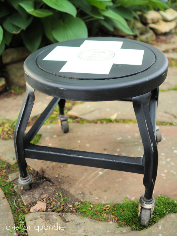
So when my neighbor, nnK, brought me a stool that she picked out of the trash I decided to do it again.
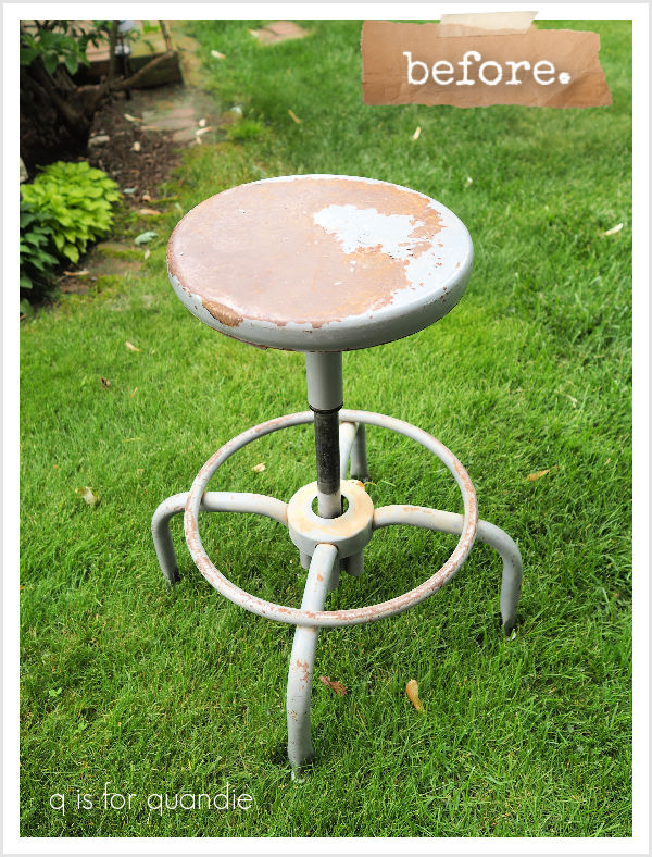
This one took a little more prep work. I had to scrape some peeling paint, then give it a good sanding on the top to smooth the surface out a bit. I also had to pry off some old metal ‘feet’ and replace them with new plastic feet (mainly because one of the original feet was missing and I couldn’t find a replacement to match). Luckily my handyman Ken helped with that part.
After a thorough cleaning (it was totally filthy too), I decided to give this one a coat of Dixie Belle’s clear Bonding Boss before starting to paint. There was a fair amount of rust and the Boss will prevent most of it from bleeding through my paint.
Next came two coats of Caviar and the Swiss cross in Drop Cloth.
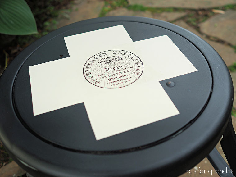
At this point let me say that I.O.D. claims that you can get two or even three uses out of their paint inlays. I have found that I am rarely happy with the image I get with a 2nd use. I shared some of those results in this post.
Also, sadly, the Floriography paint inlay only comes with two versions of the round label (there is a 3rd round design, but with a crest of some kind rather than typography), and I had used both of them.
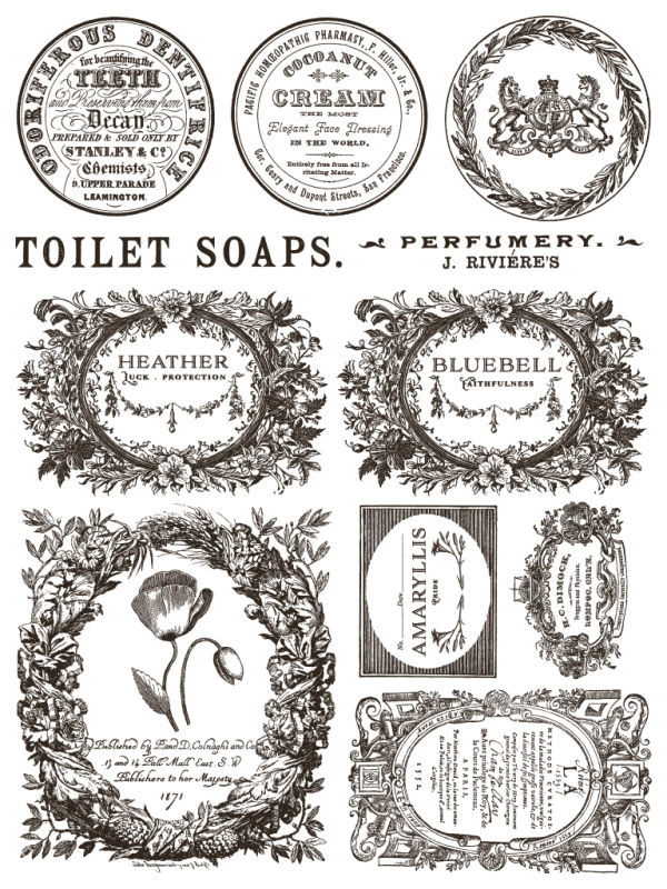
I did briefly consider just ordering a new Floriography set for this last stool, but at nearly $50 it didn’t seem like a wise choice.
So I decided to go ahead and try to get a 2nd use out of the paint inlay that I used on the shorter stool.
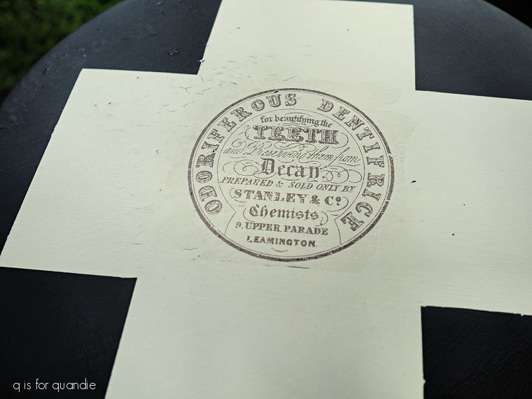
Truly, it’s not bad, just a bit more faded. But I definitely prefer the more crisp and defined look from the first time around.
That’s just me being picky though.
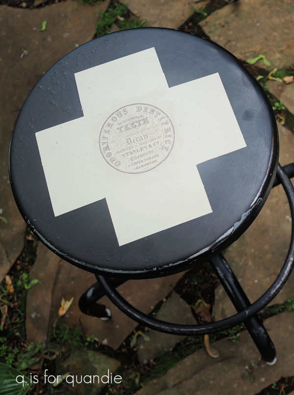
Overall, I think both stools turned out pretty cool.
I had both of them at my recent sale, but unfortunately neither one sold.
But I’m sure they’ll go eventually. I’ve listed them on my ‘available for local sale‘ page just in case any of my local readers are interested.
As for the rest of you, leave a comment and let me know what you think of my industrial stools!