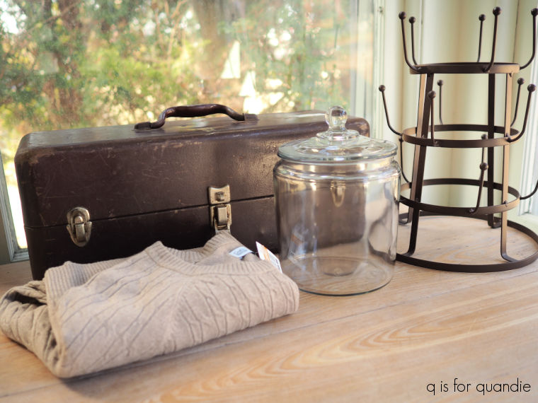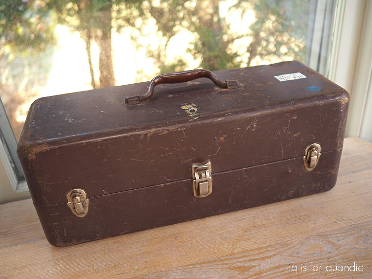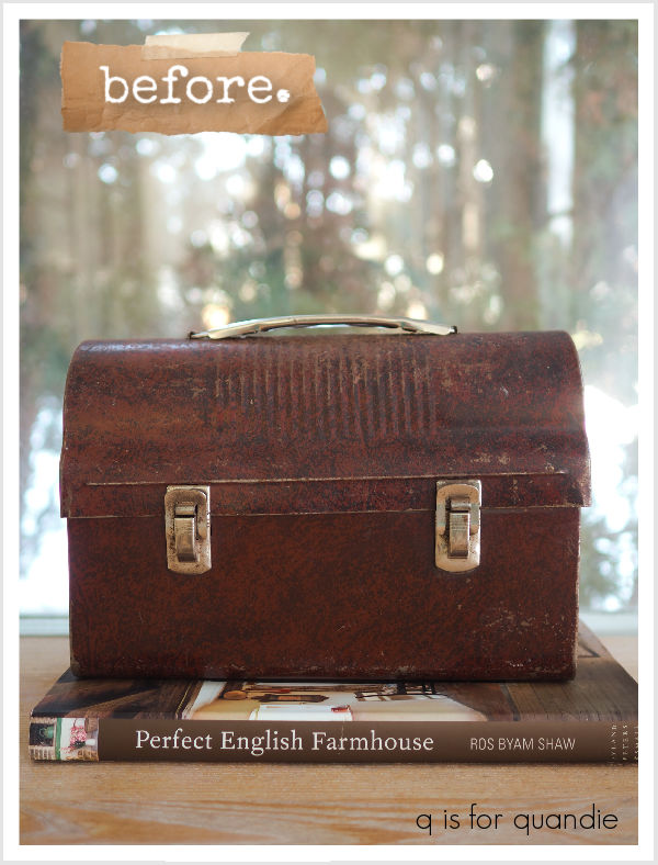
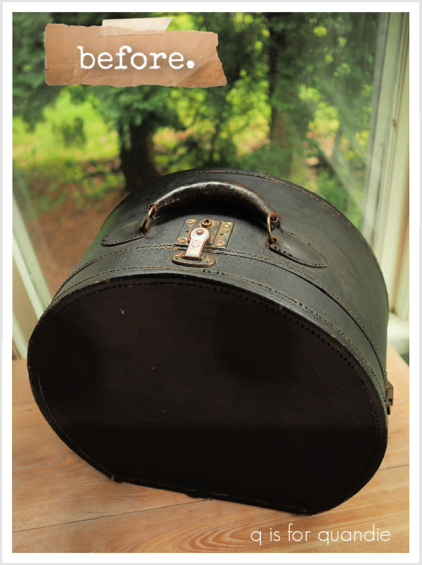
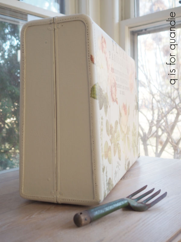
Remember the cool vintage suitcase that I picked up at a garage sale a few weeks back?
I asked you all if I should just leave it ‘as is’ or if I should paint it and add a stencil or transfers of some kind.
Opinions were fairly evenly divided between the two.
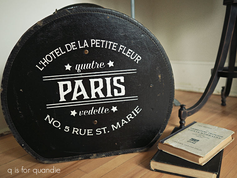
So I sort of split the difference in that I didn’t paint the entire suitcase, but I did add a stencil.
But before we get to the end result, I have to tell you guys that I had my heart set on a specific stencil that I saw on Etsy.
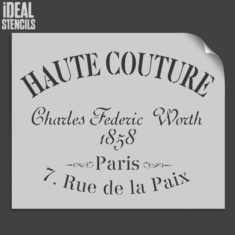
The curved typography would have been perfect for the semi-round suitcase, and the subject matter was good too. I mean, obviously, this would be a suitable suitcase for your haute couture, right?
In addition, you can order the stencil in varying sizes, so I could have gotten just the right fit.
However, the size I wanted was $28.85 and the real kicker was that shipping was another $17.93 because it was coming from the U.K. So taxes would have pushed it over $50 … and that just wasn’t going to be worth it.
I did spend a bit of time surfing the web trying to find the same stencil for less. I found several sellers on Etsy, but all of them were from the U.K. I also found a very similar version on eBay, again coming from the U.K. and priced similarly.
I did end up also finding a somewhat smaller version of the stencil on Temu for about $6. However, Temu wouldn’t let me place an order for less than $50. Have you run into this with Temu? Apparently this rule can fluctuate based on your location and/or your purchase history.
Initially I thought “well, OK, I’ll just order some more miniatures from Temu” and I started filling up my cart. But then I discovered that not everything on Temu counted towards the minimum purchase total. It’s something to do with whether or not the items come from overseas or some such thing.
So even though I had over $50 of stuff in my cart (most of which I didn’t even really need or want), I still needed to spend yet another $35 to meet my minimum purchase amount.
And that’s when I gave up on Temu.
Can you imagine walking into Target to buy a pack of gum and having them say “oh, you can’t buy that unless you spend a minimum of $50 on other stuff … and not everything in the store will count towards that total …”
Yeah, I don’t think so.
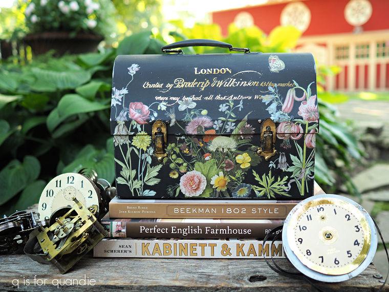
Not only did I give up on Temu, I also gave up on finding the Haute Couture stencil. Instead I pulled out the fairly significant stash of stencils that I already own. Surely there would be one that would suffice, even if it wasn’t perfect.
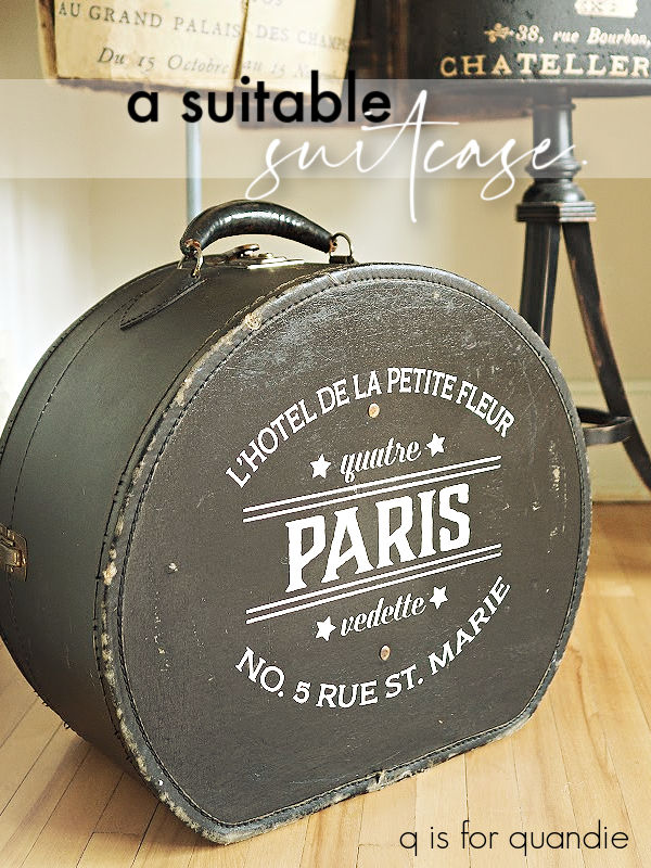
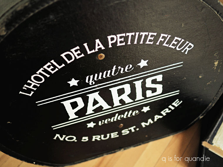
That’s when I remembered the stencil that I used on this bookcase over six years ago.
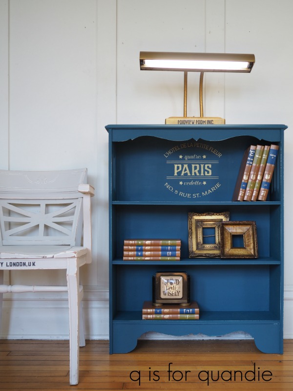
Um, wait a minute, it might just be perfect.
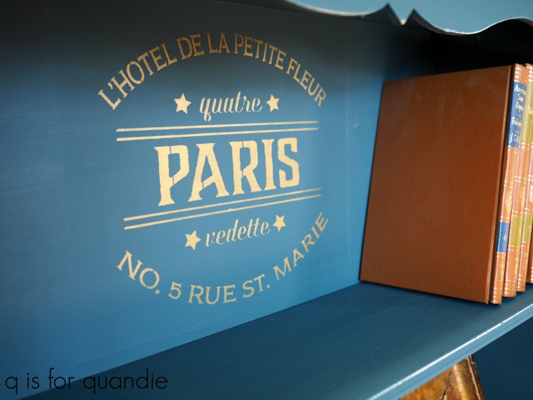
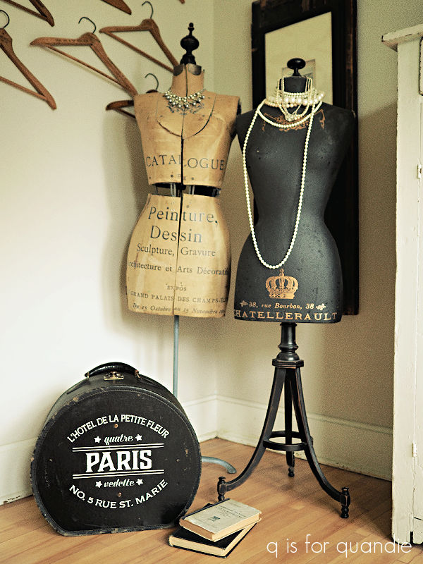
It also has the curved typography, and it’s about the perfect size for the suitcase. Plus, it’s a logo for a hotel.
Suitcase, hotel logo, a match made in heaven.
Best of all, I didn’t have to spend a dime.
That left just one more decision, how to place the stencil. Do you place it with the suitcase standing upright? Or with the suitcase laying flat? Because those are two different directions.
Sometimes that’s an easy decision because a suitcase is tapered and thus wouldn’t lie flat anyway.
But with a non-tapered suitcase I like to give people the option of displaying it upright or flat.
So, I stenciled the bottom of the suitcase in the upright position …
and the top of the suitcase so that you could lie it flat.
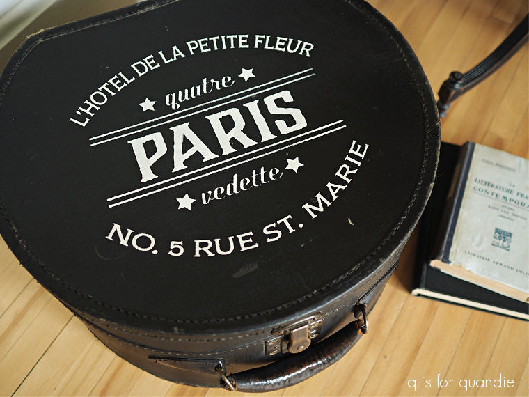
See what I mean?
Versatility is always a good thing.
I used Dixie Belle’s Best Dang brush and their Ecru paint to do the stenciling.
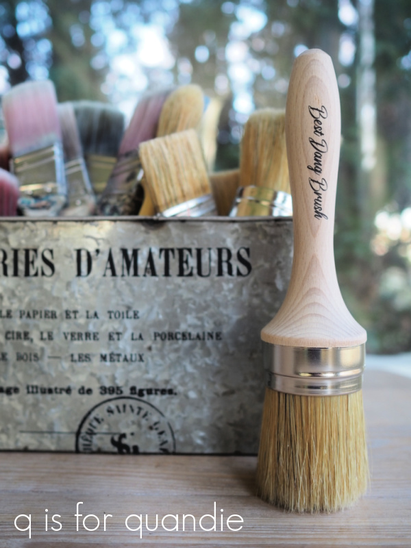
Also, my jar of Ecru was nearly empty and the paint had thickened up a bit (as it does when you’re down to the last bit) which made it absolutely perfect for stenciling.
If you want some more stenciling tips, check out my how-to post.
By the way, if you’re curious, the inside of this suitcase is in pretty good condition.
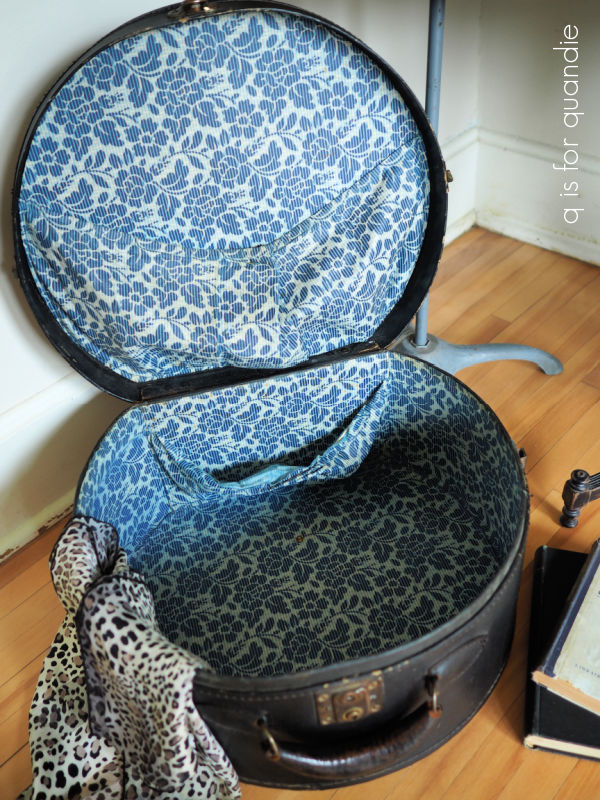
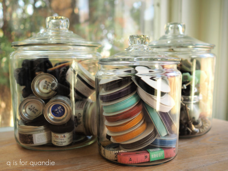
So, it would be perfect for storing things like hats and mittens in the off season, or sewing supplies and the like.
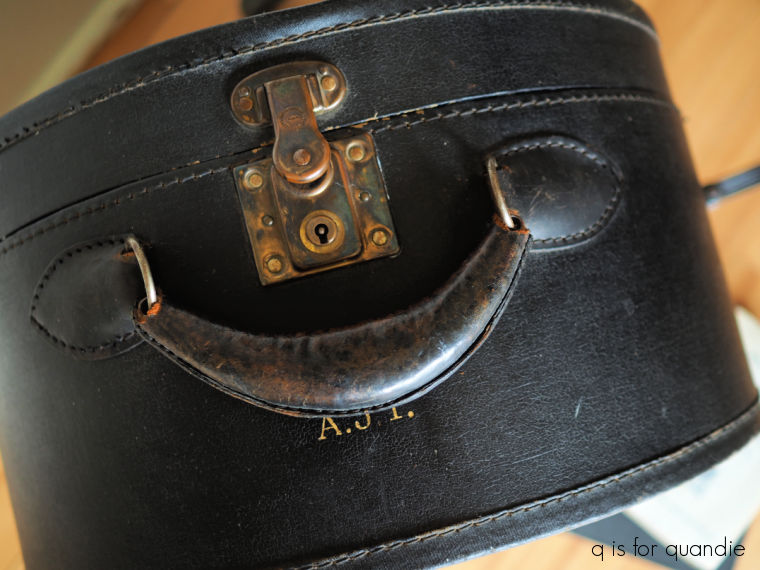
Once my stencil paint was fully dry, I added a coat of Dixie Belle’s clear wax to the entire outside of the suitcase. That helped clean it up a bit more and added some much needed moisture to the dried out leather.
What do you think of the end result?
It looks pretty good next to the girls. Do I want to keep it? Well, sort of.
Wouldn’t it be fun to actually even use it for travel? I don’t know, would it fit in the overhead compartment on a plane?
For now I’m listing it for sale and we’ll see what happens. Check out my ‘available for local sale‘ page for more details.