We’re still recovering from the ridiculous amount of snow we got last weekend, but things are looking up weather-wise here in the Twin Cities, we might even hit 60 by Sunday. I am suffering from a very serious case of garage sale withdrawal, so I’m chomping at the bit for some spring!
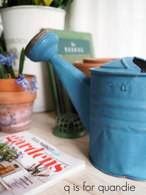
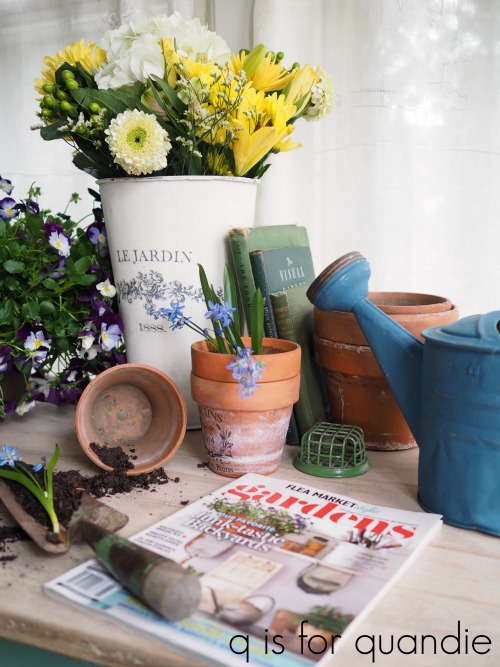
I thought I would nudge it along a little bit with a spring fling in the form of a garden themed dresser.

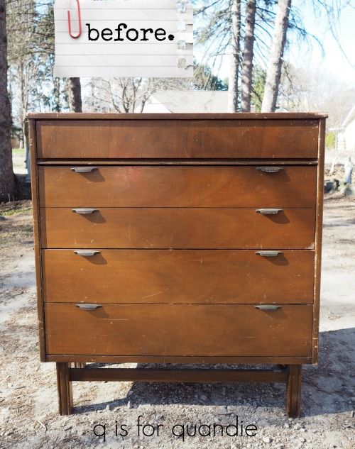
I shared the beginning of the journey of today’s dresser with you guys on Wednesday. This dresser just insisted on being something other than what I first imagined. After several failed attempts to salvage a milk paint finish, I threw in the towel and decided to start over again.
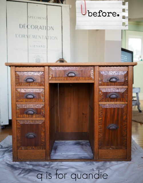
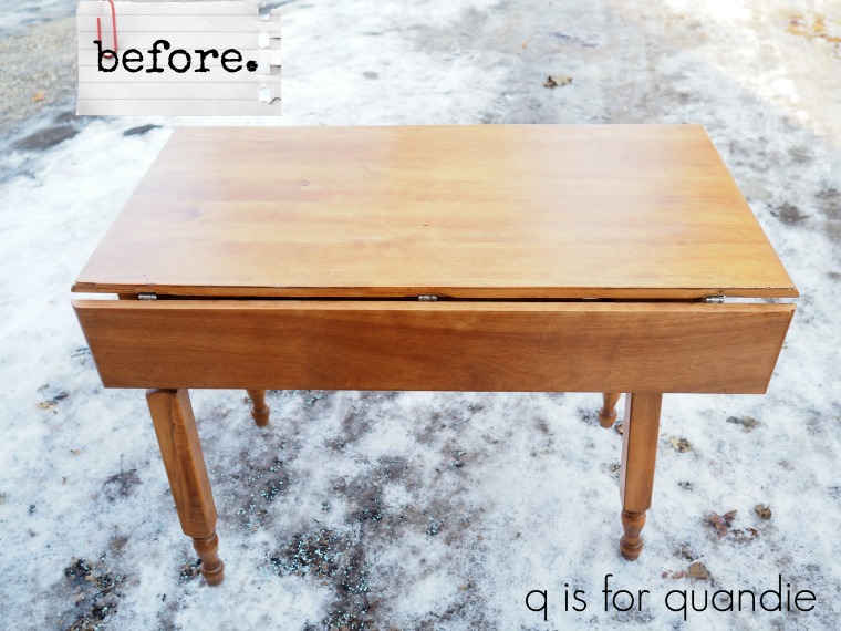
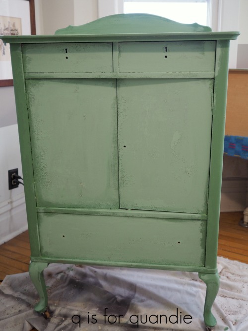
As a reminder, when we last left the dresser it looked like this.
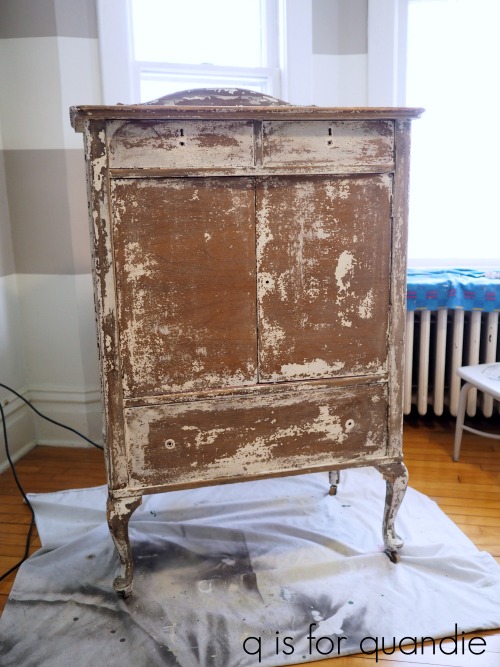
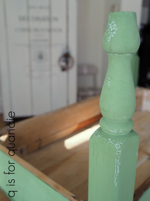
The first thing that you have to understand is that any remaining chippy paint is going to leave a texture on the surface of the dresser if you just paint over it. In addition, whatever you put over that remaining paint may ultimately chip off as well. The adherence of your final paint layer is only as good as the adherence of what is under it. So the first thing I had to do was make a choice between just sanding off the loose chips, or doing a heavier sanding and removing all of the milk paint entirely.
I went with with the former. I used my orbital sander and a 120 grit paper to remove as much of the chipping paint as I could knowing that the remaining bits of paint would add some texture to my piece.
There were several ways I could have proceeded from there that most likely would have worked well. I could have stuck with my original milk paint plan and simply added bonding agent to my paint to make it adhere to the surface of this piece better. Unfortunately, I had already used up almost an entire bag of both the Homestead House Texas Rose and the Miss Mustard Seed Linen. I did not have enough of either color left to start over with them (and I also don’t happen to have any more bonding agent on hand either).
Another option would have been to paint a base coat of acrylic or chalk paint over the entire piece and then add a layer of milk paint without bonding agent. The chalk or acrylic paint would have adhered to the dresser, and the milk paint would have adhered to the chalk/acrylic paint. Again though, I didn’t have enough of the Miss Mustard Seed Linen paint to go that route.
So I decided to just move on to chalk paint, and to switch up my color scheme a bit as well. I started with an undercoat of two green shades of Dixie Belle paint, Kudzu and Mint Julep.

I wanted the Kudzu (the darker green) to show through some distressing on the edges, but I didn’t have enough Kudzu to paint the entire piece. Since I hadn’t gotten all of the milk paint off the piece, I knew I would have some texture from what was left and an undercoat would show when I sanded those areas too, so I wanted to have a shade of green there as well. Luckily I also had a bit of Mint Julep on hand.
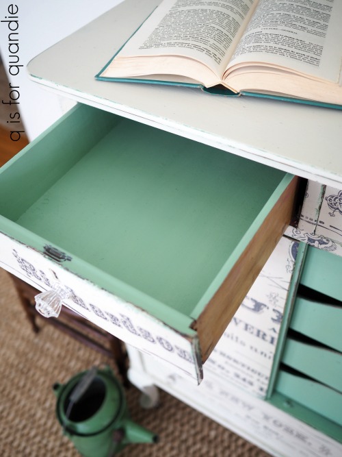
In the end, I decided to paint the inside drawers in the Mint Julep as well.
And I’m so glad I did because it adds the prettiest pop of color when you open the doors.

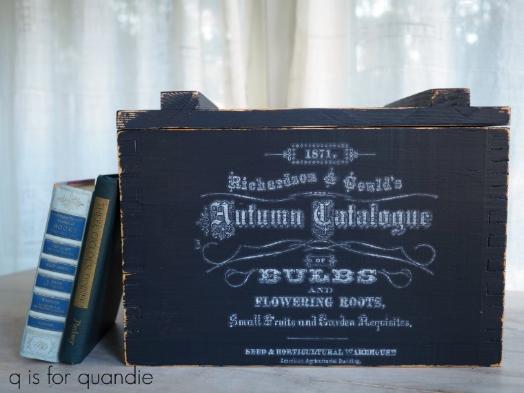
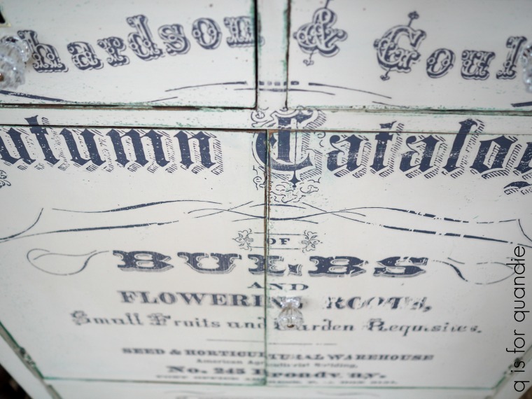
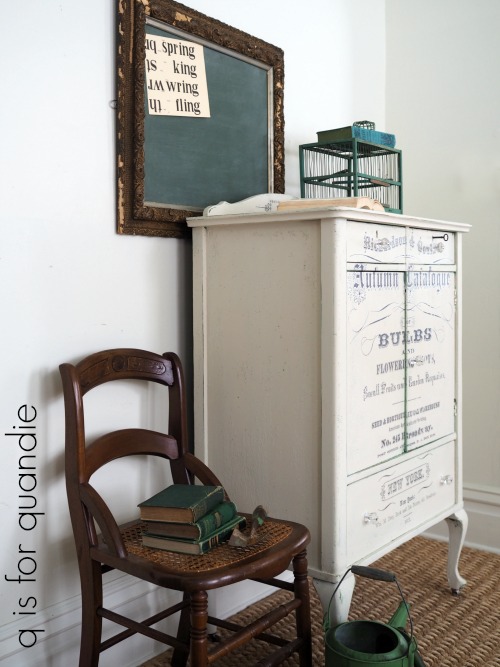
But before I got to that, I painted two coats of Dixie Belle’s Drop Cloth (paint compliments of Dixie Belle) over the exterior. Drop Cloth is a warm off-white. Then I added one of my absolute favorite Iron Orchid Designs transfers (transfer compliments of Prima Marketing) to the front of the piece.

You can sort of see what I mean about the undercoat of green coming through in that photo above, right? By the way, you can order this transfer online at Scrapbook.com here. When I looked last night it was on sale for $17.99, which is a great price.
The thing that I really love about these furniture transfers is that they are sized for furniture. I love the way this one fills up the entire front of the dresser (this is the large version of this transfer, there is also a smaller version available and you can see it on this piece).
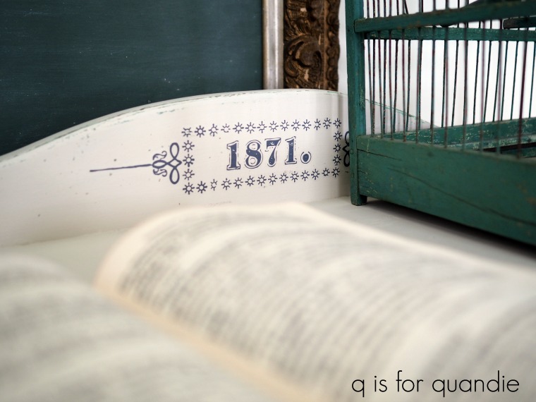
And in fact, the large transfer was actually a tad too long so I cut off the “1871.” and put it on the trim at the back of the dresser top.

This is the 4th time I’ve used the larger version of the transfer and each time I have absolutely loved the results. You can see the other three pieces here, here and here.
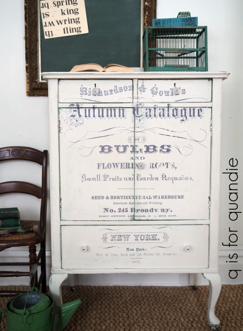
Once I had applied the transfer, I waxed this piece with Miss Mustard Seed Furniture Wax over both the Drop Cloth and the Mint Julep Dixie Belle paint, as well as over the transfer. Yes, you can definitely was over a rub-on transfer.
By the way, I almost forgot to mention. This dresser came with a key!
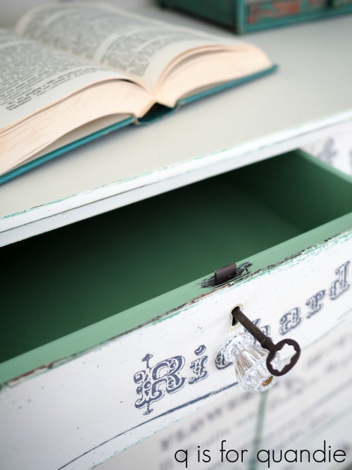
It’s really quite rare to have the key, and locks that still function.
Do you ever wonder about these old pieces with locking drawers? It seems like all of the pieces from this era had them. What did people lock up in them? Money? Their last will and testament? Their secret diary? Their hidden stash of chocolate? Today it seems laughable that you would lock something up in a drawer and feel like it was secure, doesn’t it?
I swapped out the original wooden knobs for some pretty glass knobs. I buy these knobs in bulk from D Lawless Hardware. I am exaggerating only slightly when I say ‘in bulk’, but I do order them by the dozen so that I always have them on hand. I also buy three different sizes. This is the middle size, or 1 1/4″.
I love using the glass knobs on pieces with the transfers because they disappear a bit and don’t interfere with the detail of the transfer itself.

Here’s one more look at that pretty pop of mint green on the inner drawers.

And there you have it. It may not be milk paint, but I still think it turned out beautiful in the end.
 If you need a garden themed linen press dresser and you live near the Twin Cities, be sure to check out my ‘available for local sale’ page for more details.