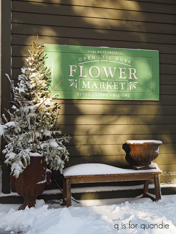
Today I thought I’d share just a few smaller projects that I’ve worked on recently. None of them merit their own individual post, so I’ve been saving them up for a bit of a compilation.
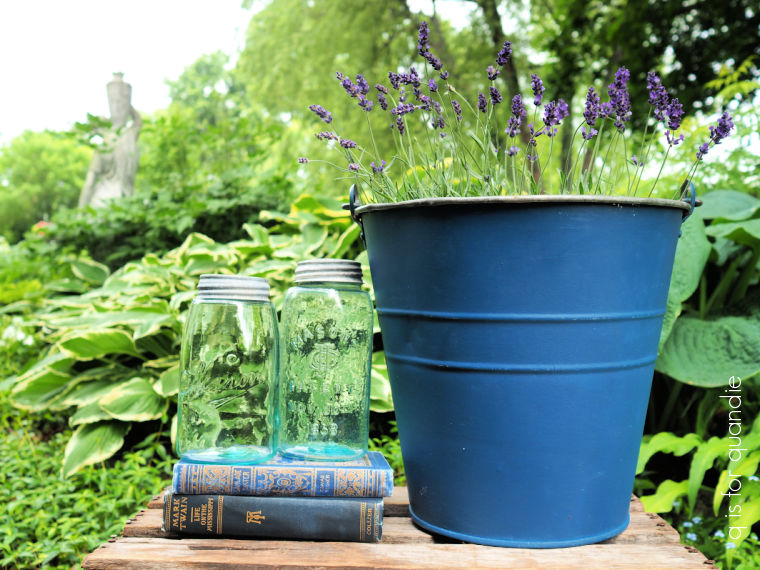
First up, a simple painted bucket.
While going through my pile of decor books recently, the blue bucket on the cover of Romantic Prairie Style caught my eye.
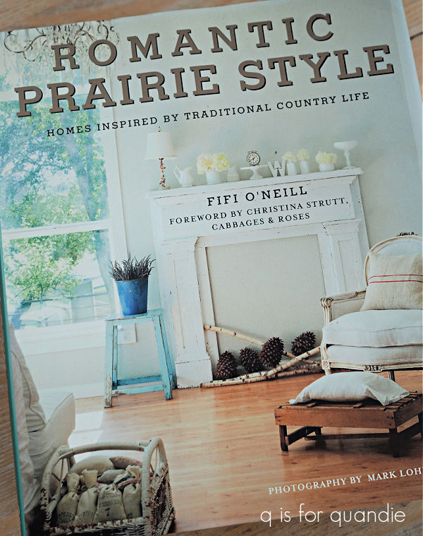
See it there, over by the window? Isn’t that a fabulous cobalt blue?
So I thought, hmmm … I have some old metal buckets, maybe I’ll paint one blue.
So I pulled out this one …
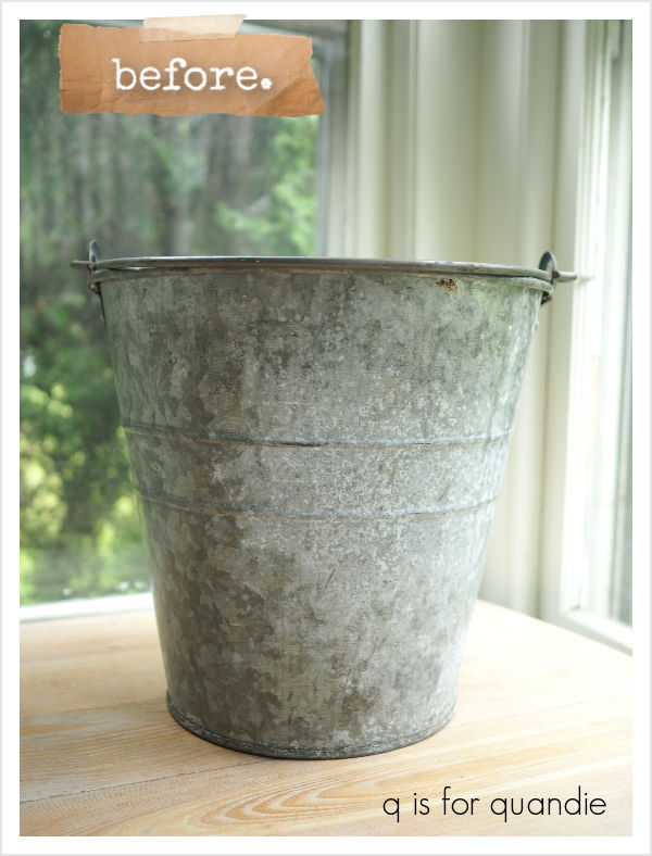
and then I pulled out the Soldier Blue milk paint from Homestead House.
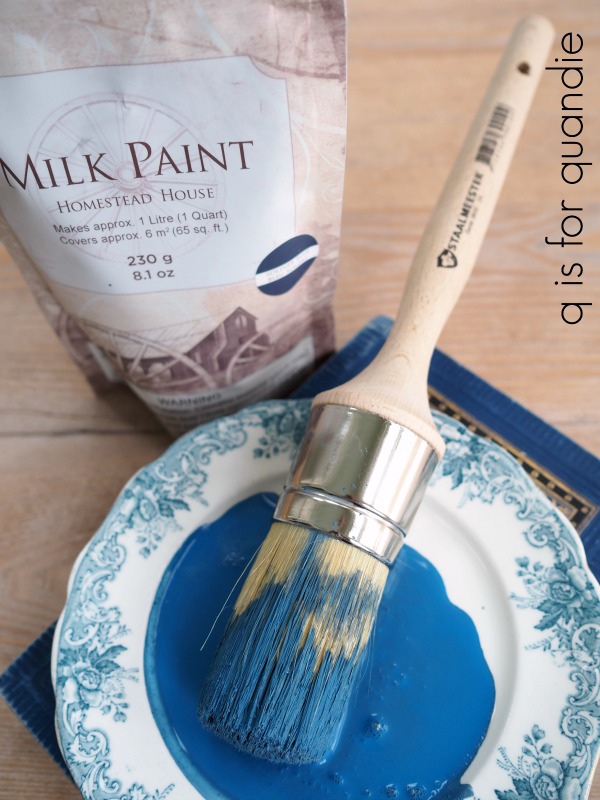
I thought it would be the perfect match for the inspiration bucket.
I gave my bucket a quick wash with Dawn dish soap and hot water, and that was it for prep. I find that milk paint tends to adhere quite well to old galvanized items, the key word being ‘old’. The old ones usually have a rough surface that is fairly matte, while newer galvanized pieces have a slicker, shinier surface. Also, keep in mind that any greasy or oily residue on an old galvanized piece will also resist milk paint so be aware of that.
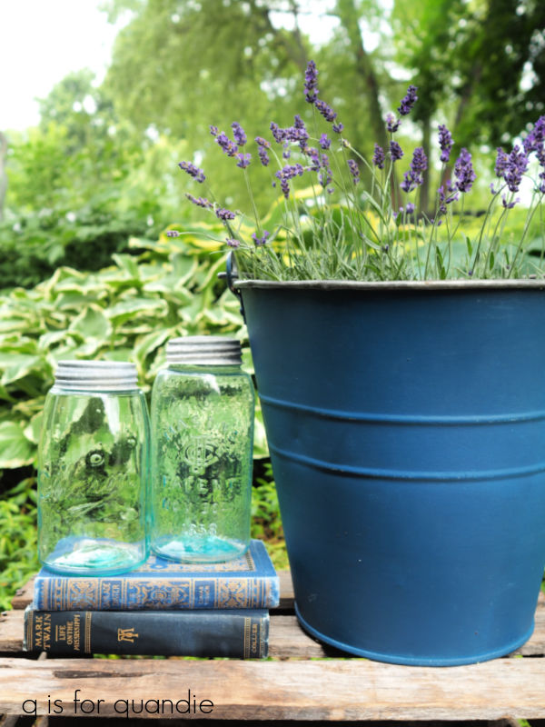
I gave the bucket two coats of the Soldier Blue.
As you can see, I didn’t really get any chipping at all even though I did not using any bonding agent, or any special primer.
Once the paint was dry, I sanded it lightly with some 220 grit sandpaper to smooth out the surface and add a little wear to the edges. I followed that up with a coat of Dixie Belle’s Big Mama’s Butta. If you aren’t familiar with this product, I like to say that if hemp oil and wax had a baby it would be Big Mama’s Butta.
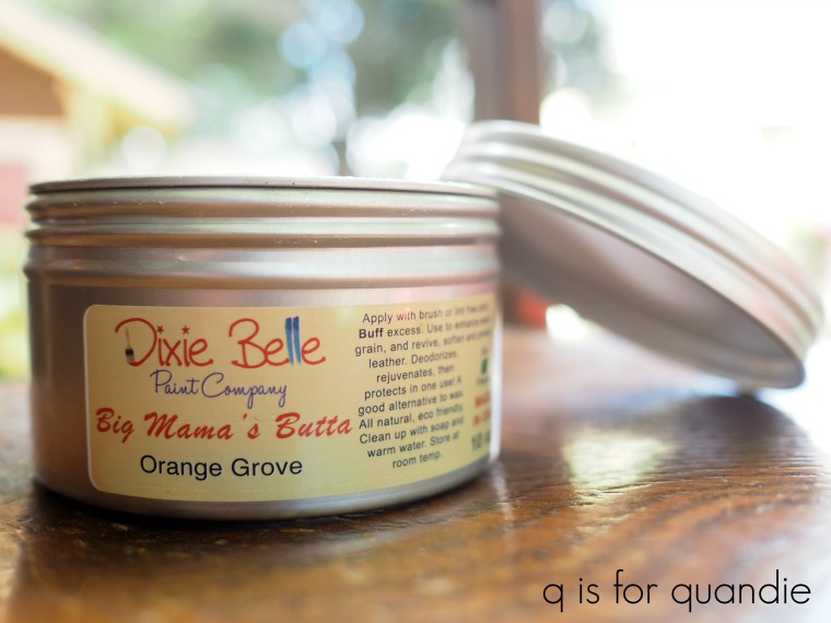
It’s super easy to apply with a brush or a rag, and it comes in some nice scents with Orange Grove being my favorite. It works beautifully over milk paint.
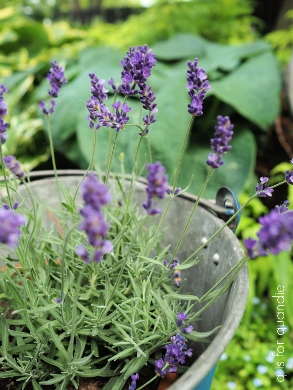
I popped in a couple of lavender plants that I am attempting to grow this summer.
I think my blue bucket is a pretty good match for the one in the book, what do you think?
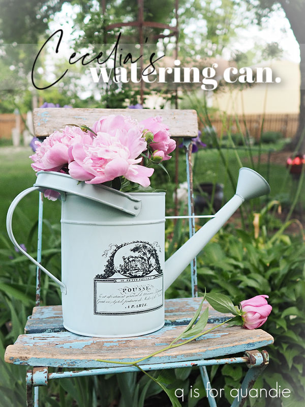
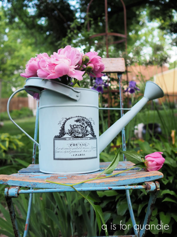
Next up I have another old galvanized piece.
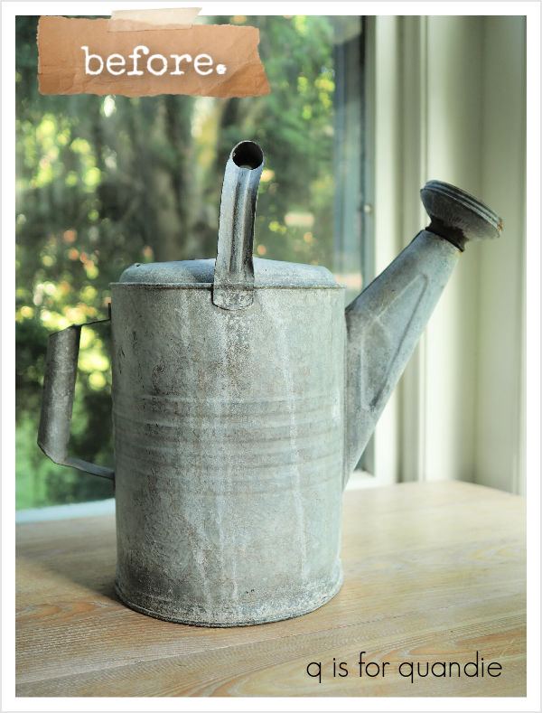
This is the $2 watering can that I picked up at the MacGrove neighborhood sales.
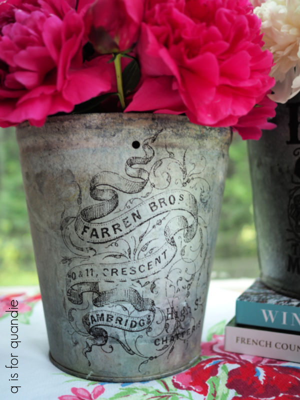
I originally thought it would be kind of shabbily fabulous to just add a paint inlay to the watering can without painting it. I did that recently on another bucket and it worked out great …
So after giving the can a coat of Dixie Belle’s flat clear coat, I applied the inlay face down into the wet clear coat. I was fully aware that the watering can had some horizontal grooves, so I was very careful to press the inlay down into the grooves creating good contact.
Apparently, I wasn’t careful enough …
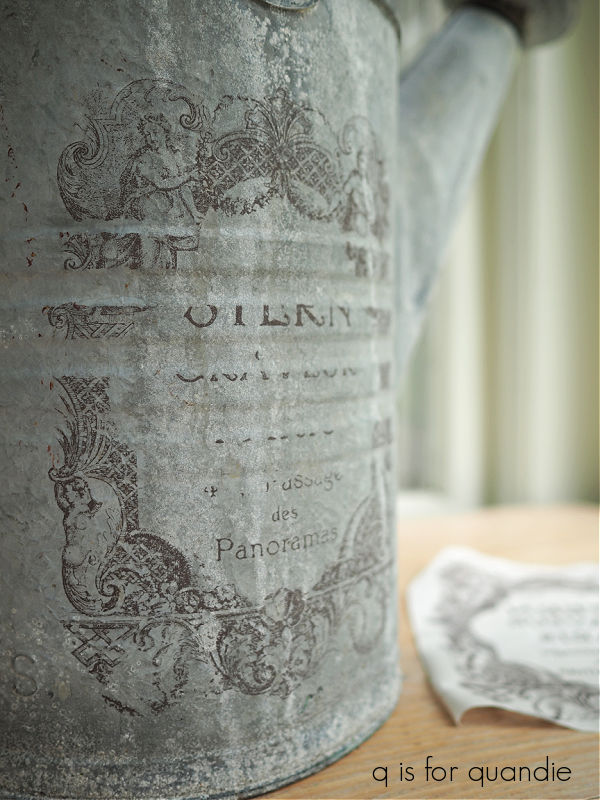
Drat!
I will say that it was absolutely pouring rain the day I worked on this, I believe the humidity level was literally 100% for a good chunk of the day. So I did also have a problem getting the paint inlay to dry and ended up using a hair dryer to help it along. So I’m not sure if it was the grooves or the humidity, but either way this inlay didn’t quite work out.
Well, you win some, you lose some.
One major bonus of a paint inlay is that you can wash it right off if you haven’t sealed it yet. It wiped right off this watering can, and then I was back to square one.
Since the blue bucket turned out so nicely, I decided to give the watering can a simple milk paint treatment as well. In this case, I went with Sweet Pickins milk paint in In a Pickle.
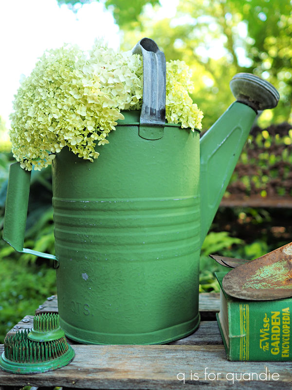
Once again, very little chipping, but I think it looks somewhat authentically old after a little distressing with 220 grit sandpaper.
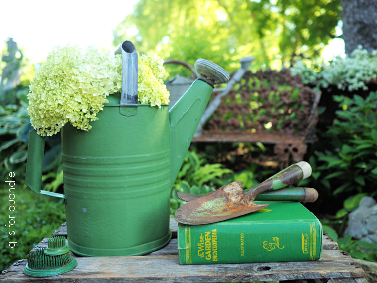
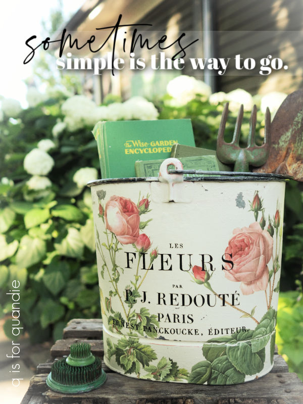
I did debate putting a transfer over the green paint, but in the end sometimes keeping it simple is the way to go.
But then sometimes not so simple is a better option, which brings me to project no. 3.
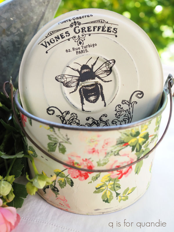
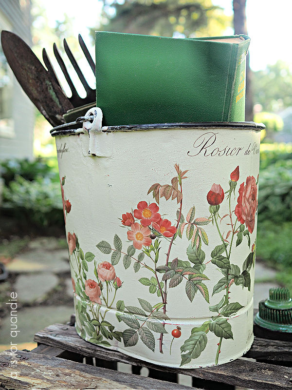
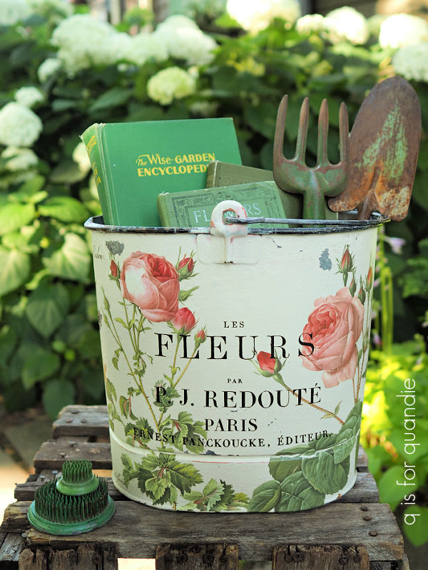
This is the oval bucket that I purchased at the So. St. Paul city wide garage sales.
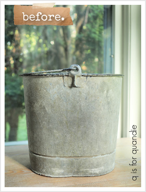
I decided to play around with some layering on this one. So, after giving it a good cleaning, I added some of Dixie Belle’s Sea Spray texture additive to their Cottage Door paint. I then applied just one coat of that to the bucket using a chip brush.
Once dry, I sanded with 150 grit sandpaper and then wiped away any dust. I followed that up with a a coat of Rust-Oleum semi-gloss spray sealer.
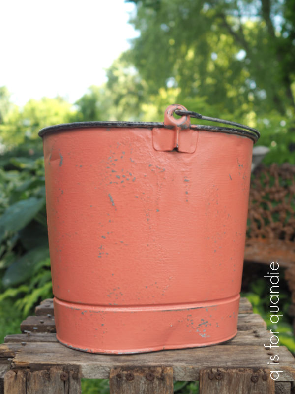
I then mixed up some off-white milk paint using a combination of Fusion’s London Fog and Homestead House Sturbridge White. The London Fog is too creamy, and the Sturbridge White is too white for me, so I salvaged both colors by mixing them together.
I was hoping to get a good crackle finish, like I did on the box I painted back in June. I applied a layer of clear coat first, then brushed on the milk paint. Only this time around I put the bucket out in the hot sun to dry rather than adding heat with a blow dryer. I’ve inadvertently had milk paint crackle under the hot sun in the past, so I thought it would work here.
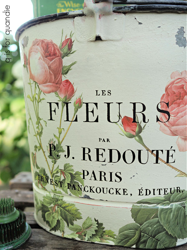
Ultimately I did get some crackling, but not enough to really reveal that underlayer of pink. In hindsight, I made two mistakes with this treatment. First, I shouldn’t have sanded the textured Cottage Door color as much as I did. I basically removed most of the texture. I should have waited until after adding the off white, and then sanded lightly to reveal the pink. I also should have added some beeswax here and there over the pink to create a resist before adding that off white.
Regardless, after adding some of I.O.D.’s Rose Botanicals and a little wording from that retired Label Ephemera transfer, I love how this bucket turned out anyway.
I wrapped the roses around the back.
And I finished the whole thing off with a couple of coats of Rust-Oleum’s matte spray sealer.
Although sometimes keeping it simple is the way to go, other times dressing it up is definitely the way to go.
What do you think? Leave a comment and let me know.


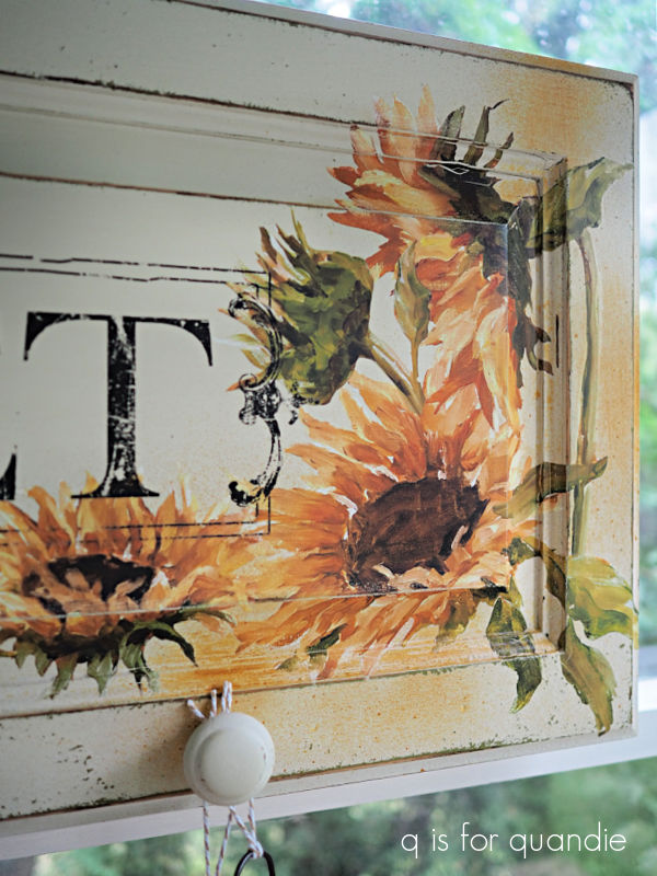
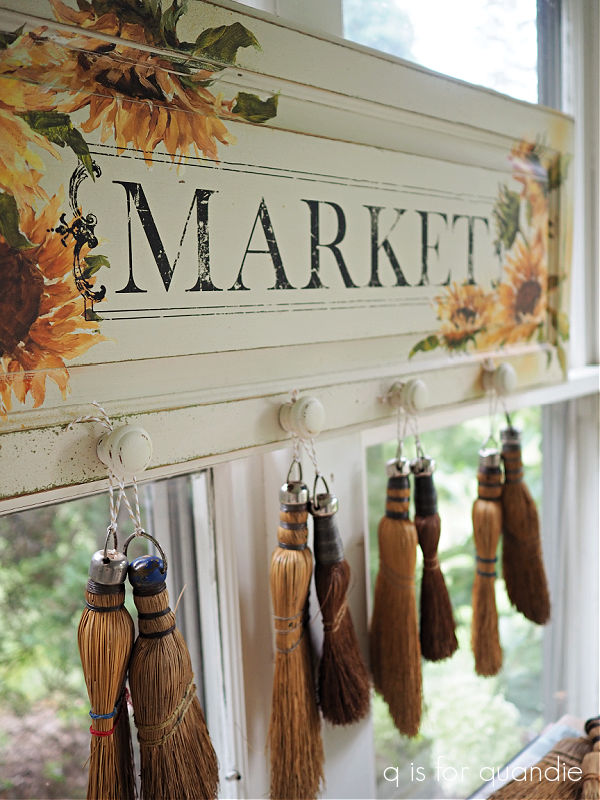

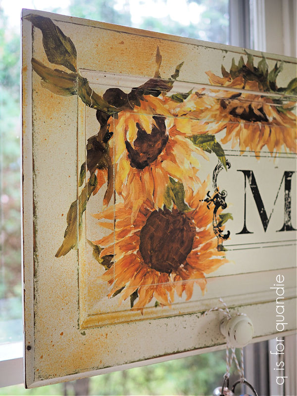
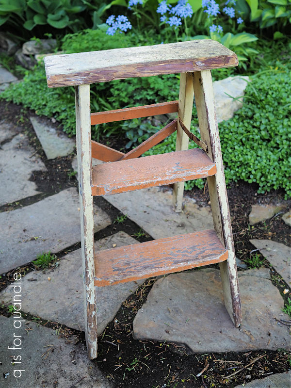
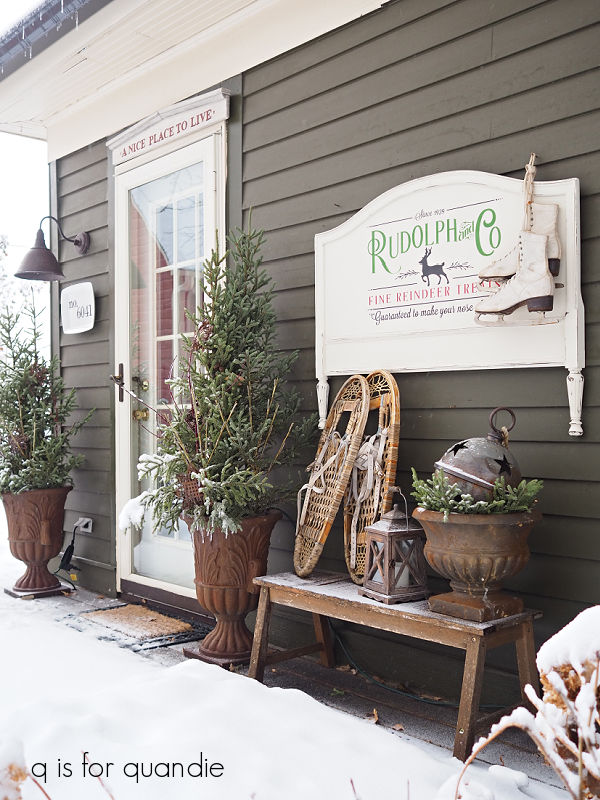
 This would be a great way to display your non-collection of whisk brooms, should you happen to have one. If not, you could hang your kitchen towels on it, or maybe some ironstone pitchers.