Good morning from the garden!
I’ve had a few requests for a full garden tour, so this morning I thought I would attempt it.
My gardens are broken down into … hmmm … let’s see … 8 areas. There is the front garden, the fern garden, the shade garden, the carriage house garden, the potting shed garden, the cutting garden, the fairy garden and the sunny perennial border. Phew! You may want to grab your favorite beverage because this may be a long one.
The front garden.
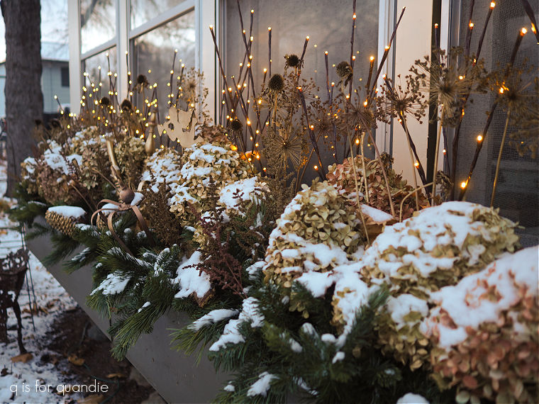
Let’s start out in the front garden. This is just the bit of garden that runs along the front of our house, and it’s where the long window box is.

The box doesn’t look too impressive at this time of the year, but it should fill in quickly.
This area faces north and is very much shaded by the house for most of the day. This is always where the very last bit of snow melts in the spring, and where plants take the longest to emerge from their winter slumber.

But things are starting to fill in nicely now. This space is filled with a variegated sedum, a purple astilbe that loves this location, some dark purple heuchera and plenty of hostas.

The heuchera looks the best it ever has for this early in spring, I suspect due to our very mild winter. Last spring I had decided to give up on heuchera because it did so poorly over winter, but it’s back in my good graces now.

This garden also contains our fountain, and my rusty chair. My neighbor/handyman Ken gave me a set of this grape cluster iron furniture back in 2022. It was painted a crisp white when I got it, but I like something a little more subtle. So I gave the pieces a makeover with Dixie Belle’s patina paint. This chair and the bench both have broken legs, so no one can actually sit on them. I also did not seal the rusty finish, so rust would rub off onto your clothing if you did sit on them. So I tuck them into the garden where no one will make the mistake of trying to actually use them.
There were a few tulips and daffodils in this space that looked good earlier this spring, but right now I’m mostly still waiting for things to fully emerge. The big star of the show in this garden is the astilbe. I divided it last year and found that there weren’t as many blooms, but I’m hoping it rebounds this year. When it blooms in mid-summer, it should look like this …

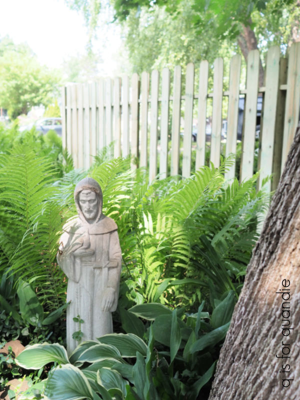
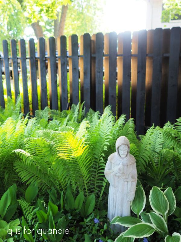
The fern garden.
Our driveway runs alongside the house all the way back to the carriage house. The fern garden is on the east side of the driveway.

The ferns look gorgeous right now, especially with my newly blackened fence behind them, but if we have a dry summer they will start to fade by mid-August and then they don’t look so good.

But I’ll enjoy them while they last along with some vinca vine and lily of the valley, both of which are currently flowering.
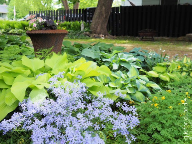
The shade garden.
On the opposite side of the driveway is my shade garden.

I have to admit that this is my favorite, and thus it gets the most attention from me. It’s filled with all kinds of shade loving perennials including bleeding heart, brunnera, maiden’s hair fern, japanese painted fern, lungwort, and more.
It’s also home to quite a few hostas including a few of my favorites like Lakeside Dragonfly …

Sun Power (on left) and June (on right).

Autumn Frost is one of my newest hostas, and it’s looking really good so far.

My garage sale find statue, Cossetta, also lives in this garden.

Right now the foam flower, or Sugar & Spice Tiarella, is in bloom.

I have these sprinkled throughout the front of the shade garden and I like the way they repeat here and there.
There are some foundation gardens alongside the house that I consider part of the shade garden as well.

You may remember that I used the Bronze patina paint with the green spray on the buddha and the Japanese lantern in the background.
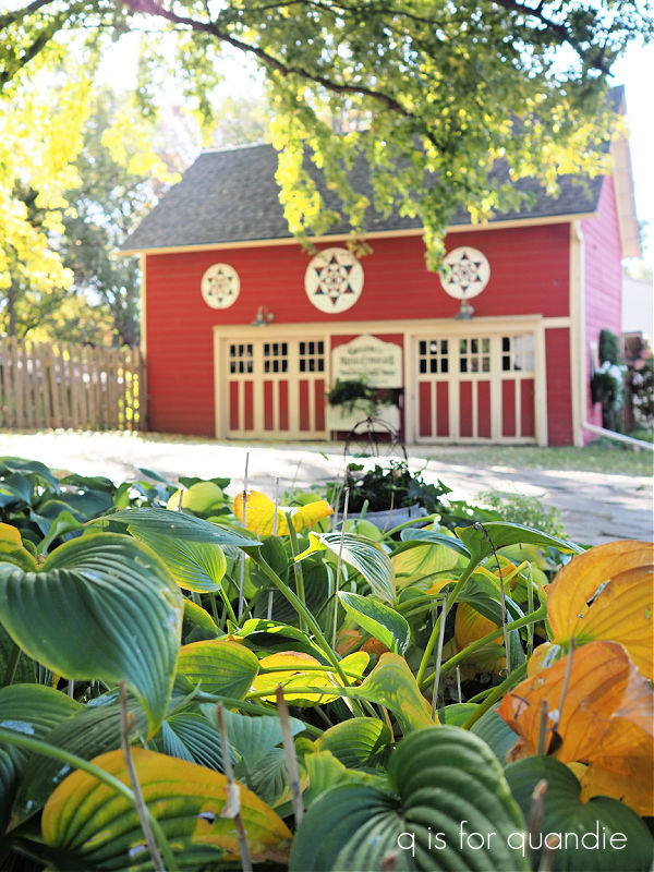
The carriage house garden.
I call the garden that runs along the side of the carriage house the carriage house garden (creative, right?). I struggle a bit with this one because it is shady all morning, then gets hit with the blazing sun in the hottest part of the day. Most plants prefer the exact opposite of that, morning sun and afternoon shade.
It also is backed by that red wall of the carriage house, shades of pink looks positively awful next to it and it has taken me about 35 years to accept that.

But this is the first year that it’s starting to come together. It looked awesome a couple of weeks ago with grape hyacinths, bright yellow daffodils, and that new white azalea.

Right now the only things blooming are a handful of alliums, but the yellow iris are going to open up any day now.
Wait, I take that back. There is also a fabulous cranesbill, or perennial geranium, blooming at the far end.

This plant was a garage sale purchase back in May 2022, this is its third year so it’s time to leap (first year sleeps, second year creeps, third year leaps).
Here’s how big it was when I brought it home.

So while I still want to caution you to be careful about those jumping worms, you gotta love a garage sale plant. You can always count on them to be hardy in your area, and prolific (which is why the seller has extra to part with).
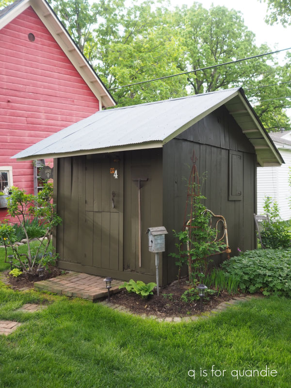
The potting shed garden.
Again, another creative name, the potting shed garden comprises the beds around the potting shed.

This garden is mostly shaded on the east side, but gets afternoon and evening sun on the west side. I popped a few allium in on both sides last fall to see if they would grow, and they seem to have done quite well. I think I may move these elsewhere and replace them with white allium for next year. Wouldn’t white allium just pop against my dark green paint color?
The bugleweed, or ajuga, is in full bloom on the east side right now.

And over on the west side the geranium macrorrhizum, or Bigroot geranium is full of flowers now too.

If you need a plant that will grow in sun or shade, will fill in any available space, requires absolutely no maintenance, then this is the plant for you. It does wilt a bit in hot afternoon sun, but it recovers quite quickly. It’s very easy to pull out if it spreads more than you want it to. I have a lot of it, as you’ll see when we get to the perennial border.
As for growing just about anywhere, along the west side of our house we have only about 8′ or so of fully shaded space between our house and the property line. The previous owners of our house put down plastic and then rock, and planted a row of arborvitae that has gotten massive. After all of this time enough dirt has accumulated amongst the rocks that I have to weed that area. So a couple of years ago I decided to see if this geranium would grow in the rocks.

The answer is a resounding yes! it will. Quite happily in fact. And it looks so much better than weeds.
So if you have a problem area in your garden, keep this plant in mind. Also, if you’re local, keep me in mind. I have plenty to share if you want to try it.
The fairy garden.
My fairy garden is planted in an old rusted out wheelbarrow that is nestled in a bed of variegated vinca. Last year it was ended up totally overgrown, so I decided to be a little more minimal with the plants this year.

Usually I plant a wire vine on that arch, but it totally takes over and requires a lot of maintenance to keep it from completely covering it and the path beneath it.
So this year I’m going to leave that out. Instead I added a couple more miniature hostas compliments of my neighbor nnK (sorry, don’t know the names of them), and I also added a tiny Japanese maple tree to the left of the fairy house.

nnK’s mom, Judy, planted one of these in her fairy garden last year and it did not survive the winter, so I’m taking a bit of a gamble with that one. Especially since I paid $25 for it a Abrahamson Nursery. I may pull it out of there in the fall, put it in a pot, and try to overwinter it somewhere more protected. Japanese maples do require a period of cold dormancy, so I can’t bring it in as a houseplant.
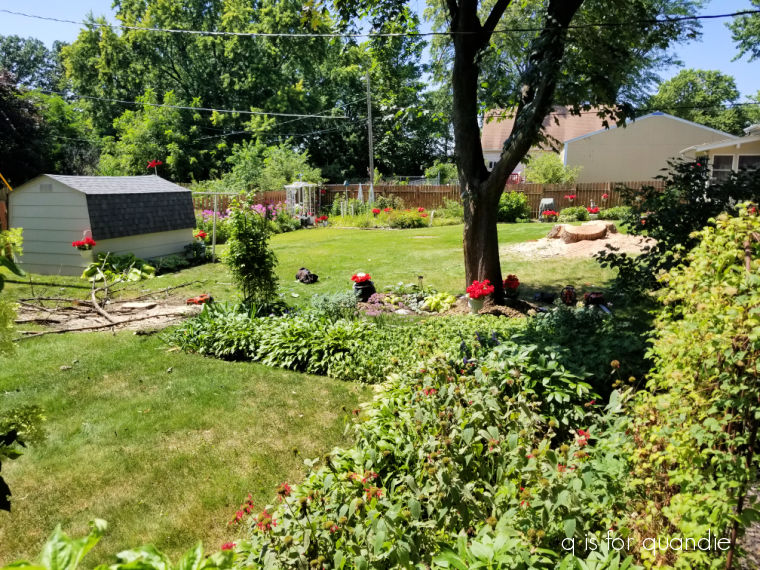
The sunny perennial border.
This garden is directly behind the house and it used to be my sunniest space. Over time the trees in handyman Ken’s yard next door (yes, that is his house in the background) have grown so big that they shade this bed most of the time except around high noon. As a result, I’ve been struggling with this one over the past several years.

Can I just point out that the grass in our area is looking particularly fabulous at the moment. We’ve had plenty of rain mixed in with lots of sunshine and the grass is flourishing for now. I’d love to keep it looking this good all summer, but if we get dry weather again this year all bets are off.
I have a border of small green hostas along the front edge of this garden that do really well here. I also have a big mass of that Bigroot geranium in the middle section.
Right now the alliums are definitely the stars of the show, I just wish they would last longer.

There are three clematis in this bed, two on the trellis …

and one on the obelisk.

They are all loaded with buds, but only one of them has started to open so far.
I do have a couple of pink peonies in this garden.

Fortunately they will be done flowering before the self-seeding red bee balm takes over in mid-summer …

The cutting garden.
The cutting garden is hidden away behind the carriage house. There used to be nothing but weeds back there, but then one day I realized that it was the sunniest spot that I had left for a garden. Why not use it to grow peonies?

So now I have about 6 peonies back there, plus some siberian iris and a big Annabelle hydrangea.
None of them are blooming quite yet, but the peonies should be opening soon. Here’s a picture from June 11 of last year that shows them all in bloom.

Since the cutting garden isn’t visible from the house, or really anywhere in our yard, I don’t feel bad at all about cutting all of the blooms and putting them in vases where I can appreciate them.

That about wraps it up for this morning’s garden tour. I hope you enjoyed it! And now I’m off to do some work out there. It seems as though there are always tasks waiting to be done in a garden!


 That was back in September 2017 (you can read all about it