milk paint topcoats.

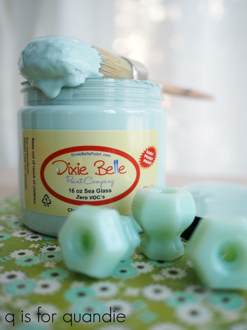
Welcome back for day 2 of milk paint madness week!

Today I’m going to share a bit of information about the various topcoats you can choose for your milk painted furniture, but I gotta say one could write an entire book about this stuff.  There are so many options out there!  I haven’t tried them all though, so I’m just going to scratch the surface on this topic (pardon the pun).  You may want to go grab a cup of coffee first, this is going to be a long one.  I’m going to list the finish options starting with least amount of protection/added durability and ending with the most durable finish.

going topless.

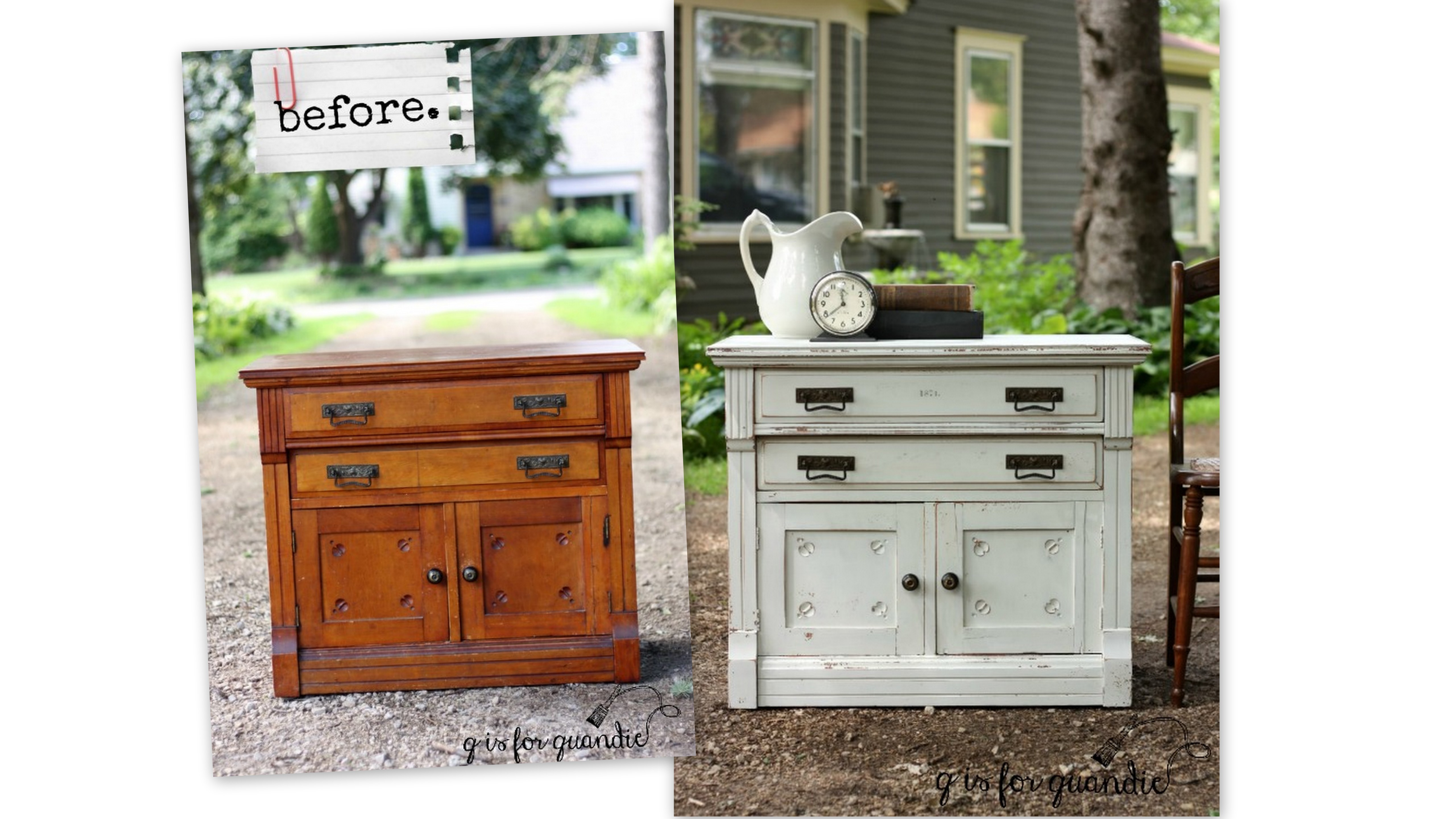
Before we get into the topcoats, what about not using a topcoat at all?  This is an option with milk paint.  It’s definitely not the most durable option and your milk paint won’t be especially water resistant or scrub-able, but if those factors aren’t important to you, you can go topless!  Without a top coat milk paint has a very matte finish.  I would probably never go without a topcoat on the darker colors, but I do like the look with white or other pale shades.

I didn’t use a topcoat on my Belgian bench.

I painted this piece back in July 2016.  We sit on it to put out shoes on, so it gets a fair amount of use.  The finish has definitely worn a bit more since I first painted it.  But if you’re a fan of the distressed, chippy look that’s a bonus.  The paint itself cures rock hard and won’t rub off on your skin or clothing.
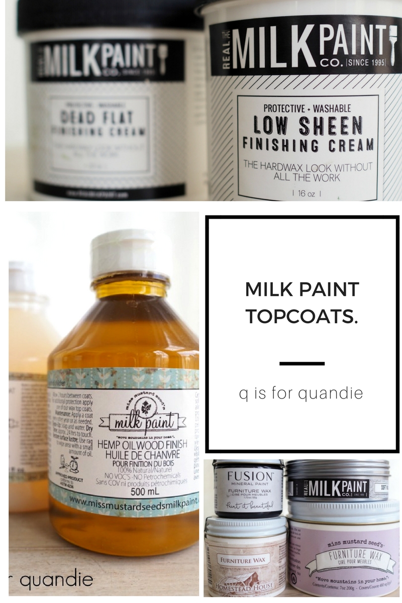
hemp oil.

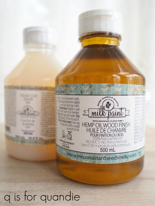
Hemp oil is one of my favorite topcoats over dark milk paint colors, especially black.  It’s all natural, has zero VOC’s and is solvent free.  Remember what I said yesterday about milk paint having similar qualities?  If you work with these things frequently, it’s important to think about not only the environment, but also your own health.  Homestead House, Miss Mustard Seed and The Real Milk Paint Co all sell an all natural hemp oil in their milk paint lines.

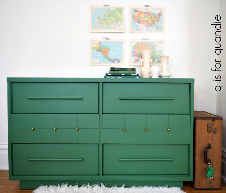
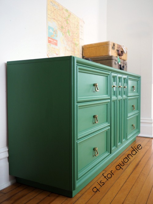
One thing to keep in mind when choosing a topcoat is that all topcoats may change up the color of milk paint to varying degrees.  Hemp oil will deepen the color quite a bit, that’s why it’s perfect for use over dark colors.  It works equally well over mid-tone or lighter colors, but you may want to experiment a bit to see how you like the color with the hemp oil topcoat.  Here you can see how much it changes up Sweet Pickins’ In a Pickle

I like to apply hemp oil with a cheap chip brush that I reserve especially for that purpose.  Once applied, I wipe off the excess with a clean cloth.  There is no buffing required with hemp oil.  Hemp oil dries to a matte finish with no sheen.

Your hemp oiled finish will be somewhat more water resistant and durable than if you went topless, but not as much so as the rest of the topcoat options.  Also, the hemp oil will wear away over time.  If you want to maintain that deep rich color you will have to reapply the hemp oil every year or two.

Here’s a q tip for you that’s just good to know, don’t use hemp oil on your leather goods.  According to The Real Milk Paint Co’s website:  ‘Because Hemp Oil is a drying oil it will soak into leather and dry. This will cause the leather to crack and prematurely destroy your leather goods. Repeated applications of Hemp Oil to leather will just speed of the destruction. Use oil products made to treat leather. These will protect your leather goods for the long term.’

wax.

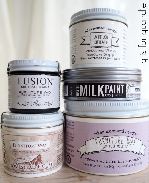
Wax is another great topcoat for milk paint.  There are so many waxes on the market these days, I could probably write a week’s worth of posts just about wax.  I did write a post about how all waxes are not created equal back in January 2017 (read that here).  Based on the research that I did for that post there are some brands of wax that I won’t use anymore because of their harmful ingredients so be sure to read it for more info on that.

Wax comes in quite a few different colors these days too.  You can get clear, white, brown, grey and black.  Fusion even has some metallic furniture waxes available.

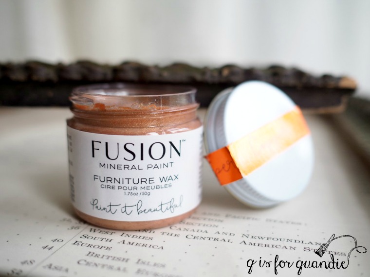
Clear wax will darken the color of your paint somewhat, but not as much as hemp oil.  Brown, grey and black waxes will deepen your paint color and add a tint of their own color to it, while white wax will lighten your color and add a bit of a whitewashed sort of look.

Here’s a great tip;  if you’ve never used colored wax, I highly recommend doing some experimenting with it before you apply it to a piece of furniture.  Paint an old board with your milk paint color, and then try the colored wax over it.  If the look is too dramatic for you, you can try applying clear wax first, then adding a colored wax over it.

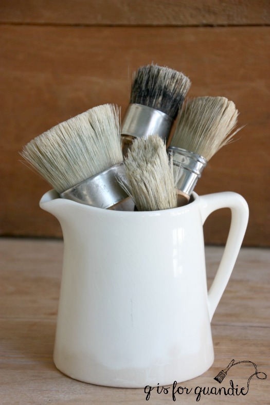
I like to apply my wax with a wax brush.  I find it easier to get into the nooks & crannies with the wax.  Since I do a lot of waxing, I keep a separate wax brush for each color I use regularly.  That way I don’t have to clean them after every use.  I only clean them a couple of times a year (I probably shouldn’t admit that out loud).

  Once you’ve applied the wax using a circular motion, wipe away the excess with clean cloth in the direction of the grain.  After the wax dries for about 5 – 10 minutes you can go back and buff it with a clean cloth to get more shine if you want it, but I have to admit I rarely do that.

If you’ve struggled in the past with a waxed finish that ends up feeling tacky, you’ve likely used too much wax.  Keep switching to a section of clean cloth to wipe away excess wax until your surface feels smooth.  Once cured (after about 30 days) a properly waxed surface will feel smooth and silky.

Personally I love the look of a waxed finish.  It has a patina that appeals to me, not super shiny but not completely flat either.  A waxed finish is more durable than hemp oil, but still not really scrub-able.  It will resist liquids though, sort of like a freshly waxed car.  In addition, a waxed surface is pretty easy to ‘fix’ if it does get dinged up.  Just simply sand very lightly and re-wax that spot.  No need to touch up the entire surface.

Much like hemp oil, wax will wear away over time and to maintain water resistance you’ll want to reapply every year or two.  I’m not gonna lie though, I’ve yet to re-wax a single one of my waxed pieces.  But then durability is not something I really worry about in my household.  If you have small children it might be more important to you.

finishing cream.

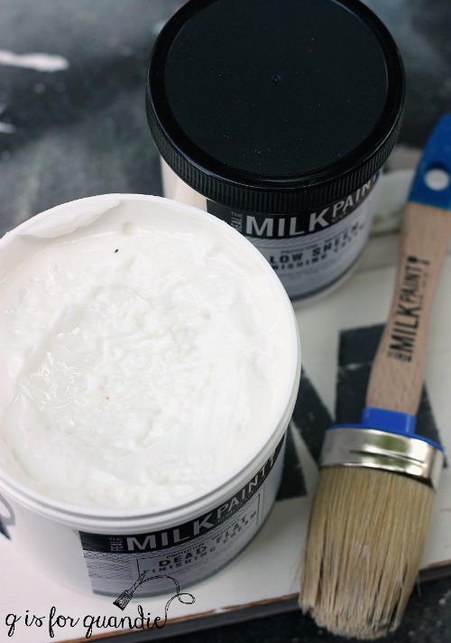
The Real Milk Paint Co’s Finishing Cream is rapidly becoming one of my favorite topcoats for milk paint, especially for the lighter colors.  I’ve used the low sheen and the dead flat versions and I like them both.  This topcoat won’t change the color of your milk paint by much, if at all.  The low sheen adds just a minimal amount of shine and the dead flat is more matte.

You can apply this product with a rag, brush or damp sponge.  I usually go with a brush.  What I love about the finishing cream is that it’s very thick.  Sort of like the consistency of a body cream rather than a lotion.  Because of that you really don’t have to worry about runs (which seem to be a problem for me).  So far I have found this stuff to be pretty fool proof.  It also takes less effort and time than a hemp oil or waxed finish.  You just brush it on, no need to wipe away excess or buff.

After drying for 24 hours, a piece with this topcoat will be fully washable and more durable than hemp oil or wax.  You shouldn’t have to reapply the product unless your piece gets a lot of wear, in which case you can re-apply if necessary.  I used a finishing cream top coat on the nightstands in our bedroom to protect them from glasses of water left overnight.

One thing to note here, the Dead Flat version is not recommended for use over black or other dark colors.

tough coat.

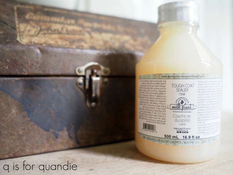
Tough Coat Sealer is a non-yellowing, clear topcoat that is available under both the Miss Mustard Seed brand and the Fusion brand.  This product also will have a minimal effect on the color of your milk paint, although it may darken it just slightly.  It is considered a matte finish, but it gives a little bit more sheen than hemp oil or wax.  Please note, this topcoat is also not recommended for use over dark colors as it may look cloudy.

You can also apply the Tough Coat with a brush or sponge applicator, or just wipe it on with a lint free cloth.  The Tough Coat Sealer is more of a liquid than the finishing creams.  For that reason you want to be careful to watch for drips, especially on vertical surfaces like the sides of a dresser.  For more info on how to apply this product click here.

Tough Coat is very durable, and even more so if you apply two coats.  It’s a great choice for tabletops or other areas that will get a lot of wear.

stain and finishing oil.

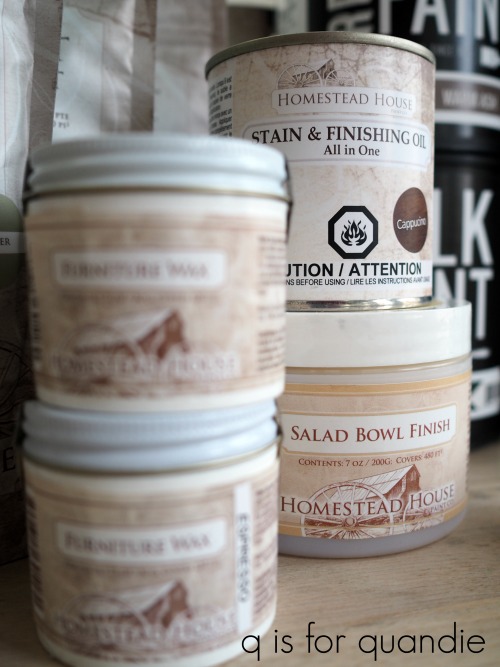
Homestead House Stain & Finishing Oil All is made from safflower oil, tung oil, linseed oil, vegetable wax, safe odourless mineral solvent and cobalt free siccative which means effective drying without toxic cobalt dryers.  Initially I assumed this product was just meant for use over bare wood as a stain and sealer in one.  I never would have thought to use it over milk paint until I saw it done by someone else.

You might have noticed that both of the more durable topcoats I’ve mentioned so far, Finishing Cream and Tough Coat Sealer, are not recommended for use over dark colors.  There is some sort of science-y reason for that and it has to do with the matte finish which can look cloudy or spotty over dark colors.  For that reason I tend to use either hemp oil or one of the dark colored waxes over dark colors.  However, if you are looking for a more durable option that works great over dark colors, the Stain & Finishing oil is perfect for that.

This product comes in a selection of colors (see them here), the natural option will have the least impact on your milk paint color while the Cappucino will darken up your color quite a bit.  Multiple coats of SFO will increase durability, but also increase the color it adds to your piece.

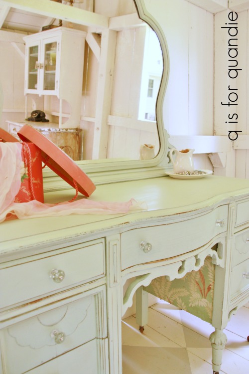
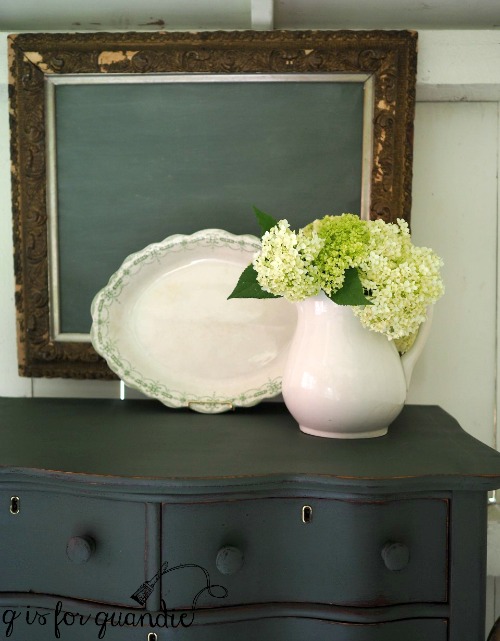
I used one coat of the Cappucino SFO over black milk paint on this desk and got great results.

Refer back to that post for much more detail on how to use SFO over milk paint.

And that brings us to the fun part, today’s prize!

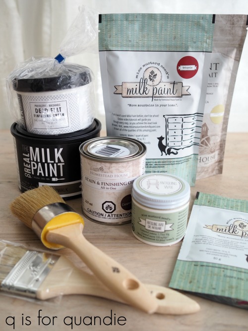
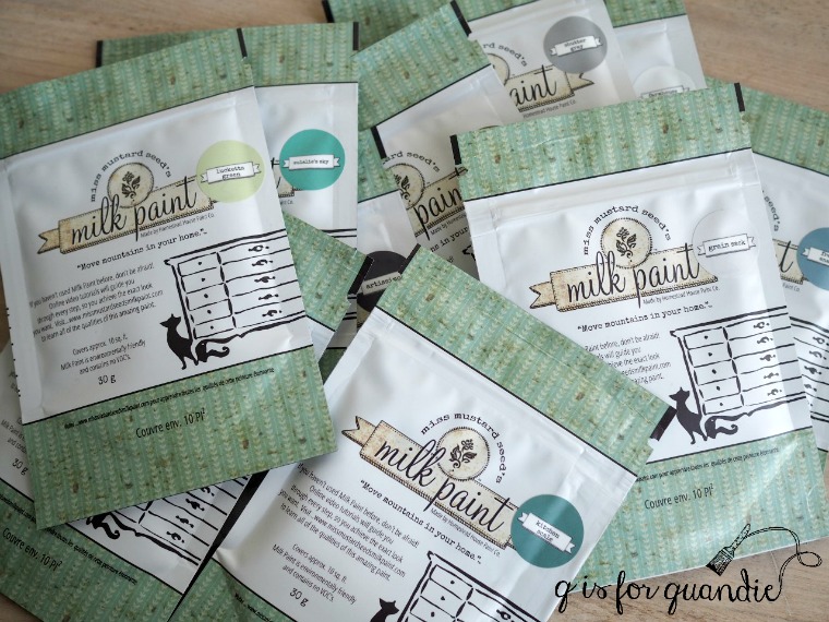
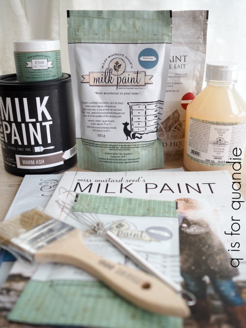
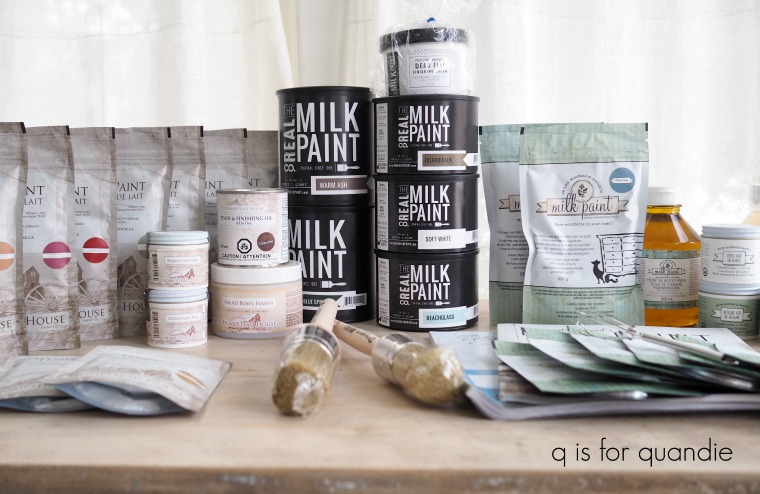
Includes: four colors of milk paint, Homestead House Stain & Finishing Oil in Cappucino, The Real Milk Paint Co’s Dead Flat Finishing Cream, Miss Mustard Seed’s Antiquing Wax, a Miss Mustard Seed waxing brush and a paint brush.  Thank you to Homestead House, Miss Mustard Seed and The Real Milk Paint Co for providing items for today’s giveaway. 

The basic rules:  to be eligible to win today’s prize leave a comment on this blog post telling me what your favorite topcoat is (or maybe you prefer topless!).  Your comment must be left on the blog, not on Facebook.  You are not required to follow my blog, although it would be awesome if you did!

Normally I make a point of answering every comment left on my blog.  If someone takes the time to leave a comment, I like to acknowledge that.  But I usually only get 10 to 20 comments so it’s easy to fulfill that promise.  But I’m guessing that I’ll get many more comments on these posts so I’m going to warn you up front that I won’t be answering each one.  That helps make it easier for me when it’s time to pick a winner too, so I hope you guys will cut me some slack on that this week.

I will randomly draw the name of a winner for today’s prize from all of the comments left on this post by Saturday, April 7, 2018 at the stroke of midnight.  You are eligible to win each day, so if you leave a comment on each day’s post, your name is eligible to be drawn for each prize.

The fine print: no purchase necessary, you must be 18 years of age or older to win, void where prohibited by law, the number of eligible entries received determines the odds of winning, approximate retail value of prize is $150, if the prize is not claimed by Friday, April 13, another name will be drawn at random to win, blah, blah, blah.

Be sure to check back tomorrow for the next segment of milk paint madness, and in the meantime remember to pin today’s post for future reference.

milk paint basics.

Welcome to day 1 of milk paint madness week, milk paint basics.

For those of you who might be entirely unfamiliar with milk paint, this post is for you.  But everybody, be sure to read to the end for details on today’s giveaway.

  First of all let’s just establish that when I’m talking about milk paint, I’m talking about paint that comes in powder form and you mix it yourself with water when you’re ready to use it.  Some of my favorite brands of milk paint include Miss Mustard Seed, Homestead House, The Real Milk Paint Co and Sweet Pickins.

Don’t be confused by General Finishes Milk Paint which is really an acrylic paint and not a milk paint at all.

Also, don’t be confused by The Real Milk Paint Co’s packaging.  It looks more like a traditional paint can, but there is a bag of powder inside.  There is also a marble inside which is a very clever tool for mixing your paint, but I’ll get to mixing in a minute.

Milk paint is made with only a handful of basic ingredients including milk protein, lime and pigment.  It is non-toxic and has zero VOC’s.  In other words, it is a very green product that is not harmful to the environment or to you while you’re using it (go here to read more about the green quality of milk paint).  Since I paint a lot, I’m exposing myself to the products I use on a regular basis and I bet you are too.  Don’t forget to take this important quality into consideration when choosing which products you’re going to use.

Milk paint in powdered form can be stored pretty much indefinitely as long as it is in a sealed container and stays dry.  It doesn’t take up very much space on your shelf this way, which is an added bonus.

Although these days most of us use milk paint over a pre-existing finish and are delighted when it chips and crackles because of that resistance, historically milk paint was intended for use on raw wood.  When used on raw wood, milk paint soaks into the wood much like a stain rather than sitting on the surface like other paints.  That makes it incredibly long lasting and durable.  When used on raw wood milk paint won’t chip or peel away.

So let’s talk about mixing your milk paint.  The basic rule of thumb is to mix equal parts water to powder.  However I like to mix darker colors a little thinner (more water, less powder) and lighter colors a little thicker (less water, more powder).  But half and half is a good starting point.

You can also mix your paint really thin and use it as a wash.  Or leave it thicker if you want to add some texture to your piece.

There are all kinds of methods for mixing your milk paint.  Unlike Mr. Bond’s martini’s, it can be shaken OR stirred.  This is where that marble comes in from The Real Milk Paint Co.  If you like to shake your paint in a jar, throw the marble in the jar as well and it helps mix the paint beautifully.  You can also choose to use one of those battery operated milk frothers to mix your paint (reserving it for paint use only of course).  I’ve even heard that some people use a blender, but that seems like overkill to me.

I used to always shake my milk paint in a glass jar and the marble is pure genius for that.  It was also a very environmentally sound practice.  However, Mr. Q eventually got tired of washing out those jars for me (he does all of the dish washing in our house, we don’t have a dish washer).  So I switched over to stirring my milk paint in a disposable solo cup with a plastic spoon.  I purchased what may prove to be a lifetime supply of plastic spoons at a garage sale for a dollar and I haven’t run out yet.

Do you put the water in first, or the powder in first?  Some say one and some say the other, but I don’t think it makes that much of a difference.  However, if you put the powder in first, just be sure to mix all the way to the bottom.  It’s sort of like making hot chocolate from a powder, you don’t want to get that overly chocolaty last swallow because a bunch of the mix was stuck at the bottom of your cup.

Should you use cold water or warm water?  Again, I’ve heard both.  I suggest meeting in the middle and using room temperature water.

I’ve also heard that sometimes well water may cause problems with milk paint.  When I was in high school a friend of mine had orange hair from washing it with well water.  So if your well water turns things orange, you might want to try using bottled water instead.  But city water from the tap should be perfectly fine.

One thing to keep in mind about milk paint is that once it’s mixed with water it has a limited shelf life (no longer than one week).  So obviously you don’t want to mix way more than you are going to need.  I think this factor stresses people out unnecessarily.  Over time you’ll develop a feel for how much paint you need, but in the meantime I have a little trick for you.  For a typical piece of furniture like a desk or medium sized dresser, start with about a 1/2 cup paint mixed with a 1/2 cup water.  Then start the first coat of paint on your piece and pay attention to how much of the paint you use.

Did you use all of it for the first coat?  If so, mix the same amount again for the 2nd coat.

Did you run out?  If so, mix a bit more the next time adding enough to finish the first coat and complete the 2nd coat.

Did you have way too much?  You get the idea.  As long as you have enough paint mixed to paint your final coat all from one batch you are going to be OK.

That being said, you can not mix a new batch of milk paint just to finish that one last drawer and expect it to match.  It most likely won’t.  So be sure your final coat of paint is all mixed at the same time (see an example of that here) .

Speaking of mixing, be sure to stir your milk paint frequently as you use it (that plastic spoon really comes in handy for this).  Because this paint is all natural, the heavier pigments will sometimes fall to the bottom of your cup as you’re painting.  This can result in some fairly obvious color differences between the beginning and end of your piece .  The best way to prevent that is to give your paint a little stir every 10 minutes or so as you are painting.

Here’s one of the best milk paint tips I ever got; mix your paint first and then let it sit while you are prepping your piece to be painted.  That gives the milk paint ingredients time to dissolve and blend while you are removing knobs, lightly sanding and then cleaning your piece.

Speaking of prep work, I recommend not skipping this step when using milk paint (actually, I recommend taking the time to prep your piece no matter what paint you are using).  Especially the cleaning step.  If there are any oils (or furniture polish) on your piece of furniture it will resist the paint, possibly by a lot.  I like some chipping, but maybe not quite this much (check back later this week to learn how to get the perfect amount of chipping).

When buying a piece of furniture always ask the seller if they cleaned it up with anything recently.  I often find that Craigslist sellers will put a coat of furniture oil on a piece to make it look good for pictures.  If that’s the case, you want to be sure to clean that off before you start painting.  I like to use TSP Substitute for that.

Also, don’t panic if your piece looks like the one above after the first coat of paint.  If this happens to you, get out your shop vac and vacuum off the flaking paint.  Sand the piece thoroughly, you don’t have to remove all of the paint just the lose stuff, but you also want to give the wood underneath some more ‘tooth’ to hold the paint so you don’t repeat the same result.  Vacuum again after sanding, wipe the piece down and start over.

OK, so you’ve mixed your paint and you’ve prepped your piece.  The next step is painting.  This is the simplest part of milk paint.  Because it’s thinner than most paints you don’t have to worry about brush strokes (although do keep an eye out for drips).  You really can use just about any kind of paint brush and still get good results with milk paint.  This may sound odd, but I find it less physically taxing to paint with milk paint versus other kinds of paint because it’s much lighter on your brush and it doesn’t really drag as you’re painting it on.  I don’t think I can really explain that properly, but if you’ve ever gone from painting with milk paint to then painting with another paint you’ll know what I mean.  It just feels like less work.

Another big bonus to milk paint is how quickly it dries.  When painting a dresser I generally remove the drawers and paint them first, then move on the body of the dresser.  By the time I’ve finished the body, the drawers are usually dry (unless it’s a super humid day).  Because the paint dries so quickly, I often am able to complete a piece from start to finish in one day.

Milk paint coverage can be variable.  It will depend on how thick or thin you mixed your paint, what color you are using and what color you’re covering up.  I’ve gotten away with as little as one coat when using black or other very dark colors, but I’ve also needed at least three coats when using white over a dark wood.

Here’s a great tip regarding coverage.  If you’re painting over a dark finish with a very light color, like white, start with a coat of paint in a mid-tone shade of grey first.  Then move on to the white.   You’ll get better coverage in fewer coats.

Don’t worry if you feel like your first coat of milk paint looks terrible.  The first coat rarely looks good (with the exception of those dark colors).  Move on to the 2nd coat and you’ll be amazed at how much better it suddenly looks.

Once your final coat of paint is dry you might notice that milk paint is a little rough to the touch.  Get out your sanding block and some 220 grit sand paper and hand sand over the entire piece (I say you can count this as your cardio for that day).  The finish will become smooth like butta’ and it will be time to move on to the topcoat, which is the subject of our post for tomorrow.

By the way, if you are a visual or auditory learner you can click here for a link to a great milk paint basics video by Marian Parsons, a.k.a. Miss Mustard Seed.

Now it’s time for the fun part, the prize!

Includes:  Miss Mustard Seed Look Books 1 & 2, paint brush, whisk paint mixer, 4 colors of milk paint, Miss Mustard Seed’s Beeswax, Miss Mustard Seed’s Tough Coat Sealer.  Thank you to Miss Mustard Seed, Homestead House and The Real Milk Paint Co for providing items for today’s giveaway!

The basic rules:  to be eligible to win today’s prize leave a comment on this blog post telling me whether or not you’ve tried milk paint.  Your comment must be left on the blog, not on Facebook.  You are not required to follow my blog, although it would be awesome if you did!

Normally I make a point of answering every comment left on my blog.  If someone takes the time to leave a comment, I like to acknowledge that.  But I usually only get 10 to 20 comments so it’s easy to fulfill that promise.  But I’m guessing that I’ll get many more comments on these posts so I’m going to warn you up front that I won’t be answering each one.  That helps make it easier for me when it’s time to pick a winner too, so I hope you guys will cut me some slack on that this week.

I will randomly draw the name of a winner for today’s prize from all of the comments left on this post by Saturday, April 7, 2018 at the stroke of midnight.  You are eligible to win each day, so if you leave a comment on each day’s post, your name is eligible to be drawn for each prize.

The fine print: no purchase necessary, you must be 18 years of age or older to win, void where prohibited by law, the number of eligible entries received determines the odds of winning, approximate retail value of prize is $140, if the prize is not claimed by Friday, April 13, another name will be drawn at random to win, blah, blah, blah.

Be sure to check back tomorrow for the next segment of milk paint madness, and in the meantime remember to pin today’s post for future reference.

milk paint madness.

One of the things that you may have noticed about my blog is that I like to use different types of paint, as well as different brands of paint.    Although I do receive free product to use from several different paint brands, I don’t sell paint myself.  I like to think of myself as the Switzerland of furniture painting blogs, able to remain neutral.  I love trying new things, but I only promote the products that I truly love working with.

I love the ease and simplicity of using acrylic paint for some projects, especially mid century pieces.

 And I also love the beautifully smooth finish and the gorgeous coverage you can get with chalk paint.

And sometimes I even resort to using spray paint on certain pieces like wicker and cane items, but shhhh, don’t tell anyone about that little dirty secret.

However, in the end, the paint I love the most for pieces I’m keeping is milk paint.

Just for fun I took a little walk around my house and counted my own painted furniture pieces.  I have 1 piece painted in Fusion, 1 piece painted in latex from way back, 3 pieces painted in chalk paint, 4 cane backed chairs that were partially spray painted, and 19 pieces painted in milk paint!

My guest bed below is painted in Homestead House milk paint in a color called Ochre and finished with the Real Milk Paint Co’s Dead Flat finishing cream.

One of my favorite pieces is my rooster cupboard.  It’s painted in Miss Mustard Seed milk paint, a base layer of Artissimo and a 2nd layer of Flow Blue, then finished with Miss Mustard Seed Antiquing Wax.

The bed in our master bedroom is painted in Homestead House milk paint in Coal Black with Homestead House black wax as a topcoat.

I love the look you can achieve with milk paint, especially when it crackles …

or gets chippy in just the right places.

There is just simply an authentic feel to a distressed milk paint finish that you can’t get with any other kind of paint.  Sure, you can come close, but to me the others always look a bit more faux.

That being said, I thought it would be fun to write a blog post sharing all of my favorite products from the various brands of milk paint that I’ve used over the years.  I’m hoping that I can inspire some of you to break out the milk paint yourselves.  And what better way to do that than having a giveaway?

So I reached out to my favorite Fab Four milk paint companies, Homestead House, Miss Mustard Seed, The Real Milk Paint Co and Sweet Pickins, and asked if any of them would like to offer some product for me to give away.

And you know what?  They all said yes!  And then sent me piles of stuff to give away.

Not just paint, but also different top coats, brushes, books and even some stains.

In fact, they were so generous with the free stuff that I’ve decided to break it down into five prizes!

One for each day of the week, Monday – Friday.  So just for next week, and next week only, I am going to return to posting each weekday.  Five days in a row of posts all about milk paint.  We’ll start with the basics and work our way up.  I’ll post about different techniques such as layering with other types of paint, how to get your paint to crackle, how to achieve perfect chipping every time (and how to fake it if not), what kinds of topcoats to add and how durable they are and any other subject I can think of.

And each day there will be a giveaway!

Details on how to win will be included with each post.

So be sure to check back on Monday for the start of Milk Paint Madness!

re.design with prima.

A while back the folks at Prima Marketing contacted me and asked if I’d like to try some rub on transfers from their new re.design line.

After I danced around the room with glee for a few minutes, I promptly responded with um, yes!

One of the designs they sent to me is called L’Amour Et Des Reves.

As soon as I saw it I knew it would be perfect for the blank wall above my guest bed.  Normally I use the rub-on transfers on furniture, but did you know that they can also be adhered to walls, windows or even mirrors?

So last Saturday I decided to get to work and apply it to the wall.

The first thing you’ll notice when you remove the transfer from the tube it came in is that it’s in separate pieces.  If you’re used to the IOD transfers that come on one big sheet, this is going to be different for you.  The L’Amour transfer came in four sections.

I laid them out on my guest bed to get a better look at them.

First of all, let me point out that I have the floral section upside down in that photo.  Oops.

But what kind of clicked in my brain at this moment was that I could pick and choose which sections of the transfer I wanted to use quite easily.  Also, this would be super handy if you’re putting the transfer on the front of a dresser and you want to put each section on a separate drawer front.

Initially I didn’t think the full design was going to fit on my wall centered above the bed.  I had to contend with that slanted ceiling.  So I thought I might not use the floral section (as shown above), or maybe just remove that one narrow section of wording (as shown below, with the flowers still upside down).

However, as I studied the design I bit closer I realized that I could overlap the sections a bit and then the entire design would fit my wall.

Make sure you notice that at this point I still have the waxy backing paper in place so that my transfers aren’t sticking to the wall yet.  I wanted to be able to play around with the layout first and make sure it was going to fit.  And apparently this was also fortunate since I still had the floral section upside down, duh!

Once I had the entire design placed where I wanted it, I removed the lower three sections and put them out of the way on the bed.  Then I moved my yellow tape from the side of the transfer to the top.  That makes it easy to keep the transfer in place while you carefully lift the top sheet and remove the waxy backing paper from behind it.

 Next I just followed normal procedure for applying a rub on transfer.  Using the flat stick that came in the package, just start carefully rubbing over the design while lifting the clear sheet slowly making sure that everything is sticking to the wall.  This is really the trickiest part of the entire process.  Just go slowly watching to make sure that each part of your design is sticking before lifting away the transfer sheet.

And remember, if you mess up in a couple of spots you’ll probably be the only one who notices.  I messed up in about 4 different places on this one.  I challenge you to find them.

Once the first section was applied, I kept going.  Putting each section in place, carefully removing the waxy backing paper and then applying the transfer to the wall.

And hey, look, I got the flowers right side up finally.

I didn’t time it, but I would say it took me about an hour from start to finish to get the entire transfer onto the wall.  That includes frequent stops to take the photos for this post.

Isn’t it gorgeous?  Seriously.  Every time I walk past the room I have to stop for a moment to admire it.

By the way, were you able to pick out my mistakes?

I lost the bottoms of a couple of S’s, and the very bottom of the F.  My point in showing you these is to show that it doesn’t matter if your application isn’t perfect.  The designs are meant to look distressed a bit, not new and shiny, but old world aged.

That’s just my kind of design!

If you want to order your own re.design transfer, you can order online from Red Posie.  You can also find them on Etsy.  In addition, currently both the How to Paint Like a Pro and the Paint it Beautiful Facebook groups are hosting giveaways from the re.design line so be sure to check those out too.


the piano stool.

Do you ever make a decision to try something knowing full well that you are probably making a mistake but you just can’t help yourself, so you do it anyway?

You’re so excited to see the end result that you press on full steam ahead even though you know deep down inside that you shouldn’t?

Yeah.  I do that sometimes too and this is a story about one of those times.

You might have noticed the awesome antique piano stool in the photo of the desk that I shared a while back.

I purchased the stool last summer at a garage sale just down the street from my sister’s new house.

Here’s another ‘before’ picture.

I love the gorgeous ball and claw feet, don’t you?  Although gosh, I guess they aren’t really ball and ‘claw’ because those are actually bird beaks holding those balls, not claws.

Ball and beak feet?  Doesn’t sound quite right, does it?

Anyway, I wasn’t quite sure exactly where I’d end up with a makeover on this stool.  I thought about painting the entire thing.  Or stripping and staining just the seat and painting the base.

However, when Prima Marketing sent me some samples of their Decor Transfers they included this gorgeous medallion transfer.

And it just happened to fit absolutely perfectly on the seat of this stool.  It’s as though it was meant to be.

I pictured it over a rustic wood seat, with the base of the stool painted black.

So I started by stripping the seat of the stool using Citristrip.  Then I sanded it down and realized it had some unattractive splotches and stains.  I didn’t want to go too dark on the finish because I wanted the transfer to contrast well with the color of the wood, but at the same time I wanted to blend those stains a bit.  So I thought that using Fusion furniture wax in Espresso would be perfect.  I waxed the seat of the stool which did work perfectly to blend the stains and make them less obvious.  But then this is where I made my fatal error.  I chose to immediately attempt to apply the transfer over the fresh wax.

Today’s q tip:  Do not apply transfers over freshly waxed pieces.  You will end up with a sticky gooey mess.  The more you rub the back of the transfer sheet (creating heat with friction and thus softening up the wax even more), the gooier your mess.

Normally you would wax after your add your transfer.  I knew this.  I’m still not quite sure why I did it this way.  But I was so excited to see the end result, so I just kept going even though there was a little voice inside my head that kept saying ‘um, I don’t think this is a good idea, stop now before you ruin a perfectly good transfer‘.

Yeah.  Ruin it I did.  The transfer just wouldn’t stick to the fresh wax.  The more I rubbed to try and make it adhere, the worse it got.

But even though this particular effort was a failure, I could see that the transfer itself was going to look amazing on the wood seat (once I got it right) and fortunately the people at Prima Marketing took pity on me and agreed to send me another of the Medallion transfers.

Thus it was time to start over!

First I had to remove the portions of the ruined transfer that did stick.  If you’ll remember back, I had to remove a transfer once before.  That time I had used one over a dark green color and it was also a fail (aren’t you glad you have me to make these mistakes for you, so you don’t have to waste a transfer on them yourself).  I tried using a razor blade to scrape it off, but that didn’t work at all.  Once these things are adhered, they are on there pretty good (which is a good thing usually, right?).  I ended up sanding that one smooth and then painting over it.

But in this case I didn’t want to paint over it.  I wanted to remove it entirely.  So I tried scrubbing with mineral spirits and a scrubbing pad.  After lots of elbow grease, I had made some progress but at that rate it was going to take me all afternoon to remove the entire thing.

  The mineral spirits did remove the wax though which was a good thing.

I finally decided to just break out my orbital sander and sand the heck out of it.  That did the trick.

If you’ve ever wondered how well the Prima Marketing transfers  will adhere to your finished piece, wonder no more.  They are stuck pretty good.  It takes 120 grit sandpaper and an orbital sander to get them off.

At this point the original patina of the stool’s seat was pretty much obliterated, so I stained it with Varathane Wood Stain in Early American.  Then I tried again with the transfer.

This time it went on beautifully and quite easily.  It took no more than 10 or 15 minutes to get the entire design transferred onto the stool.  Once that was done, I sanded lightly over the entire thing with 320 grit sandpaper and then added a Fusion’s clear furniture wax over the transfer and the rest of seat.

Ahhh, so much better.  And by the way, the base of the stool is painted in Dixie Belle’s Caviar.

I’m not sure if I’ll keep the stool or not.  I love the way it turned out, but it feels kind of small in front of my baby grand.  I usually have a chair in that spot.

Also, here’s a head up, Dixie Belle sent me all of the supplies needed to paint my piano black.  I’ve wanted to do so for several years now and just haven’t had the courage to tackle it.  It’s big and it has a lot of flip sides and insides and outsides.  But I’m working up the nerve.

But in the meantime, I love how the stool turned out, what do you think?

If you want to copy this idea on a stool or chair of your own, you can order the transfer via Amazon (here is a handy link).

And remember today’s q tip, don’t try to apply a Prima Marketing transfer over freshly applied wax!  Transfer first, wax second.


putting your eggs all in one basket.

You’ll remember that I shared my co-worker Jodie’s house last December (here, here, here & here) and her decor was fab.  She has done some really clever things in her home.

Recently she mentioned to me that she wanted to make some Easter eggs similar to some she’d seen on Pinterest.

Initially she tried decoupaging old sheet music onto plastic colored eggs, but she wasn’t happy with the results she got.  So she and I were discussing other options and I mentioned that I had a few rubber stamps that looked like old printed pages.  Maybe she could stamp some tissue paper and then decoupage it.  But we both decided the ink would probably run when the tissue paper came into contact with the glue.

Then Jodie was shopping at JoAnn Etc and she found some plain brown cardboard eggs.

She thought maybe she could stamp right onto the eggs and get the look she wanted.

The flexibility of one of my Tim Holtz stamps worked perfectly for that.  Normally this stamp is meant to be adhered to an acrylic block before using it, but in this case the ability to curve the stamp around the eggs was an advantage.

Jodie just inked up the stamp and then wrapped it around the egg as best as she could.  I think the design of the stamp, which is full of random styles and sizes of fonts allowed her to blend and overlap the stamp which created the perfect look on the eggs.

I love Jodie’s choice to have some rather non-traditional looking Easter eggs, don’t you?

She stamped about half of her eggs and left the other half plain.

She loaned them to me so I could take photos to share with you guys, but when I return them I think she plans to keep them all in one basket (well, OK, it’s really a bowl).

But do you think she’d notice if I nabbed just a few of them to display in my little ironstone tureen?

Or maybe I need to make my own stamped eggs for Easter.  What do you think?

hello spring.

Woo hoo!  Happy spring!

OK, technically the first official day of spring was yesterday so I’m a day late.  It snowed here yesterday though, so it didn’t feel particularly spring-like.

Here in Minnesota we won’t actually be able to start gardening for at least another 4 to 6 weeks.  On average we are not safe from potential frosts until May 15.

But the days are definitely getting longer and last Saturday was bright and sunny with a high in the upper 40’s.  Some of you from warmer climates might be shaking your head at that, but for us sunshine and 48 degrees in March feels pretty dang awesome.  Lots of snow was melting!

To celebrate the arrival of spring, I hauled out my Cricut machine and added words to some stuff.

It may be too early to plant in the garden, but it’s not too early to plant up some succulents for your windowsill.

Reclaiming Beautiful (the shop in Stillwater, MN where I sell on commission) is bringing back their famous succulent bar starting tomorrow.  Basically they have everything set up for potting up some succulents.  You choose a container, fill it with soil, choose some succulents to add and then add some further embellishments if desired.  If you are local, check out the full details here.

I’ll be bringing in some vintage-ware that can be used as containers.

I love planting in old enamelware.

Pretty vintage china is perfect for succulents too.

So, if you’re local you should swing by Reclaiming Beautiful, and if you aren’t local, head to your favorite nursery and find something green to pot up in a vintage container to tide you over until spring really does arrive!

the sea glass dressing table.

Several weeks ago one of my blog readers contacted me and asked if I was interested in purchasing some furniture she was getting rid of.  She sent me some photos and quoted a bargain price, so I said sure.  She lives about 40 minutes away, which is a bit far but worth it because there were three pieces, and as I said, there was also that bargain price tag.

So one Friday night Mr. Q and I headed out to pick up the furniture.  We headed straight up I35, took the exit for Wyoming, MN and headed due west down a dark, curvy road with a 55 mph speed limit.  One thing I’ve mentioned here on the blog before is that I am a city girl.  I like my roads well lit at night, and straight and familiar doesn’t hurt either.  I also find that when you are driving on these country roads, the locals behind you get quite impatient if you don’t go at least 5 – 10 miles over the speed limit.  You see, they know the road.  But I didn’t, so I was driving 55 and being very cautious, using my high beams every chance I got.

We made it safely to our destination and loaded up the three pieces, which fit perfectly into our van.  Then we headed back the way we came.  We were about halfway back to the interstate when we came upon an accident scene.  No emergency vehicles had arrived yet, however I could see flashing lights headed our way from further down the road.  The roadway was full of debris.  There were multiple cars pulled over on both sides of the road and people dashing around.  And did I mention how dark it was?  We couldn’t really see much, so by the time we realized what was going on it was too late for us to pull over, the shoulders on either side were full of cars.  So we kept going, driving very slowly through the debris field.  It wasn’t until we were almost through that I glanced over and saw the van that was on its side in the ditch.

As I mentioned there were plenty of people on the scene.  A police car was responding.  And Mr. Q and I have no special skills that we can offer at the scene of an accident.  So we just kept on going.  We would only have been in the way had we stopped.

All the way home we wondered what had happened and whether or not the occupants of the vehicle were OK.  It wasn’t until a couple of days later that I learned that some of the passersby had put out a fire in the van using snow.  The driver of the van died on the scene.  His wife was airlifted to the hospital.  There was a second vehicle involved (we never saw that one) and that driver was also airlifted.

I really debated whether or not to share this story with you guys.  It’s so sad, and I really want my blog to be a happy place.  But I’m still feeling haunted by this.  Had we been on the road 10 minutes earlier, would it have been us in that accident?

My heart goes out to the family that lost a loved one, and I am reminded to be incredibly grateful for the life that Mr. Q and I get to go on living.  And also for the reminder to drive cautiously on dark country roads at night, or really anywhere, anytime.  If nothing else, I hope all of you reading this will slow down, don’t use your phones while driving, and just remember to treat driving with the respect it deserves.  Driving continues to be the most dangerous activity that most of us participate in on a daily basis.  So please, be safe.

Now let’s move on to happier topics, shall we?

I’ve finished one of the pieces we picked up that night and I want to share it with you today.  Here’s the before.  The mirror is just leaning against the back, but later on you’ll see it in place.

I know I broke one of my photography composition rules with this photo, I took it from a standing position shooting slightly downward.  But I was trying to keep myself out of the mirror.  And hey, it’s a ‘before picture’, so I don’t have to follow the rules for that, right?  It’s supposed to look bad.

As you can see, the finish is rather beat up.  In addition, there is an unseen problem.  It was pretty smoky smelling.  But that just made this a great opportunity for me to try the BOSS that Dixie Belle sent to me a while back.  BOSS stands for Blocks Odors Stains Stops bleed-thru.

The instructions require two coats of BOSS followed by paint.  Logic dictates that in order to block the odor, I have to coat every surface inside and out.  To experiment with that I coated the insides of a drawer and then asked Mr. Q to give it the sniff test.  Sure enough, he agreed that the inside of the drawer no longer smelled of smoke.  However, turning the drawer over, the underside still smelled.

So, two coats on every surface.  I went through almost an entire 16 oz. jar of BOSS for this one piece of furniture.  The jar costs around $18.  When you are negotiating the price for a piece of smoky furniture, just remember that the smell can easily be dealt with using this product but be sure to factor in the extra cost if you are flipping the piece to sell.

The BOSS leaves a sort of tacky surface behind.  Perfect for hanging onto paint, but that also means you must put paint over it you can’t just leave it.  So that meant painting every surface as well.

Luckily Dixie Belle had just sent me a fresh batch of paint including a jar of Sea Glass, a beautiful blue green.  I knew it would work beautifully with some lovely jadeite knobs that I had in my stash.  I purchased them a while back from D Lawless.

While painting this piece I used the Dixie Belle method of dipping my brush into a cup of water first, then into the paint which basically results in watered down paint.  The paint goes on much smoother this way.  If you are one of those people who don’t like to see brush strokes, this is the way to achieve that.  I used two coats of paint on everything except the undersides of the drawers which only got one coat.

After painting the insides and outsides of each drawer, I also added a topcoat of Dixie Belle’s Flat Clear Coat and then lined them with scrapbook paper.

Now, here’s something I learned recently about Dixie Belle paint.  You don’t have to put a top coat over it.  What?  Do your eyes deceive you?  No they don’t.  It’s true.  Once the paint cures (in about 30 days) it is very durable without a top coat.  Eureka!  This was a revelation to me.

After learning that I decided to try a little experiment.  As I mentioned, I used the Dixie Belle Flat Clear Coat inside the drawers.  I also used it on tops of the two sides.  But then I left the rest of the piece as is.  I wanted to see if there was a noticeable color difference between the sealed areas and the unsealed areas and the answer is no.  At least that’s true with Sea Glass, it may not hold true for darker colors.  I’ll have to test that theory further.  I like having a little extra protection on the surfaces that might get spilled on, while knowing that I don’t have to clear coat (or wax) the sides, the mirror frame, the legs and so on.

The vanity didn’t come with a chair, but once I had it painted I felt like it really needed one.  I have a few chairs out in the carriage house, I’d picked them up here and there last year at garage sales.  It’s good to have single chairs handy to pair up with desks or vanities.

I used the top chair in that stack and I asked Ken to cut a piece of hardboard that I could upholster for the seat.  I painted the chair itself in the Sea Glass and upholstered the seat with some simple muslin fabric that I stamped with the Iron Orchid Designs Decor Stamps (see this post if you’d like more details on how to do that).

By the way, getting photos of pieces with mirrors straight on without getting yourself in them is tricky.

The angle was a little bit easier.

I staged this piece with a bit of pink which I thought looked very pretty paired with the Sea Glass.

This lovely sea glass vanity is for sale locally, so be sure to check my available for local sale page for more details.

kiss me I’m Irish.

Do you remember back in the day when we had those buttons that said “Kiss me, I’m Irish”?

I always wore one of those on St. Patrick’s Day even though I’m not a bit Irish, although many of my friends are.  Have you ever heard that there are more people of Irish ancestry in the U.S. than there are in Ireland itself?  Hey, I’m not making this up, check out this article from the Washington Post if you think that sounds crazy.

Well, regardless of whether or not I’m Irish, I do love the color green.  So in honor of St. Patrick’s Day I thought I’d share some of my favorite creations that are wearin’ the green.

One of my all-time favorite shades of green is Sweet Pickins In a Pickle.  I’ve used it on a few things, but the first was this old farmhouse table.

This shade isn’t for the faint of heart.  It’s a rich, saturated green.  After falling in love with it on that desk, I also used it on a vintage dresser.

I think what I loved most about that dresser was how beautifully the paint crackled.  It was a gorgeous finish.

I used the color again on this sweet little table.

And I just used up the last bit of a packet of In a Pickle on an adorable kid size chair.

Another shade of green that makes a big impact is Fusion’s Park Bench which looked amazing on this mid-century piece.

That piece was such a hit that I used it again on another fab mid-century piece.

And then I completed the Park Bench trilogy with my latest mid-century piece earlier this week.

You might not guess it lately from reading my blog, but Fusion has some other lovely shades of green too including Little Speckled Frog, the subtle pale shade of green on the body of this next dresser (the drawer fronts are painted in Fusion’s Limestone).

This next piece is painted in Fusion’s Lily Pond.  This color was available for a limited time only so I’m not sure how hard it might be to get your hands on it, but some retailers might still have some of it around.

Miss Mustard Seed milk paint has a darker green called Boxwood and a lighter green called Luckett’s Green and I used both of them on this little table.  The undercoat is Boxwood, and the upper coat is Luckett’s.

Miss Mustard Seed also has a lovely shade of mint green called Layla’s Mint.  Although I didn’t use an official packet of that color on this vanity, I did use Miss Mustard Seed’s recipe for it which combines several of her other colors.

 The Real Milk Paint Co makes a gorgeous, deep rich green called Peacock that I once used on an antique Eastlake style dresser.

Homestead House also makes a similar shade of green in their milk paint line called BayberryBayberry leans a bit more towards the yellow end, while Peacock is a bit more blue.

Bayberry is the perfect shade of green for painting chalkboards too.

So how about you?  Do you have a favorite shade of green paint?  Maybe in a brand that I haven’t mentioned.  If so, please be sure to share in a comment!

more fun with rust.

You may remember the recipe box that I painted last fall.  It started out looking like this …

Then I painted it with a sample of Miss Mustard Seed’s Bergere, added an IOD rub-on transfer and a metal key-hole escutcheon.

But I have to admit, that shade of blue just wasn’t doing it for me so I decided to start over.

I took my inspiration from the stool I painted when I first sampled the Dixie Belle chalk paint …

I repainted the box with the same Dixie Belle paint in Drop Cloth, with grain sack stripes painted in Dixie Belle’s Yankee Blue.  I even added a smaller version of the same Milk and Cream graphic using Fusion’s Transfer Gel.

I used some Tim Holtz rub-on numbers to add the “1953” to the front of the box.  This was to become a birthday present for my friend Terri, and I think you can all now guess what year she was born.  Then, instead of putting the key-hole escutcheon back on, I decided to add a little clasp to the front of the box.

I debated spinning a yarn here about how I found this old rusty hardware in a coffee can full of rusty bits and pieces that I picked up at an estate sale held in a big ol’ red barn out in the countryside, and I bet you guys would have believed it, right?  That would have been an awesome story.

But the real story is that I purchased a pack of 3 of these at Hobby Lobby for $2.50 during a half off sale and they were a sort of ugly ‘antique gold’.

So I used the Dixie Belle Patina Collection to add some rusty goodness.

I used the Prime Start first again since this little clasp is made out of metal.  Then I painted it with the Iron paint, followed by a spritz of the Green Patina spray (for more detailed instructions on using these products check out this post).  And now the little clasp looks like this …

I love that I can take something new and make it look old and rusty with this stuff!

Yep, I am much happier with the outcome this time and I’m pretty sure Terri liked it too!