stylish storage solutions.

Today I’m sharing another quick and easy thrift store upgrade.  Unfortunately, I forgot to take a real ‘before’ photo.  Instead I grabbed a quick photo after paint, but before the remainder of the makeover.

Does that count?  Probably not really.

Well, suffice to say, this metal storage drawer box thingie was originally just a dark colored metal throughout.  I left the drawers unpainted, so you’ll see that original color in a minute.

I painted the outside of the box in Dixie Belle’s Sawmill Gravy first.  But it turned out that I didn’t like it in that color.  I felt like it was too stark of a contrast with the dark drawers.  So I then painted it in Dixie Belle’s Putty.  As a result, when I sanded to distress, you can see some of that Sawmill Gravy peeking through.  But that’s OK, in my opinion it just adds another layer of interest.

Next up I added a couple of designs from IOD’s new Brocante transfer to the top.

This is another set of transfers that are perfect for using on smalls.  I have to give my honest appraisal though, this one is probably not one that I will purchase again.  It leans a little bit more towards the florals rather than the words, and it’s also a bit pricier at around $40.

And you know I love me some typography.

You know what?  Maybe that’s not fair.  It really does have a good mix of everything.  Typography, florals, farmhouse animals, birds, bugs, and the Eiffel Tower is really cool (can’t wait to find something to use that on).  You do get a lot of bang for your 40 bucks.

So you be the judge.  You may absolutely love this one!

I’m sure that I will ultimately use almost every one of those designs on something, and I’ll probably have to eat my words at some point.

But back to the drawers.

They are perfect for storing craft supplies like distress ink and some paper ephemera.  They would be great for someone’s scrapbooking area.

One of these days I really need to get back to finishing up my index card scrapbook project.

Maybe if I run out of stuff to paint next week I’ll find time to work on it.

What would you store in these drawers?  And what are your thoughts on the Brocante transfer?  Are you a fan of more than just typography?  Leave me a comment and let me know!

talk is cheap, and so am I.

Some of you have wondered how I keep my prices so low when I use expensive transfers on pieces.  That got me thinking.  After all, I don’t disagree.  Transfers are not cheap.

But I am!  So if I’m making it work, maybe I should share the math on that with you guys.

One of the transfers that I get lots of use out of on my smalls is the IOD Label Ephemera transfer.  This one is actually retired (so disappointing), but you can still find it to buy (for now anyway).  I have to admit that I have 3 of these in my cupboard unopened, just in case they get hard to find!

It’s usually priced right around $30.  I get at least 10 projects out of this one transfer.

And often even more.

So that means that in the end, I’m spending $3 or less per piece.

Another transfer good for multiple projects is re.design with prima’s Classic Vintage Labels.

There are 27 separate labels, plus those two adorable bees.  So obviously this one goes far.

I have a couple of favorites from this set, like this one …

and this one …

Oh, and this one …

and then there is this one …

OK, I love quite a few of them.

  I have to admit that there are a couple of designs in the set that I don’t really like and tend not to use.  So in all, I probably get around 20 pieces out of each Classic Vintage Labels transfer that I purchase.  This one also retails for around $30, so I’m spending around $1.50 each.

Seriously, look how much personality I’m adding for $1.50!

Another one from re.design with prima that I’ve gotten many small projects out of is the Everyday Farmhouse transfer.

This one is awesome for just adding a little wording, especially if you like that farmhouse vibe.

You can get at least 20 projects out of this one.

It has a couple of designs that are sized just right for buckets.

The Everyday Farmhouse transfer also retails at around $30, so again, if you can get 20 items out of it, that’s about $1.50 each.

Last week I posted about the various IOD Pot transfers, those are also good for getting lots of projects out of one transfer.

You can also find this set online for around $30 (although some places charge more, so be sure to shop around).  This one has 32 designs, so even less than $1 each!

All of this being said, on occasion I do really splurge like I did on this fabulous toolbox.

Although I only used half of it, this IOD transfer (June, Ode to Henry Fletcher) was also $30.  So the half I used was a $15 expenditure (I’ll be able to use the other half on a future project).  But I was able to sell this toolbox priced accordingly (for $65), so it was worth it.

And then sometimes you just have to go all out!

That’s re.design with prima’s Parisian Letter transfer.  It also usually retails around $30.

It took two sets of their French Ceramics transfer to cover all of the drawers in this linen press …

But I still think that was worth it too!

And then of course there is the Rose Celebration transfer from re.design with prima.

This one is really a splurge at around $45, and you really can’t break it up for multiple projects.  But if you want to make a statement, this is the way to do it.

So tell me, do you use transfers on your projects?  Have I convinced you to give them a shot?

the fritz kohnen armoire.

I was surfing Facebook Marketplace lately and came across this lovely armoire.

Coincidentally, it was being sold by someone I know (in fact, I shared a tour of her lovely home over on the Reclaiming Beautiful blog a few years back).  So I reached out and set up a time to take a look.

I have to confess up front, this piece has some very pretty veneer.  I know there will be those out there who are appalled that I painted it.  So I’ll say two things about that before I move on.  First up, the finish was very dry and even completely worn off on the legs.  It needed to be refinished at a minimum.  Second, it’s only paint.  Down the road it could always be stripped off again when this style of veneer is back in fashion.  And it would be a fairly simple strip job.

In the meantime, I painted it.  Or some of it anyway.  The top was in good condition as is, and it had a lovely warm patina to it.

  So I decided to leave it alone, get the paint on the rest and see if I liked it that way.  Or perhaps more importantly, see if it sells that way.

I can always paint it later if it doesn’t sell like this.

So, I did my usual prep on the areas I planned to paint and then painted them in Dixie Belle’s Caviar.

Once I had the paint on, I really felt like it needed just a little bit more to make it stand out in a crowd so I added a stencil to each door using Dixie Belle’s Putty.

I’m often asked if I know what these foreign language stencils say, and while I don’t speak German, I’m fairly sure those are just names on this one.  The name of a person, Fritz Kohnen, and the name of a place, Roßhaupten, which is a municipality in Bavaria.  This stencil is from Maison de Stencils, and I really love it.  I’ve gotten tons of use out of it.  I may even have to buy another one because I’ve let the paint get really gunked up on this one and am starting to have trouble getting crisp lines.

Here’s my q tip for today; do as I say and not as I do and clean the paint off your stencils.  Especially if they have fine lines and you want to be able to reuse them over and over again.  Although that being said, I’ve definitely gotten my money’s worth out of this one and it would be well worth the price to simply purchase another fresh one at this point.

Next up I used the ‘wet distressing’ method to distress this one.

Wet distressing works really well with the Dixie Belle Chalk Mineral paint.  If you’re unfamiliar with this technique, it’s basically using a wet cloth to rub away paint from the areas you want to distress rather than using sandpaper.

I like to use this method when I just want to carefully remove the layer of paint without removing any of the finish beneath it.  With sandpaper you will often go right down to the bare wood.  It has the added bonus of not creating any dust, which is great when you work in your piano room during the winter.

Just in case you’re curious to know whether I have a fabulous painting studio or not, no, I do not.  Here is where I paint in the winter …

I move that chair out of the way, which creates enough open floor space for most pieces of furniture (although painting a dining room table would probably be out of the question for me in winter).  Then I throw a drop cloth over the piano so that I can use it as a work bench.  On the plus side, this room is really pleasant to work in.  It’s flooded with light in the winter, which is nice.  But it is smack in the middle of my house, so it tends to look fairly messy most of the time.

Anyway, back to the armoire.

After two coats of Caviar, adding the stencil, wet distressing, and a light sanding all over with 220 grit paper, I added two coats of Dixie Belle’s flat clear coat.  To avoid the topcoat looking streaky over black, I added about a teaspoon of the Caviar paint to the clear coat before applying it.

I decided not to paint the inside of the armoire.  Instead I gave it a good clean, followed by a light scuff sanding and then I buffed it up with some of Dixie Belle’s Big Mama’s Butta in the Orange Grove scent.

Now the wood looks gorgeous, and it smells good too.

There is a bar inside for hanging clothes.  I debated having Ken add shelves, but ultimately decided to just leave this as an armoire for hanging items.  Hopefully there is a buyer out there who needs more space to hang things.  One could use it in the foyer for extra coats and jackets.  Trust me, here in Minnesota we need an entire wardrobe of various jackets.  The spring warm raincoat, the summer lightweight raincoat, the early fall lightweight jacket, the late fall medium weight jacket, the ‘January thaw’ winter jacket, and the ‘omg, it’s 20 below zero out there’ parka.  We need extra space for all of that outerwear, am I right fellow northerners?

This was such a beautiful piece to work on and I totally enjoyed every minute of it.

I’ve already begun work on the next piece I plan to share with you guys …

I bet most of you can guess what I’m going to do with this one, right?

But in the meantime, this armoire is for sale locally so be sure to check out my ‘available for local sale‘ page for more details.

Thank you to Dixie Belle Paint Co for providing the products used in this makeover.

the café cupboard.

You guys know I just can’t help myself when it comes to mini furniture.  Today’s piece isn’t quite up to my usual standards.  I usually prefer more vintage pieces.  But when I saw this piece at the thrift store I thought ‘why not?’.

First up was removing the faux punched tin inserts.

I could have just painted them, which may have improved their look somewhat, but I didn’t care for the wheat theme.  So I tossed them.

I had a couple of ideas in mind for replacing them.  I considered using window screening like I did in this mini-cupboard of my own.

But then I couldn’t find my stash of old screening.  It’s out in the carriage house somewhere, but I wasn’t going to spend a lot of time digging for it in the sub-zero temps we had while I was working on this one.

Next I thought maybe I’d just use some drop cloth fabric.  But in the end, I couldn’t come up with a good way to install it that would look neat and tidy on the inside.  Hot glue, maybe?  But I know myself well enough to know that making hot glue look tidy is a bit beyond me.

And in the end, I really wanted to be able to use some transfers on the doors, so I decided to just cut some new inserts out of a very thin piece of wood.  But … that didn’t quite work out either.  I didn’t have any wood that was thin enough.  So Mr. Q came up with some heavy duty cardboard that he had in his bookbinding supplies, it’s meant for creating book covers.  I cut that to fit, and then painted it, which worked out quite well.  I was even able to add the transfers to the pieces before installing them.

Then I just glued them in place (with regular glue, not hot glue).

The outside of this little cupboard is painted in Dixie Belle’s Sawmill Gravy, and the inside is painted in French Linen.

I pretty much chose those colors simply because I already had them out for the barrister bookcase that I shared last Friday.

You may have noticed by now that I also added some ‘hardware’ to the front of the cupboard.

That’s not exactly meant to be ‘real’ hardware.  It’s a scrapbooking do-dad, made out of very thin metal (Hobby Lobby carries the Paper Studio brand).  The color it comes in originally is called ‘antique gold’.

These come with little brads to attach them to paper.  I used some little tack nails that I had on hand to attach mine to the cupboard doors.

I also tried to give them a new look with some of Dixie Belle’s Gilding Wax in Zinc.

The Gilding Wax had nothing to grip onto because the metal had a slick, shiny coating on it. The usual remedy is to scuff sand the surface in a case like this, but this little latch is very small.  I wasn’t really able to rough it up as much as I wanted to.  I ended up with a patchy sort of look.

Still, it looks pretty cute I think.  And by the way, in case you are looking for them, those transfers on the doors are from re.design with prima’s Classic Vintage Labels.

There is only one of that design in each set (I just happen to be addicted Classic Vintage Labels and have purchased several of them).  I cut out just the wording and didn’t include the laurel wreath that surrounded it.

I really haven’t decided whether or not to hang onto this one.  It does look good on the shelves in my living room though.

This was a fun little project to tackle on a cold January day.  And really, any of the changes I made to this piece could apply to a larger piece of furniture too.  Replace cupboard door inserts, add hardware, change the color of hardware with a gilding wax, add transfers, modify transfers by eliminating portions you don’t want to use, and of course paint.

What do you think?  Am I tempting you to go look for some mini furniture at your local thrift store?

simply fabulous.

I was online recently and saw that IOD has released another version of their ‘Pots’ transfers.  This time it’s called Traditional Pots and you get 4 sheets of the transfer designs; two in black, one in white and one in blue!

I’ve been a fan of these ‘Pots’ transfers going way back. The first few sets I had came in a grey color and were called French Pots I, II, III and IV.  Each set only included 3 of the various designs, rather than all of them.  I used one of those on a galvanized watering can once and that wasn’t such a good choice.

The grey really disappeared on that galvanized metal.

However, that being said, it did work great on other surfaces if you like this more subtle look …

Then they switched to black with their Classic Pots, which worked much better on galvanized metal.

But now, they’ve added white and blue with Traditional Pots.  How exciting is that?  Or am I the only one to find that thrilling?

A quick q tip for today.  When ordering online, be sure you are ordering the set you want.  I see all three versions of these transfers still available out there, so pay attention to which one you are looking at.

To recap; French Pots = grey (and only 3 designs in each), Classic Pots = black, Traditional Pots = blue, white and black.

Anyway, I ordered a set of the Traditional Pots online and while waiting for them to arrive I stocked up on potential transfer candidates at the thrift store.

Once I started looking for white porcelain, I found a fair bit of it.

Then it was as simple as washing it all up and applying some transfers.  As always, use care when applying transfers to glass/ceramics/porcelain.  They are attracted like a magnet and once any part of the transfer touches the glass, it is stuck.  Make sure you have it aligned properly before you get to close to the surface.

Doesn’t that blue look amazing?  It totally takes that cannister from boring to simply fabulous.

This next one is my favorite …

I even added just a couple of lines of blue text to this little ironstone dish.

Such a tiny detail, yet it adds so much.

This little pitcher was one of my picker’s finds, and the blue edges it already had made it the perfect candidate for a blue transfer.

I have just one complaint about this new set of Traditional Pots transfers … that they aren’t ALL blue!

In addition to the one sheet of blue, there is one sheet of white transfers.  I have to admit, I’ve never been much of a fan of the white transfers.  I’ve always felt like they left too much of a shadow around the edges (like on this piece).  But these look pretty darn good.

You might see a few more black toolboxes with white transfers from me in the future.  This toolbox contains a bunch of my scrapbooking supplies (why can’t I part with them?  I rarely scrapbook anymore) so it’s not for sale.

And then of course, there are two sheets of the black versions included in the Traditional Pots.  Not that I don’t like the black ones, obviously I do since I’ve been using them for a while.

Remember that adorable button box!

That’s one of the older Classic Pots transfers, and you do get this same transfer in black with the Traditional Pots.

Since I had a feeling about the blue transfers that was very similar to how I assume hoarders must feel, I decided to use black ones on the pair of cannisters (thus hoarding the remaining blue transfers).

I painted the wooden lids black using Dixie Belle’s Midnight Sky to work with the black transfer.

I used a black transfer on the enamelware refrigerator box as well.

The question I’m always asked when I use transfers on glass, or on enamelware, is whether or not I put any sort of sealer over them, and I do not.  I find that the transfers really want to stick to these surfaces (sometime even more than you want them to!).  However, I would advise gentle handwashing only.  If you scrubbed on them, I’m sure they would scratch. But gentle washing with warm soapy water is fine.

So, what do you think?  Are you as big a fan of the blue transfers as I am?

I brought most of these items into the shop last week, so I’ll have to see whether they sell well or not.  I’ll be sure to keep you posted.

the barrister bookcase.

I shared the ‘before’ of the barrister bookcase that I found at the thrift store in Wednesday’s post.

I’ve always loved these bookcases with the glass fronts that drop down, so I snatched this right up.

I couldn’t remember off the top of my head what these were called, so I did a little googling and that landed me on the Wayfair site where these little babies go for over $700 for the two section version like this one!  I definitely did not pay that much at the Goodwill.  The finish on this one was quite beat up, but otherwise it is in good working order.  Nothing that some paint and a little imagination couldn’t cure.

After my usual prep, I painted the outside in Dixie Belle’s Sawmill Gravy and the inside in their French Linen.  Once dry, I sanded lightly to smooth out the finish and distress the edges and then I added a couple of coats of their flat clear coat.

Then came the really fun part.  I added some sections from re.design with prima’s gold Flower Collector transfer to the glass doors.

FYI, here is the full transfer …

I tweaked it a bit to fit on my piece.  I removed some curlicues, and I tightened up the space between a few of the lines of text.

I also didn’t use any of the bottom 3rd of the transfer, so I’ll have that on hand for a future project.

I really struggle to capture the color of the Sawmill Gravy.  Dixie Belle calls it a ‘smooth beige’ on their website.  I’ve never really thought of it as a beige, it has the slightest hint of a grey undertone as well, a really warm gray.  Or maybe I just think that because I always pair it up with the French Linen.  Either way, I hope my photos do it justice.

I think the gold of the lettering plays really well with the warmth of the Sawmill Gravy.  I kept the original brass knobs for that reason as well.

Wouldn’t this piece be perfect for a little reading nook?  I can also see it being used under a window with plants on top.  I think it would work well next to a sofa too, it’s just the right height to function as a side table. Another idea would be to put it on top of a dresser to function sort of like a hutch.  So many possibilities with this one!

This piece is for sale locally, so be sure to check my ‘available for local sale‘ page for more details if interested.

As always, thanks to Dixie Belle Paint Co for providing the paint and topcoat used for this makeover.


stuff for the shop.

Now that I’m retired from the day job, and the holidays are over, I’ve been doing a little more thrifting.  Most of the items I purchase while thrifting get a makeover and then go to the shop where I sell on consignment, Reclaiming Beautiful in Stillwater, MN.  Reclaiming Beautiful restocks and rearranges their shop every Wednesday evening, so when they open on Thursday everything looks fresh (they are open Thursday thru Saturday each week).  I’m hoping to make it down there tonight with a load of goodies, so I thought I’d share some of what I’m bringing with you guys today.

Starting with this collection of 6 well worn wooden croquet balls.

My picker Sue found these for me a while back and I’ve been hanging onto them trying to figure out how to display them.  Finally it occurred to me that I could just find a cheap wooden bowl at the thrift store, paint it black and voila!

I washed the bowl with TSP Substitute to make sure I was removing any oils first, then I sanded it lightly and painted it in Dixie Belle’s Midnight Sky.  I sanded to distress and finished it with some of their Big Mama’s Butta.  Then, while I had the Butta out, I also buffed up the balls a bit (I was really tempted to title this blog post “buffing my balls with butta'”, but I was fairly certain that would be attract the wrong crowd).

Anyway, the bowl of balls is priced $24.

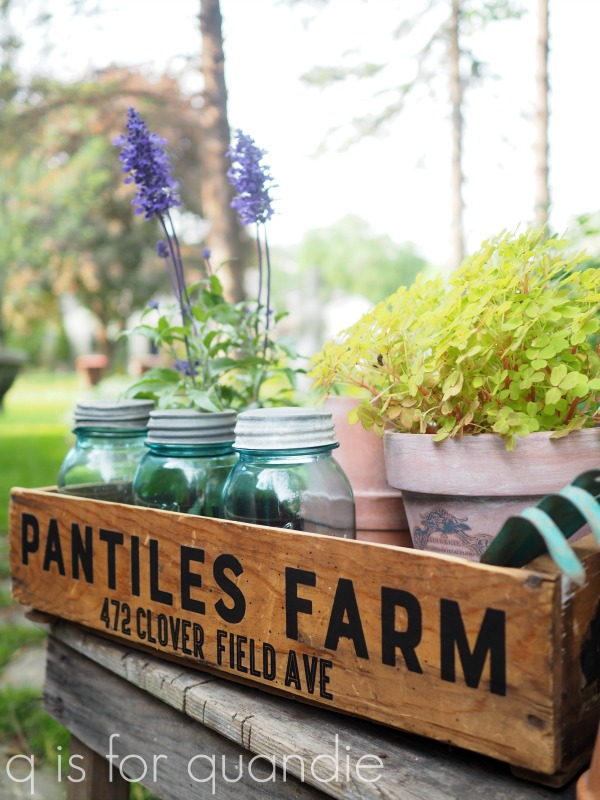
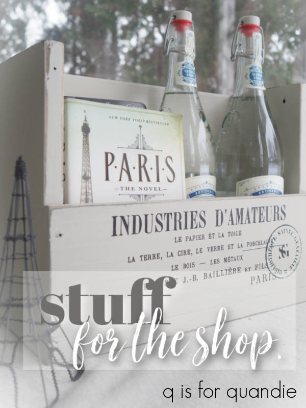
This next piece came from the thrift store looking like this …

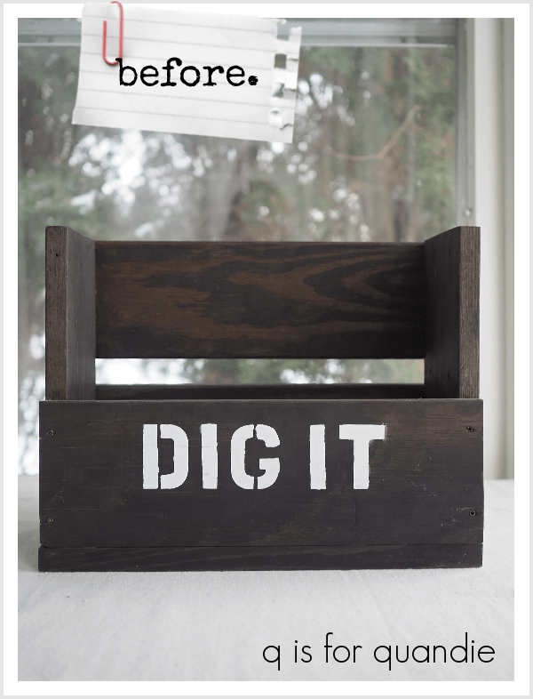
I’m not exactly sure what was meant by that ‘dig it’, maybe there were gardening tools inside originally?  Regardless, I didn’t really ‘dig it’ as is, so I sanded it down and painted it in Dixie Belle’s Sawmill Gravy and added some bits from one of my favorite IOD transfers, Label Ephemera.

It would make a fabulous gift basket filled with French themed items.

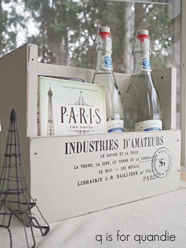
Another fun idea would be to put some potted herbs inside.  If I had some, I’d stage it up and photograph it that way, but I’m fresh out of potted herbs.  I’m pricing the crate at $24, without the contents.

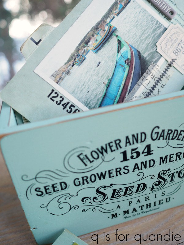
On the same visit to the thrift store, I picked up this little wooden tote.

I really didn’t care much for that handle, so I replaced it with something from my stash with a bit more of a vintage feel.

Then I painted the whole thing in Dixie Belle’s Drop Cloth including the handle, sanded to distress and added a few transfers.

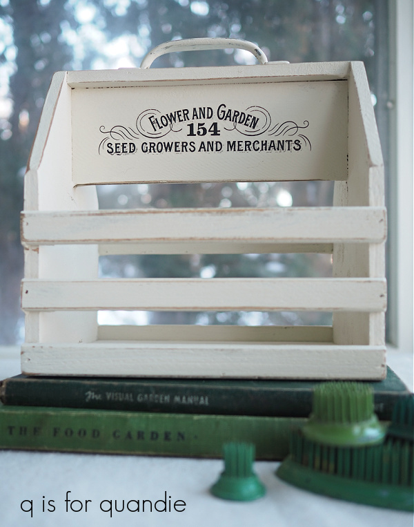
The black Flower and Garden transfer is one of re.design with prima’s Classic Vintage Labels, and the flowers on the sides are from the Dixie Belle Vintage Floral transfer …

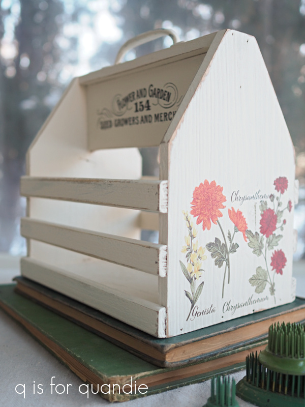
This little tote would be totally adorable as a gift basket, or even an Easter basket.  I can see it lined with faux moss and then filled with pretty Easter eggs.  Is it too early for Easter?

The flower crate is $18.

Next up, this lovely silver bowl.

It’s a little difficult to judge the size from that photo, but it’s a good sized bowl.  Maybe halfway between cereal bowl and punch bowl.  I love the embossed shield and crown.  I purchased this one at an estate sale last fall, not during my recent thrifting, but thought I’d share it here anyway.

I think this bowl would be gorgeous for a floral arrangement, maybe filled with peonies for example, like this smaller bowl I shared last summer …

The silver bowl is priced at $28.

Quick question for you guys; do you prefer to see silver freshly polished or with a bit of tarnish?  I’m a fan of the tarnished look, but I know it might not be everyone’s cup of tea.  Would you have polished that bowl before bringing it in to sell?

Next up is another item that I didn’t actually buy at a thrift store recently.  This … um, I have no idea what to call it …

Spiral thingie?  Does anyone know if these have a name?  I suspect it is some sort of desktop organizing item, and in fact that is what I had been using it for on my desk at the old day job.  I brought it home with me when I retired, but haven’t found a good spot for it at my house so I’m going to sell it on.

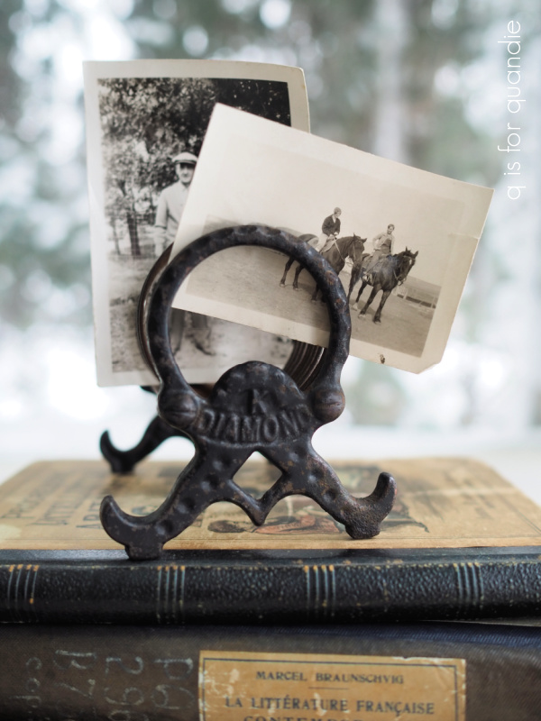
It’s perfect for displaying some old photos, and it’s priced at $12.

I brought in a couple of buckets as well.

I shared both of these back in December and was planning to take them in to the shop, but just never made it.

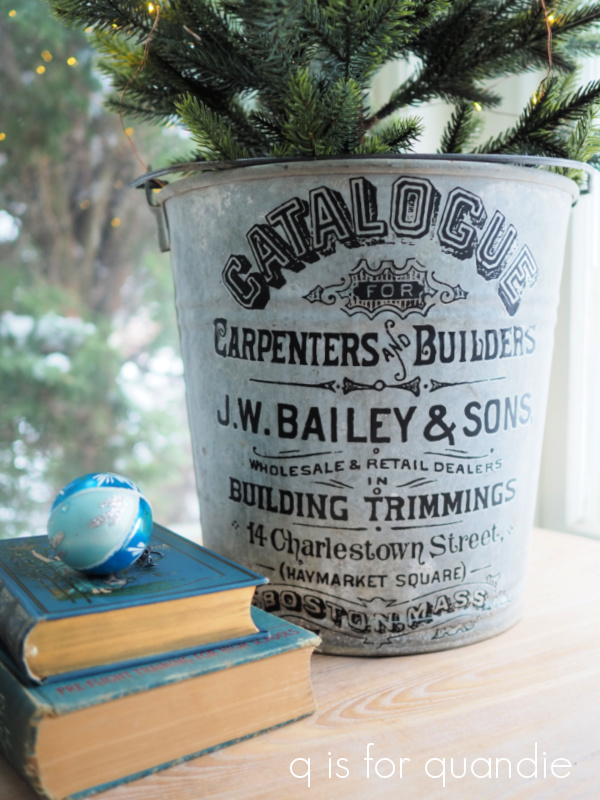
Although I staged them up for Christmas in these photos, these buckets can be used in so many different ways.  I use one as a trash can in my home office.  They also look great filled with peonies (clearly I’m craving spring).

The buckets are priced at $40.

Another item I’m bringing in is this mirror with a transfer …

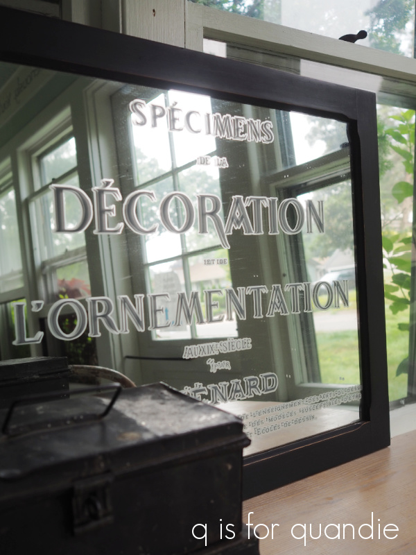
I posted this one here a while back and I still have it, so I’ll bring it in and hope it sells for $40.

I’m also bringing in this trio of vintage blue books.

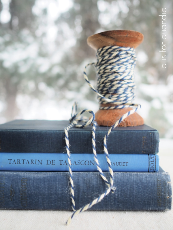
Books in similar colors are great for introducing different heights to your decorating vignettes.  The set of books is $10.

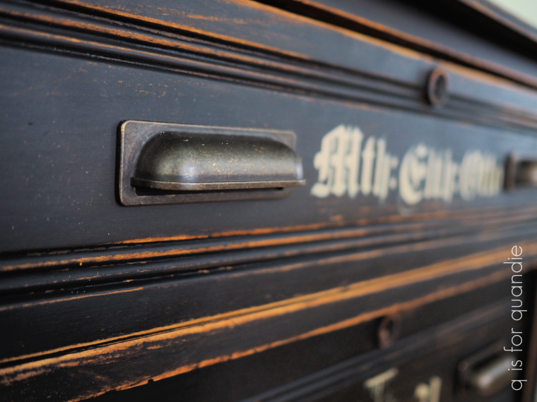
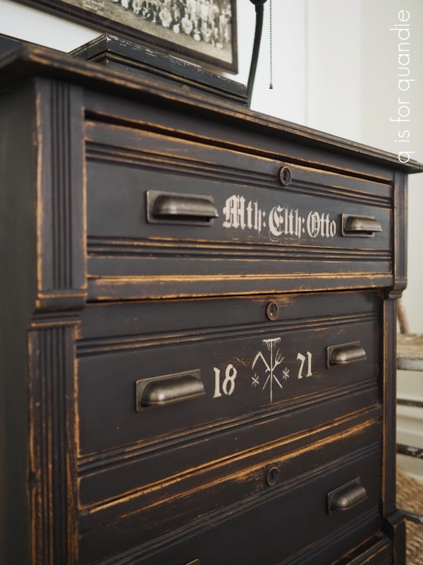
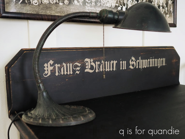
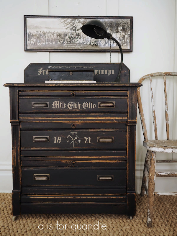
Of all my finds at the thrift store last week, I’ve saved the best for last.

I’m just putting the final touches on this barrister’s bookcase and I plan to share it here on Friday, so be sure to stay tuned for that.

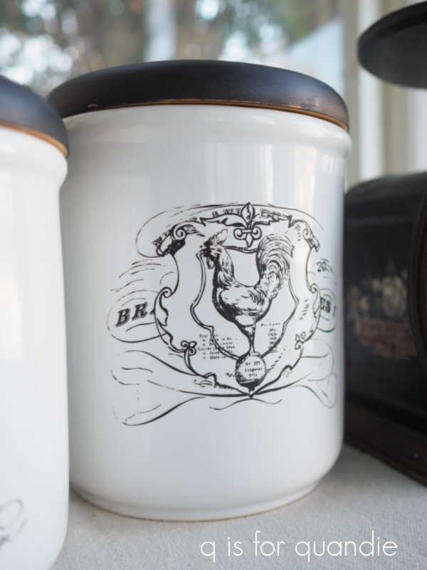
Finally, in case you are wondering, I do sometimes bring things home from the thrift store and hang on to them.  I saw this old flour cannister that had lost its lid and I immediately thought ‘tulips!’

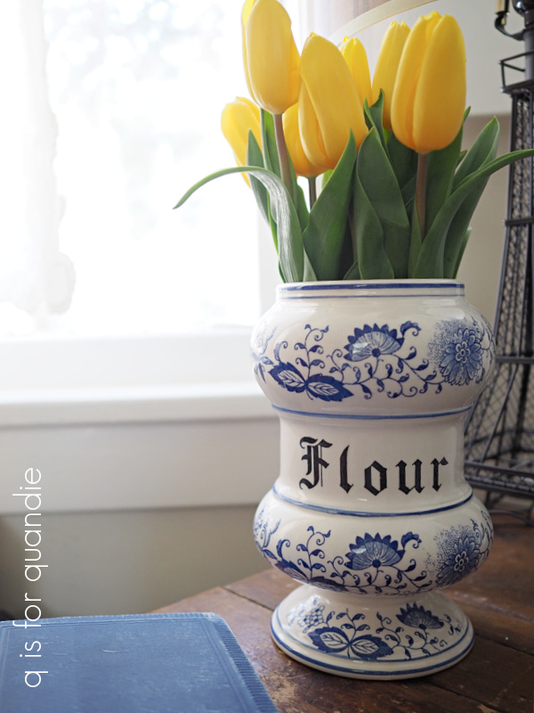
I suppose that the look of delftware automatically makes me think ‘Dutch’, which then makes me think ‘tulips’, but it does make an awesome vase for this bunch of yellow tulips that I picked up at Target.  It’s a great way to add a little touch of spring to these bitterly cold January days.  And spring is just around the corner … OK, maybe that’s optimistic thinking for January, but a little optimism never hurt anybody, right?

the turquoise tacklebox.

Some of you may remember way back in 2018 (gosh!  4 years ago!) when I dressed up some toolboxes with some prima marketing transfers.

I sold the black one and the green one, but the turquoise one … which actually is a tacklebox, rather than a toolbox … was one that had been gifted to me by my co-worker Jodie.  I wanted to keep it, it’s perfect for holding my hot glue gun and extra glue sticks.

I have to confess, those pink roses were never really ‘me’ though.  But somehow re-doing something that I keep inside a cupboard was never at the top of my to-do list while I was still working a full time job and blogging.  Now that I’m retired from the day job, I’m determined to get around to doing a few makeovers for myself, starting with this tacklebox.

The first step was to sand down the transfers a bit, just to smooth them out so that their outline didn’t show under a new coat of paint.

Next I cleaned the box with some soapy water.

I definitely wanted to keep that turquoise color, so I pulled out some Dixie Belle paint in The Gulf.

It was quick work to paint a single coat of paint over the box, and that was all it took to get the coverage I wanted.

Pretty good coverage for one coat, don’t you think?

After sanding to distress and vacuuming away the dust, I added a few words from IOD’s Label Ephemera transfer.

The number “05713” on the right is from a Tim Holtz transfer.

I added a topcoat of clear wax to bring out a little depth to the paint color, and to protect the paint job.

By the way, I did not paint that little plate that holds the handle in place, that’s the original color.  The Gulf was a pretty good match!

If I was planning to sell this one, I would have taken the time to paint the inside of the box as well.  But since I’m keeping it for myself, and since the color still works, I just left it alone.

This was such a quick and easy makeover.  I bet it only took me about an hour including dry time.  I guess I probably could have squeezed it in while I was still a working woman 😉

So, what do you think?  Do you prefer the ‘before’ or the ‘after’?  Are you a fan of the original rusty patina, or do you like the fresh paint job better?  And how about that color?  Should I do more toolboxes in vibrant colors, or do you prefer the more neutral look I usually do?  I’m curious about all of these things, so leave me a comment and let me know.

the primitive.

I know it’s not everyone’s cup of tea, but I’m rather drawn to primitive pieces.  It’s hard to find a definitive description of ‘primitive’ when it comes to furniture, but I’m referring to pieces of furniture that look like someone made it by hand, most likely out in their barn.  I’m also referring to pieces that have a very worn paint finish, and really just look like they have been around for 100 years.  That brings me to the inspiration photo for today’s piece.

I found this photo on pinterest when searching for ‘black painted dressers’.  I’m not sure where it originates from, so I don’t have any info on this piece.  But it was definitely the jumping off point for the dresser I painted last weekend.  I knew I could approximate this look with some black milk paint, and in case you are wondering I am going to forgo adding the dripping paint spill on that third drawer down.

I’m starting with this dresser that I purchased at my local ReStore a few weeks ago.

You’re probably not quite seeing any comparison to that inspiration photo just yet, but trust me on this one.

To start with, I really didn’t care for the knobs that were on this dresser when I bought it.

I don’t think that these knobs were original to the piece.  Usually this style of furniture has a pull that looks somewhat like this …

Or this …

Or this …

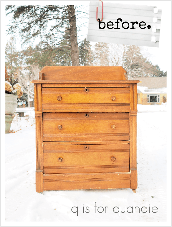
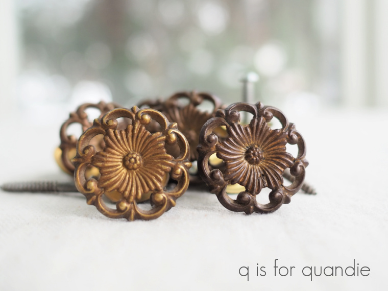
But this dresser only has one hole for a knob, so obviously it didn’t originally have drawer pulls that required two holes.  So I guess I’m really not sure if those knobs were replacements or not.  Either way, they had to go.

I wanted to get pulls similar to those on my inspiration piece, but have you guys tried to order things like this lately?  It felt like every affordable version I found online was out of stock, or only available in a shiny brass or chrome.  I ended up using some cup pulls that I found at my local Menards.

The other change I made to this dresser was to remove the wooden brackets on either side of that back piece.

I just didn’t like the look of them.  They were screwed in place from the back, so it was easy to remove them.  I took them off and then gave that back piece a wiggle to make sure it didn’t absolutely require them for support (which it didn’t).  I filled the holes where the screws went through the remaining back piece with Dixie Belle’s Mud.

Next up I cleaned the dresser using TSP Substitute.  This piece was pretty gross, so it required a good clean.  However, I did not sand it before painting.  I knew I was going to use milk paint, and I was willing to risk some (or even a lot) of chipping.

Today’s q tip:  Milk paint is intended to soak into the surface of bare wood.  When using it on a surface that isn’t bare wood, it will chip when it meets resistance to absorbing into the wood in the form of oils (such as grease, oily finger prints, furniture polish, etc) or previous finishes such as varnish, poly, paint, etc.  If you want to mitigate that chipping, you can be sure to clean off any oily residues using TSP or TSP substitute, and/or you can scuff sand your piece to break down previous finishes.

I chose to just clean my piece and not scuff sand because I’d be OK with some chipping.  If you’re worried about excess chipping with milk paint, do both.  Or use a bonding agent.

While cleaning the inside of the dresser, I found that it had been signed …

I think that’s definitely a clue that this piece was made by hand rather than by machines in a factory.

When I went to pull out my Miss Mustard Seed milk paint in Typewriter, I found that I only had about 1/4 cup of the powder left in the bag.  Yikes!  I was really nervous that this wouldn’t be enough paint for this project, but it turned out to be plenty.  Mainly because I ended up needing only one coat of paint.  I was going for a worn look anyway, so it was perfectly fine if I didn’t end up with fully opaque coverage.

Milk paint dries really fast, especially when you’re painting inside a heated house with pretty much zero humidity.  So once the paint was dry, I sanded my piece with vigor to get the worn look that I wanted.  I focused on areas that would have received more wear over time, like around the key holes and the edges of the drawers.

Next, I pulled out some of my European grain sack style stencils (from Maison de Stencils).  I knew I’d have some that could give me a look similar to the inspiration piece.

I used Dixie Belle paint in Putty to do the stenciling.

Finally, after vacuuming away all of the dust, I used Dixie Belle’s Big Mama’s Butta to seal the dresser.  I usually describe this product as halfway between hemp oil and wax.  It provides a little more protection than plain hemp oil, but not quite as much as wax.  I love using it over dark colors in particular though.  I think it really brings out the richness of the color.

I chose to line the drawers of this dresser with some map themed wrapping paper.  They had some ink stains that were a little unsightly, so I opted to add this last detail.

This was a fun one to work on and the perfect project for milk paint.

I think I did a pretty good job of creating the same ‘look’ as my inspiration piece, what do you think?

This dresser is the perfect size to use as a nightstand, it’s not terribly large.  It is for sale locally, so please check my ‘available for local sale‘ page for the dimensions and other info if interested.


how to dress for cold weather.

I was googling up some good cold weather quotes to use for this post and I saw this one:

Funny.

I never follow that advice though.  If I did, I’d probably have to stay in bed for about six months out of the year here in Minnesota.

I was exchanging emails with one of my readers over the past weekend and I mentioned to her that it was 11 below zero here.  She’s from Los Angeles, and she was wondering if anyone goes outside when it’s that cold (yes, I’m talking about you Connie!).

So the next day, when my sister, niece and I decided to go to Como Park for the afternoon I was thinking about Connie’s question.  As it turns out, yes Connie, we do go out when it’s that cold.  Sometimes we even go to the zoo.  We just have to dress accordingly.

That’s my niece Kris, my sister Debbie, and then me on the right.  I have to mention, that hat I’m wearing is the warmest hat I’ve ever owned.  It’s fleece on the inside and faux fur and knitted on the outside, and you can wrap those furry tails around under your chin to keep your neck warm.  Super toasty.

I found it rather comical that masks were required even in outdoor areas at the Como Zoo.  Do you think Covid can live in sub-zero temperatures?  Does anyone know?

Well, no matter.  The masks were great for keeping our faces warm.

One of the big benefits to going to the zoo on super cold days is that you have the place practically to yourselves.  Pretty much none of the benches are taken.

Another benefit is that the polar bear is really active.  He (she?  I don’t know which polar bear this was and the zoo has three of them) was in and out of the water (just look at that steam coming off of him), rolling around in the snow and trying to get that frozen hunk of meat detached from the ice.

And also apparently posing for photos.  My sister took that photo.

Other animals that seemed oblivious to the cold were the reindeer, the arctic foxes, the wolves, and the bison.  They were all out and about.

But for those humans that don’t happen to be cold weather lovers, you can always head inside the conservatory.

Once inside you’ll find lots of tropical plants …

not to mention lots of people trying to pretend like they live in a tropical climate in January.  I saw one girl meditating in the lotus position on a bench in the fern room.  I’m fairly sure she was chanting in her head “I’m in the Bahamas, I’m in the Bahamas, I’m in the Bahamas” or something like that.

But really the main reason I like to go this time of year is to see the poinsettia display.  I almost missed it, but it runs through January 9 so we made it in time.  They had an interesting display for 2021 with red, orange and yellow ones.

The red one in that photo is a new variety called ‘Christmas Mouse’ because of its more rounded bracts that resemble the shape of mouse ears.

I love that they change it up every year, but I have to admit that this particular color combination was not one of my favorites.  It was very cheerful and colorful, but I’m just not a a yellow and orange girl.  And definitely not for Christmas.

As we were heading out after our visit to Como Park, all three of us agreed that our favorite part of the day was having the outside mainly to ourselves.  I guess all three of us are truly Minnesotan’s at heart.  Not only do we prefer cool temperatures outdoors, but we also prefer cool colors in our poinsettias.