

I was online recently and saw that IOD has released another version of their ‘Pots’ transfers. This time it’s called Traditional Pots and you get 4 sheets of the transfer designs; two in black, one in white and one in blue!
I’ve been a fan of these ‘Pots’ transfers going way back. The first few sets I had came in a grey color and were called French Pots I, II, III and IV. Each set only included 3 of the various designs, rather than all of them. I used one of those on a galvanized watering can once and that wasn’t such a good choice.
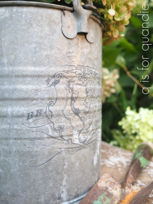
The grey really disappeared on that galvanized metal.
However, that being said, it did work great on other surfaces if you like this more subtle look …

Then they switched to black with their Classic Pots, which worked much better on galvanized metal.

But now, they’ve added white and blue with Traditional Pots. How exciting is that? Or am I the only one to find that thrilling?

A quick q tip for today. When ordering online, be sure you are ordering the set you want. I see all three versions of these transfers still available out there, so pay attention to which one you are looking at.
![]()
To recap; French Pots = grey (and only 3 designs in each), Classic Pots = black, Traditional Pots = blue, white and black.
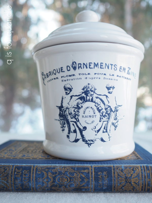
Anyway, I ordered a set of the Traditional Pots online and while waiting for them to arrive I stocked up on potential transfer candidates at the thrift store.

Once I started looking for white porcelain, I found a fair bit of it.
Then it was as simple as washing it all up and applying some transfers. As always, use care when applying transfers to glass/ceramics/porcelain. They are attracted like a magnet and once any part of the transfer touches the glass, it is stuck. Make sure you have it aligned properly before you get to close to the surface.
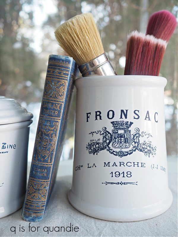
Doesn’t that blue look amazing? It totally takes that cannister from boring to simply fabulous.
This next one is my favorite …
I even added just a couple of lines of blue text to this little ironstone dish.

Such a tiny detail, yet it adds so much.
This little pitcher was one of my picker’s finds, and the blue edges it already had made it the perfect candidate for a blue transfer.

I have just one complaint about this new set of Traditional Pots transfers … that they aren’t ALL blue!
In addition to the one sheet of blue, there is one sheet of white transfers. I have to admit, I’ve never been much of a fan of the white transfers. I’ve always felt like they left too much of a shadow around the edges (like on this piece). But these look pretty darn good.
![]()
You might see a few more black toolboxes with white transfers from me in the future. This toolbox contains a bunch of my scrapbooking supplies (why can’t I part with them? I rarely scrapbook anymore) so it’s not for sale.
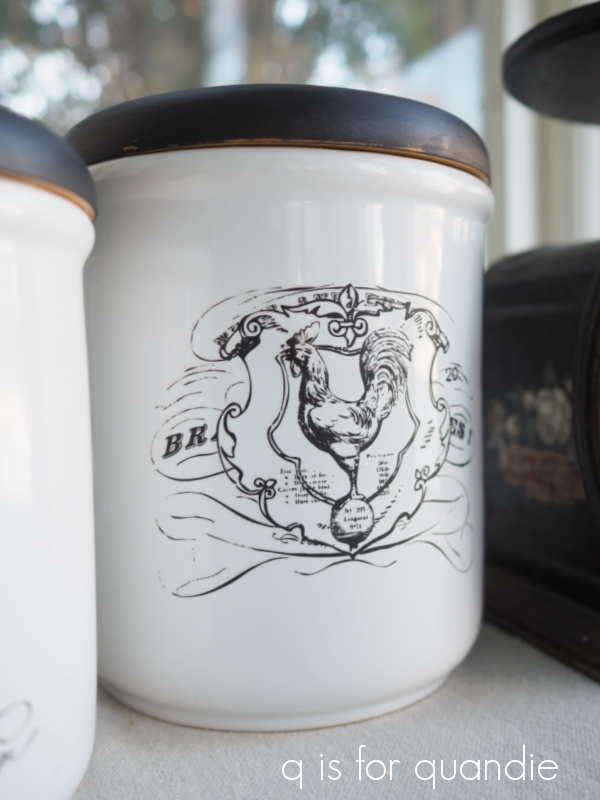
And then of course, there are two sheets of the black versions included in the Traditional Pots. Not that I don’t like the black ones, obviously I do since I’ve been using them for a while.
Remember that adorable button box!

That’s one of the older Classic Pots transfers, and you do get this same transfer in black with the Traditional Pots.
Since I had a feeling about the blue transfers that was very similar to how I assume hoarders must feel, I decided to use black ones on the pair of cannisters (thus hoarding the remaining blue transfers).

I painted the wooden lids black using Dixie Belle’s Midnight Sky to work with the black transfer.
I used a black transfer on the enamelware refrigerator box as well.

The question I’m always asked when I use transfers on glass, or on enamelware, is whether or not I put any sort of sealer over them, and I do not. I find that the transfers really want to stick to these surfaces (sometime even more than you want them to!). However, I would advise gentle handwashing only. If you scrubbed on them, I’m sure they would scratch. But gentle washing with warm soapy water is fine.
So, what do you think? Are you as big a fan of the blue transfers as I am?
I brought most of these items into the shop last week, so I’ll have to see whether they sell well or not. I’ll be sure to keep you posted.

I really like the blue, of course blue is my favorite color but I also like the black on those canisters with the black lids.
LikeLike
Thanks sis!
LikeLike
You inspired me! I have quite a few tool, fishing and small boxes. I did a transfer on a tackle box. I’m pleased how it turned out. Now if I could just paint as well as you 😉.
I like the different color transfers . I use more red in my house but blue is most popular.
Smiles, Alice
LikeLike
One caution about these Pots transfers; many of the designs are a bit curved to go on curved items like pots (or cannisters for example) and they can look a little wonky on flat surfaces like toolboxes, etc. You can still use them, and some are more curved than others (take a look back at the button box above for a visual), but just something to keep in mind.
LikeLike
I agree with you that the blue transfers are amazing! My favorite is the blue on the pitcher with the blue trim. If I am completely honest, that pitcher caught my eye before that transfer was added and once applied….oh my I am in LOVE!
LikeLike
Thanks Deborah!
LikeLike
I love the blue transfers! It gives a more vintage European flair than the plain white.
LikeLike
I agree 🙂 Love them!
LikeLike
Oh man….love these! Love the blue pitcher especially, but the black transfers with the painted black lids is alsoexceptional! Takes them from drab to fab! ❤
LikeLike
Thanks Terri!
LikeLike
I love the blue too. Blue and white always looks so clean and fresh, a nice change from black and white. Although I think both combinations are classic and have a difficult time selecting a favorite.
LikeLike
Yes, I suppose part of the appeal of the blue is that it’s new and different and I’ve been using the black ones for so long. It is a nice change!
LikeLike
The blue is stunning! For some reason it reminds me of French toile. The black on the enamelware with the painted black lid looks great too, but that blue makes my heart go potter-patter. These are going to sell like hotcakes.
LikeLike
Fingers crossed!
LikeLike
I LOVE the blue Miss Quandie! It is AB FAB and has its own deeply traditional look…….Not sure if I’d love it as much on white furniture, but maybe. On the white ceramic, though, it’s killer. I just now looked at last Friday’s post (I was unavoidably AWOL that day!) and woooooooo weeeeeeee! it is gorgeous! I love love love it! If you had a “SURPREME” category, that would be in it!
LikeLike
Yeah, I think you might be right about that Connie. Not sure I would like the blue transfers on actual furniture either. And thanks re: Friday’s barrister bookcase! I was very pleased with how that one turned out too 😉
LikeLike
Oh my I do wish you lived closer to me at Wasaga Beach, Ontario, Canada. All of these are absolutely gorgeous. I love them….How are Mom and Sis doing? We are having an unbelievable snow storm here. Regards Bettty
LikeLike
Well, enjoy that snow Betty! I bet it looks pretty 🙂
LikeLike
I like blue the best too!😍
LikeLike
It is pretty awesome 😉
LikeLike
I am a collector of blue and white so these transfers are fabulous! Thanks for the heads up. I love, love, love that little pitcher your picker found. Is that enamelware or just made to look like it? Either way, very cute!
LikeLike
Thanks! It’s not enamelware, I think it’s just pottery of some kind.
LikeLike
All fabulous as always!
LikeLike
Thanks Melissa!
LikeLike