winter isn’t over yet.

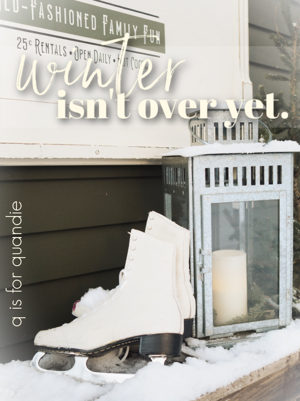
Spending last week in sunny Las Vegas and then returning home to sub-zero temps reminded me … winter isn’t over yet.  At least not here in Minnesota.  We still have plenty of winter left.

I don’t know about you, but I’m usually at a loss when it comes to decorating after the holidays are over.  As much as I’d like to jump right into gardening season, it just isn’t reflective of our weather reality in a northern climate.

So when I saw the Skate Rental stencil while perusing the Wallcutz website, I decided that although it’s listed in the Christmas stencils section, it’s really more ‘winter’ than ‘Christmas’.  It would be perfect for the part of winter that comes after Christmas, but before spring really arrives (which seems to last about six months in Minnesota).

My next task was finding something to put the stencil on.  I was super happy with how my Rudolph & Co. foot board sign turned out, so when I saw a headboard/foot board combo for sale on Facebook Marketplace I jumped at it.

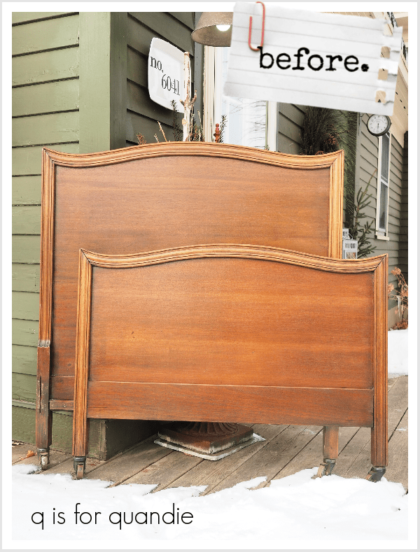
I snagged this set for $35.  The seller didn’t have the side rails, and I suspect that’s why she’d priced it low.  So for a mere $17.50 each, I had the raw materials for two signs.  I think I’m going to hang onto that foot board for another Rudolph & Co sign, but the headboard was perfect for a Skate Rental sign.

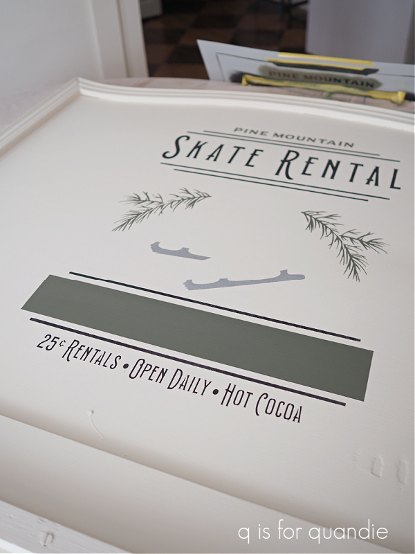
As a bonus, the nice people at Wallcutz agreed to sponsor this post by sending me the stencil free of charge.  So I measured the headboard to determine what size would be best and sent in my request for the largest version of the stencil, 26″ high by 18″ wide.  One of my favorite things about Wallcutz is that you can order their stencils in a variety of sizes to suit your particular project.

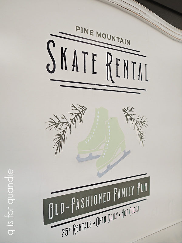
I started by painting the headboard in Dixie Belle’s Drop Cloth, my favorite warm white.  Then I started stenciling.  I knew that I wanted to use more than one color to give my ‘sign’ a more custom look.  I also knew that I was going to be hanging it on my dark olive green house, so I wanted to work with that color.

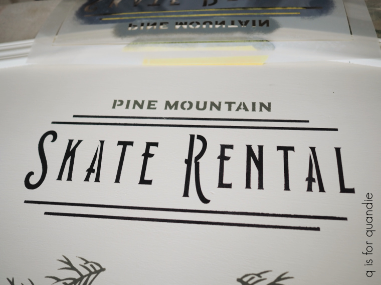
So I began by taping off various sections and stenciling them.  Most of the wording is done using Dixie Belle’s Caviar, except for “Pine Mountain” which is stenciled in the Juniper from Suzanne’s Fall Colors collection.  The pine boughs are also stenciled in Juniper, naturally 😉

Taking a cue from the example of this stencil on the Wallcutz website, I decided to paint in a block of the Juniper and then stencil the “Old-Fashioned Family Fun” over that in Drop Cloth at the bottom of the design.  I simply used the stencil as a guide to mark the area where I wanted my block, then taped it off and painted it in with two coats of Juniper.

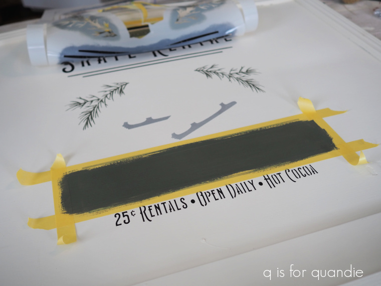
Once dry, I removed the tape …

 and then I put the stencil back in place and stenciled the wording over it.

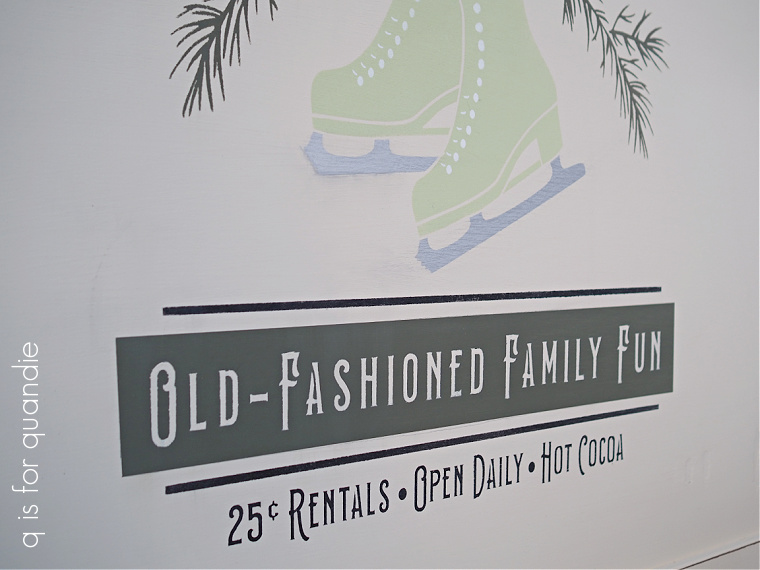
The blades of the skates were stenciled using Dixie Belle’s Gemstone Mousse in Diamond.

The skates themselves were stenciled using DB’s Farmhouse Green.  The laces are a separate stencil, and I added them once the Farmhouse Green was dry using DB’s Cotton.

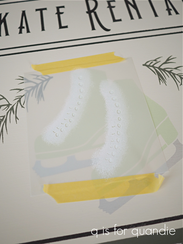
I wanted a whiter white for the laces, so that’s why I went with the Cotton instead of Drop Cloth.

One last thing to note, I often fill in the bridges with a fine artist brush when stenciling.

Today’s q tip:  if you want a stencil to look like a hand-lettered sign, fill in the bridges.  If you want a more industrial, stenciled look, don’t fill in the bridges.

If you aren’t familiar with the term, bridges are the gaps in a letter (or other design element) that are necessary to hold the stencil together.

It’s fairly easy to fill those in with a small artist brush, and I think it makes a big difference to the end result.

Since I’m keeping this sign for myself, I’m being way less cautious (ie. more lazy) than I would be if I was selling it.  I just gave it a quick coat of Dixie Belle’s spray on wax to seal it.  For maximum durability, I probably should have used a clear poly sealer … but hey, whatever.  If it doesn’t hold up, no worries.  I’ll just re-do it.

I have the perfect spot to hang this on the side of my house next to the door.

This is the door that we use on a regular basis (rather than our front door), so I get to admire the sign every time I go in and out (which isn’t all that often in this cold!).

What do you think?

If you have any favorite decorations for this part of winter, be sure to leave a comment and share your ideas with all of us.

Thank you to Wallcutz for providing the stencil, and to Dixie Belle Paint Co. for providing the paint used for this project.

a visit to the library.

I gave up reading ‘real’ books quite a few years ago.  At least when it comes to fiction.  And by ‘real books’ I mean those made out of paper with a cover.  It’s just so much easier to read on my Kindle.  It lights up at night, I can make the font larger (good grief, I feel old when I say that), and I can take a bunch of books with me on a trip without weighing down my suitcase.

So I hadn’t stepped foot in a library in years.

My mom, on the other hand, is a regular patron of her local library.  She needed to return some books, and get new ones, while I was out there last week so I went along for the ride.  I was pleasantly surprised to find that her library had quite a lot of decorating books that appealed to me, so I used my mom’s library card to check a few of them out.

I spent a good part of my time out there pouring over these books, so I thought I would do a quick review on each for you guys.  Just in case you’re in the market for a new decorating book.  Or perhaps you want to go see if your library has some of these!

I’ll start at the top of the pile and work my way down.

Modern Farmhouse Made Easy by Caroline McKenzie was the newest of the books in my pile having been published in 2021.

If you’re one of those who is in agreement with the ‘farmhouse is out’ opinion out there lately, this book might be a good one for you.  There are lots of good examples on how to give the farmhouse vibe a more modern twist …

But with plenty of vintage appeal to keep me happy too …

I enjoyed the section on ‘how to get the look’ depending on whether your style is traditional, rustic, minimalist or cottage.

It was fun to see a couple of houses in my neck of the woods used as examples for exteriors, one in Stillwater and one in Ellsworth, Wisconsin.

My only problem with this book was that much of it felt unattainable to me (ie. way out of my price range) and most of the homes shown were new construction.  It was definitely worth checking out from the library, but doubt I would ever purchase this one.

Next in the pile is Restore.  Recycle.  Repurpose. by Randy Florke with Nancy J. Becker.

This one was published in 2010, and is a Country Living book.  I tend to really like the Country Living books, so even though this one is around 12 years old I thought it would be worth a look.

The focus of the book is on how to be ‘green’ through reusing vintage finds, which is right up my alley.  It included lots of practical ‘how to’ info, and I loved that many of the examples were from genuinely old homes.

Some of the décor shown was perhaps a bit outdated, but a lot of it felt timeless to me.

One piece that really jumped out at me was this desk …

We’ve all seen these old (super heavy) mid-century steel desks, and I love how this one is painted in that gorgeous turquoise.  The next time I see one of these for sale I may have to take a second look.

Flea Market Chic by Liz Bauwens and Alexandra Campbell was published in 2012.

This one had a plastic cover over it, so it was tough to get a good photo of that cover.  I wasn’t about to deface a library book by trying to remove it.

This book has a distinctly UK vibe that always appeals to me.

I always keep an eye out for painted furniture inspiration too, and this book had plenty of it.

The Rachel Ashwell book, My Floral Affair, was published in 2018.

Are there any other Rachel fans out there?  I have to say, I still absolutely love everything she does, even if I no longer have much in the way of ‘shabby chic’ in my own home.  I actually own most of her books, but had never seen this one before.

It’s filled with gorgeous floral eye candy, whether it’s real flower arrangements …

pretty floral china …

or subtly flowered wallpaper …

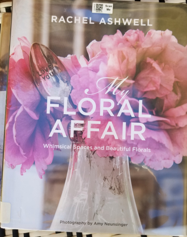
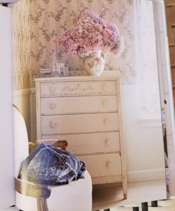
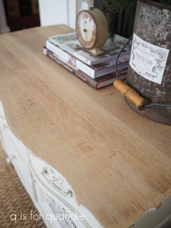
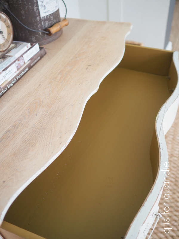
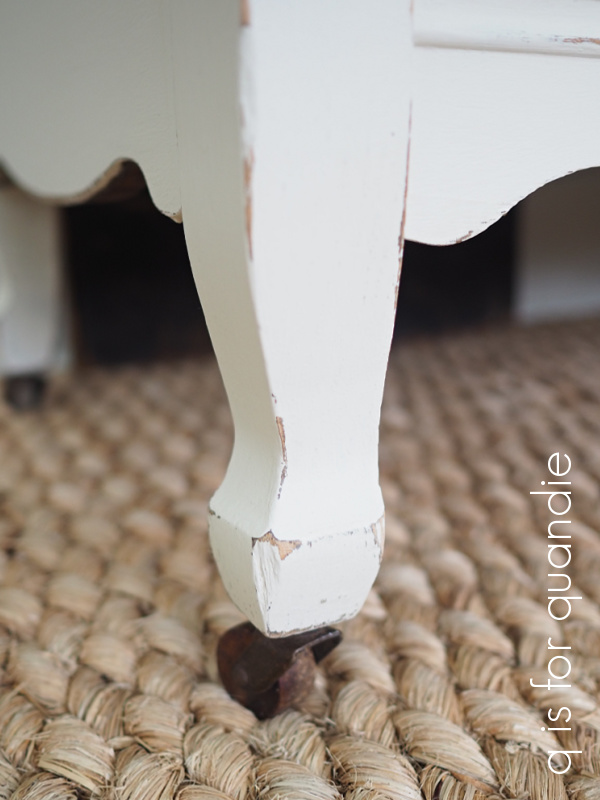
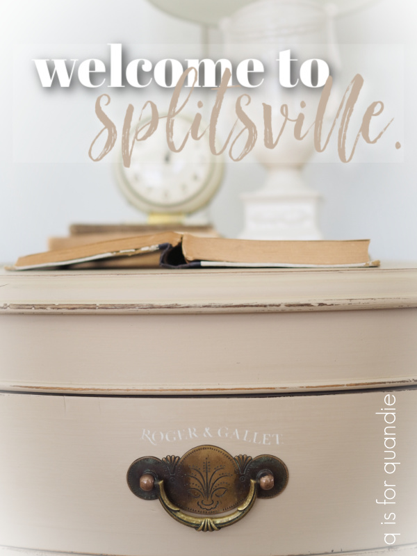
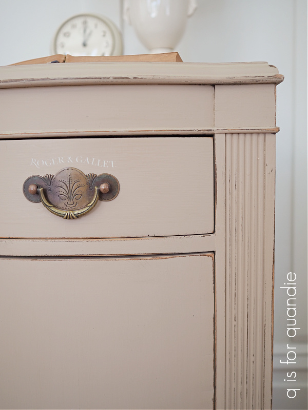
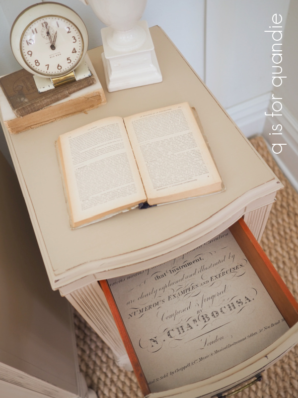
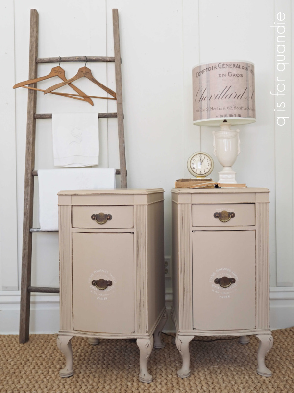
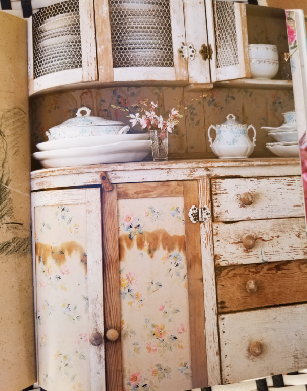
There are a few examples of classic Rachel Ashwell shabby chic style painted furniture too.

I have to confess, it makes me a bit sad that this style is no longer as popular as it once was.  I’d love to still be creating pieces like the one above, but I fear that they wouldn’t sell well.  Any opinions on that?

Of all the books I’m sharing today, this is probably the only one that I would actually purchase.  And you know what?  The more I think about it, the more I think that the next time I see a gorgeous set of old floral plates at the Goodwill I’m going to buy them and start using them.  Who says you can’t have pretty mismatched floral china?  Who cares if it’s no longer trendy, right?

That brings me to the bottom of the pile and The New French Décor by Michele Lalande.

Published in 2007, this is the oldest of the books I checked out.  It’s translated from French, and thus it has a very authentic European vibe.

Much of the featured décor has that mad scientist feel, if you know what I mean.

Lots of taxidermy, animal sculls, labeled apothecary jars and creepy anatomy drawings.  If you’re into that look (and I know there are plenty of people who are), then this book is a good option for you.

There was some fabulous painted furniture inspiration in this book as well …

One of my favorites was this Swedish piece …

And I was inspired by this snowy garden photo.

Clearly I need some of these mini greenhouses to pop up out of the snow in my garden.  Although they’d have to be a bit taller, I think this size would mostly just be buried in snow in my garden.

My friend/picker/ex-coworker/garage sale mentor (she has a lot of titles!) Sue recently suggested that I check out our local library, so I might just have to head over there and see what kind of decorating books they might have.

How about you?  Do you have a library card?  Or maybe you own some of these books, or see one that looks like it could be a favorite?  Or maybe you have another favorite decorating book that you’d like to recommend.  If so, be sure to leave a comment!

just around the corner.

And just like that, I’m back from visiting my mom.  Isn’t it funny how trips fly by so quickly?  Oh, what am I saying?  Time in general just flies by so fast these days, am I right?

I had a lovely time visiting my mom.  The Las Vegas area was experiencing a warm spell last week and temps were above average while I was there, so I was able to enjoy five glorious, sunny days in the 70’s … only to return to -8 in Minnesota!  Jeesh!

That patio makeover that my sister and I gave Mom last year is really paying off.  I spent a fair amount of time sitting on the patio, soaking up that warmth with a cup of coffee and a good book from the local library.

I’ll be sharing reviews of those books later in the week, so be sure to stay tuned for that.

I also visited the Goodwill that is literally just around the corner from my mom’s place.

I usually stop in there when I’m visiting.  Although obviously it’s not like I can buy much, only items that I can fit into my suitcase.  But honestly, that’s not usually much of a problem since they don’t typically have much in the way of my kind of vintage out there.

This is a good example of the usual sort of thing I see …

Creepy, right?

But this visit was the exception to the rule.  I saw a couple of items that I wished I could purchase starting with this copper boiler …

It was $19.99 and I would have snatched that up in a heartbeat if I was at home.  It would have made a fantastic window box like the ones I have on my carriage house and photo cottage.

Of course, mine are just galvanized.  Copper would be so much more fabulous!

I also saw this adorable kid sized antique roll top desk.

It was also $19.99.  And it would be such a fun project!  Can’t you just picture it painted in some chippy milk paint?

By the way, my mom’s Goodwill offers a much better senior discount than mine here in Minnesota.

She can get 40% on Wednesdays, and 20% all other days.  At my Goodwill I get 25% on Wednesdays only.  I was surprised to find that these details were different in a different part of the country.

I did find one thing I could purchase, this set of canisters …

They were half off (with an orange tag), so a bargain price.  And to be honest, even more of a bargain for me since my mom insisted on paying for them!

There are actually three in the set (they were all stacked inside of each other at the store).

And being able to stack them meant I could fit them into my suitcase!

The wooden lids on these do not fit tightly, so I knew they would not be suitable to use for food storage.  But I thought they’d be great for storing art/crafting supplies.

Another great option would be to use them on your potting bench and fill them with seed packets, flower food, or garden tools.   Gardening season is also just around the corner!

They had lots of possibilities, so I brought them home and gave them a quick makeover.

I started by giving them a good cleaning, including using a Magic Eraser to get any scuff marks off.  Next up I added some of my favorite IOD Pots transfers to them.

These are the black ones from the Classic Pots version of the transfer, although the black ones in the newer Traditional Pots set look pretty much the same.

I ended up painting the lids black using Dixie Belle’s Caviar.

Originally I thought I would leave the lids ‘as is’ because I liked the sort of faded driftwood-ish appearance of them, but once the transfers were in place I felt like black was a better option.

I finished everything up with a coat of clear wax for some protection.

I’ll probably bring these into the shop on Wednesday, so if any of you locals need some canisters for your craft room or potting bench be sure to stop in.

I had a very relaxing get away at my mom’s.  I have to say, now that I’m retired it practically feels as though my mom’s place is just around the corner.  It’s a quick 3 hour flight, and I can generally find some pretty good deals on flights to Vegas.  Now that I don’t have to ‘use up’ vacation time to go, I think I’ll be visiting much more often.  In fact, my sister and I already have a trip out there booked four weeks from now and I’m already looking forward to some more of that warm weather!

the do-over with a twist.

I’ve posted my share of do-overs here on the blog, pieces that didn’t sell for whatever reason and thus they get a 2nd makeover.  But today’s post is a do-over with a twist.

I came across an ad for a dresser on Facebook Marketplace recently, and here’s the picture that was included in the ad.

If you’ve been following me since 2017, this might look familiar to you.  It sure looked familiar to me!  I painted, and then sold, this one five years ago.

It always startles me a bit when I see my pieces being re-sold.  This isn’t the first time it has happened, but this is the first time that I decided to go ahead and buy it back!  The price was right, and I had a pretty good idea what the condition of the dresser would be (assuming the new owners hadn’t done significant damage in five years).  In addition, I knew that I had painted it in Fusion Mineral Paint, and therefore it would be fairly easy to paint over it.

Just for fun, here is what this dresser looked like when I originally purchased it.

And if you go back and read that original post, Ken did a fair amount of repair work on this piece before I ever got around to painting it.  Plus I replaced all of those knobs with pretty glass.  So why let all of that go to waste?

So I bought it back.

This time around I decided to ditch the mirror completely.  Last time I shared photos of the dresser with and without the mirror, but included it with the dresser to be used at the new owner’s discretion.  To be honest, I never really liked the way the mirror looked though so I separated the arms that held the mirror from the trim piece at the back.

I’ll do something with the mirror on its own down the road.

Next I just gave the entire piece a scuff sand and a good cleaning, and then repainted it in a custom mix of Dixie Belle Silk paint.

This mix is probably about 3/4 Tide Pool to 1/4 Hampton Olive.  I just mixed a little of the Hampton Olive at a time into the Tide Pool until the color felt right to me.

The Hampton Olive tones down the brightness of the Tide Pool just a bit, and adds a little more green to the mix as well.

I have to apologize, I struggled to capture this color accurately in my photos.  White balance can be a challenge sometimes, and this is one of those times.  Oddly enough, my camera did the best job of capturing the color in this close up photo of the gold frames.

But this is also one of those chameleon colors that changes with the light, and depending on what colors are next to it.

So I did my best.

One thing to always keep in mind when you are painting over pre-existing paint is that when you distress the edges you are going to see some of that original color.  So in the case of this dresser, that is going to include both the black and the white.  The white was more obvious than the black though, so I tried to distress very gently over the upper portion of the dresser that was white.

I’ve always loved the combination of this blue-green color with gold, so I decided to add a gold transfer to it.

These are all sections from re.design with prima’s Somewhere in France transfer.

It’s subtle, but I love that it added a bit of bling.

To continue with the gold, I added some gold gilding wax to the key holes as well.

So what do you think of this simple do-over with a twist?

Which is your favorite look?  No. 1, No. 2 or No. 3?

Be sure to leave me a comment and let me know.

This dresser is for sale, so if you are local and in need of a pretty dresser, be sure to check out my ‘available for local sale‘ page.

Thank you to Dixie Belle Paint Co. for supplying the paint used in this makeover!

elevating the ordinary.

My sister and I popped into one of our local garden centers (Gertens, for any of you locals wondering) a week or so after Christmas.  We just happened to be in the neighborhood, and thought maybe they’d have some Christmas stuff at a steep discount.

And sure enough, all of the Christmas stuff was 75% off.  I purchased some fun starburst lights that I’m going to use in the front window box next year, but I also found this large glass cloche in the Christmas section.  I have no clue why it was considered a Christmas item, do you guys have any guesses?

I know it’s hard to tell the size from that photo, but it’s about 16″ tall and a foot wide.  It was originally $79.99, but at 75% off I got it for around $20.

I couldn’t resist it.  You just gotta love a good cloche, right?

Once I got it home, I decided it needed a good base to go with it.  I happened to have some large wooden chargers that I received from re.design with prima back when I was a content creator for them.

The chargers come in three different sizes, 10″, 12″ and 14″   …

Back in early 2019, I had dressed these up with some paint and transfers.

I sent them in to the shop to sell, but only the top one went.  That, by the way, is the French Ceramics transfer that re.design with prima recently re-released because it was in such demand.  It is fab, isn’t it?

The bottom two eventually came back home with me and have been awaiting a do-over.  The largest one happened to be just the right size for this cloche.

So I sanded down the transfer a bit first.  Not enough to remove it completely, but just enough to smooth out any edges that would show through paint.  Then I painted over it with Dixie Belle’s Drop Cloth.  Once that was fully dry, I pulled out my IOD Brocante transfers.

I think you’ll probably agree that there was an obvious choice staring me in the face.  Yep, the clock.

The clock was literally the same exact diameter as my new cloche.

It was about at this point that I realized that putting anything on the charger, inside the cloche, was basically just going to cover up that cool clock.  Duh.

Well, no worries.  I gave it a shot and decided I like the look after all.

No, you can’t see all of the clock, but you can see that it’s there.

Somehow putting even the most ordinary items inside a cloche elevates them to something special.

For now I’ve got some books, a vintage camera and an old photo of my grandmother on display.

Do you have any cloches?  And if so, what’s under yours?

a british bird cage.

As I mentioned last week, I’m actually off visiting my mom in Las Vegas this week!  But not to worry, I have scheduled a few posts in advance, just to keep you company while I’m gone.

I went thrifting with my picker/ex co-worker/friend Sue last week and one of the items I came home with was this giant bird cage.

I’m not sure if you can judge the size of that thing in that photo, but it is about 40″ tall and 18″ wide and deep.

I think the best thing about it is that it comes apart easily.

So, not only easy to transport, but easy to fill the inside with whatever you want to put in there.  A pretty fern?  Some books?  Some sweet concrete birds?

Just don’t plan on putting a live bird in there, this thing is for décor purposes only.

I love all of the layers.  Maybe simply because it reminds me of a big wedding cake, and I could really go for some cake right now.

Of course I had to give it a little bit of quandification.

I lined the pull out tray with some Cavallini London map paper.

Then I added just the smallest bit of wording above each of the doors.

Are you sensing a bit of a theme here?

The transferred words and date are both from IOD’s Label Ephemera transfer.

How fun would it be to add different things inside for each season?

This cage is really too large for my small house, but for someone with larger rooms it would be fantastic.

So, if any of you locals are interested, yes, this slightly British bird cage is for sale ($48).  Send me a quick email at qisforquandie@gmail.com or leave a comment on this post if you are interested and we can set something up for when I return from my mom’s house.  And if no one calls dibs by the time I get back, I’ll be taking this one in to Reclaiming Beautiful.

What do you think?  Do you need a British bird cage?

a little less factory.

A while back my picker found this little cupboard for me.

I have to say, I’m pretty sure that she has a lot more faith in my abilities than I do sometimes.

This is a new-ish piece made out of that factory coated, shiny, particle board stuff.  I really wasn’t sure I’d be able to do anything with it, so it sat out in the carriage house for months.  But I pulled it out a couple of weeks ago and decided to give it a go, with my main goal being to make this cupboard look a little less factory-made.

After removing the knob, I sanded all of the surfaces inside and out to take off a little of the shine, and then gave it two coats of Dixie Belle’s Slick Stick.  As per the Dixie Belle website, “Slick Stick allows you to paint shiny, slick, or slippery surfaces with ease. Surfaces like PVC, glass, Formica, laminate, metal, and more are easily painted and stay painted.”

Next up I painted the inside of the cupboard in Dixie Belle’s Kudzu.

I just love that green!  This is the color that I debated using on the washstand that I shared on Wednesday.  I decided against it for that piece, but I had to use it on something!  It’s gorgeous paired with the Dixie Belle Drop Cloth that I used on the exterior of the cupboard.

I dug through my stash to find a substitute handle that felt a little more vintage to me.  I painted that in an undercoat of Kudzu, followed by a couple of coats of Drop Cloth.

I think this handle goes a long way towards making this cupboard feel more vintage and less ‘factory’.  It’s a vast improvement over that dinky little wood knob it came with.

Ditto the gold transfers that I added to the glass.

These are from a mish mash of re.design with prima transfers.  I used left over bits from Flower Collector, Cosmic Roses, and the bee is from their Gilded Home & Nature transfer.

This cupboard can be hung on the wall, or set upon a shelf, desk or table somewhere.  It would be perfect for housing some of my matte white pottery.

But I’m not keeping this one.

It is up for grabs to a local buyer, so be sure to check out my ‘available for local sale‘ page if interested.

Tell me, what would you display inside this cabinet?

the “not from the 70’s” washstand.

If you’ve followed me for long, you know that I love working on washstands.

These pieces make perfect bedside tables.  And really, they are very versatile.  You can also use them in a foyer, next to the sofa, between two chairs, in the kitchen, add a vessel sink and use it in the bathroom, and on and on.

So when I saw this washstand on Facebook Marketplace I jumped at it.

I think the ad had been up for 27 minutes when I responded.  Lately it seems like I have to be quick to be the first in line.  I inquired on five pieces last week, and I was only able to purchase two of them (you’ll see the other one down the road a bit).  There are plenty of these out there that aren’t selling quickly, but they are the ones priced at over $100, even as high as $200 or $250.  When pieces are in my price range (as this one was), they go fast.

Anyway, the person selling this was not terribly knowledgeable about furniture.  It was listed as “table, with drawers, likely 70’s built”.  Hmmmm.  Not exactly.

I remember the 70’s, and this is not what they looked like.

I wouldn’t exactly call it a table either.  However, it does have drawers.  I feel fairly sure he was looking at those drawer pulls when he decided this was from the 70’s.  In fact, I am betting that the previous owners refinished this piece in the 70’s and added those pulls at that time.  As I cleaned it, I found telltale traces of paint.  So I know that at some point this piece had been painted, and then stripped and refinished.  Don’t you love it when these things go full circle?  Possibly multiple times.  Perhaps 50 years from now someone will strip my paint back off again.

I also love it when these pieces have their original labels on the back.

I like to do a little google research when I have this sort of info, and I discovered that Crescent Furniture Co from Evansville, Indiana went out of business in 1939.  So that reinforces my opinion that this piece was not built in the 70’s.

My first task was to figure out what to do about hardware.  I knew those 70’s colonial style pulls had to go.  So I dug through my stash and came up with a pair of pulls with the right look for this piece.  I wish I had four of them, but I only had three.  So I put two of them on the top drawer and then filled the holes on the other two drawers.

I found three wood knobs in my stash for those two drawers and the door.

After coming up with the hardware, I decided to sand down the top to see if I could go with a lime waxed top.  This was made possibly by my acquisition of a FlexiPort Power Tool Hose Kit from Dust Right (I purchased mine at Rockler Woodworking and Hardware).  One of my favorite customers had told me about this kit (thanks again Susan!) which basically allows you to attach a hose between your hand held electric sander and your shop vac.  You run the vacuum while you use the sander and it sucks up all (well, most) of the dust.  I have to say, it works pretty slick and was only an investment of $34.99.  Now I can sand indoors in the winter, eureka!

I sanded off the original finish, and decided that this was the perfect candidate for a simple waxed finish.  Now, when I say ‘perfect’,  I don’t mean to imply that this wood top is now in perfect condition because it isn’t.

The person who refinished this in the 70’s left some pretty deep orbital sander marks in the top, and there were also some deep scratches.  But I’m OK with leaving those marks alone on a waxed solid wood top like this one.  I think they add character and age.  All I did for this top was sand off the old finish using 80 grit sandpaper, follow that up with some 220 grit paper, vacuum and wipe away any dust, and then rub in two coats of Fusion’s Lime Wax.

Today’s q tip:  when lime waxing (or white waxing), apply your wax by rubbing it on against the grain of the wood.  The wax will get worked into the grain giving you a lighter look.

By the way, sometimes I kind of cheat a little bit when I’m doing a stripped wood top like this with a painted base.  Rather than trying to strip the finish off the curved edge, I just paint right up to the flat top.

It can be a real pain to get the finish out of those crevices.  It’s so much easier to just paint that part, and I think it looks perfectly fine on the finished piece.

OK, so now that I had my hardware figured out, and my top situated, I was left with the decision of what color to paint the base.  I debated a lot of options.  Black?  Putty?  The night before I started painting, I went to bed having decided to paint it green.

But then in the clear light of morning I second guessed that decision.  Why?  Because I wasn’t sure green would sell well.  I wish I could say that marketability was never a consideration for me, and I always just go with my artistic vision, but that would be a lie.  I don’t have a lot of storage space for finished pieces, so I can’t have them sticking around for months on end.

So, I painted it in my go-to warm white, Dixie Belle’s Drop Cloth.  I did go out on a little bit of a limb on the inside though.  In a nod to the actual 70’s, I painted the interior of this washstand in a color from Dixie Belle’s new Silk Paint Desert Collection called Mojave (FYI – these colors are not available on the Dixie Belle website until February 9).

I have to admit, I never would have thought that I would paint something in this sort of goldenrod/dark mustard color.  Who else remembers the iconic Harvest Gold?  That screams 70’s to me.

But everything comes full circle eventually, including Harvest Gold.  Dixie Belle sent this color to me along with a few of the other new colors so I thought I’d give it a try.

And you know what?  I love it paired with the Drop Cloth.

The drawer bottoms of this piece had their share of unsightly stains, so I just went ahead and painted them all.

I really think this color is perfect for the interior of this washstand.

The beauty of the Silk paint line from Dixie Belle is that this paint has a built in primer and topcoat, so it’s perfect for interiors like this.  Two coats and you’re done.

You’ve probably already noticed that I added a transfer to the door on this piece.

This is from the IOD Label Ephemera transfer.

One last detail to note, I added vintage casters to this piece.

This washstand had clearly had casters at some time.  The caster sockets were still in place.  Luckily I had four matching wooden casters in my stash that fit perfectly.

Some pieces just look like they were meant to sit up on casters, while others clearly do not.  Who else remembers this dresser?

That one was definitely not meant to have casters, although it came with four of them.

But I think this piece was meant to have them.  The legs felt a wee bit squatty to me without them.

So what do you think?  I gave this one a little bit of the 70’s on the inside, but the outside remains neutral and firmly ensconced in the earlier part of the 20th century.

This washstand is for sale locally, so be sure to check my ‘available for local sale‘ page for more details if interested.

P.S.  Speaking of the Mojave, I realized recently that being retired means that I can travel whenever I want to.  My mom pointed out that it’s much warmer where she lives, and I was able to get an airline ticket using my frequent flyer miles and paying only the $12 tax.  So for less than what it would cost for dinner out, I’m going to visit my mom next week (she’s in Las Vegas, which is in the Mojave Desert, get it?).  So if any of you locals are interested in this one, be sure to reach out to me by Friday!

Thanks to Dixie Belle Paint Co for providing the paint used in this makeover.

the apothicaire bag.

Sometimes I make bad choices.  Like the time I thought that the underwater motor scooter excursion in St. Thomas would be super cool (not a good choice for someone who is a bit claustrophobic).  Or the time I decided to go through a red light at 2 a.m. because there was absolutely no one else on the road (except for that police car that I didn’t see half a block over).

And now I can add this attempted makeover to the list.

I purchased this bag from a friend of mine who had a really cool shop in an old round barn.

I’ve had it for several years and it sits on an uppermost shelf in our living room.  For some inane reason, I recently decided that it might look really cool painted in Dixie Belle’s Drop Cloth instead.  So I dusted it off and gave it a couple of coats.

I quickly realized that this was totally misguided.

Another coat of paint, some sanding and a topcoat of wax would have improved this look somewhat, but even so, I could see it wasn’t going to work.  Mainly because I didn’t want to paint the metal trim and handle.

I love the original patina on those and didn’t want to lose it.  But they totally looked wrong with the warm white paint color.

So obviously, the best way to salvage the situation was to just go back to the black.  So I pulled out Dixie Belle’s Caviar and painted back over the Drop Cloth.

Ahhhhh.  So much better already.

Then I picked a stencil out of my stash that I thought was appropriate for a bag and added that to the front using the Drop Cloth.

If this feels really familiar to you, it’s because I used this stencil on a black bag before.

Anyway, after adding the stencil, I added a coat of clear wax to the bag.

Then I tied a tag made out of an old family photo to the handle, just for fun.

I purposely did not distress the paint job because I didn’t want the white paint underneath to show at all.

And now I’ve returned the bag to its rightful spot on the top shelf in the living room.

Live and learn, right?

Have you ever made any bad decisions that you almost immediately regretted?

welcome to splitsville.

Everybody’s doing it.

It was only a matter of time before I jumped on the bandwagon.

I’m talking about taking a vanity/dressing table like this one and splitting it up into a pair of nightstands.

I don’t think there would be much of a market for this piece as is.  It didn’t even have a mirror with it (and I imagine it must have had one originally, right?).  With that step down in the middle, it really couldn’t have functioned as a writing desk.

I called Ken over to help me with the actual splitting.  That center section was held in place with pegs and glue (not screws), so he took a pragmatic approach and sawed right down the middle of that piece first using a reciprocating saw.  Then he was able to use a chisel and a hammer to break pieces free from their glue and pull them out of their pegs.  Then Mr. Q used our Porter Cable Oscillating Tool to cut the pegs off fairly level with the surface.  This process did a fair amount of damage to the veneered surface, but after some gluing, filling, and sanding I think those sides look pretty good after being painted.

I have to mention though, after completing my photo shoot, dismantling the whole set up and moving the nightstands into another area I realized that I photographed the better one.  The patched side of the other nightstand is not quite as smooth.

But how about that color?

That is Dixie Belle’s Burlap.  I recently decided that I should branch out and try some new neutral shades.  So I ordered this one, and also their Spanish Moss and Dried Sage.  I’m looking forward to testing out both of those colors too.  But in the meantime, boy is that Burlap pretty.

My original plan was to use some transfers on the fronts.  However, after going through all of my transfers, and studying the drawer pulls and how they were situated, I decided to rethink that plan.  So next I went through all of my stencils and discovered that this stencil from Jami Ray Vintage actually fit fairly perfectly around those pulls …

And part of another stencil from that set was perfect for the drawer.

Both of these are from their Crock Minis stencils.

They are super subtle, I know, but I think that’s part of their charm.

Speaking of the drawers, they didn’t really need to be lined but I had the perfect paper for them so I went ahead and did it anyway.

The bottom section of each side has a little shelf inside.  I just cleaned that interior up with some of Dixie Belle’s Big Mama’s Butta in Suzanne’s Garden (a floral, rather rose heavy, scent).

The feet on these pieces are pretty charming.

They were in pretty rough shape though.  Several of them have some chunks missing, a couple of them had split at some point and someone gave them a very sloppy repair job, and a couple still needed to be reglued.  I did what I could with them, and luckily paint hides a multitude of flaws.

I finished these pieces off with some clear wax on the sides and three coats of Dixie Belle clear coat in flat on the top.  Are  you curious why I chose to use different top coats?  Well, the clear coat is more durable than wax and since people tend to put water glasses on their nightstands (or coffee, if you like to read in bed with your first cup of coffee in the morning, oh, the simple pleasures of being retired!) I thought some durability was in order.  But I tend to struggle with drips when using clear coat on a vertical surface like the sides, so I went with wax there instead since the sides don’t need quite as much protection.  The combination of topcoats worked out quite well I think.

So after a bit of teamwork and some elbow grease, this vanity is now splitsville.

Actually, this isn’t the first time I’ve split up a vanity.  I did that once before back in 2017 and I learned a lot about using stamps over paint that time around.

You can revisit that post here.

Splitting this one was a definite improvement I think.

What do you think?

This pair of nightstands is for sale, so be sure to visit my ‘available for local sale‘ page if you’re interested in more details.

Thanks to Dixie Belle Paint Co for providing the products used for this project.