Welcome back for the final installment of toolbox week!
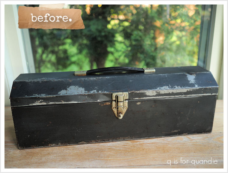
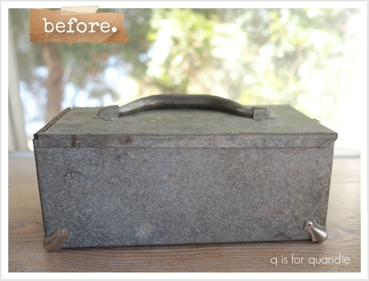
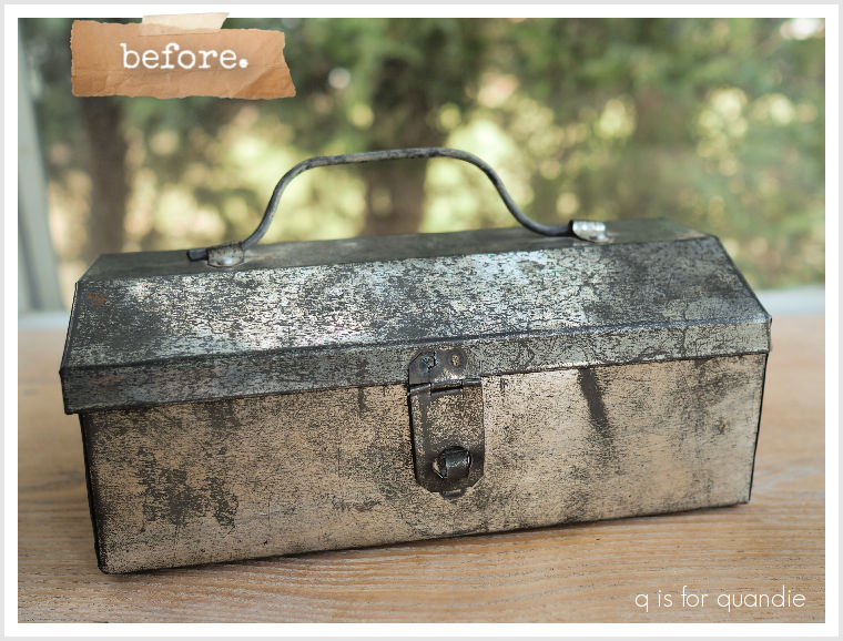
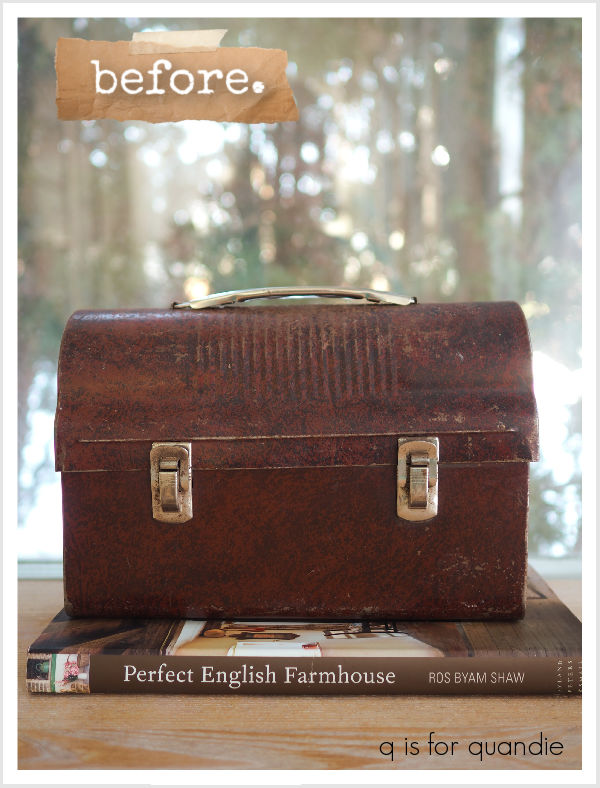
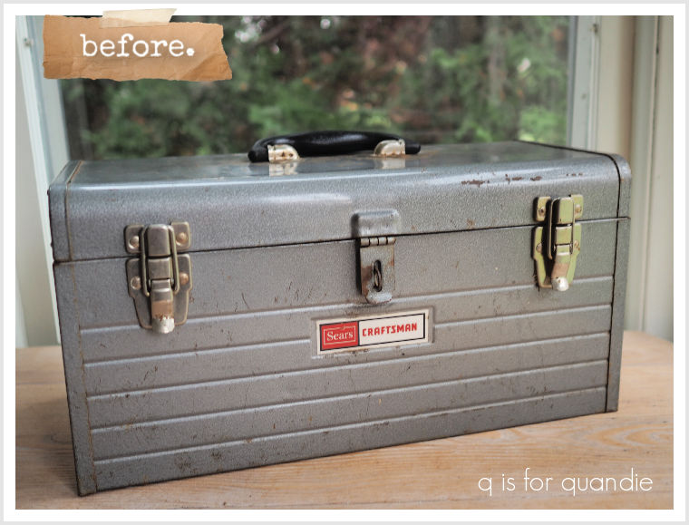
I have a confession to make, this isn’t my favorite style of toolbox.
I’m not sure what it is, but somehow I just don’t love this shape where it’s deeper at the top than at the bottom.
I have done at least one like this in the past, and it turned out fine …
But I really struggled with this next one.
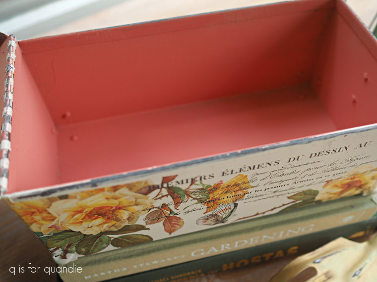
I started out painting it red on the outside and navy blue on the inside because I thought I’d do another Norwegian flag toolbox like this one.

But I just wasn’t loving it in the red.
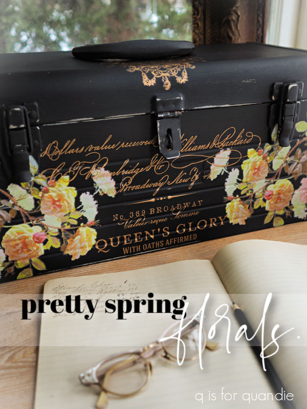
So I painted over both the inside and outside with black. I was thinking I’d do another one like this one …
But then I didn’t love that either.
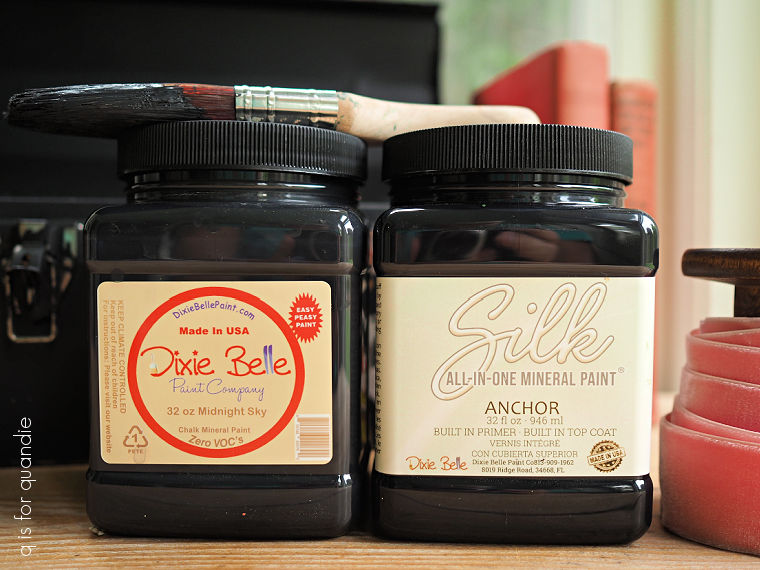
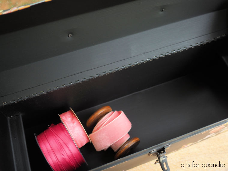
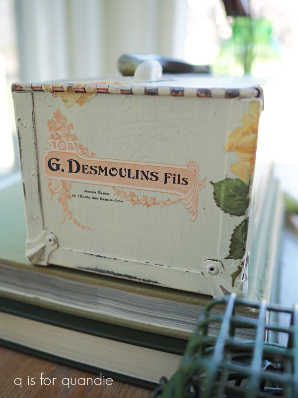
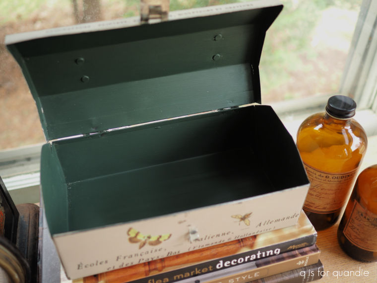
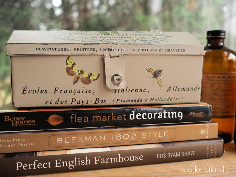
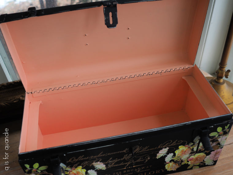
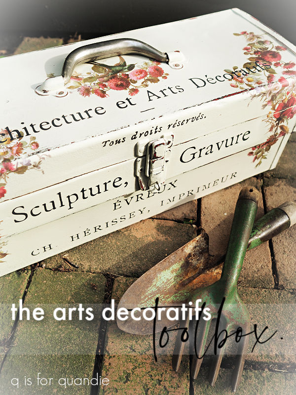
So I painted over the inside yet again, this time in Dixie Belle’s Oxford Fog.
That’s such a pretty color.
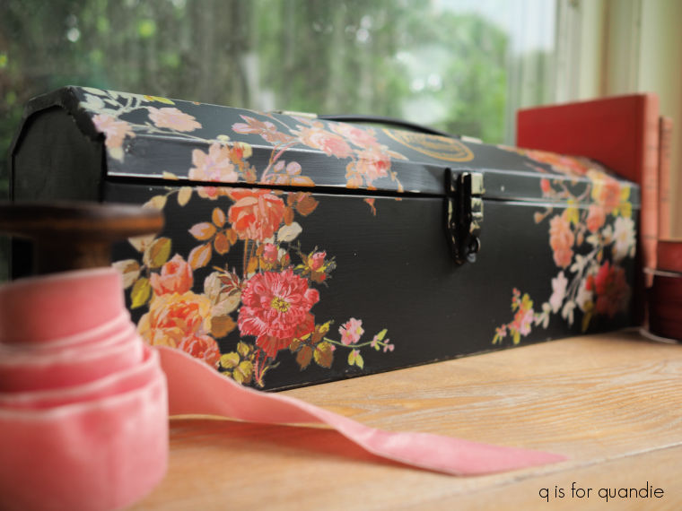
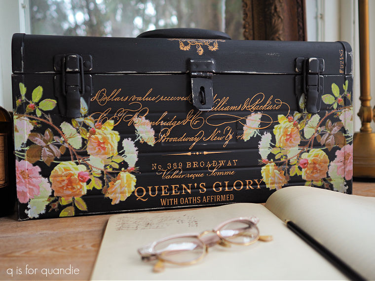
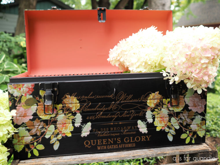
Then I painted over the exterior in DB’s Drop Cloth.
I must admit, it felt a little boring at first. But then I gave it a major distressing job using my mouse sander and some 150 grit paper. That started bring it to life.
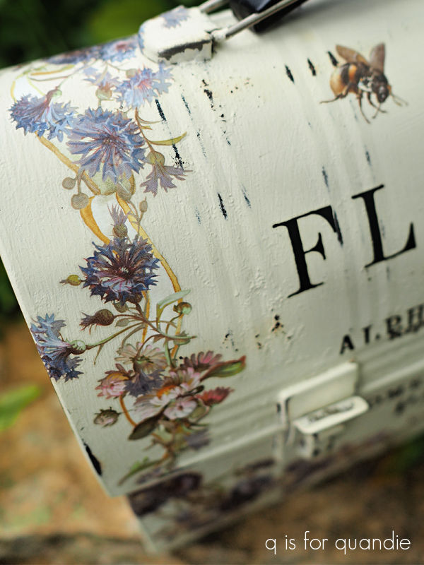
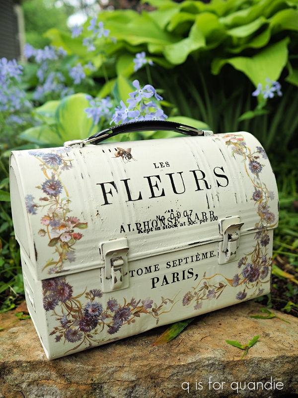
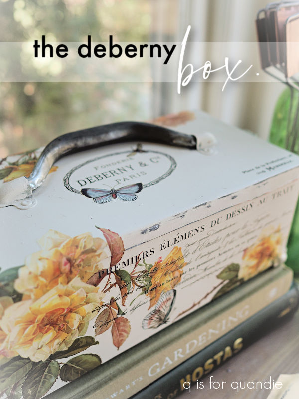
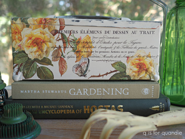
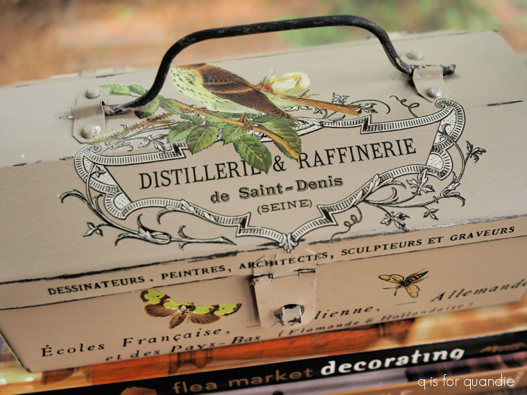
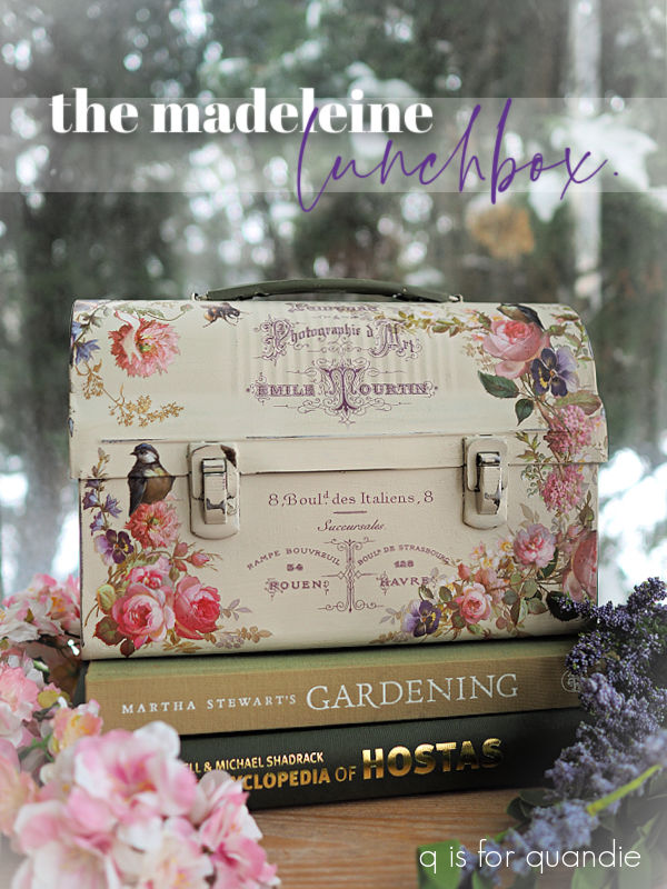
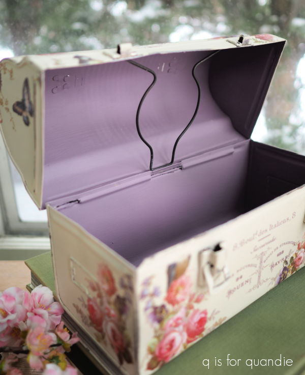
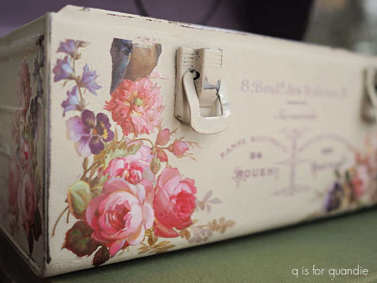
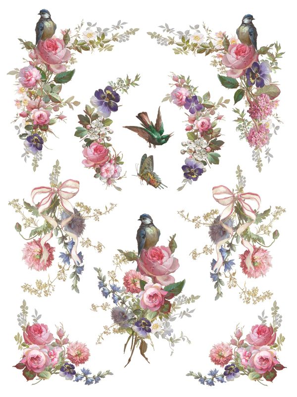
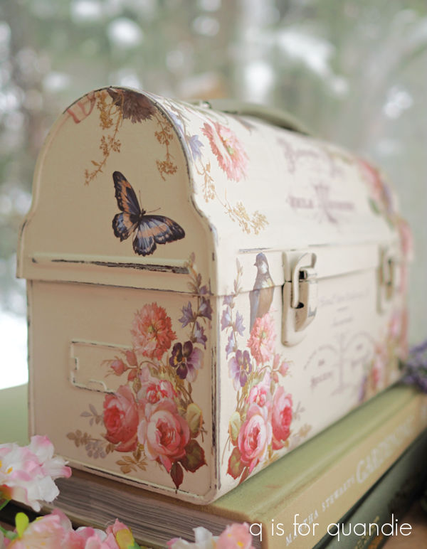
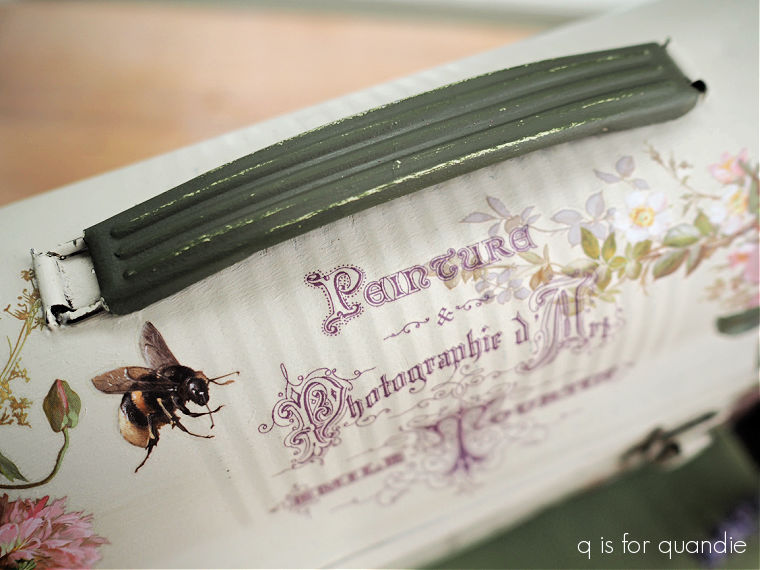
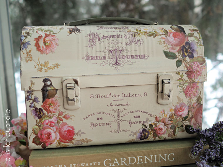
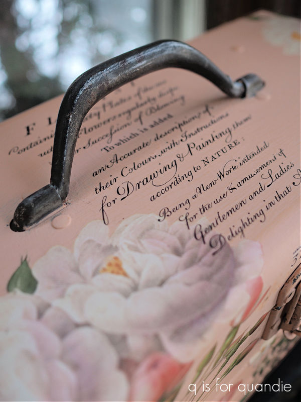
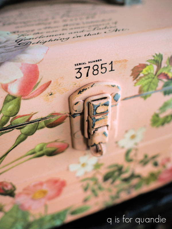
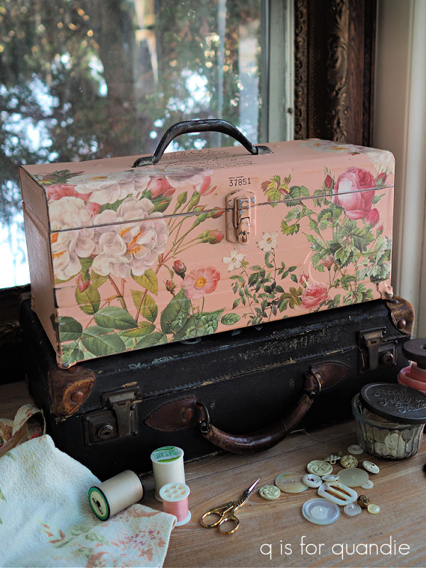
I followed that up with some really lovely florals from the I.O.D. Madeleine transfer.
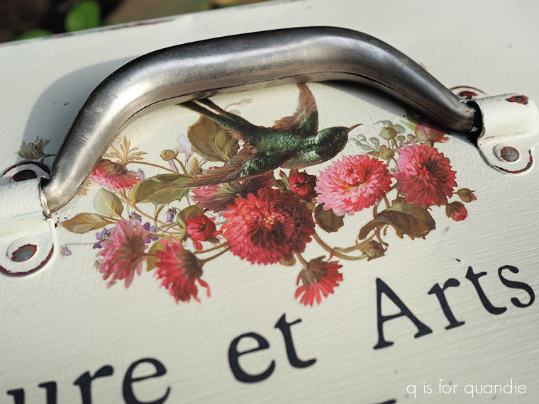
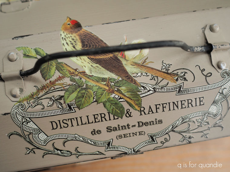
And the bird is pretty gorgeous too.
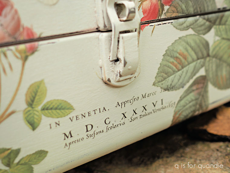
The typography comes from an old re.design with prima transfer called Catalogue. This one goes way, way back. And actually, I didn’t buy this one, I’m pretty sure this is one that my reader Monica sent to me (correct me if I’m wrong on that Monica).
I rearranged the words a little, and I only had bits and pieces from the original full transfer, but it worked out perfectly.
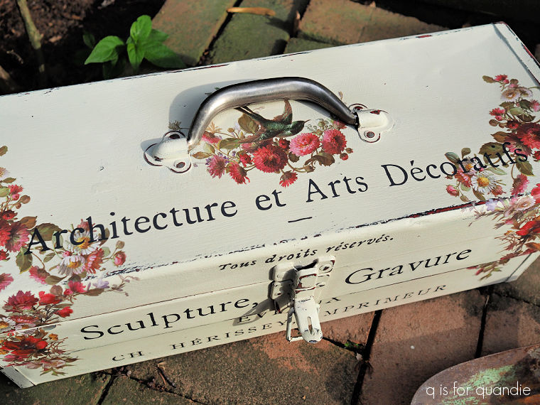
In the end, I think this one turned out quite nice.
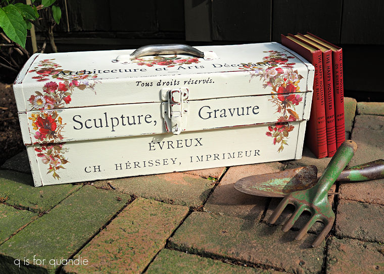
It might even be my favorite.
But then again …
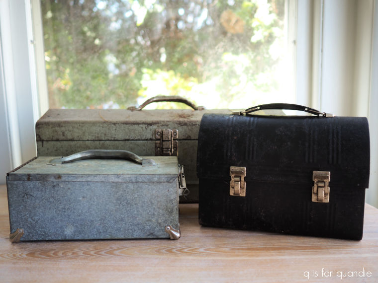
Now it’s your chance to share your opinion. Which of the five boxes I shared this week was your favorite?
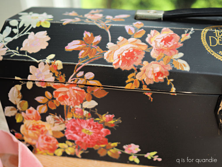
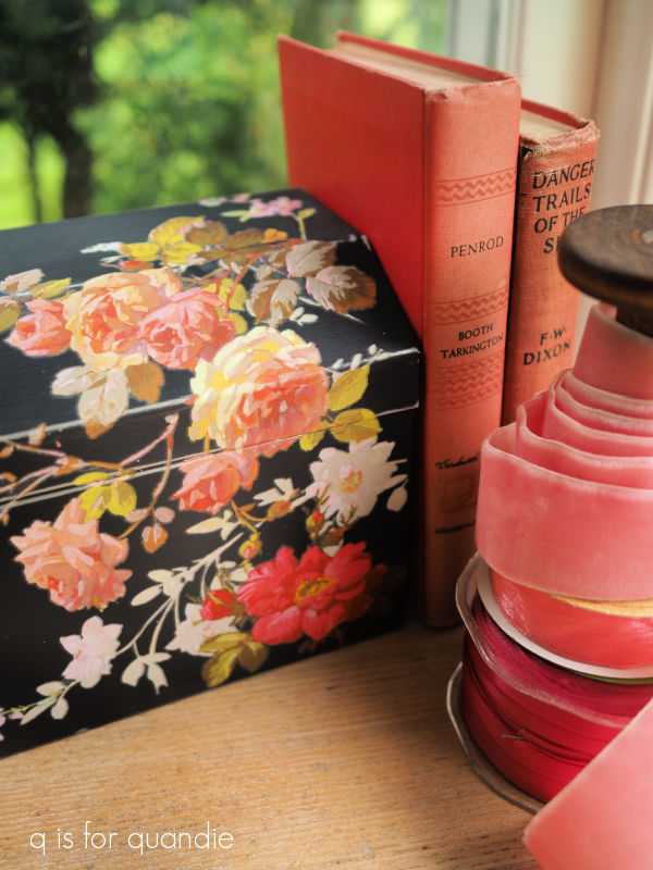
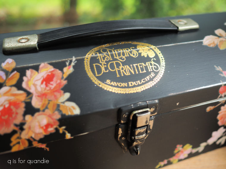
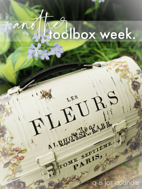
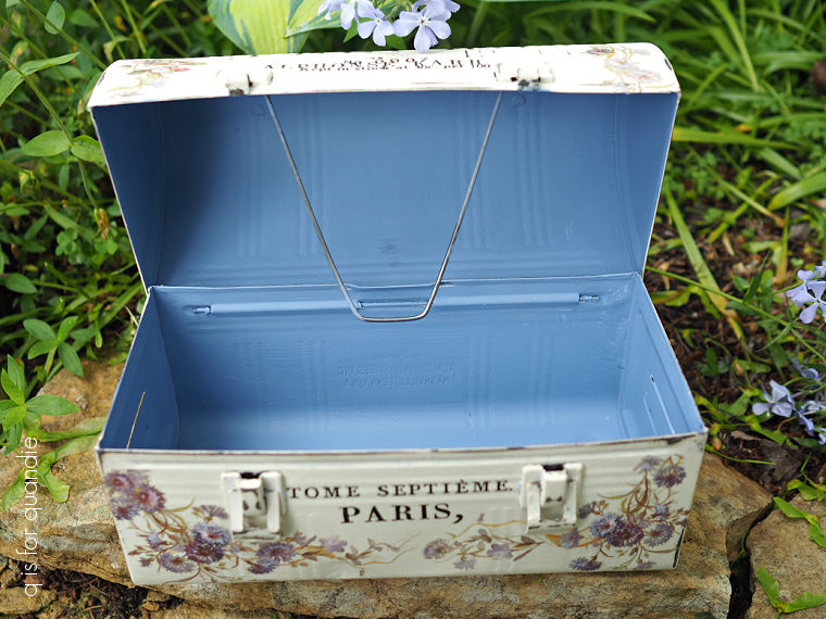
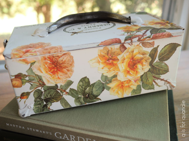
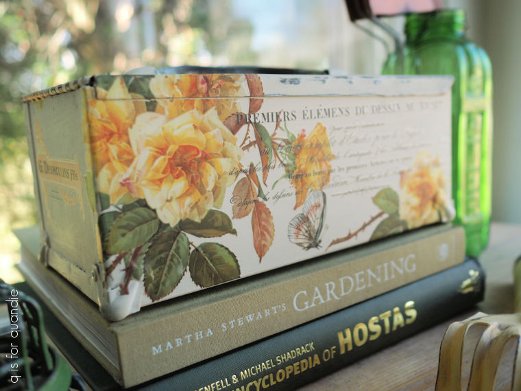
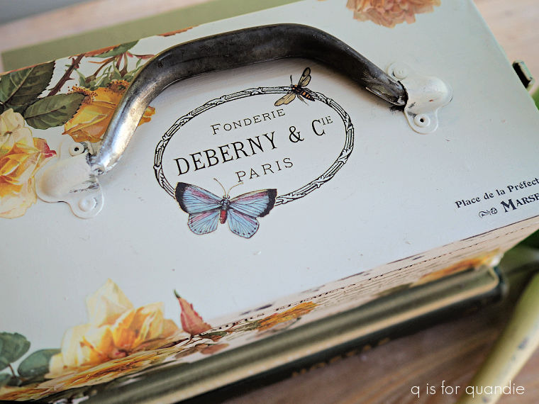
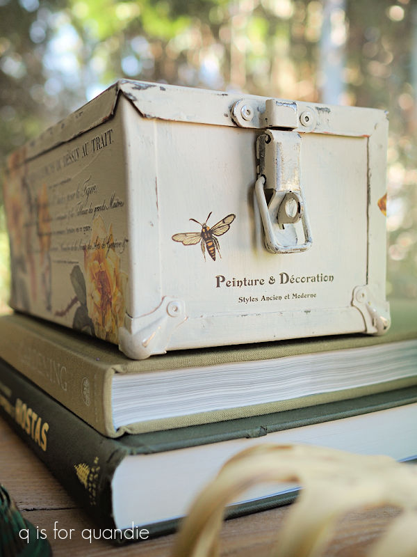
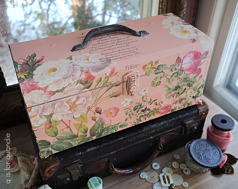
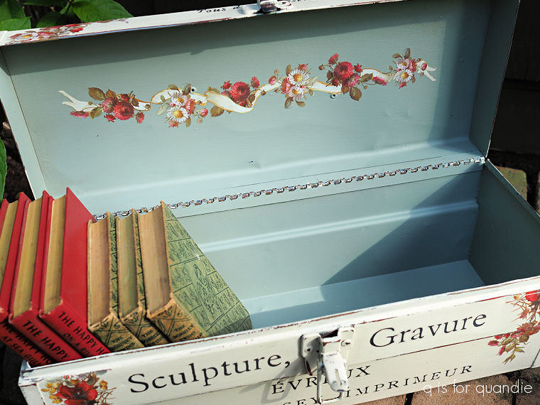
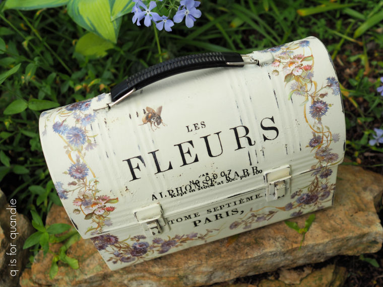
The Les Fleurs lunchbox …
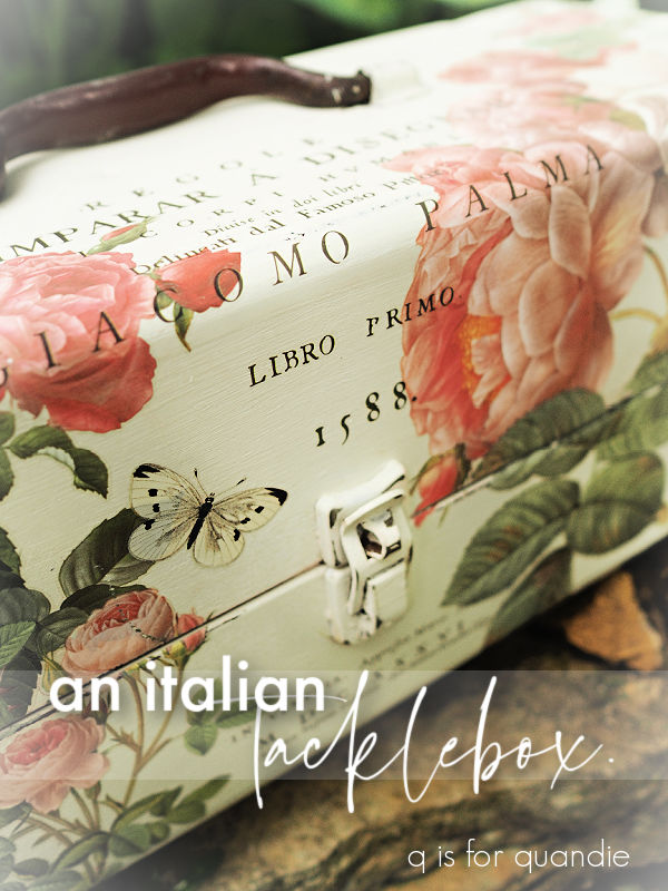
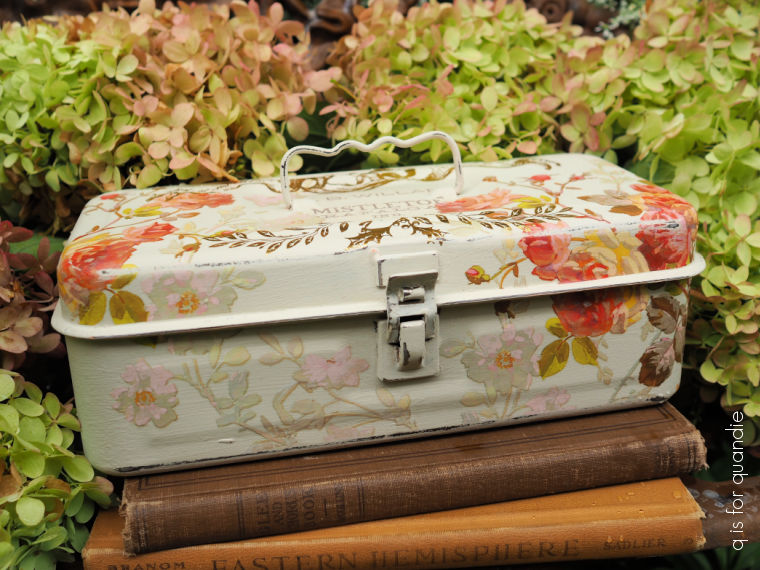
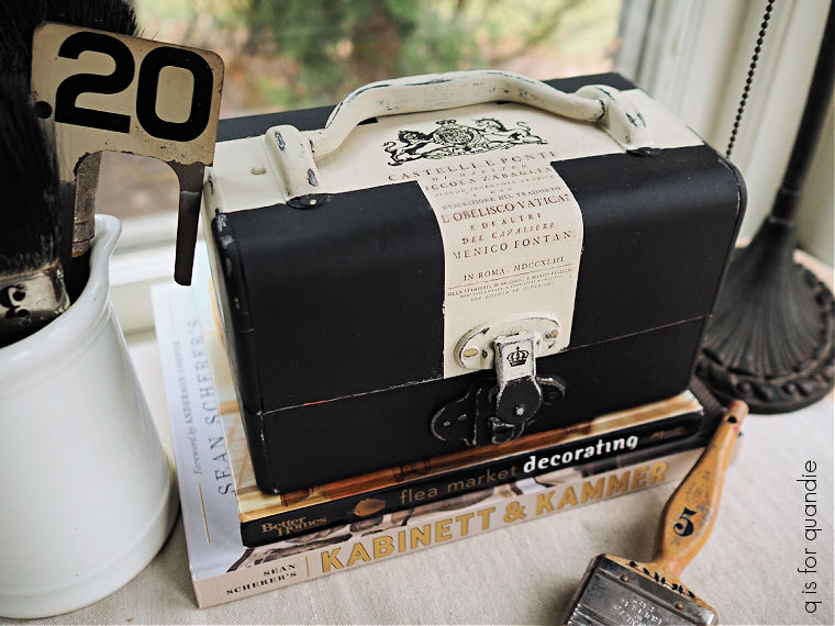
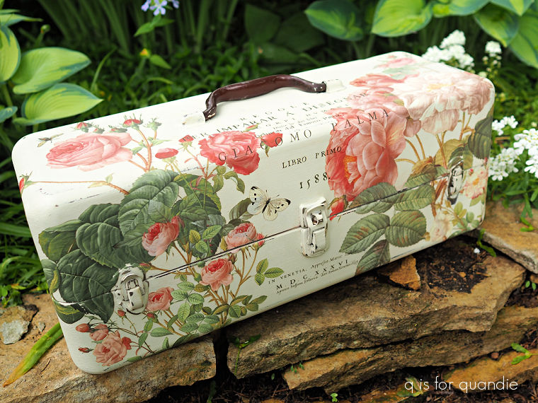
the Italian tacklebox …
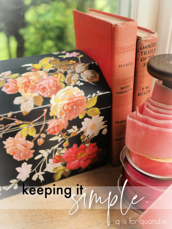
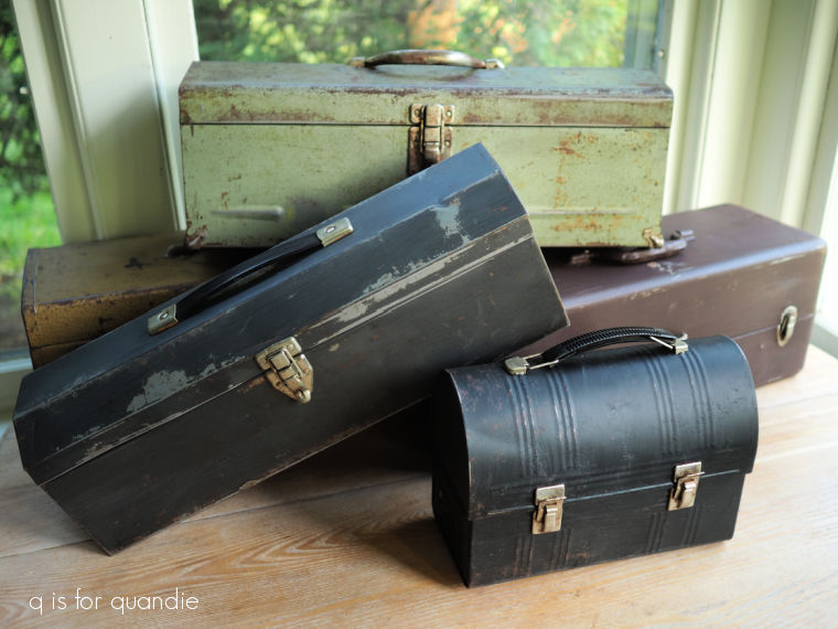
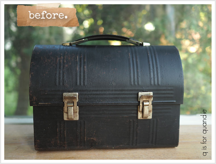
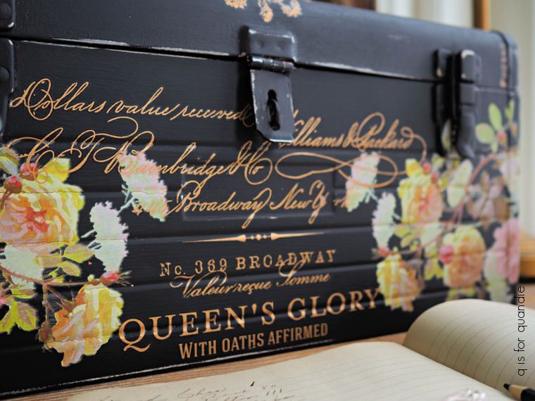
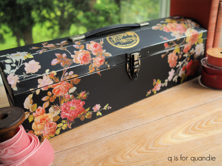
the simple black toolbox …
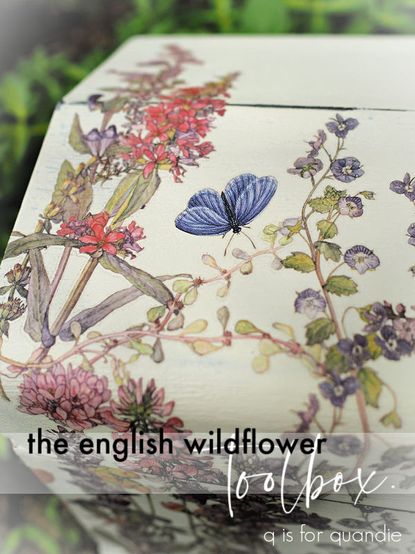
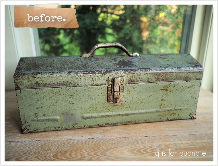
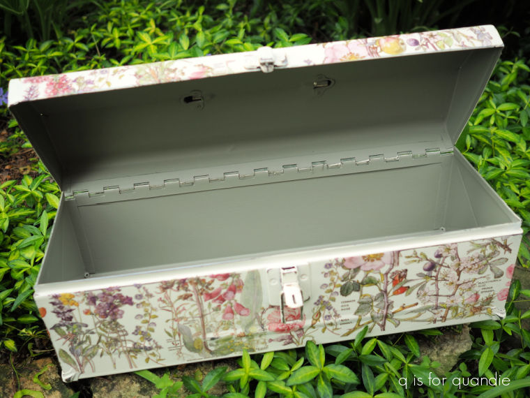
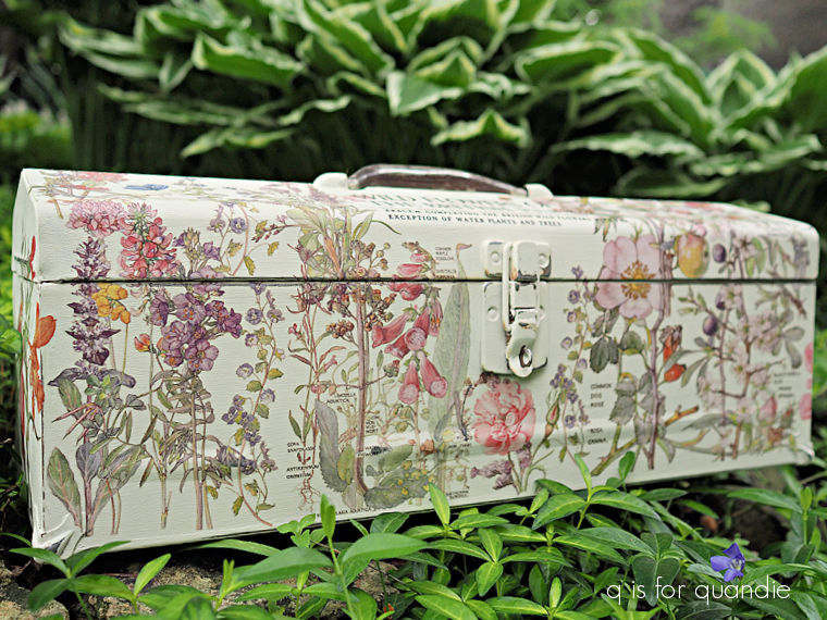
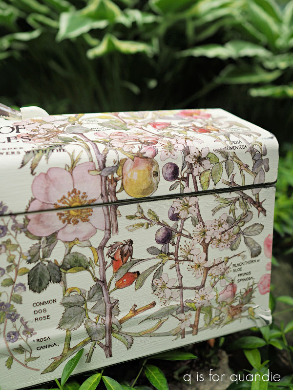
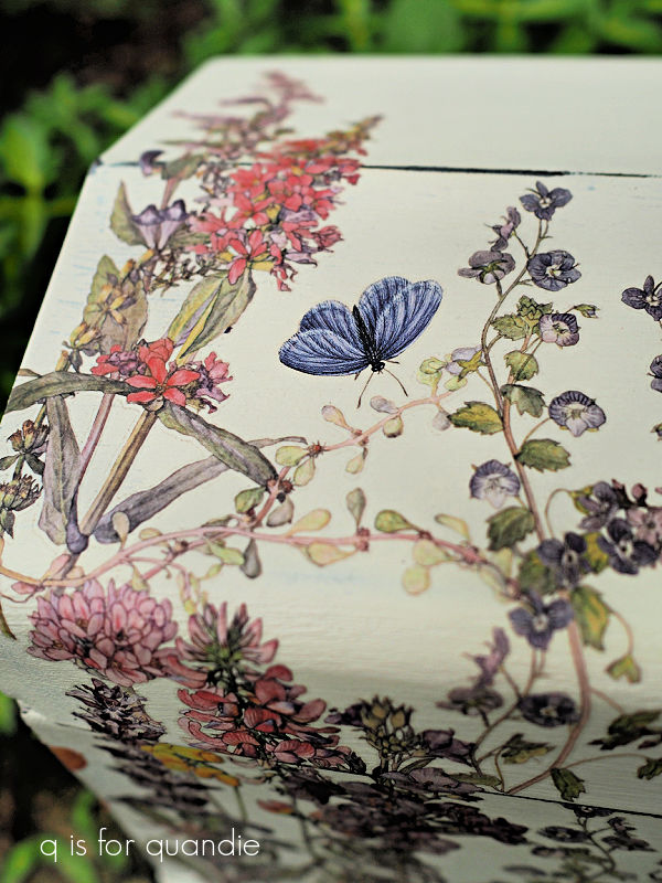
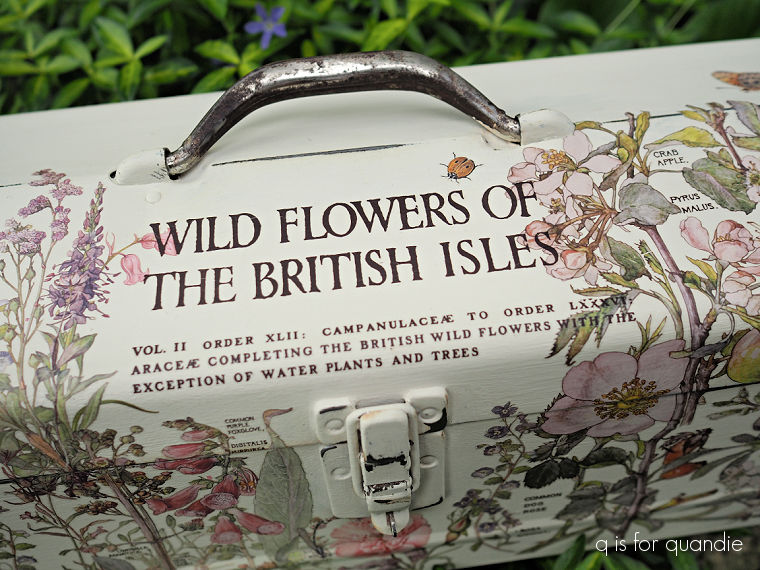
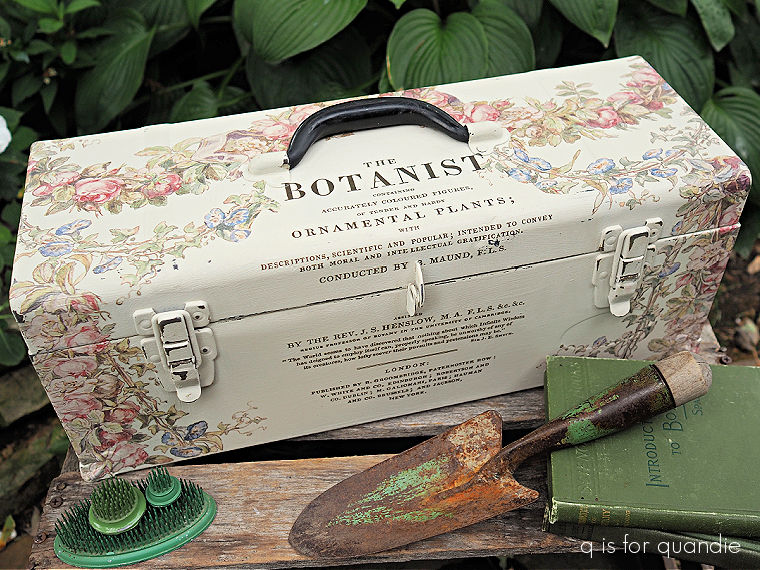
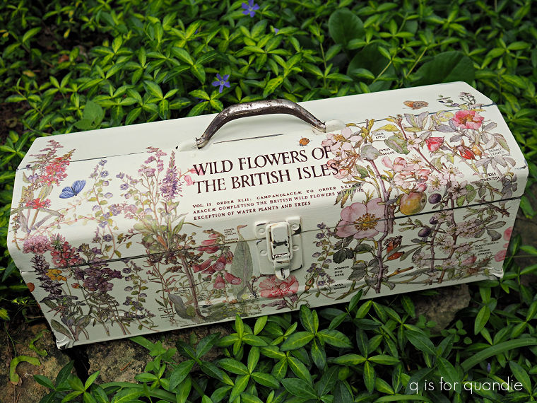
the English wildflower toolbox …
or today’s architecture et arts décoratif toolbox?
Leave a comment and let me know.