On our recent Charleston vacation, we stayed at the La Quinta Charleston Riverview, which is just across the Ashley River from the historic part of town. Let me just say, this hotel was not great. The traffic noise in our room was deafening, the hotel staff were awful (we had two hangers in our room and when we stopped at the front desk to ask for more we got a shrug and ‘I don’t know if we have any extra hangers’). The included breakfast was so bad we only ate it once (and that was with a spoon because when we asked for forks we got another shrug and ‘we don’t have any forks’, apparently there is a hanger and fork shortage in the south). I could go on, but suffice to say, I do not recommend staying at this hotel. There must be better options out there.
That being said, we chose it because it was on the cheaper end … so I have to remind myself that you get what you pay for. Lesson learned, it might be wise to pay a little more for your hotel. I will say that it was in a pretty convenient location though if you have a car. It was less than a 10 minute drive into the heart of historic downtown, and there was plenty of free parking at the hotel. Although their website says that they have a free shuttle to downtown, when we arrived we were told that they no longer provide a shuttle. Fortunately, we had rented a car and weren’t counting on their shuttle.
After our formal guided walking tour the previous day, on day two in Charleston we decided to just wander the historic district on our own. We drove to an area called the Battery because my research told me that there was free parking to be had if you got there early.

Since we’re early risers, and we were skipping that bad hotel breakfast, it was no problem to be parking the car in one of those free spots by 8 a.m. Although it was overcast and the forecast called for rain, we never did get wet.
We walked along the battery towards Bakehouse Charleston where we knew we could get good coffee and some pastries (and FYI, their frozen mint lemonade is totally delicious too).

It’s a lovely walk where you can admire beautiful old antebellum houses along one side, and pretty water views along the other (and there are those free parking spaces in the foreground, as you can see they were filling up already).
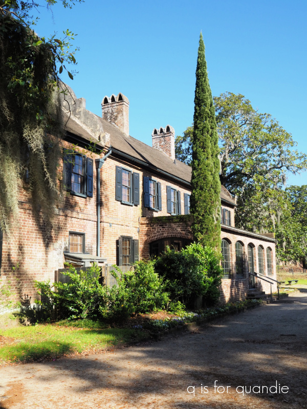
This house along the Battery caught my eye. It stood out because it was looking a little worse for the wear (this would have been a good one for your dad to fix up Connie), I wonder if it’s a popular stop on the many ghost tours that are offered in Charleston.

Check out that big ol’ crack in the foundation. Yikes! I can just imagine how expensive it is to maintain these old homes. I’m so glad there are people out there willing to do it. And FYI, this was the exception, not the rule. For the most part the homes along here were in immaculate condition.
Once we were fortified with coffee and pastries, we headed out towards Waterfront Park.

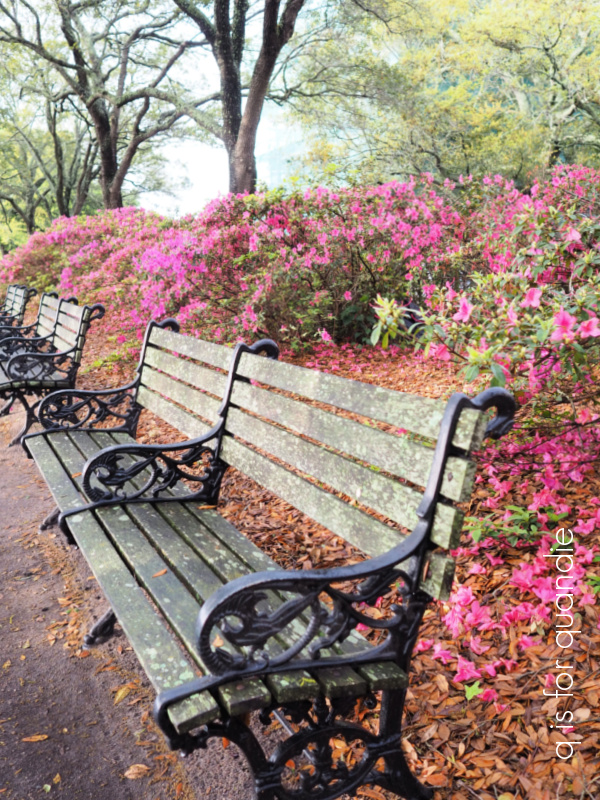
This is where I found some of the only azaleas blooming for the entire trip (more on that in a future post).
This is also where you’ll find the Pineapple Fountain.

It’s a lovely place to just stroll around.

Just a sidebar note for any of my fellow cruisers out there, there was a Carnival ship docked right there at the pier.

So if you ever end up on a cruise that stops in Charleston, I can tell you that you are going to be docked right in the heart of the historic district and everything I’m sharing with you in this post is within easy walking distance of the ship.
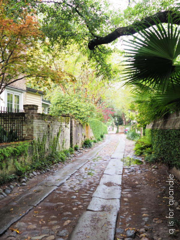
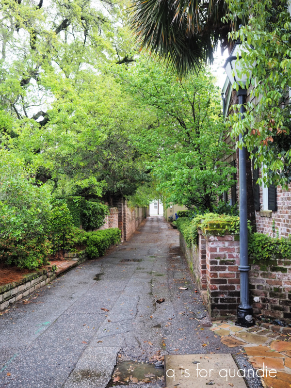
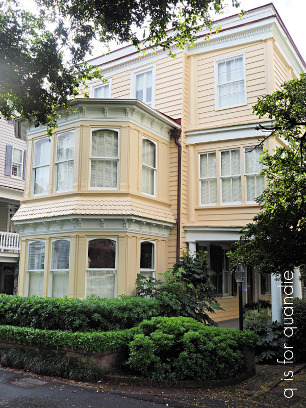
And this brings me to one of the absolute highlights of our trip, for me at least. Wandering through the neighborhood called South of Broad.

First off, if you want to avoid the crowds, this is one way to do it. We did see the occasional horse drawn carriage full of tourists,

but for the most part Mr. Q and I had these streets all to ourselves except for the locals out walking their dogs, and the gardeners who were out cleaning up after the previous night’s storms.

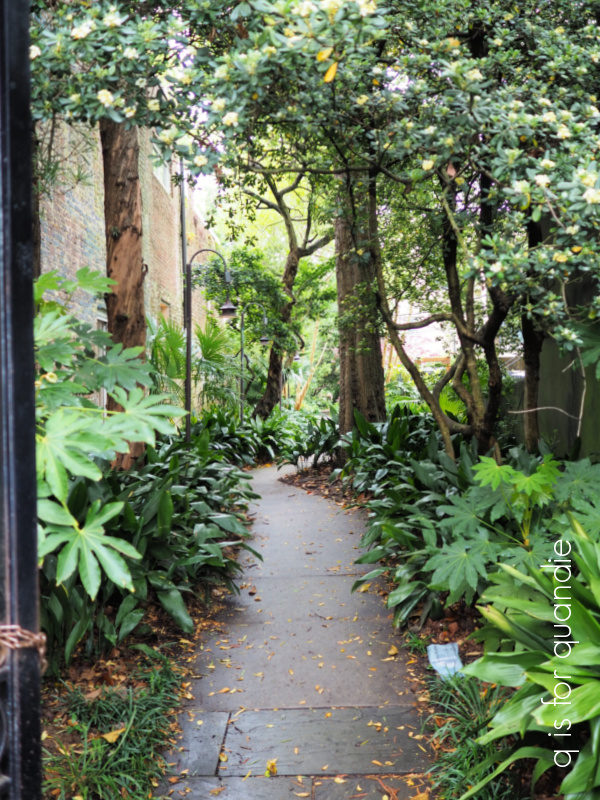
My goal was simply to admire the houses …
and the gardens …

up close and personal-like (gosh I envy their boxwood!). And there’s no better way to do that than on foot.
I’m fairly sure that Mr. Q deserves a medal of some kind for being OK with just wandering around this neighborhood for a couple of hours, stopping every 30 seconds so I could take another picture.

And even being willing to pose next to a giant planter to show the scale. Seriously, that thing was huge.
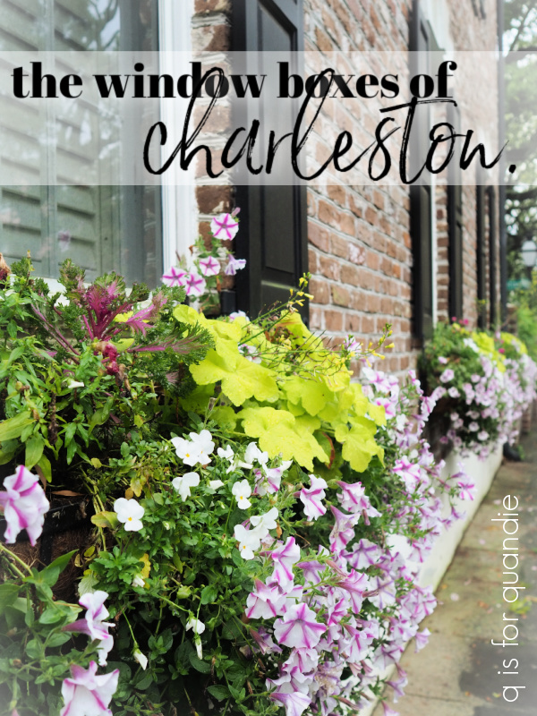
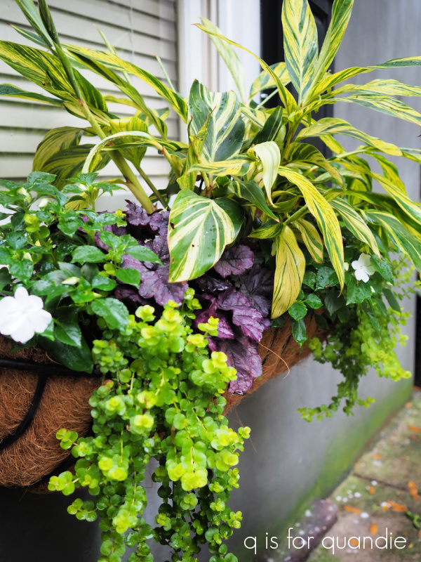
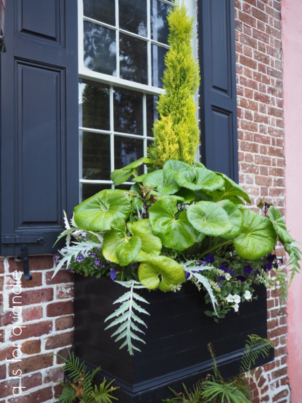
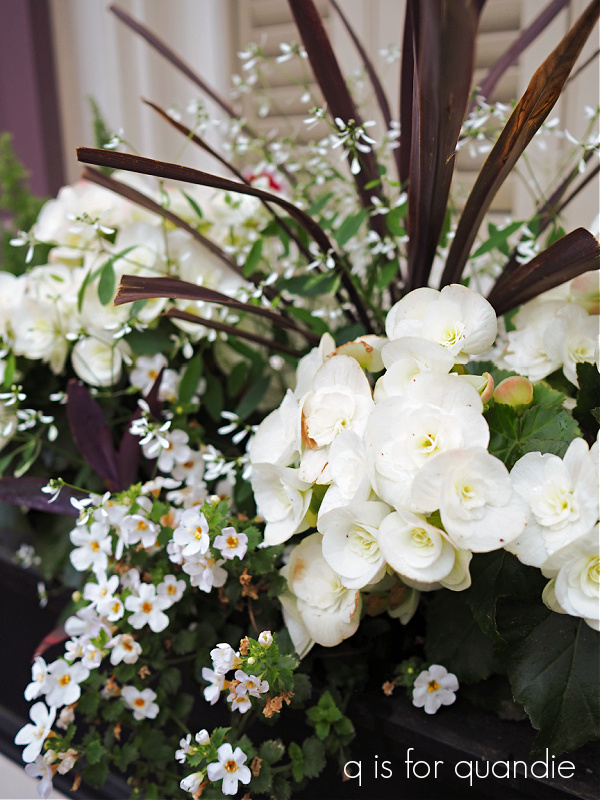
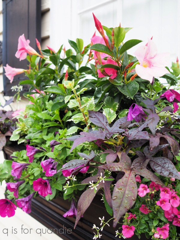
Speaking of huge planters, check these out.

Aren’t they gorgeous?
Charleston is known for something called a single house, and there were quite a few examples in this neighborhood.
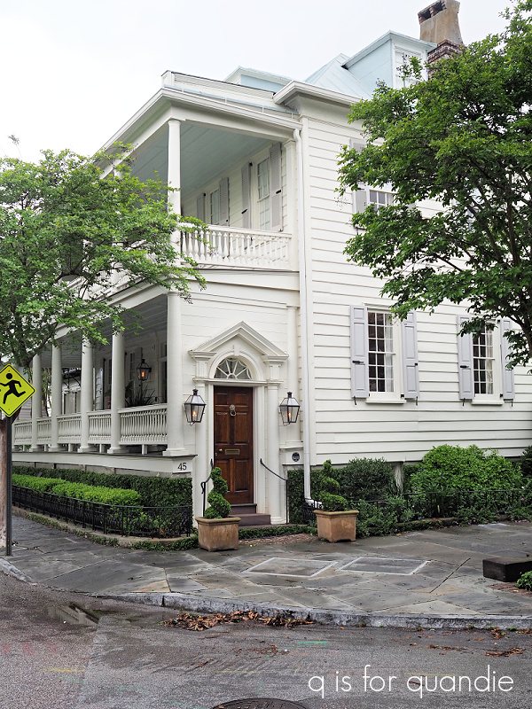
A single house is one room wide, with a porch running the length of the house down the side. That door you see in the photo above leads to stairs up to the porch. The actual front door to the house is in the middle of the porch. If you want to learn more about single houses, check out this informative article from charlestonlivability.com.
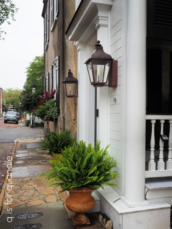
Another really cool detail on the houses in Charleston were the gas lanterns. I initially thought the flickering flames they gave off were some kind of fancy light bulb, but I asked our guide on the Alley tour and he said they were genuinely gas fueled flames. Since it was a rather dreary overcast day, those lanterns added a warm, cozy feel. They also go a long way towards convincing you that you are visiting a bygone era somehow.
Now, get ready for some serious eye candy … well, at least for my fellow gardeners out there. I totally stopped and drooled over every garden we passed by. Some of them were front and center for everyone to see.

While others were tucked away behind wrought iron.
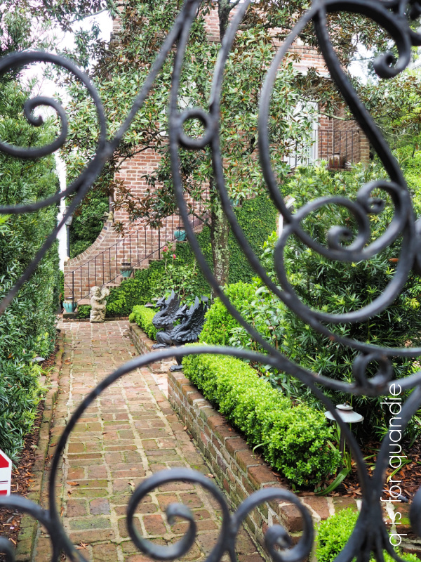
Wrought iron being another thing that Charleston is known for.

Is there any better combination than wrought iron and wisteria?
 This planted staircase also caught my eye.
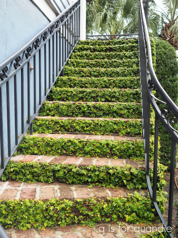
Isn’t that unique? I don’t know that I could do anything like that here in Minnesota. What plant would survive our winters in that little amount of soil? And how would you clear a foot of snow off those steps without disturbing the plants? Hmmmm.
I’m afraid I might be coming off as some kind of snoop here, peering through gates and over hedges (and just to be clear, I did not trespass. I stayed on the public sidewalk or street the entire time). But my philosophy on gardening is this; if you go to this much trouble to have a beautiful garden, you probably want other people to see and admire it too.

Tell me fellow gardeners, am I wrong? Does anyone garden simply for their own enjoyment, unwilling to share the beauty with others?
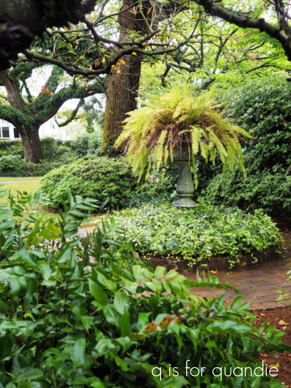
I didn’t just admire the gardens, I drooled over the houses too.

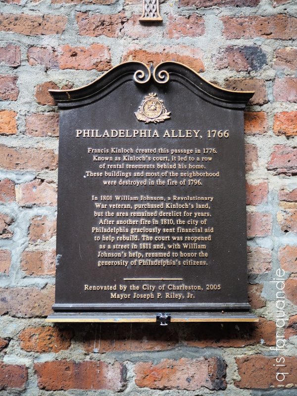
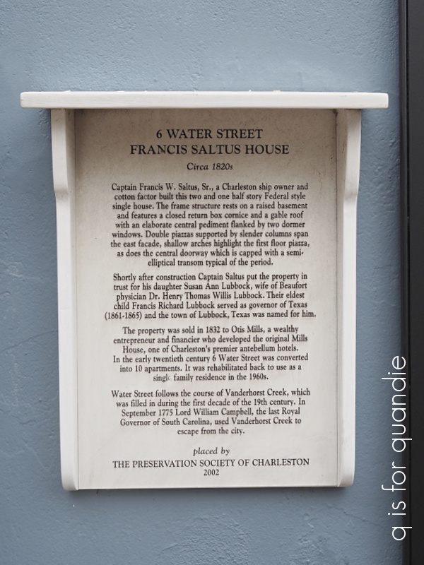
Our self-guided tour was made even easier by the frequent presence of plaques giving the history of notable houses.

We saw quite a few of these, and they gave lots of interesting information.
So if those aren’t an invitation to snoop around, I don’t know what is.
If you ever get to Charleston, I absolutely recommend taking some time to just walk around this beautiful neighborhood. Get some coffee to go at Bakehouse Charleston and then just stroll around. While it’s easy to get turned around, the area is small enough that you never can actually get lost (kind of like Venice, right bff?!). There always seems to be a glimpse of the water around the next corner to re-orient you.
Although I have some more posts coming up about some day trips we took from Charleston, this is the last one about Charleston proper. Just in case any of you are planning a trip there, I can also recommend the following things we did:
Touring the Old Exchange and Provost Dungeon.

This is a great way to learn about the history of Charleston.
Visiting the Gibbes museum of art.
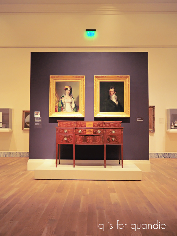
The Gibbes is small (at least compared to our MIA here in Minneapolis), but really well done. If you’re interested in furniture (um, you are, right?), it’s worth a quick visit. My favorite exhibit was the miniature portraits though. Definitely go see those.
Taking a food tour with Bulldog Tours.
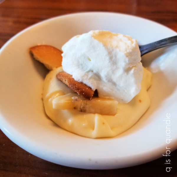
This is a great way to learn a little bit about the cuisine in Charleston and how it was formed by the varied cultural influences of French Huguenot and English settlers, and of course the African slaves, combined with the local food sources available. I admit, I never did quite understand where the banana pudding came into play, but it was delicious.
Eating amazing BBQ at Home Team BBQ.

They have a few different locations, we ate at the one on the Ashley River Road. It’s fairly unassuming looking from the outside. We just stumbled upon it when driving back to our hotel one afternoon. Mr. Q had the BBQ nachos with pulled pork, and yes, he ate all of it! I discovered my love of Carolina mustard based bbq sauce there. Yum!
So, I’m curious. What’s your favorite thing to do on vacation. Would you also be content to walk around and admire beautiful houses and gardens? Do you enjoy museums? Are you interested in the local cuisine? Or do you prefer more adventurous activities like rock climbing or skiing? Or maybe you’d rather just a sit on a beach with a cocktail (don’t worry, that activity is coming up later too). Leave a comment and let me know!


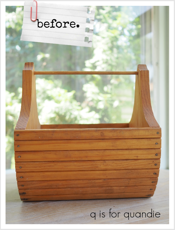
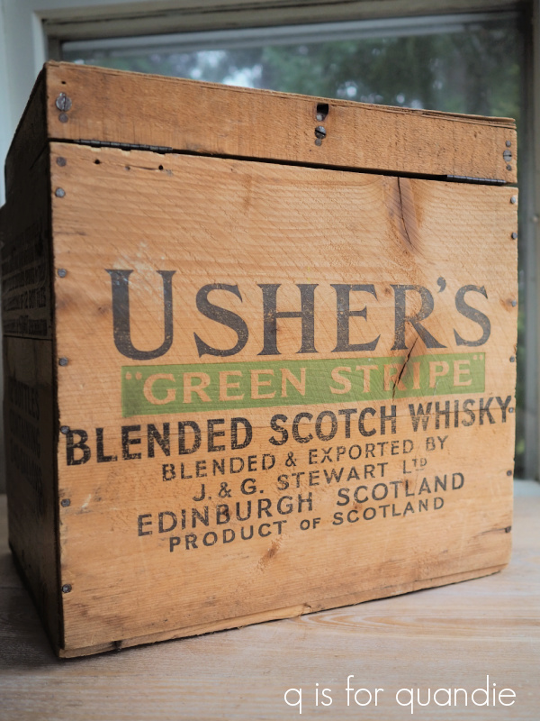
 This box came filled with everything needed to shine your shoes. There were something like 10 brushes for various colors of shoe polish, multiple tins of dried up shoe polish, and lots of well used polishing rags. I tossed all of that.


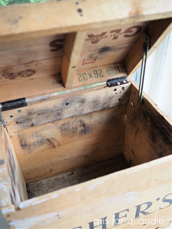


 Next up is the bare wood version.


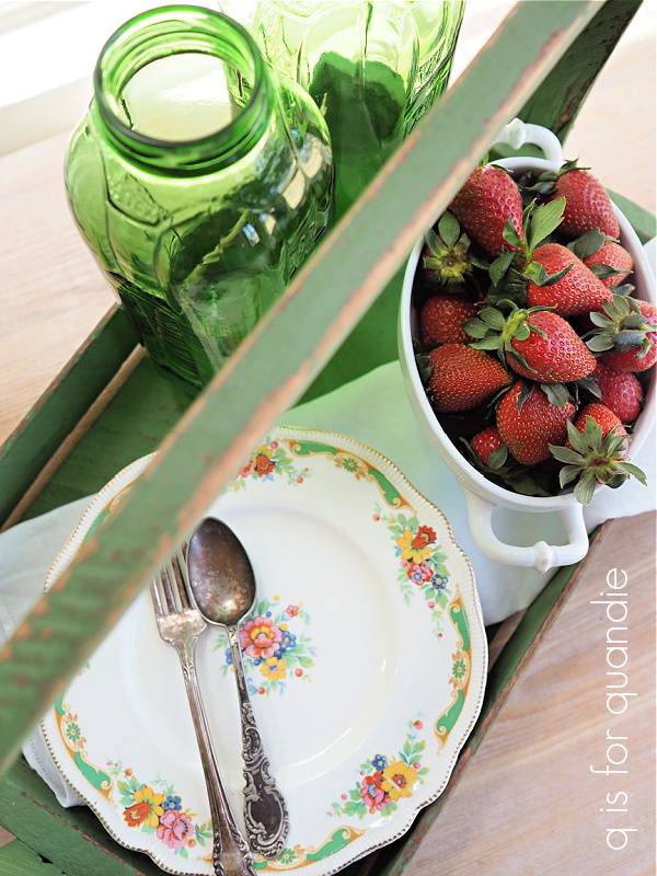
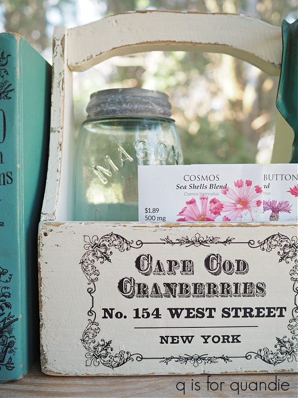
 I often see this style of wood tote referred to as a berry basket.