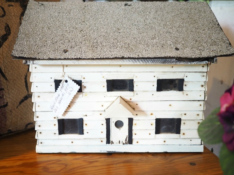
Sometimes when I bring home a piece of furniture to refurbish I have an immediate vision of what color I’m going to put on it. Other times I really struggle with this decision.
Usually that’s because I’m trying to walk the line between choosing a color that I think will look amazing on something and choosing a color that I think will sell. Sometimes these two are the same thing, but oftentimes they aren’t. Since I can’t keep every piece I paint no matter how much I love them, I have to consider how well something is going to sell. I find that the neutral pieces usually sell faster than colors.
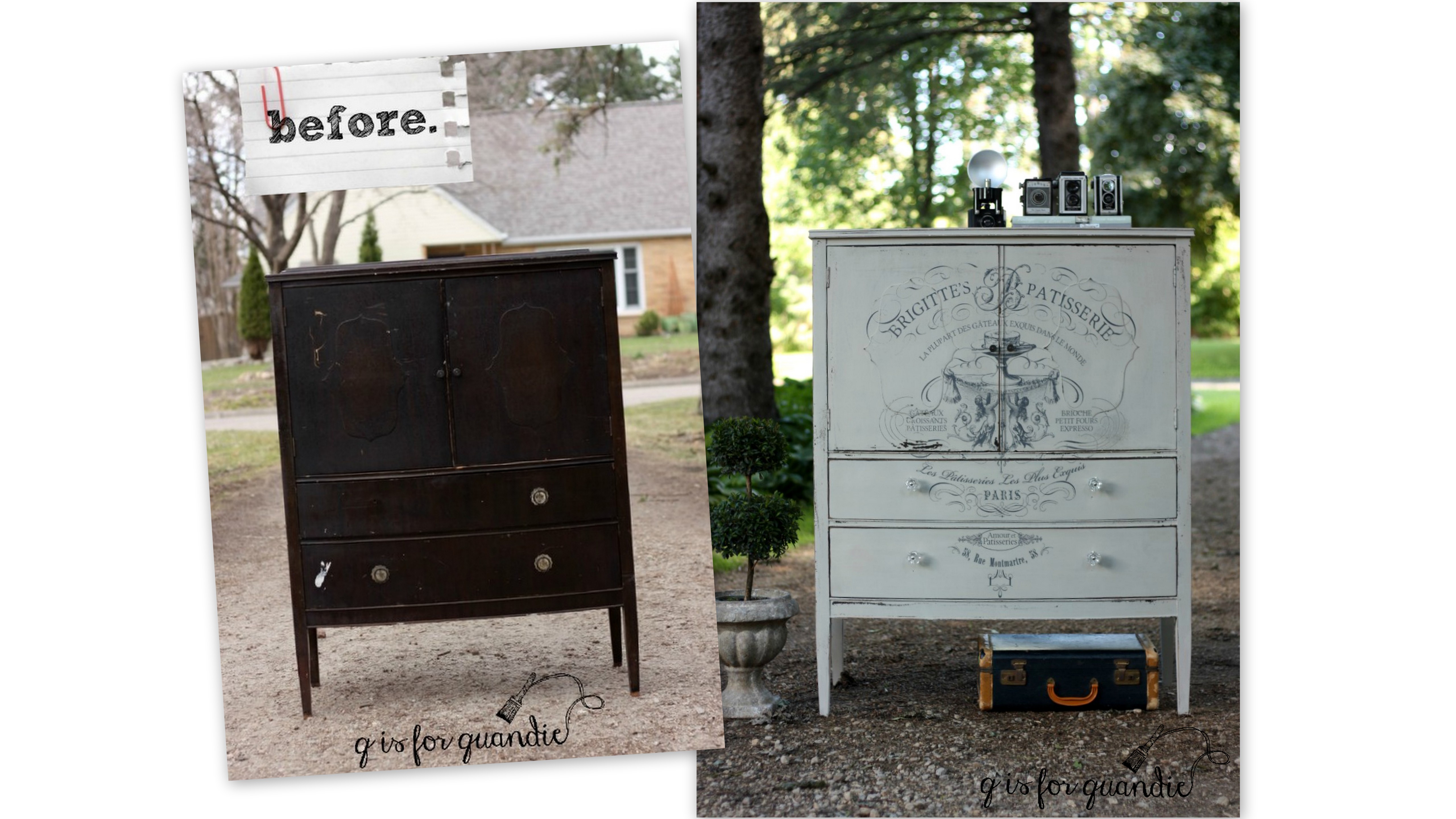
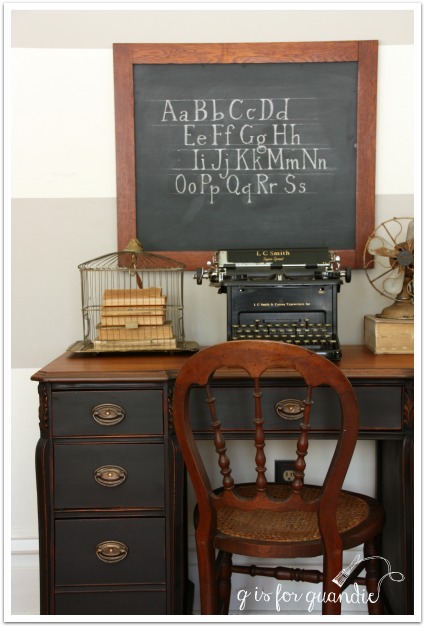
Black is always a big seller (this next piece is painted in Miss Mustard Seed’s Typewriter). It’s a classic, and every room needs a pop of black!
 It’s easy for potential buyers to fit a neutral piece into their existing décor like this book shelf painted in Little Billy Goat’s Greyson.

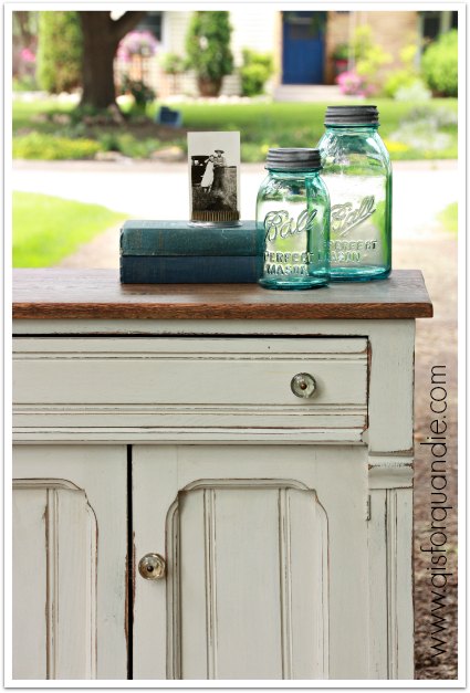
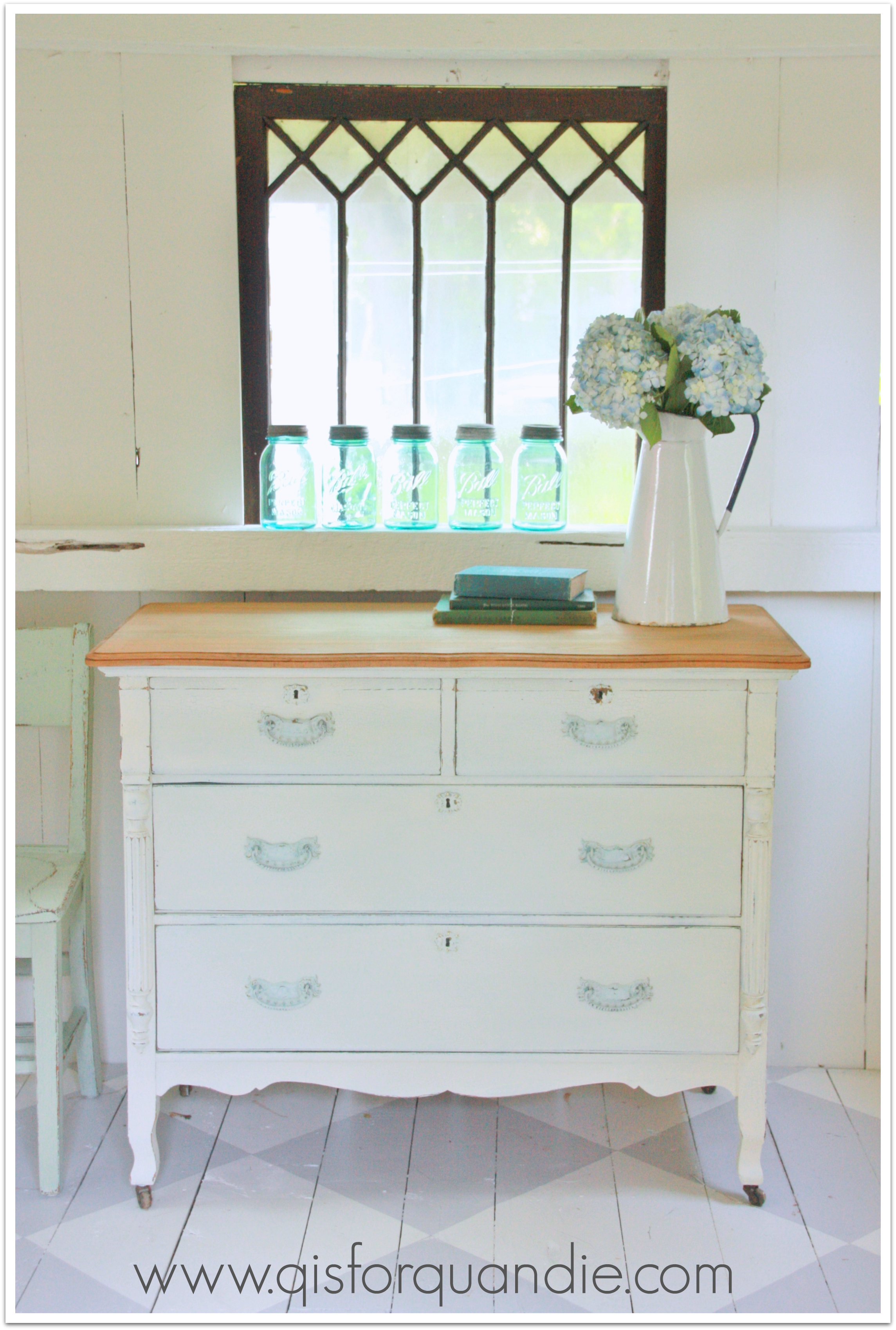
A creamy almond is also an easy color to blend into an existing room. The Miss Mustard Seed’s Marzipan on this little washstand is perfect.
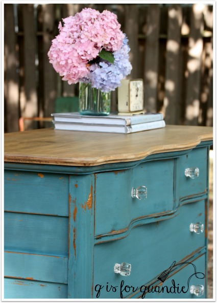
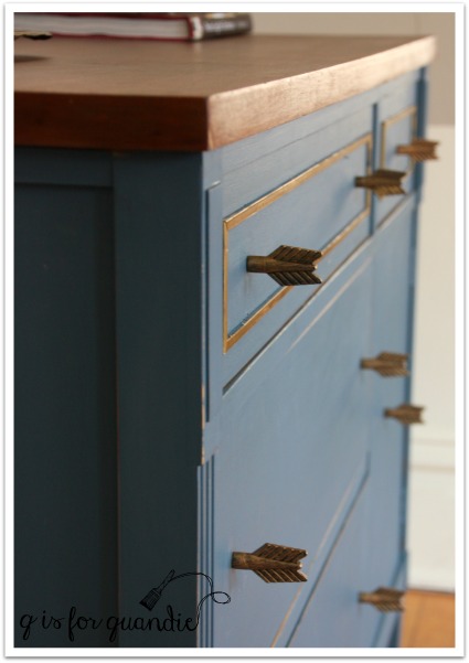
It’s not quite as easy to add a vibrant blue like the Real Milk Paint Co’s Dragonfly on this dresser. This one took a while to sell.
The fresh green of Sweet Pickins’ In a Pickle is one of my favorite greens. This fab desk sold pretty quickly painted in this color …

but this dresser in the same color took over a year to sell.

On the other hand, I have to say that most shades of aqua sell pretty quickly, like this sweet dresser painted in Little Billy Goat’s Momma’s Fridge.

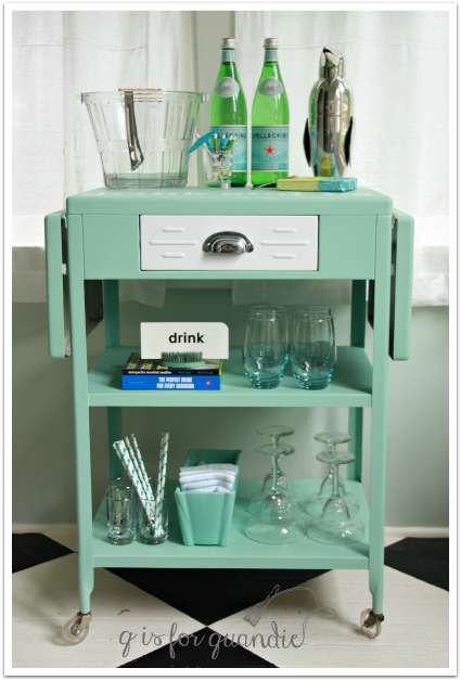
Even more saturated aqua’s have traditionally sold really well for me, like the Fusion Laurentien on this bar cart.
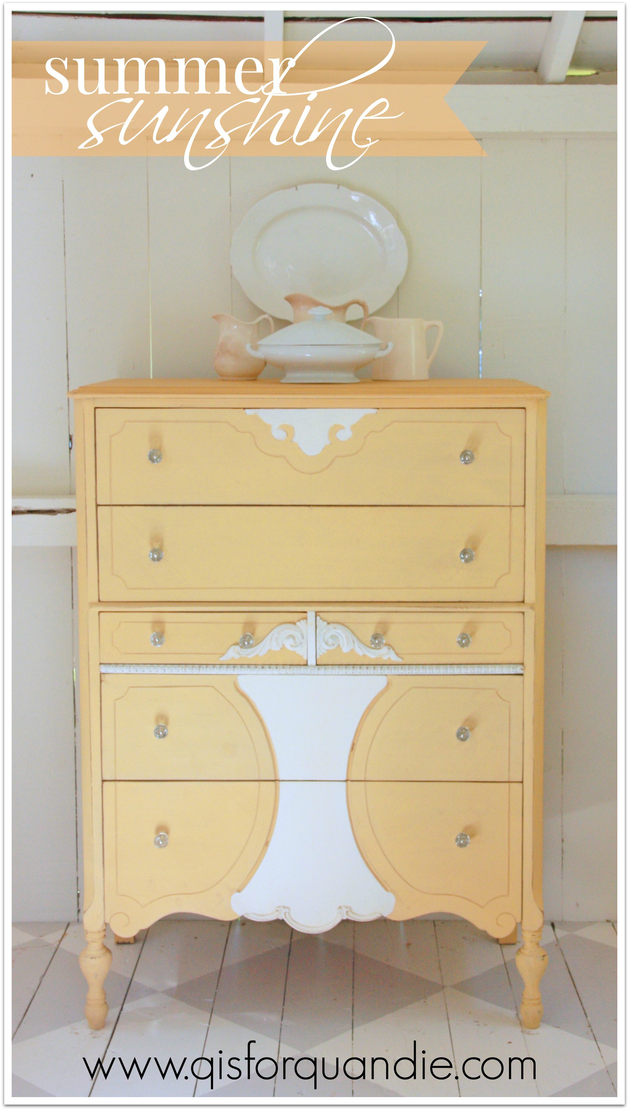
I’m always a little nervous when I paint something yellow, but most of my yellow pieces sell well also. This next piece is painted in Fusion’s Buttermilk Cream and Limestone.
And this is Miss Mustard Seed’s Mustard Seed.
And just to prove my friend Lisa wrong (because she can’t believe I’ve ever painted anything red), here is a piece I painted in Miss Mustard Seed’s Tricycle. This piece sold pretty quickly, but another dresser I painted in Tricycle was around for over a year as well.

Since I have a day job that pays the bills, I have the luxury of not relying on furniture sales to put food on the table. But I also don’t have room to store unsold pieces indefinitely.
And honestly, it saps my motivation to paint more furniture when my finished pieces linger for too long unsold. So I think long and hard before using colors with a bad track record.
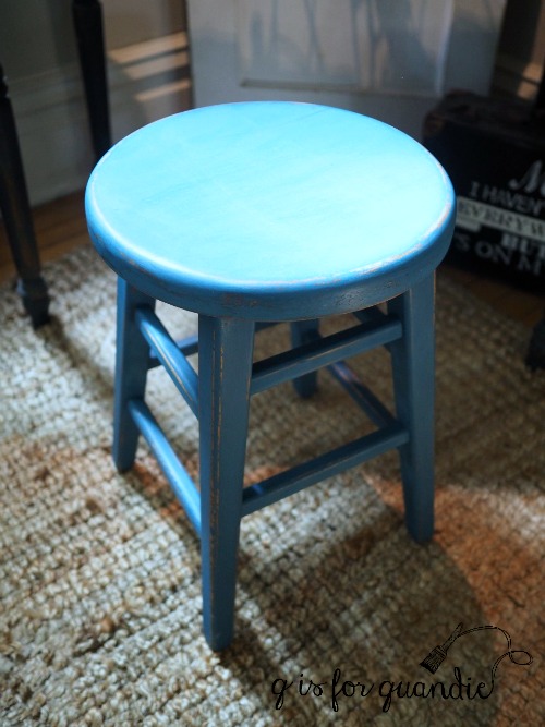
Another consideration when deciding what color to use on a particular piece is what colors I have on hand. I have so much paint! Some women have so many shoes in their closet that they could never possibly wear them all, I have so much paint in my cupboard that I’m not sure I’ll ever use it all, mainly half used paint. There isn’t enough left of each color to paint an entire piece of furniture, but I certainly can’t just throw it away! This is where custom mixing comes in handy like this mix of equal parts Miss Mustard Seed Shutter Grey, Eulalie’s Sky and Layla’s Mint.

I mixed Fusion’s Liberty Blue and Homestead Blue to create a color called Lake Superior Blue.
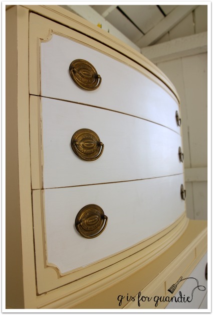
Yet another factor that I keep in mind when choosing a color is you guys. After all, how boring would my blog be if I painted everything in neutral shades like Annie Sloan’s Coco?

That would get old fast, right? It would get boring for me too, always painting in the same old neutrals.
Don’t get me wrong, it’s not that they aren’t lovely!
But sometimes you just gotta mix it up.
How about you, do you have a favorite color? Or if you are a furniture seller, what color sells best for you? Is there a color that you absolutely love, but avoid using because it just doesn’t sell? I’d love to hear about it in the comments.