Have you made yourself a recipe box scrapbook yet?
I shared this idea a few years back when I made one for our Adriatic cruise.
That cruise went to some of the most beautiful ports I’ve seen; Venice, Ravenna, Kotor, Split and Valletta. If you’re considering a European cruise, I highly recommend looking for one that visits those ports of call.
But, I digress. This isn’t supposed to be a travel post. This is a post about a makeover for this recipe box.
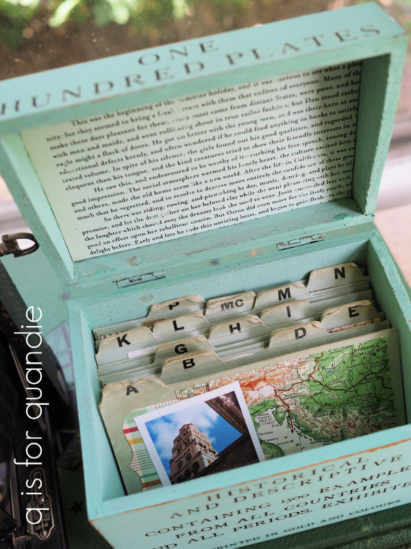
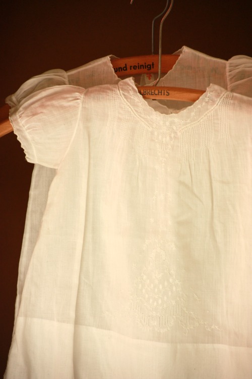
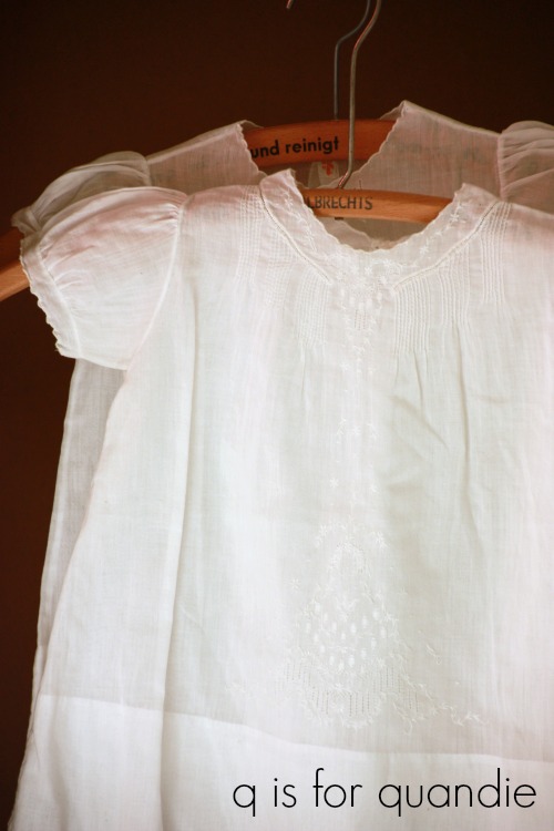
I found it the last time I went thrifting with my friend Sue. It’s a nice, big one which would make it perfect for photos.
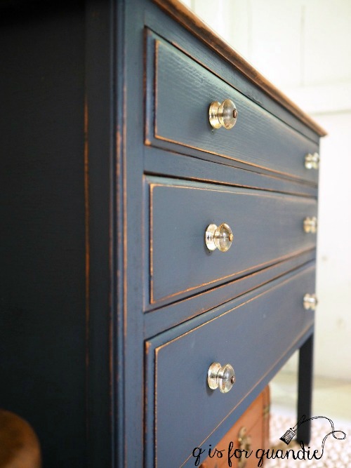
After sanding the box down, I painted it with one coat of Dixie Belle’s Sea Glass. Once that first coat was dry, I blended more Sea Glass with some of DB’s Juniper around the edges (FYI, I believe Juniper is no longer available, it was a seasonal color back in 2021).
I’m still practicing my blending skills, I do like the way a little blending adds some depth to a piece.
Once painted I added some I.O.D. transfers from the Brocante and Label Ephemera sets.
The floral and the butterfly are from Brocante, the wording is of course from Label Ephemera.
I didn’t paint the inside of the box, but I did line it with some scrapbook paper.
Unfortunately, the previous owner of this box had defaced most of the alphabet index cards.
I have only A thru J in their original state.
The tabs for the rest of the alphabet have been obscured with white out.
Still, someone creative could work with those cards. Especially if they happen to have any of the October Afternoon word stickers. They all have index tabs on them, like the “Family History” one below.
You can still find some of the word stickers on Etsy, but October Afternoon has been out of business for several years.
I decided to go ahead and paint over the white with some of Dixie Belle’s Mint Julep to make it a little less obvious.
I used my cute little Savoy camera to stage these photos.
This is one of the few items I’ve ever purchased at a legit antique shop. It was $30, but I fell in love with the colors, which happen to work beautifully with the colors in the October Afternoon supplies I’ve used on my index cards.
You might be thinking that I plan to save this one for myself, but actually I am going to sell it (without the photos). If I do eventually decide to make one for my old family photos, I’ll likely theme the outside to something more ‘family like’. But it was fun to break out the scrapbook supplies and show you what you could do with this box.
So tell me, have I encouraged you to create your own recipe box scrapbook yet?
Before I move on with today’s post, I want to say congrats to Libby. I drew her name as the random winner of the pair of Dixie Belle brushes I’m giving away and Mr. Q is heading to the post office today to get that shipped out along with the desert themed giveaway that Debbie Dee won two weeks ago (I’m so sorry Debbie, I’m terrible about getting things in the mail promptly!)
Last Friday I wrote about losing my mojo with furniture painting, and today I thought I’d post about another creative outlet that I lost my mojo for. I used to be an avid scrapbooker. I feel like I must have inherited the gene for it from my grandmother, based on the scrapbook she made of their 1953 road trip.
I have almost completely given up scrapbooking, although I do still occasionally create scrapbook alternatives like the recipe box scrapbook of our Adriatic cruise.
I still haven’t finished that project. I meant to get to it over the winter, but somehow the winter has slipped away from me and here it is spring already!
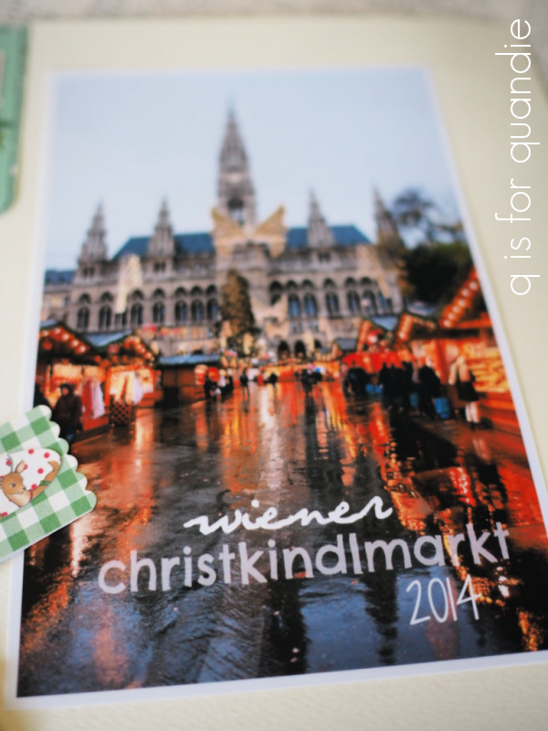
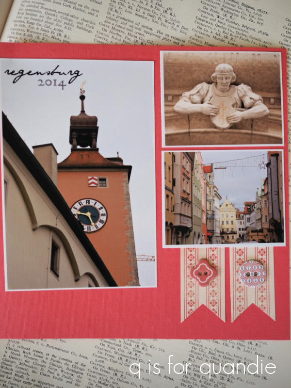
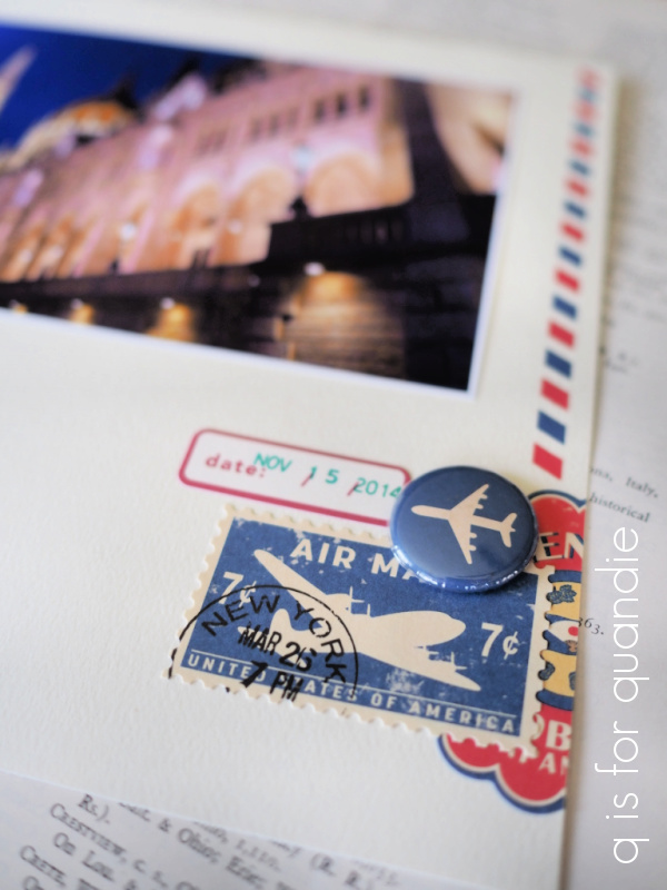
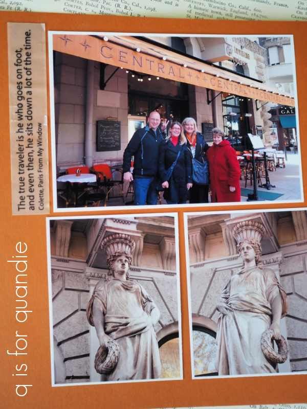
While I was out visiting my mom last month, she sent another scrapbook home with me (my mom is at that age where she wants to get rid of things). This is a small scrapbook that I made for her as a memento from a Viking river cruise that we (Mr. Q, my sister, my mom and me) took on the Danube back in 2014.
As I looked through it I was reminded that I kept it fairly simple and uncluttered, so overall it came together pretty quickly. Plus the 8″ x 8″ size of the pages in this book are easier to fill than those in a larger book.
So I thought that I’d share some tips today on creating a simple scrapbook just in case any of you might be inspired to get out your old scrapbooking supplies this weekend.
My first tip has to do with the photos themselves. I print my own photos on a relatively inexpensive color printer and I use matte photo paper. You know me, I’m not a fan of shine, even in my photos. Printing the photos myself as I go allows me to size them to fit the layout on my page.
By the way, that guy in the photo at the top of the page is making something called kürtöskalács or chimney cake and it was delicious!
I also edit my photos using the same program I use for my blog photos, PicMonkey. You can make all kinds of adjustments to your photo for color, exposure, etc and you can play around with fun effects (check out what I did with their “miniature” effect in this post), but my favorite thing to do is to add titles right to the photo.
There are lots of fonts to choose from, and you can adjust the color and transparency of the title as well.
Personally I find PicMonkey fairly easy to work with compared to some of the more complicated photo editing software packages like Photo Shop.
I tried to keep the focus on the photos in this book and I chose plain but colorful background paper to bring out the various details.
I didn’t add too much embellishment to most of the pages, but when I did I just layered a few elements.
I know you all are probably noticing that I didn’t do any journaling other than those titles on the photos. Here’s my thoughts on journaling; it’s more important for scrapbooks that might be handed down to future generations than it is for your own keepsake. When I look back at these pages I am transported back to the places we visited on this trip. I remember quite well how rainy it was in Vienna, and the pretty pastel colors on the buildings in Regensburg.
And I definitely don’t need any more journaling to remember how freezing cold it was sailing through the Wachau Valley, even for a hardy Minnesotan like me. I had on about five layers of clothing, plus two blankets and I was still freezing!
We spent a couple of days in Budapest before our cruise sailed and we hired a private guide for a walking tour which turned out to be amazing.
I have to admit that quote sticker I chose to place beside the photo is a bit tongue in cheek. We walked, and walked, and walked for a full five hours (it was supposed to be 4, but we just kept on going) on that tour and definitely did not sit down a lot of the time. My poor mom was totally wiped out. At one point we offered to send her back to the hotel in a taxi, but she was a real trooper and she hung in until the end.
By the way, if you are ever going to be in Budapest I can’t recommend Orsolya enough. Our tour was amazing. You can check out her website here. At $150 for the entire group for a 4 hour walking tour, I’d say she is still a bargain!
This scrapbook definitely serves it purpose as a memento of a wonderful trip.
Here’s hoping that we’ll all be able to travel like this again soon. I’d love to take another river cruise in Europe one of these days! I have to admit, I’m starting to despair that Europe will never open back up for U.S. travelers, but I’m trying to embrace optimism. Therefore, I predict that one year from now I’ll be writing a blog post all about the trip to Europe that we are planning for Fall of 2022. Fingers crossed!
If you’d like to see more of my scrapbooking efforts, I did post about the full size book I made about this trip for myself here, and if you’d like more details on our walking tour with Orsolya, you can find a post about that here.
With Spring officially here (and possibly even actually here, I do have a few things starting to come up in my gardens), I’m realizing that I’m really looking forward to returning to outdoor photo shoots this year.
Last year around this time I was feeling really insecure about my outdoor photos. I had read something online that was critical of the idea of taking your furniture photos outside. The writer suggested that you should always stage your furniture in spots that show how it could actually be used and that outdoor photos were ‘unprofessional.’
I immediately thought to myself ‘oh man, I’ve been doing it wrong all this time’, ‘I need to change what I’m doing to meet professional standards’ … which led to those inevitable feelings of ‘my work is inferior’ and ‘I don’t measure up.’
I started trying to think of ways I could set up better indoor photos year round.
I do have my photo cottage for summer photo shoots …
But it is in dire need of a fresh paint job, plus I can never quite get the lighting right in there. Also, it’s small, so I have limited ability to shoot the piece from different angles other than straight on.
I also have the one blank wall in my house that I can stage for furniture photos …
It works great in the winter. However, we have a lot of trees in our yard and in summer when they leaf out this spot is no longer filled with natural light.
I’d even thought about setting up a spot in my carriage house for summer ‘indoor’ photo shoots.
This spot seemed like it would be ideal because it has an authentic ship-lap style wall, and that concrete floor has a cool industrial vibe. The lighting all comes from the side, but maybe I could work with that. But in the end, the one thing that drove me crazy was the fact that the ship-lap is not level with the floor. So my photos all end up looking crooked. I can either make the furniture level or the ship-lap level, not both.
Finally I simply came to the conclusion that maybe outdoor photos were OK after all. I mean seriously you guys, when am I going to learn to follow my own instincts and ignore the naysayers?
There really is something about outside photos that appeals to me. Maybe it’s that unexpected juxtaposition of an outside setting with some inside furniture.
Or maybe it’s just that I enjoy working outside in any capacity when I have the chance. Our summer season is so darn short here in Minnesota, so I like to enjoy it while I can.
I do realize that I’m lucky to have an awesome leafy, green background to take advantage of, not to mention a giant Limelight hydrangea to use as a backdrop.
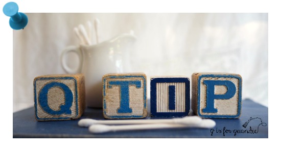
In the end, outdoor photos work great for me. So I thought I’d share a few q-tips with all of you on how to get the best outdoor photos.
Early morning or late evening light is best. Photographers call the hour after sunrise and the hour before sunset the ‘golden hour’, the light is softer than at other times of day and you can get a beautiful glow on your subject, whatever it might be.
You can shoot outside at mid-day if you’re in full shade, or if it’s an overcast day.
However, you should avoid direct sunlight which creates harsh shadows.
Dappled shade can be a problem too.
If shooting in dappled shade try to make sure that your piece itself is mostly in shade. Or ask your neighbor to come over and hold up a large golf umbrella just out of frame to throw some shade on your piece (nnK comes in really handy for this).
By the way, all of these tips work great for portrait photography too. So the next time you want to get a good family photograph keep them in mind.
I’m looking forward to embracing ‘outdoor photo shoot season’ again this year.
Hey, I bet you guys thought I forgot all about Photo Finish Friday!
With all of the hubbub over milk paint madness week, it sort of fell to the bottom of the priority list. But it’s back!
My first photo finish Friday blog post was all about composition, while today’s photo finish subject is white balance. White balance is a very important part of photography, especially so when you want to correctly represent colors in your photos. It’s also something that I struggle with all of the time. I am constantly correcting, and re-correcting, the white balance in my photos!
All light is not created equal. In fact, lighting has color depending upon its source. Lighting from an incandescent bulb will be more yellow or orange, while fluorescent lighting will be bluer.
We can also talk about light in terms of temperature. Incandescent lighting is warm, fluorescent lighting is cool. Outdoor lighting changes throughout the day depending on the angle of the sun, whether or not it is overcast, or things it reflects off of (like snow, or the side of a big red barn).
However, our eyes (or maybe technically it’s our brains) have the magical ability to automatically adjust the white balance of what we are looking at without us even being aware of it. That ends up being one of the trickiest aspects of white balance. Sometimes our brains adjust for it and we don’t even notice that the white balance in our photos is off. So be sure to take the time to really scrutinize your photos.
There are two easy ways to control white balance; using the white balance settings on your camera and using photo editing software to adjust the white balance of your photo in post processing.
Let’s start with setting the white balance on your camera. Most cameras will have a white balance setting. Even my smartphone, which isn’t all that smart because it’s ancient, has a white balance setting. If you don’t know how to change the white balance on your camera (or whatever you are using as a camera), now is the time to figure that out. I recommend googling it. For me that’s the easiest way to get a quick answer on where a setting might be located on my camera.
Typically your camera will have an automatic white balance setting and a few settings for specific lighting conditions both indoors and out. Those usually include incandescent (or Tungsten), fluorescent, cloudy, sunny, shady and possibly a few more. Most cameras I’ve seen use the same, or similar, icons for their white balance settings.
The incandescent setting is best for traditional household light bulbs. The fluorescent setting will prevent the green cast common to photos taken in fluorescent light. The cloudy setting will add a bit of warmth to the light; the shade setting adds a slight pink tone to eliminate the blue cast that shadows take on in open shade; and sunny option sets the color temperature to something typical of mid-day sun.
For the most part I keep my camera on automatic white balance. My camera will do its best to determine the current lighting condition and adjust for it. However, the camera doesn’t always get it right. When I notice that happening I will try one of the other settings to try and improve the white balance.
But when I fail to get the white balance right in the camera, I still have a chance to correct it in post-processing.
Here’s an example of a photo I took with the automatic white balance.
And here it is after I adjusted the white balance in PicMonkey.
PicMonkey is a photo editing software that used to be free, but unfortunately it isn’t free anymore. There are lots of options out there for photo editing software ranging from basic to really technical, and from inexpensive to really expensive. I haven’t tried very many of them, and in fact two that I’ve used regularly in the past have become defunct (Picasa and Window Live Photo Gallery) leaving me currently with just PicMonkey. Because I’m a renewing customer, I recently paid $48 for another year of PicMonkey. However, new customers pay a little more.
For the moment I’d rather pay my $48 and not have to learn something new.
Correcting the white balance in PicMonkey is relatively easy most of the time. Under ‘Basic Edits’ you click on ‘Colors’ and then ‘Auto Adjust’ and PicMonkey takes its best shot at correcting the color for you.
I didn’t necessarily think this next photo needed to be adjusted …
But I tried ‘Auto Adjust’ anyway, and this is the result …
See how it warmed up the colors giving the photo more of a pink cast? Honestly, I’m not really sure if that is an improvement or not.
The ‘Auto Adjust’ doesn’t always get it right, especially if there are multiple sources of light or multiple shades of white in your photo. In that case, you may have to choose the spot on your photo that you think represents the best neutral shade. In PicMonkey you can do that by clicking on ‘Neutral Picker’ instead of ‘Auto Adjust’, then use your mouse to position the little pointer over the spot you want to base the white balance on.
I tried that again with the same photo, positioning the neutral picker over the ironstone tureen.
Hmmmm. Now it’s really pinkish.
Next I positioned the neutral picker over the folded tablecloth at the bottom of the photo.
That really warmed up the color.
Choosing a sunny spot on the curtain in the background gave this result.
But which one is right? I’m not sure of the answer to that question. Beauty is in the eye of the beholder, or perhaps it really depends upon the color settings on your computer screen.
Regardless, I try to choose the white balance that I think best represents the colors on the item I’m featuring in my photo. Especially if I’m taking photos of a piece of furniture I’ve painted. I want the paint color to be as accurate as possible.
Is my custom Blue Alligator color more blue …
or is it a tad more green?
That difference might be important to a potential buyer.
It’s well worth your time to take a few extra minutes to get the white balance right in your photographs. I hope you’ve learned a bit about white balance and how to adjust it today.
Now get your camera out and play around with the white balance this weekend!
I know that a few of you out there are fellow furniture painters. Some of you might just take your pieces to a shop to sell them, but I’m betting that many of you need to take good photos of your pieces to sell them online too. Possibly you share photos of your furniture on Facebook. Or maybe you’re a blogger, or thinking about starting a blog, in which case you really do need to have great photos.
I’m hoping that whether you take your photos with a smartphone, iPad, click and shoot or a more expensive DSLR, you’ll get some info out of this post that you can put to use. I’m planning to stick with tips that you can use without having to purchase software or buy new equipment of any kind.
Today’s post focuses (pardon the pun) on one of the most important pieces of the photography puzzle and that is composition. That are lots of things to consider when it comes to composition, so let’s just briefly touch on the ones that can be directly applied to furniture photos.
Rule of thirds.
Many of you probably already know about the rule of thirds because it’s one of the basic rules of good photography of any kind. Many cameras even have an option for including a grid in your view screen that will help you instantly see if you are following this rule. It might look like this …
The basic idea is that you will create a more dynamic photo if rather than centering your subject, you place it on one of the lines of a grid separating your frame both vertically and horizontally into thirds.
You might be wondering how you can accomplish that with a close up furniture shot where the piece fills the frame. The trick is to pay attention to what the subject of your photo really is. For example, in this next shot the subject of my photo is the drawer pull itself, not the entire piece.
But even with photos from further out showing the entire piece of furniture you can use props on one side of the piece to balance a photo where your furniture isn’t centered in the frame.
Sometimes it still makes sense to center your piece in the frame though, if so then try to use some of these next tricks to improve your composition.
Symmetry.
As I was looking back through my blog posts for a good example of symmetry, I realized it’s something I rarely use. To achieve symmetry you want to center your subject and then have each side of the frame somewhat mirror each other, or at least be visually balanced. This symmetry in this next photo comes from the cabinets that are behind the piece and are equally balanced on each side.
Triangles and diagonal lines.
Making a visual triangle with your props is another great way to add dynamic tension to your photos.
Diagonal lines work well for this also.
OK, technically that’s not a piece of furniture, but you get the idea.
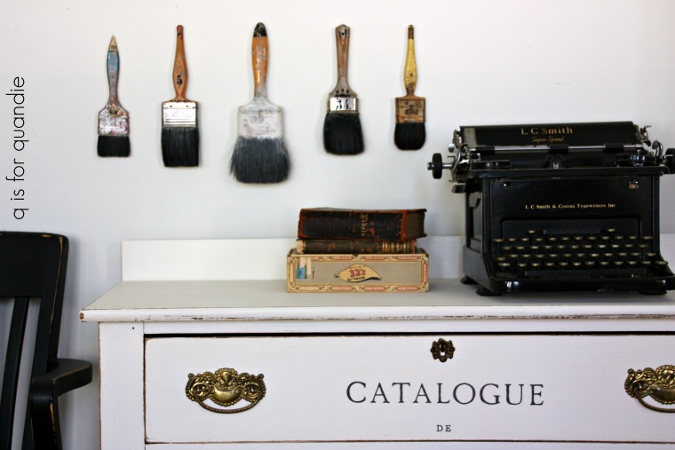
Rule of odds.
This is a simple rule to follow when adding multiple props to your photos. For some reason odd numbers of items always look better than even numbers. For example, five paint brushes, three books, etc.
This works when styling shelves in your home as well, try grouping things in odd numbers.
Filling the frame.
This is the idea that you should fill your entire frame with the subject of your photo, even to the point where you can’t see the entire thing. Filling the frame adds instant impact to your photo.
There are three ways to accomplish this; 1) use a zoom lens to zoom in on your subject, 2) just get close with your camera or 3) crop your photo in post-production.
Foreground interest.
This is something that I wish I would remember to do more often. One of the furniture artists I admire most does this all the time and it looks amazing (Marthe Leone). Basically the idea is to have something in the foreground of your photos to help add some depth to your photo and make it look less two-dimensional.
This can be challenging if you don’t have a lot of space where you take your photos, but if you have the room give it a try!
Point of view.
Point of view refers to the position your camera is in when taking a photo and it’s an important thing to pay attention to. Are you looking up at your piece? Down at your piece? Are you taking the photo from an angle or from straight on?
I find that a lot of people tend to take furniture photos from a standing position, and thus are really shooting down on their subject. While shooting down can be flattering for people (because it makes things look smaller), and it can add some artistic flare to one or two photos in a blog post (like the one above), it tends to throw off the scale of the piece. Especially if you’re taking a photo for an ad.
Instead try taking your photos straight on at eye level with the piece. I use a little kid size chair to sit on when I’m taking the majority of my furniture photos (just because it’s easier than spending a lot of time on my knees). Always include at least one or two photos taken at eye level when posting an ad for selling your pieces.
As you’re taking the photo, pay attention to your lines. The horizontal and vertical lines of the piece of furniture should all be straight and even like in the photo above.
I hope some of my tips for composing photos specifically for furniture have been helpful. If you’re interested in seeing more posts with photography tips for furniture painters or if there is a particular subject you’d like me to address, be sure to let me know with a comment. If you guys are interested, I’ll definitely do some more photo finish Friday posts!
The cold that I’m still fighting off has completely zapped my energy, so since I haven’t had the gumption to finish a piece of furniture I thought I would share an update on the Olympus O-M-ED-10 camera I purchased over a year ago.
I realized recently that I tend to grab my Olympus camera (which is a mirrorless camera) more often than my old Canon Rebel (which is a DSLR) these days. I have to say, it took me almost a year to get to the point where I am more comfortable with the Olympus. That’s mostly because I’m a slow learner when it comes to the tech-y stuff. I just don’t have the patience to learn something new, I’d rather jump in at the deep end and sink or swim, which usually tends to involve a bit of sinking.
I purchased my Olympus back in September 2016. You can read a post about that purchase here if you want more details on why I chose to purchase a mirrorless camera. And then back in May 2017, just before my cruise to Norway & Scotland, I purchased a 17mm prime lens for it, and I posted another update on the camera here.
I promised to keep you guys updated on how the new camera worked out for me and now that I’ve had it for over a year I feel like I’m in a good position to report back on it.
I generally use my camera for two things, travel photos and blog photos, so I thought I’d address both of those needs separately.
Travel Photos.
I took both of my cameras on that cruise last May, but I definitely used the Olympus far more than the Canon.
Flam, Norway
The main reason for that was size. The Canon is much bigger and heavier than the Olympus. I just didn’t want to carry the Canon around with me all day. The only time I took the Canon off the ship was the day we hired a private guide with a car, so we weren’t on foot all day plus I could leave the camera in the car if I wanted to.
Dunrobin Castle, Scotland
I also used the Canon while taking photos from our balcony. I have a decent zoom lens for it, so it was fun to play around with that from the comfort of our room. I definitely got some shots with that zoom lens that I couldn’t have gotten with the Olympus (unless I purchase a zoom lens for it).
sailing away from Bergen, Norway
However, when were off the ship touring around on foot, I only carried the Olympus with me.
It worked beautifully in low light situations.
The Beamish
And I got some beautiful landscape shots with it.
Isle of Skye, Scotland
Before our next trip I plan to find a good zoom lens for the Olympus and not even bother with packing the Canon.
Blog Photos.
As I mentioned at the start of this post, I find myself grabbing the Olympus for blog photos most of the time these days too. I can’t blame that on size and weight, since I don’t have to lug the camera far to take my furniture photos.
One of the main reasons is the 17mm prime lens that I use with it. For those of you who aren’t into tech-y details you can skip this next bit, but for those of you who are interested, a 17mm prime lens on a mirrorless camera (like my Olympus) is approximately equivalent to using a 35mm prime lens on a DSLR camera (like my Canon). There is some sort of mathematical reason for that, but let’s not kid ourselves, who really understands that stuff? And who really cares?
The important bit is what that means. With a prime lens you can’t zoom in and out. It has a fixed focal length. That means to ‘zoom in’ you have to literally walk closer to your subject, and to ‘zoom out’ you have to walk away from your subject. You may be wondering why anyone would want a prime lens at this point. Well, it’s because you can get a good, fast prime lens for less money than a good, fast zoom lens … and speed translates to crisper photos, especially in less than optimal lighting conditions. So when I’m taking furniture photos in winter, I get better results with a prime lens.
Currently I have a 50mm prime lens for my Canon. It works great for furniture photos out in my driveway when I can get a good 20’ away from my subject.
But it doesn’t work so great inside my house where I just can’t get far enough away from a piece of furniture to fit it into the frame using that 50 mm. I can only use it to take close up photos indoors.
The 17 mm prime lens on the Olympus, on the other hand, is just right for indoor photo shoots. I only need to get about 6’ away from the piece of furniture to get a full shot of it.
I should point out here that if I had a 35mm prime lens for my Canon DSLR I could easily use that for indoor furniture photo shoots too, I just don’t happen to have one.
The 2nd reason I tend to grab the Olympus these days is that feature I mentioned the last time I posted about this camera. The touch screen focus. Here’s how that works, the LCD screen displays the image you’re about to take and to choose the spot where you want the camera to focus you just touch the screen there. The camera focuses and takes the shot with just one touch, no need to depress the shutter release button.
I use this feature ALL. THE. TIME. I can’t emphasize that enough. It’s how I get awesome crisp photos of the hardware on my furniture even when the hardware isn’t centered in the frame, like this …
I can accomplish that with my Canon also, but it take a few more steps and it’s not as precise.
Lastly, I have found that the automatic white balance setting on my Olympus works better than the same setting on the Canon. White balance is something I have an ongoing struggle with. Since a big part of my blog involves showing specific paint colors and how they look on furniture with different top coats, I want the colors in my photos to look as real as possible. Honestly, sometimes I still don’t manage to pull that off, but I do work at it. Seriously, just how many different shades of white are there in this next photo? And which one is ‘true’ white?
Of course, you can adjust your white balance with photo editing software after the fact, but it’s so much easier if you are starting out with a photo that was captured with good white balance. If you are a fellow furniture painter or blogger, I hope that you are also paying attention to white balance in your photos. Even if you’re taking photos with a smart phone you should have some options for setting your white balance so be sure to check that out.
One instance where I do still prefer my Canon Rebel is when I want to get a photo like this next one.
For some reason I still find it easier to use the zoom lens on my Canon to create photos with a shallow depth of field (where the background is blurred out like the example above). If you want to learn more about how to take photos with a shallow depth of field, check out this article I found on the subject. I’m sure that I can accomplish this with the Olympus, but that is something I need to work on. That sounds like a good goal for 2018, doesn’t it?
If you’ve stuck with me to the end of this post I hope you learned something new about cameras, lenses, white balance or depth of field. I plan to be back next week with a gorgeous dresser makeover (photographed indoors with my Olympus mirrorless camera and 17mm prime lens), so be sure to stay tuned.
First things first, the winner of the milk paint giveaway is Vicki Bougie. Congrats Vicki! And thanks so much to everyone who left a comment. You all have so many great projects lined up, I just wish I could send milk paint to all of you!
OK, so I’m not a techie person, let’s just get that straight right up front. I rarely have the patience to sit down and learn the ins and outs of a new device. I’ve never loaded a single app on my phone. And I should probably spend a little more time tweaking the design of my blog. But all in all, I’d much rather be painting furniture.
That being said, I do occasionally force myself to try and learn more about my photography equipment so I can take good photos of the aforementioned painted furniture.
Today I thought I’d share an update regarding the camera I purchased back in September since I promised to report back on how I like it. For those of you with absolutely no interest in camera equipment, this is the point where you should go do something more interesting with your time.
For the rest of you, the camera I purchased is an Olympus OM-D E-M10 mirrorless camera and I paid $399 for it. If you want to refresh your memory regarding why I made this choice or what a mirrorless camera is, go back and read the post. It’s OK. I’ll wait.
This is a great little camera in a decent price range. If you want a little more than just the camera on your phone or a simple point and shoot, this camera is a great step up.
Here’s why I love it.
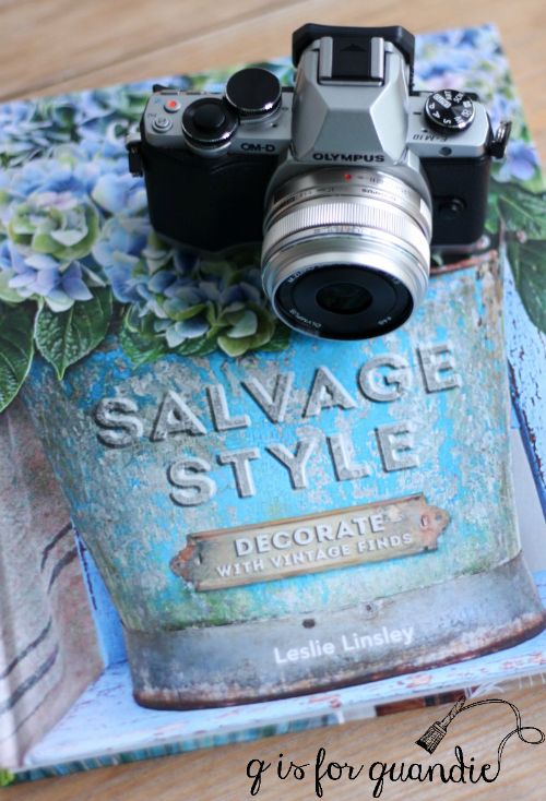
the size.
Whoever said ‘size doesn’t matter’ would be just plain wrong when it comes to having a camera that you want to carry around with you. The Olympus OM-D is just so much smaller and lighter than my Canon Rebel (which is a DSLR camera). This is one of the major pros to a mirrorless camera.
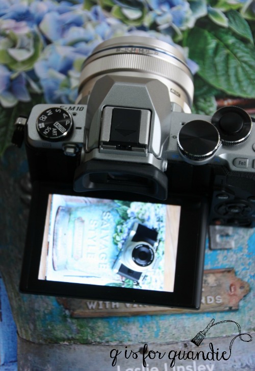
I can throw it in my regular purse without having to switch to a larger bag. If you don’t want to carry a big bag of gear around, this is a great feature. Just to give you an idea of the size I took a photo of it on my Salvage Style book because I thought that would put it into perspective for many of you.
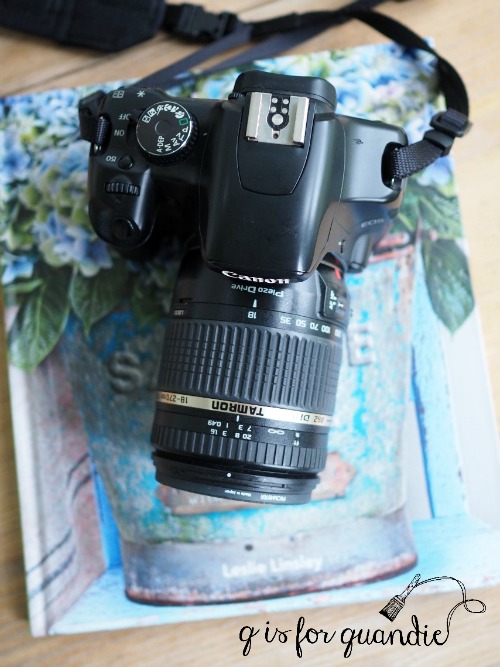
In comparison, here is my Canon with the Tamron lens that I normally use.
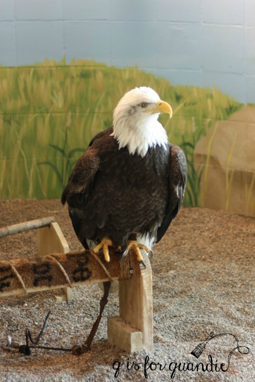
I’ve found that I’m much more likely to throw the Olympus in my bag when taking a day trip somewhere, like when we went looking for bald eagles back in March. Even though I don’t have much of a zoom lens on the Olympus, I find that it takes such good quality photos that I can crop my photos with photo editing software later to ‘zoom in’ on my subject. That’s how I got so ‘close’ to this eagle.
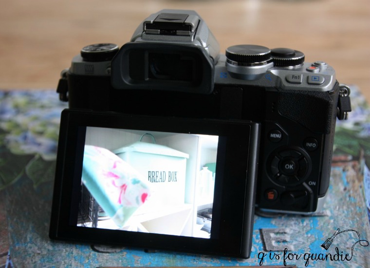
the touch screen shooting.
I totally underestimated how much I would love using the touch screen, especially when I want to redirect the camera’s focus. Here’s how that works, the LCD screen displays the image you’re about to take and to choose the spot where you want the camera to focus you just touch the screen there. The camera focuses and takes the shot with just one touch, no need to depress the shutter release button.
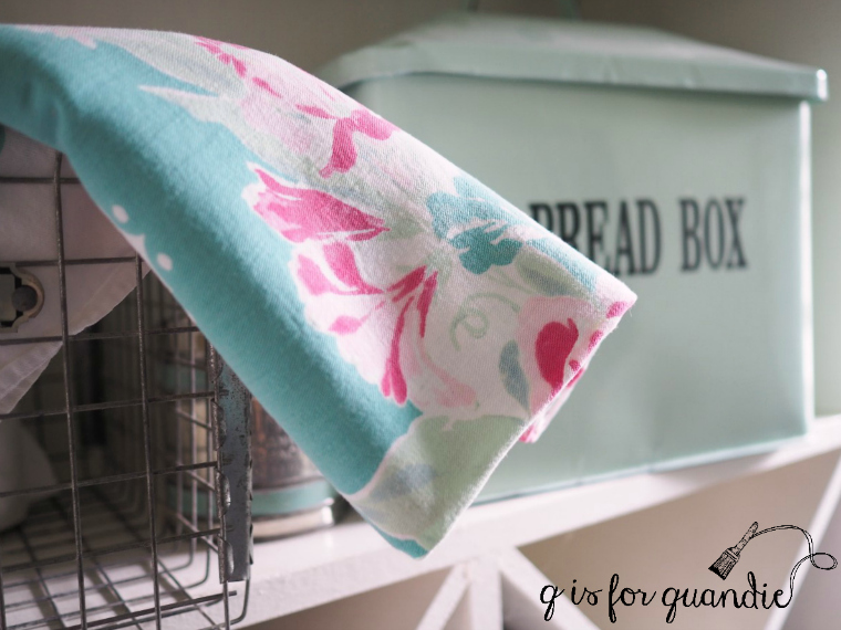
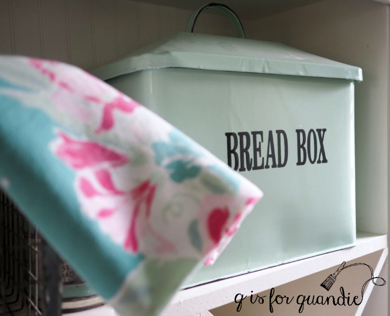
Here’s an example of what I’m talking about. In this first photo I touched the screen over the vintage tablecloth in the foreground.
And here is that same shot, only this time I touched the screen over the bread box.
Is that slick or what? It’s something that I use really frequently. When taking photos for the blog I often want to focus on a specific spot that isn’t centered in the shot, such as the drawer pull on this dresser …
With my Canon I have to reset the focal point, and then change it back every time, requiring multiple button pushes. With the Olympus I can take unlimited photos one after the other with different focal points by just touching the screen in a different spot for each.
the LCD display.
I really like the LCD display more than I thought I would as well. I’m a little embarrassed to admit the reason, but here it is. I can take photos without having to remove my reading glasses! I can see how my photo is composed, I can see all kinds of settings around the perimeter of the screen including a histogram, and then I can take the shot without have to take off my readers first. I still have the viewfinder as a backup for outdoor shooting on bright, sunny days, but I rarely find myself using it otherwise. With my Canon DSLR I am constantly putting readers on, then taking them off, putting them on, then taking them off. You younger punks may not appreciate this feature, but those of you closer to my age know exactly what I’m talking about here.
Another handy feature of the screen is that it tilts, even as far as perpendicular to the camera.
This can be super handy when you want to hold the camera at about waist level and shoot straight on at your subject (usually a piece of furniture for me). You can still easily see the screen.
how easy it is to adjust the exposure.
It’s also far easier to make quick changes to adjust the exposure on this camera. You just turn the ring that is around the shutter button. It couldn’t be easier to go just a hair lighter or darker and you can immediately see the results either through the viewfinder or on the screen. With the Canon I have to hold down the AV button with one finger, move the ring with another and you can’t see the results until after you take the photo and then check it on the view screen (take the readers off, put the readers back on).
photo quality.
After reading all of these glowing reasons why I love my Olympus camera you must be assuming that I don’t even use my Canon any more, but no, that’s not true.
The biggest reason that I continue to use the Canon is that I have several expensive lenses for it, and I don’t want to fork out the money for similar lenses for the Olympus. At least not all at once. And personally I find that the lens I’m using makes the biggest difference to the quality of my photos. Lately I’ve been experimenting with prime lenses and have found that the sharpness of my photos (especially in lower light situations) is much better with a prime lens. I have a 50 mm prime lens for my Canon, and it takes really sharp photos. The 50 mm is not quite wide enough for taking photos of furniture indoors though. At least not in my house. I can’t get far enough away to get the whole piece of furniture in the frame. That’s why I’ve been doing a lot of outside shots lately.
However, I did just splurge on a wide-angle 17 mm prime lens for the Olympus both in anticipation of my upcoming trip and so that I can work on my indoor shots (the 17 mm for a mirrorless camera is approximately equal to a 35 mm prime for a DSLR, so a bit wider than the 50 mm that I’ve been using, I know, this all gets so confusing, doesn’t it?). I have two weeks to decide if I love it enough to justify the expense (it cost more than the camera itself at $599 including a good quality UV filter), so I plan to do a lot of practicing with it between now and then. I used it to take the photos of the watering can in Monday’s post, and so far so good.
The other reason I don’t always reach for the Olympus is that little thing I mentioned at the beginning of this post. I’m not patient about learning new technologies. The Olympus has so many bells and whistles that it’s a serious challenge to learn about all of them. I’ve been using it for over six months now and I still struggle with making adjustments on the fly. But the more I learn about this camera and the more I practice, the more I use it. I suspect that I will be using it a lot in Norway and Scotland, so I’ll be sure to report back on how it worked out for me after my trip, which is coming up soon!
In the meantime, I’ll be back next week with some more furniture makeovers so be sure to stay tuned.
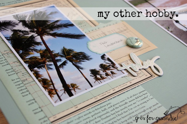
I’ve mentioned before that I have another hobby, scrapbooking.
I used to do a lot more of it, but these days I only scrapbook about once a year when I head off on a retreat with some friends. My sister used to fly out from New Jersey for these scrapbook weekends, so it’s really fun now that she lives here in Minnesota and doesn’t have to come from so far away! She can bring many more supplies when she doesn’t have to bring them on an airplane.
So instead of painting furniture last weekend, I was off creating scrapbook pages. Since I don’t have any furniture makeovers to share with you, I thought I would share some of my favorite scrapbook page techniques instead.
One of my favorite techniques is to focus on one color, in this case pink.
This works great when there is an obvious color to pull from a photo on the page, like the pink flowers on the right. I like to pair my colors with a charcoal gray background.
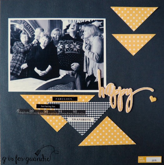
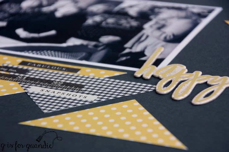
I used that same technique on this next page, only this time using yellow.
I also used a black and white photo on this one leaving just the yellow of my embellishments for color.
The ‘happy’ chipboard sticker (and the ‘love’ from the pink page and the ‘today’ from the title photo) is from Heidi Swapp, but unfortunately this design has been discontinued.
Such a bummer, they were one of my favorites.
Yellow was an obvious choice for this page of photos from Bonnet House in Ft. Lauderdale.
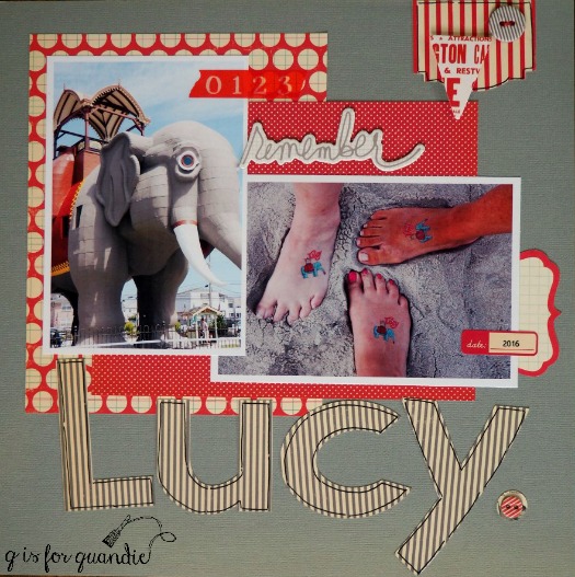
Here’s another example using red and grey. Much like with decorating your home, it’s easy to combine different patterned papers if you stick with the same color.
In case you are wondering, Lucy is the name of the elephant and she is located in Margate, New Jersey. These pics are from my trip to the Jersey Shore last summer.
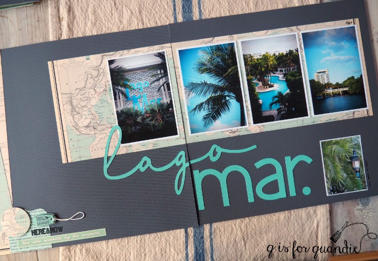
Another technique I like to use is the two page spread. Instead of focusing on just one 12″ x 12″ page, I create a design across the full 24″ width of two pages. Even if that means cutting some elements down the middle. Once you get the pages in the book your brain barely registers that they are cut apart.
Lago Mar is the hotel we stayed at in Ft. Lauderdale last November.
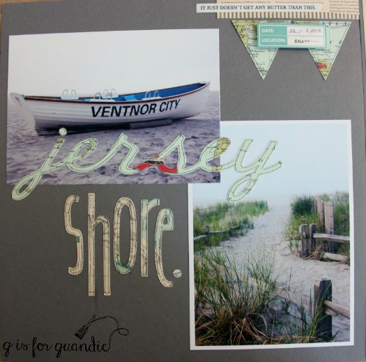
A Cricut machine really comes in handy for cutting page titles out of paper.
‘Jersey shore.’ was cut out on the Cricut in two different fonts. I think a patterned paper works great for titles and outlining each letter with a fine tipped black pen helps give them more definition so they are easier to read.
Here’s another title cut out with the Cricut. Two fonts with two different papers is so much more interesting than doing the whole title the same.
By the way, if you’re wondering about the look of my photos and how I manage to not get any glare from them at all, it’s because I print my photos on matte photo paper. I love the look of the matte paper. I buy it at Target, but I’m sure you can find it many places.
October Afternoon products continue to be my favorites. I like that I can mix and match their paper, stickers, chipboard and other embellishments and the colors always work well together. Everything on this next page aside from the grey solid background (and the photos of course) is from October Afternoon.
I have just one last page to share with you. I basically did this page to torture my sister. I’ve mentioned before that I have some old slides from when we were kids and I had a bunch of them turned in to jpeg files. I print out a few here and there and I’m working on a scrapbook of just the slide photos. This one of my sister cracks me up because the cowlicks in her hair are totally out of control. As I was working on the page I realized that a photo I took of her while on vacation showed those same crazy cowlicks so I added that photo in the little Kodek slide frame.
I called them ‘devil horns’ and pointed out that she still has them just to annoy her. Hey, I’m a little sister, I’m supposed to annoy her every now and then. I’m pretty sure it’s in the job description.
If you missed seeing some of my other posts about scrapbook pages, you can them here, here and here. And if you are thoroughly bored by scrapbooking, don’t worry, I’ll be back next week with some fun painting projects that I currently have underway.
I take a lot of photos. You’ve probably already noticed that about me. But lately I’ve found that I tend to miss out on photo opportunities because I don’t want to lug around my big DSLR camera and lens(es). On top of that, I’ve also been having some technical difficulties with it. My Canon Rebel EOS XSi is somewhere around 10 years old I think. Lately it has been ‘acting up’. It just stops working. It has happened twice now. Each time I’ve been shooting a lot of photos on a hot, sunny day. I find that if I let it ‘cool down’ by shutting it off and leaving it alone for about 20 minutes or so, it starts working again. I don’t have any problems with it during short furniture photos shoots, but when I’m taking 300+ photos in the space of a couple of hours it acts up. I have to admit, I get a little panicky when my camera stops working! And it has stopped at some extremely inconvenient moments! As of yet I have been unable to diagnose the problem because I don’t get an error message of any kind. Changing the battery doesn’t help. Changing the photo card doesn’t help. I suspect it’s overheating, but I haven’t been able to find any definitive information on that online.
So I decided it might just be time for a new camera. If you have absolutely no interest in cameras, stop reading now and come back next week for another post that might be more interesting to you. But if you are considering a camera purchase of your own in the future, keep reading!
Since I have a lot of money invested in various lenses and filters for my Canon, the obvious first choice was to just buy a new Canon Rebel body that would work with the lenses I already have. But I quickly realized that didn’t solve my first problem; that lugging around all of that equipment is not always practical. Plus my current Canon still works well for furniture photo shoots as long as I don’t overuse it. What I really need is a good travel camera for places like Budapest …
Thus began the research. I’m not a huge fan of techie research of any kind, but it has to be done. There are so many options out there. I started with reading a few different articles reviewing various cameras and their features. That helps me narrow down the features that are available and whether or not they are important to me. For example, I really prefer using an optical viewfinder. I used my sister’s point and shoot camera at the McCrory Gardens when we were out in South Dakota and I hated using the LCD display to compose my shots. I couldn’t see the screen at all in full sunlight, and even in shady areas it was difficult to see. I felt like I was shooting blind. I also realized that even though I want a more portable camera, I still want the ability to control my settings. I also want good quality photos. And down the road I want the option of investing in higher quality lenses for my camera if I decide I need them.
After doing a bit of reading, I quickly realized that what I wanted was a mirror-less camera. Don’t know what that is? Check out {this article}.
Can’t be bothered with reading that? The short version; it’s smaller and lighter than a DSLR (so more convenient for traveling), but still allows you to have more control over settings than the typical point and shoot. It also allows you to swap out lenses.
Not all mirror-less cameras come with an optical viewfinder though. Some have an optional optical viewfinder (say that 10 times fast) that costs extra, and some don’t have a viewfinder at all. I really wanted a viewfinder so that limited my choices.
I also was working with a budget of $500. There were plenty of options that were priced way out of my price range! I just can’t justify spending $1,500+ on a camera.
I ended up with two potential cameras on my list. The Olympus OM-D E-M10 and the Canon EOS M3.
Once I had my choices narrowed down to these two I used a very helpful website to make my decision, cameradecision.com.
I used their comparison tool to see how the two cameras stacked up. Check that out {here}.
The Olympus OM-D E-M10 came out just slightly ahead of the Canon overall according to this website. Despite that, I was still leaning towards the Canon because I’m used to a Canon (less of a learning curve), plus I could use my current Canon lenses on it (with the help of an adapter, I think).
But in the end I went with the Olympus after all.
As it turned out, the price on the Canon EOS M3 on Amazon was $479 for just the body with no lens. The camera with an 18-55 mm kit lens was $599. To add on the optional viewfinder was another $189. Yep, suddenly I’m looking at almost $800 for a camera that I thought was under $500. If I also wanted an adapter so that I could fit my existing lenses on the camera, that’s another $100.
By comparison I found the Olympus (with its built in viewfinder) in a kit that included a 14-42 mm lens for $399. Wow! That’s half the price of the Canon and $100 under budget.
Purchasing the camera was just the first hurdle. Somehow I had this crazy notion that my new camera would arrive and I’d pop it out of the box and start shooting. Silly me. It practically took me five minutes just to figure out where the memory card went!
After struggling with that, I went to youtube and found an awesome video tutorial for my camera by Tony Northrup. That radically simplified things for me. I find it so much easier to learn by watching and playing along. Plus, that guy is not exactly hard to look at, if you know what I mean (although obviously not nearly as handsome as Mr. Q).
So, the new camera is up and running and I’m playing around with using it.
Whether or not I love it for travel remains to be seen, but so far I am getting some rather nice photos with it.
Sidebar: this next photo is Hosta Sun Power. It is a hosta that will not only tolerate a little more sun, it actually needs a little more sun to become this vibrant yellow-green. It practically glows in the garden.
I’ll report back in a couple of months and let you know whether or not I continue to be happy with my camera choice.
Please note that this is not a sponsored post and there are no affiliate links for purchasing anything. Both the camera decision website and the camera tutorial are free. I paid for my new camera myself and all opinions are my own. In addition, the camera I chose suits my needs but may not suit yours. If you are in the market for a new camera, I hope you’ll find some of these resources helpful in choosing the best camera for you. I know I did!
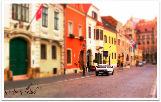
Today I thought I would share with you a really special project I’ve been working on lately, a 1″ scale model of Budapest’s Castle Hill!
Bwa ha ha ha … April Fools! Did I have you going for maybe just a split second?
Of course that’s actually the real Budapest, but I’ve used a new ‘effect’ available on PicMonkey to make it look miniature.
I’ve mentioned before that I do most of my photo editing on PicMonkey (I am not affiliated with them in any way, and this post is not sponsored by them). They have a free version, but I pay the extra $33 per year for the Royale version which gives me access to extra features such as this one. It’s worth every. single. penny.
They frequently come out with new stuff. Either new fonts, such as the Lato (budapest in) and Coffeebreak (miniature) that I used on this photo …
… or new effects that are just plain fun to play around with.
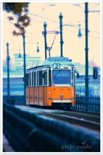
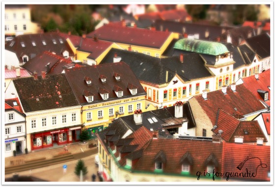
Recently they added the ‘miniature’ effect. Maybe you’ve seen this effect on TV commercials, where they make something normal size look like a miniature scene. Well, you know me and my uncontrollable attraction to anything miniature! So I pulled up some of the photos from my trip to Budapest in 2014 and started experimenting. I didn’t even save my first couple of attempts and I was ready to chuck it entirely, but then I read some of the tips (yes, when all else fails, read the instructions); use a photo with good depth (one that has a foreground and background) and is taken from slightly above the scene. As it turns out, I didn’t have very many photos that perfectly fit that description. This train photo turned out pretty cool, but doesn’t quite look miniature to me. If I had taken this from a little higher vantage point, it would have been awesome.
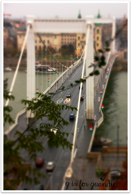
But this one is pretty cool, right? Those look like toy cars on a bridge.
This is so much fun!
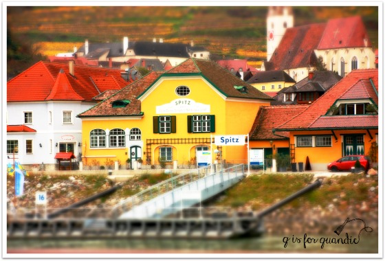
Here is Spitz in miniature …
How about mini Passau?
And mini Melk …
Am I the only one who finds these highly entertaining?
If you find yourself with a little extra time on your hands this weekend, maybe you can make some mini-photos of your own!