Congrats to Ellen, the winner of last week’s blogiversary giveaway.
Back at the end of November I promised to give away a few of my favorite things from some of the companies that have provided me with products to try and share with all of you here on the blog. I’ve already given away Miss Mustard Seed’s products, Fusion products and Dixie Belle products. Today will be the final giveaway and it features transfers from Prima Marketing.
I have to say, discovering these transfers has been a game changer for me. I absolutely LOVE them and really can’t say enough good things about them.
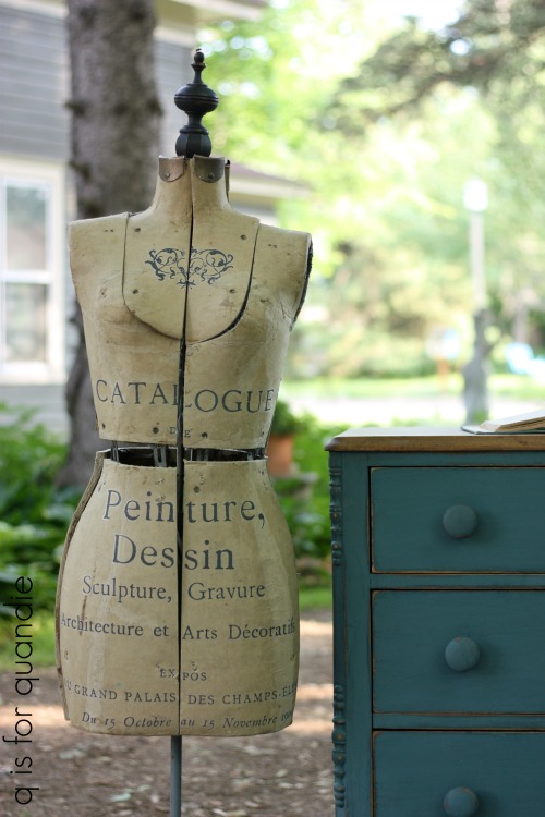
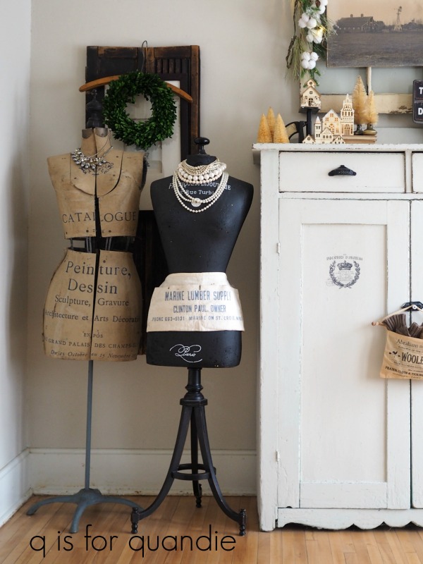
I will put them on just about anything including dress forms …
or ironing boards …

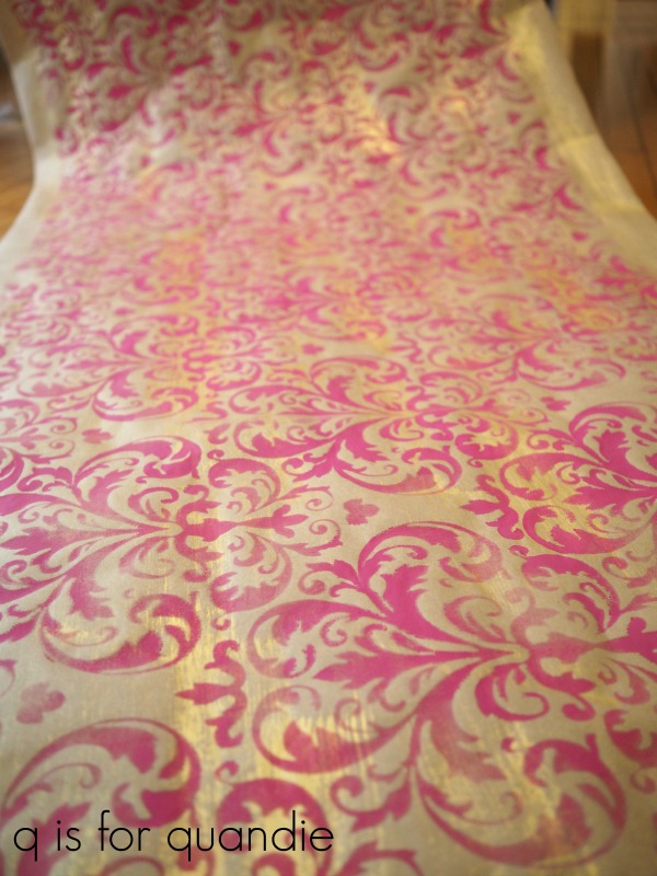
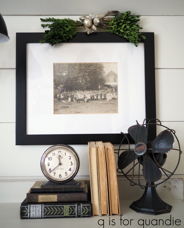
or walls …
![]()
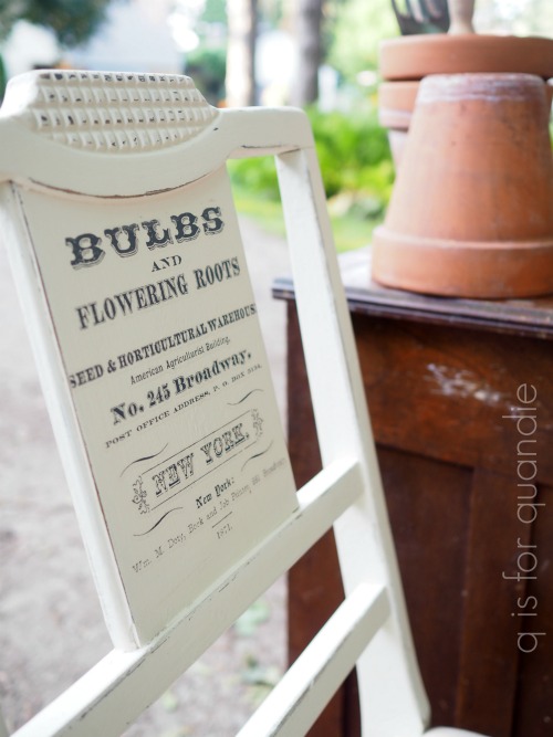
or on wooden tool boxes …

or galvanized watering cans …

or foot boards made into shelves.

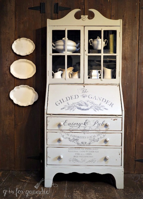
But my favorite thing to put them on is furniture.
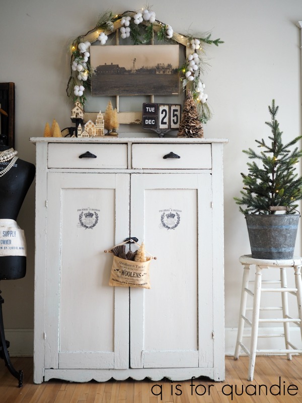
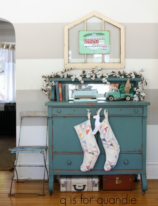
My first transfer project was fairly simple. I added the Specimens transfer to the primitive cupboard where I store my painting supplies in the winter …

This Specimens transfer also looked amazing on a bench that my handyman/neighbor Ken made out of a bed …
![]()
There are a few transfer designs that I’ve only used once …

![]()
That’s not because I didn’t love them, but simply because there are just so many to choose from.

But I quickly grew attached to the Seeds transfer and used it on numerous pieces.
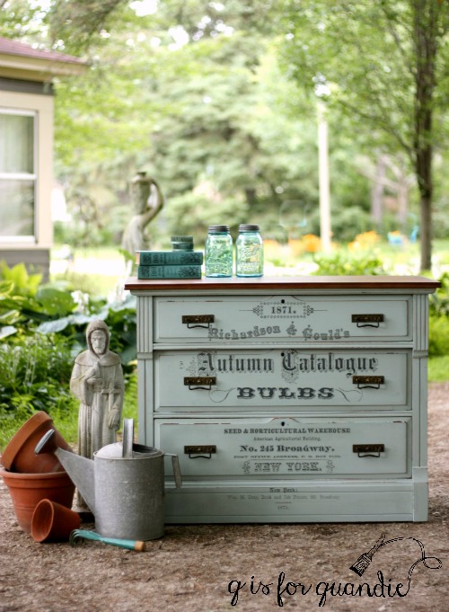
There is just something about the typography on this one that appeals to me.

So I keep using it, over and over again.
![]()
It was the perfect choice for the ‘garden beds’.

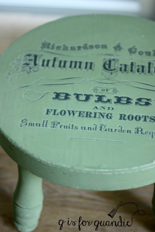
It comes in the large size, but also in a smaller size that is perfect for smaller pieces of furniture.

or for small stools.
And then Prima Marketing came out with some more elaborate and more colorful designs earlier this year like the Rose Celebration transfer.

And the Imperial Garden transfer.

The French Ceramics transfer was perfect on the inner drawers of this linen press dresser.

They keep upping the game and coming out with even more fabulous transfers.

I totally fell in love with their new knob transfers the minute I saw them.

I’ve done a couple of projects with them.


If you haven’t already tried the transfers you really should!

I’ve found them quite easy to apply, although you do have to be somewhat careful with them. Here are some q-tips for working with the transfers.
- If your transfer is stuck to the waxy backing sheet, try popping it in the fridge for 15 minutes or so first.
- If your transfer isn’t sticking to your surface, try warming up the surface first with a blow dryer just a bit.
- Don’t allow the transfer to fold over on itself, that can create a mess as it will stick together.
- Don’t apply a transfer over a freshly waxed surface, wait until after applying the transfer to add wax.
- When working with a transfer that comes on multiple sheets like the Imperial Garden or the Rose Celebration transfers, lay them out and make sure you have them in the right order before removing the backing and placing them on your piece.
- It’s tricky to apply a transfer over really chippy milk paint that hasn’t been sealed. The milk paint chips will stick to the transfer sheet rather than the transfer sticking to your piece. If you want to use a transfer over chippy milk paint, seal your milk paint first with something like Miss Mustard Seed’s Tough Coat and then apply the transfer.
- When applying a transfer on glass be sure that you have it positioned exactly where you want it before it gets too close to the glass. Once the transfer and the glass meet, the transfer is there to stay.
And now, here’s your chance to give them a try without having to buy them. Today’s giveaway includes these three Prima Marketing transfers.
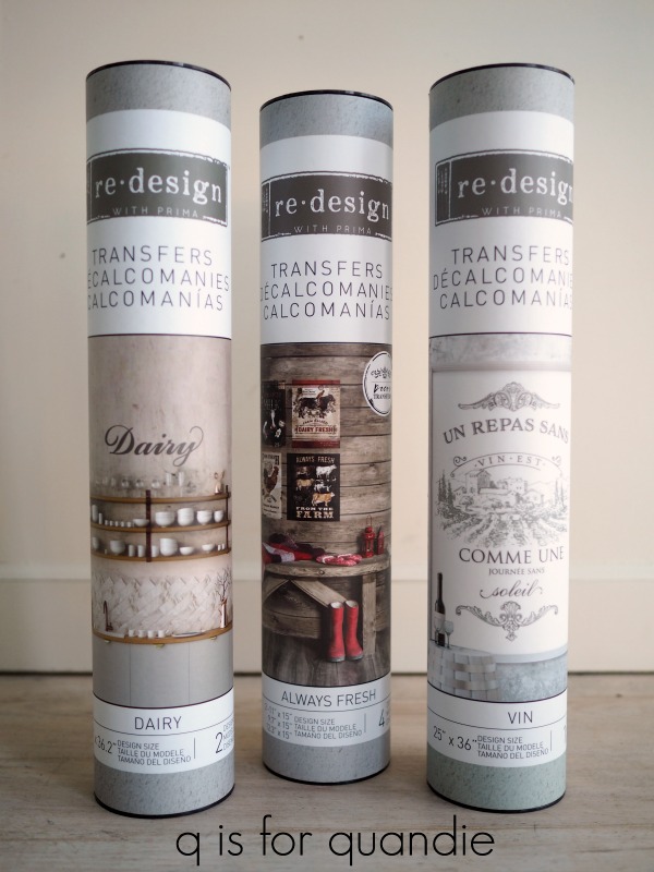
And I say three because there are three packages, but you’ll really end up with 7 transfers because the Dairy set comes with 2 versions of the word ‘Dairy’ and the Always Fresh set comes with 4 designs.
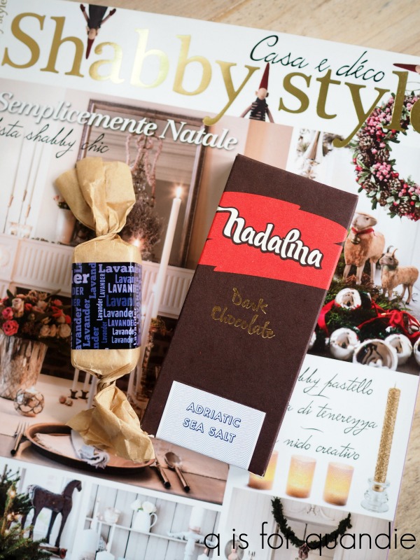
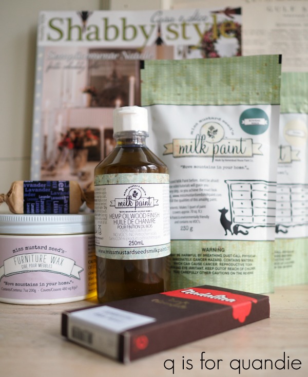
Of course, I’m also including another Italian decorating magazine and some Croatian soap and chocolates with this prize as well.

Thank you so much to Prima Marketing for supplying the transfers that I am giving away today!
The basic rules: to be eligible to win today’s prize leave a comment of any kind on this blog post. Your comment must be left on the blog, not on Facebook or Instagram. You are not required to follow my blog, although it would be awesome if you did!
Normally I make a point of answering every comment left on my blog. If someone takes the time to leave a comment, I like to acknowledge that. I usually only get 10 to 20 comments so it’s easy to fulfill that promise. But I suspect I’ll get a few more comments on this post so I’m going to warn you up front that I may not be able to answer each one, so I hope you guys will cut me some slack on that.
I will randomly draw the name of a winner for today’s prize from all of the comments left on this post by Friday, December 21, 2018 at the stroke of midnight (U.S. Central time).
The fine print: no purchase necessary, you must be 18 years of age or older to win, void where prohibited by law, the number of eligible entries received determines the odds of winning, approximate retail value of prize is $100, if the prize is not claimed by Sunday, December 23, another name will be drawn at random to win, blah, blah, blah.
Good luck!


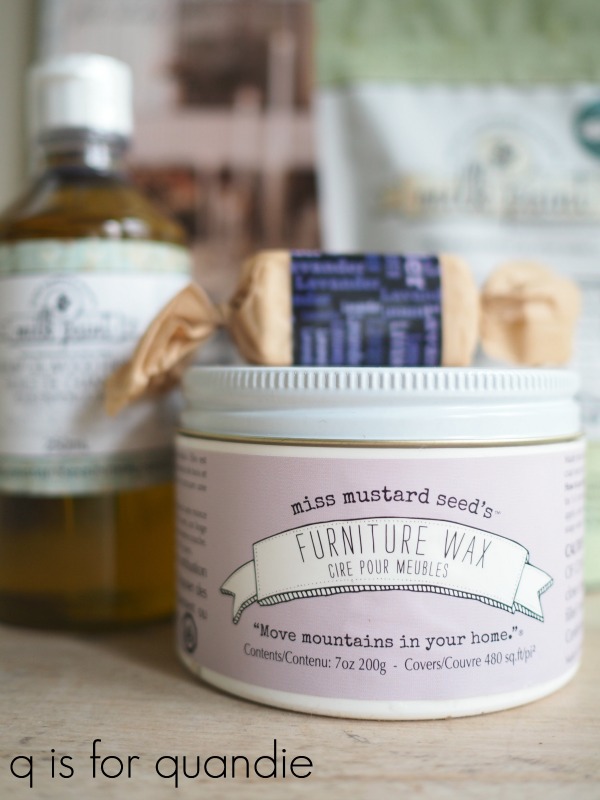 This was a limited edition product and I’m not sure how readily available it is anymore, but I was able to snag a jar of it for my giveaway (thank you Miss Mustard Seed)!