mom’s canisters.

Hey everybody, I’ve gone to visit my mom in Vegas again this week.  But no worries, once again I’ve pre-scheduled a couple of posts to keep you entertained while I’m gone.  This time around my sister is joining us, and we’re going to take a little road trip to Sedona.  If anyone has any tips on what to see and do in Sedona, be sure to leave a comment today!

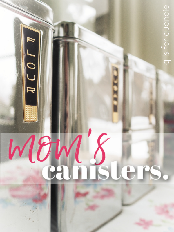
Meanwhile, it feels apropos to share this post about my mom’s canisters with you guys while I’m away visiting her.

If you’ve followed me for years, you’ll know that my sister and niece moved here to Minnesota from New Jersey nearly 7 years ago now (gosh time flies!).

When they initially moved here, my sister stored some unpacked boxes upstairs in my carriage house.  Once she bought her house a few years later she moved almost everything over to her place.  She just left behind a couple of things that she no longer wanted.  One of those things was my mom’s old canister set.

I have photographic evidence of this set when it was new.

That’s my mom, and she is pregnant with my sister in that photo, making it 1961.  That is my parent’s first apartment in Chicago, and there are the canisters.

My mom says they were either a bridal shower gift, or a wedding gift.  Seems like a canister set would be a more typical shower gift back in the early 60’s (it’s not fancy enough to be a wedding gift, those were more likely china, silver or crystal).

My mom used these canisters for 20+ years.  Until after my sister got married.  At some point my sister mentioned to her how much she liked them and my mom gave them to her (she has always been, and still is, my mom’s favorite!).  Then my sister used them for another couple of decades until they ended up in a box in my carriage house.  And she doesn’t want them back (and yet, she’s still the favorite, go figure!).

I am a little stunned by how well the canisters have held up after 60 years!

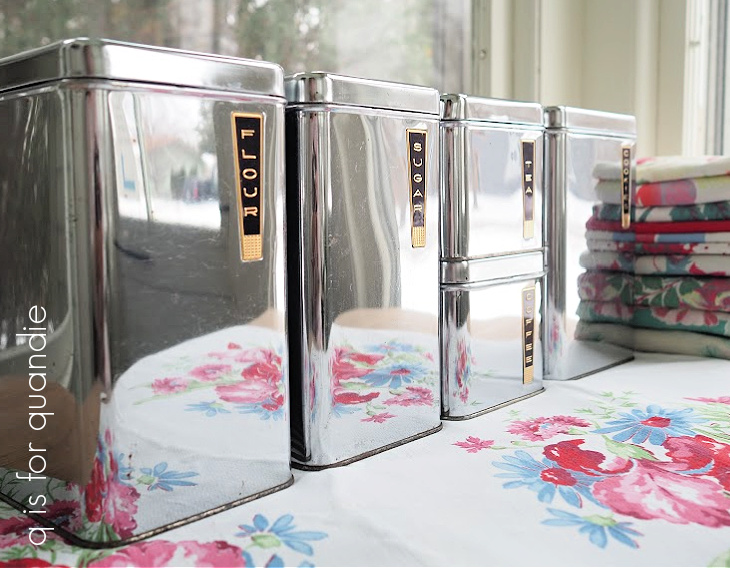
I gave them a good clean, and they look amazing.

A couple of little dents here and there, and one lid is missing its knob.

  But otherwise they are in really great condition.

It is a little obvious that neither my mom nor my sister drink coffee or tea,

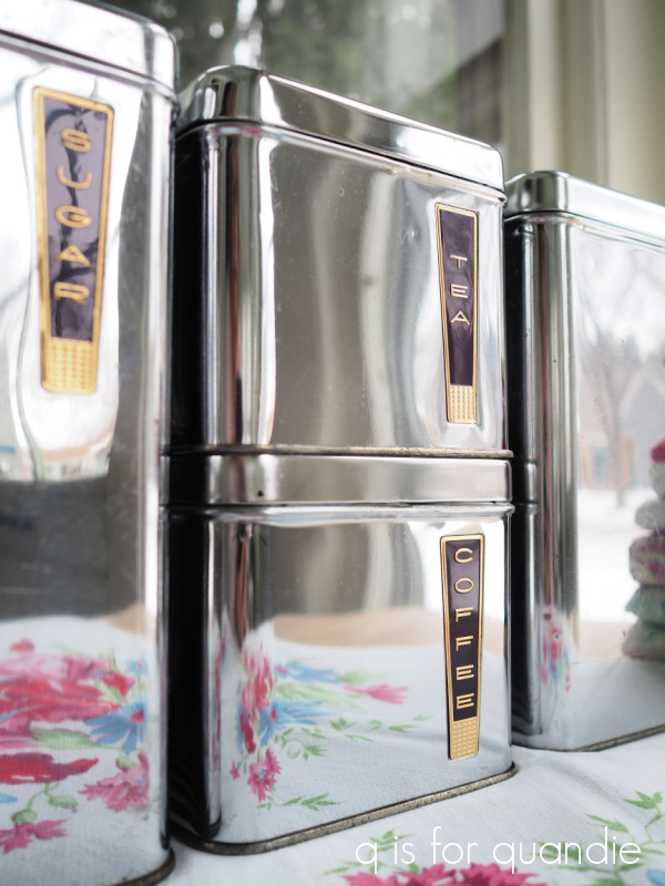
those two canisters are in the most pristine condition.

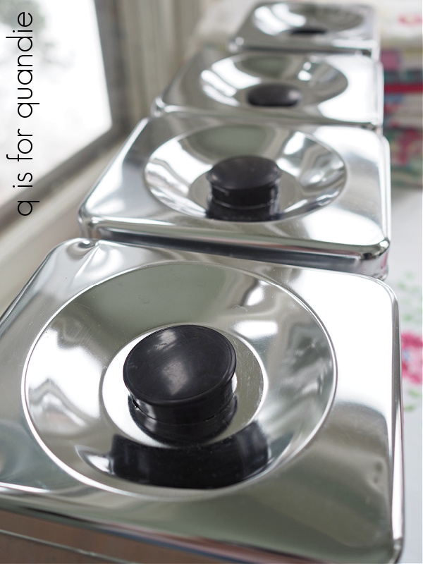
It’s also obvious which one got the most wear at our house …

Duh.

I am a self-professed cookieholic.  Give me a fresh baked cookie and I simply can’t say no.  I’m sure my grubby little hands were into that one on a regular basis (given the state of my dress in the photo below one has to assume that my hands were pretty grubby!).

And hey, can I just note that I was rockin’ the beachy wave before it was even a thing.  These days I have to work really hard to get my hair to look that good.

I have to admit, it cracks me up a bit that these were called ‘BeautyWare’.

As though they were some sort of cosmetic product, or pretty clothing, rather than a functional kitchen item.  Seems like a blatant attempt to glamorize the drudgery of housework to me.

I wish mid-mod was my thing.  But it just isn’t.  I can appreciate the aesthetic, but it doesn’t work with the rest of my décor.

I know what Marie Kondo would say, that I should thank these canisters for the service they have done over the years and then let them go.  And I have to agree.

I would much rather see them go to someone who is going to appreciate them and give them another 20 years of use.  I did a little googling and found a never used, still in the original box, set of 4 of these canisters (it doesn’t include the cookie one) for $299.95 on Etsy.  Wowza!  I also found a set in similar condition to this one (also without the cookie one) for $129.99, also on Etsy.

So I’m going to price this set at $49, and include the cookie one, and hope that some mid-mod lover out there will want to purchase them and continue to use them.

How about it, are any of you locals in need of a mid-mod canister set?  If so, be sure to leave me a comment.


the fine print.

I picked up this dresser at my local Habitat for Humanity ReStore a few weeks ago while out thrifting with my friend/picker Sue.

It felt very much like a blank slate to me.  I knew it would be pretty with the top stripped, and the bottom painted.  There were a few ideas that went through my head from there, but then I saw this photo …

I love that look!  I know it may not be to everyone’s taste (sometimes I feel like I’m the only one out there who still loves toile), but I thought it was gorgeous.  That is another of the new IOD paint inlays called Grisaille Toile on the front of that dresser.  I immediately thought that this would be the perfect look for my piece.  So I ordered the paint inlay online.  While I waited for it to arrive, I stripped the top of my dresser, and prepped and painted the base in Dixie Belle’s Drop Cloth.

I was basically going for the same look as on the example piece above.

I was super excited waiting for my package to arrive.  And FYI, I ordered from The Painted Heirloom.  My order arrived promptly and I would certainly order from her again.  The paint inlays were on sale for $38.40 (and last I checked they still are) and shipping was $2.95 for orders over $100 (and free for orders over $150).  I added some Homestead House milk paint (including more of their fabulous Soldier Blue) to my order to bring it over $100.

I pulled the paint inlay out of the package and trimmed off all of the edges as per the instructions (for my complete tutorial on applying a paint inlay, click here).  I then laid out the sheets trying to match up the edges to create a cohesive design to fit across the front of my dresser.  And that’s when things went haywire.  I just couldn’t figure out how to lay out the design at 4 sheets wide by 2 sheets tall and still match up the repeat (think of wallpapering).

I had made the assumption, based on that photo above, that I would be able to use it that way.

Turns out that in order to go wider than two sheets of the paint inlay, you have to have more than one packet (and even at $38.40, these things aren’t cheap).  Clearly I should have read the fine print!

To save any of you from making the same mistake, here is a helpful graphic that I found online.

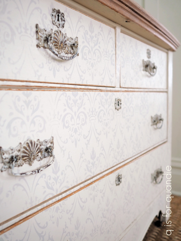
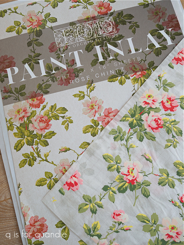
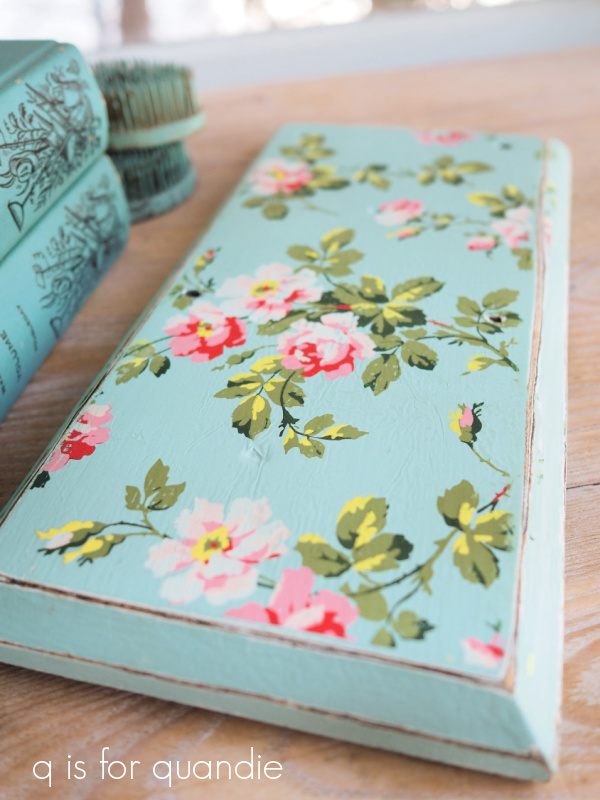
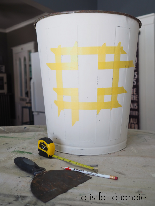
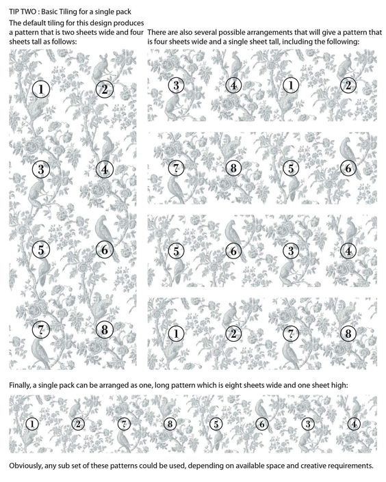
You can do 2 sheets wide by 4 sheets tall.  Or you can do 8 sheets wide by 1 sheet tall.  You can not do 4 sheets wide by 2 sheets tall without using multiple packs.

So, now I have the Grisaille Toile inlay in my stash of supplies waiting for another project that it might work on.  I’ll have to find a tall narrow piece because I can’t see myself ever wanting to put over $80 worth of paint inlays on one piece of furniture.  OK, it would be one thing if I was doing a piece for myself.  In that case I might splurge in this way, but if you’re painting furniture to sell and trying to make some sort of a profit, this is a non-starter (in my opinion).

Back to the drawing board.  I still had my dresser ready to go with a stripped top and a body painted in Dixie Belle’s Drop Cloth.  So I gave some thought to how I could create a similar look using supplies that I already had on hand.  I started by going through my stencils and pulling out the Dixie Belle Royal Damask stencil.

Then I tested out a couple of different paint colors for stenciling over the Drop Cloth on a test board.

I decided that using Dixie Belle’s Sawmill Gravy would give me a look very similar to the example piece, at least color-wise, plus I preferred how subtle it was compared to the Burlap.

As I was stenciling the front of the dresser I was reminded of the benefits of using a stencil rather than a transfer or paint inlay.  You can cover as much square footage as you need with a stencil at no extra cost.  You can use whatever paint color you want to.  If you mess up, you can just paint over it and start again without any additional outlay of cash.  You can re-use a stencil over and over on other pieces, thus bringing the cost per use way down.  So at $24.95, this stencil is a much better buy than the paint inlay.  Just sayin’

Today’s stenciling q tip:  when working with an overall pattern like this be sure to start stenciling in the center of your piece and then work your way out on either side.  This way your finished design will be symmetrical.

Once I had the front of the piece stenciled, I sanded the edges of the dresser with 120 grit sandpaper to distress them and then sanded all of the flat areas with 220 grit to smooth them out.  I then added a top coat of clear wax.

For the top of the dresser, I had already stripped it using CitriStrip, so I simply sanded it smooth and then finished it with some white wax.

I toyed with the idea of adding a more modern hardware to this dresser.  Unfortunately, all of the options that I found online that I thought would work were out of stock.  Have you tried finding inexpensive hardware lately?  Is it just me, or is it hard to come by?

I felt like the drawer pulls and key hole escutcheons that came on the piece were just a tad over the top, so I decided to try toning them down with a little paint.  I didn’t want to give them a solid coat of paint though.

So I made a wash of the Dixie Belle Drop Cloth paint by mixing water and paint about 50/50.  I painted that on the hardware, making sure it was in all of the crevices, and let it dry.  Then I used a damp cloth to remove the paint from all of the high points.  I followed that up with some clear wax.

I like the look of painted hardware that has been worn down over time.

I also like the subtlety of the almost tone on tone look of the Sawmill Gravy over the Drop Cloth …

and that sort of washed out, beachy vibe from the pale colors paired with the white waxed top.

I also think the fine print of this stencil gives a more delicate look than had I used the Grisaille Toile inlay.

Personally, I feel like there is pretty much no contest between the ‘before’ and ‘after’ of this dresser.  That ambered oak finish had to go.

What do you think?

If you’re local and in need of a dresser, be sure to check my ‘available for local sale‘ page for details on this piece.

Thank you to Dixie Belle Paint Co for supplying the paint and stencil used on this project.

one last paint inlay experiment.

I wanted to share one last IOD paint inlay experiment with you today.

According to IOD, the paint inlays can be re-used up to three times.  So I thought I’d try using a sheet more than once to see how it goes.

I started with this trio of books that I had lying around.

I painted the middle book (Robinson Crusoe) in Dixie Belle’s Kudzu and stenciled the spine.

I thought it would be nice to have a coordinating color to go with my pair of floral books.

Next, I painted the smallest book on the top of the stack in Dixie Belle’s Drop Cloth.  I let the first coat dry, and then added a second coat and while it was still wet I applied the IOD Rose Chintz paint inlay.

As a reminder, you can find a how-to on using the paint inlays here:

It was fairly easy to apply the inlay to a book cover …

As you can see, the texture of the cover causes the inlay to not transfer perfectly.  But I think that is part of the charm of an inlay and it gives the book an authentically distressed look.

Finally, I painted the third book in DB’s Drop Cloth as well, and then I pulled out my used inlays.

For comparison purposes the inlays above are (from left to right) unused, used once over Kudzu, used once over Sea Glass.  As you can see, the inlay will pull some of the paint you are working with back off with it when you peel away the paper.

I decided to use the inlay that had been used once over Sea Glass for my 2nd book.

And here you can see the result.

That book on the bottom of the stack is the one done with a 2nd pass of the inlay.  The design is quite a bit more faint.  I rather like it, it’s as though it has faded over time like chintz fabric would.  In fact, I think I like the look of the used inlay even better than the fresh first time inlay.  I thought I would see more of that Sea Glass color transferring back off the inlay.  Had I used the Kudzu sheet, I think you’d see some of that green coming back off onto your project though.

I’ve had fun playing around with the paint inlays.  I think they will be great to use on various small projects like my watering can, flower crates, and now these painted books.

I also think they’d be awesome for collage style art projects.  Also, one packet of the paint inlays will go a long way on smaller projects.  I’m not so sure that I would choose to use them on furniture though, especially furniture that one intends to sell.  The cost is a bit prohibitive (and spoiler alert, as you’ll see in this coming Friday’s post, you may need more than one packet of paint inlays to cover a piece of furniture) and I’m not sure they add enough value to allow you to recoup that cost by charging more for the furniture piece.  Be sure to stay tuned for Friday’s post where I’ll explore this subject a bit more!

painted watering cans.

Continuing my experiments with the IOD Rose Chintz paint inlay, I pulled out this watering can to see how hard it was to apply the inlay to a non-flat surface.

Normally I don’t paint galvanized cans like this one, but I had attempted to add an IOD French Pots transfer to it a couple of years back and as you can see, that didn’t really work out very well.

The French Pots transfers from IOD were the first generation of this design, and they were a charcoal grey color.  The color wasn’t really dark enough to show up well on galvanized metal.  Although I can see where that faded appearance might appeal to some.

Just for reference, the newer black Classic Pots and Traditional Pots transfer show up much better on galvanized metal.

But for this watering can, I felt like my best option for ‘fixing’ it was to paint it.  The only way to get that transfer off would have been to sand it off, which would have compromised the patina in that spot.  It never would have looked right.

So I painted it with a coat of Dixie Belle’s Sea Glass.  Then I applied the Rose Chintz paint inlay (for details on how to apply a paint inlay click on the image below to see my how-to post).

It really wasn’t difficult at all to work with the inlay on the curved surface.

Rather than use a brayer to press the inlay into the wet paint, I just used a wet cloth to smooth it into place.  I was worried I would have problems with the design getting smudged, but even over the curved surface it was easy to get crisp results.

One sheet of the paint inlay was not quite enough to go all the way around one side of the can.  I wanted to be sure and share this with you because there is a very definite line where the inlay ended.

I wasn’t expecting the line to be quite so obvious, so just be aware of that.

Since a) I’m a total cheapskate, and b) I was doing this watering can just for myself and therefore knew that this wouldn’t be noticeable where I was putting it, I decided to just try to soften that line rather than use another sheet of the inlay to piece in that space.

Before you seal the inlays (with a spray sealer), the paint (because they are indeed just paint) can be manipulated when wet.  So you can use a small artist’s brush and some water to reactivate the paint and move it around a bit.

Hmmm.  I may need a bit more practice at that.  I think I succeeded at softening up that edge a bit, but clearly I need to work on my fine painting skills.

Regardless, I’m quite happy with how this project turned out.

This watering can is joining a few other painted versions that live above the shelves in my pantry.

The 2nd one in line is one that was already painted white when I found it, but I added the IOD Petit Rosier transfer to it.

The 3rd can in the lineup was also already green when I purchased it.

So far I’ve left it alone, but you never know, I may add something to it one day.

And the last one in line is one I painted in Homestead House milk paint in a color called Maritime Blue.

I just fell in love with that pretty shade of blue.

I’ve done one more quick project to show how the paint inlay looks when re-using a previously used sheet and I’ll be sharing that on Wednesday.  Otherwise, I still have quite a few sheets left and I’ll be on the lookout for more fun ways to use them!  Have you tried them yet?  If so, be sure to leave a comment and let us know if you liked them or not.

flower crates.

My picker found these wooden crates for me last summer … at least I think it was last summer.  Time tends to blend together for me these days.

Either way, last summer was when I added some stencils to the sides thinking that I would sell them that way.

But ultimately I decided that I didn’t like the dark stains on the wood, and I also didn’t think the stenciling in black worked well with the dark wood.  So I never did try to sell them, I just tucked them away and figured I’d give them a do-over sometime.

Well, that sometime is now!

I painted the first crate in Dixie Belle’s Caviar.

I just added one quick coat of paint and didn’t worry too much about completely full coverage.  I knew I wanted to sand the paint way back in the end to make the crate look super worn.

I re-stenciled the ends in the same ‘flowers’ stencil that I used on one of the crates last summer.  This is part of a larger stencil that I purchased on Etsy from The Stencil Market.

I used my normal process for adding a shadow to stenciled letters.  I stenciled the design first in Dixie Belle’s Putty, then moved the stencil slightly up and over and stenciled again in DB’s Drop Cloth.

It’s a small detail, but I think it adds so much depth.  I also filled in the bridges on this stencil using a small artist’s brush.

Once I’d sanded heavily, I added a coat of clear wax.  I happened to have this cool zinc liner that fit this crate almost perfectly so I’m going to pair them together.

Lastly I filled it up with some of my matte white pottery just for the photos.

For the 2nd crate, I went in a different direction color-wise.  I painted it in Dixie Belle’s Kudzu.  I really wanted to try that IOD paint inlay over the green.

I had a feeling those pinks would really pop over the green.

If you want a step by step on how to use the IOD paint inlays, check out my how-to post by clicking on the image below:

I’m doing a bit of experimenting with the inlays, and you’ll be seeing the results of that in the next week or two.  But in the meantime, after adding the paint inlay to the two ends, I stenciled the sides of the Kudzu crate with the same ‘flowers’ stencil.  This time I did not add a shadow.

The need to get photos of these crates was a really good excuse to go to my local nursery and pick up some flowering plants.  They didn’t have much to choose from, but I got a few pretty cyclamens.

And I always get sucked in by those Baby Tears plants, and I can never keep them alive.  I think it has something to do with forgetting to water them on a regular basis.  They look great while they last though.

As per usual, my decorating split personality loves both versions of the crate.  The simple, worn black version and the colorful floral green version both really appeal to me.

As for the 3rd crate, I had something different in mind.  I wanted to provide a container for that mid-mod china that I found while thrifting last week.  I’m going to try to sell it at the shop, so I thought it would be fun to package it somehow.

First, I asked my handyman Ken to re-size that crate to fit the dishes.  He cut it down and reattached everything to create a perfectly sized container.

I painted it in Dixie Belle’s Silk paint in Tide Pool, taking that color cue straight from the dishes.  Then I added the ‘Bon Appetit’ from re.design with prima’s Delicious Menu transfer.

Mr. Q was not a fan of the way I wrapped the wording around the two sides of the crate, but I rather like it.  What do you think?

I brought both flower crates (not including contents) and the crate of mid-mod china in to Reclaiming Beautiful in Stillwater on Wednesday evening, so if any of you locals need a fabulous flower crate be sure to stop by the shop this weekend (note: closed on Sunday).

Which crate is your favorite?  Or do you have a split personality when it comes to decorating like I do?  Leave me a comment and let me know.

blame it on the cabin fever.

First things first, congrats to Patty.  I drew her name at random to win my Shades of White giveaway.  There were a couple of Patty’s who commented, but I have been in contact with the winning Patty so I apologize to the other Patty’s who may have momentarily thought they won and now realize they didn’t.

My friend Sue and I went out thrifting on a cold, but sunny, day last week and I managed to fill up the trunk of her car.  That’s saying something, because as Sue likes to say, she originally purchased her car for the size of the two-body trunk (yep, you could easily fit two bodies in there, or a ton of garage sale/thrift finds).  On the other hand, my car (the VW bug convertible) has a trunk about the size of a bread box.

Anyway, I came home with A LOT of stuff.  And not my typical haul, I have to say.  I don’t think I purchased a single item that needs to be painted.  Want to see what I found?  That’s rhetorical, I know you do.

Let’s start with the clear glassware.  Normally I totally steer clear of glassware (lol, pardon the pun), but for some weird reason I was just drawn to it this time.

Ideas came to mind for most of these items.

For example, I added transfers to a few of the canister type pieces.

These two glass vessels would be great for holding gardening tools, or kitchen utensils (or paint brushes for that matter).

I initially thought this next one would just make a great vase, but I also like it filled with vintage silverware.

You can’t quite see it in the group photos, but I purchased a clear glass hobnail jar.

I’m keeping it to use for casual bouquets of flowers from the garden next season … or maybe even just tulips purchased at the grocery store while it’s still bitter cold outside.

Sue suggested I try turning the larger vase I purchased into a cloche.  She’d seen it done on White Cottage Co’s YouTube vlog just that morning.  So I gave it a shot.

All I did was flip it upside down and use E6000 to glue a glass knob to the top (former bottom).

I’m always looking for cute little jars to put in metal baskets or wood totes that I find, so when I saw this trio I thought I’d tuck them away for the next container that comes along.

They fit pretty nicely into this one, for example …

And speaking of containers, I purchased this metal one separately from the jars that are in it.  I only bought the jars for their zinc lids.  I needed lids for some older, cooler lid-less jars that I had at home.

Instead of filling that wire basket with jars, I decided it would make a fantastic windowsill herb garden.

My local Bachmans just happened to have these potted herbs on sale for $3.99 each so I grabbed four of them and put them in clay pots and then in the basket.  This is my feeble attempt to bring a little summer to my wintery world.

Last up in the glassware category are these corn on the cob dishes.

I purchased these just for myself.  Probably the last thing in the world I need is specialized dishes just for corn on the cob.  But as I stood in the aisle at Goodwill looking at them, I could just picture a summer BBQ on the deck with steaks sizzling on the grill, a delicious cocktail in my hand, and fresh picked corn on the cob swimming in melted butter in those dishes.

What can I say, there’s a foot of snow on the ground and it was about 9 degrees outside that day.  I’m totally blaming that decision on the cabin fever!

I was lucky this time out and came across the holy grail of thrifting … ironstone.

I rarely find ironstone at our thrift stores here in the mid-west.  I am separating the pitcher from the bowl.  I think a pitcher in a bowl has that 80’s country antique vibe, but separately they are both great pieces.

You can’t tell from that photo, but the pitcher is a big one at about 8.5″ tall.  I’m probably going to end up adding it to my non-collection.  It was definitely the find of the day.

The bowl is 14″ across and would be perfect to use as a fruit bowl in the middle of your kitchen table, it’s going to go to the shop to sell along with a couple of other large ironstone bowls that came from my picker.

I wasn’t planning to keep the gravy boat, but I just happen to have the perfect spot for it on my Welsh cupboard so I may just have to.

That tall piece in the background of my ironstone haul photo is not ironstone.  It’s a sort of faux, crackly … I don’t know what material it’s made out of.  But I knew it would look great with a transfer on it.

I came across a few galvanized items that day as well.

The two pieces on the left are from the Hearth & Hand line.  And all three of these are much bigger than they look in the photo.  The tallest one is 2′ tall, and the squat one is 16″ across.

I had to dress up the two tall ones with some transfers, but I left the short one unadorned.

I also came home with some dishes.  I seem to be a sucker for these sets of decorative plates.

They are perfect for tucking into a gift basket.

I happened to have purchased another cute metal basket and a book called The Cheese Course while thrifting that day.

I added some cheese knives that I had on hand.  Now all it needs is a couple of fancy cheeses, and it’s the perfect hostess gift.

In the ‘fail’ department, I also purchased this fabulous cheese baker that I was going to include in my cheese themed basket …

But I made a rookie mistake.  The cheese baker was in a box when I picked it out, and I never pulled it out to look it over.  When I got it home and out of the box, I discovered it was chipped.

Drat!  Now what do I do with it?  I certainly can’t sell it like that.  Is there a simple way to repair that chip?  Do any of you have any ideas?  I may just have to toss it.

I also grabbed this set of china as a sort of experiment.

I thought the colors on them were lovely.

They were in perfect condition, and there were six dinner plates and six salad plates.  And hey, they say right on the back that they are ‘vintage fine china’, so who am I to argue?

I googled them and found some interesting info on them.  They were manufactured from the 1950’s through about 1964.  In addition, according to antigotrunk.com “this was an exclusive pattern for Max Schoenfeld (that’s the MS on the back stamp). Max was was a California distributor of china and pottery in the Los Angeles area and distributed for many different porcelain houses.  Some designs were given to him as “exclusives” only he could sell them, and the initials MS would be added to the back of the each piece.”

Anyway, I thought I’d give it a shot and see if a set like this will sell at the shop.  I’ll keep the price very affordable and see what happens.

So there you have it, a bunch of fabulous finds from the thrift store.  Which one is your favorite?

the latest thing.

I must confess, I am rarely on top of the latest, newest thing out there.  I was one of the last ones to get a DVD player, an iPod, a cell phone, a digital camera and so on and so on.

But lately I’ve been seeing all kinds of YouTube videos about the new IOD product, paint inlays.

While out visiting my mom in Las Vegas, I popped into a shop called Bloom.  There are several Bloom locations in her area, but I went to the one in The District (I’ve also been to the one in Boulder City on previous visits).

They just happen to be IOD stockists, although I will warn you now, don’t go in there expecting to see a large inventory of IOD products.  They had a handful of transfers, some of the molds (although none of the paper clay that I was hoping to find) and just a couple of the new paint inlays.  I would have loved to get the Grisaille Toile one, but they didn’t have that one.  They did however have the Rose Chintz.

As I’ve mentioned previously, I’m still a sucker for Rachel Ashwell’s shabby chic style and this Rose Chintz falls right in line with that look.  So I couldn’t resist.

Now, before I go any further I want to address the elephant in the room.  These things are Pricey, with a capital “P”.  I paid $47.95 plus tax for one package that includes eight 12″ x 16″ sheets.  Ouch!

I know I’ll be able to get quite a few smaller projects out of one package of the sheets, but if you want to use these on a piece of furniture it could get expensive.  According to what I’ve seen online, you can get at least two and sometimes three uses out of a sheet before discarding it.  However, the look you get on the 2nd pass is not the same as the look you get from a fresh sheet.  In other words, you couldn’t really re-use them on the same piece of furniture and expect it to look uniform.  I’ll be experimenting with this going forward and I’ll keep you posted on the results.

As with any new technique or product, I highly recommend creating a test board first to avoid wasting too much of your very expensive product if you have a failure while learning.  As you’re about to see, paint inlays are nothing like transfers.  It’s a totally different process.

So, taking my own advice, I pulled out a small board that I use for lots of practices and gave it a shot.

Step 1 – paint a first coat of your chosen paint color.  I should note here that this product is best used with chalk style paints only.  I used Dixie Belle’s Sea Glass.

Step 2 – while your first coat of paint is drying, take the time to get the lay of the land with your paint inlays.  They all have a repeating pattern, sort of like wallpaper.  So all 8 sheets can create one large connected pattern.  What I discovered while trying to line up the Rose Chintz is that there are 4 sheets with one pattern, and 4 sheets with a 2nd pattern.  Those with the same pattern can be lined up going horizontally all the way across all four sheets.  Those with the 2nd pattern can be lined up below the first pattern, and also can go four across.  I hope that makes sense.

Step 3 – trim off the excess margin all around each sheet of the paint inlay.  This is mainly important if you are going to be lining up the sheets side by side (and if you don’t do it, just remember that the design does not go all the way to the edge of the paper), but I did it for my test project too.

Step 4 – dry fit the paint inlay to your project.  In my case, I was just using it on a small board, so I cut the sheet down to size.  I didn’t want to waste any of the excess, I can save that to use on another project.  If you are using multiple sheets on a larger surface, now is the time to make sure that you know what order they go in, and have them lined up and ready to go.

Step 5 – this isn’t really an official step in the process, but I recommend that at this point you have all of the items you’ll need at hand and ready to go.  You’re going to be working in wet paint, so you don’t want to dilly dally looking around for tools.  You will need your paint and brush, your paint inlay trimmed, cut to size and ready to go, a spray bottle of water (or a damp rag), and a paper towel.  You can also use a brayer, but that’s not an absolute requirement.

Step 6 – apply a generous, even coat of paint to the surface of your project.  Since my practice board is small, I could do the whole thing at once.  But if you’re working on a larger surface, it’s best to work in sections no bigger than the size of each sheet of the inlay.  While the paint is still wet, lay the paint inlay with the pattern side down onto the wet paint.  At this point you can either spritz the inlay with water and then use a brayer to press the inlay down, or you can use a damp cloth to press the inlay into your piece.  Make sure that the sheet is fully in contact with your paint.  You can blot away any excess water using the paper towel.

Step 7 – let it dry.  This is the easiest step.  Just let the paint and inlay dry.  You can tell that it’s drying because the sheet becomes more opaque when dry.  Once it is dry to the touch, you can move on to step 8.

Step 8 – once dry, it’s time to remove the paint inlay sheet from your surface.  Spritz it again with water.  The inlay becomes translucent again.  Let the water soak into the inlay paper for about 30 seconds or so, just long enough to soften up the paper backing.

Step 9 – carefully peel away the inlay paper.  If you find that you can’t get the paper unstuck, you may need to dampen it a bit more.  Let the removed paper dry, and you can then use it again on another project.  FYI, the 2nd use will likely produce a more faded looking result.  In addition, you’ll see that the paper has taken away with it some of your base paint color, and that color may transfer to the next project somewhat as well.

As you can see in the photo below, places where the paper wrinkled will show as texture in your dried paint.  You can reduce that by getting the inlay nice and flat using the brayer in step 6 above.  Conversely, you can also leave more texture in the form of wrinkles if you like that look.

Step 10 – once you’ve peeled away the paper, simply let your piece dry thoroughly.

Step 11 – seal the inlay.  This is important!  It’s best to seal the inlay with a spray sealer of some kind.  The inlay paint is easily reactivated with water, or a water based sealer.  If you brush a water based sealer over it, or rub over it with wax, it may smear.  I say ‘better safe than sorry’, use a spray sealer.  I used the Rust-oleum Chalked protective topcoat in matte clear.

Once the topcoat is dry, you can sand to distress and then topcoat again with your finish of choice.  In my case, I sanded my board to distress the edges and also to knock back a little bit of the texture overall.  Then I added a coat of clear wax.

Isn’t that pretty?

I feel like the look is reminiscent of vintage wallpaper.  Mr. Q says the end result looks much more like a hand-painted design rather than a decal.  If you’re one of those people that just can’t live with the slight halo that comes with transfers (although that problem has really been minimized in more recently released transfers), you might really love paint inlays.  So far there are only three designs available, but I’m sure there will be more coming in the future (at least I hope so).

Be sure to pin this post so you can refer back to it when you get some paint inlays!

If you want more instruction on using this product in a video format, I recommend checking out this video from Lynne at ellen j goods.

I’ll be sharing a few more paint inlay projects over the coming week or two, so be sure to stay tuned for that!


the botanical cupboard.

I found this piece a few weeks back on Facebook Marketplace.

When I reached out to the seller, she said that if I could come pick it up right away that would be best for her.  Now that I’m retired from the day job, dropping everything and running out to pick up a piece of furniture is well within the realm of possibility, so I said sure.

Normally I don’t like to leave the house without changing out of my flood water, paint splattered sweat pants, putting on at least a little makeup and doing something with my hair.  This might all sound a bit high maintenance, but the thing is, I tend to run into people I know.  Having worked for the city I live in for 34 years, I know a few people.  Including all of the public works employees, the police officers and most of the EMT’s (I sure hope I never have a heart attack while wearing those sweat pants!).

But the seller was only about 5 minutes away, and we weren’t making any other stops, so I decided it would be fine just this once.  As we drove through a school zone on the way to her house, I asked Mr. Q to be sure not to speed because if we got pulled over I would be mortified.  I could just imagine the officer going back to City Hall and telling everyone how much I’ve let myself go since retirement!

But we made it to our destination without incident.  We went up to the door and rang the bell.  As the seller answered, she was just saying goodbye over her shoulder to someone who had come to purchase an elliptical machine from her … and wouldn’t you know it!  It was a police officer I had worked with for 25+ years.

Seriously, what are the chances?!  How mortifying!  See?  Let this be a reminder to me, never leave the house without make up!

In the long run, it was worth it though.  It’s such a cool piece.  The seller wasn’t sure what it was, but I knew right away it was an old radio cabinet.  Especially after taking a look inside.

By the way, when I brought the cabinet home it did not have a back.  My handyman/neighbor Ken added the beadboard back before I took the photo above.  Obviously there were some sort of components originally mounted on the shelves in this cabinet.  A look at the label that was inside confirmed my suspicion.

Yep, definitely a radio cabinet.

After adding the beadboard back, Ken cut some pieces of hardboard that I had in my stash to cover up those holes and provide shelves instead.

There were some big grooves running down each interior side of the cabinet and I debated just leaving them, but ultimately decided it would look better if I filled them.  So I used some of Dixie Belle’s Mud in white (because I was all out of brown) to do that.  As it dried, I noticed that I definitely was getting some bleed through that was turning the white Mud pink.  At that point I decided to hedge my bets and add a coat of Dixie Belle’s B.O.S.S. to the entire piece.  Better safe than sorry, right?

Next up came paint.  As I was applying my first coat of Dixie Belle’s Sawmill Gravy, I was once again reminded of what a nice job the B.O.S.S. does of preparing a dark piece for a light colored paint.  I even stopped to take a photo for you guys …

I don’t know if that helps or not, but that’s just the first coat.  Look at that coverage!

I gave the piece one full coat of Sawmill Gravy, followed by a 2nd cursory watered down coat to catch any spots that I didn’t get perfect coverage on with the first go around.

Next I painted the inside in Dixie Belle’s Silk paint in Hampton Olive.

I love to use an all-in-one style paint inside cabinets like this.  It’s just so much easier to paint two coats of paint and be done, no primer or top coat required.  Now, you might be looking at this color and thinking it’s an odd choice to go with the Sawmill Gravy.

Well, here’s why I chose it …

I took that greyish olive green color straight out of the IOD Floral Anthology transfer.

This is a combination of two transfers.  The floral stuff is from the IOD transfer, and the wording is from re.design with prima’s Flower Collector transfer in black (it also comes in gold).  Don’t they make a great pair?

In both cases I have cut apart the transfers and arranged them to fit my piece.  It definitely makes a piece look more custom when you do this.  I especially love the look of the flowers flowing down from the arched detail at the top of the doors.

I used part of the Flower Collector transfer on the inside of one of the doors too.

The interior color makes a lot more sense when you see it in conjunction with the floral transfer, right?

I think it was the detail at the base of the cabinet that originally caught my eye when I saw that Facebook Marketplace ad.

Isn’t that pretty?  They just don’t make pieces like this anymore.

You really could use this cabinet for anything.  Fill it with linens, clothing, toiletries or towels in a bathroom, dishes in a dining room or kitchen, or fill it up with your pottery non-collection like I did.

It would be the perfect addition to a potting shed.

What do you think, did I improve upon the original?

I wish I had a spot for this one, but I don’t.  So it is for sale locally.  If any of you locals are in need of a unique cabinet, be sure to check out my ‘available for local sale‘ page for details.

Thank you to Dixie Belle Paint Co for supplying their products used in this makeover.

we’re talking trash.

First up, thank you so much for all of the comments on Monday’s post.  I know Mr. Q appreciated all of the well wishes on his birthday, and I enjoyed reading all of your comments as well (although I wasn’t able to respond to all of them).  Remember, you have until Sunday to leave a comment on that post to be included in the drawing for the giveaway!

Today on q is for quandie we’re talking trash.  Well, my kind of trash anyway.  Vintage trash cans to be precise.

My picker Sue found a pair of old metal schoolhouse trash cans for me last summer.

That isn’t exactly a true ‘before’ shot.  I cleaned these up a bit last summer when I could hose them down out in the yard.  They were quite grungy.  I also gave the insides of the cans a quick spray paint.  I really thought I’d taken a ‘before’ photo before doing all of that, but I’ll be darned if I could find it.  After that clean up, I put them aside out in the carriage house to await their moment in the sun.

After being inspired by a vignette in one of the library books that I was studying while visiting my mom, I had an idea for the trash cans so I pulled them out of the carriage house and took that quick ‘before’ photo above.

Since I had two trash cans, I decided to give them each a different color scheme.  I painted one of them in a couple of coats of Dixie Belle Drop Cloth, and the other got two coats of their Caviar.

Once the paint was dry, I sanded them to distress.  I’ve learned the hard way to distress my painted pieces before adding a contrasting color to avoid dust from one color getting into the other.  This is especially important with red and white!

Next I taped off some swiss crosses.

I don’t get super precise with these.  I just sort of eyeball it, and measure a little to make sure they are even, and the lines are straight.

I painted a cross in Honky Tonk Red on the Drop Cloth can, and a Drop Cloth cross on the Caviar can.

Once the crosses were dry, I did sand them to distress them a bit, but I was very careful not to drag any of the dust into the neighboring color.

I’m quite happy with the results of both combinations.

But I bet you can guess which one is my favorite!

You know I love me some black and white.

You may have noticed that I left the rusty rims of the trash cans unpainted.

I felt like just that touch of rust and old paint around the edge lent some authenticity to the cans.  I sealed the insides of the cans and those rusty rims with a couple of coats of Dixie Belle’s clear coat.  However, the painted exteriors received a topcoat of clear wax instead.  There’s just something about a waxed finish that feels more authentic to me too.

I really debated keeping this black one for myself, but couldn’t find a spot for it.  So I took them both into Reclaiming Beautiful last week.

Which one is your favorite?  Black and white, or white and red?

Thank you to Dixie Belle Paint Co for providing the products used for this makeover.

shades of white.

Hey guys, tomorrow is Mr. Q’s birthday!  I thought maybe we could celebrate with a giveaway so be sure to read all the way to the end to get all the details on how to qualify for the giveaway.

Actually, the idea for this post has been brewing since way back in October when I compared the different shades of black Dixie Belle paint.

I think someone suggested that I do the same with shades of white at the time, and that sounded like a pretty good idea to me.

So I went to the Dixie Belle website to review all of the different shades of white, and guess what?  There are quite a few of them!  There are 4 in their chalk style paint line and 5 in their all-in-one Silk paint line.

That’s a lotta white.

So I’ve decided to break them down into separate posts (and separate giveaways).  Today I’m just focusing on the chalk style paint … and oh, not all 4 of the colors that Dixie Belle includes in their ‘white’ category.  I neglected to include Buttercream.  I think of that as more of a pale yellow or cream rather than a white, so I hope you’ll forgive me.

For today that leaves us with Fluff, Cotton, and Drop Cloth.

If you’ve been following me for any length of time, I think you know which is my favorite!

Drop Cloth!

I’ve used this color on a multitude of pieces.

Seriously.  I don’t think I could even begin to count all of the things I’ve painted in Drop Cloth.

Dixie Belle describes this color as “a stylish linen white with a touch of warmth,” and that pretty much nails it.  I really prefer working with a warm shade of white that you can bring into your home and it doesn’t instantly make all of the other white items look dull.

When standing alone, Drop Cloth reads as warm white to me.  It’s only when you put it right next to a bright white that it appears so much darker.

I am not a fan of a harsh, bright white and that brings me to the Cotton.  Dixie Belle has this to say about Cotton:  “Cotton is our purest white, perfect for a clean and classic look. This color is for anyone who wants to decorate their home with stark simplicity.”  Yep, that pretty much sums it up.

The fact that I’m not really a fan was readily apparent when I tried to find samples of my work in this color.  The best I can do is the table runner that I shared back at the end of December.

I ended up painting that swiss cross on the drop cloth in Cotton because my usual go-to white, Drop Cloth, was … well, duh!, the nearly the same color as the drop cloth itself (no wonder they named it that!).

I also used the Cotton on the Skate Rental sign that I shared last week, just to do the laces on the skates.

That brings us to Fluff.  Dixie Belle describes Fluff as “a serene, soft white with a slight gray undertone.”  Spot on again.  I have to say, if you are wondering what a color really looks like, read the description.  Many times the photos can be deceiving.  It’s so hard to get a color right on a computer screen.  But I find that Dixie Belle does a really good job of describing the colors.

Once again, examples of Fluff are few and far between on my blog.  I did use it on this bookcase.

And here is Fluff on a picture frame.

It would be fair to say that when I want a whiter white than Drop Cloth, Fluff would be my choice.

Speaking of Shades of White, have you seen Fifi O’Neill’s newest book by that name?

If you are a fan of decorating with white, vintage and pale wood tones, you will love this book.

I’d say the trick to making a mostly white color scheme work is using varying shades of white such as white with the barest hint of grey like the cupboard above.  Or warm white walls with a brighter white beadboard wainscoting like shown below.

And of course I love the tone on tone look of this next dresser …

So, in other words, one can embrace all of the shades of white and allow them to mix together.

And that brings me to my giveaway!

The lucky winner of today’s giveaway will receive a copy of Shades of White, 16 oz. of Drop Cloth, Cotton and Fluff, and the medium oval paint brush from Dixie Belle.

The rules:  Simply leave a comment (if nothing else, wish Mr. Q a happy birthday) on this blog post to be eligible to win.

Your comment must be left on this blog post, not on Facebook or Instagram.  You are not required to follow my blog, although it would be awesome if you did!

I will randomly draw the name of a winner for today’s prize from all of the comments left on this post by Sunday, February 27, 2022 at the stroke of midnight (U.S. Central time).

The fine print: no purchase necessary, you must be 18 years of age or older to win, void where prohibited by law, the number of eligible entries received determines the odds of winning, approximate retail value of prize is $135, if the prize is not claimed by Friday, March 11, 2022 another name will be drawn at random to win, blah, blah, blah.

Thanks to Mr. Q for ordering the book for today’s giveaway from amazon.com, and thank you to Dixie Belle Paint Co for continuing to provide me with products that I can give away 😉  Good luck!