Welcome back to the rest of the garden tour from last week. Today I’m sharing my garden with you. You might want to grab a cup of coffee, this is going to be a long post.
I always think the garden looks best right about now in mid-June. We haven’t had any hail storms yet, so the hostas are looking fabulous. Well … except for the ones that have been munched on by deer. The other evening I looked out the window to see a momma deer strolling up to my garden with her little fawn trailing behind her. That fawn was adorable, but I shooed them away nonetheless. Now I’ve started calling this part of the garden the ‘salad bar’.

They seem to especially love the Sun Power hosta, which is the bright chartreuse one on the left. If you look closely you can see that the ends have been munched off quite a few of the leaves.
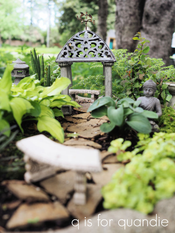
My fairy garden is in the cracked birdbath that is poking out of the hostas in the photo above. I found the bird bath at a garage sale, and since it no longer held water due to the crack, it was super cheap. That made it perfect for my fairy garden because it provides for drainage.
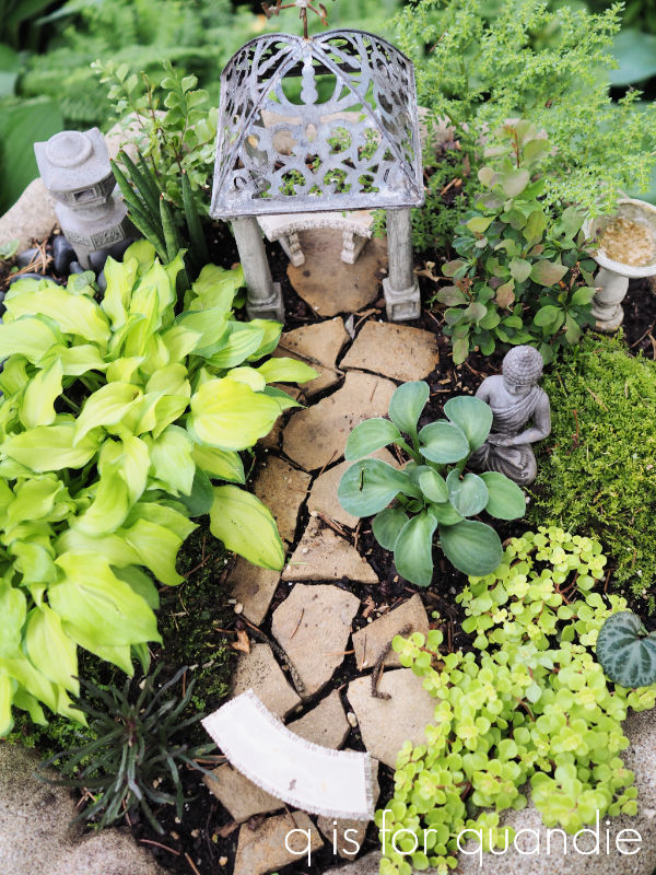
I lost a few of the plants in there over last winter (we bury it for the winter next to the house in a pile of leaves to protect it), but some came back. The big clump of bright chartreuse on the left is a miniature hosta called Feather Boa. I divided it last year and it has come back stronger than ever. The much smaller blue-ish colored clump on the opposite side of the path is another miniature hosta called Blue Mouse Ears. Just behind the buddha is Berberis thunbergii ‘Concorde’, I gave it a little pruning and it’s looking good. The rest of the plants are new and they are annuals, so they won’t come back next year.
I had some trouble finding fairy garden plants this year. Usually Bachman’s has a great selection, and so does Rose Floral in Stillwater but this year it was slim pickins. I have to assume that somehow the whole COVID thing made them hard to come by.
Much like my friend Sue, a good chunk of my garden is in the shade. But I’ve learned to love shade gardening. For one thing, working in the garden is much more pleasant when you aren’t roasting under the hot sun. Also, a shady garden doesn’t need to be watered nearly as much as a sunny one.
Of course hostas are perfect for a shade garden …
But other shade loving perennials that do well for me include ferns of all kinds, bleeding heart, lily of the valley, wild ginger and foam flower.
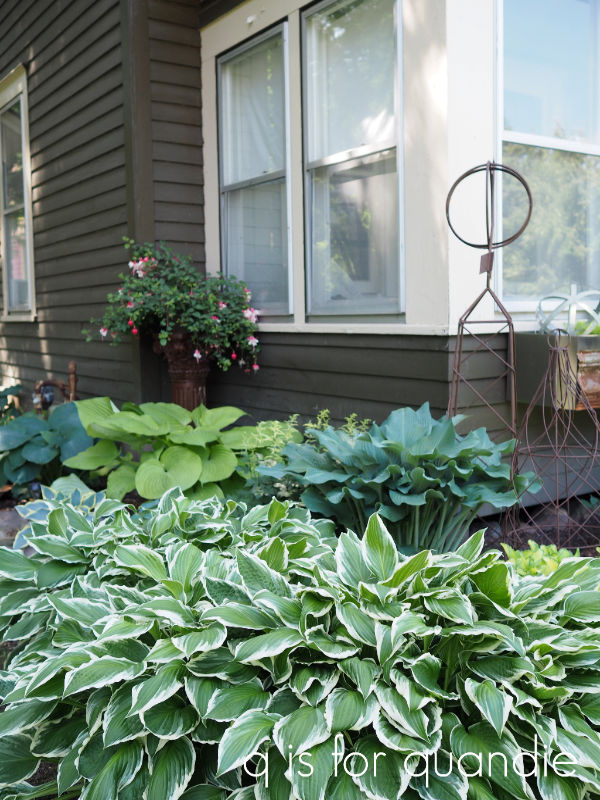
If you’ll remember, last summer we lost two trees in front of the house so now there is a bit more sun in that garden. Luckily all of the plants I have in that bed seem to be enjoying the extra sunshine.

In addition to the hostas, I have some Purple Palace heuchera, some white and some purple astilbe, and a variegated sedum that is really happy to finally get some sun.
 I try to change up the front window box every year. This year I went with a chartreuse and white theme using coleus, sedum, white New Guinea impatiens, white trailing verbena and Diamond Frost euphorbia.

Since it’s getting a little more sun this year, I think this bright lime green sedum will do really well here.
 I added one of the Classic Vintage Label transfers to my watering can, doesn’t it look fab? And it’s holding up perfectly well outside.
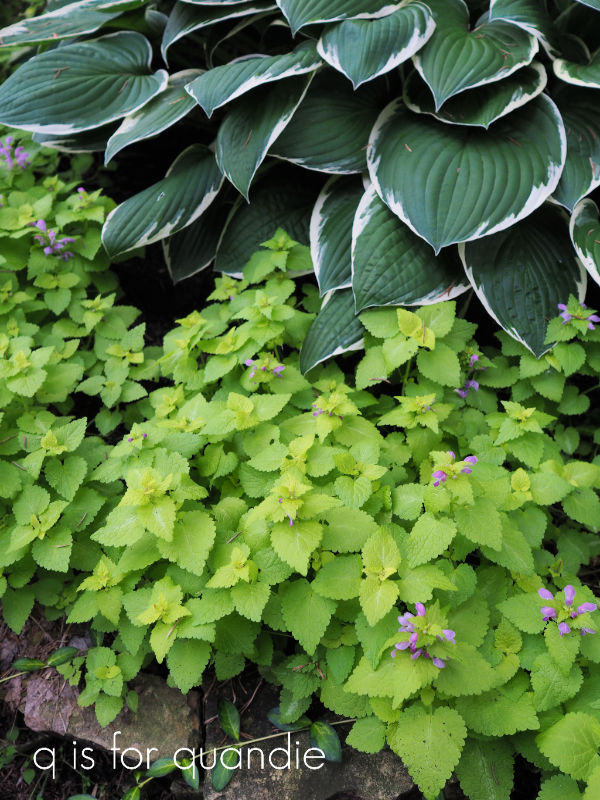
I’m a big fan of adding pops of lime green foliage to the garden, especially either in the shade or planted next to darker green plants. This ‘Lemon Frost’ lamium is a perfect example of that.
Most of the ‘decor’ in my garden has come from garage sales including this sweet concrete bunny.

The gal who was selling it had several concrete garden items and said that her son had been experimenting with making them using molds. I only paid $8 for it, and it has held up quite well.
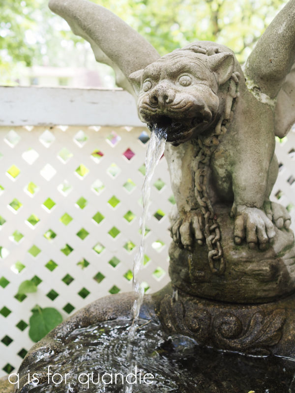
This fountain was from a garage sale …

It sits just below the galvanized boiler window box which is also from a garage sale.

Well, or at least the boiler was from a garage sale. It had a rusted out bottom, so I only paid a couple of dollars for it. Handyman Ken added some wood slats to the bottom so that it would hold soil, but still allow for drainage and then he devised a way to hang it on the wall.
And all of the pretty china I use to decorate my garden is from garage sales too.

While the ladies were touring my garden, they asked if I don’t have problems with breakage having china in the garden. But really, I don’t. I think I’ve had one or two plates break over the years, but since I get them dirt cheap at garage sales it’s not really a big deal.
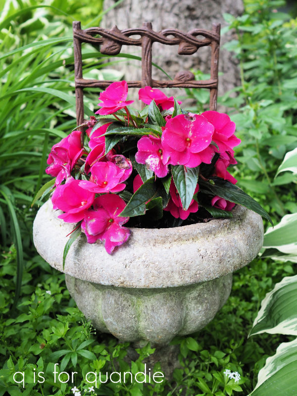
Both of these planters were garage sale finds …

Although I have doctored them up with Dixie Belle’s patina paint to make them look like rusty iron planters (see how to do that here). In reality one is black plastic and the other is made out of that foam faux concrete looking stuff.
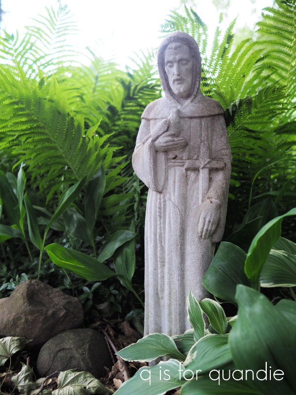
Even Cossetta, my large statue, is from a garage sale.

She manages to make her way into the background of quite a few of my furniture photos …

Many of my plants are also from garage sales including that variegated sedum that I shared earlier. Another of my favorite garage sale plant finds is Sweet Woodruff, it’s the ground cover that is under this concrete planter …
It’s nearly done blooming now, but a couple of weeks ago it was a carpet of delicate white flowers.

A quick q tip about garage sale plants, there is a good chance that plants you buy at a garage sale are considered invasive. There is a reason the seller has enough extra to sell some. For me, invasive isn’t necessarily a bad thing. It just means that you need to control it by planting it in spots with natural borders. In this case there is a tree at the back, large hostas on either side and a stone border in the front. When the plant starts expanding beyond those borders, I just yank it out. You have to be a little brutal about it.
I have many ‘invasive’ plants in my gardens including a rather large bed of ferns that has taken over the space to one side of our driveway.
This area is in deep shade though, and prior to adding the ferns I really had trouble getting anything to grow well in that spot.
Another favorite plant of mine is the clematis. I added three new ones this year, bringing my total to 7. They don’t all bloom simultaneously. I wish I could say that I planned it that way, but it really just happened.
This one goes first …

Then a week later, the blooms on this one start to open …
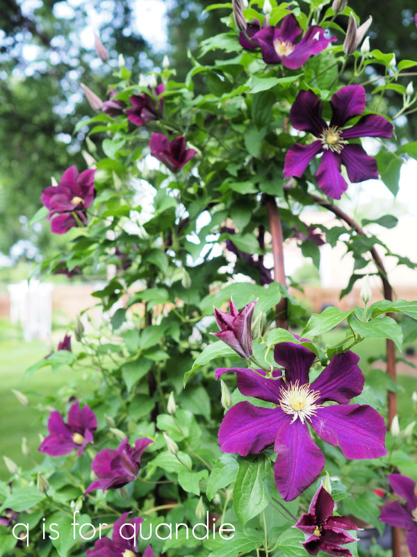
The rest haven’t yet started to bloom. One of the new ones I planted is Sweet Autumn, which blooms in late summer to early fall. So now I should have clematis blooming for most of the season.
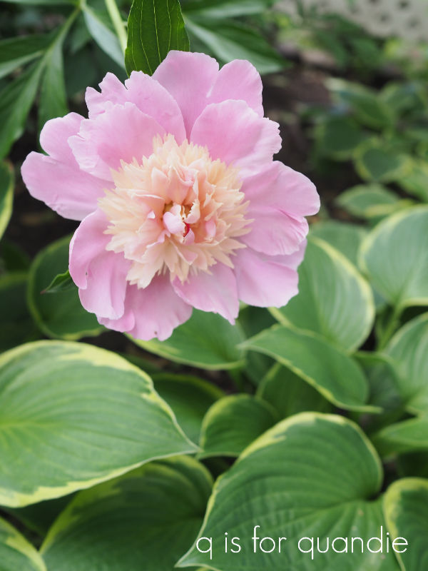
I have one last thing to share with you guys, my cutting garden. It’s tucked away behind the carriage house. The sole purpose of these plants is to cut the flowers and bring them in the house, so the plants don’t have to look pretty in place.

In case you haven’t noticed, I really love peonies so most of the space back here is taken up by them.
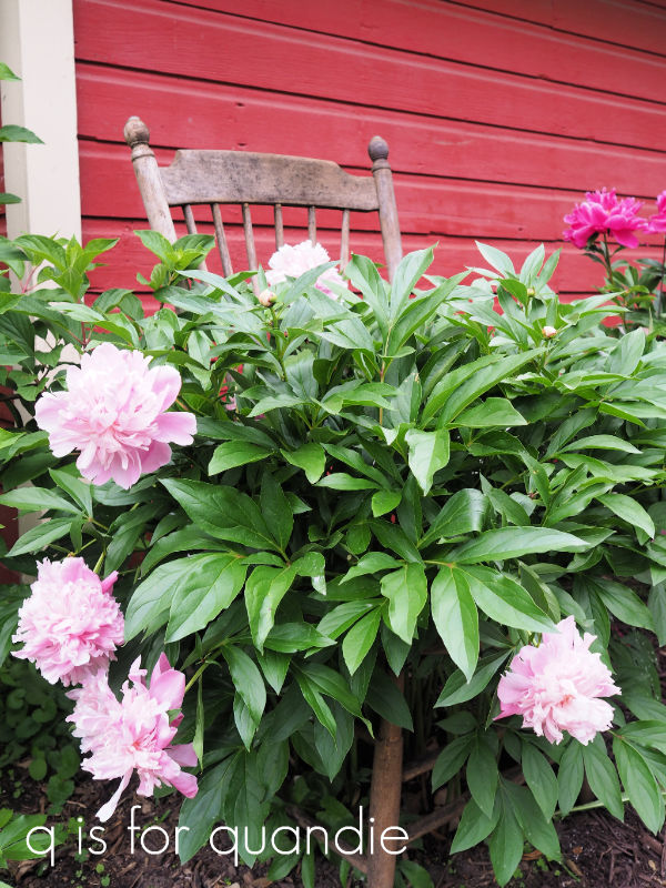
You might remember that about a month ago I shared the idea of using an old chair to support your peonies …
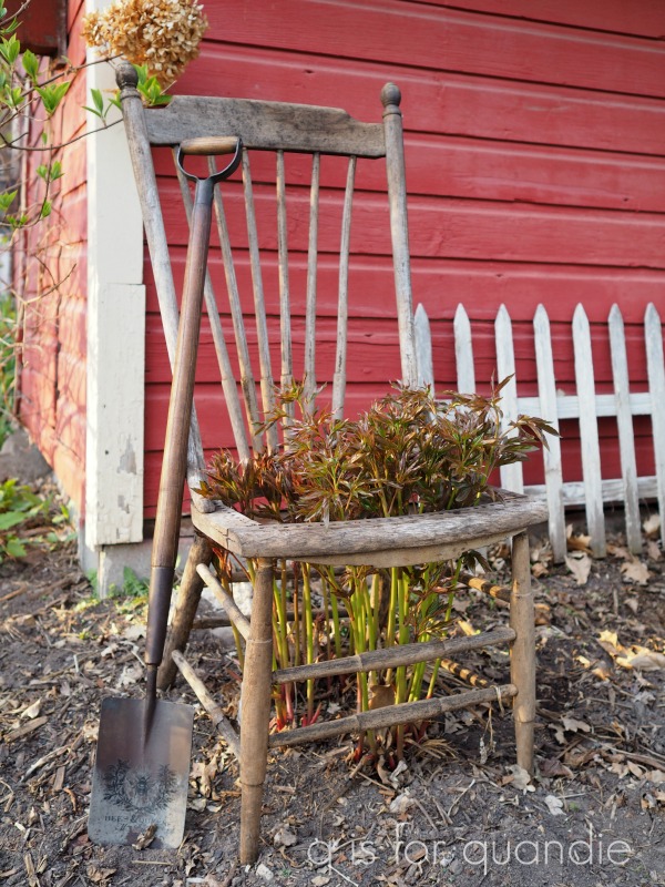
. As you can see, the peony has grown quite a bit since then …
Well, I hope you have enjoyed this tour of my gardens even though it got a bit long.

And I also hope you’re a fan of these sort of ‘tour’ posts, because on Friday I’ll be sharing another tour of a really lovely home in Stillwater. Here’s a little sneak peek …

So be sure to stay tuned!