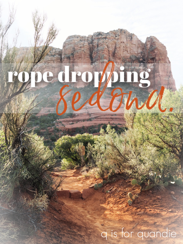
Those of you who visit Disney parks will know exactly what I mean when I say ‘rope dropping’, but for the uninitiated, rope dropping is when you get to a park before it opens to try and beat the crowds. Back in the day they literally had a rope across the entrance that they dropped at opening time, hence the name.
My sister and I are expert rope droppers, we wouldn’t do Disney parks any other way. They get so crazy crowded later at mid-day. These days I find that the only enjoyable time to be in the parks is early morning, or late evening.
Well, as we discovered on our trip out there last week, Sedona, Arizona is a bit of the same. Debbie and I put our expert rope dropping skills to work in Sedona!
But let me start at the beginning. After flying out to our mom’s house, we got up early the next morning, packed up the car and headed for Arizona. It takes just over 4 hours to drive from Henderson, Nevada to Sedona, Arizona.
We drove to Flagstaff, and then took 89A, a.k.a. the Oak Creek Canyon Scenic Drive, south from there into Sedona. I took this photo from the Oak Creek Vista just so I could show you guys what that road looked like.

Uh, yeah, it was kind of scary.
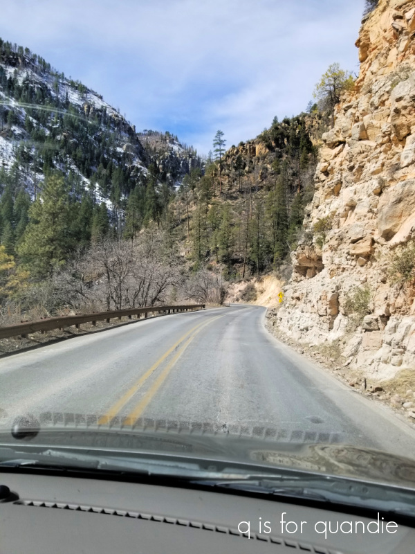
Rock wall on one side, massive drop off on the other. My mom was cool as a cucumber in the back seat, but Debbie and I white knuckled it the whole way down. The scenery was absolutely spectacular though.
If you head into Sedona from Phoenix or Tucson you won’t be coming this way, but it’s worth taking the drive up and back just for the scenery. Just take 89A north out of Sedona.
Just to mess with our heads, we were traveling on the first day of daylight saving time. Plus, Arizona is a different time zone than Nevada. Plus, we had just flown in from Minnesota which is in even another time zone. Plus, Arizona doesn’t do daylight saving time, but Nevada does. Seriously, wrap your head around that. We had a heck of a time figuring out what time we needed to leave my mom’s house in order to be in Sedona for a 2 p.m. tour we had scheduled.
But we managed it.
Prior to leaving home, we had read a travel tip that suggested taking a trolley tour when first arriving in town to get a good overview of the area and to decide what areas you want to go back to explore further.

So we had booked the Sedona Hi-Points Tour through Red Rock Magic Trolley.
I’m not going to lie, I was a little disappointed when I realized that our tour was in a van, not a cute little trolley. Once again, I hadn’t read the fine print. Only the shorter 55 minute tours took place in a trolley, our 2 hour tour was with a van. But in the end, it was a fantastic tour. In addition to the three of us, there was only one other couple in our group so it really felt like we had a private tour. Our guide was super nice and very knowledgeable about Sedona. We visited Bell Rock, The Chapel of the Holy Cross, and Airport Mesa. Our guide explained the energy vortexes that Sedona is known for, and even did a little demonstration at the Airport Mesa, which is considered to be the most powerful vortex in Sedona. I have to admit, I’m a bit of a skeptic about these things. I didn’t get any sort of magical tingly feeling, but hey, maybe my chakras were a little cleaner after that. Who knows? My mom wasn’t up for much walking so she opted to stay in the van at Bell Rock and at the Chapel and our guide stayed with her and regaled her with stories of Sedona. He was super nice to her and didn’t make her feel like she was an added burden at all. It was handy having a driver to drop us off at both of these locations because they were very crowded and parking was a nightmare, so the tour was worth it just for that.
After our tour concluded, we settled in to our hotel. We stayed at the Best Western Plus Arroyo Roble Hotel in the Uptown area. The view from our patio was pretty spectacular.

Just behind the hotel you can walk down to Oak Creek, and my sister and I did that just before sunset on our first night.

It was so peaceful and picturesque.
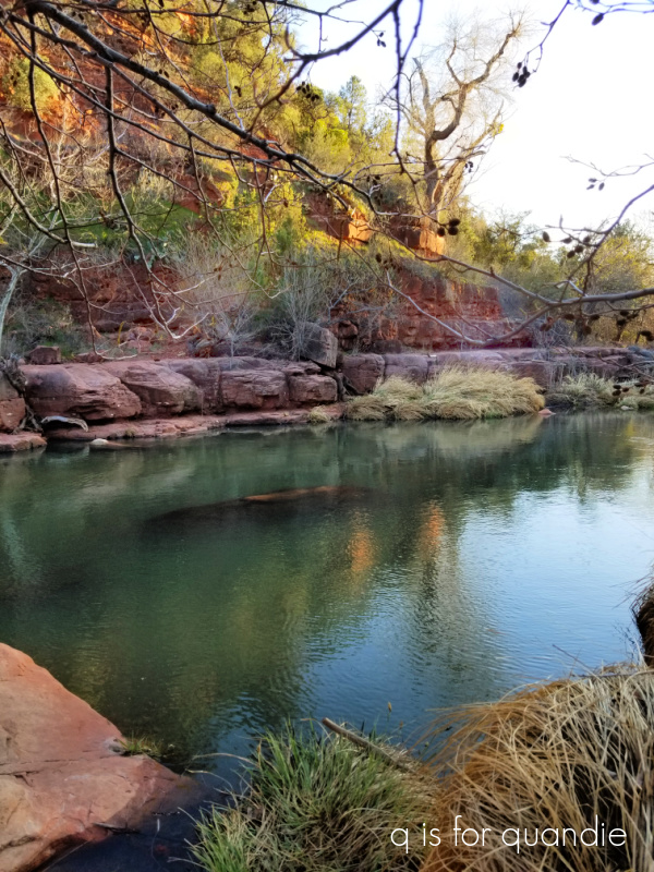
And having just flown in from Minnesota (where it was 7 degrees) the previous day, it just felt amazing to be outside in such beautiful surroundings.
The hotel also offered a fire pit.

Seriously, does that look like a fake backdrop or what? Nope, that was our actual view. Some other travelers at the hotel joined us out there after dark and it was fun chatting with them.
The pool area was lovely as well.

Although it was fairly cool while we were there, the pool was heated and people were using it in the afternoon. We hadn’t brought swimsuits though, so we missed out on that.
I should mention that this hotel is right smack dab in the heart of the most touristy part of Sedona called Uptown. I didn’t get any photos of that area, but it’s full of over-priced restaurants, cheap souvenir shops and LOTS of tourists. It’s a strange juxtaposition to have all of that beautiful nature out the back, while being steps away from all of that intense action out front. It was interesting to note that everything closed up fairly early though. By 8 p.m. the area out front was practically deserted.
I have absolutely zero complaints about this hotel. The customer service was fantastic. In fact, on our last night there were weren’t able to get into the safe in our room and my sister had put the car keys in there while we went to dinner. After the hotel staff couldn’t get it open either, they located someone at 9 pm to come and drill the safe open so that we wouldn’t have to give up our plan for a sunrise hike the next morning. The included breakfast buffet was really nice too.
And speaking of breakfast, I think the best advice we got from our tour guide was to get up before dawn and do some of the popular hikes before breakfast to avoid the crowds. In other words, we had to be at the trailhead at rope drop!
Now, I should preface this next bit by pointing out that my sister and I aren’t getting any younger. She’s nursing a knee injury, and I have tendonitis issues in one of my heels. Add on to that the fact that we are both afraid of heights. So we planned on hiking the easier trails in Sedona, and not doing any climbing. But for those of you in the same boat, these hikes are still well worth it for seeing some pretty spectacular views.
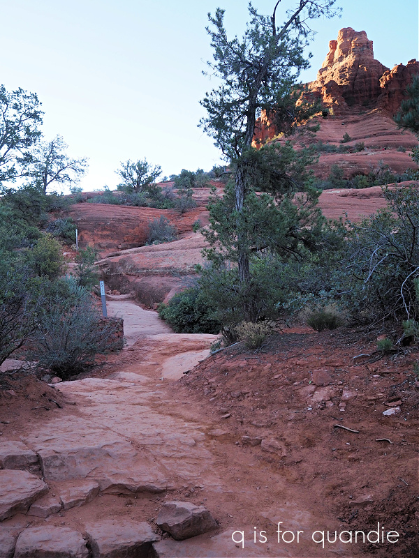
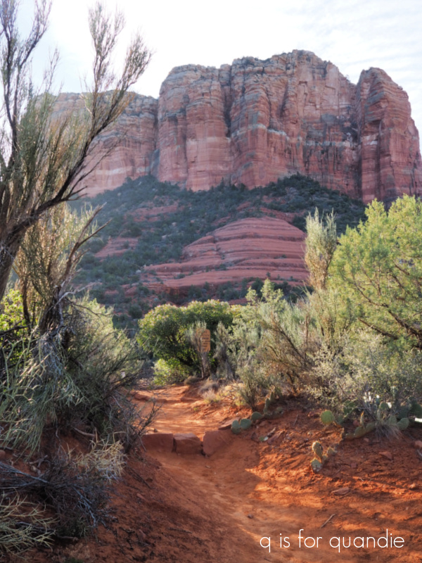
Our sunrise hike on the first morning was to Bell Rock and Courthouse Butte.
We started off down this trail headed towards Bell Rock just as the sun was coming up.

As you can see, the trail is pretty flat at first. You can opt to climb Bell Rock, and there were plenty of people doing that, but I got sweaty palms just looking at other people standing at the edge up there. So we chose to just walk around the perimeter, which still offered awesome scenery.

Just to be clear (for those who may also want to take this hike), the trail wasn’t flat sand the entire time. There was some easy rock scrambling involved too. But it was very doable.
Next we headed off towards Courthouse Butte.
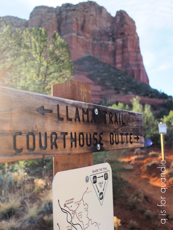
The butte is pretty darn impressive.
By the way, a butte is defined as an isolated hill with steep sides and a flat top (similar to but narrower than a mesa).

As impressive as that view is, if you turn around, the vista from here is even more spectacular.

After hiking for a couple of hours, we headed back to our hotel for breakfast. After breakfast we decided to check out a popular shopping area called Tlaquepaque.
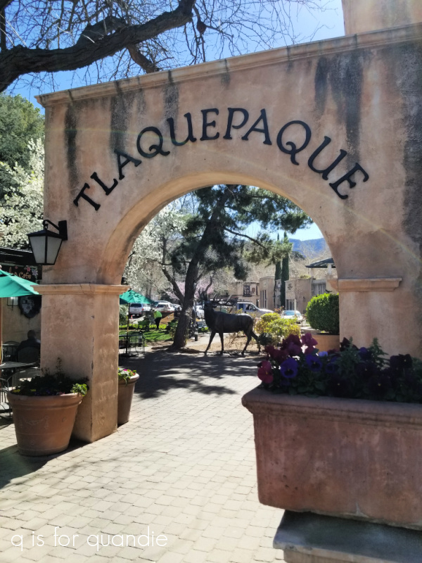
None of us are big shoppers, but the area was so pretty that we could have wandered around in there for quite some time just admiring it.
Tlaquepaque was designed in the 1970’s and the design was based on traditional Mexican villages.

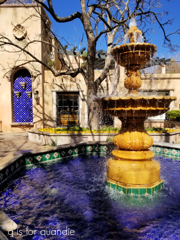
There were pretty little plazas around every corner.
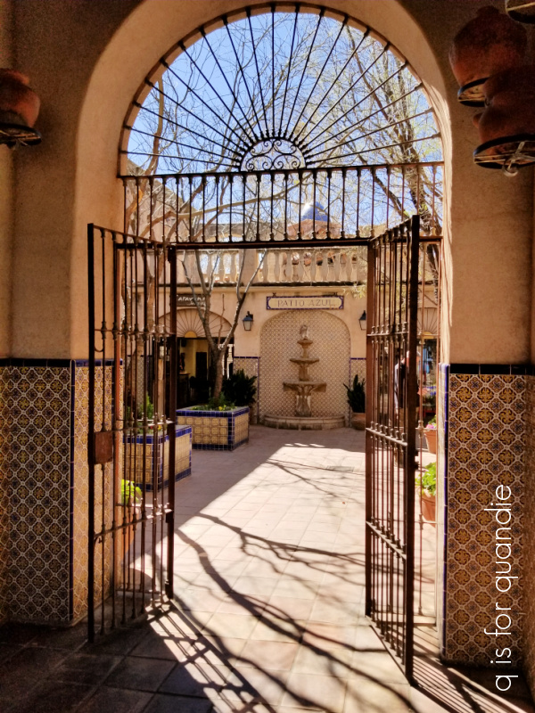
And the tilework was really gorgeous.
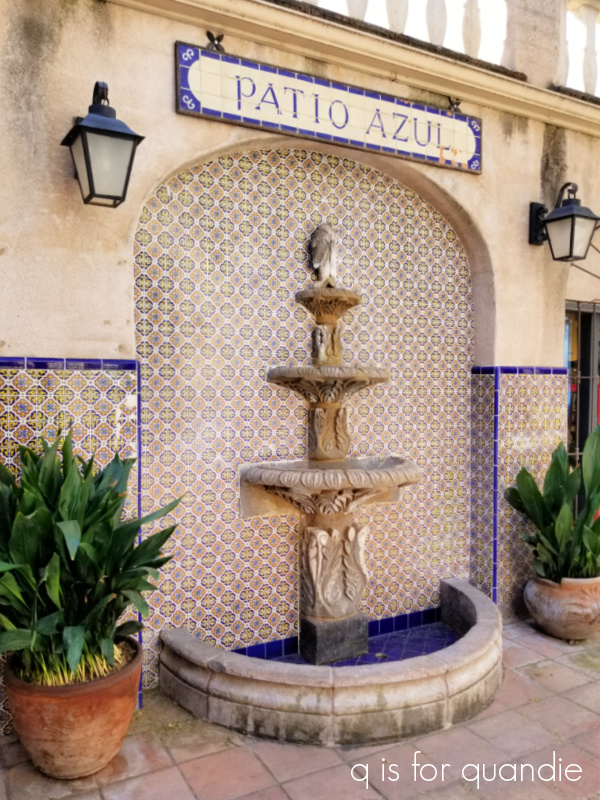
I really did feel as though I was in another part of the world entirely. But then, this is completely different from anything you’d find in Minnesota!
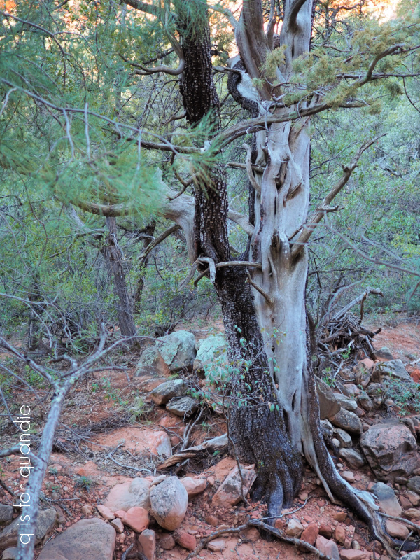
We did a shorter sunrise hike the next morning before heading back to mom’s house.

I have to say that the hike into Fay Canyon wasn’t quite as impressive as the previous day’s hike, but it was still rather magical.
As with the Bell Rock hike, there was only one other car in the parking lot when we arrived, but it was almost full when we left. All the way back to the hotel we saw cars lining the roads at each trail head that weren’t there when we arrived at dawn.

So my biggest q tip for you if you ever get to Sedona is to be sure and rope drop the hiking trails. They are absolutely gorgeous in the morning light. You won’t have them entirely to yourself, but there won’t be hoards of people on them yet. And best of all, after all of that hiking you don’t feel one bit guilty about that extra sausage you’ll have with breakfast later!
Be sure to stay tuned because I’ll be sharing the rest of my trip out west next week and I’m planning a fabulous giveaway to go with it. In the meantime, I have a dresser that I just finished up that I’ll be sharing on Friday. See you then!