my all-time favorite.

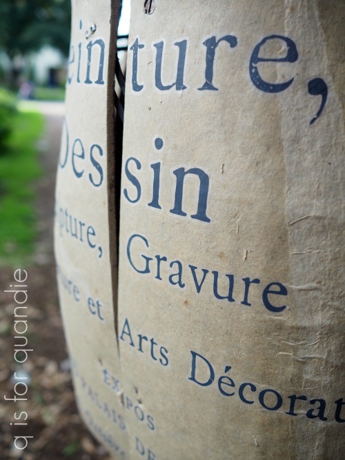
 For today’s ‘re-run’ I decided to share all many of the pieces I’ve done using one of my all-time favorite transfers called Seeds.

I’ve never actually added up how many times I used this transfer, I’ll try to do that with this post, but I’m not sure I’ll find all of them.

Unfortunately, this design is now retired and after a quick search online I was unable to find it for sale anywhere.  If any of you are retailers and have these available, be sure to leave a comment below with your details so people could buy them (or so I could buy them).

This transfer came in two different sizes and two colors, black or white.  And I’ve used them all, so let’s take a look shall we?

My first ever use of this transfer on a piece of furniture was the Blue Alligator dresser.

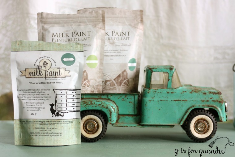
I had custom mixed the milk paint color for that piece using three different colors and two different brands of milk paint.  It’s equal parts Homestead House Loyalist, Homestead House Upper Canada Green and Miss Mustard Seed Kitchen Scale.

I loved the resulting color, and I named it Blue Alligator.

This was early days for furniture transfers (although smaller rub on transfers have been around for decades) and since then they have cleaned up the look of that hazy halo that a lot of people complained about.

But it never bothered me.  I was so thrilled to find a product for adding detailed typography to furniture that wasn’t incredibly painstaking and time consuming (hand-painting).

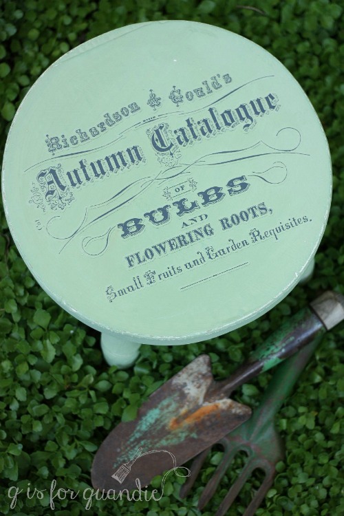
That was back in April 2017, and I used the smaller version of the transfer on a metal stool that month as well.

Or a portion of it anyway.

I used the upper half of that smaller transfer on a little wooden stool a couple of months later.

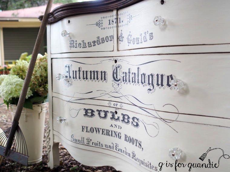
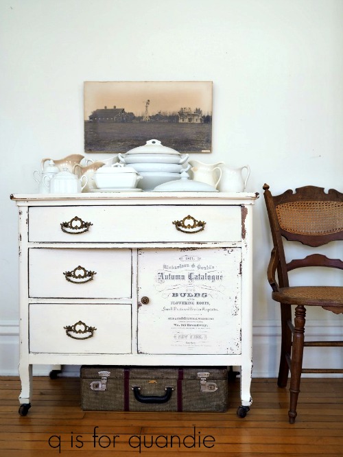
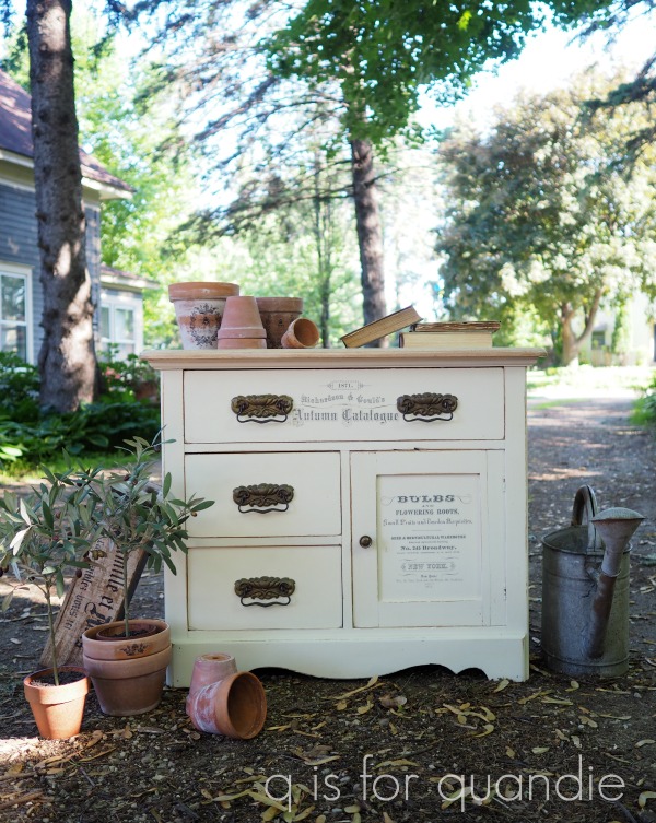
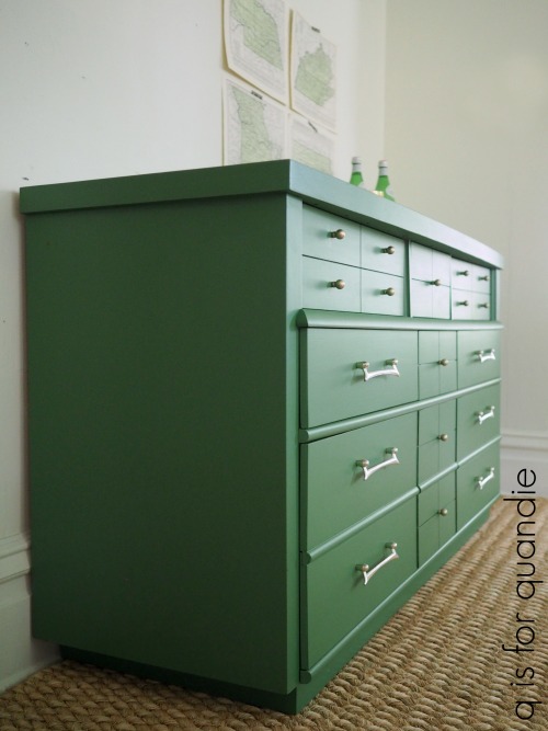
The next larger piece that I used the Seeds transfer on was this dresser in July 2017.

 I mixed up a custom milk paint color for this one too, mainly to use up a few partial packets of paint I had on hand.  I started by mixing equal parts Miss Mustard Seed’s Eulalie’s Sky and Shutter Gray.  The resulting color was just a bit too blue for me, so I then added another equal part MMS Grain Sack to both lighten it up and add a little more grey.  I loved the subtle pale blue gray color that I ended up with.

In autumn of 2017 I added the Seeds transfer to yet another dresser, this time over Fusion’s Limestone.

In January 2018 I used the smaller version of the transfer again, this time on a washstand that was painted in Miss Mustard Seed’s Linen milk paint.

I advise using caution when applying a transfer over chippy paint as the transfer can pull off the paint, rather than adhering to your piece.  You may want to add a clear coat over your milk paint first, then add the transfer to avoid that problem.

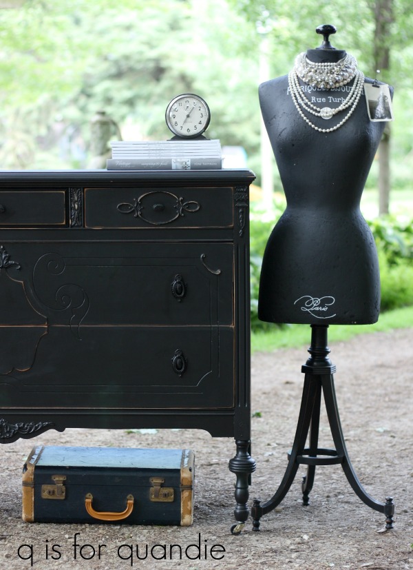
The next piece that received a Seeds transfer was this linen press dresser painted in Dixie Belle’s Drop Cloth.

That piece was a bit of work since I initially painted it in milk paint that then proceeded to almost completely chip off.  I had to sand it down and start over with Dixie Belle chalk style paint.  But in the end it was awesome.

Next up came the garden beds.

It’s not often that I find a matching pair of twin beds, so I was thrilled to find this duo at a garage sale.

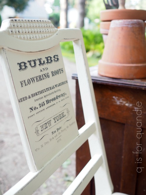
I added the smaller version of the transfer to the back of this chair in July 2018 …

and also to this little wooden stool in the same month.

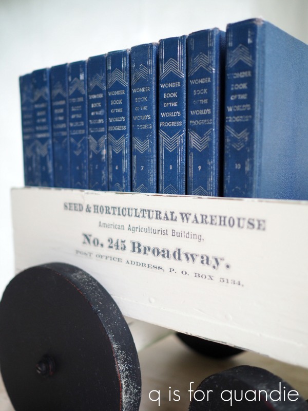
While I was at it, I also used some remnants from a large Seeds transfer on this wooden tote.

Let’s see, are you keeping track?  What am I up to?  An even dozen pieces so far.  Let’s keep going.

I used another small sized transfer on a mirror frame that I turned into a chalkboard in September 2018.

and also on this washstand in October of that year.

That one is also painted in Dixie Belle’s Drop Cloth.

I also had some fun using pieces of the smaller version of the transfer on this pull toy.

I still can’t believe I paid less than $1 for that horse and cart at a garage sale.

I also applied bits of the smaller one to this vintage refrigerator box.

The following January I used the larger version again, this time on one of the bed benches that my handyman Ken created from an old headboard/foot board combo.

That bench is painted in Fusion’s Bedford.

In summer of that year I used the smaller versions on yet another washstand that was painted in Drop Cloth.

I also used the smaller version on the back of a wooden folding chair in July 2020.

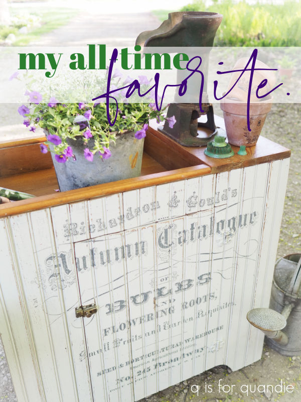
It wasn’t until January 2021 that I used the larger version on a big piece of furniture again.  I think that’s because I was hoarding my last couple of these transfers knowing that I’d eventually not be able to find more.

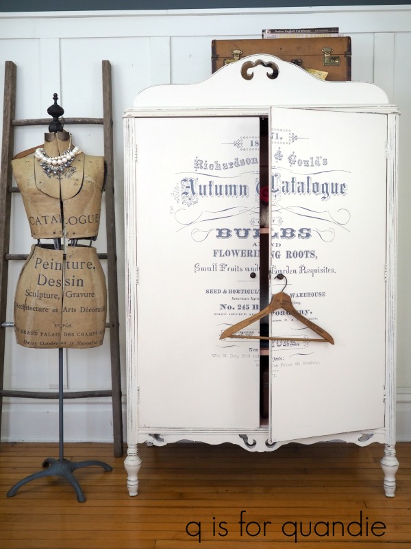
That armoire was perfect for it though.

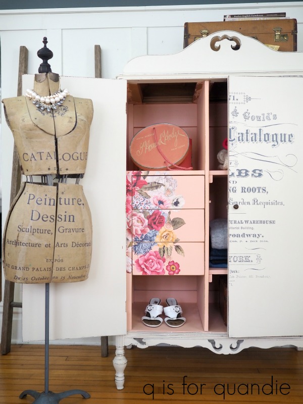
It remains one of my all-time favorite pieces.

I used another of my carefully guarded stash of Seeds transfers on this dry sink last summer.

Wasn’t it just perfect for that piece?

As I mentioned in the blog post about that one, I don’t necessarily recommend hoarding a stash of transfers like I have done.  They do tend to dry out a little over time, and then they become harder to apply.  Not impossible necessarily, but certainly more difficult.

But when they keep retiring your favorites, there doesn’t seem to be any other option.

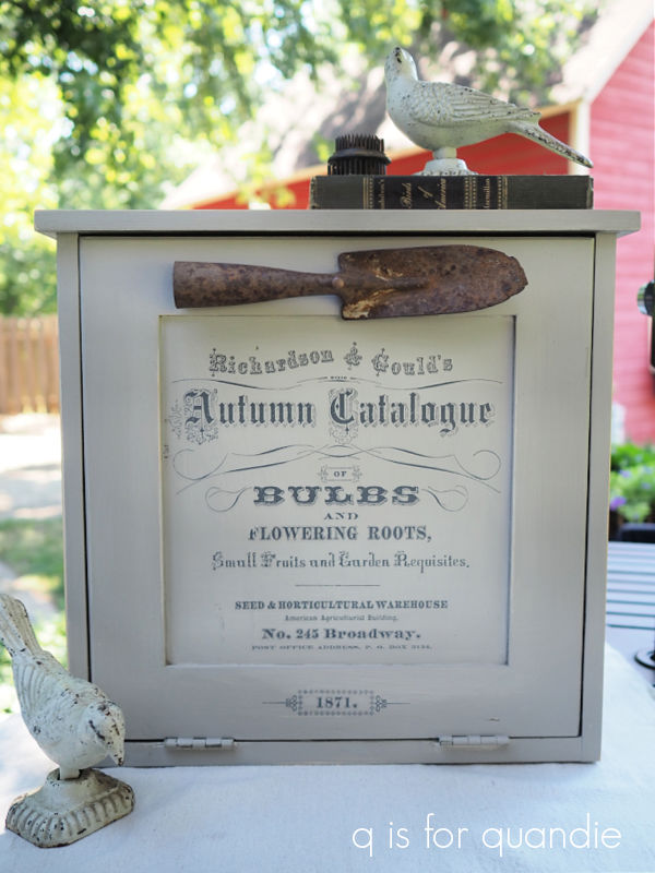
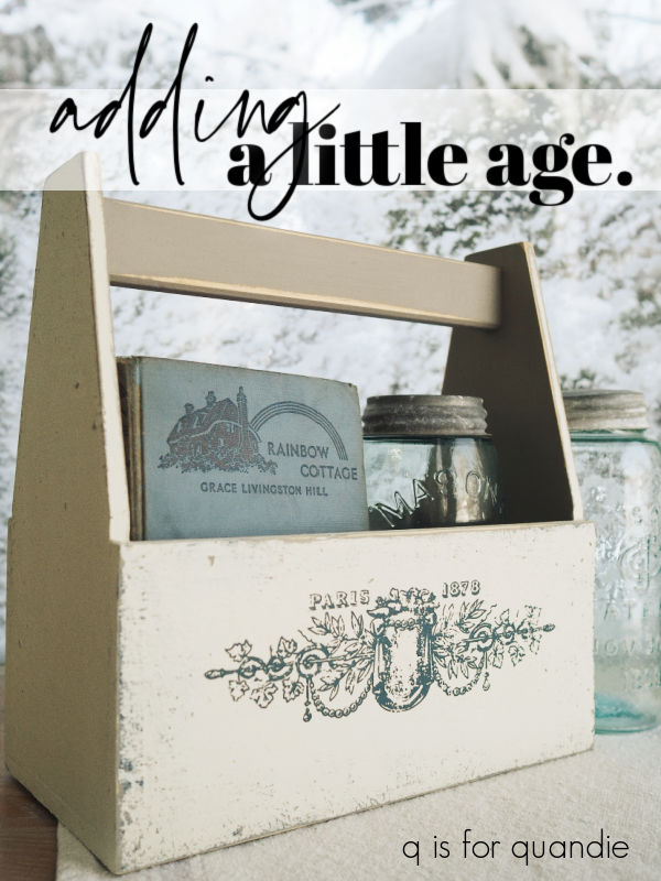
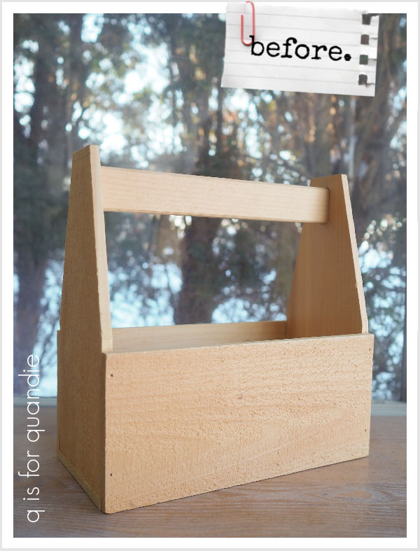
Sadly, that dry sink received the last of my large sized Seeds transfers.  However, I did have a few scraps that were left over from pieces where the entire transfer didn’t fit.  I used one of them on the wooden box I painted for my potting shed last fall.

Then one of my lovely readers was kind enough to send me one of the smaller ones, and it made its way onto this little cupboard.

In the end I had one small white Seeds transfer left.  But to be honest, I never liked the white version.  The first time I used it was on a wooden box that I painted up as a gift for my sister in April 2018.

Yep, not spectacular.

I wouldn’t have purchased a second one, but when I ordered a black one from a retailer online she sent me a white one instead.  When I contacted her about the mix up, she admitted that she didn’t actually have a black one, so ultimately I just kept it.

I finally used part of it last fall on this toolbox.

It worked out well on that piece, I think because it was just a small dose.

I also tried to use the remainder of that one on this case …

I applied it over the I.O.D. Rose Chintz paint inlay, and that was a bit of a fail.  I ended up sanding that down and painting over it.

Although I did keep the little “New York” bit on the side.

OK, so I think I counted 26 pieces with some portion of the Seeds transfer on them.  Yep, I’d say this one was definitely a favorite of mine.

How about you?  Did you use the Seeds transfer on anything?  Or do you have another favorite that you used over and over?  Leave a comment and let me know.

this furniture is permanized.

I thought I would try something a little different while off on vacation this week, re-runs!

Hey, it works on T.V., so I thought maybe it could work here.

I’ve picked out a couple of different furniture makeovers from the past to share with you guys this week.  I tried to go a ways back so it wouldn’t feel too repetitive for those of you who follow me on a regular basis.

I refurbished these mid-mod pieces back in 2018.  Wow, can you believe that was five years ago now?  Time flies, doesn’t it?

Here is how they looked when I brought them home …

I purchased these two along with a 3rd matching dresser that I painted up separately, and forgot to get a ‘before’ photo of.

I thought it was funny that the manufacturer said these pieces were ‘permanized’.

I once again tried googling “Kroehler permanized furniture” to see if I could find any info on it, but that mostly took me to my own blog post about these two pieces.  So I still have no idea exactly what that means.

After scuff sanding and cleaning, I painted this pair in Fusion’s Ash.

This dark gray works beautifully with the mid-mod style.  I don’t typically use Fusion anymore, these days I would swap that out for Dixie Belle’s Gravel Road.  That’s simply because I find that a chalk style paint is more error proof than an acrylic paint.  It adheres to a dicey surface better, it distresses more easily, and if you water it down a tad you don’t have to worry about brush strokes.  On the other hand, chalk paint does require a separate top coat while the acrylic paints do not.  It’s a trade off.

I painted the inside of the bookcase portion of the headboard in Fusion’s Mustard.

I love that pop of mustard yellow next to the gray, and it’s so easy to find bedding to coordinate with that combo.

In addition to the paint, I also refreshed the hardware using some of Prima Marketing’s art alchemy Metallique wax in Bronze Age.

The bronze was gorgeous next to the dark gray.

Although I painted these two pieces to match, if I remember correctly they didn’t sell together.  I believe the dresser sold right away and it took a while to sell that headboard.

As for the 3rd piece from this set, I went in a different direction with that one.  I painted it in Fusion’s Park Bench.

I definitely went through a phase where I painted at least half a dozen mid-mod pieces in this gorgeous green.  They all sold super fast too, so it was definitely popular.

I lined the drawers on this one with some paper I’d found that was perfect to pair with the Park Bench.

 I wanted to retain the original light gold on the drawer pulls for this piece, so I just washed those with soapy water and put them back on.  But the little round knobs were a much darker brass color than the pulls.  To get a better match, I again used the Metallique wax, but this time in a color called White Gold.

This trio was not actually the first time I followed this formula.  The previous February I’d painted another pair of mid-mod pieces in the same colors.

When I went back and read the original blog post, I was reminded that this pair had sat on Craigslist unsold for weeks before I purchased them and they were very reasonably priced.  Five years ago you could still get mid-mod pieces like this pretty easily.  I feel like that no longer seems to be the case, do you find that as well?

This time the tall dresser was painted in Dixie Belle’s Gravel Road.

And the credenza style dresser was painted in Park Bench.

You can check out all of the details on those makeovers here and here.

So tell me, which color appeals to you the most, the dark gray (whether it’s Fusion’s Ash or Dixie Belle’s Gravel Road) or that fabulous Park Bench green?  And what do you think of the mid-mod style, do you think it will continue to be popular for another five years or even longer?

Leave a comment and let me know.

the first flowers.

Before I headed off to visit my mom a couple of weeks ago, I mentioned that I hoped my scilla wouldn’t bloom while I was gone.

I needn’t have worried, because it held out and I enjoyed it for the full week and half between that trip and leaving for Florida yesterday.

These are always the first flowers of the season in my garden.  Scilla siberica, or squill, is a bulb that blooms in late winter to early spring.  In my zone 4b garden they usually bloom anywhere from the middle to the end of April and I’m always so excited to see them after a long, cold winter.

I have two colors of scilla in my garden, white and blue.  The white ones were already in the garden when we purchased our house 30 years ago.

As you can see, up close they have a little bit of a blue streak to them.  From a distance they mainly look white though.

I prefer the blue ones, so I planted some of those myself a few years back.

They are such a gorgeous, vibrant shade of blue.

Scilla is perfect for naturalizing, ie. it will spread over time filling in the space where it’s planted.

  Some consider it to be invasive, so keep that in mind.  If you decide to plant it, be sure to put it somewhere that you won’t mind having lots of it.

Over time, mine has crept out into the lawn in some spots.

It also pops up randomly, rather far away from where it was originally planted.  I’m not at all sure how it does that.

The brilliant thing about scilla is that after it blooms it dies completely back to the ground.  In the garden, it starts dying back as the perennials around it start to fill in, so it’s perfect.  And in the lawn, by the end of May you won’t even know it was there.

Another huge plus to scilla is that it’s deer and squirrel resistant.

Speaking of which, I have decided to give up on tulips.  You’ll remember that I planted a bunch of new ones last fall, and here’s what I found out in the garden the other morning.

Not only have the deer munched them right down to the ground, they’ve literally pulled two of the bulbs right out of the dirt.  Argh!

I know I could do things to thwart the deer, like spray smelly deer repellant on the garden after every rain or enclose the tulips in chicken wire, but neither of those solutions are appealing to me.  I’d just as soon forgo the tulips and plant other bulbs that the deer won’t eat, like daffodils, alliums or more scilla.

How about you?  Do you have scilla in your garden?  Or are you able to grow tulips without deer eating them all for breakfast?  Leave a comment and let me know.


goodbye snow, hello flowers.

You may remember this tote from a recent thrift store haul.

I always feel a little bit bad about painting over someone else’s hand-painted item, but that snow covered pine cone branch had to go.

As I was working on this post last Saturday morning, it was lightly snowing off and on outside, so I thought maybe if I symbolically removed those snowy pine cones it would also bring about a change in our weather.  Wishful thinking?

Either way, I’m about done with snow both on the ground outside, and on this tote.

I sanded the hand-painted bits down so that they wouldn’t show through my new paint job, then I painted the outside of the tote in Dixie Belle’s Drop Cloth and the interior in their Holy Guacamole.

I love pairing this avocado green with the Floral Anthology transfer from I.O.D. that has a similar shades of green in it.

That’s the backside of the tote, which I left word free.

For the front, I added some wording from the I.O.D. Label Ephemera transfer.

I wrapped the florals around both sides as well.

Now the tote is pretty from all four sides.

Speaking of being done with snow, I’m heading off to Florida with my sister on Saturday.  We’re spending another week at our favorite Disney resort, Port Orleans – French Quarter.  This time we’ll be at Epcot for the Flower & Garden Festival, so I’m betting I’ll have a Sunday morning garden post for you when I return.

But in the meantime, due to my back to back trips, I’m a little short on projects to share here.  However, I do have a couple of flashback posts scheduled for next week to keep you entertained while I’m gone so I hope you enjoy them!

an altered recipe box.

Have you made yourself a recipe box scrapbook yet?

I shared this idea a few years back when I made one for our Adriatic cruise.

That cruise went to some of the most beautiful ports I’ve seen; Venice, Ravenna, Kotor, Split and Valletta.  If you’re considering a European cruise, I highly recommend looking for one that visits those ports of call.

But, I digress.  This isn’t supposed to be a travel post.  This is a post about a makeover for this recipe box.

I found it the last time I went thrifting with my friend Sue.  It’s a nice, big one which would make it perfect for photos.

After sanding the box down, I painted it with one coat of Dixie Belle’s Sea Glass.  Once that first coat was dry, I blended more Sea Glass with some of DB’s Juniper around the edges (FYI, I believe Juniper is no longer available, it was a seasonal color back in 2021).

I’m still practicing my blending skills, I do like the way a little blending adds some depth to a piece.

Once painted I added some I.O.D. transfers from the Brocante and Label Ephemera sets.

The floral and the butterfly are from Brocante, the wording is of course from Label Ephemera.

I didn’t paint the inside of the box, but I did line it with some scrapbook paper.

Unfortunately, the previous owner of this box had defaced most of the alphabet index cards.

I have only A thru J in their original state.

The tabs for the rest of the alphabet have been obscured with white out.

Still, someone creative could work with those cards.  Especially if they happen to have any of the October Afternoon word stickers.  They all have index tabs on them, like the “Family History” one below.

You can still find some of the word stickers on Etsy, but October Afternoon has been out of business for several years.

I decided to go ahead and paint over the white with some of Dixie Belle’s Mint Julep to make it a little less obvious.

I used my cute little Savoy camera to stage these photos.

This is one of the few items I’ve ever purchased at a legit antique shop.  It was $30, but I fell in love with the colors, which happen to work beautifully with the colors in the October Afternoon supplies I’ve used on my index cards.

You might be thinking that I plan to save this one for myself, but actually I am going to sell it (without the photos).  If I do eventually decide to make one for my old family photos, I’ll likely theme the outside to something more ‘family like’.  But it was fun to break out the scrapbook supplies and show you what you could do with this box.

So tell me, have I encouraged you to create your own recipe box scrapbook yet?

planting outside of my comfort zone.

I had planned to get out to the botanical garden at Ethel M’s while I was out at my mom’s house last week.  I thought it would make a great ‘Sunday mornings in the garden’ post.

If you aren’t familiar with Ethel M chocolates, first of all they are named after Ethel Mars.  She was Forrest Mars Sr.’s mother, and he is the founder of Mars, Inc.  So many brands are under the Mars umbrella, including Snickers and M & M’s, but Ethel M is their fresh-crafted gourmet chocolate line and they make them in Henderson, NV.

You can tour the factory to see where they are made, and to try a free sample.  But I go for the botanical garden outside.

I have to admit, I’m not really a big fan of desert scenery.  I tend to prefer a much more lush look.  But the Ethel M garden shows how beautiful cacti and other desert plants can be.

All of that being said, I didn’t actually get out there this time.  All of those pics are from my visit last year.  My mom came down with bronchitis just before I arrived last week, and she wasn’t feeling up for much.  So I basically spent the week laying low with her.  Honestly, I was quite lazy and didn’t accomplish much.

However, I did do some planting for her.

She has a few pots on her patio, and I tend to plant those up with annuals each time I visit.  When I was out in February I put in some pansies.

They were still looking OK, but with hot weather just around the corner for her, I knew they weren’t going to last much longer.  I wanted to replace them with some moss roses, which did extremely well for her last summer, but they weren’t available at her local Lowe’s yet.

So I left most of the pansies in place and decided to plant a few things right in the ground for her this time around.

Here’s the thing, my mom lives in a townhome.  They have a rock landscape with irrigation spots here and there for specimen plants.  As plants have died over time, it seems that her HOA is not replacing them.  So there are lots of spots that have a functioning irrigation drip, but no plant.

I’m not usually a rule breaker, technically my mom is supposed to get approval to do any planting in the ground.  But … well … I didn’t have time to wait around for approval.  I planted anyway.

The first challenge for me was figuring out what to plant in her zone 9a, which is a long ways from my own zone 4b garden.  I started out with the yellow lantana.  There are already several of these in the ground in her complex, so I figured they were a safe bet.  I also thought maybe the HOA wouldn’t notice them since they would just blend in with existing plantings.

I grabbed that plant in the back of the photo above with the bright pink flowers because I thought it might attract hummingbirds.  My mom has a hummingbird feeder just outside her sliding glass doors and she loves to watch the birds.

It’s a Chiapas Sage which grows best in full sun and is drought tolerant so I’m hoping it will do well, and draw in lots more hummingbirds.

I also grabbed a gardenia while shopping.  When my family lived in Florida we had a gardenia and my mom loved it, so I thought I’d give it a go.

I wasn’t sure it would do well in the ground with their once a week drip irrigation, so I decided to put it in one of her pots where it would be easy for her to water.

The tag said it would do best with 3 to 4 hours of morning sun, but with protection from the intense afternoon sun.  I was able to place the pot in the perfect location on her patio for that.

I had to laugh when digging through the boxes of stuff in my mom’s garage looking for plant food because I found some vintage garden tools.

She was never much of a gardener, so I was surprised to find this.  If I came across it at a garage sale I’d probably pick it up to use as a photo prop!  Who knows when the last time was that this tool was actually used.  I may have to sneak it into my suitcase the next time I visit.

For now, I’m keeping my fingers crossed that everything I planted survives.

How about you, do you ever garden outside of your zone?  Leave a comment and let me know.


adding a little age.

Hey everybody!  I’m back from visiting my mom, but haven’t had a spare moment yet to sit down and respond to comments.  I’m going to get to that this morning, but in the meantime, here’s a quick project to enjoy with your morning coffee.

You may remember that I picked up this wooden tote while thrifting a few weeks ago.

It pretty much looked freshly constructed out of new wood.  The one downside was that it was made out of fairly rough sawn wood.

So a week or two ago when I was looking for a quick project to fill some spare time, I pulled this out of the pile to see if I could age it up a bit.

I started by sanding down that rough wood a bit.  I didn’t get it totally smooth, but now you can handle it without getting a splinter.  Next I gave it a base coat of Dixie Belle’s French Linen.  Once that first coat was dry, I added a little bit of Dixie Belle’s Sea Spray (a texture additive for paint) into the French Linen and stippled it on randomly.  Adding some texture to the paint helped further disguise that rough sawn wood.

I think the key to aging a piece is to have several layers of different colored paint, so I then added some of DB’s Bunker Hill Blue here and there.  Once that dried, I painted the entire outside of the tote in DB’s Drop Cloth.

Next up came sanding with 120 grit paper to both smooth out the Sea Spray a bit, and to reveal some of those layers of colors.

I’d recently used one of the Lovely Labels Middy transfers from re.design with prima on a bucket, so I knew there were a couple of segments in that transfer set that would work perfectly on this tote.

I put the ‘Paris 1878’ section on one side, and the ‘blessed’ section on the other side.

Once I had them both applied, I top-coated everything with some of Dixie Belle’s Easy Peasy spray wax.

And yes, that is snow on the window behind the tote, but I took these pics after our April Fool’s Day snow storm.  I returned home from my mom’s to see that all of our snow has melted.  It’s always kind of amazing how fast those big snow banks will melt away in the spring.

I hope you enjoyed this quickie tote makeover.  Leave me a comment and let me know!

Lula and Collette.

Last week I mentioned the dress form that I saw at Acme Junk Co with a price tag of $475.

It was very cool, but you know me, I’d never spend $475 on something like that.

So I thought this might be a fun time to re-visit the stories behind my ‘dress forms’.  One that I made myself out of a Styrofoam mannequin torso, a lamp table base and a door knob, and one that I purchased at a garage sale.

I shared the story of my first ‘dress form’ once before here on the blog, back in 2013.  Yowza, have I really been blogging that long?!

You’ve maybe seen it being used to stage a piece of furniture here and there over the years.

  But lots of you probably don’t know the story behind Lula.

I named her after one of my favorite great aunts.  She was my grandmother’s sister and she and her husband lived on a farm in South Dakota.  As children, my brother, sister and I would stay with them for a week or two in the summer.

That’s a photo of Lula and her first husband, whom I never met.  He passed away and she then married my Uncle Homer.

The mannequin torso that I used to create Lula was rescued from the old Oakdale Mall (for any of you locals who may remember it) by one of the city’s public works superintendents.  The mall was being torn down and the property cleared for new development (it’s now a HyVee grocery store).  He brought it over to City Hall and asked if I wanted it (this, of course, was back when I worked there).

To be honest, I wasn’t quite so sure about a yellow Styrofoam torso, but I took it.

I knew I needed to come up with some sort of a base for it, so when I came across one of those mid-century lamp tables in the free pile at a garage sale I grabbed it.

You remember those lamp tables that were popular in the 50’s and 60’s right?

Mine didn’t look quite like that, and of course it was in pretty rough shape.  But you get the idea.  The base ended up being perfect for my mannequin.

Naturally, I asked for my handyman Ken’s help in attaching the mannequin to the table base.  To this day I’m still not sure exactly how he did it, but they are firmly attached.

It was a long time ago, but I’m pretty sure I painted the table base in black latex paint.  I was totally unfamiliar with chalk paint back then.  However, I painted the Styrofoam torso in Rust-Oleum black chalkboard paint.

I knew I needed to do something to cap off the neck of my mannequin, so I ended up deciding to use an old black enamel door knob.

It’s just pinned to the Styrofoam, but it mostly stays in place.  Same for the metal no. 1 plate.

All of the photos so far in this post are showing Lula decorated with a white chalk pen, but a few years ago I gave the torso a fresh coat of black chalk paint, and then added some gold re.design with prima transfers to her instead.

The crown and the swag on her chest are from their Gilded Home & Nature set, and the wording at the base is from their Somewhere in France set.

My second dress form, Collette, start out life looking like this …

It was covered in an ugly grey jersey knit fabric that had definitely seen better days.

I purchased it at a garage sale, and unfortunately I don’t remember exactly how much I paid, but I know it was less than $100.

It was fairly simple to rip all of that fabric off to reveal the cardboard form underneath.

The metal collar at the neck was still just a bit too new and shiny looking for my taste, so after first painting it with a coat of Dixie Belle’s Caviar, I gave it a coat of Prima Marketing’s Metallique wax in Bronze Age.

Then I changed out the original finial for this painted one …

For the final pièce de résistance, I added bits and pieces from the Prima Marketing Catalogue transfer to it.

By the way, in case any of you are wondering, I did not top coat the transfers on either one of these dress forms and they are still holding up perfectly.  Of course, they are indoors and not handled frequently so that may be a factor.

I totally love how this one turned out.

So much so that I still have it.  In fact, both of these dress forms are in the corner in our bedroom.

I haul them out for the occasional photo shoot, but otherwise they just hang out there holding all of my vintage necklaces.

So let’s see, Lula was mostly free.  The torso was free, the table lamp base was free, the door knob came out of my stash, so that just leaves paint and transfers.  And actually, I was a content creator for re.design with prima at the time, so the transfers were free too.

I don’t remember precisely what I paid for Collette, but I know it was less than $100.  Probably significantly less.  The finial I added was in my stash, and again, the transfer was a freebie at the time.

So, for significantly less than $475 each, I have two pretty cool dress forms.  It just goes to show what you can come up with if you use a little imagination!

the first gardening task of the year.

I can now positively say that spring has finally sprung, and so have my alliums.

Just before I left to visit my mom in Vegas we had several days with temps in the 70’s and it really started to feel like summer is on the way.

Between you and me, I’m taking full credit for the weather warm up.  Every time I plan a trip somewhere warm in the winter, Minnesota gets unseasonably warm temps while I’m away.  As soon as I booked my ticket to Vegas, the forecast went from 1′ of snow to sunny and 75.  You’re welcome Minnesota!

Now that gardening season is upon us, I’m going to resume my ‘Sunday mornings in the garden’ series.  So for those of you who are gardeners, be sure to keep an eye out for Sunday morning blog posts.

The very first gardening task I take on each year is pruning my hydrangeas.  This is a job that can be tackled pretty early on in the season (even late winter if you’re so inclined), but I usually save it for our first warm sunny day when it’s still too soon (and too muddy) to do much else in the garden.

After a long, snowy winter the blooms that I left on for winter interest are looking pretty tired (and yes, that is still a big patch of snow and ice in front of the potting shed, will it ever melt?).

There are a few general rules I keep in mind while pruning my panicle hydrangeas (Limelight, Little Quick Fire, Strawberry Vanilla, etc, etc).

  • reduce the overall height of the shrub by about 1/3.
  • remove any dead, broken or weak branches.
  • remove any branches that are rubbing on other branches.
  • prune just above a leaf node.

All of that being said, in my experience you don’t really have to worry too much about rules when pruning panicle hydrangeas.  A couple of years ago I totally hacked at the Limelight hydrangea in my front garden.  I took it down to about 2′ (from probably about 7′ or so).  I left only the thickest stems, and I didn’t even look for leaf nodes.  Yet it still came back gangbusters, and was right back to 7′ tall two years later.

Since panicle hydrangeas bloom on new wood, pruning them will maximize the number of blooms you get.

  I like leaving a little more height on the hydrangea next to our deck because once it leafs out it creates a nice little privacy screen.  It doesn’t look like much now, but here’s how it will look from this spot in August.

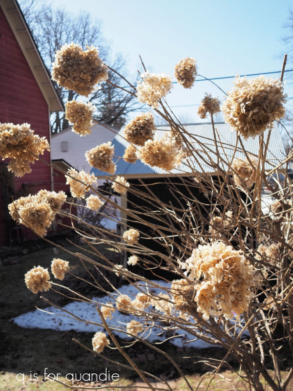
I also prune my arborescens variety hydrangeas (I have Annabelles) in the spring.  They also bloom on new growth, so pruning will encourage blooms.  However, one major downside to this variety of hydrangea is that the stems are often not strong enough to support the flower heads.  The first big rain after they bloom will turn your bush into a floppy mess.

A few years back I read an article that recommended pruning your Annabelles by no more than a couple of inches below the flower heads, leaving the strong old wood stems in place to help support the flowers.  You can also remove weak, broken or dead stems all the way down.

I’ve also given the Annabelle under my kitchen window a little extra support with an old brass headboard.

It was looking quite straggly after the long winter, but I cleaned it up a bit.

Personally, I wouldn’t recommend adding an arborescens hydrangea these days.  Even though some of the newer versions claim to have solved the flopping problem, they haven’t eliminated it entirely.

I actually inherited this Annabelle with the house, and since we moved in I’ve divided and moved it.  There is a big chunk of it out behind the carriage house in my cutting garden, which can be another good idea for this variety.  Place it in a spot where you will just be cutting the blooms off, but it doesn’t have to look good in situ.

So now I’ve checked the first gardening task of the year off of my to-do list.

I’m hoping that I don’t miss the blooming of my scilla while I’m out at my mom’s.  The flower buds were just appearing before I left, but they weren’t open yet.  They do usually bloom in mid to late April, and have even been known to be blooming in the snow as they were in 2020.

I think they’ll hold off this year until I get back.  Fingers crossed.

I also have lots of daffodils, tulips and allium coming up.  Luckily they are willing to pop right up through the snow.

You may remember that I put in a lot of bulbs last fall, so I can’t wait to see how they do.

It feels so good to be back out in the garden!  I’m really looking forward to spending lots more time out there again this year, and sharing lots of tips with you guys along the way.

So tell me, are you back out in the garden yet this year?


some ‘q tips’ on stenciling.

Have you ever checked out my ‘how to.’ page?  If you’re on a computer or tablet, you can find it up above, just under my header photo collage right after ‘available for local sale’.  If you’re on your phone, click on MENU in that same spot.  Or you can click here.

The ‘how to.’ page is where I keep all of my posts that go into specific detail on certain techniques or products such paint inlays, milk paint or how to remove paint from old drawer pulls.

I like having these ‘how to’ posts handy so that I can refer to them in future posts and I don’t have to outline all of the steps for particular techniques each time I use them.  That would get so boring for those of you who either already know how to use them, or really don’t care.

I hadn’t added to my ‘how to’ page in a while, but I recently added the post on how to use the Dixie Shine.  I’d also been thinking that I should add a post on stenciling techniques, so here it is.

I know that some people struggle to get a good result while stenciling.  This vintage suitcase that I picked up at the thrift store a few years ago is a rather dramatic example of a bad result.

I’m sure none of you have quite that much trouble, but you still may be able to use a few q tips on how to stencil.

Tip no. 1 – First and foremost, my number one tip is to use chalk paint for stenciling projects if possible.  This is one instance where a chalk style paint is going to be superior to an acrylic paint (such as Fusion or Dixie Belle’s Silk paint, or those little bottles of paint from the craft store).  The chalk paint has a rougher surface that doesn’t allow your paint to slide around as much as it can on the slicker acrylic paint.  In addition, chalk paint is thicker (less runny) than acrylic paints, so that also helps you avoid allowing your paint to bleed under the edges of your stencil.

Tip no. 2 – The second most important tip I can give you is to use a dry brush.  I can’t stress this enough, and this may be the biggest mistake most people make.  Just tap your brush very lightly into your paint, and then wipe most of that paint off on a paper towel.  Even if you aren’t getting perfect coverage with the first pass, you’re better off going over that with a very dry brush for a second coat rather than having too much paint on your brush.

Tip no. 3 – Use the right brush.  Your stenciling brush should have densely packed bristles and a flat end.  The Best Dang Brush from Dixie Belle is my current go-to brush for stenciling.

It’s a big one though, which works great for larger stencil projects but will require taping the edges on smaller projects like the one above.

I’ve seen a few people use sponge tipped applicators for stenciling, but I found that the application tends to look a bit sloppy when I’ve tried using one of those.

Tip no. 4 – Use an up and down, stippling motion with your brush.  This helps you avoid pushing paint under the stencil, thus creating a smudgy looking result.  I’ve seen so many YouTube tutorials where the person uses a swirling, circular sort of motion to apply the paint and I always cringe a little.  You may be able to get away with that technique if you’re using an adhesive stencil of some kind, like a silk screen stencil or a stencil that you cut out of adhesive vinyl on a Cricut machine.

But I say always stick with that up and down stippling motion to be on the safe side.

Tip no. 5 – So far I’ve only mentioned using a brush to stencil, and 99.9% of the time that is what I do.  However, you can use a roller, which can make things go faster with a larger stencil.

I like to use a small foam roller for stenciling larger, all over patterns such as the one on the Venetian velvet inspired gift wrap I made a few years back.

Do be sure to follow the same principle of off-loading some of your paint first when using a roller, and don’t press too hard.

Tip no. 6 – My next tip is to know your surface.  Part of the reason the stencil job on that vintage suitcase is so bad is because the surface of the case is very bumpy.  Even the most practiced stenciler is going to have a tough time with that.  The flatter the surface, the easier it is to get a crisp result.  That doesn’t mean you absolutely can’t stencil over an uneven surface, but it will be trickier.

My advice for stenciling over a bumped up area like on the piece above is to stencil lightly and cautiously over that area, then when you take the stencil away, go back and fill in by hand around those curves using a small brush.

Tip no. 7 – Fill in the bridges for a more hand-painted look.

Bridges are those spaces in the lettering in a stencil that hold the inner pieces of the stencil in place.  I like to go back in with a small artist’s brush and fill those in.

Of course, you don’t have to do that.  Sometimes you may want a more industrial looking result, in which case you should just leave the bridges unpainted.

Tip no. 8 – Add a shadow to wording to give your piece more dimension.  This is one of my favorite tips!  It’s so easy to do and adds so much.

Just start by placing your stencil slightly (about 1/8″) down and over to the left of center (or wherever you want your final stencil to go).  Stencil the darker shadow color.  Once that’s dry, just move your stencil up and to the right by that same 1/8″ and stencil again with your final color.  It’s a super simple technique that adds so much, but keep in mind that it works best with chunkier lettering.

Tip no. 9 – If you are new to stenciling and nervous about giving it a shot, practice on fabric first.

These inexpensive flour sack dish towels were a quick and easy stencil job.

As were these pillow covers.

When stenciling fabric, be sure to have a hard, flat surface beneath your fabric.  I placed a piece of thin hardboard inside the empty pillow cover to give me a nice firm surface to stencil on and also to prevent my paint from bleeding through to the back of the pillow case.

Brown craft paper is also a good choice for getting in some practice as a beginner.

Both of these surfaces have a lot of ‘tooth’ making it easier to get a crisp result.

I hope some of you will find these tips useful.  Stenciling is a great way to add some detail to a piece without breaking the budget.

Be sure to leave a comment if you have any questions about stenciling that I haven’t answered in this post.