a book recommendation, and give away.

Aside from clearing out the front porch and working on a couple of small projects last weekend, I really didn’t get much accomplished.  Which means, I don’t have a fabulous furniture transformation to share with you today.  I seem to have fallen into a groove with my blog, and I generally post something on Monday, Wednesday and Friday.  As a result, not having a post at all on a Wednesday just feels, well, wrong somehow.  The truth of the matter is that I spent a good deal of last weekend just chillin’.  Every once in a while, I need some downtime to just be lazy.  This often includes staying in bed on a rainy Sunday morning with coffee and a good book.  So today, you’re getting a book recommendation!

I know, weird right?  And no, this isn’t an April fools joke!

So, if you aren’t a reader, feel free to ignore this post as a blip on the radar and come back on Friday when I plan to post about a quick chair makeover.

But if, like me, you are always in the market for a good read, then keeping reading …

First a little background.  I LOVE to read.  I watched an interview (on Ellen) with Jim Parsons (plays Sheldon on Big Bang Theory) the other day, and he admitted that he factors in reading time every night before bed.  Well, he and I have this in common.  I read every night for at least a little bit.  I look forward to weekends when I can read late into the night and not have to worry about getting up the next morning.

The main thing that I look for in a book is the author’s ability to immerse me in their story, whatever it might be.  I crave books that are so good I can’t put them down.  The kind where I keep reading until the book falls forward and hits me in the nose because I’m dozing off despite myself.  For some reason, I have found such books hard to come by lately.  I’ve started lots of books, only to give up on them because I just don’t care what happens next.

However, recently I was in the Valley Bookseller in Stillwater (Mr. Q was promoting the latest Chicken Soup book that he has a story in) and the gal there recommended a book by William Kent Krueger, Ordinary Grace.

ordinary-grace-200

Krueger is a local writer from the Twin Cities.  He might be better known for his Cork O’Connor mystery series, but this particular book is not part of that series.

Here is how his website describes Ordinary Grace:

“New Bremen, Minnesota, 1961. The Twins were playing their debut season, ice-cold root beers were selling out at the soda counter of Halderson’s Drugstore, and Hot Stuff comic books were a mainstay on every barbershop magazine rack. It was a time of innocence and hope for a country with a new, young president. But for thirteen-year-old Frank Drum it was a grim summer in which death visited frequently and assumed many forms. Accident. Nature. Suicide. Murder.

Frank begins the season preoccupied with the concerns of any teenage boy, but when tragedy unexpectedly strikes his family—which includes his Methodist minister father; his passionate, artistic mother; Juilliard-bound older sister; and wise-beyond-his-years kid brother—he finds himself thrust into an adult world full of secrets, lies, adultery, and betrayal, suddenly called upon to demonstrate a maturity and gumption beyond his years.

Told from Frank’s perspective forty years after that fateful summer, Ordinary Grace is a brilliantly moving account of a boy standing at the door of his young manhood, trying to understand a world that seems to be falling apart around him. It is an unforgettable novel about discovering the terrible price of wisdom and the enduring grace of God.”

I’ll admit, this description didn’t immediately grab me.  Young boy, coming of age, yada, yada.  Whatever.  But, the book won a bunch of awards, so I figured I’d give it a whirl.

Once I started reading, what really hooked me was how I could practically hear the crickets chirping on a balmy summer evening and smell the river flowing past its weedy banks.  I could feel the sun on my head on a hot July day and taste that ice cold root beer after a Saturday of yard work.  I remember that feeling of lying in bed on a hot summer night before air conditioning was something that everyone had.  The book transported me to a hot Minnesota summer and a time when things seemed just a little bit simpler (even if they really weren’t).

cindyrella gardens

I enjoyed the book so much, that I was inspired to tell you all about it.  Then, I thought, gee, I’m done with the book, why not offer it up as a giveaway?

If you would like to have my copy of the book, please leave me a comment by Friday, April 3 at midnight.  I’ll draw a name from the comments and mail the book off to that person.

So,  good luck if you are hoping to win, and even if you don’t, I highly recommend that you pick up a copy of Ordinary Grace.

And if you’re really just looking for an awesome chippy chair makeover, come back on Friday!

refreshing for spring.

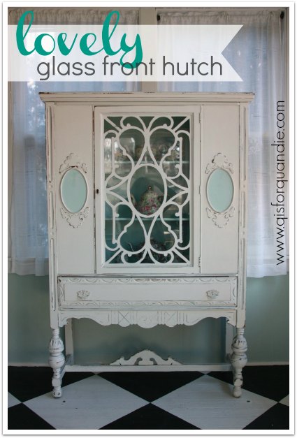
This past weekend I spent some time revamping my enclosed front porch.  You see, I kind of spent the entire winter shoving stuff out there to get it out of the way.  It was a mess.  With spring officially here, I felt the need to get it cleaned out.  I also took advantage of the situation and decided to swap out some furniture.  Remember the black cabinet from my former craft room?  Well, I wasn’t quite ready to get rid of it after all.  So, I moved it into the spot that was formerly occupied by a little pale green painted washstand.

front porch cabinet

So now, the washstand is for sale (SOLD!).

washstand ad

And then, it obviously would be silly to have two display hutches out on the porch …

front porch with two hutches

so I decided the white one had to go.  So now, it is for sale also (SOLD).

front porch hutch

And since I was getting rid of the white hutch, I also decided to move on from my chintzware collection that was formerly housed in this hutch.

chintz collection

So I posted an ad for it on craigslist.  I have no idea if things like this sell on craigslist, or really even at all.  Floral china is no longer terribly popular.  Hopefully I can find another collector out there who wants to add to their collection.

For the moment, I’m not sure what I’m going to put in the space where the white cabinet sat.  I am quite sure that I will come across the perfect piece at some point though.  I’ll know it when I see it.

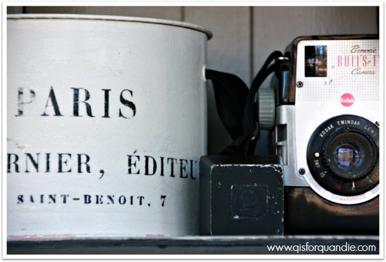
But meanwhile, the black cabinet turned out to be the perfect spot to display my vintage cameras.

front porch display

front porch vintage camera

And some of my other black and white stuff.

front porch hutch display

I added some new H & M Home throw pillows into the mix.

front porch pillow

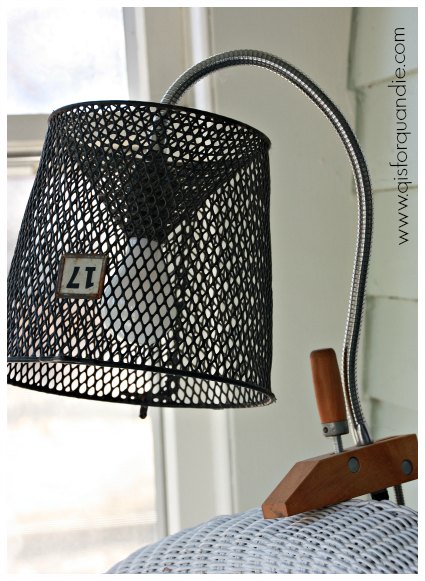
I don’t think I’ve ever pointed out the reading light over my chaise lounge.  I cobbled it together using an old clamp on shop light with half of an old minnow cage for a shade.

front porch reading light

And now the front porch is spruced up and ready for spring.

front porch spring 2015

If you are interested in the washstand, the chintzware or the hutch, please feel free to leave a comment or email me directly at oakdalecarriagehouse@gmail.com.

picking pieces.

Recently someone asked me how I pick the pieces I paint.  I didn’t come up with a very good answer on the spot because I really haven’t given much thought to my process.  I just pick what I like.  But I do realize that choosing the right piece to paint is nearly as important as the painting itself.  So I decided to try and pin down my process a little for all of you.

In winter, most of my pieces come from my local craigslist.  We have a thriving craigslist community here in the Twin Cities.  So a while back I headed out to craigslist and picked out a few examples of what was out there to share with you.

First let’s talk price.  I generally set a maximum of $100 for a dresser.  I use the craigslist search tool to limit my search, otherwise I will be distracted all day by gorgeous pieces of furniture that are listed at $400, which is a total waste of my time.  Although $100 is my max, I will only pay that much for a piece that has all of its hardware, is in great shape, doesn’t need repairs and has something unique or special about it.  Otherwise I like to stick to a price range from $40 to $75 for a dresser.

Let’s start with a dresser that I would not pick.

dresser, 100, pass

The first problem with this dresser is the hardware.  Gack!  It is just plain ugly and would have to be replaced, and there are 8 handles.  That is going to add up.  Not to mention, these handles have two holes each, so I’d either be filling holes, or trying to find replacements that fit these existing holes.  But the real problem with this dresser is that it just doesn’t have any personality at all.  If this dresser were dirt cheap, let’s say around $25, and I didn’t have to go far to pick it up, I might consider it.  It could be dressed up with some number stencils on the drawers.  But it was listed at $100.  No way.

Here is another “no” for me.

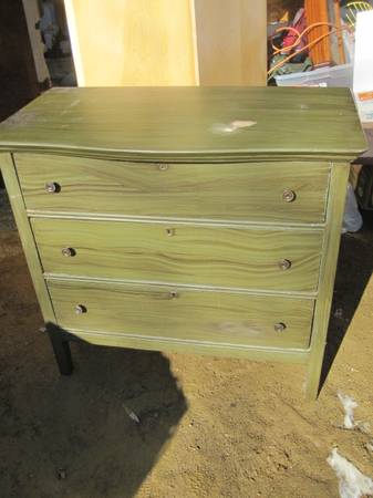
dresser, olive green

This dresser was listed for $50.  Great price.  It has something I always look for, key holes.  To me key holes usually indicate a well made, antique piece of furniture.  The ad claims this piece is solid wood, another plus.  So, why don’t I want it?  It’s painted a weird olive green.  I hate stripping paint.  It’s time consuming and messy.  So my choice on this piece would be to either paint it something that works with the green and allow the green to show as an undercoat, paint it a solid coat of chalk paint (or even Fusion!) and not distress it at all.  But the fact of the matter is, I’m a distressing sort of girl.  I reserve the non-distressed look for mid-century pieces.  But that’s just me.  Maybe you’d be OK with any of these options, in which case this dresser is a great deal!  I generally steer clear of previously painted pieces though.

Let’s move on to a distinct ‘maybe’.

dresser, apple valley, 75

These are often called a “chest on chest” dresser because they have a wider lower section of drawers with a slightly narrower section on top.  I find this look really appealing.  The Seven Seas dresser that I painted recently was a chest on chest. The trim around each drawer on this one adds a lot of detail.  The legs in front are pretty sweet.  They aren’t turned, but they still have some personality.  This dresser was listed for $75, which is a decent price but not great.  One glaring problem is the missing drawer pull.  As I’m fond of mentioning, one missing drawer pull is the equivalent of not having any hardware at all.  You’re never going to match that.  You’d have to replace all of the hardware on this piece.  But, it still might be worth it.  Honestly, if I didn’t already have a bunch of unfinished pieces lined up in my garage, I’d follow up on this one.

Here is another dresser that I would seriously consider:

dresser, otsego, 75

This dresser was also listed at $75.  Look at that charming detail on the top two drawers, and the lovely turned legs in front.  It has a mirror (it was shown in a separate photo), but I often leave these mirrors off.  Especially when they are mounted on two turned supports like this one is.  I just don’t like that look very much, and I find the turned supports annoying to paint.  This is a style of dresser that can work really well for a wide screen TV when there isn’t a mirror.

I do have one concern about this one though.  It could be a ‘bleeder’.  Are you familiar with that term?  Basically some of the orange to reddish colored stains will bleed through paint.  No matter how many coats of paint you use to cover them up, that orange/pink color will just keep coming through.  There are methods you can use to deal with the dreaded bleed thru, which usually involve sealing the piece somehow, but that adds another step to your process and can really be frustrating.  So, I usually avoid those pieces.  They can be hard to spot though.  This one looks like it has the potential to be a ‘bleeder’ although it may not be.  I would have to see this dresser up close and in person before making a decision on it.

This last example is right up my alley.

dresser, minnetonka, 75

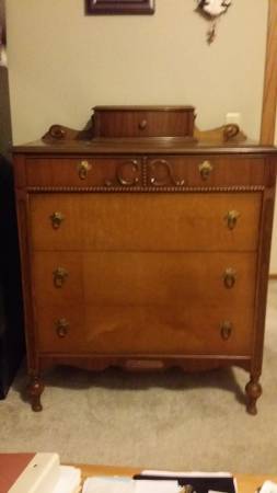
It was listed at $75.  What do I love about it?  The turned legs, the beaded trim below the first pair of drawers, the fabulous hankie drawer at the top.  I can picture in my mind how this piece will look painted.  I know that I can play up those details with some distressing, or contrasting colors.  I can’t really see what the hardware looks like in this picture, but I can see that it is all there.  But even if I have to replace it, I think this piece is worth it because of that charming hankie drawer.

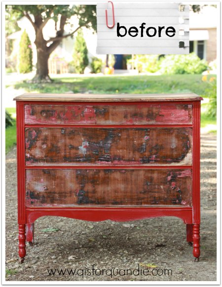
In fact, I liked this one so much that I did send Mr. Q out to pick it up.  Here is the ‘before’ photo I took when we got it home.

hotel dresser before

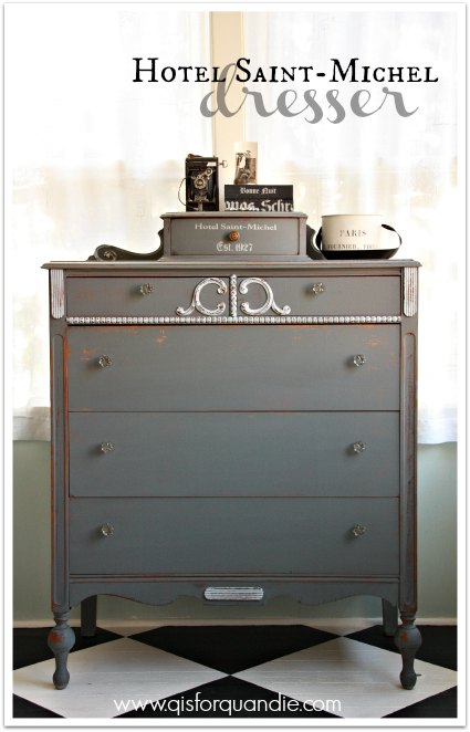
And here it is after its make-over.

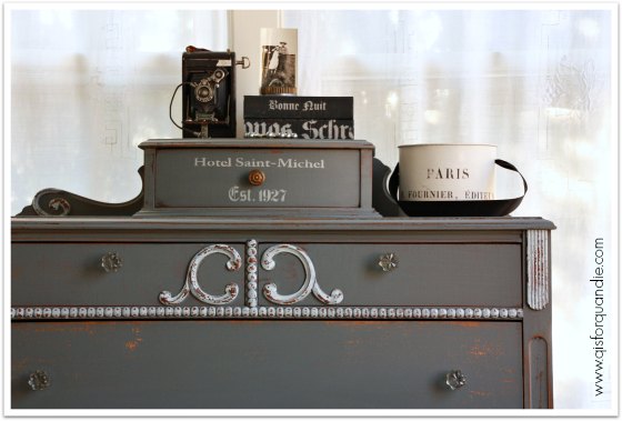
Dresser painted in MMS milk paint in Trophy

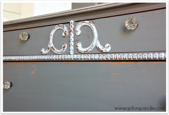
I painted it in Miss Mustard Seed milk paint in Trophy.  I used MMS Ironstone on the trim details, and I finished with hemp oil.

I added a little stenciling on the hankie drawer just to give it a little extra personality.

hotel dresser stencil

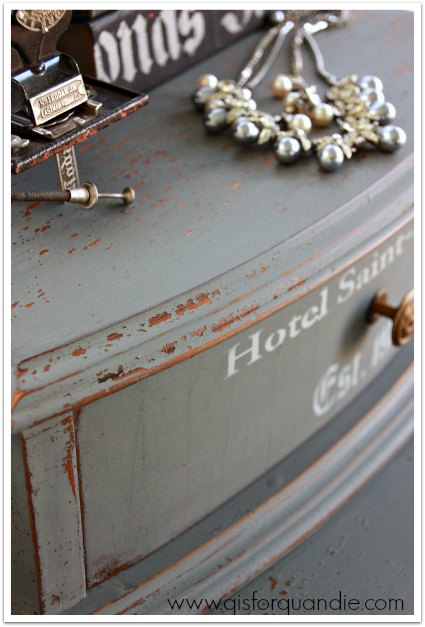
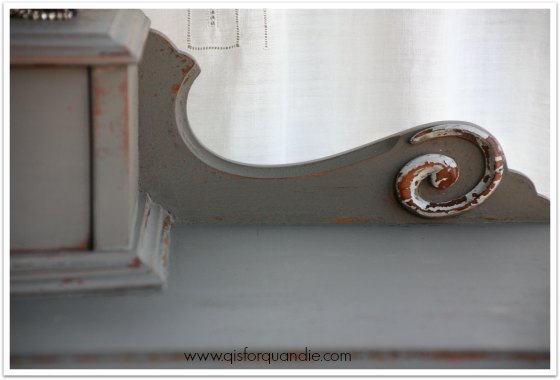
I got some really fantastic chipping on this piece.

Chippy milk paint close up

hotel dresser details

I really wanted the details on the dresser to pop, so I painted them in Ironstone for contrast.

hotel dresser front

As you can see, I did end up changing out the hardware on this one.  The original hardware was pretty, and it was all there, but it was a very yellow brass and I didn’t like the way it looked with the grey of the Trophy.  I just left the original knob on the hankie drawer.  I’m not really sure why, but I tried that one both ways, and just liked the original better (the other drawer pulls are bigger and brassier than this little knob).

hotel dresser staging

I hope this post gives you some ideas of your own about re-fabbing a dresser or two.  Head to your local craigslist and see what you can spot for yourself!

hotel dresser collage

And meanwhile, yes, this lovely dresser is for sale.  Let me know if you are interested.

Linking up with:  Finding Silver Pennies.

a shoe in.

I’ve been working on some small painting projects lately as a part of spring cleaning.  I had various piles of thrift store and other finds and I needed to get them painted and out of the Q Branch.

After finishing some more hatboxes as well as a set of wooden shoe trees, it occurred to me that these projects would make a great comparison study for Fusion paint v. Miss Mustard Seed milk paint.

Shoe forms and hat box

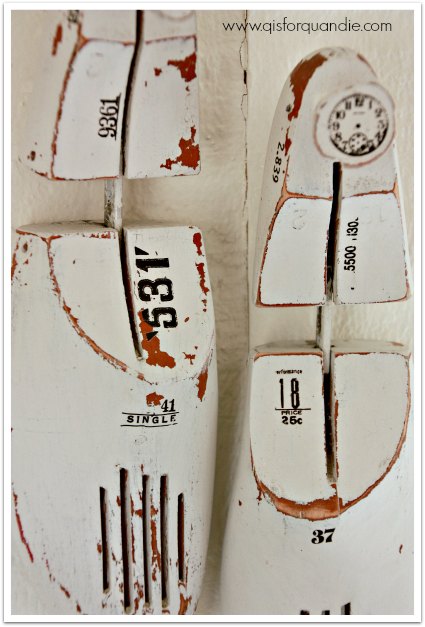
Can you guess which is painted in MMS milk paint and which in Fusion?  It’s kind of a no brainer due to the chippy factor.  Yep, the shoe trees are painted in MMS Grain Sack, and the hatbox is Fusion’s Champlain.

Let’s start with the shoe trees.  My friend Cathy passed these on to me.

shoe in before

Even though they are really just beat up shoe trees, not fabulous vintage shoemaker forms, I knew I could make them fab with the addition of some paint and some rub-ons.  I also thought ‘the chippier, the better’, and these had the sort of semi-shiny wood finish that would be conducive to chipping.  I used a mere tablespoon of milk paint powder to one tablespoon of water for these and did have some paint left over.  Once they were dry, I sanded them and added clear wax.  Then I added a variety of 7 Gypsies rub-ons to them.

shoe forms close up

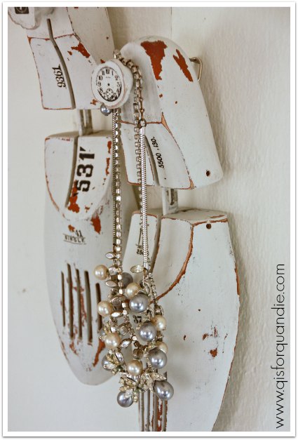
I added some picture hangers to the back of each so so they can be hung on the wall as decor, or as a place to hang your necklaces or maybe your bathrobe.

shoe tree upcycled

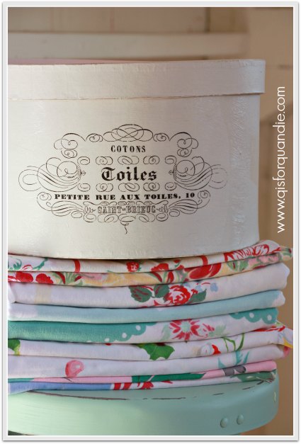
In between painting the shoes trees, I also worked on some more hatboxes.  I wanted to try doing some with the Fusion paint.  I painted my first hat box with chalk paint and that ended up being a little dicey when it came time to wet down the transfer.  I had to be really careful to not remove too much paint along with the paper backing of the transfer.  But here is what Fusion’s manufacturer says about their paint:

“FUSION is made up of 100% acrylic resin and is unlike any other product on the market. This results in one consistent and cohesive surface across your piece. So what exactly does that mean?

It is a water proof, non-porous surface which is why you do not need a top coat for water-permanency! Using 100% acrylic binder results in the strongest adhesion and durability once cured.”

The ‘water-permanency’ part was key for me.

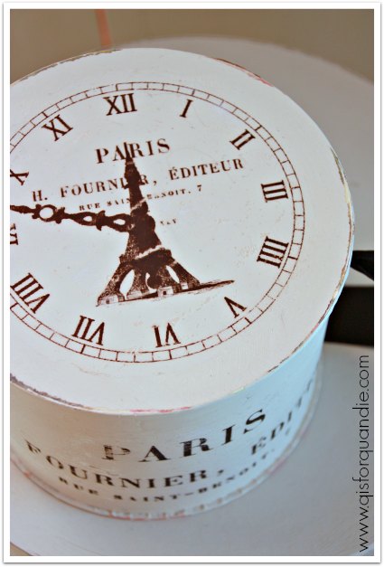
I started with a coat of Bedford on my hat box so that when I distressed the edges the grey would show through.  Then I ran a block of canning wax around the edges to make them easier to distress later.  Next came two coats of Fusion’s Champlain.  I let that dry overnight.  The next day I added my transfer design using the same process I used on my previous hat box, letting it then dry overnight.  Turns out I was right, it was easier to wet the paper without taking off any paint.

Once I had removed the paper to reveal the transfer, I used some 220 grit sandpaper to rough up the entire box.

painted hat box

Easy peasy.  This hatbox was so much fun that I did another one.

hatboxes

and then another small one …

small hatbox

hatboxes 3

To recap, let’s compare the results.  When it comes to the chippy factor, milk paint wins hands down.  But, that really only works on certain surfaces.  Mainly wood or other more porous materials.  If you need a paint that will stick to non-porous materials, or become more waterproof for things like these gel medium transfers, then Fusion is a better choice.  If you want an authentic looking distressed finish, you can’t beat milk paint but the results can be unpredictable.  You can distress the Fusion paint, but I find it more difficult than with other products.  If you want to paint straight out of the can and not mess with mixing and measuring, Fusion is for you.  But I haven’t forgotten my old friend chalk paint.  For painting straight out of the can, and the ease of distressing, it is still an excellent choice.  Just remember you’ll still need to add that top coat of wax or some other sealant.

I’m pretty sure I will continue to paint most of my vintage cottage style furniture pieces in milk paint.  But I will definitely go with Fusion for mid-century modern pieces, metal, glass and pieces that I want to add gel medium transfers to.  Both are great products and as you can see with my shoe trees and hatboxes, if you work with them you can get an awesome vintage look out of either one!
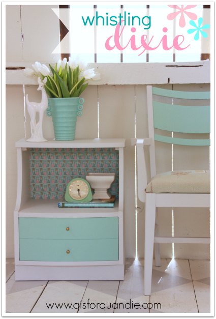
Shoe forms and hat box

whistling dixie.

During the recent miraculous spring warm-up here in the Twin Cities, my co-workers Sue and Cathy and I headed out to our first lunch time garage sale of the season.  Woo hoo!  Mid-March, and sales are already popping up.  So exciting!

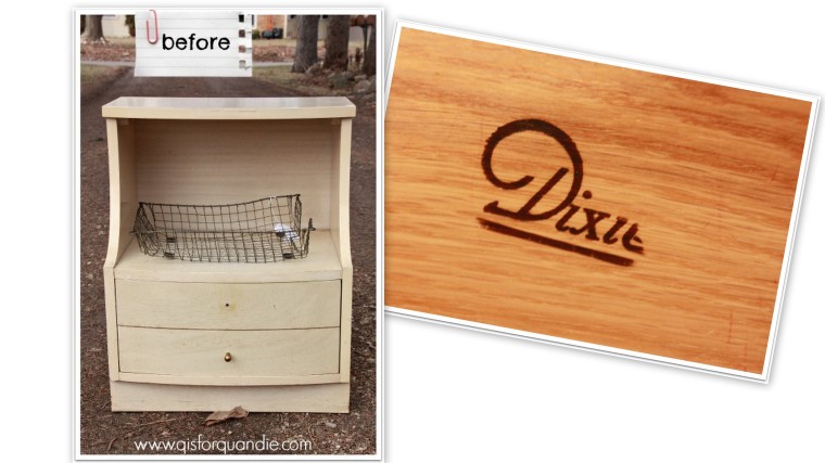
We didn’t find much, but I did come home with a Dixie blonde mid-century nightstand and a really fab old wire ‘in-box’ (which now lives in the Q Branch).

2015 spring blog

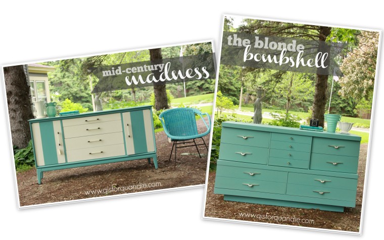
The nightstand was bargain priced, and I knew it would be the perfect candidate for another Fusion makeover.  Why?  Well, when I paint MCM pieces I always feel like they shouldn’t be distressed.  Normally I am all about the distressing, but not with these pieces.  Obviously, milk paint is out of the running when you don’t want to distress.  True, you could add the bonding agent and get a non-distressed look, but seriously, why bother?  That’s going to get expensive, and putzy, and unnecessary.  In the past chalk paint was always my go-to for MCM pieces.  And, don’t get me wrong, they did turn out lovely.

2014 summer blog2

vintage blonde dresser painted in Aloe

But now that I have tried Fusion, I am pretty sure it’s going to be my paint of choice for MCM pieces and I’m not just whistling dixie!

I painted the body of the nightstand in Fusion’s Champlain and the drawer in my new favorite color, Laurentien.  The color reminds me of my favorite shade of McCoy pottery.

MCM tulips

I let the paint dry overnight, and then I added some of my fav MCM vintage wallpaper to the inside of the cubby hole.  As I was working with the wallpaper, it was nice to not have to worry that I was taking off any paint while wiping off excess paste.

MCM wallpaper

The wallpaper has little touches of gold in it, so I decided to add some gold Rub ‘n Buff to the knobs to bring that out.  When I purchased this piece, Cathy assumed I was going to replace those knobs.  Nope.  The knobs are perfect for this piece and are part of its personality.  What do you think of them now Cathy?

MCM knobs

I love how the gold works with the turquoise.

MCM nightstand painted in Fusion's Laurentien

Since I felt like the little nightstand would be lonely in a photo shoot all by itself, I also decided to paint up a chair that was waiting for a makeover.

MCM chair before

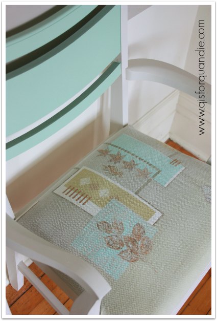
I used the same colors on the chair, and then added some vintage barkcloth to the seat.  The aqua in the barkcloth was a perfect match for the Laurentien.

MCM chair upholstered in barkcloth

Didn’t it turn out sweet?

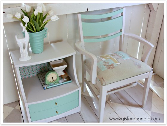
MCM nightstand and chair

Almost makes me want to add a few mid-century pieces to my own home.  How about you?

utterly happy.

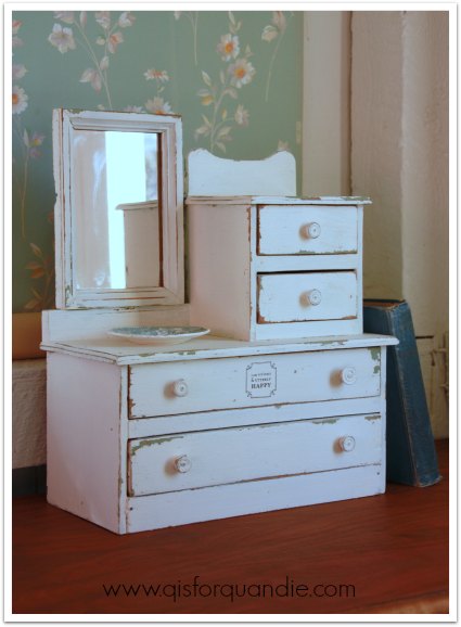
I may have to seek a 12 step program soon.  I can see it now, “hello, my name is Linda and I am addicted to miniature dressers.”

But gosh, this one was so unique.  A different style completely from my other ones.  I just really had to have it.

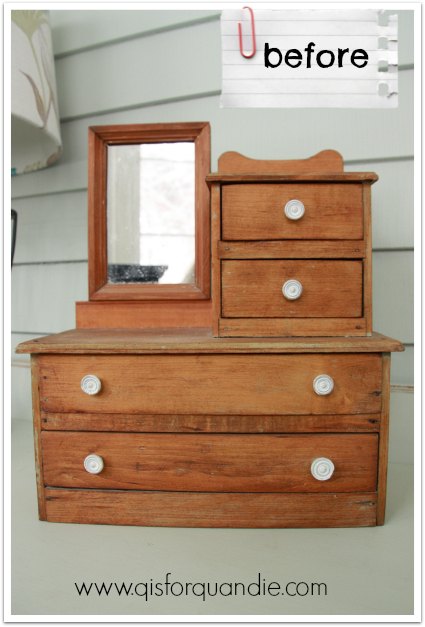
mini before

I’m sure I overspent on it.  It was $55.  I should have negotiated.  I should have walked away.  But this is the problem with addictions, you just don’t care about the cost.  I guess there are worse things I could be addicted to though, right?

Once I got a good up close and in person look at this little dresser, I realized that it was originally painted, but had been stripped at some point.  Here is a message for all of those people who gasp whenever someone paints wood, guess what? some wood was meant to be painted all along.  This isn’t pretty wood.  I’m sure back in the 80’s when stripping paint was all the rage, someone stripped a perfectly fantastic vintage paint job from this dresser thinking they would find beautiful wood underneath.  Bummer.  And it was in my favorite shade of aqua too.  See …

mini prior paint job

But luckily I had a pretty good idea about how to restore an original looking paint job … with layers of milk paint.

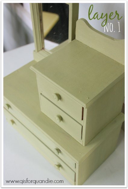
First I wiped the dresser with a damp cloth.  I didn’t sand at all, because I was going to be fine with some chipping.  The surface felt really dry to me though, so I had a feeling it wasn’t going to chip much.  I started with a layer of Miss Mustard Seed’s Luckett’s Green.

mini dresser layer no 1

Yep, as I suspected, no chipping.

Next I added some hemp oil.  I just dabbed a little on my finger and ran it around all of the edges.  Then I added two coats of Miss Mustard Seed’s Linen.  I used a little blow drying (with a hair dryer) between coats to encourage my paint to chip (and it did chip in all the spots that were hit with the hemp oil).  Once the final coat was dry, I sanded lightly with 220 grit sandpaper, then finished with some furniture wax.

miniature dresser

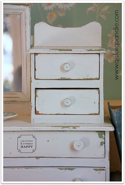
I also added a rub-on message to one of the drawers.  And it’s true, I am utterly happy with how this one turned out.

vintage painted miniature dresser

Just look at that chipping, talk about divine!  This is MMS milk paint at its finest.

The drawers all got lined with some pretty October Afternoon scrapbook paper.

mini drawer lining

The beauty of working on this little dresser was knowing that I was keeping it for myself, so I could do whatever I wanted with it.  This is totally my look; vintage, chippy, pretty, aqua and green.  Perfect for me.

utterly happy dresser

 I’ve already made a place for this in the Q branch.

mini dresser in Q branch

 It will be the perfect spot to store my rubber stamps and ink pads.  Now I will know exactly where they are whenever I need them.

oh darling, let’s be adventurers.

A while back Denise from Denise … on a whim left a comment for me, so I wandered off to check out her blog and came across this …

adventurers suitcase

And I fell madly in love.  Isn’t it fab?

You know I love a good painted suitcase, and the message just spoke to me.

So I left a comment for Denise in return and long story short, she offered to send me the artwork for her design.  How absolutely generous and kind of her, right?

That meant I needed to paint up a suitcase so I could use it!  I knew this would be another great test for Fusion paint.  Plus, one of Fusion’s promo photos for the Fusion paint included a suitcase that I just loved and I knew I could re-create the look of it myself with their paint.  I decided to combine these two features; Denise’s design with Fusion’s color scheme.

fusion suitcase

By the way, before I continue about my project, when my sister was visiting I showed her this picture and she remembered that my parents had a suitcase just like this and I used it to store my Barbie doll paraphernalia.  As soon as she said it, I remembered it and realized that is probably why I find it so appealing.  All of those happy hours spent dressing my Barbie in fabulous clothes!

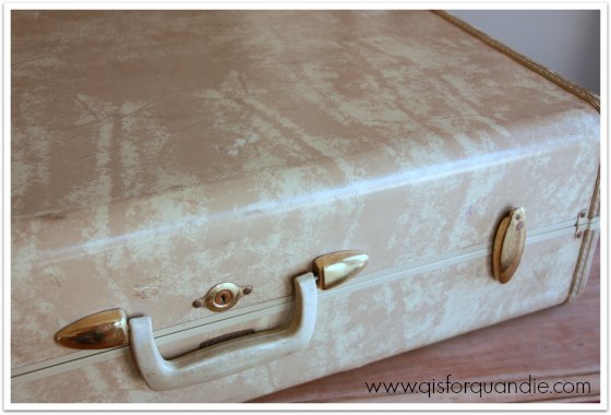
OK, back to my project.  I started out with one of the suitcases that my friend Meggan grabbed for me at Goodwill, one of the thrift store unicorns!

unicorn

First I painted the top ¾ of the case in Fusion’s Bedford.  I used two coats, but if I had painted more carefully I probably could have gotten away with just one.  I let that dry overnight and then taped off a straight line on both sides and painted the lower part of the case, as well as the sides and the handle, using Seaside (again, two coats).  When I pulled the tape off, the Bedford was still in pristine condition underneath.  I have had trouble using tape with both chalk and milk paint.  With milk paint you can pretty much count on a good deal of paint coming off with your tape.  It is less of a problem with chalk paint, but you do still get some paint coming off.  So if you are going to do a project that requires taping (a stripe for instance, or maybe a union jack design) Fusion is a great choice for you.

Honestly, the suitcase was completely darling already at this point.  I could have left it alone and been quite happy with it.  It was amazing how ‘genuine’ it looked.

But I really wanted to use Denise’s artwork.  I’m too cheap to pay to have a stencil cut, so I decided to try my old technique.  I printed the design on regular paper, then used tracing paper to trace it onto the suitcase.

oh darling tracing

Then I filled in the design with black acrylic craft paint using a small brush.  This method takes a bit longer than using a stencil, but I accomplished it in less time than one episode of Fixer Upper, which was playing in the background while I painted.

oh darling close up

So, what do you think?  Cute as pie?

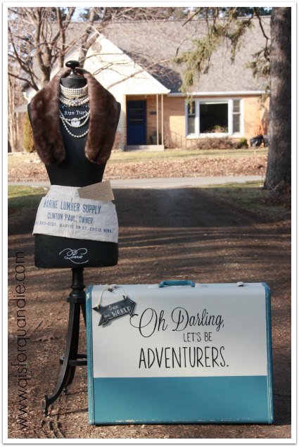
oh darling angled

I added a chalkboard arrow tag and as you can see this suitcase still has its key.

oh darling arrow

Lula is dressed and ready to take off on an adventure.

oh darling with Lula

And tucked into her pocket …

oh darling quote

So how about it?  Are you the kind of adventurer who needs a painted suitcase of your own?   There are still spots available in my Painted Suitcase class at the end of the March (click here for details).  If you are interested, be sure to send me an email at oakdalecarriagehouse@gmail.com or just leave me a comment and I’ll get back to you.

wearing of the green.

Happy St. Pat’s!  Are you wearing the green?  I haven’t got an Irish bone in my body, but I do love green stuff.

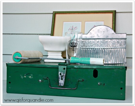
My friend Meggan and I were thrifting again a couple of weeks ago, and for some reason I was finding lots of it.  I came home with this little pile of goodies.

green day

I passed on a lovely mid-century decanter set in green glass with gold details.  I should have grabbed it, but didn’t.  Shoulda, coulda, woulda, right?

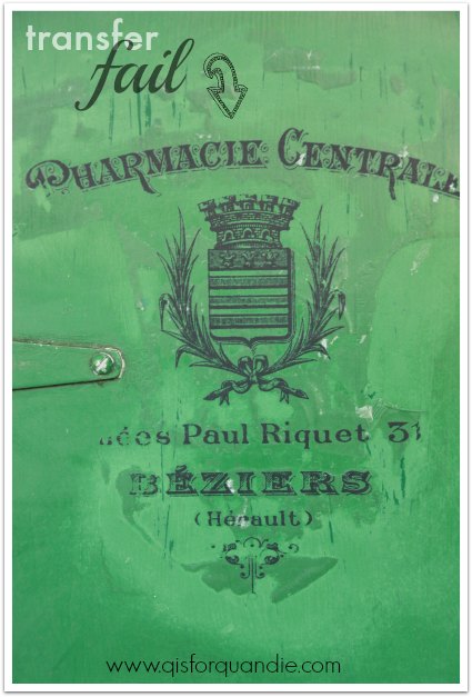
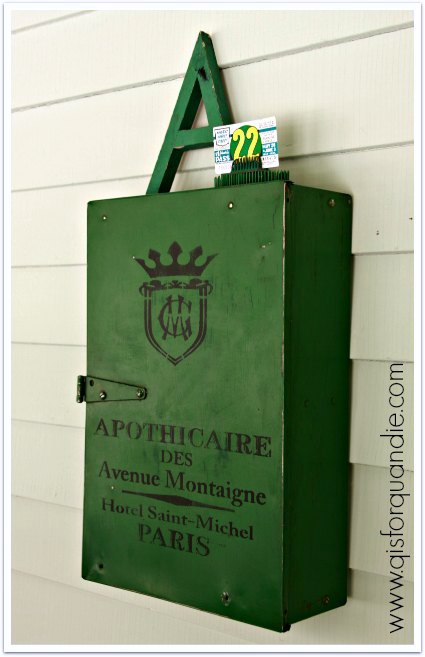
I had an idea that the green metal box would make a fantastically junkalicious medicine cabinet, so I decided to try the gel medium transfer method on it.  I found an awesome french graphic on Graphics Fairy, and followed the same method I used last time on the hat box.  I was so excited, and sure that this was going to be amazing.

Um, hmmmm, not so much.

green day fail

What went wrong?  I’m really not sure, but the gel medium didn’t stick to the metal.  Picture putting some Elmer’s glue on something, and then being able to sort of peel it right off once dry.  That’s what happened here.  It peeled.  And the more I tried to salvage it, the worse it got.  Eventually I realized that the entire design was just going to peel off.  Did I apply the gel medium too thickly?  Should I have prepped the surface better prior to application?  Or was my idea doomed from the start because the gel medium just won’t work on painted metal?  Or perhaps it would have all been OK if I had added a coat of mod podge on top.  Unfortunately, I don’t have any answers for you.  Just a warning that sometimes the gel medium transfer is not all it’s cracked up to be.

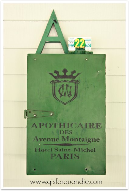
In the end, I was able to remove the whole thing quite easily by scraping it off with a razor blade.  Then I started over with a stencil and some paint.  A much better choice for this piece.

apothicaire cabinet

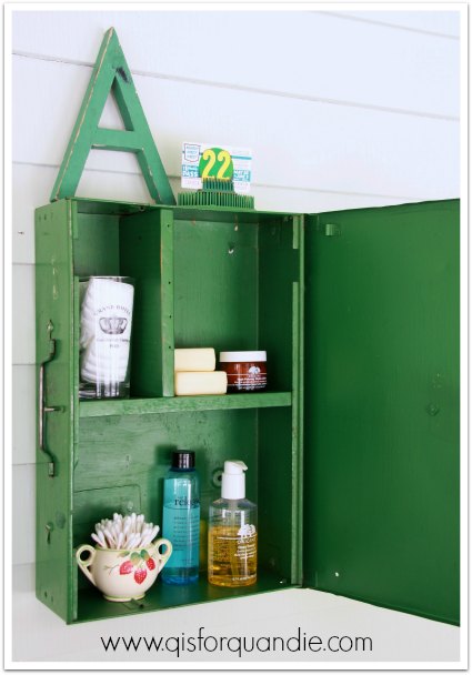
I don’t love this design as much as the first one from Graphics Fairy, but it still adds a cool vibe to the box.  I had Ken put some holes in the back so I could hang it on the wall as a cabinet.

green day cabinet inside

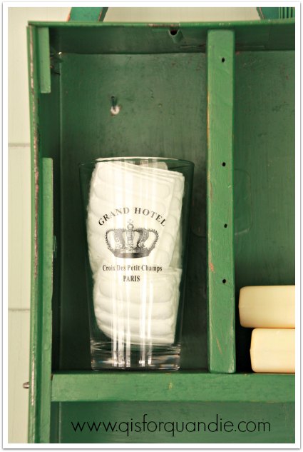
Meggan spotted the glass that is tucked inside the cabinet for me, isn’t it fab?  It came home from the thrift store the same day.

green day glass

green apothicaire cabinet

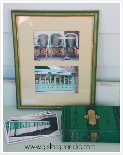
In addition to the fab green cabinet and the little french glass, I also purchased the green frame that is in the back of my first photo.  I just loved the patina on the frame, and the green color.  I knew it would be perfect for some Paris in Color postcards in green.  Are you guys familiar with Paris in Color?  It’s a book of photography by Nichole Robertson.  Check her out if you haven’t seen her work.

green day postcards

The postcards fit perfectly in the existing mat, and they are so much better than the 80’s tulip prints that were there originally.

I hope you enjoyed this little touch of green, now go out and drink some green beer and beware of bad leprechauns!

trash to treasure.

Today I’m sharing some true trash to treasure projects (my favorite kind) with you.

trash to treasure

  Last summer a lovely gal named Jen purchased a pretty yellow dresser from me via craigslist.  She wasn’t sure how she would get it home, so Mr. Q and I offered to deliver it for her and in exchange she gave me an old dresser that she found in her garage when she bought her house.  By the way, I also featured her darling house on Q.

The dresser in question was in pretty rough shape.  The former owner had started stripping the paint, but never finished.  Once I got it home and inspected it more closely, I realized that both of the lower drawers were fairly shot and had bottoms that were warped beyond repair.  Don’t get me wrong, I’m not complaining, it was FREE after all!

t to t before

Now, I’m going to make a confession, sometimes I have trouble thinking outside the box.  I have tried to work on developing this ability, but it does not come naturally to me.  This dresser is a case in point.  After realizing the drawers were shot, I threw a drop cloth over it and started using it as a painting bench.  It was six months later before it occurred to me that I could just remove the drawers and work without them.  Duh, right?  I know.  Now you all know my dirty secret, I’m not really as creative as I appear online.

Removing the drawers entirely meant I needed to have a new ‘bottom’ added to the dresser, so of course I called on my miracle handyman/neighbor Ken.  My first thought was to just add some fiber board and paint it, but then I remembered a stash of old bead board I have.  I knew they would lend the perfect vintage look!  Ken went above and beyond, as he always does, and notched the ends so that they fit into place perfectly.  He also removed all of the support pieces for the middle drawer.

t to t inside before

I had completed the stripping job on the top of the dresser last summer, and I knew I was just going to wax it with some Cece Caldwell aging cream, so I decided I would also leave the bead board unpainted as well.

Here is the top after the application of wax.  Isn’t that veneer pretty?

t to t top

That left me with two decisions to make.  Whether to paint over the red or not, and what color to paint the inside.  I’d had several people tell me how much they loved the look of the half-stripped red paint on the dresser.  It was basically pre-distressed without any work from me.  I’ve had mixed results trying to sell red pieces though.  Oh, how I wish this dresser were green or blue instead.  But, the red was just too delicious to cover up.  So I sanded it a little, waxed it and called it good.

Next I pulled out my Fusion samples and painted the inside in their Laurentien.  This was the perfect application for Fusion paint because it doesn’t require a top coat.  Have you ever had to wax the inside of something like this?  It pretty much is one of my least favorite things to do.  You feel like you practically have to crawl inside the thing to get that wax worked in.  In addition to not needing wax, the Laurentien also covered in one coat!  Eureka!  How fab is that?

interior painted in Fusion Laurentien

I have always been a fan of the red/turquoise combo, how about you?

trash to treasure dresser

I added simple glass knobs from Hobby Lobby to the drawer.

glass knob

By the way, have you noticed anything about my photos so far?  Yep!  I’m back in the photo cottage!

trash to treasure dresser

We are having an amazing March warm-up here in the Twin Cities.  The snow is gone, we’ve had brilliant sunshine and temps in the 60’s.  It is a spring miracle.  Woo hoo!

As I was setting the dresser up in the photo cottage, I decided I needed to add a little something more to the staging.  So I grabbed one of the metal industrial stools that nnK found for me (they were throwing them in the trash at the school where she works, so of course my number one spotter grabbed them for me).  I wiped it down with a damp paper towel and then painted on two coats of Laurentien.  After the paint was dry, I sanded the edges for a distressed look.

metal stool in Fusion Laurentien

And that was it.  It was truly that simple.  No mixing, no measuring, no prepping, no waxing.

Now, you know me.  I love my chippy, distressed finishes.  Nothing will ever replace my MMS milk paint for giving me that look.  But it is a challenge to work with some times, and the results are always somewhat unpredictable.  Plus, it’s not always the right paint for every project.  I can see Fusion taking the place of chalk paint for me though.  Especially on projects like both of these.  It does take a little more elbow grease to distress than chalk paint, but I like not having to wax.  I should also mention that it flows off your brush like dream.  With chalk paint I always feel like I really have to work the paint with lots of passes with the brush.

Furthermore, I am totally loving this color, Laurentien.  I initially thought it would be too bright to use on anything of size, but I it totally works on both of these pieces.  I don’t know that I would ever paint an entire dresser in this color, but it works well for adding a pop of color.

 I’ve staged the dresser with some vintage suitcases and a pile of 50’s tablecloths inside, but you could also use some locker baskets or a wicker basket.  Some wooden fruit crates would be great as well.  You could also just fill it with stacked quilts, or even stacks of fabric if you have a sewing room or stacks of towels in a bathroom.

trash to treasure dresser

Quirky pieces like this add a ton of character to your home.  No one else will have one just like it.  And of course this is for sale.  Anyone interested?

Linking up with The Painted Drawer Inspiration Friday.

P.S.  A quick note.  Although the Fusion people sent me free samples of their products to try out, there were no strings attached.  They just asked me to try it.  All opinions in this post are my own and I am not being paid to provide them.

mission possible.

One of my blog followers, Janice from Fred and Bessie’s, was kind enough to pass my info on to Homestead House Paint Co and they offered to send me some of their new Fusion paint to try!  It was like Christmas when a box filled with paint and other goodies arrived on my doorstep!  However, my sister and niece were here visiting, so I didn’t feel like I could say “hey, go entertain yourselves, I’m going to paint something.”  So, instead I suggested that we all head to a local thrift store and each of us pick something out to paint.  Their mission, should they choose to accept it, was to pick something ugly and turn it into something fabulous with Fusion paint.

fusion thrift finds

Debbie is holding two cutting boards (that were mine), a little wooden handled container and a counter top paper towel holder.  She and I also purchased some glass jars.  Kris picked out some hideous framed ‘art’ and a large silver glass platter.  Pretty much looks like a pile of tacky stuff from the thrift store, right?

fusion thrift finds before

Debbie wins the contest for spending the least amount of money at $3.75.  I came in second, spending $4.75 and Kris spent a whopping $9.20!

After we hauled our items home, we pulled out the Fusion paint and got to work.  Debbie was really drawn to the saturated hues of the Renfrew Blue and Ceramic.

fusion Renfrew

I really wasn’t sure about the bold teal blue of the Renfrew when it first went on.  But look how cute this turned out!  Debbie is going to use it on the counter in her bathroom.  She painted it with 2 coats of Renfrew Blue, then she used sandpaper to distress.

fusion trug after 2

She used the Ceramic on her glass jar and got some interesting results when she sanded it.  The sanding brought out a little more yellow in the color.  We both really liked that effect.

fusion jar after

Kris decided to simply remove the tacky prints from her two picture frames, paint them and then stencil the glass.  She used Champness on one frame, and Seaside on the other.  She used acrylic craft paint for the stenciling.  Stenciling on glass is a bit tricky.  The paint tends to slide around a bit more and not give a crisp result, and she wasn’t happy with that.  I think this one will look great hanging over the sink in her apartment though.

fusion french market sign

Kris also embraced her inner Jackson Pollock when it came to the glass plate she painted.  She painted two coats of Sterling, a very pale, silvery grey, first.  Then she used the colors that both my sister and I used on our pieces to splatter on top.  She’s going to use this plate on her coffee table.  The Fusion paint left a finish that was smooth as silk on the glass, by the way.

fusion painted plate

As for me, I painted both of my cutting boards using Fusion’s Bedford, which is a very nice greige.  I used two coats of paint, and then added my stencils using acrylic craft paint.  Once mostly dry (after about an hour or so), I sanded vigorously.  I felt like both of these benefited from some serious distressing.

fusion cutting boards after

As for my jar, I painted it with my favorite color, a beautiful turquoise shade called Laurentien.

fusion Laurentian

Since I had the paint out and ready to go, I decided to see how it worked with metal as well.  I grabbed a plain metal tin that I had on hand and slapped on two coats of paint.  Once dry, I added a couple of rub-ons.

fusion Laurentian 2

So, in the end our pile of thrift store goodies went from this:

fusion thrift finds before

to this:

fusion after

We accomplished all of it in an evening.  My sister and niece don’t have any special painting skills.  They are both ‘crafty’ people, but neither of them has any experience with using milk paint or chalk paint.  They didn’t require any special instructions from me to use this product.  So, if you are looking for a paint that is easy to use straight from the can, Fusion is for you.  If you are also looking for a paint to use on surfaces other than wood such as glass or metal, Fusion is a good choice.  I plan some more in-depth testing with Fusion over the coming weeks, so stay tuned to learn more.

If you are local to the Twin Cities, you can find Fusion at Farmhouse Inspired in Hudson or the Porch and Atelier in Buffalo.  Check it out!