c’est magnifique!

Remember the really gorgeous bedroom set I picked up a while back?  I have been working on a custom paint job with a client on the dresser (and she is also purchasing the bed).  I have to say that coming up with a plan for the dresser was very much a collaborative effort.  We started out in a completely different direction, but once my client shared her vision for the entire room (this dresser is going to be part of a full makeover of her master bedroom) we were able to pull together a look that will work in the room.  One of the major considerations was another piece that she has, a gold antique french curio cabinet.  Something similar to this (although this is not her exact piece) …

french gold curio

I knew that she wanted a french look for the dresser, but once I saw this piece I realized she wanted what I consider a ‘Louis the XIV’ sort of french look.  We had originally talked about using black on the dresser, or possibly even a grey.  But I really couldn’t picture either of those colors working well with the gold piece.  The gold curio is clearly a statement piece and should be the standout in the room, but the dresser will also have a big presence.  I didn’t want them to compete, but instead work together.  At some point, my customer mentioned that she liked the idea of adding some gold to the dresser.  I’ll admit, I was not on board at first.  But then I started doing a little research on pinterest.  I even put together a new board called ‘go for the gold.’

This chair in particular sold me on the gold idea.  I realized that when done right, a touch of gold could be gorgeous.

french chair

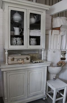
Also, this made me feel like I finally had a clear idea of what my client was looking for.  Except instead of grey, we decided on Duck Egg blue, which will bring out some of the color in the mural on her curio (which is similar to the example above, with a gentlemen in a blue coat).  It’s also the color that she originally talked about wanting to bring into the room.

Which brings us to the resulting dresser.

Dresser painted in Annie Sloan Duck Egg

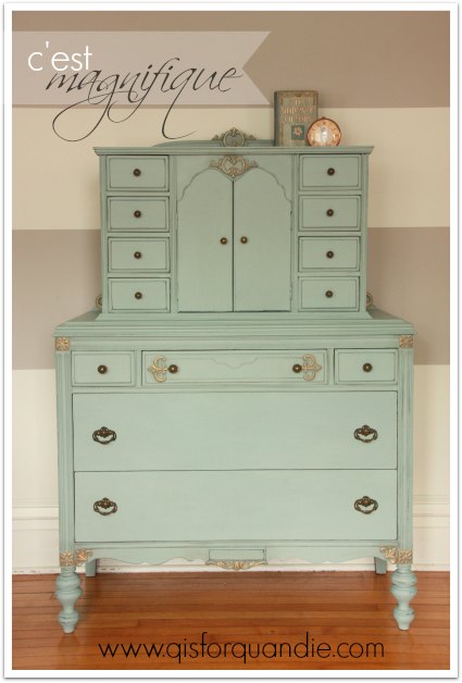
I used a light hand to apply the gold Rub ‘n Buff to bring out the details on the dresser.

french dresser detail

It’s enough gold to help tie this piece in with the curio cabinet.  I think the gold works really beautifully with the Duck Egg blue.

dresser painted in Annie Sloan Duck Egg

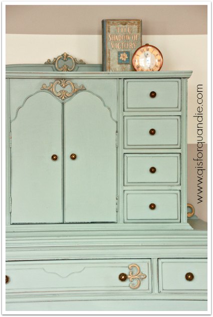
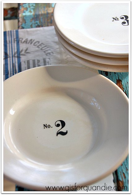
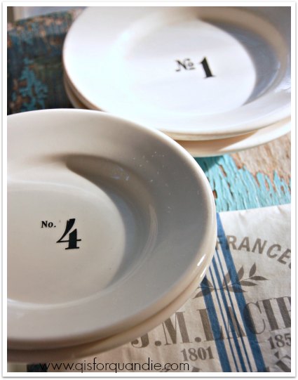
I staged this piece very simply with an old book that has the same look as the dresser, a duck egg blue with gold details, and a vintage clock.

french dresser detail 2

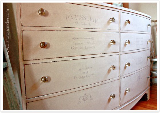
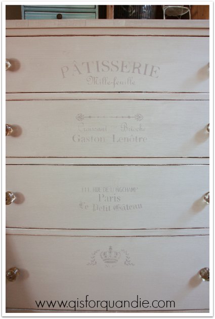
The original hardware on this dresser is very pretty, and was already gold toned.  I just cleaned it up a little and put it back on.

Annie Sloan Duck Egg with Gold Rub 'n Buff

Those little doors at the top of the dresser open to reveal two shelves inside.  I painted the interior to match.  Don’t you just love the curvy-ness of that opening?

french dresser inside

I also love the little detail of these pretty brackets that sit at the back of the wider portion of the dresser.

french dresser bracket collage

I’m more than happy with how this dresser turned out in the end.  It was such a gorgeous piece to start with, so I wanted to do justice by it, and I think I did.  What do you say?

french dresser before and after

P.S.  That little french cane back chair with the gold accents from my pinterest board is going to be the inspiration for how I paint the vanity that matches this set.  But first I have to paint the bed.  Stay tuned.

pop up painting class.

In the past I’ve had a few people ask me whether or not I teach classes on painting.  Last year I taught a couple of classes that focused on milk paint at the Round Barn, but other than that I really haven’t done any classes.  But I’ve thought about it, and wondered if I could pull it off at my own house.  So when a gal I knew from a craigslist purchase mentioned that she’d love to take a class, I suggested that she and a friend be my guinea pigs.  After all, I have a lot of knowledge learned on the fly, and I am more than happy to share what I know with others.

class title

The one big thing that I can offer in a class of my own is a complete lack of bias or focus on a particular product.  In other words, my class encompasses all of the various products out there, along with when, why and how to use them.  Since I am not selling any products here, I don’t need to be promoting a particular brand.  I firmly believe that both milk paint and chalk paint have their place.  Not all projects are good for milk paint, and vice versa.  I also have a couple of money saving tips, such as when you can substitute a much cheaper product, and when you can’t.

class paints

So on a recent sunny Saturday afternoon my guinea pigs, Emily and her friend Jess, came over for a class.  They each brought something from home to paint.  Emily brought some simple wood storage cubes, and Jess brought a toy box that she saved from the dumpster.  Someone she knew was going to toss it!  So she grabbed it and brought it along to paint.  I am kicking myself now because I didn’t get ‘before’ pics!  Darn!  But suffice to say, the cubes were already painted in pastel colors, and the toy box was painted black.  We assumed that all of them were painted in a latex satin or semi-gloss paint.

Emily and Jess learned how to decide which product is right for your piece, how to prep your piece before painting, painting with chalk paint, mixing and painting with milk paint, stenciling, distressing and finishing with either wax or hemp oil.

They used both chalk paint and milk paint on their pieces.  Here is Emily putting a coat of MMS Artissimo milk paint on one of her cubes, after having already painted the inside with chalk paint in Duck Egg.

class Emily

And Jess went with an undercoat of Cece Caldwell Vintage White chalk paint followed by MMS milk paint in Apron Strings for the toy box.

class Jess

We experimented with a hemp oil resist, and also with blow drying.  Here is Jess blow drying her toy chest (boy, that just somehow sounds wrong, doesn’t it?)

class blow drying

Originally Jess was going to stencil a number on the toy box, but once I showed her this french stencil, she knew it was perfect.

class toy box

“sweet dreams my child, good night”

The Apron Strings was a great color choice for this piece as well.  Jess really liked the variations in this color ranging from pink to coral.  It really worked well for her, and it was a great way for me to show them this quality of milk paint (which can be good or bad, depending on what look you are going for).

Our class lasted just a tad over 4 hours, and both Emily and Jess went home with finished pieces.

class results

It was really fun, and I enjoyed sharing my knowledge.   I think I learned a couple of things about how to make it go more smoothly next time (like actually have some handouts ready to pass out, oops).  I wasn’t sure we’d be able to fully complete our projects in that time span, so I was glad to learn that yes, it can be done.

I’ve got some ideas floating around in my head for future classes.  One idea is to have a class where each person paints a vintage cupboard door to turn into a ‘sign’, like my French Market sign.

sign 2

Another possibility is a class where everyone goes home with a painted suitcase (but first I have to get my hands on some suitcases!).

suitcase pair

But I also would be willing to just host some more classes where people bring their own item to paint.

So, if any of you locals might be interested in a class, please leave a comment or drop me an email at oakdalecarriagehouse@gmail.com

I’d love to hear from you!

the q branch.

At first I thought Mr. Q’s idea of calling my former craft room ‘the Q branch’ was kind of dorky.  But the thing is, I am a huge Bond fan (which he knew).  I don’t have a favorite Bond, I love them all equally.  Well … maybe I’m a tiny bit partial to Daniel Craig.  I mean, who isn’t?

Bond

Oops.  Got distracted there for a moment.

Anyway, what really sold me in the end was the fact that I found a fabulous logo for it!

qbranch

Well, maybe if I could edit out the guns … those aren’t really appropriate.  Could I somehow change them into paint brushes?  I’ll have to work on that.  But really, the motto?  Always have an escape plan?  It couldn’t be more perfect.

But meanwhile, I bet you all want to see a final post with everything pulled together in the Q branch!  And I bet you also wouldn’t mind knowing how much I spent on the total room makeover would you?  Well, read on, all is about to be revealed.

First of all, with nnK’s help, I repainted the walls and ceiling in the room using paint that I already had.  The wall color is a mixture of the two colors I used for my living room stripes, and the ceiling paint is the same blue I used in my living room also.  I had quite a bit of paint left over from those earlier projects, so I didn’t have to buy any paint for this makeover.  The cost for paint, $0.

study paint job

Next (after giving the floor a really good cleaning), I brought in the chippy farmhouse cupboard.  I paid $195 for it on craigslist.  I paid $4 for the rooster feed sack.  The drawer pulls were some that I already had on hand.  I used about a cup of milk paint, plus quite a lot of antiquing wax, so let’s call that about $20.  All in all, I spent about $219 on the farmhouse cupboard.  However, I’ll be selling my previous cupboard and am hoping to get $225 for it, a net gain of $6.

rooster cupboard

The desk is a table that I paid $20 for at a garage sale last summer.  The french cane back chair came from craigslist last winter, and I paid $25 for it.  The door behind the desk is one that I painted a couple of years back.  I hauled it out of a dumpster, $0.  So, I spent about $45 for the new desk, but I have already sold my old desk on craigslist for $225.  So, a net gain of $180.  So far, I seem to be making money on this makeover!

study desk w french chair

Naturally I brought Lula back into the room, but she resides in the opposite corner from where she used to be.  I shared her story with you a while back, in which I mentioned that she was cobbled together from a Styrofoam manikin that was free.  Behind her I hung an old rusty child sized folding chair that I turned into a chalkboard.  My friend Michelle gave me this chair to see if it could be saved.  It’s another item that was for sale at my last sale, but had no takers.  The cost for these, $0.

Lula at q branch

On the opposite wall, I kept the dresser that was here before, but gave it a new paint job.  I used about $10 worth of paint, and I gave this piece all new knobs from Hobby Lobby.  I purchased them at 50% off (never, never, never pay full price for these at Hobby Lobby, they go on sale all the time), still the knobs set me back $40 because I needed 16 of them! The cost here, $50.

q branch dresser wall

I already had all of the wooden crates.  I grab them whenever I see them at garage sales and usually use them to display items at my Carriage House sale.  I’m going to have to find some more before my sale next June!  I had fun filling them up with some of my favorite vintage things.

q dresser collage

The ladder is one that I hauled in from the Carriage House.  I’m not even sure where this ladder came from, it might be one that came with the place.  We found a few old wooden ladders stashed in the rafters out there.  I added my newly painted tackle box, a cyclamen potted in an old flour sifter, a vintage camera, some old books and a toy phone.  I have an idea for a future project involving this ladder, but for now I kind of like it as is.

q branch ladder

Over on the other side of the dresser is the chippy chair that didn’t make the cut for a desk chair.  I added a seat cushion from H & M Home.  Above the chair I hung an old washboard to use as a magnetic board and added an old photo of my mom when she was little.

q branch collage

The second most expensive piece in the room was the rug.  It was $180 from Overstock.com.  Initially I wasn’t going to splurge on it, but I felt like the room needed a rug to really look pulled together.  Even Mr. Q agrees that the rug did a lot to make the room seem more cozy.

q branch carpet

I kept my existing window treatment, which is nothing more than a vintage embroidered cutwork tablecloth hung over the window (although it is hard to see in this photo), along with my ‘inspire’ banner.

As you are about to leave the Q branch, you’ll notice that I hung some of my ironstone plates over the arched entryway.  This was my friend Meggan’s idea.  I had mentioned to her that I really wanted to keep these in the room, but wasn’t sure where to put them.  She came up with the idea of hanging them over the arch, and don’t they look fab?  Clever idea Meggan!  Thanks!

q plates 2

So, if you are keeping track, once I sell the black cupboard I should be out only about $50 for this entire room makeover.  Not bad, right?

On another note, I’ve had a couple of people mention that it’s hard to get a feel for the layout of my rooms.  So I took a couple of photos to help put the location of this room into perspective for you.

q branch location 1

It is just through an opening off the piano room.  See where the Kitchen Scale buffet normally resides?  When I do photo furniture shoots in winter, I move that buffet to the other side of that arched opening and use that space for staging furniture.  It works fairly well because I have the buffet on those felt slider thingies, so it’s easy to just push it over, and then push it back when I am done.

Here is another angle into the Q branch.

q branch location 2
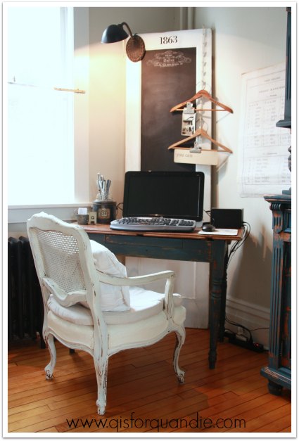
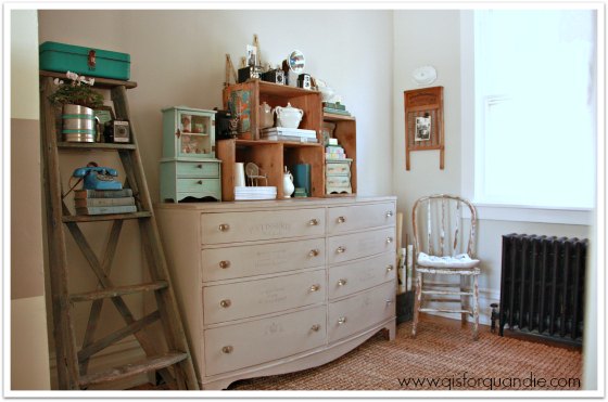
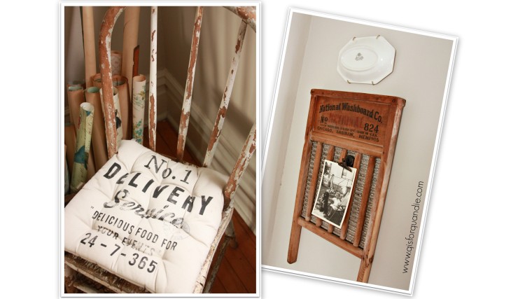
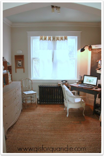
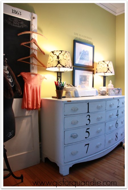
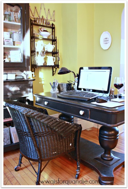
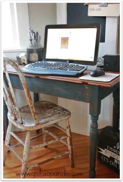
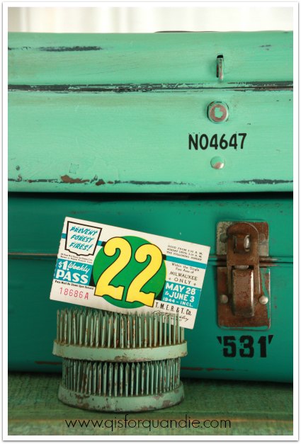
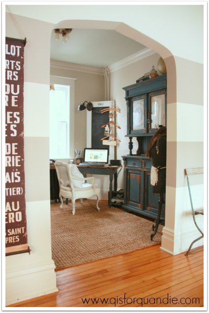
These photos explain why I felt a need to make this room prettier.  It really is on display to anyone coming into our home.  It also really needed to flow color-wise, which it does much better now.  Hopefully now that I have spruced the room up a bit, and helped make it more functional, I’ll be able to keep it tidy.  I’m really happy with the results of my makeover.  I spend a lot of time in the Q branch writing up blog posts and editing photos, so it will be nice to have a lovely room for it!

Linked up with:

Elizabeth & Co

a thrifty field trip.

As my new friend Meggan showed me around her house a couple of weeks ago, pointing out all of her fantastic thrift store finds, I thought to myself “hmmm, what is her secret?”  I’ve never had much luck at thrift stores.  I find the occasional gem, but most of the time I leave empty handed.

So when Meggan offered to let me tag along on a visit to her favorite thrift store, I jumped at the chance.

It’s actually not far from my house, but I had only been there once or twice, and that was quite some time ago.  So the other night, Meggan picked me up and we ran over there.  Time just flew by while we were browsing around, and Meggan showed me the ropes; the color coding system on the tags, and how that night anything with a green tag was half off.  We filled our cart to overflowing, and were shocked when they announced over the loud speaker that they were closing in 15 minutes.

I came home with all of this, plus a few more items that didn’t make it into the photo.

field trip 1

Now, you may be thinking, ‘huh?  what was she thinking?’, but trust me.  I’m going to transform most of these items into something fab.

In fact, I’ve already begun the process with that little set of 4 plates.

thrift store plates

I cleaned them up, and added some of my favorite Tim Holtz rub-ons.

thrift store plates rehabbed

They aren’t food safe, but they would make a great dish for holding your spare change or some jewelry on your dressing table.  They would also be sweet hung on the wall.

thrift store plates rehabbed 2

You will have to stay tuned to see what I do with the rest of my haul.  I’m really anxious to get started on this.

thrift store lambs

You’ll just have to trust me on this one!

Meanwhile, check back on Friday for the full reveal of my craft room makeover.  See you then!

french farmhouse dresser.

Remember how my dresser in the ‘room formerly known as my craft room’ looked before?  If not, here is a reminder.

studio south wall

It was looking a little worse for the wear.  You can see that some of the veneer was breaking off the top edge above the drawers.  And I never liked those drawer pulls.  Plus, it didn’t really fit with my vintage farmhouse theme for the room makeover, so I gave it a little spruce up.

First I took all of those pulls off, which had two screws each, and filled one of the holes.  You all have seen tutorials on how to do that a million times, right?  If you’ve never tried it, don’t be intimidated.  It is really easy to pull off.  You just need some patience to fill them with wood filler, let them dry (there will be shrinkage no matter what the manufacturer says), fill again, let dry (sometimes I even need a 3rd pass with the filler, but not always), then sand.  Easy, peasy, but putzy.

Next I also sanded the numbers off.  I didn’t want to see the outline of them through my new paint.  The rest of the dresser got a light sanding too.  Then I painted with Cece Caldwell’s Young Kansas Wheat.  A few years ago, if you had told me I was going to paint anything in a warm, greyish beige color I would have told you that you were crazy.  But, I didn’t want this piece to be the showstopper in this room.  I wanted it to blend a bit, especially since it is so big.  This color works very well for that.  After all, when one of the other pieces in the room is a saturated blue cupboard with a rooster feed sack, well, that makes enough of a statement for one room.

Are you wondering why I didn’t use milk paint on this piece?  Especially since I wanted a rustic, farmhouse look?  It was mainly because of the existing white latex paint.  I didn’t want to see an undercoat of white through any chipping.  For some reason, I just have a thing about white undercoats.  They remind me too much of primer maybe.

Dresser painted in Young Kansas Wheat

Let’s chat about the stencils for a moment.  I used sections of two different stencils to add something to each drawer.  I wanted it to be subtle, but maybe not quite this subtle.  When I painted the stencil before waxing the piece, there was much more contrast between the dresser color and the acrylic stencil paint.  When I added the wax, the Young Kansas Wheat chalkpaint got darker, the acrylic stencil paint did not.

dresser stencil closeup

The top drawer has been waxed, the lower two are not waxed.  See the difference?  At first I was disappointed, but I’ve gotten over it now and I like the subtlety of the stencil.

The knobs that I added are from Hobby Lobby.  They are brand new, but look old and grungy.

It’s probably a stretch to take a piece like this with very traditional lines and try to turn it into something ‘vintage farmhouse’, but I think the color, the distressing, and the new hardware help.  The stencil just adds that little bit of french-ness that I love.  So maybe this dresser isn’t exactly what you picture when I say “french farmhouse”, but it’s working for me.

dresser stencils

I’ve added some rustic wooden crates to the top of the dresser for more height, and more display space for some of my favorite collectibles.  My vintage cameras, my mini furniture and some of my ironstone pieces are right at home here now.

dresser full

Eventually I would like to replace this piece with something a little more ‘me’, but for now I need the storage and this piece will serve that purpose until I find the perfect thing.

I was waiting for one last piece, a rug I ordered from Overstock.com, to complete my room makeover.  It arrived last weekend, so if you have been following along, stay tuned later in the week when I’ll be posting a final reveal of the whole room.

chippy farmhouse desk.

I mentioned in my previous post that I’m going to start calling the room I’m currently revamping ‘the study.’  But really, that name isn’t quite right either.  Let’s face it, I don’t do any studying in here.  As part of making over the room, I gave some serious thought to what I need the room for and how it should function.  In the end, there are two main purposes for this room;  I write my blog (and do other computer stuff), and I store my creative supplies here.  What shall I call it?  Got any ideas for me?

After giving some serious thought to functionality, I realized that the desk had to go.  Here it is, in case you don’t remember it.

studio desk

It is beautiful, but see that base?  That was annoying.  My legs are far too long for this desk.  It would be perfect for a shorter person who likes to raise their feet a little under their desk, but I am 5’10”.  My feet always had to be tucked under my chair.  Plus, this desk (technically, it’s a library table) was just large enough that I tended to pile crap on it.  Empty surface area = piles of stuff to look through later.

And let’s just mention the chair for a moment.  Those wheels were leaving big black marks on the floor.  I was able to get them up with a magic eraser, but still.  Not good for the floor.  Although it was quite comfy.

But all of that brings me to my new desk!

study desk w french chair

A bit smaller for sure, but enough space for exactly what I need, a perch for my computer.  It’s now tucked in the corner which makes the room seem ten times larger.  I angled it to avoid the look of furniture just lined up along the walls.  Once Mr. Q and I put the angled desk in place, I realized that the space behind it was perfect for my chalkboard door.  See those pipes running up the wall behind the door?  Those are radiator pipes going up to the 2nd floor.  Because of those, nothing could really be tucked right in to this corner of the room.  And I now have a fab little vintage suitcase hiding all of those electrical cords, but I forgot to put it in place before this photo.  Dang.  In an older house, lack of electrical outlets can be a big challenge.  This room has two, neither of which are in a good spot for the desk.

So let’s talk about the ‘desk’ itself.  Do you recognize it?  It’s the Boxwood farmhouse table!

boxwood as desk

I tried selling it at my last Carriage House sale, and there were no takers.  Clearly it was meant to stay.  As much as I loved the green, it just wasn’t working in this room.  So, I really quickly slapped on a coat of MMS Flow Blue followed by a coat of MMS Artissimo.  We’re seriously talking ‘slapped on’ here folks.  The lighting was dim, I didn’t try to get 100% coverage.  I wanted the look of a piece that has been painted multiple times.  And here is what I got.

desk collage

Love it!  Perfect chipping with layers of color.  Just what I wanted.

As for the chair, I have to laugh, I started out with this chippy farmhouse chair (oh, and there is the little suitcase in this shot).

desk with chippy chair

That chair lasted all of about five seconds.  I don’t know what part of my brain thought that I could actually sit and write blog posts in that chair.  It looked cool, but was definitely not going to be functional.  Thank goodness I still had my french cane back chair out in the photo cottage!  It’s perfect for the new desk.

desk with chair

It is super comfy (I’m sitting in it now as I’m writing this).

There is just enough room on the desk for my computer, a couple of external hard drives (note to self, come up with way to disguise these!), some pens, a little container of business cards and a little ‘Q’.

desk top

I’ve used some vintage hangers and metal clips to add a little ‘pin board’ of sorts to my chalkboard door.

message board

So now you’ve seen both the farmhouse cupboard and my farmhouse desk.  Are you sensing a theme?  Stay tuned next week when I reveal what I did with the dresser on the other side of the room, plus a final room reveal (if one final piece arrives in time!).

another quandie quickie.

The quickies have been few and far between lately (I’m referring to quick projects here people, get your minds out of the gutter).  I’ve been doing a lot of BIG projects instead.  Making over a whole room, painting large pieces of furniture, etc.  But while I was waiting for a dresser to dry the other day, I decided to tackle (pardon the pun, you’ll get it in a minute) painting some metal boxes (tackle boxes, get it?) that I picked up last summer at a garage sale.

I am a big fan of old shabby metal containers of any kind, and I bet many of you are as well.  There are some great ones out there.  Then again, there are some that really aren’t all that fabulous.  The color is a bit blah, as it was on these two.

metal toolboxes before

But instead of passing these by when I saw them, I decided to nab them and then see if I could fab them up a bit.

I had recently picked up a sample pot of Cece Caldwell’s chalk paint in Sante Fe Turquoise.  It’s a fairly bright turquoise.  I don’t think I would be inclined to use it on a piece of furniture, but it was the perfect color for a small metal box.  So, I painted the smaller one with it.  Here it is once the paint was dry, but before I distressed and waxed it.

metal toolbox painted

Of course, you can’t leave it like this!  I sanded it, then waxed it with clear wax.  Then I added a little dark aging wax to some areas for a little more age.  Finally, I added a couple of Tim Holtz rub-on’s.

I painted the larger box using Annie Sloan’s Florence, and then gave it the same treatment with wax and rub-on’s.

Et voila!

metal toolboxes after

Now I have the most fabulous vintage metal boxes!

metal toolbox top

Aren’t the colors divine?

metal toolbox side view

Did you see my lucky number, by the way?  While cleaning out my craft room for its makeover, I came across a stash of vintage tickets that all have a ’22’ on them.  I purchased them at Oronoco Gold Rush a couple of years ago.  The vendor selling them had boxes and boxes of ticket stubs, all sorted by number!  I can’t imagine how long it took her to sort them.  I’m glad I found them, I’ll use them on my scrapbook page with all the photos of my lucky number from my Danube trip.

metal boxes 22

But maybe I’ll save one or two for future photo shoots.

Got any old metal boxes you can dig out and slap some paint on?  It’s a super fast and easy project for a winter afternoon.  Give it a try!

a chippy farmhouse cupboard.

In typical fashion, my decision to get rid of the chartreuse walls in my craft room snowballed into a more comprehensive room make over.  My original thought was to just repaint the room, maybe repaint some of the existing furniture and restyle the room a bit.  But as I thought about it, I realized that painting over the black on my existing cupboard wouldn’t give me the result that I wanted.  I decided that if I could find a new-to-me cupboard at a reasonable price, I could buy it and then sell the black one on craigslist … hopefully with a net outlay around $0.

And within days I found this guy.

studio hutch before

A clean canvas for whatever color I wanted.

But boy oh boy, did I go round and round about what color I wanted!

First, I was convinced that I had to paint it in my signature aqua.  Love that color!  And I pinned this example for inspiration.

aqua cupboard

Yes, it would have been gorgeous in this color.  I seriously considered it.

Then, I had a moment where I thought ‘white!’  Back to basics.  Keep the entire room bright and filled with light.  I even found a cupboard on pinterest that is very similar in style and painted white.

white cupboardAlso very nice.  But as much as I admire this all white decor, it just isn’t me.

I like color.  And I wanted this cupboard to be the focal point in my study (that’s what I’m going to call it now since I rarely actually do any crafts in here).  So I decided to go with a rich shade of blue.  Miss Mustard Seed painted her jelly cabinet in exactly the color I was looking for, so I decided to just copy her technique.

jelly cupboard

She started with a layer of Artissimo, so I did too.

studio cabinet sneak peek
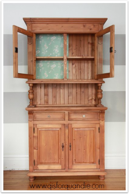
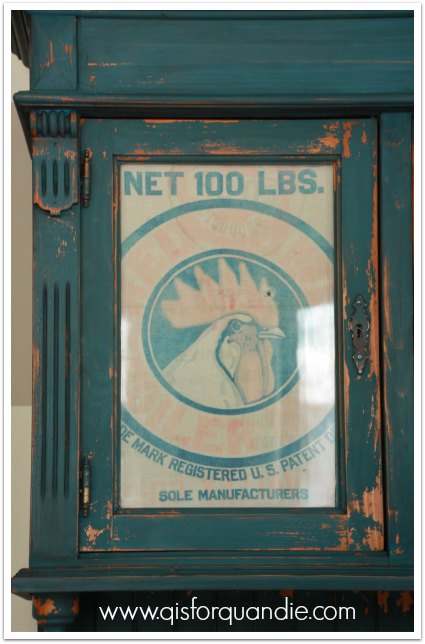
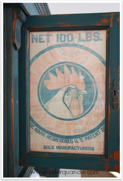
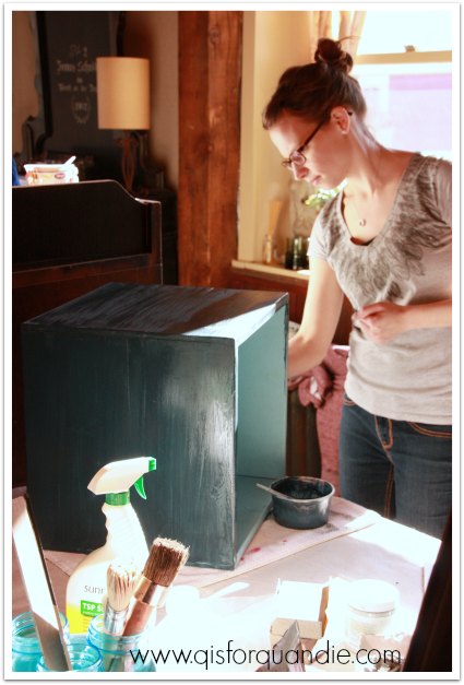
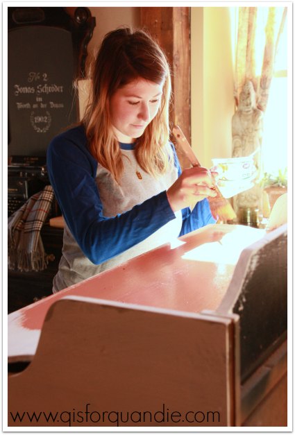
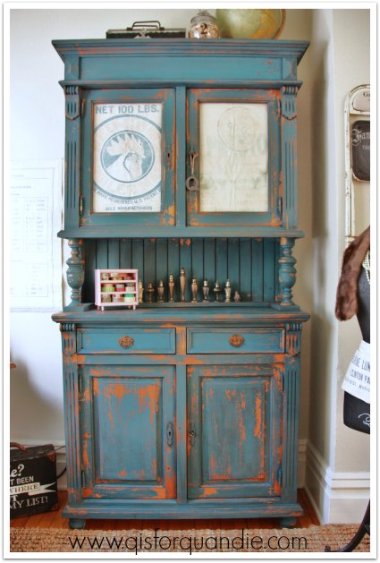
I really wasn’t sure about this pine finish that I was painting over.  I suspected it might chip like the dickens.  But the first coat of Artissimo really didn’t chip at all.  Hmmm.  OK.  I wanted a little chipping, so I was a little disappointed not to get any.  I waited a full day and then moved on to add a coat of Flow Blue on top of the Artissimo.  And then guess what?  It started chipping.  And then it chipped A LOT.  I freaked out.  Some cuss words may have been uttered.  This is the point in many projects where I decide to sleep on it.  Maybe even wait a couple of days before making any decisions.  But I really thought I was going to be sanding it down and starting over with chalk paint.  Not the end of the world, but I’m not a fan of starting over.

Then, on day 4, I came home and took another look at the cabinet.  I pondering the extreme chipping and I realized that it was starting to grow on me.  Maybe I could just go with it, maybe play it up a little.  And thus, the chippy farm cabinet was born.

cupboard rooster

I love it!  Every time I walk in to the room, I smile a little inside because this cupboard makes me happy.  I think it’s the rooster.  Whatever it is, this is the response I want to get from my decor.  So if it’s not everyone’s cup of tea, that is OK, because it is definitely mine.  And since I’m keeping this one, I’m the only one who has to like it.  Well, it’s a bonus if Mr. Q likes it too, and he does.

chippy farmhouse cabinet

A couple of things about the color.  First of all, my color doesn’t really look much like Miss Mustard Seed’s jelly cupboard.  I think I followed her exactly, a coat of Artissimo, followed by a coat of Flow Blue, and then finished with her antiquing wax.  Why so different looking?  Maybe because my piece started out a different color?   Maybe because the lighting is different in my photos?  In addition, in person the cupboard doesn’t seem to have such a color variation between the top and bottom.  I’m not sure if that is another trick of the lighting, or if it’s just something that isn’t so noticeable in person.

I added some vintage drawer pulls to this piece from my stash.  I wanted it to feel ‘old’, and these helped with that quite a bit.

you can

What really pulled it all together for me on this cupboard was the rooster feed sack.  That was just a little bit of fate at work.  I knew I wanted to put something behind the glass because I want to be able to shut the doors and not see all of my stuff (unlike the old cupboard).  I figured I would do a stenciled piece of linen or something, but as I dug through my fabric I came across this feed sack.  The coloring couldn’t have been more perfect.  And that rooster is just plain handsome, isn’t he?

rooster feed sack

I staged the cupboard with some ironstone and some blue canning jars just for these pictures.

farmhouse cupboard

Once I have it in place in the study, I’ll show you how it will look in ‘real life’.

chippy farmhouse cabinet 2

But in the meantime, what do you say?  Chippy farmhouse?  A ‘do’ or a ‘don’t’?

let’s monkey around.

I’ve had a couple of people ask me how I add titles, banners or other items to the photos on q is for quandie, so I thought I would just share a quick run down on that with you.  It’s really a very easy way to make your photos look more professional, whether it’s just for your own blog or for craigslist ads.

In general I use PicMonkey for this stuff.  PicMonkey is free, unless you want to upgrade to “Royale”, which gives you access to more fonts, more overlays … well, just more cool stuff in general.  It also means you don’t have to see any ads.  And at a mere $33 a year, it was a no-brainer for me.  But, start out with the free stuff and see how you like it.  You can always upgrade later.

I’m not going to give you a step by step tutorial, because that would likely drive me to drink.  Instead, I’m just going to give you an idea of how I do what I do, and then you’ll have to play around with it on your own (or watch the tutorials that they provide).

Let’s start with this photo.

the carriage house

What did I do?  I added a banner (the grey shading behind the title) from the ‘Overlays’ menu, which started out black but I used the ‘fade’ feature to make it transparent.  I added the title over the banner using the ‘Text’ menu.  Each word was done separately using a different font (Futura Medium, Scripting Pro and Ecuyer Dax) with the color changed to white.  I do each word separately so that I can size them and then place them (click and drag) exactly where I want to.  My blog address is also added using the ‘Text’ menu.  Finally, I added a Simple Edge using the ‘Frames’ menu and changed it to white, then added a Drop Shadow from the same menu.

Here is a tip that took me a while to figure out.  If you don’t want your banner to overlap your white border frame, you have to add it first, save the photo, reload the newly saved photo and then add the Simple Edge and Drop Shadow.  Putzy?  Maybe.  But those kind of details matter to me.

Once you have the basics down, the world is your oyster.  There are all kinds of fun things that you can add to your photos using PicMonkey.  You can also do basic editing like cropping, color adjustments, brightness adjustments and so on.  I also use PicMonkey to resize my photos to save memory space on my blog.

Here is another example of something you can do with PicMonkey.

2014 Fall Carriage House Sale

To create this I used the Collage feature.  This is a “Jigsaw” layout, but they have lots of options, including a Facebook Cover.  (tip:  I also used a PicMonkey collage to create the header of my blog).

Once I had my collage ready to go, I saved it and then used Editor to add the circle, changing it to white and fading it to be more transparent.  The text was once again added in several different sections in different fonts.

I will tell you, I am no computer whiz, nor am I a rocket scientist.  So, if I can do this stuff, so can you.

so sweet

You can play around with colors, and adding little accents like these pink and white ‘stars’ from the Overlays menu.

Once you have gotten comfortable with monkeying around, you can move on to Picasa, another free editing program that will allow you to make your collages look like this.  Maybe we’ll leave that for another day (hint:  I added all of the text and overlays in PicMonkey first, saved each photo individually and then used Picasa to create this collage where the photos overlap).

Provence nightstand before and after

Hey, it’s January, it’s cold out, so why not spend some time playing around with these programs to see what they can do for you!  And while you are doing that, I’m going to be busy painting my craft room, and maybe a piece of furniture or two.

(Once again, please note, this post is not sponsored in any way by PicMonkey or Picasa.  I received no compensation, free products or encouragement of any kind.  I’m just sharing what works for me.)

furniture, furniture, everywhere.

You may have noticed that I haven’t posted any finished pieces from last weekend.  Well, I didn’t get much painting done.  I was booked solid picking up furniture.  Sometimes it just works this way.  I’ll go weeks without seeing much of interest on Craigslist, and then suddenly I’ll see numerous items that I want to get my hands on.  Last weekend we picked up six pieces!

Want to see them?  Of course you do!

First, this fab tall dresser.  It’s right up my alley.  I’ve done quite a few similar pieces, like the Grain Sack dresser and the Kitchen Scale dresser .  I was able to send Mr. Q to pick this one up Friday morning while I was off at the day job.  I’m not sure yet what color I will choose for this one, any suggestions?

riverside dresser before

Can I just say?  Are you digging this ‘before’ picture as much as I am?  Since I am storing this one in the Carriage House until I can get to it, I decided to take a few quick before shots in the driveway rather than hauling it into the house just for a quick picture.  And yes, it was lightly snowing at the time.  I truly had no idea how lovely that would make the picture.  Now I want to take all of my furniture outside for winter photo shoots!

And since I was in the driveway with my camera, I went ahead and got a ‘before’ photo of this buffet that Mr. Q and his friend Gene picked up for me early Sunday afternoon.

Prescott buffet before

In case you are wondering, I do plan to paint this in Kitchen Scale just like my own very similar buffet.

Kitchen Scale hutch

So if you have always coveted it, and you are local … well, soon you’ll have your chance!

This one even came with the original keys for the locks which is extremely rare.  And the inside was lined with newspaper pages from 1959 which is kind of cool.

1959 newspaper

The real reason that I had Mr. Q call in Gene for assistance was the next 3 pieces that came as a set.  The seller told me they were heavy and I needed to bring my own manpower, so I did.  I spent a little more than I normally would on this set, and you’ll see why in the end.  But let’s start with the bed.  And in case you are wondering, I just took these pics yesterday when the sun came out again.  Not quite as magical as the snowy pics, right?  So much for the winter outdoor photo shoots.

forest lake bed before

But, isn’t the bed beautiful?  From the above photo you can’t even see what sold me on it.

It’s the wrap around foot board …

forest lake bed details

Isn’t that unique?  I’d never seen one like this before.

The set also came with a vanity.

forest lake vanity before

(Sorry Terri, Mr Q’s legs are still fully clothed!  It was -9 degrees when we took these pics.)

But the real reason for the splurge on this set was the dresser.  I have a customer who has been looking for a spectacular piece for a bedroom makeover, and I knew this piece would be just that.  I sent her some pictures of the dresser before I purchased it to be sure she was interested, and she definitely was, so I took the leap.  And here it is.

forest lake dresser before

This picture does not do justice to this piece, not to mention it’s just a bad picture overall.  There is some trim at the back of the top that doesn’t even show here, but is similar to the top of the mirror on the vanity and the top of the headboard.  This dresser is just so heavy, there was no way Mr. Q and I were going to haul it outside, or even into the next room for its photo shoot, so we’ll have to make do with this photo for now.

I don’t normally do custom work.  Why?  Because I already have a day job where I have to answer to others, so when I work on furniture, I want to have the freedom to do whatever I want to.  But every once in a while I make an exception, like I did with the ‘travel the world’ desk for my fabulous customer, Nikkii.  And now with this piece, I’m making another exception just because I really want to turn it into something spectacular for this client.  The next step is to meet with her and decide on a plan for its makeover.  I’m really excited to see just how lovely this dresser can be.

My final find from last weekend is something that I am keeping for myself.  Mr Q and I picked it up on one of our Friday date nights.  When I first saw the ad for this piece, I got an 80’s country pine vibe from it and initially I just wasn’t sure.  After thinking about it, and getting my friend Terri’s opinion, I decided to at least go take a look.  I knew I could do a lot for it with some paint.

studio hutch before

In person, the piece was not nearly as “chunky” as I was worried it might be.  In fact, at first I thought perhaps it really was old.  The cupboard doors open with some antique looking keys, it has that beadboard back.  The sellers we purchased it from had an amazing 1925 house in Edina that appeared to be filled with gorgeous antiques.  But no, upon closer inspection it is obvious that this is a newer piece of furniture that was likely designed to look like an antique.  In a way, this is a good thing.  I don’t feel one iota of guilt about painting it.

I hung the wallpaper inside the top of the cabinet while I was considering what ‘look’ I wanted to go with, but in the end I went in a different direction.  Here is a sneak peek of coat no. 1.  This is MMS milk paint in Artissimo, in case you are wondering.  It looks quite different before a top coat, doesn’t it?

studio cabinet sneak peek

So, I did get some painting done last weekend.

I’m sure you can guess what my future plan is for the cabinet since you know what room I’m working on.  I’m not sure how soon you will be seeing it again, but you’ll definitely see it down the road.  In the meantime, I think I may have crossed the line and become a furniture hoarder, so I am swearing off craigslist for now until I can get these pieces done.  I’m not even going to look.  Well … unless something really fabulous is out there 😉