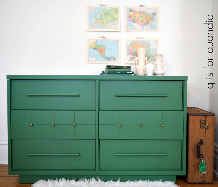
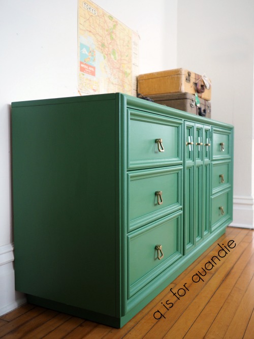
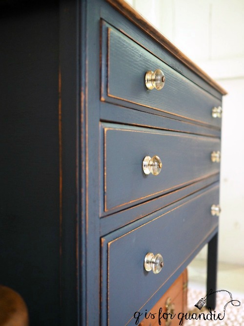
Several weeks ago one of my blog readers contacted me and asked if I was interested in purchasing some furniture she was getting rid of. She sent me some photos and quoted a bargain price, so I said sure. She lives about 40 minutes away, which is a bit far but worth it because there were three pieces, and as I said, there was also that bargain price tag.
So one Friday night Mr. Q and I headed out to pick up the furniture. We headed straight up I35, took the exit for Wyoming, MN and headed due west down a dark, curvy road with a 55 mph speed limit. One thing I’ve mentioned here on the blog before is that I am a city girl. I like my roads well lit at night, and straight and familiar doesn’t hurt either. I also find that when you are driving on these country roads, the locals behind you get quite impatient if you don’t go at least 5 – 10 miles over the speed limit. You see, they know the road. But I didn’t, so I was driving 55 and being very cautious, using my high beams every chance I got.
We made it safely to our destination and loaded up the three pieces, which fit perfectly into our van. Then we headed back the way we came. We were about halfway back to the interstate when we came upon an accident scene. No emergency vehicles had arrived yet, however I could see flashing lights headed our way from further down the road. The roadway was full of debris. There were multiple cars pulled over on both sides of the road and people dashing around. And did I mention how dark it was? We couldn’t really see much, so by the time we realized what was going on it was too late for us to pull over, the shoulders on either side were full of cars. So we kept going, driving very slowly through the debris field. It wasn’t until we were almost through that I glanced over and saw the van that was on its side in the ditch.
As I mentioned there were plenty of people on the scene. A police car was responding. And Mr. Q and I have no special skills that we can offer at the scene of an accident. So we just kept on going. We would only have been in the way had we stopped.
All the way home we wondered what had happened and whether or not the occupants of the vehicle were OK. It wasn’t until a couple of days later that I learned that some of the passersby had put out a fire in the van using snow. The driver of the van died on the scene. His wife was airlifted to the hospital. There was a second vehicle involved (we never saw that one) and that driver was also airlifted.
I really debated whether or not to share this story with you guys. It’s so sad, and I really want my blog to be a happy place. But I’m still feeling haunted by this. Had we been on the road 10 minutes earlier, would it have been us in that accident?
My heart goes out to the family that lost a loved one, and I am reminded to be incredibly grateful for the life that Mr. Q and I get to go on living. And also for the reminder to drive cautiously on dark country roads at night, or really anywhere, anytime. If nothing else, I hope all of you reading this will slow down, don’t use your phones while driving, and just remember to treat driving with the respect it deserves. Driving continues to be the most dangerous activity that most of us participate in on a daily basis. So please, be safe.
Now let’s move on to happier topics, shall we?
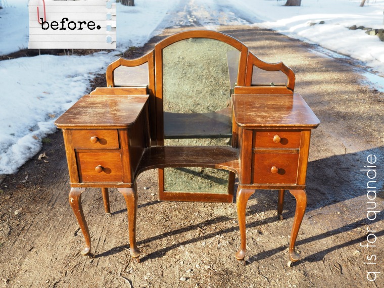
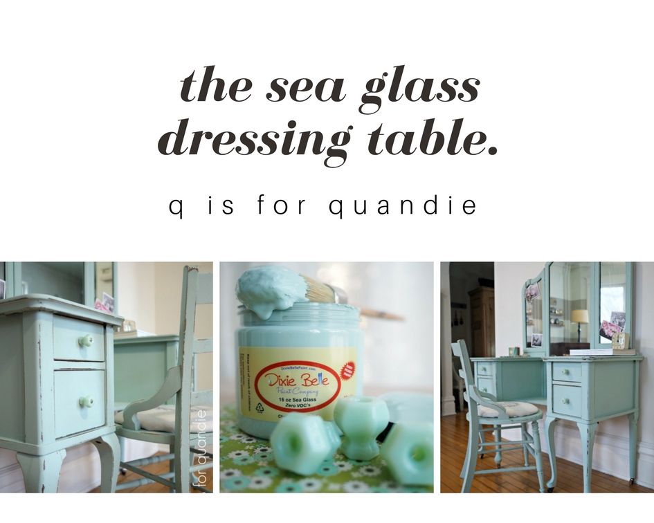
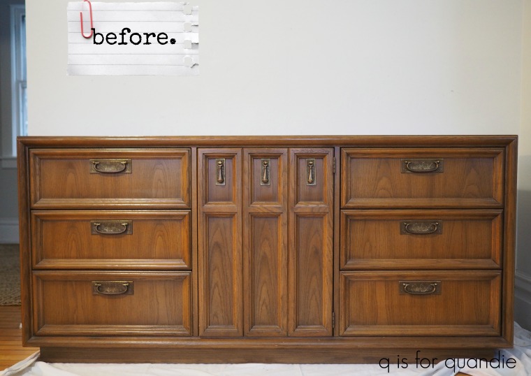
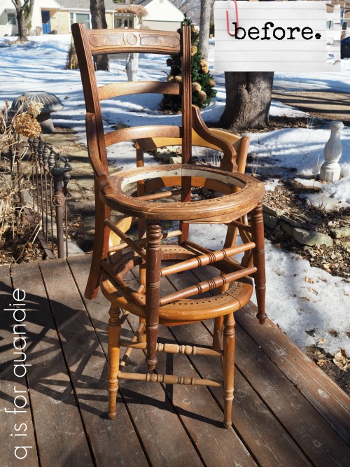
I’ve finished one of the pieces we picked up that night and I want to share it with you today. Here’s the before. The mirror is just leaning against the back, but later on you’ll see it in place.

I know I broke one of my photography composition rules with this photo, I took it from a standing position shooting slightly downward. But I was trying to keep myself out of the mirror. And hey, it’s a ‘before picture’, so I don’t have to follow the rules for that, right? It’s supposed to look bad.
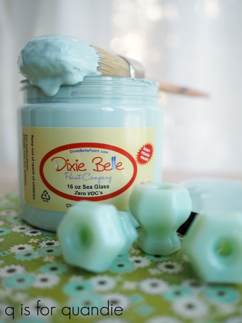
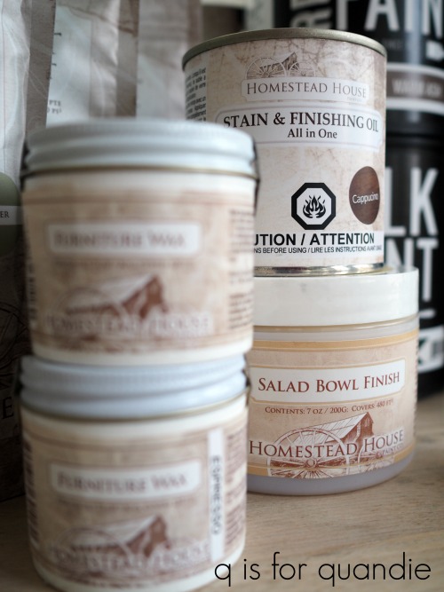
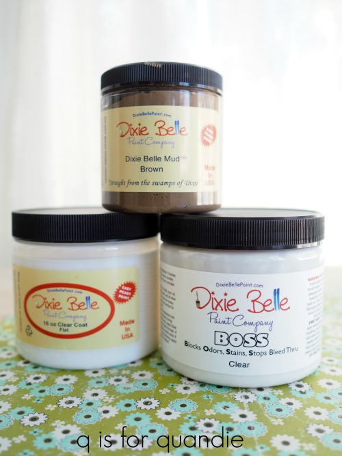
As you can see, the finish is rather beat up. In addition, there is an unseen problem. It was pretty smoky smelling. But that just made this a great opportunity for me to try the BOSS that Dixie Belle sent to me a while back. BOSS stands for Blocks Odors Stains Stops bleed-thru.

The instructions require two coats of BOSS followed by paint. Logic dictates that in order to block the odor, I have to coat every surface inside and out. To experiment with that I coated the insides of a drawer and then asked Mr. Q to give it the sniff test. Sure enough, he agreed that the inside of the drawer no longer smelled of smoke. However, turning the drawer over, the underside still smelled.
So, two coats on every surface. I went through almost an entire 16 oz. jar of BOSS for this one piece of furniture. The jar costs around $18. When you are negotiating the price for a piece of smoky furniture, just remember that the smell can easily be dealt with using this product but be sure to factor in the extra cost if you are flipping the piece to sell.
The BOSS leaves a sort of tacky surface behind. Perfect for hanging onto paint, but that also means you must put paint over it you can’t just leave it. So that meant painting every surface as well.

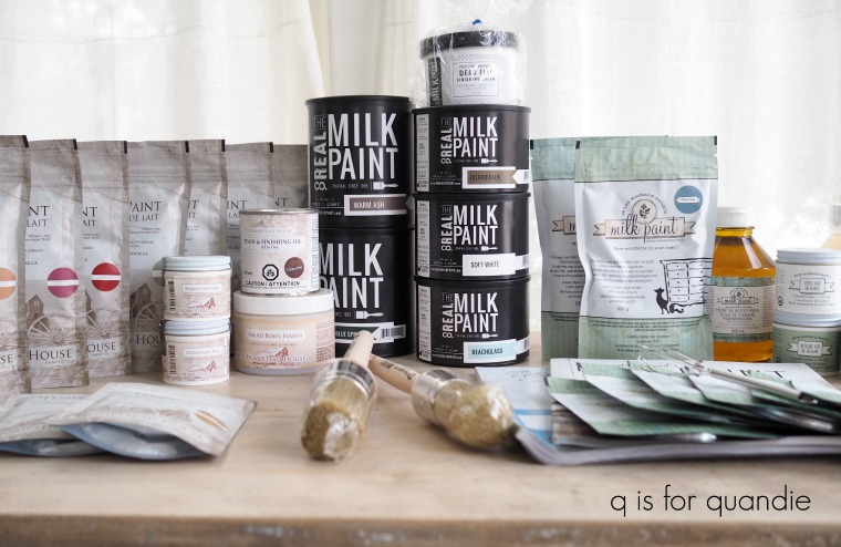
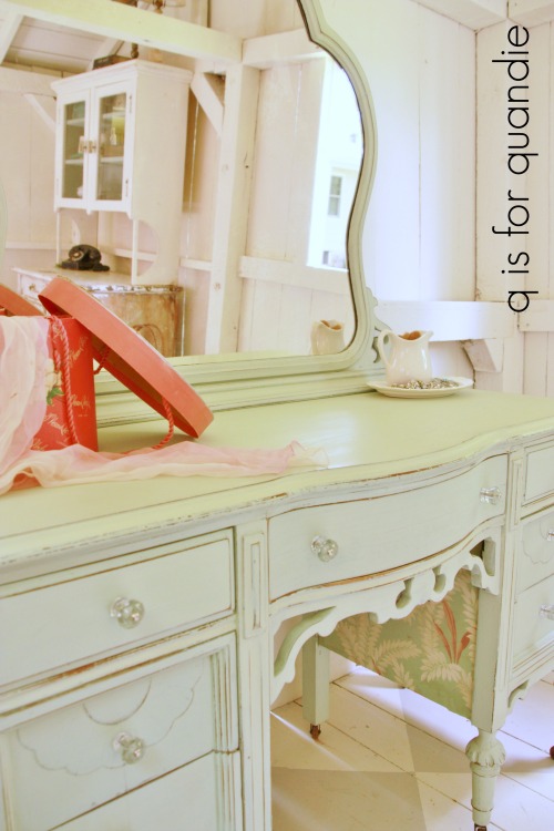
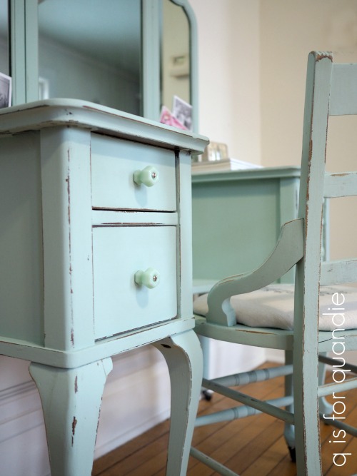
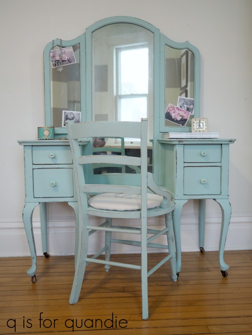
Luckily Dixie Belle had just sent me a fresh batch of paint including a jar of Sea Glass, a beautiful blue green. I knew it would work beautifully with some lovely jadeite knobs that I had in my stash. I purchased them a while back from D Lawless.
While painting this piece I used the Dixie Belle method of dipping my brush into a cup of water first, then into the paint which basically results in watered down paint. The paint goes on much smoother this way. If you are one of those people who don’t like to see brush strokes, this is the way to achieve that. I used two coats of paint on everything except the undersides of the drawers which only got one coat.
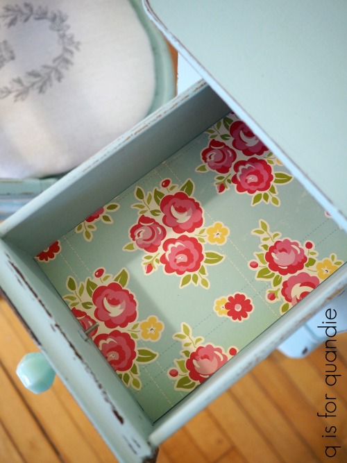
After painting the insides and outsides of each drawer, I also added a topcoat of Dixie Belle’s Flat Clear Coat and then lined them with scrapbook paper.

Now, here’s something I learned recently about Dixie Belle paint. You don’t have to put a top coat over it. What? Do your eyes deceive you? No they don’t. It’s true. Once the paint cures (in about 30 days) it is very durable without a top coat. Eureka! This was a revelation to me.
After learning that I decided to try a little experiment. As I mentioned, I used the Dixie Belle Flat Clear Coat inside the drawers. I also used it on tops of the two sides. But then I left the rest of the piece as is. I wanted to see if there was a noticeable color difference between the sealed areas and the unsealed areas and the answer is no. At least that’s true with Sea Glass, it may not hold true for darker colors. I’ll have to test that theory further. I like having a little extra protection on the surfaces that might get spilled on, while knowing that I don’t have to clear coat (or wax) the sides, the mirror frame, the legs and so on.

The vanity didn’t come with a chair, but once I had it painted I felt like it really needed one. I have a few chairs out in the carriage house, I’d picked them up here and there last year at garage sales. It’s good to have single chairs handy to pair up with desks or vanities.
I used the top chair in that stack and I asked Ken to cut a piece of hardboard that I could upholster for the seat. I painted the chair itself in the Sea Glass and upholstered the seat with some simple muslin fabric that I stamped with the Iron Orchid Designs Decor Stamps (see this post if you’d like more details on how to do that).

By the way, getting photos of pieces with mirrors straight on without getting yourself in them is tricky.
The angle was a little bit easier.
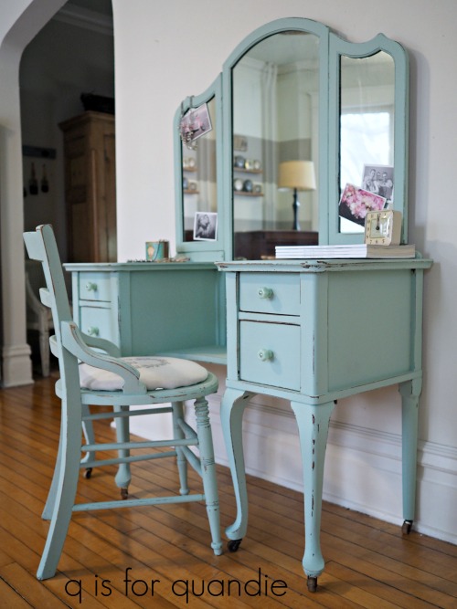
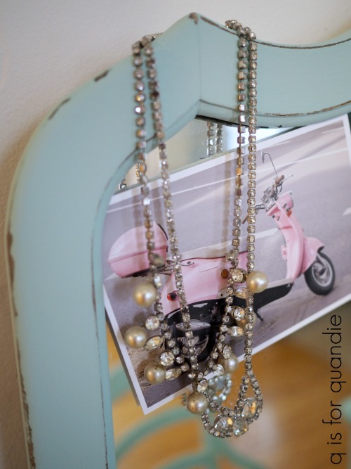
I staged this piece with a bit of pink which I thought looked very pretty paired with the Sea Glass.

This lovely sea glass vanity is for sale locally, so be sure to check my available for local sale page for more details.