split.

Today’s port of call from our Adriatic cruise is Split, Croatia.

If you aren’t familiar with Split, it is the 2nd largest city in Croatia.  Many people enjoy Split for its beaches, but we were much more interested in the fact that Split was built on the remains of Diocletian’s Palace, a Unesco World Heritage site dating back to A.D. 295.

Diocletian was a Roman emperor from 284 to 305.  He was the first Roman emperor to ever voluntarily give up the position and retire.  In fact, only 20 of the 70 Roman emperors died of natural causes, the rest were assassinated, died on the battlefield, were executed or forced to commit suicide (check out this link to read more about the demise of various Roman emperors).  Anyway, Diocletian built his palace in Split to serve as his retirement home.

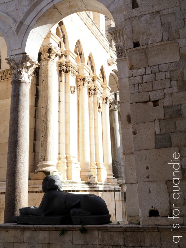
It took 10 years to build and Diocletian spared no expense, importing marble from Italy and Greece, and columns and 12 sphinxes from Egypt.

They call it a palace, but in reality it was more of a military fortress with an imperial residence and a fortified town within its walls.  There are 220 buildings within the walls.  One thing that Mr. Q really wanted to find when we were there was a small model of the walled complex that he could buy, and lo and behold, he did find one.

That gives you some idea of what it would have looked like in Diocletian’s day.  Back then the waterline would have been at the front door (it no longer is).

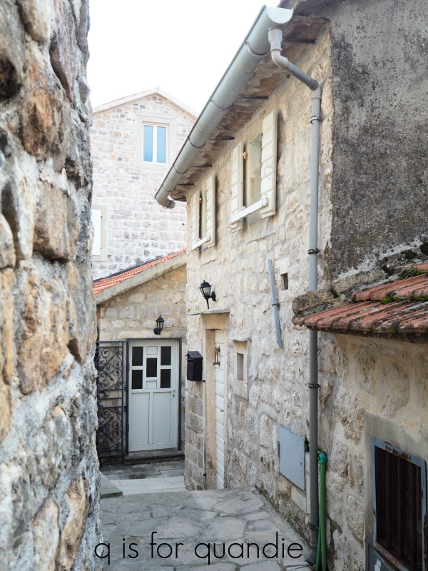
Our ship docked just a short walk away from the Silver Gate, or the eastern entrance into the walled city.

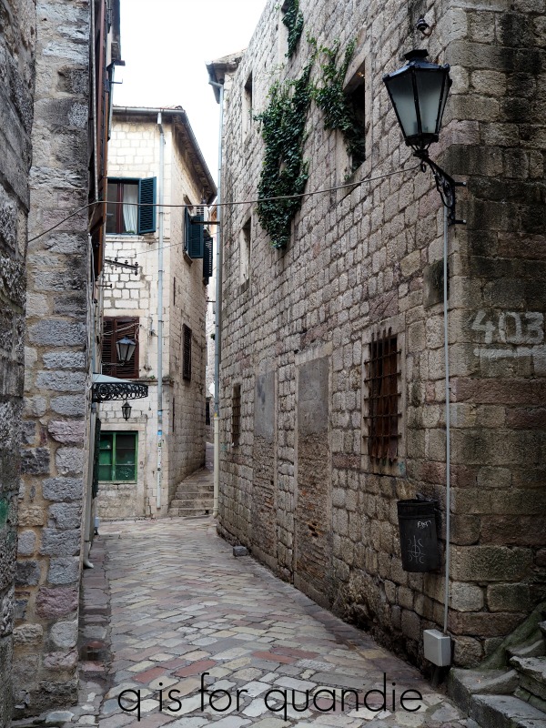
The walk from the port to the Silver Gate takes you past a bus station and a strange gauntlet of luggage storage kiosks.  I’ve never seen so many people who want to store your luggage for the day.  Apparently travelers come to Split by ferry or bus just for the day and need to store their luggage somewhere while they hit the beach or explore the town.

But, more importantly, our walk also took us past an ATM machine.  Croatia has its own currency called the Kuna.  We withdrew a small amount of cash just in case we needed some, and lucky thing because the public bathrooms in Split are not free of charge.

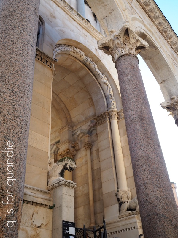
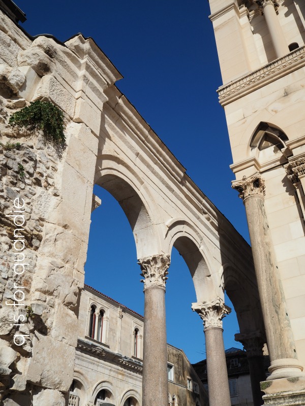
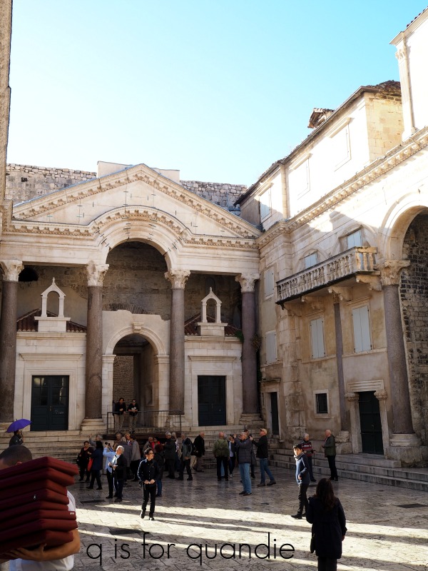
We spent a bit of time just wandering around Split and admiring the unique look of ruins within a thriving city starting with the peristyle.  A peristyle is an open colonnade surrounding a court.

Here is my handsome husband with the peristyle behind him.

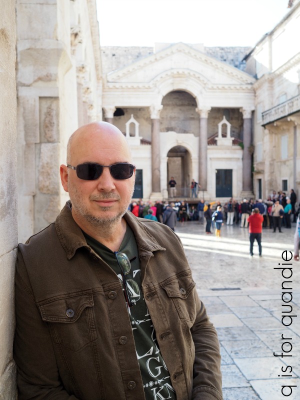
As you can see, this particular location was a tourist magnet.  How many tourists with cameras can you spot in this next photo?

We had sort of entered the peristyle through the back door.  The front door would have led into the Imperial Audience Hall with its oculus, which is just beyond that arched opening directly opposite in the above photo.  I’m sure the hall was designed to impress visitors as they arrived at Diocletian’s palace.

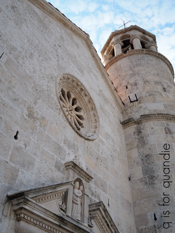
The building to the left (which is not at all visible in my photo of the peristyle) is the Cathedral of Saint Domnius.  The structure itself was built in AD 305 as the Mausoleum of Diocletian.  According to Wikipedia, it was later consecrated as the Cathedral of Saint Domnius at the turn of the 7th century AD and is regarded as the oldest Catholic cathedral in the world that remains in use in its original structure, without near-complete renovation at a later date (though the bell tower dates from the 12th century, and was totally reconstructed in 1908 after it collapsed). By the way, Saint Domnius was martyred by Diocletian.  Hmmmm.  Such irony.

That bell tower is stunning, don’t you think?

Finally, off to the right when looking at my photo of the peristyle is the Temple of Jupiter.  However, this dude on display inside the temple is not Jupiter …

Instead this is a modern day bronze statue of St. John the Baptist, and I have no idea what he is trying to convey with that hand gesture.

But you have to look up to see the real treasure inside the temple.  It’s this vaulted ceiling which is original to the 300 A.D. structure.

Each of those 64 panels has a face in the middle representing a particular human emotion.  Let me get you a close up so you can see them …

Slightly freaky, am I right?

After visiting all of these spots we just wandered the town for a bit.  I simply had to snap a quick photo of this impossibly chic woman as she walked by …

I felt like I had literally stepped into the pages of a fashion magazine.  European cities simply have the best people watching opportunities!

After exploring for a bit, we came upon a coffee shop and the smell of rich, dark coffee brewing drew us inside for a coffee break.

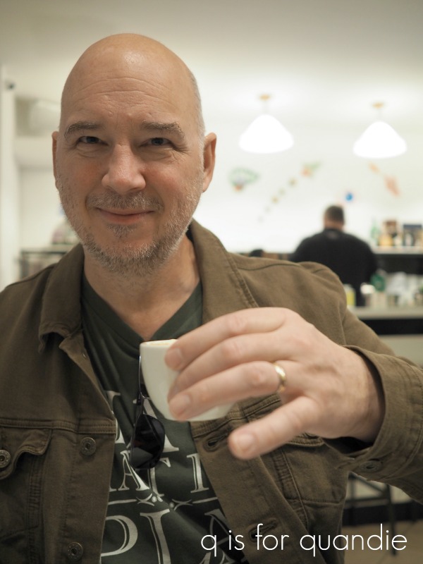
Comically enough, shortly after we sat down with our coffee the skies opened up and it poured rain.  Honestly, we hadn’t even seen it coming.  It had been a lovely sunny day up until that moment.  Seriously, check out all of my photos above, the sky is blue!

So, what was only going to be a quick break for one cup ended up turning into a 2nd cup (and the use of a complimentary toilet) while we waited for the rain to subside.  In the meantime a lovely young couple ducked inside with a small baby sleeping in a baby carriage.  They sat at the table next to us and we struck up a conversation.  I have to tell you guys, this is Mr. Q’s favorite part of traveling.  He loves to meet people and just talk to them, he is a true extrovert.  The young man was from California, but his wife was from Split.  They lived in California, but had brought their young baby to meet the family in Split.  They told us that they actually got married in the Cathedral of Saint Domnius.  I bet that was a beautiful wedding.

The rain eventually passed and Mr. Q and I said goodbye to our new friends and headed out to stroll around some streets that were a bit more wet now before eventually making our way back to our ship.

We stopped off at a little kiosk along the way to spend the rest of our Kuna on some pop (FYI, that’s Minnesotan for soda for those of you not from around here) and a bag of chips (or as the British say, crisps).

By the time we got back to the ship the sun had come back out.

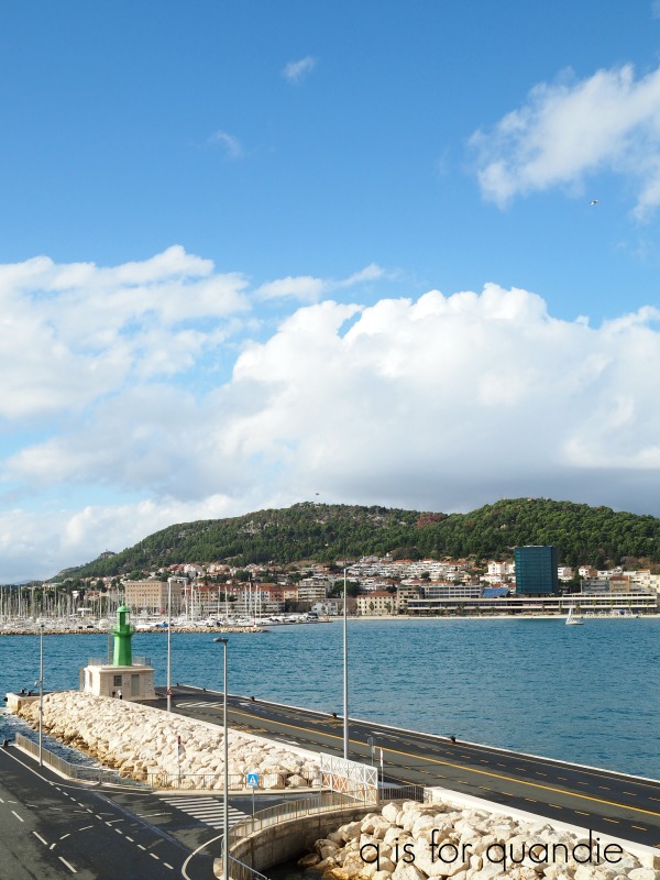
So we were able to sit on our balcony with our feet up, relax and enjoy the view before our ship once again set sail.  Next we are headed back to Italy, this time to Ravenna.  Be sure to check back next Wednesday to learn more about Ravenna and its beautiful mosaics.

tiny cupboard update.

As you know, I have a fondness for tiny pieces of ‘furniture’.  I purchased this little cupboard at a garage sale quite a few years ago.  It was actually the first piece I ever painted in Miss Mustard Seeds milk paint.

That color is Eulalie’s Sky.

But then a little over a year ago I decided to unify all of my tiny pieces by painting them all white using Homestead House milk paint in Limestone.

I managed to break the glass in the door when I did that, so I replaced it with window screening.  I have to say that I kinda prefer the screening.

Then recently I swapped out the metal knobs on this one for some small glass knobs from D Lawless.  More for practical reasons than anything else, those metal knobs were sort of cobbled on with glue and they kept falling off.  I keep my chalk in the upper drawer of this little cupboard, so I need the drawer to be functional.

So that brings us to ‘before no. 2’.

Then recently I became slightly obsessed with one of the Iron Orchid Designs (IOD) transfers called Le Petit Rosier.

For those of you who are confused when it comes to IOD transfers, here’s the scoop.  Originally IOD partnered with Prima Marketing to design some transfers such as my absolute favorite, the Seeds transfer …

So there is an entire line of Prima Marketing transfers that were designed by IOD.  But then IOD branched out on their own and now have a line of transfers that are not from Prima Marketing.  Le Petit Rosier is one of them.  When you are searching for a place to buy IOD transfers, make sure you specify if you are looking for the older Prima Marketing line designed by IOD, or the newer IOD line of transfers.

After trying to resist buying any of the new IOD transfers (because I have a backlog of Prima Marketing transfers to work with), I finally caved a couple of weeks ago and ordered a few online.  La Petit Rosier comes in two sizes, so I ordered two of the smaller ones and one of the bigger ones.  Then I did this goofy thing that I tend to do, I ‘saved’ them for ‘just the right project’.  I call it goofy because obviously I could always order more when ‘just the right project’ comes along if I’ve already used these.  It’s not like I can’t ever get any more of them.

So rather than wait for just the right project to show up, I wandered around my house looking for something I could put one of these transfers on.  That led me to my tiny cupboard.

Only about half of the smaller sized transfer fit on the front (which explains why I originally felt it wasn’t quite ‘the perfect project’ for it).

But dang!  It’s adorable!  And I can always use the bottom half of the transfer on something else.

I love how the glass knobs allow the transfer to be the star of the show.

I did have some floral scrapbook paper lining the inside of the cupboard and the drawers before, but I switched that out for some French papers.  My friend Terri gave me this set of French ephemera for my birthday a few years ago.

Once again, I was ‘saving’ it for the perfect project when I could have been using it for any number of things.  What is wrong with me?

When I went through the things included in the packet of ephemera I found this French religious medal, so I hung that from the cupboard door.

After adding some little pieces of ironstone on the shelves, my tiny camera added the perfect final touch.

For now this little cupboard is on the shelf over the radiator at the foot of the stairs where I can admire it every time I go up or down.

I absolutely LOVE how it turned out.  Not that I didn’t love it before, but sometimes it’s fun to switch things up.

What do you think?

made for each other.

One question that comes up rather frequently on my blog is ‘where do you get your inspiration?’  I’m betting that most of us find inspiration on pinterest, Instagram, in magazines and home decor books, and even in our friend’s homes … oh, and hopefully on your favorite blogs too 😉

But I want to add one more thing to that list for me, my travels.

Back in 2017 I was inspired to paint some things in what I called Norwegian Blue after a trip to Norway.

That’s actually Miss Mustard Seeds Flow Blue on that stool, which I thought made the perfect Norwegian Blue.

I was inspired to make my own Christmas wrapping paper after seeing some gorgeous velvet fabrics in Venice on our recent Adriatic cruise.

I also found some inspiration in Montenegro.  On Wednesday I shared our visit to Our Lady of the Rocks in Perast where I was very much enamored by the painted trim inside the chapel.

I love that combination of blue and gold.  It provided the perfect inspiration for revamping this thrift store frame that I picked up last year.

Naturally that slightly creepy picture of a girl was the first thing to go.  But the frame needed a little work too.  Here’s a close up ‘before’ photo …

The gold paint on the inner frame was barely hanging on by a thread.  Initially I was just going to brush off the loose paint, seal the rest, and call it good.  But most of the paint came off when I touched it.

So plan B was to give the frame a new look inspired by the chapel at Our Lady of the Rocks.

I used a small piece of sandpaper to remove as much of that flaking gold paint as possible and then I repainted the middle section of the frame using Prima Marketing’s re.design chalk paste in a color called Buxton Blue.

Are you wondering what exactly chalk paste is?

It’s basically a very thick version of chalk paint.  It is more commonly used in combination with a stencil to create dimension, but it can also just be used as a thickly textured paint.  It was the perfect choice for this frame because it left behind a textured, layered, aged looking finish with just one thick coat.

Once the Buxton Blue was dry, I pulled out the re.design decor wax in a color called Eternal, which is a gorgeous metallic gold.

Using a q-tip, I applied the wax to the inner-most section of the frame to brighten up the gold a bit.  Then I also used it to highlight the detail on the outer-most silver part of the frame to tie it in with the gold.

The final step was to toss the creepy girl picture and replace it with this water color over a Minneapolis plat map.  This was also a thrift store find, but it came framed in a really cheap and tacky modern metal frame.  And by the way, this is a print not an original artwork.

But it looks so much better (and more authentic) in this vintage frame, and can you believe how perfectly it fit!  It’s like they were made for each other.

So, what do you think?  Can you see where the inspiration from Our Lady of the Rocks played a role in this makeover?  Anyone else tempted to try a blue and gold color scheme on something?

our lady of the rocks.

Last Wednesday I shared part of the day we spent in Montenegro on our cruise in November, but I saved our morning tour to Our Lady of the Rocks and Perast for today.

As you may remember our ship sailed past these two spots in the early morning hours on the way to our dock in Kotor.

Our Lady of the Rocks is that little island on the left and St. George island is on the right in the photo above, and here is Perast …

Shortly after our ship docked in Kotor, we disembarked and took a short walk to another dock to board the smaller boat that would take us to Our Lady of the Rocks.

As I mentioned last week, the water in the Bay of Kotor was as smooth as glass.  As we were heading out, this beautiful sailing ship was heading in.

I believe this ship offers some sort of day excursion but I couldn’t find any info about it online.

Although it was a little chilly on the water, the sun came out and the scenery was amazing.

Our Lady of the Rocks is situated on a man-made artificial island.  There is a legend that the islet was created over the centuries by local seamen who kept an ancient oath after finding an icon of the Madonna and Child on a rock in the sea on July 22, 1452. Upon returning from each successful voyage, they laid another rock in the Bay. Over time, the island gradually emerged from the sea. Apparently the custom of throwing rocks into the sea is still alive. Every year at sunset on July 22, the local residents take their boats out and throw rocks into the sea, widening the surface of the island.

Initially a tiny orthodox chapel was built on the island, but in the 1600’s the Venetians took over this region and they replaced it with a Catholic chapel in 1630.  However, the current church was built in 1722.

The church contains 68 works painted by Tripo Kokolja in the late 1600’s.  According to Wikipedia, the paintings on the ceiling were badly restored by Josip Rossi in 1883.  If you look closely, especially at some of the faces, I think you’ll agree.

There are more of Kokolja’s paintings all around the perimeter of the chapel.

Above the painting hangs a collection of over 2000 silver votive offerings.

These are thin sheets of silver embossed with a design, in this case mostly of ships, that were presented by sailors to give thanks for a safe journey at sea.

There is a natural island (not man made) near Our Lady of the Rocks called St. George island.  It contains an abandoned monastery, but it was also used as a cemetery thus giving it the nickname ‘the island of the dead’.

I bet that would be a creepy place to visit at night, but I think I would have enjoyed seeing it by daylight.  However, our tour did not stop there.

Instead we headed over to Perast.

We could have stayed with our group and toured the local museum, but we were ready to just wander around on our own.  Passageways that look like this just call out to be explored!

We climbed up to the higher points in Perast to check out the view.

Then we headed back downhill and walked the length of Perast’s waterfront.

Along the way we encountered a local who was giving free samples of some Montenegrin pomegranate wine,  and naturally after test tasting it we had to buy some.  We still haven’t popped the cork on that bottle, I’m saving it for a lovely summer evening when we can enjoy it on the deck while fondly reminiscing about our day in Montenegro!

a Swedish (but slightly Norwegian) trunk.

Some of you might already be familiar with Goedele François.  Goedele is a blogger (check out her blog, Dala Muses, here), a business coach for creative entrepreneurs, a furniture painter and now a stencil designer!

Goedele recently released her own Dala Muses Nordic stencil collection.  Her stencil designs are influenced by Scandinavian folk art (read more details here) and were also inspired by her move to Sweden.  She now lives in the Swedish province of Dalarna, where the symbol of the Dala horse originated.

My paternal grandfather happened to be of Swedish decent and I still have the Dala horse that he gave me when I was a child.  My sister has one too.

So, when Goedele offered to send me one of her stencils to try out I chose the Dala Horse stencil.

I had the perfect project for it too.

This is a trunk that my sister uses as a bedside table (how many of you are noticing that I took this ‘before’ photo before I painted my living room?).

The trunk originally belonged to our maternal grandmother, so technically it’s Norwegian rather than Swedish.  It was not always painted black, my sister spray painted it about 40 years ago!

Unfortunately no one has retained any historical information about this trunk other than that it came from our grandmother’s attic.  My mom doesn’t recall anything about it at all.  So I have no idea how old it might actually be or who might have made it, which is a bit of a bummer.  I searched the inside and the bottom hoping to find some clues, like a signature or a written note, but no such luck.

Well, regardless, it was ready for a makeover.

I started by sanding it down thoroughly and then cleaning it well.  I decided to use milk paint this time because I think milk paint gives the most authentic looking aged finish.  Plus I had the perfect color for my sister, Miss Mustard Seeds Aviary.  However, I’ve had some super chippy experiences using milk paint over spray paint, so I added a little bonding agent to the mix this time.  My sister would be OK with a slightly chippy finish, but I don’t think she’d like a seriously chippy look.

The Aviary is a lovely smoky blue.  And lucky thing I added that bonding agent because even though I did’t see much chipping as the paint was drying, once I started sanding it smooth the next day I got a bit more chipping than I thought I would.

Especially on this lower corner which makes me suspect there was some kind of oily residue on this part of the trunk …

Had I not used the bonding agent this piece would have been over the top chippy.

Next I pulled out Goedele’s stencil.

As you can see, it’s a two-part-er.  One stencil is the body of the horse and the other is the detail of the saddle, etc.

I suggested to my sister that we use a warm white for the body because I thought it would stand out nicely against the smoky blue of the Aviary, and Debbie really wanted some traditional orange in there somewhere so I used orange for the details.  I used acrylic craft paint for both.

I wanted to line up three horses in a row across the front, all facing the same direction, mainly because I’m a fan of using odd numbers of things.  But Debbie vetoed that plan and said it was either one centered horse, or two.  So I went with two (I thought one would look rather lost all by himself) and turned the stencil over on the 2nd so that they are facing each other.

Once the stencil paint was dry I sanded over the horses lightly to give them a more distressed look.  Then I finished the entire trunk with Miss Mustard Seeds clear wax.  The next day I added a second coat of wax to just the top of the trunk for added durability.

So here’s some behind the scenes info.  When I stage pieces to take photos of them I often start out rather stumped.  For this trunk I just couldn’t imagine how I was going to stage it aside from adding the blue and yellow quilt and some vintage books.

I also knew I wanted to include my little Dala horse and I tried just placing him on top of the books, but that looked pretty silly.  That led me to bringing in this adorable kid sized chair …

and then adding a few other smaller details to the chair like this fun vintage card game …

It wasn’t until I’d taken quite a few photos already that I thought ‘hmmm, maybe I should get some shots with the trunk open’ …

I then added this beautiful vintage monogrammed tablecloth because that’s what you would pull out of a trunk like this, right?

Finally, I realized that I really preferred the look of the trunk open.

So I took a few more shots that way and they turned out to be my favorites.

We were planning on delivering the trunk back to my sister yesterday, but we had snow for most of the day so I opted to stay in.  We’re supposed to have more snow late tonight and into tomorrow, and again on Thursday … so, I’m not sure when I’m going to get this over to her.  But hopefully she’ll like it, and now this trunk will always remind her of our Swedish grandfather and our Norwegian grandmother.

Many thanks to Goedele for sending me the Dala Horse stencil.  You can check out Goedele’s Dala Muses Nordic stencil collection here.

Her stencils are available from selected paint retailers in Europe, but those of you in the U.S. and Canada can order directly from Goedele by emailing her.  Be sure to check out that link for more details.

Also, I’d like to once again thank Miss Mustard Seeds milk paint for providing the Aviary paint, bonding agent and clear wax used for this project.


embracing the dark side.

Step 2 of my magic wand decorating scheme was to paint my living room.  The biggest challenge was picking a color.  I don’t know about you, but I’m very seasonally motivated when it comes to color choices.  If it’s summer, I want to go all light and airy.

But in the winter I want warm, dark and cozy.  Especially when our temps are hitting ridiculous lows like the -27 F we had last week, or today’s ‘practically balmy by comparison’ -7.

Dark walls have really been on my radar lately.  First I saw Danielle’s home office makeover for her husband …

Gorgeous, right?  You can read all about that makeover on her blog Finding Silver Pennies.

Then my friend Meggan, a.k.a. the thrift doctor, emailed me to say that she painted her sun room walls black!

As a reminder, I shared a full tour of Meggan’s home back in 2015.  At that time her sun room had pale green walls.  But now they look like this …

The dark walls are perfect for showcasing her milk glass collection.

And as a sidebar, isn’t that cupboard fab?  It was free!  As Meggan says, nearly everything in her house was either free or is from the thrift store.  She painted the inside of the cupboard in a minty green and switched out the hardware, but otherwise left it ‘as is’.

I think Meggan’s dark walls are perfect for emphasizing the amazing view out her bay window too.

Isn’t that gorgeous?

So after seeing all of this fabulous inspiration, I decided to embrace the dark side in my living room.  I went to Home Depot thinking that I could easily pick out a deep, rich dark charcoal grey for my walls.  I started pulling out the little paint chips and every time I grabbed a different one, it totally changed the look of the last one.  I don’t know about you, but I find that even when I have a specific image in my head of the color I want, I have a lot of trouble finding it in the store.  The terrible lighting in most of the big box DIY stores doesn’t help either.

Over the years I have found that it’s wise to bring home some samples and test them on my own walls and at various times of day to make sure I get the color I really want.

The Home Depot paint guy recommended I try these Sure Swatch thingies for that.

Instead of painting your test swatches right on the wall, you paint this 9″ x 12″ film and the temporary adhesive back allows you to move it around to different locations on your wall to see how it looks.  For example, you can see how it looks next to the window trim, and then how it looks on the wall that gets the most sun, or maybe the wall that is next to the bookcase.  You get the idea.  They were quite convenient, except I moved them around so much that the sticky back lost most of its stick-ability.

After studying them in various lighting conditions, I was surprised to find that I liked the color called Black Locust (Behr) best.  I thought for sure I was going to go with Grey Tabby (PPG) while I was in the store.  But I really loved the depth of the Black Locust.

Next came the easy part, first I coerced Mr. Q into sanding the edges of the existing horizontal stripes on the walls.

Today’s q-tip:  If you have taped off stripes on your walls, there will be ridges in the paint wherever it met the tape.  You absolutely must sand those down smooth before repainting your walls or you will see those lines.

Then I coerced my bff, Vonda, to come over and help me paint!

Jobs like this always go so much faster when you have some company.

We were done in no time!  The paint covered really beautifully.  We did only one coat of cutting in and two coats of rolling.

You guys, I absolutely LOVE this color!  And it works beautifully with my existing pale blue ceiling and front hallway color.

It didn’t take me long to realize that the farmer’s market sign from my dining room would look amazing hanging above that archway instead.  I made that using a cast off side rail from a bed.

My newly styled bookshelves really become a focal point in the room with the dark walls, although it was a little difficult to get a good picture of them on a gloomy day.

So, the last remaining item to take care of in this room is buying new furniture.  My old stuff is in terrible condition and has needed to be replaced for years now.  I have an idea of what I want but need to find the time to get out there and see if I can find it.  Then I suspect I’ll have to order it and wait 2 years for it to arrive!  So you’ll have to be patient and wait for the final reveal of this room.

In the meantime, I’m going to move on to the next room and see if I can get some of that tackled.

But first, tell me, have you embraced the dark side at your house?


montenegro.

Before we get to the next stop in the line up from our Adriatic cruise last November, I have to tell you guys about the sea day in between.  When I originally posted about this trip I mentioned that we were going to be on the smallest ship in the Princess fleet, the Pacific Princess.  This ship only holds around 680 passengers.

Here’s a photo I borrowed from the web to give you a visual.  That is the Pacific Princess in the front and the Grand Princess in the back.  The Grand Princess holds 2,590 passengers.

There are definitely some pros and some cons to being on a small ship.  First the biggest pro of all in my opinion, there are no crowds.  Pretty much ever.  No crowds, and no lines for anything.  As far as I recall we never waited in line for anything, even at embarkation.  No lines at the buffet, and it was rare to have to wait for an elevator.  We never had to arrive early for entertainment, there were always plenty of seats available.  There were also always plenty of chairs available around the pool.  This is definitely not the case on the larger ships.

And this also translates to the ports of call.  There is a big difference between a ship unloading 680 passengers into a small medieval walled city like Kotor, and a ship unloading 2,590 passengers into that same small area.

Another pro, less tendering.  Some of the bigger ships are too large to dock in the smaller ports so your ship drops anchor and you shuttle to land in little boats called tenders.  Tendering can be time consuming, and a lot less convenient than being able to walk right on and off the ship.  On this trip we were able to dock in every port, no tendering at all.

There are some cons though too.  For one thing, there aren’t nearly as many amenities on board the ship.  There is no rock climbing wall, water slide, ice skating rink, giant movie screen under the stars or zip line.  There was only one small pool, although we never went in it so we weren’t missing anything there.

That being said, the Pacific Princess is a beautiful, if somewhat more traditional, ship.  The cabins were all refurbished about two years ago and the new design was by none other than HGTV designer Candice Olson (I always loved her show).

The other con to the smaller ship that I want to point out is that you can definitely feel a bit more movement.  Which brings me to our day at sea.  We crossed the Mediterranean from Malta to Montenegro during a bit of a storm with 50 mph winds and 15’ seas.  I’m sure we would have felt those waves on any size ship, but on this small ship it was pretty significant.  Fortunately I had taken some Bonine when we left Malta because the captain had warned us that the seas would be rough, so I didn’t have a problem with sea sickness at all.  But it was a bit difficult to get around.  Having lunch in the buffet was quite the experience as dishes were crashing to the floor right and left, and it was tough to get to your table with your plate of food intact.  In addition, all of the exterior decks were closed for the day.  But that was OK.  We were worn out from constantly being on the go, so a day spent reading in bed was perfectly fine with us.

By evening things had calmed down quite a bit and there wasn’t any dish crashing heard at dinner, but there were quite a few empty chairs due to people who weren’t feeling all that well.  There were only 5 out of the normal 8 at our table.

By the next morning when we sailed into the Bay of Kotor the water was as smooth as glass.  The difference was night and day.

Much like last week when I didn’t precisely know where Malta was located, the same was true of Kotor, Montenegro.  What can I say, I skipped geography in school (really, I did, it had to do with moving from Minnesota to Florida between school years, long story for another time).

But I know where it is now!  And just in case you don’t, here’s another map to put it in perspective for you.

According to Wikipedia, “Montenegro has both a picturesque coast and a mountainous northern region. The country was a well-known tourist spot in the 1980’s. Yet, the Yugoslav wars that were fought in neighboring countries during the 1990’s crippled the tourist industry and damaged the image of Montenegro for years.”  However, the tourist industry has been recovering steadily over the past 18 years and seems to be going strong now.

Sailing in to Kotor reminded me a lot of sailing through the Sognefjord and the Aurlandsfjord to Flåm, Norway.  I can’t really do justice to describing the feeling of waking up in your cabin and seeing mountains slipping silently past as your ship glides through the water.  We sleep with our curtains open just so that we can wake up and see our surroundings without even getting out of bed.  It really is a spectacular way to start the day.

On our way to Kotor we sailed past Our Lady of the Rocks (on the left) and St. George Island (on the right).

As well as Perast …

It was fun to see them knowing that we were headed back to these spots on our morning excursion.  Speaking of which, I’m going to wait and share that with you next week because this post is getting rather long and I still have lots of great pictures to include.

Instead I’m jumping ahead to the afternoon that we spent in Kotor after our excursion.

The old town part of Kotor is a fortified city and no one knows the exact timing of the first settlement there.  It was first fortified in the early middle ages, 535 A.D. and it is a UNESCO World Heritage Site.

Our Rick Steves’ guidebook said that the old town part of Kotor was very small and it would be easy to do a self-guided walking tour in only a couple of hours, and that was true (his book on Croatia & Slovenia also includes Montenegro).

There isn’t a ton of stuff to see, but if you enjoy wandering around narrow, cobble stone alleyways admiring ancient buildings then you would love Kotor!

And if you’re a fan of the amazing patina on old painted doors, then this is definitely the spot for you.

And finally, if you are a cat lover you will enjoy this town as well.

Kotor is known for having a large population of stray cats.  Apparently many of the residents and shop keepers leave food out for them.  Kotor even has a Cat Museum.

The cats make themselves at home everywhere, including snuggling up for a cat nap on a park bench.

Strolling around Kotor was a perfectly lovely way to spend an afternoon, but would not have been enough to keep us occupied all day.  Be sure to check back next Wednesday to read about the tour we took in the morning!

step one.

I’m sure that many of you are familiar with Liz Galvan’s blog, Liz Marie Blog.  If not, you should definitely check it out.

I’m obsessed with her style.  I mentioned last week that I wish I had a magic wand for decorating and could just wave it and magically transform my house.  If I had that wand, I would wave it once and my whole house would now look like Liz’s house.

Not only do I love her style in general, but I also admire her bravery when it comes to things like painting all of her floors white.  I love that she doesn’t aim for perfection, or feel the need to spend a lot of money on every project.  Her recent staircase makeover is a case in point.

Well, as we’ve already established, I don’t have that magic wand so I’ve decided to start transforming my house in a more practical way, one step at a time.

Item no. 1 on my to-do list was repainting and restyling the built in bookcases in my living room.  I’ve totally taken my inspiration from Liz’s home office built in bookcases.

After all, my bookcases already had the bare bones in place.  They even have the same bead board backs.  They just needed a fresh coat of paint.  Here’s how they looked before.  White on the outside, and a blue green color on the inside.

By the way, have I ever mentioned that my handyman/neighbor Ken built these bookcases?  And he did it for the previous owners of my house.  I didn’t even know that until after we’d lived in our house for 20 years or so!  I always just assumed they were original to the house.

Anyway, they’ve undergone a couple of transformations since we’ve lived here.  The last one was a coat of blue-green paint on the insides that would showcase my pottery collection.

To prep the shelves, Mr. Q sanded them lightly all over for me and vacuumed up as much of the dust as possible.  Then I wiped them down with hot water and a cloth.

Next came two coats of Fusion’s Raw Silk (thank you Fusion for supplying the paint needed for this project).  It took most of two jars to paint the insides of the shelves along with the long shelf that sits on top of the radiator under the windows.

Fusion Mineral Paint is always my go-to paint for things like shelves.  It’s extremely durable and washable once cured.  It doesn’t require a topcoat, so less money spent on products and less time spent applying them.  I painted the plant ledge in my dining room window in Raw Silk two years ago and it has held up beautifully, even though it frequently gets wet and dirty.

I also decided to remove the wood corbels at the inner corner of each shelf and replace them with a rusty, crusty pair of metal brackets that I had on hand.  I found these at a garage sale several years ago and always intended to use them somewhere in my own house.

Luckily my bff was here helping me paint this weekend so I was able to have her and Mr. Q hold them in place so I could see how they would look before we installed them.

I gave the shelves a couple of days to dry thoroughly before putting things back in.  You need to give any type of paint time to cure to reach maximum hardness.  I find that is especially important for shelves that you’ll be putting lots of stuff on.  Total cure time for Fusion paint is 21 days, but surfaces can be gently used after 24 – 48 hours of dry time.

Next came the fun part.  I pulled out all of my black and white vintage goodies and started styling.

I brought in quite a few of my vintage cameras, as well as a couple of my vintage alarm clocks.

I returned most of my white pottery to the shelves as well.

I purchased this gorgeous old scale at Reclaiming Beautiful a while back and hadn’t quite found a home for it until now.

I added a few old family photos too.

I absolutely love the new look of these shelves, and now I can check off the first project on my magic wand decorating list!

Next on the list is painting the walls in the living room and as I mentioned, my bff came over to help me with that over the weekend.  I’ll be sharing their new look on Friday, so be sure to stay tuned!

coloring as therapy.

I mentioned last week that while I was sick a while back my sister and niece brought me a get well gift that included an adult coloring book and some colored pencils.

As it turns out, I really enjoy coloring!

Did you know that coloring can be incredibly therapeutic?  Just google it, there are tons of articles out there about how it is similar to meditation in that it allows us to switch off our brains from other thoughts and focus on the moment .

According to this article, ‘researchers have discovered that coloring activities help relax the amygdala – the section of the brain that is activated in situations where you feel stressed or scared.’

Do you suppose people would look at me funny if I brought a coloring book to my next dentist appointment?

In addition, according to that same article, coloring ‘opens up the frontal lobe of the brain- the home of organizing and problem solving – and focuses the mind.’

I don’t know about you, but I can certainly use more of all of the above.  And I have to admit, I do feel more relaxed and less stressed while coloring.  I suspect that painting furniture has a similar impact on the brain.  It’s just a bit more physical labor than coloring.

Recently my niece got a new job as a manager at a Barnes & Noble, so last weekend my sister and I visited her at work.  While there I found some great coloring books, like the Secret London one pictured above (and below).

I also purchased a set of 75 colored pencils.  At 75% off, they only cost a little over $8 … a bargain.  Although to be honest, as I’ve been using them I think I got what I paid for.  The leads are broken in many of them, so as I try to sharpen them the points just keep falling off.  I think I’m going to have to invest in some better pencils if I keep this up.  After all, it’s supposed to be relaxing, not frustrating.

But meanwhile, the pencils came in a huge, tacky, molded plastic case.  Obviously that was not going to cut it for me.  So I pulled out this toolbox I picked up last summer at a garage sale.

It just needed a bit of a re-do to make it perfect for storing my ‘art supplies’ (I can call them that even though I’m just coloring, right?)

I started out by painting it with the same Homestead House Laurentien milk paint that I used on those adorable little folding chairs from last week.  I had a bit leftover from that project so this was a great way to use it up.  But first I added a bit of Miss Mustard Seeds’ Bonding Agent to make sure the paint would adhere well to the metal toolbox.  I wasn’t sure what kind of oily residue might still be on the box, although I did scrub it down with some grease cutting dish soap first.

Once it was painted, I sanded it down to both make it smooth and to distress the edges.  Then I pulled out the same Overflowing Love transfer that I used on the last toolbox I revamped.

I still had quite a few designs left in this set to choose from.

I added a section of french wording (at least I’m assuming that is French) to the front of the toolbox, and a little butterfly above it on the lid.

Then I wrapped a floral section of the transfer around the opposite corner of the toolbox.

Once I had the transfers in place I sealed the entire box inside and out with The Real Milk Paint Co’s Finishing Cream in Dead Flat.  Then I used some scrapbook paper to line the inside.

So much better than a molded plastic case, don’t you agree?

If, like me, you’re looking for a way to turn off the noise in your head for a bit, consider giving coloring a try.  You’ll probably need a cool toolbox to keep your supplies in too!

the rest of Malta.

Last Wednesday I shared just the morning of our recent visit to Malta.  After enjoying a little coffee break at Caffe Cordina, we met up with our driver and headed toward Ħaġar Qim next.

We made a quick pit stop along the way to see the Blue Grotto, a collection of sea caverns on the south east coast of Malta.

According to Wikipedia, ‘the location of the caves, combined with the rays of sunlight, lead to the seawater mirroring and showing numerous shades of blue on the cave walls and ceilings.’

Several caverns also mirror the brilliant phosphorescent colors of the underwater flora and fauna.

Even just looking down from above we could see the brilliant blue color of the water.  You can take a boat into the caves and I imagine that is quite beautiful.

But we didn’t have time for a boat ride.  We were headed to Ħaġar Qim.  By the way, Ħaġar Qim has an interesting pronunciation.  The “Q” is silent.  Mr. Q got a big kick out of that for some reason, apparently he thinks the “Q” should be silent more often 😉

This megalithic temple complex is a UNESCO World Heritage Site and dates to 3600 to 3200 B.C.

Obviously no records exist that explain how these temples were used, but it seems to be widely accepted that rituals of some kind took place in them whether they were fertility rituals or some other sort of ceremonies possibly involving animal sacrifices (numerous bones of animals have been found, but I like to think that they were just having lots of barbecues!).

 One of the prehistoric chambers at Ħaġar Qim contains an elliptical hole which is hewn out in alignment with the Summer Solstice sunrise. At sunrise, on the first day of summer, the sun’s rays pass through the hole and illuminate a stone slab inside the chamber.

So maybe they weren’t just hosting barbecues after all.

It’s fascinating to see these sort of structures and to wonder how in the world people managed to build them without any sort of power tools whatsoever.  Compared to that, my little home decorating to-do list from Monday seems like a cake walk, right?

Leaving the temples behind, we next headed to the small, traditional fishing village of Marsaxlokk for lunch.

Unfortunately, the day had been growing steadily more overcast and it started to rain just as we arrived in Marsaxlokk so I didn’t get very many photos.

Their traditional fishing boats called luzzu were very brightly colored.

We had lunch with our guide in a local restaurant and of course we had to order the fish.  I’m not usually a fan of fish, but this was delicious.

After lunch we headed to Mdina.  Mdina is a fortified city that was founded in around the 8th century.  It was the capital of Malta until 1530.  We entered the city through the Mdina Gate, designed by the French architect Charles Francois de Mondion in 1724.


Once again, since I don’t actually happen to have a drone, I am going to borrow a photo from the world wide web to show you just how amazing this walled city looks from above.

The church that you can see on the right hand side of the photo above with the big dome and two belfries is St. Paul’s Cathedral.

You may remember that last week I wrote about the Co-Cathedral in Valletta and explained that there was already a cathedral in this diocese which is why that one is called a Co-Cathedral.  Well, St. Paul’s is the first cathedral.

Mdina is nicknamed The Silent City, and according to Wikipedia that may be partially because the number of vehicles allowed inside the city walls are limited to residents, emergency vehicles and ‘wedding parties’.  I found it amusing that the Wikipedia entry specified ‘wedding parties’, and thus I’m guessing that St. Paul’s Cathedral is a popular spot for weddings.  Can’t you just imagine the gorgeous wedding photo ops in this lovely place?

OK, just for fun I had to google some.

Yep, just as I imagined, gorgeous.

I didn’t happen to see any wedding parties while I was there, so my street shots are mainly empty.

Between being there in the off-season, and in the rain, Mdina certainly deserved its nickname of The Silent City during our visit.

While wandering around the labyrinth of passages we passed a door with this absolutely amazing knocker …

That patina is so fantastic, I just had to share it with you guys.

We thoroughly enjoyed our tour of Mdina, and the rest of Malta.  Now that you all know where it is, maybe you’ll put it on your travel bucket list.

If you are enjoying these travel posts, be sure to check back next week when we head to Montenegro!