a garden chair.

The fun continues with the freebies from my friend Terri’s uncle.  Today we have a sweet little garden chair.

garden chair 1

It didn’t start out as a sweet little garden chair though.

garden chair before

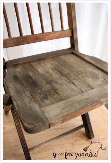
This poor thing was a little rough for the wear.  I suspect it was used in the garage as a workshop chair.  It had lots of oily looking stains.

garden chair seat before

Take a look at how dark those two front legs are.  They appeared to be almost saturated with some sort of oil.  Or maybe it’s just really greasy dirt.  I scrubbed the chair good with some TSP substitute (which is a de-greaser), and then I decided to just go for it.  Either I’d paint it and the paint would just all bubble off, or it would stick.  I was willing to take a chance on it sticking.  After all, the chair was a freebie.  It likely would have ended up in the trash if I didn’t take it.

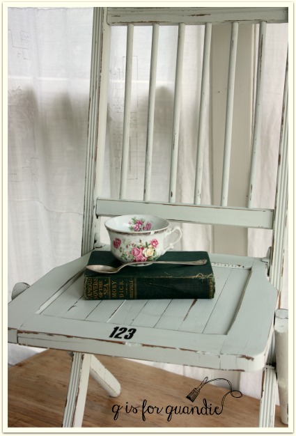
I pulled out the second sample color of Shabby Chic paint I received from Bungalow 47, Green Fields, which is a lovely pale, pale green.  I painted it on straight from the can without watering it down.  I somehow felt like I’d need a good thick coat of paint to cover this thing.

I was super impressed when two coats did the trick.

garden chair close up

Even on those legs!

garden chair leg

I was worried that those greasy stains would bleed through the paint, but I only had trouble with that in one spot on the seat.  If you were being very particular about your finish, this wouldn’t be good enough (in which case I would have used the Shabby Chic Clear Primer first) …

garden chair stain

But since I was going for a distressed look on this chair, I decided it was OK to leave that as is.  I specifically choose not to use the Shabby Chic Clear Coat this time around because I didn’t want to draw any more of those stains through the paint.  Instead I waxed this with Miss Mustard Seed furniture wax.

garden chair distressed

I could have gone without a top coat of any kind, but when I am distressing heavily like this I prefer to use a wax.  The wax darkens up those bare wood edges and makes them look more ‘believable’, like they have worn away over time, not just been freshly sanded.

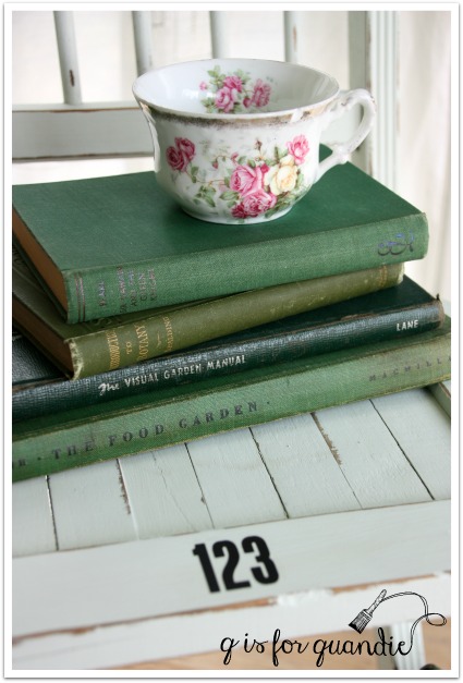
Did you notice that I applied some rub-on numbers to my chair?

garden chair books

I like the touch of whimsy that they add.

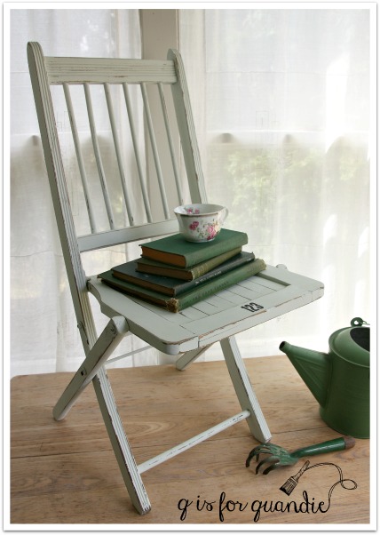
garden chair full

In the end, this chair is rather wobbly and most people would feel a bit insecure sitting on it.  It will have to be more for looks rather than function.  But I think it would be darling as a bedside perch for books.  Or use it in your potting shed to hold a stack of clay pots.  If you are local, this chair went to Reclaiming Beautiful last week!

french provincial.

I think there are three categories of blog readers.  First there are the ones who just look at the pictures, but don’t really read anything I write (come on, I know they are out there … but they probably aren’t reading this, so I’m safe).  Then there are those that read my text and look at the photos, hopefully finding both at least slightly entertaining.  The last category are those that also read the comments.  I know Mr. Q reads comments, as does my sister.  How about you?  If you don’t, you are missing out!  I have quite a few regulars that leave insightful and often funny comments.  By the way, if you don’t know how to read the comments, you just click on the little ‘conversation bubble’ that is to the right of the title of the post.  Hopefully there is a number in the bubble, because that is the number of comments.

You also might get a little sneak peek into my future projects by reading the comments.  In this case, I’m referring to a comment left a while back on one of my posts from Skip.  Skip was asking whether or not I’d be interested in some free furniture, all I had to do was drive to St. Cloud to pick it up (about 1.5 hours from here).  She later sent me some photos by email, and I was in!

Although originally Skip had offered me a buffet/sideboard and dining room table pair, when I got to St. Cloud she had a couple more pieces that she was parting with and one of them was this sweet little french provincial end table.

fp before

Of course I threw this in the truck!  I love those graceful legs and the pretty hardware.  I knew that some paint would help bring out its charm.

fp 1

See?

I knew exactly what colors I wanted on this one.  I painted the body of the table in Fusion’s Inglenook and the drawer front in Fusion’s Limestone.  French provincial, Inglenook and gold hardware make a great combo.  I figured this out last year when I painted this lovely french provincial piece …

french nightstand

I love the way this little table turned out.

fp 5

I distressed the edges just a little, because that’s the way I like ’em.  Plus I always feel like if your piece is purposely distressed, than a couple more unintentional distress marks will just blend right in.

fp 3

This table has a leather insert in the top.  I just painted right over it.  I’ve done this before using milk paint

fp top

Once the paint is cured (in about 21 days), I expect this to be quite durable.

I spruced up the hardware by adding a little gold rub ‘n buff.  You could get this same effect using the Gold Leaf Goat Stick (I just couldn’t find mine, I think it rolled under the cupboard in my Q Branch and I still need to dig it out).

fp 4

This little table is the perfect spot for your cup of tea.

fp cup of tea

Do you need a spot for your tea?  Check out my ‘available for local sale’ tab to find out if this piece is still available.

fp table collage

bloom where you are planted.

bloom where you are

I’m ending out the week with another garden themed post.  I have tulips, scilla and crocuses coming up in my garden.  Just you never mind that we got a snow storm on Wednesday!  It’s mostly melted now, so it’s safe to start thinking about what annuals to plant this year, what perennials need to be divided, which garden beds need to be revamped, and what new things can I use to ‘decorate’ my gardens.

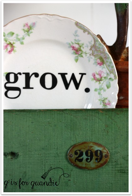
Along those lines, I’ve dropped off a load of garden decor items at Reclaiming Beautiful, including a whole new crop of plates with words.

grow plate in box

I did a few of these last year and they were a big hit, so I’m doing more.  If you’d like more details about how I create these, check out {this post}.

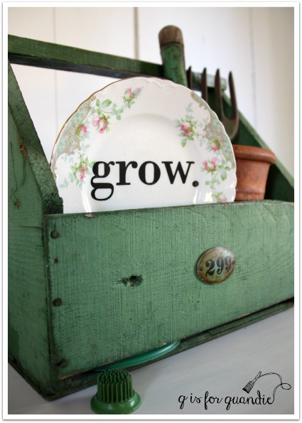
 You can tuck these plates into a wooden crate with some vintage garden tools for display in your potting shed or on your porch.  Or you can add them to a planter, like this example.

grow plate

 I kept this plate in my boiler pot window box all summer and the vinyl letters held up just fine.  I’ll be putting it back out again this year.

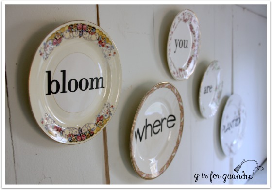
I found some sweet plates at an antique shop in Buffalo, MN a week or so ago when we went out there to see my niece’s school play, The Wizard of Oz.  These were perfect for turning into garden plates.

bloom plate

But these plates that I purchased at the Macalester Groveland neighborhood garage sale last year are my absolute favorites.

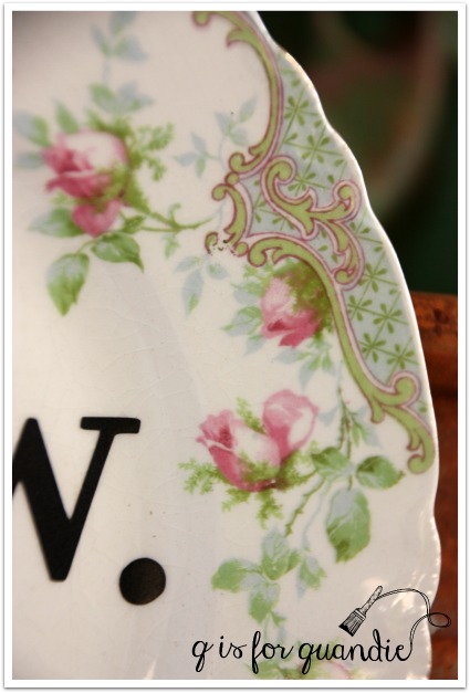
grow close up

Isn’t the detail on these plates just gorgeous?  And I just love the colors.

grow plate detail

How about hanging this larger platter outside your front door?

welcome plate

I’ve also done up a couple of garden quotes on plates …

bloom plates 1

earth laughs

After I took these photos, I switched out the font I used for the “flowers” on that last plate.  I wasn’t loving how that one turned out.  I don’t have a photo to share though, I forgot to take another one before I sent them off to the shop.

In addition to the plates, I’ve also added ‘grow.’ to this old enamelware pot.  I used a large nail and a hammer to pound some holes into the bottom of it so that it has drainage.  You could plant some bright red geraniums right in the pot.  Or perhaps you’re more partial to petunias!

grow pot

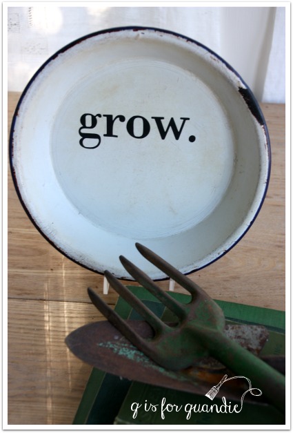
And this enamelware plate is probably my favorite of all.  I really was thinking about keeping this one.

enamelware grow plate

There’s just something about the rustic, farmhouse style simplicity of this one that appeals to me.  I can picture it added to a planter made out of an old galvanized tub, can’t you?

Are you starting to think about spring gardening where you are?

the potting shed.

Back in the day long before it became the photo cottage, the summer house in my backyard was known as the potting shed.

photo cottage

I actually had it all decked out with a workbench for potting up plants.  In reality, it did not make a very efficient potting shed.  Potting plants is messy work, I’m better off doing it right outside where I can just brush the dirt away onto the lawn.  Still, it was fun to stage today’s piece out there as though it still were a potting shed.

the potting shed

If I didn’t get so much use out of the photo cottage as is, I’d be tempted to turn it back into a potting shed now.

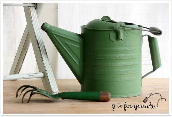
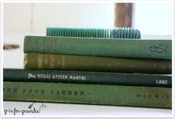
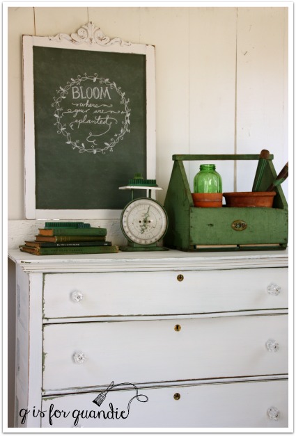
green garden booksI have lots of fab garden-y props, all in lovely shades of green.

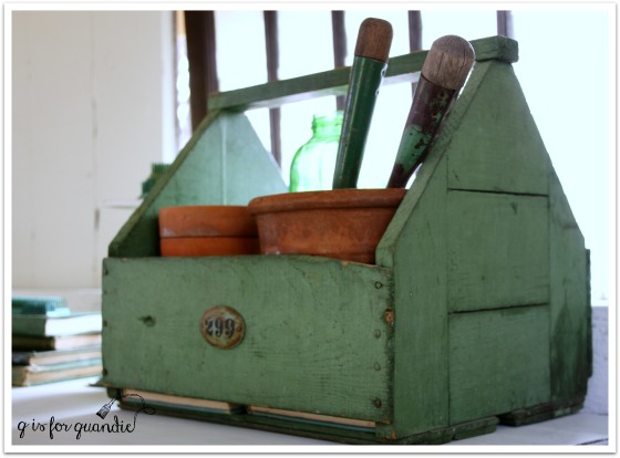
green scaleThis green box usually resides in my pantry holding cleaning supplies.

green garden box 2

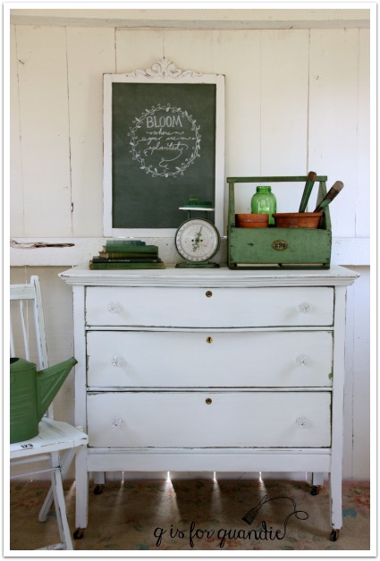
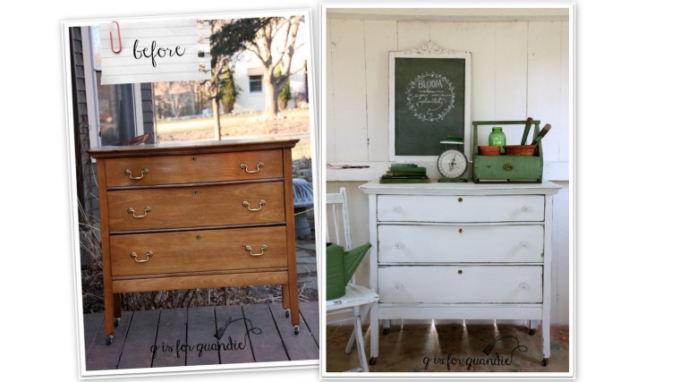
But the real reason for this post is the dresser.  This is another one that Mr. Q picked up for me via Craigslist.

porch swing before

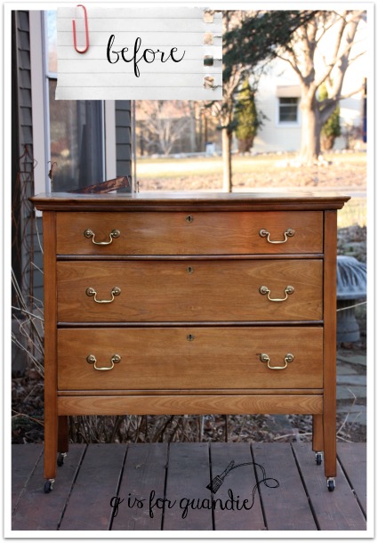
This was an interesting piece.  The style says ‘old’, and inside it looks old, but there were some things that were throwing me off.  For one thing, the casters are new.  The drawers pulls are new too.  And the finish was very plastic-y and shiny, like new.  Someone worked really hard to take the “old” out of this piece, which I found to be a little bit sad.  Obviously it was up to me to put the ‘old’ back in!

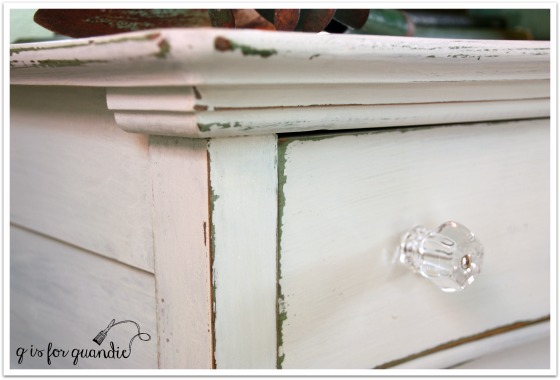
I got off to a bit of a false start with this one.  I painted it with Little Billy Goat’s Porch Swing, which is a lovely green (in fact, a very similar green to the wood box with the handle in my photos).  But it did not work out.  I’m still doing some research into where I went wrong, and when I have some answers I’ll share that with you.  In the meantime, let’s just say I knew I had to go back to the drawing board.  I decided to paint over the green with white milk paint.  I purposely added some wax around the edges first so that some of the white would chip away to reveal the green.  This is the same mix of MMS whites that I used on the chalkboard frame from Monday, by the way.

potting shed dresser close up

Perfection!  In the end, maybe this was meant to be.  Just a hint of green rather than a sea of green.

potting shed dresser angle

As you may have noticed, I replaced the brass drawer pulls with some glass knobs.  These are the 1 1/2″ glass knobs from D Lawless Hardware.  They are the larger size glass knobs, and I think the scale of these was just right for this piece.

potting shed dresser 2

potting shed dresser 3

I took about six hundred photos of this thing.  Some with the window …

potting shed dresser 4

Some with my false wall in place.  If you don’t know about my false wall, you can read about that {here}.

potting shed dresser 1

I think this dresser would be perfect in a farmhouse style kitchen, or maybe on a covered porch.  Or perhaps beside the bed in place of a nightstand.

potting shed dresser collage

This one is for sale (local sales only, no shipping available), so if you’re interested in more details feel free to leave me a comment or shoot me an email at qisforquandie@gmail.com.

going green.

First things first, congrats to Cindy Brown who won the pair of Goat Sticks from last week’s giveaway.  I will be getting those out in the mail to her this week, but now, on with today’s post.

One thing that I have definitely learned in my 52 years of living is that tastes change.  Or at least mine do.  I hope yours do too.  I’ve written about this before, like back in October when I painted a chair gold after having said a year earlier that I didn’t think I’d ever like gold.

I’ll be so sure that I am never going like something, and then it grows on me and the next thing I know, I love it.

Such is the case with green chalkboards.

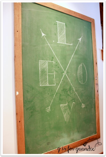
If you’ve read my blog for a while, then you know I love a good chalkboard.

chalkboard 2

Some people are starting to say that chalkboards are so over, but not me.

wall chair

Not only do I have a total of five at my house, but I often switch out mirrors for chalkboards and sell them to others who obviously still love chalkboards too.

Sometimes I make chalkboards out of foot boards …

chalkboard 1

Or out of doors …

q branch desk close

Or out of chairs …

q branch chalkboard chair

I like little chalkboards too …

plant a garden slate

But have you noticed something that all of my chalkboards have in common?  They are all black.  In fact, I’ve always thought green chalkboards just didn’t cut the mustard (pardon the pun that will be apparent shortly).  I even painted over a green one with black once.

Then a year or so ago I shared my friend Meggan’s house with you all, and she had a green chalkboard that looked pretty fab.

Meggan chalkboard

And that started me thinking that maybe green wasn’t so bad after all.

Recently Miss Mustard Seed posted the most amazing chalkboard.  Did you see it?  If not, check it out {here}.  And it’s green!  Apparently a green chalkboard does cut the mustard 😉

Her chalkboard is painted in MMS milk paint in a combination of Boxwood (green) and Artissimo (dark blue).  Wowza!  I love it!  Miss Mustard actually copied the recipe from Allison at The Golden Sycamore.  It’s 2 parts Artissimo to 3 parts Boxwood.  I just happened to have those colors on hand, so I knew I had to try this myself.

I started with a mirror that I had removed from a dresser.  The harp that held it in place had come apart, but even if it was still intact I probably wouldn’t have left it on the dresser.

garden chalkboard frame before

 I had taken the mirror glass out of the frame already, so all I needed to do was ask Ken to cut a piece of hardboard to fit the opening.

  Next I painted the mirror frame with MMS milk paint in a blend of whites (Linen, Grain Sack & Ironstone).  But wait, before we get that far, take a look a this …

green chalkboard frame before detail

Sometimes it’s just funny what people will do to ‘repair’ something.  Ken and I shake our heads over this sort of thing all the time.  Ken is always flabbergasted when people try to repair something with nails instead of glue.  I have to say that this example really takes the cake.

Anyway, I painted the frame in my mix of Mustard Seed whites (painting right over those nail heads).  I did not use bonding agent (would have been happy to get some chipping, but really didn’t) and I didn’t add a top coat of any kind.

green chalkboard detail

I also mixed up the ‘recipe’ for the chalkboard green and painted my hardboard.  I did three coats for extra good coverage.  Once dry, I sanded lightly to make it smooth and then I seasoned the chalk board by rubbing chalk all over it and then wiping it away.  And voila, I have a chalkboard!

green chalkboard

I used some of my new chalkboard skills to add a little spring-like message.

green chalkboard final

I’ve been in a green and garden-y mood lately, maybe since yesterday was the official first day of spring.

So stay tuned this week because there will be a few more garden themed goodies coming your way!

a quandie quickie.

I really enjoy quick little projects to just dress something up.  Improvements that don’t take long, but totally change the look of something.

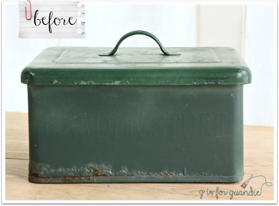
I purchased this green metal box a while back.  I liked the lid, and that the box was quite heavy duty, but I didn’t love the forest green color.  Not to mention the fact that it looked decidedly ‘spray painted’.

green box before

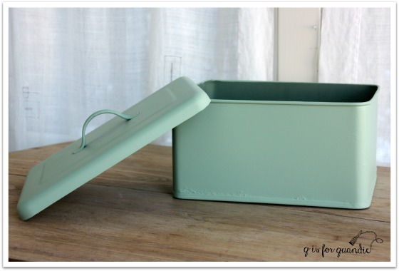
I knew this piece could benefit from a makeover.  I started by sanding it rather well.  Partially to allow the new coat of paint to adhere well, but also partially to remove that spray paint texture.  I then painted it with two coats of Fusion’s Lily Pond, a pretty paler green.

green box painted

Next I used sand paper to distress the box.  I distress almost everything I paint.  I think distressing is what brings an item to life.  It gives it a sense of history.  It keeps the piece from looking ‘freshly painted’ and too bland.  It has a secondary function that I also like.  When a piece is distressed it doesn’t matter down the road if it gets a few more dings.  They just blend in with the intentional distressing.

You can really see the results of the distressing on the lid …

green box lid

Once the box was distressed, I went over it with some of Fusion’s beeswax just to get a richer sheen and to protect the areas that I distressed down to the metal.

Next, I glued on an enameled number plate using some E6000.

green box after

This box could be used to store all kinds of things.  It’s a nice size for your extra toilet paper rolls in the bathroom.

green box for tp

I use boxes like these in my pantry to store things that aren’t in the greatest packaging on their own.  Things like cat food, kleenex, cleaning products, etc.

smile jar

This was such a quick and easy update!  Projects like this are perfect for the working gal like me, you can accomplish them in one evening between supper and bedtime, while doing a load of laundry in between coats of paints.  Multi-tasking at its finest!

This weekend I plan to do some serious multi-tasking.  I’m finishing up a dresser and a buffet, plus I have a couple of smaller projects to work on as well.  But first my sister and I are going to attend the anniversary celebration at Reclaiming Beautiful in Stillwater this evening.  If you didn’t see my post about that over on their blog, check it out {here}.  Maybe I will see you there!

Mar reclaiming beautiful

playing with crayons.

When I was a kid I always loved getting a new box of crayons.  Especially if it was the box of 64 with the built in sharpener.  You can probably guess some of my favorite colors; Sea Green, Robin Egg Blue, Cornflower.

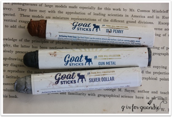
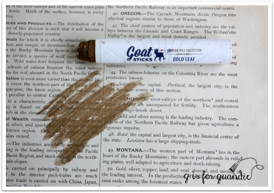
Well recently Allie from Little Billy Goat offered to send me some of their products to try out.  In addition to some paint and other supplies, she also sent me a bunch of their Goat Sticks.  What’s a Goat Stick?  It looks like a giant crayon …

goat sticks

But basically it’s a metallic wax (although there are a couple of non-metallic options as well) that comes in crayon form.

I used the Gold Leaf crayon on the knobs for my Lake Superior credenza.

ls knobs

Since the credenza already had some brassy gold trim on the top drawers (plus some brassy feet), I decided to stick with a gold metallic for the knobs.  I originally purchased these knobs from Hobby Lobby …

hobby lobby lucite knobs

They really looked fabulous on the credenza.  The gold worked beautifully with that trim.  But they simply wouldn’t stay straight, no matter how much I tightened the base, that lucite and gold cross piece would always continue to turn.  I could just imagine how annoying this would be to live with for the final owner of the credenza.  So they are going back to the store.

When those didn’t work out, I remembered that I had these arrow knobs (also purchased at Hobby Lobby).  But they weren’t gold, they were black-ish (they call it ‘bronze pewter’ on the Hobby Lobby website).  No problem!  I pulled out the Gold Leaf Goat Stick and got to work.

arrow knobs

To begin with you have to remove the hard outer layer on the Goat Stick.  You can sort of peel it away, but I just rubbed mine on some paper until I got to the softer wax underneath.

gold leaf goat stick

By the way, the Goat Sticks are self sealing after 24 hours, so you’ll do this each time you use it.

For my knobs, I then just ‘colored’ the gold right onto them with the crayon.  However, I then found that it needed some additional blending so I used a q-tip to blend the wax and smooth it into the groves of the feather tips a bit more.

blending gold leaf

Since the Gold Leaf was so much fun to play with, I decided to try some of the other colors that Little Billy Goat sent me.  I really love the Old Penny.  With copper becoming so popular, I’m sure this will be a top seller.  In hindsight, the copper would have been an awesome choice on my Lake Superior Blue credenza.

old penny goat stick

I experimented with Old Penny and a couple of other colors on some old lion’s head drawer pulls that I had on hand.

lion heads

That’s Silver Dollar, Gunmetal and Old Penny (from left to right).

I have to admit, I still enjoy playing with crayons!

One thing that I want to be sure and point out is that it takes about 24 hours for the wax to dry and seal itself.  When you first put it on it is malleable and blend-able … which also can translate to ‘wipe-off-able’.  When using it, be sure to blend it to the point where you like the result and then don’t mess with it for 24 hours because you can rub it off during that period.

In addition to metallics, the Goat Sticks also come in Cream and Saddle (a medium brown).  They can be used on wood, plastic, metal, paper and fabric.  You could use them on wood trim (I’m going to experiment with the Cream on some wood trim later this week).  There are so many possibilities for these.  If you are local, you can find them at Reclaiming Beautiful in Stillwater where they are priced at $14/each.  If you’re not local, check out Little Billy Goat’s site to find a retailer near you.

Or better yet, I’m giving away a Saddle and a Gunmetal.  So if you like to play with crayons too, leave me a comment by Friday at midnight and I’ll put your name in the hat to win this pair!

lake superior blue.

lake superior blue title

A little while ago I told you about the Fusion custom color contest.  After some confusion about when the deadline was for submitting colors, I can confirm that it has definitely been extended to March 31, 2016 (instead of February 29).  Which means I had some time to get my act together and submit a piece myself.

To participate in the contest, you have to create your own custom color by mixing together two or more existing Fusion colors.  Then you have to name your color and paint something in it.  Check out their Facebook page for more details.

custom color contest

When my sister was over for my hatbox party the other day, she played around with mixing some colors and she came up with a gorgeous dark teal blue by combining equal parts of Homestead Blue and Liberty Blue.

debbies colors

So I asked her if she wanted to team up with me to paint a piece to submit to the contest using her color and my painting skills.  We even went halfsies on the paint.  She had a jar of Liberty Blue and I had a jar of Homestead Blue.  We mixed our two paints until we got a color that we thought was perfect.  Our recipe ended up being 3 parts Liberty Blue to 2 parts Homestead Blue and it leans a little more towards blue than Debbie’s original half and half mix (although it certainly doesn’t look that way in the jar!)

lake superior blue

Debbie hadn’t come up with a name for her color though, so I gave it some thought.  I wanted to name it something that reflected our partnership, but also described the color.  I thought about our trip to Duluth last fall and came up with Lake Superior Blue.

vintage Duluth postcard

I knew this color would be the perfect choice for updating this piece …

lake superior before

This was another freebie from my friend Terri’s Uncle Don.  The finish was in terrible shape and the bottom drawer was completely stuck.  Poor Mr. Q spent quite a long time getting that thing out.

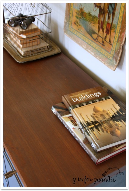
Although the top of the credenza had numerous stains (I think someone probably kept house plants on it at one time), I decided to attempt to stain it rather than paint it.  I wanted the warmth of some wood to pair with the cool Lake Superior Blue.  The existing finish on this one was so dried out that I was able to easily sand it off with just a couple of passes with the palm sander.  Also, it was so nice out last weekend that I was able to work on it right there outside on the deck so creating a bunch of dust wasn’t an issue.  I sanded it down first, then I decided to try bleaching some of the heavier stains.  I used a q-tip to apply bleach just to the dark stains, then left the piece out in the sun for an hour or two.  Then I sanded some more.  I wasn’t able to eliminate all of the stains entirely, so I stained the top with in a dark walnut to camouflage them a bit more.  I then added a wipe on poly in a satin finish.

ls top

This was the darkest stain and although I didn’t remove it entirely, in the scheme of things it blends in fairly well.

ls stain mark

Here are the knobs that I ended up with on this piece.  It took me a while to land on this choice.  I’ll be posting more detail about this choice on Wednesday, so be sure to check back!

ls knobs

That brings me to the trim detail on the two upper drawers.

That’s metal.  I debated removing it and filling the groove with wood putty, but I think it would have been difficult to disguise it completely.  I also considered just painting over it.  The Fusion would have stuck to it, and that would have been a very reasonable choice.  But ultimately I decided to work with it.  It was a brassy gold to begin with, but I added some gold rub ‘n buff to give it a more of a gold leaf look.

ls front

I purchased this India board game box on eBay many years ago.  The colors worked beautifully with the credenza, but I had a lot of trouble with glare on it in my photos.  I originally tried hanging it on the wall, but for some of the shots I had to angle it in strange ways in order to not just get a shiny blank in the photos.  So for some final shots, I just took it down from the wall.

ls India

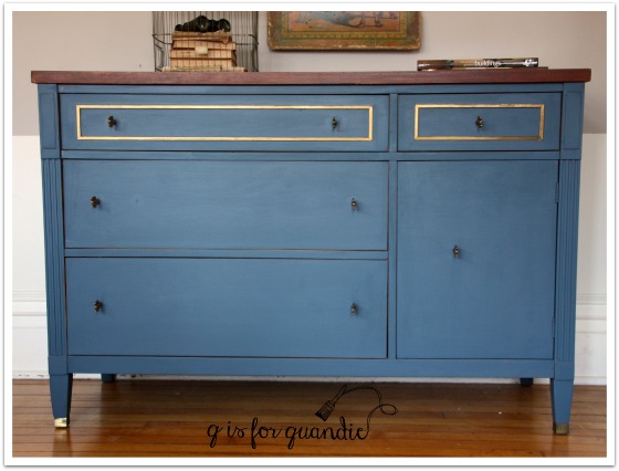
And voila!  Here is the Lake Superior Blue credenza!

lake superior blue credenza

What do you think of our Lake Superior Blue?

Voting for the contest begins in April so I may have to call on you guys to go and vote for us!

Sharing at Friday’s Furniture Fix!

a shabby stool.

I’m always a little sad when I find an already shabby, painted piece that is just not quite right.  Let’s face it, as much as we try to recreate an authentic chippy, shabby, aged finish using all of the fabulous products available to us, we are still only approximating the look of a genuinely aged piece.  But those genuinely aged painted pieces are hard to come by.  If they were a dime a dozen, people like me would be out of work (or out of a hobby might be more accurate).  And when we do find them, many times they cross the line from fantastically shabby chic to just plain shabby.

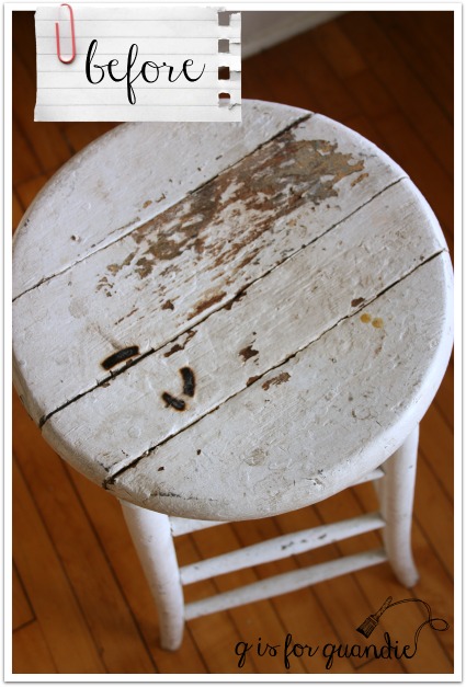
shabby stool before

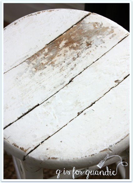
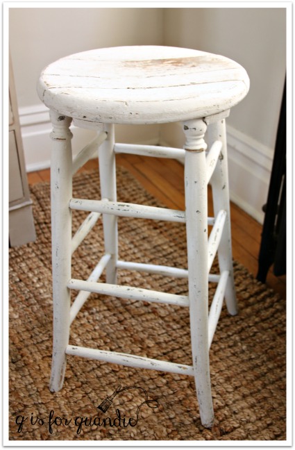
Such was the case with this stool.  It’s so close to being fabulously chippy, but darn those cigarette burns!  They just aren’t charming at all!  I had to deal with cigarette burns once before (on this piece) and they can be seriously frustrating.  On that earlier piece I sanded and I bleached, and in the end I used a dark stain to try and disguise them.  On this stool I went in a different direction.  I wanted to clean things up just a bit, without losing the chippy vintage paint job entirely.

First I pulled out the Fusion Colour Blocker, which I just discovered has a new name, Concealer.

Fusion color blocker

Just so you know, this product is not a stain blocker or a primer.  Concealer is made from 100% recycled waste pigments.  It costs about half as much as the paint.  The idea is that when you want to paint a dark piece white, you can start with a coat of two of Concealer first and then follow that up with another coat (or potentially two) of your final shade of white thus saving some money on your paint costs.  In my case, I used this product much like its name implies.  I used it to conceal those black burn marks.  I used a small brush and put about 4 coats of Concealer just over the marks.

Once the Concealer was dry, I mixed up some random Miss Mustard Seed whites.  I had several already opened pouches with just a little powder left in them, so I mixed up about a tablespoon each of Ironstone, Grain Sack and Linen.  I painted on two coats of milk paint.  I did not paint carefully or try to fully cover the entire stool.  In fact, I specifically avoided the large area of chipped away paint on the top of the stool.  One the milk paint was dry, I sanded the stool fairly haphazardly to ding it back up again.

And voila!

stool after

Burn marks are gone, gross drippy marks are gone … but the shabby looks is retained.

stool

I’m choosing to forgo a top coat of any kind on this stool.  I want to see how the milk paint wears over time without one.

stool 2

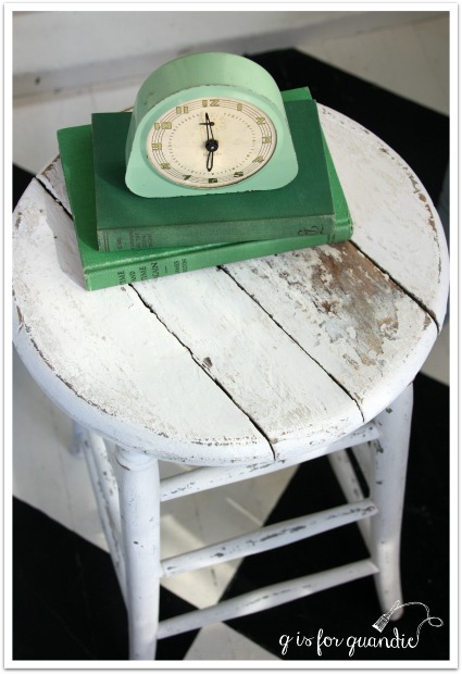
So, the next time you see a painted piece that has crossed the line into just plain shabby, consider giving it a milk paint makeover!

stool with books and clock

two degrees of separation.

two degrees title

You’ve all heard of the concept of six degrees of separation, right?  This is the theory that absolutely everyone is connected by no more than six other people.  This led to the game “Six Degrees of Kevin Bacon”.  Any other Footloose fans out there?

Well anyway, today I am officially two degrees of separation away from one of my earliest decorating idols, Rachel Ashwell!

ashwell

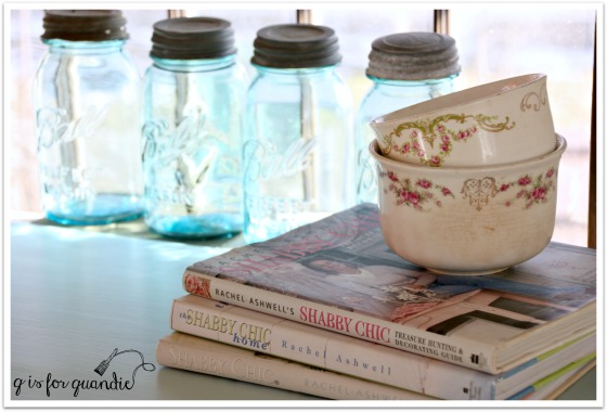
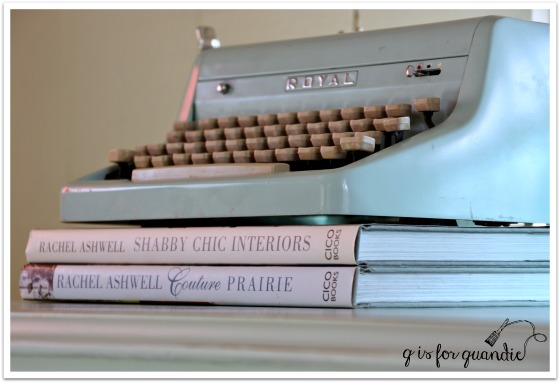
Yep, I’m definitely a fan from way back …
ashwell books 2

I’ve got all of her books …

ashwell books

And now we are separated by just two short degrees!

A while back I was contacted by Chantelle from Bungalow 47.  They are the distributors for Rachel Ashwell’s new line of chalk and clay paint.
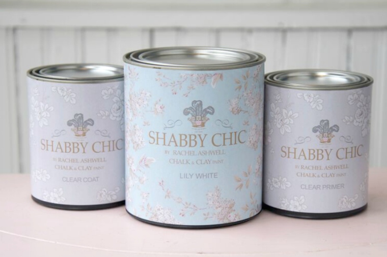
ashwell paint

She asked if I would be interested in sampling this new line of paint products.  My answer was “Um, YES!  Where do I sign?”  After all, Rachel’s shabby chic movement was what prompted me to begin painting furniture in the first place!

So I picked out a color, Caribbean Sea, and Bungalow 47 sent it off to me along with a can of their Clear Primer and their Clear Coat.

The next step was trickier.  It was finding just the right piece to paint!  I hemmed and hawed, and went round and round with myself.  I had a couple of dressers lined up to paint, including the ‘battle scar dresser’ from last week, but none of them seemed “Rachel” enough.  I also knew that I wanted to add some vintage wallpaper into the mix, so I needed a piece that had a spot for wallpaper.  I debated painting my own armoire, but decided it just wasn’t ‘vintage’ enough.  And then I came across this piece …

ashwell dresser before

A lovely linen press with two doors in front that would provide the perfect spot for some vintage wallpaper.  It looks as though at some point these doors had embellishments of some kind on them.  You can see a ghost of them, but whatever was there is long gone.

Painting the dresser was a breeze.  I followed my usual m.o. of cleaning my piece with some TSP substitute first.  Then I painted my first coat of paint straight up out of the can.  Once dried, I could see that I needed just a light second coat to get perfect coverage.  Bungalow 47 suggests dipping your brush into the paint first and then into water to get a thinner coat of paint, but I went ahead and actually poured some paint into a small container (another empty Talenti ice cream container if you must know) and thinned it out by mixing water directly with the paint.

After the second thin coat, the coverage was perfect.  Rachel Ashwell Shabby Chic paint is a chalk and clay paint, and much like other chalk paints it dries to a very matte finish.  At this point I had some options about a top coat.  According to the instructions from Bungalow 47, I could have gone without a top coat if this piece didn’t need much protection from wear.  In that case their instructions are to buff the finish with a clean dry towel.

I also could have waxed this piece.  The Rachel Ashwell line doesn’t include a wax yet (they are working on developing one), but you can use another brand of wax with it.  The Miss Mustard Seed wax is my personal favorite.  But I’m all out at the moment.

So in the end I decided I should just try the Rachel Ashwell Clear Coat since they had taken the trouble to send it to me.  I don’t normally use a clear coat, so I have very little experience with them.  Chantelle had warned me about the potential for water based clear top coats to draw stain from under paint.  Are you aware of this?  I was not.  I should have listened to her when she explained this the first time, but you know me, I always prefer to learn things the hard way!  So, I went ahead and added two coats of Clear Coat to my dresser.  The next evening I proceeded with adding the wallpaper to the doors (to read more about how to wallpaper furniture, check out this post).  As I was doing that I noticed that there was some discoloration around the edge of one of the doors.  I thought maybe I’d gotten a little messy with the wallpaper paste, but then it wouldn’t wipe off.  A closer inspection revealed that I did indeed have stain bleeding through my paint.
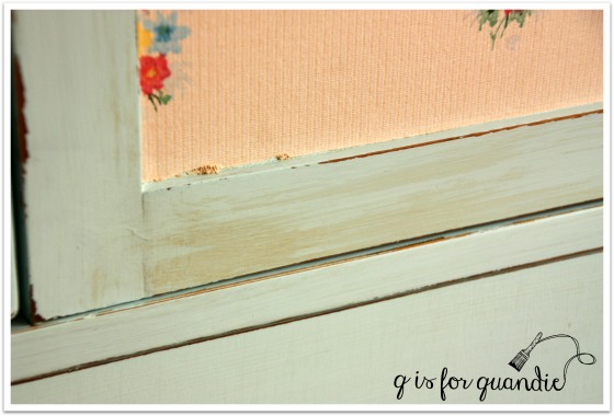
ashwell stain bleed

The next day I ran home on my lunch break from the day job so that I could inspect the dresser in the light of day.  Sure enough, I had stain bleed thru in a few other spots too.  Yikes!

Luckily all was not lost at this point.  You can use the Clear Primer to solve this problem.  I painted a coat of the Clear Primer over the areas where I had bleed thru.  In my case, this was just on the sides and the right door of this piece, the top and the drawer fronts were fine.  Once the Clear Primer was dry, I painted another coat of paint, and then finished with another coat of Clear Coat.  Problem solved.
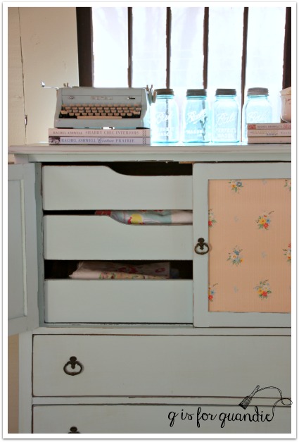
ashwell linen press cornr

So here’s the thing, even though I had to learn about this the hard way, you don’t have to!  You can just pay attention now and not make this mistake yourself.  Here are your options:

Option no. 1 –  Just start out with the Clear Primer.  If you know you are going to use Clear Coat or a similar water based sealer, then seal your piece first.  In addition, if you have a piece that you are pretty sure is going to be a bleeder even without the Clear Coat, one with a very dark stain, or a very red stain, just hedge your bets and start with Clear Primer.  Yes, you can also use shellac or a stain blocking primer for this purpose.  The benefit of the Clear Primer over shellac is that it can be cleaned up with soap and water and it isn’t as stinky.  The benefit of the Clear Primer over a stain blocking primer such as Zinsser or Kilz is that it’s clear.  If you are going to distress your piece, you probably don’t want to see a white primer underneath your paint color.

Option no. 2 – Wax your piece instead of using Clear Coat.  If your piece is painted and there is no bleed thru yet, you will be fine with wax.  The wax will not draw out the stain if it hasn’t already bled through.  The downsides of wax are that it takes some elbow grease to apply and it is not as durable as a clear coat.  If you are working on a dresser or similar piece of furniture that isn’t going to be subject to a lot of wear, wax is awesome.  Personally I prefer wax over other top coat options most of the time.

So, to recap, Clear Primer and Clear Coat together, or wax.  Got it?  I know I do now!

And after all of that, what do you think of the finished dresser?
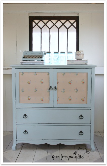
ashwell linen press

Oh, and hey, did you notice?  Anybody?  I’m back in the photo cottage!  Spring has sprung here in Minnesota, for the moment anyway.  The snow has mostly melted and I can be out in the photo cottage without freezing my buns off.  It’s always a happy day for me when I get to head out there again.

By the way, I call this piece a ‘linen press’ because of the drawers that are behind the doors.
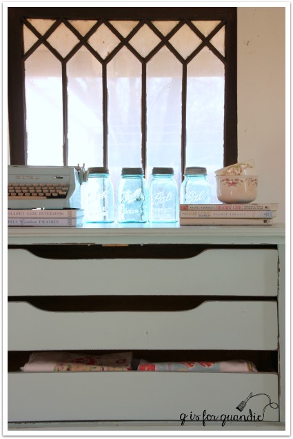
ashwell linen press interior

Once upon a time I read somewhere that these drawers were intended for storing linens and these pieces are called linen presses.  I kind of love that name, so I go with it.  I love the idea of storing one’s linens in a piece like this rather than in a closet in the hallway.

ashwell linen press angle

Did you notice that this color is almost exactly the same color as my new favorite vintage typewriter?
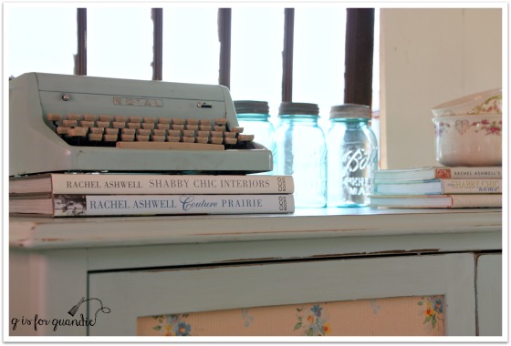
ashwell blue

There are 9 other equally lovely colors in the Rachel Ashwell line up.

ashwell wallpaper

If you are interested in learning more about the Rachel Ashwell Shabby Chic paint line, or if you’d like to order it online simply visit Bungalow 47.

If you are local and are interested in purchasing this lovely linen press, leave me a comment and I will email you with the details!