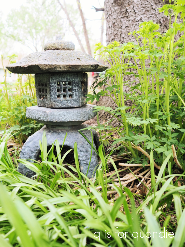
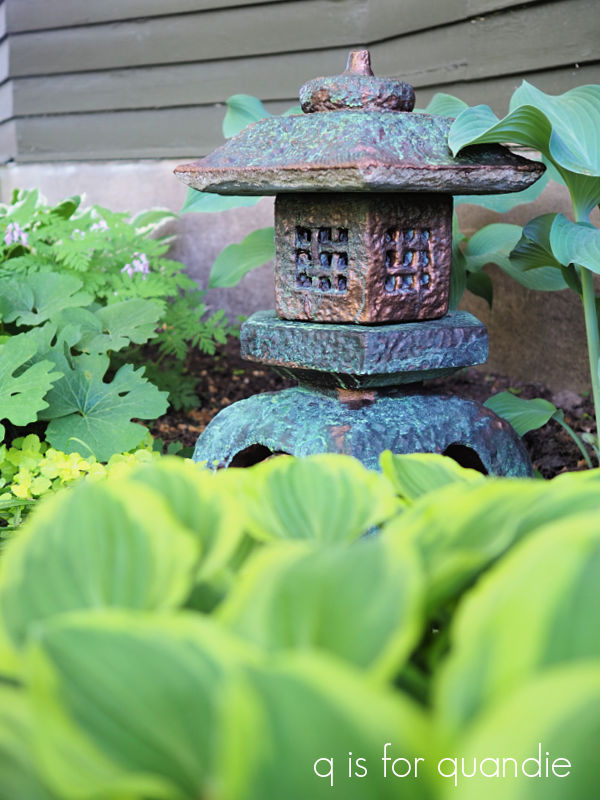
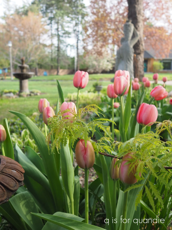
If you’ve been following me for long, then you’ve seen my fairy garden bird bath.
This was basically a miniature garden planted in a cracked concrete birdbath that I purchased at a garage sale. It didn’t hold water anymore, so that made it perfect for planting in. I’ve shared it many times, even decorated for fall.

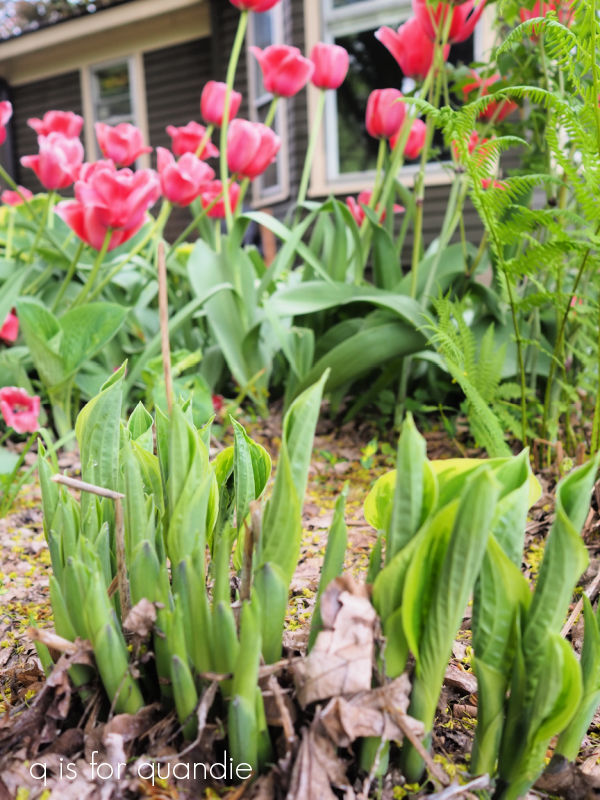
It had a few really nice miniature hostas and a miniature Barberry that reliably survived our Minnesota winters as long as we buried the birdbath top in a pile of leaves up against the house for the winter.
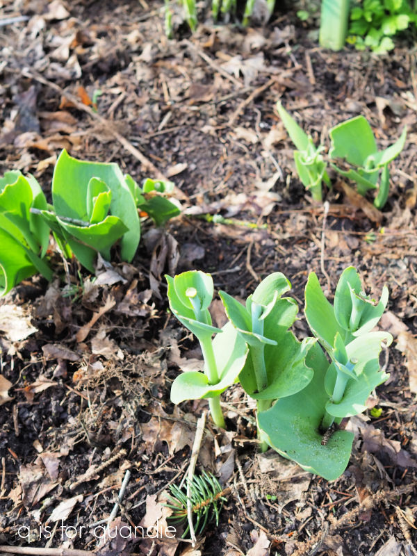
Unfortunately, I somehow missed doing that last year. So here’s what survived …

Yep, that would be zilch. As a sidebar, in order to survive the winter in a pot (rather than in the ground) a perennial needs to be zoned two zones colder than your normal zone. In other words, since I’m in zone 4b, I’d need a plant zoned to 2 or lower.
But you know what, that was all the motivation I needed to push me to expand the fairy garden. Well, that plus the cute little fairy house that my sister gave me for Christmas.

I knew I didn’t have enough square footage in the birdbath to accommodate the house.
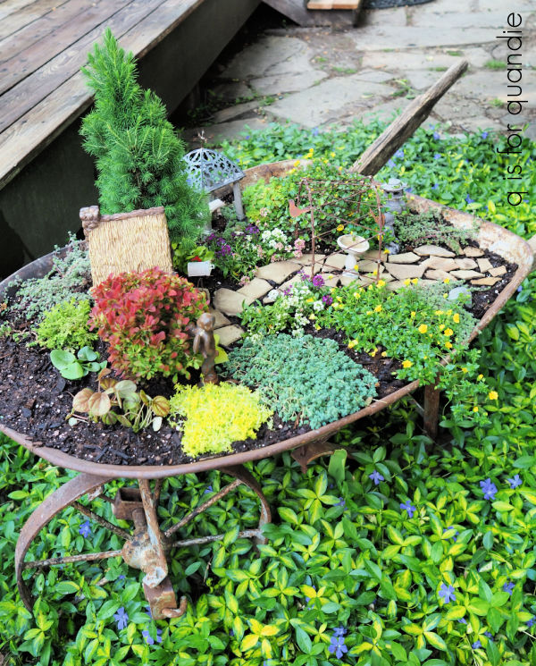
I’d been thinking about using a run down old wheelbarrow that we had in the garden for exactly this purpose, but it needed a little help first.

I asked my handyman neighbor Ken to help me shore it up. It didn’t need to be functional as a wheelbarrow, just sturdy enough to sit upright. So he basically used some screws to hold the wooden handles in the appropriate place, and then we drilled out some drainage holes in the bottom.

Today’s q tip; you ALWAYS need drainage holes in outdoor planters! If you’re turning some sort of vintage vessel into a planter, be sure to drill some holes in the bottom if it’s going to be outside.
So once that was done, I placed the wheelbarrow in a patch of vinca and filled it up with potting soil.
Then came the fun part, planting the garden.

I’ve been to a bunch of nurseries around my area looking for just the right plants for my garden in miniature, so I can’t exactly remember where I got each individual plant. But I can tell you the names of most of the plants in case you what to create your own fairy garden.
First up, I planted ‘Easter Bonnet Mix’ alyssum on either side of the path.

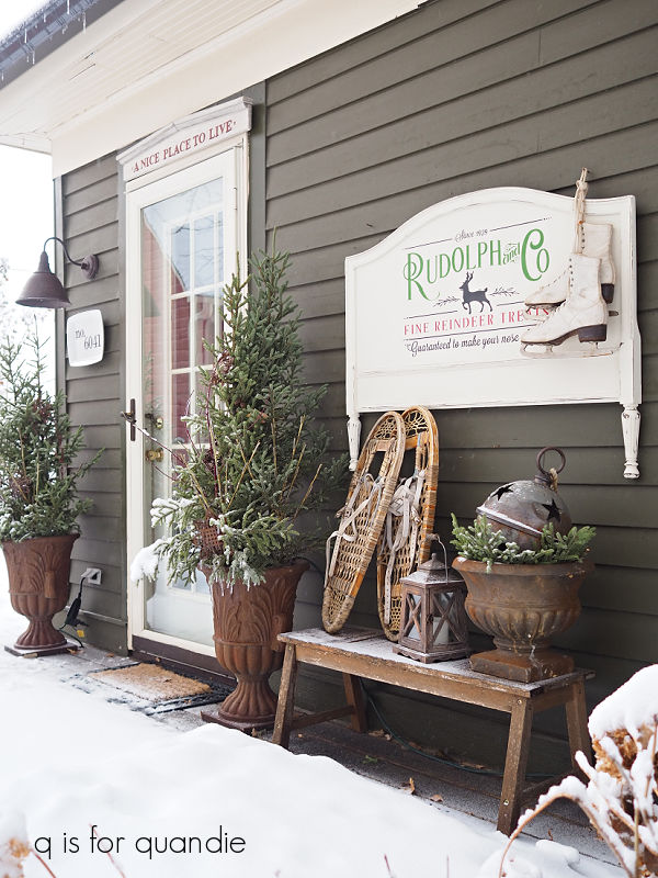
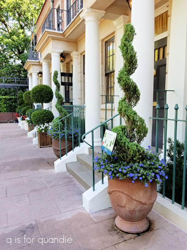
I got this idea from the model train garden in the Germany pavilion in Epcot. I’ve never really been a fan of alyssum in the garden, but I’d never thought about how perfectly miniature it is until I saw it being used there.
The plant with the tiny yellow flower is Golddust Mecardonia from Proven Winners.

It also has a tiny bloom that is perfect for a fairy sized garden.
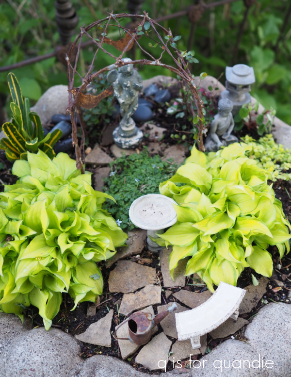
I’ve been planting a wire vine on the metal arbor for years.

It has tiny little leaves that are the perfect size. I have to periodically weave it up and over the arbor though, it doesn’t climb by itself.
The buddha and his lantern are sitting in a patch of woolly thyme.

Some of the other small plants I’ve used include Sunset Velvet oxalis, Golden Oregano, some small sedums, and a couple of small unidentified plants from the fairy garden section at Bachmans.
Also, thankfully, when I last divided the miniature ‘Feather Boa’ hosta in my old fairy garden, I put a few chunks of it in the ground near the potting shed. So I was able to dig one back up to put in my new fairy garden.
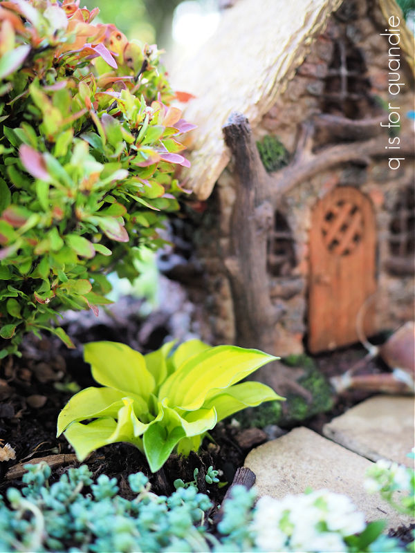
Since I’ve placed the wheelbarrow in the sunniest spot in my entire garden, I realized that I needed to provide some ‘shade’ for that hosta. I looked high and low for fairy garden sized trees or shrubs and was totally striking out. Two of my local nurseries, Bachmans and Rose Floral (in Stillwater, MN) always used to have them. But I noticed that they disappeared during Covid and they haven’t come back at either place. They still have other small plants, but no tiny evergreens or shrubs.
Oddly enough, I ended up finding some that would work at Lowe’s. The evergreen tree is a Dwarf Alberta Spruce.
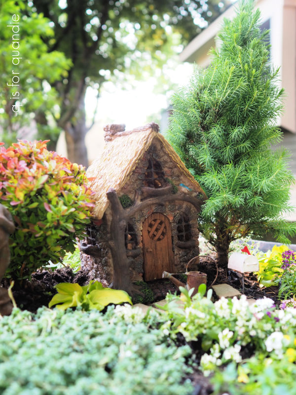
The average mature size is 3′ to 4′ tall and wide, but I’m hoping to keep it smaller with regular pruning. I also trimmed off some of the root ball when I planted it to encourage it to stay small. In addition, there isn’t a ton of room in that wheelbarrow for roots, so hopefully that will discourage too much growth, but not kill the tree.
It was only $11.98 though, so if it doesn’t survive I’m not out a lot of cash.
The bush on the other side of the house is another barberry, a Golden Ruby.

It’s potential full size is 2′ tall and wide, so I gave it the same treatment as the tree, pruning both the top and the roots.
Naturally, after I had the tree and bush planted, my neighbor nnK texted to let me know that the Abrahamson’s Nursery in St. Croix Falls has a big selections of fairy garden trees and shrubs. So if any of you locals are also looking, check Abrahamson’s. They have several locations in the St. Croix valley.
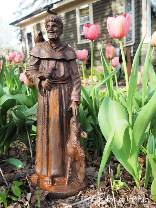
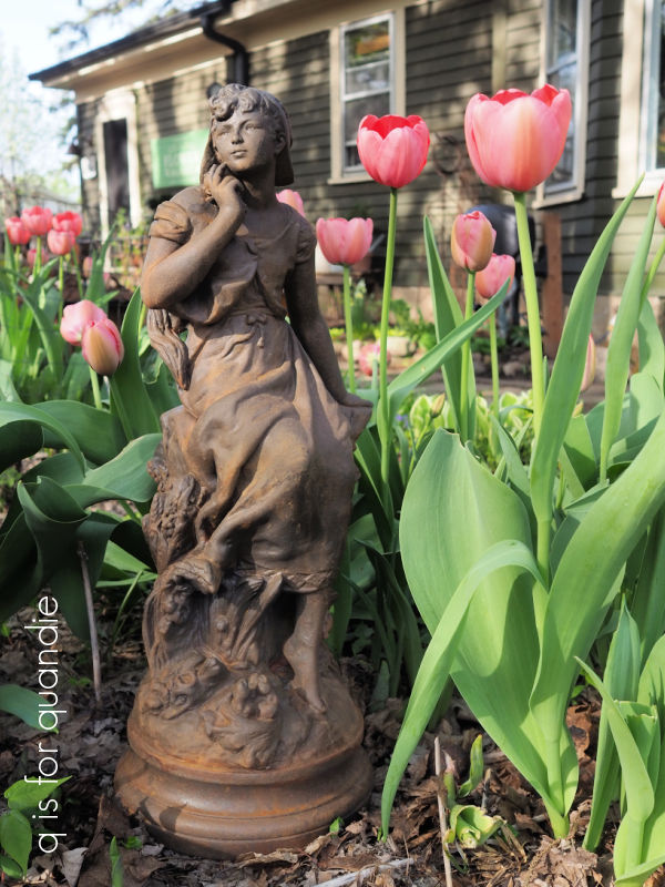
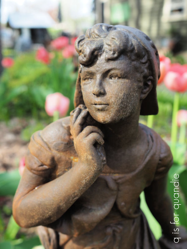
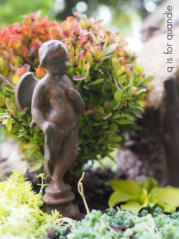
I wonder if any of you remember that I mentioned potentially trying the Dixie Belle patina paint rusty look on my little angel statue last year? It was looking rather shabby, so I did rusty it up using the Iron paint and the green spray (for all of the details on using that product, check out this post).
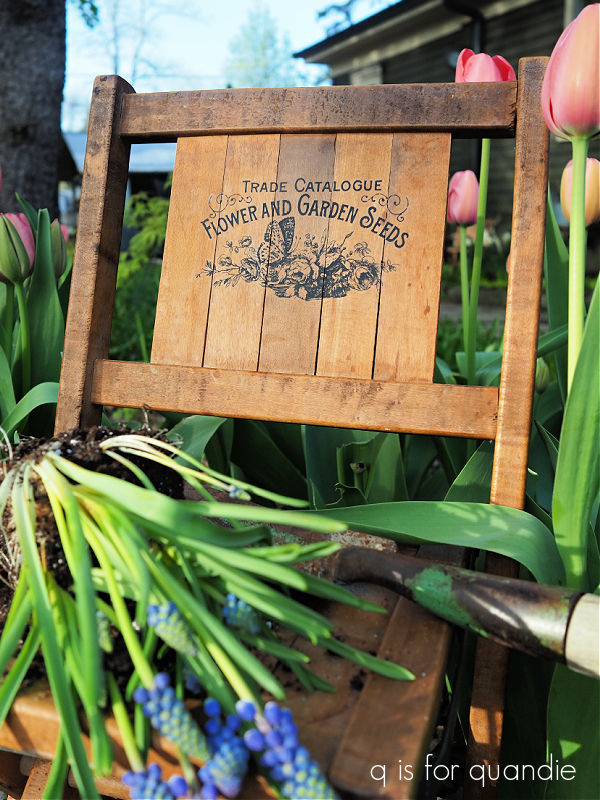
I added the path using thin slices of flagstone that have broken off my full size flagstone patio.
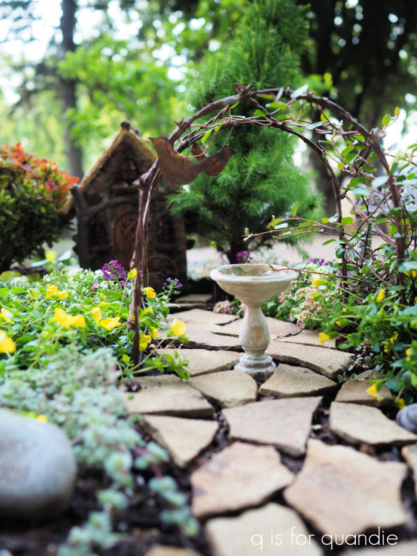
I’ve had this little pavilion for several years now, but my old birdbath fairy garden wasn’t big enough for both the pavilion and the arbor, so I used to switch it up every other year or so.
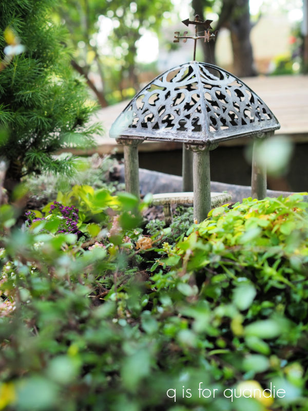
Now I can fit both of them in.
One fun thing about fairy gardens, you don’t need a drone to get good aerial shots.

I had lots of fun creating my garden in miniature. It’s so much easier to plant a tree when you can just pick it up and move it with one hand, and weeding it takes no time at all.
It’s also much cheaper than it would be to create a full sized garden from scratch. Although, that being said, I probably spent somewhere around $100 for all of those mini plants.
Now, as long as the squirrels don’t decide to start digging stuff up, I think the new fairy garden is good to go. I’m looking forward to seeing it fill in over the summer. And I have about 5 months to figure out how I’m going to protect it in winter.
Have any of you got a fairy garden? Or perhaps I’ve inspired you to create one now? It would be the perfect solution for those of you who only have a small space for gardening. Leave a comment and let me know.


 I also added a few rusty spots to him using the Iron paint with the green spray.