the crocodile suitcase.

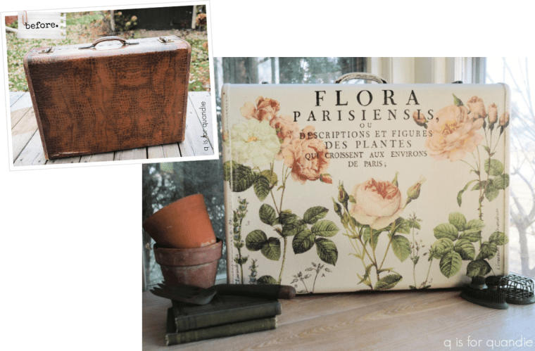
I’ve had this faux crocodile suitcase in my stash for quite some time.

As you can see in the lower left corner, it’s a little beat up.  It’s also one of those cases that are tapered, so it doesn’t lend itself to stacking because it becomes an angled surface when you lay it flat.

So I couldn’t really add it to my stack of vintage cases.

So I decided to paint it up to include at my occasional sale this summer.

After giving it a good cleaning, I applied two coats of Dixie Belle’s Drop Cloth.  I painted the handle as well, but not the rest of the hardware.

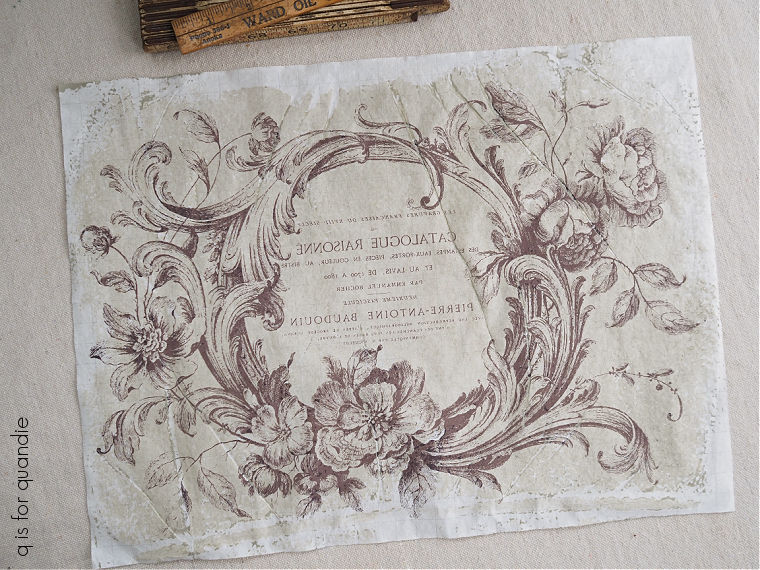
Then I went through my stash of transfers to see what I could add.  I ended up choosing the I.O.D. Flora Parisiensis transfer.

I had to cut it up and rearrange it a bit, overlapping some of the elements, to fit my suitcase.

But that wasn’t difficult.

Once I had the transfer on, I went over it gently with one of Dixie Belle’s 220 grit sanding sponges to both distress the transfer and to bring back a little bit of that crocodile texture.

I finished everything off with some of DB’s clear wax.

This suitcase would be perfect for extra storage of things like Christmas decorations, or even off-season clothing because it does not have a musty fabric lining.

This interior is easy to wipe clean.

I have to admit, using a $30+ transfer was probably not a wise investment for a vintage suitcase that I plan to sell.  It’s unlikely that I can charge more than $45 or so for it.  In other words, I’m not expecting to make much of a profit, if any at all.

But I have an embarrassingly large stash of unused transfers that I’ve had on hand for a while.  Many of them are several years old or more.  At this point I think it’s wise to just go ahead and use them.  It’s not like I’m making any money on them sitting in my cupboard.

What I really should do is quit buying more!  But I can’t seem to help myself.  However, if I enjoy revamping items with them, and in the end I’m not actually losing money, I count that as a win.  For those of you who may actually have to make a living at this, then this probably isn’t a good idea for the use of an expensive transfer.

I also used this transfer on a tackle box last year, and I didn’t regret it one bit.
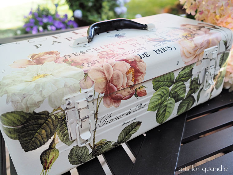
So if you’re just creating for your own enjoyment, I say go for it!

I think this suitcase turned out lovely, but I think whether or not it’s an improvement will be a matter of personal preference.  I’m sure some of you may prefer the original faux crocodile look over this floral one.
What do you think?
when will I learn?

I can’t even begin to tell you guys how often I make the same mistake more than once.

You’d think I’d learn from my mistakes the first time around, but that is definitely not always the case.  Today’s project is a good example.

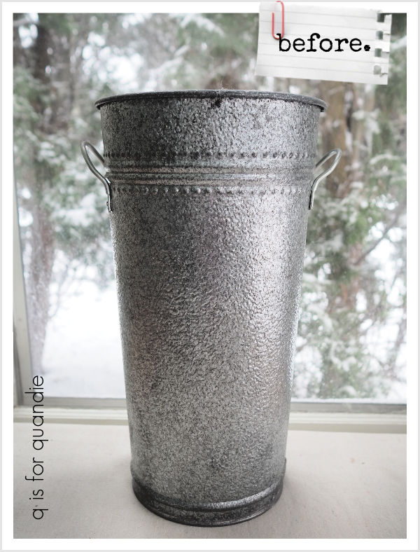
I think I found this flower bucket at the Goodwill.  Or maybe it was a garage sale.  I really don’t remember.

It’s a nice solid galvanized metal (not the flimsy ‘new’ sort of stuff).  I knew it could benefit from a paint job though.

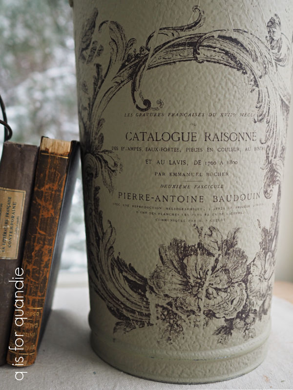
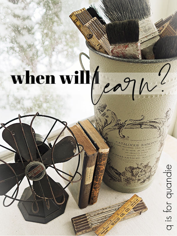
So after giving it a good cleaning, I painted it with Dixie Belle’s Dried Sage.  Over time I have learned that chalk style paint is your best bet over metal like this.  It really doesn’t need any extra primer to help it stick.

Once I had the paint on I went through my embellishments to decide what to add.

I considered using a simple transfer, like I did on this flower bucket.

Or the one I just brought home from thrifting …

Or this one …

But as I was going through my stash I remembered the gorgeous paint inlay from the I.O.D. Melange set that I used on the trunk on our front porch last summer.

It looked like the perfect fit, and I’d only used it the one time so I should have been able to get a 2nd use out of it (like I did on the wooden box I shared earlier this week).  I knew it would be a bit more faint the 2nd time around, but I forgot to factor in whether or not it would work well over the Dried Sage paint, which is a bit on the darker side.

I do think this could have worked over a lighter shade, like Drop Cloth.  But it was really just too faint over the darker color.

That being said, other than the very faded look of it, I loved this design on the bucket.  And I just happened to have a 2nd set of the Melange inlay on hand.

So I scuff sanded over the faint inlay just to smooth out any texture, added another two coats of the Dried Sage, and then tried again with the fresh new inlay.

Ahhhh, so much better!

I just love it.

I did save the used paint inlay …

and maybe next time I’ll remember to use it over Drop Cloth!

Once the flower bucket was dry, I gave it a quick spray with some Rust-Oleum matte spray sealer to seal the inlay.  Once that dried, I went over it again with some clear wax.

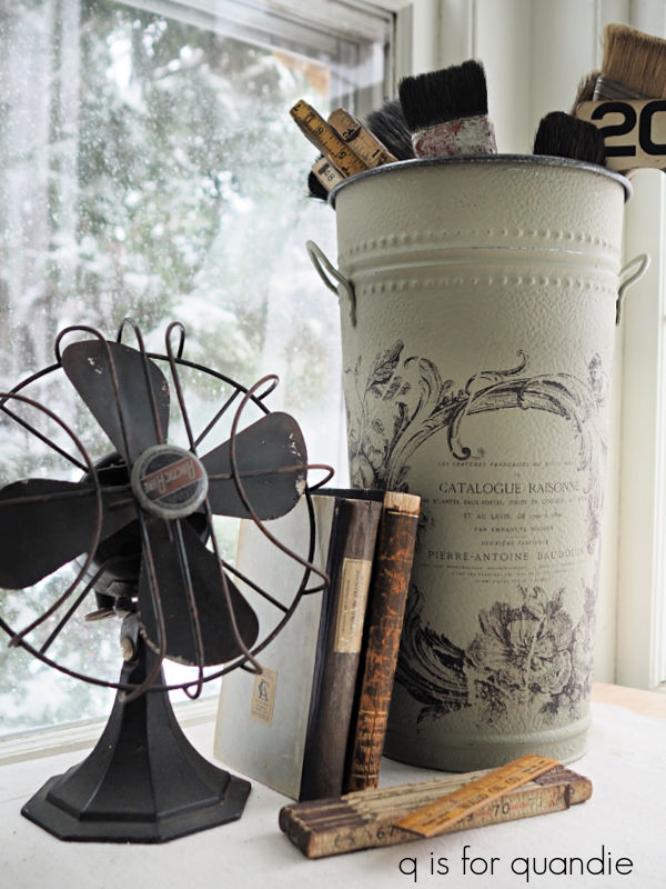
I filled it up with some old paint brushes and some vintage wooden rulers for my photos.

But I really think it would be perfect for some dried hydrangeas.  Unfortunately, I didn’t harvest any this past fall because at the time I couldn’t think what I would use them for.

I guess that makes two lessons learned from this project.  First, don’t re-use a paint inlay over a darker color and second, always dry your hydrangeas, you never know when you’ll find a use for them!

In other news, my sister and I are off to visit our mom again.  But this time around I have some blog posts pre-scheduled to keep you entertained while I’m gone.  So be sure to stay tuned!

better safe than sorry.

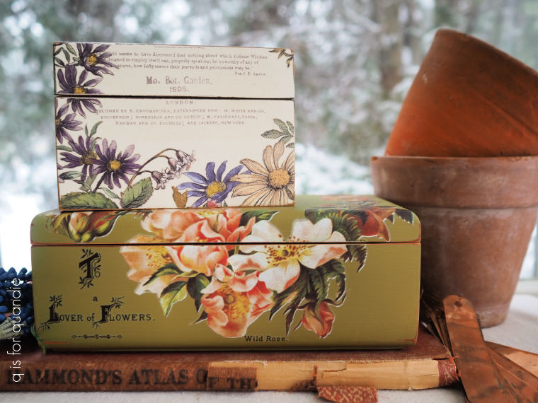
Today I’m bringing you a wooden box makeover.  Actually, two wooden box makeovers.

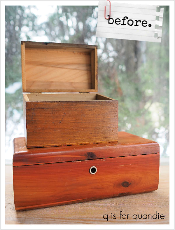
These two have been waiting patiently all winter for a makeover and I’m finally getting around to them.  The box on the top is a small recipe card holder and the bottom box is one of those cedar Lane boxes that were given away to girls graduating from high school from the 1930’s through the 1980’s (read all about that here).

After giving both boxes a scuff sanding and good cleaning, I gave each two coats of Dixie Belle’s clear B.O.S.S.  They were both pretty orange in color and I was worried about the potential for bleed-thru.  I’ve run into bleeding boxes before, so ‘better safe than sorry’ so I simply started with the B.O.S.S.

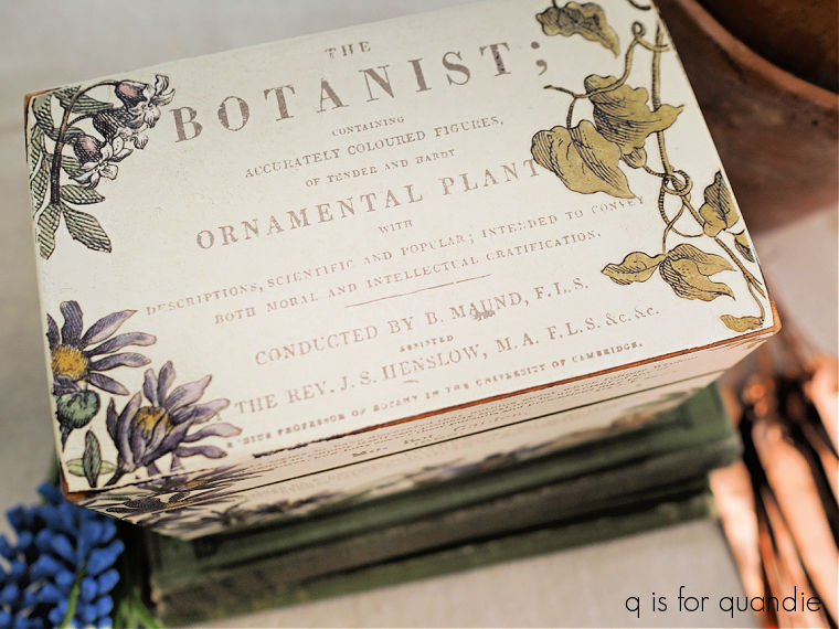
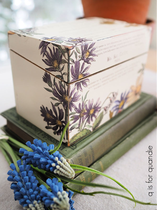
Next up I painted the smaller box in Dixie Belle’s Drop Cloth, and then I applied a section from the I.O.D. Melange paint inlay.  This was my 2nd use of this section of the inlay, I first used it on a similar recipe box back in December.  Here’s a picture showing that first use of the inlay for comparison purposes …

I.O.D. says you can re-use their paint inlays 2 to 3 times, although the image will get more and more faint with each use.  I have experimented with that with mixed results (more on that here), but I thought I’d give it a go again.

It’s definitely more faint.  Also, the inlay ended up tearing quite a bit when I removed it, so I won’t be getting a 3rd use out of it (and that has happened to me nearly every time I’ve used an inlay twice).  But that being said, I still think it worked out nicely for this 2nd use.

After sealing the inlay with some Rust-Oleum matte spray sealer to make sure it wouldn’t smear, I pulled out some scraps from the I.O.D. Floral Anthology transfer to apply to the box.

I love being able to use up these bits and pieces!

I think the recipe box turned out pretty sweet.

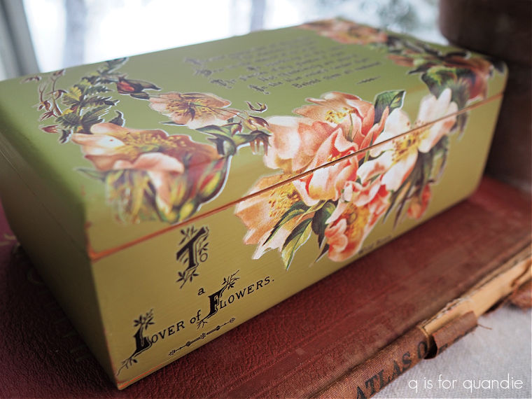
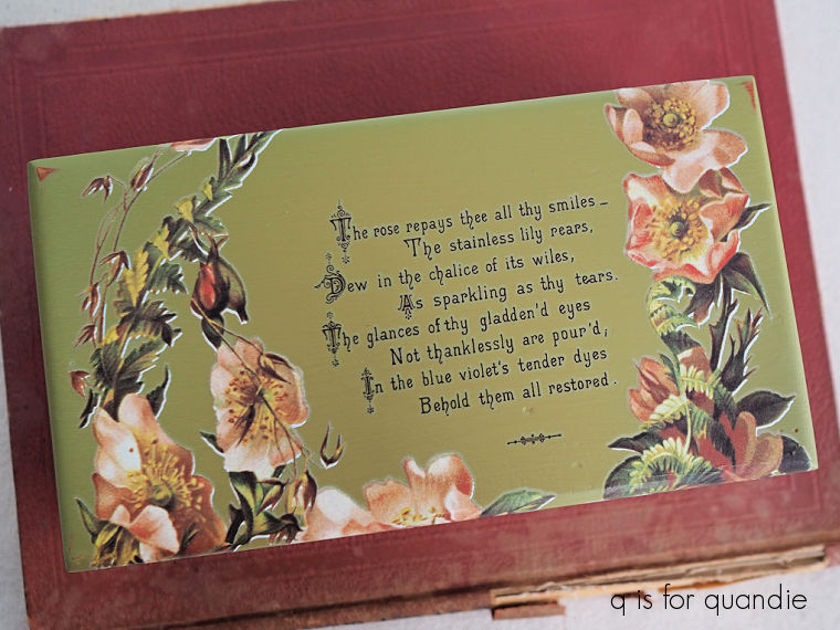
Next up I painted the Lane box in Dixie Belle’s Guacamole.  Once dry, I added some transfers from the I.O.D. Lover of Flowers set.

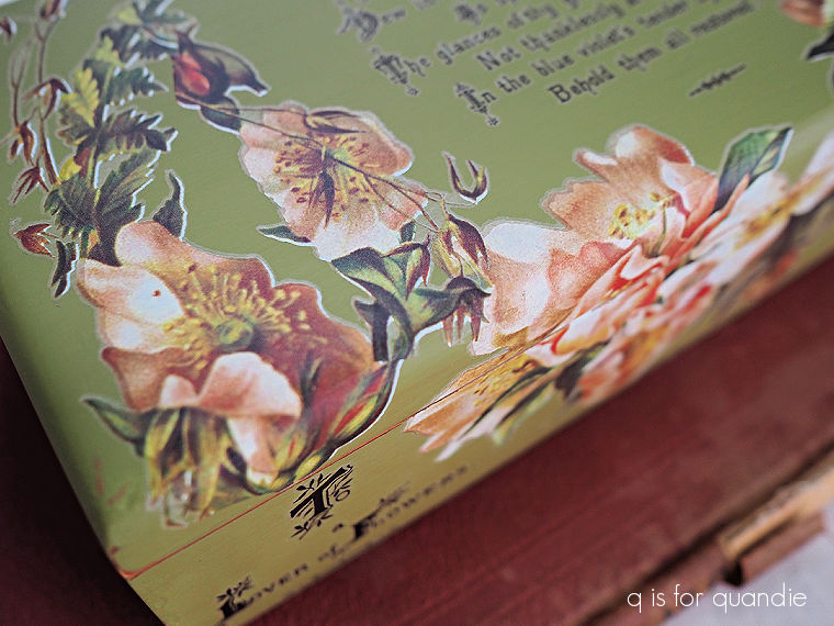
It wasn’t until I had the florals applied to the box that I realized there was a flaw in the transfer.

Do you see it?  Here, let me give you a close up.

There is a white shadow around the florals that is not supposed to be there.  I’m guessing that the transfer wasn’t lined up properly during the printing process.  I think they must print a white base first, and then add the color image over that.  Maybe?  I don’t really know how that process works.  But that white shadow is not the look I was going for.  It’s also definitely not how the transfer is supposed to look.

So far this seems to be the only page from my set that was effected, so that’s good.  Also, as I mentioned in a previous post, I did order two sets of Lover of Flowers and this same image in the 2nd set seems to be fine.

I purchased my transfers online from Vonda at The Painted Heirloom.  So I emailed her to ask about this.  She agreed that there was a flaw in the transfer and then sent me a replacement at no charge.  So if this ever happens to you, you should be sure to reach out to the retailer that sold you your transfer.  And I highly recommend The Painted Heirloom if you’re ordering online, she always ships orders super fast (I usually get them within 3 or 4 days), and clearly her customer service is excellent.

Unfortunately, if, like me, you already have your transfer in place before you notice a problem, you’re stuck with either living with it ‘as is’ or sanding the entire piece down and starting over which could be a bit of a bummer on a piece that is larger than this box.

Therefore, I would advise all of you to check your transfers over for this flaw before you apply them.  It can be hard to see since the transfer comes on a white backing sheet, but ‘better safe than sorry’ definitely applies here too.

I’ve decided to go ahead and try to sell my box ‘as is’, so I’m putting it in the pile for my occasional sale.  If it doesn’t go I may have to sand it down and start over again, we’ll see.

But in the meantime, let me know which of these is your favorite.  I’m not gonna lie, I much prefer the smaller box.  Hopefully someone out there will love the more saturated colors on the Lane box, but if not, I can always go back to the drawing board.

champagne taste on a beer budget.

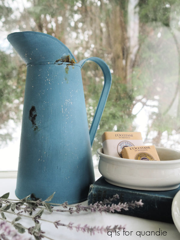
I went to a fantastic vintage sale recently with my friend opK (it was Haupt Antiek Market for any of you locals who may be familiar).  They had several really lovely, and authentic, French blue enamelware pitchers.  At $98 each, they were a bit out of my price range though.

However, when I got back home I remembered that last summer a good friend of Mr. Q’s offered me a trio of metal French style pitchers.

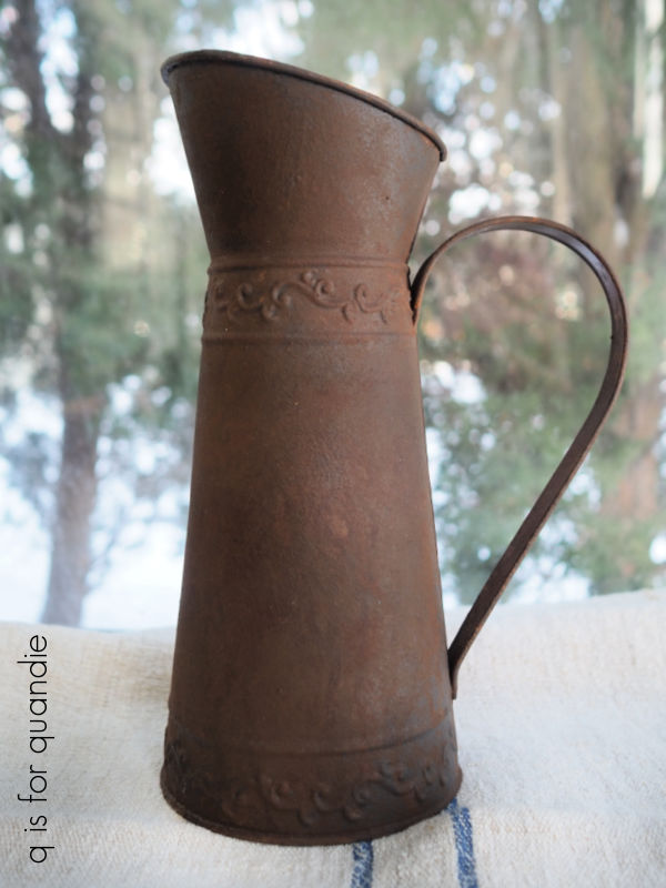
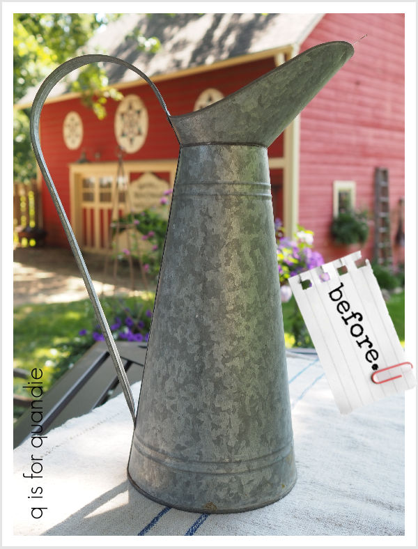
Unfortunately, they weren’t the authentic French enamelware kind.  But even though these are inexpensive knock-offs, I thought it would be fun to try to give them an authentic look using paint.

The first pitcher to get a makeover was this one.

I initially planned to give this one a rusty look with the Dixie Belle Patina paint.  So after cleaning it and then giving it a base coat of Dixie Belle’s Midnight Sky chalk paint, I gave it the rusty treatment using their Iron paint and Green spray (for full instructions on this process, check out this how-to post).

While it did turn out exactly as expected, it feels a bit boring to me (more on that in a minute).

I then moved on to the next pitcher.

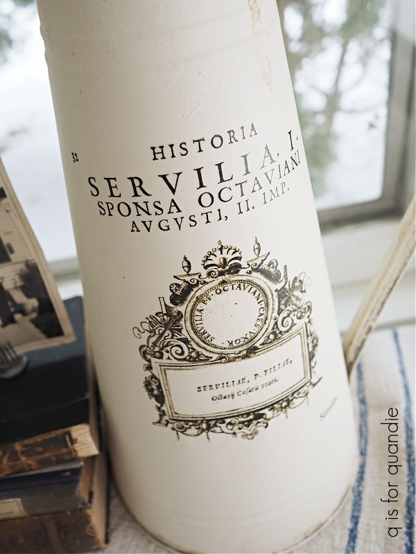
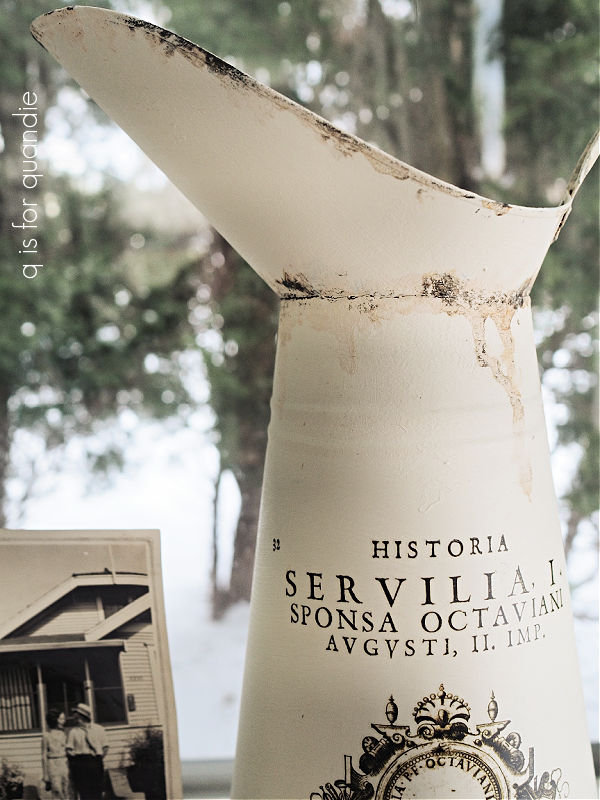
After cleaning, I gave it two coats of Dixie Belle’s Drop Cloth.  Then I added a transfer from the I.O.D. Brocante collection.

I then gave it a spotty rust treatment.

I’d recently seen a YouTube video by The Provincial Farmhouse where she used the Dixie Belle Iron paint and Green activator spray to add some rust to a metal tray that she was painting to look like faux enamelware.  So I decided to give that a go on this pitcher.

Basically I just dabbed some of the Iron paint onto my pitcher here and there and then used a brush to dab the spray over the wet Iron paint (spraying it wouldn’t have given me enough control).

Over time that rust will continue to develop and look more authentic.

I love the sense of age that this added to what otherwise looked like a rather freshly painted pitcher.

After being inspired by those authentic French pitchers at Haupt Antiek Market, I pulled out the Miss Mustard Seed milk paint in French Enamel for the third pitcher.

It had a very shiny factory paint job both inside and out, so after giving it a good cleaning, I painted it with a base coat of Dixie Belle’s Dried Sage.  I knew the milk paint wouldn’t stick to that shiny original paint.  The chalk paint will adhere nicely to it though, and the milk paint will adhere nicely to the chalk paint.

Once I had the French Enamel paint on, I gave this one some spotty rust as well.

And as you can see in that photo, I did get a few small chippy spots.

I added a topcoat of Dixie Belle’s clear wax to this one.

I loved the end result, and I especially loved the French Enamel color, so I brought my somewhat boring rusty pitcher back out and painted over the rust with the rest of my already mixed milk paint.

I noticed that the milk paint was getting a little chippy, and then I remembered that I had added a dark wax to a couple of spots on this pitcher.

So those waxed spots were resisting the milk paint, while it adhered fairly well in the non-waxed areas.

I wanted to preserve that chippy look but still prevent more paint from flaking off, so I gave the pitcher a quick spray with some Rust-Oleum matte spray sealer.  Once that was dry, I followed it up with another two coats of Dixie Belle’s flat clear coat.

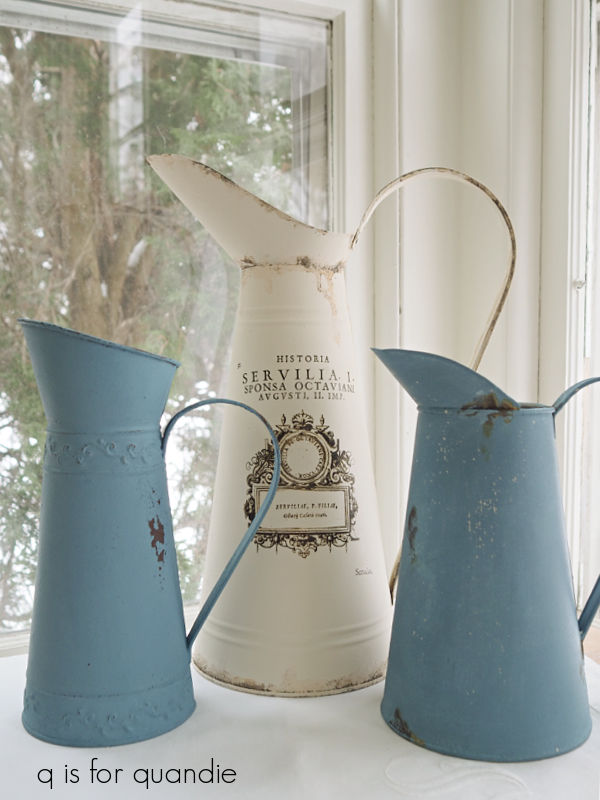
And with that, all three pitchers have been transformed.

Now, I fully realize that none of these are going to pass as authentic French enamelware.  But rather than a price tag of $98, I’ll probably mark mine somewhere in the $18 range instead.  So for those of us with champagne taste on a beer budget, these would probably do just fine.

What do you think?
the barn makeover.

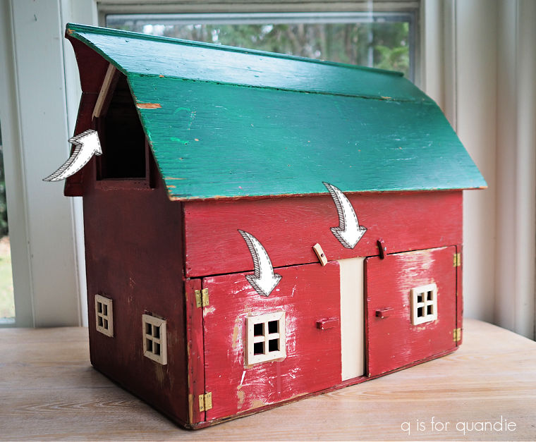
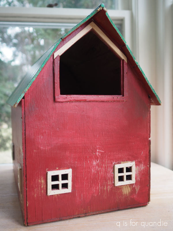
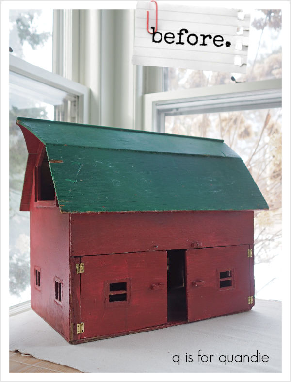
You’ll remember the mini barn that I purchased at my local Goodwill.

It was missing a bit of trim, and a section of wall between the two doors, so I sent it over to Ken’s workshop for some repairs.

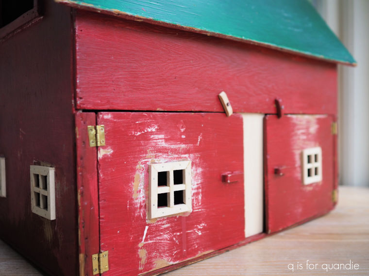
He replaced that section of wall, the trim on six of the windows, and one of the little door latches …

and he also added a little trim to the loft opening.

Next up I gave the entire barn a scuff sanding, and after wiping it down I gave it two coats of Dixie Belle’s B.O.S.S. in grey.  I didn’t really need to block any stains, but I thought it would be easier to cover that red and green if I had a grey primer down first.

In hindsight, I wish I had painted the entire barn in a dark color such as DB’s Coffee Bean first so that I could have distressed my final paint back to the darker color.  In the end, I could see both the grey B.O.S.S. and the green when I later attempted to distress the roof.  Rookie mistake.

Next up I painted the roof and the interior of the barn in Dixie Belle’s Dried Sage, and the exterior walls in their Drop Cloth.  It still took two coats of paint to cover the grey primer, so again, I would have been just as well off with a darker paint.  Once my paint was dry, I experimented with some different colors on the window trim.  I tried a bright white (DB’s Fluff) first, which was distinguishable from the Drop Cloth, but I didn’t like it.  I tried Coffee Bean, but I didn’t like that either.  I even considered just painting them with the Drop Cloth, but ultimately I decided to go with the Dried Sage.

After a bit of sanding to distress them, I think they look good.

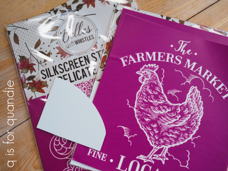
Next up I pulled out Dixie Belle’s Farmhouse silkscreen stencils

I especially thought the Fresh Eggs one would be perfect on the side of the barn.

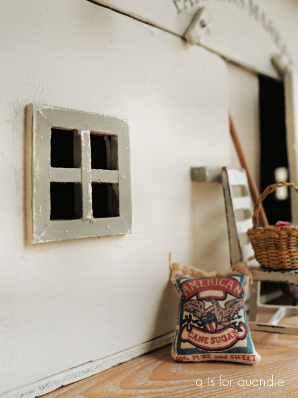
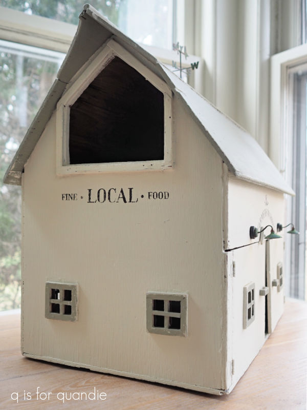
I cut up the one with the chicken and just used the typography on both the other side …

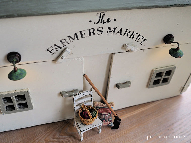
and the front of the barn.

Once all of my paint was dry, I gave everything a coat of Dixie Belle’s clear wax.

And that brings me to the lights.

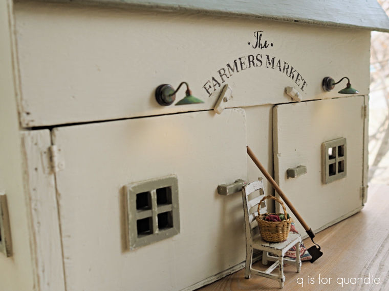
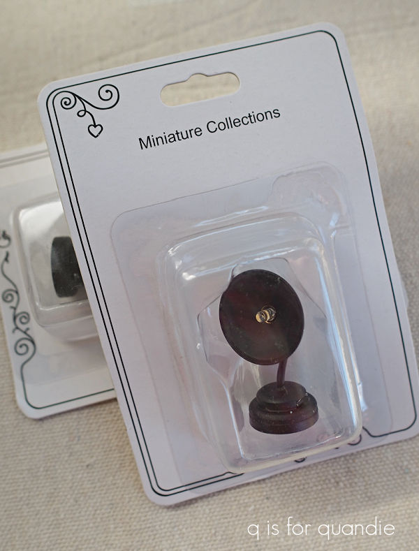
As I was working on this project I kept thinking how fun it would be to have some barn lights over the doors.  So I went on Etsy just to see what was available out there.  I ended up finding the perfect lights at Miniature Crush (although I ordered them through Etsy, you can also order items directly from Miniature Crush, and as a bonus for me, they are also located in Minnesota).

They came in a matte black color that was rather one dimensional though.

I wanted them to look galvanized so I pulled out some of Dixie Belle’s Gilding Wax.  I started with the Zinc, but it was too dark and barely showed up over the black.  So then I tried the Silver, which looked pretty good but was maybe just a bit too bright.  I went back and added a bit of the Zinc over the Silver, and I still didn’t love it.

It doesn’t quite look authentic to me.

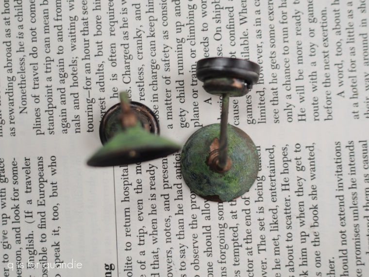
So then I pulled out the Dixie Belle Patina Paint in Copper, along with the Green activating spray.  I first removed as much of the Gilding Wax as I could with a q tip dipped in mineral spirits.  Then I painted over the lights with the Copper paint, and followed that up by dabbing the activating spray over the wet paint using a small brush.

Eureka!  So much better.  The totally look legit now.

One quick note about these lights.  They are battery operated, and they have a little switch on the side to turn them on and off.

To get to the battery (which is replaceable) you have to screw off the back part of the base.  So you can’t really glue these lights in place permanently.  Instead they come with a tiny adhesive magnet on the back.  You apply the adhesive side of the magnet to your item, then the light fixture hangs onto the magnet.  Here’s the thing, that means they come away pretty easily.  And that makes this item unsafe for small children who could pull them off and choke on them.  So they would have to be removed if you wanted this to be a child’s toy.

In addition, the lights were $19.99 each!  So now I have an additional $40 invested in this makeover.  I’m not sure that was a wise decision, especially since I plan to try and sell this one.

But all of that being said, I sure do love how they look!  And maybe someone else will as well.

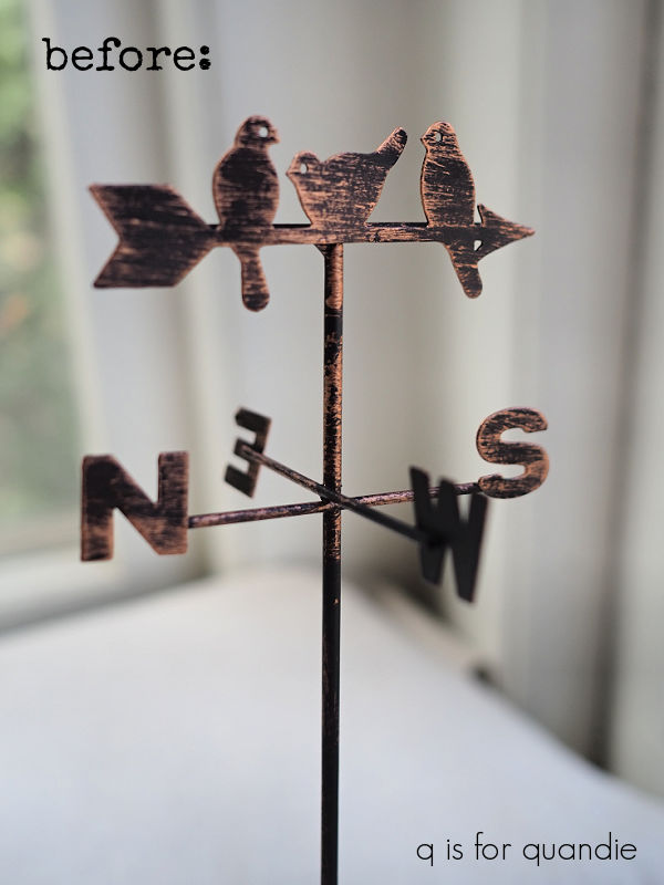
I initially thought I would stop here, but then I was at Hobby Lobby and I came across a miniature weathervane.

And at only $2.99, it was so much cheaper than the lights!  So how could I resist?

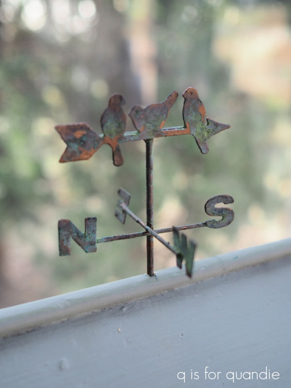
I gave it the same treatment as the lights using the Copper patina paint.

The verdigris patina develops pretty quickly with the Copper paint.  And doesn’t the weathervane also look so much more authentic now?

I had to drill a hole in the roof of the barn to attach it, but that was fairly simple.

And with that, my barn makeover is complete.

How cute is that?  I much prefer my toned down neutrals to the red and green.

What do you think?

If any of you locals just can’t resist adding this adorable barn to your decor, check out my ‘available for local sale‘ page for more details.

preventing rusty bleed thru.

When I paint rusty toolboxes, I always try to mention that I start with a coat of Dixie Belle’s B.O.S.S. to prevent existing rust from bleeding through my paint.

Today I thought I’d elaborate on that a bit.

First up, let me start by saying that I used the word ‘prevent,’ but that might not be entirely precise.  I don’t want to say that the B.O.S.S. will completely eliminate any possibility of future rust bleed-thru.  However, it will definitely mitigate most of the problem.

Also, I should clarify that Dixie Belle has replaced the original B.O.S.S. (shown above) with their new Bonding Boss.  In addition to blocking stains and odors, the Bonding Boss also improves the adhesion of your paint.

But either of these products will work to reduce bleed thru, so if you have the older version you can continue to use it for this purpose.

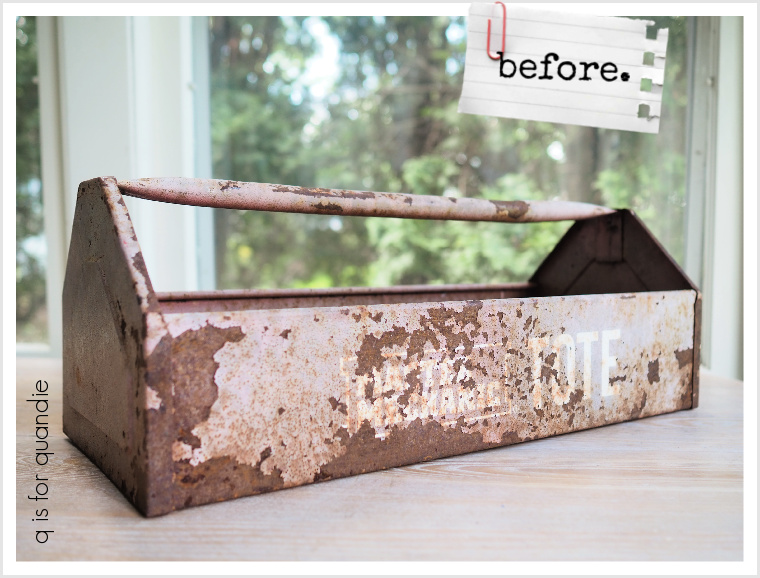
This rusty, crusty metal tool caddy is a great example of what happens when you don’t use a blocking primer over rust.

It had been out in my stash for ages.  I’m not even sure how long, or where I picked it up.  As you can see, it started out with some pretty significant rust.

I’d pulled it out of the stash sometime last year thinking that I could paint it black and add the I.O.D. Rose Chintz paint inlay.  At the time I figured I didn’t need to worry about blocking the rust because it was going to be black, so it wouldn’t show too much (which I’m sure would not have worked out).  But for some reason, after I had it painted black, I really didn’t love it.  So I shoved it back in the ‘future project pile’.

Then I pulled it out again a few months later and decided to give it a coat of Dixie Belle’s Dried Sage.  Why?  I honestly don’t even remember.  But really, I didn’t love that color on it either, so back in the pile it went again.
I also had forgotten that I didn’t give this one a coat of B.O.S.S. to block the rust before adding the black paint.  So here we are another six months or so later, and now the rust had definitely bled thru both the coat of Midnight Sky, and two coats of Dried Sage.

Whoops!  Anyone who has experienced any kind of bleed thru knows that paint alone won’t block it, no matter how many coats you apply.

Just look at all of that rust coming through!

Fast forward to last week when I once again pulled it out of the pile.  This time I gave it not just one, but two coats of Dixie Belle’s B.O.S.S.  I’ll admit, unless a toolbox is especially rusty, I usually only give them one coat of B.O.S.S., but the instructions for this product do say to use two coats for the best results.  This is true if you’re trying to block other sorts of stains as well like tannin bleed thru, or the ink from a Sharpie.

So I gave it two coats, allowing both to dry fully before moving on to the next.  I then gave the final coat of B.O.S.S. 24 hours to dry fully

I followed that up with one of Dixie Belle’s new National Park Collection colors from their Silk line called Everglades.

It only took what I like to call one and a half coats of Everglades to get good coverage.  In other words, I painted one full coat of paint, and then just had to go back and touch up a couple of spots that needed a little bit more.

I know not everyone is going to love this sort of pea green color, but I am really drawn to it.  If you prefer a chalk style paint over an acrylic (the Silk is acrylic), then Dixie Belle’s Guacamole is a good option.

It’s not quite as bright as the Everglades, but it’s a fabulous avocado shade.

Once the Everglades was dry, I pulled out the Floral Anthology transfer from I.O.D. and added a few florals.

If you haven’t heard, I.O.D. has come out with some new designs for spring and I couldn’t stop myself from ordering a few of them.  So while I wait for those to arrive, I was trying to use up some of my older transfers.

I also added some wording from the Classic Vintage Labels transfer from re.design with prima.

The Dixie Belle Silk line of paint has a built in topcoat, so I didn’t need to add a topcoat to the paint.  However, the transfers do need a topcoat to protect them over time, so I added a coat of Dixie Belle’s clear wax over the entire caddy (yes, you can wax over the Silk paint).

So far, so good.  But I’ve only had this painted for about a week.

I definitely need to hang onto this tool caddy for a few months more to be sure that the rust really isn’t going to bleed thru.  So this one is now going into my newly created ‘stuff I’m accumulating for a potential occasional sale at my house’ pile.  I’ll keep you posted on the results, so be sure to stay tuned!

a 70’s flashback.

Last week my friend opK and I headed to Minneapolis for the Gathering of Friends Antique Market.  They hold this market twice a year in one of the greenhouses at the original Bachman’s location.

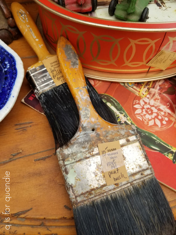
I have to admit that I rarely actually buy anything, I mainly go to get inspiration.  I like to get a feel for what kinds of things seem to be popular, such as old, crusty paintbrushes, lol!

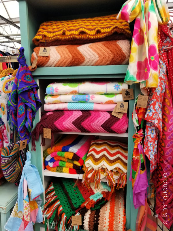
And of course, at this time of year garden items are always popular.

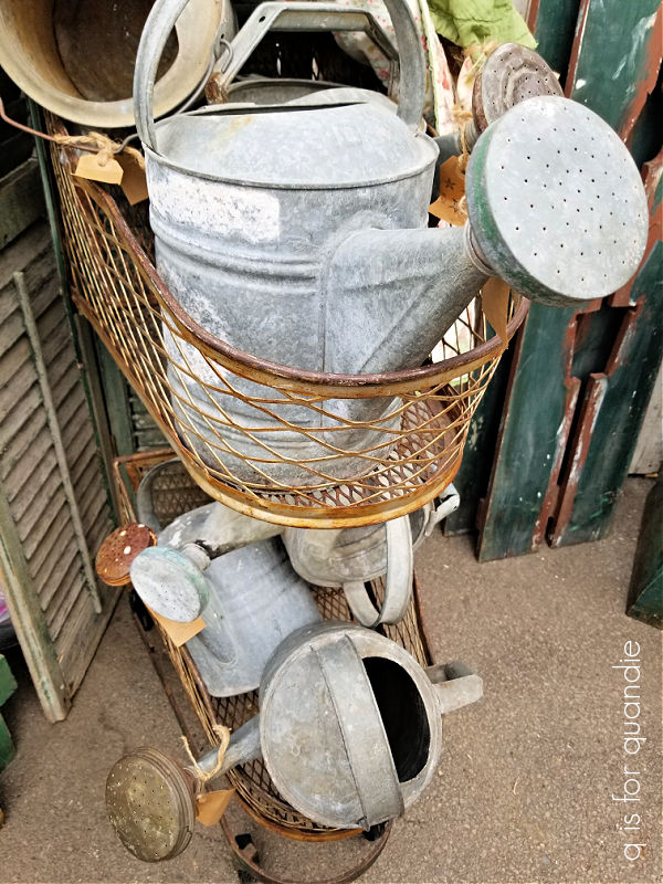
There were lots of galvanized watering cans.

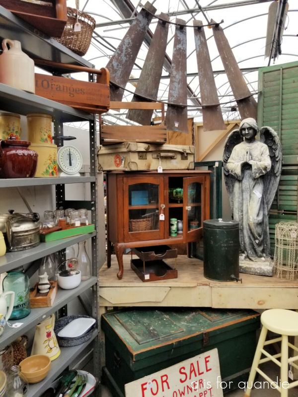
And quite a lot of garden statuary that was either way out of my price range, or already marked sold.

I saw a twin to my Cossetta …

priced at $425.  Yowza!

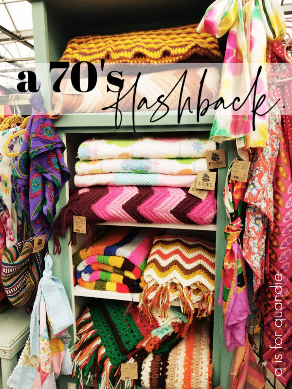
But the trend that really jumped out at me was the 70’s stuff.

Who else remembers Harvest Gold and Avocado Green?

Earth tones were big in the 70’s, and now they are coming back.  But apparently, so are the bright colors of the 60’s.

I’m not sure I’m ready for that, how about you?

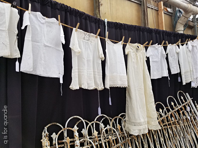
There were some classic items on display as well, like this clothesline strung with antique baby gowns.

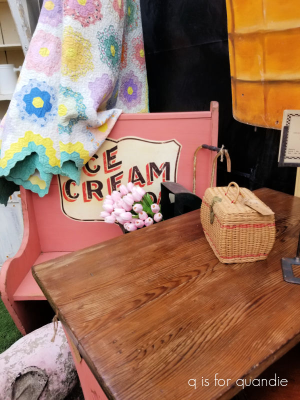
And plenty of quilts.

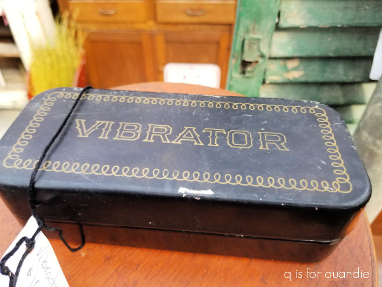
There were also a few unusual items.  I was initially startled by this one …

until I opened it up to find sewing machine parts inside 😉

I didn’t find anything tempting enough to actually purchase, but I did come home with lots of ideas.  I was also inspired to consider going back to hosting my own occasional sale out of the carriage house this year, so if you’re local be sure to stay tuned for more on that later this spring!

another library book review.

It’s time for another library book review!

If you’ve been following me for a while, you know that my mom goes to the library on a regular basis.  So when I’m visiting her I tag along and check out what her library has to offer.

Unfortunately, I seem to have exhausted their supply of ‘decorating with vintage stuff’ type books.  They didn’t have anything on the shelf in this category that I hadn’t already checked out.

So I decided to check out their gardening section next, but it seems as though books on gardening aren’t much of a draw in the desert!  For obvious reasons (they currently have a watering ban that only allows them to water plants once a week).

I did find one book on landscape design, and a handful of ‘garden adjacent’ books to check out though.

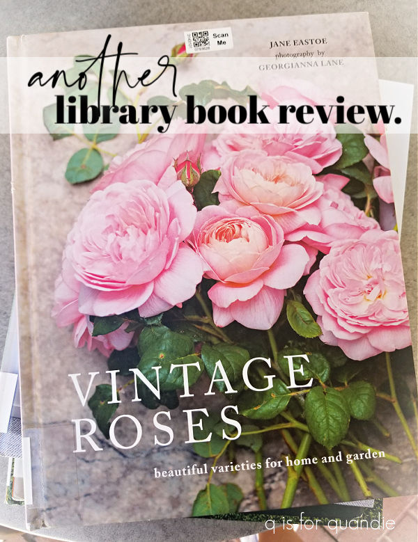
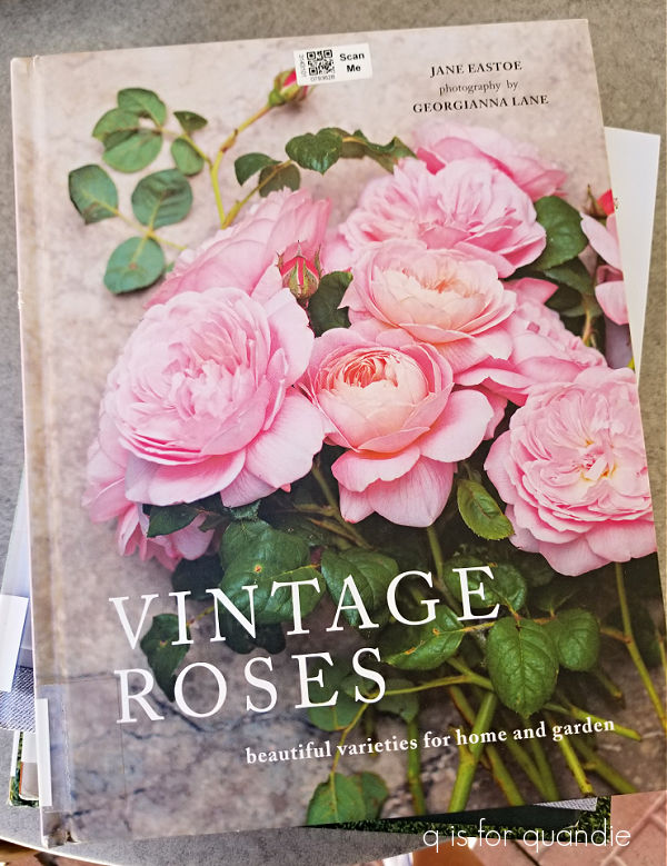
I’ll start with the prettiest of the books, which was Vintage Roses.

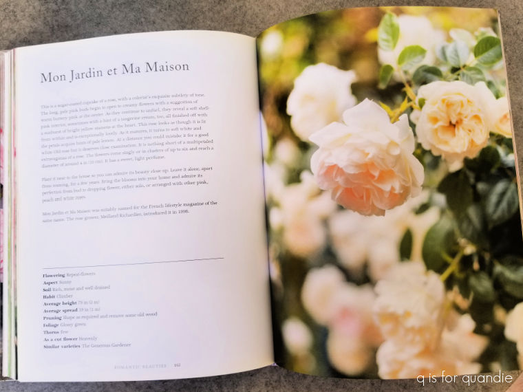
This book is absolutely chalk full of gorgeous photos of roses.

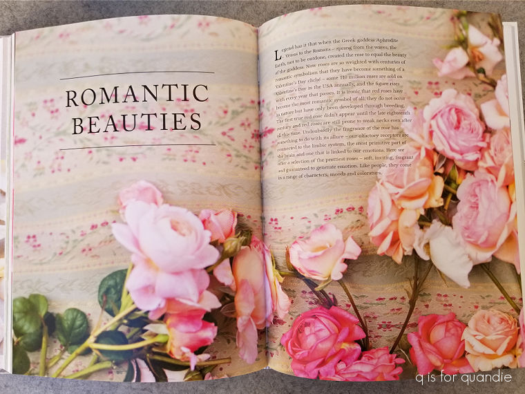
It begins with a brief section on the history of roses, then goes on to highlight specific varieties which are broken down into four categories; classic blooms, dramatic flowers, romantic beauties and fragrant delights.

Each rose looks positively drool-worthy to me.

I wish that I could get better results with roses here in my garden.  Unfortunately, I don’t have the patience to deal with the many challenges of growing roses, including those nasty Japanese beetles that turn their leaves into Swiss cheese every year.  I still have one old fashioned shrub rose (the easiest type to grow) that I try to train up a metal garden obelisk each year with very limited success.

My neighbor Arlene had a lovely rose garden for decades until she finally gave up the roses back in 2018.  I found quite a few local readers here on the blog that were willing to take them for their own gardens.

If you have any interest at all in roses, you would really enjoy this book.  I also think it would make an awesome gift for a rose lover.

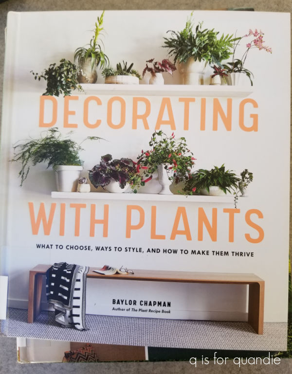
Next up in the library book pile is Decorating with Plants.

This books gives a lot of detail on the growing needs of specific varieties of house plants.

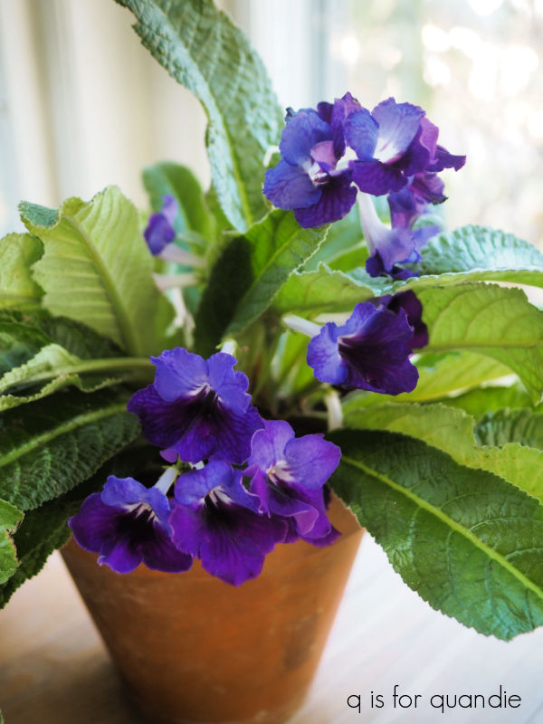
If you are getting into house plants, this book would be a great resource.  They had a page on Streptocarpus, or Cape Primrose, and after reading it I realized I was making some mistakes with the Streptocarpus that I brought into the house this winter.

It looked great when I first brought it in (above), but I haven’t seen many flowers on it all winter.  The foliage is lush and green though.  Apparently I shouldn’t be feeding it over the winter, too much fertilizing can cause lush foliage and no flowers.

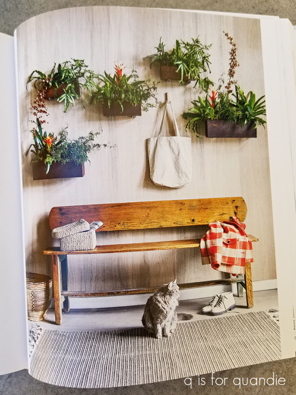
But back to the book.  This one also contains room by room ideas on displaying your houseplants like this vertical garden for a foyer.

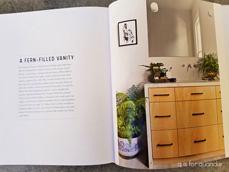
Or this idea of filling your bathroom with ferns.

The third book in my pile also features houseplants and is called Plant Craft.

This books features 30 specific craft projects that feature plants.  Mostly indoor, but there were a handful of outside projects too.

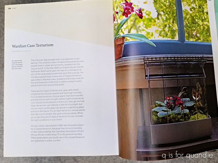
I have to admit that I really only found two projects that appealed to me, the first being a simple terrarium.

But most of us could probably figure out how to plant a terrarium without a book.

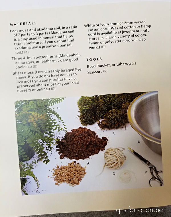
There was also a section on how to make a Kokedama.

If you aren’t familiar, Kokedama is the Japanese art of growing plants in a moss-covered ball of soil wrapped with string.  I’ve debated trying to make one of these, but in the end decided that caring for it would probably be a bit too fussy for me.

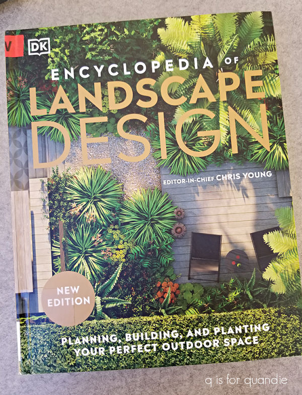
Last up is the Encyclopedia of Landscape Design.

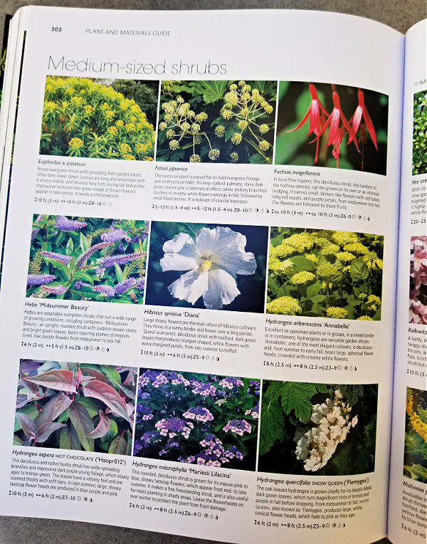
This is one of those DK books (published by Dorling Kindersley).  They specialize in illustrated reference books.  I absolutely love their travel guide books.

This book is packed with tons of info on everything from creating a site plan …

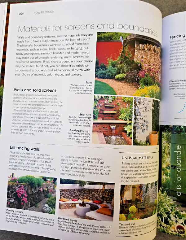
to ways to create screens or boundaries.

They also have lots of info on plants including tree, shrubs and perennials.

Unfortunately quite a lot of the plants they featured were not hardy in my zone 5a (formerly 4b) garden.

Still, this book would be a great resource if you are starting from scratch with some landscaping.

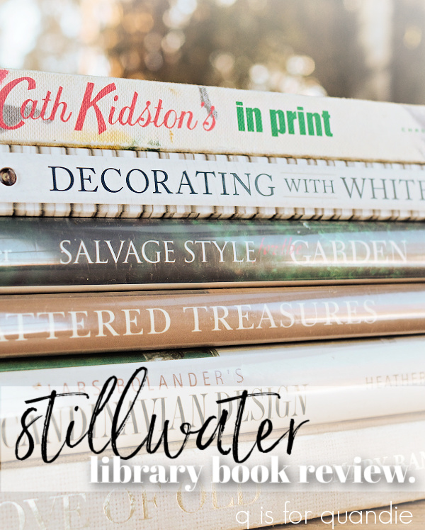
I hope you found this library book review of interest.  If you’d like to check out some of my other library book reviews, just click on the photos below to head to those posts.

kitchen wax and other things.

And once again, I’m back from my travels.  In case you weren’t paying attention to my last post, I went off to visit my mom in Henderson, NV for a week.

My mom will be turning 84 later this year, so I like to take every opportunity to spend some time with her these days.  In fact, I’m going back again in April with my sister.

For this trip I was flying solo though.  It is incredibly easy for me to get to my mom’s, despite it being 1,680 miles away.  There are plenty of flights to choose from between Minneapolis and Las Vegas, and the flight takes about 3 hours.  I live fairly close to the airport on my end, and my mom lives even closer to the airport on her end.  In addition, I find that both the Minneapolis airport and the Las Vegas airport tend to operate quite smoothly.  The same can not be said for Puerto Vallarta …

That place was a zoo!

And of course, now that I am retired I can go visit my mom anytime.

Aside from dining out a couple of times, and doing a little shopping and errand running, we mostly just spent some quality time hanging out.

I thought I’d share a few updates on projects out at mom’s that I’ve shared with you guys in the past, starting with her front door.  If you’ve been following me for long, you may remember that I painted her front door back in February 2022.

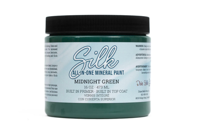
I used Dixie Belle’s Midnight Green Silk paint from their Desert Collection, which seemed appropriate since she lives in the Mojave Desert.

Two years later, the door still looks as good as the day I painted it.

It was a little dirty, but wiping it down with a damp rag quickly took care of that.  Considering that this door is subjected to the blinding Nevada sunshine on a daily basis, I am pretty impressed with how well this paint has held up.

Speaking of holding up, check out that pot of cyclamen.  I planted that back in October of last year, and my mom basically does nothing more than water it now and then.

It has been outside all winter, and despite the occasional night below freezing it still looks fantastic and is blooming away.  Here in Minnesota we basically treat cyclamen as a blooming houseplant.  I rarely get a 2nd flush of blooms out of them.  My mom says this one has been blooming steadily all winter.

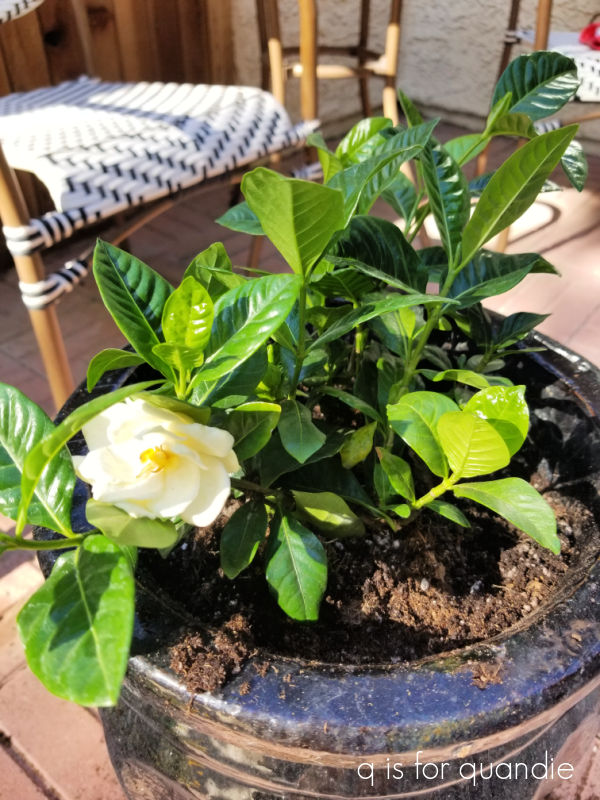
I can’t say the same for the gardenia that I planted for Mom back in April of last year.  Here’s how it looked when I planted it.

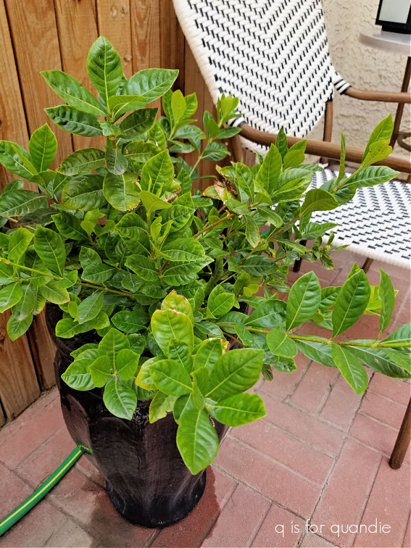
It has grown quite a bit, but unfortunately it has never bloomed again.

I suspect that it might just be too hot on my mom’s patio for this plant to thrive.  If any of you have any tips on getting a gardenia to bloom, be sure to leave a comment.

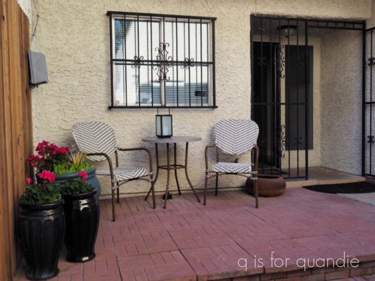
In March of 2021, my sister and I gave my mom’s patio a makeover.

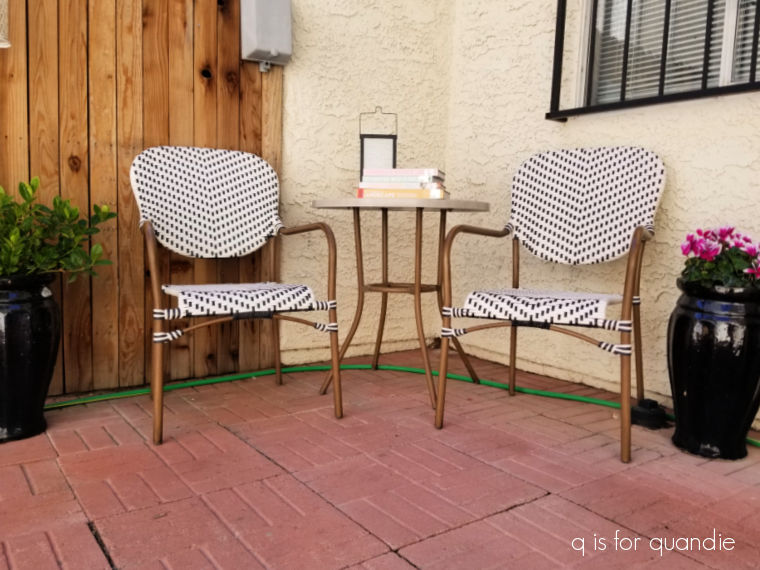
We purchased that cute little bistro set at Lowe’s for $248, and it too has held up beautifully for three years.  Unfortunately this set is no longer available at Lowe’s or I would certainly recommend it.

This little enclosed courtyard is perfect for enjoying a cool late February morning with some library books and a cup of coffee.

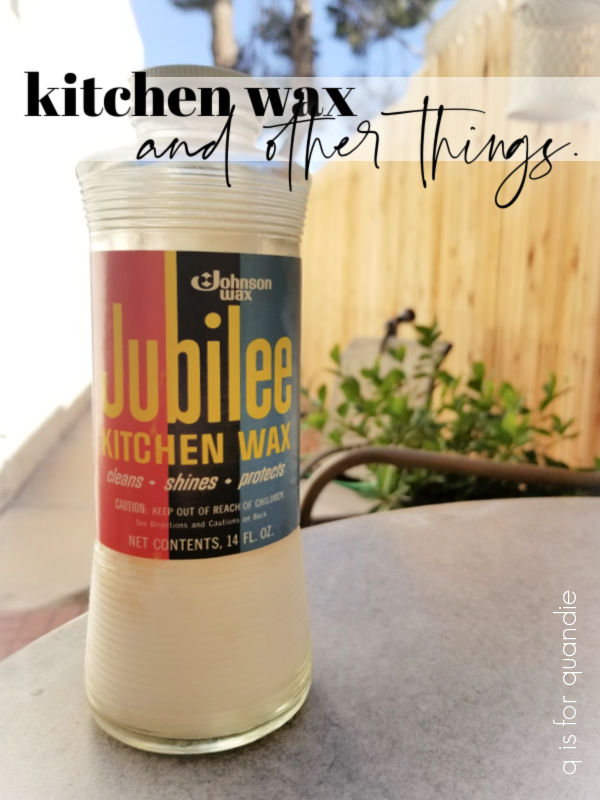
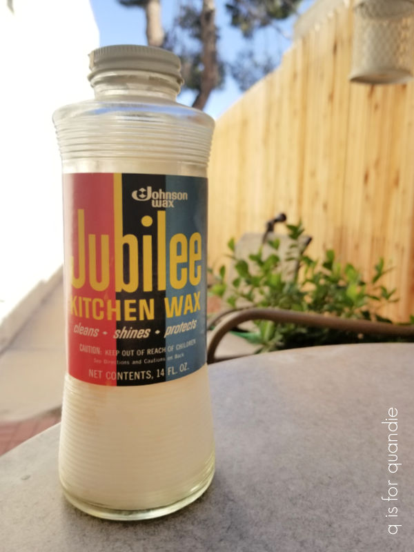
One of the things I did out at mom’s was to clean out some closets, as well as her laundry area in the garage.  I had to laugh when I came across her Jubilee kitchen wax.

I’m fairly sure that my mom has not waxed a floor since I was in grade school.  But for some reason the Jubilee wax has made every move from Illinois to Minnesota to Florida to North Carolina to Kentucky to Nevada (yes, my parents moved a bit).  And she even packed it when she moved out of her big four bedroom, three bath house to her current townhouse.

There’s no way my mom’s going to be down on her hands and knees waxing a floor these days, but for some reason she just keeps hanging onto that wax.  And now, somehow I just can’t bring myself to toss the Jubilee either.  How silly is that?

I did take some time to stop into the Goodwill that is just around the corner from my mom’s place.

Unfortunately there wasn’t a single item that could be considered ‘fabulous’.  It was quite disappointing (garage sale season can not arrive soon enough!).

How about you?  Are you ready for garage sale season?  Leave a comment and let me know!

the mini adirondack.

As I’ve mentioned in the past, our next door neighbor Ken is also our ‘handyman’.

He has done so many projects for us over the years!

He custom built our pantry.

He helped me create the faux shiplap wall in our principle bedroom.

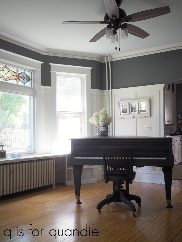
He also created the faux board and batten look in our piano room.

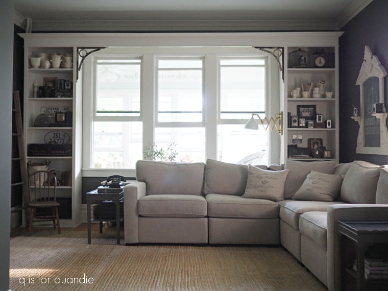
We also discovered, long after we moved in, that Ken had built the shelving in our living room for the previous owners of our house.

In addition to these larger projects, Ken has also helped out with innumerable smaller projects around our house.  He once saved us $6,000 by building custom screen inserts for the windows in our dining room (we thought we’d need to replace the windows and the quote for that was $6,000!).  This would become a really long post if I tried to list everything he’s done around here.

And of course, on top of all of that, Ken also does the bulk of my furniture repairs.  I think his favorite fix, or at least the one he still talks about, is the humpty dumpty dresser.  After accidentally knocking it off some sawhorses and having it completely fall apart, he put it back together again.

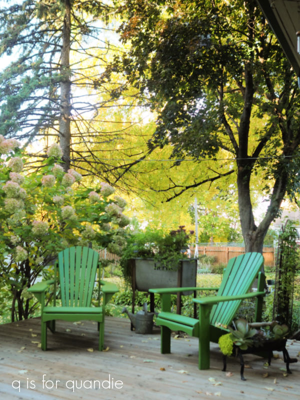
I’ve also mentioned here that Ken builds Adirondack chairs.

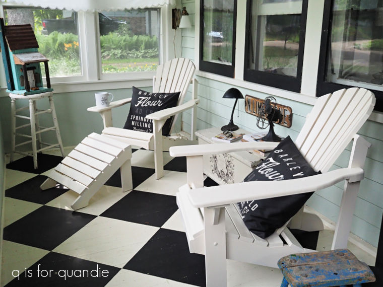
We have two of them on the front porch, and two of them on the deck out back.

The thing that makes these chairs special (besides the fact that Ken built them) is that they are super comfy.  They are all based on an Adirondack chair that nnK once had.  Ken took her chair apart and created a template for making more.  Since then he has made countless chairs.

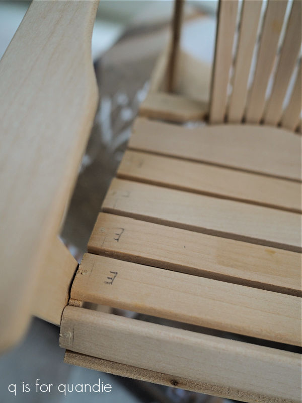
A while back he decided to see if he could make a miniature version.  He scaled his template down and came up with a perfect mini replica of the chair.

He put it together with painstaking detail.

He used toothpicks as miniature dowel rods to attach the slats.

He made one of these mini’s for nnK first.  Then he made another for himself.  And then finally, he made one for me!

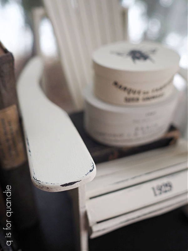
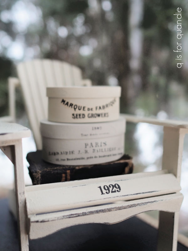
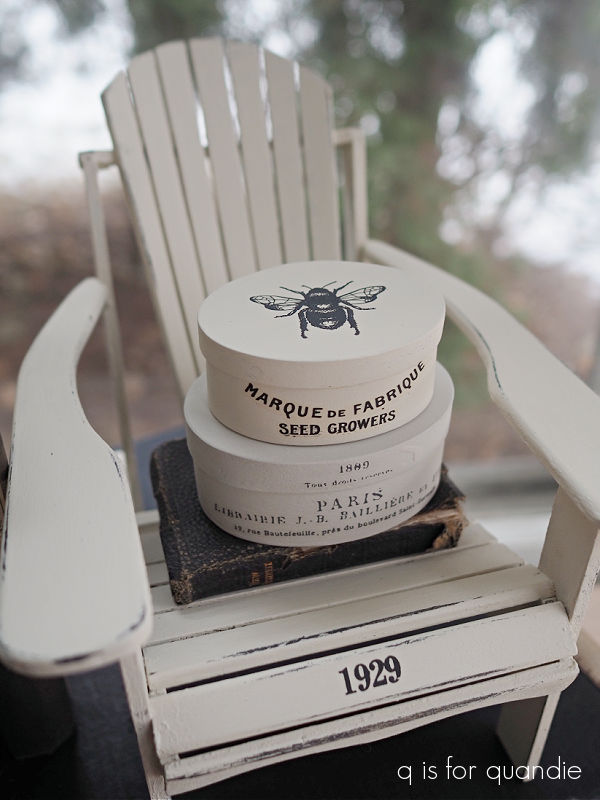
Of course, I gave mine a paint job.  I started by painting it with Dixie Belle’s Midnight Sky, which I then covered up with their Drop Cloth.  I wanted the dark base coat so that I could distress back to it along the edges, rather than just seeing that pale wood underneath.

Once the paint was dry, I added a simple, small Tim Holtz number transfer to the front of the seat.

After sanding lightly to distress, I finished it all off with a coat of clear wax.

I staged these photos using a few of my favorite things including the small boxes I painted up last fall.

They are sitting on a tiny new testament bible that belonged to my grandfather.

There is an inscription inside that says it was gifted to him as he went off to fight in WWI.  And yes, that’s WWI, and it was 1917.  I believe he would have been around 24 years old at the time.  If you’re trying to figure out the math and how I could have a grandfather that was born in 1893, I have to point out that he was 47 years old when my mother was born.

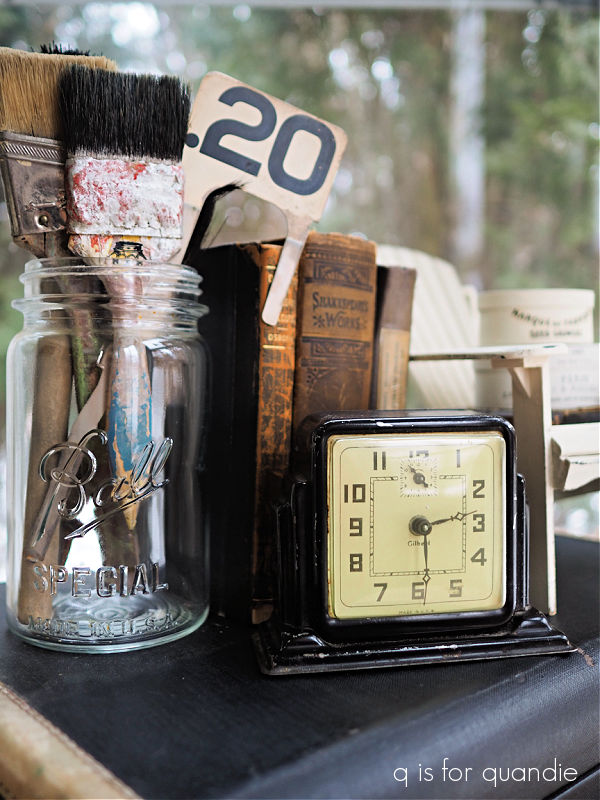
I grabbed a few other items to add to my photo …

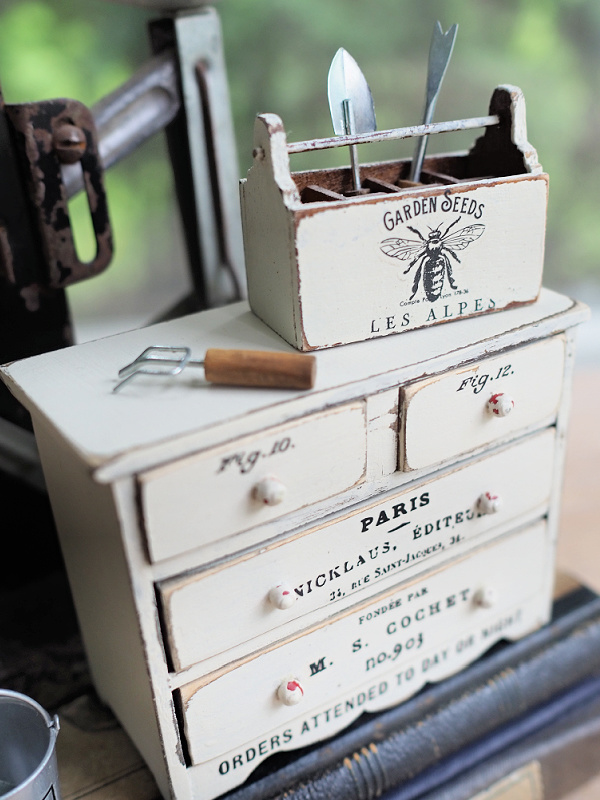
Most of these things come from those shelves in my living room, which is the eventual home of the mini adirondack as well.  Unfortunately, it was far too gloomy here last week to get a good photo of the chair in its ultimate resting spot.  So you’ll just have to trust me when I say that it fits right in with some of my other mini’s on those shelves like this one

and this one

I don’t know why I find miniatures so darn appealing.  How about you?  Are you drawn to miniature versions of furniture?  Leave a comment and let me know.