it’s like falling off a bike.

I can’t exactly remember the circumstances, but recently I meant to saying something was ‘like riding a bike’ (meaning it was a skill that would come back to you easily, even if you hadn’t done it in a while), but instead what came out of my mouth was ‘it’s like falling off a bike’.  The people I was with all got a good laugh.

But now I’m wondering if ‘falling off a bike’ fits this particular situation better.

It had been a while since I’d used milk paint when I pulled out the Miss Mustard Seed Tricycle to paint my North Pole Bed and Breakfast sign a few weeks back.

That particular project went quite smoothly, although I didn’t really get the chipping that I wanted.

I was painting another of those cupboard door signs at the same time.  I followed the same exact prep process with both.  I lightly scuff sanded them, and then cleaned them with a TSP substitute (I use the Sunnyside brand from Menards, if anyone is curious).

For the 2nd sign, I pulled out some Sweet Pickins milk paint in a color called In a Pickle.  I mixed it up and painted up the 2nd cupboard door.  Imagine my consternation when the 2nd one not only chipped, it chipped A LOT.
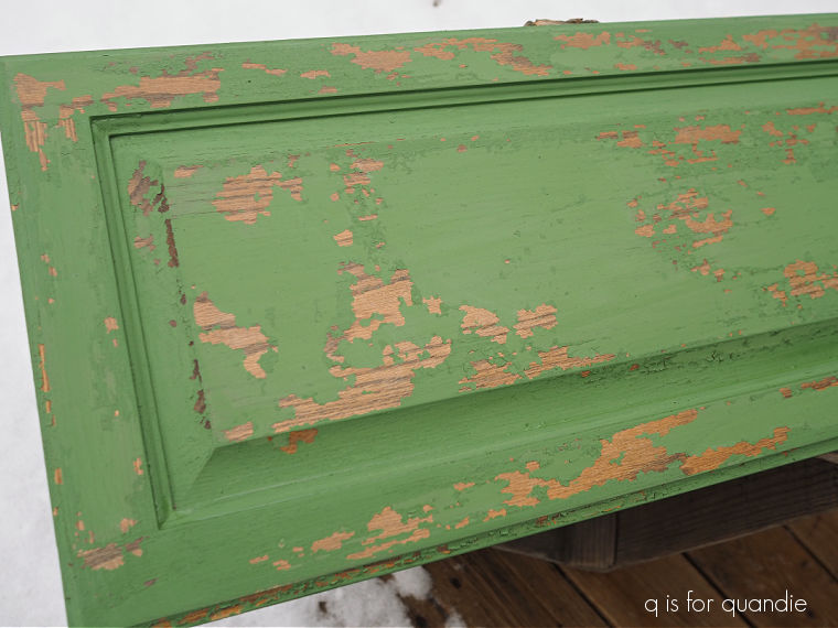
I’d forgotten just how unpredictable milk paint can be.  Frankly, this is why I rarely use it anymore.  It can be pretty frustrating to get results like this when it’s not what you wanted.  I get much more reliable results with the chalk style paint from Dixie Belle that I use most often.

Also, I want to point out that you can always add the bonding agent to your milk paint which will eliminate the chipping altogether.

That being said, there really is no substitute for the authentically chippy look you can get with straight up milk paint … you just have to be OK with the possibility of wildly varying results.

I have experienced my share of overly chippy milk paint projects in the past, and in one case I ultimately ended up sanding the piece down entirely and starting over with chalk paint (you can find that story starting here, and ending here).

Since I really wanted some chippy-ness on this piece though, I decided to try a couple of tricks to see what I could do with this one.  First up I sanded it a little bit more thoroughly, which did remove quite a bit of the chipping paint, and then I painted two more coats of In a Pickle.  Once the paint was dry, I still had quite a lot of chipping.  So next I vacuumed away all of the loose chips, and then I sealed it with a coat of Rust-Oleum matte spray sealer.  Once that dried, I went back in again with another coat of the milk paint over it.

That helped somewhat, but it definitely did not eliminate the chipping entirely.
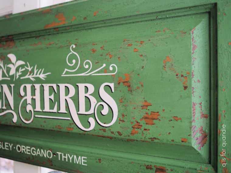
But at that point I decided this was a level of chipping that I could live with.

After giving the piece another coat of spray sealer, I added a stencil.
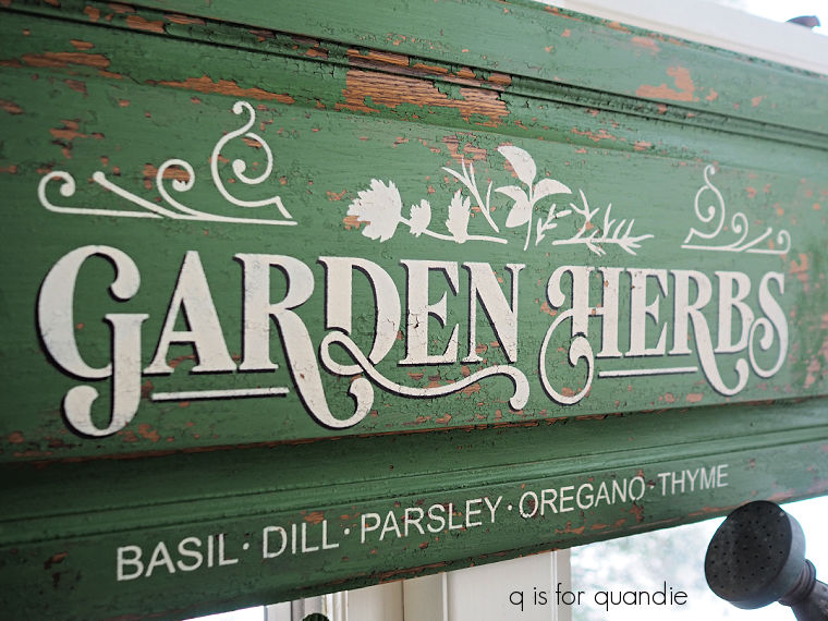
This is another one that I ordered from The Stencil Smith.  I had to modify it slightly to fit on my cupboard door by leaving the “Picked Fresh Daily” off the top.  But otherwise it worked perfectly.

Once again I used my shadowing technique to put a dark shadow behind just the “Garden Herbs” wording.

That is Dixie Belle’s Coffee Bean for the shadow, and Drop Cloth for the 2nd layer.

Once the stenciled paint was dry, I once again sealed the entire piece with the Rust-Oleum spray.

In the end, I’m quite happy with how this turned out, chipping and all.

What do you think?  Are you a fan of the chippy look, or are you over it?  Or maybe you never were a fan at all?  Leave me a comment and let me know.

This garden herbs sign is for sale locally (check my ‘available for local sale‘ page for more details).

a feast for the eyes.

Just a couple of days before Christmas my friend opK and I headed to Minneapolis to check out the 75% off sale at Bachman’s.  I’ve mentioned Bachman’s here before, but for those of you who may not be familiar, it is a local chain of ‘floral, home and garden’ centers.  They have been in business since 1885 when the founder began planting vegetable crops on a plot of land in south Minneapolis.  That plot of land still contains their flagship store and corporate headquarters.

I normally shop at their Maplewood store, which was their 2nd location and opened in 1990, but the flagship store is a bit larger and opK and I were hoping that there would be a bigger selection of Christmas merch remaining.  Spoiler alert, there wasn’t.  But we each purchased a few things.

Then we decided that we should check out a couple of other shops while we were in the big city, starting with Loft Antiques.

I have to admit that I rarely actually ‘shop’ at antique stores.  I mostly just like to scour them for inspiration, sort of making a mental list of items I should be snatching up at garage/estate sales.  Like original oil paintings by unknown artists

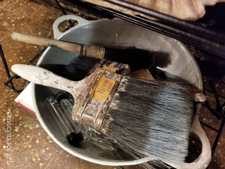
or … LOL … old crusty paint brushes!

See?!  I’m not the only one who likes a crusty old brush.

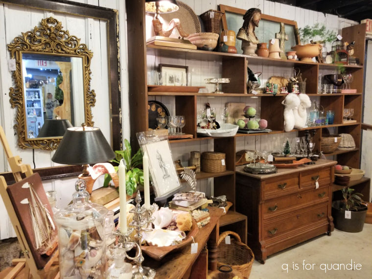
There was a lot of inspiration to be found at Loft.

And by the way, I did ask for permission to take photos in their shop.  Most shop owners are perfectly fine with someone taking photos, but every once in a while you run into one who is vehemently opposed.  I’m thinking back to a shop Mr. Q and I visited in Summerville, SC.  I’m not naming names though, it was not the shop I blogged about back then.

I actually even purchased something at Loft!  I couldn’t resist this antique “Merry Christmas” shop signage.

My friend and fellow Reclaiming Beautiful vendor, Amy, has similar signage on the wall at her house (although not Christmas themed, but from an old church) and after seeing hers, I just had to have this one.  I’ll probably repaint it, I’m not sure.  But either way, I’m looking forward to finding a way to use it in my Christmas decor next year.

There are two more shops worth a visit right next door to Loft Antiques, Clarabel Vintage and A Rare Bird Antiques.  They are fairly small and I totally neglected to snap any photos to share with you.  But if any of you locals are in the neighborhood, they are worth checking out.

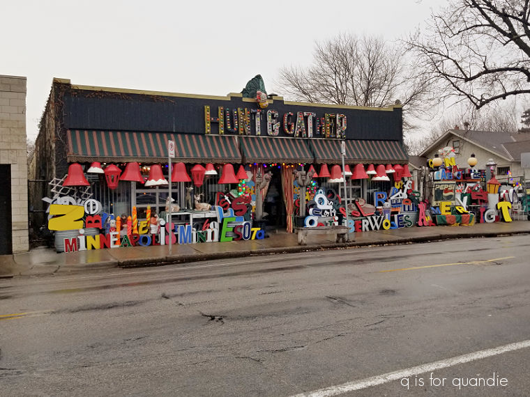
Our ultimate destination though was right across the street from Loft, Hunt & Gather.

opK had never been to Hunt & Gather, and I found it rather difficult to describe it to her before we got there.  But I think seeing the outside is a good hint as to what you’ll find on the inside.

But really, how would you describe it?

Here is how they describe themselves on their website

“a vintage amusement store.  groovy.  kooky.  fresh.  unusual.  fun oddities & curiosities.”

Yep, that fits.

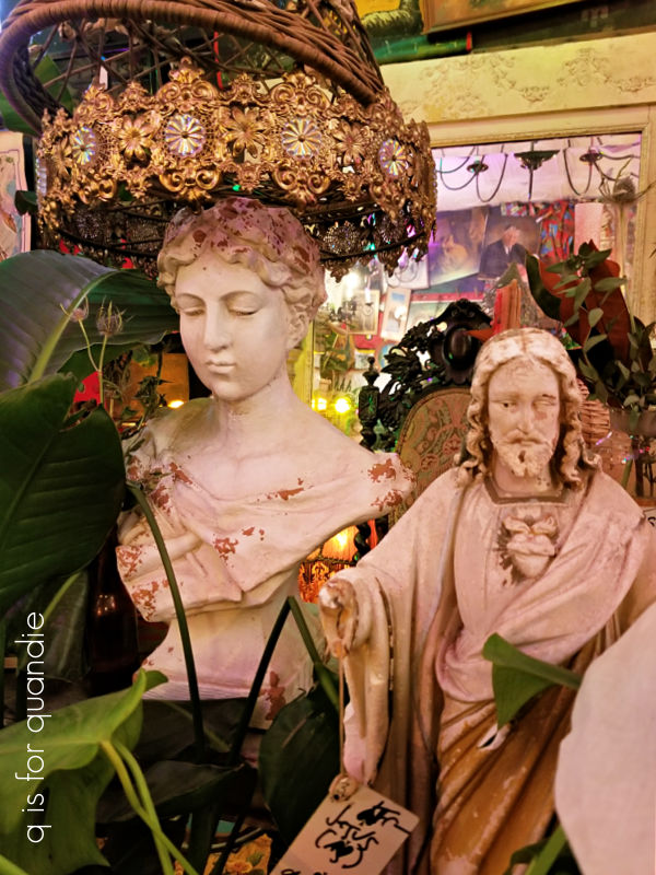
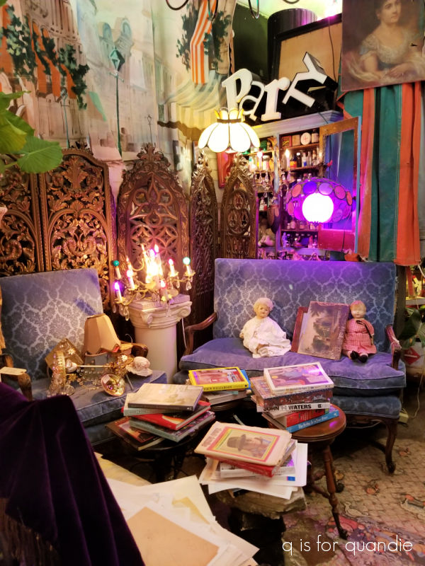
It’s definitely a feast for the eyes!

It’s your one stop shopping spot for all kinds of things, like silver trays …

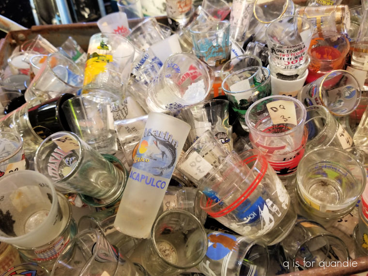
souvenir shot glasses…

and creepy dolls!

I have to admit that seeing so much stuff packed into this shop makes my eye twitch just a little.  All I can think about is how much work it would be to clear it all out if they ever needed to.  I tend to think that way about my own house too, especially this time of year.  I always make a New Year’s resolution to start cleaning out drawers and closets, but I rarely follow through.  Maybe this year will be different.

How about you?  Are you a fan of the ‘more is more’ sort of style?  Or are you more of a minimalist?  Leave a comment and let me know.

and I’m back.

First up, congrats to Gretchen!  I drew her name using a random number generator to win my 10th blogiversary giveaway.

In other news, I’m back from a very relaxing week in Puerto Vallarta, Mexico.

If you were following me last year around this time, you’ll know that last year my neighbor nnK’s parents invited me along on their family vacation to Mexico.  They had been finding it more and more challenging to navigate the airports at either end on their own, so I went along to help tote their luggage and so forth.

It ended up working out really well last year, and I guess they didn’t find my company too tedious, because they invited me back again this year!

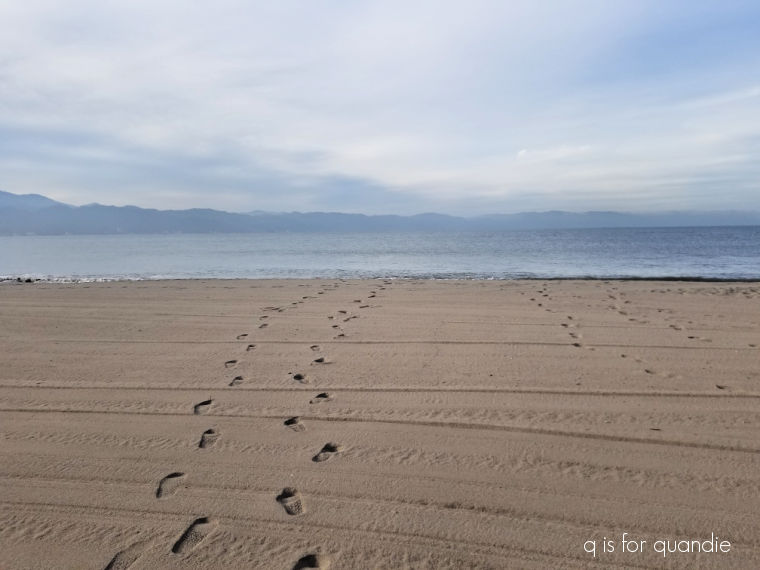
We had a lovely time, mainly just hanging out at the pool, sipping cocktails and reading.  I also enjoyed my coffee out on the beach in the early hours.

I have to tell you guys, the grounds at Velas Vallarta are immaculate.  There were groundskeepers out every day pruning, mowing, blowing, and raking.

They also cleaned up the beach and ran some kind of roller over the sand.

It was pristine first thing in the morning.

In general, the level of service at this resort is spectacular.  We were enjoying the all-inclusive package, and I have to say the poolside waiters delivered drinks all day long.  They also delivered lunch to your poolside table.  I can recommend the chicken taquitos and guacamole.

I had a good indication of how things were going to go our first night at dinner.  I ordered a glass of Tempranillo (wine) and they brought me the entire bottle.

While it seems like so many places have really cut back on their housekeeping services since Covid (including even DisneyWorld resorts where they are still only cleaning your room every other day), Velas staff is not only cleaning your room every day, they also come back in the evening for a turn down service and to replenish towels and drinks in the fridge (also included) if needed.

The number of people I spoke to at the resort who come back year after year after year speaks volumes.  This place is a gem.

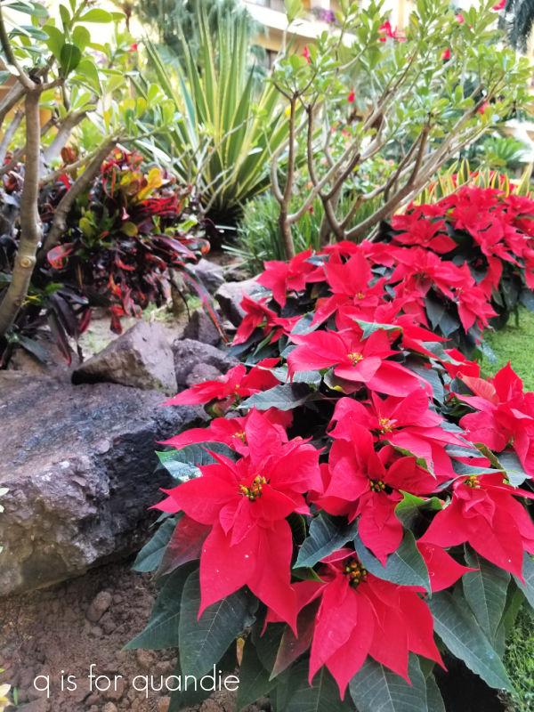
All of that being said, I have to admit that spending a week in a tropical paradise does not exactly put you in the Christmas mood (despite their lovely addition of poinsettias to the gardens).

I’m struggling to get back on the holiday decor band wagon, although the snow that we got the night before last helped some.

So I’m going to fire up the Christmas music, pull out some paint and a new Christmas stencil I ordered before I left for Mexico and see if I can get back in the groove.

So be sure to stay tuned!

the merry fairy box.

OK, I know it’s too early for Christmas.  But for those of us who make things to sell, we have to get going on that now.  I find that November is the best month for selling holiday decor, and guess what?  That’s next month already.  Yikes!

Anyway, remember my holiday themed toolboxes from last year?

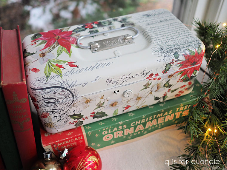
My favorite was this one.

I actually ended up keeping it.  I love the subtle nod to Christmas with the poinsettias and the red typography.  It doesn’t scream Christmas with candy canes and Santa Claus, and that’s what I like about it.

This is another one from last year …

I used some of that same Christmas floral transfer, Evergreen and Holly, from Dixie Belle.

Unfortunately, that transfer was a limited time only sort of deal.  They don’t have it anymore, and as far as I can tell they aren’t coming out with a new one for this year.

So I have been searching high and low for something similar to use on some toolboxes that I have waiting in the wings for this year.  But everything I’m finding is coming up short.

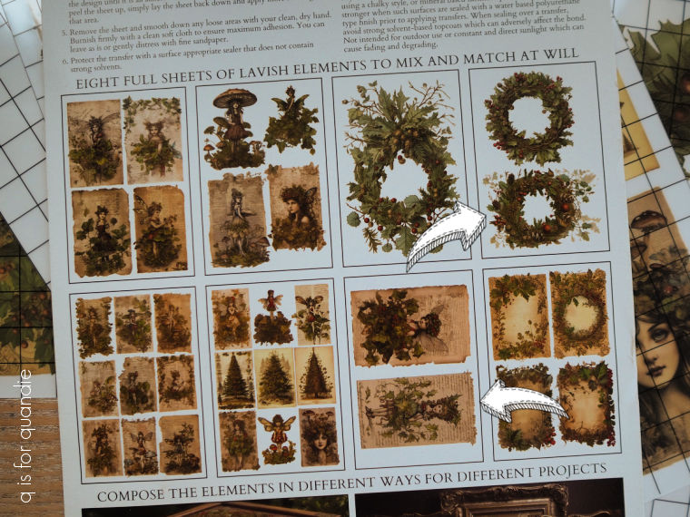
I did order the Holly Jolly Xmas transfer from redesign with prima, but those designs are a bit too big to fit on a typical toolbox.

When the new I.O.D. holiday release came out, I was super excited about a couple of their new holiday transfers; Candy Cane Cottage and Fairy Merry Christmas.  So I ordered those too.

I noticed that the sheets they came on were a bit smaller than usual, but I figured they’d still be perfect for toolboxes.  But I was wrong.  Or at least sort of wrong.  A few of the elements are a good size for toolboxes, but many of them are just way too small.  Plus, I’m mainly interested in the florals, which are absolutely gorgeous, but again, quite small.

All in all, I’m pretty disappointed.

But that being said, I am going to try to find ways to use them … maybe just not on toolboxes.

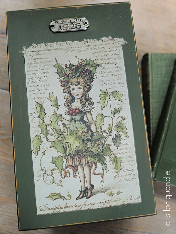
That brings me to today’s project.  I have a stash of various recipe or card catalogue type of wooden boxes.  So I decided to paint one up that was just the right size for one of the images from the Fairy Merry Christmas set.

I painted the box in Dixie Belle’s Cactus, and once dry I added a merry fairy to the top.

Sweet, right?  But maybe not 100% my cup of tea.  I love the delicate look of the holly, and boy oh boy do I wish they had some transfers that were just sprigs of that holly!

The closest thing to that in this transfer set are the three wreaths that are included.

Two of which are a mere 6″ wide and tall.

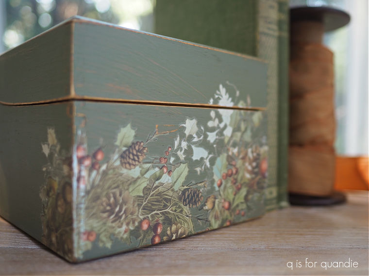
I really wanted to use more of those pretty holly elements on this box though, so I ended up cutting up one of the wreaths and re-arranging it around the front of the box.

I think I did a pretty good job of disguising the fact that it was originally wreath shaped.

I chose to add another of the merry fairies inside the lid of the box.

Now, don’t get me wrong.  I do think these transfers are very pretty.  I love the subdued color palette, and the artwork is beautiful.  I just wish they were more suited to my needs.  Selfish of me, I know.

I think this transfer would be perfect for making gift tags, or maybe small wooden Christmas tree ornaments or something.  And who knows, maybe I will end up doing something like that with some of them.

Certainly, this little box turned out nicely.

But I sure do wish I could find another Christmas floral that I like as much as I liked that Dixie Belle Evergreen and Holly!

How about you?  Do you have a favorite Christmas transfer?  Any suggestions for one that might work on my toolboxes?  Leave me a comment and let me know!

a spice rack?

My friend Sue found this … well … I don’t really know what it is … for me recently.

What do you think its original purpose was?  I’m leaning towards shoe shine box.  Those dark stains could be shoe polish.

I thought I’d give it a new life repurposed for something else though.

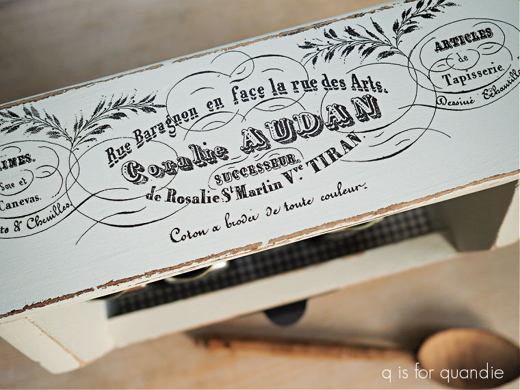
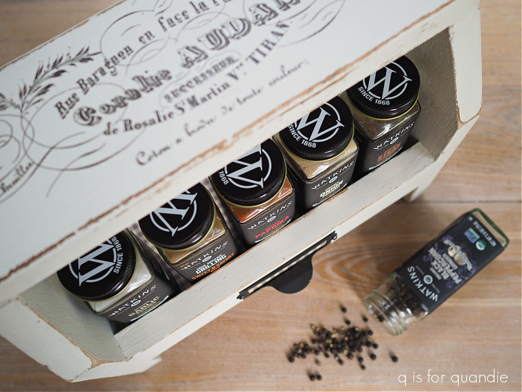
I started by painting it with Dixie Belle’s Drop Cloth, once dry I distressed the edges and then added an I.O.D. transfer to the top.

That section from the Brocante set fit perfectly.

I then gave the entire piece a coat of clear wax.

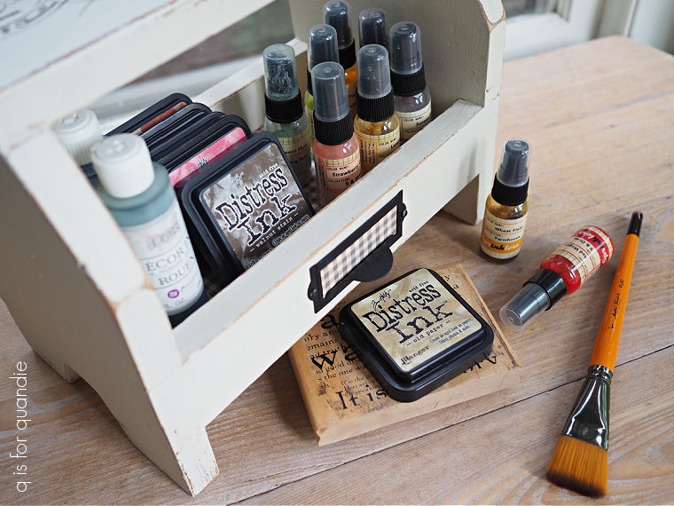
Next I lined it with some gingham paper, and added a metal label holder to the front with the same paper added.

Now all that’s left is to figure out what it could be used for … other than a shoe shine box that is.

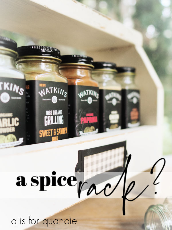
My first thought was ‘spice rack’.

Wouldn’t it be cute sitting on the kitchen counter filled with spices?

But maybe you don’t really cook all that much, and instead you prefer to spend your time crafting.

Well, it would work great for holding your craft paints and/or inks.

Why do I have so much ink, when I rarely use it any more?

Somehow I just can’t seem to part with it.

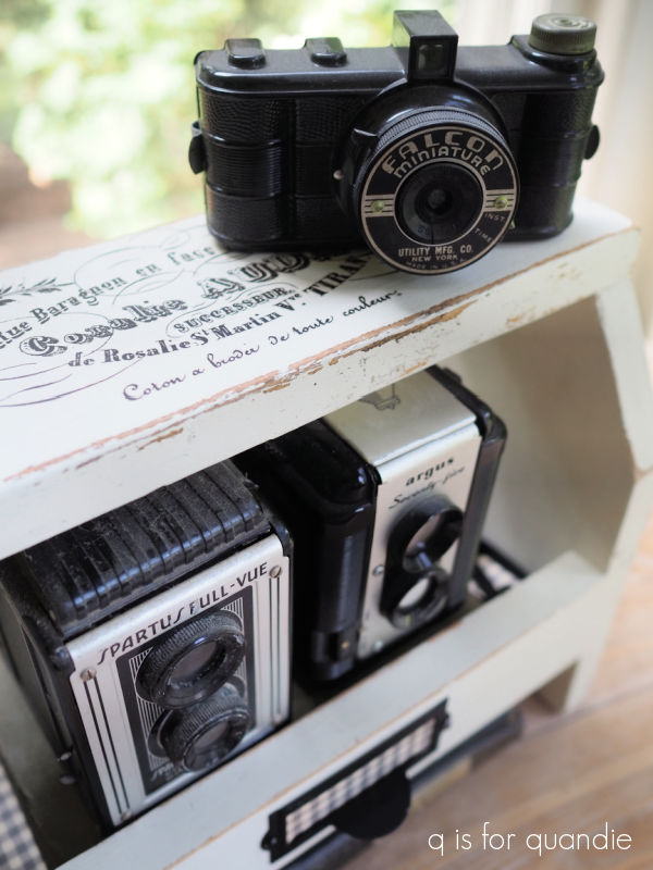
Then of course, there is always the option of just using it to display your non-collection of vintage cameras.

Or some other non-collection that is on the small side.

So many possibilities!

What would you use it for?

far from faultless.

I suspect that not too many of us actually enjoy doing laundry, am I right?

Sorting, shoving things into the machines, realizing after washing that you left a kleenex in a pocket, drying, folding and then putting away.  Not exactly fun times.

But I have to admit that I actually do enjoy the process of laundering vintage linens.

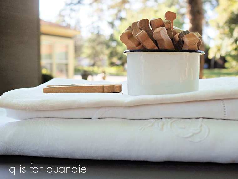
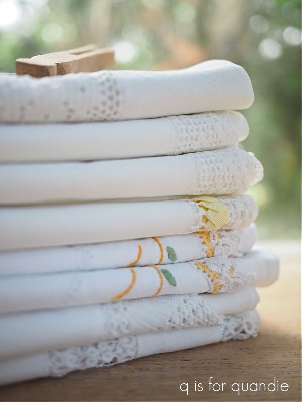
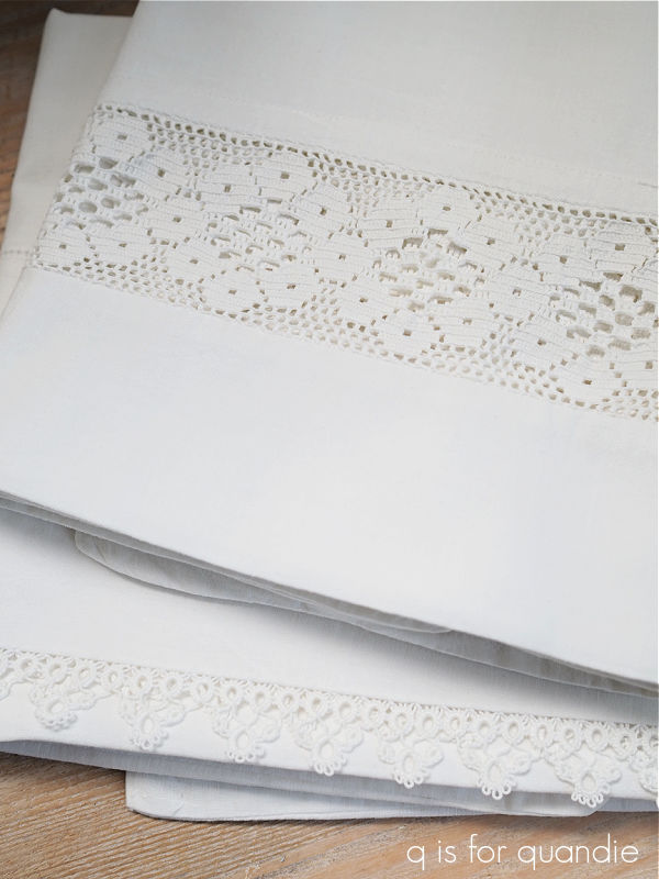
They are so lovely to handle, and there’s something so satisfying about a crisp stack of freshly laundered and pressed white linens.

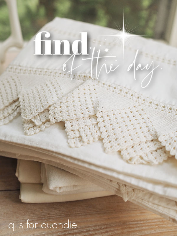
You may remember that I purchased a few vintage pillowcases at the Fridley garage sales earlier this summer.

After I took them out of the ziploc bags that they came in and inspected them a bit more closely, I found that they needed to be whitened up, and a couple of them also needed a bit of mending.  So I thought I’d share that process with you.

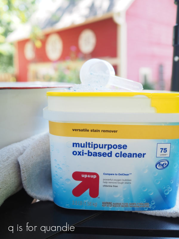
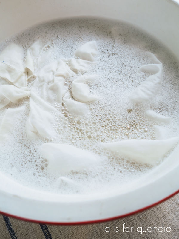
The first step for me is to soak them in some OxiClean, or in this case, a generic oxi-based cleaner from Target.

I usually soak them for at least a few hours, or even overnight.

Then, after removing them from their oxi bath, I wash them on the gentle setting in my washing machine.  Except for the more fragile ones, those just get rinsed by hand in the sink.

Next, I hang them on the line in the sun for a full day to get a little natural, non-chemical bleaching.

I have an ancient clothesline that is attached to the carriage house on one end with some serious looking hooks.

  It has probably been there forever, it was there when we moved in 34 years ago.  I wonder how many generations of laundry have been hung out to dry on that line?

Once they’ve had their day in the sun, I like to press old linens using starch.

I have a sneaking suspicion that very few people iron with starch anymore.  The last time I ran out I had a difficult time even finding it in the shops.  Comically enough, I came across two full cans of Faultless premium starch at an estate sale a while back for $1 each, so I snatched them up.  I’m fairly certain they’d never even been used.

You get a fabulously crisp result using starch.  In fact, I suspect that these vintage linens were originally meant to be starched.

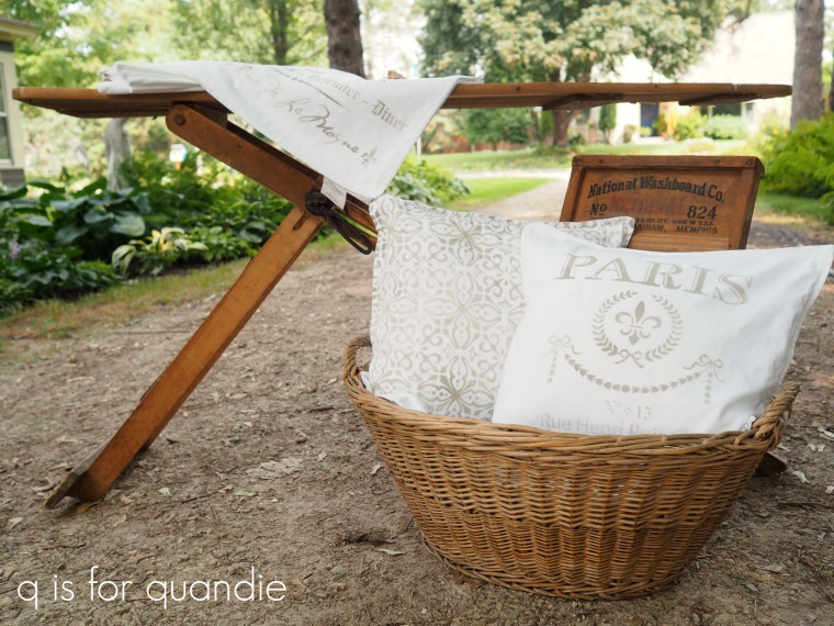
I wish I could say that I press my linens outside in the garden on a pretty wooden ironing board while bluebirds sing in the trees nearby …

But that’s just for photo shoots.

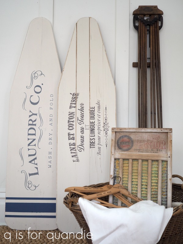
I actually iron in my creepy, spidery, damp, very much non-blog worthy basement.  Maybe I need to rethink that?  Now I’m regretting all of the fabulous vintage wooden ironing boards that I’ve sold over the years.

The next time I see one I should snag it and then keep it handy in the carriage house, or maybe even the potting shed, for outdoor ironing.

Anyway, back to the starching.  This is usually the step where I find out that my vintage linens are far from faultless.  As I’m laying them out on the ironing board and pressing out each wrinkle, I find all of the flaws that I didn’t notice before.

I’ve mentioned a few times that I’m not much of a seamstress, despite my mom’s best efforts at teaching me to sew.  But I can manage a little simple mending with a needle and thread.

Does the fact that the needle packaging says “West Germany” give you an idea of how old those needles are?  I’m sure I purchased those at a garage/estate sale too.

This repair didn’t take much effort, and was easily accomplished while watching my favorite gardeners on YouTube.

My repair job isn’t quite faultless either, but it will do the job.

The amount of work that went into some of these pillowcases is quite amazing.

Sadly, some of them are just too far gone for my simple mending skills though.

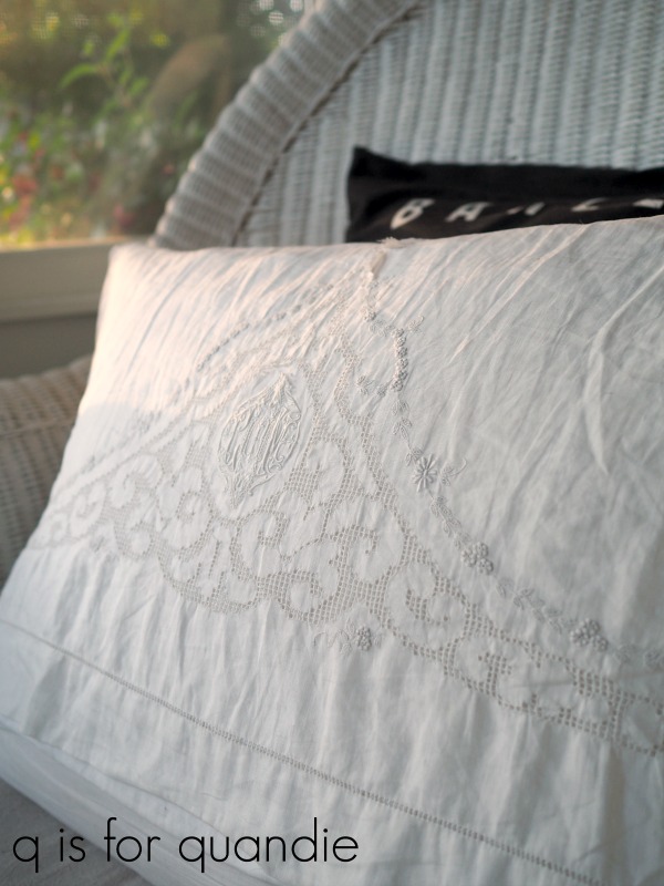
Such is the case with the pillow case that I was using on the wicker chaise that used to be my front porch.

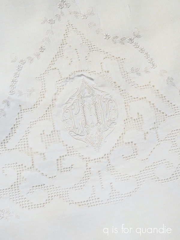
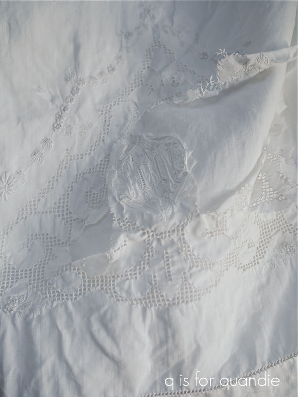
The work on this one is so beautiful, just check out the detailed embroidery on that monogram …

and that floral border.  And the cutwork is painstakingly detailed.

Living on the three-season porch for over a decade had really done a number on it though.  The fabric itself was deteriorating and basically shredding in some spots.

And unfortunately, even just a gentle soak weakened the fabric so much that when I hung it on the line it totally fell apart.

So sad.  I did get years of enjoyment out of it before this happened though, so I’ll console myself by remembering that.

If any of you locals are looking for some lovely vintage pillowcases, I took a few of these in to Reclaiming Beautiful in Stillwater last week.

I priced them low, ranging from $12/pair to $18/pair for the prettiest ones, so be sure to head down there soon!


big projects and little projects.

You may have noticed that I didn’t have a blog post on Monday, or on Wednesday (maybe someone noticed?).  As it turned out, for the last week or so I had a number of irons in the fire, but nothing that was both completed and felt blog-worthy.
The first big project was fixing/replacing a section of our very rickety privacy fence.

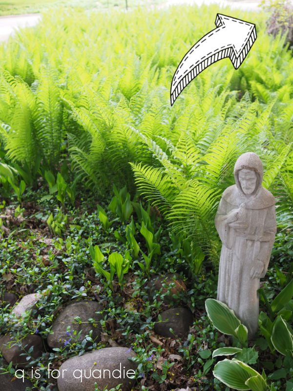
Last winter the 24′ section that was 3′ tall behind my fern bed toppled over.  It was pretty well disguised by the ferns that grow tall enough to hide it, but here’s a photo that will give you just a hint of what it looked like.

Those ferns tend to die back early, so it was time for some sort of solution.  We debated just pulling out that section and going fenceless there.  That option seemed pretty reasonable when looking at the area in summer when the ferns are taller than the fence was anyway.

But that’s only good for about 3 months out of the year, for the rest of the year we needed something to block the multiple vehicles in the neighbor’s driveway.  Luckily I have some really awesome neighbors who are good at DIY, and have lots of tools, and access to cheap labor (high school kids who need a little cash).  So all of that added up to replacing that 3′ tall section of fence with a 6′ tall section instead.

It was still a big job and took about two days to complete.

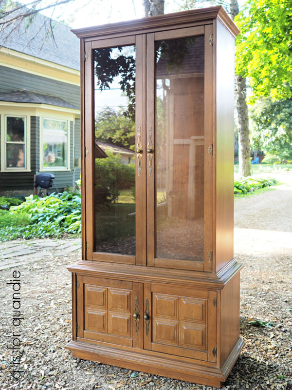
The other big job I’m working on is painting that hutch that I purchased a few weeks back at a garage sale.

I have it mostly painted, but I’m waiting on some supplies for finishing it up, so it’s kind of at a standstill for now.

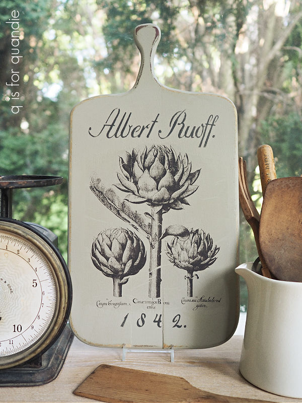
Meanwhile, I did squeeze in a couple of smaller projects in between the bigger ones, such as this cutting board.

It was a fun little project, but there is really only so much you can say about painting a cutting board, so it didn’t seem worthy of its own blog post.

I painted it in Dixie Belle’s Dried Sage, then I added the artichokes from I.O.D.’s Melange paint inlay.  Then I felt like it needed just a little something more, so I added the ‘Albert Ruoff’ and the ‘1842.’ from one of the 8″ German Grain Sack stencils from ellen j goods.

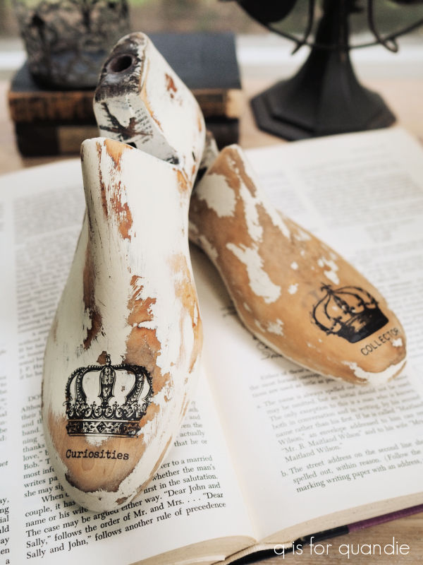
Another small project I completed this week was this pair of shoe forms.

I purchased these at a garage sale quite some time ago … dare I say several years ago?

If these had a really cool original patina, I would have left them alone.  But I thought they could be improved with a paint job.  So sometime last year I painted one of them in Dixie Belle’s Drop Cloth and one of them their Midnight Sky.  Then I attempted to add some transfers, but instead of the transfer sticking to the paint, the paint stuck to the transfers and pulled right off.  I suspect that these forms had been ‘spruced up’ with some kind of oil or wax before I purchased them, thus causing adherence problems.

So I ending up pushing them to the back of the shelf where they sat for the last year or so.

But I pulled them out recently and gave them both a good sanding.  I thought the one that was originally painted in Drop Cloth looked pretty good, so I simply added a crown and some small wording from a Tim Holtz transfer.

Wouldn’t it have been more fun if that transfer said ‘non-collector’??  LOL.

I decided to paint up the 2nd one in a similar way.  So I gave it two coats of Drop Cloth, and then sanded heavily to distress.  I followed that up with another crown and some wording.

I also added a little number to the heel.

And there you have it.  Two big projects, and two small projects.

Hopefully I’ll have a few more fun things to share with you guys next week, so be sure to stay tuned!

it won’t hold water.

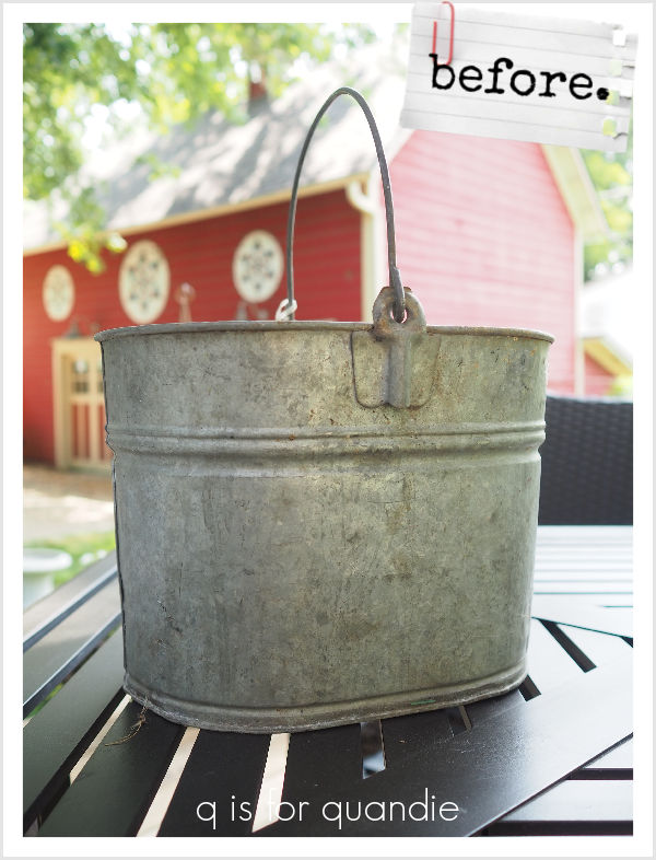
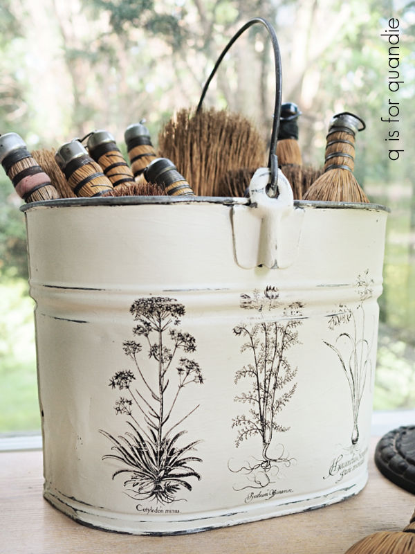
I purchased this galvanized bucket at my friend Lisa’s occasional sale.

I was mainly drawn to it because of its unique oval shape.

But I pretty much love old galvanized buckets in general, regardless of shape, and have several myself.

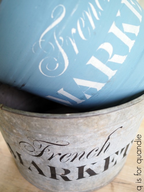
Back in the beginning, let’s call it b.f., ‘before transfers’, I used to stencil on them.

I still have one of those French Market buckets serving as the trashcan in our bathroom.

Sometimes they were painted first, and then stenciled.

And then I discovered transfers.

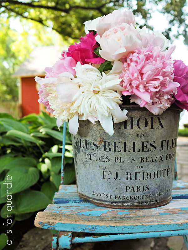
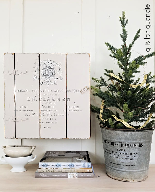
Most of the buckets I’ve kept have wordy transfers added to them, like this one …

I use them for flower arranging, or for containing a small Christmas tree.

However, it seems that when I leave them unpainted and just add words they don’t sell very quickly.  So perhaps it’s just me that likes them that way?

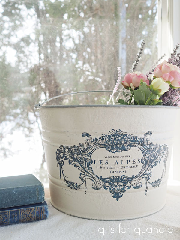
The painted ones, on the other hand, tend to fly off the shelves.  This one originally just had some wording and it never did sell, so I painted it and added a transfer and it sold quickly …

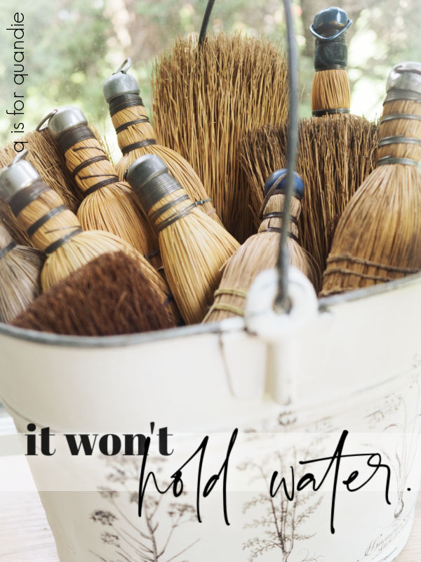
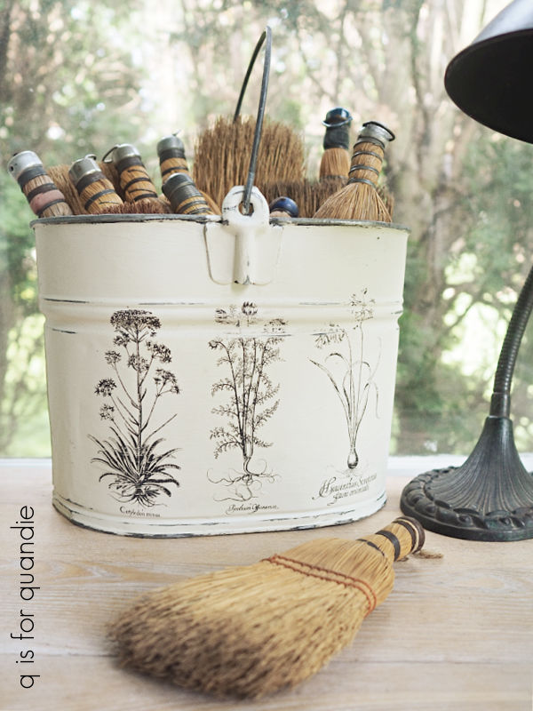
So I decided to go ahead and paint the oval bucket in Dixie Belle’s Drop Cloth.  Then, rather than adding a transfer, I thought it would be fun to try an I.O.D. paint inlay this time around.

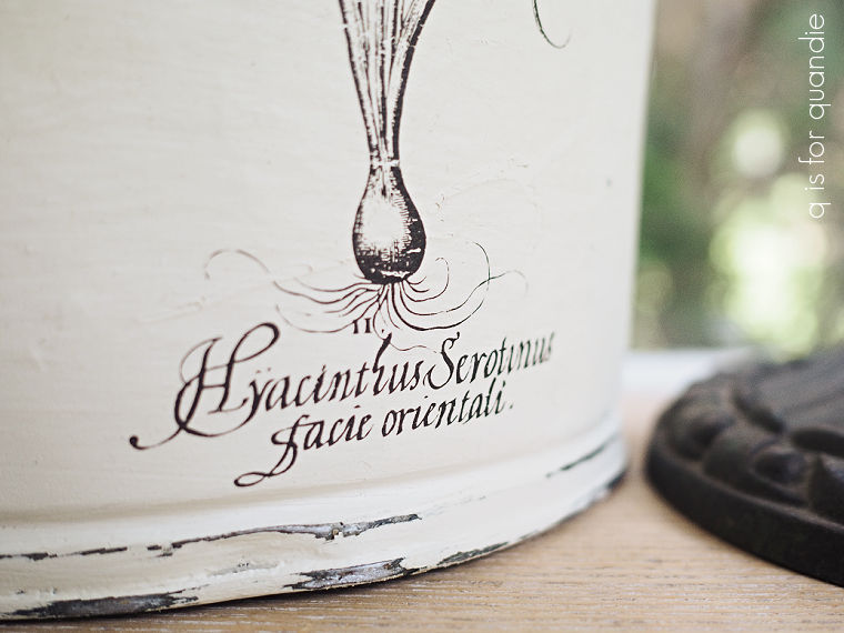
I added a section from the Melange inlay that has three wildflowers in a row, at least I think they are wildflowers.

Wait a minute, upon review, no they are not wildflowers …

That one seems to be a hyacinth, so let’s go with just ‘flowers’.

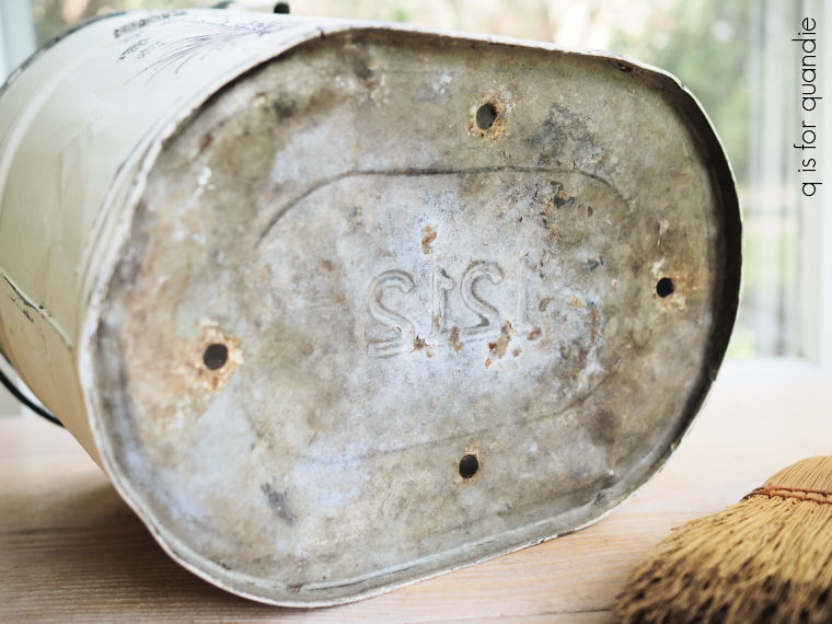
Some previous owner of this bucket added drainage holes to the bottom so that it could be used as a planter.

So it definitely won’t hold water.

But I added several coats of spray sealer so that it could be potted up with plants and used outside or in.  Wouldn’t it look great filled with herbs?  Or even just simple geraniums?

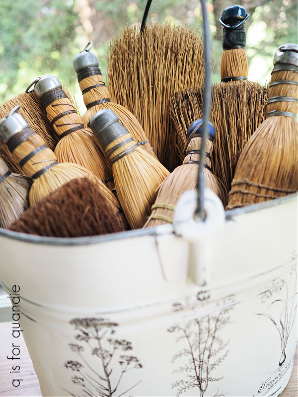
I went ahead and filled it with whisk brooms for my photo shoot, because, well, why not?

You wouldn’t have to use it for plants.

I’ll be bringing this one into the shop, so we’ll just see how well it sells with a paint job.

What do you think?  Do you prefer the painted buckets over those with just words over the galvanized metal?  Leave a comment and let me know.

up a creek.

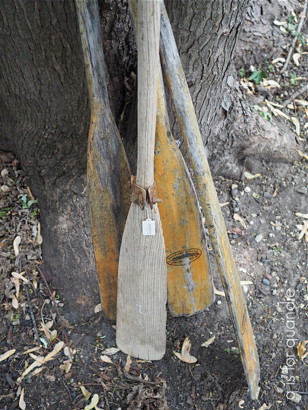
Remember the oars that I found at the MacGrove garage sales?

Well, if you read the comments on my blog posts, you may have noticed that a neighbor of mine mentioned that she’d be willing to trade me some toolboxes for the oars.

To be honest, I wasn’t really sure what I was going to do with all of those oars.  I just couldn’t pass them up at only $2 each and I figured I’d come up with something.

But would I rather have some toolboxes?  Yes I would!

So I loaded up the oars and headed over to Karen’s house (not nnK, my neighbor across the street, another Karen, I may have to start calling her onK, or ‘other neighbor Karen’).

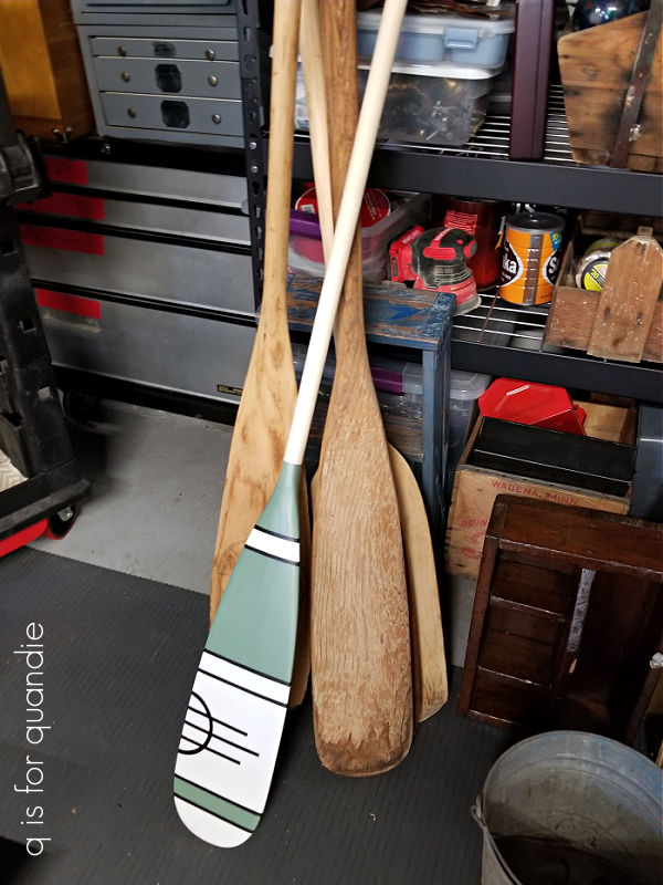
Turns out, this was an excellent decision.  As it happens, Karen is a bit of an oar (or paddle) artist.

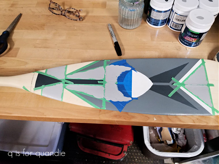
The one shown above is still in progress, but isn’t that a cool design?

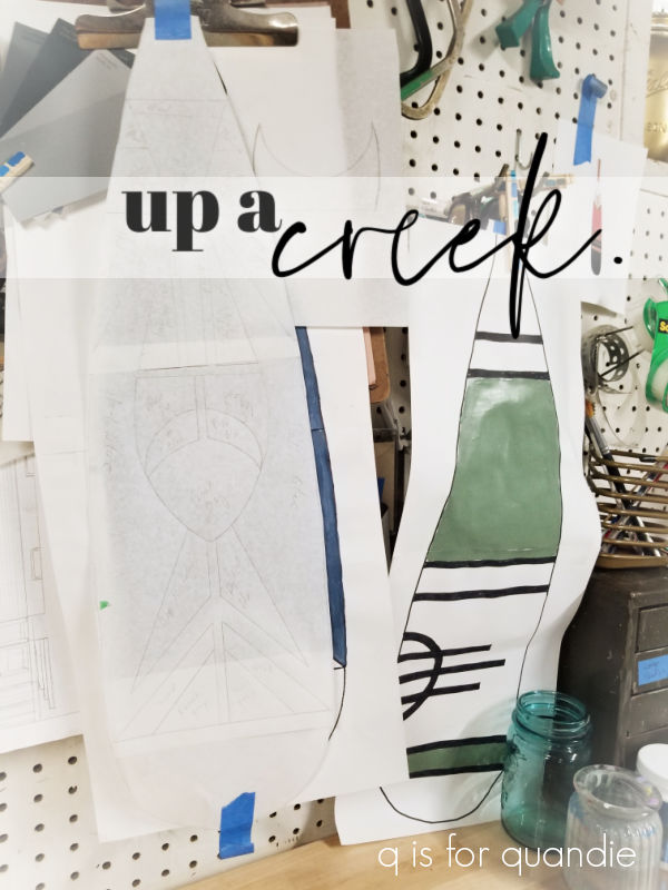
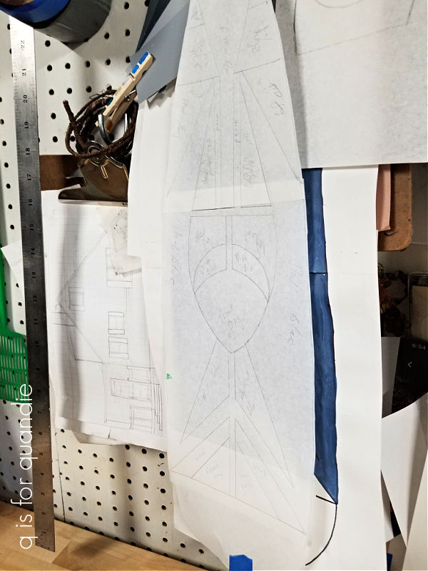
Karen does some very precise work, and she starts by drawing out her pattern on paper.

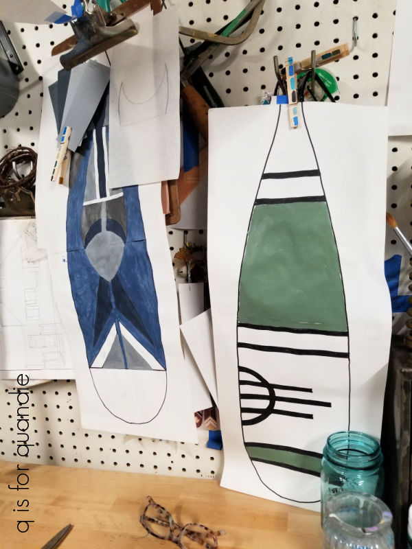
Then she even tries out her color selections on paper before painting the actual paddle.

Such a great way to make sure your colors are going to work together.

I really like the abstract fish design that she’s adding to this one …

As you can see in the upper right of that photo, Karen uses regular ol’ latex paint.  She gets the sample size jars and has them mixed up in whatever colors she wants to use.  It’s pretty cost effective, and she doesn’t need much of each color of paint.

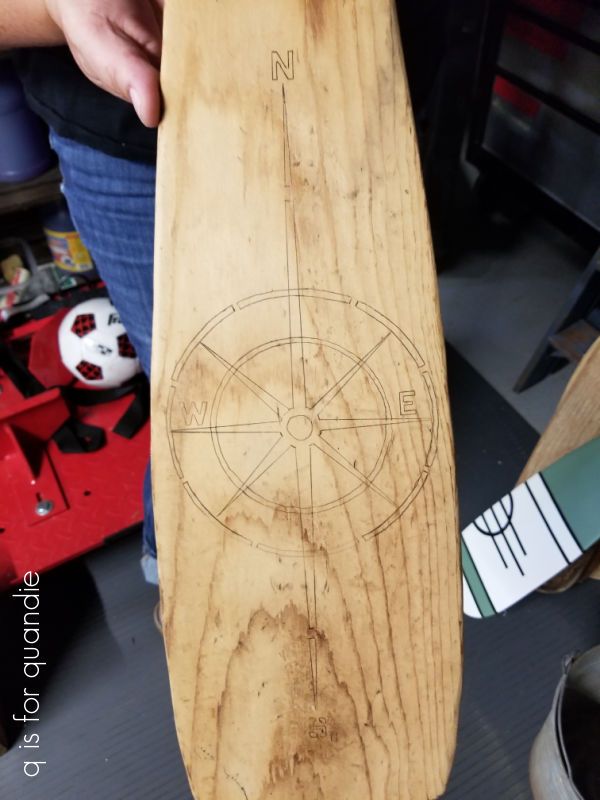
Here’s another design that she has just started working on.

I don’t believe she ever does the same design more than once.

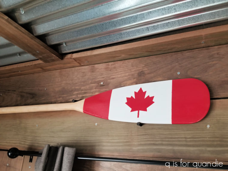
She created the Canadian flag version below for her husband who is originally from Canada.

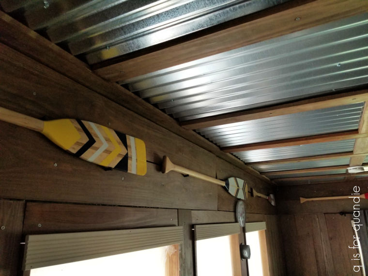
Karen displays a number of her paddles around the perimeter of her sun room (which happens to have really cool wood clad walls and a corrugated metal ceiling).

I think it’s fair to say that Karen will never be up a creek without a paddle!

I’m so glad that the oars went to someone who is going to do something like this with them.  I would never have come up with anything as special for them.

Unfortunately, Karen doesn’t have any sort of social media presence so I can’t send you anywhere to look at her work.  But I’m sure she’ll be reading this blog post so be sure to leave a comment and let her know what you think of her gorgeous paddles and oars!

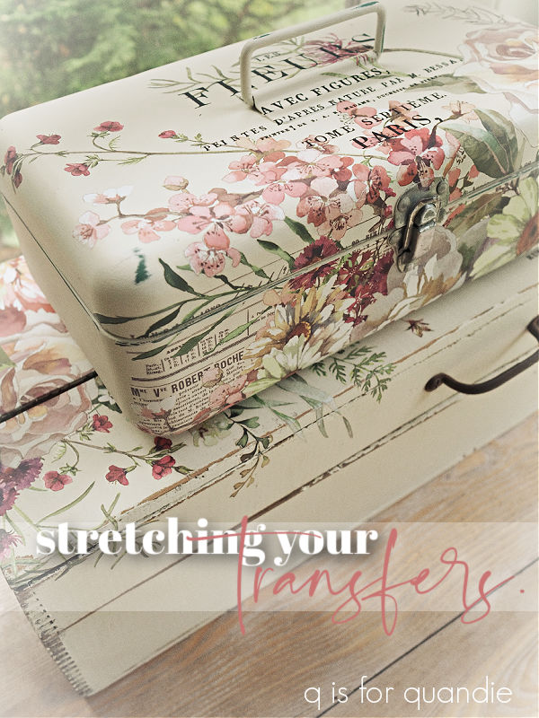
stretching your transfers.

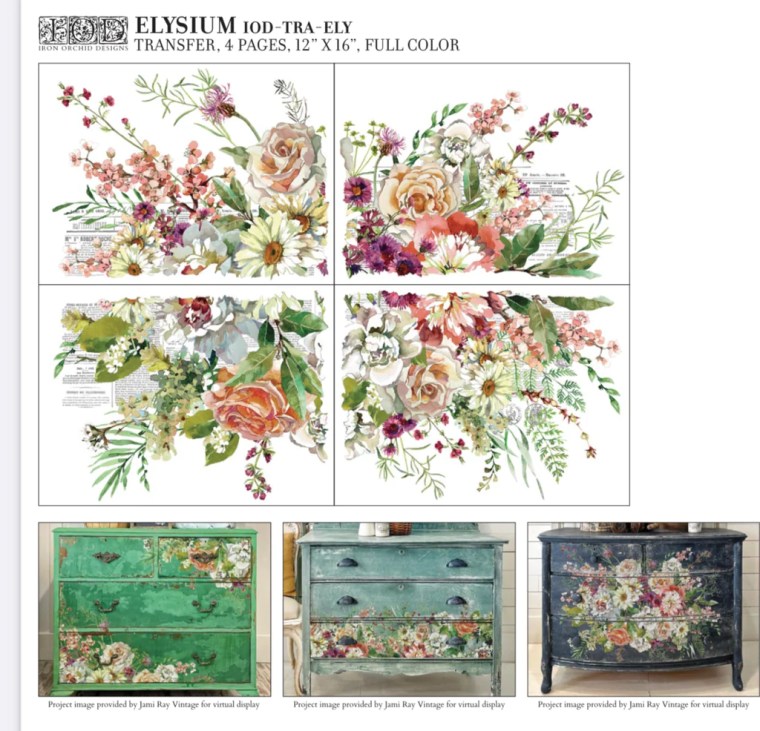
I’m sure that many of you saw that I.O.D. came out with a new summer release recently.  It included a couple of really pretty transfers.  Even though I’m trying not to buy new transfers, and instead use up the ones that I have, I just couldn’t resist this one called Elysium.

This transfer costs around $30 (plus shipping in most cases), so adding it to a smaller item, like a toolbox for example, that I am planning to sell for less than $50 doesn’t seem like a smart plan.

But I figured I could break it up and get at least 4 smaller projects out of just this one transfer, and suddenly the cost seems a lot more realistic.

So far I’ve used it on two pieces, so I thought I’d share those together today.

First up is the rustic box that’s underneath the wood tote in this photo …

It may once have looked pretty cool with that paper label on the front, but there wasn’t enough left of the label to salvage.  So I cleaned the box first, then sanded off most of that label.  As I was working with the box, I realized that it was pretty much falling apart.  So I did a little gluing and nailing too.

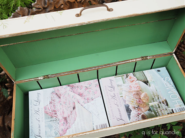
Finally it was ready for paint.  I first painted the interior in Dixie Belle’s Kudzu.

Other than paint, I left the inside quite plain.

I kept the pretty stuff on the outside.

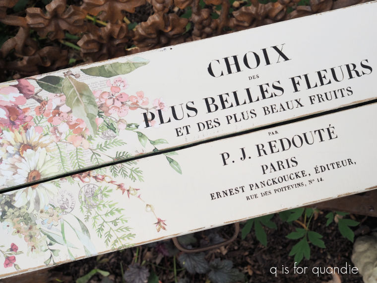
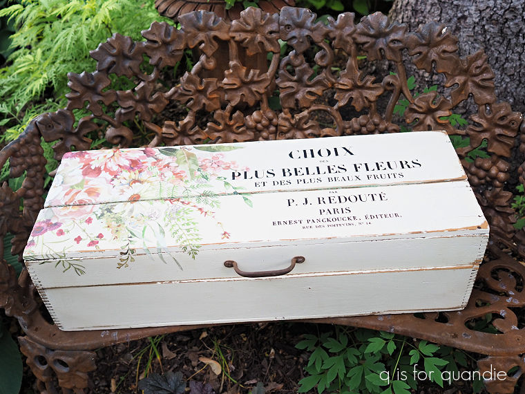
After painting the exterior of the box in Dixie Belle’s Drop Cloth and sanding it well to distress the edges, I added just one sheet of the Elysium transfer to the top (this transfer comes in 4 pieces).
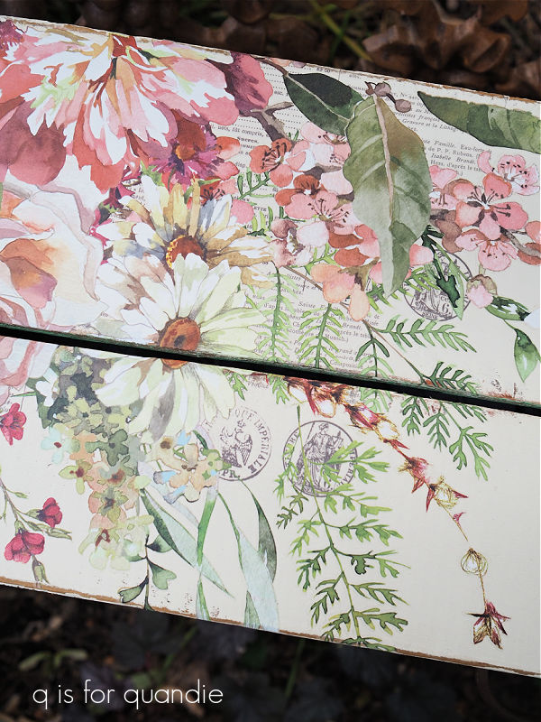
One thing to note with this transfer is that there is some typography in the background.  It’s subtle, but it’s there.  So you want to be careful to not place it with the words upside down.

 Next I layered on some wording from the I.O.D. Label Ephemera transfer.

Once I had those in place, I decided that the box needed some rustic hardware, so I added this old rusty handle that I had in my stash.

And voila, a fun box that would be perfect for housing your stash of Jeanne d’Arc Living magazines (or any sort of magazine really).

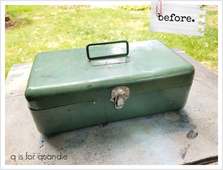
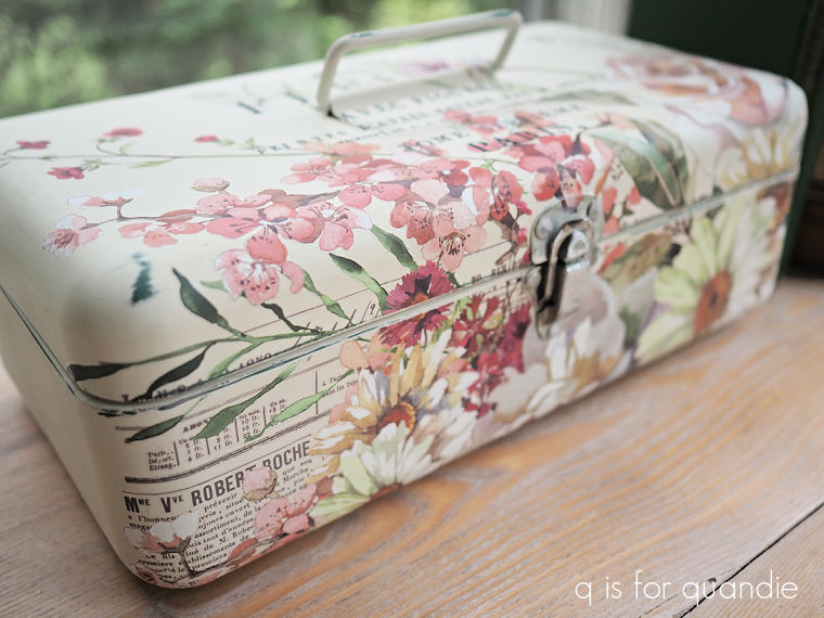
The 2nd project using just one sheet of the Elysium transfer is this tackle box.

I picked this out of a ‘free’ pile on the curb in my neighborhood.  Mr. Q and I were passing by on our daily walk and there it was, so I grabbed it.

It didn’t look too terrible on the outside, but the inside was a gunky mess.

I actually ended up discarding the tray because I didn’t think it was worth the effort to save.  But for the rest of the interior I first soaked it in soapy water and then scraped off as much gunk as I could.  Then once dry, I sanded it down until it was mostly smooth.

Then I applied a coat of Dixie Belle’s B.O.S.S. to prevent any kind of bleed thru problems in the future.  I followed that up with two coats of DB’s Holy Guacamole.

Then I sealed it with two coats of DB’s flat clear coat.  My main goal here is to make the inside of the box suitable for use, whether that use is containing art supplies, storing old photos or holding your makeup.

I painted the outside in two coats of Drop Cloth, and then I added the Elysium transfer.

Once I had the floral in place, I again added some wording from the I.O.D. Label Ephemera transfer to the top.

With this section of the transfer, it would be much more apparent if the background typography was upside down.

So there you go, two projects down and I still have two more sections of the transfer to use on a couple more things.

Both of these items are for sale, so be sure to check my ‘available for local sale‘ page for more details if interested.

As always, thank you to Dixie Belle Paint Co for supplying their products used in these makeovers.