the stuff that didn’t sell.

Even after more than 25 years of refurbishing vintage furniture, I don’t always know exactly which pieces will sell quickly, and which ones won’t sell at all.  Somehow I still sometimes manage to get it wrong when making decisions about the new look for a piece.

In general, I find that pieces painted in a neutral color such as white, black, dark navy or grey sell really quickly.

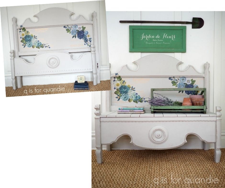
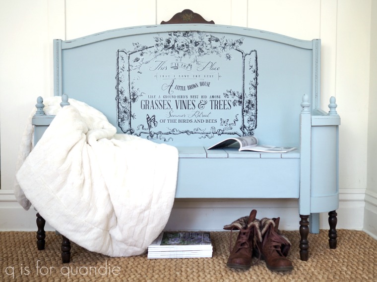
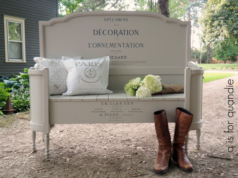
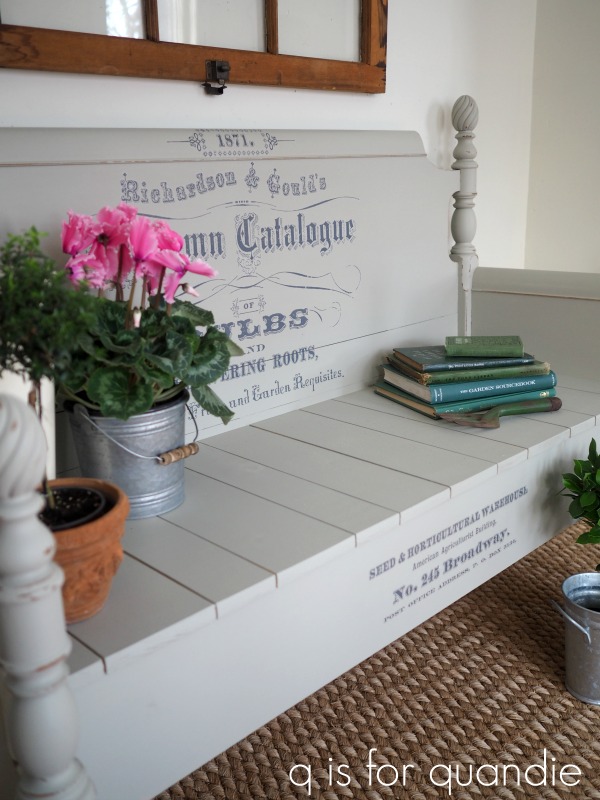
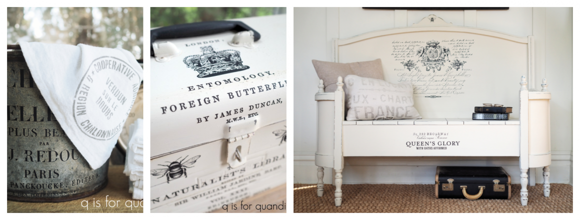
While pieces painted in a less neutral color tend to take longer to sell, and sometimes don’t sell at all.  For example, I originally painted this bench in a smoky pale blue …

I thought the transfer was really pretty, and had the perfect message for a foyer.  And although the color wasn’t quite neutral, it also wasn’t really bright.

But it did not sell.  I gave it 9 months, and then decided to re-paint it in my favorite Dixie Belle Drop Cloth.

And it sold right away.

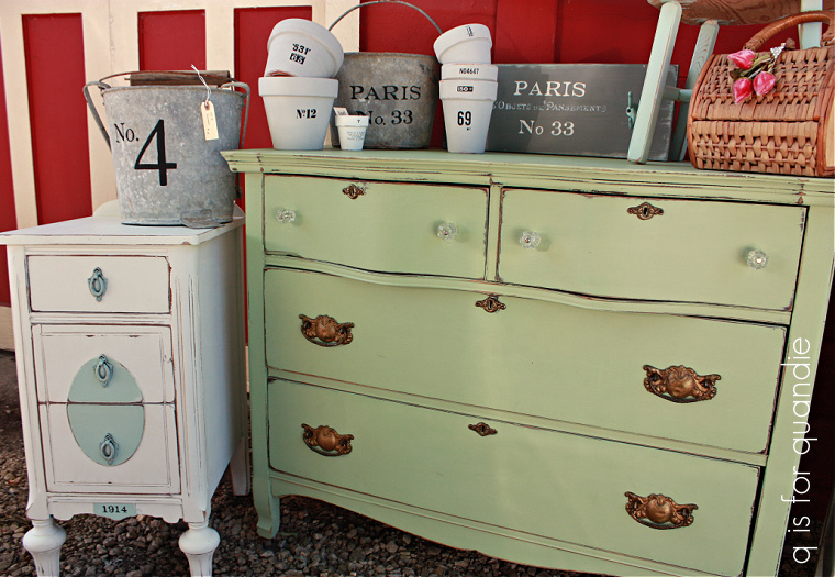
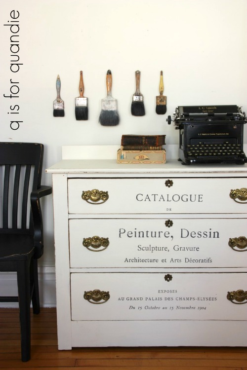
Sometimes the pieces painted in neutrals don’t sell either though.  For example, this dresser did not sell despite its white paint job.

This one really surprised me, the white pieces usually sell easily.  Was it the toile transfer on those two upper drawers?  I loved it, but clearly it was not everyone’s cup of tea.

After months of trying to sell it, I ended up sanding off the toile and adding an IOD transfer over the entire front of the dresser instead.

And once again, it sold fairly quickly.

But there are always exceptions to the neutral color rule, my mid-mod pieces painted in Fusion’s Park Bench green have always flown off the shelf.

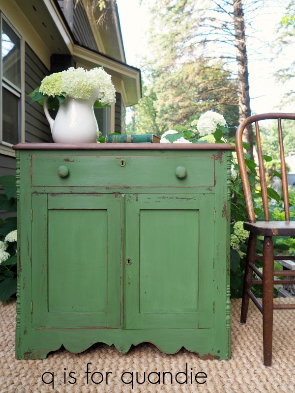
And even this vintage piece painted in a vibrant green milk paint (Sweet Pickins In a Pickle) sold, although it did take a little bit longer than the neutral pieces.

I do think that you have to get to know your own geographical area and what will sell best in your neck of the woods too.  I suspect that the floral pieces may do better in the south, while here in the upper mid-west, people are a little more conservative.  I’m not sure if conservative is the right word, but we’re maybe just a bit less frilly (correct me if I’m wrong about that Southerners).  So whenever I add a floral transfer to a piece, I always assume it will take a little longer to sell.

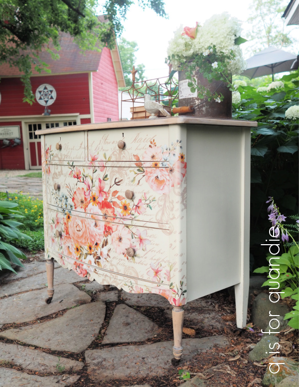
The exception to that rule is this one though …

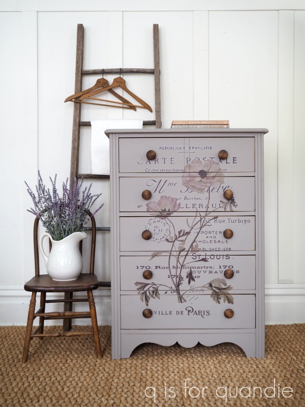
That’s the Rose Celebration transfer from re.design with prima.  I’ve only used it twice, but both times the piece sold really quickly.

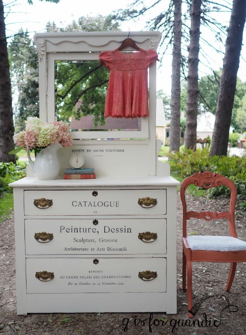
Then there was this piece …

For the life of me, I couldn’t sell this piece with the mirror attached. Generally, I find that it’s more difficult to sell a dresser with a mirror than without.  I think it’s because dressers are so much more versatile without their mirrors.  They can be used in a dining room, or a living room as a TV stand, or in the laundry room or home office.  You’d think buyers could just take the mirror off, but I think most people are reluctant to dismantle a piece like this.

But not me.  With my handyman Ken’s help, I removed the mirror and replaced it with some trim that I painted to match.

And that was all it took to get this one to sell.

Finally, I also find that certain pieces of furniture sell faster than others.  Dressers, nightstands and washstands are the easiest to sell for me.

Things like hutches, cabinets, buffets and chairs usually take a little longer.

And then we have desks and benches.

Desks have just never been a quick sell for me.  Perhaps it’s because people don’t really need desks anymore, or at least not in the traditional sense.  Still, I am a bit surprised that I haven’t found a buyer yet for this one …

At this point I plan to paint a mirror to match that can be hung on the wall behind it to turn it into more of a vanity/dressing table.  Then I’ll restage my photos and try again.  Maybe that will help, maybe not.  I will really be bummed if I eventually have to paint over it.  I absolutely love the IOD transfer I used.  I may have to figure out a way to keep it myself if I can’t sell it.

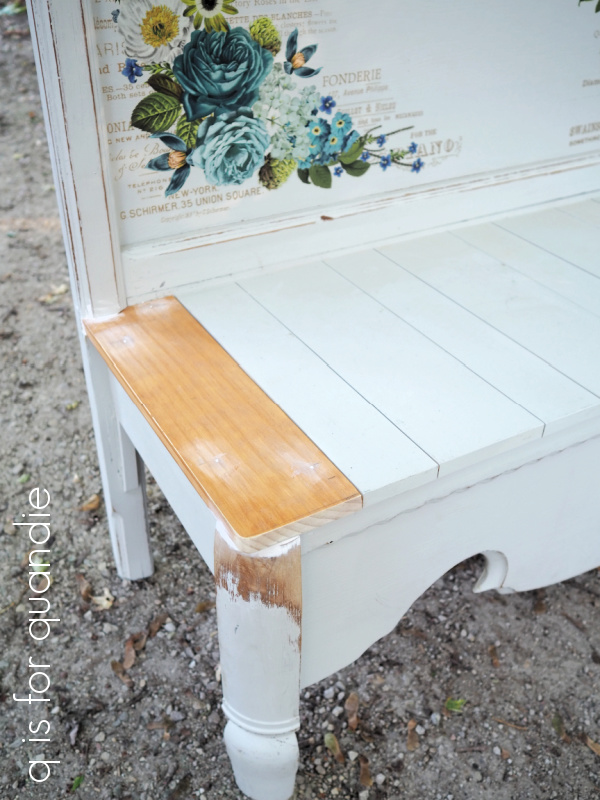
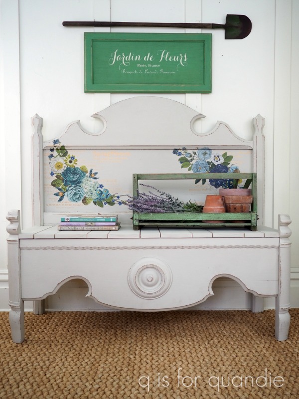
The benches that Ken makes out of old bed frames always take longer to sell as well.  Maybe it’s because I have to charge more for them to pay for the materials and for Ken’s time.  Some of them sold fairly quickly though, like this one in basic black …

Some of them took a fair amount of time to sell, but did eventually go, like this one …

and this one …

And that brings me to this piece.

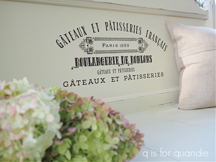
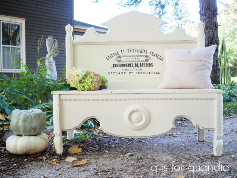
This one started out as a bed frame.  Unfortunately, it turned out to be a 3/4 sized bed (the original owner swore it was a twin, but I should have measured myself).  Once that little detail came to light, I sent the pieces over to Ken’s workshop to be turned into a bench.

I thought he did a brilliant job of re-working that footboard, but Ken was not happy with how it turned out.  He didn’t like the fact that the footboard had those corner posts that stuck up on either side of the seat in the front.  I thought that would be OK though.  It was already mostly painted in Dixie Belle’s Sawmill Gravy and had the Cosmic Roses transfer from re.design with prima on the back.  I’d done this combo before, on this dresser …

and it was a success.  So I touched up the paint here and there and listed it for sale.

But this bench just hasn’t sold.  Is it the color?  Is it the floral transfer?  Is it those posts sticking up in the front?  Or is it a little bit of all three?

I’m not really sure.  So I’m going to change all three.  Last week it once again went back to Ken’s workshop.  He cut off the tops of those posts in the front, then he replaced the two outer boards on the seat.

Now it’s back in my workshop.  I’ve sanded off the transfer and am now giving some more thought to its new look.  Any ideas?  I’ve very tempted to just paint it black.

For those of you who also paint furniture, what do you find sells best in your area?  Do you have a magic formula that works every time?  Leave a comment and share your experience with the rest of us!

good things come in small packages.

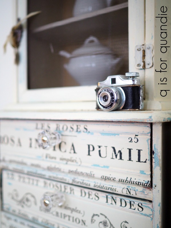
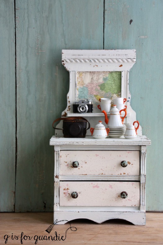
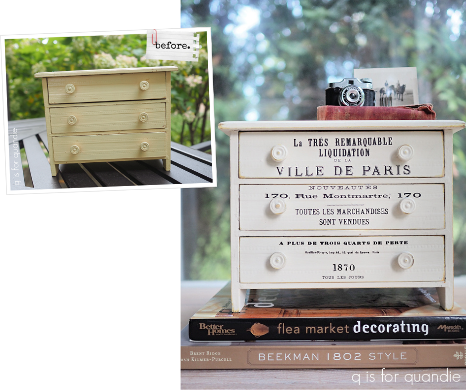
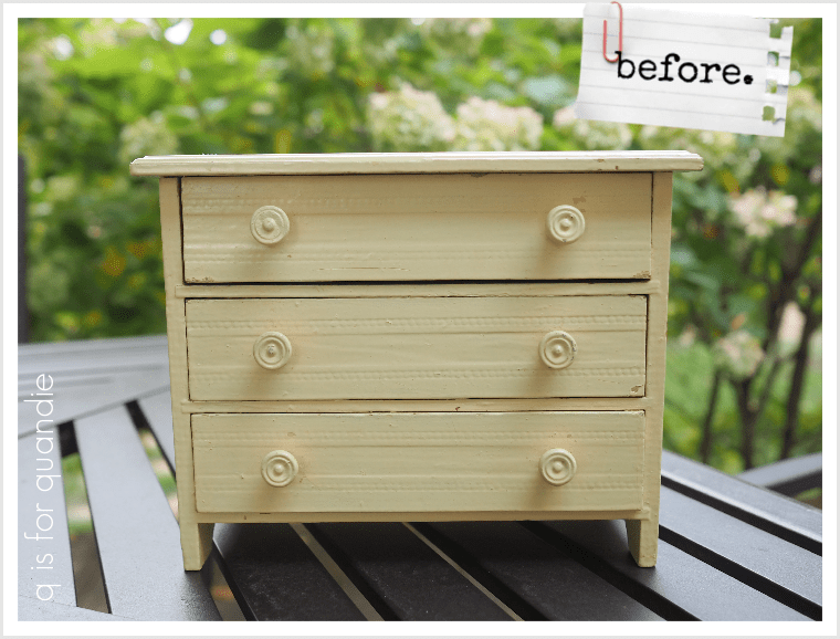
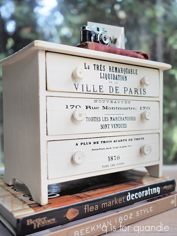
My picker, Sue, knows me so well.  I’m sure as soon as she saw this tiny dresser she snatched it up for me.

Especially when she saw the price tag, which was $1.50.

I’m sure that there are some vintage lovers out there who would have preferred that I left it in its original yellow paint job (and P.S., that photo does not do the color justice, it was a bright yellow).  And I do agree that it has a certain aged charm about it.

But I tend to paint stuff.  In case you haven’t noticed.

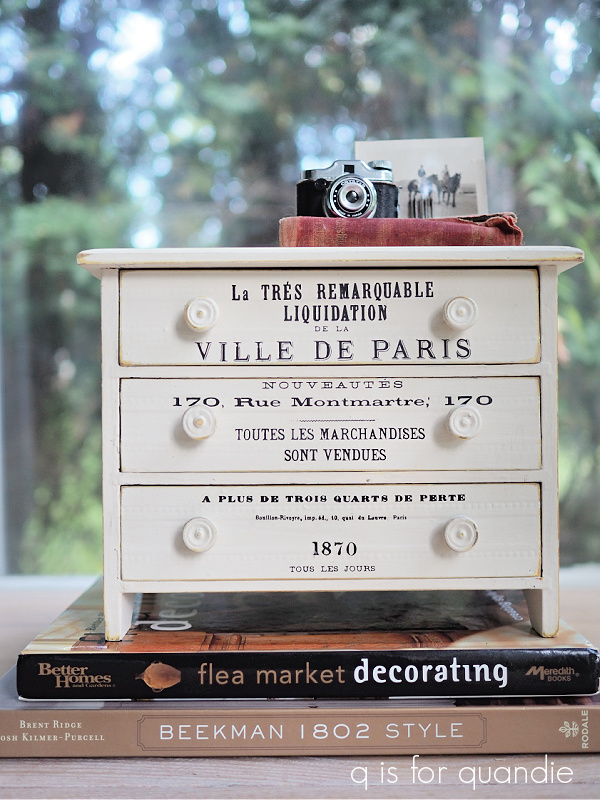
So I cleaned it up, gave it a quick sand and then painted the insides of the drawers using a dark charcoal grey spray paint (because it’s quick and easy).  Then I painted the exterior in two coats of Dixie Belle’s Drop Cloth.

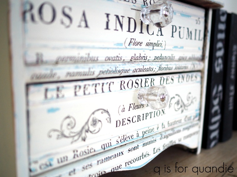
To dress it up I added some wording from re.design with prima’s Paris Valley transfer.

I had to move things around a bit to avoid the knobs.  Seeing as I don’t actually speak French, I don’t know if the order I’ve put things in makes any sense at all.  French speakers everywhere are probably rolling their eyes.

But I think it’s pretty darn adorable.

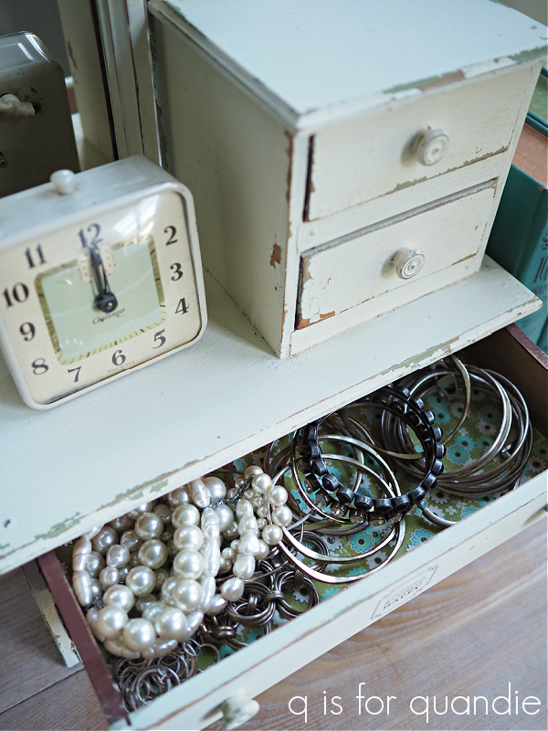
I lined the drawers with some more October Afternoon scrapbook paper.  As I’ve mentioned in the past, October Afternoon was a local company here in the Twin Cities and they have been out of business for a while now.  You can sometimes still find inventory left over from various online retailers though.

I used to stock up at their annual warehouse sales, so I have a lot of their paper on hand still.  Since I rarely scrapbook anymore, I’m always happy to find other uses for it.  This particular design is from their 9 to 5 collection.

I staged this one up simply with my mini camera, a small photo and a little book.

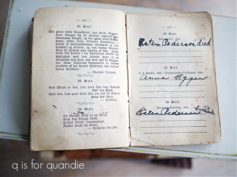
That little book is a birthday reminder book.  It is inscribed to my grandmother from her grandmother on January 2, 1912.  My grandmother was born in 1898, so she would have been 13 at the time.

I’m fairly sure it must be in Norwegian, since that particular great, great, grandmother of mine was from Norway.

My grandmother must not have kept up the book, because I’m not listed on November 22.  For that matter, my mother isn’t listed on her birthday either.  Maybe my grandma didn’t need to be reminded of those 😉

This little dresser could be used to house all sorts of tiny treasures; jewelry, a coin collection, scrapbook supplies, mending supplies, etc, etc.

After all, good things come in small packages.

For now I think I’m going to add this little charmer to my own collection (or should I say non-collection?) of mini furniture.  I just need to find a spot for it somewhere!

inspired by.

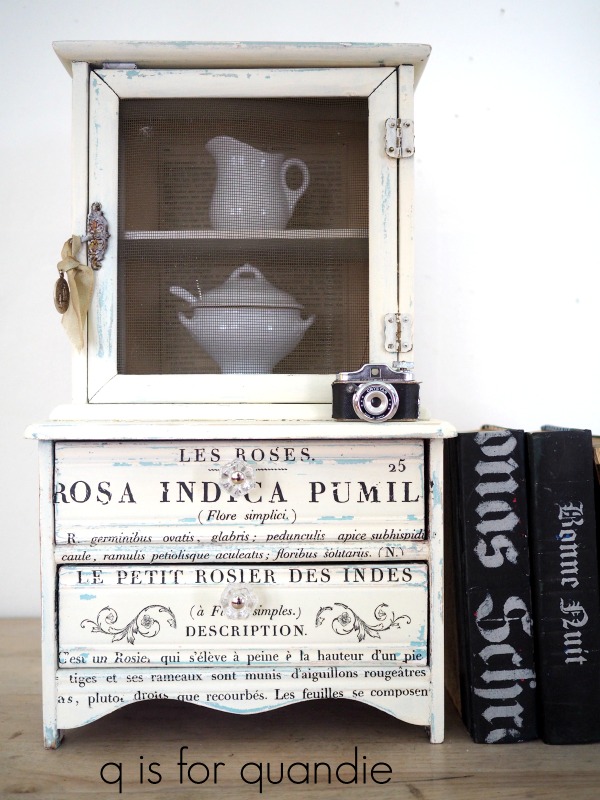
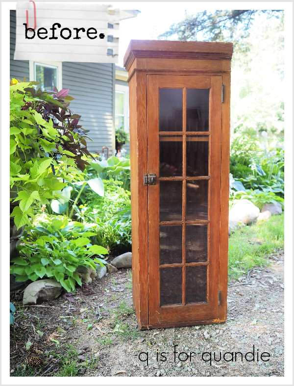
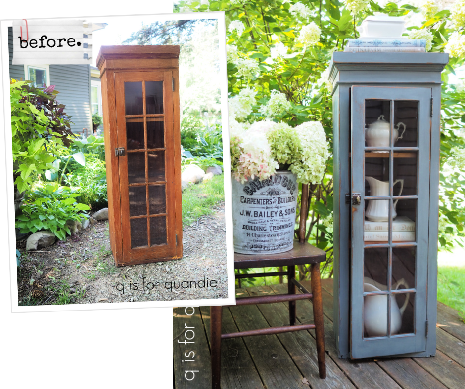
One of my readers offered me this little cabinet a while back.  She’d planned to give it a makeover herself, but never got around to it and finally decided to give it up.  Hey, it happens to all of us, right?

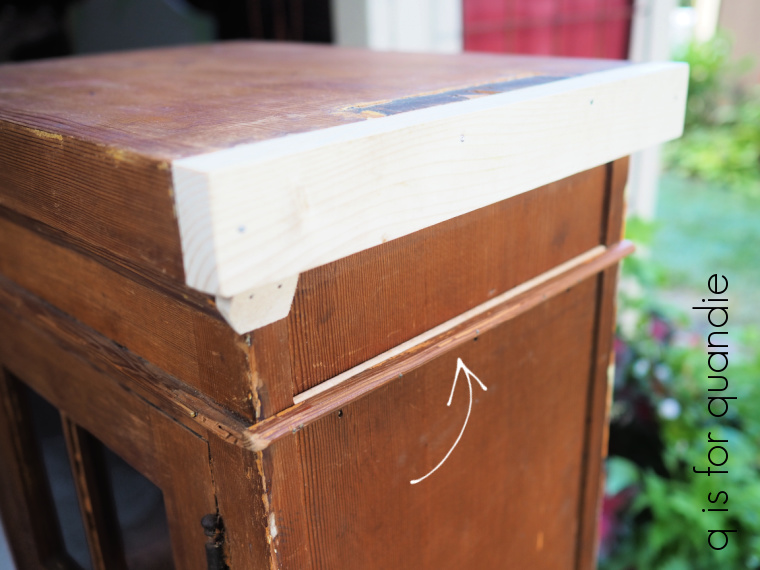
If you look at the top, right side of the cabinet, you can see that this piece was formerly a built-in.  There isn’t any trim on that side because it was up against a wall.  So the first step with this piece was to have my handyman Ken work some of his magic on it.

He wasn’t aiming for perfection, I just wanted him to add a little bit of balance to that side of the cabinet.

So he added a 1″ x 2″ board to the side to ‘match’ the other side, and then he moved that tiny bit of trim (with the arrow pointing to it in the photo above) from the back of the cupboard to the side instead.  He also added a little piece of filler wood behind it so that there wasn’t a gap.

Then he added that little triangular piece of wood under the 1 by 2 to sort of fake your eye into not noticing the lack of trim there.

I used some of Dixie Belle’s Mud to hide some gaps too.  Then I painted all of the new wood in Dixie Belle’s Coffee Bean.  I did that because I knew I wanted to paint this piece in milk paint, and milk paint over raw wood looks a bit different than milk paint over finished (or painted wood) and I didn’t want that area to stand out.

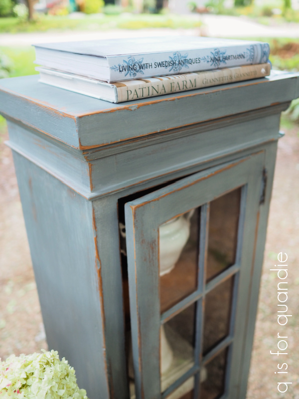
I mentioned that last week’s spooky furniture was inspired by the Kabinet & Kammer book.  I’m often inspired by things I see in decorating books, and today’s piece is another example of that.  This time my inspiration comes from Patina Farm by Gianetti & Gianetti.

Specifically, this cupboard in Patina Farm …

I love that smoky blue grey color, along with the really worn and distressed look of that cabinet.

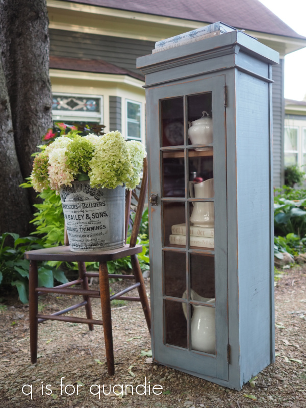
I thought that I could probably recreate that look using Miss Mustard Seed milk paint in Aviary.  So I mixed up the rest of the Aviary paint I had on hand and started painting.

I really cut it close with the paint.  I’d already used some of the package of paint on both my sister’s trunk and a small chair, so I had less than half left.  Luckily I was aiming for a massively worn look because that helped disguise the fact that I didn’t really get perfect coverage with just two coats on paint on this piece, but that was all the paint I had left.

It was enough to give me the look I wanted though.

After painting the outside, I distressed heavily (by sanding with 220 grit paper) and then added a top coat of clear wax.  I ultimately decided not to paint the inside.  I think the smoky blue color works well with the tone of the warm wood interior, and with the door shut you really don’t see much of it.

I did clean it up a bit inside using Dixie Belle’s Big Mama’s Butta though.  This time I used their new scent for fall called Flannel.  It smells pretty much just like men’s cologne, so if you’re looking for a more masculine scent, this is it.  It would be perfect for freshening up the drawers of a gentlemen’s chest of drawers.

This cupboard would be a fun piece to tuck into a narrow spot in your home, and as you can see it looks great with some ironstone inside.

Although this is usually where I tell locals that they can check out my ‘available for local sale’ page for more details, but this sweet little cupboard is already spoken for!

Just a heads up to those of you who look for my blog posts on the regular, my sister and I are flying out later today to visit our mom.  We’ll be gone all of next week, so I’ll be taking a little bit of a blog break.  But I’ll be back with another post on October 4, so be sure to stay tuned!

a little bit spooky.

Last year I shared a cute little chair that I gave a little bit of a spooky makeover to using a stencil.

I thought it was super cute, and it sold right away.  So I thought I’d give it another shot on a larger chair.

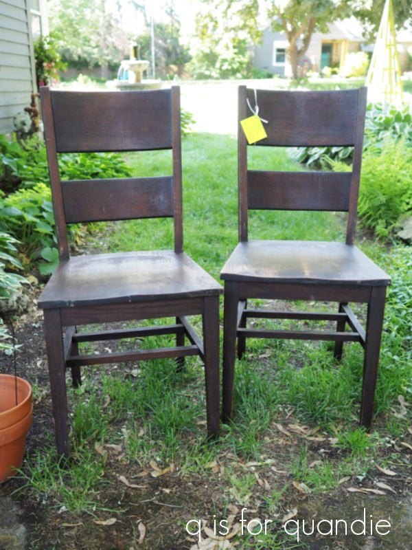
I purchased this pair of chairs thinking I’d save them for a similar treatment for Christmas (paint and a stencil) …

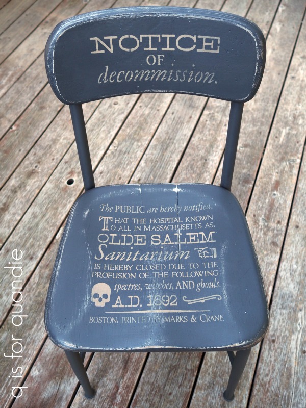
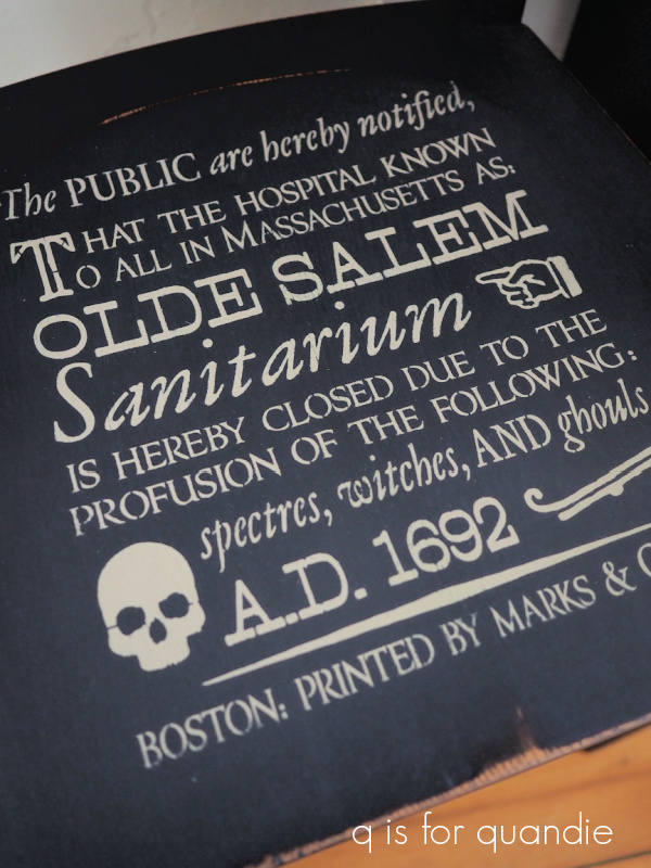
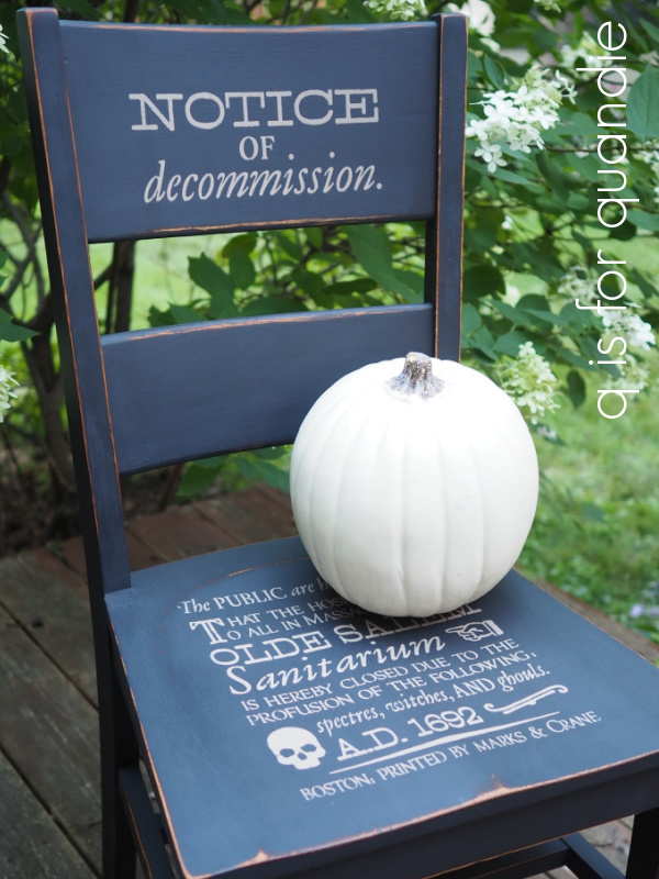
But recently I decided to try the Notice of Decommission stencil on one of them first.  If it doesn’t sell, I can always sand it down and paint it again for Christmas.

I started by cleaning the chair, scuff sanding it lightly and then painting it in Dixie Belle’s Midnight Sky.  I added the stencil using their Putty.

Next I sanded to distress and added a coat of clear wax.

And that was it.

Wouldn’t this chair be cute in your foyer, or on your covered front porch, for Halloween?

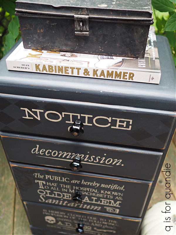
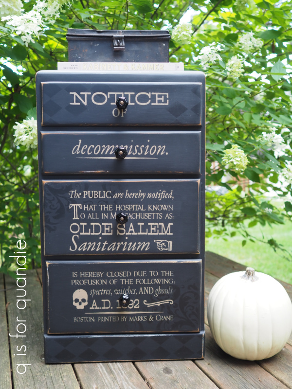
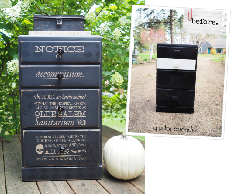
Since I loved the results on the chair, I decided to go out on a limb and use the same stencil on this little chest of drawers that I picked up at the White Bear Lake Trash to Treasure day.

I say I’m going ‘out on a limb’ because I really don’t know if a piece of furniture like this will sell with a slightly spooky theme.  But again, if it doesn’t sell I can always start over with fresh paint.  After all, that’s the beauty of paint.

It appeared as though this piece had been painted with spray paint, and it was starting to peel in some spots.  So I sanded more heavily than I normally would, I had to remove that spray paint almost entirely.  Your paint job is only as good as the surface under it, so painting over peeling paint doesn’t do anything to stop the peeling.

I then gave this piece a fresh coat of the Midnight Sky as well.  Then I decided to add a little depth to the piece by stenciling some designs using a slightly darker black with a tiny bit more sheen.  For that I used Dixie Belle’s Silk paint in Anchor.

I wasn’t entirely sure how this would work out, but I love the result I got.  It’s kind of subtle, and maybe even a little bit ghostly.  I used the Dixie Belle Harlequin stencil for the diamonds and the damask pattern is a stencil from re.design with prima.

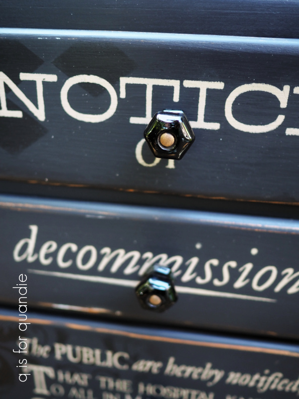
Next I added my Notice of Decommission stencil, again in the Putty.

I sanded to distress, and topcoated with clear wax.

I had removed the original drawer pulls when I prepped this piece, and I decided not to put them back on because they would have covered up too much of the stencil.  So I went through my stash and found 4 black glass knobs.

The silver bolts that hold the knobs in place were a bit too jarring in the middle of the black knobs, so I painted them with the Midnight Sky first and then added a quick coat of Prima Marketing’s Bronze Age Metallique wax.  That warmed them up perfectly.

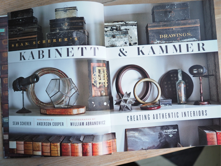
I staged my photos of this piece with Sean Scherer’s Kabinett & Kammer.

If any of you are familiar with that book, you’ll understand why.  The overall aesthetic leans slightly towards the dark and mysterious.

Even my use of the black metal strong box was inspired by this book.

I’m hoping that someone out there appreciates this style and will want to add a unique little chest of drawers to their home.

What do you think?

Both the chair and the chest of drawers are for sale.  Be sure to check out my ‘available for local sale‘ page for more details if interested.

Thank you to Dixie Belle Paint Co for supplying the paint used for these makeovers.

the kroger stool.

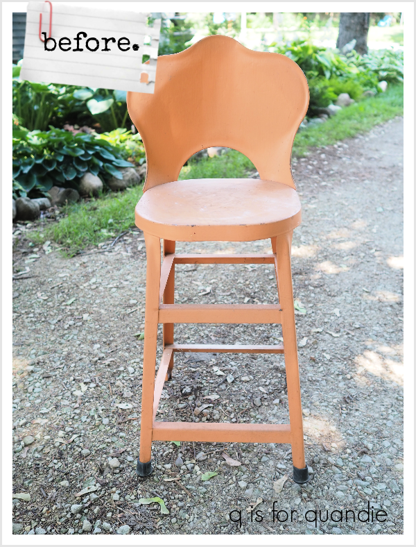
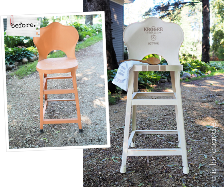
A couple of weeks back one of my blog readers offered me a free cupboard and when she was dropping it off she also offered me this little metal stool.

So, I thought, why not?  I knew it would be a fun little project to give it a new look.

I started by sanding it well.  It had peeling paint in some areas, especially underneath, so I wanted to get rid of that.  As I was sanding I could see that this stool had been various colors in the past including red, and yellow.

I debated going with red myself, but I find that red is a bit of a tough sell for me.  So instead I decided to go with my favorite Dixie Belle Drop Cloth.

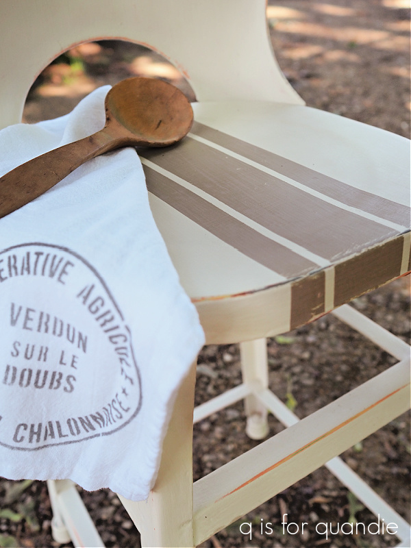
Continuing to keep it fairly neutral I used Dixie Belle’s Putty to add a grain sack style stripe to the seat …

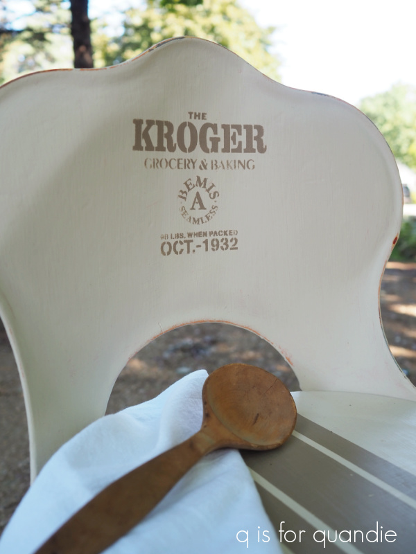
And to add a Jami Ray Vintage Grain Sack Mini stencil to the back …

I sanded the edges to distress, and then I gave it all a top coat of clear wax.

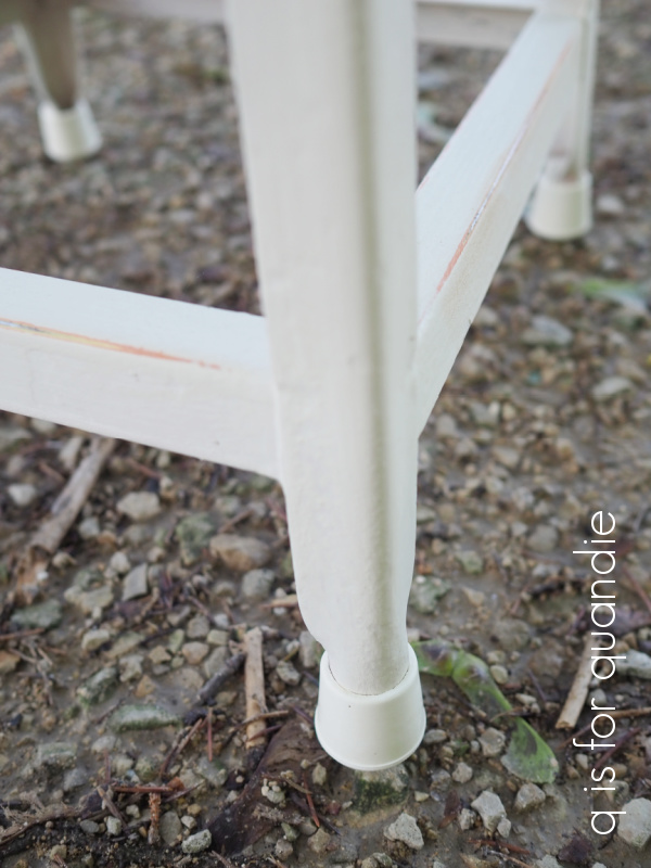
For the finishing touch, I purchased new rubber feet.

I found these at my local Menards for $1.49 for all 4, and the color matched the Drop Cloth perfectly.

Hopefully this more neutral version of the stool will fit perfectly in someone’s kitchen.  Maybe even yours?  If you’re local and can pick it up, that is.

Overall, it was quick and easy to go from outdated peach to farmhouse neutral with just a little paint.

What do you think?

Thank you to Dixie Belle for providing the paint used on this project.

if at first you don’t succeed.

Sometimes you just have to try again.

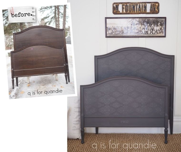
I painted this twin bed back in January …

I have to admit, I didn’t absolutely love it when it was finished.  But that’s not totally unusual, there are plenty of pieces I’ve painted that didn’t exactly tug at my heart strings but they still found a home with someone who did love them.

But that wasn’t the case with this bed.  It didn’t get even a spark of interest from a potential buyer in the last six months.  And quite honestly, I probably didn’t promote it as much as usual because I didn’t really love it myself.

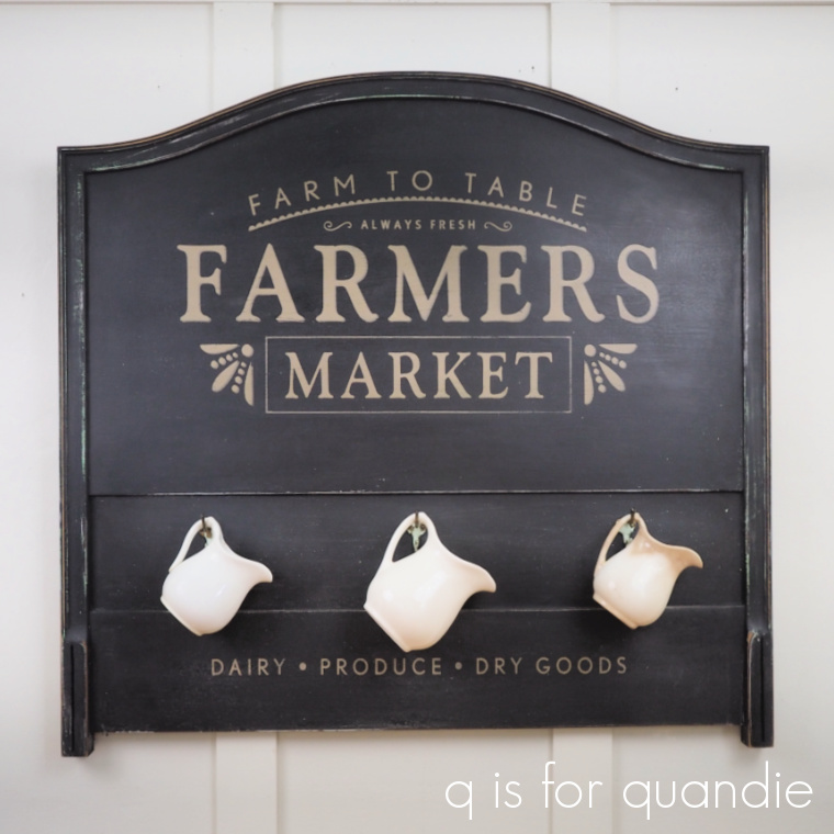
So, I decided to re-purpose it entirely by turning each piece into a sign, starting with the headboard.

To begin with I gave it a coat of Sweet Pickins milk paint in a color called Window Pane which is a white with a grey undertone.  I was trying to go for a chippy look.  But once it was painted I really didn’t love the color.  I’ve found this particular shade of white kind of finicky.  It either really works on something, or it really just doesn’t.  I’ve painted over it as many times as I’ve kept it.

So I went back to the drawing board again.  I mixed up some of Dixie Belle’s Mint Julep with their Sea Spray additive to add texture.  I stippled that onto the headboard in random spots, mostly around the frame.  I’m learning as I go with this product, I’ve found that I don’t really like lots of texture, I want my results to be a little more subtle.  So once the textured Mint Julep was fully dry, I sanded it down a bit to knock off the peaks.  Then I painted over the entire thing in my final color, DB’s Midnight Sky.

Next up I pulled out the Farmers Market stencil that I purchased from Wallcutz.

My favorite thing about Wallcutz is that you can order their stencils in different sizes.  This one is available anywhere from 10″ x 17″ up to a whopping 22″ x 38″.  Mine is the 16″ x 28″ version, which currently is priced at $21.95.  I think you get a lot of bang for your buck with these larger sized stencils.

I used my shadowing method to create a shadow behind just the word “Farmers”, and behind the little do-dads on either side of the word “Market”, and although it looks OK in person, it’s a bit too subtle to show up well in photos.

In hindsight, I wish I’d gone a bit darker with the shadow color.  The full stencil was painted using Dixie Belle’s Putty, and the shadow was Putty mixed with some Gravel Road to darken it up.
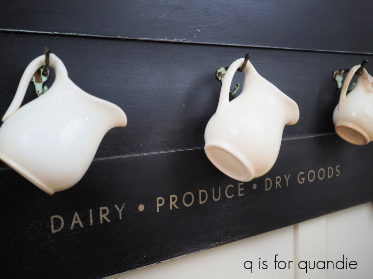
The first time around with the stencil, I kept the full design intact.  But then I realized that it looked off balance to have nothing at the bottom of my “sign”, so I sanded off the “DAIRY PRODUCE DRY GOODS” section from just beneath “MARKET”, painted back over that area with Midnight Sky, and then moved the stencil down to the bottom section of the headboard and added those words there.

Once everything was dry, I sanded with 120 grit paper to distress.  That revealed some of that Mint Julep texture that was under the Midnight Sky.  You can also see a bit of that Window Pane in some spots, as well as the original DB Gravel Road that was on the bed in the first place.

Really, nothing adds age as well as several layers of different paint colors.  I added clear wax as a final top coat.

But wait, we’re still not done.  My ‘sign’ still needed a little something more.  So I went through my stash of old hooks and found a set of three that just happened to have some old chippy paint on them that was very similar in color to the Mint Julep.

So I added those between the two sections of stenciling.

They are perfect for hanging some ironstone pitchers.

Oh, and I almost forgot one more step.  I asked my neighbor nnK to bring over her circular saw and cut down the legs for me.  They were a bit too long hanging off the bottom.

So, what once was a bed frame now is a Farmers Market sign.

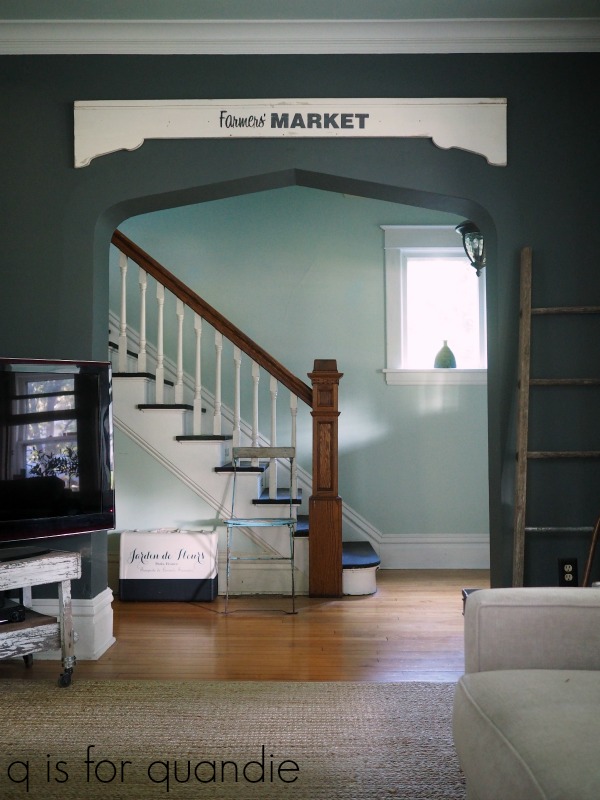
I’ll be doing something similar with the foot board, although I think I’m going to make it into a Christmas themed sign.  I may end up turning the side rails into signs as well.  I’ve done that before, and in fact even have a ‘side rail sign’ hanging in my own living room …

So, what do you think?  Do you suppose I’ll have better luck selling a Farmers Market sign rather than a twin bed?  If any of you locals are interested in it, be sure to visit my ‘available for local sale‘ page for more details.

Before I let you go today, I thought that since I’m having so much fun playing around with the Dixie Belle Sea Spray maybe I should share the wealth.  So I’m going to give give away two bags of Sea Spray.

The rules:  Simply leave a comment on this blog post to be eligible to win.

Your comment must be left on this blog post, not on Facebook or Instagram.  You are not required to follow my blog, although it would be awesome if you did!

I will randomly draw the names of two winners for today’s prizes from all of the comments left on this post by Friday, August 27, 2021 at the stroke of midnight (U.S. Central time).

The fine print: no purchase necessary, you must be 18 years of age or older to win, void where prohibited by law, the number of eligible entries received determines the odds of winning, approximate retail value of prize is $25, if the prize is not claimed by Friday, September 3, 2021 another name will be drawn at random to win, blah, blah, blah.

As always, thanks to Dixie Belle for providing the paint and Sea Spray I used on this project as well as the Sea Spray for my giveaway.

unpainted.

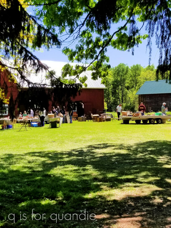
A while back my sister, niece and I took a Friday off work just for the heck of it.  We visited a few cute shops, had lunch at a fabulous spot in Stillwater (Brick & Bourbon where the whiskey & cola shaved beef was amazing), and ended up at Selma’s in Afton for some ice cream.  And all along the way we stopped at garage sales whenever we saw a sign.

We actually started out at a barn sale that we’d gone to last year as well.  It was one of the first sales I made it to last year after all of my regular spring neighborhood sales were canceled.

I bought a handful of things at the sale including this cool vintage camera to add to my non-collection (“non-” because I’m in denial that I collect anything) …

I get a little chuckle out of the ‘miniature’ name.  Here’s a comparison of this one to my truly miniature vintage camera …

The Falcon is about 5″ across.  For its day (1939), I’m betting it was considered quite small though.  I really just choose the additions to my non-collection based on looks.  I couldn’t care less about things like value, or how rare something is.  In this case, I loved the graphics around the lens.

I also picked up the frame to a dresser mirror at the barn sale.  It was pretty beat up, filthy dirty and the mirror was long gone.  But the price was right, so I grabbed it.  Unfortunately, once again I neglected to get a before photo.  Drat!  You’ll just have to use your imagination.

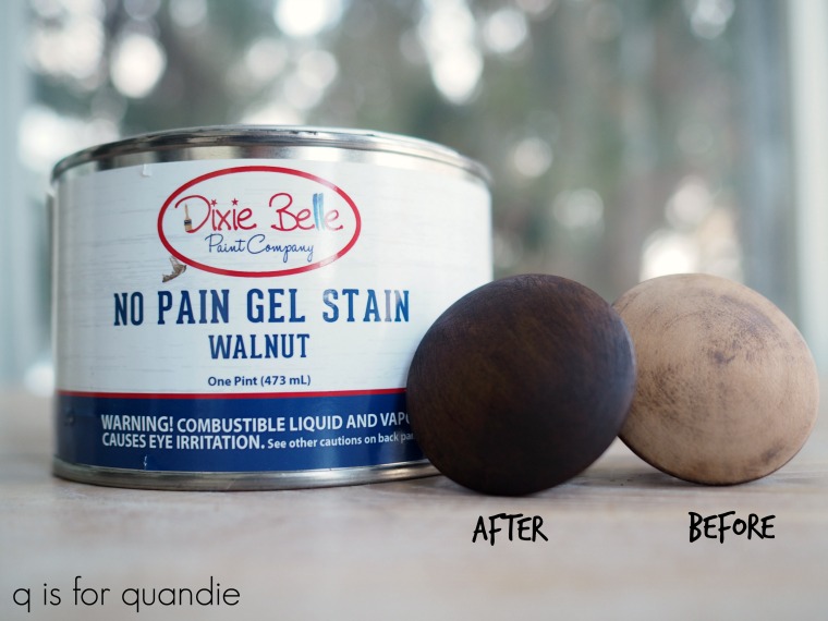
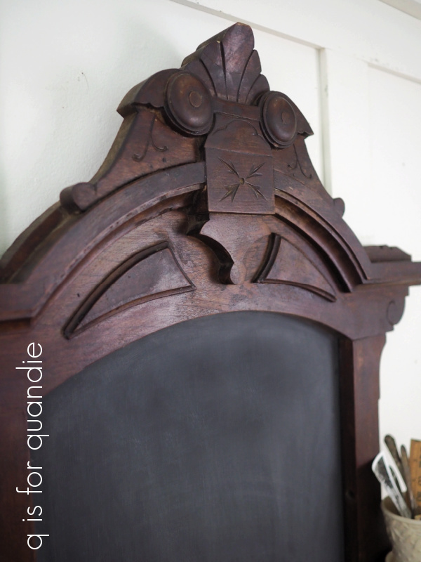
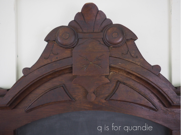
I cleaned it up, re-glued the joints, and as I was contemplating what color to paint it I realized that I kind of liked the look of the original dark stain.  So I decided to try something a little bit different this time around.  Instead of painting the frame, I gave it a light sanding to remove any loose bits of finish and then I refreshed it with some of Dixie Belle’s No Pain Gel Stain in Walnut.

I’d used this stain before on more of a bare wood surface, but this time I just wiped it right over the lightly sanded original finish on this frame using an old t-shirt.

This is the moment when I really wish I had a ‘before’ photo so I could show you the difference.  It was more of a subtle sprucing up rather than a dramatic change.

Gel stain sits on the top of a surface rather than soaking into it like traditional stains.  For that reason you can use it over an existing finish without removing every trace of the original top coat.  In this case it just sorted of blended everything a bit.

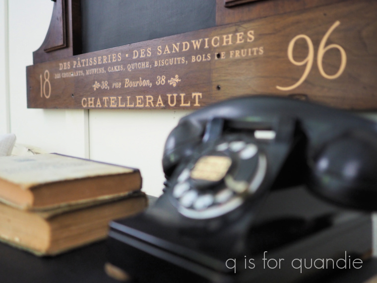
Once I’d let the gel stain dry for a couple of days (it’s an oil based product and takes longer to dry than water based products) I added part of re.design with prima’s Somewhere in France transfer to the bottom.

Then I used clear wax over the entire frame to give it a tiny bit of sheen.  I followed up by adding a piece of hardboard in place of the mirror.  I turned that board into a chalkboard simply by painting it with Dixie Belle’s Midnight Sky, then sanding it with 220 grit paper and not adding any sort of top coat to it.

And there you have it …

What do you think?

Are you on board with my decision to leave this one unpainted?  Or would you have preferred to see it painted?

I really enjoy taking something that many people would have thrown in the burn pile and turning it into something worthwhile again.  It’s so satisfying.

I think it would be perfect for a kitchen or dining room.  You could write your menu on the chalkboard when entertaining.  Or maybe you could just keep your grocery list on it.  If I had the wall space, I’d keep it myself.  But since I don’t, it’s for sale.  If any of you locals are interested, be sure to check out my ‘available for local sale‘ page.

Thank you to Dixie Belle Paint Co for supplying the No Pain Gel Stain and Midnight Sky paint, and to re.design with prima for supplying the Somewhere in France transfer.

the farm fresh shelf.

My picker found this shelf for me at a garage sale earlier this year.

This is one of the those farmhouse/country/rustic style pieces where I feel like you just have to go with that style rather than trying to change it.  So I decided to just embrace it by using the Out on the Farm transfer from re.design with prima.

When I pulled the transfer out of the tube, I was surprised to find that it had changed since the first time I used this particular design.  That was back in June of 2019 when I used just half of the transfer on this washstand

At that time the complete transfer I had looked like this …

I had ordered another one of this design back when I was a content creator for re.design with prima, so I can’t say exactly how long I’ve had it in my stash, but this 2nd one looks like this …

So, go figure.  I guess they changed it.  Who knew?

Well, probably people who were paying attention knew, but clearly I was not paying attention.

I thought I’d share that little piece of info with you guys in case any of you weren’t paying attention either.  And by the way, I did find both versions of this transfer available from various vendors on Etsy.  So if you’re ordering one, that would be the time to be sure and pay attention to which one you want 😉

The one thing I wished I’d done differently on that washstand two years ago was to paint it in a shade of white that blended better with the background color of the transfer.

Not that it looked bad, but I would have preferred it to blend a little bit more at the edges.

However, that washstand came already painted and I simply added the transfer.  But this time around I chose to paint my shelf in Dixie Belle’s Sawmill Gravy.  It’s more of an off white with a very grey undertone, and it ended up working beautifully with the transfer.

Before we go any further, let’s address the elephant in the room.  That is, putting a transfer on the inside back of a cupboard.

I used to be rather opposed to that idea.  I felt like it was a waste since you’d be covering up most of the transfer with items on the shelves.  But then I put a transfer inside my own cabinet out on my front porch …

And I loved how that turned out.  Also, the usually suppressed minimalist in me appreciates having less clutter on those shelves.

Instead of filling up the shelves completely, you can showcase just a few special items while allowing the transfer to peek through.

I think it works.

As you can see in my photos, after painting and then applying the transfer, I sanded the edges of the piece to give them a worn look and then I added a topcoat of clear wax.

All that was left was to add knobs.  Back when the piece was in its original wood finish I kind of hated those knobs.  To me they were just too ‘in your face’ because the white ceramic was a bigger contrast with that medium toned pine.  So my original plan was to change them out for something different, although I wasn’t sure what.

But actually, once the piece was painted I thought the knobs worked.

They don’t jump out at you quite as much.

And with that, there you have it.  A farm fresh shelf.

Perfect for a dining room, kitchen, mud room, pantry, laundry room, and so on and so on.

If any of you locals have a spot for it, be sure to check out my ‘available for local sale‘ page for more details.

Thank you to Dixie Belle Paint Co for supply the Sawmill Gravy paint, and to re.design with prima for supplying the Out on the Farm transfer.

random small projects.

This week I’ll be sharing a few random small projects that I’ve been working on lately starting with this fire house captain’s chair.  Here is how it looked when I purchased it …

You can’t really tell in that photo, but there was a rung missing from the bottom right (your right, chair’s left).  Ken replaced that for me some time last year, and then this chair just patiently sat in the photo cottage (which has now become the furniture storage cottage) awaiting its makeover.

I painted one of these chairs two years ago (you can see it here) and that’s when I discovered that this style of chair is called a fire house captain’s chair.  I wasn’t able to find any info online that explained why they are called that, but if you google it you’ll see many examples of the style.

I finally pulled it out last weekend and decided to paint it using Homestead House milk paint in Midnight Blue.  But before I started painting with the milk paint I needed to put a coat of something on that new rung.  It was bare wood and had I painted it right off with the milk paint, the paint would have soaked into the unfinished wood and given a much different look on that rung than on the rest of the chair.  So I simply gave the rung a quick coat of Dixie Belle’s Coffee Bean.

Once that was dry, I mixed up my Midnight Blue and gave the whole chair two coats of that.

Speaking of fire(s), sort of, you may notice a lovely golden glow in some of my photos.  We are getting a lot of smoke from the wildfires in Canada these days.  Like, seriously, ‘worst air quality on record’ sort of smoke.  I snapped a quick photo of the cottage to see if I could capture the smoke in the air …

There wasn’t a cloud in the sky when I took that, just a smoky haze.  You can also see my brown grass.  We’ve decided to let the lawn go since we are under a watering ban (we can only water on odd days, before 10 a.m. or after 5 p.m.), instead I’m just focusing on watering the gardens and some of my plantings that were new this year.

The quantity of smoke in the air is quite surreal, but it does make for some pretty lighting for outdoor photos, making the golden hour even more golden.

Anyway, once again, I would have been fine with some of that milk paint chippy goodness on this piece, but the finish was super dry and thus didn’t really chip.  But I gave it a good, harsh sanding once the paint dried because I wanted a very worn appearance.  Especially on the arms of the chair that would have worn down naturally from use.

Since I’d chosen a navy blue color, I decided to go with a nautical sort of theme.  I pulled out a stencil that I had from Maison de Stencils called East Coast Yacht Club and used some Dixie Belle paint in Putty to do the stenciling.

Initially I wanted to use the full 12″ x 12″ stencil on the seat of the chair, but because the seat is fairly curved, I couldn’t get the stencil to lay flat enough to get a crisp, clean result.

So I went with just a small section of it on the seat back, and another on the seat itself.

I was totally stumped when it came to staging this chair for photos.  I really don’t have a stash of nautical-ish props lying around.  So I just went with a simple vintage suitcase and some old binoculars.

Wouldn’t this chair be absolutely perfect for a lakefront home?  Or maybe just for someone who wishes they had a lakefront home?

Next up today is this antique piano stool.

This was another garage sale find from last year.  The seat was not attached to the base properly, so every time I would pick up the stool, the seat would come off in my hands and the base would be left behind.  So, Ken fixed that up for me and then this piece sat in the photo cottage waiting for its makeover along with the firehouse chair.

I began the job by stripping the seat.  In hindsight, I’m not sure I really needed to do that.  It wasn’t in terrible shape.  It was maybe a tad too shiny for my tastes, but that probably wasn’t worth the effort to strip and re-stain.  None the less, that’s what I did.

I re-stained the seat in Special Walnut, and then added a very subtle stencil (also from Maison de Stencils) using Dixie Belle’s Midnight Sky paint.

Once all of that was fully dry, I coated it with some of Dixie Belle’s flat clear coat.

I painted the base of the stool in the Midnight Sky as well.

Then I sanded the edges to distress and added a top coat of Dixie Belle’s Big Mama’s Butta, which I love using over a dark paint color like this one.

You may not have a piano, but this stool is perfect to pair with a desk or makeup table, but I also think it would make a nice small side table, just big enough to place a beverage on.

That brings me to a couple of mirrors that were due for a quick makeover.

As you all know, I like to remove mirrors from dressers.  Personally I prefer most of them without their mirror.  Then every now and then I pull out the mirrors, paint the frames, add hangers to the back and sell them separately.

These two each got a coat of Miss Mustard Seed milk paint in Typewriter on the frames.  Once again, I didn’t get much in the way of chipping.  I seem to be 0 for 2 on the chipping for this post.

Once painted, I cleaned the glass and added some old IOD transfers to them.

It is next to impossible to do justice to these in a photograph.  My camera refuses to focus properly on them.

But hopefully these pics give you some idea of how they turned out.

So that’s it for small projects today.  I have a couple more that I hope to have finished and shared with you by the end of the week.  In the meantime, all of these items are for sale and will likely eventually end up at the shop where I sell on consignment, Reclaiming Beautiful in Stillwater, MN.  But if any of you locals need a chair, piano stool or mirror, be sure to let me know (you can check out the details on my ‘available for local sale’ page or email me at qisforquandie@gmail.com).

sometimes you really just need something to go right.

Today, as promised, I’m sharing the desk from my neighbor’s uncle’s estate sale.

Here is how it started out.

Upon first glance, my plan was to strip the top of the desk and paint the base, but unfortunately there was some veneer damage on the top.  So I decided to just go ahead and paint the whole thing.

I began by washing the desk with some spray cleaner and then rinsing it with a damp rag.  As I did that, I noticed that I was wiping off some orange-ish colored stain.  That’s usually a sign that the stain is going to bleed through your paint.  So I decided to just head that off at the pass by using Dixie Belle’s BOSS on this piece.

First up though, I patched the chipped spots of veneer by gluing down the loose edges and then filling in with some Dixie Belle Mud.  Next I scuff sanded the entire piece, and smoothed out those Mud repairs.  Then I wiped away any dust.  After that I added a coat of BOSS.  Here’s a quick snap I took after adding the BOSS to the side of the desk …

Yikes, that stain is just bleeding orange all over the place.  Gruesome, right?  I definitely needed to boss this one around!  This is the clear BOSS, by the way.

It goes on milky looking but dries clear, in case you were wondering.

Once the first coat was dry I went ahead and added a 2nd for good measure.  Sometimes one coat of BOSS is enough, but I wasn’t taking any chances with this one.  After that 2nd coat, I left the piece to dry overnight.

The next day was Monday, and it was a particularly stressful day at the day job.  So when I got home that evening, I really just needed something to go right for me because nothing else had gone well all day.

And you know what?  The BOSS did its job perfectly.  I added a coat of Dixie Belle’s Drop Cloth over it and not only was there not one tiny spot of bleed through, but the Drop Cloth also covered beautifully.  It was just really gratifying to see that first coat of paint go on without a hitch.  I really needed a win on Monday, and being able to paint this piece white so easily was just the ticket.

I’ve noticed in the past that even the clear BOSS will improve the coverage of white paint, and that was definitely the case with this piece too.  I still needed a second coat of the Drop Cloth, but I call needing only two coats a plus when using white paint of any kind.

A couple of days later, I pulled out two of the smaller version of IOD’s Petit Rosier transfer.  I used most of one each on the drawer fronts down each side of the desk …

I did have to lose about an inch of the transfer on either side to get it to fit inside the trim.  If any of you can read French, you probably realize that, but for the rest of us I think it looks perfectly fine.

I used the top portion of just one transfer on the middle drawer.

I absolutely love this transfer and am really disappointed that it has been retired.  Why do they do that?  Do sales slow down after the initial excitement of a new transfer?  Really, some of these should just be considered a classic that people like me will buy over and over again.

You can still find it online from shops that have some remaining in their inventory, but they are getting harder and harder (and more expensive) to come by.

I sanded the edges of the desk to distress it, and followed that up with a topcoat of clear wax.  Then, I simply washed up the original hardware and put it back on (the pulls that were missing from the middle drawer in the ‘before’ photo were inside the drawer).

I staged the desk with some of my painted books.

Those of you who have been following me for a long time might remember when I did these.

I absolutely love how this desk turned out.

This look is totally ‘me’.  I’m going to list it for sale, but I won’t be sad if it doesn’t go.  In the end, I may just have to keep it for myself.  Although I have no idea where I would put it.  I’d have to move something else out, to move this piece in.  Maybe one of you can save me from that fate.

Being able to count on that BOSS to just do exactly what it was meant to do to on this desk was something that I really needed last week.  So I want to say a huge thank you to Dixie Belle for making a product that just simply works, and for their easy peasy paint that also just does what it’s supposed to do without requiring much effort or expertise on the part of the user.  Sometimes you really just need something to go right the first time, even if it’s just a paint job.  You know what I mean?

The next time you want to paint a piece that you suspect will be a bleeder, just save yourself some trouble and reach for the BOSS first.  You’ll be glad you did.

If any of you locals are in need of a desk, be sure to check out my ‘available for local sale‘ page for more details on this one.