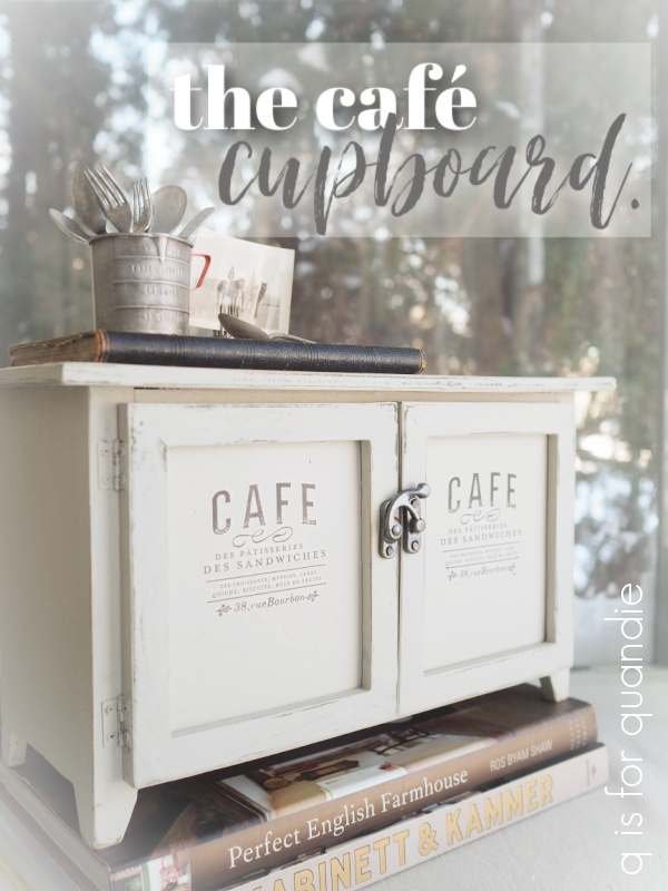
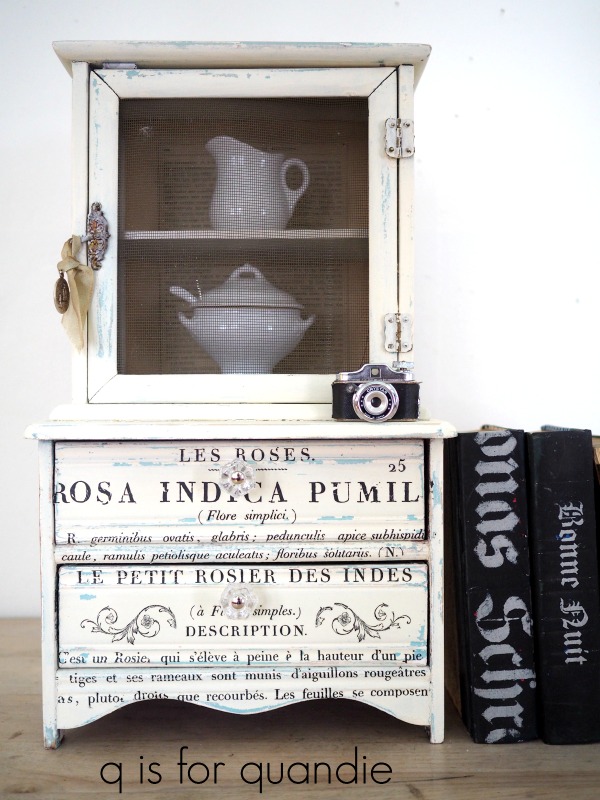
You guys know I just can’t help myself when it comes to mini furniture. Today’s piece isn’t quite up to my usual standards. I usually prefer more vintage pieces. But when I saw this piece at the thrift store I thought ‘why not?’.

First up was removing the faux punched tin inserts.

I could have just painted them, which may have improved their look somewhat, but I didn’t care for the wheat theme. So I tossed them.
I had a couple of ideas in mind for replacing them. I considered using window screening like I did in this mini-cupboard of my own.
But then I couldn’t find my stash of old screening. It’s out in the carriage house somewhere, but I wasn’t going to spend a lot of time digging for it in the sub-zero temps we had while I was working on this one.
Next I thought maybe I’d just use some drop cloth fabric. But in the end, I couldn’t come up with a good way to install it that would look neat and tidy on the inside. Hot glue, maybe? But I know myself well enough to know that making hot glue look tidy is a bit beyond me.
And in the end, I really wanted to be able to use some transfers on the doors, so I decided to just cut some new inserts out of a very thin piece of wood. But … that didn’t quite work out either. I didn’t have any wood that was thin enough. So Mr. Q came up with some heavy duty cardboard that he had in his bookbinding supplies, it’s meant for creating book covers. I cut that to fit, and then painted it, which worked out quite well. I was even able to add the transfers to the pieces before installing them.
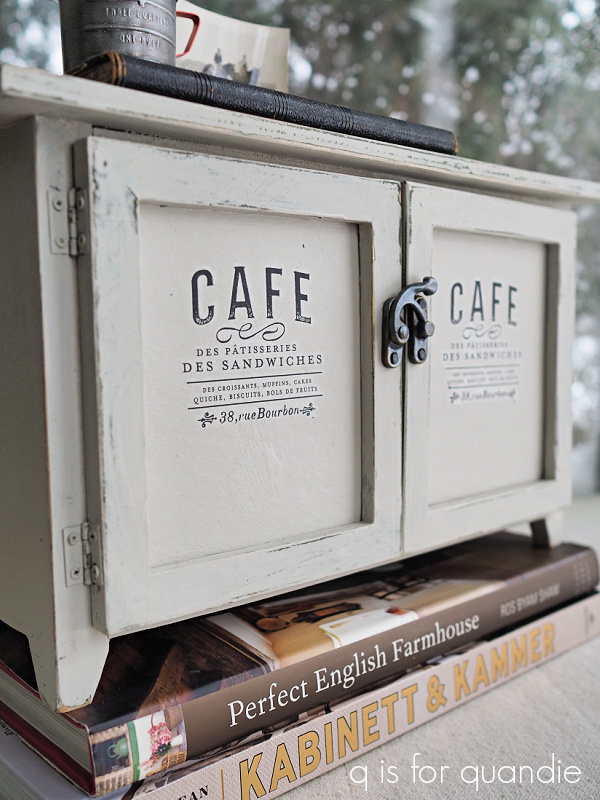
Then I just glued them in place (with regular glue, not hot glue).
The outside of this little cupboard is painted in Dixie Belle’s Sawmill Gravy, and the inside is painted in French Linen.

I pretty much chose those colors simply because I already had them out for the barrister bookcase that I shared last Friday.
You may have noticed by now that I also added some ‘hardware’ to the front of the cupboard.
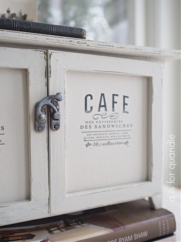
That’s not exactly meant to be ‘real’ hardware. It’s a scrapbooking do-dad, made out of very thin metal (Hobby Lobby carries the Paper Studio brand). The color it comes in originally is called ‘antique gold’.
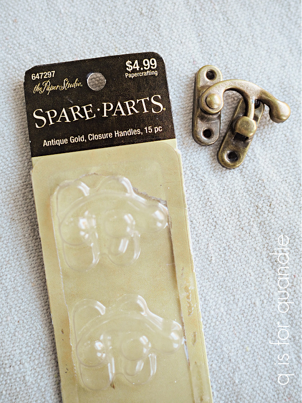
These come with little brads to attach them to paper. I used some little tack nails that I had on hand to attach mine to the cupboard doors.
I also tried to give them a new look with some of Dixie Belle’s Gilding Wax in Zinc.

The Gilding Wax had nothing to grip onto because the metal had a slick, shiny coating on it. The usual remedy is to scuff sand the surface in a case like this, but this little latch is very small. I wasn’t really able to rough it up as much as I wanted to. I ended up with a patchy sort of look.
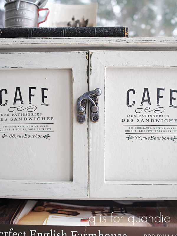
Still, it looks pretty cute I think. And by the way, in case you are looking for them, those transfers on the doors are from re.design with prima’s Classic Vintage Labels.

There is only one of that design in each set (I just happen to be addicted Classic Vintage Labels and have purchased several of them). I cut out just the wording and didn’t include the laurel wreath that surrounded it.
![]()
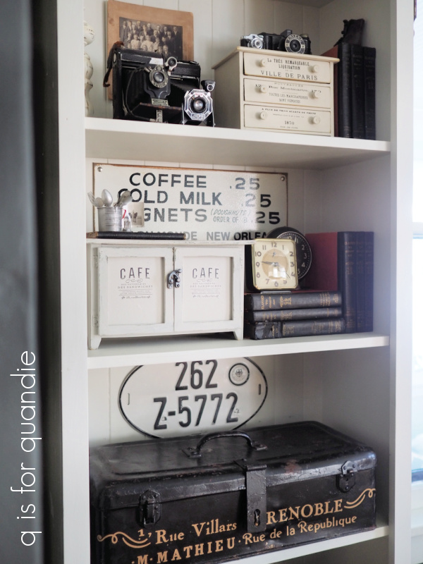
I really haven’t decided whether or not to hang onto this one. It does look good on the shelves in my living room though.
This was a fun little project to tackle on a cold January day. And really, any of the changes I made to this piece could apply to a larger piece of furniture too. Replace cupboard door inserts, add hardware, change the color of hardware with a gilding wax, add transfers, modify transfers by eliminating portions you don’t want to use, and of course paint.

What do you think? Am I tempting you to go look for some mini furniture at your local thrift store?


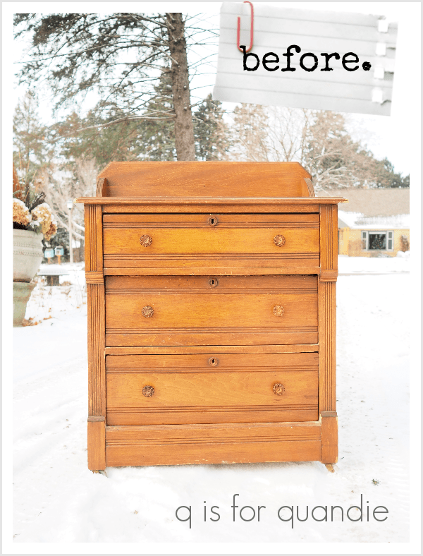
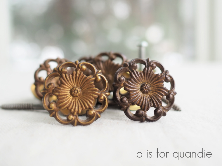
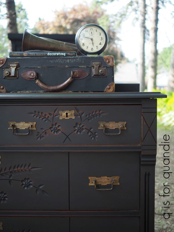

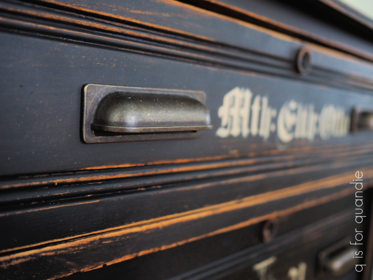
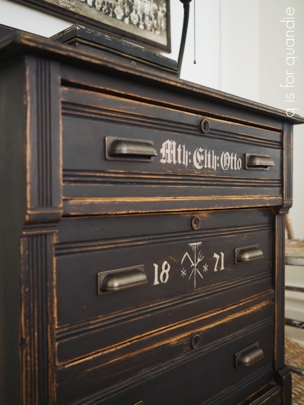
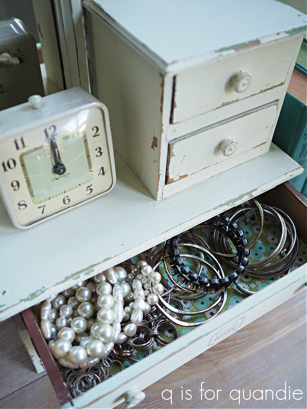
 But this dresser only has one hole for a knob, so obviously it didn’t originally have drawer pulls that required two holes. So I guess I’m really not sure if those knobs were replacements or not. Either way, they had to go.