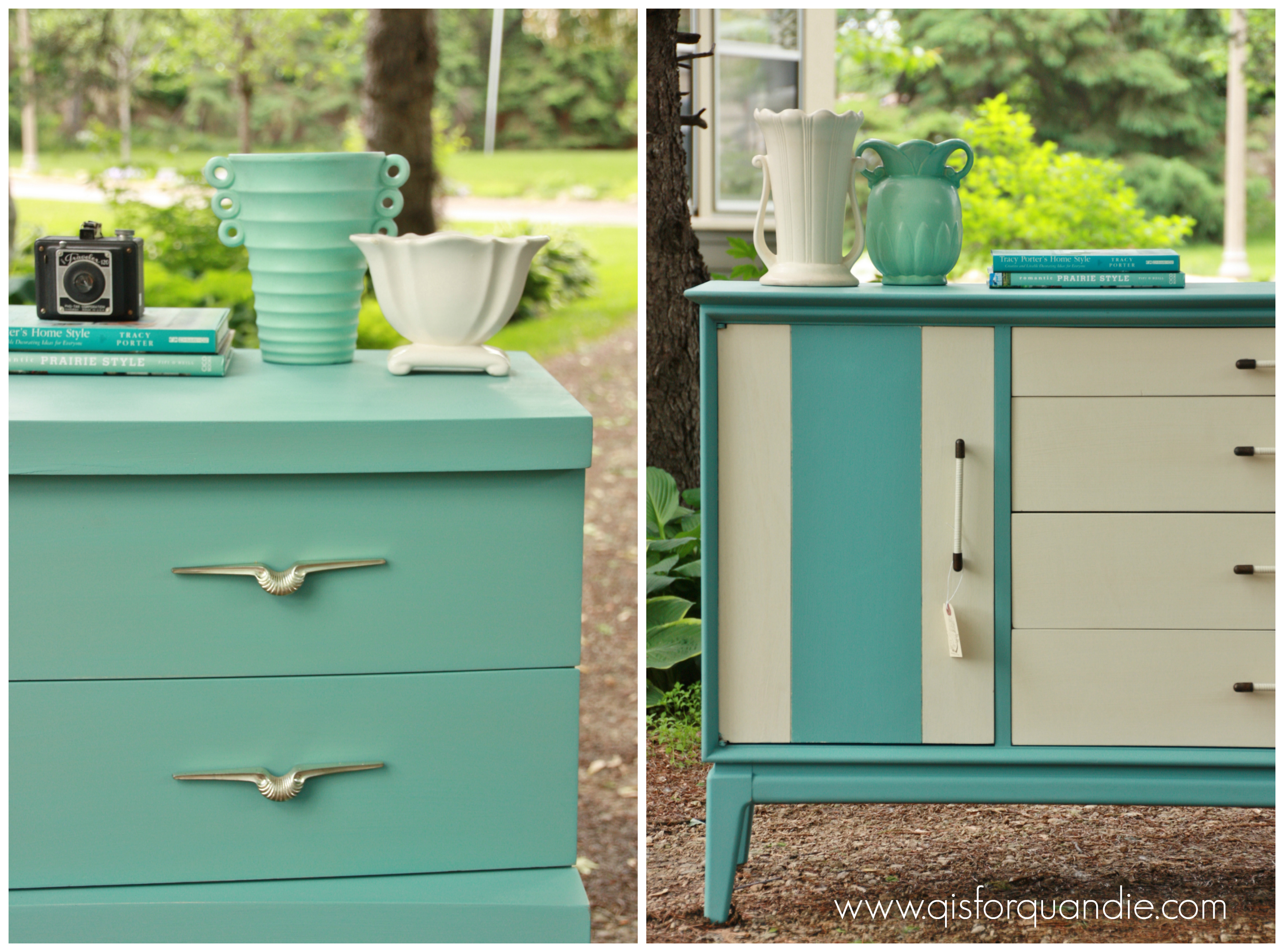
If you are a Miss Mustard Seed follower (as I am), you’ll have seen her recent post about inventing a new minty color for her friend Layla.

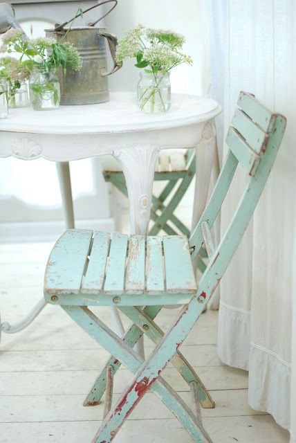
It was great timing because I had also recently pinned this fabulous minty chair.
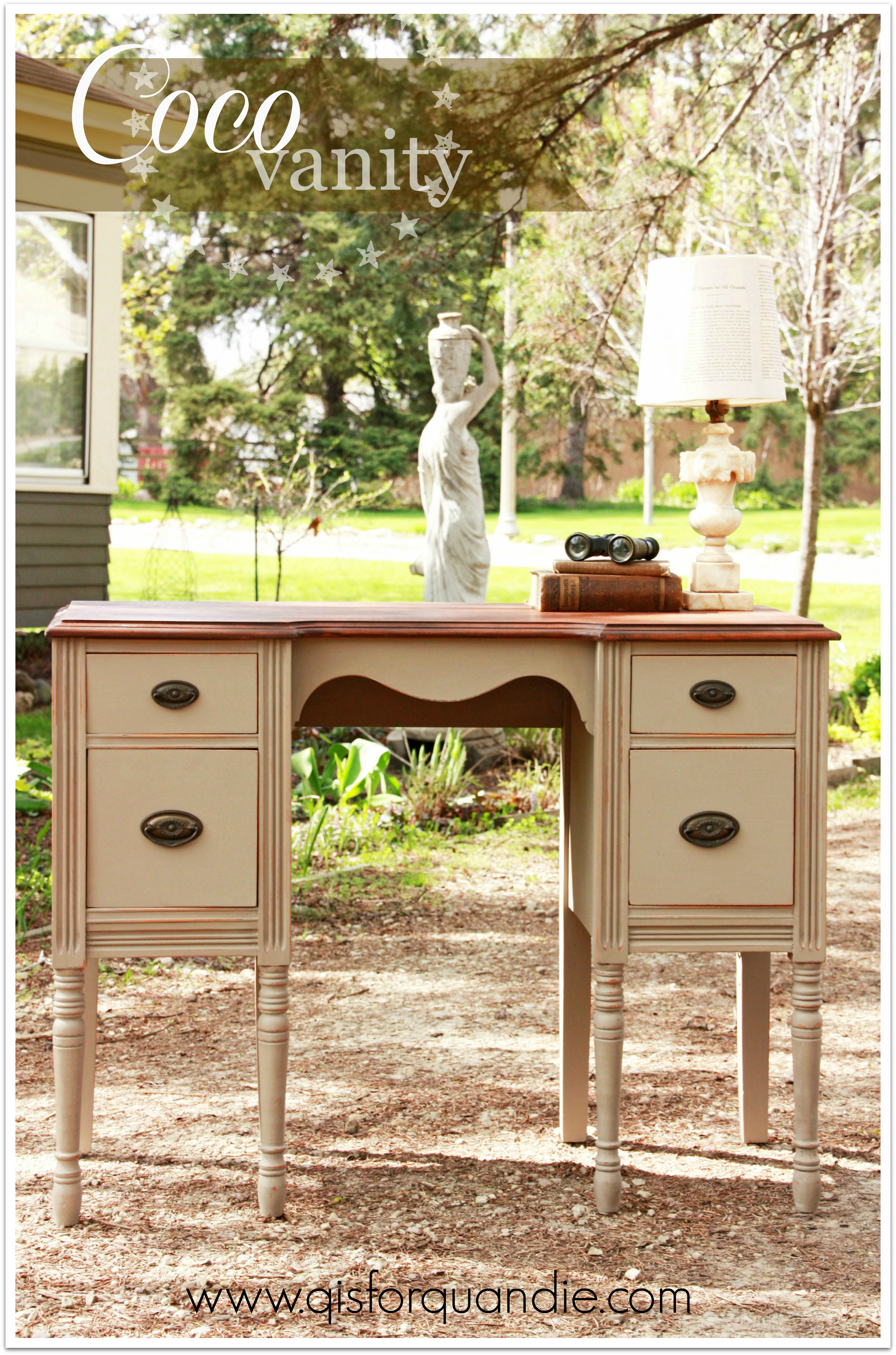
And I was contemplating a fresh new color for the vanity table I was about to paint. You’ll remember this vanity, I posted about it many moons ago and said I needed to get around to painting it.

Well, I finally got around to it.

I don’t know what I was waiting for. I could say that I was waiting to find the time, but the really honest answer is that I knew I had to deal with some veneer issues and that was holding me back because repairs aren’t my favorite thing to do. I like to just get on with the painting. In the end, the repairs were really simple and didn’t take much time at all. I simply removed all of the remaining veneer from the decorative scrolly bits at the bottom of the drawers on each side. It came off very easily. The scrolly bit on the left side of the mirror was a bit more work. Ken had to rebuild a portion of it and then I had to do some gluing and patching.
But once all of those little tasks were completed, I was able to get to my favorite part. Painting.
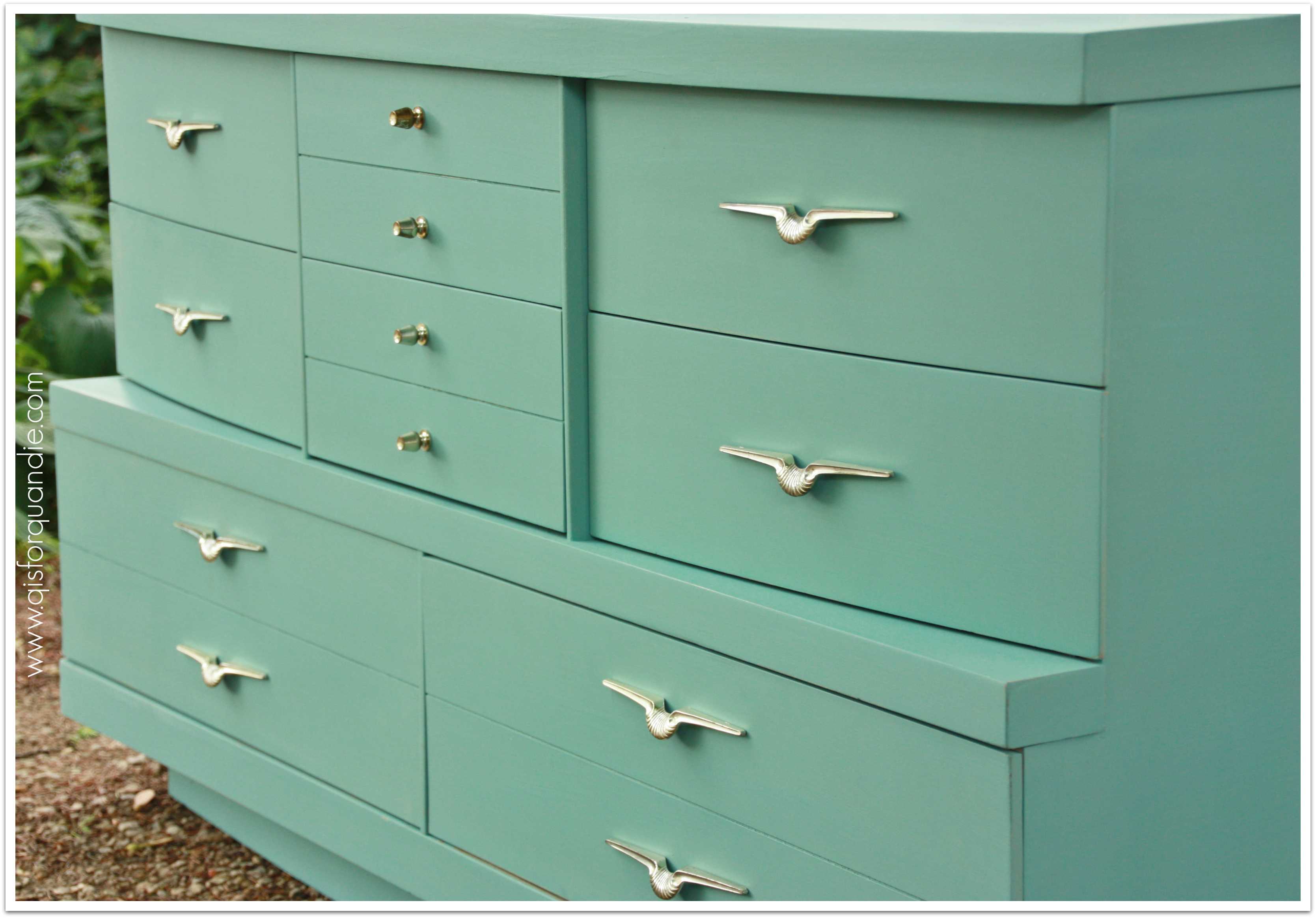
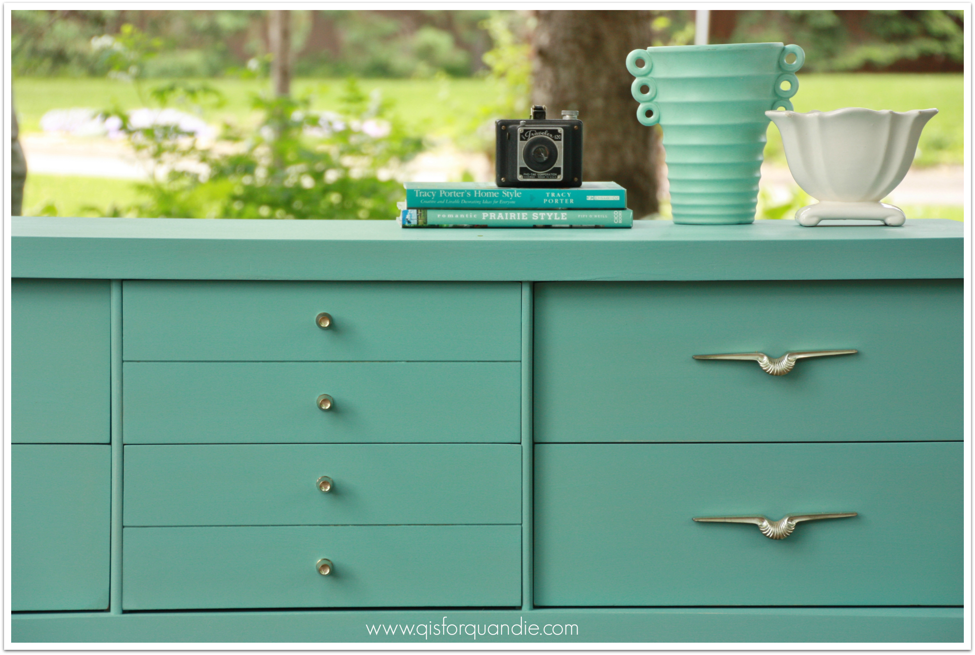
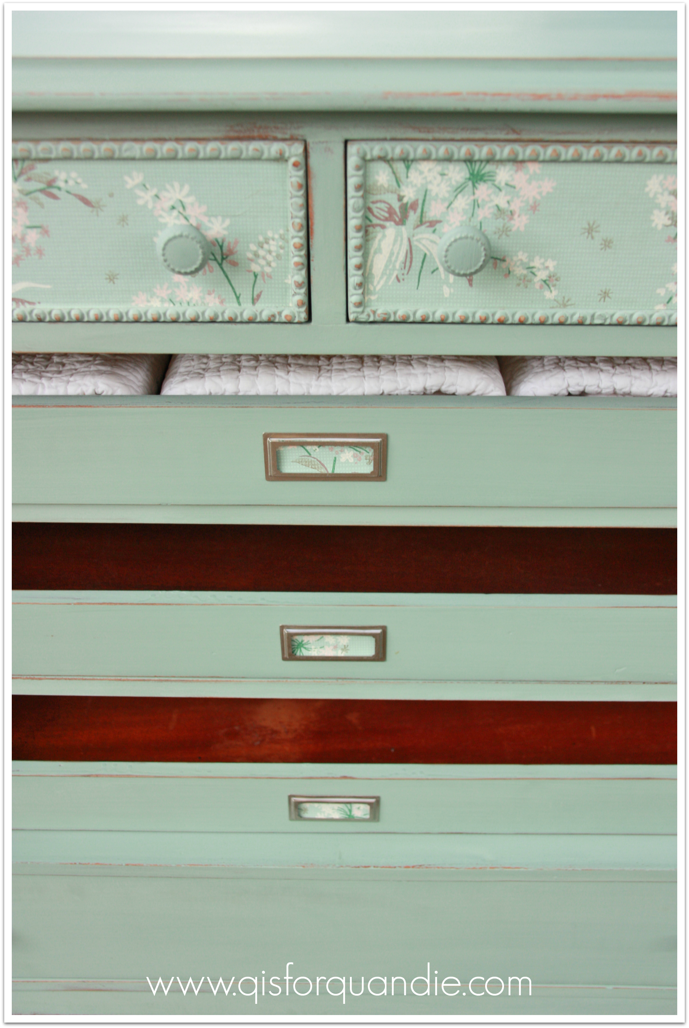
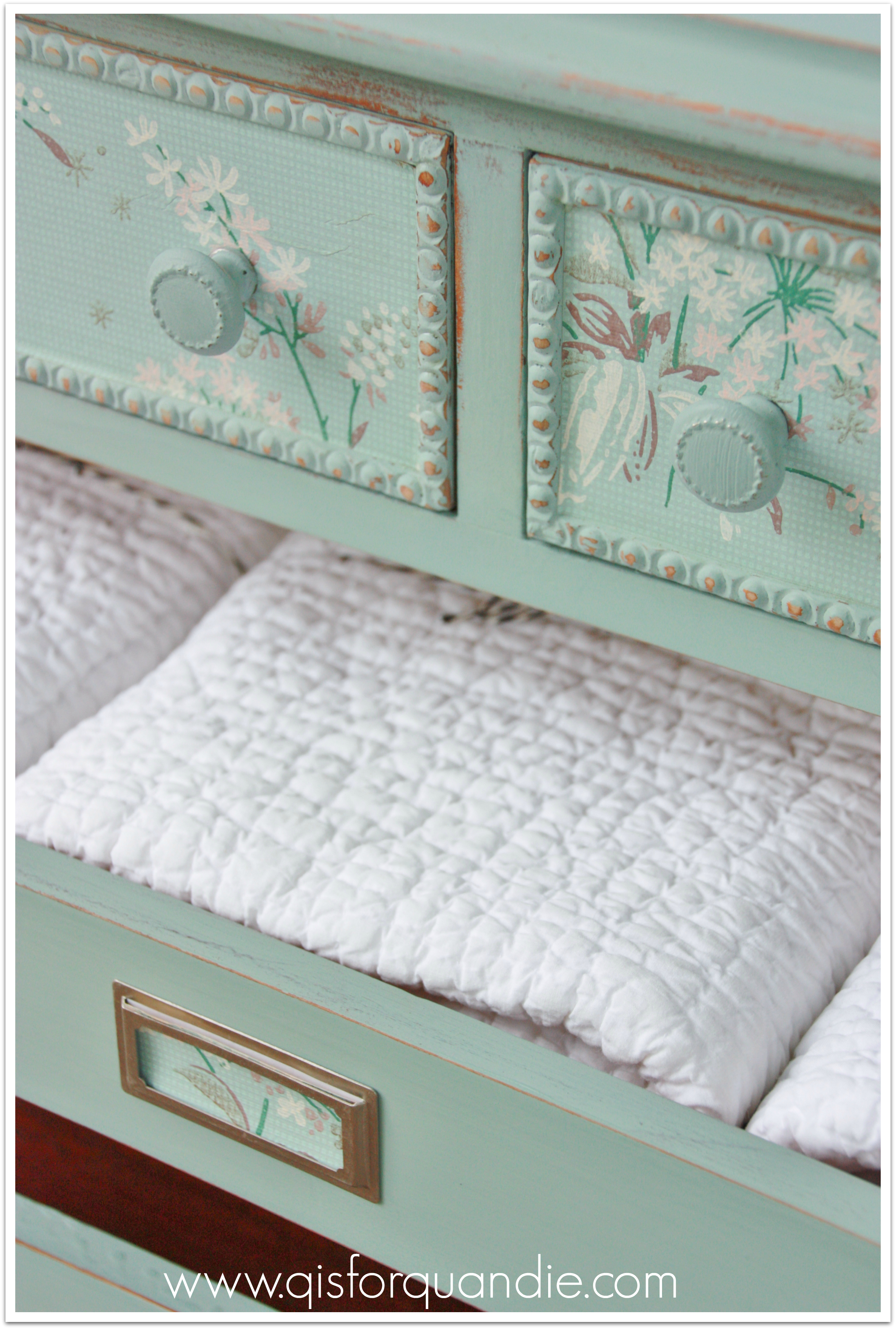
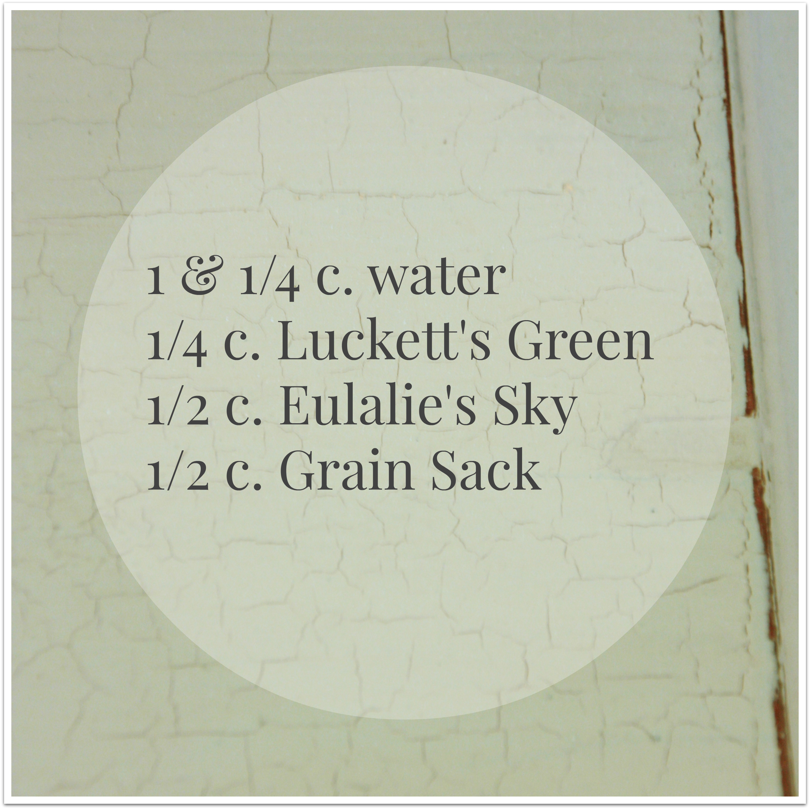
I used Miss Mustard’s recipe for Layla’s Mint, but then I added a little extra Eulalie’s Sky. I wanted my mint to lean a bit more towards the aqua end of the spectrum.
For clarification, or if you are trying to match it, here is my exact recipe using Miss Mustard Seed milk paint:
This made more than enough paint for the vanity. But when I am custom mixing like this, I always err on the side of extra paint. I know it would be difficult to match it exactly with a second batch if I run out of paint, and this would be a serious bummer. I plan to use the excess to paint an oak chair, and I can always add a touch of something more if I don’t have quite enough for the chair.
OK, so, enough of this babbling. What do you think?
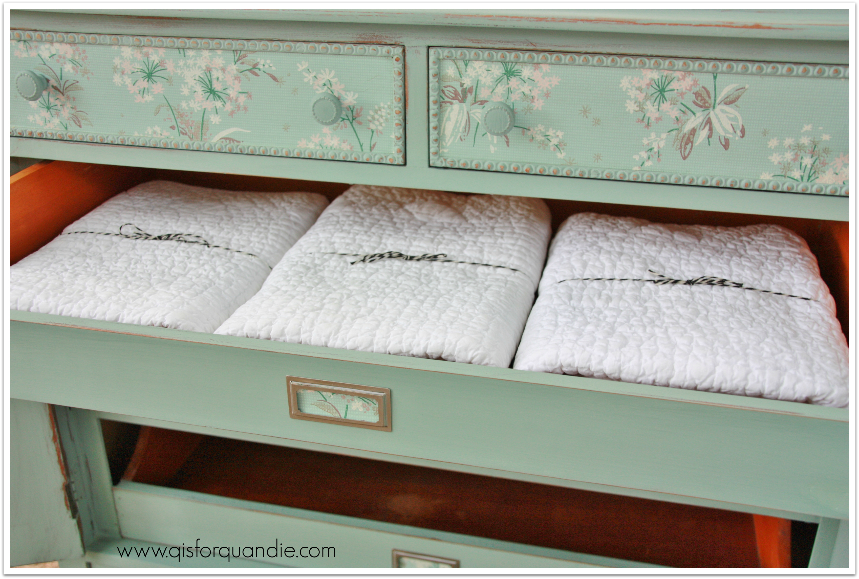
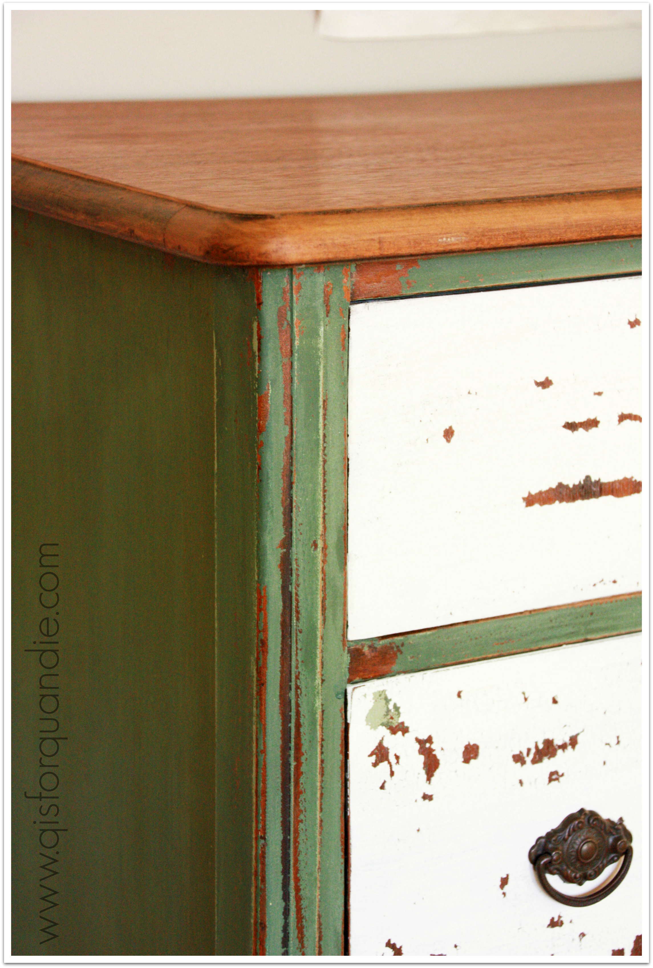
Once again I did not get any chipping, bit I did get some great crackling.

I should back up and explain that I was painting this vanity in the Carriage House during a thunderstorm. So we are talking some major moisture in the air. The milk paint was not drying nearly as quickly as it did in the middle of winter inside my heated house. So when I had painted the entire thing once, and realized the drawers I started on still weren’t dry, I got out the blow dryer. I know that blow drying leads to crackling, but this piece was starting to crackle even before the dryer came out.

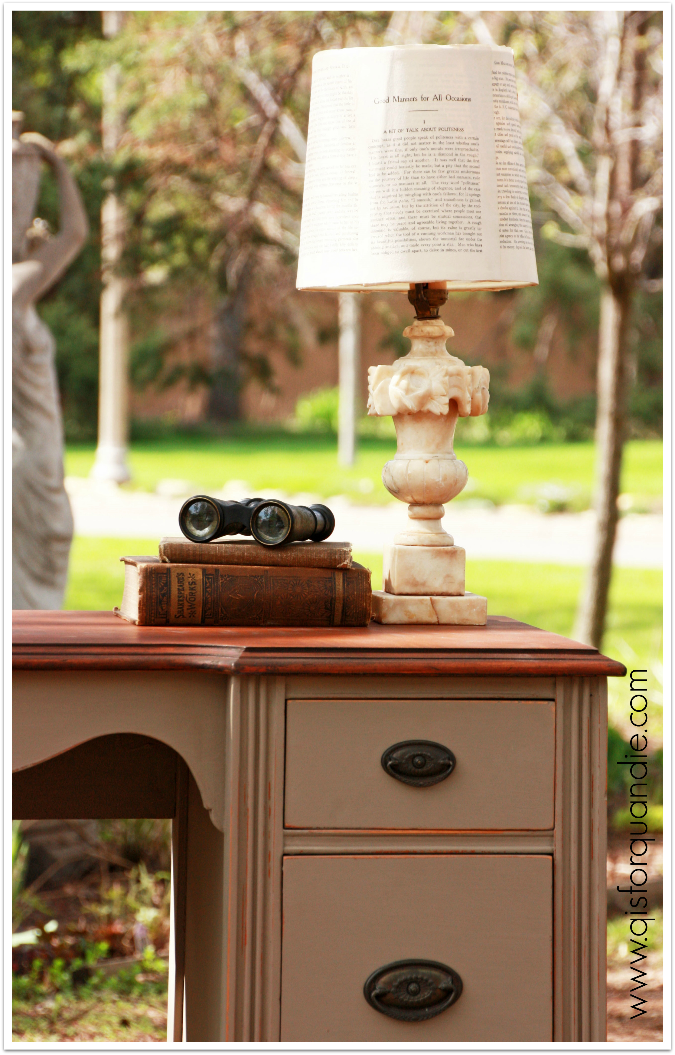
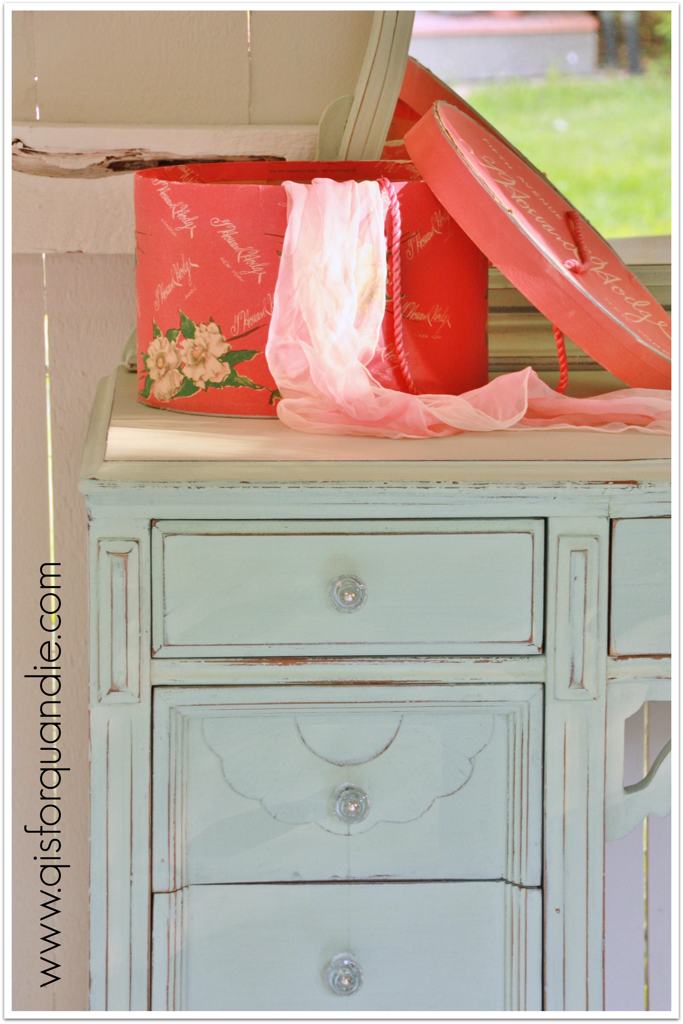
You may also have noticed that there is vintage wallpaper peeking out from underneath this piece. I thought it would add a touch of fabulosity, but I was hoping it would be a little more noticeable. My friend Sue says it’s sexy to have just a little bit showing like this, so I’m going with that!
 I have some more of this wallpaper left and I think it’s gorgeous. I’m sure it’s going to make its way onto another piece of furniture in the future.
Meanwhile, this minty fresh vanity is ready to go!
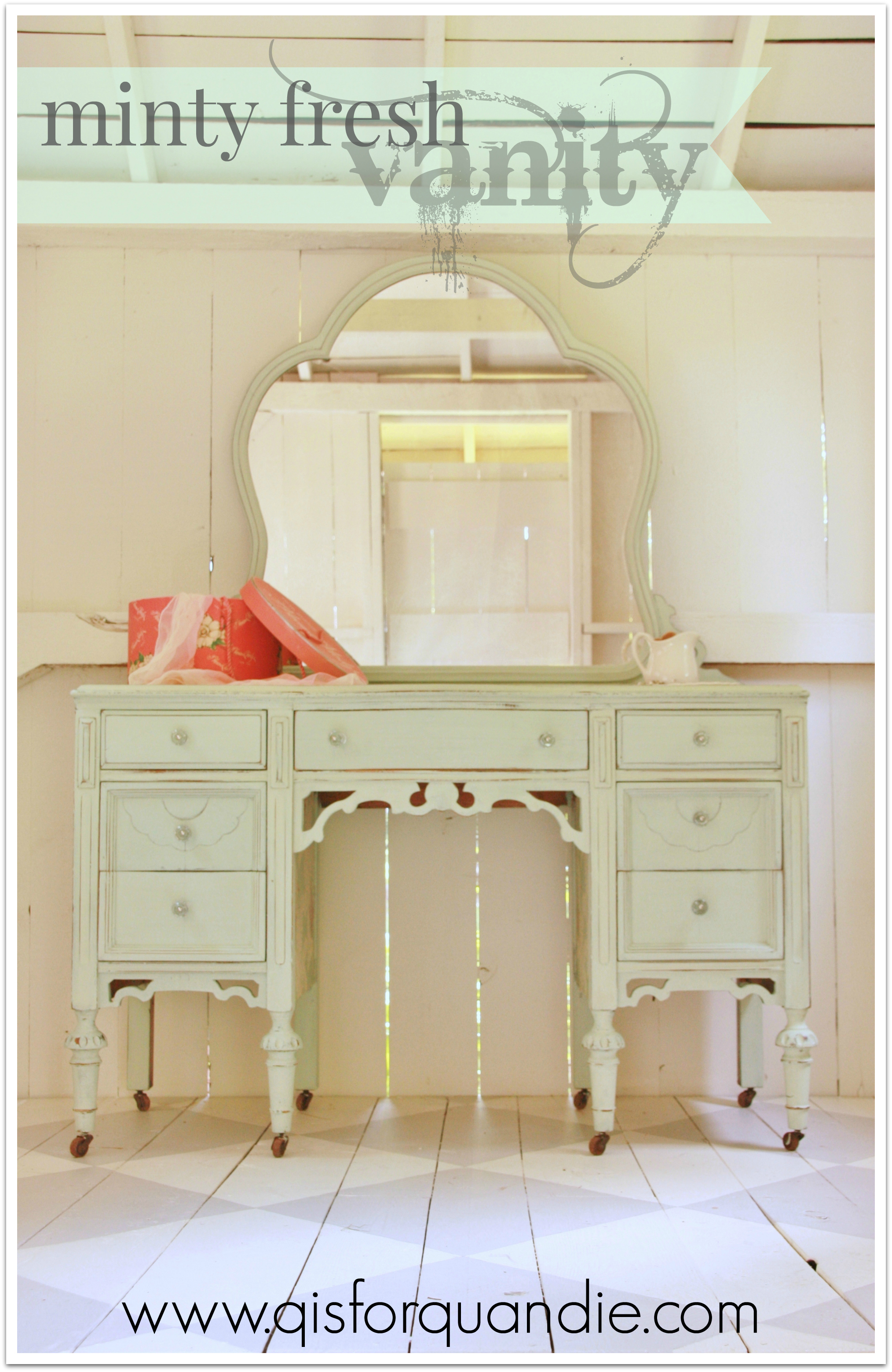
Wait! One last thing. Did you notice? My first real photo shoot in the new studio. I’m loving that floor! And the faux wall is perfect behind the vanity (a window would have been very strange). If you are wondering how I took this shot without appearing in the mirror, it was a combination of cirque du soleil style contortion-ism and being able to open the lower half of my door while leaving the top half closed. Those Dutch doors are very handy!