kitchen scale dresser.

I have been struggling a bit with the milk paint lately.  I know it’s unpredictable, and it’s hard to control the chippy factor.  I know all about the color variations.  But this summer I seem to be getting one unexpected result after another.  This dresser is a case in point.

Let’s start at the beginning.

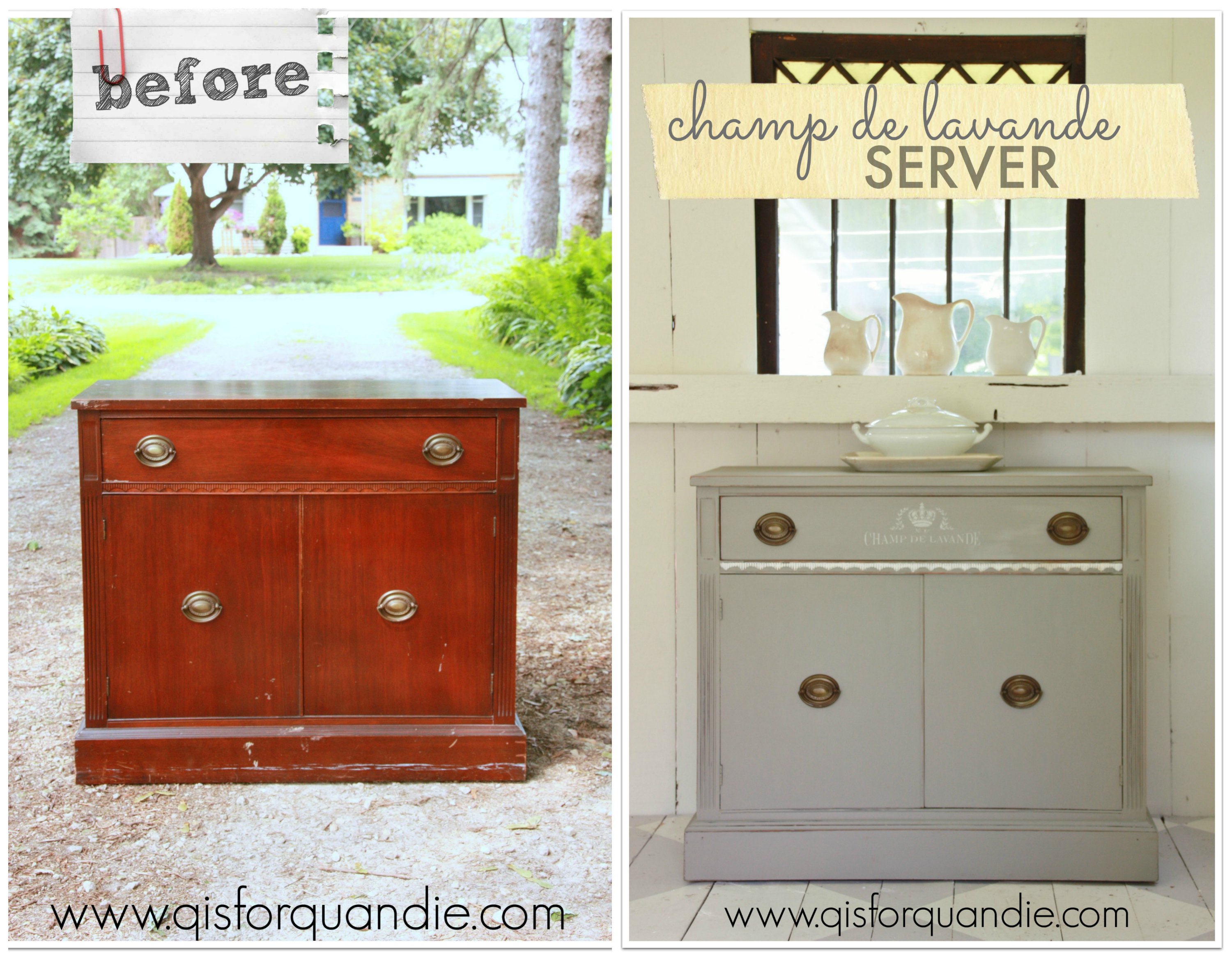
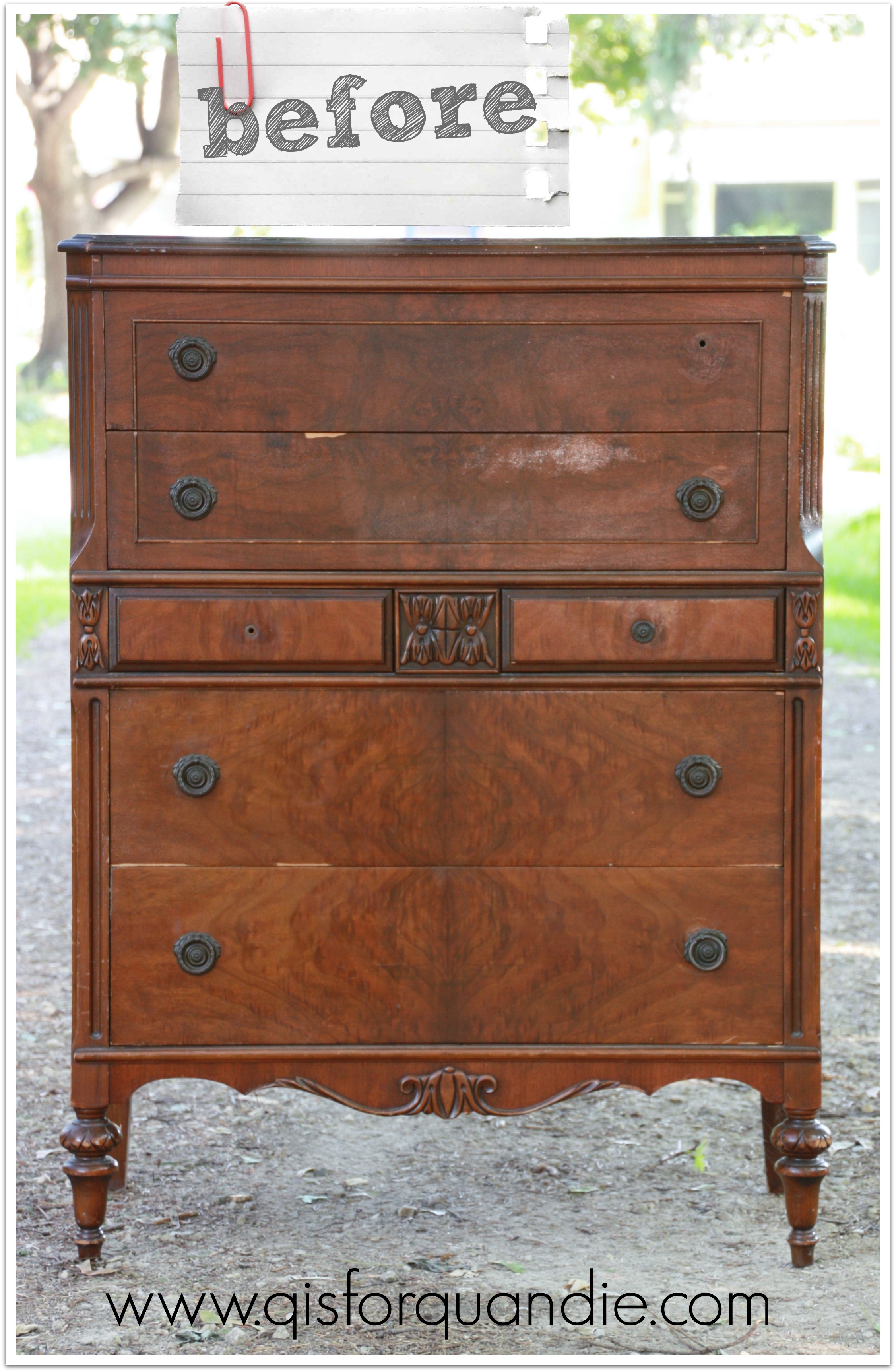
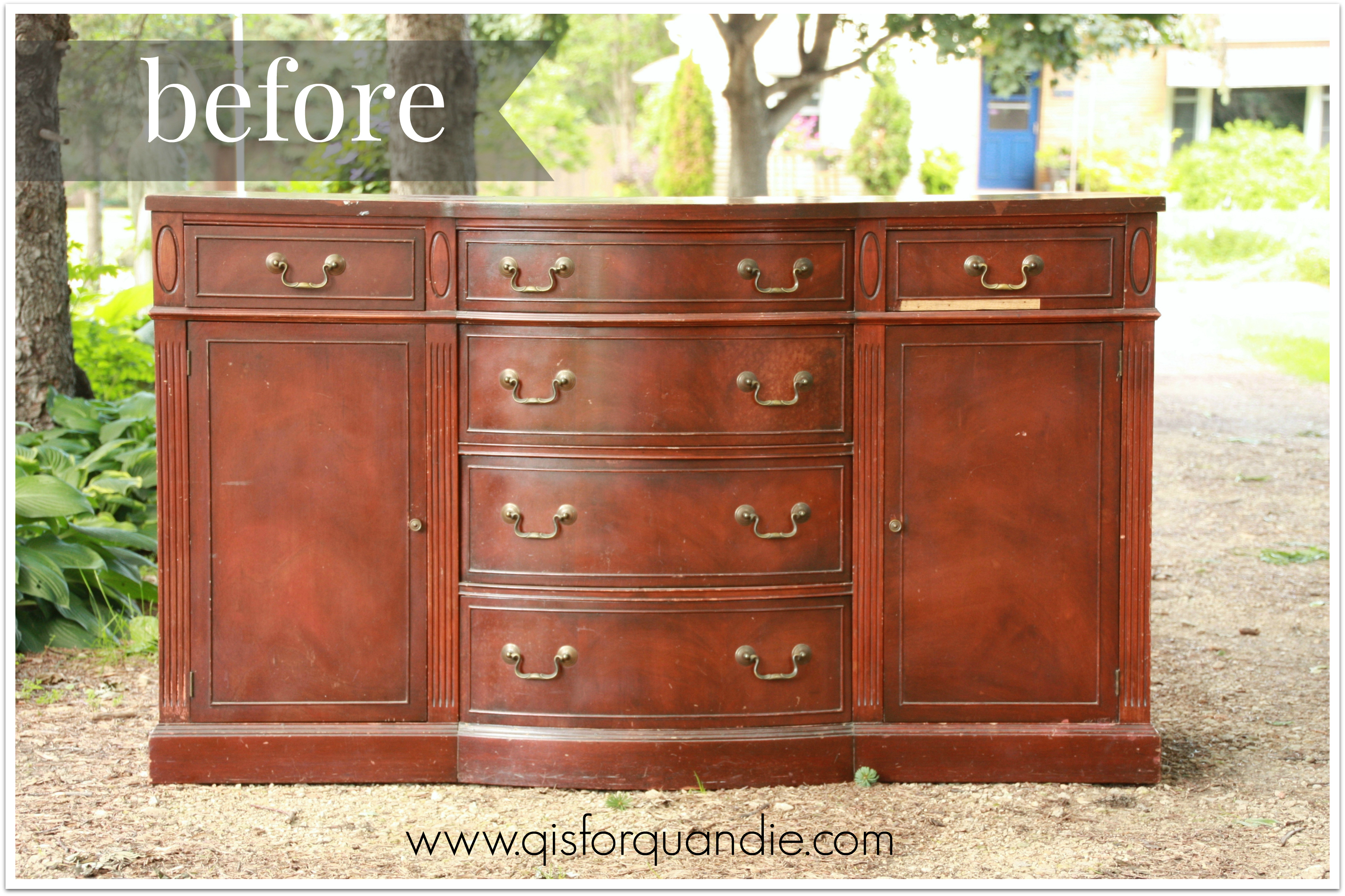
kitchen scale beforeThis one has lots of potential, right?  It has a little bit of veneer damage, and a chunk of the trim is missing at the bottom.  It’s the perfect candidate for a paint job.

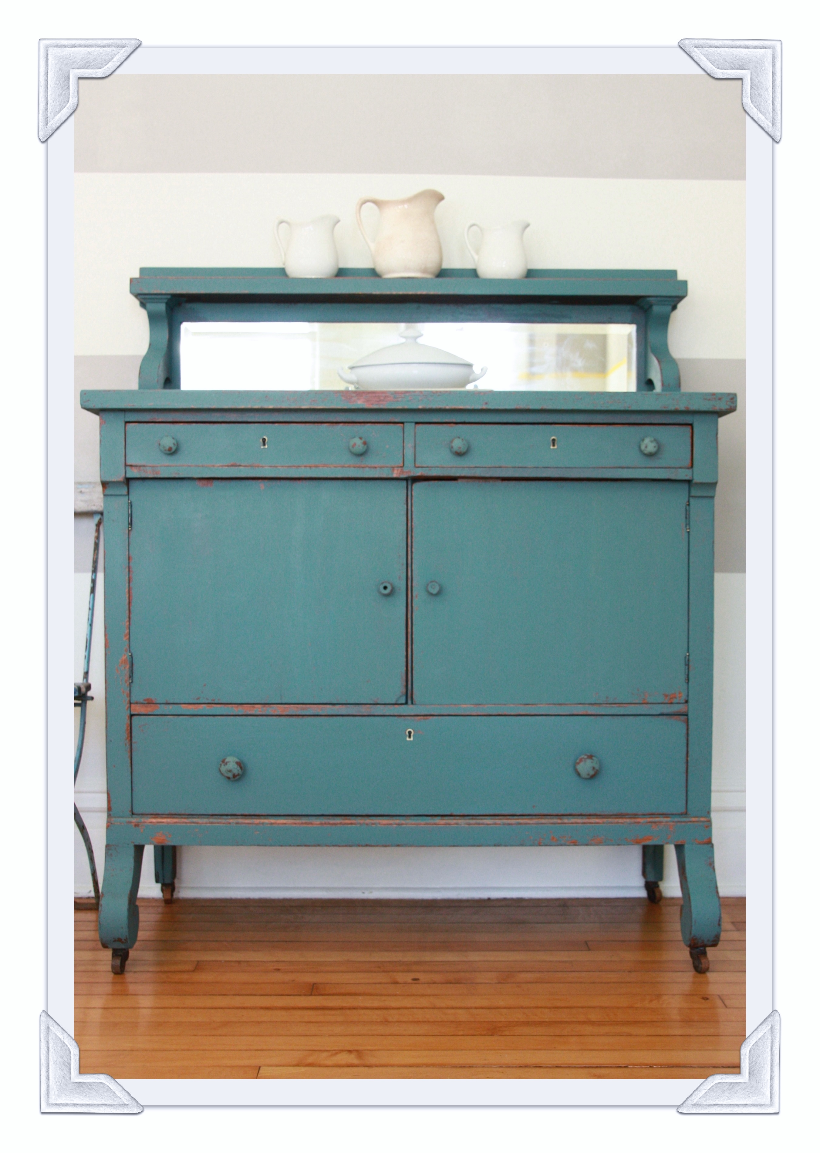
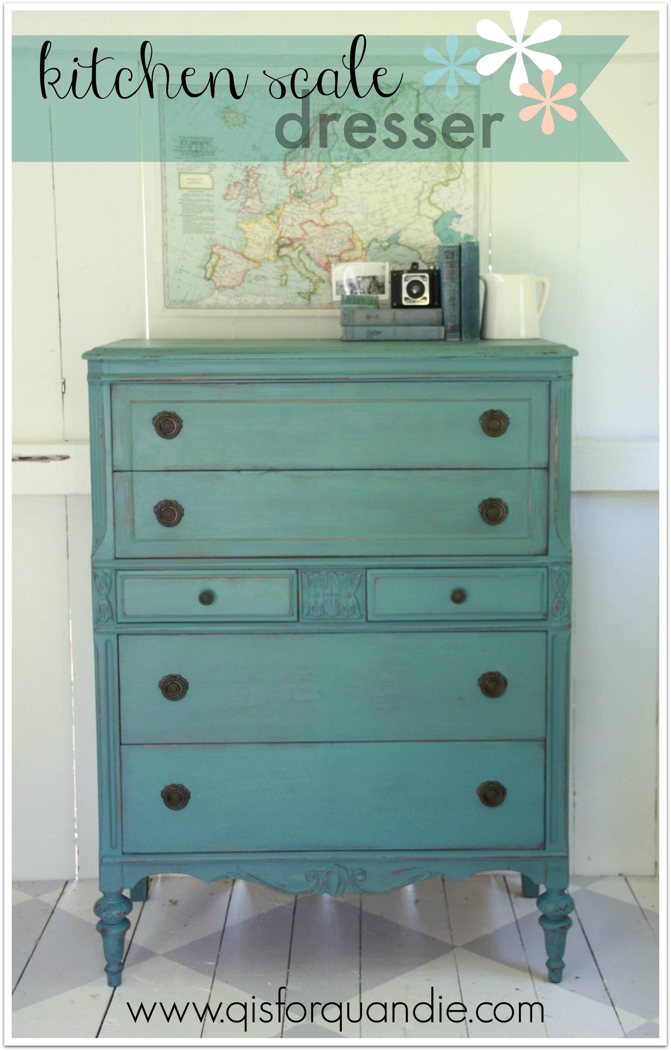
I decided to go with my absolute fave MMSMP color, Kitchen Scale.  I hadn’t used this color for a while.  My own mirrored buffet is painted this color and I absolutely love it.

header hutch

 It works fantastically with grey, the neutral of the moment.

So I decided it was time for a Kitchen Scale dresser.  I sanded this one quite vigorously because it was in rough shape, and I didn’t want a ton of chipping, just a subtle chippyness.  I have to note here that I did mix the paint a little bit thicker than usual.  I ignored the little voice in my head that was telling me to thin it down a bit more, which may have been a mistake.  I painted my first coat and closed up shop for the evening.  When I went back out the next day, I found a massive amount of crackling.  On every surface except for the sides of the dresser.  The sides didn’t crackle at all, go figure.  Massive, bad, over the top, too much crackling everywhere else.  I should have taken a picture for you, but I didn’t.  When I have issues like this, it generally puts me in a bad mood and photography doesn’t happen.

I will note here that I did not apply heat to the dresser, and it was not all that warm outside and I did not paint under the full sun.  Why the giant crackles?  Was it just the thickness of the paint?  No idea.

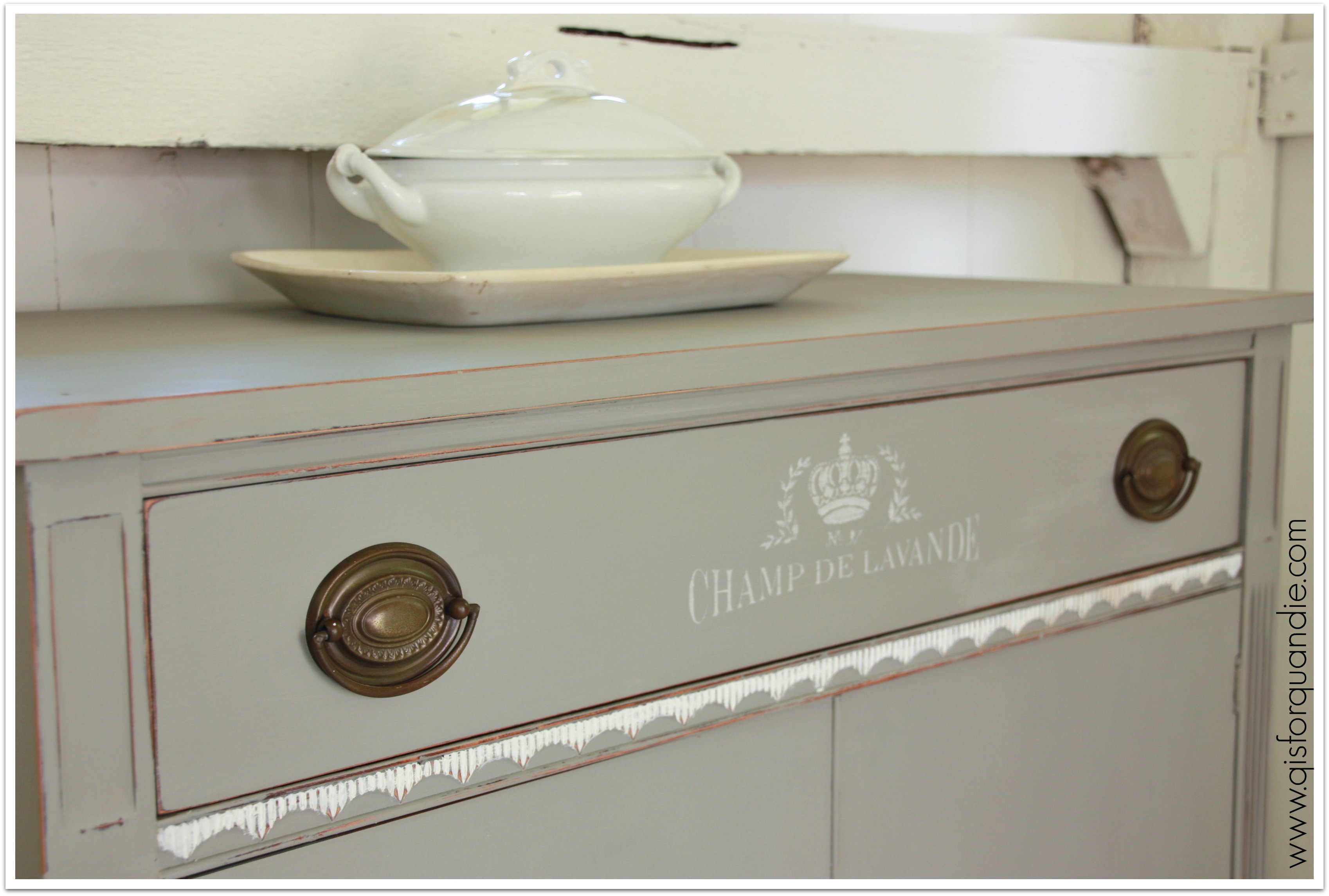
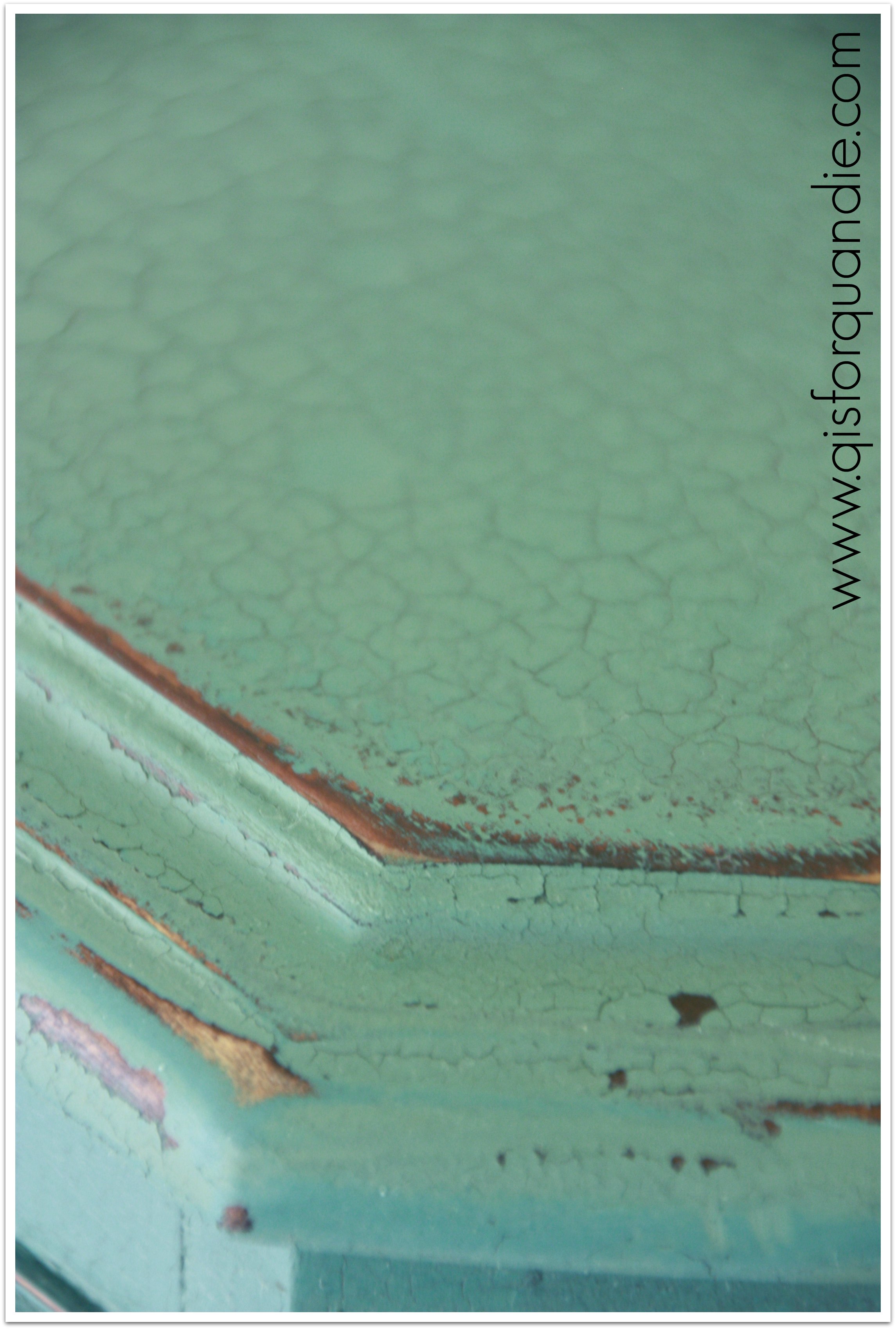
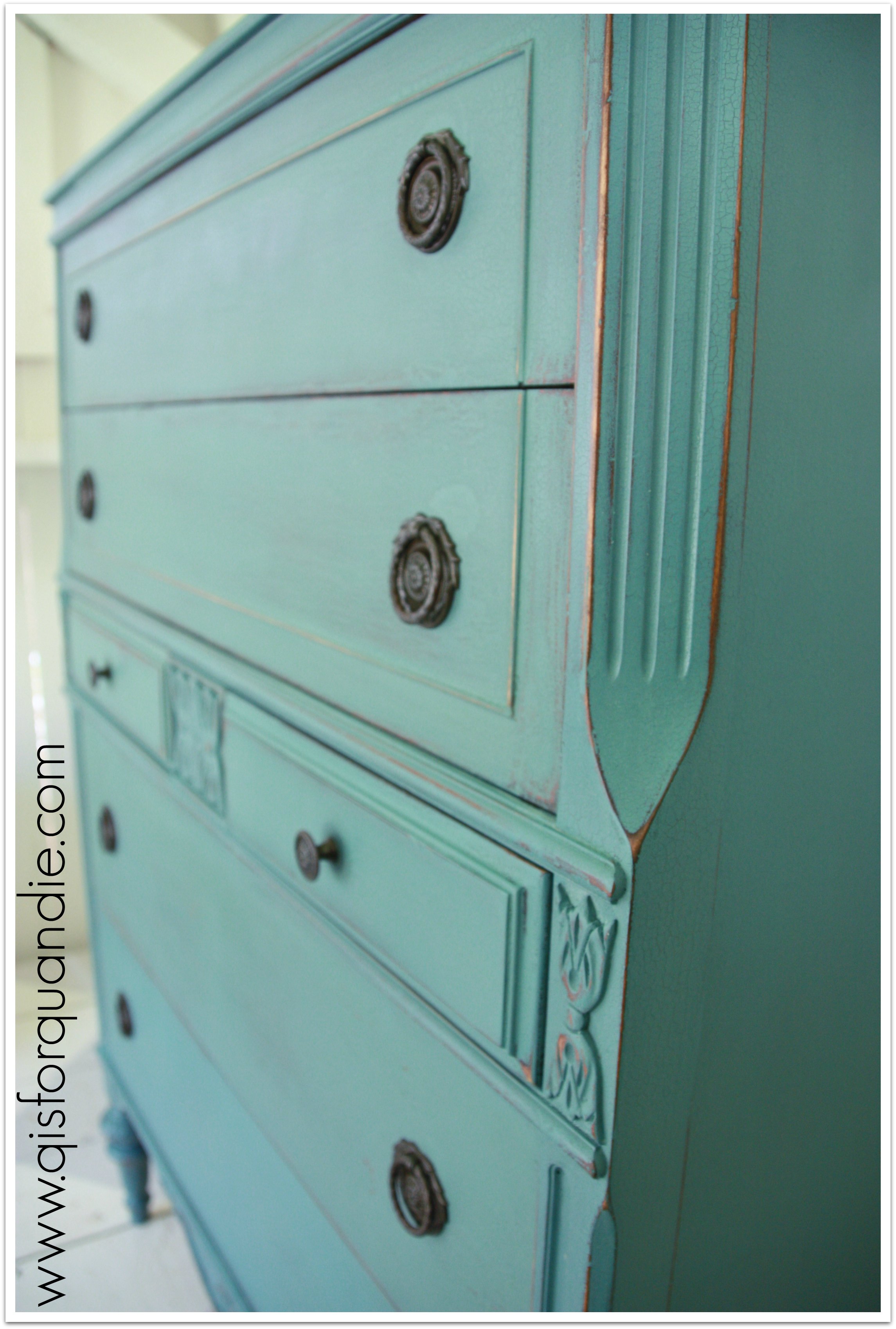
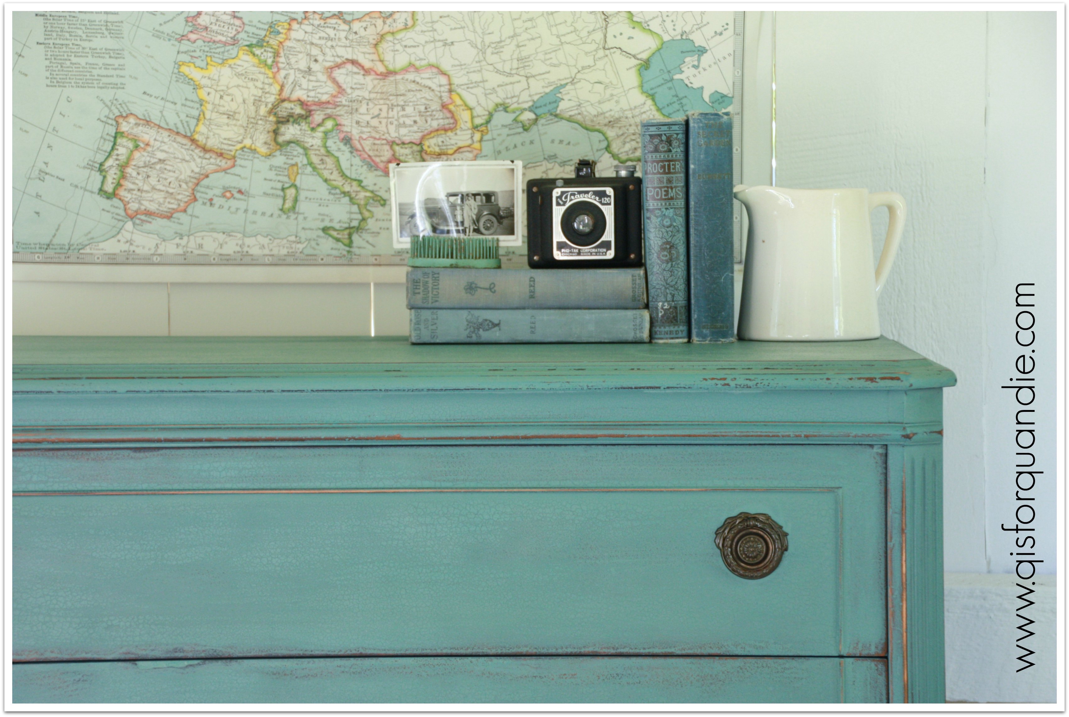
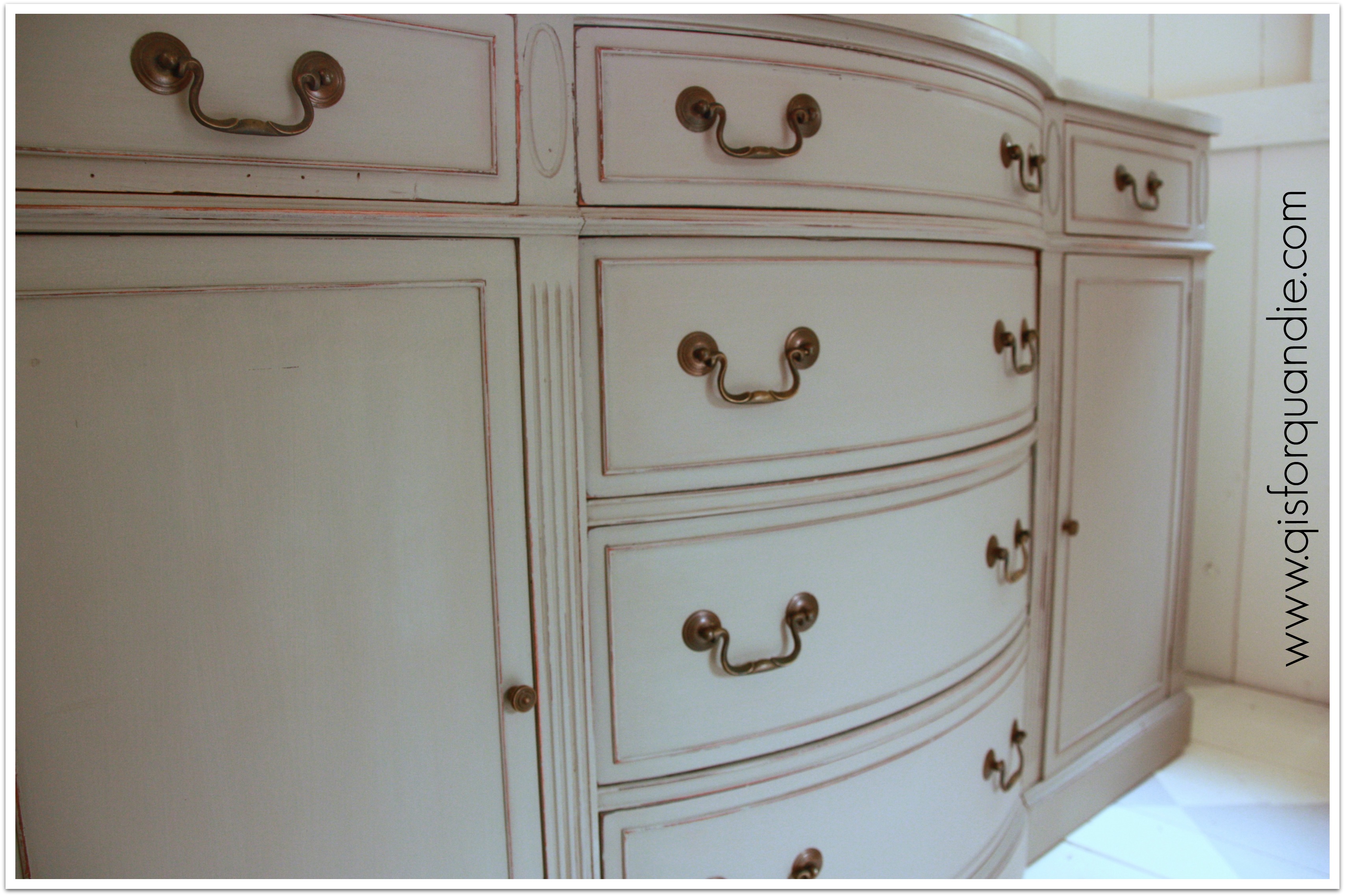
I decided to sand the heck out of it again, and try adding another coat of thinner paint.  It had the desired result.  It toned down the crackle.  Oh, it’s still there, for sure, but now it’s at an acceptable level.

kitchen scale close up

Am I the only one who considers this an acceptable level?

2014 summer blog23

Often people wonder if milk paint will continue to chip away down the road, and the answer is no, it shouldn’t.  As long as all of the loose chips were removed as part of the finishing process.  In this case, I sanded the dresser pretty thoroughly and then vacuumed it to remove any loose chips.  I put a final coat of hemp oil on it which also helps the paint remain adhered.  I can run my hand across this dresser pretty vigorously and no paint chips off.

Alternatively, some people choose to leave the chipping paint in place and seal it with a poly finish.  I’ve never tried this approach, but I can see where it would be a fabulous look in some cases.  Maybe down the road, if I get a good chipper, I’ll give this a try.

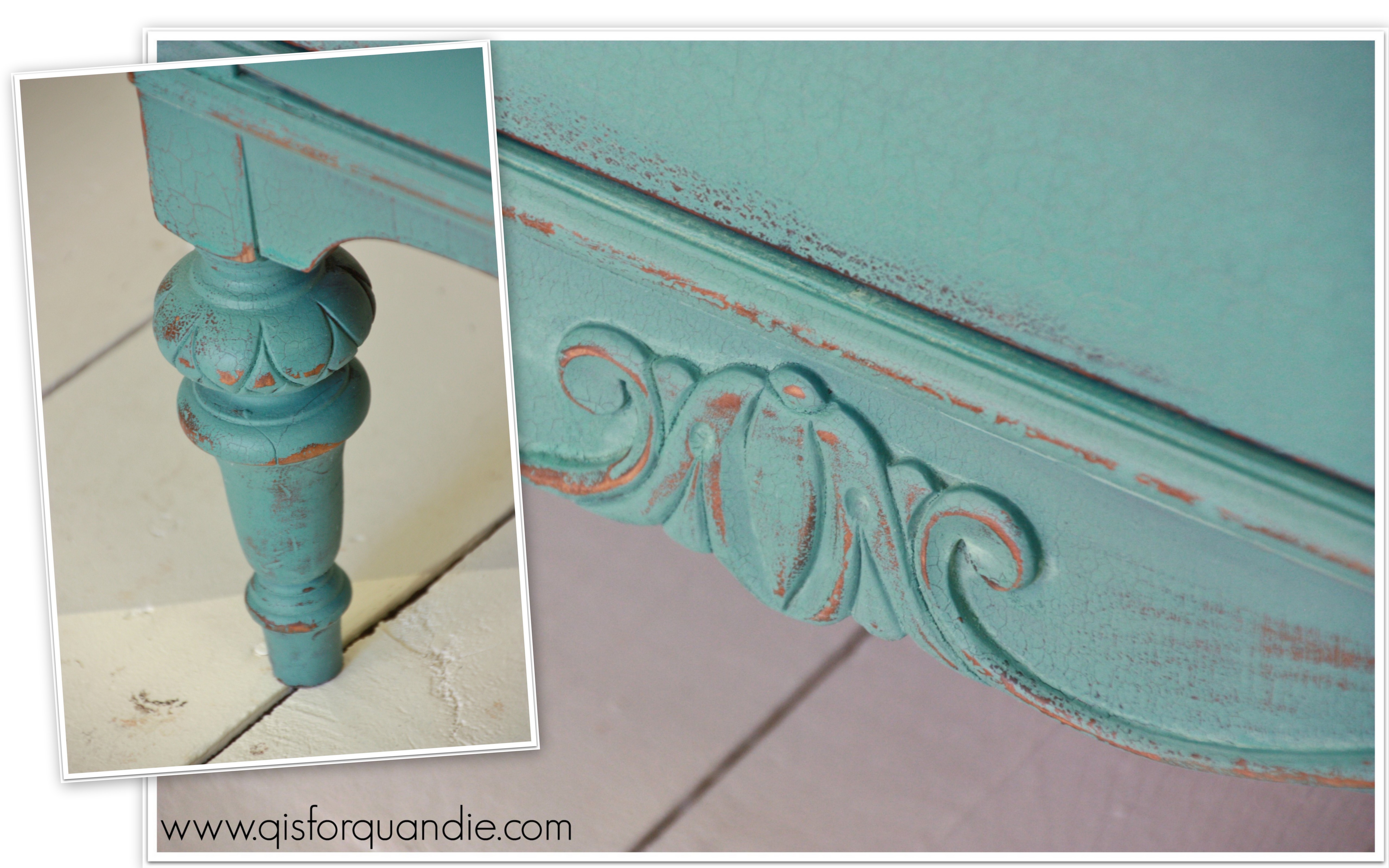
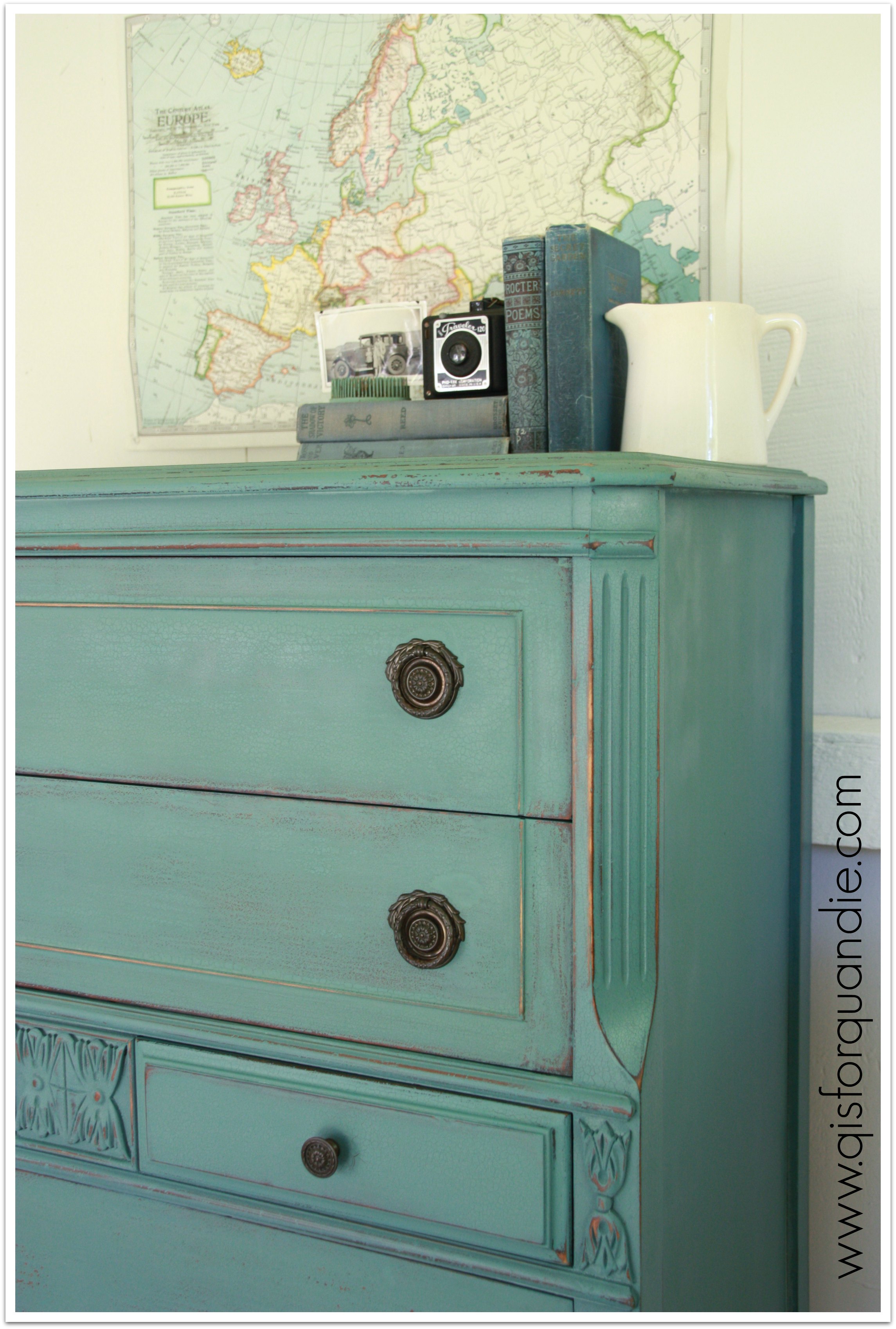
In the end, I think the dresser is quite lovely.  It has some fantastic details like the angled sides and the carved bits that really pop now.  I kept the original hardware because it is quite charming.  This dresser is definitely distressed and has an aged appearance, but there are plenty of us out there who love that look, right?

kitchen scale front

Please say yes.

kitchen scale staging landscape

The moral to my story, if at first you don’t succeed, try, try, again.  You can always sand something down and add a little more paint.

After all, ending up with something that looks like this is not an altogether bad thing.

kitchen scale angleAnyone out there in the market for a gorgeous distressed dresser in my favorite shade of milk paint?

kitchen scale title

 If so, leave me a comment and I will get back to you.  Ooops!  Sorry, this one is SOLD.

another golden oldie.

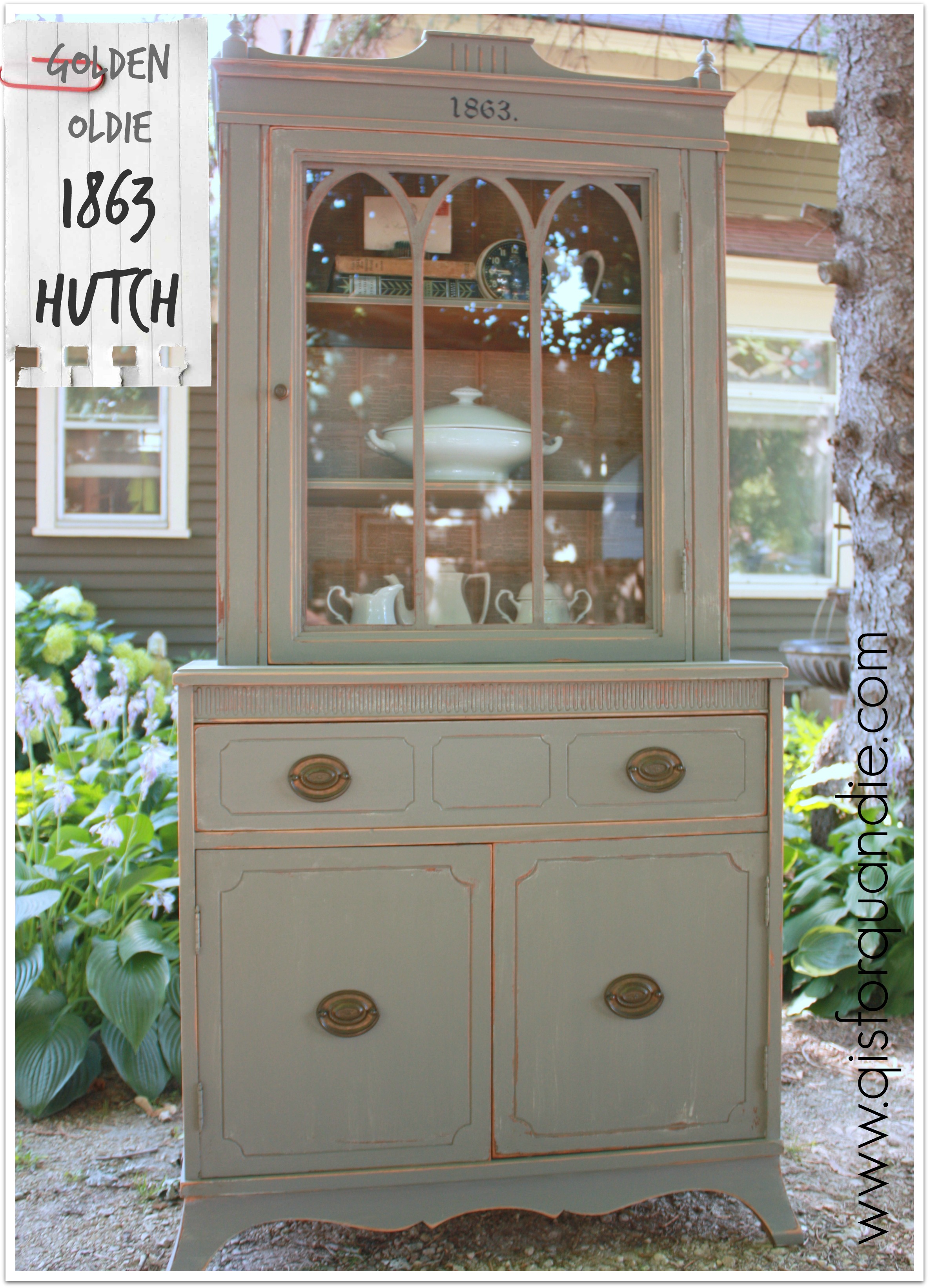
I painted this gorgeous hutch last summer.  I wish I had a ‘before’ pic for you!  I knew the moment I saw the craigslist ad that this would be gorgeous painted.  It wasn’t horrible, but it was rather outdated looking in its original state with a rather orange-y stain.

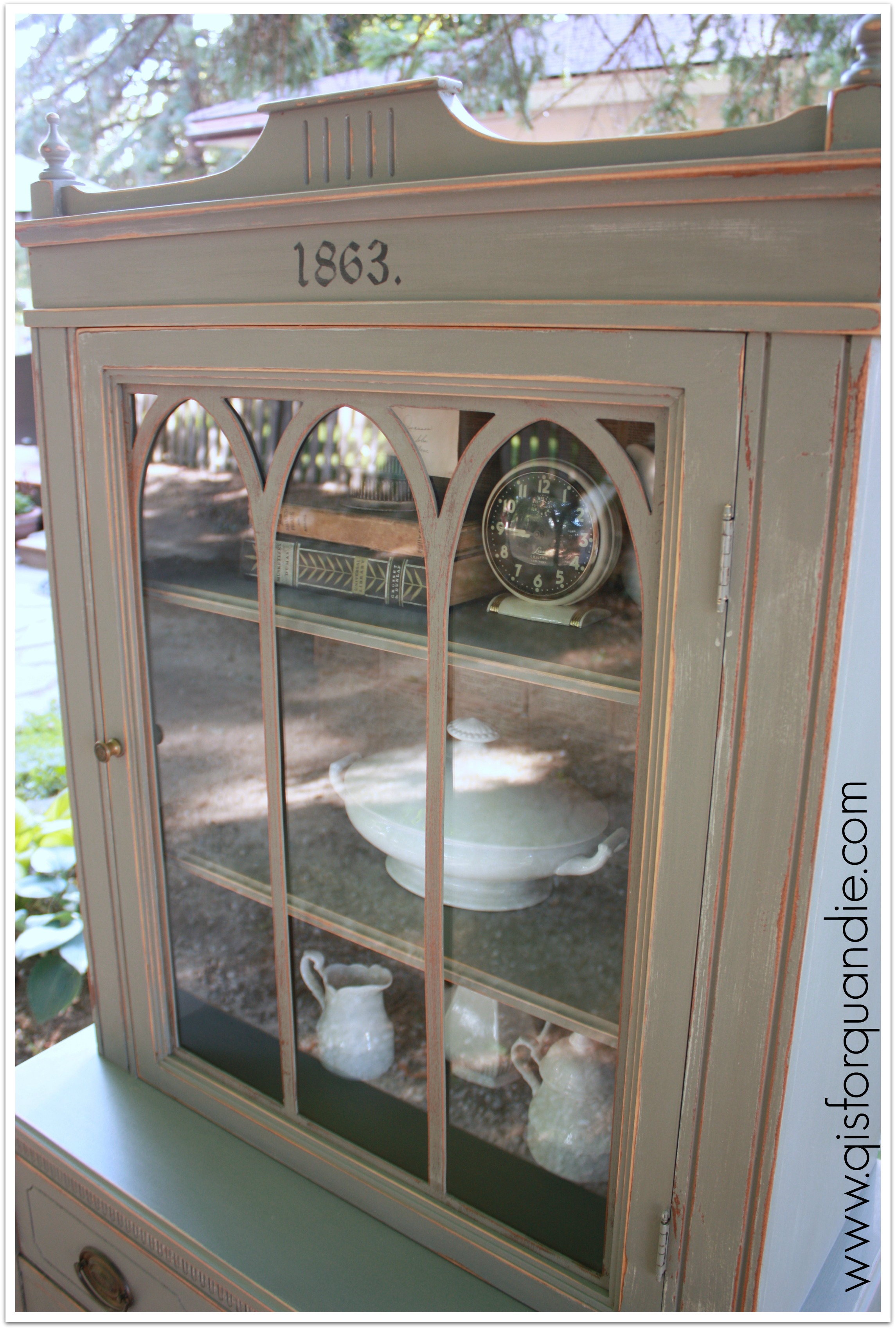
1863 hutchI loved the Gothic arches in the glass door and the detail at the top of the cabinet.  I have to admit, this is still one that I look at and think “why didn’t I keep that?”

1863 hutch door

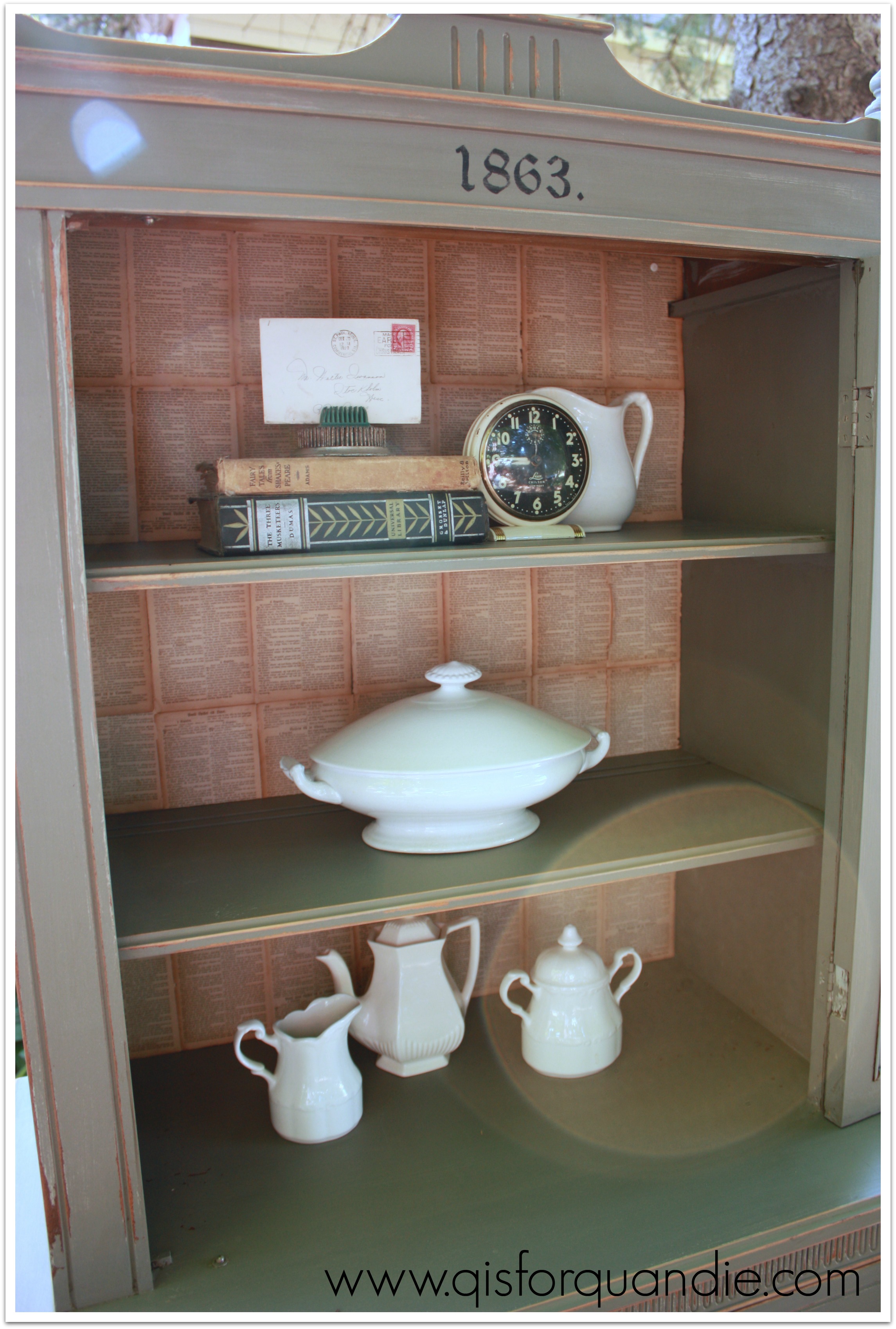
You can see that I lined the inside with pages from an old Swedish bible.  I hand painted the ‘1863.’ at the top.  It’s not a stencil, I just printed the image off my computer, traced it onto the cabinet using tracing paper, and then painted it in with a small brush.

1863 hutch interiorYep, she was a beauty.  I sent this one up to the Round Barn and it is long gone.  Sniff, sniff.

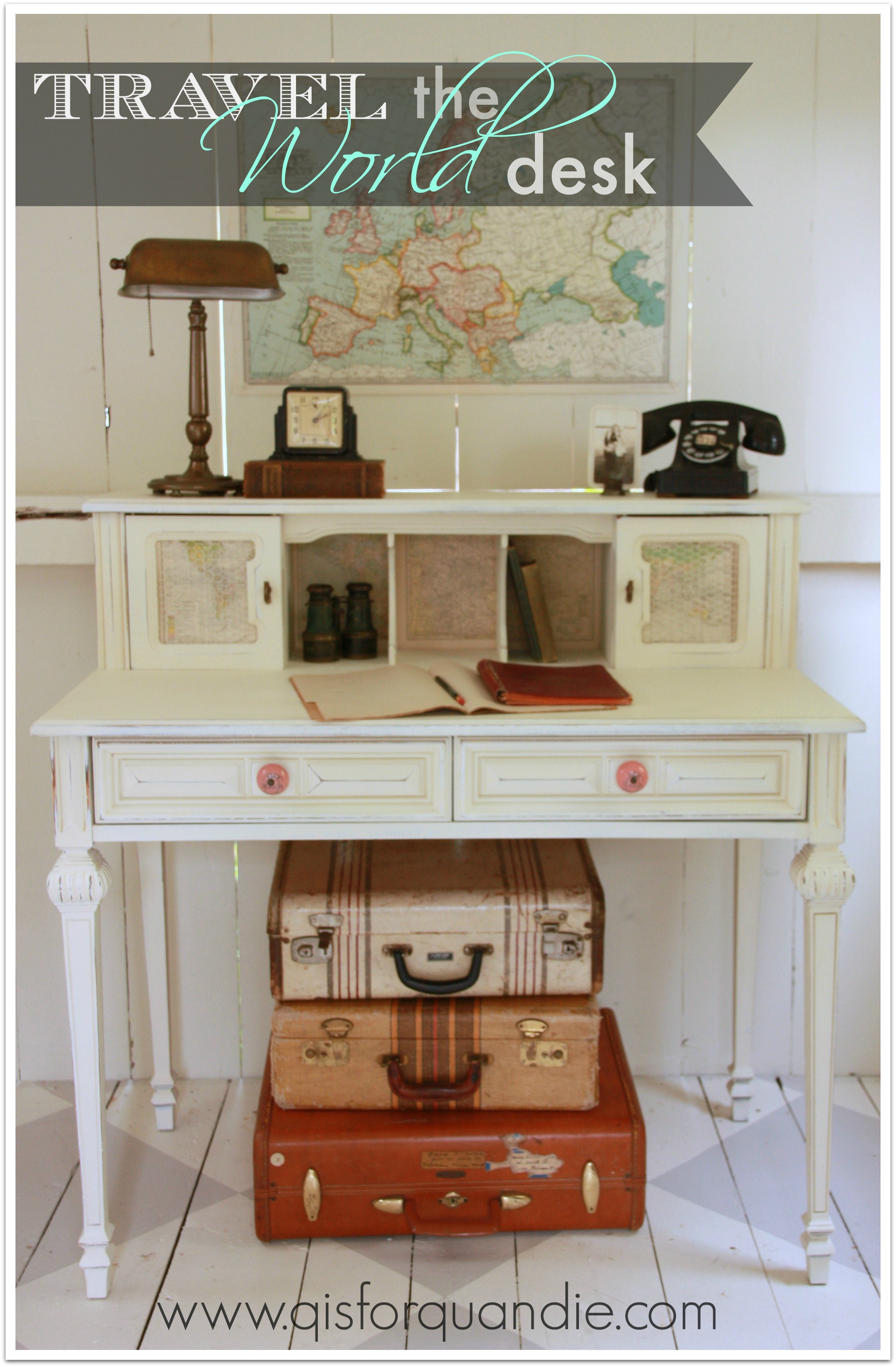
travel the world desk.

I didn’t plan to carry on with the travel theme, it just sort of happened.

travel desk quoteAnd I don’t normally do custom work, but this particular job was obviously meant to be.

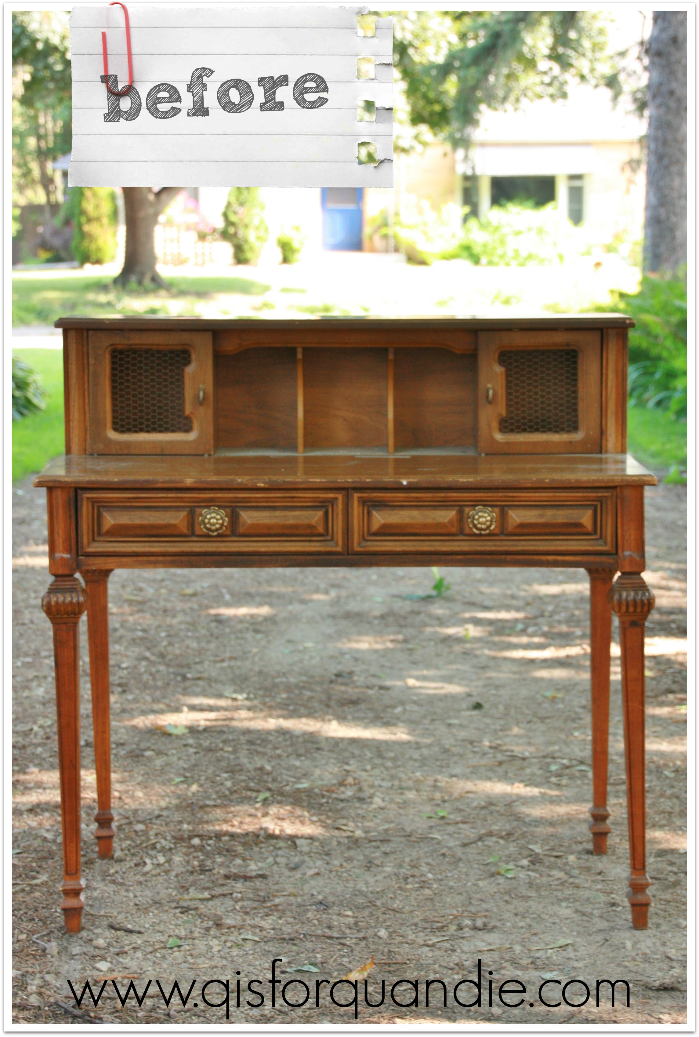
One of my fave customers came by to pick up the Duncan Phyfe buffet, and as she was getting ready to leave she just happened to ask if I had any desks.  She was looking for a specific style, and showed me a pin from pinterest.  It is a unique style, and it was just an amazing coincidence that I had a very similar desk on hand.  I’m sure she totally expected me to say no.

It was tucked away in the creepy lean-to storage area of the Carriage House waiting for inspiration to strike.

travel desk before

As you can see, she had to have amazing powers of imagination to see that this could turn into something fab.  She also had to brave potential spiders and bad lighting.

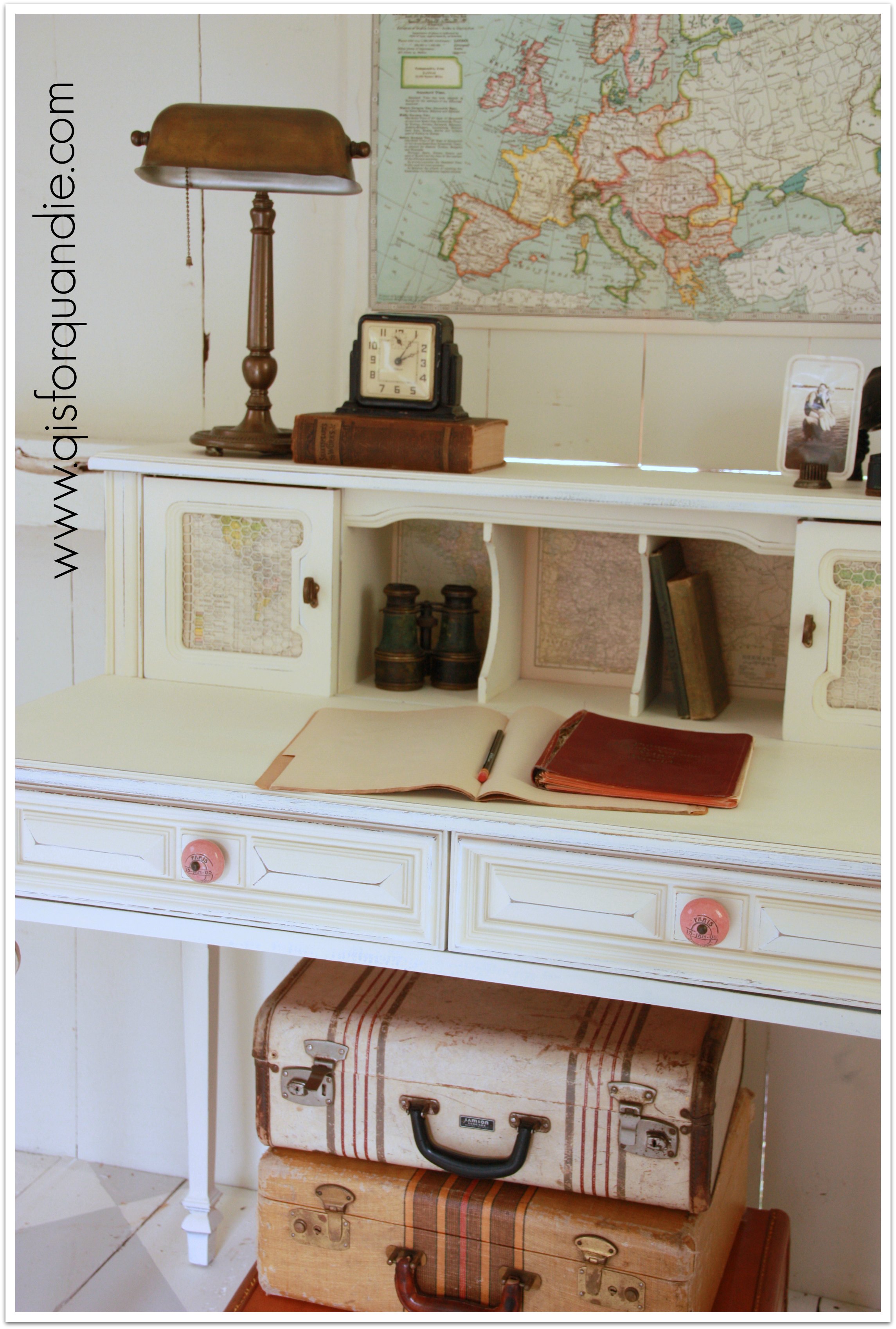
She told me that I could do what I wanted with it as long as I painted it white.  I had been thinking of white anyway, so I was more than willing to bend my ‘no custom work’ rule.  And here is the result.

travel desk title
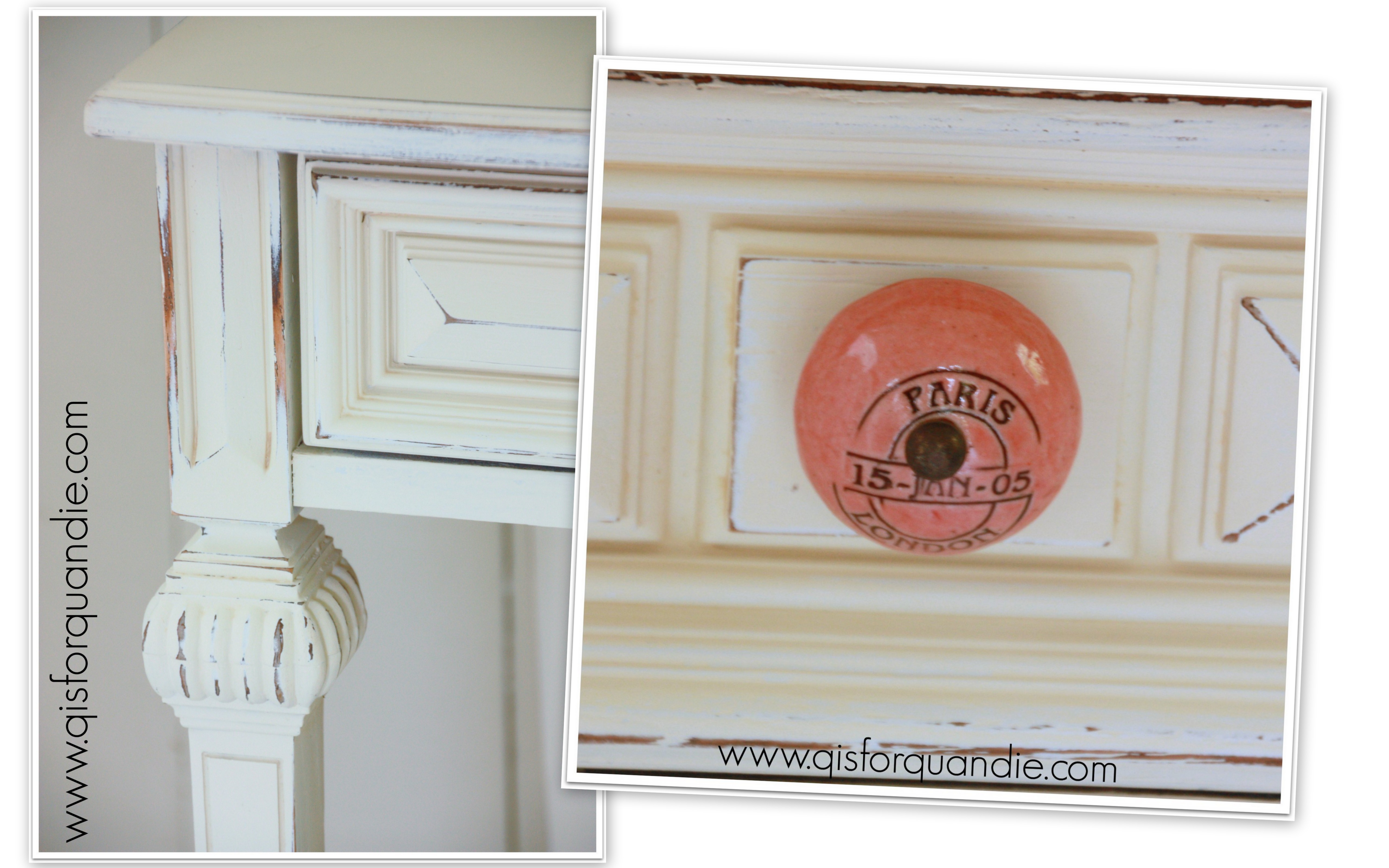
I’ve had the pair of pink knobs around for a while, and I thought they’d be a nice pop of color on the desk.  If you look close, you can see that they say PARIS and LONDON on them.

2014 summer blog18

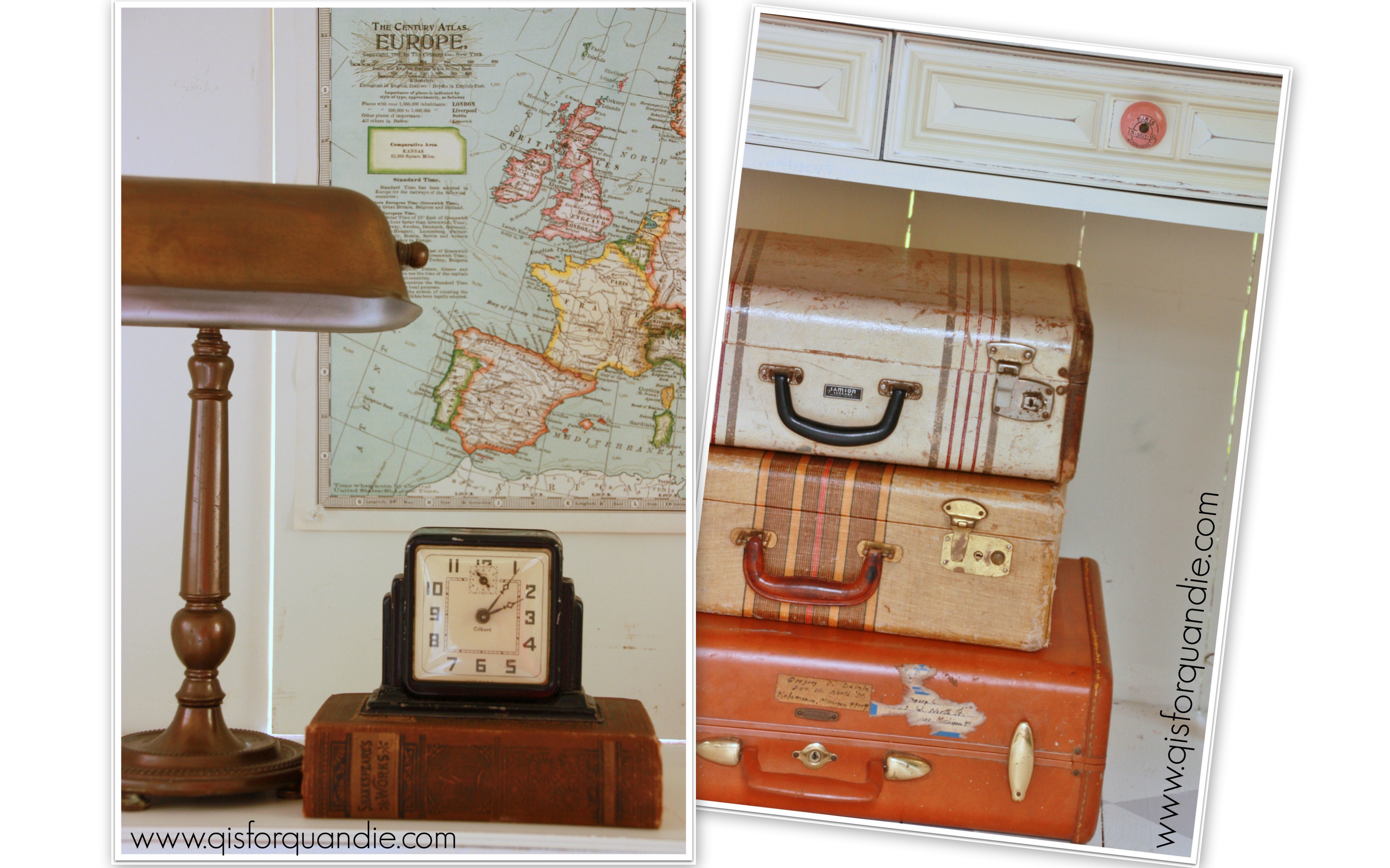
I knew I wanted to put some sort of vintage paper at the backs of the cubbies, and the knobs inspired me to use old maps.

travel desk cubbies

2014 summer blog17

The maps came out of the Putnam Handy Volume Atlas of the World from 1922.

I picture a young woman from the 1920’s sitting at this desk planning her grand tour of Europe.  She has her Europe map hanging on the wall, and her luggage is piled up and ready to go.

2014 summer blog19

She’s making notes about the Doge’s Palace in Venice and Notre Dame de Paris in her journal.  Perhaps she’ll visit the Leaning Tower of Pisa, and hopefully the Tower of London.  Handsome Italian men will try to sweep her off her feet at the Spanish Steps in Rome.

She has plenty of film and her cameras are ready to go.

travel desk cameras

I hope that this desk inspires some travel, or at least a sense of adventure in its recipient.

travel desk on angle

 Don’t you sort of wish you had a trip to plan now?

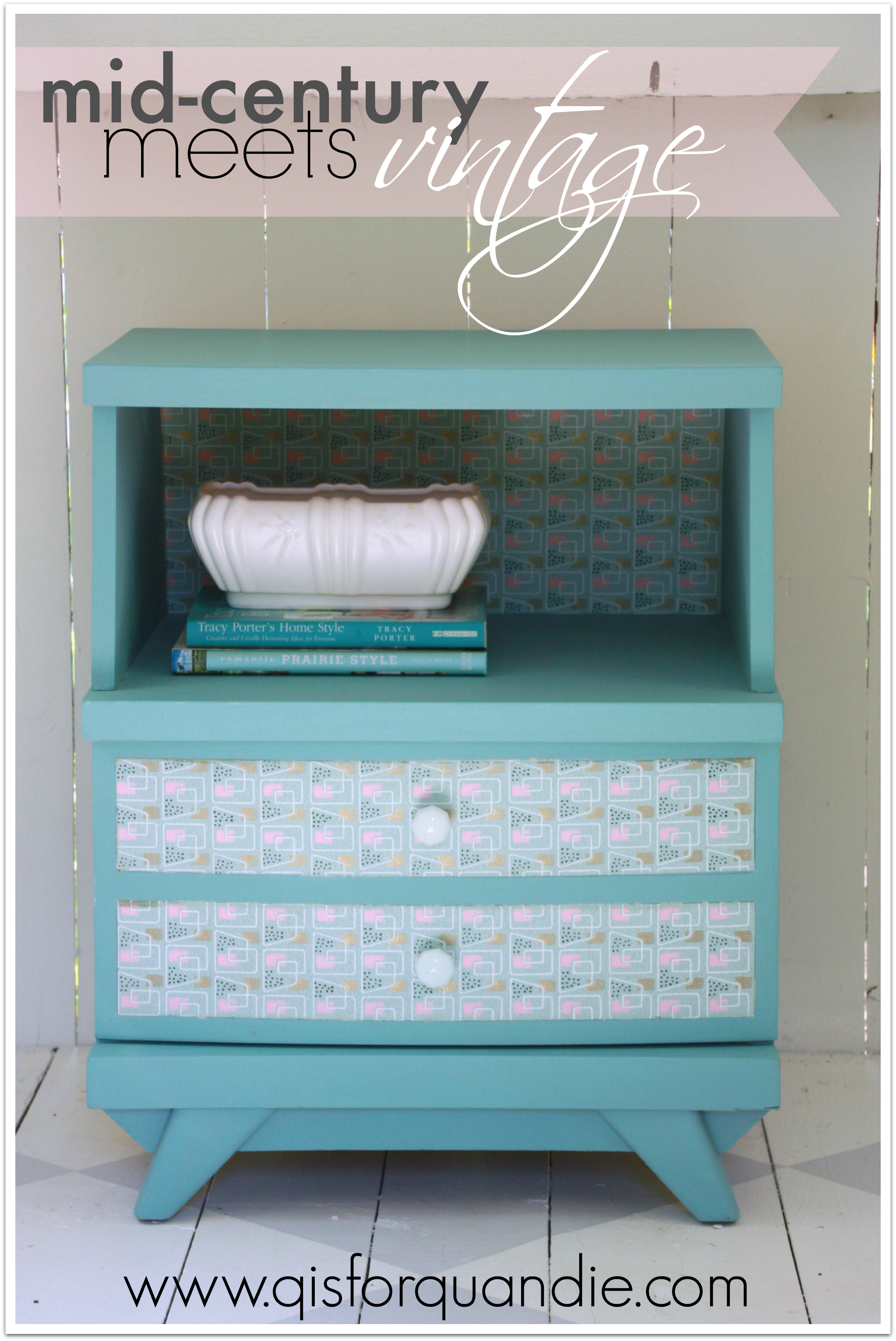
mid-century meets vintage.

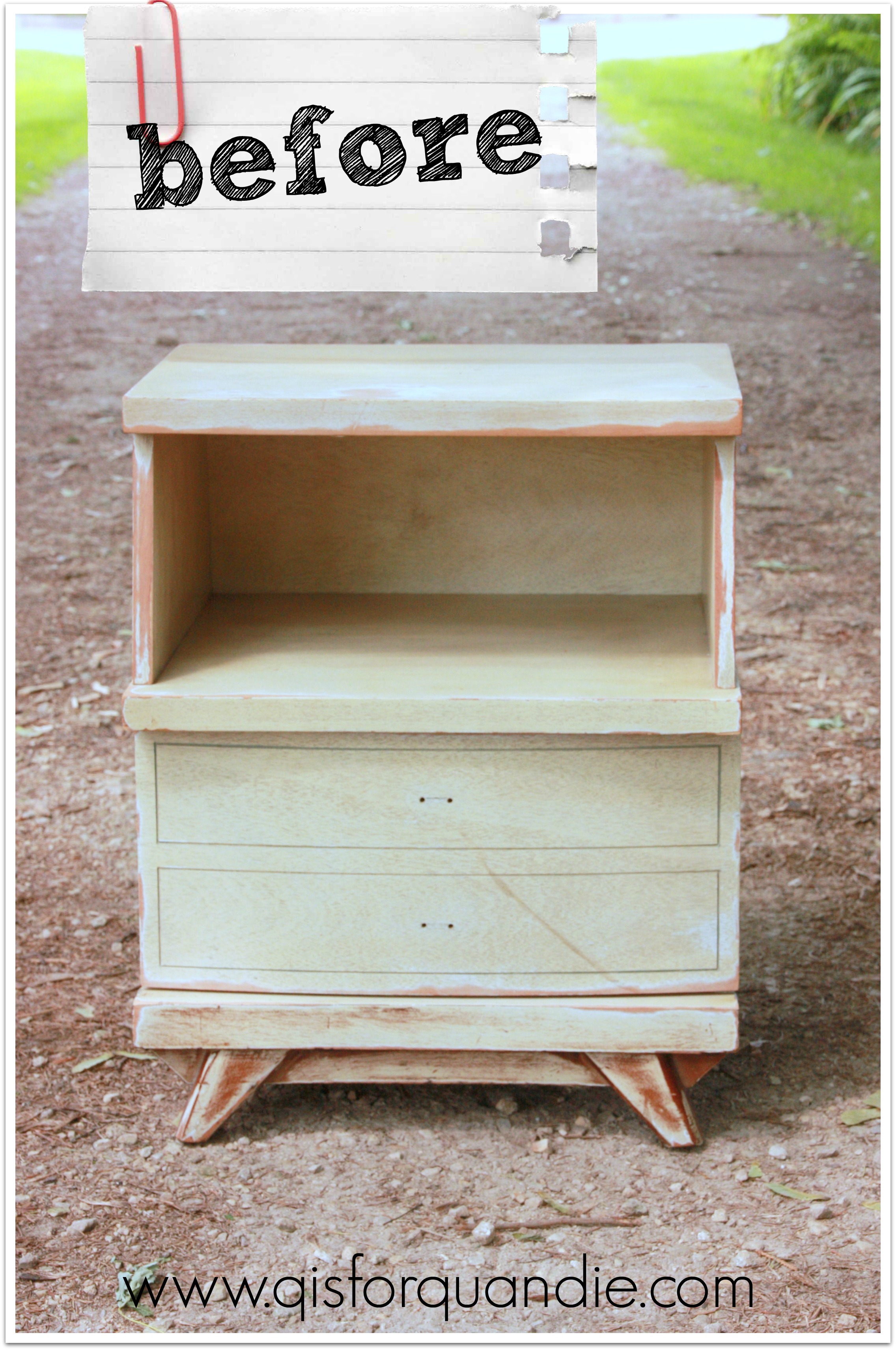
I picked this nightstand up at the Highland Park garage sales.  It was pre-prepped for me, meaning the person selling it had intended to refinish it herself, but she never completed it.  She had sanded it and removed the knobs (unfortunately, she didn’t have them anymore).

highland park mid-century before

It was so nice of her to take care of the boring parts of the process for me!  All I had to do was focus on the creative, ie. fun, part.

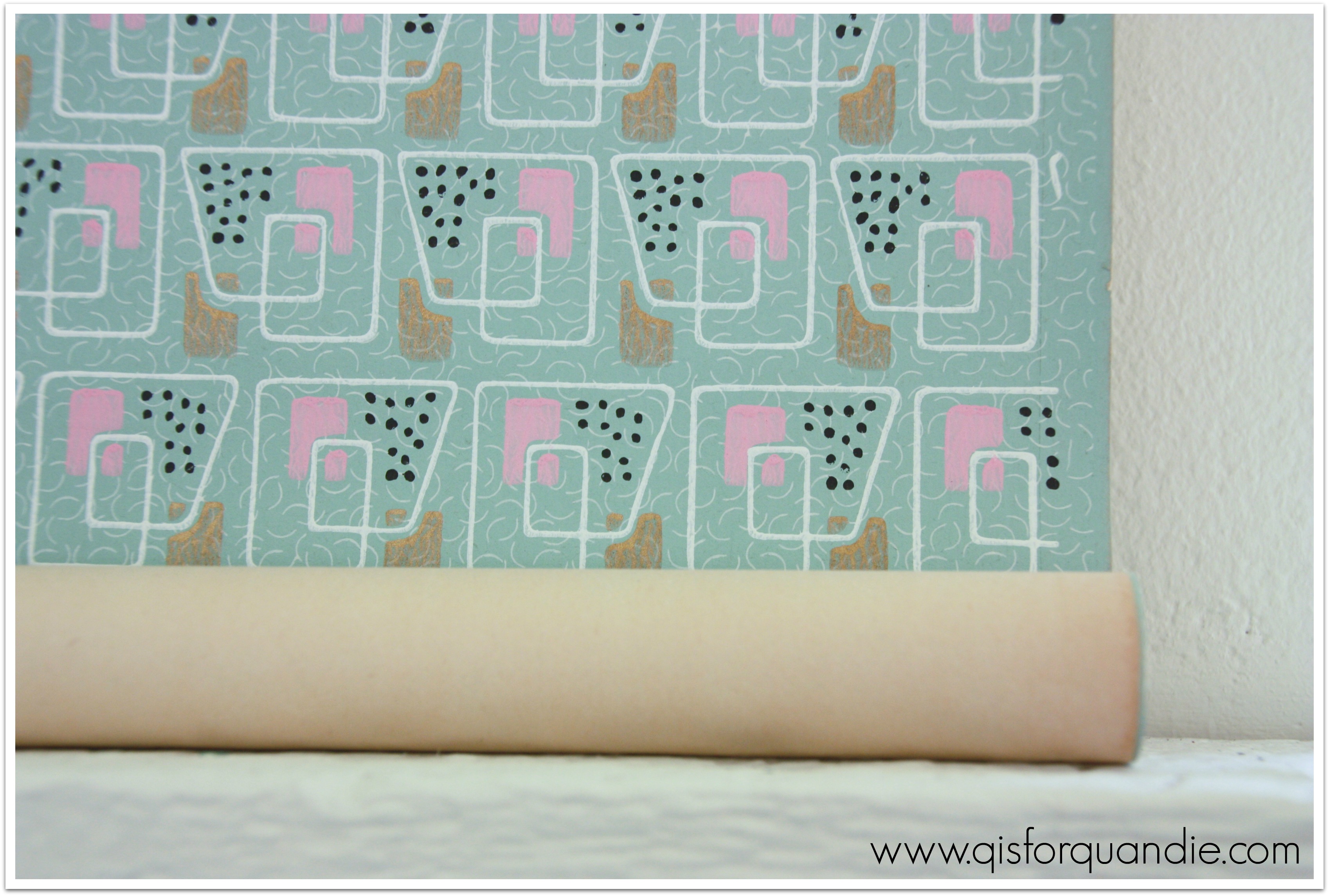
A while back I made a trade with my friend Michelle.  I found some darling mid-century Italian tole wall sconces at a garage sale that I knew would be perfect for Michelle, and I had been admiring a roll of fab mid-century wallpaper that she had stashed in her studio.  An easy trade.

Provence wallpaper

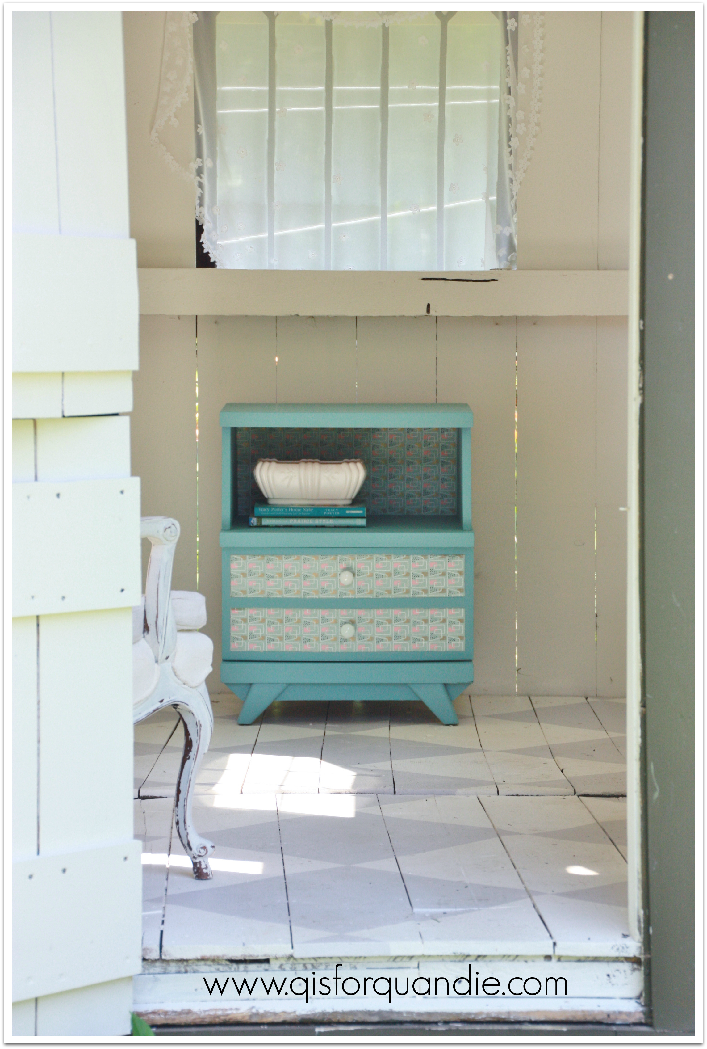
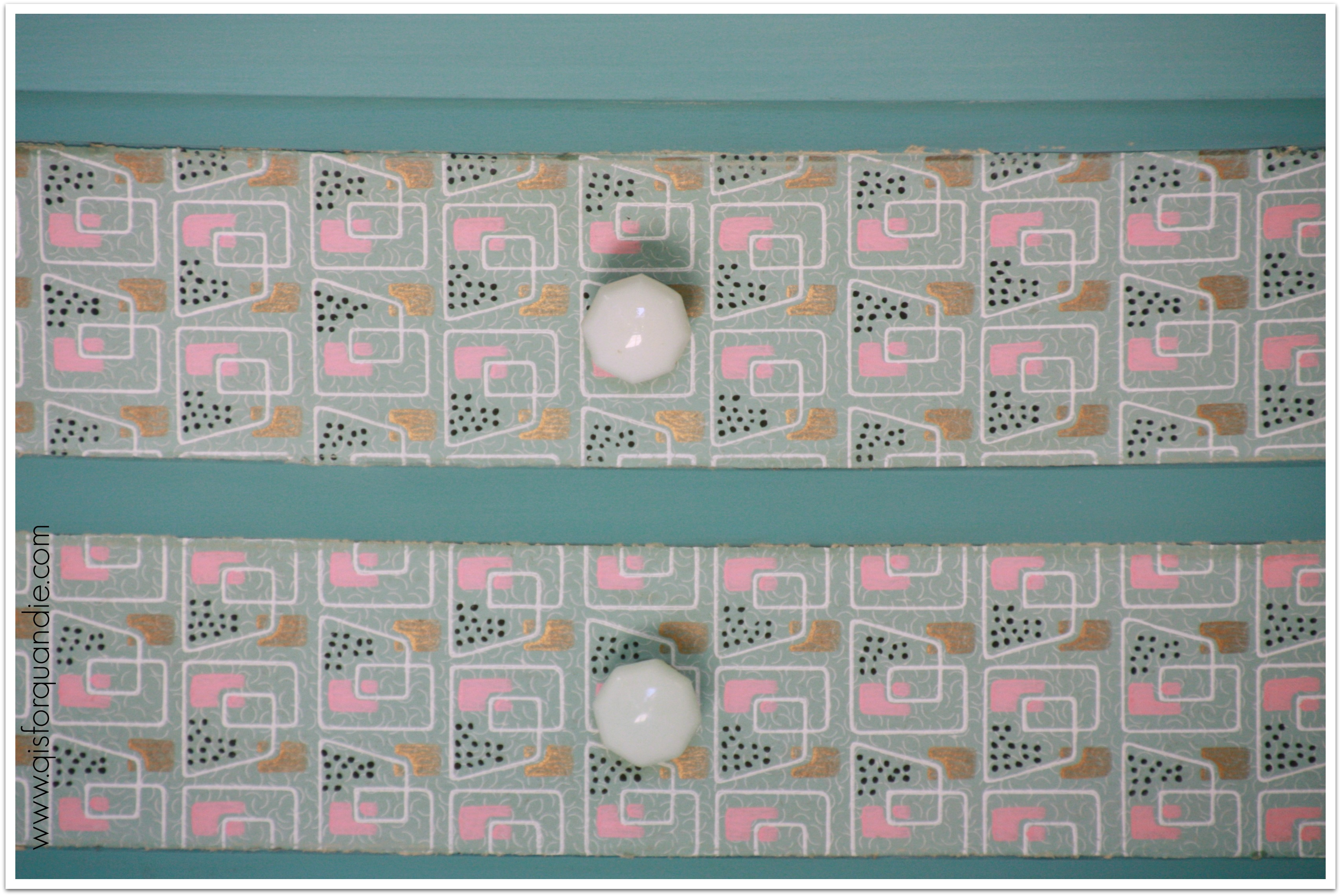
What I love about this wallpaper?  The colors are perfect, aqua, pink and white with that little touch of metallic gold and black.  Feminine, without being flowery.  Geometric all-over pattern that isn’t difficult to line up.  It’s perfect for my needs.  I was hanging on to it just waiting for the right mid-century piece to use it on.  And I knew this nightstand was it.  So let’s pop into the photo cottage and see how it turned out!

Provence nightstand in cottageYep, pretty fab, right?

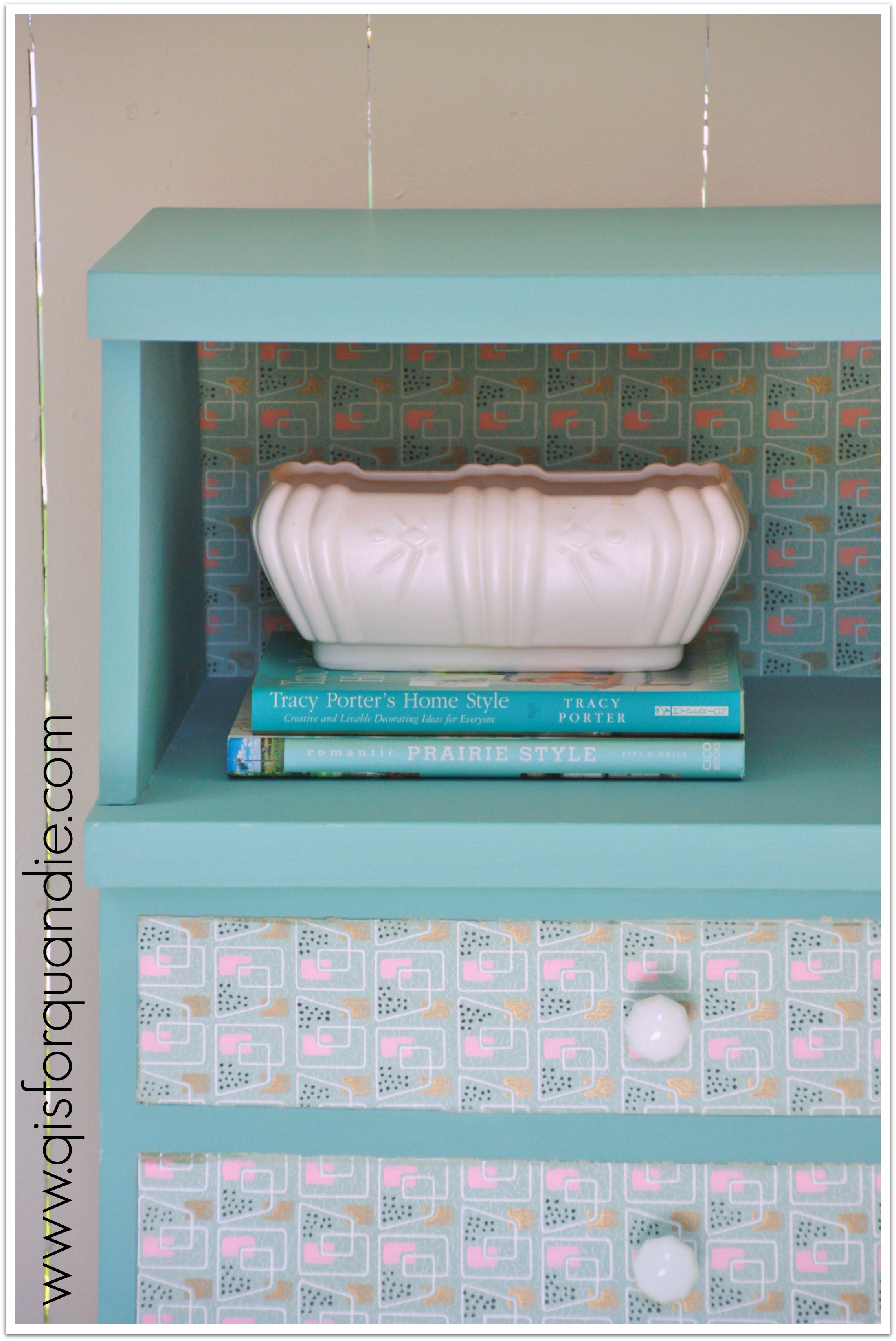
Provence nightstand close up

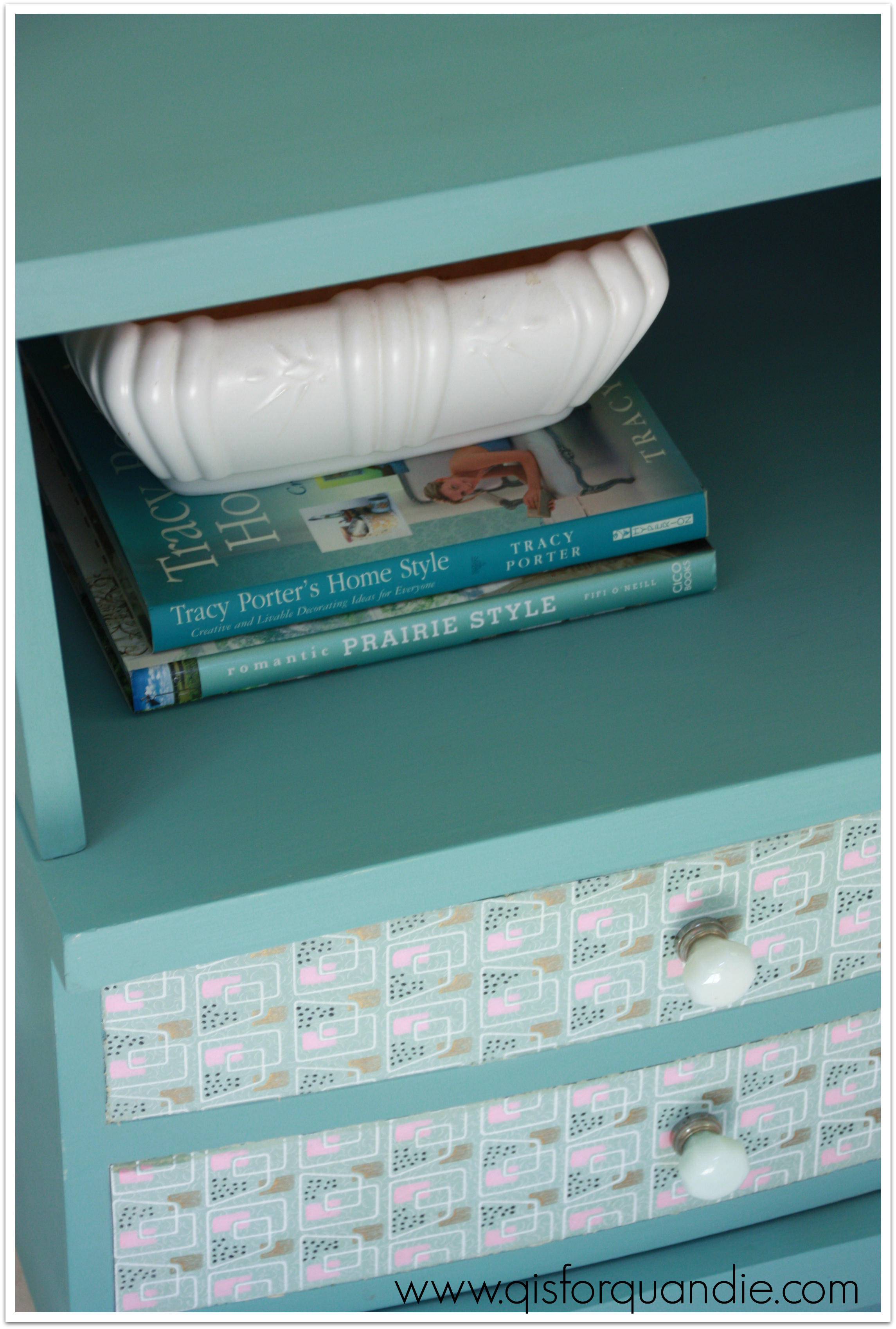
I painted this with Annie Sloan’s Provence.  Then I added the wallpaper to the back of the cubby area, and the front of the drawer.

Provence nightstand on angle

A couple of my friends really pushed me to find a more classically mid-century knob for this piece, but after perusing Etsy and finding the knobs I liked to be rather pricey, I opted to go with some vintage milk glass knobs that I already had on hand.  They aren’t typical mid-century.  They were not stark white, but had a bit of an aqua tint.

Provence nightstand knobs

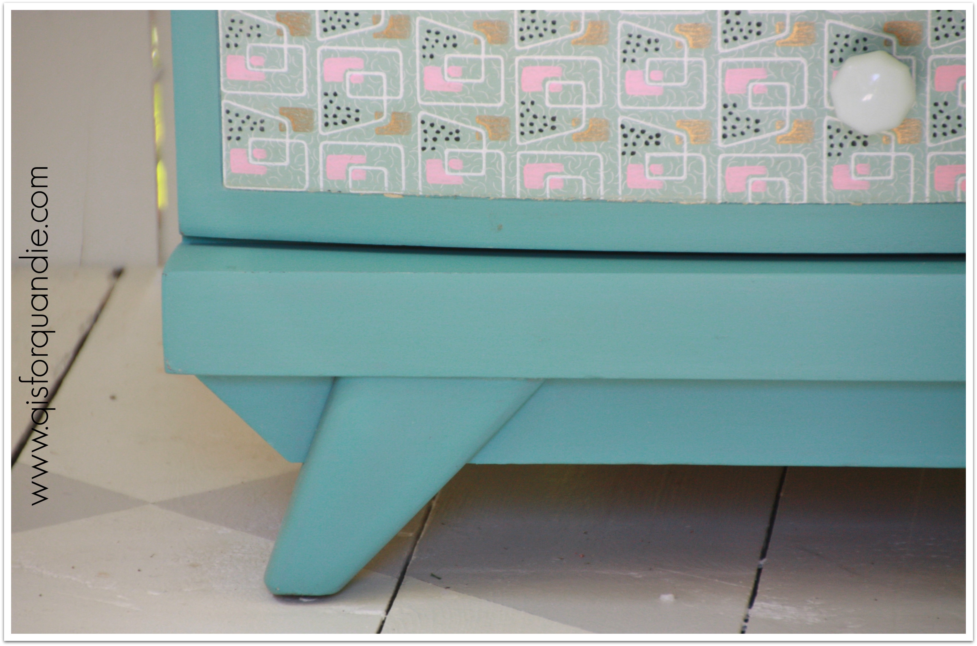
Classic mid-century base.

Provence nightstand base

 I think the combination of the very mid-century style of the nightstand, the mid-century wallpaper and vintage milk glass knobs comes together nicely to create a ‘mid-century meets vintage’ look.

Provence nightstandI’ll leave you with one last b & a.

Provence nightstand before and after

 What do you think?  A good combo of mid-century and vintage?

golden oldies.

Since deciding to spend Saturday sitting beside my bff’s pool drinking special Fresca’s (that’s Fresca with vodka, don’t knock it til you try it, it is very refreshing), I’ve been feeling guilty because I don’t have any fabulous new content for the blog.  I have several projects underway in the Carriage House, but none are quite finished.  I didn’t want to bore you with another gardening post (although I do have one coming soon).  So I came up with a brilliant plan!  I’ll begin a new ‘column’ on the blog sharing some of my furniture rehabs from the pre-blog days.

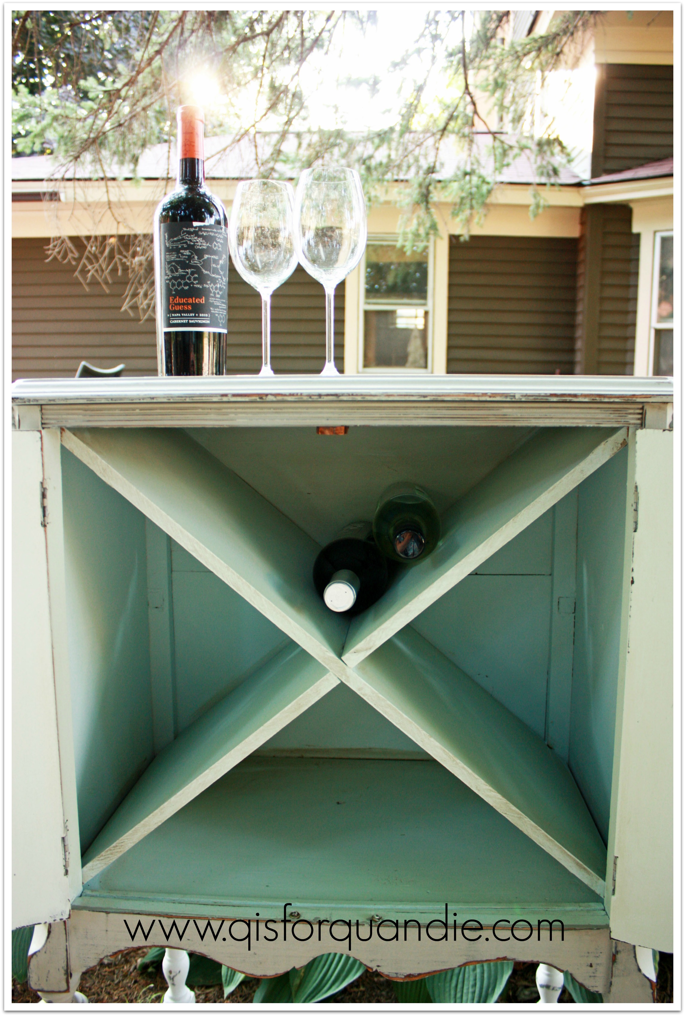
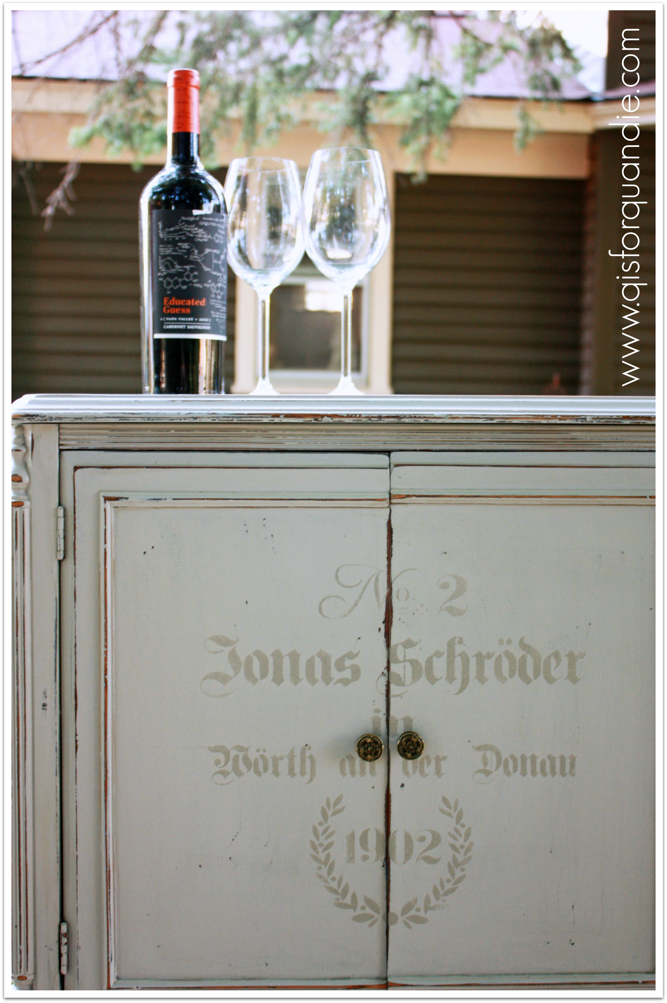
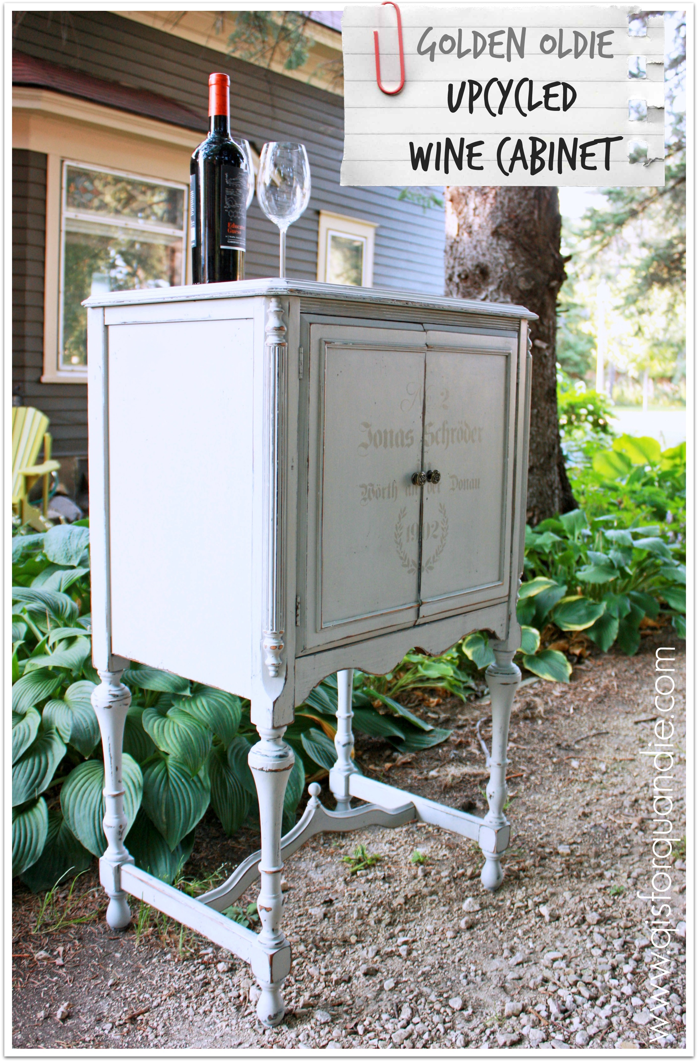
I’m starting with this darling radio cabinet that became a wine cabinet.

upcycled wine cabinet

Unfortunately, prior to the blog I often neglected to take before pics.  But this was your basic gutted radio cabinet.  It was empty inside and was open in the back.  Originally there would have been a huge radio inside (‘cuz back in the day, they were huge.  Remember when we thought boomboxes were portable, ha!)?  I think there may have been a turntable inside as well because the top opened.

I bribed Ken into helping me with this one, probably with wine.  He built the shelves which were modeled after the wine storage in my pantry (which he also built).  He was able to tuck them into place with the top off.  Once that was done, he attached the top permanently using dowels and glue.

upcycled wine cabinet interior

I tested this out and one could store over two dozen bottles of wine in here.  Not bad.

I used one of my fave stencils on the front.

upcycled wine cabinet close up

Back in the day, I mainly painted with homemade chalk paint.  Basically flat or satin latex mixed with Plaster of Paris and a little water.  I had great success with it, and I still use it some times.  It won’t give you the chippyness of milk paint, but it is budget friendly and you have endless choices for color.

I love the detail at the bottom of this cabinet.  It needed to be glued up a bit when I got it.

upcycled wine cabinet bottom detail

So the next time you see a beat up radio cabinet at a garage sale (or heaven forbid, at the curb), think outside the box and turn it into wine storage!

upcycled wine cabinet collage

color blocked.

Usually when I mention to co-workers or acquaintances that I buy furniture on craigslist and fix it up, they make a pained face and mention serial killers.  As if it is somehow a horrible prospect to them that I would actually go to stranger’s homes on a regular basis.

The reality (for me at least) is that 99.9% of the people I have met via craigslist have been super nice, friendly folks.  Maybe it is because we’re talking vintage and antique furniture here.  Probably not a lot of wackos out there selling grandma’s old dresser (knock on wood, literally).

None the less, I practice ‘safe craigslisting’.  I always have someone with me when I go to purchase an item, either Mr. Q or my neighbor nnK in a pinch.  I also always make sure that someone else is around when I am having a buyer over to see a piece that I have finished.

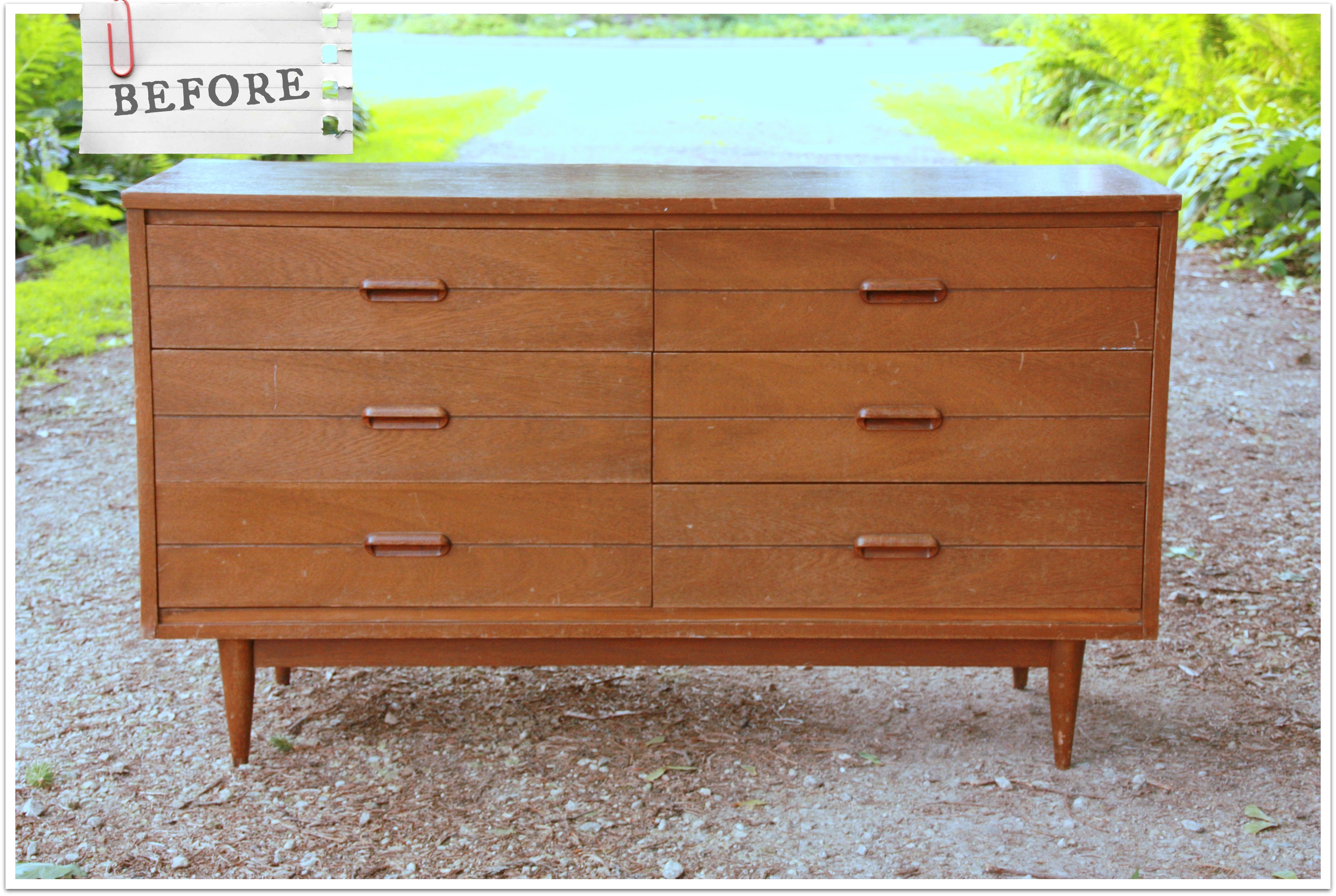
Sometimes we just really enjoy the people we meet via craigslist, and the seller of this mid-century dresser was one of those people.  He was scrupulously honest about the condition of the dresser.  He had the dresser pulled out of the garage and ready to go when we got to his house, which was immaculately maintained, by the way.  He and Mr. Q had a great time quoting old ’80’s movies.  We also learned some interesting stuff about his neighborhood off McKnight Road in St. Paul that was originally developed for employees of 3M, or as those who remember it from back in the day, ‘the mining’.

It was really just a pleasant way to spend a part of the evening, and as a bonus I got to come home with this.

color block mid century beforeFun, right?

How many of you out there are mid-century fans?

I’ll admit, I’m not really a fan in so far as I will probably never do mid-century in my own home.  That being said, I love the look in other people’s homes.

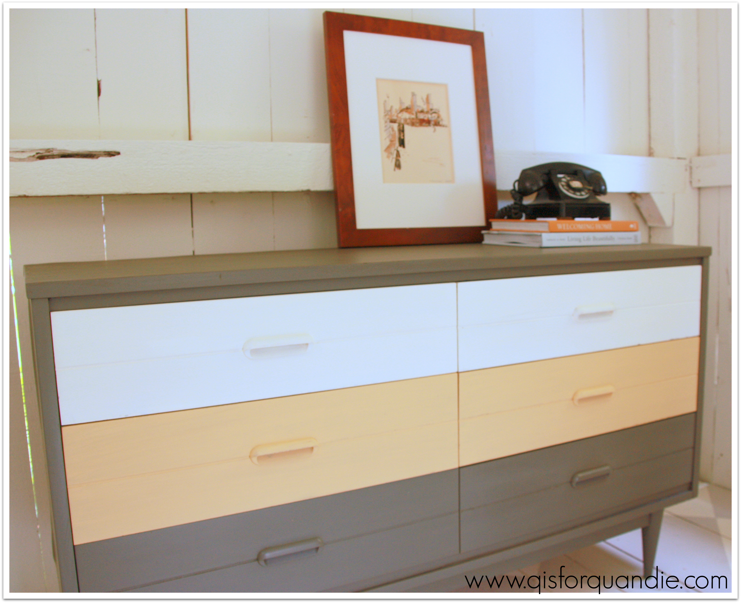
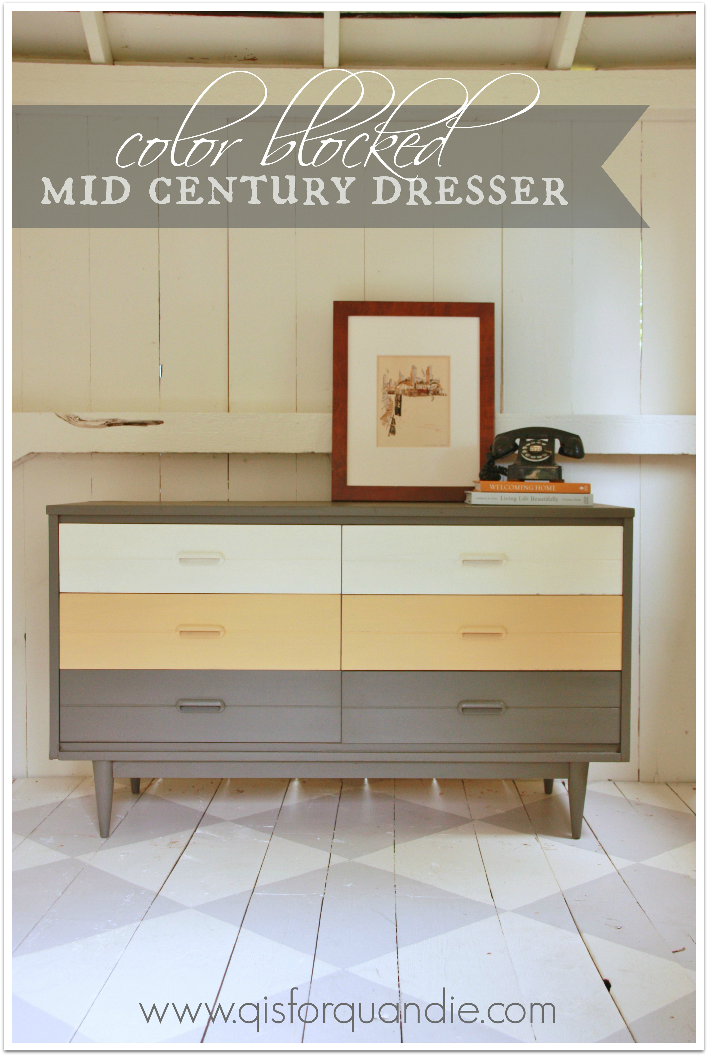
I took some inspiration from pinterest and tried some color blocking on this one.   I was going to use my standby fave color, aqua, but then I saw a dresser painted in grey, yellow and white and decided to venture a bit outside my normal color comfort zone.  And I LOVE it!

color blocking close up

I revamped this with a mishmash of products.  The grey is an ‘oops’ paint from Home Depot.  It was $2.  I mixed it with plaster of paris and water to create my own chalk paint.  I wanted a deep, rich grey and this one was perfect.  The yellow is a Behr sample.  I could have used the MMSMP in Mustard Seed Yellow because they are very close to the same color.  In fact, I could have done this entire piece in MMSMP using Trophy for the grey and Linen for the white.  However, I definitely didn’t want this one to get chippy, so I opted for homemade chalk paint for the yellow as well, and Annie Sloan’s Old White for the top two drawers.

color blocking on an angle

I used 3 different waxes on this one too.  Never let it be said that I am not detail oriented, and possibly a bit picky about my results.  The grey is waxed in a custom mix of dark Briwax and clear paste wax (the cheap stuff, SC Johnson).  The dark wax gave a little more depth to the grey and reduced the blue tint a bit.  The yellow is waxed in clear SC Johnson.  For the white however, I have found that you have to pull out the big guns to avoid yellowing your whites, and that is Miss Mustard Seed’s clear furniture wax.  Not a bit of yellowing with that one.

I had considered staging this one with some fab mid-century stuff borrowed from some friends, Mike and Meg.  They have the most fabulous ranch home that is completely decked out in classic mid-century modern.  Even all of their poolside patio furniture is collector quality mid-century.  But in the end, I was too impatient.  I wanted to catch the light in the photo cottage while I had it, so I staged it very simply with some of my own stuff.

color blocking staging

The water color was drawn by my grandfather.  I have a pair of his watercolors, and they are on the list of stuff I’ll never part with.  The book, Welcoming Home:  Creating a House that Says Hello, was written by a friend, Michaela Mahady.  Her husband, John, and Mr. Q are coffee shop buddies.  Michaela is an architect at SALA and does gorgeous work.  She and John also do beautiful stained glass work through their Pegasus Studio.

But, I digress.  The color blocked mid-century modern dresser was a fun departure from my usual style and I really enjoyed the process.  And it looks great in my photo cottage, don’t you think?

color blocked title

So, mid-century, are you in or out?  Grey, yellow and white?  You love it, or it’s not your cup of tea?

sweetie jane cabinet.

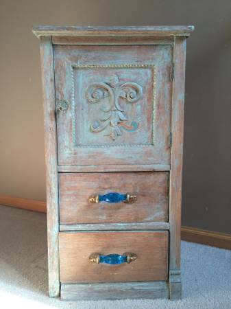
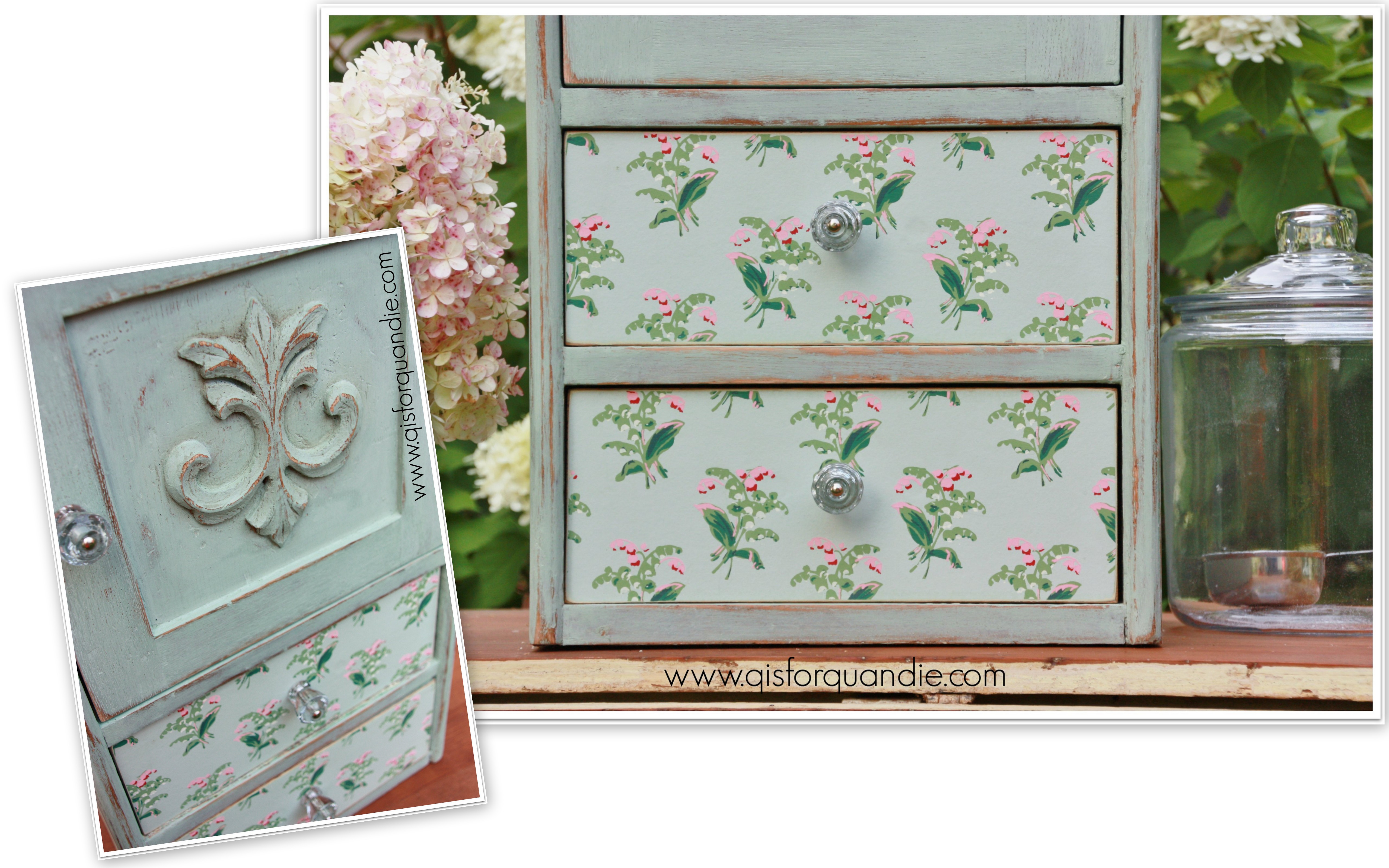
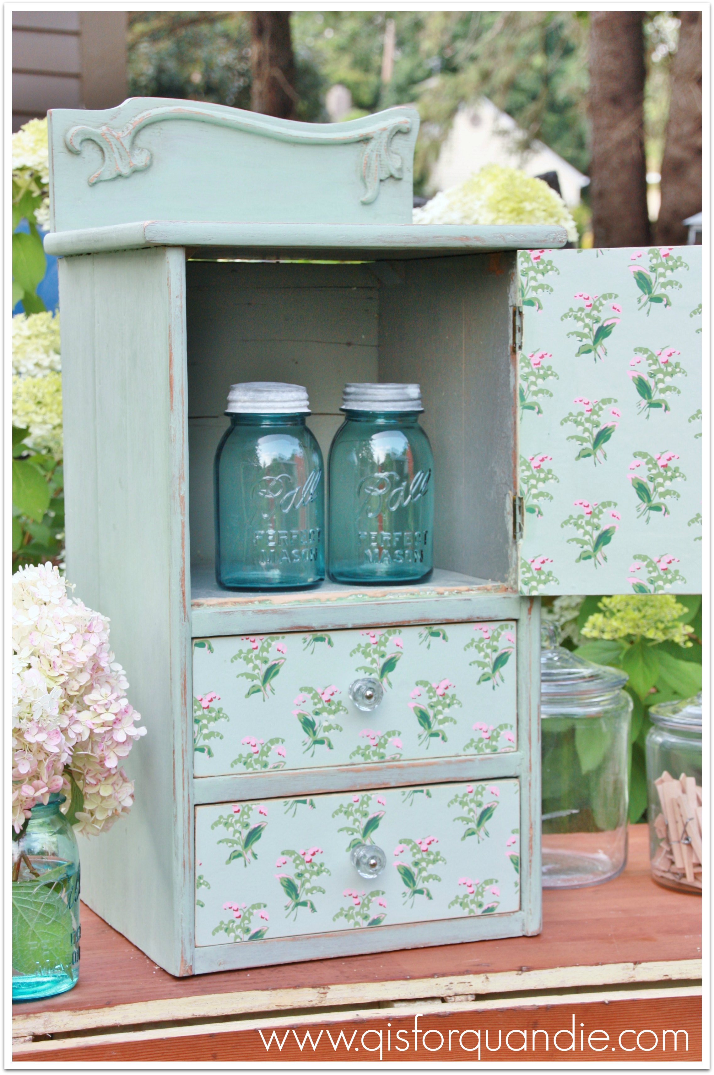
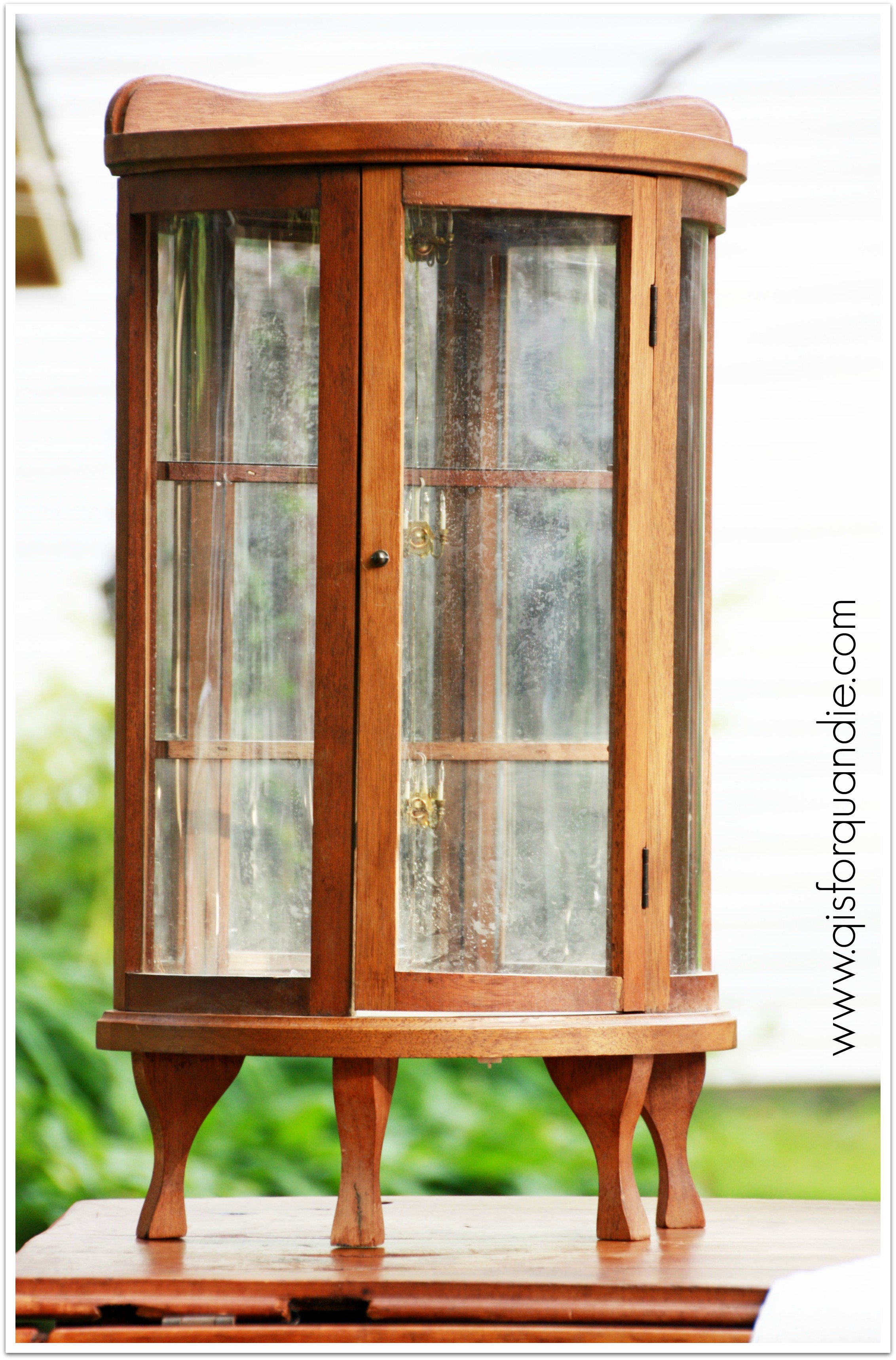
Remember the fab little doll sized bow front cabinet that I purchased earlier this year at a garage sale?

ECCO 4Well, I decided to give it a paint job.  It was kind of sweet, but I knew it would be much more magical with a little paint.

I’d been admiring a milk paint color by someone other than Miss Mustard Seed … gasp … there, I said it out loud.  Not that I don’t love Miss Mustard Seed, but Sweetie Jane by Sweet Pickins Milk Paint just kept catching my eye.  It looked like that perfect vintage shade of blue green.  So I sent away for some.  Since the very first piece of furniture I painted with Miss Mustard Seed milk paint was this miniature hutch …

first cupboard

I decided to repeat the experience with Sweetie Jane and this miniature cabinet.

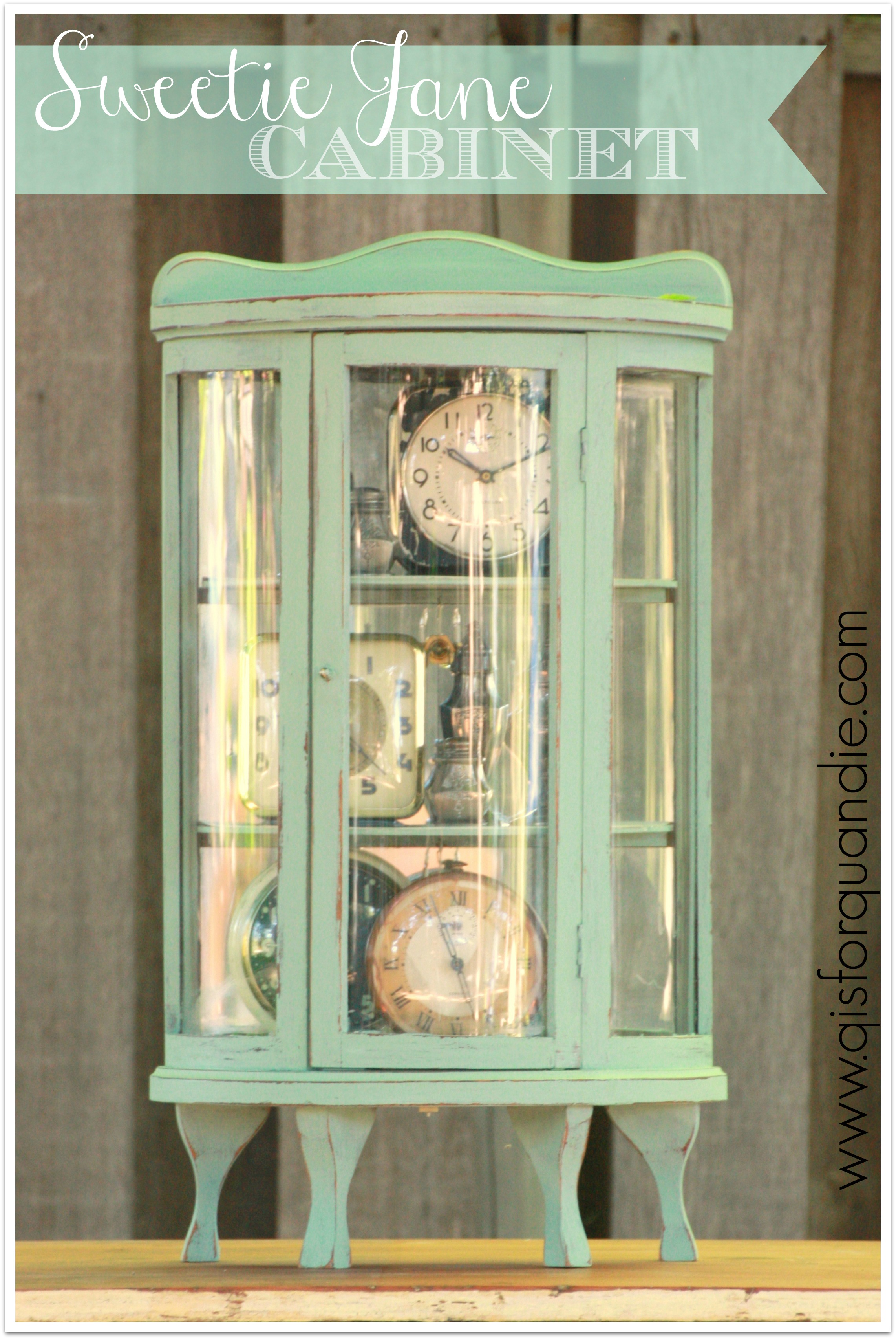
The product itself is very similar, a powder that comes in a little resealable package, mix it with water and so on.  And here is the finished product.

sweetie jane title

At this point, you might be thinking, ‘hey, aren’t those the same color?’ and it’s a fair question.  The color is pretty close to Miss Mustard Seed’s Eulalie’s Sky.  But the Sweetie Jane has just a touch more green in it.  At the end of the post I’ll show a picture of these together and you can see the subtle difference in color.

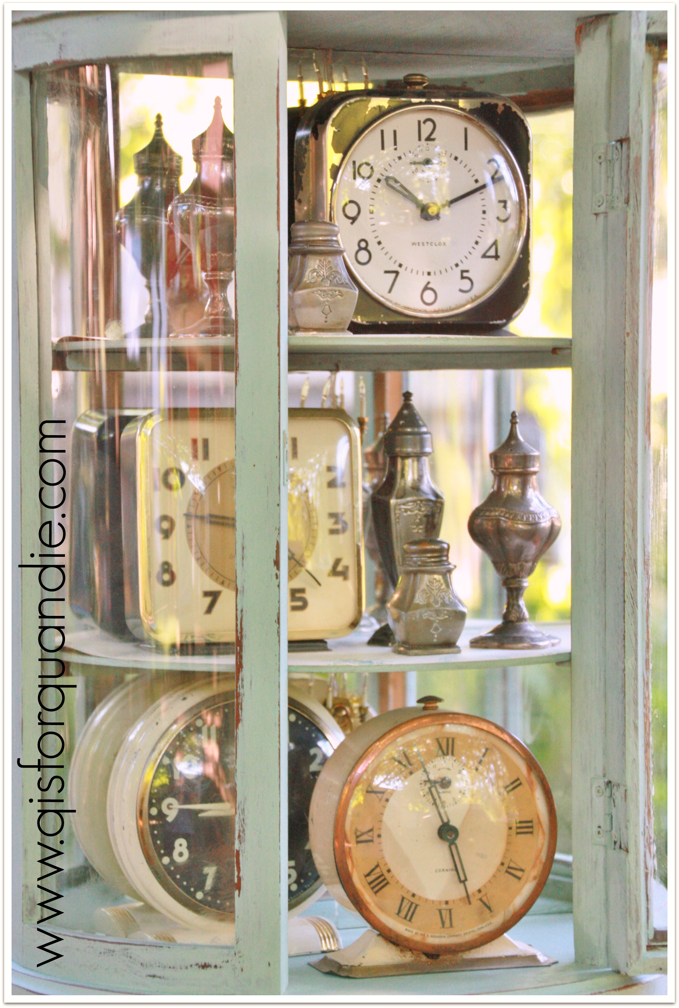
I filled this little cabinet with some of my vintage clocks to show that these can make great display pieces.  They don’t have to be used as toys, or filled only with miniatures.

Sweetie Jane cabinet clocks

You may remember that this cabinet was missing its shelves when I bought it.  Ken cut new ones out of cheap 1/8″ hardboard.  I painted them, and then added some vintage wallpaper to them.

Sweetie Jane cabinet interior 2

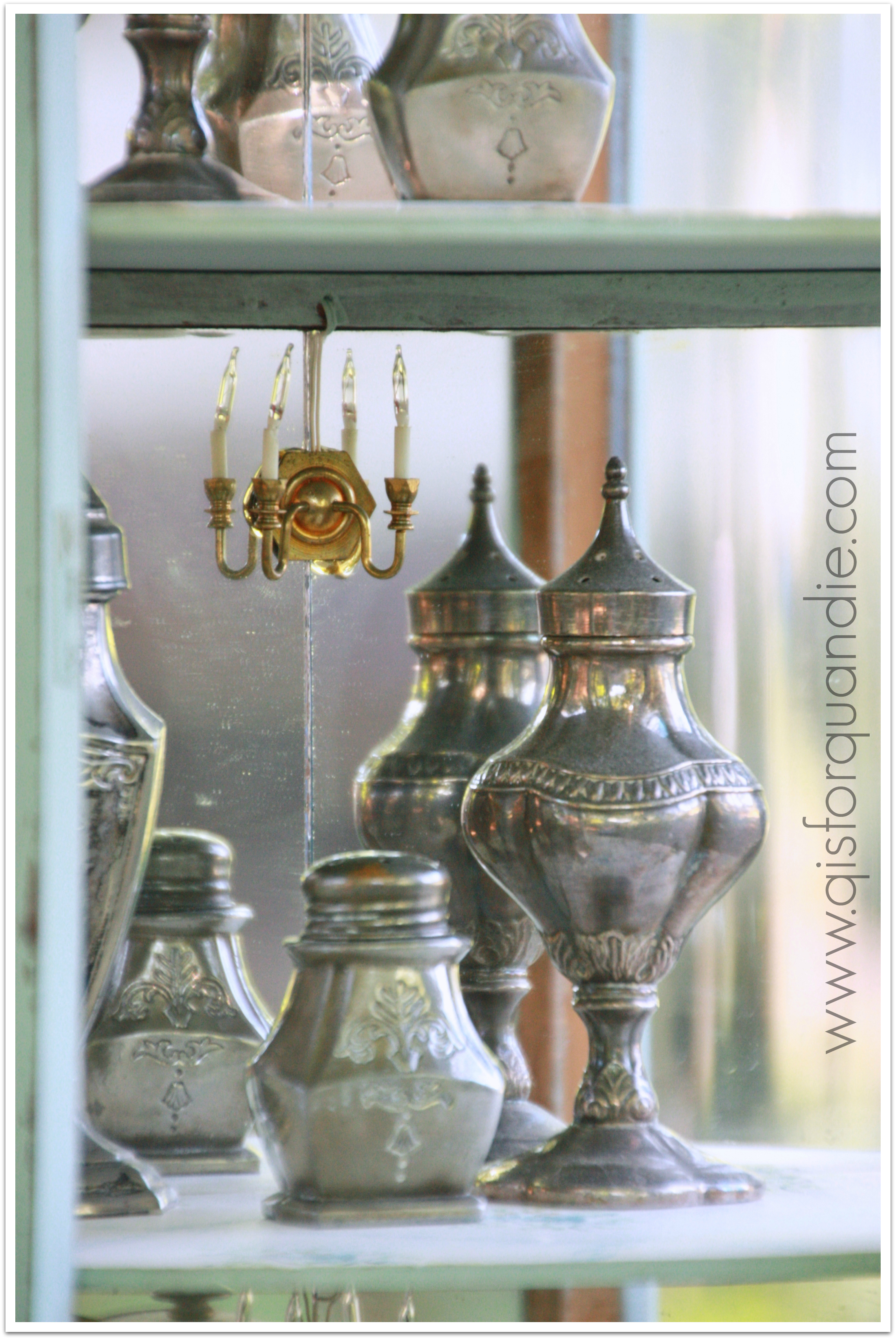
You can’t see them in any of the pictures so far, but this little cupboard has lights inside.

Sweetie Jane cabinet lights

There is one over each shelf.  However, the wiring to these lights is some sort of flat tape with a connector that I don’t recognize.  I have no idea if I could find the right kind of adapter to actually plug it in.

I haven’t decided the fate of this cabinet yet.  I may keep it, due to my fascination with all things miniature.  Or I may sell it.  Depends on my mood on any given day … well, and it also depends on whether or not I can find a spot for it.

Perhaps I should line up my miniature cupboards and keep them on the front porch.

trio of mini cabinets

What do you think?

P.S.  Jennifer has featured my home today on her blog, Town and Country Living!  Check it out!

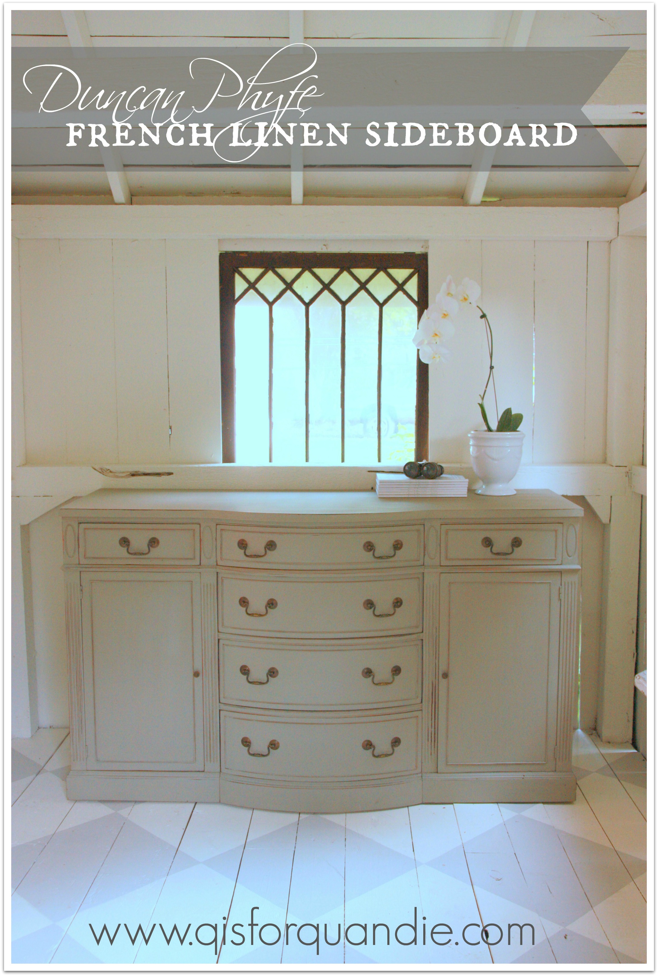
french linen sideboard.

My very slapdash on line research suggests this would be a Duncan Phyfe style sideboard.  Seems logical.  It has that neoclassical vibe that characterizes Duncan Phyfe.   I’ve seen a few sideboards like this on craigslist, but either they are priced far out of my reach, or someone else snatches them up ahead of me.  So when nnK sent me a link to this one, I acted on it promptly and arranged pick up for the same day.
french linen buffet before

Luckily Mr. Q took one of his strong manly heavy lifting type friends (OK, really he might be his only manly heavy lifting type friend) to pick it up because they had to carry it down a narrow staircase!  And since I have now had to move it a few times for very short distances,  I appreciate that I did not have to attempt to get it down some stairs.  It is very heavy and large.

It has that one flaw on the upper right drawer where a hunk of veneer is ripped off.  Otherwise, it was in quite good condition.  The major problem with this sideboard is that the original finish is hopelessly outdated.  Am I right?

So I gave it an Annie Sloan makeover.  A simple paint job in French Linen.

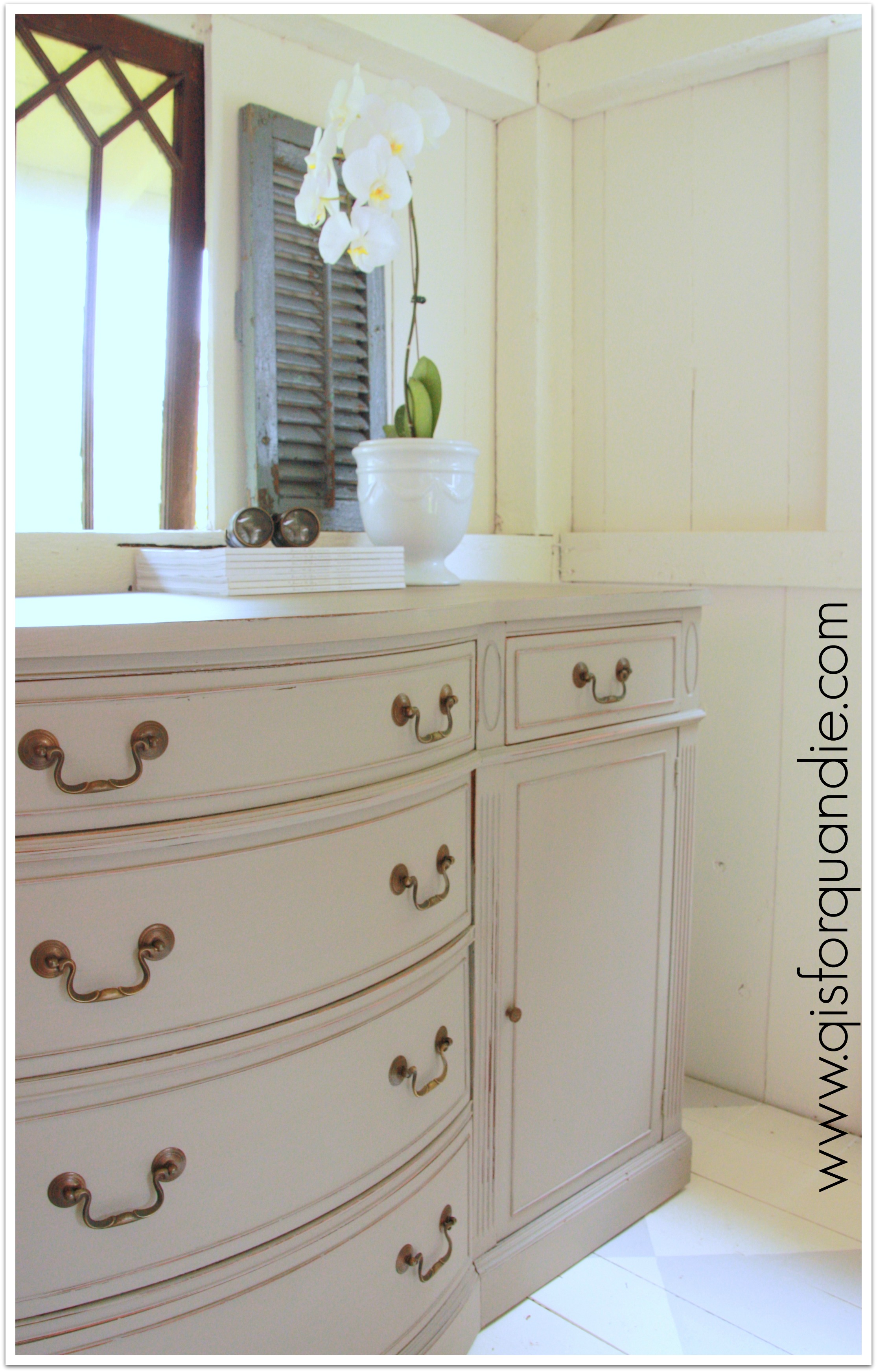
french linen sideboard closeup

Such a gorgeous shade of grey.  Nice and warm, not too dark, not too light.

I even painted the insides of the two side cupboard areas.

french linen sideboard interior

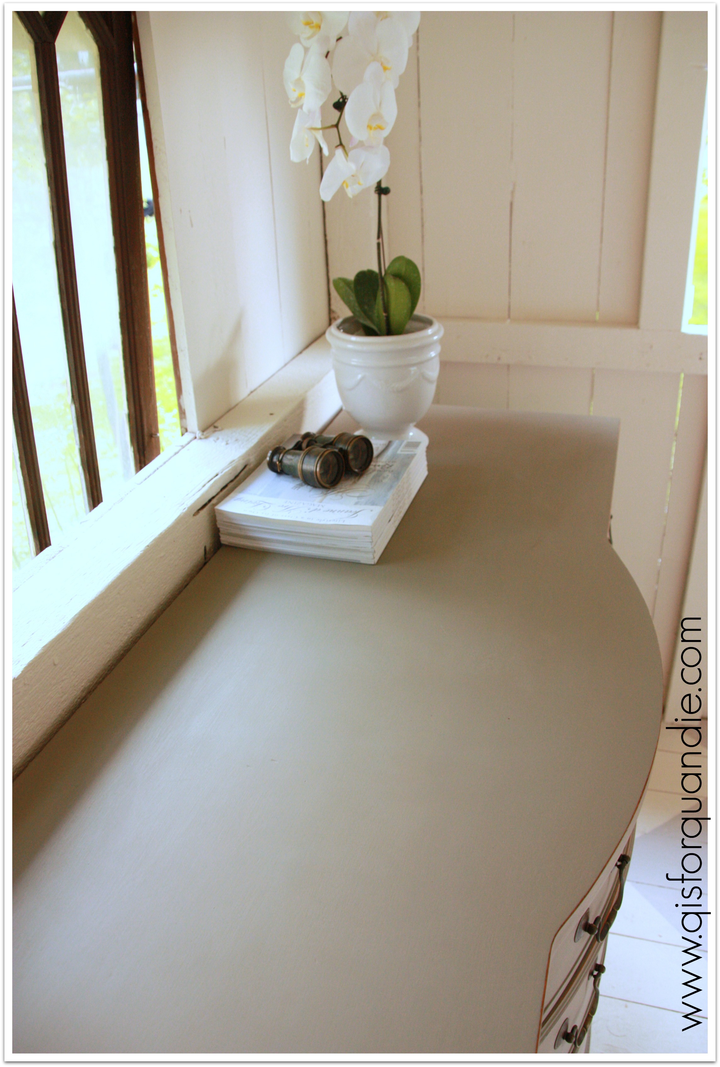
I sanded the top a bit to make sure it was smooth, and it feels like silk now.

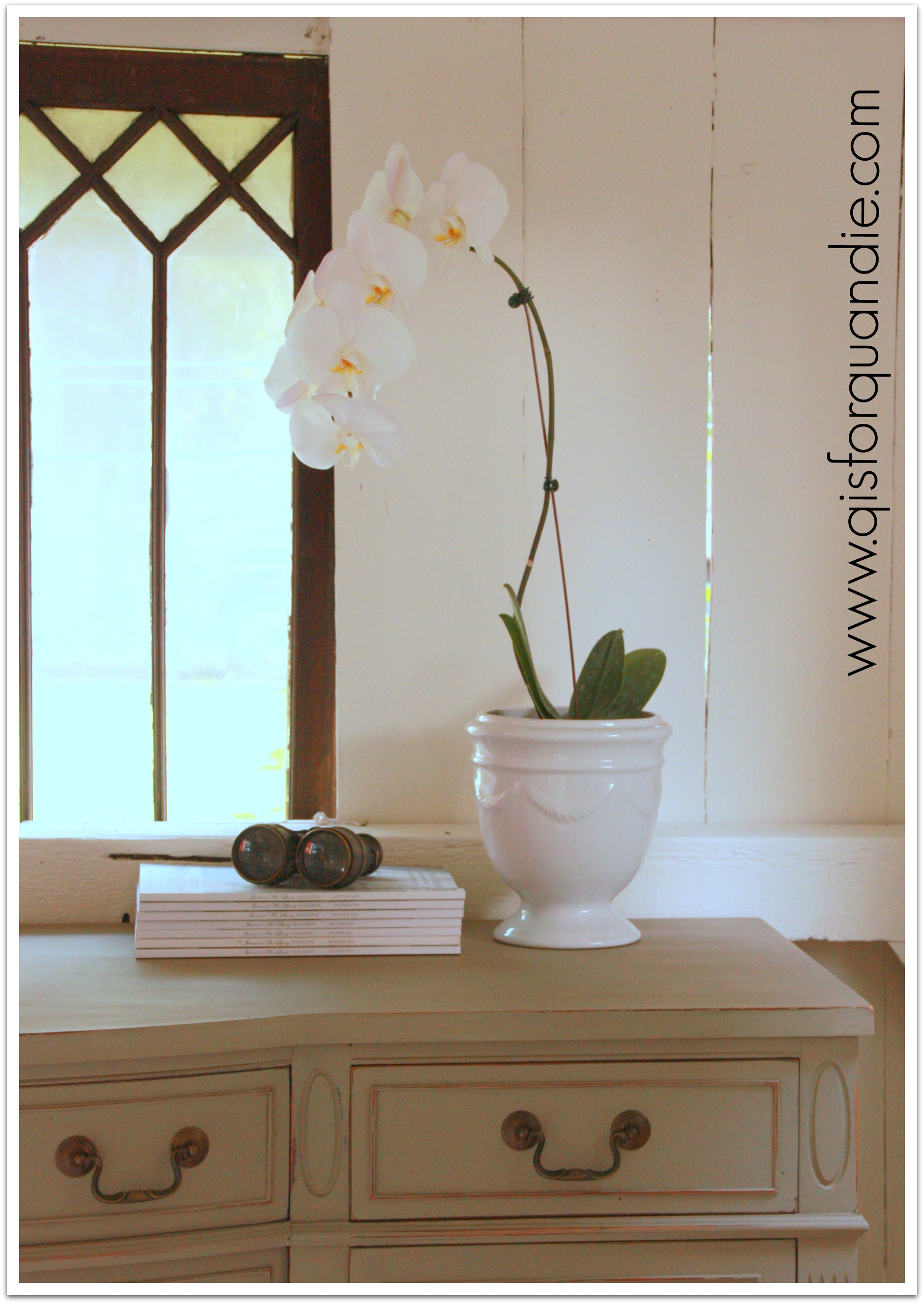
french linen sideboard topI staged this one quite simply with just an orchid in a white pot that I just purchased for 50 cents at a garage sale (the pot, not the orchid).  The orchid is actually from Home Depot and cost $12.99.  I added a stack of my Jeanne d’Arc magazines and the fabulous old binoculars that I purchased at a garage sale earlier this summer.

french linen buffet stagingSometimes I struggle between finishing something in a way that I know will appeal to a broader audience and will find a buyer more easily and finishing something in a way that is creative and unique.  I vacillated between those two choices with this one.  I thought about putting a stencil on either side door.  I thought about a two toned paint job, and I even considered stripes on the drawers.  In the end, I decided that a simple paint job would help keep this piece marketable.  I also felt like it had enough ornamentation on its own and didn’t need a fancy treatment.

french linen sideboard with shutter

Likewise, I simply cleaned up the drawer pulls and put them back on.  I always hesitate to spray paint hardware because I’m not convinced that it stands the test of time.  I think it scratches too easily and doesn’t necessarily wear all that well.  In a pinch, if the hardware is a horrible color, I’ll resort to oil rubbed bronze spray paint.  Also, I’ll paint hardware with chalk paint or milk paint if I intend for it to be chippy.  I think this hardware works well as is though, so I left it alone.

I’ll leave you with a final ‘after’ shot.

french linen sideboard afterAnyone in the market for a Duncan Phyfe style sideboard in French Linen?

farm fresh table.

Mr. Q picked this table up in the middle of last winter.

farm table beforeTrust me when I say this picture makes it look nicer that it really was in person.  There are some big oily stains and paint splotches on the top.

I had visions of this table ending up all chippy and farm fabulous, like this one from pinterest, after a coat of milk paint.

via pinterest
via pinterest

So, I painted it with MMS milk paint in Luckett’s Green.  And all of those oil stains came right through, and half the paint chipped right off the top.  Not exactly what I was going for.

Then I did what all good ostriches do, I buried my head in the sand by throwing a sheet over it and using it as a workbench for the next six months.  But last weekend I decided to give it another go.  I added a couple of coats of MMSMP in Linen over the green.  I did not add bonding agent because I still wanted a chippy shabby result, but in a good way.  I really thought the Linen would chip as much as the Lucketts did.  I also thought the oily stains would continue to seep through, but I tried it anyway.  And for some reason, none of that happened!  Really.  I have no idea why.

So then I sanded the crap out of it and ended up with this.

farm table close up

Not quite the super shabby chippy look I wanted, but it will have to do.

farm table leg

And remember the oak chair I bought at the ‘breakfast meeting’?  I used the left over paint from the minty fresh vanity and painted the chair.

minty chairNow I have a pretty decent farm fresh table and minty chair.

minty chair and table

I think the table is more versatile without its leaves because it can become a desk.  Plus, they were seriously lacking in structural stability, so I took them off.

farm table as desk

This duo would be great tucked into the corner of a room.  Just enough space for your laptop.

It would also make a fun alternative bedside table, pair it up with something mismatched on the other side of the bed, all of the cool kids are doing that these days.

Or, go ahead and use it as a small table in the kitchen.

So many possibilities for a farm fresh table like this one.

a ray of summer sunshine.

Here is it July and I’m not sure if summer has actually arrived in Minnesota.  For those of you not local, the high temps this week were in the upper 60’s to low 70’s.  That is a little unusual, even for Minnesota.  I’m not complaining though, I kind of love it.  Perfect weather for getting stuff painted.

But, I thought I would add a little more summer sunshine into July with this gorgeous dresser.

Let’s start at the beginning, shall we?

Scrolly dresser before

 This dresser had fabulous written all over it.  Lucky for me, nnK spotted it on craigslist.  Obviously it was gorgeous in its day, but it was rather the worse for the wear.  The trim detail on the bottom had bits broken off.  There were scratches and dings everywhere.  A couple of the knobs were missing.  Really, it just wasn’t meeting its potential.

My immediate thought was to paint it aqua.  Either Annie Sloan Duck Egg or MMSMP Eulalie’s Sky.  But something about that plan just didn’t sit right.  Then, lying in bed one morning, it came to me.  Mustard Seed Yellow with Linen accents.  I had done another dresser in this color scheme for Junk Bonanza, and it was the first piece of furniture that sold.  I just knew it would be perfect for this one too.

Let’s pop on in to the photo cottage and take a look!

sunshine in cottage

The Mustard Seed Yellow is bright and cheery.  The Linen just makes the details pop.

IMG_0042

Suddenly I am craving a glass of freshly squeezed lemonade, or maybe some lemon meringue pie.

sunshine close up

How about you?

summer sunshine afterThis beauty is for sale for $245.  I’ll be posting it on craigslist later today.  If anyone out there wants a delicious pop of yellow dresser, leave me a comment and I’ll get back to you via email.