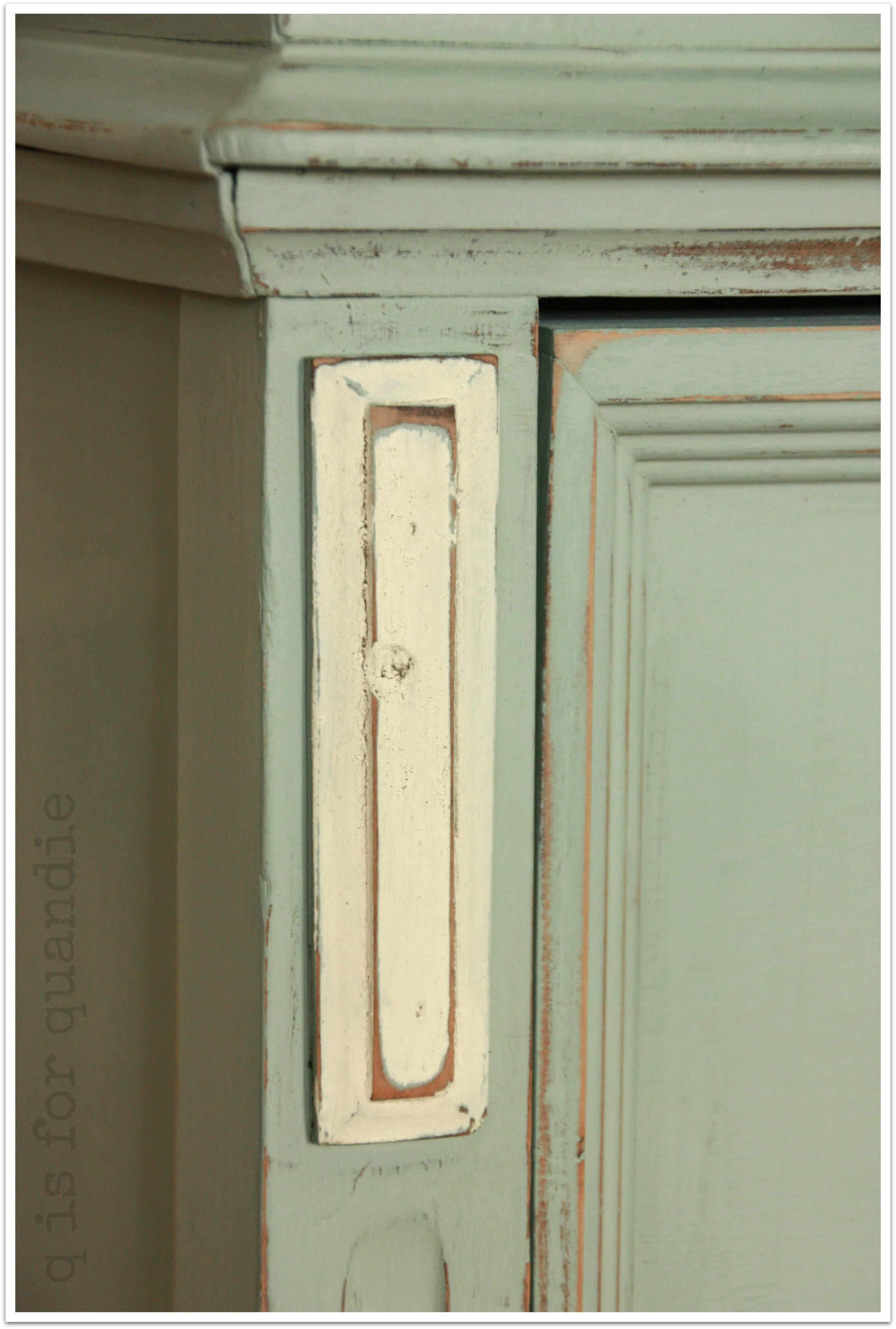
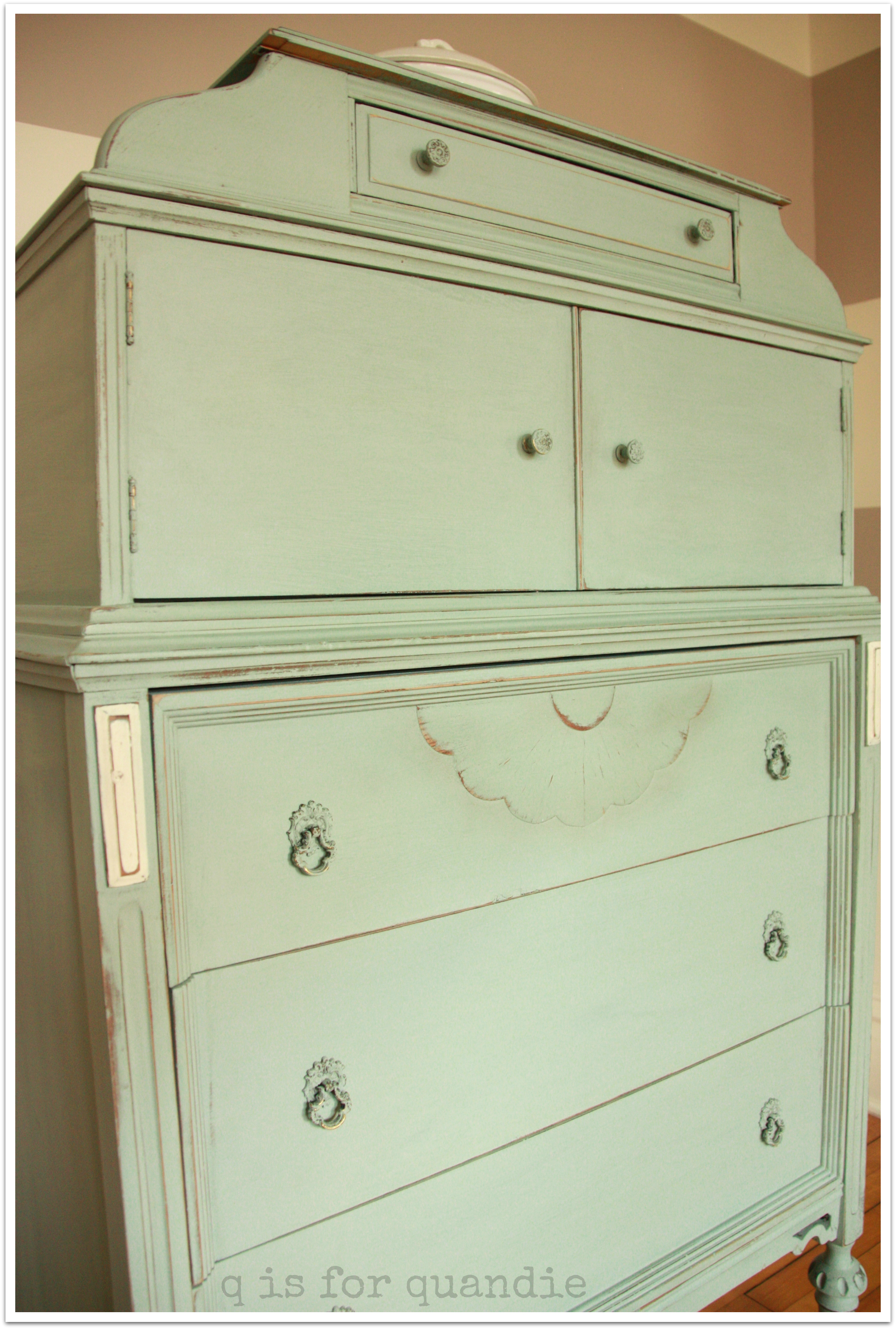
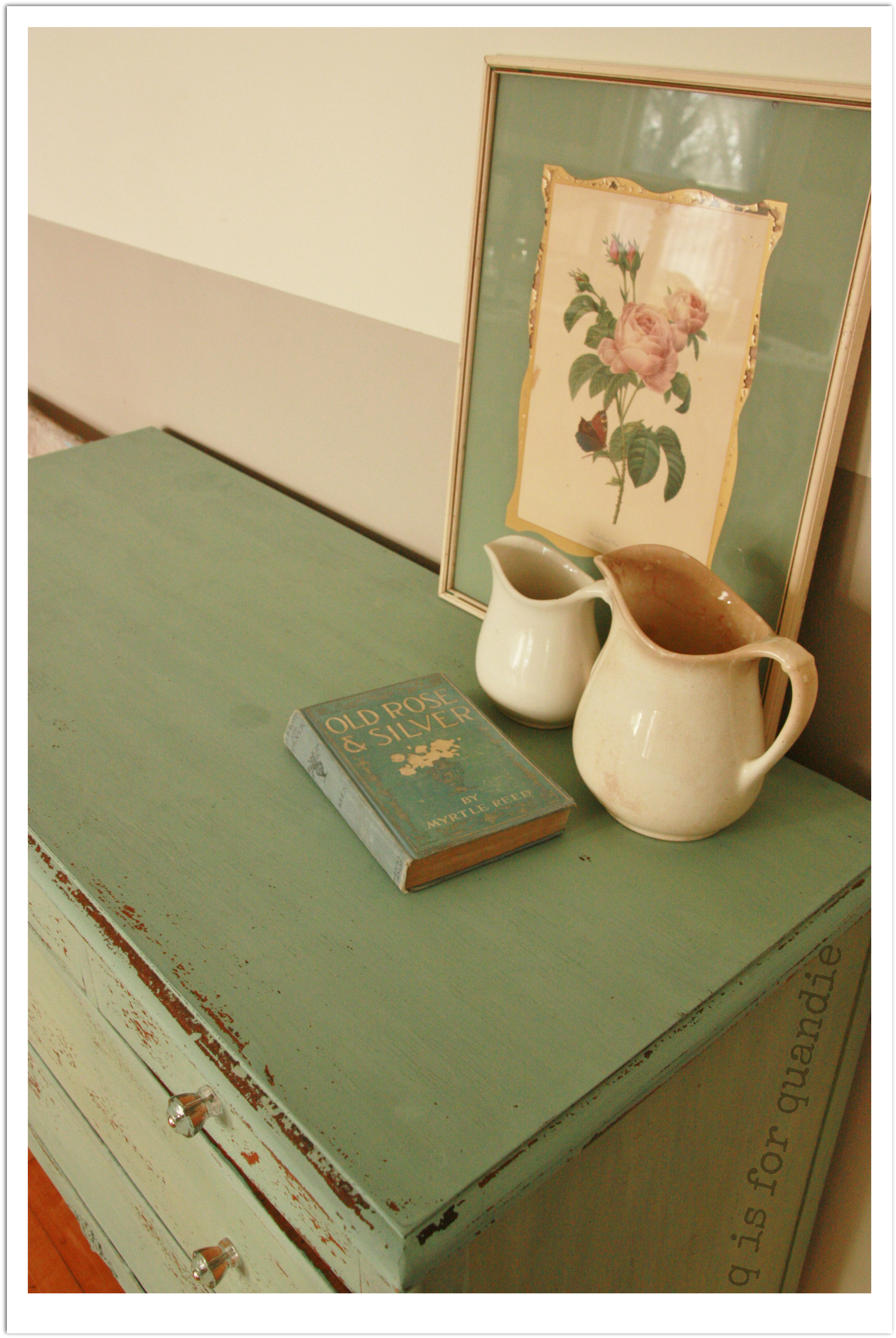
coco.

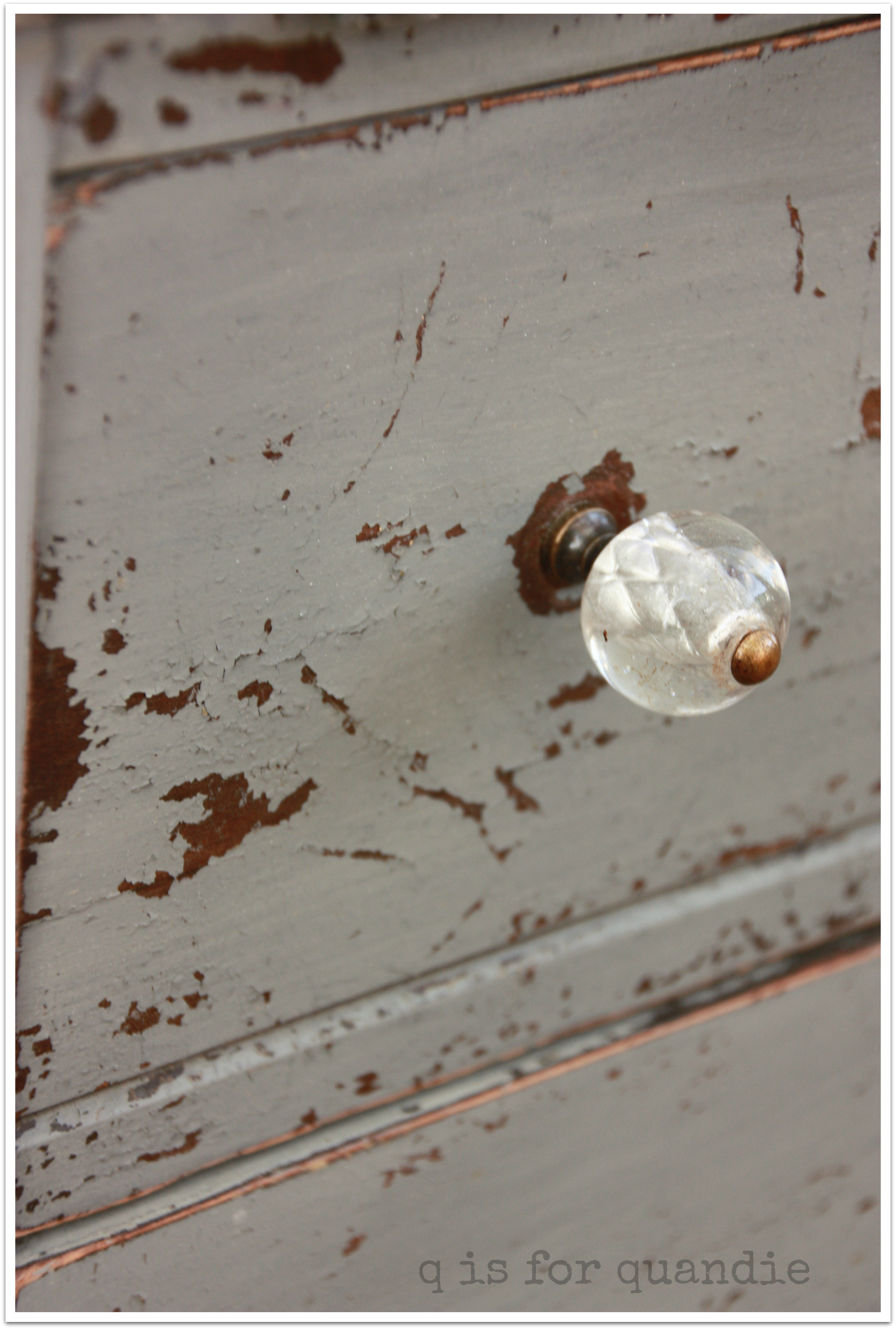
I never would have bought this color based on the sample chips.  I also never would have found it appealing based on the Annie Sloan description, a ‘warm greyed brown’.  Brown?  Me?  No way.

Then I saw a dresser painted in it.  Yes way!  Lovely.  So I purchased a can of Annie Sloan’s Coco and brought it home.

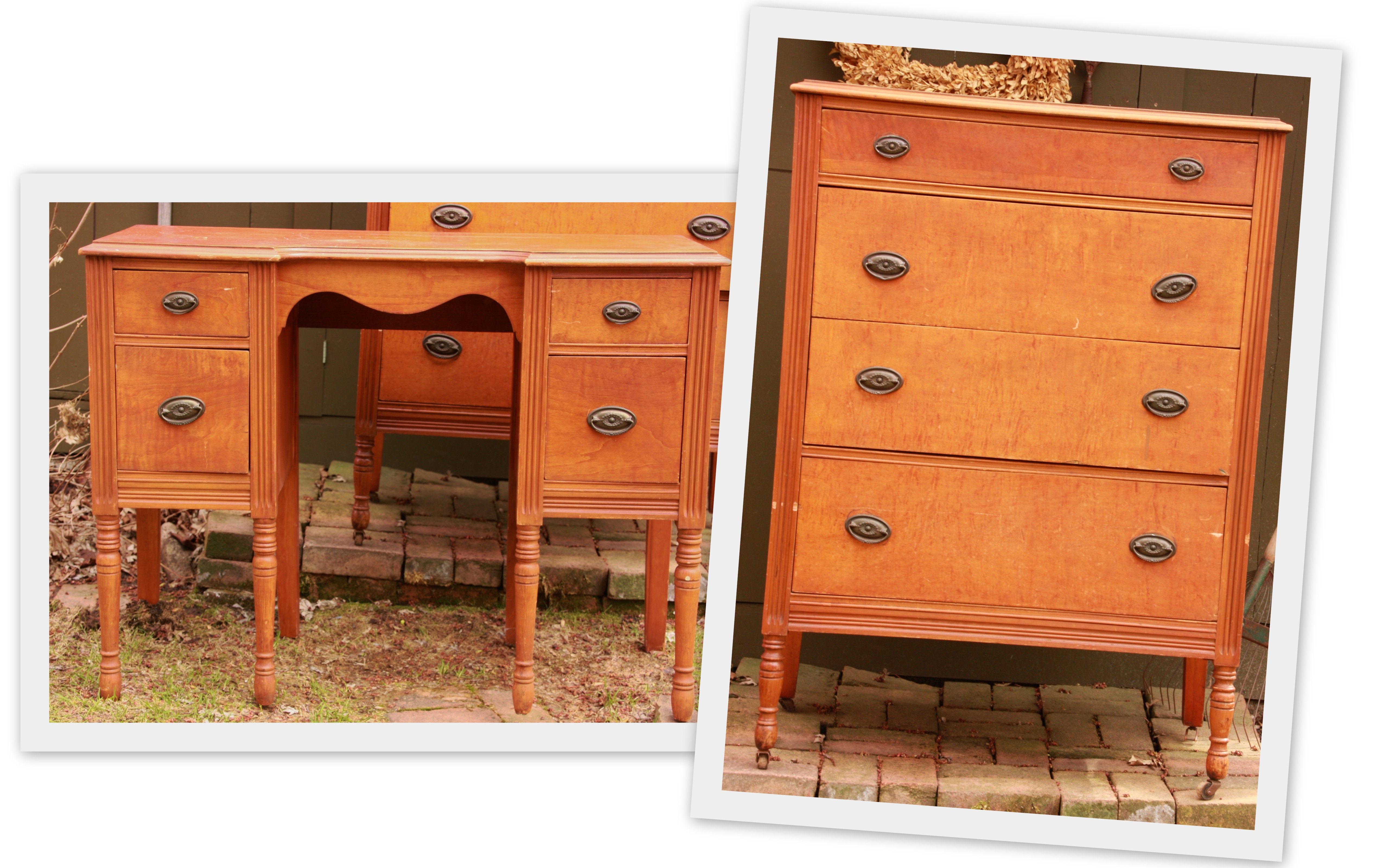
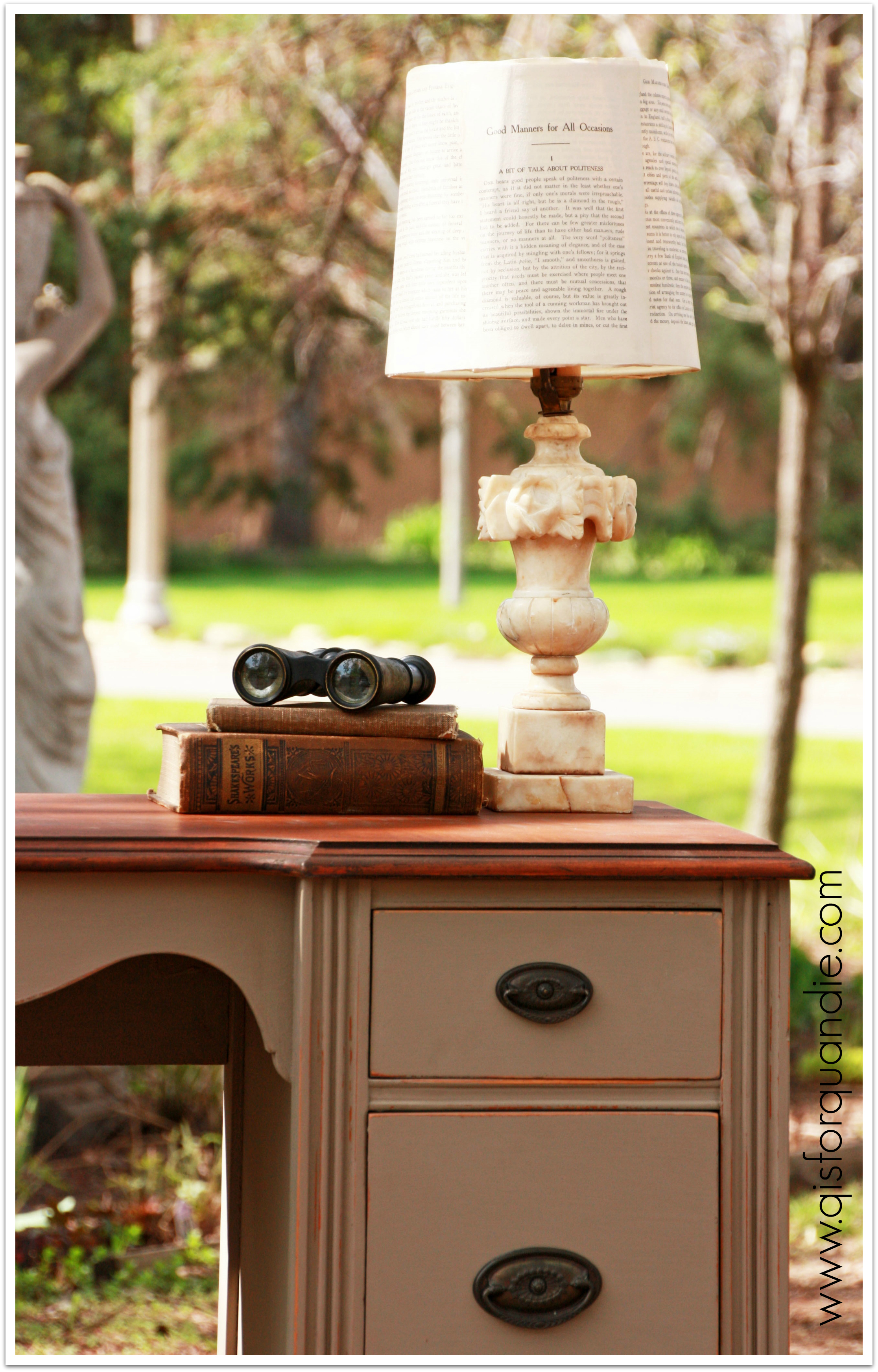
And I decided to use it on the Bryn Mawr vanity.  You remember, the orange-y companion to the dresser that I picked up in Bryn Mawr.

2014 spring blog9

I wanted to get some more practice with stripping and staining, so I stripped the top and refinished it with the General Finishes Java gel.

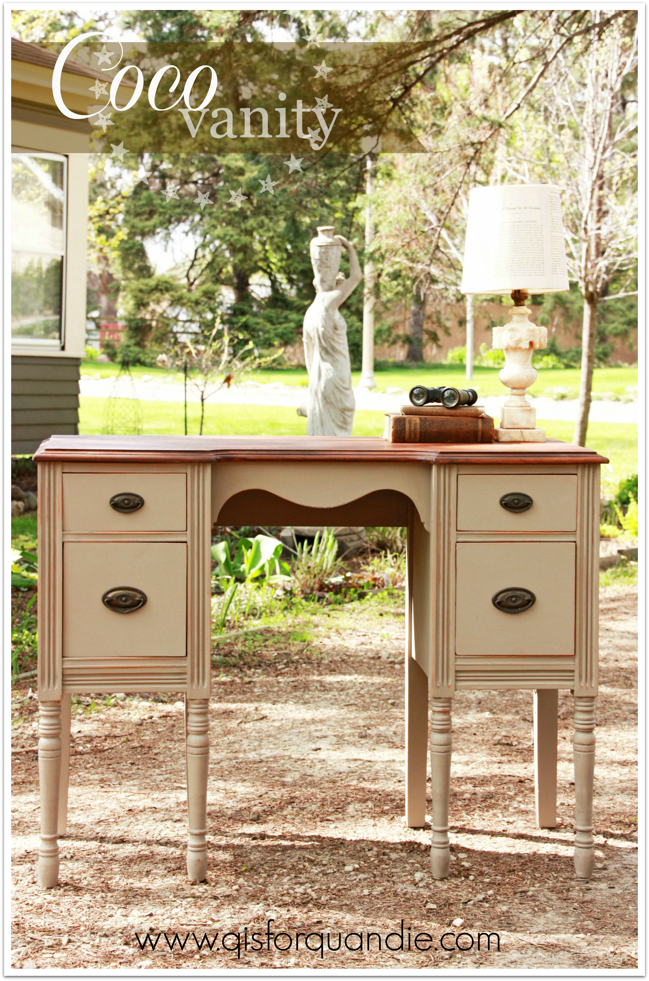
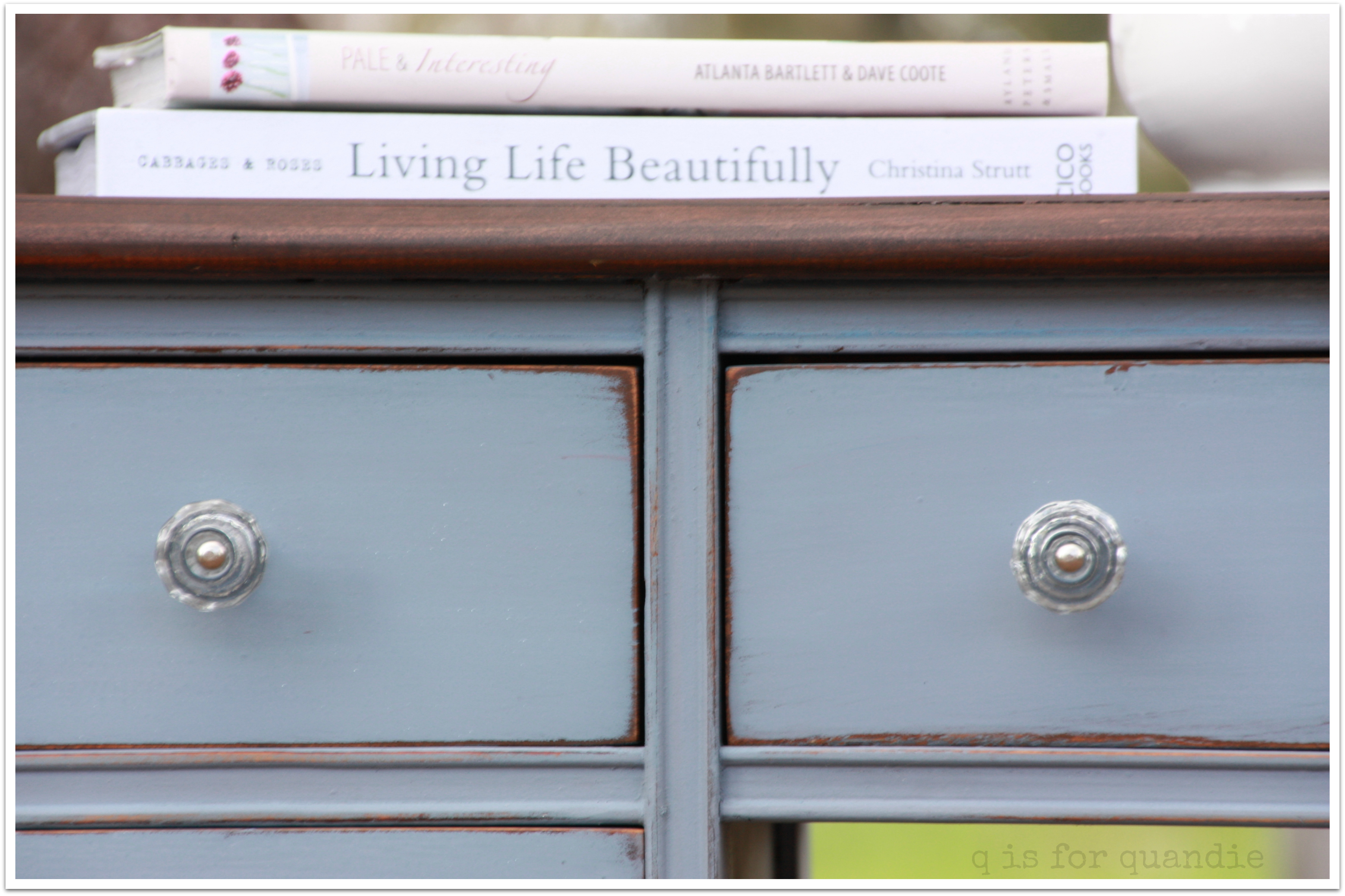
It was the perfect pairing.  The dark Java finish on top with the Coco on the bottom.  I could just eat this one up.

Coco vanity 1

I’m calling it a vanity, but I don’t have a mirror for it.  Perhaps I should just call it a desk.  It’s a nice petite size, which would be perfect tucked into the corner of a living room or bedroom.

I staged this with one of the alabaster lamps I picked up at the Linden Hills sales.  I actually came home with three of them!  And I happened to find the perfect shade for it in my stash.

Bryn Mawr vanity lamp

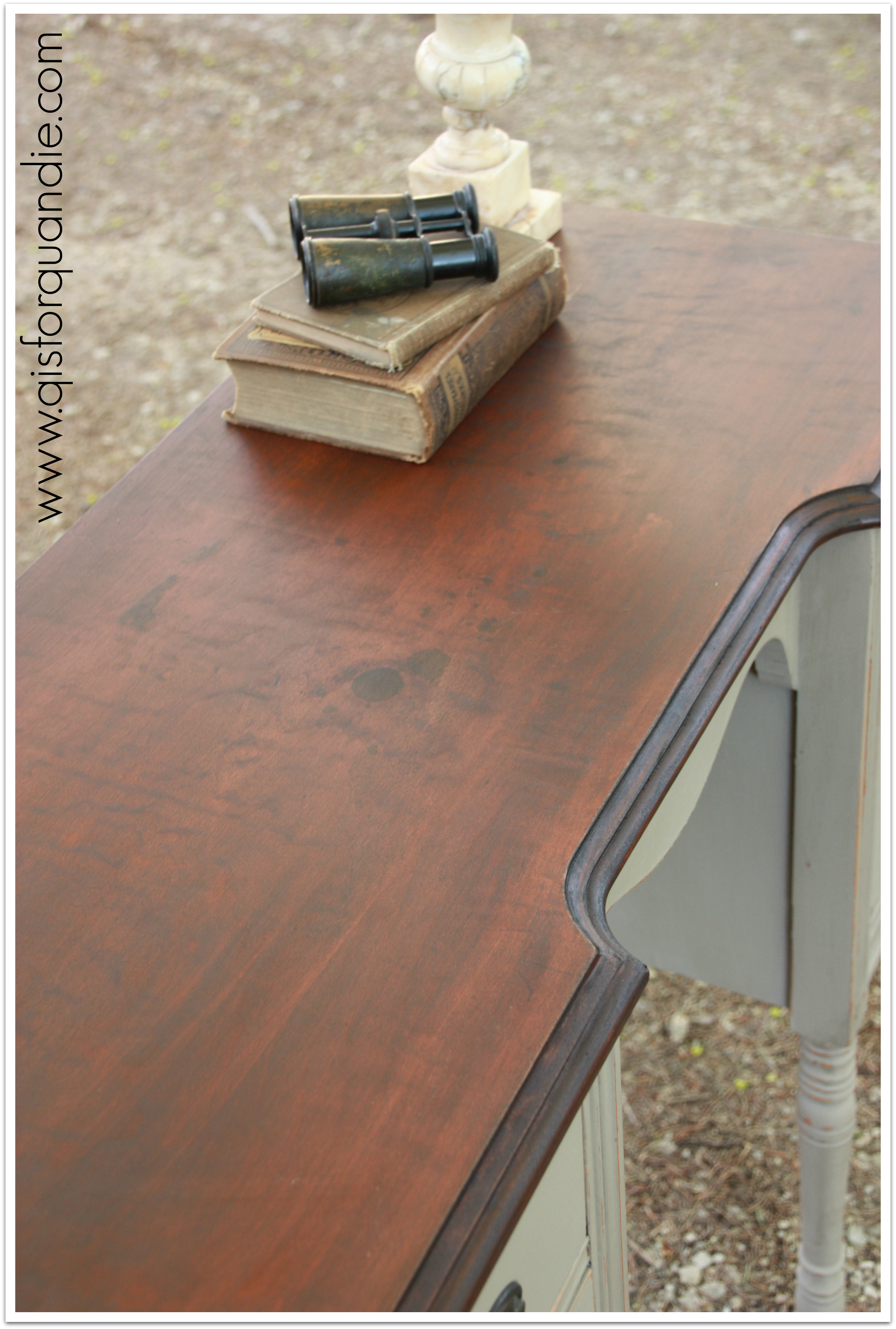
This guy does have a bit of a flaw.  I thought the dark finish would cover up some stains on the top, and they are still visible.

coco topBut I am sure that someone out there will be able to overlook that because otherwise this vanity/desk is quite lovely.

coco side view

I like this side view shot because it gives you a good look at how nicely the Coco and the Java gel work together.

I’m sure this one will go home with some lucky new owner.  Will it be you?

It is posted on craigslist for those of you in the Twin City area.  Woops, missed it, this one is SOLD.

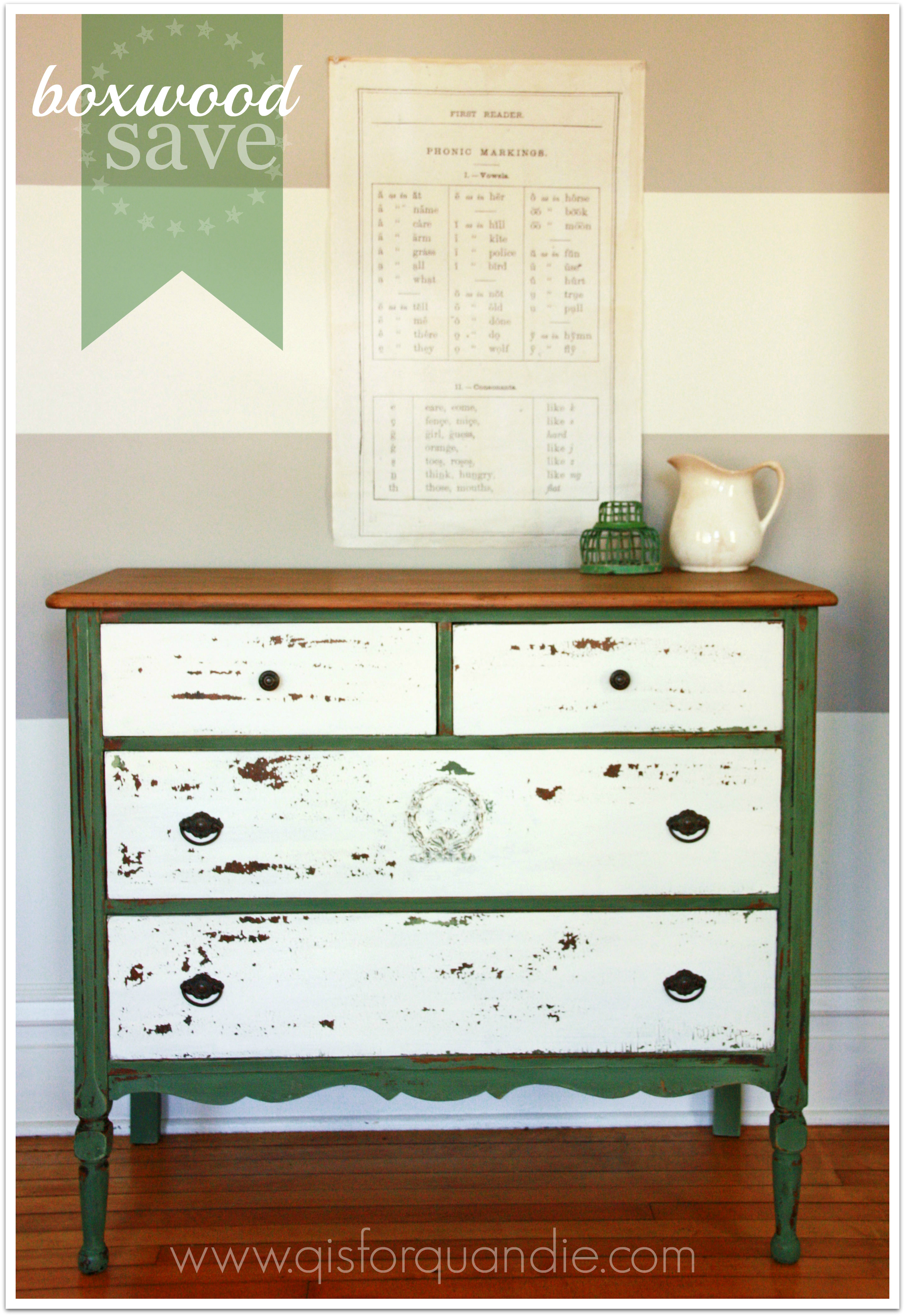
the boxwood save.

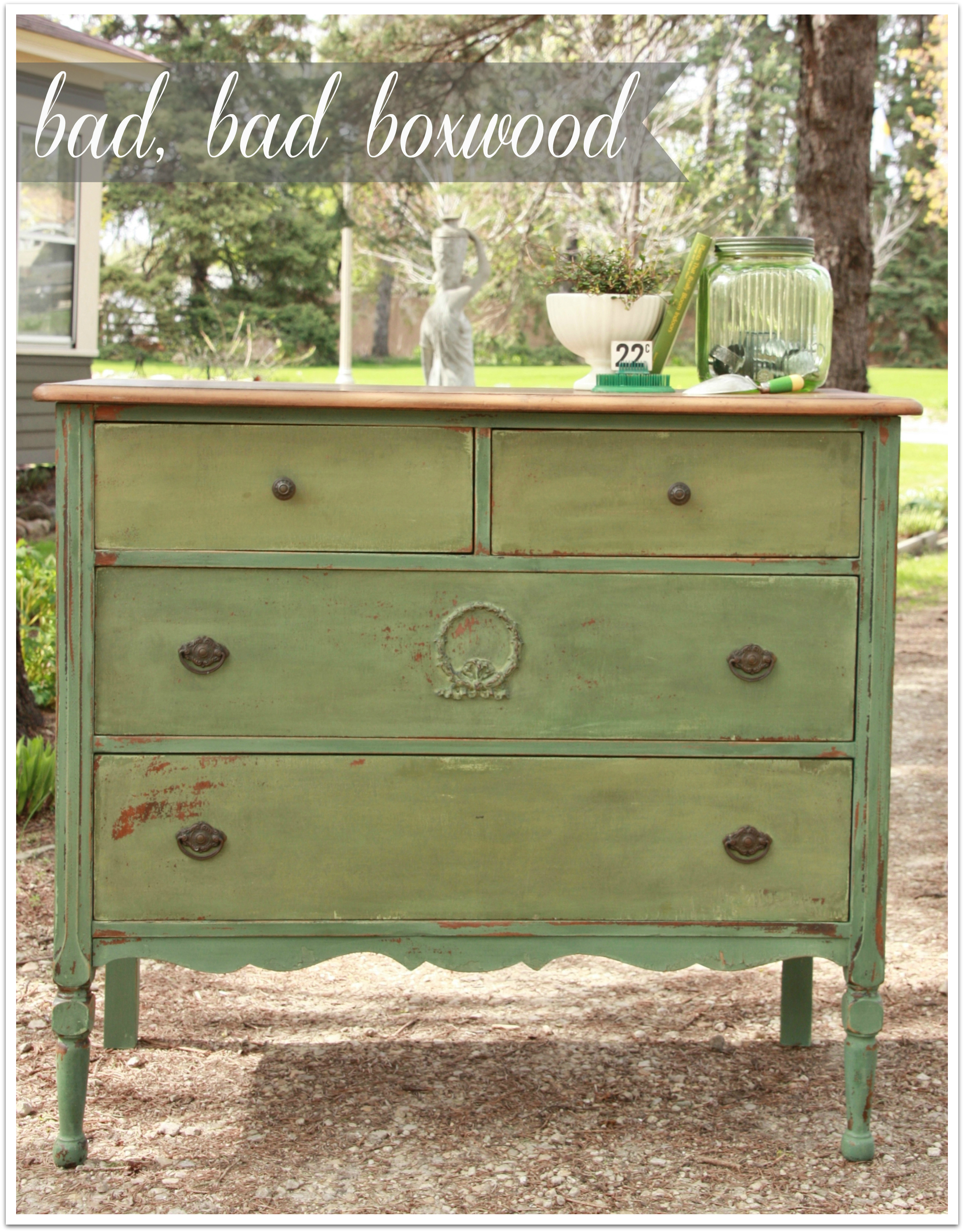
Mr. Q picked up this dresser the other day.  I was drawn to the wreath applique on the middle drawer.  It hearkens back to my shabby chic days.  I still like a well placed applique.

boxwood save beforeThis one had some veneer problems at the bottom that someone tried to fix with a red marker.  Not with much success.

Anyway, here is where our story begins.  I had just seen a gorgeous dresser that Miss Mustard Seed herself painted recently.  She used an undercoat of Luckett’s Green, some well placed vaseline, and then a top coat of Boxwood.  She also left the top unpainted.  When I saw this dresser, I thought to myself “yes, this would be perfect for that very same look!”

I got to work.

I stripped the top, sanded it and then just waxed it with dark wax.  So far, so good.  Easy and the results were lovely.

Next, I painted two coats of MMSMP in Luckett’s Green.  Then, I strategically rubbed some hemp oil in areas where I wanted to distress the final color to reveal the Luckett’s underneath.  Next, I added two coats of Boxwood.

Let me add here that I know all of the rules.  Or at least I think I do.  I mixed my paint ahead of time and let it sit to be sure the pigments were dissolved.  I shook.  I stirred.  I let it rest again.  I shook.  I stirred.  The paint looked good to me.  No lumps.  I stirred frequently while painting.  Basically once between each side, and between each drawer.

I let it dry, and then I started distressing.  I worked on the body of the dresser first, and it was turning out absolutely beautiful.  I was excited.  Then I started on the drawers.  They weren’t looking quite as good as the body, but I thought it was just me.  Finally, I waxed everything and put it all back together.
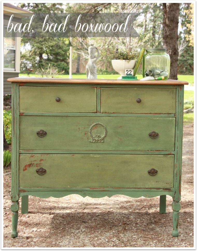
bad boxwood

Oh my.

I don’t even want to put my name on this one.

It’s awful.  If anything, it looked even more awful in person than it does in this photo.

The green on the drawers had far more yellow in it than the body of the dresser.  And I hated it.

I was crestfallen (isn’t that a great word?).  Horrified, really.  I had spent ALL day on this.  And it was hideous.

Sometimes I just have to walk away.  Put the dresser in the corner with its face to the wall to consider its bad behavior.  Go three days without even looking at it.  In the end, I figured I had a number of options.

I could try repainting the drawers with another batch of paint, as I have done in the past with two other dressers in milk paint greens.  But the danger in this plan is that I could end up with the same problem all over again.

I could repaint the entire thing in another color all together.  Specifically I was thinking of some Annie Sloan chalk paint because I knew I wouldn’t have the same coloration problem.  But, I also knew I wouldn’t be able to replicate this fabulous chippy look with Annie Sloan.  And this dresser just needed to be chippy.

  Final option … I could try painting just the drawers white and see how it looks.  I just loved the way the body of the dresser had turned out and I didn’t want to cover it up.

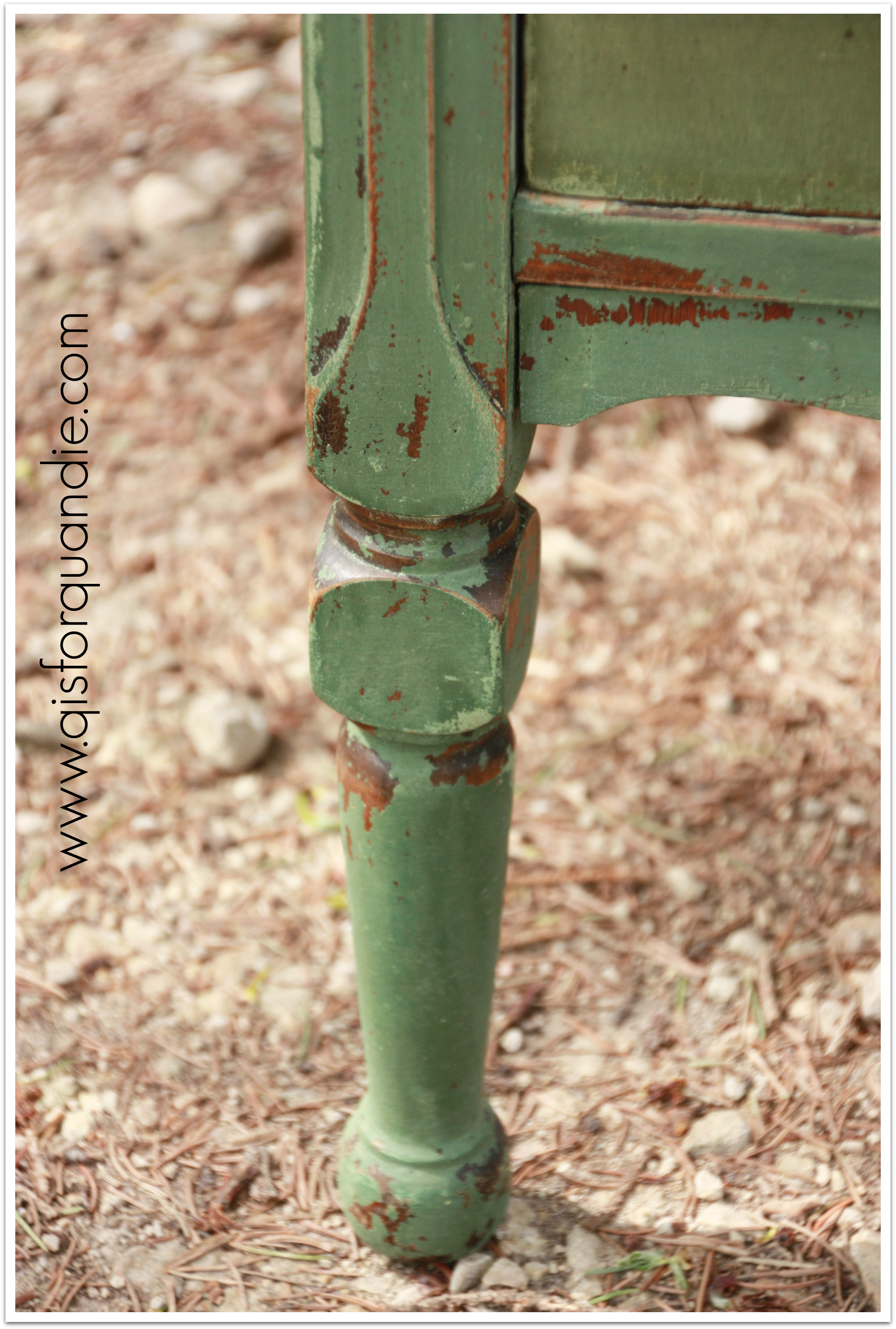
I mean, really, just look at this gorgeous leg.
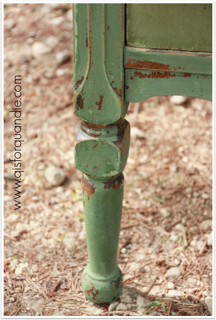
boxwood leg

Would you want to cover that up?

So … I sanded the drawers really well (remember, they had already been waxed), mixed up some MMSMP in Linen, and painted it on.  I could see a lot of chipping showing up pretty quickly.  I was nervous.  Would it be too much chipping because of the wax?

boxwood save 2

And here it is.  Yes, there is plenty of chipping on the drawers.  But I really think the chippyness works with this style of dresser.

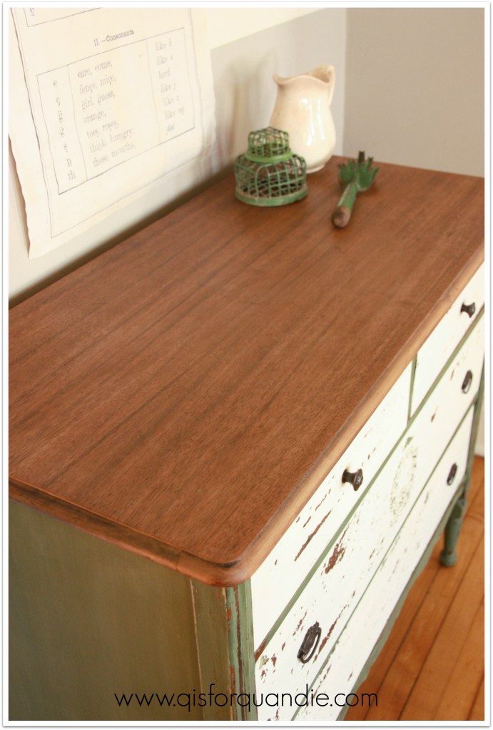
I love the white and green combo.  It’s fresh.

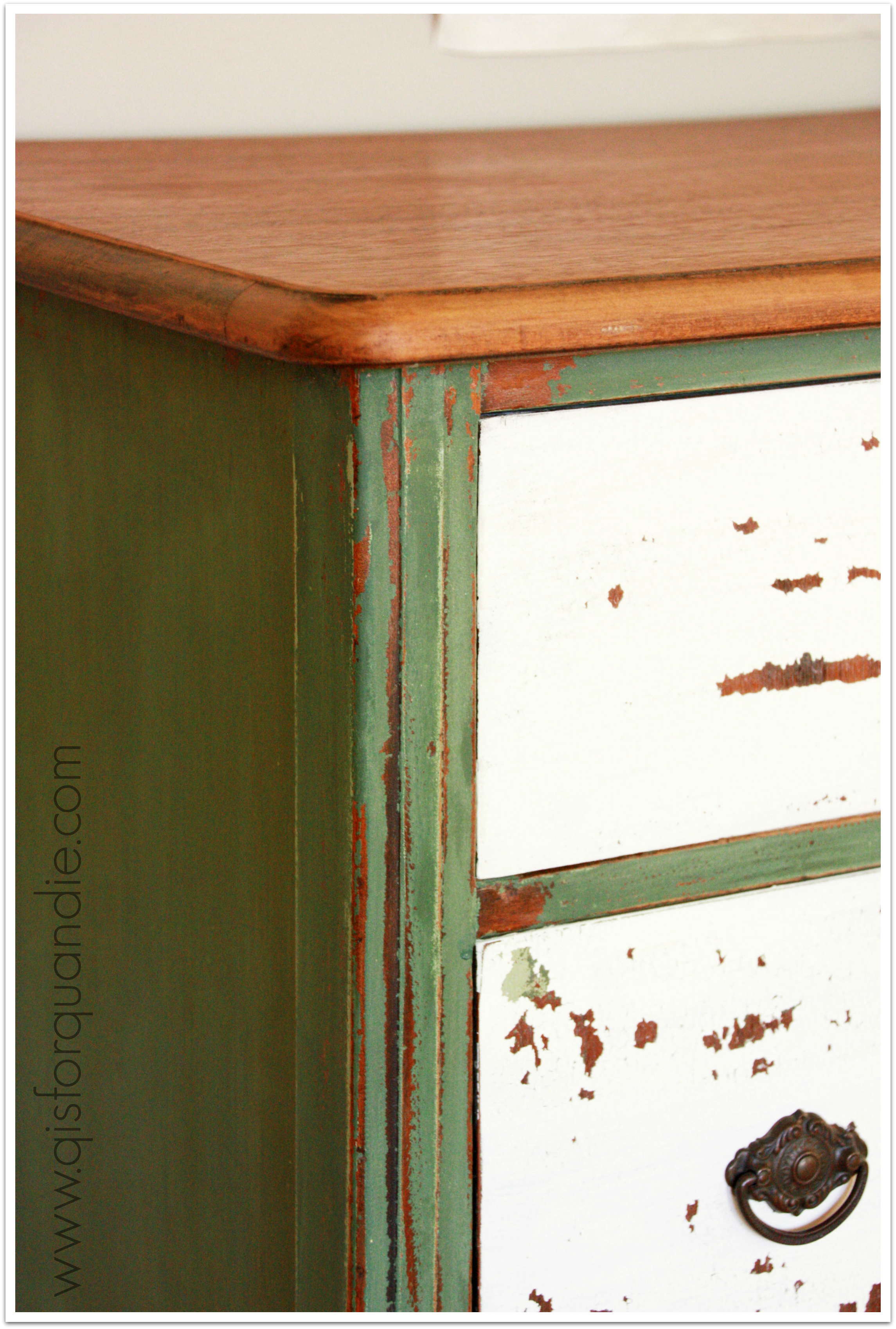
You can see that in most spots I got chipping right down to the wood on the drawers, but some spots just chipped to the green undercoats.
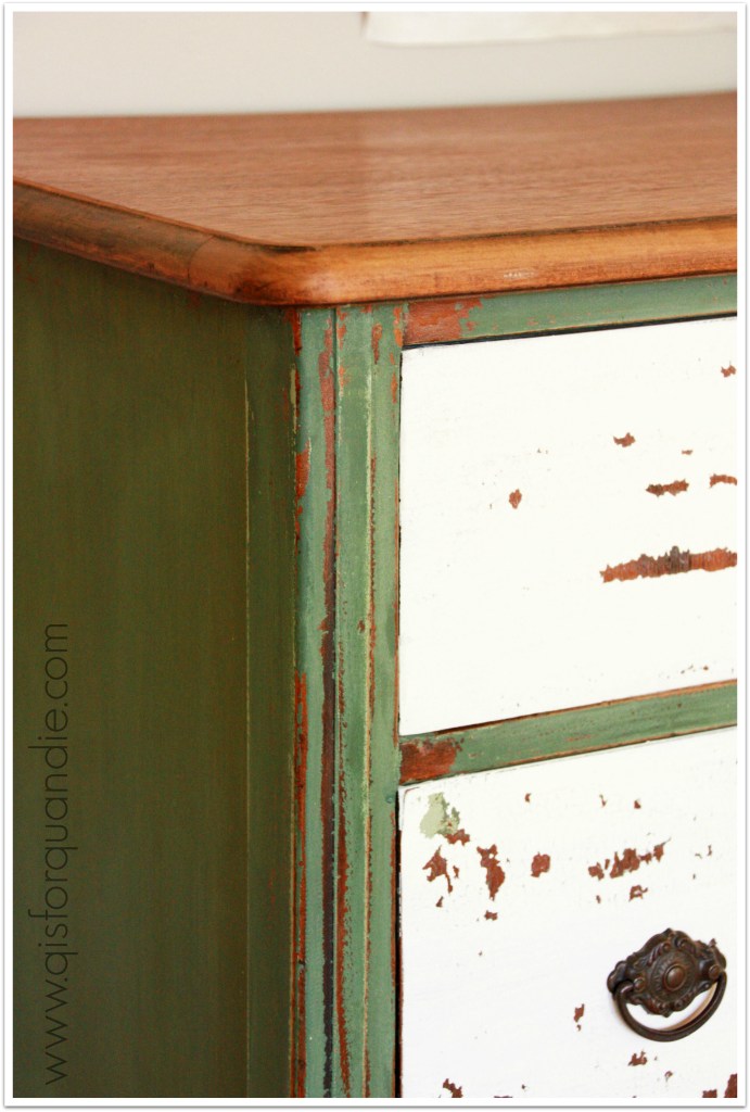
boxwood save 3Here is the top.

boxwood save top

 This dresser has a fresh spring garden appeal to it.  I’m sure it will be perfect in someone’s fabulous home.

If you are interested in purchasing it, leave me a comment.

the apothicaire desk.

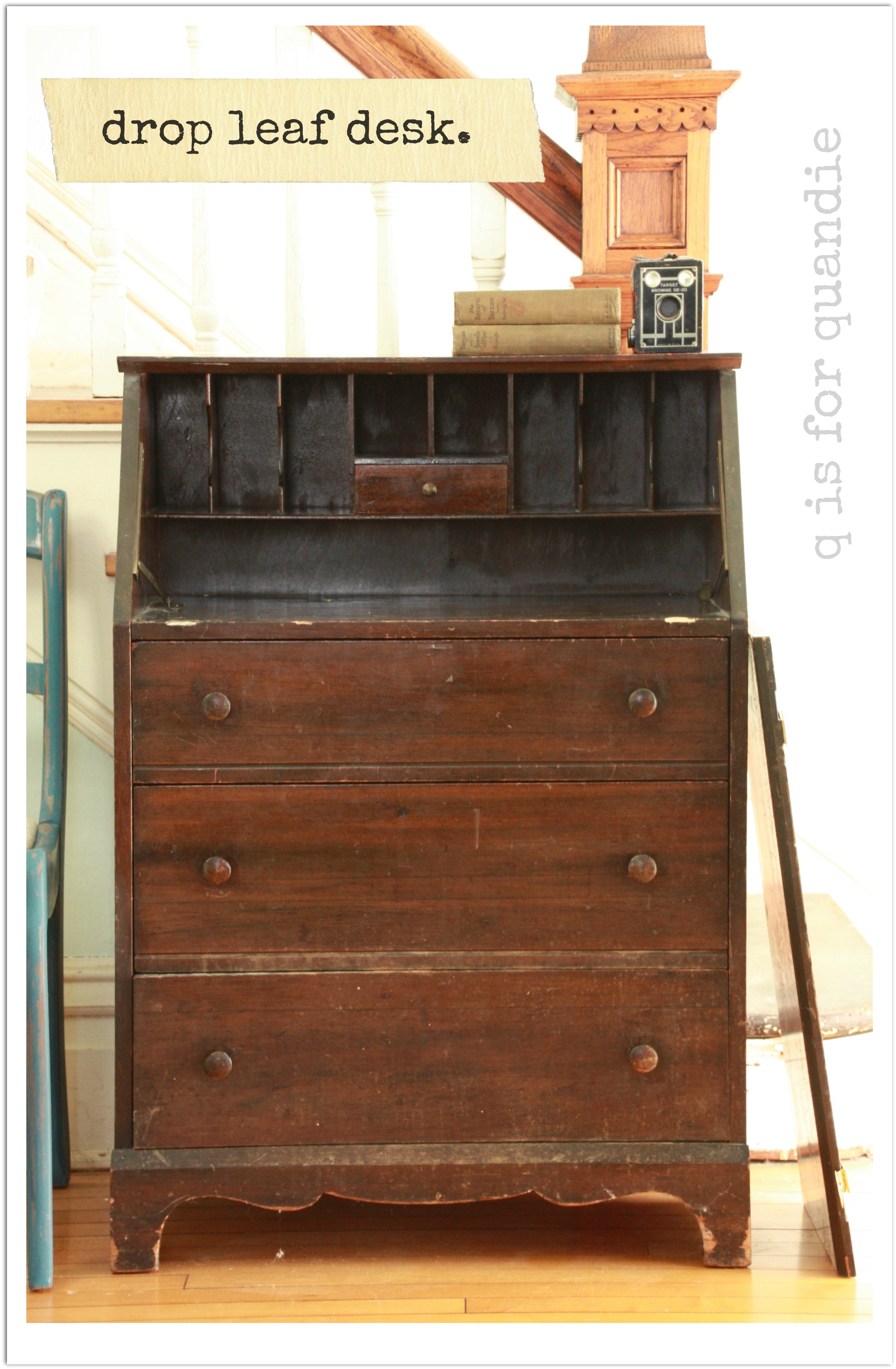
Remember the little drop leaf desk that was so kindly donated to me by some friends?

workshop drop leaf deskWell, I wanted to give it an old, chippy, came out of a Victorian scientist’s lair, sort of vibe.  As if the drawers are filled with handwritten ledger pages full of notes about experiments and science-y stuff.

I think I succeeded.

apothicaire desk 2
After Ken re-attached the drop leaf, I gave this dresser a bit of a sanding and a cleaning.  Then I painted it with Miss Mustard Seed’s milk paint in Trophy.  As you can see, I got a lot of chipping, even though I had sanded quite well.

apothicaire desk chippy

I pretty much loved the chippy look on the outside, but I was worried that the inside would chip even more since I knew I wouldn’t be able to do a good job of sanding inside those cubbies.  This lead to a rash decision to paint the inside with Annie Sloan chalk paint in Old White.  Nope, didn’t like it at all.  Looked so fresh and white.  All wrong for this chippy old desk.  So, I painted over that with the MMS Trophy with some bonding agent mixed in.  Still not entirely thrilled with the result though.  The bonding agent adds a little shine to the paint, and I don’t love that.

apothicaire inside

Some of this shine is the freshly applied hemp oil and will tone down a bit, but still … in hindsight, perhaps I should have just let it get chippy.

You can also see that the bonding agent changes the color a bit, making the grey a bit warmer.

I added some fabulous old metal drawer pulls to the inside drawer and the drop leaf.

apothicaire inside closeup

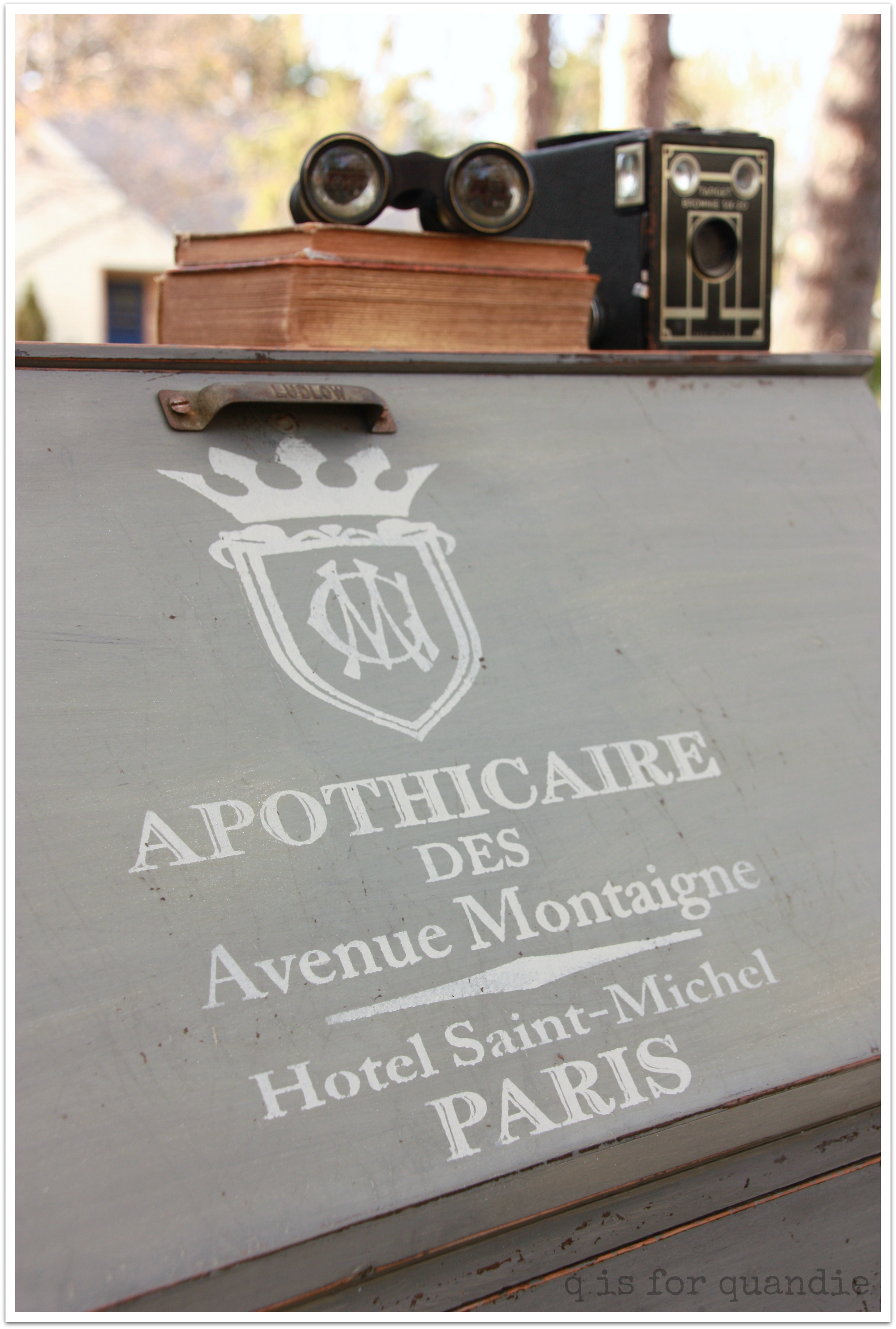
But really, I don’t know that anyone would actually use a desk like this for its original purpose of writing letters (or taking notes on mad scientist experiments).  I think one would tend to keep the leaf up to admire the fabulous stencil.

apothicaire desk 1

One could still store important papers in the drawers, maybe sort bills using the cubbies.

Or just gaze at this desk and imagine a scientist tucked away in his garret in the center of Paris, making notes about his findings using ink and a quill, perhaps by candlelight.  Drinking absinthe and listening to Edith Piaf.

What shall be the fate of this lovely little desk?  It may make it into the Carriage House sale.  But as always, if you are interested in this one, let me know.

re-styled sideboard.

Well, a number of you voted on what I should do with the sideboard, but I decided to go my own way (I hope at least some of you are humming some Fleetwood Mac in your head right now).

You’ll have to get used to it.  I assume it annoys the crap out of my friends.  The way I always ask for opinions and ideas, and then I pretty much do what I want.  I do listen.  And I ponder.  And I consider my options.  But in the end, I make up my own mind.

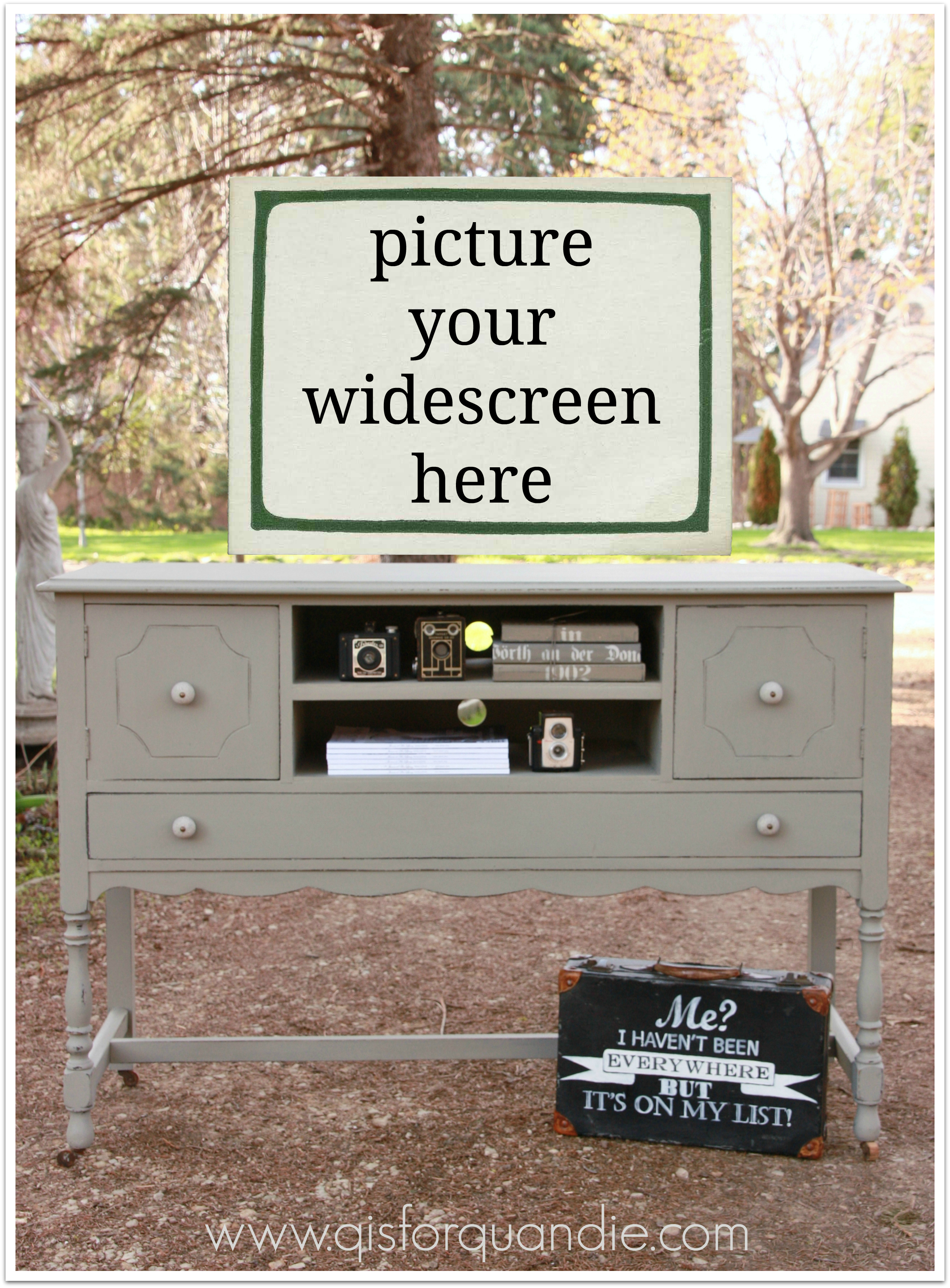
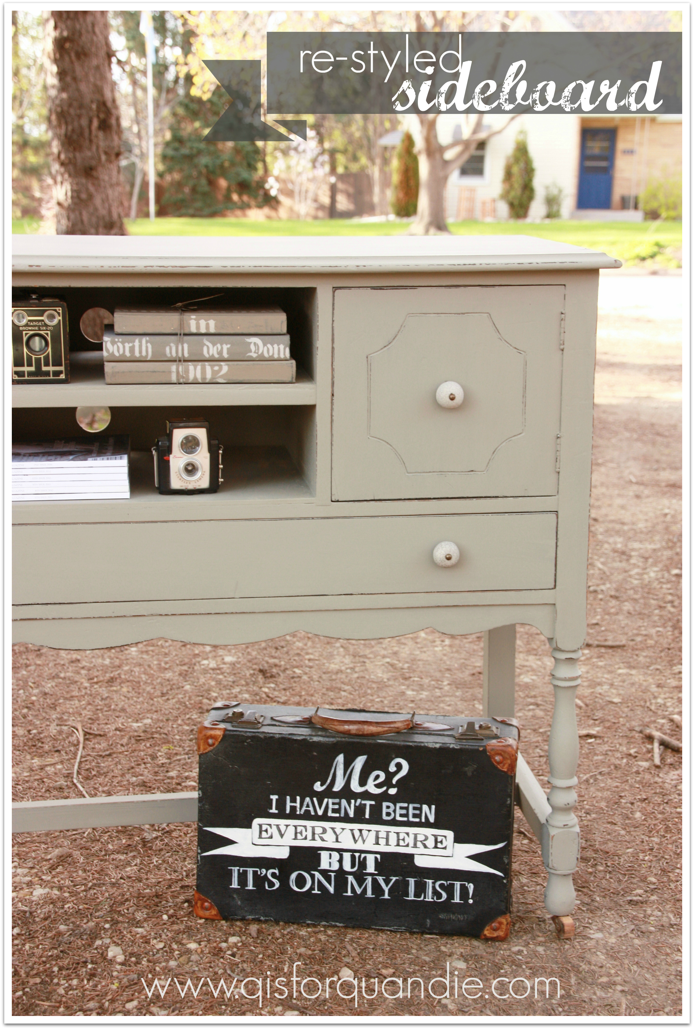
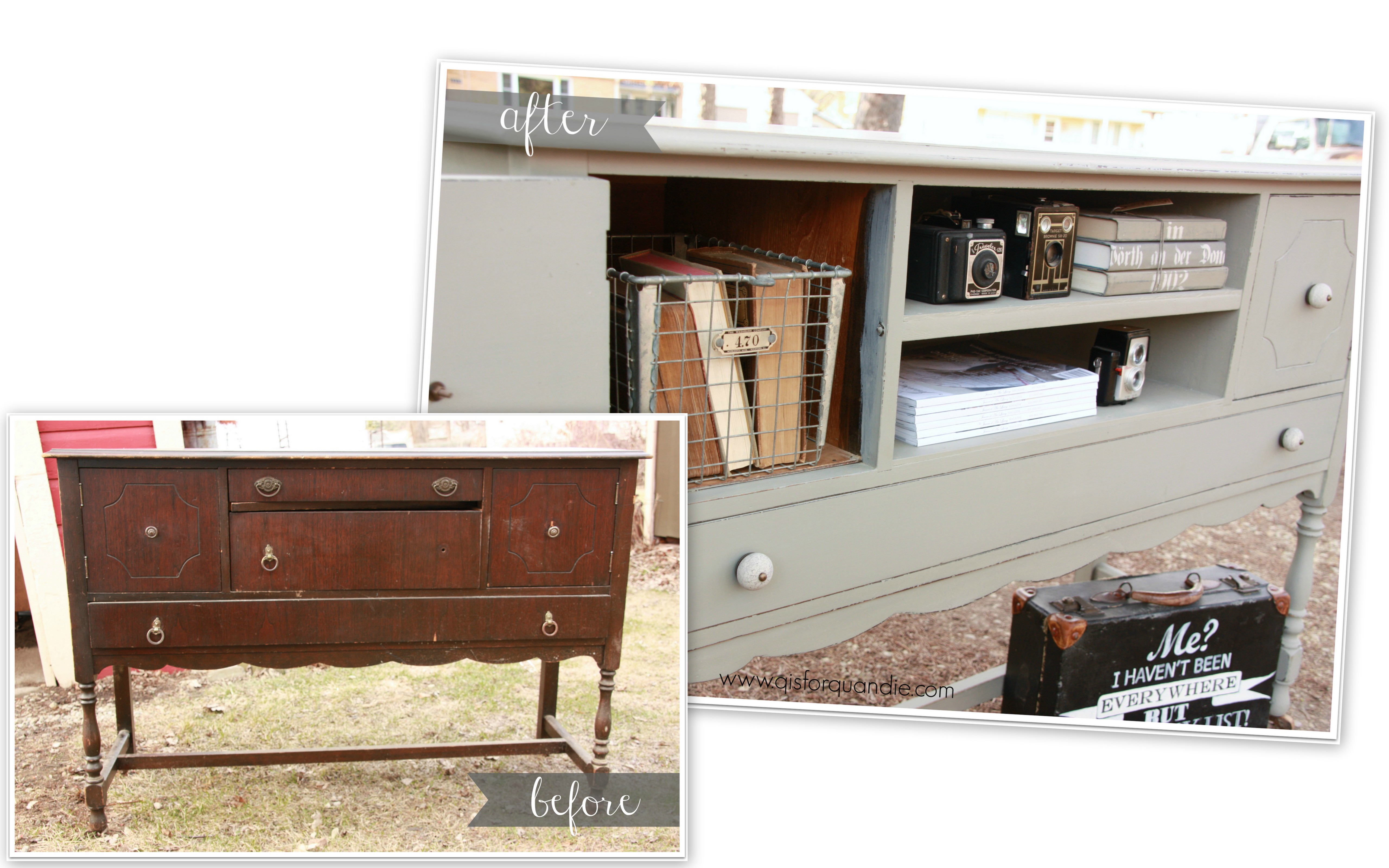
In this case, that meant that I re-styled the vintage sideboard to accommodate a wide-screen TV and some components.

tv standI just felt there were more people out there that needed a fab vintage piece to put their TV on, than those that needed a place to store the china.

I basically stole this idea from a picture that one of my blog readers had pinned (thank you Meggan).  I consulted with Ken, and he took out the middle drawers, built a shelf there instead and added some holes in the back for the cords.

tv stand cords

Keep in mind that the holes seem really obvious in these pictures because they are back lit.  Also, once you have some components on those shelves, they will block those anyway.

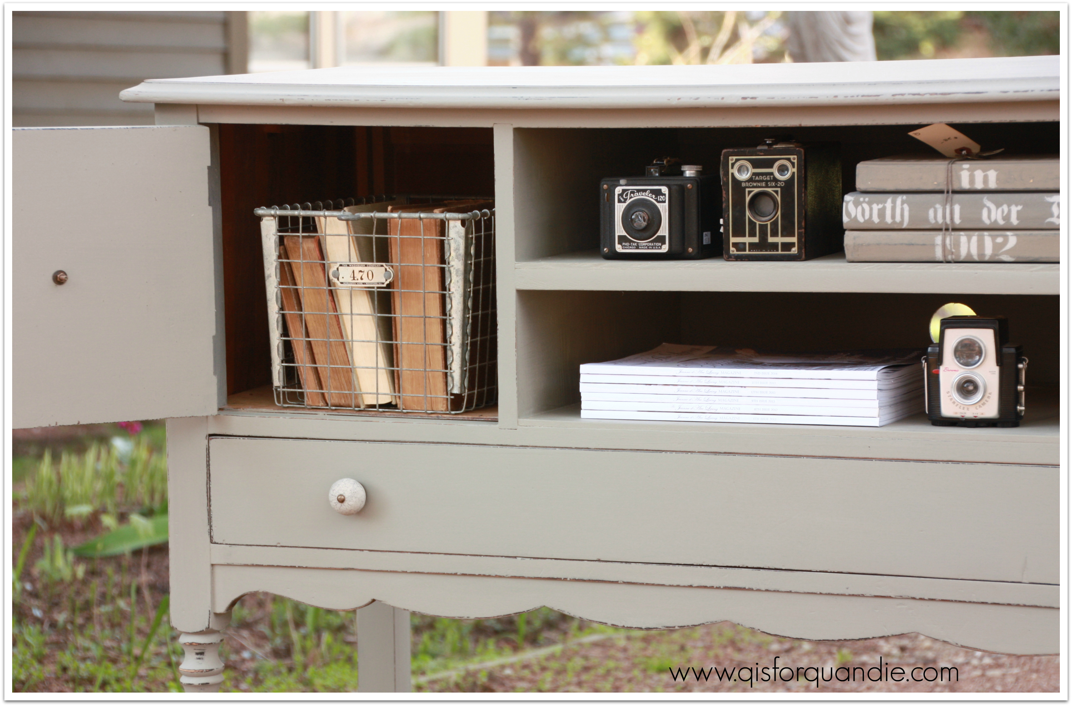
I painted it with Annie Sloan’s French Linen and finished with paste wax.  I even stole borrowed the color from the inspiration pin.  This color is a fabulous shade of greige.  You know greige, right?  Grey and beige.  Beige and grey.  A nicely warm grey.  I didn’t realize until now that greige is not a made up word, it actually means:

greige (greɪ, greɪʒ) 

adj.  unbleached and undyed: greige linen.

Suddenly Annie Sloan’s name choice for this color makes sense.

tv stand 2

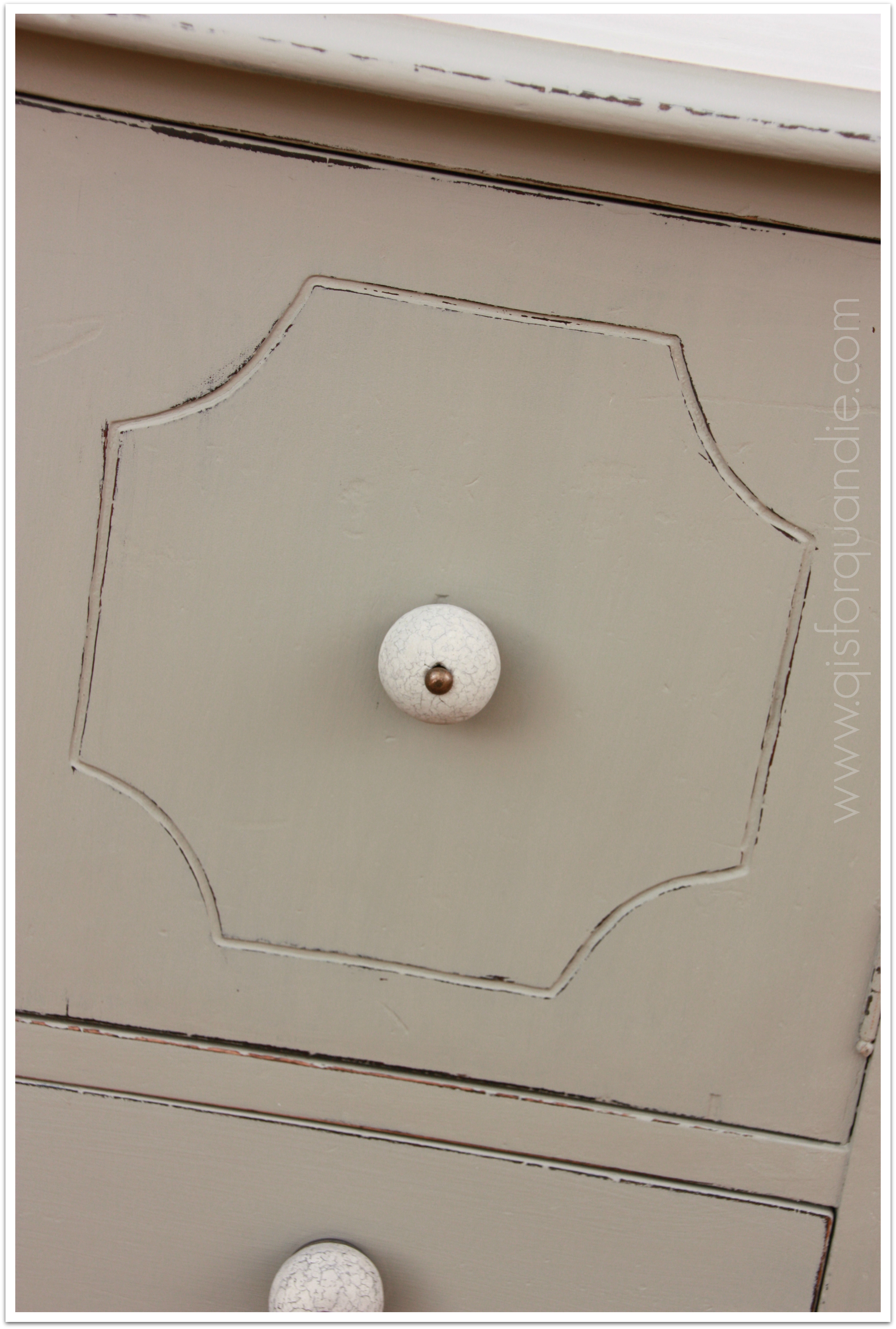
I updated the hardware to these stone knobs in keeping with the updated use for this piece.

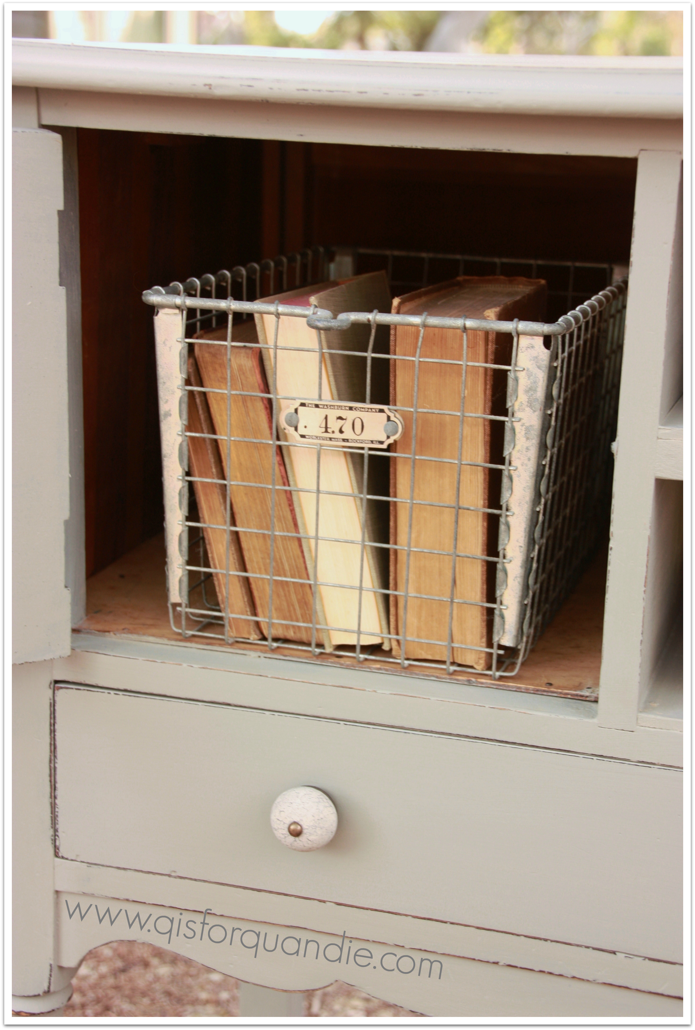
tv stand hardwareI staged the inside of the cubby on the side with a fabulous old locker basket, but it won’t be included, I normally use this to store my paper towels in the pantry.  Although it would be a clever way to corral your DVD’s or games.

tv stand locker basketThese side doors had been removed from the inspiration piece on pinterest.  I did like that look, but decided that most people would rather hide stuff behind doors on the sides.

So there you have it, a re-styled sideboard.  Perfect spot for your wide screen TV.  A nice juxtaposition of vintage furniture meets modern technology.

restyled sideboard

By the way, the house in the background with the blue door?  That is nnK’s house.  She was out doing yard work and threatened to photo bomb my pics.  One of these days I bet she’ll do it!

Also, the fab vintage suitcase pictured above was painted by Bees Knees Bungalow.  I had to have it.  She has another in brown that will likely make its way to the Carriage House Sale.

One final b & a.

2014 spring blog14

As always, please feel free to leave me a comment if you are interested in purchasing this re-styled sideboard.  I will likely post it on craigslist by the end of the week.  Oops, you missed this one, it is SOLD.

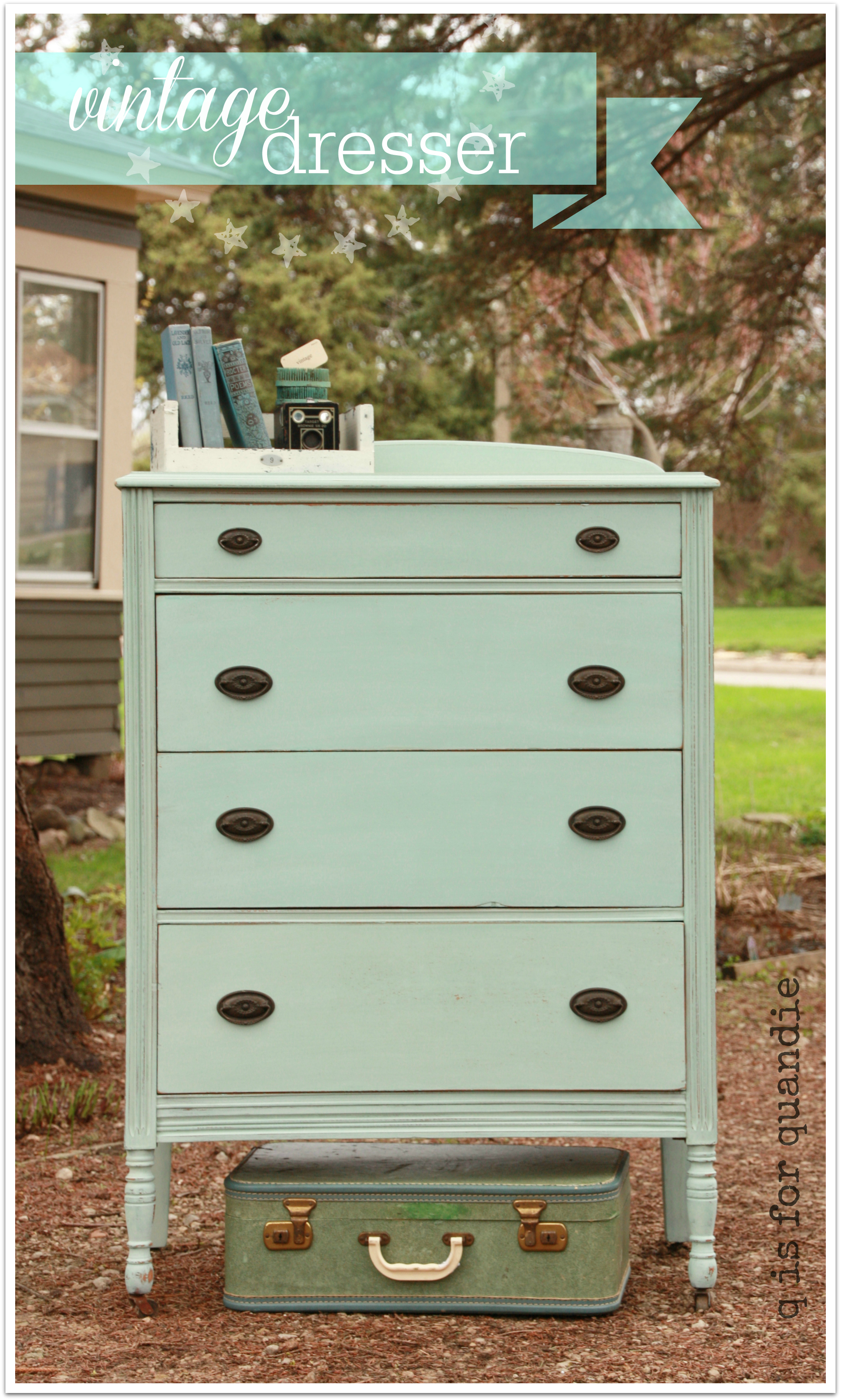
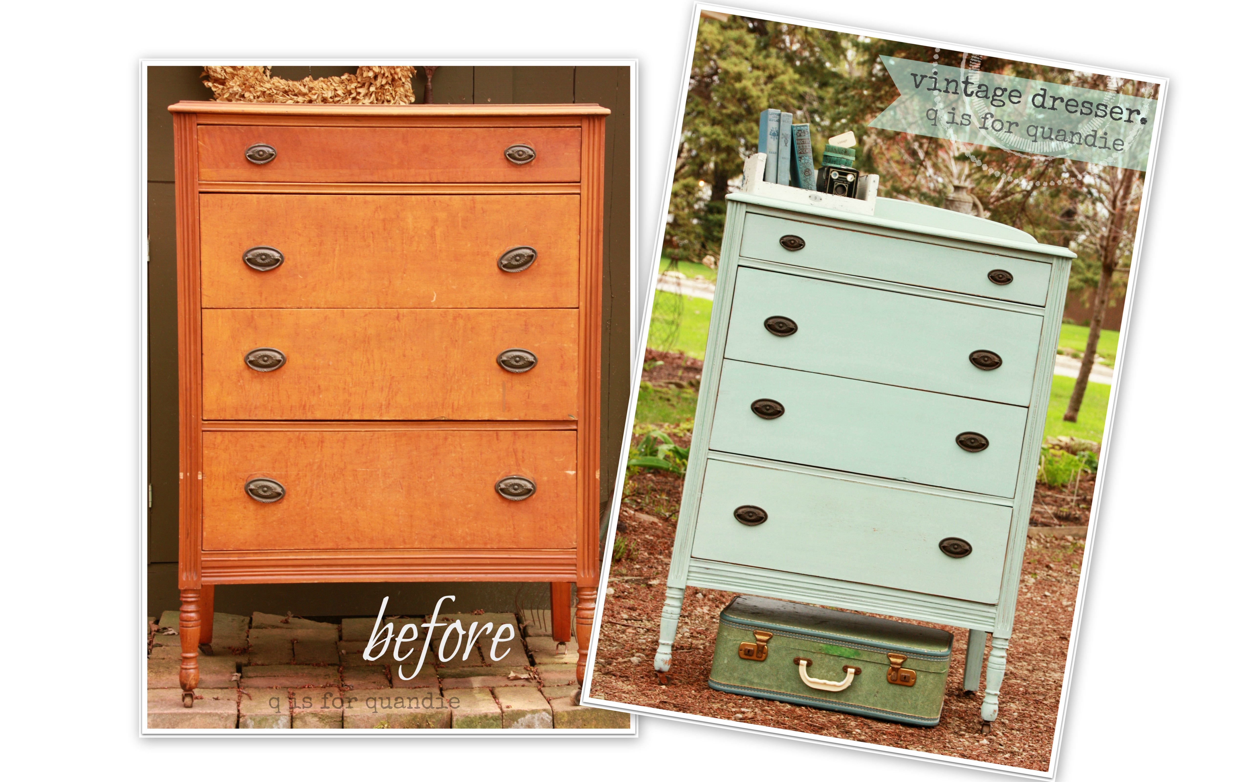
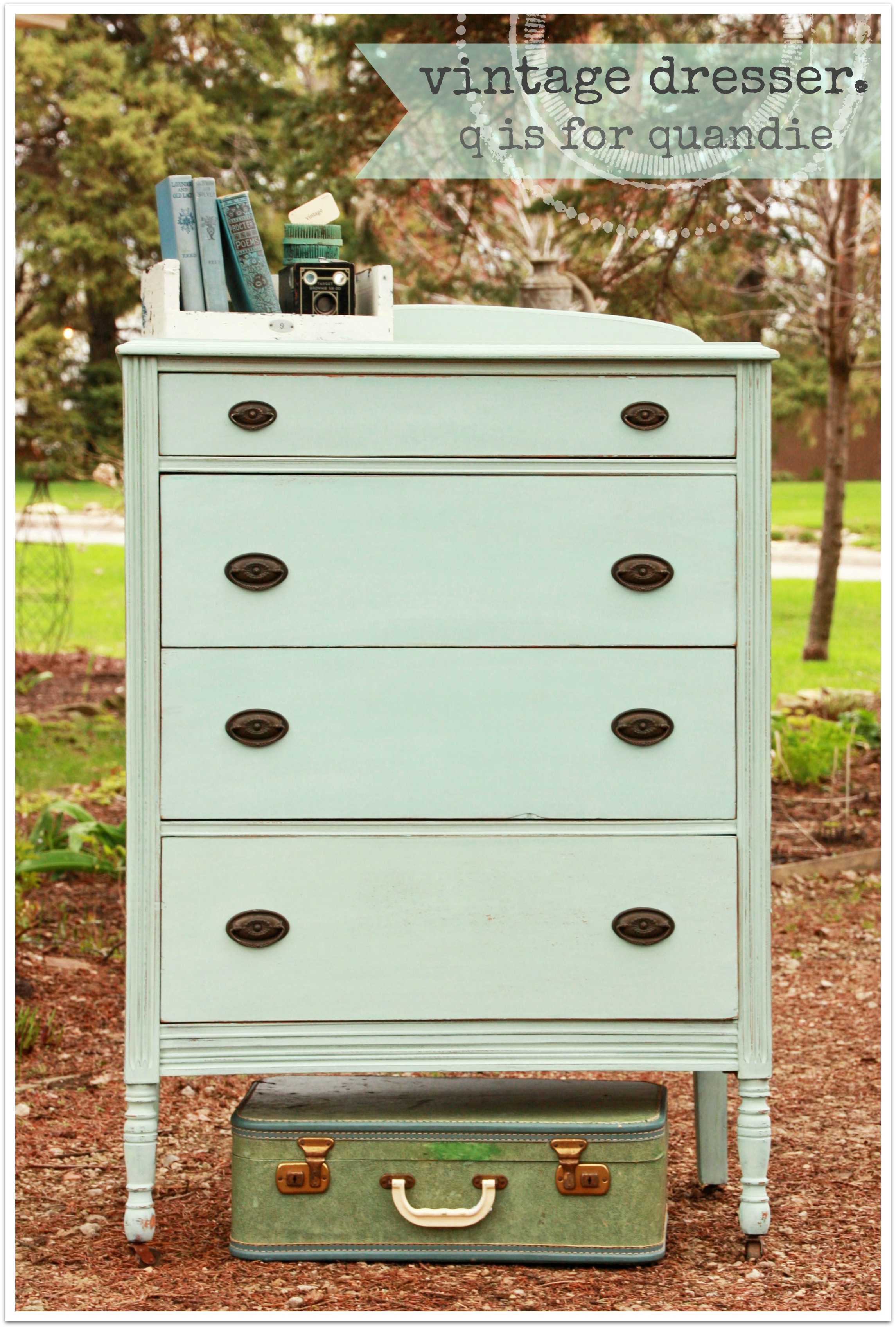
vintage dresser.

I was planning to paint the dresser from Bryn Mawr in MMSMP in Luckett’s Green.  Truly.  I was.

But somehow when my hand went into the box to grab the paint, it came out with Eulalie’s Sky instead.  And as soon as I saw the label, I realized that this was the perfect choice for it.

vintage dresser
Granted, it would have been lovely in Luckett’s as well I think.

I tried to think of a clever name for this one, and all I could come up with was ‘vintage’.  After all, to me this is the quintessential vintage color.  It just screams vintage.  So I went with it.

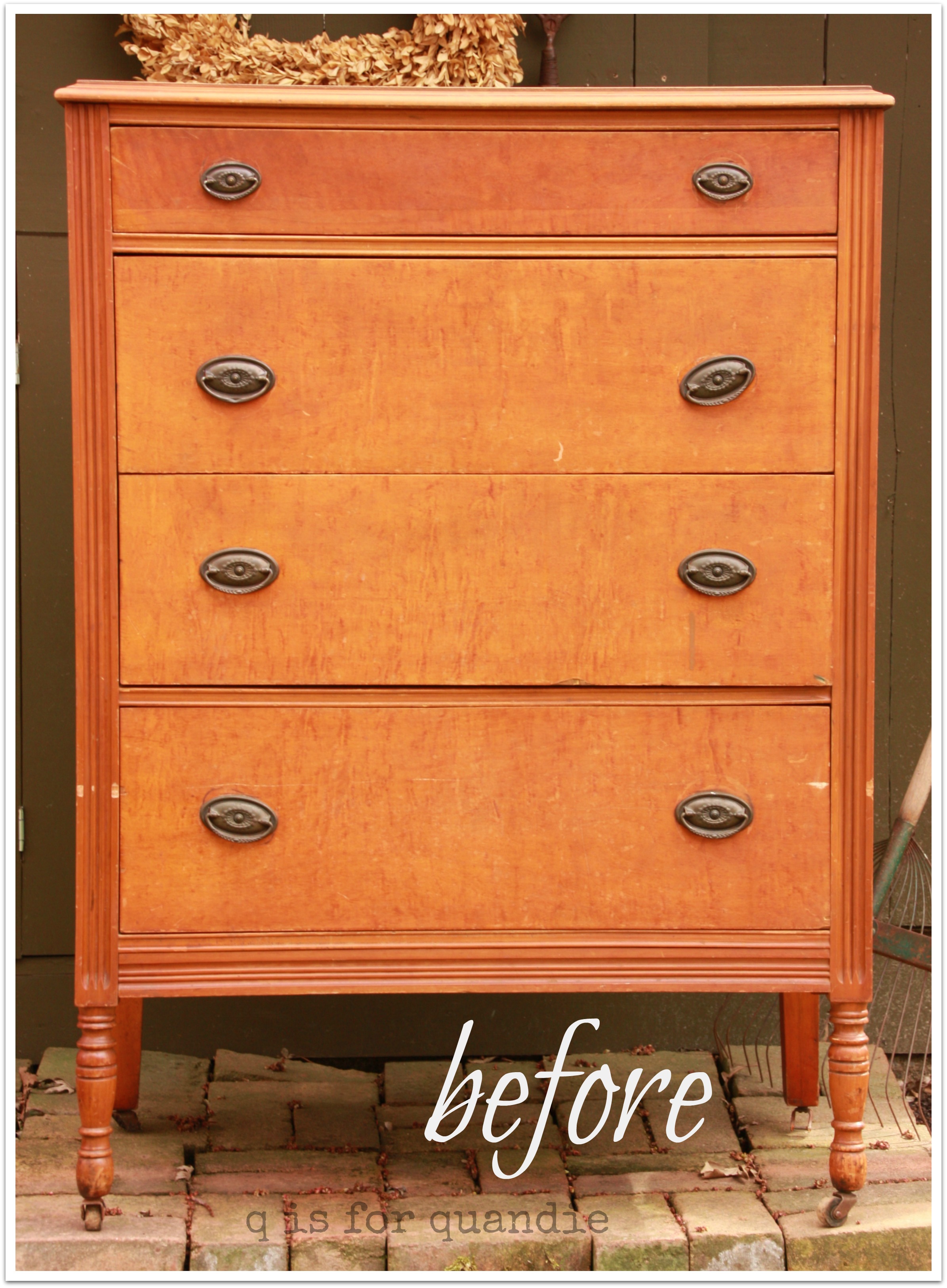
vintage dresser 3I find the MMS milk paint tends to be slightly transparent, especially the lighter colors.  As a result, I think the final color depends on what is underneath it sometimes.  In this case, you’ll remember that this dresser was rather orange.

vintage dresser beforeSo I think the Eulalie’s Sky went more towards the green side of aqua this time.  Sometimes the Eulalie’s Sky looks more blue to me.

I also have to tell you that it took 4 coats to cover this one sufficiently.  That orangey stain was hard to cover up.  I probably should have mixed my paint a little thicker to compensate.  In addition, I got almost no chipping.  I’m OK with that, but in the end, I think I could have gotten this same effect with chalk paint in less coats.  I finished this dresser with clear paste wax.
vintage dresser 1

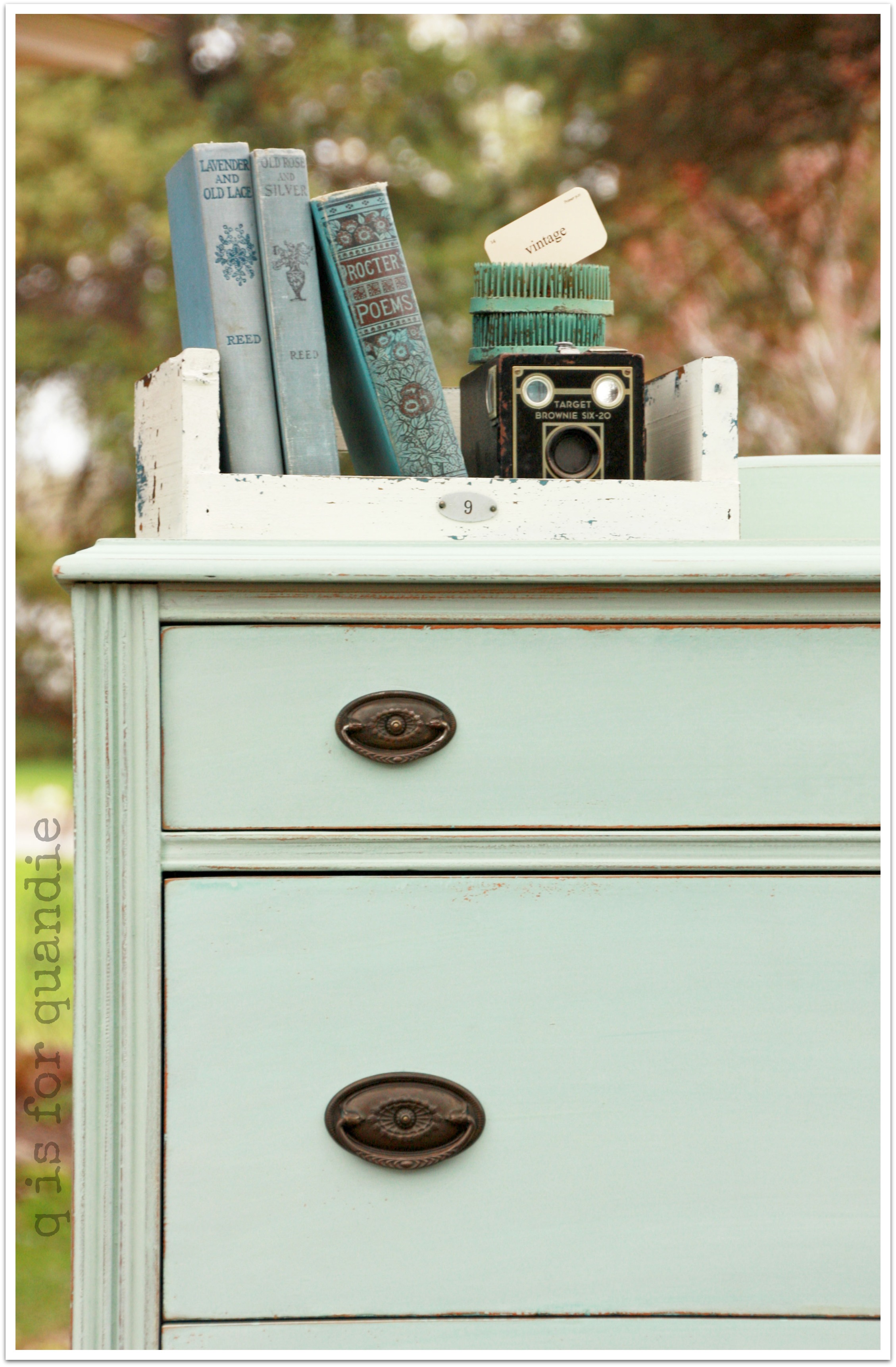
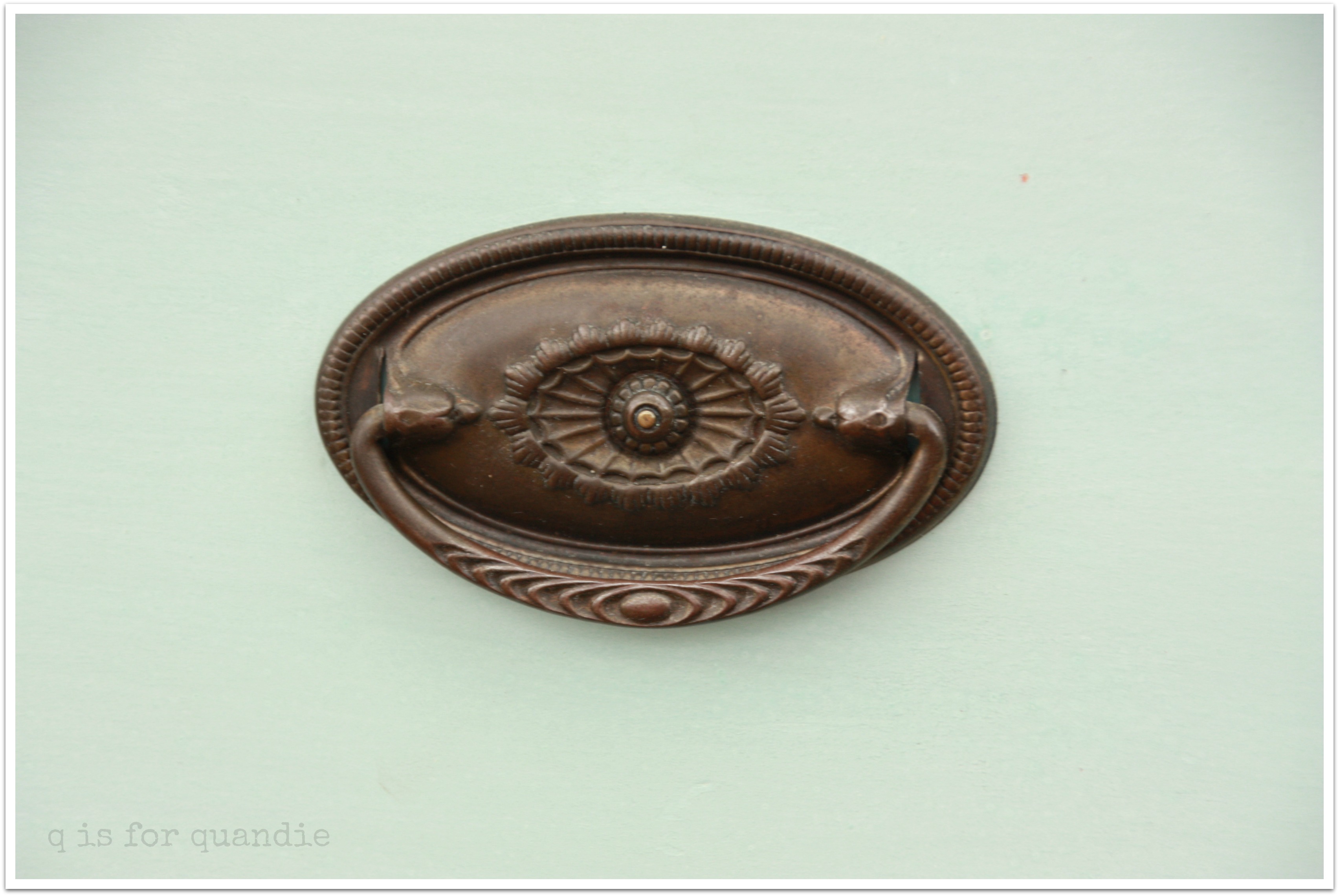
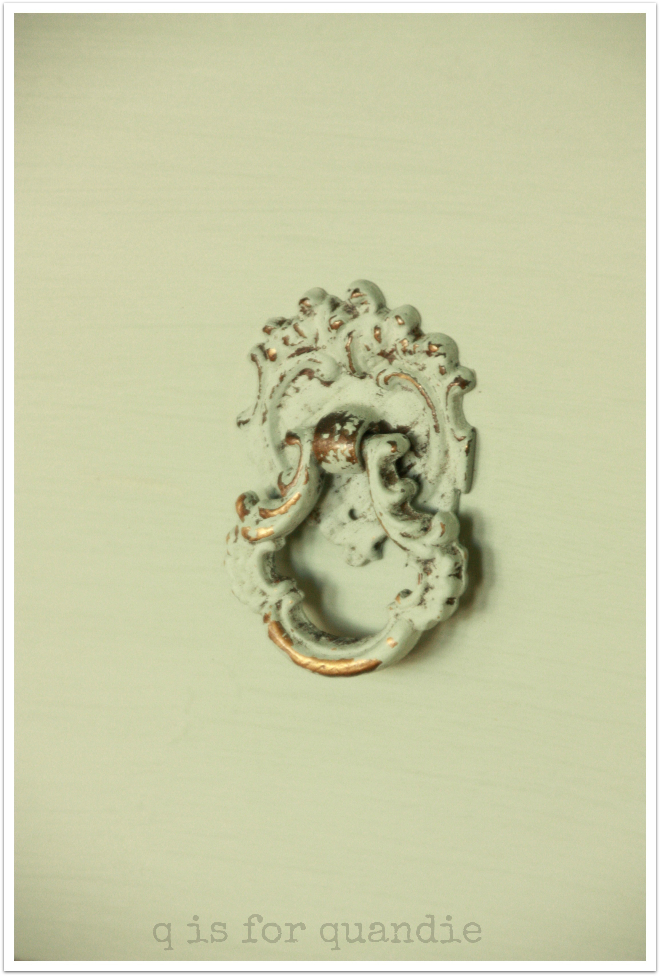
 This one came with all of its hardware intact, and I am sure glad it did because look how pretty the drawer pulls are.  I just cleaned them up a little by rubbing them with paste wax.

vintage dresser pull

I haven’t decided on the ultimate fate for this dresser.  I may hang on to it for the Carriage House sale, or I may just go ahead and list it on craigslist.  It kind of depends on how much space I have to store it.

2014 spring blog13

As always, if anyone is interested in purchasing it, please leave me a comment.  Woops, you missed it, this one is SOLD!

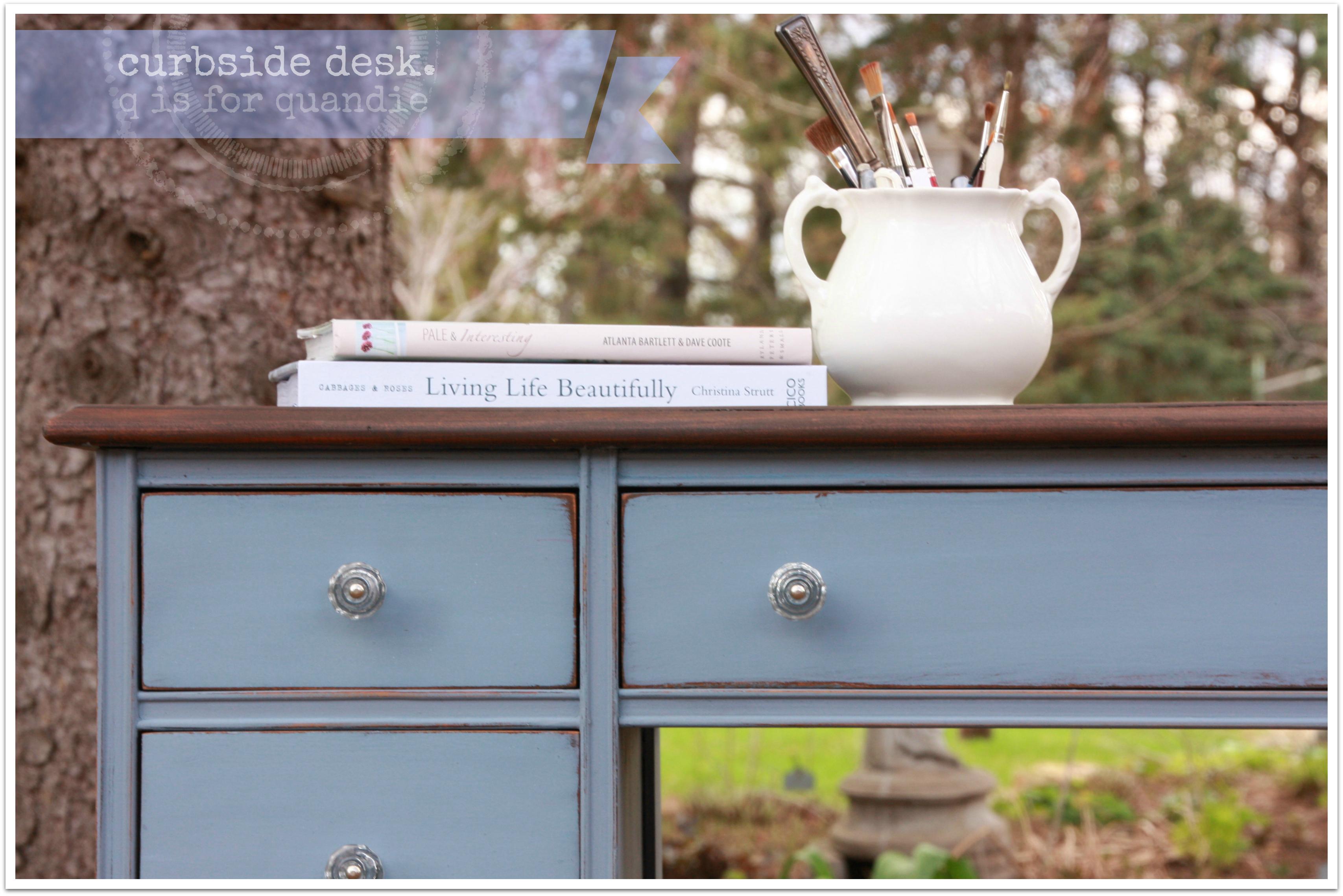
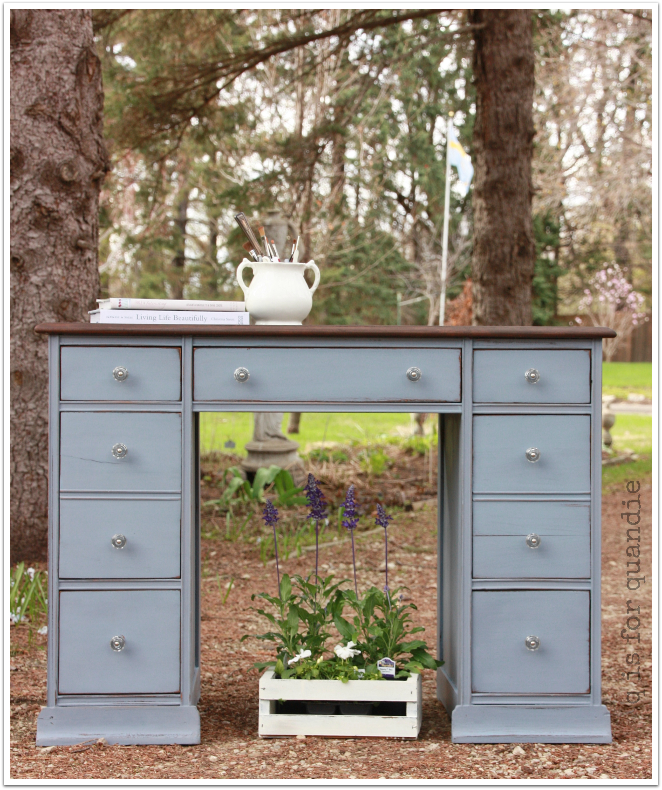
curbside desk.

Mr. Q picked this desk up off the curb last autumn.  There it sat with its FREE sign.  Poor thing.

workshop curbside desk

I showed it to you in my post about the items lined up in my shop waiting to be painted.  The top was stripped, but otherwise it was in pretty rough shape.  Several of the drawer runners had come off.  Several knobs were missing, which was no real loss because they are quite ugly anyway.  I suspect someone started this project, but then realized how much work it would be, stored it for a couple of years in the garage, then kicked it to the curb.

But after a little elbow grease on both my part and Ken’s, the curbside desk has a new lease on life.

curbside desk 1

I had been hanging onto a packet of MMSMP in Dried Lavender ever since I saw how lovely it looked on the interior of my friend Lori’s shelves at the Round Barn.  It’s a gorgeous color, lavender, yet slightly blue, yet kind of grey.  If you look out there in blogland for examples of this color in action they vary wildly.  I tried hard to get the color to come across in photos.  I came close, but the color looks a tad more blue in the pictures than it does in reality.  I used MMS hemp oil on top of the paint.

Anyway, I had been waiting for the perfect piece to paint Dried Lavender and I decided this desk was it.

curbside desk 2

Isn’t it lovely?

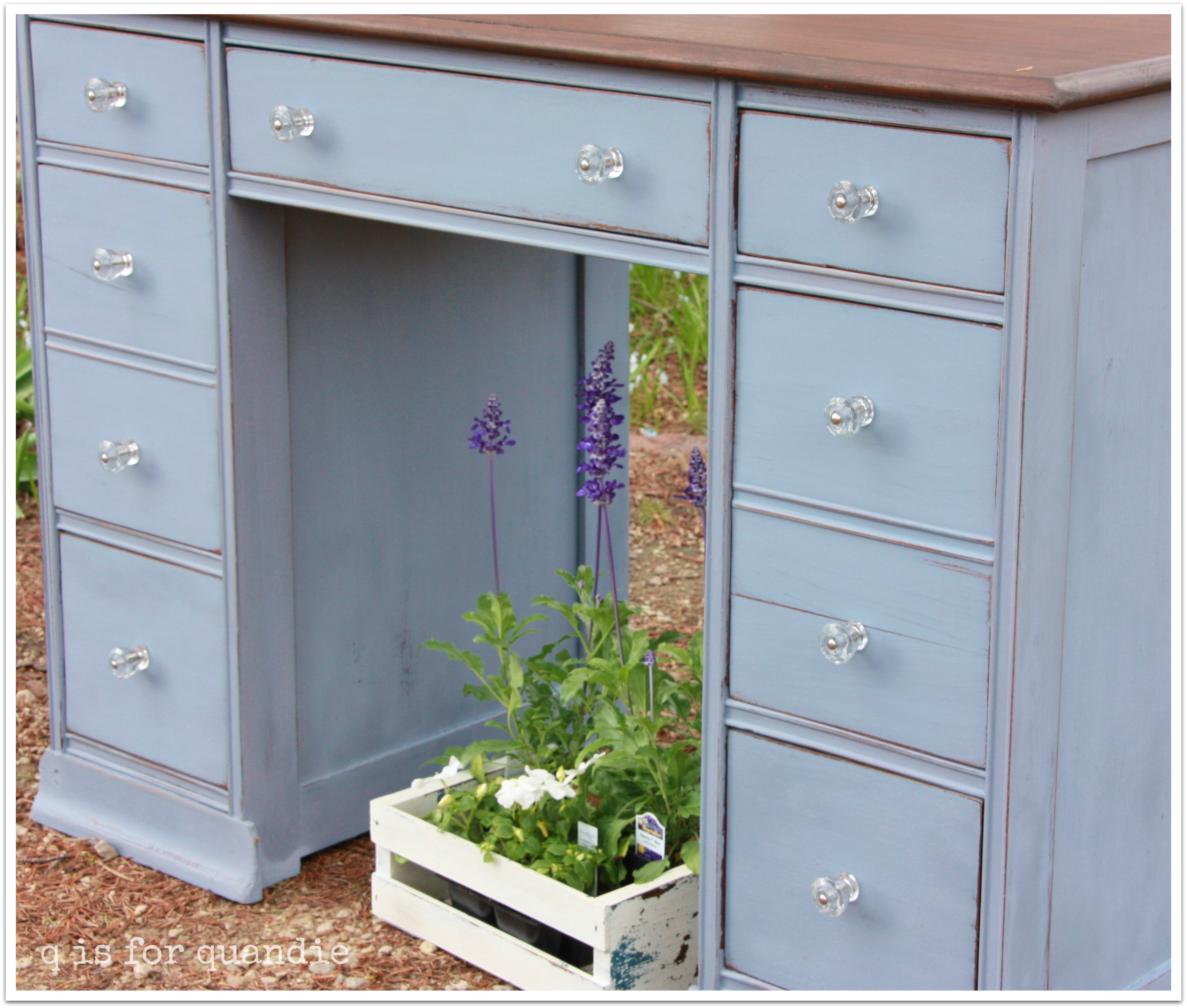
I gave the drawers new glass knobs, and I think they help up the ‘pretty’ factor.

curbside desk knobs

Since the top was already stripped, and since I have set a goal of learning how to stain, this desk was the perfect candidate for a stained top with its Dried Lavender body.  After doing a little research, I picked up some Java gel stain by General Finishes.  Most of what I’d read online made it sound pretty foolproof, which is exactly what I needed.  Sure enough, easy peasy.  Brush on with a foam brush, wipe off excess, let dry.  That was it.

curbside desk top

Bam!  Gorgeous top.  I am already planning my next stripping and staining adventure.

The back of this desk is finished off as well.  I’ve sold a few desks, and often people are specifically looking for a desk with a finished back so that they can float it in the room, or allow the user to face out while sitting at the desk.  I like a desk with a nice back.

curbside desk back

I’ve staged my photos with some of the annuals I just picked up at my favorite nursery, Country Sun.  The tall purple flowers are Salvia farinacea in Velocity Blue.  I love the way these add vertical interest in a planter.  These are destined for the copper boiler window boxes on the Carriage House and Summer House.  Stay tuned for more on that later.

curbside desk flowers

I believe I shall hang on to this desk until my occasional sale.  Unless someone out there is interested in it now.  If so, feel free to leave me a comment.

sunny side table.

I picked up this sweet little table at the Bryn Mawr garage sales and decided it would be lovely in a sunny yellow.  This is MMSMP in Mustard Seed Yellow mixed with a little Linen.  I didn’t exactly measure, which is kind of how I usually cook too.

Sunny side table by qisforquandie.com

It got nicely chippy.  Not too much, but enough to look properly vintage.
Sunny side table by qisforquandie.com

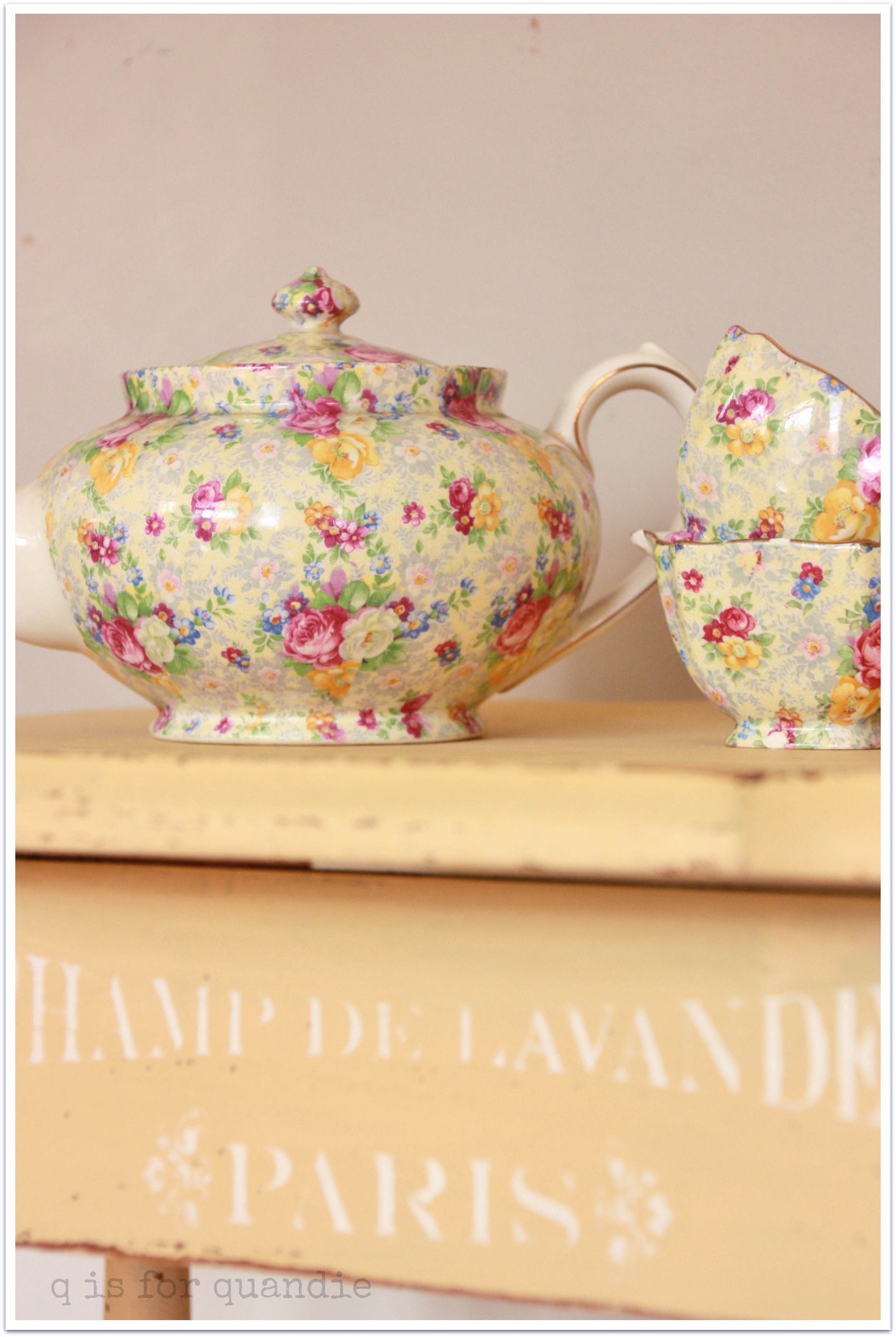
I debated adding the stencil.  I have to confess, I hesitated because I overheard someone at Junk Bonanza say “I wish everything didn’t say Paris on it!”  Has this ever happened to you?  It made me question my use … or overuse? … of stencils.  But in the end I decided that my furniture doesn’t have to please everyone.  I love the stencils, so I will keep on using them.  So there.

Sunny side table by qisforquandie.com
It’s just a sweet little sunny side table.

Sunny side table by qisforquandie.com

The perfect shade of yellow for my chintzware teapot.

This one will be part of the inventory for my summer Carriage House Sale.

duck egg.

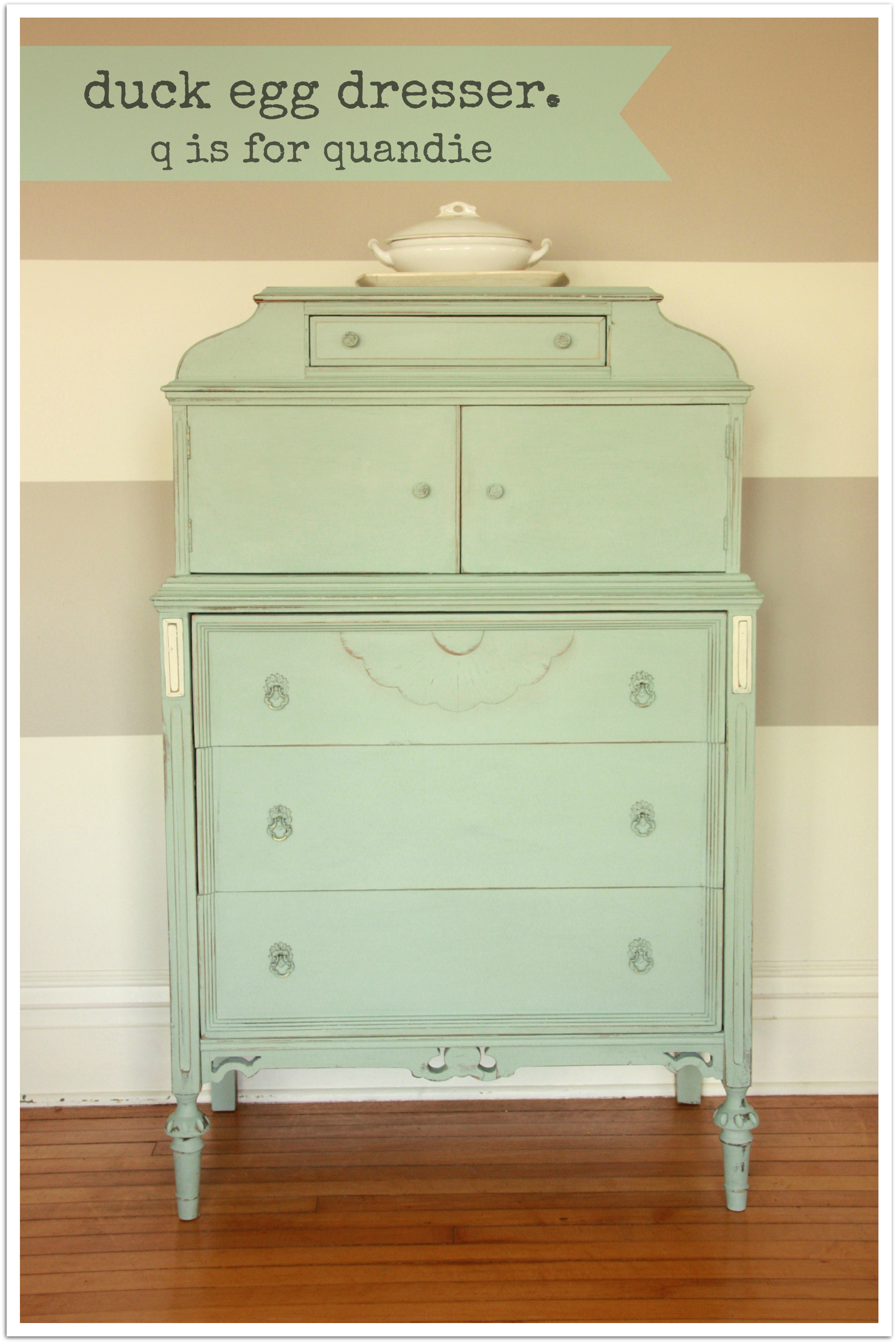
Remember this dresser that was in the line up to be painted?

workshop dresser

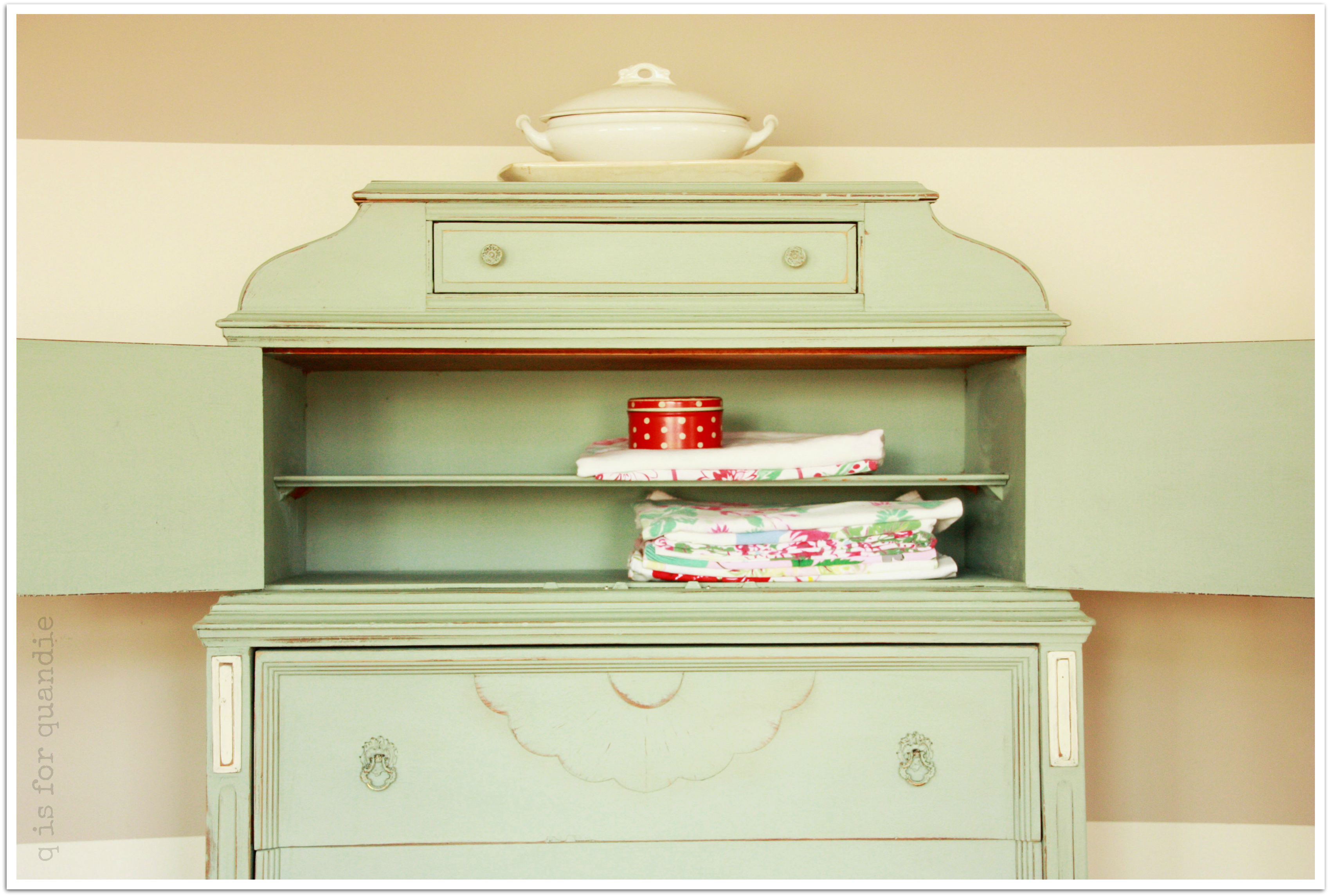
Well, I chose to paint him with Annie Sloan chalk paint in Duck Egg.  It is a gorgeous color.  Although Miss Mustard Seed has some very lovely blues in her milk paint, she doesn’t quite have one with this same muted blue/green feel to it.  Her Eulalie’s Sky is close, but I think it leans a little more towards blue and it’s also a little brighter.  The robin’s egg blue that I custom mixed came closer, but was still a little more blue.  So since I’d purchased some Duck Egg at Junk Bonanza, I decided to break it out and paint this guy.

duck egg 3I even went whole hog and painted the inside shelves behind the two little doors.

duck egg inside

The original hardware for this piece was brass, and I didn’t think the gold tone would play well with this cool color, so I was going to change it out.  Then I thought about it and realized that since there were no missing pieces, I should try painting it instead.  I think the chalk paint works better for this than the milk paint.  It worked like a charm.

duck egg pull

I added just a little white to highlight these details.

duck egg ad 3

I do believe I am quite in love with this guy.  Don’t tell Mr. Q!

This would be an excellent piece for storing my vintage tablecloths.

IMG_8555Unfortunately I simply have no where to put him.  Therefore he will be up for sale.

duck egg

 I’ll be posting him on craigslist soon, but in the meantime, if you are local to the Twin Cities and interested in purchasing this dresser, please leave me a comment.  Woops!  You missed it, this one is SOLD!

on the bench.

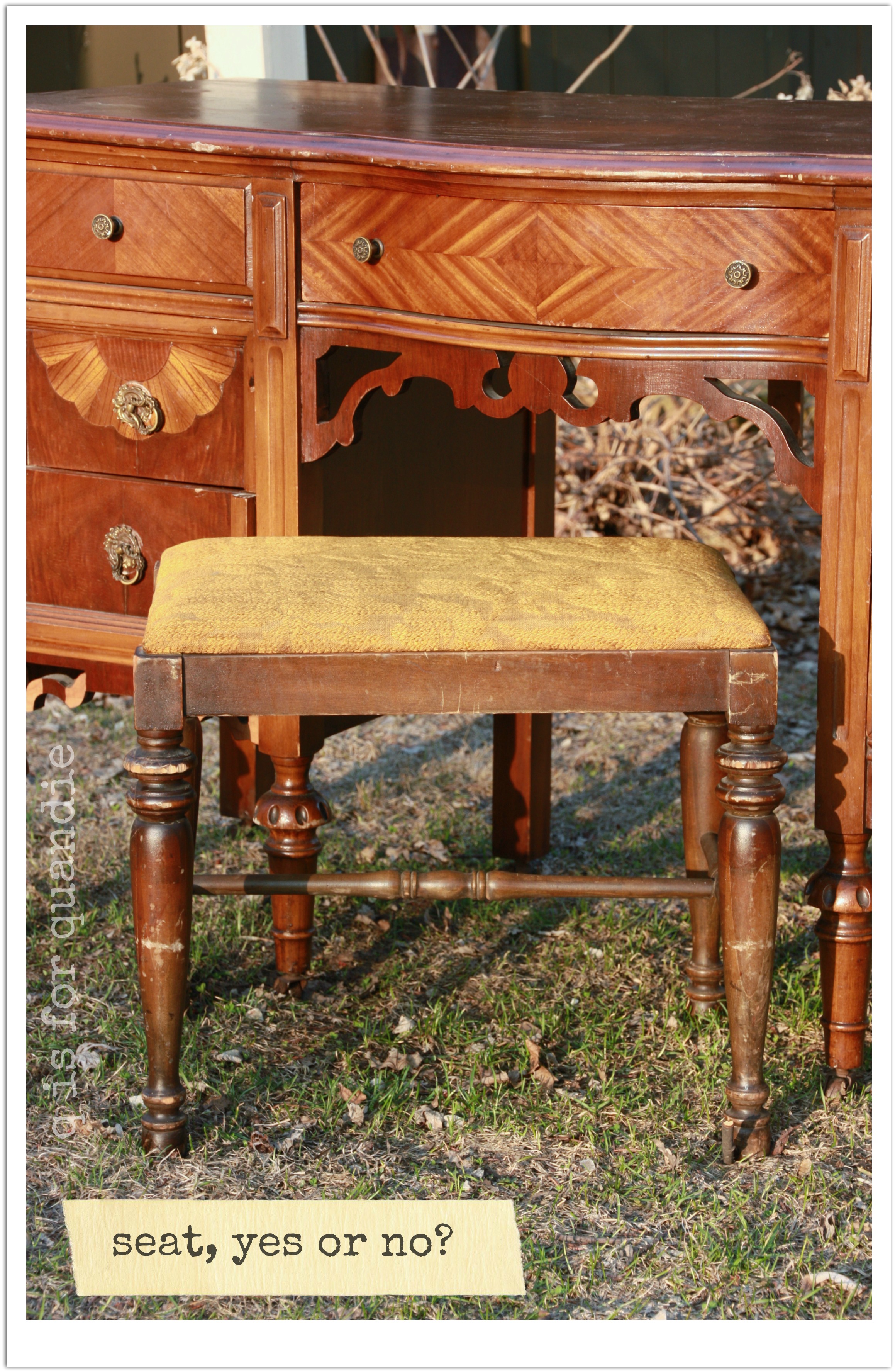
Remember the little mismatched bench that came with this vanity?

workshop vanity seatIt didn’t really match.  And upon closer inspection, I realized that because it is wider than the opening, it was getting pretty beat up where it would hit against the sides of the vanity.  Clearly, it’s not a good match.  So I decided to experiment on it.  Eeek!  Sounds slightly evil, doesn’t it?

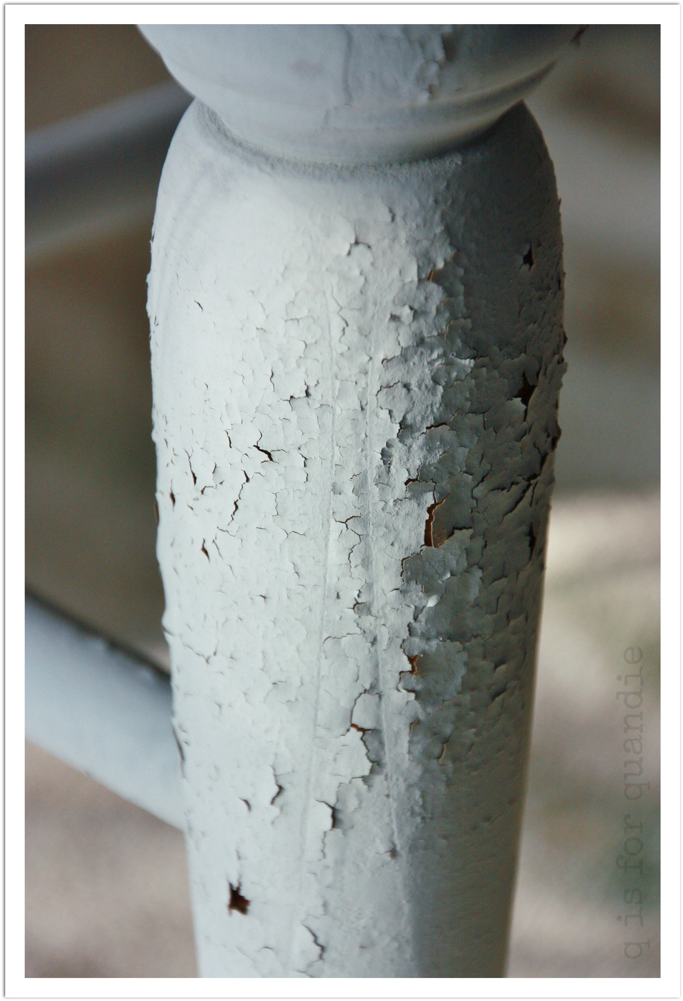
First, I decided to paint it in a 50/50 mix of MMSMP in Shutter Grey and Grain Sack.  I was hoping for a lovely pale Gustavian sort of grey.  I got the right amount of paleness, but maybe it’s not quite warm enough.  The Shutter Grey has so much blue that it gives a definite coolness to the grey.  Also, just look at how much chipping I got!

bench chippy

Wowza!

Likely the result of little to no sanding.  I just hate sanding round spindly bits.

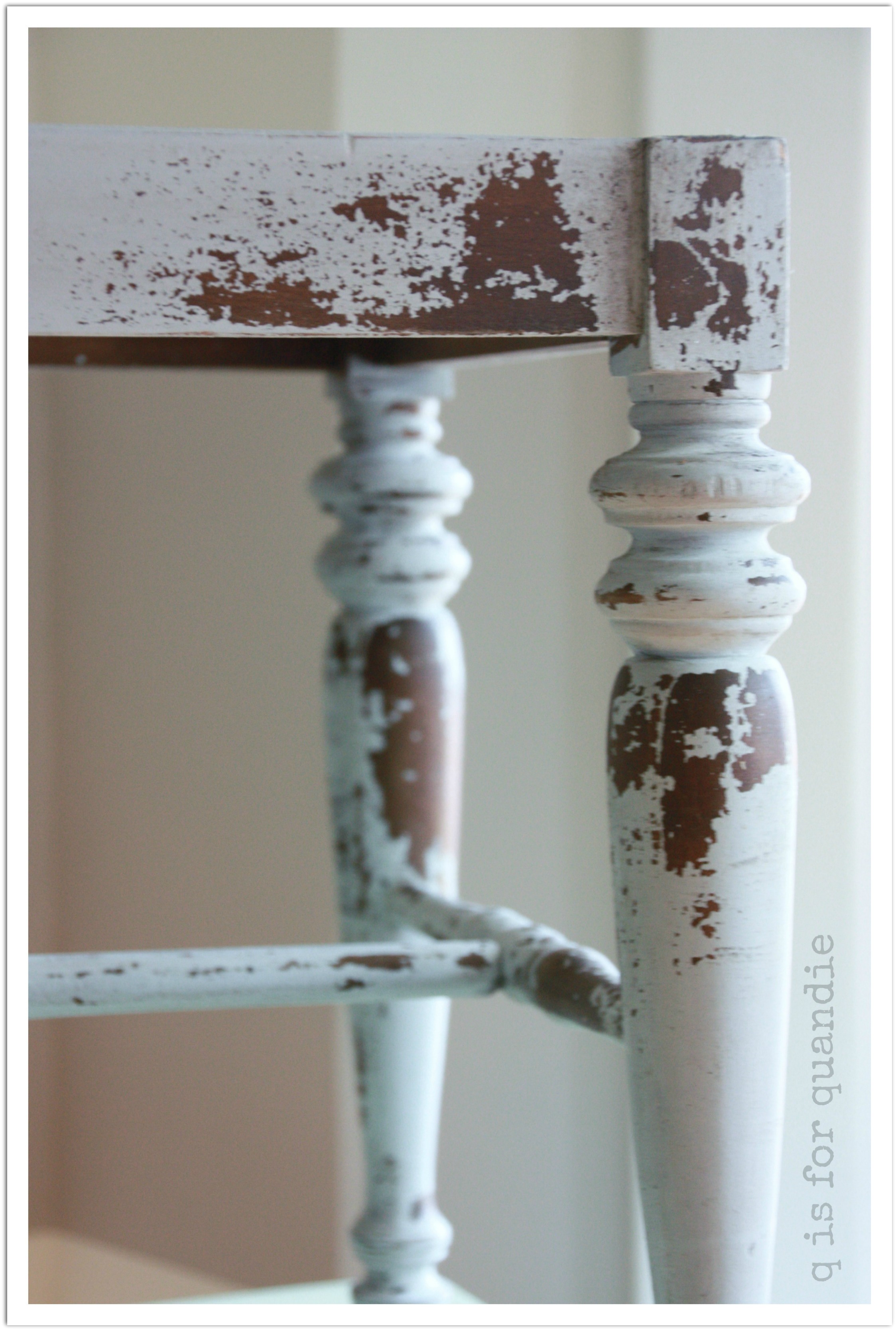
After knocking back the paint chips and adding some antique wax, I am left with this.

bench chippedA very chippy look for sure.  Not everyone’s cup of tea, but I know some of us love this look for its very chippyness.

But the next decision is what to use to upholster the seat.

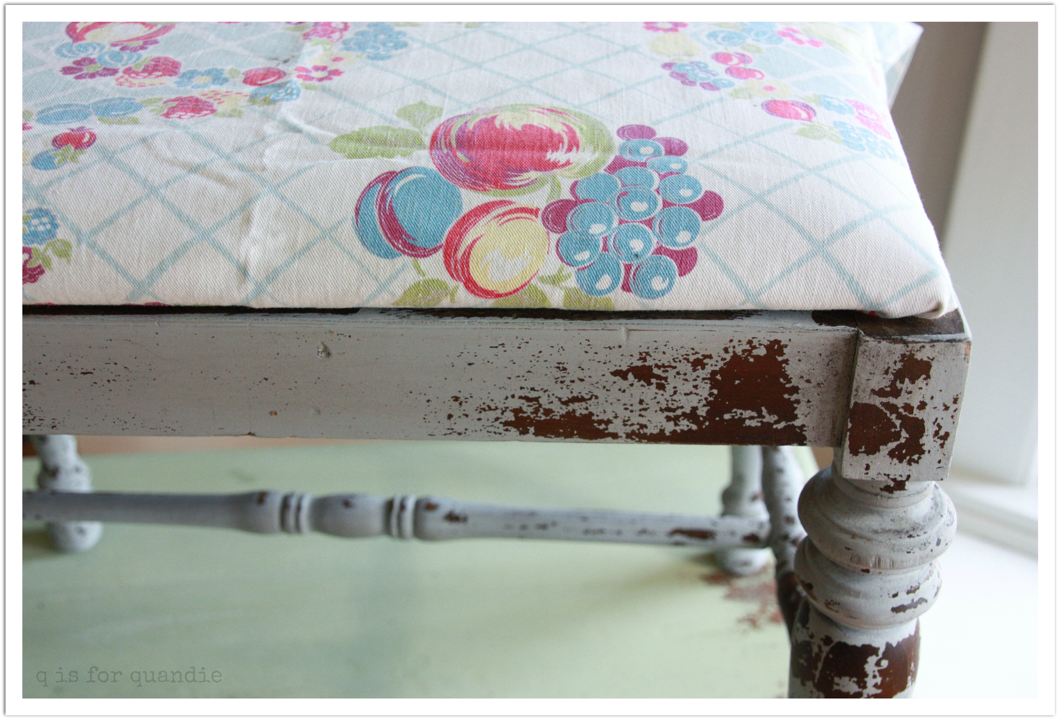
First I tried a colorful vintage 50’s fabric.

bench option 1

Hmmmm.  Very shabby chic.  But to me, this fabric and this paint job do not belong together.

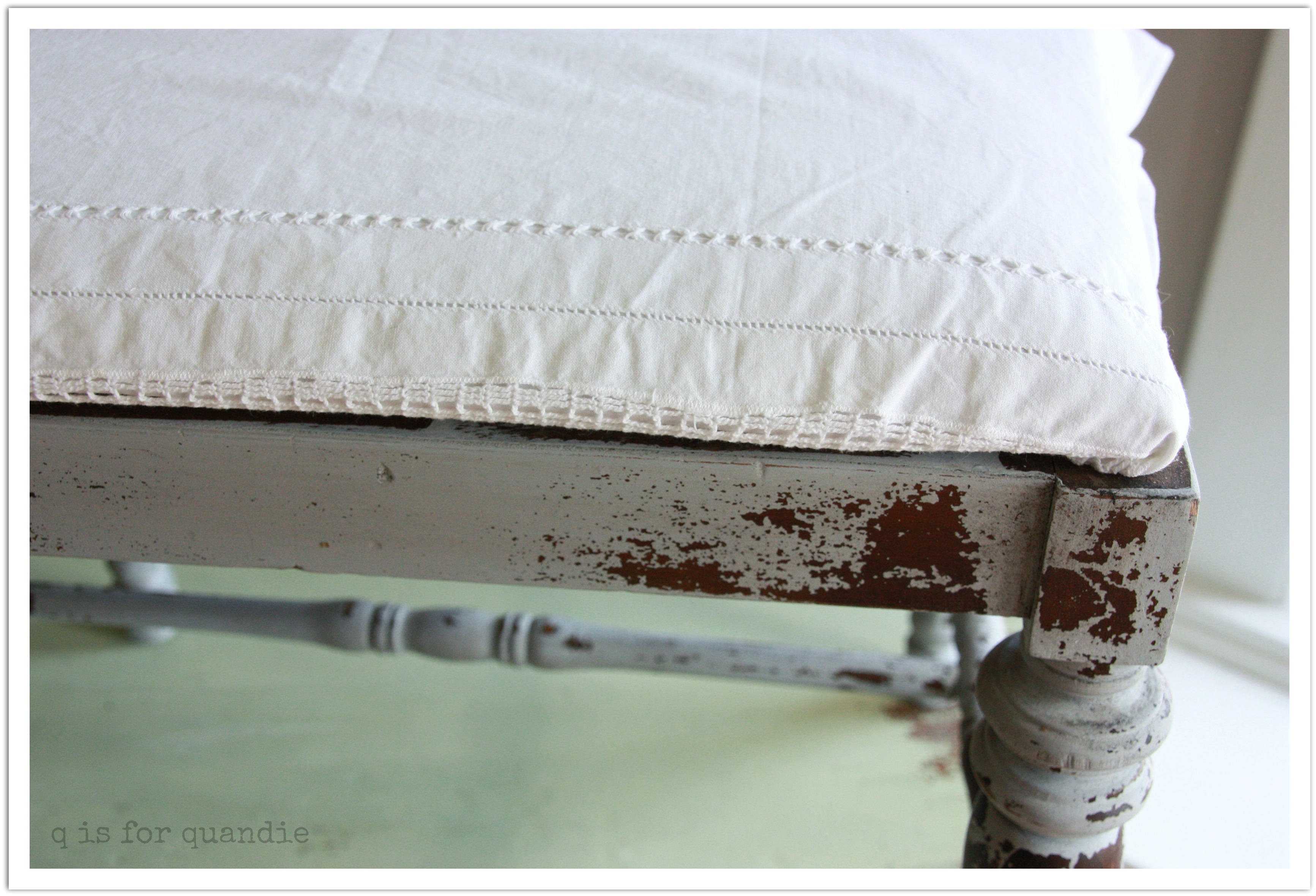
Next option, some vintage white cotton with some cut work.

bench option 2Too crisp and dainty for the rustic paint job?

How about a patched grain sack?

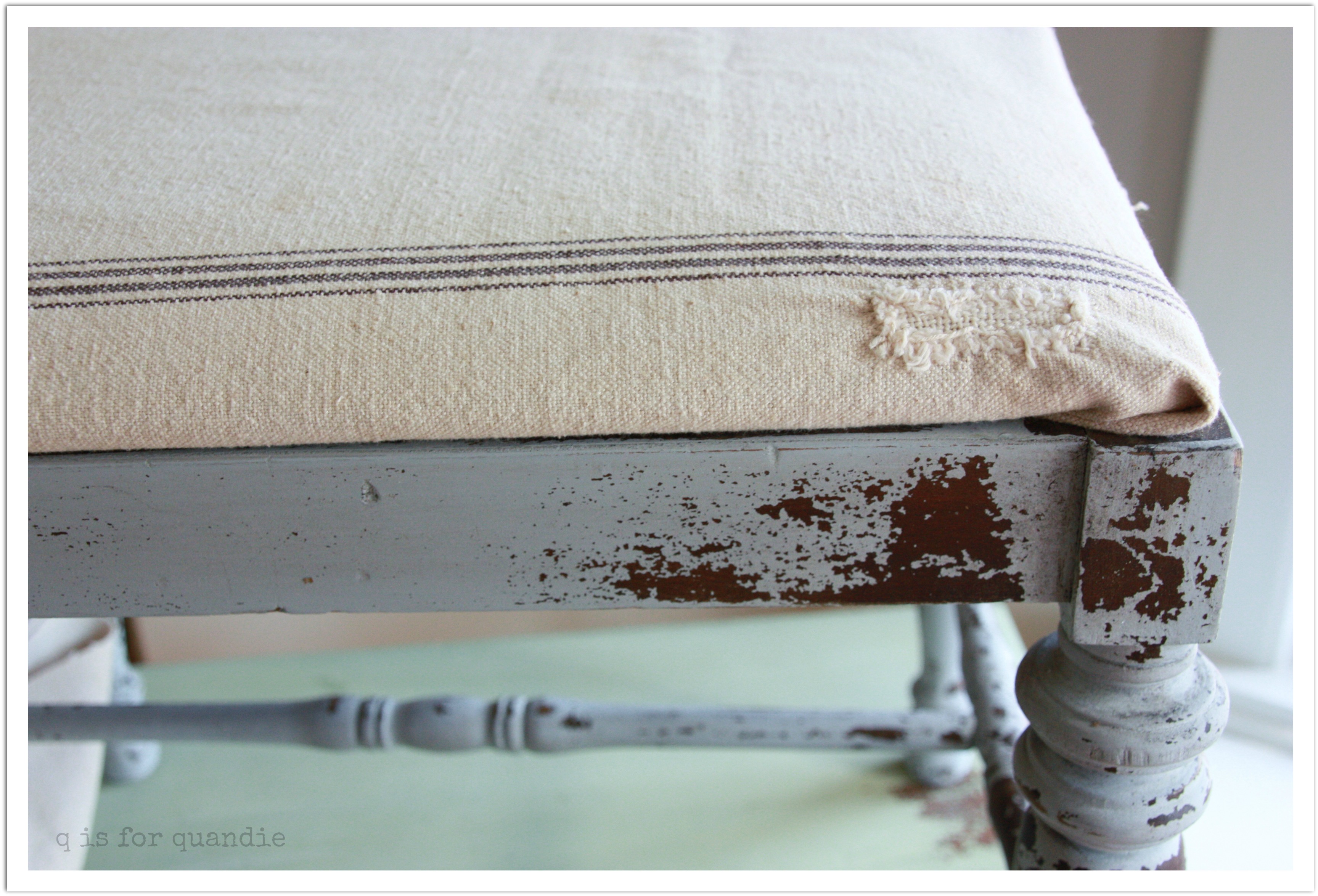
bench option 3

I think the grain sack color is too warm next to the cool tone on the bench.  Otherwise, I like the idea of the grainsack, and I even like the patch on it.  It’s the perfect amount of scruffy to work with the chippy paint job.

Next, I tried just a generic scrap of linen that I figured I could add a stencil to later.

bench option 4

Definitely not very exciting.  Although a stencil would add some pizzazz, I just don’t think this is quite the right choice either.

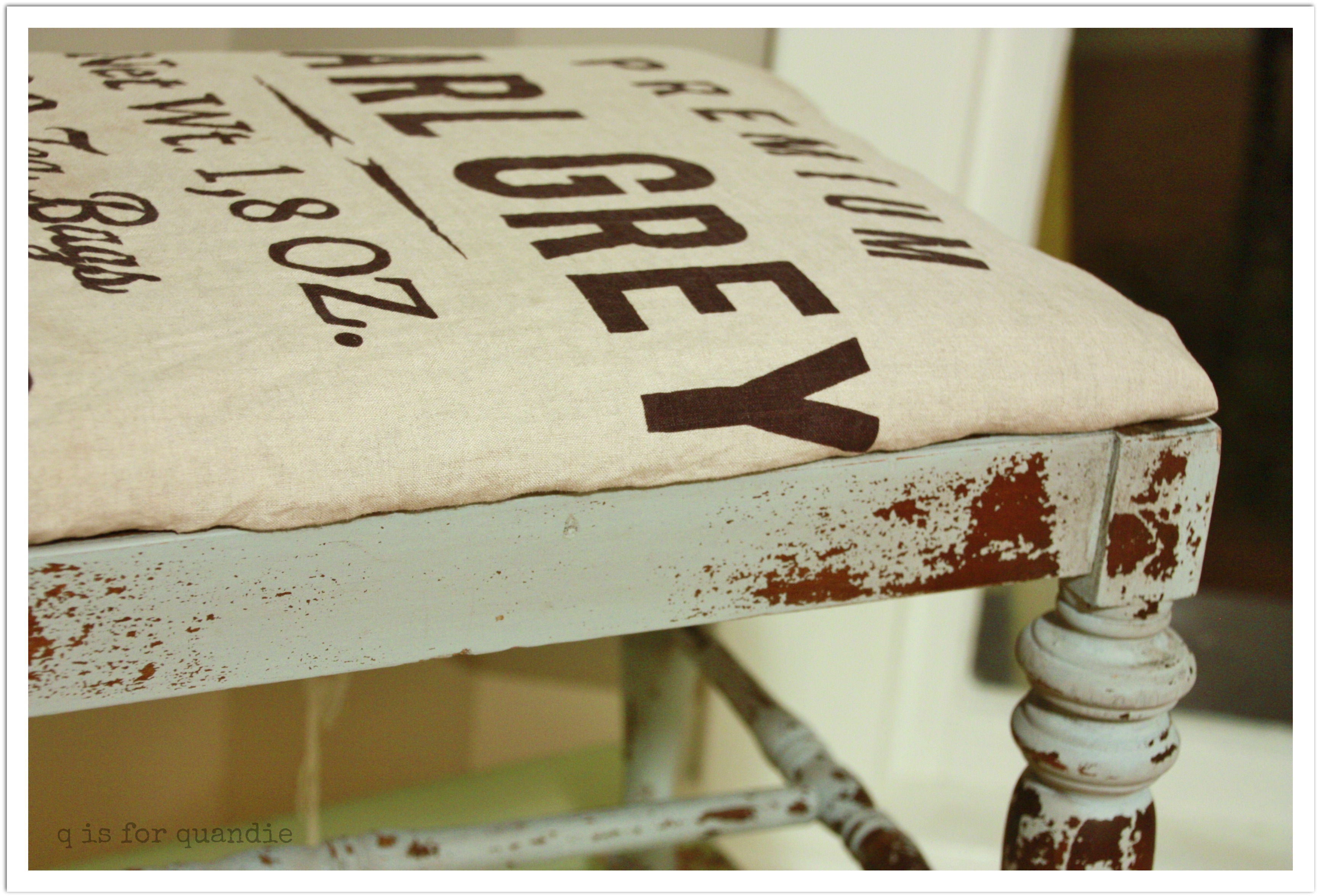
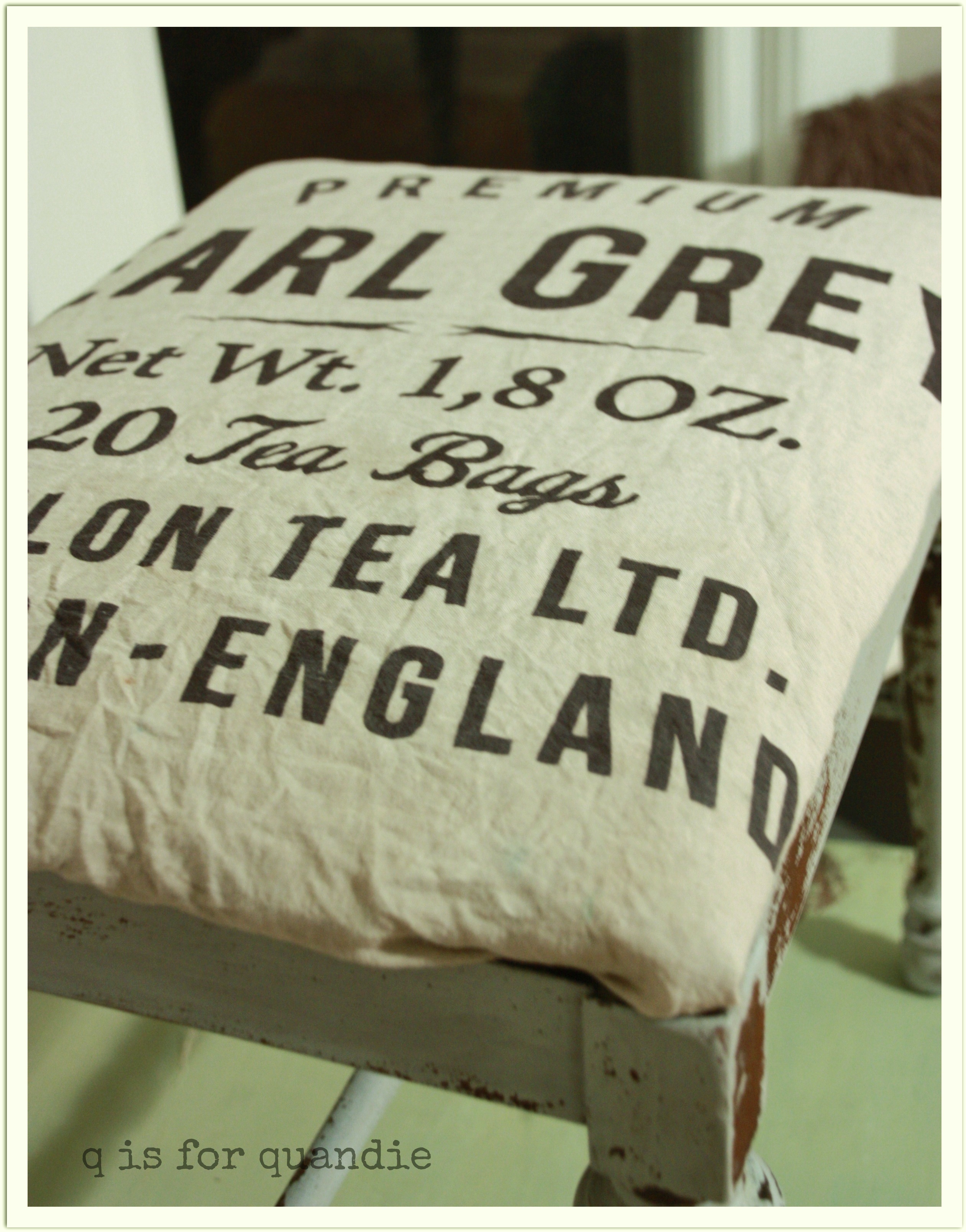
In the end, I decided to put the bench aside and wait for the perfect fabric.  But then, as I was cleaning up the kitchen I came across the tea towel that I bought from H & M.  Hello!  I thought it just might be perfect.

bench option 5

I think it works!  Now I just have to wash it up and staple it on.

bench option 6And I’ll have a fab little bench with a graphic seat.

robin’s egg blue.

For the curvy gams dresser I decided to create my own Miss Mustard Seed paint color by mixing several colors together and I absolutely LOVE how it turned out!  In honor of spring, I am calling it Robin’s Egg Blue.

robins egg postcard

The color is almost an exact match for the aqua flower frogs that I picked up at Junk Bonanza.

robins egg paint

Here is the recipe:

1/4 cup Luckett’s Green

1/2 cup Eulalie’s Sky

2 T Flow Blue

Mix well with equal parts water.

This made more than enough paint for two coats on this dresser.  I also painted a mirror frame and still have a little paint left over.  And in case you are wondering, yes, my paintbrush really looks this bad.

And without any further ado, here is the robin’s egg blue dresser.

robins egg blue 3

I can’t even begin to tell you how much I LOVE this color.  This color is ME.  I wish I had a spot for this dresser, but alas, I do not.  However, I do plan to paint something of my own in this mix.  I have a small wash stand on my front porch that I may paint in this.  Or perhaps even just a small chair or stool.  Definitely something.

As you can see, this dresser has a fair amount of chippy fabulousity.  I love the way it looks like you just hauled it out of granny’s attic.

I changed out the knobs for all glass.  The existing pulls were OK, but I just didn’t think they were right with this color.  I’ll save them for use on another piece down the road.  I finished this dresser with Miss Mustard Seed clear wax, the color was so lovely that I didn’t want to alter it too much with hemp oil or a dark wax.

2014 spring blog5

I really struggle with capturing accurate color in my photos.  Do any of you have this problem?  I know I need to correct the white balance in some of these.robins egg 1

Somehow these pictures don’t seem so bad on my home computer, but then when I look at them on my phone or my work computer, I see that they need work.  I’m trying to work on my photography skills as I go.  Hopefully they will improve with time! robins egg 6

Anyway, in this picture you can see that the top didn’t chip nearly as much as the drawer fronts.  This seems to be an ongoing question with the milk paint, and as most will tell you, oftentimes you just can’t predict the chippy.  I will tell you that I sanded the top and sides of this dresser with a palm sander, and I sanded the drawer fronts by hand.  I didn’t sand the edge around the top at all.  Obviously the areas that were sanded most thoroughly (with the palm sander) had the least amount of chipping.  I generally find this to be true.

Collages

If you are interested in purchasing the robins egg dresser, it is available for $225 , woops, you missed it!  It’s sold!