You may remember that back in August I shared a metal roller skate case that I painted up.

The case was originally black, so I’d simply given it a fresh coat of black to clean it up a bit, and followed that up with one of the German Grain Sack stencils from ellen j goods.
Unfortunately, the case didn’t sell. So I brought it back home from the shop a few weeks ago to try giving it a different look.
I sanded down the stencil, added a fresh coat of black and then followed that up with the I.O.D. Rose Chintz paint inlay. I love the way this inlay looks over black paint, gorgeous.

But I didn’t leave well enough alone. I had this idea that the white Seeds transfer would be perfect over the floral.

Ummmm. Yeah. That didn’t really work out so well.
You know, sometimes you just have to try something to find out whether or not it will work. However, it can be a real bummer when you’ve used up product that wasn’t exactly inexpensive. Hopefully I can save you from that by sharing my fails here on the blog.
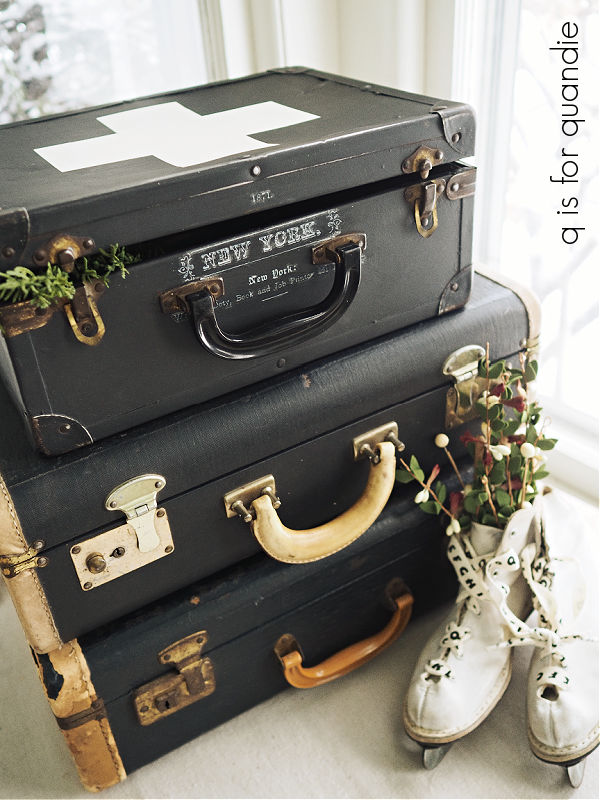
So it was back to the drawing board for idea no. 3. I sanded it all back down again and gave it another base coat of black paint (in this case, Dixie Belle’s Silk paint in Anchor).
You know, one of the problems with a case like this is that you have to decide which way is up. If the case will be sitting upright with the handle on the top, the wording will go one way. But if the case is sitting flat with the handle on the front (like shown above) the wording needs to go in the other direction.
I struggle with the question of which way is up with suitcases (or in this case, a skate case) every time I do one.
I tend to opt for the upright position the most. This is a much easier decision when the suitcase has angled sides since they don’t sit flat if you put them on their side. so it’s unlikely to be displayed that way.

I often do the non-angled versions this way too.

I figure the majority of people are going to display them like that.
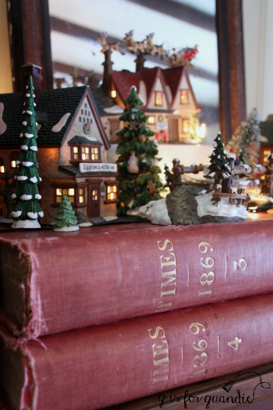
But with the smaller cases, like this roller skate case, you never know. One might want to stack it on top of larger cases instead of sitting it upright.
While considering what I wanted to try for makeover attempt no. 3, I decided to go with something that would look right either way. That meant no wording, or designs that have a distinct top or bottom to them.
The swiss cross seemed like a great solution. It can go either way.

I did leave the bit of writing from the Seeds transfer by the handle though.

I love the idea of stacking this case on top of a couple of other vintage cases.
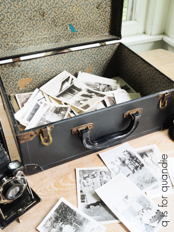
You could store any number of things inside it, including the old photos that I shared the first time around.
But I thought it would be more appropriate to the season to stage it as an ice skate case this time around.
I purchased these skates at the thrift store (or was it a garage sale?) and they came with some sparkly gold laces.

The sparkle wasn’t quite doing it for me though, so I swapped out the gold laces for some alphabet ribbon that was in my stash.

Now they are the perfect companions for my swiss cross case.

Whether or not the case will sell better with this design remains to be seen, but I’m going to give it a shot. If any of you locals are interested, both the case and the ice skates are listed on my ‘available for local sale‘ page.
As for the rest of you, what do you think? Are you a fan of the swiss cross look, or would you have preferred the rose chintz? Leave a comment and let me know.