I don’t normally post on a Sunday, but this morning I wanted to thank you for your support after my post on Friday regarding Tom & Naomi’s fire. Every comment and/or donation was greatly appreciated. The ash has settled and Tom & Naomi are considering their options on how to proceed from here. I’ll be sure to keep you all posted as their plans progress.
Also, I wanted to let you know that Mr. Q’s grandpa Bud passed away early this morning. You might expect us to be a house in mourning, but that isn’t the case. Bud had an amazing long and full life. He was always telling stories about his experiences such as helping his dad run bootleg liquor down from Canada during prohibition. He also told many tales about serving in WWII as an interpreter. Having been around for over 100 years, Bud had seen a lot. Can you imagine having been born at a time when only 35% of homes had a telephone and then living to see that come full circle to cell phones that can be taken with you everywhere eliminating the need for a home phone?
Recently though Bud was basically just patiently waiting to join his wife who passed away two years ago. When someone asked him what he thought she would say when he joined her in heaven, his answer was ‘what took you so long?‘
So rather than being sad, we are celebrating the fact that Bud has gotten his wish to join his wife and that after two years apart they are finally back together again now and can both rest in peace.
The radio station that I regularly listen to used to have listeners call in on Monday mornings with their ‘high’ and their ‘low’ from the weekend. It was amusing to hear what kinds of things people called in with. But it also made you think about life and how it really is all about the highs and the lows, and how often they happen in the same week.
But this week the balance got a little out of whack around here.
High:
Mr. Q’s bff (I’m pretty sure they don’t call each other bff’s, but I can, right?) came to visit from New York to help him celebrate his birthday.
Low:
Mr. Q’s 100 year old grandpa’s health has been steadily declining and this week they officially put him on hospice care. Grandpa Bud has been ready to go for a while now. He hasn’t had much quality of life for the last couple of years. Mr. Q has breakfast and lunch with him every day, which is an awesome thing and I know Bud enjoys seeing him, but nonetheless Bud has made it clear that he is tired and ready to be done with this thing we call life. He says that no one should live to be 100. So although it’s hard to see Bud declining, it is not unexpected and it will ultimately be a blessing when Bud goes.
And another low:
And then while my mother-in-law was in town to attend a meeting about her dad going on hospice care, her husband’s incredibly amazing workshop burned down.
When Tom & Naomi moved back to this area from New Orleans several years ago they bought a fixer upper property. Their plan was to fix it up over time doing all of the work themselves. They live on a very modest fixed income, so they have to space the work out over time as they can afford the supplies. It’s absolutely nothing like an episode of Fixer Upper where the work is done by a team of people in the space of a month or two.
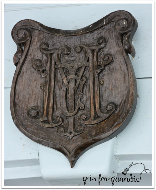
Their initial priority was to build a workshop for Tom to work in. He is an amazing woodworker. I showed you the trim he made for the front of their house …
But before he got to that trim, Tom spent several years getting his workshop up and running. He’s been continuing to work on it while also working on the house. The upstairs of the workshop was nearing completion. Naomi had just called me last week to ask if I would help them stencil the ceiling (which I thought would make an awesome future blog post).
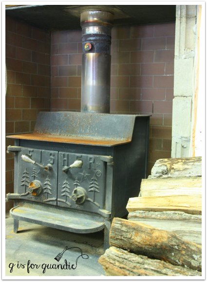
They heated the workshop with a giant wood burning stove.
They thought it was safe.
They were wrong.
Although there is no official word on the cause of the fire, it’s likely that it was a spark from the wood burning stove.
Not only did Tom lose his workshop, but he lost everything in it.
His tools and supplies, his books, his photos of past projects.
What used to look like this …
Now looks this …
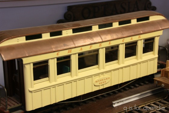
But worse yet, he also lost some of his most precious things like this amazing miniature train chapel car that he built many years ago for Naomi.
Which now looks like this …
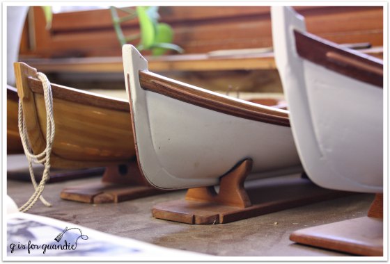
Remember the tiny boats that he carved …
Gone.
Yes, these are just things. And no one was hurt, which is absolutely the most important thing here. We haven’t lost sight of that and we feel totally fortunate that this wasn’t so much worse.
But I know many of you are fellow artisans and can probably understand the loss that we are all feeling, most especially Tom. Many of the pieces in that workshop were ones that he put his heart and soul into crafting by hand.
So today I am doing something I’ve never done before (and hopefully won’t ever have to again). I’m asking you to consider showing your support for my blog with something more than just a comment. Even if all you have to give is $10 or $20, if even just 100 of you can give a small amount … well, you can do the math. It will add up.
It will also go a long way towards helping Tom & Naomi rebuild. Although they are insured, the insurance is never going to pay out enough to replace all of the equipment that was in the shop, and certainly never enough to replace the handmade details that made the workshop what it was.
So thank you from the bottom of my heart if you are able to help. And even if you can’t help with a donation, just knowing that people care would be a big boost to Tom & Naomi’s morale, so please leave a comment that I can share with them.
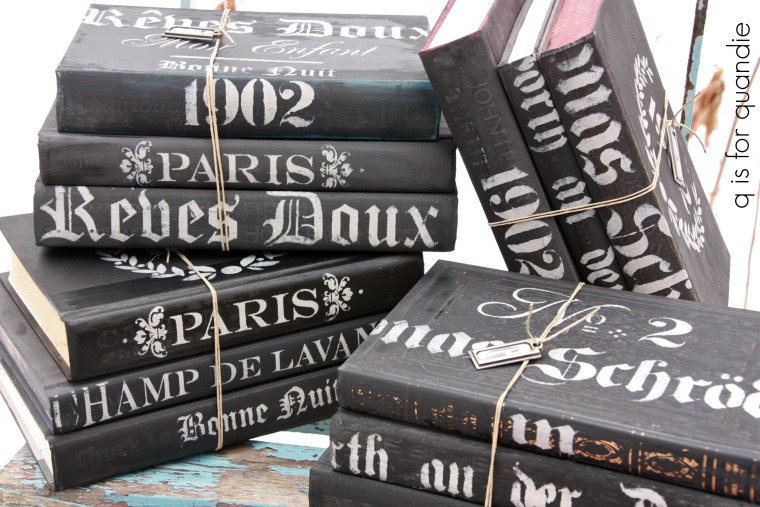
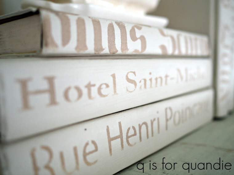
It’s been a while since I’ve painted some books. Unless you’ve followed me from the beginning, or gone back and read to the beginning, you probably haven’t seen my painted books.
The first batch I painted were all done in Miss Mustard Seed milk paint in Typewriter, then stenciled in a pale grey acrylic craft paint and finished with some hemp oil.
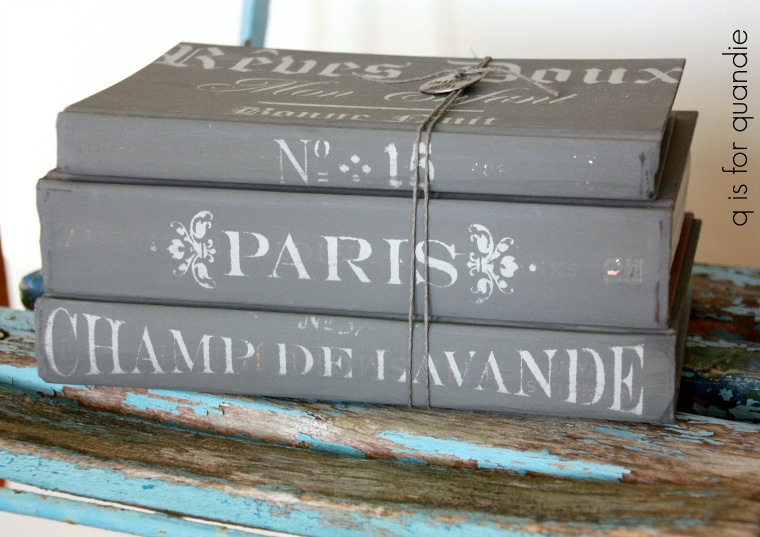
Then I branched out and added some grey books (painted in Miss Mustard Seed’s Trophy)…
and some pale minty green books.
For a while now I’ve been thinking it would be nice to have some white painted books.
So I pulled out some old hardcover books (find them at your local thrift store for as little as .15 ea when they are having a sale) and started by painting the covers with Dixie Belle’s Drop Cloth and sealing them with The Real Milk Paint Co’s Dead Flat.
Then I pulled out a bunch of my stencils.
Don’t worry about the stencils being larger than the books. I think it just adds to the look to have the design running over the edges.
This is a great way to get a bunch of decorative books to fill up some shelves on a budget. Displaying things en masse always has more impact.
It seems that the Drop Cloth goes particularly nicely with some old ironstone.
The painted books also make great props for furniture photo shoots.
If nothing else, it’s just a fun project for a cold winter day!
Unlike some lucky furniture painters, I don’t have a pole barn full of furniture waiting to be painted. Although on occasion I’ve been known to have as many as 10 or so pieces out in the carriage house waiting for their moment in the sun, for the most part I don’t have room to store a lot of inventory.
I try to stock up a bit in the fall because typically by now there are slim pickings on Craigslist. In February people in Minnesota are hibernating, they aren’t cleaning out the attic or getting ready to move. Plus in the winter I’m obviously not finding pieces at garage sales either.
But I’ve pretty much worked through most of what I had stocked up and now I’m scouring Craigslist on a regular basis looking for candidates for a makeover and not finding a whole lot. The occasional piece that attracts my eye ends up either too far away, too expensive, or else it has already sold to someone else but the ad wasn’t deleted yet.
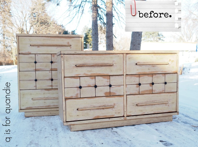
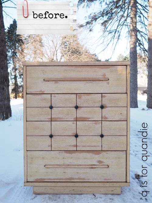
When I initially came across the ad for this pair of mid-century dressers I gave them a pass. I didn’t hate them, but I didn’t love them either. I do enjoy working on the occasional mid-century piece, but I usually prefer older stuff.
But week after week I kept seeing this ad. I suspect they weren’t selling because the seller wasn’t ‘working his ad’ very aggressively. By that I mean that he wasn’t renewing the ad periodically to keep it towards the top of the list. Over a month had gone by since the ad was originally posted and he’d never renewed it once.
Or perhaps the problem was that no one could see the potential in these pieces.
The price was certainly right, and after seeing the ad pass by a couple of times I stopped to take a closer look. You know what I saw? I saw two pieces where someone else had already done half of the work for me. They’d already been sanded and were pretty much ready to paint (and when Mr. Q and I picked them up the seller told me that he’d also already replaced all of the runners inside). So I realized that these two pieces could be a pretty quick turnaround.
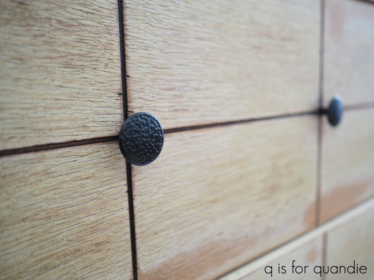
Unfortunately, in addition to the sanding and repairing, the seller had also replaced the original knobs with these awful cheap knobs from the hardware store that are all wrong and have zero mid-century style.
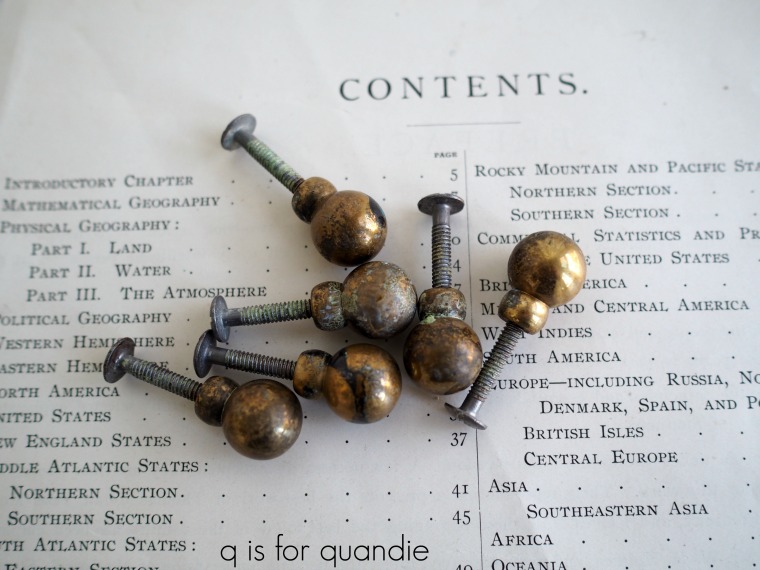
But imagine my glee when I opened one of the drawers and found a Ziploc baggie filled with the original knobs inside. Jackpot!
If you are thinking they look a bit grungy in that photo, just sit tight. You’ll see what I did to spruce them up in a few minutes.
As we got talking with him, the seller happened to mention that he’d also made a couple of … well … let’s call them adjustments to the style of the pieces. He said that originally the drawers with the long handles has been inset. He thought that looked weird, so he added stops inside the dresser to keep the drawers from pushing all the way back. Plus he moved the shims on either side of those drawers forward to bring all of the drawers flush with the front.
Now that you are aware of this, go back and look at the ‘before’ picture again. Yep, now your eye immediately goes to those shims and you realize they look kind of odd, right?
I realized that I had to un-do those changes before I could start painting. So much for the quick turn around. But that being said, thank goodness the seller mentioned this. I’m honestly not sure that I would have figured this out on my own. I know I would have been puzzled about those shims, but would I have realized that two of the four drawers were meant to be inset? Probably not.
I tried to remove the shims intact so that I could just simply move them back to their original location, but I ended up breaking two of them. That’s when I called my handyman Ken for a consultation. He came over and helped me get the rest of the shims off without breaking them (they were glued and stapled with heavy duty staples), and he took the broken ones home and cut replacements for me. What would I do without Ken?
While Ken was working on that I had to take care of one last problem before I could start painting.
It wasn’t until I was wiping the drawers down to paint them that I noticed there was a hole on either side of the long wooden drawer pulls. I’m guessing that there used to be a metal cap of sorts on either end of that pull. I wish I’d found those inside a drawer in a Ziploc baggie, but no such luck. So I needed to fill those holes. I used my usual trick of placing a piece of tape on the back side of the hole, but then this time I filled them using Dixie Belle’s brown Mud. It cracks me up that the label says ‘straight from the swamps of Dixie’.
Fortunately it does not smell like it’s straight from the swamps of Dixie 😉
I used a putty knife to press the mud into the holes and then I let it dry. Once the first pass was dry I went over the holes a second time with the mud to make sure they were level with the drawer front. Once dry again, I sanded them smooth and cleaned the drawer fronts with a damp rag.
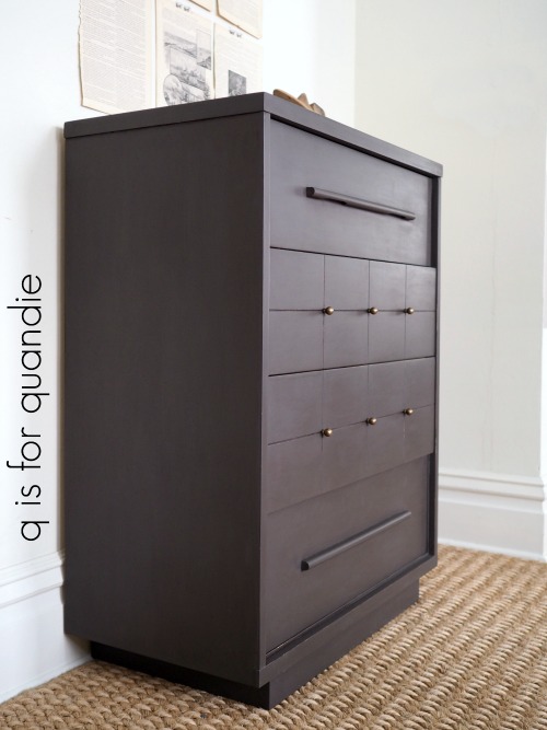
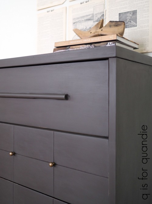
Now came the fun part, the paint! I always struggle with deciding between choosing a more neutral color that I think will sell more easily and choosing a more vibrant color that will be fun to paint with but may not appeal to as many buyers. So I made a deal with myself to paint one piece in a neutral and one in a brighter color. Today I’m starting with the taller piece, and it’s going more neutral.
Dixie Belle’s Gravel Road, to be precise, which is a warm, dark grey. Once again I used Dixie Belle’s recommended method of painting. I dipped my brush in water periodically to thin down the paint. The paint goes on so smoothly using this technique. It does also thin it down a fair bit, so two coats were required. Also, in case you are wondering I used about half of the 16 oz jar for this dresser, so less than $10 worth of paint.
I use Dixie Belle’s Best Dang Wax! in brown as a top coat. I like how the brown wax warms up and deepens the color a bit.
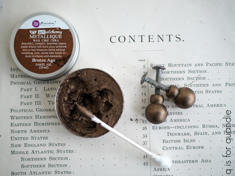
Before putting those original brass knobs back on, I washed them with soap and warm water and then once dry I added some Prima Marketing Metallique wax. I debated using the Old Silver and although I think that would have looked gorgeous, I went with the warmer tone of the Bronze Age instead.
I like to apply it with a q-tip (although some people just use a fingertip). The trick is to apply even coverage and then leave the knobs alone to ‘dry’ for a couple of hours. Once dry you can buff lightly to add some shine.
They look amazing on the dresser. It was so lucky that I was able to put the original knobs back on this piece.
I have to admit that I did not have high expectations for this dresser. I really expected to improve it somewhat with a paint job and call it good.
But in the end, after salvaging a bit of the original mid-century modern style, I am amazed by the transformation.
By now I’m sure most of you have seen the 2018 Pantone color of the year.
Purple.
A choice that seems to have come completely from out of the blue.
As a Minnesotan, I should probably be embracing the purple. Purple pride, Purple Rain, purple is everywhere here (just for fun, check out this flash mob video taken at this year’s ice castle and you’ll see what I mean!)
But no, I’m just not a fan of purple. You aren’t likely to see me painting purple furniture anytime soon. Although as I like to say, never say never. I did use purple on a dresser I painted for my niece a while back and I did once paint a desk using Miss Mustard Seed’s Dried Lavender, so you never know.
However, when I want a little more color, for the most part I’ll stick with the blues.
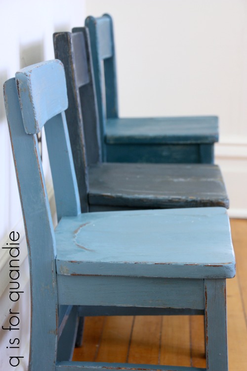
I have yet to meet a shade of blue that I didn’t like. The trio of chairs below are painted, from front to back, in Miss Mustard Seed milk paint in French Enamel, Artissimo and Flow Blue (I’ve included a link to the original post for all of the following pieces, just click on the green underlined wording to go back and see the full details on each one).
Little Billy Goat makes a beautiful shade of dark blue called Prize Winner.
I also used Prize Winner on the pirate desk (click on that link to find out why I called it the pirate desk, but here’s a hint, it has a peg leg).
I haven’t used it in a while, but I always liked Annie Sloan’s Aubusson.
Sometimes I just create my own shade of blue. This next dresser was painted in a mix of Miss Mustard Seed’s French Enamel, Luckett’s Green and Eulalie’s Sky with a touch of Ironstone thrown in to lighten it all up.
Miss Mustard Seed’s Eulalie’s Sky, Shutter Grey and Grainsack combined to make the gorgeous pale grey blue shade on the dresser below.
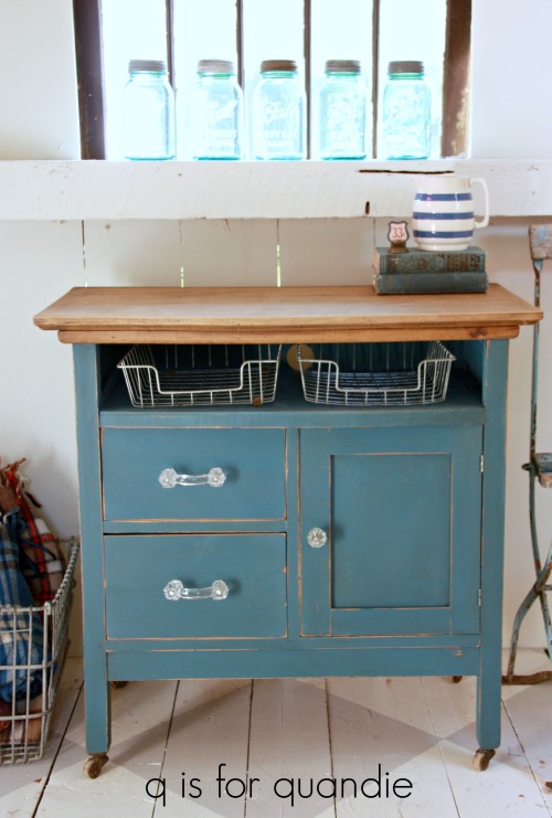
This washstand is also painted in a mix of Miss Mustard Seed colors.
Mixing Fusion paints to come up with a unique shade of blue is fun too. My sister created a color we decided to call Lake Superior Blue, which is a mix of Fusion’s Homestead Blue and Liberty Blue.
And now I’m looking forward to painting something in Dixie Belle’s Yankee Blue.
I have just the piece in mind, a lovely buffet that I brought home a few weeks ago. It needs a little work first though, and my handyman Ken doesn’t work in the cold. So it could be a while before I get to it.
But how about you? Do you have a favorite shade of blue? Please share in a comment.
I don’t have a pretty, frilly pink or red filled post for you today. Valentine’s Day just isn’t a holiday that I decorate for. I’m pretty much heartless, at least when it comes to decor.
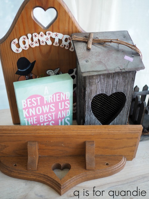
A while back my thrifting friend Meggan and I were at our local favorite thrift store (Arc Value Village on White Bear Ave, for those of you locals who might be curious) and I was laughing over the plethora of items with hearts on them. I pointed them out to Meggan, and we both agreed that hearts are pretty much out these days from a home decor point of view (thus they end up in thrift stores by the dozens). I mentioned to Meggan that I have a couple of tricks for dealing with them though and she suggested that would be a great idea for a blog post. So I filled my cart with some hearts …
The easiest way to get rid of a heart is to just simply cover it up. That’s what I did with the heart cut out on this little wall shelf.
But first I transformed the shelf with Dixie Belle’s Patina Collection. You may remember that they sent me some of their Iron paint and Patina Spray to play around with a couple of weeks ago. At the time I mentioned that I wanted to try this stuff on wood to see how it looked, so this shelf was the perfect candidate for a little experimentation.
Since the shelf is made of wood, you don’t need to use the special Prime Start primer (you just need that if you are painting over metal). Instead you can just start with a layer of any color paint. I used Dixie Belle’s Gravel Road since I happened to have it close by, but the color really doesn’t matter since you’ll be covering it up entirely. Once that dried I added a coat of the Iron paint and allowed that to dry. Then I added a second coat of the Iron paint and while it was still wet, I sprayed it with the Patina spray.
Next I just dug through my stash of random bits and pieces and found this back plate to a drawer pull. It was already rusting on its own, plus it was just the right size, so I thought it was the perfect cover up.
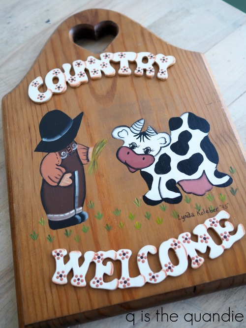
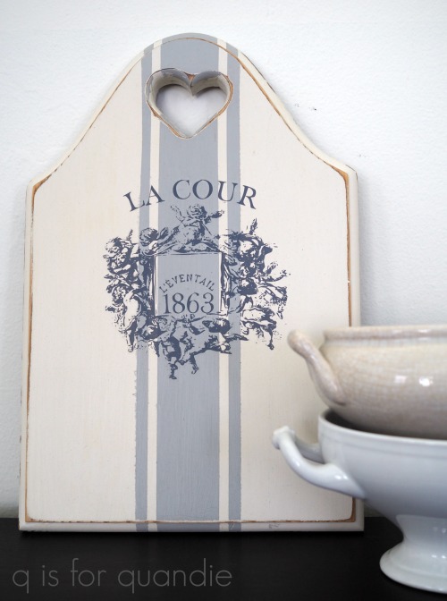
Both Meggan and I simply couldn’t resist this next item.
It’s got both a heart and a cow … a classic.
And actually, in the end I didn’t get rid of the heart cut out, just the cow with her heart shaped face and the country welcome.
I removed the glued on words, sanded the entire thing down and then painted it in Dixie Belle’s Drop Cloth. I added the grain sack stripe in Dixie Belle’s Driftwood.
Then I added an Iron Orchid Designs rub-on from one of the French Pots collections.
A vast improvement, even if it isn’t totally heartless.
Unfortunately I ran out of steam (and straight into that cold that I’m still getting over) before I could get to the rest of those heartfelt pieces from the thrift store. I may have to hang onto them until next year.
But to prove that perhaps I’m not entirely heartless after all, I couldn’t leave the thrift store without this sweet Dinner for Two cookbook.
It has some great illustrations …
A candlelit dinner for two served on a gondola in Venice would be my idea of the perfect Valentine’s celebration.
So sweet. This is much closer to my idea of a little Valentine decor.
How about you? Valentine’s Day decorating, yeah or nay?
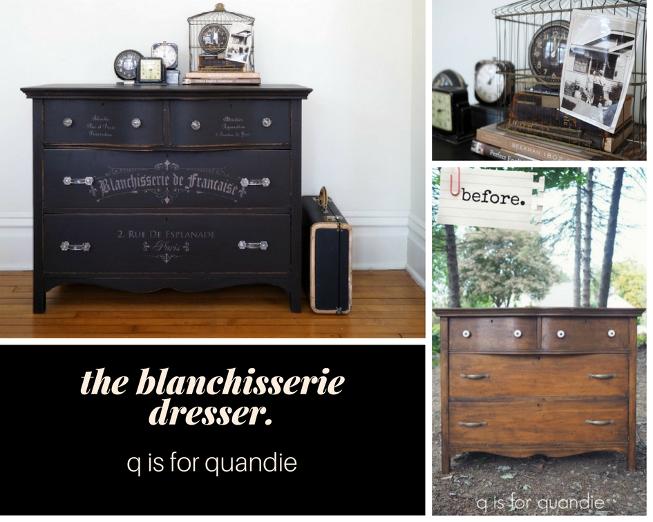
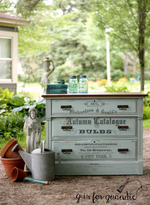
As you can probably tell by the ‘before’ photo below, I purchased this dresser back at the end of summer when I was trying to stock up some projects for the winter.
I think we can all agree that the previous owner had made some rather unfortunate hardware decisions, but otherwise this piece didn’t look all that bad at first.
I wanted to strip the top and then wax it with a dark wax, but after stripping the top of the dresser it looked like this.
I’ve run into these black streaks before. I’m not 100% sure, but after doing some quick google research I think they might be iron oxide stains (if any of you have any insight, please share in a comment). Iron oxide stains can occur when the tannins in the wood interact with moisture and turn black over time. There are methods for removing these stains, but I didn’t think it was worth it to spend that much time and effort on this dresser. The wood just wasn’t that pretty. So, in the end I opted to just paint the whole thing.
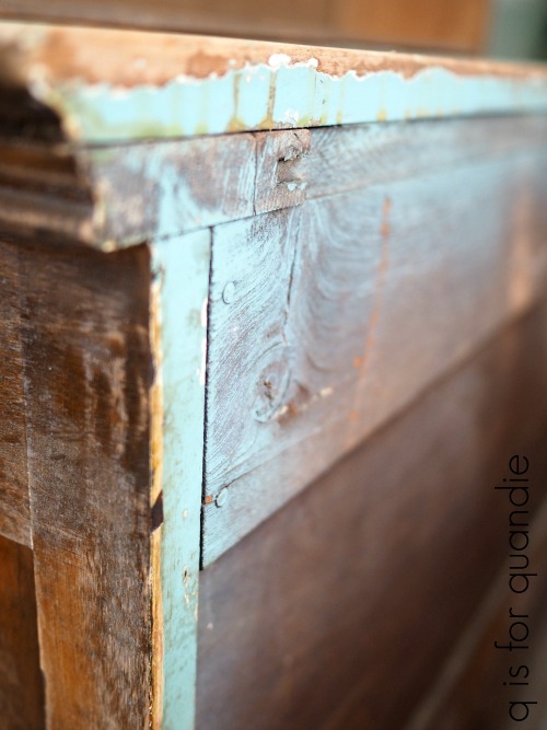
I also found some clues to tell me this dresser was probably originally intended to be painted. In fact, it had been painted at least twice and possibly three times. Clue no. 1 is on the back side.
Isn’t that a gorgeous aqua? I know I would have loved that color!
Clue no. 2 was inside the openings for the drawers …
So it was probably also pink at one time, and maybe even white.
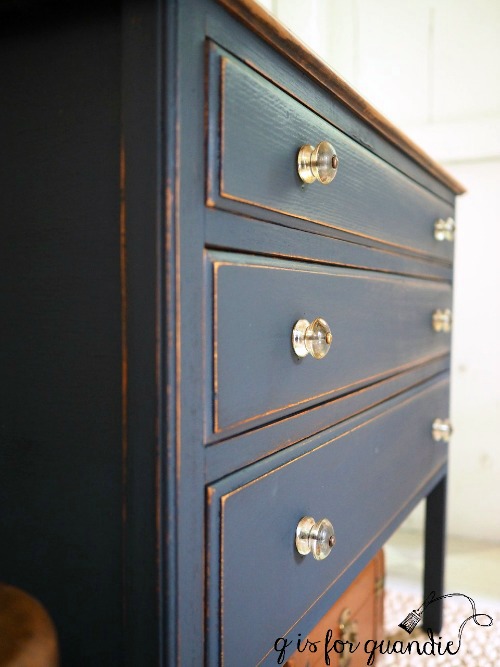
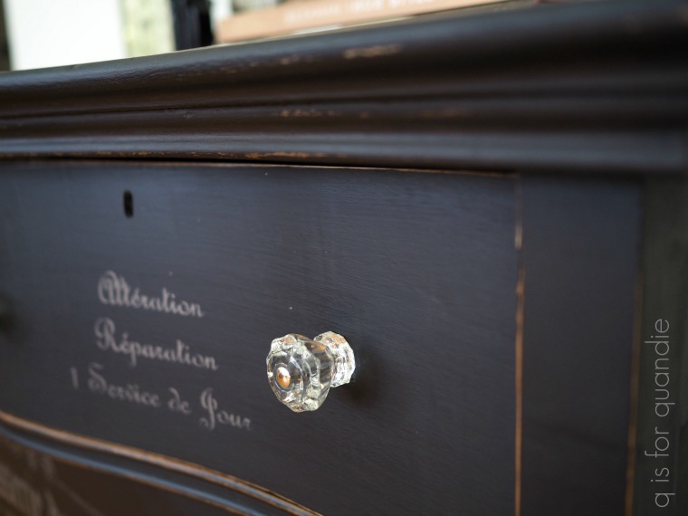
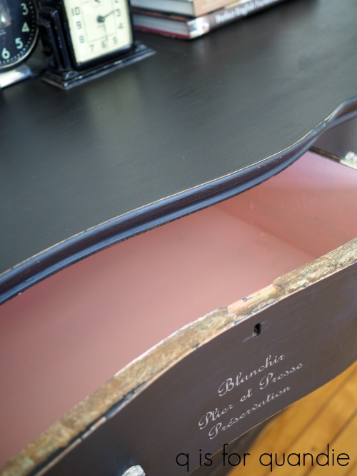
Whoever bought the dresser, then stripped off all of those colors and refinished it, was probably pretty disappointed in the lackluster results. But I was happy to take it back to its roots. Except I didn’t choose aqua, pink or white. At least not on the outside. Instead I chose black. More of Dixie Belle’sCaviar to be precise.
Once the paint was dry I added bits and pieces of my french laundry stencil to the drawer fronts. Once again, I’d love to share a source for this stencil but the company I purchased it from via Etsy seems to no longer be in business.
To keep the stencil subtle I used a warm, dark grey acrylic craft paint rather than a white.
Once the stencil paint was dry, I sanded lightly by hand over the entire dresser with a fine grit paper and then waxed it using Dixie Belle’s Best Dang Wax! in brown. I think the amount of sheen I got from this wax is just about perfect.
I ended up using clear glass knobs and drawer pulls on this dresser because I happened to have them on hand. My friend Sue gave them to me and I had just the right amount for this dresser, plus they were just the right size for the existing holes. It seemed like it was meant to be.
As a nod to the remnants of pink paint that I found inside the dresser, I painted the interiors of the drawers in Fusion’s English Rose.
I like to use Fusion paint in spots like this because it doesn’t need a topcoat, yet is still fully washable once cured. A great quality for the insides of drawers. It only took me about 20 minutes for each coat of paint (I used two) and that fabulous pop of pink when you open the drawer is a lot of bang for your buck, time wise. I generally only resort to painting the inside of drawers when they are really stained up and scary looking. These drawers had a few ink stains that needed to be covered up. In order to prevent the ink stains from bleeding through my paint I tried out the new clear sealer that Dixie Belle provided me with last month, B.O.S.S.
B.O.S.S. stands for Blocks Odors, Stains, Stops bleed-thru.
Had I wanted to block odors, or stop a reddish stain from bleeding thru I would have painted the B.O.S.S. over the entire surface. However in my case I just had a couple of stain spots that needed blocking, so I just painted two quick coats of B.O.S.S. over the stains themselves. It worked perfectly.
You might be wondering why I didn’t paint that edge of the drawer. That is because the drawer fits fairly tightly as it is. If I added paint, it would not open and close freely. Always beware of adding too much paint to the edges of your drawers when they are a tight fit. Nobody wants sticky drawers!
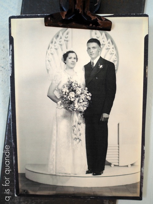
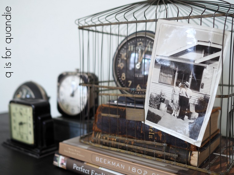
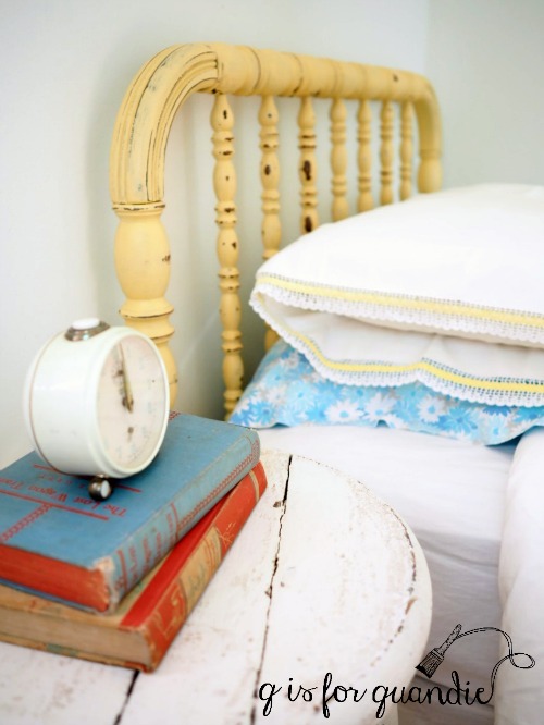
I staged the dresser with some of my favorites from my non-collection of vintage alarm clocks, plus one of my favorite old photos.
That photo was taken on the stoop of my grandparent’s home in South Minneapolis, but no one in the family seems to know who the people are. They look like such a fun couple though, don’t they? I imagine that it was a sunny spring day and they were on their way to a picnic at Minnehaha Falls when the photo was taken.
This was back in the day when ladies wore dresses and men wore ties on picnics in the park.
They probably had fabulous painted dressers with glass knobs too, but maybe not with french stencils on them. Their loss, right?
I gotta tell you guys, I’m kind of in love with this Dixie Belle Caviar. Lucky they sent me the big jar, because I’m going to be using a lot of this color.
The blanchisserie dresser is available while it lasts, be sure to check my ‘available for local sale’ page for more details!
The cold that I’m still fighting off has completely zapped my energy, so since I haven’t had the gumption to finish a piece of furniture I thought I would share an update on the Olympus O-M-ED-10 camera I purchased over a year ago.
I realized recently that I tend to grab my Olympus camera (which is a mirrorless camera) more often than my old Canon Rebel (which is a DSLR) these days. I have to say, it took me almost a year to get to the point where I am more comfortable with the Olympus. That’s mostly because I’m a slow learner when it comes to the tech-y stuff. I just don’t have the patience to learn something new, I’d rather jump in at the deep end and sink or swim, which usually tends to involve a bit of sinking.
I purchased my Olympus back in September 2016. You can read a post about that purchase here if you want more details on why I chose to purchase a mirrorless camera. And then back in May 2017, just before my cruise to Norway & Scotland, I purchased a 17mm prime lens for it, and I posted another update on the camera here.
I promised to keep you guys updated on how the new camera worked out for me and now that I’ve had it for over a year I feel like I’m in a good position to report back on it.
I generally use my camera for two things, travel photos and blog photos, so I thought I’d address both of those needs separately.
Travel Photos.
I took both of my cameras on that cruise last May, but I definitely used the Olympus far more than the Canon.
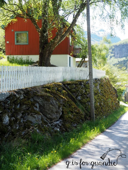
Flam, Norway
The main reason for that was size. The Canon is much bigger and heavier than the Olympus. I just didn’t want to carry the Canon around with me all day. The only time I took the Canon off the ship was the day we hired a private guide with a car, so we weren’t on foot all day plus I could leave the camera in the car if I wanted to.
Dunrobin Castle, Scotland
I also used the Canon while taking photos from our balcony. I have a decent zoom lens for it, so it was fun to play around with that from the comfort of our room. I definitely got some shots with that zoom lens that I couldn’t have gotten with the Olympus (unless I purchase a zoom lens for it).
sailing away from Bergen, Norway
However, when were off the ship touring around on foot, I only carried the Olympus with me.
It worked beautifully in low light situations.
The Beamish
And I got some beautiful landscape shots with it.
Isle of Skye, Scotland
Before our next trip I plan to find a good zoom lens for the Olympus and not even bother with packing the Canon.
Blog Photos.
As I mentioned at the start of this post, I find myself grabbing the Olympus for blog photos most of the time these days too. I can’t blame that on size and weight, since I don’t have to lug the camera far to take my furniture photos.
One of the main reasons is the 17mm prime lens that I use with it. For those of you who aren’t into tech-y details you can skip this next bit, but for those of you who are interested, a 17mm prime lens on a mirrorless camera (like my Olympus) is approximately equivalent to using a 35mm prime lens on a DSLR camera (like my Canon). There is some sort of mathematical reason for that, but let’s not kid ourselves, who really understands that stuff? And who really cares?
The important bit is what that means. With a prime lens you can’t zoom in and out. It has a fixed focal length. That means to ‘zoom in’ you have to literally walk closer to your subject, and to ‘zoom out’ you have to walk away from your subject. You may be wondering why anyone would want a prime lens at this point. Well, it’s because you can get a good, fast prime lens for less money than a good, fast zoom lens … and speed translates to crisper photos, especially in less than optimal lighting conditions. So when I’m taking furniture photos in winter, I get better results with a prime lens.
Currently I have a 50mm prime lens for my Canon. It works great for furniture photos out in my driveway when I can get a good 20’ away from my subject.
But it doesn’t work so great inside my house where I just can’t get far enough away from a piece of furniture to fit it into the frame using that 50 mm. I can only use it to take close up photos indoors.
The 17 mm prime lens on the Olympus, on the other hand, is just right for indoor photo shoots. I only need to get about 6’ away from the piece of furniture to get a full shot of it.
I should point out here that if I had a 35mm prime lens for my Canon DSLR I could easily use that for indoor furniture photo shoots too, I just don’t happen to have one.
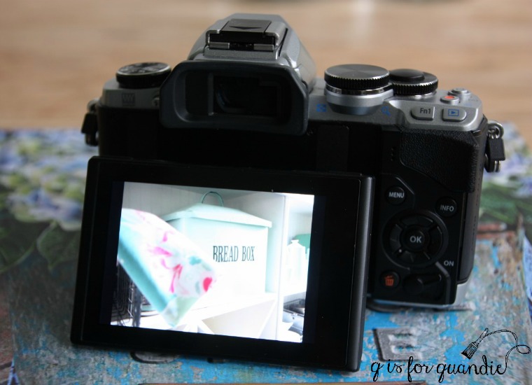
The 2nd reason I tend to grab the Olympus these days is that feature I mentioned the last time I posted about this camera. The touch screen focus. Here’s how that works, the LCD screen displays the image you’re about to take and to choose the spot where you want the camera to focus you just touch the screen there. The camera focuses and takes the shot with just one touch, no need to depress the shutter release button.
I use this feature ALL. THE. TIME. I can’t emphasize that enough. It’s how I get awesome crisp photos of the hardware on my furniture even when the hardware isn’t centered in the frame, like this …
I can accomplish that with my Canon also, but it take a few more steps and it’s not as precise.
Lastly, I have found that the automatic white balance setting on my Olympus works better than the same setting on the Canon. White balance is something I have an ongoing struggle with. Since a big part of my blog involves showing specific paint colors and how they look on furniture with different top coats, I want the colors in my photos to look as real as possible. Honestly, sometimes I still don’t manage to pull that off, but I do work at it. Seriously, just how many different shades of white are there in this next photo? And which one is ‘true’ white?
Of course, you can adjust your white balance with photo editing software after the fact, but it’s so much easier if you are starting out with a photo that was captured with good white balance. If you are a fellow furniture painter or blogger, I hope that you are also paying attention to white balance in your photos. Even if you’re taking photos with a smart phone you should have some options for setting your white balance so be sure to check that out.
One instance where I do still prefer my Canon Rebel is when I want to get a photo like this next one.
For some reason I still find it easier to use the zoom lens on my Canon to create photos with a shallow depth of field (where the background is blurred out like the example above). If you want to learn more about how to take photos with a shallow depth of field, check out this article I found on the subject. I’m sure that I can accomplish this with the Olympus, but that is something I need to work on. That sounds like a good goal for 2018, doesn’t it?
If you’ve stuck with me to the end of this post I hope you learned something new about cameras, lenses, white balance or depth of field. I plan to be back next week with a gorgeous dresser makeover (photographed indoors with my Olympus mirrorless camera and 17mm prime lens), so be sure to stay tuned.
Hello! I’ve been down for the count with a cold since last Friday, so I don’t have anything earth shattering to share on the blog today. Instead I pulled together a post on this quick project I worked on a while back.
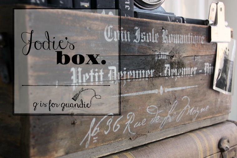
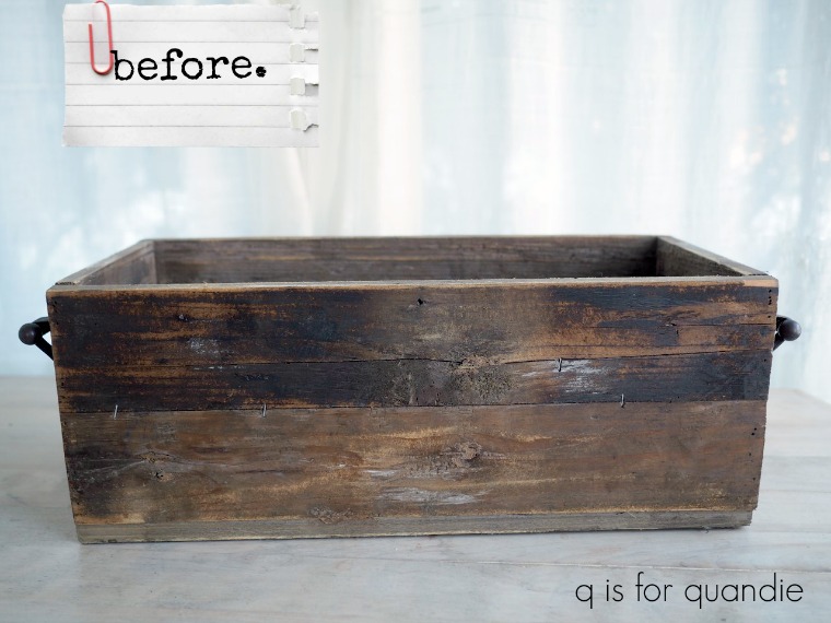
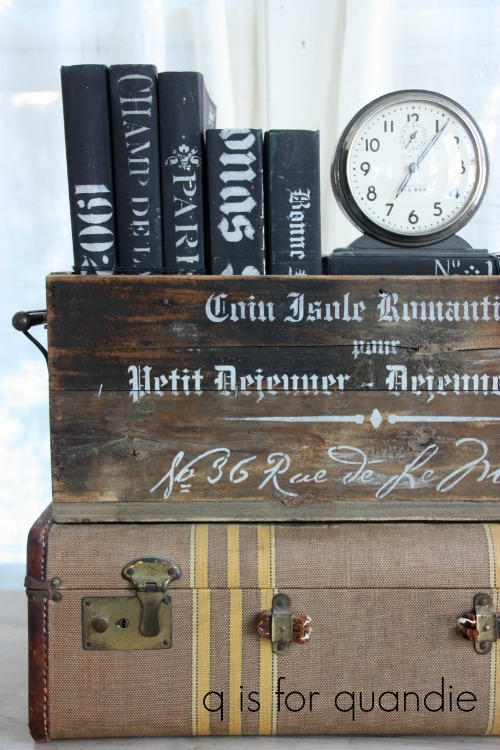
You probably don’t recognize this box, but it has been shared here on q is for quandie once before.
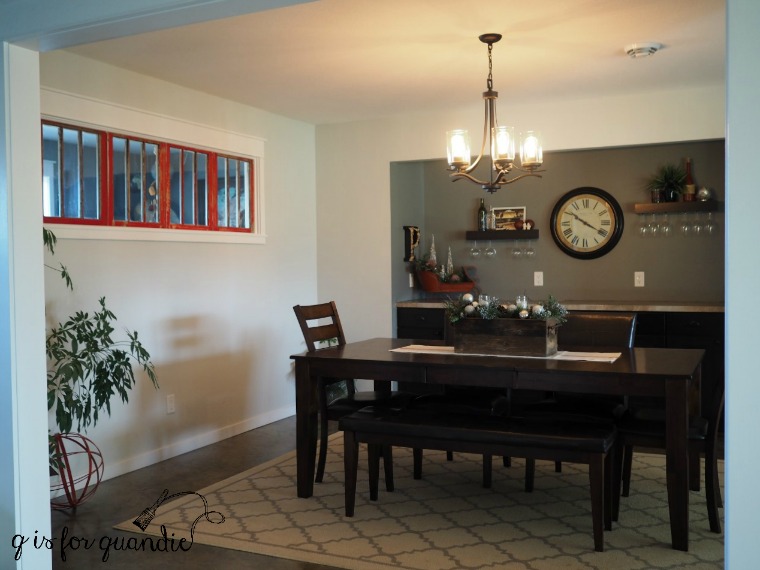
It belongs to my friend Jodie, and the box made it into the photo of Jodie’s dining room back in December when I shared a tour of her home. There it is on her dining room table …
Recently Jodie decided the box needed just a little more oomph, so she asked me if I would stencil it for her.
Of course I agreed. Stenciling is just so quick and easy, and really cost effective once you already have the stencils (and I have quite a few).
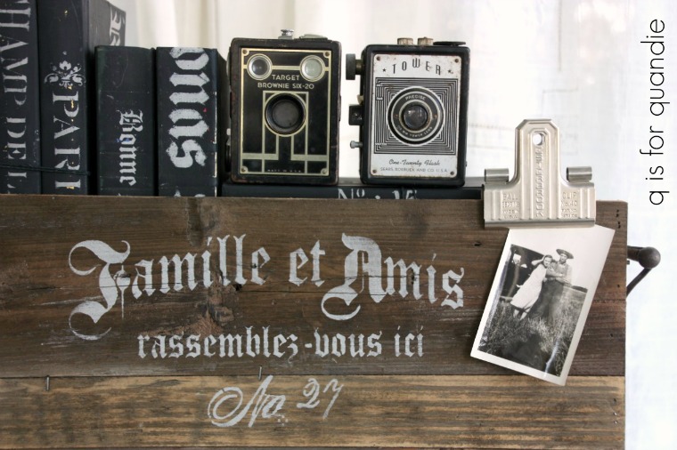
Jodie was pretty flexible and said I could use whatever stencils I thought would look good, so I went with some french stencils that seemed appropriate for a dining room. I used a different one on each side.
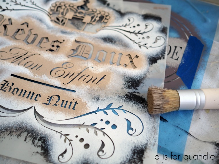
By the way, both of these are just portions of a larger stencils. I just used sections that would fit and looked good on the box. I purchased both of these stencils via Etsy which is a great place to find them. You might recognize the first one I showed, it’s the same stencil I used on the Windsor chairs last Friday.
Jodie asked me to use white paint for the stencils, but I suggesting going with a pale grey instead. I think a crisp white would have been too stark and would not have worked with the rustic, aged look of the wood. The pale grey (this is Martha Stewart Multi-Surface acrylic craft paint in a color called Wet Cement) reads as white next to the wood.
How’s that for a quick and easy update?
Hopefully I’ll get my energy levels back up to normal soon and be able to share something a little more exciting with you. Until then, be sure to stay tuned!
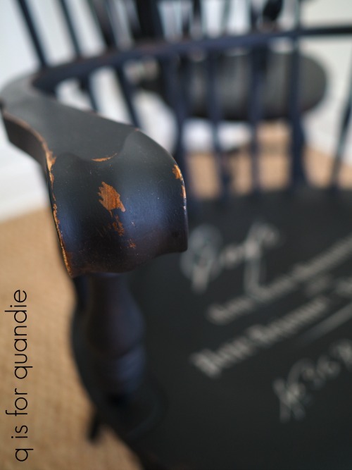
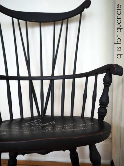
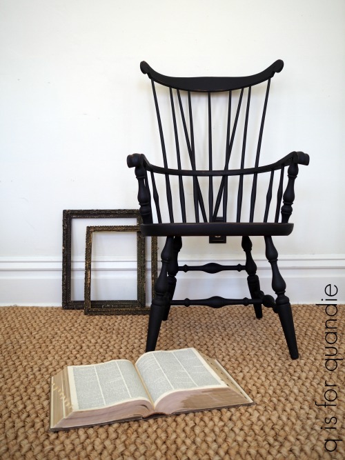
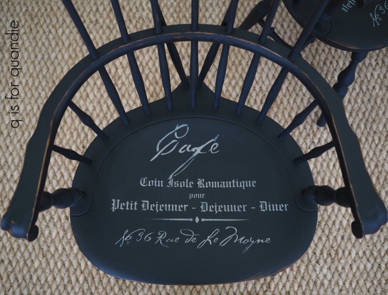
You might think I’m about to talk about England’s royal family, but no. I’m talking about the chair kind of Windsors, not the royal kind of Windsors.
I picked up these Windsor chairs at one of the neighborhood garage sales last summer .
Structurally they are in great shape, they just have a bit of an outdated finish on them. As soon as I saw them, I pictured them painted black. Black is a classic color for a Windsor. So when Dixie Belle sent me some of their chalk style paint in a color called Caviar I dug these chairs out of the carriage house to give them a makeover.
I did not sand the chairs before painting them, I just gave them a good cleaning with some TSP Substitute and started painting. I used the same damp brush technique that I mentioned in my post on Monday, simply dipping my brush in a cup of water occasionally while painting. It took two coats to fully cover mainly because the paint thins out using this technique, but it also goes on ultra smooth. So for those of you who prefer to see a brush-stroke free finish, this is definitely the way to go.
Once dry I wet distressed the edges of the chairs using a damp rag and then used a 320 grit sandpaper on the seats, flat arms and flat top at the back.
I did not sand any of the spindles because that would likely have pushed me over the edge. Painting them was putzy enough, just look at all of those spindles!
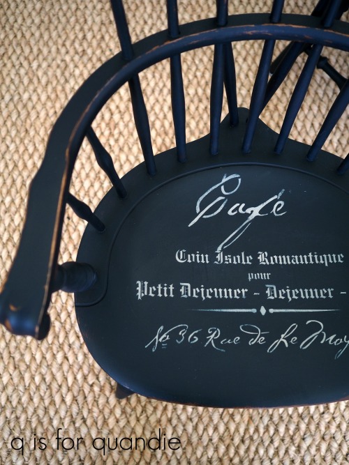
Can we just stop here a minute though and talk about this color?
The Caviar is a gorgeous deep, rich, saturated black. It looked deep and dark even before I waxed it.
In fact, here’s a secret. I didn’t wax the legs yet. Obviously I have to get to that before I sell the chairs, but I was trying to take advantage of a sunny day to get my photos done so I saved the legs for later.
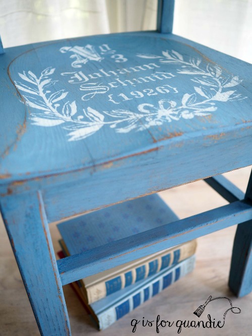
Before waxing I stenciled the seats with a fab french design. I’m fairly sure I ordered this stencil via Etsy, but once again the shop I ordered from is no longer there. I seem to have bad luck in this way with stencils. So I’m sorry that I can’t give you a source for this one.
The stencil was just the pop of something special that took these chairs from ho-hum to fab.
Once I had the stencils done, I sanded lightly over them with 320 grit sandpaper and then waxed the chairs (and I will get to those legs!) with Dixie Belle’s Best Dang Wax in clear.
If you’re used to using Miss Mustard Seed, Homestead House or Fusion wax (like I am), don’t be freaked out when you open up the Dixie Belle clear wax and it looks really white. I thought for sure I had gotten a white wax by mistake. But no, ultimately it dries clear.
Also, you really won’t need a dark wax (like brown or black) to deepen the black color of this paint. It looks gorgeous even with the clear wax.
I love how the chairs turned out. If I had a spot for them I’d definitely keep them. But there is no room at the inn, so they have to go. If you are local and need a pair of Windsors, be sure to check my ‘available for local sale’ page for more details.