a buffet of buffets.

Oh no, you guys.  Although I’ve been trying to minimize the time I spend watching COVID-19 related bad news these days, I made a huge tactical error the other night and started watching some YouTube videos about its impact on the cruise industry.

In case you hadn’t heard (and maybe many of you don’t actually care), on April 9 the CDC extended its ban on cruise ships sailing in U.S. waters to 100 days.  In addition, the cruise lines are going to have to make some fairly significant changes to the way they operate before they can resume business.  At least in U.S. waters.  I don’t know if the E.U. or other areas will follow suit.  Nonetheless, it seems like the chances of Mr. Q and I actually going on our European Capitals cruise in September are looking slimmer and slimmer.  If you’re an avid cruiser and want to learn more about this, check out this guy on YouTube.

One of the many expected changes for cruise ships is an elimination of buffet style food and drink on board.  So no more self-serve ice cream, no more taco bars, and no more midnight buffets.

So, as a sort of fond farewell to the buffet, I thought I’d share a few of my favorite buffets starting with one I actually called ‘the midnight buffet.’

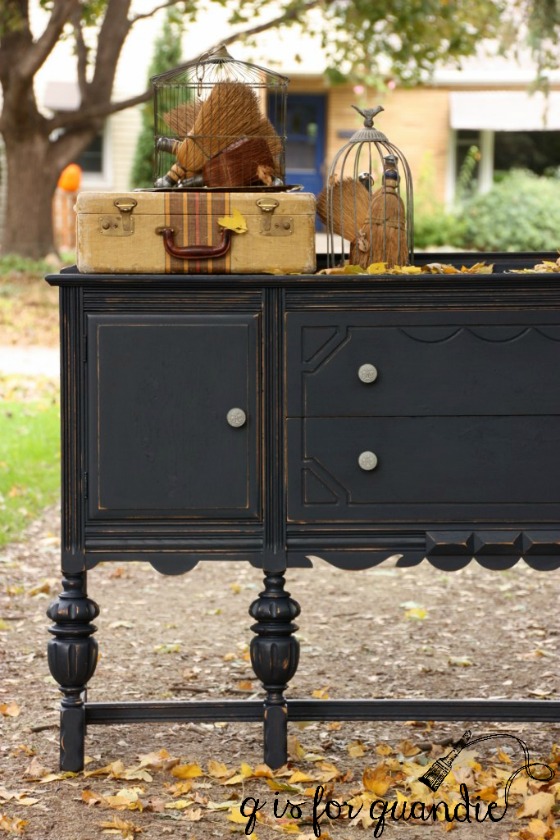
I painted this one back in October 2016.  It’s painted in Fusion’s Midnight Blue.  It only required one coat of paint (thanks to the dark color over a dark existing stain), plus Fusion doesn’t require a topcoat.  So this was a definite plus when working on such a large piece.

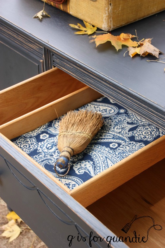
I had so much fun staging the midnight buffet outdoors using some funky whisk brooms in cages and taking advantage of the falling leaves.

I painted another buffet in dark blue, this time using Dixie Belle Paint Co’s Bunker Hill Blue.

This blue is a little bit brighter than Fusion’s Midnight Blue, but I toned it down by adding a black glaze over it (if you want to see this color without a black glaze, check out this piece).

Another option for achieving a similar color using Dixie Belle paint is to make a 50/50 mix of their Bunker Hill Blue and In the Navy.

This time around I stripped and refinished the wood top with Fusion’s furniture wax in Espresso (a dark brown wax).

Just for fun I added a bright pop of color to the interior using Fusion’s Coral.

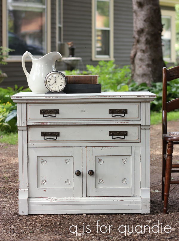
Not all of my buffets have been dark blue.  When I first starting painting with Miss Mustard Seed’s Milk Paint I went through a definite Kitchen Scale phase starting with painting my own buffet (at the time, I have since sold it) in this color.

I loved it so much that I painted two more buffets in Kitchen Scale.

This next piece was so pretty, but it was quite large and since I painted it in the winter I wasn’t able to do my photos outside.

Plus this was back when I first started blogging and my photo skills were in need of practice.  So, I don’t feel like my pictures did this one justice.

But the chippy finish of milk paint was perfect on this piece.  Just check out those chippy legs!

If you’re wondering why those three pieces all seem to be a slightly different color, there are a few factors at play.  First of all, as per Miss Mustard Seeds blog, there can be as much as a 15% variation in the color from one bag of milk paint to the next.  In addition, milk paint tends to be a little less opaque than some paints so the color you are covering up can make a difference in your final color.  Finally, the white balance in my photos isn’t perfect in any of those photos.

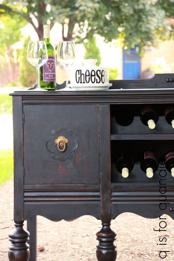
Not all of my buffets have been left as buffets either.  I turned this one into a wine bar with the help of my handyman, Ken.

I had finished it just prior to one of my Carriage House sales, so I was in a hurry to get photos taken before the sale.  The hemp oil topcoat was freshly applied when I took these, and that’s not really a good look for photos.

Another fun piece was this buffet re-styled as a TV stand.

Ken cut holes in the back behind each of those center shelves so that one could run the electrical cords for a DVD player or other components out the back.

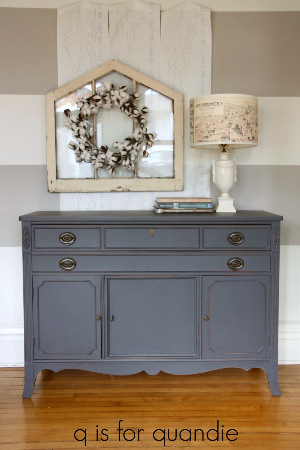
I’ve done a few more buffets in varying shades of grey.

A few years back I decided to try the General Finishes Milk Paint.  I think this product did more to confuse people about milk paint than any other product out there.  That’s because it’s not really milk paint.  Here is what they say about that on their website:  We named our product Milk Paint with the intention of putting a clear, bright, contemporary spin on an old fashioned furniture paint tradition. With that said, GF’s Milk Paint is not a true Milk Paint as it does not contain any milk powder.

Instead, General Finishes is a mineral based acrylic paint.  I found it very similar to Fusion paint.  Much like Fusion, it does not require a topcoat, although you can add one if you want to.  If you like using Fusion, you’ll like General Finishes Milk Paint and vice versa.

Anyway, this next buffet is painted in their Queenstown Gray.

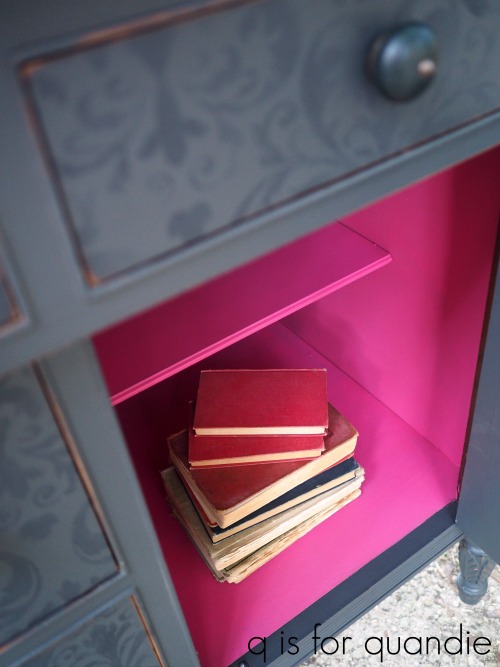
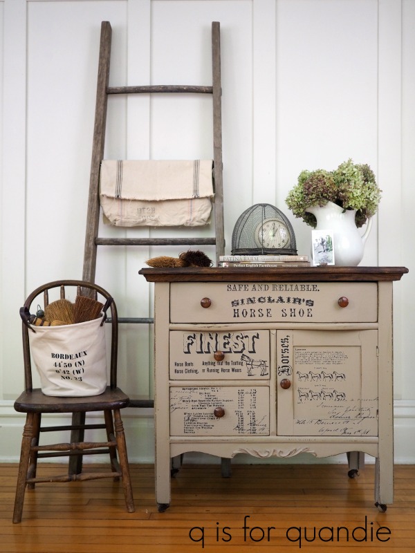
On this next piece I used a fun technique.

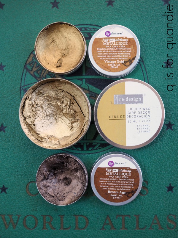
  I started out by painting it with Fusion’s Ash.  Then I used the Imperial Damask stencil and the Galaxy Decor Wax from re.design with prima to add a subtle design.

This one has a fun pop of color on the inside too, this time using Dixie Belle’s Peony.

This last grey piece is really more of a dresser, but I think it would work beautifully as a buffet so I decided to include it in this post.

That one was painted in Homestead House milk paint in a color called Bedford.

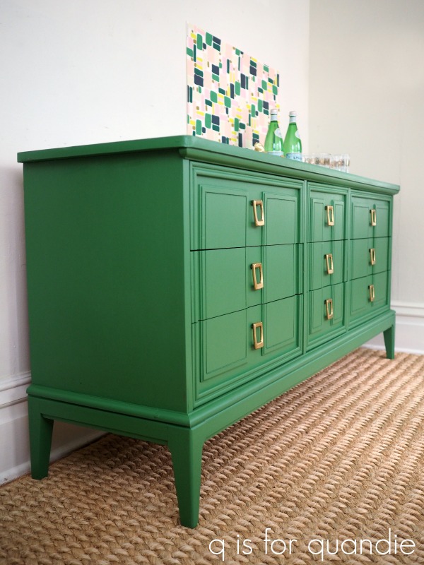
Although I usually call them credenzas, I always enjoy doing the mid-mod version of a buffet using a bit more color.

There’s my absolute favorite green, Fusion’s Park Bench.

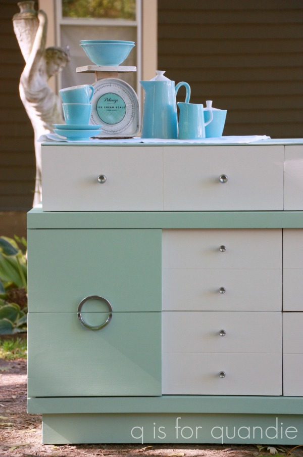
And this next one was a fun combination of turquoise and warm white.

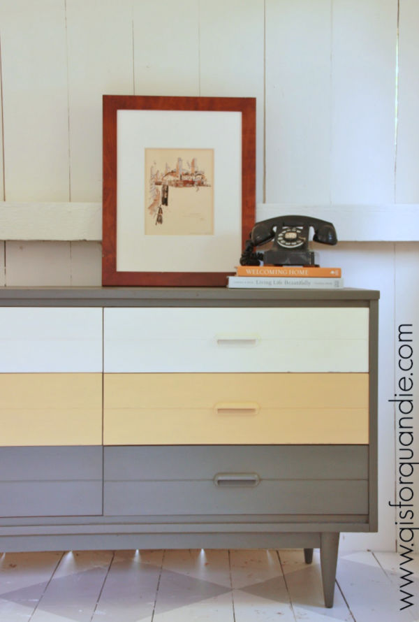
I did some color blocking on this next mid-mod piece in grey, yellow and white.

And although this next piece is meant to be a dresser, I think it would work really well as a buffet too.

In fact, I staged it that way for the photos.

That pretty shade of green is a Sherwin Williams color called Aloe from their Vintage Moxie collection.

I hope you enjoyed this ‘buffet of buffets’ with me.  On the plus side, it was calorie-free!

Let me know what you favorite buffet was.  And if you’re also fond of cruises, are you also going to miss the buffet?

a carriage house flashback.

As it’s starting to feel like spring might be just around the corner … well, maybe not this week, but soon … I have been thinking about yard sales.  Are we going to be able to have any this year?  How long before people feel like they can be out and about, mingling with other shoppers again?  I suffer through garage sale withdrawal every winter, but usually about now I’m planning which spring neighborhood sales I’m going to make it to this year.

I guess we just have to accept the uncertainty for now, not knowing when we’ll be able to get our yard sale fix.

In the meantime, I thought we could all take a walk down memory lane and visit some of my previous Carriage House sales.

If you’re a little bit new to my blog, you may not be familiar with my former sales.  Up until 2016 my friend/co-worker/picker/garage sale mentor Sue and I used to hold occasional sales out of my carriage house.

I started keeping records in 2002, but we started the sales even earlier than that.  Originally it was nothing more than a slightly upscale garage sale.  But over time it grew bigger and better.

Usually we did a spring sale and a fall sale, but some years we just had one sale.

One thing I did find with this style of sale is that the furniture didn’t sell terribly well.  Furniture doesn’t tend to be an impulse buy, something you can purchase on a whim and know you’ll find a spot for.

We had much better luck selling the smaller items.

Genuine vintage items were always a hit …

including vintage linens.

Plus, the linens were always fun to display …

We even sold the occasional vintage handbag or dress.

Our final sale was chock full of amazing stuff.

We often had a table of baked goods at the sale.

In case you’re wondering, no, I was never the baker.  We had various bakers over the years.

At the fall sale we always had a section of vintage Christmas items.  They were rather hit or miss.  People aren’t usually thinking ahead to Christmas quite yet in late September.

One of the biggest problems with the sale was that we had really outgrown the carriage house.  As a result, a lot of our merchandise had to be displayed out in the driveway.  That tended to be a problem when it rained.

The weather was always unpredictable.  Sometimes it was ridiculously hot and humid for our June sale, and then freezing cold for our fall sale.  One year the severe weather sirens sounded just after we opened our doors.  You might think that no one would show up in that kind of weather, but on the contrary, it was one of our best years in terms of gross sales.  We just tried our best to stay dry under some tents and hoped nothing would get ruined.

As much fun as it was hosting the Carriage House Sale, it was also quite a lot of work.  The space where the sale was held is also my workshop.  In order to hold the sale I would have to completely empty out my workshop, set up the sale, hold the sale, dismantle the sale, then re-set up my workshop.  In the end, I just felt it wasn’t the most efficient way to handle things.  So I shopped around to find a place to sell my items on consignment and that’s when I ended up at Reclaiming Beautiful.

So the Carriage House sale became a thing of the past.  I’m still grateful for all of the people who came to our sales though!

You never know, some day I may bring the sales back again.  But probably not while I’m still working full time at the day job.

How about you?  Are you a garage sale fan, wondering when we’re going to be able to get out there and hit the sales without having to wear masks or worry about staying 6′ away from each other?

P.S.  Many thanks to those of you who left comments on my ‘social distancing glasses‘ post last week.  I took the advice that many of you gave and went back to my eye doctor.  Turns out the glasses were two degrees weaker than they were supposed to be.  That sure explains why the whole world felt out of focus to me … well, that plus this whole pandemic thing.  While I can’t do much about the pandemic, except stay home and try not to breath on people, I can get the glasses fixed.  So they have gone back to the lab to be re-made and hopefully they’ll work better when I get them back 🙂

getting ready for gardening season.

This past weekend was your typical spring weather in Minnesota.  On Saturday it was 60 degrees and sunny.  Mr. Q and I took a long walk, started clearing the winter debris out of the gardens, and then sat on the deck and enjoyed the feel of sunshine on our faces.

On Sunday, those same chairs looked like this.

And my Scilla siberica looked like this …

This always happens here in April.  We get teased with a glimpse of spring, and then shot back down with the realization that this is Minnesota and we can’t actually count on good gardening weather until May.

Well, we can still dream of gardening weather.  And that brings me to my quick and easy project for today.

I started with one of the aprons from re.design with prima.

I couldn’t find a single online photo of this product that didn’t have the re.design logo blocking the front pocket.  In some of the photos it even looked like the logo was actually part of the apron.  It isn’t.  This is a 100% cotton apron that is essentially a ‘blank canvas’ that you can paint, dye, or otherwise embellish to suit your tastes.

It has that front pocket that I mentioned, plus a sweet ruffle along the bottom hemline.

Since it’s made out of 100% cotton, I recommend washing it before you get started.  I did wash and dry mine first.

Since I tend to like simple, uncluttered designs, I decided to add a quick and easy stencil to my apron to dress it up.  I used Dixie Belle Paint Co paint in Gravel Road (which is a warm, dark grey) and a couple of stencils from Maison de Stencils.

I placed different sections of each stencil wherever they fit best on my apron.

You can set the paint with heat by either throwing your apron in the dryer on high heat, or pressing the apron on the reverse side with a high heat iron.

It’s probably far more likely that I’ll use this apron to protect my clothes while painting, but it would work great for keeping the dirt off while re-potting plants.  And I also suppose one could wear it while cooking … but we all know I don’t do much of that.

How about you?  Are you much of an apron wearer?

As always, thanks to Dixie Belle Paint Co, re.design with prima and Maison de Stencils for providing the products used for this makeover.

my social distancing glasses.

Every now and then I drop hints about my age, and sometimes I even just come right out and say it out loud … I am 56 years old.  And these days that means I can’t see my hand in front of my face without ‘cheaters’.

Up until the age of 40 I had perfect 20/20 vision.  But I practically had to go out and buy a pair of readers on my 40th birthday.  Or at least it felt that way.  In many ways it seems like my previously perfect vision left me woefully unprepared to handle even the slightest blurring.

At first I only needed readers for the really small print, and only the lowest magnification.  But over time I found myself having to transition from the 1.25+ to the 1.5+ to the 2+.  Then I found myself needing the 1.25+ to see the TV clearly and read street signs while I drove, while I needed the 2.5+ to read small print.

For several years now I’ve found myself switching back and forth between a 1.25+ and a 2.5+ depending on whether I need to see up close, or far away.  It’s kind of a pain in the butt.

But when it really gets annoying is while garage saling … and we can’t have that!

I’d have to wear the 1.25+’s to scope out the whole scene and zero in on the items I wanted to head for first, but then switch out to the 2.5+’s to read the price tag.

I was constantly juggling two pairs of glasses over the past several years and it was really getting annoying.

So, in anticipation of garage sale season 2020, I finally made an eye doctor appointment a while back so I could get some bi-focals.  I paid around $600 for some progressive lens bi-focals (so they don’t have that line in them that immediately brands you as an old person).  Then COVID-19 starting going strong here in the U.S. and delivery of my glasses was delayed.  I finally got a call last week that they were in, but my eye clinic’s hours were reduced to 9 a.m. to 11 a.m. each day.  Fortunately, it’s not far from my office so I snuck out of the office one morning earlier this week to pick them up.

I have to say … bi-focals are definitely going to take some getting used to.

What I noticed about them initially is that in order to see someone’s face clearly I have to be right around 6′ away from them.  Any closer and they start to get blurry.

That’s when I realized!  I seem to have inadvertently purchased ‘social distancing glasses’.

In order to see the face of the person I’m talking to clearly, I will have to stand about 6′ away.

Did they make them this way on purpose?

 Recently I read an article that said we shouldn’t be calling this ‘social distancing’ at all.  We should simply be calling it ‘physical distancing’.  During these crazy, totally strange, emotionally unbalancing times, we don’t need to be socially distanced.  Instead we should be working on reinforcing our social bonds, or getting socially closer.  And we can easily do that by phone, email, text, Zoom video conferencing, Skype, Instagram, Facebook and any of the other multitudes of social media platforms out there.  The only distance we really need to maintain is a physical one, not a social one.

So how about we all start calling it ‘physical distancing’ instead of ‘social distancing’?  Who’s with me on that one?

And who else out there has graduated to the bi-focal?  How long is it going to take me to get used to these things?  Because for now I feel a bit sea sick wearing them, and it seems like nothing is perfectly clear … or maybe that’s just how everyone feels these days.

the humble washstand.

I felt like I needed a bit of a break last weekend.  Although I had a number of projects I could have worked on, I just wasn’t in the mood.

I think the trip that Mr. Q and I took to Target on Saturday morning threw me off.  There was just something so disconcerting about people making an obvious effort to stay 6′ away.  Of course I know why people are doing it, but I still somehow feel rejected when someone takes a big detour around me as though I am giving off a bad odor.  And then there were the people with bandannas over their faces.  Are they about to rob the place, or are they just out hoping to find toilet paper like I was?

The world has turned completely upside down, and I needed some time to process it.  So Mr. Q and I played some board games, went for a walk in the park and then binge watched Travel Man on Hulu.

But I didn’t want to leave you guys hanging today, so I decided to do a compilation post.

Thus, I bring you the humble washstand.

I’ve painted quite a few of these over the years.  They are perfect for a quick makeover because they are smaller than a dresser or desk and you can easily whip one up in a day.  They are also fairly versatile pieces.  You can use them as a bedside table, an end table, in the foyer … I’ve even seen them with sinks added to the top and used as a bathroom vanity.

Another possibility is to use them as a coffee bar.

Looking back, it seems that my favorite color to use on washstands is white.  I’ve painted several of them, including this next one,  with Dixie Belle Paint Co’s Drop Cloth, which is a warm white.

Miss Mustard Seed milk paint in Linen is also a lovely warm white, and it worked beautifully on this washstand

Miss Mustard Seed milk paint in Grain Sack is also a good choice if you want a cooler, grey undertone to your white (and if you aren’t a fan of milk paint, I recommend Dixie Belle’s Sawmill Gravy as a substitute for this color) …

Grain Sack was the color I chose for the washstand that I inherited from my grandparents.  We use this as a nightstand on Mr. Q’s side of the bed.

If you want more of an almond color, Miss Mustard Seed’s Marzipan is a great choice.

I’ve done two in Marzipan, this next one being one of my favorites.

I didn’t even have to paint this next washstand, it was already white when I bought it.  But I did add the Out on the Farm transfer from re.design with prima.

Every once in a while, I break out some more vibrant colors.  This washstand is painted in Sweet Pickens In a Pickle and turned out perfectly chippy.

This next washstand is painted in a custom mix of Miss Mustard Seed milk paint, 1/3 Boxwood to 2/3 Kitchen Scale

In general, I’m more of a neutral lover though.  Dixie Belle Paint Co’s Putty was perfect on this one along with re.design with prima’s Fine Horseman transfer.

So, there you have an even dozen of my favorite washstand makeovers.

Which one is your favorite?  Or have you painted some washstands yourself?  What is your favorite color to use on them?

As always, thanks to my blog sponsors Dixie Belle Paint Co and re.design with prima for providing many of the products used on these washstands. 

dying to try it.

Well here I am, like many of us, stuck at home.  I’m very fortunate to be able to do some of my regular day job work from home, and I’m still going in to the office every few days to take care of things I can’t do at home.  Aside from that, I’m trying very hard to do my part and comply with the Stay at Home order here in Minnesota.  The basic tenet of our Stay at Home order is that one should stay at home when at all possible.

For me, that means that for the time being I’m not buying or selling furniture via Craigslist or Facebook Marketplace.  If you’ve been reading my blog for long, then you realize that furniture painting/blogging is just a side gig for me.  It doesn’t pay the bills or put food on the table, I have the day job for that.  So in my case, I feel like I should avoid those transactions for now.

However, it’s important to note here that I do not think everyone has to be doing this.  I say more power to those who are finding ways to practice ‘social distancing’ while still working their businesses.  Reclaiming Beautiful (the brick and mortar shop where I sell on consignment) is posting their furniture pieces online and having some success with selling by appointment (check out their Facebook page here to see what they have).

But in my case, I’m going to try to continue to work with things that I already have on hand.  Of course, it’s a tad ironic that I started working my way through my stash of projects several months ago before we’d even heard of COVID-19.  In hindsight, I should have kept buying furniture to stock up instead, because then I would have plenty to work on now.

Instead, I’m having to dig deep for projects to work on.

When Victoria mentioned that she was sewing napkins in her comment last week it reminded me that I had a stash of linen napkins that I’ve been meaning to dye (thanks again for sparking that idea Victoria!).

Ding, ding, ding.  The perfect project to complete while ‘staying at home’.

So I grabbed some Dixie Belle paint in colors that I thought would be pretty on napkins.

I ended up choosing Mermaid Tail, Antebellum Blue and Honky Tonk Red.  That last one was meant to be Peony, but I grabbed the wrong jar.  However, as you’ll see in a few minutes, that worked out OK because I ended up with a pretty pink anyway.

Before getting started, I googled a few YouTube videos and blog posts about how to dye fabric using chalk paint.  As generally seems to be the case when researching online, I got some conflicting info.  So I tried to sort through the tips based on my previous experience with actual dye (I dyed lots of these vintage linen napkins back in the day using actual fabric dye).

Let’s run through the basic process first.

Step 1:  Wash the napkins in hot water.  This may or may not be necessary depending on the item you are dying.  Since I was using vintage linen napkins that looked as though they hadn’t been washed in decades, washing seemed like a good idea.   Another thing to note here, choose a natural fiber like cotton or linen.  Polyester can only be dyed with specially formulated dyes.

Step 2:  Fill a wash pan with luke warm water and then add your paint.  Stir well, making sure that the paint is fully dissolved and mixed in with the water.  If you have clumps of solid paint in your water you will get dark spots of paint on your fabric.  You should use approximately 1 part paint to 20 parts water.  I don’t think I used quite enough paint because I followed conflicting advice to use just one tablespoon of paint.  As you’ll see shortly, my color ended up very pale.

Step 3:  Add the napkins, still wet from being washed.  This is another conflicting piece of advice from my google results.  Some people added dry fabric, some added wet.  When I used fabric dye back in the day, I always put items in wet, so I went with that approach.

Step 4:  Swish the fabric around for about 5 minutes or so.  Again, this is another step where I read conflicting instructions online.  Some said to leave it absolutely no longer than 5 minutes, others said to leave it for at least 30 minutes or longer.  I went with five minutes on my first batch using the Honky Tonk Red.

Step 5:  Remove the napkins from the dye bath and rinse them (or not).  I found that rinsing removed quite a bit of the color leaving my napkins a pale pink.  Be sure to read to the end of this post to learn about the results I got without rinsing.

Step 6:  Dry the napkins in your clothes dryer using high heat to set to set the color.

Step 7:  Press the napkins using high heat to make doubly sure the color is set.

This was my first batch, and they turned out quite pretty.  If you keep in mind that you’re going to get a very pale version of the paint color, you will be happy with these results.

Also, keep in mind that hand dyed fabrics will have inconsistencies in the color.  But that’s part of their charm.

I followed the same process for my second batch, but used Dixie Belle’s Antebellum Blue as the color.

Again, the resulting color was quite a bit lighter than I expected. You can see how dark the paint color is in the spoon.

But the napkins ended up being a beautiful pale blue.

Things pretty much went off the rails with the third batch I tried using Mermaid Tail.

It sure looked pretty in the water.  But this time I wanted to try to retain more of the color so I decided not to rinse.  I was going to throw them in the dryer to set the color, but Mr. Q was worried I’d end up with paint in the dryer.  So I opted to try line drying them without rinsing, then setting the color with the hot iron.  That was pretty much a fail.  Line drying them left an obvious line of darker color where the napkin was hanging across the line.

I decided to cut my losses at this point and try washing out the color and starting over.  I can verify that if you don’t set the color with heat, most of it will wash out.

So it was back to the drawing board after that.  The second time around I put the napkins into the dye bath dry, added quite a bit more paint to the water (closer to the 1 part paint to 20 parts water), and shhhh, don’t tell Mr. Q but I didn’t rinse them.  I wrung them out and then threw them in the dryer.

Eureka!  We have a winner!  They turned out gorgeous.

However, they did leave a film of Mermaid Tail paint inside my dryer.  Ooops.  Luckily it wiped right out using a damp cloth.  But keep this in mind if you decide to try it at home.  You will need to clean out your dryer immediately afterwards.

If you’re stuck at home and looking for a fun afternoon craft project, I highly recommend experimenting with dying fabric using chalk paint.  To recap, for best results, wash and dry your fabric first, use 1 part paint to 20 parts water luke warm water,  agitate while soaking for about 5 minutes, ring out excess water but don’t rinse, dry with high heat and then immediately wipe out your dryer.  Got that?

I’m curious, have any of you tried it?  Got any tips for the rest of us?

As always, thanks to Dixie Belle Paint Co for supplying the paint for this project.  Please note that many of the local Dixie Belle Paint retailers are still available to ship paint, or they may be offering curb-side pick up.  You can find your local retailer here.  If you don’t have a local retailer, you can also order Dixie Belle products here.  Dixie Belle Paint Co is continuing to ship orders as well.

the travel bug.

I didn’t really see the irony in that blog title until I actually typed it.

I guess there are two ways of looking at having the ‘travel bug’ these days.  Fortunately, so far, I only have the traditional travel bug.  That is, a strong desire to travel.  I do not have COVID-19, the other ‘travel bug’.

I’d go on here about how it seems like once you no longer have the opportunity to do something, that’s when you really want to do it.  That doesn’t really fit though, because I always really want to travel and that hasn’t changed as a result of COVID-19.  Although now that I can’t go anywhere, not even to my favorite thrift stores, I have been daydreaming more about traveling and all of the places we would like to go.

Mr. Q and I actually have already booked our next trip.  I still remember when we decided on it way back last summer.  We were dining on the deck and Mr. Q was perusing the latest Princess cruises brochure.

At the time we weren’t even really thinking about another cruise, but he came across one that really looked intriguing.  As we studied the ports of call I realized that we could check out several places I’ve always wanted to see; Bruges, Giverny (to see Monet’s gardens) and Madurodam (seriously, check this place out, especially if you’re into miniature things like I am).

The itinerary is called European Capitals, which is a little bit of a misnomer.  It sails round trip from London and the ports of call are:

Hamburg, Germany – theoretically for Berlin, which is a capital, but is really rather far away from the port.

Aarhus, Denmark – not a capital

Copenhagen, Denmark – OK, finally, a real capital

Gothenburg, Sweden – again, not the capital (and in this case, I really wish it went to Stockholm instead)

Oslo, Norway – another real capital

Rotterdam, Netherlands – not a capital

Bruges, Belgium – not a capital

Le Havre, France – also not a capital, but much like Berlin, you can get to Paris from here but it’s a lengthy trip

So technically speaking, only two of the eight ports are actual capitals.  Maybe they should have named this itinerary the A Handful of European Capitals, or Close, but No Cigar to European Capitals.  But we don’t care, we are just as interested in seeing these non-capital cities.

Only two of them are repeats for both of us, Copenhagen

and Oslo

both of which we love and are happy to return to.  I’ve also been to Aarhus, but that was 25+ years ago on my very first trip to Europe with my mom (it was also my first ever visit to an open air museum and I loved it).  I’m betting it has changed a bit since then.

We got a great deal when we booked.  Free tips, a $300 ship board credit and we only had to pay a $200 deposit.  We were also given a free upgrade a couple of months ago, from a balcony to a mini-suite.  That has never happened to us before!

So we’d been feeling pretty excited about this trip.

And then COVID-19 happened.

And in the early days all of the bad press seemed to be focused on cruise ships … even specifically Princess cruise ships.

Still, we figured our trip was far enough out (it’s in September) that we’d be fine.  I’m starting to wonder about that a little bit more now that things have really gone downhill.  But, we have almost six months before our trip.  I’m keeping my fingers crossed that all will be well by then.  Or at least well enough for people to begin traveling again.

In the meantime, all we can do is day dream about travel right now.  If you need some help with that, check out all of my travel posts by selecting the travel category under ‘stuff.’ over on the right side of your screen (if you’re using a computer to view the blog, if not, try this link).

So tell me, if this COVID-19 thing wasn’t happening and you could go anywhere right now, where would it be?


a tad boring.

TGIF!

This has been a crazy week, I’m sure most of you can relate.  As many of you know, I have a day job working in municipal government.  I don’t share much about that here because that’s part of my boring, 9 to 5, accountant persona.  It’s not terribly exciting to share, but I do love my work there.

Here in Minnesota, our governor has finally issued an order for non-essential workers to Stay at Home starting tonight at midnight.  We were anticipating that he would do so, so I spent most of the week preparing for the possibility that I would have to work from home.  I won’t be able to do all of my work from home, but I can do a good portion of it here.

So this week has been spent scrambling to put things in place in preparation for the Stay at Home order over the next two weeks.  It has been a strange combination, being really busy at the day job and then going home and feeling like I had absolutely nothing to do.  Even though not all of our businesses have been closed yet, I’ve been trying to avoid public contact whenever possible so Mr. Q and I have been staying in and binge watching M.A.S.H.

I’ve also been at a loss for a good blog post for today.  All I worked on this week was a simple pair of candlesticks from the thrift store.

I purchased these because I liked the beefy size of them.  They weren’t horribly ugly or anything, maybe just a tad boring.

I decided they might look pretty fab with a rusty finish, so I pulled out some Dixie Belle products.

I started by painting them with a base coat of Dixie Belle’s Caviar, a basic black.  Once that dried, I added two coats of the Iron paint from their Patina Collection.  Before the 2nd coat of the Iron paint had a chance to dry, I sprayed them with the Green spray.

After waiting about 24 hours, they had developed some rusty patina.

It’s definitely an improvement, but I wanted a little bit more rust.

But I have found that when using these products, the rust continues to develop over time.  So last night I checked them out to see if they had gotten any rustier since last weekend.

They look a little rustier for sure.

I’m debating putting them outside to encourage even more rusting, like I got with the planters I painted last summer.

Hmmm, watching candlesticks turn rusty … seems like ‘a tad boring’ is a bit of theme today.

How about you?  How are you coping with the pandemic?  Working from home?  Having to close your business entirely?  Missing your family?  Running out of toilet paper?  Got any great ideas for relieving the boredom?

As always, thank you to Dixie Belle Paint Co for providing the Patina products used for today’s project.  You can find their products here.


the spring flowers bed.

I hope that all of you are surviving the pandemic.  We had my sister and niece over for a game night on Saturday.  We did our best to practice safe socializing.  First off, I thoroughly cleaned the house including using sanitizing wipes on all of the door knobs and handles.  Next, I used individual plates and small bowls for the game night snacks so that no one was sharing from one bowl.  My niece refrained from tasting my Jose’ Cuervo Cherry Limeade Margarita (although normally she would have).  No hugs were exchanged, and my sister and niece stayed on their side of table and we stayed on ours.

Naturally we played Pandemic.

We’ve been playing this game since before it was trendy.  If you aren’t familiar, it’s a co-operative game, which means that everyone works together for a common goal.  In this case, saving the world from diseases.  Either we all win or we all lose.  Each player takes on a role such as Quarantine Specialist, Medic or Researcher and has specific skills to use in trying to defeat four diseases before they multiply uncontrollably.

Sadly, we aren’t that good at the game.  We lost every single time on Saturday.  I hope that’s not a sign.

Earlier on Saturday, I worked on a bed that I brought home from a garage sale last summer.

It was a freebie.  I had considered having Ken make it into another bench but the foot board is too short for that to work.  So, it stays a bed.

I started by sanding it down, cleaning it with TSP substitute and then painting it with two coats of Dixie Belle’s Sawmill Gravy.

Once dry, I sanded to distress and then waxed the foot board with clear wax.  I held off on waxing the headboard so that I could add a transfer.

Always remember, don’t try to apply a transfer over freshly applied wax.  You’ll end up with a sticky mess as the friction from rubbing the transfer heats up the wax.  You can wait until the wax cures (about 30 days), but that’s not terribly practical.  I prefer waiting to wax over the entire piece after the transfer is added.

Next I pulled out re.design with prima’s Cosmic Roses transfer.

The full transfer was a bit too tall for the headboard, so I decided to just use the floral bunches in the two opposite corners.  I’ll save the middle cluster of flowers for another project.

I simply trimmed around them before removing the backing paper.

I also changed the placement of some additional segments, like the Spring Flowers above.

Always keep in mind that you don’t have to use these transfers exactly as they come out of the tube.  You can get creative with trimming and re-arranging them to customize them for your piece.

Unfortunately this bed did not come with its side rails.  I have two pair of spare side rails in my carriage house (left over from beds that became benches), and sadly neither one of them fit the existing slots on the bed.

I’m going to try and sell it without the rails first, but if that doesn’t fly I’ll order a set of bolt-on rails from Amazon (like this one which is only $34).  I know some people will only purchase an item that is ready to go, while others are OK with having to add the rails themselves.  I’ll just have to see how that goes.

By the way, remember the bookshelf I shared last week?  Wouldn’t it be a great companion piece for this bed?  The Antebellum Blue on the bookcase works beautifully with the blues in the Cosmic Roses.  Plus, both pieces have a touch of gold.

As always, thanks to Dixie Belle Paint Co for providing the paint and to re.design with prima for providing the transfer for this project.

If you’re looking for Dixie Belle products you can find them here.

If you’re looking for re.design with prima products you can find local retailers here, or online sources here.

And if you are local and in need of a twin sized bed, check out my ‘available for local sale‘ page.

the thrift store lamp.

A couple of weekends ago, before the world shut down, my sister and I hit up the thrift shops again.  We didn’t find much.  Debbie found some colorful plastic drinking glasses for using on the patio this summer, and I brought home just a handful of things.

I always pick up the glass canisters when I see them at a good price.  I love using them to store my craft supplies.

The fact that you can see what’s in them makes it so much easier to locate the item you need.

I’ve already added a Classic Vintage Label transfer from re.design with prima to the little galvanized bucket.

It’s perfect for a small plant, but also works great for holding paint brushes … if you happen to have a lot of them, which I do.

I’ll be painting the candlesticks eventually, but didn’t get to them in time for this post.

But my favorite find was the mid-mod desk lamp.

It was a little beat up, and the felt bottom had seen better days.  But I checked it at the store and it still worked.  I’m not sure about every Goodwill store, but the one we were at had a strip of outlets near the electrical goods so that you can plug something in to make sure it works.  Handy.

The first thing I did after cleaning the lamp was rip off the grungy old felt bottom and replace it with some new felt.  I simply cut it to fit and stuck it in place with spray adhesive.

Next I wanted to spruce up the gold finish on the lamp just a bit, so I pulled out a selection of metallic waxes to see which one would best match the existing color of the lamp.

The Bronze Age (bottom), which is one of my favorites, was clearly too brown.  The Eternal (middle), also a favorite, was a bit too bright.  But the Vintage Gold (top) was just right.

I used a piece of cloth to apply the wax all over the lamp.  It was pretty much a perfect match, and it helped even out some dings and other imperfections.

If you’ve never used this wax before, I’ll tell you that a little goes a long way.  It comes in a rather small container, but look how much I still have left in mine and I’ve used it on countless projects including this lamp …

I will let the wax cure for a full 30 days before using the lamp just to avoid melting it with the heat from the bulb.

I really wanted to add just a bit of an industrial vibe to the lamp to finish it off, so I pulled out the Everyday Farmhouse transfer from re.design with prima and added a little wording to the base of the lamp.

Adding just a little graphic punch to something always makes me happy.

I’m really loving the mid-mod vibe of this lamp, how about you?

Once the wax is cured and life has gone back to normal, I’m sure I’ll be bringing this one in to Reclaiming Beautiful to sell because I don’t have a spot for it myself.

As always, thank you to re.design with prima for providing the Vintage Gold wax and the Everyday Farmhouse transfer used on this project.

If you’re looking for re.design with prima products you can find local retailers here, or online sources here.