use your words.

OMG you guys!  I almost did it again!  I almost posted the reveal of the new transfers and decor tissue papers too early.  When writing the post I shared this past Monday, I didn’t realize that the release date had been changed from yesterday to this coming Monday.  Thank goodness I noticed that before I posted my project using them today or I would have been in trouble again with the ‘release police’.

Now, before you think I’m a complete idiot who can’t keep track of dates,  the only notification of the change was a note on the Facebook group page for brand ambassadors.  In case you don’t already know this about me, I am notoriously bad about paying attention to Facebook.  I pretty much only see something on Facebook if I’m specifically tagged.  Otherwise, yeah … who has time to read everything that’s posted on Facebook?

Anyway, I apologize to all of you.  I’d promised you the big reveal today and now you aren’t going to see it until Monday.

In the meantime, thank goodness I had another project waiting in the wings to be shared or I would have had to have another giveaway today 😉  And speaking of giveaways, you still have until midnight tonight to leave a comment on Monday’s post to enter that giveaway.

My picker found this adorable little … um, what would you call this?

A mirrored box maybe?  I’m not sure.  But it was obviously meant for jewelry because there was a padded velvet lining inside, so maybe a mirrored jewelry box?

Regardless, I ditched the velvet, because I think I’d be more inclined to keep makeup inside the hinged box.  Although it would work well for jewelry still too.

I gave it a paint job with Dixie Belle’s Drop Cloth on the outside and their Apricot on the inside.  Then I added some words from the IOD Label Ephemera transfer.

I added some above the mirror too.

Isn’t it amazing how much using a little paint and a few words can totally change the look of something?

And this one is pretty on the inside too.

I can’t tell you much about that though, because I used one of prima’s new decoupage tissue papers on the inside.  I can’t tell you the name of it or show you the entire sheet of tissue until next week.  But this is just a little bit of it, so I think I can get away with calling it a ‘sneak peek’.  And honestly, even if I wanted to share the name of this one I wouldn’t be able to because I don’t know what it is.

But stay tuned.  Next week not only will I share more on this one, but I’ll share a couple of other new decoupage tissues and also more about the technique I used to adhere it inside my mirrored box.

But in the meantime, how do you like this mirrored box’s new look?

As always, thank you to Dixie Belle for providing the paint used for this project. If you’re looking for Dixie Belle products you can find them here.

And if you are local and could use a sweet little mirrored box, this one is for sale for $38.

Be sure to check back on Monday when I can officially reveal the new re.design with prima designs!

timing is everything.

Sometimes timing is everything, and I just get it wrong.  As a brand ambassador for re.design with prima, they send me products before they are released to the general public. That way I can work with them and have some projects ready to go when they are released.  They give me a release date and I’m not supposed to share the products ahead of that date.

I totally screwed that up with the molds I used on these clay pots back in May.

Yep, I completely forgot that the release date for the new molds was later than the date I posted them.  Ooops!

Well, re.design with prima is releasing some new designs this coming Friday.  Once again, they sent me some of them in advance and I’ve been busy creating some stuff to share here on the blog.  Unfortunately, once again I also wasn’t paying enough attention to the release dates.  I’ve been busy finishing up those projects and I forgot to factor in having something to share with you guys today.

There is one loophole though.  Today is the ‘sneak peek’ day.  That means I can share some sneak peeks of my projects, just not the entire thing.

Here’s one …

And here’s another …

Honestly, I’m never really sure just exactly how much I’m allowed to show in a sneak peek, but I definitely can’t share any details.

So you’ll just have to stay tuned until Friday to see it all.

And in the meantime, as a sort of consolation for not having a ‘real’ blog post for you today, I’ve decided to have a giveaway instead.

In addition to being a brand ambassador for re.design with prima, I’m also a content creator for Dixie Belle Paint Co.  They provide me with lots of their great products, enough so that I can pay it forward and share some with others.  So today I’m going to give away a few of their ‘problem solvers’.

First up is their B.O.S.S. which stands for blocks odors, stains and stops bleed-thru.  It comes in clear and white, and I’m including the clear version in the giveaway.  I think the clear is more versatile because you can use it under any color and when you distress the edges of your piece you won’t see a layer of white as you would with the white version.  However, the white version works well under white paint and reduces the number of coats of white paint needed for full coverage.

I have used B.O.S.S. to eliminate the smell from a piece of furniture that came from a smoker.  I’ve also used it to block bleed-thru stain, as well as ink stains.

You can really see it in action on these two drawers.  The top one was painted without the B.O.S.S., the bottom one with.  Just check out the stain bleeding through the paint on that top drawer, yikes!

Next up is Dixie Belle’s Slick Stick.

This product is used to help their paint adhere to a slick surface like glass, formica or laminate.  I love using this product on laminate pieces like this Thomasville faux bamboo dresser that I painted in Dixie Belle’s Peony.

Finally, I’m also including some Dixie Belle Mud in the give away.

Mud is a filler that you can use to fill in deep scratches (or burn marks like the one above), but the most common way that I use it is to fill in holes when I’m changing out the hardware on a piece.  In the case of this next example, the previous owner had taken off the original single hole knobs and replaced them with a drawer pull that required two holes.

I wanted to go back to the single hole, so I filled the extra two holes with Mud.  I like to add a little spackle after the Mud dries (check out the full technique I use here) and then look, you can’t even see those holes.

So, to recap, today’s giveaway prize includes:

a 16 oz. clear BOSS, an 8 oz brown Mud and an 8 oz Slick Stick.  Plus a little plastic spatula thingie that works great for the Mud.

Thank you to Dixie Belle for sponsoring this giveaway by providing the products.

The rules:  to be eligible to win today’s prize leave a comment on this blog post.  Your comment must be left on the blog, not on Facebook or Instagram.  You are not required to follow my blog, although it would be awesome if you did!

I will randomly draw the name of two winners for today’s prize from all of the comments left on this post by Friday, August 21 at the stroke of midnight (U.S. Central time).

The fine print: no purchase necessary, you must be 18 years of age or older to win, void where prohibited by law, the number of eligible entries received determines the odds of winning, approximate retail value of prize is $45, if the prize is not claimed by Sunday, August 23, another name will be drawn at random to win, blah, blah, blah.

Good luck!

if only I’d thought of that sooner.

A while back I shared this pile of goodies that I’d brought home from garage sales …

I’ve made over everything in this pile (medicine cabinet, box, birdcage, lamp) except for the pair of chairs which will likely become an early spring 2021 project (it’s a little late in the season for planter chairs now) and today’s project, the little camp stool.

I didn’t quite remember to get a photo before I started working on it, but I did grab a quick one after removing the canvas seat …

The existing seat was pretty gross, and the wood frame was looking shabby as well.  The finish was mostly gone and the wood was quite dry looking.  I tried to capture that in this photo …

Once I had the seat off, I scrubbed the wooden frame with some Dawn and the garden hose.  Once it dried again, I re-evaluated.  At this point I could have painted it, but I really liked the warmth of the wood.  So I decided to see if I could rejuvenate the wood without totally stripping and refinishing it.

I started by sanding it to remove all loose bits of the previous finish.  Then I pulled out the Dixie Belle Howdy-Do Hemp Seed Oil.

This has become my preferred brand of hemp oil because it has almost no odor at all  (I have had issues with bad odors when using other brands).

I like to apply hemp oil with an inexpensive chip brush.  Some of the really cheap ones from the DIY/hardware store tend to shed their bristles and make a total mess of it, but the premium chip brush from Dixie Belle is little better quality and it’s only $1.50 on their website.  It’s perfect for using with hemp oil.

OK, so I brushed the hemp oil onto the wood.  Then I gave it a minute or so to soak in and wiped away any excess oil using an old rag.

In the meantime, I had asked my friend/picker Sue (who also does a bit of sewing for me) to hem up a piece of drop cloth fabric to same size as the former seat of the camp stool.  She whipped it up in no time, and once I had that back from her I stenciled it to give it a grain sack look (the stencil used can be found here).

After that it was super simple to just staple the seat back onto the frame.

It wasn’t until I was contemplating how best to stage this camp stool for a photo that I realized I’d missed a prime opportunity.  Last weekend Mr. Q, my sister, my niece and I went for a hike in William O’Brien State Park.  If only I’d thought ahead and brought the camp stool along.  I could have gotten some photos of it with an appropriately camp-ish background.  I could have placed it beside the St. Croix River with an old fishing pole leaning on it.

Or maybe just next to this babbling brook with a vintage cooler beside it.

It would have been perfect!

Drat!  If only I’d thought of that sooner!

Instead I just took some photos of it on my deck next to the patio furniture.

Not quite as camp-ish, I know.

It makes a fun alternative to a traditional side table though.  It could also double as a foot stool.

What would you use an old camp stool for?

Many thanks to Dixie Belle for providing the Howdy-Do hemp seed oil used for this project. If you’re looking for Dixie Belle products you can find them here.

And if you need a refurbished camp stool, this one is for sale locally for $25.

a french-ish bed.

A while back my friend/picker Sue gave me a heads up on a Saturday morning garage sale that was happening near me and I came home with a pile of goodies.

You’ve already seen the chairs made over …

This past weekend I worked on the bed.

Now, you might be thinking ‘hey, wait a minute, that bed is already painted! Q is totally cheating!’

But what isn’t entirely apparent in that ‘before’ photo is that it was spray painted.  Sometimes spray paint can leave an uneven sheen, especially on flat surfaces like this one.  Here’s a photo where you can really see what I’m talking about.

See those patchy dull areas?  Not really a good look, so this bed really needed a new paint job.

I briefly toyed with the idea of painting it in a warm white, and it would have been absolutely lovely in that color.  However in the end, I decided to save myself some effort and just go with the black.

I sanded the bed lightly all over to make sure I’d get good adhesion with chalk paint over the spray paint (by the way, just a random tip, milk paint does not adhere well over a shiny spray paint, just in case you were curious about that).  Next I cleaned the surface with a damp rag and then added a coat of Dixie Belle’s Caviar.

Since I was painting black over black, one coat of paint was totally sufficient.  Well … or, it would have been.  Except for the part where I had the headboard leaning against the Carriage House to dry and a stiff wind knocked it over face first onto my gravel driveway.  Ugh!  When will I learn not to do that?  This is not the first time this has happened.  I can only blame myself.

But after a quick sanding of the damaged areas, and another coat of paint, all was well again.

Next I pulled out the Somewhere in France transfer from re.design with prima.

I used about 2/3 of the full transfer on this bed.  I added one section to the headboard …

and another section to the foot board (have any of you also wondered why ‘headboard’ is one word, but ‘foot board’ is two?) …

You can really get a good bang for your buck with the Somewhere in France transfer by splitting it up to be used on 3 or more different projects.

Here’s just a bit of it used on a hat box …

I’ve also used it on a toolbox  …

And on this old wooden box…

It’s also a great transfer to pair with other transfers, like the pretty floral one (Lavender Bush) on this bed.

Or the gold crown from the Gilded Home & Nature transfer that I used on Lulu, my manikin.

Anyway, I digress.  After adding the transfer to the bed, I added a coat of clear wax to everything.

But before calling it good, I also decided to dig out the Vintage Gold Metallique wax from prima …

I used a q-tip to add a bit of the gold wax to the carved wood applique at the top of the headboard.

It was just enough extra gold to tie in with the transfer.

In case any of you are gardeners and are wondering about the hydrangea in the background, that is a Little Lime.  It’s similar to a Limelight, but smaller.  The Little Lime will grow to 5′, while the Limelight will get up to 8′ tall.  So if you’re looking for a hydrangea that will stay a little smaller, go with the Little Lime.

Normally this is the part of my post where I mention that this bed is available to local buyers, etc … but this one is actually already spoken for.  One of my good customers stopped by to pick up the do-over dresser from last Monday, saw the bed and called dibs on it.

As always, thank you to Dixie Belle Paint Co and to re.design with prima for providing the products used for today’s project.

If you’re looking for Dixie Belle products you can find them here.

If you’re looking for re.design with prima products you can find local retailers here, or online sources here.

a stitch in time.

One of my regular customers brought me a present the other day (thanks again Suzy).  She had seen my post about the button box, and she thought this piece had a similar feel.

I photographed the ‘before’ shot with it lying on a table, but it is supposed to be hung on the wall to hold spools of thread.  It’s not in terrible shape, and the little daisy chain at the top is pretty cute, but that shade of yellow … well, it’s a little garish, isn’t it?

But, that was nothing that a little spray paint couldn’t fix.

First I sanded off the daisy chain though.  The paint used for the flowers was a bit thick, so had I just painted over it you would have still seen the outline.  So I sanded those flowers off completely, then added a few coats of Rustoleum’s Heirloom White.  Next I added a little section from the Classic Vintage Labels transfer from re.design with prima to the top.

I had remarked on how much I loved the look of the old wooden spools that came with the button box compared with modern plastic ones …

But I’d included them with the box when I sold it, so I didn’t have any of those left.  All I had were the 4 spools that came with this rack.

So it was kind of kismet when I happened to find a big box of old thread at a lunchtime garage sale for $1.

They weren’t all old, but there were enough vintage spools in there to make it worthwhile.

I put all of the plastic ones in the Goodwill pile, and added the vintage ones to the spool holder.

Wouldn’t this be sweet hung on the wall in someone’s sewing room?

I don’t actually happen to sew though, so that someone won’t be me.

But if you’re local, and a seamstress, it could be you.  It is for sale for a mere $22.  If you’re interested, leave a comment or shoot me an email at qisforquandie@gmail.com.

And if there aren’t any takers, I’ll be putting it in the pile to take to Reclaiming Beautiful, the shop where I sell some of my things on consignment.

back to the drawing board.

Sometimes you just gotta go back to the drawing board.

Perhaps you remember this dresser that I painted back in February …

I loved how it turned out.  But then, I happen to be a fan of toile (that is the Simplicity transfer from re.design with prima).  Especially the black and white version.

It would seem that not very many other people are.  Or, at least that’s what I’m blaming for the fact that this dresser hasn’t sold.  Of course, it could be many other things, like COVID-19 for example.  Or it could be that I haven’t stayed on top of keeping ads for it posted and updated online.

Regardless, it has been collecting dust for six months now, so I decided it was time to re-think the design.

I began by sanding the transfer off the top two drawers.  I’ve found that sanding is the easiest way to remove a transfer (to read more about removing a transfer, check out this post).  For those of you who have wondered about the permanence of a transfer, I can say that once properly adhered they will stay on until you want to take them off.  And when you do want to take them off, you can do so, but you won’t be able to salvage the finish beneath them in the process.

So once I had the transfer (and most of the paint) removed, I simply repainted the top two drawers in the same paint I used on this piece back in February, Amulent paint from The Chippy Barn.

Back then, this color was called Cottage White.  For some reason, The Chippy Barn decided to rename it and now it’s called Country Cream, just in case you are looking for it.

Anyway, with very little effort, I then had a totally blank canvas on which to start over.

Quite some time ago I ordered a few IOD transfers.  You’ve seen some of the smaller ones that I’ve used on watering cans, a step stool, and a button box.  But I also ordered the larger version of their Le Petit Rosier (it’s 24″ x 33″).  I’d been waiting for just the right piece to use it on.

Turns out, this dresser is the one!

It took quite a bit of elbow grease to get this transfer applied.  I really had to work at each individual letter to make sure it was down before continuing to lift the backing.  And there are a lot of letters …

And I messed up on quite a few of them losing half of an ‘a’ or the top of an “L”.  But overall I think those mistakes just sort of blend in.

Once the transfer was on, I waxed over it lightly with clear wax and then put the same glass knobs back on.

The polka dotted paper I used to line the top two drawers continues to work with this new look as well.

Now, all that remains is to see whether or not the dresser will sell this time around.

And if it doesn’t, then I am going to find a way to keep it because I absolutely love it.

But if any of you locals want to snatch it up, check out my ‘available for local sale‘ page for more details.

a heartless hope chest.

A couple of weeks ago my niece asked if I would paint a trunk for her, and when she added that I could paint it any color I chose, I was in.

Actually, I say that, but you all know the truth.  I would have happily painted it for her even if she wanted it to be orange (or purple and green) or something.  But I was glad to be given carte blanche.

Now, those of you who are wood lovers (and if so, I can’t imagine why you are still following my blog) should look away at this point.  I will fully admit that the wood on this particular trunk was still in beautiful condition.  It is a cedar chest made by Lane.

That being said however, that lacy heart really had to go.

And as Mr. Q likes to say, it’s only paint.  If sometime down the road Kris decides she no longer wants the trunk painted, she can always strip it back down to bare wood and refinish it.  That wouldn’t be too difficult because it has such clean lines and no carved details.

Back in the day, a piece like this was called a hope chest.  I’m not sure whether or not my niece calls it that.  The Wikipedia definition of a hope chest is …

‘a piece of furniture traditionally used to collect items such as clothing and household linen, by unmarried young women in anticipation of married life.’

Hmmmm.  That feels like a pretty dated idea these days.  But I suspect that my niece was originally given this trunk to serve as a hope chest.  That heart kind of gives it away.

But I gave it a whole new look starting with a paint job using Dixie Belle’s Sawmill Gravy.

You know, when I first saw this color I really didn’t think it was anything special.  But since then I’ve used it on numerous pieces and I seem to keep coming back to it.  There is something about it that I love.  Maybe that it’s not a bright white, and it’s not quite grey or beige or cream either.  It’s just the perfect pale neutral.

To start, I sanded the chest and cleaned it with a damp rag.  Then I painted it with two coats of the Sawmill Gravy.

After giving it a light sanding with 220 grit sandpaper to smooth out the finish, I added the bottom half of the Cosmic Roses transfer from re.design with prima to the front.

I’ve yet to see this particular transfer look bad over any color.  It’s amazing over pretty much any shade of blue …

It also looks great over a mid-tone grey like Dixie Belle’s French Linen

I’ve also seen others use it over yellow, or even some really dark colors, and it still looks fantastic.

But I happen to love it over this color in particular.

I happen to know that Cosmic Roses is one of my niece’s favorite transfers, so it was the perfect choice for her trunk.

Before I forget, I’ve got a really important q-tip for you guys today; don’t try to apply a transfer in your non-climate controlled carriage house workshop when there is a heat advisory.  I had a heck of a time applying the first sheet of this transfer (it comes in a total of six sheets, I used two full sheets and two half sheets on this trunk).  So much so that I gave up and had Mr. Q help me haul the trunk into the air conditioned house to complete the job.

Once everything (me, the trunk, and the transfer) cooled down, it went on perfectly fine.  So, lesson learned, 90 degrees combined with high humidity does not work for applying transfers.  Keep that in mind.

But, I finally got it applied.  Once that was done, I added a topcoat of clear wax to protect it.

So, what to you think?  A definitely improvement?  Or did you prefer the heart?

As always, thanks to Dixie Belle Paint Co for providing the paint and to re.design with prima for providing the transfer for this project.

If you’re looking for Dixie Belle products you can find them here.

If you’re looking for re.design with prima products you can find local retailers here, or online sources here.

another pair of chairs.

Considering the fact that I usually tend to avoid painting chairs, I seem to have been working on lots of pairs of chairs lately.  They seem to be finding their way to me despite my best efforts.  There was the pair of folding chairs that my neighbor, nnK, gave to me.

Then it was the pair of library chairs that I purchased at a garage sale.

And then there is the pair of chairs I purchased to turn into planters …

Although I still haven’t worked on them yet.

And today I’m sharing a pair of chairs that one of my co-workers, Jackie, found for me at a garage sale.

It’s another pair of folding chairs.  The original paint on one was black, and the other was a dark red.

The existing paint on these was so dry that it mostly came right off with the lightest touch of 220 grit sandpaper.  I sanded them to remove loose paint and then cleaned them with my Dawn/garden hose method to prep.

I decided to go dark with this pair in contrast to the previous pair of folding chairs that I painted in Dixie Belle’s Drop Cloth, so this time I used their Midnight Sky.

I used the same stencil that I used on the library chairs.

By the way, I used Dixie Belle’s Putty for the stencil.  Because the Dixie Belle paint is fairly thick, I find that it works really well for stenciling.

Once all the paint was dry, I sanded them to distress and then finished them off with some Fusion antiquing wax.  I love the way the dark wax kept the distressed edges from looking too freshly sanded.

I wish I had a cute little bistro table to go with the chairs, that would be adorable on a veranda or in the garden.

But they are also perfect for holding a watering can full of hydrangeas.

One of them would be perfect next to the front door holding a potted plant.  It would also make a great alternative to a piano bench.

Regardless of where they end up being used, I think they are vastly improved with just a little bit of paint.

As always, thank you to Dixie Belle for providing the paint used for this project. If you’re looking for Dixie Belle products you can find them here.

And if you are local and could use a pair of vintage folding chairs, be sure to check out my available for local sale page for more details.

the rebel yellow rocker.

I recently decided to try out Dixie Belle’s Rebel Yellow.

It’s a pretty shade of pale yellow.  It reminds me quite a bit of Fusion’s Buttermilk Cream, which is the pale yellow on this stool …

It’s also very similar to Homestead House milk paint in Ocher, color no. 2 on these pots …

If you’re already a fan of either of those two paints and colors but you want to use a chalk style paint, or you’re just looking for a nice pale yellow, I’d recommend Rebel Yellow.  I always like to have a pale yellow on hand, just in case something comes along that is calling out for that color.

To test out the Rebel Yellow, I pulled out a child sized rocking chair that my niece found for me at the thrift store over two years ago.  Unfortunately, I neglected to get a ‘before’ photo of it.  Just picture it in a medium toned wood with a shiny poly finish, OK?

Here it is with a couple of coats of Rebel Yellow, some sanding to distress and a top coat of clear wax …

Sweet, right?

I added one of the IOD Classic Pots transfers to the back (always add the transfer before waxing) …

This is the same one that I used on that adorable button box I shared a few weeks back.

It seemed appropriate for a little kid sized rocker.

I staged it with some colorful vintage books and my favorite tiny teacup and saucer.

It would be adorable in a nursery.

It really fits in well in my guest room and pairs up nicely with my Jenny Lind bed that is painted in the Homestead House Ochre milk paint.

But I definitely didn’t need a kid size rocking chair in there.  So when one of my regular customers swung by the other night to pick up the step stool from Monday, she decided to take the rocking chair home too!

As always, thank you to Dixie Belle for providing the paint used on this rocker. If you’re looking for Dixie Belle products you can find them here.

the great river road, part 2.

I promised I’d share the rest of our trip along the Great River Road with you guys today, so here we go.

We started out day 2 of our trip in Winona, Minnesota.  Winona is quite charming and definitely has the feel of a college town.  The first item on our agenda after checking out of our hotel was to find Bloedow’s.

We’d heard they had the best donuts in town.  Normally when we stay in a hotel, we choose one that has a free breakfast included.  We did do that this time, but due to COVID the free breakfast was pre-packaged cold cereal and milk.  Not terribly appealing.

Instead we opted for donuts to go.  As you can see, even the bench outside was off limits for dining at Bloedow’s.  So we decided to drive up to the scenic overlook in Garvin Heights City Park to enjoy our breakfast with a view.

Even at 9 a.m. it was already turning into a sultry day, once again you can see that haze of humidity off in the distance of that photo above.

We were really just killing some time before we could head to The Watkins Co.

My sister had read that they had a museum and gift shop, and she loves to cook and bake so this was right up her alley.  As a safety measure, the museum was limiting capacity to no more than 4 people at a time, so we basically had the place to ourselves.  Granted, there wasn’t a line of people clamoring to get in, so we would have had it to ourselves anyway.

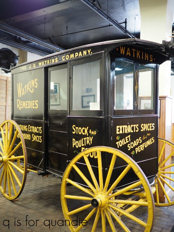
Mr. Q took a trip down memory lane because he sold Watkins Double Strength Imitation Vanilla Extract as a fund raiser when he was a boy scout.  He and his friend Timmy Johnson were the top sellers for their troupe, selling over 500 bottles of the stuff!

Personally my main interest in the Watkins museum were these fantastic vintage wooden totes that the salesmen used to carry their wares from door to door.

Much like the church shaped birdhouse in Old Frontenac, this would have made a perfect souvenir for me.  But alas, they were not for sale.  I wonder if I could somehow replicate that look?  I might see if Ken could make me one of these.

These cool old wood crates weren’t for sale either …

We did manage to score a few items in the gift shop though, including this cute little gift set that I put into the galvanized container that was one of the thrifting finds I shared last week.

The next item on our plan for the day was to check out the stained glass windows in town.  According to Debbie’s guide book, Winona is the stained glass capital of the U.S.  Yeah, I was skeptical too, but if you check out that link you’ll see it’s true.  Well, sort of true.  And sadly, I can neither confirm nor deny their claims because none of the public buildings were open due to COVID.  Once again, denied.

So instead we checked out a couple of shops downtown while Mr. Q enjoyed the local coffee shop.  We stopped off for a picnic lunch in a public park before hitting the road to continue south.  Before we head out of Winona though, I have to share this sign …

You can’t tell from the photo, but the paddle wheel turned in the wind.  It was really adorable.

Our next stop was meant to be The Bunnell House.

This gothic revival style house was built in the 1850’s.  I was fascinated by the fact that it was constructed out of white pine and has never been painted.  That sounds odd, but I’ve read that it wasn’t all that unusual to leave wood houses unpainted back then.  Obviously I wasn’t around, or everything would have been painted!

Unfortunately, our theme for the day once again reared its ugly head.

Yep, the Bunnell House was closed.  We were able to look at it through the fence, but that was about it.

So we moved on to the next stop on our itinerary, the Pickwick Mill.

But once again, you guessed it …
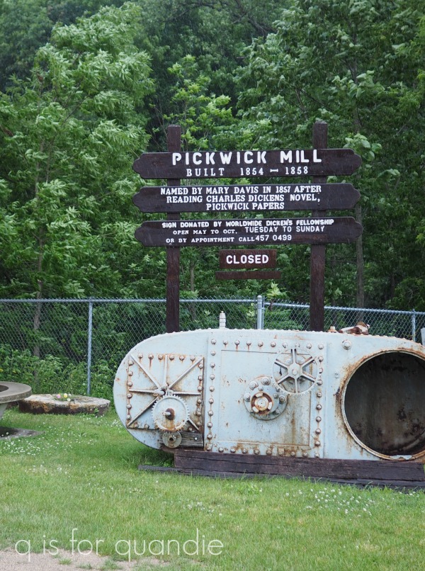
Closed.

Although we were disappointed to find both of these locations closed to visitors, I have to admit that the surrounding area was really lovely and we were traveling on some pretty scenic back roads.

We continued south to La Crescent, Minnesota where we crossed over the river to La Crosse, Wisconsin on this bridge …

Once again, there were several places we had wanted to explore in La Crosse that were closed.  We’d also planned on just walking around their charming historic downtown but as you can see in the photo above, a scary storm was blowing in.

We managed to make it into one shop before we decided it was best to head back to the car to ride out the storm.  Our plan after La Crosse was to head back up north on the Wisconsin side of the Mississippi.  We made it as far as Trempealeau, Wisconsin where we found a cute little motel overlooking the river.

I must have misplaced my camera at this point in our trip because I didn’t take a single picture in Trempealeau.  We visited the Trempealeau National Wildlife Refuge and then ended the day with dinner at a traditional Wisconsin style supper club, Sullivan’s.

Quite honestly, by day 3 of our adventure we were all fairly disillusioned.  Not only were most of the places we wanted to see closed, but the weather continued hot and humid making it difficult to enjoy the outdoor activities that were available.  So we decided to head to some of the nearby Rustic Roads in a last ditch effort to salvage the last day of our trip.

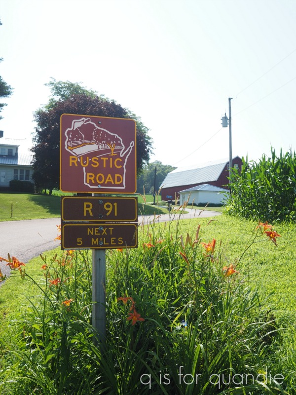
If you’ll remember, we discovered the Wisconsin Rustic Road program last summer.  Since then we’ve driven on all of the ones that are within an hour or so of the Twin Cities.  So it seemed like a good plan to check out some that we hadn’t seen yet.

This plan truly had us driving around in circles in what seemed like the middle of nowhere, but we sure saw a lot of the back roads of Wisconsin!

Eventually we realized we needed to head back to civilization.  We ended up in Alma, Wisconsin at the Buena Vista Park overlook where we had a picnic lunch and made reluctant use of a truly disgusting outhouse.

But we also enjoyed the spectacular view from the overlook.

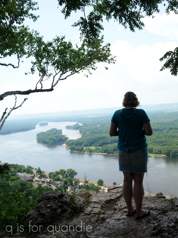
Well, maybe ‘enjoyed’ is the wrong word since both my sister and I are afraid of heights.  My niece was the only one brave enough to stand at the edge that was totally free of any kind of railing!  It makes my palms a little clammy just to look at that photo.

From Alma, we headed north and made our way back home to the Twin Cities.

At this point it’s probably obvious to all of you that this was not one of the greatest trips we’ve ever been on.  Of course, it has some pretty fierce competition for that title (like the best day ever in Invergordon, Scotland or our visit to Flåm, Norway).  We made a few mistakes in planning this one, like not checking to see what historic sites would be open (pretty much none) or making sure there would be things to do.  That being said, hotel accommodations and food were fairly easy to come by.  We totally enjoyed spending time with my sister and my niece, and we did see some beautiful scenery.  But hopefully by the next time we travel there will be a vaccine and life will have gotten at least a little bit more normal.

How about you?  Have you managed any travel this summer?  Or are you playing it safe and sticking close to home for now?
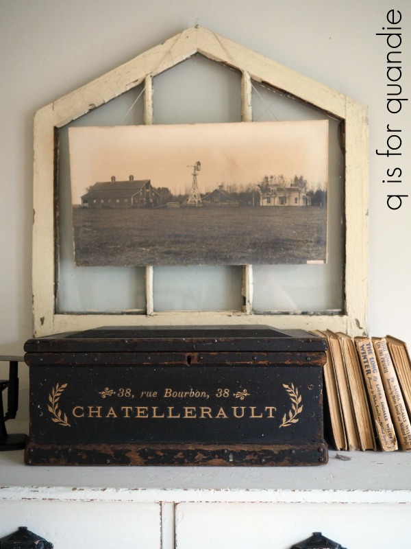