the bloom where you are planted toolbox.

I have another painted toolbox to share with you today.

Unfortunately I totally neglected to get a good ‘before’ photo of this one.

It’s actually the one at the back beneath the dark green one.  You can just see a bit of it there, and you can sort of see that someone half spray painted it brown.

Well, I painted over the outside in Dixie Belle’s Drop Cloth and I painted the inside in their Mint Julep.  Then I pulled out some scraps from the Cosmic Roses transfer from re.design with prima.  I’ve been using bits and pieces of this transfer on various things.  You last saw it on the Laundry Co sign …

I only had a few scraps left, but I was still able to trim them up and place them on both the outside of this toolbox …

plus on the inner tray …

This toolbox has a sort of bump out that holds the tray in place about half way down, and I was easily able to wrap the transfer around that.

I stenciled the top, and inside the tray using Dixie Belle’s Golden Gem Mousse.

I think the colors on this one are so pretty.

Normally this is the part where I mention that this toolbox is for sale locally, but this one has already gone home with its new owner.

I have a few more toolboxes coming up in the line up, plus a few other small projects I’ve been working on.  So be sure to check back next week!

As always, thanks to Dixie Belle Paint Co for providing the paint used for this project and to re.design with prima for supplying the Cosmic Roses transfer.

mac-grove 2021.

First up, I drew the names of the winners of the two bags of Dixie Belle’s Sea Spray that I’m giving away.  I swear to you guys that I totally draw the names of my winners at random (I use an online random number generator to pick them), so it was a funny coincidence that both winners are named Wendy!  Seriously, what were the chances?  But anyway, congrats to both Wendy’s!

I feel as though I never really got back into my garage saling groove this year.  Last year everything was up in the air because of Covid.  This year, things have sort of picked back up.  Some of the regular neighborhood sales came back, but not all.

My sister and I went to a couple of sales back in early June, but I didn’t bring home an impressive haul from any of them.

Then somehow two and a half months went by in the blink of an eye, and here we are at nearly September.  Not at all sure how that happened.  Did your summer fly by as well?

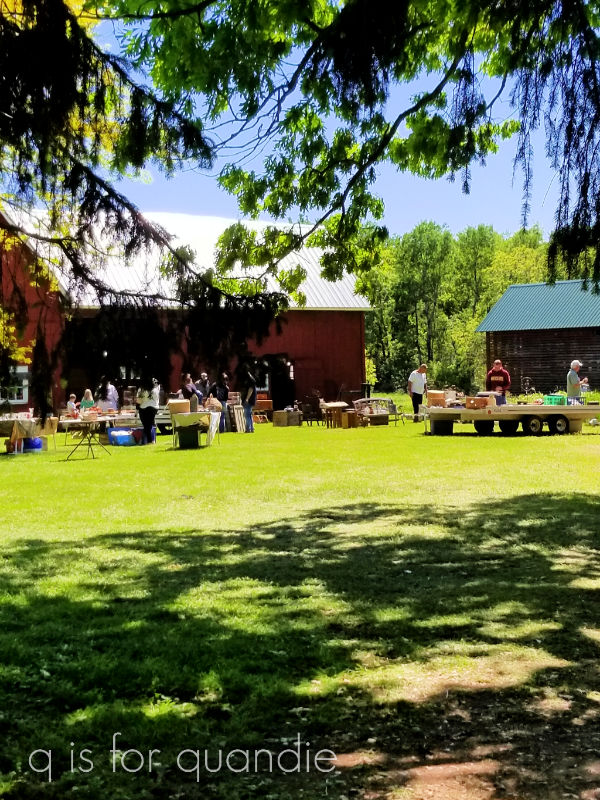
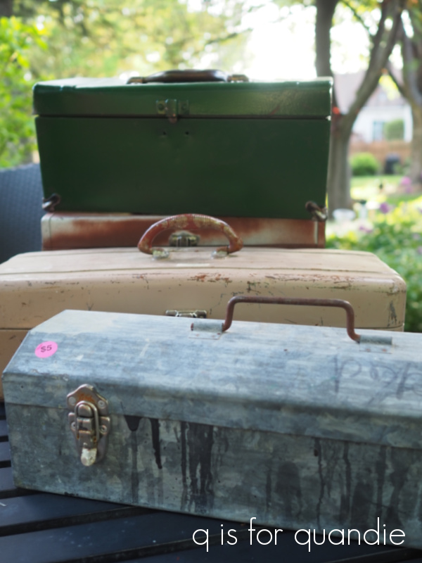
This past weekend one of my favorite St. Paul neighborhoods was having their annual sale day, Macalester-Groveland a.k.a. Mac-Grove.  Look at this fab haul from Mac-Grove in 2018 …

How in the world we fit all of that into the back of my sister’s SUV I’ll never know, but we did.

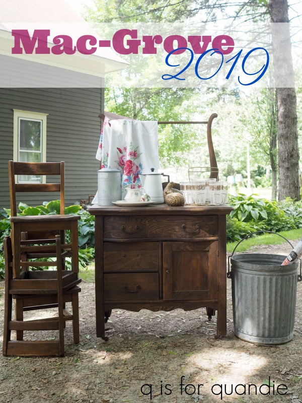
Here’s another really fun one from 2019 …

My niece happened to have a rare Saturday off work this past weekend, so the three of us headed out early feeling optimistic.

Unfortunately, I didn’t come home with another pile of fabulous stuff from Mac-Grove.  However, I brought home something a lot more important.  A renewed sense of faith in my fellow man.  That might sound a little dramatic, but honestly, every person we interacted with on Saturday was so friendly and just plain nice.  And it all felt just so very normal.

I think we’ve all been so overwhelmed lately with bad news coming at us from all directions whether it’s suicide bombers in Kabul, forest fires all over the place, a hurricane headed for Louisiana, or the latest Covid numbers.  In addition, on a personal level, things at my day job continue to be super stressful these days.  I don’t think anyone is having fun there right now.

So it was really, really good for me to get out and interact with other human beings in a such a positive way.  I really needed that this past weekend!

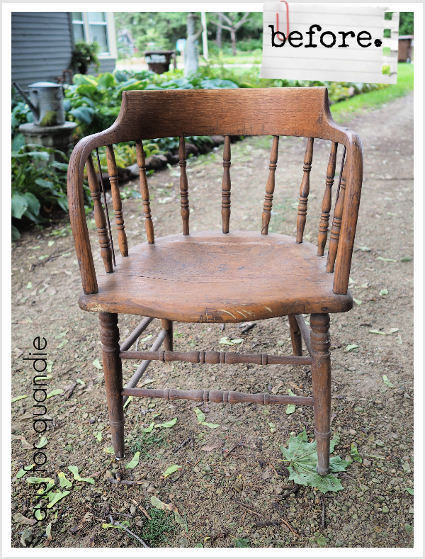
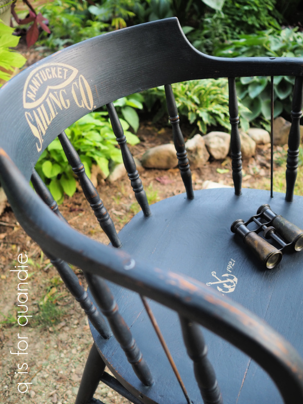
I did bring home a few fun things including this pair of chairs.

We currently have just 4 chairs around our patio table, and sometimes we have more than 2 other people over and I have to resort to pulling our dining room chairs outside.

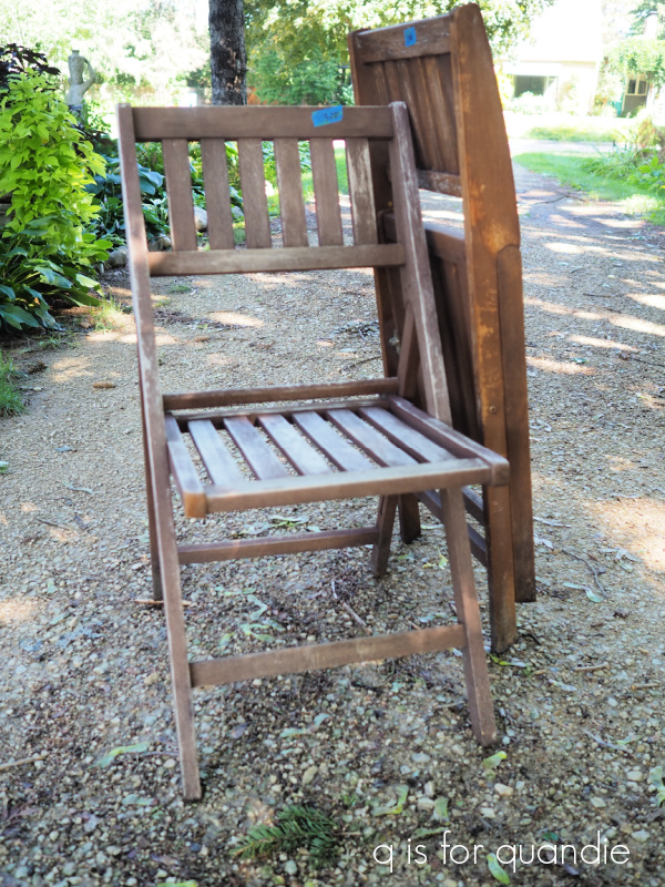
Sure, I have this other pair of folding chairs that I painted a year or two ago …

But they are a bit rickety.  I certainly wouldn’t want a guest to go crashing to the floor during dinner.

The pair I purchased at Mac-Grove also fold up and I can store them out of the way unless needed.  But they are also really sturdy, and I think if I add a little seat cushion to them they will be plenty comfortable for dinner on the deck.  Of course, I plan to give them a makeover and you’ll have to stay tuned for that.

The woman I purchased these from told us the sweetest story about a little girl who had just purchased a Barbie dreamhouse from her for $2.50.  She said the girl counted out her money very carefully and was just thrilled to be getting that dreamhouse and the seller was just tickled to see it going to someone who would love it.

I purchased this set of birch bark pieces to use as part of a thank you gift for an upcoming stay at a friend’s cabin …

and when I mentioned that to the gals selling it, they were so happy.  It had come from their aunt’s cabin and she had passed away.

They loved hearing that it would go to another cabin up north!

Then there was the couple who had tons of tomato plants in their garden including one that was a yellow, pear shaped tomato.  My sister thought they were peppers, and so she asked about them.  The husband said they were Yellow Pear Tomatoes (named simply enough), but that they didn’t taste good so don’t bother growing them.  His wife then piped in and said that wasn’t true, they were perfectly good.  She then popped one in her mouth to prove it, and offered us the chance to try them as well.  I suppose if we were tomato lovers we would have taken her up on it, but none of us really like tomatoes so we passed on that.  As we were walking away he was still insisting they were terrible, and she was insisting they were good, and we laughed all the way to the car.

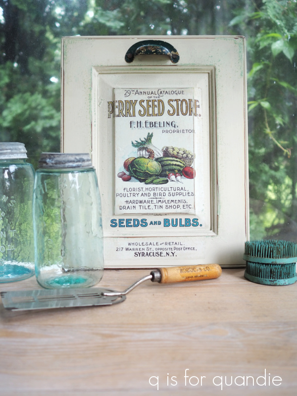
Somehow I just can’t pass up a good vintage scale, so I grabbed this one when I saw it.

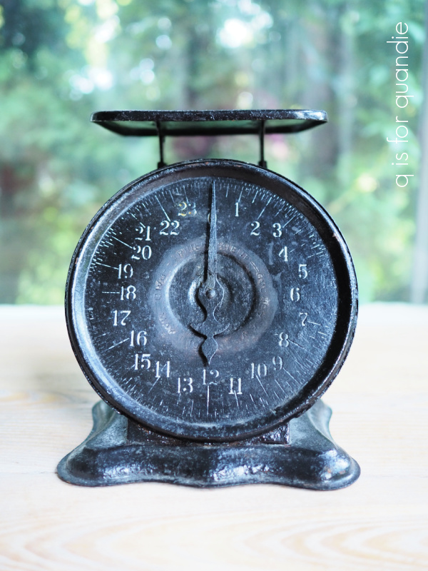
Are people still buying these?  Does anyone know?  I hope so.

How about vintage glassware?  I thought these poinsettia glasses were really fun.

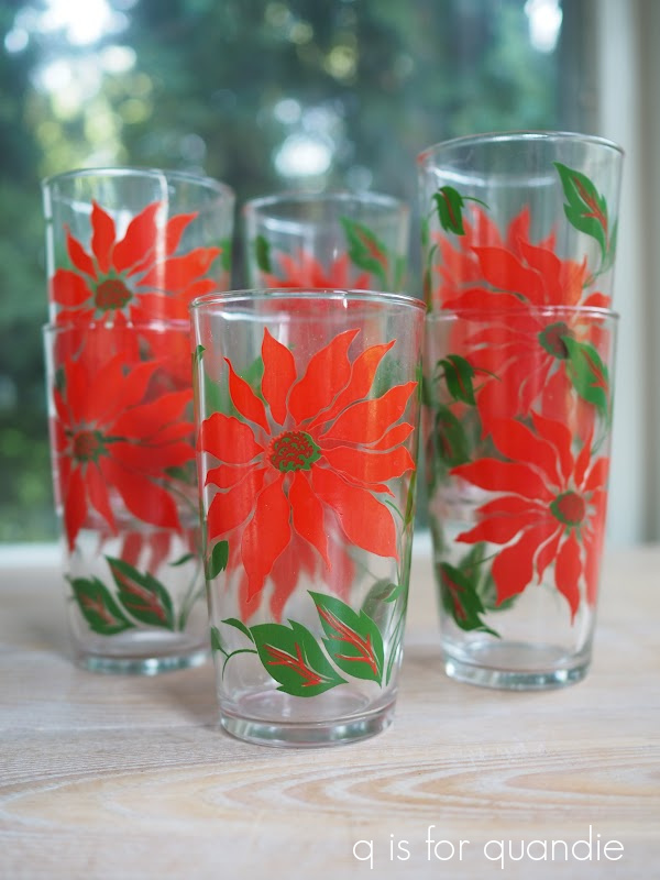
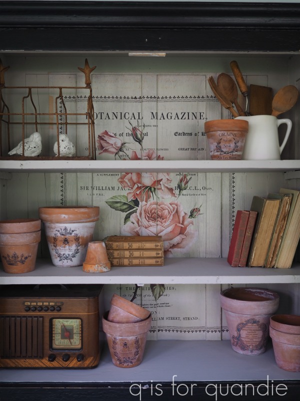
I’ll put them away until the holiday season when they’ll go to the shop as well.

I also purchased another old galvanized bucket that I’ll add a little something to, but that was about it for my garage sale finds at Mac-Grove this year.

My niece was in charge of driving this time around and she pointed out that she really only goes to these neighborhood sales to see the houses, so when we’d had enough garage saling we had a quick brunch at the Red Rabbit on Grand Ave (they have delicious mimosas, FYI) and then we strolled up Summit Ave to look at houses.

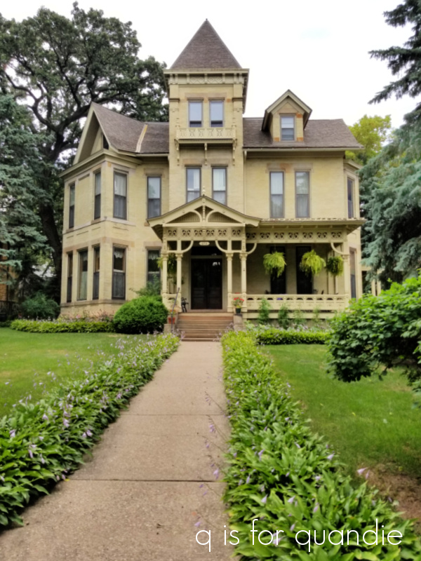
Who can resist admiring a few of these beautiful mansions from the past?

No one else loved that all white one above, but I really did, no surprise there.

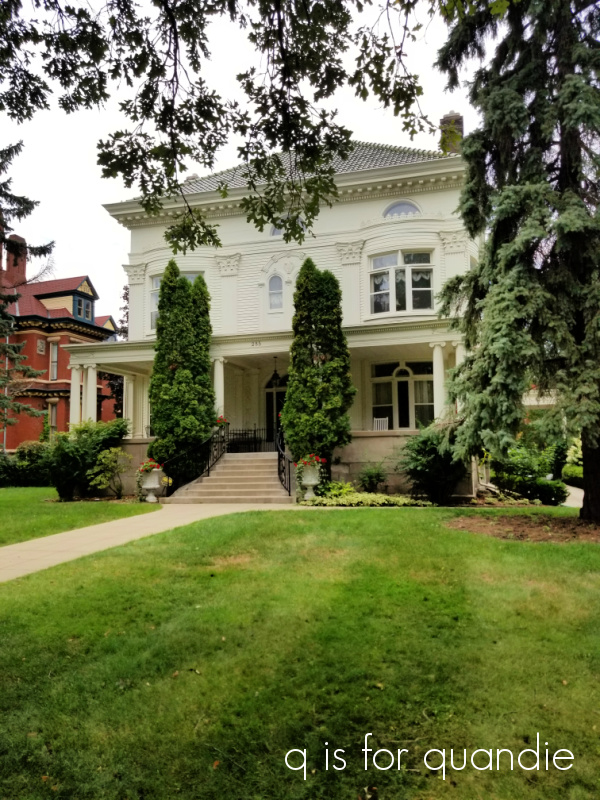
We decided that this next house must be haunted …

It was clearly unloved and had a bit of a foreboding spirit about it.

Speaking of haunts, with Halloween just around the corner (well, OK, for retail at least, and judging by how fast time is flying by these days, for me as well), I’m just putting the finishing touches on a few spooky items that I’ll be sharing with you guys soon so be sure to stay tuned!

the herbier toolbox.

First up, I just want to thank everyone who left a comment on Monday’s post.  I didn’t have time to respond to all of them this week, but I did read every one.  Also, for anyone who didn’t leave a comment, you can still get one in by midnight tonight for a chance to win a bag of Dixie Belle’s Sea Spray so be sure to check that out.

I did find time to do a little toolbox painting over the last week or two, so I thought I’d share one of those with you guys today.

Since my workshop out in the carriage house is not climate controlled, I have to strike while the iron is hot … or, well … not too hot, but not too cold either, and also not too humid.  In other words, when the conditions outside are perfect for painting, it’s a good chance for me to get a lot of stuff painted assembly line style.

With the toolboxes I start by piling them up on the lawn and giving them all a good wash with the hose and some spray Dawn dish soap.  Once dry, I sand them lightly (more if they are rusty, less if they aren’t) and then wipe them down again.  Then I add a coat of Dixie Belle’s clear BOSS to the rusty ones to slow down the rust coming through the paint.  I say ‘slow down’ because I don’t know that BOSS inhibits further rusting.  I suspect that over time they will continue to rust, just not as quickly.

I leave the BOSS to dry for a day, then start with painting the insides of all the toolboxes.  I painted one inside with DB’s Drop Cloth, one in their Mint Julep, one in Gravel Road, and one in Blueberry.  It’s lucky that I have a lot of paint brushes so that I can have lots of colors going at one time.

Once the insides are done, I move on to the outsides.  I used DB’s Putty, Drop Cloth, and French Linen on the outsides.  I generally paint all of the sides and tops one day, then the bottoms another day.  Sometimes that process takes twice as long because I decide to do a two-tone look on the outside (you’ll see that one later).  Once all of that is dry they are finally ready for the fun part, dressing them up.

Here is how this first toolbox started out …

Super red, and super crusty.  I love the shape of it though, and the way it opens up with two sides that are on hinges.

After its coat of BOSS, this one got two coats of Drop Cloth on the inside followed by a couple of coats of DB’s flat clear coat to protect it.  Then I added some of re.design with prima’s decoupage paper to line the bottom.

For the outside of this one I decided to step outside of my Dropcloth box and paint it in Dixie Belle’s Putty.  I thought that the Putty would create the perfect backdrop for the IOD Floral Anthology transfer that I wanted to put on the front.

I think this color provided a little more depth to the overall look of the toolbox.

Once I had the floral section in place, I added some wording from the IOD Label Ephemera transfer.

The little crown on the top is from a re.design with prima Classic Vintage Labels transfer.

I added a couple of coats of Dixie Belle’s flat clear coat over everything to protect it.

I absolutely love how this one turned out.  It may be my favorite toolbox so far.

It would be perfect for storing craft supplies.  But I think I’d consider keeping my makeup in there too.  You could also store your scarves in there.  So many possibilities!

I am selling this one, and I’m pretty sure there wasn’t anyone left on my painted toolbox waiting list, so this one will be up for grabs.  Be sure to check out my ‘available for local sale‘ page if you are local and in need of a fabulous painted toolbox.

As always, thank you to Dixie Belle Paint Co for supplying the BOSS, the paint and the clear coat used on this project.

if at first you don’t succeed.

Sometimes you just have to try again.

I painted this twin bed back in January …

I have to admit, I didn’t absolutely love it when it was finished.  But that’s not totally unusual, there are plenty of pieces I’ve painted that didn’t exactly tug at my heart strings but they still found a home with someone who did love them.

But that wasn’t the case with this bed.  It didn’t get even a spark of interest from a potential buyer in the last six months.  And quite honestly, I probably didn’t promote it as much as usual because I didn’t really love it myself.

So, I decided to re-purpose it entirely by turning each piece into a sign, starting with the headboard.

To begin with I gave it a coat of Sweet Pickins milk paint in a color called Window Pane which is a white with a grey undertone.  I was trying to go for a chippy look.  But once it was painted I really didn’t love the color.  I’ve found this particular shade of white kind of finicky.  It either really works on something, or it really just doesn’t.  I’ve painted over it as many times as I’ve kept it.

So I went back to the drawing board again.  I mixed up some of Dixie Belle’s Mint Julep with their Sea Spray additive to add texture.  I stippled that onto the headboard in random spots, mostly around the frame.  I’m learning as I go with this product, I’ve found that I don’t really like lots of texture, I want my results to be a little more subtle.  So once the textured Mint Julep was fully dry, I sanded it down a bit to knock off the peaks.  Then I painted over the entire thing in my final color, DB’s Midnight Sky.

Next up I pulled out the Farmers Market stencil that I purchased from Wallcutz.

My favorite thing about Wallcutz is that you can order their stencils in different sizes.  This one is available anywhere from 10″ x 17″ up to a whopping 22″ x 38″.  Mine is the 16″ x 28″ version, which currently is priced at $21.95.  I think you get a lot of bang for your buck with these larger sized stencils.

I used my shadowing method to create a shadow behind just the word “Farmers”, and behind the little do-dads on either side of the word “Market”, and although it looks OK in person, it’s a bit too subtle to show up well in photos.

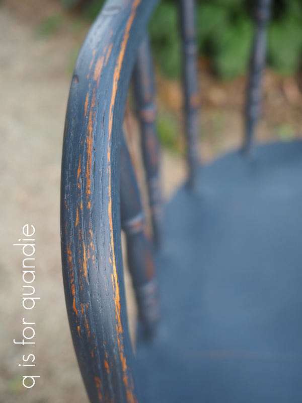
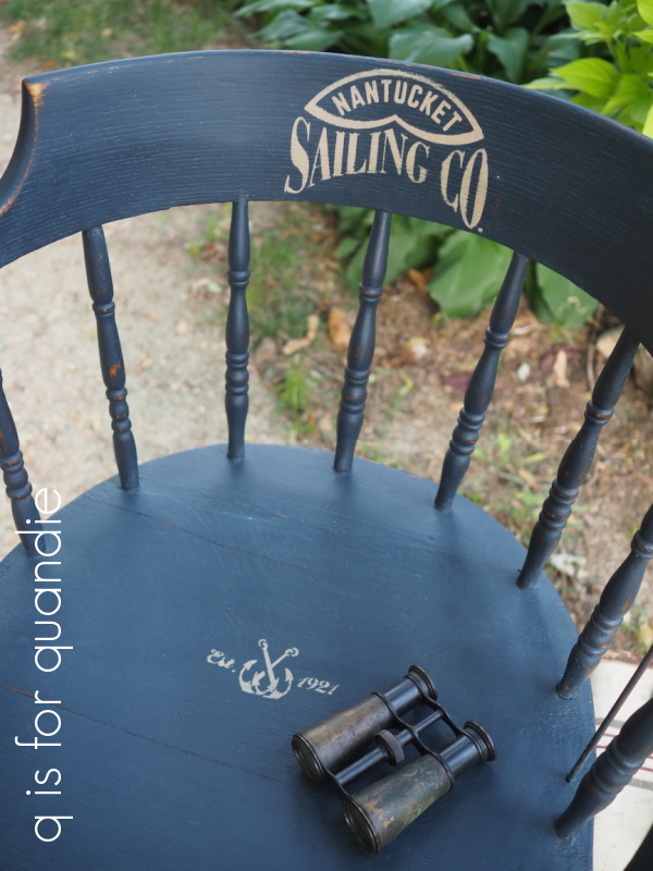
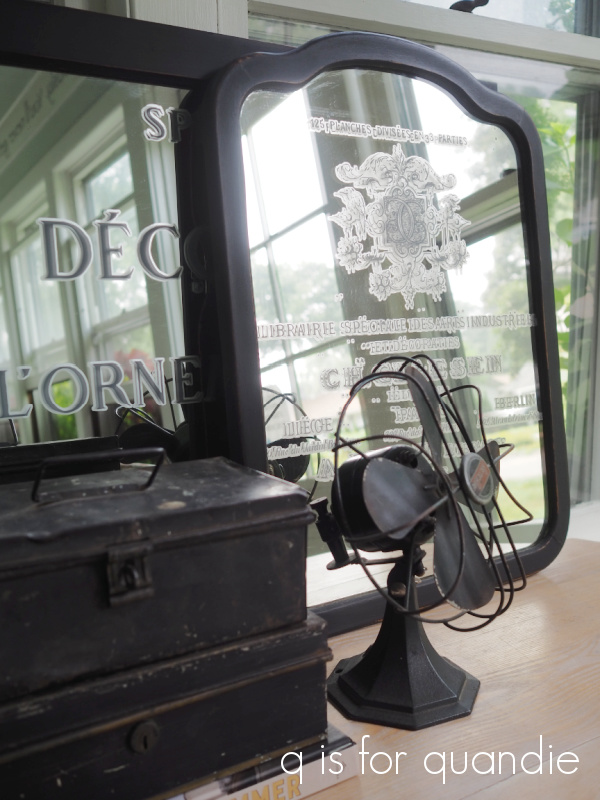
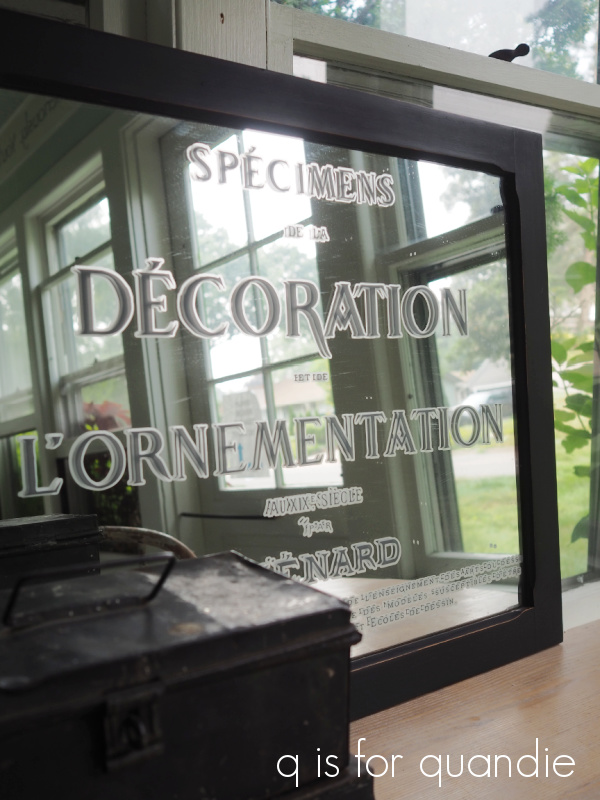
In hindsight, I wish I’d gone a bit darker with the shadow color.  The full stencil was painted using Dixie Belle’s Putty, and the shadow was Putty mixed with some Gravel Road to darken it up.

The first time around with the stencil, I kept the full design intact.  But then I realized that it looked off balance to have nothing at the bottom of my “sign”, so I sanded off the “DAIRY PRODUCE DRY GOODS” section from just beneath “MARKET”, painted back over that area with Midnight Sky, and then moved the stencil down to the bottom section of the headboard and added those words there.

Once everything was dry, I sanded with 120 grit paper to distress.  That revealed some of that Mint Julep texture that was under the Midnight Sky.  You can also see a bit of that Window Pane in some spots, as well as the original DB Gravel Road that was on the bed in the first place.

Really, nothing adds age as well as several layers of different paint colors.  I added clear wax as a final top coat.

But wait, we’re still not done.  My ‘sign’ still needed a little something more.  So I went through my stash of old hooks and found a set of three that just happened to have some old chippy paint on them that was very similar in color to the Mint Julep.

So I added those between the two sections of stenciling.

They are perfect for hanging some ironstone pitchers.

Oh, and I almost forgot one more step.  I asked my neighbor nnK to bring over her circular saw and cut down the legs for me.  They were a bit too long hanging off the bottom.

So, what once was a bed frame now is a Farmers Market sign.

I’ll be doing something similar with the foot board, although I think I’m going to make it into a Christmas themed sign.  I may end up turning the side rails into signs as well.  I’ve done that before, and in fact even have a ‘side rail sign’ hanging in my own living room …

So, what do you think?  Do you suppose I’ll have better luck selling a Farmers Market sign rather than a twin bed?  If any of you locals are interested in it, be sure to visit my ‘available for local sale‘ page for more details.

Before I let you go today, I thought that since I’m having so much fun playing around with the Dixie Belle Sea Spray maybe I should share the wealth.  So I’m going to give give away two bags of Sea Spray.

The rules:  Simply leave a comment on this blog post to be eligible to win.

Your comment must be left on this blog post, not on Facebook or Instagram.  You are not required to follow my blog, although it would be awesome if you did!

I will randomly draw the names of two winners for today’s prizes from all of the comments left on this post by Friday, August 27, 2021 at the stroke of midnight (U.S. Central time).

The fine print: no purchase necessary, you must be 18 years of age or older to win, void where prohibited by law, the number of eligible entries received determines the odds of winning, approximate retail value of prize is $25, if the prize is not claimed by Friday, September 3, 2021 another name will be drawn at random to win, blah, blah, blah.

As always, thanks to Dixie Belle for providing the paint and Sea Spray I used on this project as well as the Sea Spray for my giveaway.

the vintage seed bin door.

If you’ve been reading my blog for long, you know I am a big fan of Disney.  Not necessarily Disney movies, but the Disney parks.  My sister and I have been to three of them, Disneyland, Disney World and Disneyland Paris.  I’m slightly embarrassed to admit that we passed up a visit to the Louvre to go to Disneyland Paris instead.  That was probably a bad call, especially since the park was pretty disappointing.  The crowds were insane (considering that at the time everyone said putting a Disneyland in France was a mistake and no one would go).  We literally stood in line for 30 minutes just to use the bathroom.  Next time I’ll definitely choose the Louvre.  But I’d love to get the chance to visit Tokyo Disney one of these days!

But I digress.  Currently my sister and I are planning a trip to Disneyland at the end of September.  For us, Disneyland is the OG park.  It opened in 1955, and our first visit there was way back in 1969.  Here’s photographic evidence.

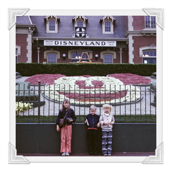
That’s me on the right and my sister on the left with my brother in the middle.

Anyway, we typically go to Disney World these days, but on a complete whim we decided to combine a trip out to visit to our mom with a trip down memory lane to Disneyland this fall.  We have been suffering from some serious travel withdrawal during this COVID business and we both have some travel dollars burning a hole in our pockets.

So what in the world does any of this have to do with today’s blog post?

Well, my sister and I have been watching the Behind the Attraction show on Disney+ in anticipation of our trip and one recurring theme for all of the rides (and really everything) in the Disney parks is that they all have a back story.  It may not smack you in the face, but even the décor in the queue is weaving a tale around you while you patiently wait to get on a ride.

And that had me thinking.

Maybe I need to come up with some back stories for my pieces, like this one.

That’s an old seed bin door from the Perry Seed Store in Syracuse, NY.    You know, one of those bins where the door is hinged at the bottom and you pull it down to access the seed.

Perry Seed Store has been around since 1898, selling seeds, bulbs, hardware, implements and bird supplies.

The proprietor, F.H. Ebeling, immigrated to New York from Austria in 1914.  Upon his arrival in Syracuse, he quickly found a clerk position in the Perry Seed Store selling all of the farming accoutrements needed for new settlers coming to America.  In 1918 the Spanish Flu broke out in Syracuse, but luckily Franz was a very diligent mask wearer and he was unaffected.  The original founder of the shop, Matthew Perry (a distant ancestor of the actor of Friends fame), was not so lucky.  He died tragically from the Spanish Flu in 1919 and his only heir, his son Joseph, had joined the circus as a sword swallower two years earlier.  Thus Franz was able to acquire the store at a bargain price.

The store contained a giant wall of seed bins and when you pulled open each of the 100 doors you could find anything from seed corn to tulip bulbs.  In order to make the shop feel more like his own, Franz hired his cousin Albin Egger-Lienz, a painter from Vienna, to add customized advertisements to all of the seed bin doors.

Handily enough, the shop was just opposite the post office so it was quite convenient for both Franz and Albin to send regular letters to the folks back home in Austria.

What do you think?  Are you buying my back story?  In case it’s not already obvious, I absolutely made all of it up.

Here’s the real story behind this piece.  This is another of the new cupboard doors that one of my readers shared with me recently.  Once again, I gave it some layers of age using Dixie Belle’s Sea Spray paint additive and three colors of paint, Mint Julep, Rebel Yellow and Drop Cloth.

Next I pulled out the Vintage Seeds transfers from re.design with prima and picked this section to use on the cupboard door.

As you can see, the transfer was just a tad bit bigger than the raised panel in the center of the door.  But, no problem.  I cut apart the ‘seeds and bulbs.’ and the ‘wholesale and retail.’ sections and placed them below, and I didn’t worry about the fact that the “P” and the “E” from Perry Seed Store fall off the edge a little bit.

Once the transfers were applied, I distressed the entire piece by sanding it well.  That was followed by a top coat of clear wax.  Finally, I pulled this old beat up cup pull out of my stash and added it to the top of the door.

I’ve had that thing for literally years just waiting for the right piece to use it on and I finally found it.

And ta da, a vintage seed bin door is born.  What do you think?

As always, thank you to Dixie Belle Paint Co and re.design with prima for providing the products used in this cupboard door makeover.

unpainted.

A while back my sister, niece and I took a Friday off work just for the heck of it.  We visited a few cute shops, had lunch at a fabulous spot in Stillwater (Brick & Bourbon where the whiskey & cola shaved beef was amazing), and ended up at Selma’s in Afton for some ice cream.  And all along the way we stopped at garage sales whenever we saw a sign.

We actually started out at a barn sale that we’d gone to last year as well.  It was one of the first sales I made it to last year after all of my regular spring neighborhood sales were canceled.

I bought a handful of things at the sale including this cool vintage camera to add to my non-collection (“non-” because I’m in denial that I collect anything) …

I get a little chuckle out of the ‘miniature’ name.  Here’s a comparison of this one to my truly miniature vintage camera …

The Falcon is about 5″ across.  For its day (1939), I’m betting it was considered quite small though.  I really just choose the additions to my non-collection based on looks.  I couldn’t care less about things like value, or how rare something is.  In this case, I loved the graphics around the lens.

I also picked up the frame to a dresser mirror at the barn sale.  It was pretty beat up, filthy dirty and the mirror was long gone.  But the price was right, so I grabbed it.  Unfortunately, once again I neglected to get a before photo.  Drat!  You’ll just have to use your imagination.

I cleaned it up, re-glued the joints, and as I was contemplating what color to paint it I realized that I kind of liked the look of the original dark stain.  So I decided to try something a little bit different this time around.  Instead of painting the frame, I gave it a light sanding to remove any loose bits of finish and then I refreshed it with some of Dixie Belle’s No Pain Gel Stain in Walnut.

I’d used this stain before on more of a bare wood surface, but this time I just wiped it right over the lightly sanded original finish on this frame using an old t-shirt.

This is the moment when I really wish I had a ‘before’ photo so I could show you the difference.  It was more of a subtle sprucing up rather than a dramatic change.

Gel stain sits on the top of a surface rather than soaking into it like traditional stains.  For that reason you can use it over an existing finish without removing every trace of the original top coat.  In this case it just sorted of blended everything a bit.

Once I’d let the gel stain dry for a couple of days (it’s an oil based product and takes longer to dry than water based products) I added part of re.design with prima’s Somewhere in France transfer to the bottom.

Then I used clear wax over the entire frame to give it a tiny bit of sheen.  I followed up by adding a piece of hardboard in place of the mirror.  I turned that board into a chalkboard simply by painting it with Dixie Belle’s Midnight Sky, then sanding it with 220 grit paper and not adding any sort of top coat to it.

And there you have it …

What do you think?

Are you on board with my decision to leave this one unpainted?  Or would you have preferred to see it painted?

I really enjoy taking something that many people would have thrown in the burn pile and turning it into something worthwhile again.  It’s so satisfying.

I think it would be perfect for a kitchen or dining room.  You could write your menu on the chalkboard when entertaining.  Or maybe you could just keep your grocery list on it.  If I had the wall space, I’d keep it myself.  But since I don’t, it’s for sale.  If any of you locals are interested, be sure to check out my ‘available for local sale‘ page.

Thank you to Dixie Belle Paint Co for supplying the No Pain Gel Stain and Midnight Sky paint, and to re.design with prima for supplying the Somewhere in France transfer.

the belles fluers suitcase.

Remember that I told you my neighbor, nnK, brought me some suitcases?  They were from her uncle’s estate sale in Iowa.

One of them was a simple (i.e. inexpensive) cardboard-ish suitcase with a plastic handle.  I’m not really sure how these were constructed, but they seem to be paper applied over a wood and cardboard sort of frame.

Anyway, here’s the before …

Technically that’s not a true ‘before’ shot because I had already cleaned it up before taking it.  But you get the idea, just picture it a bit dirtier.

After cleaning it up, I decide I really quite liked the look of the beat up paper surface and I didn’t want to paint this one.  So I decided to just play around with some new IOD transfers that I purchased recently.

So I pulled out the Floral Anthology transfer.

Sorry, I stole that image off the web and it doesn’t even come close to doing justice to these transfers.  But hopefully you get the idea.  With the Floral Anthology set you get 4 sheets of transfers and they can be combined any way your heart desires.  In my case, I just started cutting the different elements apart and then placing them on my suitcase to create a sort of floral border.

Once I had the floral pieces in place, I added the wording from the IOD Label Ephemera transfer.

The sort of faded look of the Floral Anthology transfer was just perfect over the beat up suitcase.

I struggled just a little bit with getting the transfer to stick to the flaking paper suitcase in some spots.  The paper would come up with the transfer, rather than the transfer sticking to the suitcase.  But I figured out that if I put down a coat of flat clear sealer from Dixie Belle, let that dry, and then tried again in those spots it worked like a charm.

So, in hindsight, I realize it would have worked better to seal the suitcase with the flat clear coat first and then add the transfer.  I’m going to try to remember that for next time.  You know, should I ever happen to be adding a transfer to an old cardboard-ish suitcase again.

But even though there might technically be a flaw here and there, overall it turned out fabulous.

I really don’t think anyone would even notice that it’s not precisely perfect.

This really is just meant as a decorative piece.  You could place it on top of a cupboard, on the floor at the foot of your bed, or just in front of your dress forms.  You could easily use it to store some of your off-season shoes, or maybe your Christmas decorations (that’s what I do with my vintage suitcases).

This was really just a super satisfying project to work on.  It just took adding a few transfers to really make this suitcase feel like something special.

As much as I’m tempted to keep this one, I’m going to be selling it.  If any of you locals are interested, be sure to check out my ‘available for local sale‘ page for more details.


the farm fresh shelf.

My picker found this shelf for me at a garage sale earlier this year.

This is one of the those farmhouse/country/rustic style pieces where I feel like you just have to go with that style rather than trying to change it.  So I decided to just embrace it by using the Out on the Farm transfer from re.design with prima.

When I pulled the transfer out of the tube, I was surprised to find that it had changed since the first time I used this particular design.  That was back in June of 2019 when I used just half of the transfer on this washstand

At that time the complete transfer I had looked like this …

I had ordered another one of this design back when I was a content creator for re.design with prima, so I can’t say exactly how long I’ve had it in my stash, but this 2nd one looks like this …

So, go figure.  I guess they changed it.  Who knew?

Well, probably people who were paying attention knew, but clearly I was not paying attention.

I thought I’d share that little piece of info with you guys in case any of you weren’t paying attention either.  And by the way, I did find both versions of this transfer available from various vendors on Etsy.  So if you’re ordering one, that would be the time to be sure and pay attention to which one you want 😉

The one thing I wished I’d done differently on that washstand two years ago was to paint it in a shade of white that blended better with the background color of the transfer.

Not that it looked bad, but I would have preferred it to blend a little bit more at the edges.

However, that washstand came already painted and I simply added the transfer.  But this time around I chose to paint my shelf in Dixie Belle’s Sawmill Gravy.  It’s more of an off white with a very grey undertone, and it ended up working beautifully with the transfer.

Before we go any further, let’s address the elephant in the room.  That is, putting a transfer on the inside back of a cupboard.

I used to be rather opposed to that idea.  I felt like it was a waste since you’d be covering up most of the transfer with items on the shelves.  But then I put a transfer inside my own cabinet out on my front porch …

And I loved how that turned out.  Also, the usually suppressed minimalist in me appreciates having less clutter on those shelves.

Instead of filling up the shelves completely, you can showcase just a few special items while allowing the transfer to peek through.

I think it works.

As you can see in my photos, after painting and then applying the transfer, I sanded the edges of the piece to give them a worn look and then I added a topcoat of clear wax.

All that was left was to add knobs.  Back when the piece was in its original wood finish I kind of hated those knobs.  To me they were just too ‘in your face’ because the white ceramic was a bigger contrast with that medium toned pine.  So my original plan was to change them out for something different, although I wasn’t sure what.

But actually, once the piece was painted I thought the knobs worked.

They don’t jump out at you quite as much.

And with that, there you have it.  A farm fresh shelf.

Perfect for a dining room, kitchen, mud room, pantry, laundry room, and so on and so on.

If any of you locals have a spot for it, be sure to check out my ‘available for local sale‘ page for more details.

Thank you to Dixie Belle Paint Co for supply the Sawmill Gravy paint, and to re.design with prima for supplying the Out on the Farm transfer.

wash, dry and fold.

T.G.I.F. everybody!

It has been another crazy week for me at the day job, to the point where I almost didn’t have a post again today.  But I managed to crank out this one little project to share with you guys.

This sign was the result of experimenting with a couple of different products.

But let’s start at the beginning.  One of my regular readers contacted me recently and offered me a whole bunch of old cupboard doors.  She was cleaning out her house and workshop in preparation for a move and decided she wasn’t ever going to get around to turning them into signs herself so she brought a bunch over for me.

Now I’m fully stocked for creating some more signs for the holiday season this year.  But the thing about these cupboard doors (and most of the ones that I find at the ReStore) is that they are usually new.  And that tends to make them just a little bit too pristine for my taste.  So I wanted to experiment with aging them up a bit.

Unfortunately, I totally neglected to take any photos of the process.  But perhaps I can explain what I did.  I started out mixing some of Dixie Belle’s Mint Julep paint with some of their Sea Spray additive.  The purpose of the Sea Spray is simply to add some texture to your paint.  Once I had mixed those to a brownie batter like consistency, I used a cheap chip brush to apply it to my door in a few spots.  I did not put it all over, just dabbed it on here and there.  Once that was dry, I added some swipes of Dixie Belle’s Rebel Yellow here and there (without Sea Spray).  Once that dried, I painted a couple of quick coats of Drop Cloth over everything.  Finally, again once dry, I sanded over the entire thing.

As you sand, that Mint Julep with Sea Spray texture really comes through the top coat of Drop Cloth.  You can also see bits of the Rebel Yellow here and there.

Next up I pulled out some leftover scraps from the Cosmic Roses transfer from re.design with prima and added them to the door.

Finally I pulled out the Laundry & Co stencil from Maison de Stencils.  I originally thought it would look great to just add the stencil in a dark blue paint color.  However, after I had it stenciled, it really just looked flat and one dimensional.

So I grabbed my Dixie Belle Gemstone Mousse in Golden Gem.

Then I used my trick of placing the stencil just up and to the left a tad so that a slight shadow would be left behind by the dark blue paint.  I used a stencil brush to add the Gemstone Mousse right over the dark blue.

The mousse was the perfect consistency for stenciling and the metallic Golden Gem color helps tie in the gold wording from the transfer.

Once the stencil paint was dry, I added a quick coat of clear wax over everything.

This was such a fun project to work on.  I tested out a couple of techniques that I’ve been wanting to try, using the Sea Spray and the Gemstone Mousse.  I’m definitely going to continue using that Sea Spray to add some texture, a.k.a. some faux age, to pieces going forward.  And I’m also sure to get lots of use out of that fabulous gold.

How about you?  Have you tried any of these products?  If so, how did you like them?  And what do you think of my sign?  Be sure to leave me a comment and let me know.

As for you locals, this laundry co sign is for sale.  Be sure to check out my ‘available for local sale‘ page to see more details.

random small projects.

This week I’ll be sharing a few random small projects that I’ve been working on lately starting with this fire house captain’s chair.  Here is how it looked when I purchased it …

You can’t really tell in that photo, but there was a rung missing from the bottom right (your right, chair’s left).  Ken replaced that for me some time last year, and then this chair just patiently sat in the photo cottage (which has now become the furniture storage cottage) awaiting its makeover.

I painted one of these chairs two years ago (you can see it here) and that’s when I discovered that this style of chair is called a fire house captain’s chair.  I wasn’t able to find any info online that explained why they are called that, but if you google it you’ll see many examples of the style.

I finally pulled it out last weekend and decided to paint it using Homestead House milk paint in Midnight Blue.  But before I started painting with the milk paint I needed to put a coat of something on that new rung.  It was bare wood and had I painted it right off with the milk paint, the paint would have soaked into the unfinished wood and given a much different look on that rung than on the rest of the chair.  So I simply gave the rung a quick coat of Dixie Belle’s Coffee Bean.

Once that was dry, I mixed up my Midnight Blue and gave the whole chair two coats of that.

Speaking of fire(s), sort of, you may notice a lovely golden glow in some of my photos.  We are getting a lot of smoke from the wildfires in Canada these days.  Like, seriously, ‘worst air quality on record’ sort of smoke.  I snapped a quick photo of the cottage to see if I could capture the smoke in the air …

There wasn’t a cloud in the sky when I took that, just a smoky haze.  You can also see my brown grass.  We’ve decided to let the lawn go since we are under a watering ban (we can only water on odd days, before 10 a.m. or after 5 p.m.), instead I’m just focusing on watering the gardens and some of my plantings that were new this year.

The quantity of smoke in the air is quite surreal, but it does make for some pretty lighting for outdoor photos, making the golden hour even more golden.

Anyway, once again, I would have been fine with some of that milk paint chippy goodness on this piece, but the finish was super dry and thus didn’t really chip.  But I gave it a good, harsh sanding once the paint dried because I wanted a very worn appearance.  Especially on the arms of the chair that would have worn down naturally from use.

Since I’d chosen a navy blue color, I decided to go with a nautical sort of theme.  I pulled out a stencil that I had from Maison de Stencils called East Coast Yacht Club and used some Dixie Belle paint in Putty to do the stenciling.

Initially I wanted to use the full 12″ x 12″ stencil on the seat of the chair, but because the seat is fairly curved, I couldn’t get the stencil to lay flat enough to get a crisp, clean result.

So I went with just a small section of it on the seat back, and another on the seat itself.

I was totally stumped when it came to staging this chair for photos.  I really don’t have a stash of nautical-ish props lying around.  So I just went with a simple vintage suitcase and some old binoculars.

Wouldn’t this chair be absolutely perfect for a lakefront home?  Or maybe just for someone who wishes they had a lakefront home?

Next up today is this antique piano stool.

This was another garage sale find from last year.  The seat was not attached to the base properly, so every time I would pick up the stool, the seat would come off in my hands and the base would be left behind.  So, Ken fixed that up for me and then this piece sat in the photo cottage waiting for its makeover along with the firehouse chair.

I began the job by stripping the seat.  In hindsight, I’m not sure I really needed to do that.  It wasn’t in terrible shape.  It was maybe a tad too shiny for my tastes, but that probably wasn’t worth the effort to strip and re-stain.  None the less, that’s what I did.

I re-stained the seat in Special Walnut, and then added a very subtle stencil (also from Maison de Stencils) using Dixie Belle’s Midnight Sky paint.

Once all of that was fully dry, I coated it with some of Dixie Belle’s flat clear coat.

I painted the base of the stool in the Midnight Sky as well.

Then I sanded the edges to distress and added a top coat of Dixie Belle’s Big Mama’s Butta, which I love using over a dark paint color like this one.

You may not have a piano, but this stool is perfect to pair with a desk or makeup table, but I also think it would make a nice small side table, just big enough to place a beverage on.

That brings me to a couple of mirrors that were due for a quick makeover.

As you all know, I like to remove mirrors from dressers.  Personally I prefer most of them without their mirror.  Then every now and then I pull out the mirrors, paint the frames, add hangers to the back and sell them separately.

These two each got a coat of Miss Mustard Seed milk paint in Typewriter on the frames.  Once again, I didn’t get much in the way of chipping.  I seem to be 0 for 2 on the chipping for this post.

Once painted, I cleaned the glass and added some old IOD transfers to them.

It is next to impossible to do justice to these in a photograph.  My camera refuses to focus properly on them.

But hopefully these pics give you some idea of how they turned out.

So that’s it for small projects today.  I have a couple more that I hope to have finished and shared with you by the end of the week.  In the meantime, all of these items are for sale and will likely eventually end up at the shop where I sell on consignment, Reclaiming Beautiful in Stillwater, MN.  But if any of you locals need a chair, piano stool or mirror, be sure to let me know (you can check out the details on my ‘available for local sale’ page or email me at qisforquandie@gmail.com).