harvesting hydrangeas.

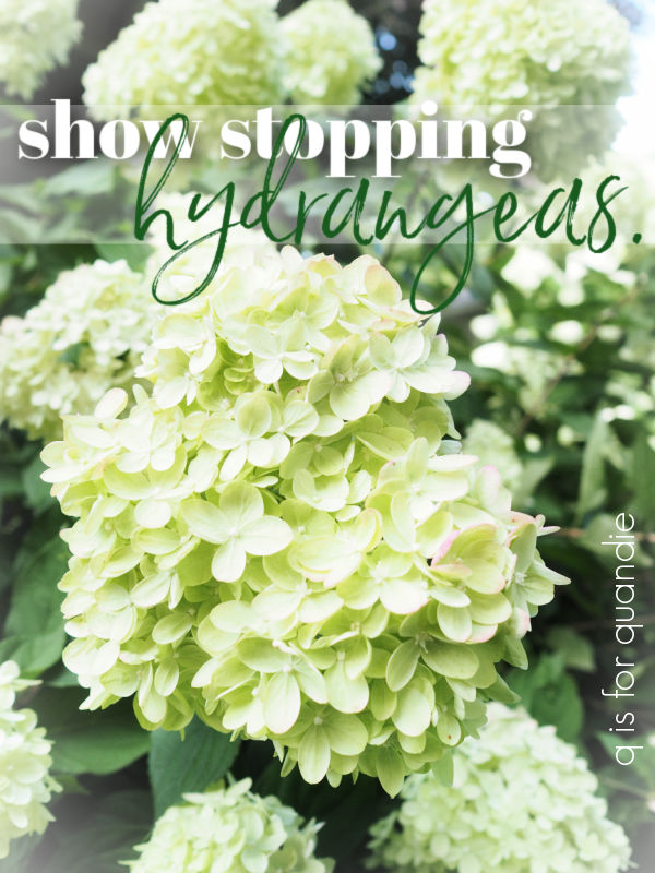
Good morning, and welcome back to Sunday mornings in the garden!

Last winter I didn’t quite get to filling my window boxes for winter until mid-December.  I’d left all of my hydrangeas on the bushes up to that point.

Don’t get me wrong, I always leave lots of hydrangea blooms in place for winter interest and I don’t prune them off until early spring.

But I usually get some cut off the bush by early October for my winter window boxes.  I’m cutting myself a bunch of slack on that one for last year though.  If you’ll remember, I was in the midst of trying to deal with an increasingly unpleasant work environment and ultimately making the decision to retire early on November 30.  So last fall doesn’t count.

I did find that the hydrangeas had really lost all of their color by the time I got around to gathering them for my window boxes though, especially the Annabelles.  So this year I’m going to be more intentional about drying them for use later in winter arrangements.

I did a bit of online research and learned that the best time to harvest hydrangeas for drying is when the blooms are past their prime and starting to dry and/or change color on the bush.

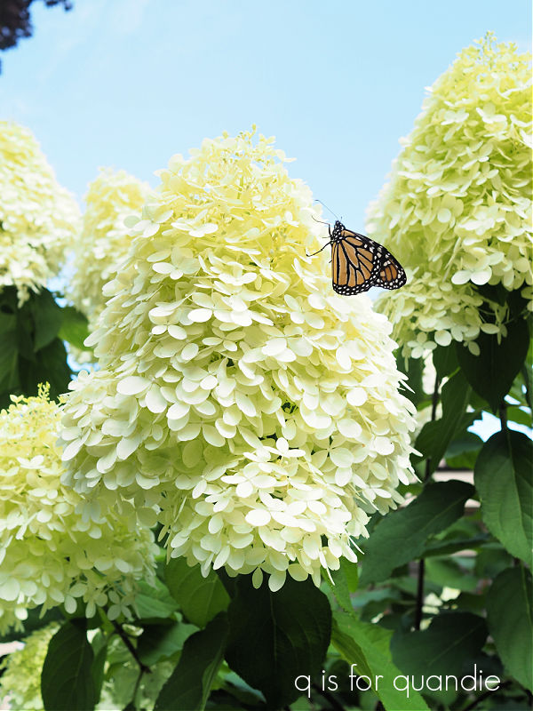
That timing is going to be different for different varieties of hydrangeas because of their bloom times.  My Annabelle hydrangeas started blooming back at the end of June.  Their flowers went from white, to green and are beginning to show a bit of brown here and there.

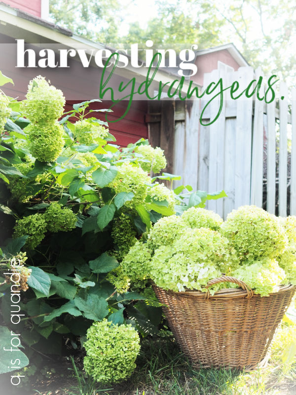
That, combined with the fact that we’ll have roofers here in the coming weeks doing who knows how much damage to plants, made me decide to go ahead and harvest them a week or so ago.  Especially the ones in the cutting garden.

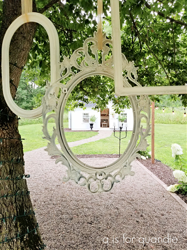
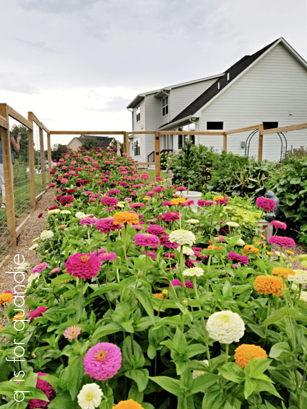
For those of you who may not already know, my cutting garden is out behind the carriage house.  You can’t see it from the rest of our yard.  Everything I grow there is meant to become a cut flower and it doesn’t matter how the garden itself looks.

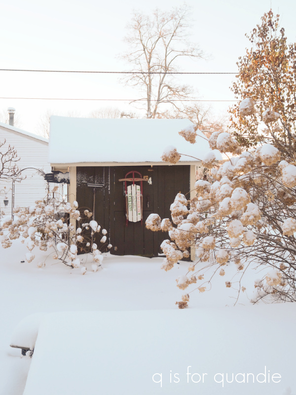
You can see where the roofline of the lean-to is in the above photo, very close to that hydrangea.  It’s unlikely it will survive the new roof unscathed.

So, while I probably could have waited a couple more weeks to do this, there’s no time like the present … at least for the Annabelle’s.  I’ll continue to let the paniculatas color up a bit more before I cut any of them to dry.

There are probably tons of different methods for drying flowers, but let’s talk about the 4 most common ones.

First, you can hang them upside down in little bundles.  This works great with flowers like roses where the blooms will droop if you dry them upright.  For the most part, you don’t really need to worry about that with hydrangeas.

Second, you can use silica gel or powder.  That’s not really practical with hydrangeas since you have to completely surround the bloom with the silica, can you imagine how much silica I would need to dry all of these?

That leaves the two most popular ways to dry hydrangeas, with water and without water.

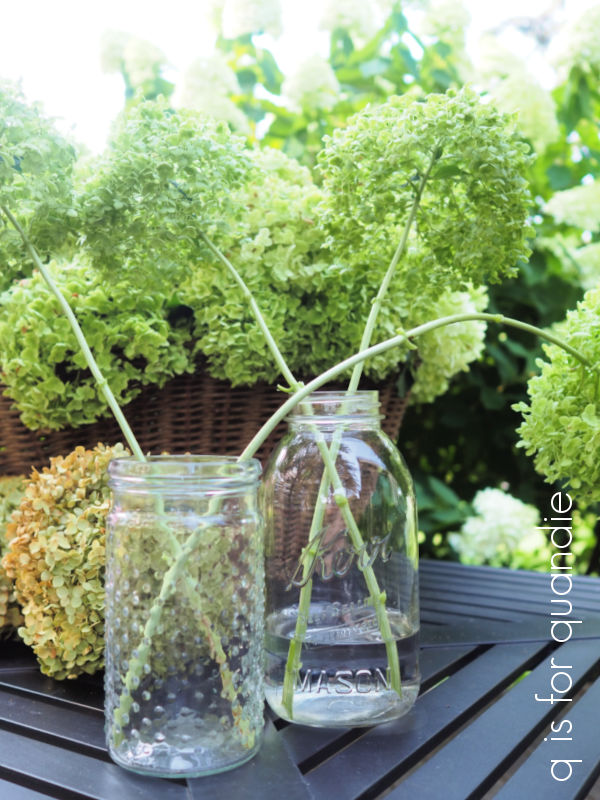
Basically the only difference between the two is whether or not you put a little water in the vessel you are drying them in.  Otherwise the technique is the same.  Cut your hydrangeas with a longish stem.  You can always shorten it later when you arrange the flowers, but you can’t add any stem back on.  Remove all of the leaves, and then place the stems upright in a container of some kind.  If you’re using water, only put a couple of inches of water in your container.  Next, place the container in a cool, dry location away from sunlight.  Once the water is gone, your hydrangeas should be dry.

I did a little experiment to see if there was a noticeable difference between the hydrangeas dried with water, and those without.  From what I’ve read, the water option allows the hydrangeas to dry out more gradually thus providing a better result.  So here we are a little over one week later.  The water is mostly gone from the jar with water, and here is a comparison of the dried blooms.

The difference is very subtle.  However, I was surprised to find that the hydrangeas dried without water kept just a little bit more of their green color.  But honestly, I don’t think it’s enough of a difference to matter.

In addition to the hydrangeas in the jars, I also tucked that entire basket full of cut hydrangeas into a dark corner of the carriage house to see what would happen with them.

And they look pretty darn good too.

Obviously this little experiment could be a one off.  Or maybe it’s just Annabelle hydrangeas that dry just as well without water as with water.  I think I’ll do a similar test with my Limelights after they develop some of their fall color and see how those turn out.  I’ll be sure to keep you posted on that one.

In the meantime, I’m looking forward to having tons of beautiful dried hydrangeas to use in my winter window boxes.  How about you?  Do you dry any flowers from your garden?  Leave a comment and let us know.

the first aid chest.

I know I said I would share the completed potting shed project with you guys today, but I’ve been a bit under the weather this week.  No worries, it’s just a cold, but rather than try to push through and do a half-assed job of sharing the final reveal I decided to put that off until next week.  So I’m sorry, but you’ll have to stay tuned for that once again.

In the meantime, I had one last small makeover project to complete my furnishings for the shed so I thought I’d quickly share that today.

My friend/picker Sue found this little plywood chest somewhere.  She initially purchased it for herself and was going to put it on her front porch, but she ultimately found a piece better suited for that spot so she passed this one on to me.

I wasn’t planning on keeping it, it was in the pile of things to makeover and sell.  But as I was completing my work on the potting shed, I decided I needed something next to the wicker chair.  As it turned out, this chest was the perfect size for that spot.

So the next task was to decide what sort of look I wanted for it.  I didn’t want it to compete with the potting bench, and thus, I didn’t want it to be too busy.  So no florals.  I also didn’t want it to match the floor, so I decided no grain sack stripes in the Dried Sage color from the floor.  It will sit next to the green wicker chair, and I didn’t want to match that either, so no green.  After studying the space, I decided that I wanted it to be plain white (ie. Dixie Belle Drop Cloth), but I also wanted to pull in a little of the red from the florals on the bench and the chair seat.  So I went with the ol’ first aide cross in Dixie Belle’s Honky Tonk Red.

After painting the chest with two coats of Drop Cloth, I taped off the cross and gave it two coats of Honky Tonk.

I then added some scraps of wording left over from an old Seeds transfer to the top, and the small ‘1871.’ to the bottom front to give it just a little more detail.

I sealed the piece with a few coats of Dixie Belle’s flat clear coat to protect it.  The spot where it sits is below a window with a screen only, so it will be somewhat exposed to some weather.

Had I been making this chest over to sell, I would have done something with the inside too.  However, I never go the extra mile for my own pieces (are any of you like that?).  I’m just planning to store extra potting soil inside, so no need to get all fancy.

This was really a super quick and easy makeover, accomplished in an afternoon (and despite not feeling well) and I’m quite happy with how it turned out.

It’s a perfect fit for the spot next to the chair, and I think it adds just the right touch.


What do you think?

the evolution of a space.

I was digging through old photos the other day looking for a picture of my front porch floor for Monday’s post, and I realized that our front porch was a great example of how a space changes incrementally over time.

When we purchased our home way back in 1988, the front porch was very utilitarian with white walls, trim and ceiling and a grey painted floor.  The previous owners had mainly seemed to use the area as a place to stash stuff.  I was so excited to have an old fashioned three season porch!  And obviously it required wicker furniture!  In addition to the purchase of a set of wicker furniture that included a chaise lounge, a chair, a coffee table, a small round stool and a console table, my friend Sue helped me add a stencil just below the ceiling.

Don’t judge, it was the 80’s.  Stenciling like this was all the rage.

Unfortunately, that’s the only picture I have of the front porch until we got around to giving it a full makeover in 2001.  That was when I painted my first checkerboard floor.

Ahhh, who else remembers Martha Stewart’s Everyday Green paint color?  It was one of my favorites.  Oh, and by the way, this was before I went digital so I only have photos in a scrapbook from this timeframe.  As for that floor, my method was simple.  Paint the entire thing in one color, then measure and mark out the squares with a yardstick and a pencil (this is the trickiest part), then hand-paint in the darker squares.

After painting that floor I realized that the walls looked dingy, so I painted them in Paris Pink.  It was left over from the living room … yep, we had a pink living room back in the day.  What can I say, I was (and really still am) a big fan of the shabby chic movement.  And as you can sort of see in the photo below, I kept the stenciling ‘as is’.

My bff sewed the floral slip covers for the cushions.

This was clearly before I developed my aversion to matchy-matchy furniture sets, although I think I was beginning to realize it wasn’t a good look because I swapped out the wicker console for a china cabinet that I painted white.

These were the early days of my furniture painting, I’m sure I used a latex paint on that cupboard.

Flash forward a decade now to 2011.  I was totally done with the pink.  I’d already repainted the living room, and it was time to get around to the front porch again.  So after repainting the walls and ceiling in a pale aqua blue, and adding a fresh coat of white to the trim, we sanded the floor and gave it a base coat of white followed by black squares.

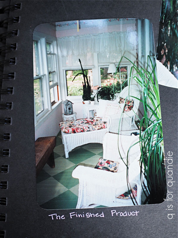
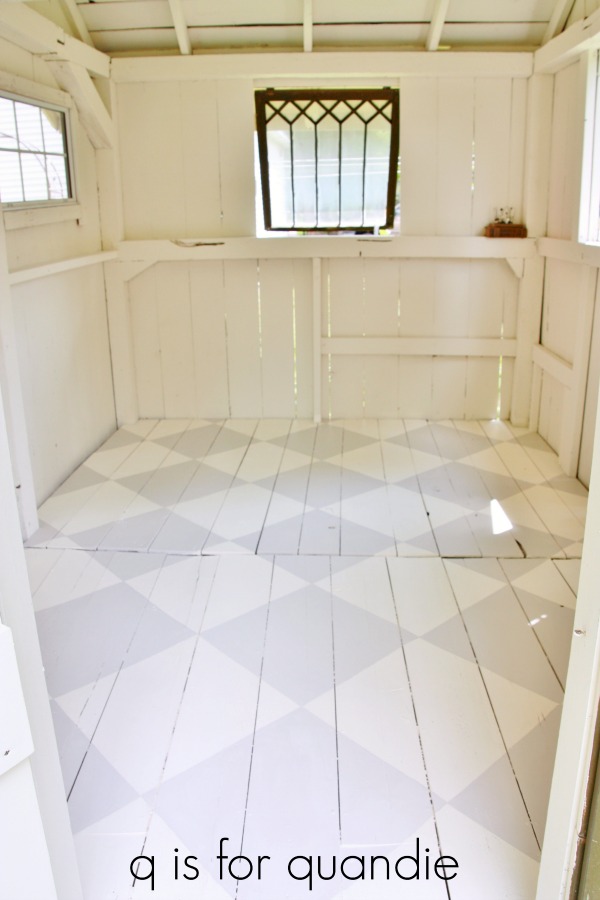
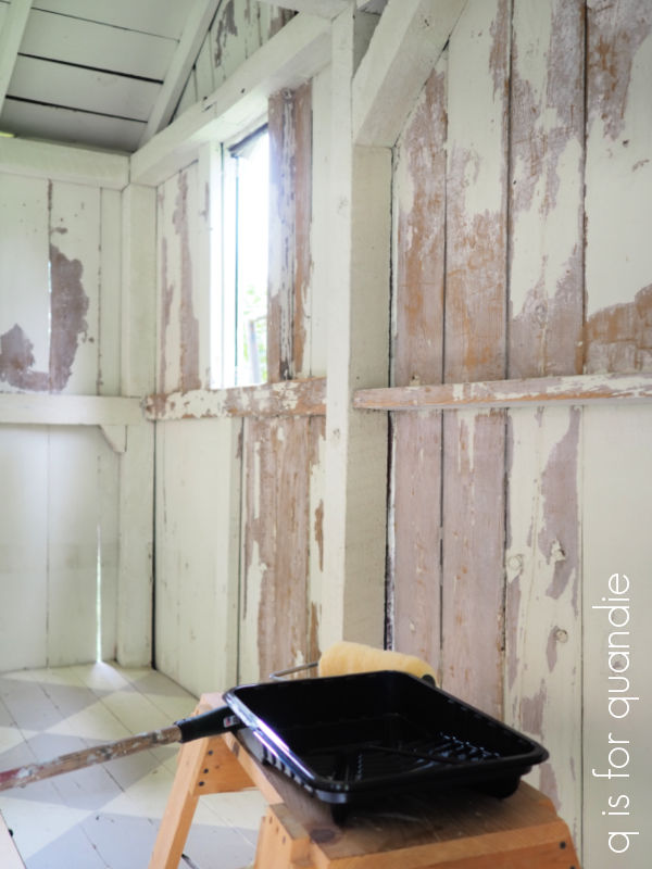
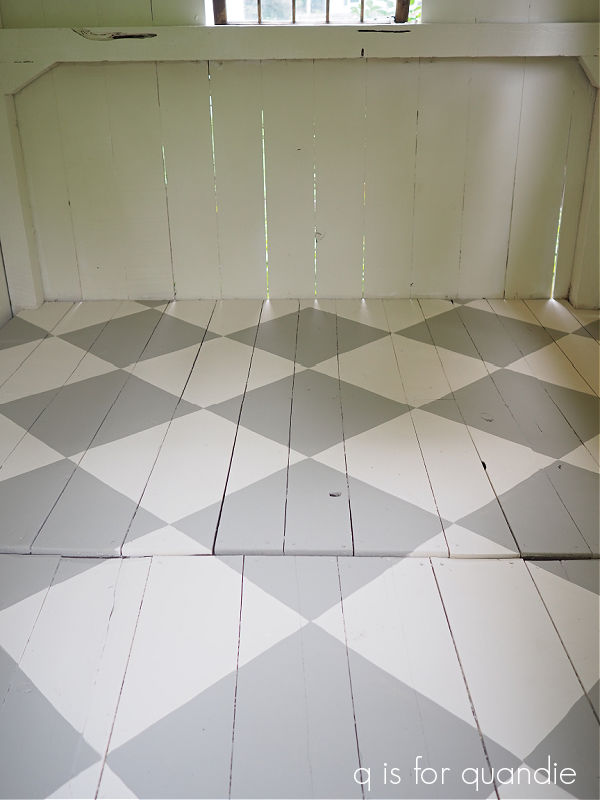
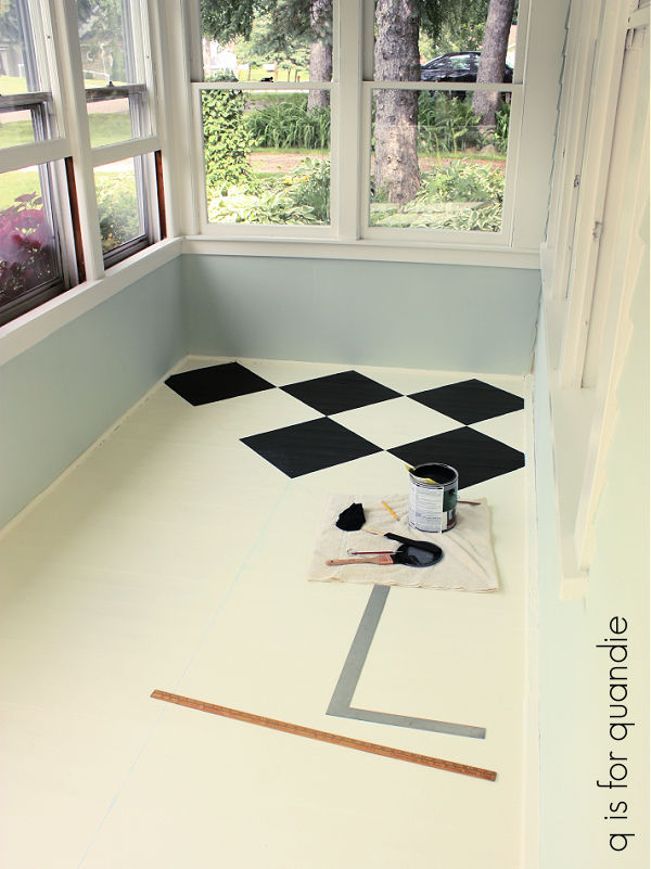
I remember specifically wanting to make the squares bigger this time around, for some reason I thought those initial green squares were too small.

I was also continuing to whittle away at that matched set of wicker.

The coffee table, small round stool and console table are gone, and I’ve added in a little washstand that I painted myself.

I’d also cut way back on the shaggy, trailing houseplants in favor of a simple orchid and a small fern.

The cushions on the wicker were recovered in a slightly less floral vintage bark cloth.

I also painted over that stenciling in favor of one of my first uses of a transfer when I added this phrase to the crown molding.

Jumping forward to 2014, Mr. Q decided he wanted one of the green Adirondack chairs from our deck on the front porch instead of the wicker chair.

I can’t say that I blame him, it’s certainly far more comfortable.  Our handyman/neighbor Ken went through an Adirondack chair making phase.  He made two of these for us for our deck.  He also made a bunch of them for our neighbor across the street, nnK, one for my sister, a couple for my friend Terri, some for Sue, and we sold a few at our occasional sale too.  I wonder if he kept track of how many he made?  But I digress.

I tried to make the lime green work by adding a throw pillow covered with vintage bark cloth that pulled together the lime green and the aqua, but in reality the color was always a bit jarring.

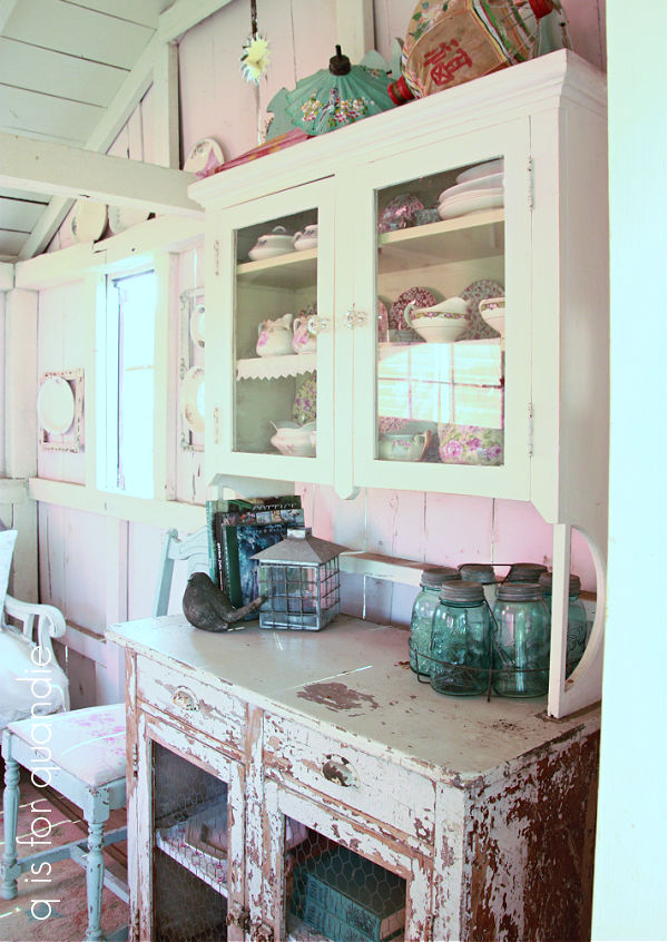
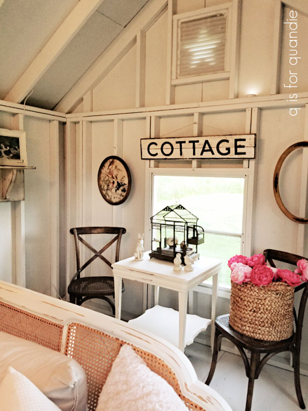
I’d also changed out the washstand at this point.  It’s not a very obvious change, but if you look at the drawer pulls above you’ll notice that this is different one than the one that was in this space in 2011.  I’ve also swapped out the piece in between the chairs for a chippy old trunk, and recovered the chaise lounge cushion in something more neutral.

Ultimately I just couldn’t live with the lime green though, so the next year I asked Ken to make another Adirondack for us.  I moved the green one back out to the deck and painted the new one white.

That throw pillow is from H & M Home.  They used to have the best stuff in this sort of style, but now they’re leaning heavily towards a mid-mod sort of aesthetic.  Just go look at the throw pillows on their site to see what I mean.  So disappointing.

At this point I also moved my black cupboard into the spot where the washstand was.

In 2019 I added a transfer to the inside back of the cupboard.

I had been contemplating selling this cupboard, but I liked it so much with the transfer that I decided to keep it.

At that time I had swapped out the china cabinet with the fretwork for a small farmhouse table with the base painted in a custom milk paint blend.

I’ve considered placing this desk (that refuses to sell) in that spot …

It would be a perfect fit.

However, this is the spot where I take most of my close up photos in the winter.  It gets great light for that purpose, so I need a neutral surface that I can move around and a small table with casters works perfectly for that.

However, the table top on that original table was less than ideal for that purpose, so I swapped it out for this one.

And that brings us up to the current day.

I do occasionally think I should get rid of that one last remaining wicker piece and find something more comfortable for myself.  Maybe we’d actually sit out here more often if I had a cozier piece of furniture in that spot.  I also should refresh the paint on the floor, I still love the black and white checkerboard but it’s getting pretty dinged up.  No amount of scrubbing with my new Norwex mop is doing the trick.

(that pic is for you Mary, LOL!)

That might be a job for next spring at this point though.

Otherwise, I’m pretty happy with how this space looks for now.

I hope you enjoyed this journey through the evolution of a space over 34 years.  If nothing else, I think this post proves that it takes time to decorate a room with vintage décor.  In addition, I always say that you’re never really ‘done’ decorating your home, it just keeps evolving.  I hope to do some decorating projects over the winter this year, but I haven’t quite decided which space will get priority.  Maybe the bathroom … or the dining room … or possibly we’ll turn the guest room into something more functional.  You’ll just have to stay tuned to find out.

coloring inside the lines.

As I shared earlier this summer, the small structure in our backyard has seen a number of different ‘uses’ in the 34 years that we’ve lived here.  For a brief while it was even a smoking lounge.  That was back when my brother lived here and we wouldn’t let him smoke in the house, even in January (he has since moved out to Nevada, where he still smokes outside but the weather is a lot more accommodating).

After he moved away, it became a potting shed, and look, I found some old photos of it in my scrapbook.

Yikes!  If that isn’t scary, I don’t know what is.  That was before I painted the ceiling and floor (and developed a more refined aesthetic apparently).  Gosh!  Sometimes I have to look back at these photos to remember how far I’ve come.

Next up, I turned it into a ‘summer house’.

The walls were painted pink, the ceiling got painted white, but the floor was still unpainted.

Obviously I was heavily into my shabby chic period at that time.

That cane back sofa was not terribly comfortable, and I bet I could count on one hand the number of times I actually went out there and sat on it.  Although … forgive me if I digress for a moment … but I did take a nap on that sofa once.  This was shortly after my dad died and while napping there I dreamt that he came into the cottage, sat next to me on the sofa and gently stroked my hair.  I think he was saying goodbye, he always was a man of few words.

Anyway, ultimately I restyled that sofa like this …

and I sold it at one of my occasional sales.

In its latest incarnation, the shed became the photo cottage.

Back in 2014 I completely repainted the interior with a plan for using this space to stage furniture makeover photos.  I went with white walls this time thinking it would create the perfect bright lighting for photos.

I painted a checkerboard pattern on the floor, but I purposely kept it a little more on the subtle side with very pale gray and white squares so it wouldn’t compete with the furniture in photos.

Although I sort of made it work for a little while, ultimately it just didn’t.  I could never get the white balance right.  Red light reflected in from the carriage house turning the walls pink.  The floor would end up looking lavender if I corrected for the walls.

There really was only one very specific time frame in the mornings when the lighting was right to get good photos in there, so in the end I gave up trying to make it work.

For the last several years we have just used the space as a dumping ground.  But we don’t actually ‘need’ it to provide storage space, we have the entire upstairs of the carriage house for that after all.  So I decided to once again turn it back into a potting shed.

It’s unlikely that I’ll actually pot things up inside, but it will make a convenient space for keeping all of my gardening tools and supplies together and easy to find.  Right now they share space with my workshop, so this will also free up some space in there.

Plus, let’s face it, it will just be a fun space to decorate!  I’m thinking I may even decorate it for Christmas this year.  Why not?  I’ve got the time (well, we’ll see about that, I already have three trips planned for this fall/early winter and I may try to squeeze in one more).

The first step was to empty all of the junk back out.  Once I’d done that it became apparent that I’d have to scrape the chipping paint off the walls and re-paint.

I had really hoped to get by without that step, after all, I love chippy paint, right?  Well, maybe not so much on walls.  That’s when things stalled for a bit because I really don’t enjoy scraping paint.  Ugh.

But luckily my friend Annie offered to come over and help with this project and that motivated me to keep going.  Between the two of us we got all of the walls scraped and ready for paint, while also getting caught up on each other’s lives.

As they say, a job worth doing is a job worth doing right.

Once the walls were scraped, I also sanded them with my orbital sander.  Then I primed them with a stain blocking primer and finally painted them with some paint left over from previous projects inside the house.

Fortunately I did not need to repaint the ceiling, it was still in pretty good shape.

And that leads me to the floor.  At this point I realized that this was the perfect time to replace a board in the floor that was weak.  Every time I walked on that board I envisioned falling through the floor and breaking an ankle or something.  It made sense to take care of it.  So I asked my handyman/neighbor Ken to take a look, and he was able to replace the board fairly easily.

I then asked Mr. Q to pretty please sand the floor for me, which he did.  And really, once the floor was sanded it looked pretty good.  It had a nice aged, worn appearance that I liked.  Except of course there was now the problem of that one unpainted board.

It may have been OK if I had the same paint I used originally and could have painted just that board, but of course I couldn’t find this paint anywhere in my stash.  Also, as I thought about it, although I really wanted to retain the checkerboard, I never did like that shade of pale gray I used the first time around.

I’m a huge fan of checkerboard floors.  As you know, I have black and white on my front porch …

And I also have a stained wood version in my kitchen.

Well, in for a penny, in for a pound right?  I may as well do it up right.  As my friend Annie mentioned while helping me scrape, I always was good at coloring inside the lines.  So repainting the checkerboard floor in the shed should be a no-brainer.

This time around I decided to use Dixie Belle chalk style paint.  I knew it would adhere well over the latex having painted over latex many times on furniture.  Rather than start over entirely from scratch with a base coat of white, followed by measuring and outlining all of those squares again, instead I carefully painted over all of the white squares in Dixie Belle’s Drop Cloth using a good angled brush.

Today’s q tip:  when trying to paint a straight line by hand, without using tape, it’s really important to use a good, angled brush and go slowly.  I purchased a Zibra 2″ angled sash brush at Home Depot and it worked beautifully.

One coat of Drop Cloth was all it took to refresh all of the white squares.  Once they were dry I moved on to picking a color for the grey squares.  After using Dixie Belle’s Dried Sage recently, I totally loved the color.  Rather than looking like a green (which I assumed it would based on the name), it’s really more of a gray with a green undertone.  But just to be sure I would like it, I painted one corner of a square with Dried Sage and one with DB’s French Linen which is more of taupe gray according the the Dixie Belle website.

Ultimately I felt like the Dried Sage was a little dark full strength, so I lightened it up by adding some Drop Cloth and then it was perfect.

To be honest, it kind of surprised me how easy it was to repaint this floor.  Now that I know how simple it was to ‘color inside’ those lines, I’m much more motivated to touch up that black and white porch floor too.

After letting the paint dry for 72 hours, I protected it with several coats of Varathane clear matte water-based poly letting each coat dry for 24 hours in between.  Some of you may remember that we had our upstairs floors refinished a few years ago.  We used a matte finish on them and I still absolutely love them, so I wasn’t afraid to go matte on this floor.  I did a little quick research online and found this article which explains that basically matte poly provides the same durability and protection as shinier versions.  In addition, the higher the sheen, the more scuffs, scratches, and footprints will show.  So hopefully this matte finish will hide a multitude of sins in the potting shed.

Now that I have the painting finished, this week we’ll be moving the furniture back in and getting the potting shed styled.  I’m a little bit nervous to see how my potting bench is going to look with that floor.

Fingers crossed that they work well together.  Be sure to stay tuned for a final reveal post later this week!

perennials that bloom all summer.

Good morning gardeners!  Today’s ‘Sunday mornings in the garden’ post is going to be a short one because I’m sharing a rather short list of plants today; perennials with long bloom times.

While the upside to perennials is that they come back year after year (so you only have to buy them once to enjoy them for years), the downside is that most of them have a rather short bloom period.

As you know, my absolute favorite perennial flower in the garden is the peony.

And the bloom time for peonies is notoriously short, and made even shorter when we inevitably suffer a spell of hot, humid weather as soon as they open.

As you may remember, last year, in an attempt to extend peony season, I experimented with saving peony buds in the fridge and I had good success with that.  So much so that I did it again this year with even more peony buds.  And … um … well …

I didn’t follow my own instructions!  I wrapped these in a damp paper towel, and then put them in the Ziploc bag.  As you can see, they got moldy.  Last year I just put them directly in the Ziploc, no damp paper towel.  I’ll have to try again next year, with no damp towel!

Another of my favorites, lilacs, also have a pretty short bloom period.

And unfortunately, I don’t know any tricks for saving them for later.  In fact, I haven’t even found any tricks that work for making them last more than 1 or 2 days as cut flowers.  If you know of anything that works, leave a comment and let us know.

Roses are another of my favorites with a short bloom time.

However, I grow very few due to Japanese beetles. Those beetles just love roses!  I never had time for fussing with insect control in the past, so I took a few things out of my garden that the beetles loved including roses, a grape vine and some Virginia creeper.  I do have this one last pink shrub rose that was given to me at least 20 years ago or more.

But wait!  I went off on a tangent, this post is supposed to be about perennials with a long bloom time, not without one.

I’m tempted to start the list with panicle hydrangeas.

They definitely have a longer bloom time than peonies, lilacs and roses.  However, they only just started blooming in mid-August, so while they will continue to look amazing for the rest of the season, they missed most of the summer.

I do have a handful of perennials in my garden that bloom for a good portion of the growing season though, starting as early as May and continuing through the first frost.

Corydalis lutea is one of them.

This is a plant that I purchased at a garage sale not really knowing what it was.  Frankly, I don’t love yellow flowers.  But I let this one do its thing because it’s such a constant bloomer.  Mine starts blooming in late spring and it’s still blooming now.

You do have to be slightly cautious with this one as it self-seeds quite easily and will take over if you let it.  I pull out good sized chunks of it every year, and it is very easy to control that way.  It’s a great companion plant for hostas, and I have it growing in dappled sunlight.

Lamium Aureum is another perennial that blooms from May through frost.

I’ve even seen this one pop up through the snow with some flowers on it!

But I have to admit, I grow this ground cover for its foliage not for its flowers.  I don’t actually like the flowers, but I love the bright lime green leaves.

It’s another great companion for hostas as it will grow in full shade to part sun.

Another long blooming perennial that I purchased at a garage sale is Dicentra ‘Luxuriant’, sometimes called fern-leaf or fringed bleeding heart.

Unlike the more common varieties of bleeding heart that bloom in the spring and have pretty much died back to the ground by now, this variety blooms all summer.  As you can see, the flowers look slightly different (and aren’t as pretty, in my opinion) and so does the foliage.  The foliage is rather fern-like, hence the name.

The plant is much more compact that your typical bleeding heart, and it doesn’t get straggly and unkempt looking in late summer like the others.

This plant will also self-seed, although not quite as readily as the Corydalis, at least not in my garden.  I do have one volunteer plant that popped up in a spot where it doesn’t belong and I haven’t had the heart (pardon the pun) to pull it out yet.

Last on my long-blooming perennial list is Myosotis sylvatica, or Forget-me-not.

This is another ground cover that can lean towards invasive.  However, I have mine interplanted with a number of other ground covers, the Lamium, a varigated vinca vine and a very small sedum.  All of them tend to battle for dominance and so far no single plant has won out.

I do love those pretty little blue flowers.  But ‘little’ is the key word here.

An honorable mention goes to my new Roguchi clematis.

I just planted it back in May of this year, but it hasn’t quit flowering all summer and is still going strong.  I just have this one growing season to go by, but so far it seems to be a winner.  Once again, it’s not the most flamboyant of the clematis varieties, but I love that it has bloomed all summer.  I think the little purple and white bell shaped flowers are super sweet too.

One thing to note about the Roguchi is that it’s a non-vining clematis.  It won’t climb its way up a trellis on its own, but you can train it (which is what I have done).  Or you can let it spill over the sides of a retaining wall, or scramble through your perennial beds.

One thing all four of these plants have in common is that they aren’t terribly showy.  Perhaps that’s the trade off here, more subdued flowers in exchange for a much longer bloom time.

How about you?  Do you have any recommendations for perennials that will bloom all summer?  If so, be sure to leave a comment and let us know.

a cherubic thrift haul.

For those of you who also frequent garage sales or thrift stores, let me ask you this; do you often find that sometimes a theme seems to emerge on any given day?

For example, there was the time I came home from a neighborhood garage sale with a jumble of chairs.

I once decided that a grouping of chairs should be called a ‘jumble’, sort of like a school of fish or a murder of crows.

And then earlier this summer I found tons of toolboxes one day.

I wasn’t particularly looking for chairs or toolboxes on those occasions, but there they were.

Well, a couple of weeks ago when my friend Sue and I went thrifting another theme seemed to emerge.

Cherubs!

They were everywhere.

First it was the tall urn that I found at Goodwill.

Well, OK, probably best not to look too closely at what’s happening on that urn, I don’t think those are cherubs after all.

However, I also found a plaque at Goodwill that definitely has cherubs.

The shorter urn was from Turnstyle, and also definitely cherubic.

And finally we have the golden cherubs, and they were also from Turnstyle.

I have an embarrassing confession to make regarding these.  I paid $14 each for them at Turnstyle, and when I got them home and was cleaning them up, I turned them over to find the original Marshall’s tag for $12.99 each.

I’m fairly sure I’m going to lose my status as an expert thrifter for that one … not that I have ever claimed to be an expert.  Clearly I’m not.

You’d think I learned my lesson from the last time I purchased an item at Goodwill that still had a Marshall’s tag on it.  That time the clerk at Goodwill charged me the Marshall’s price, which was quite a bit higher than the Goodwill price.  And I didn’t notice that one until I’d gotten home either.

But I don’t really feel too bad about it, they have turned out pretty cool as you’ll see in a minute and were worth every penny of that $28.

I had one thing in mind when purchasing all of these cherubic pieces, rust!

(if only I’d gotten the shirt!)

So I cleaned them all and then gave them a coat of flat red primer spray paint.

I could have used the Dixie Belle Prime Start, but that has to be brushed on and with all of the nooks and crannies in these piece, spray was just easier.

Next I pulled out the Dixie Belle Iron patina paint and gave them all two coats.  Yes, the Iron paint does get brushed on, but I recommend stippling it on with dabbing motions to avoid getting any brushstrokes which will become more obvious as the green spray will settle in those.  In addition, I find that you don’t have to be too particular regarding coverage with this technique.  Any spots missed with the Iron paint will barely be noticeable with that primer red base color, or they can be easily touched up.  While the 2nd coat was still wet, I sprayed everything with the green spray to create rust.

After waiting a day or so for the rust to fully materialize, I realized that I’d missed a few spots on the undersides of several of the pieces.  So I flipped them all over and dabbed more Iron paint on those areas and sprayed again.

After another day I still felt like there wasn’t enough rust for my taste, so I tried a little experiment with the two urns.  I’d noticed that the rusty pieces I’ve placed in my garden tend to get more rusty after they get a little rain.  So I decided to use my Dixie Belle Continuous Mister Bottle to spray them with a fine mist of water.

That totally did the trick.

When I’m leaving my rusty pieces outside, I typically don’t seal them.  I have several planters, and some iron garden furniture, that I’ve used the patina paint on and then left outside … even in the winter … and they hold up just fine, although of course they do continue to get rustier over time.

However, in this case I was bringing these into the shop and I didn’t want them to damage other items they might come into contact with so I gave them a couple of coats of Rust-oleum Matte Clear coat.

I find that the matte finish of this spray clear coat doesn’t alter the texture of the rusty patina quite as much as a glossier finish, although it does still change it a little.

So here is how those urns turned out.

And here is the plaque …

As for the golden cherubs, I think they would be perfect for Christmas décor, but the gold was a little too precious for me.  Now that I’ve made them rusty, they have an earthier feel.

I can see these added to a Christmas planter outside, but they could be used inside as well.  Maybe as part of a table-scape.

So tell me, which do you prefer?  Rusty or golden?

I’ll probably hang onto these cherubs until the Christmas season, unless one of you locals want to snatch them up now.  If so, check out my ‘available for local sale‘ page for more details.

You’ve probably noticed that I only had small projects to share with you this week.  Well, that’s because I’ve been hard at work behind the scenes painting the potting shed.  Phew!  I forgot how much work such things can be, and this one required A LOT of prep.  Luckily my friend Annie came over to help me, which motivated me to get ‘er done.  I’m hoping to share the completed shed next week, so be sure to stay tuned!

you had me at rusty.

My local readers are probably familiar with the Downtown Oronoco Gold Rush, but for those of you who aren’t, it’s an antique show & flea market that has been taking place for 50 years!

I hadn’t been to the Gold Rush for several years (you know, the whole Covid thing), but this past Sunday my sister and I decided to head to Oronoco to check it out.  The forecast called for a sunny day in the upper 70’s, so it was the perfect day to wander around amongst the various booths to see what people had.

I really didn’t snap a lot of photos, and this certainly isn’t going to be a comprehensive review of the event, but I thought I’d share a few of my favorite things.

Of course I was drawn to the vintage ornaments, and there were a few to be had.

The prices were reasonable, but I really don’t need to add to my already sizeable collection.  Plus I thought it would be a little challenging to carry them around without breaking them.

I saw quite a few vintage sleds …

I would never paint those two, they have a fabulous vintage patina ‘as is’, and they were priced in the $80+ range, so clearly out of my price range.  I did see another vendor selling painted sleds, but they were hand-painted with snowmen and things like that (not quite the same as the sleds that I paint), but I neglected to get a photo of her stuff.

There was no shortage of chippy spindles …

and all kinds of vintage everything …

And in another case of the Baader-Meinhof phenomenon, look what I saw …

roller skates along with their black metal carrying case.  I’m sure I wouldn’t have even noticed them had I not just worked on one myself.

I opened up the case and it was very similar to mine inside, so this certainly proves that mine was originally meant to be a roller skate case just as the seller claimed.

There are always plenty of quirky items at Gold Rush too.

and certainly lots of seasonal stuff.

To be honest, I snapped the photo of that ‘pumpkins’ sign so that I could try and make my own version of it.  Seems like it would be simple enough, right?  We’ll see if I get around to that.

I thought the fall colors in this little vignette were nice too.

I hate to say it, but this year the event did not have many booths that spoke to me.  There were really only a handful of vendors that had things styled in a fashion that appealed to me.  The last time I went to Gold Rush there were so many fabulous vignettes to admire.  I thought maybe it was my imagination, but then I went back and looked at my pictures from 2017 and that confirmed it.

This year there was really only one booth that impressed me with their styling, this one from Old Soul Vintage.

She had a fun vintage camp theme going on.

Complete with fishing gear.

But my favorite item in that booth was this one …

How perfect would that be for me?  Unfortunately, she did not have my size.

Now, you are probably wondering what I did purchase at Gold Rush, and if so you’re going to be really disappointed.  I’m kind of embarrassed to admit to my purchase, but it was a Norwex mop.  Seriously, they’re going to vote me off the vintage lovers island.  But I find my Norwex window cleaning cloth really functional, and I like the idea of being able to mop my wood floors with plain water too.  So after going through the booths of around 200 vintage dealers and finding nothing that I absolutely had to have, I went back to the Norwex booth and bought a mop!  What can I say?  I guess I was feeling practical.

So how about you?  Do you have any fabulous antique shows where you are?  And if so, do you usually window shop, or do you always find something fabulously vintage to bring home (or would you bring home a mop)?  Or maybe you have a favorite find from the past that you’d like to share.  Leave a comment and let us know!

thrift find makeovers.

Whenever I’m out thrifting I’m always on the lookout for simple wood items that I can give new life to with paint.

I’ll readily admit that none of these are spectacular finds, certainly nothing to write home about.  But all three were fun makeovers.

Let’s start with the basic cutting board.  After sanding it down and cleaning it with a grease cutting cleaner, I painted it with Dixie Belle’s Sawmill Gravy, and then added some grain sack style stripes using their French Linen.  Once dry, I sanded to distress and then added the farm animal transfer from Dixie Belle’s On the Farm transfer set.

The “Precious Stone Farm” wording is from re.design with prima’s Everyday Farmhouse transfer set.

I just love how it turned out, so cute.  It’s no longer food safe, but would make great decor.

Next up is the rooster shaped cutting board.  Once again, I prepped as usual and then painted it with two coats of the Sawmill Gravy.  Then I pulled out some scraps from the I.O.D. Floral Anthology transfer and pieced them in around the edges of the rooster.

Finally, I added some wording from their Label Ephemera transfer and now he’s a funky french floral rooster.  Again, no longer food safe, but perfect for decorating the kitchen counter top.

By the way, I top-coated both of these pieces with clear wax.

Last up is … well … I really don’t know what to call this thing.  I’m thinking it was originally a napkin, or paper guest towel holder, maybe?  Do you have any idea what this might have been used for?

Well, regardless, I painted it in Sawmill Gravy and then I decided to do a little experimenting with stamping once again.  Take note that I did not use any kind of sealer over the paint before stamping, and this is a chalk style paint.

The last time I tried stamping on paint I wasn’t terribly happy with the results.  But a couple of my readers gave me some tips including Teri B. who specifically recommended VersaFine Clair ink for stamping over paint.

So I went out and purchased some from my local craft store (I can’t remember, it was either Hobby Lobby or Michaels).

First up, I have to say that no matter how good the ink, nothing can help if you’re a clumsy stamper … which apparently I am.  On my first go around, after applying the stamp semi-perfectly, I then dropped it right back down on my surface.  Ugh.  So I wiped it back as much as I could, re-painted with the Sawmill Gravy and then gave it another go.

The 2nd time around I ended up not liking the stamp I chose (and by the way, all of these stamps are from the I.O.D. Crockery set), so once again I wiped it off using a damp cloth.

At that point it occurred to me that I rather liked the washed out look I achieved when wiping off the ink right away so I took a quick photo to share with you.  At some point I may want to use this technique on another project.  But for this piece I once again painted back over it with the Sawmill Gravy.

I will say that this is one of the benefits of stamping over paint, you can re-do it multiple times at no extra cost.

The third time is sort of the charm with this one.

I say ‘sort of’ for a few reasons.  I didn’t apply even pressure to the stamp, and I also managed to smear the ink just a little bit by accidentally brushing over it with my hand.

But those are pretty fine details, and unless you are an uber-perfectionist (which may, or may not, apply to me) this is good enough.  And really, if you’re an uber-perfectionist, stamping probably just isn’t for you.

I also achieved decent results with the stamp at the bottom too.

Teri was definitely right, the VersaFine Clair ink is the way to go if you’re stamping over chalk paint.

After 24 hours, the ink appeared to be dry enough to add a top coat over it without fear of smearing, but I chose to hold off on adding a coat of clear wax.

Why?  Well, I may keep this piece to corral some flashcards and maybe a pair of readers or two and I’m not sure I love this look.  I may decide to give it an entirely different look next, so I’m holding off on waxing in case I decide to paint over it one more time.

After working on all three of these thrift find makeovers, I have to say that I still think transfers deliver a lot more punch than stamps.  But of course, you can only use a transfer one time, while stamps can be used over and over.  So tell me, what do you think?  Do you prefer transfers or stamps?  Leave a comment and let me know.

show stopping hydrangeas.

Good morning from the garden!  Today I’m going to share my favorite flowering shrub, hydrangeas.

There are five main types of hydrangeas, so let me first mention the two that I don’t grow.

First up is hydrangea quercifolia or oakleaf hydrangeas.  Although some gardeners do attempt to grow this one in our zone 4b, it’s a tricky one.  They require hot, sunny summers in order to produce blooms and Minnesota doesn’t always provide that.  They also bloom on old wood, so getting them to bloom in our climate is challenging.  I’m not into tricky gardening, I prefer to grow plants that aren’t so finicky.

Next up is hydrangea petiolaris or climbing hydrangeas.  These will grow in zones 4 to 8, but also bloom on old wood.  I don’t really have a good spot for a climbing hydrangea, so I’ve never even attempted one.

Next up is a variety that I do actually grow, but not successfully.  Hydrangea macrophylla or mophead hydrangeas are absolutely gorgeous … when grown in the right climate.  These are those beautiful hydrangeas whose bloom color changes depending on the pH of the soil they are grown in.  When I visited the Jersey shore a few years back I saw lots of these and they were stunning.  Every bush was absolutely loaded with blooms.

Typically these hydrangeas do well in zones 6 – 9.  They bloom on old wood, so in other words if they die back to the ground every winter you’ll never get any flowers.  Ventnor City, New Jersey, where I took that photo, is a zone 7b.

So imagine my excitement when Minnesota’s Bailey Nurseries developed a macrophylla that bloomed on both old and new wood, the Endless Summer hydrangea.  Gardeners all across the north rushed out to buy these hydrangeas, including me and pretty much all of my gardening friends.  I initially planted two of them.  But their performance for me has been pretty sad.  I think 2016 was the best year for them and I got six or seven flowers that year.

And as you can see, the colors on my Endless Summer flowers weren’t nearly as spectacular as those Jersey hydrangeas.

  I pulled one of my Endless Summer plants out a couple of years ago, but I still have one in my back garden.  Last year I didn’t get any blooms at all on it, and so far I don’t see any this year either.  But hope springs eternal and I haven’t dug up that last one quite yet.  I have read that you can grow these in containers, bringing it into a sheltered area for the winter to prevent it from dying down to the ground.  Maybe I’ll dig mine up and try that.

Do any of you grow a macrophylla in zones 4 or 5?  And if so, have you had luck getting it to flower.  Leave a comment and let us know.

Next we have hydrangea aborescens or smooth (or wild) hydrangeas.  The most common, and more old fashioned, of these is the Annabelle hydrangea and I have two of them.  Mine started blooming back in early July (or maybe it was late June).  Here is one of them behind the fresh flowers cart …

The flowers on the aborescens are more rounded in shape than the paniculata (which we’ll talk about next), and they start off white and by this time (mid-August) they have aged to a green color.

They produce tons of flowers each year (they bloom on new wood), and they make great cut flowers.

However, they are less than ideal in the garden.  The stems tend to be weak and thus they flop when loaded down with big blooms.  I have an old brass bed frame supporting the Annabelle by our deck …

but I just allow the ones out back in the cut flower garden to flop away.  They can look quite bedraggled after a rain.

There is a new and improved version of the Annabelle called Incrediball that supposedly has stronger stems.  I have not grown that variety myself, but in a recent video Laura from Garden Answer mentioned that although the Incrediball is an improvement over the Annabelle, it still tends to flop a little.

In my opinion, why bother with that when you can grow my favorite variety, hydrangea paniculata or panicle hydrangeas?

Paniculatas are the most cold hardy of the hydrangeas and can be grown as far north as a zone 3.  They have more of a cone shaped flower (compared to the more rounded flowers of the Annabelle), and they bloom on new wood.  That means that in my zone 4b garden they are absolutely loaded with flowers every year no matter how harsh the winter may have been.

I grow four different varieties of paniculatas; the Limelight, the Little Lime, the Vanilla Strawberry and the Little Quick Fire.

As the names imply, the Little Lime and the Little Quick Fire are dwarf versions of Limelight and Quick Fire.  I put in one Little Quick Fire last summer, and another one this year, and so far, obviously, they are still pretty small at around 2′ tall.

The Little Quick Fire starts blooming a few weeks earlier than the Limelights, which may be a selling point for those who don’t want to wait until mid-August for some flowers.  But I have to admit that so far I’m not super impressed with this one.  The flowers on mine are rather small and dull compared to the Little Lime.  But maybe I just need to give them some time.  They also are mostly white so far with just a little tinge of pink.  I’m guessing that they don’t turn that ‘fire’ color until fall.

My Little Lime is at least 10 years old (or more) and although they are only supposed to get 4′ tall and wide, mine is easily as tall as I am (that’s 5’10”).

If you love the look of a Limelight, but don’t have space for a shrub that can get to be 8′ tall or more (my Limelights are about 9.5′ tall), a Little Lime is a great option.

We have a Vanilla Strawberry hydrangea out back next to the carriage house.  The flowers on this one start out white, and gradually turn pink.

I do like this one, and it is just as prolific a bloomer as the Limelight, but I haven’t kept up with the pruning and it’s looking a bit leggy.

Just a quick note on that, you should prune your paniculatas in late winter/early spring (it tends to be the very first garden task I tackle each year) by about 1/3 to promote strong new growth and larger flowers.  This is basically the only maintenance required for these plants.

But back to the Vanilla Strawberry, I was hoping for a gorgeous show of pink color on this hydrangea but it doesn’t start out with a bang, but rather slowly turn pink.  There is a new variety out this year called Berry White that I want to get my hands on.  It supposedly has stronger stems and deeper, richer color.

That being said, by early October the Vanilla Strawberry does look pretty spectacular …

I may have to do another Sunday morning post about how the colors of the paniculatas change into fall.  Because truly, if you think they look good now, just wait until October!

Finally we get to the star of the show, and my personal favorite, the Limelight.

There is definitely a reason this plant has become so popular.  It’s easy to grow, requires very little maintenance, is covered with blooms (if you’re giving it enough sun), and is basically a show-stopper.

We planted a pair of them in this spot next to our deck to provide additional privacy around our outdoor dining space and they’ve worked perfectly for that.

I love being able to enjoy my morning coffee with a backdrop of gorgeous flowers this time of year.

Another thing that I love about growing hydrangeas is that I can dry them for use in my winter window boxes.  I’m doing a little experimenting this year to figure out the best way to dry them and I’ll be sharing that soon so be sure to stay tuned!

I went to a garden party.

Earlier this week I had the pleasure of being invited to a really lovely garden party along with the other vendors at Reclaiming Beautiful, the shop where I sell on consignment in Stillwater, MN.

Everything was just so beautiful that I had to snap a few photos to share with you guys!

The party was held at David and Nancy’s house, and some of you may remember when I shared a tour of their home back in June 2020.  Back then, their gardens looked like this …

And now, a mere two years later, that area looks like this.

They’ve added a gravel patio and a lovely little cottage to that space.

Let’s start with the patio which you enter through this fabulous arch created from old doors.

It’s a really nice sized patio, and much of it is sheltered by a gorgeous tree.

And while some of the furnishings are more traditional patio pieces, like this seating area …

What really makes the space magical is the use of indoor furniture in an outdoor setting.

The frames hanging from the tree are such a whimsical touch.

And how about that organ?

Don’t you just love that?!

You may be wondering how these pieces hold up outside, and so was I.  Nancy said she painted them with outdoor paint, and they get a fair amount of protection from that tree.  However, they do cover them if it’s going to really rain hard.  I didn’t ask, but I’m also guessing they will store them for the winter.  Although maybe not.  As Nancy explained, she paid very little for each piece so if something gets ruined, oh well.  I can just picture that organ draped with evergreen garland and lights sitting in a snowbank, can’t you?

The fact that all of this is in such an idyllic setting surrounded by fields of wildflowers is part of what makes it so magical as well.

When I first arrived there was even a doe and her fawn grazing nearby in a most picturesque fashion, although I imagine those deer are precisely why Nancy’s zinnia garden is completely enclosed in fencing.

OK, you’re all probably dying to get inside that little cottage, I know I was.

I’m afraid I was too busy snapping photos to get all of the details on how this little building came about, so I’m sorry about that.  But isn’t it gorgeous?

The details of the cupola and those star shaped vents are fantastic.  I love that it opens all the way up on one side.

Naturally Nancy has gone all out decorating the inside.

Here’s fellow vendor Amy testing out the furniture.

Looks comfy!

We did get a tour inside the house as well, but the light was going at that point and I only had my phone for photos rather than my camera, so I didn’t take any.  But I can refer you back to my original tour of Nancy’s home if you want to see that.

No garden party is complete without party favors!

Nancy sent each of us home with some of those pretty zinnias from her garden.

Isn’t her little card just so sweet?

That is a drawing of her house, and this is the card for her business, The Festooned Farmhouse.  She offers home and/or event styling.  You can also find Nancy on Instagram.  Be sure to check her out!