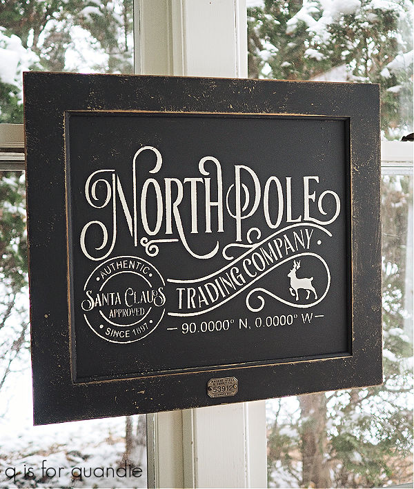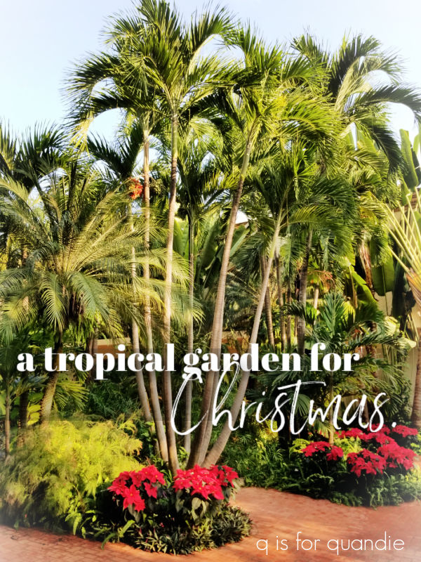
Welcome back to Sunday mornings in the garden. Once again, this post is not coming from my own garden which is currently buried under a couple of inches of snow. Instead, this one is coming to you from Puerto Vallarta!
As I’ve mentioned, my neighbor’s family invited me along on their family vacation to Mexico. Yep, I’m very lucky when it comes to neighbors. I think I won the good neighbor lottery.
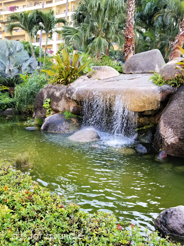
So I spent a week at Velas Vallarta with my neighbor Karen and her parents. The resort was gorgeous, and so was the weather.

We had 7 days in a row of mid-80’s and sunshine, not a drop of rain or a cloud in the sky. Perfection.

We basically spent the bulk of our time looking at this view while a very nice waiter named Edwin delivered pina coladas and nachos.
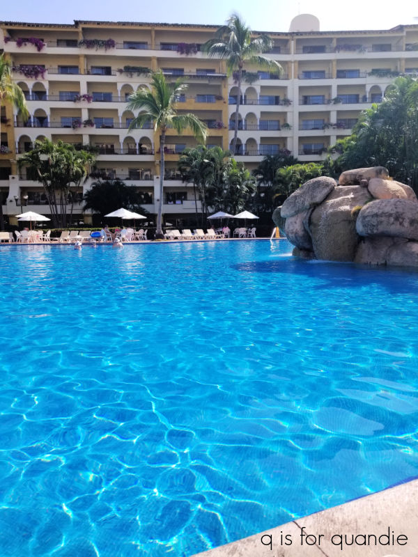
Most of the time it felt like we practically had the place to ourselves because the resort was only about 50% occupied. The week immediately following Thanksgiving week is not very popular apparently.
We did venture out to the beach a couple of times.

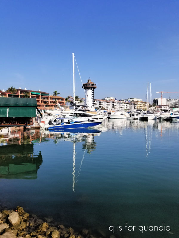
And we also ventured out to the marina to do some shopping.
But I said this was going to be a garden post, and that’s because the grounds at Velas Vallarta were just beautiful.
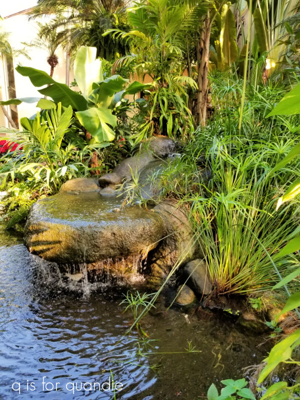
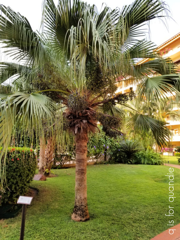
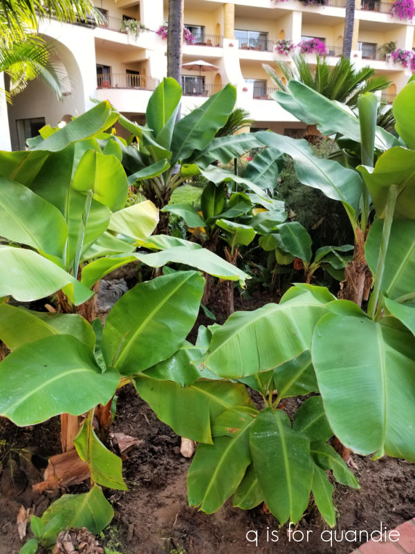
Not only that, but many of the plants had markers so it was a lot like being in a botanical garden.

I enjoyed finding out what the various plants were called, like the Washingtonia Robusta or Mexico Fan Palm.
And the Musa X Paradisiaca or the Banana!
There were two flowering plants that stood out as my favorites. First up, the bougainvillea. This is one of my mom’s favorite flowers, and she would have loved how they were spilling out of a multitude of planters on the balconies at this place.

But I think I liked the Blue Sky Vine even more.
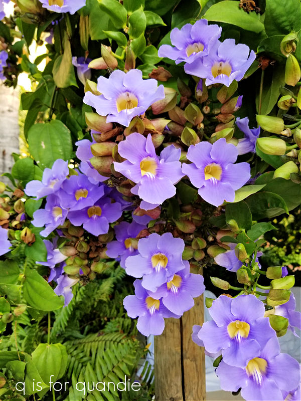
They had long pergolas around the several swimming pools that were covered in this vine and provided perfect spots for shady lounging. There was one small problem in that they really attracted the bees, and Karen got stung twice in the pool. Ouch!
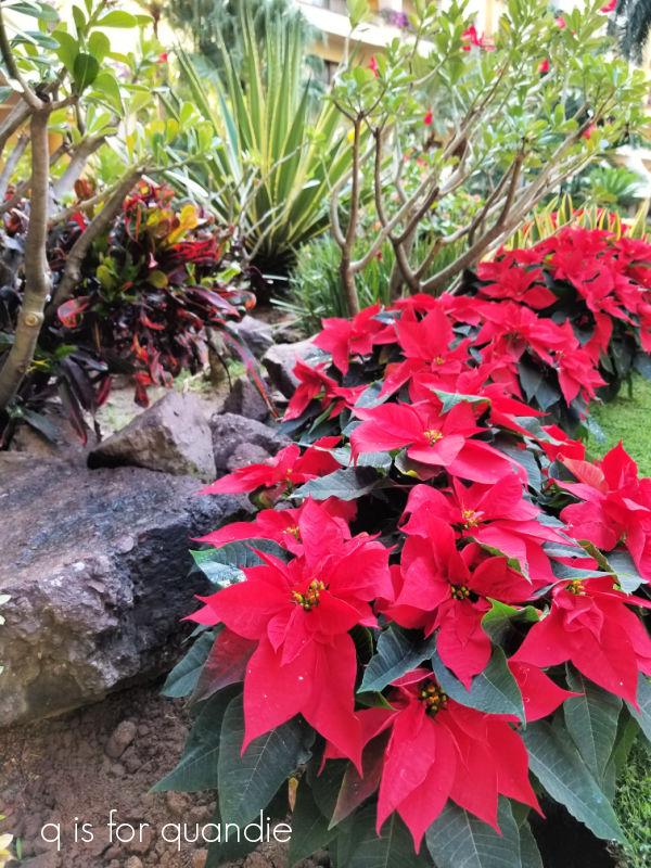
I have to admit, I find it difficult to feel properly Christmas-y in the tropics. But the resort was doing their best to add some holiday vibes. One morning I woke up to find that they had planted poinsettias in the garden the previous day.
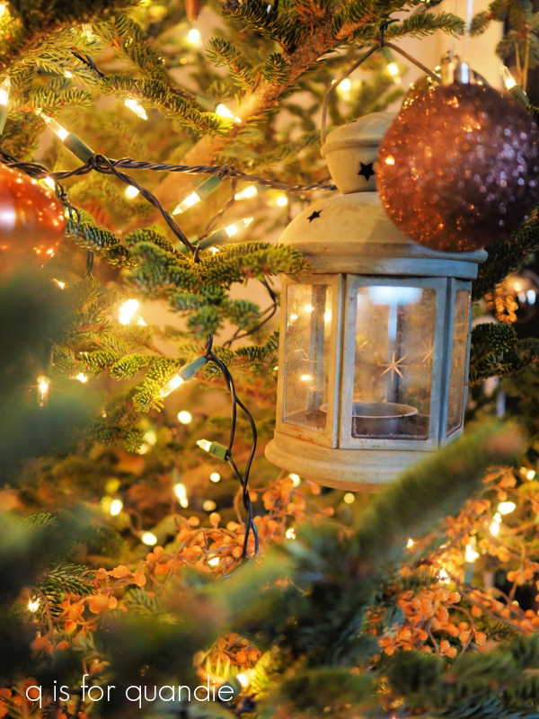
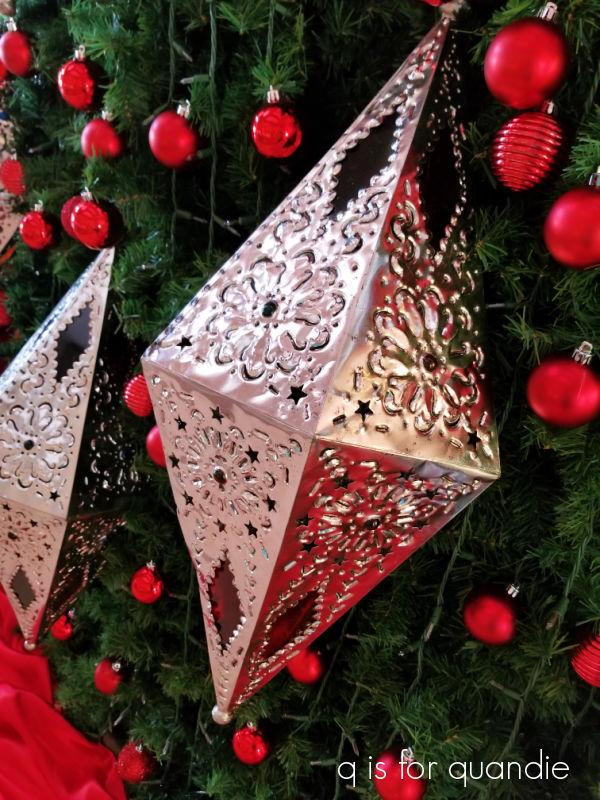
They’d also put up a huge tree in the lobby.

It was decorated with these beautiful silver lanterns.
Still, it took coming home for me to get back into a holiday mood.

As much as I enjoyed that gorgeous warm, sunny weather in Mexico, I need a little snow on the ground to feel like Christmas. How about you? Do you enjoy a tropical Christmas? Leave a comment and let me know!