utterly happy.

I may have to seek a 12 step program soon.  I can see it now, “hello, my name is Linda and I am addicted to miniature dressers.”

But gosh, this one was so unique.  A different style completely from my other ones.  I just really had to have it.

mini before

I’m sure I overspent on it.  It was $55.  I should have negotiated.  I should have walked away.  But this is the problem with addictions, you just don’t care about the cost.  I guess there are worse things I could be addicted to though, right?

Once I got a good up close and in person look at this little dresser, I realized that it was originally painted, but had been stripped at some point.  Here is a message for all of those people who gasp whenever someone paints wood, guess what? some wood was meant to be painted all along.  This isn’t pretty wood.  I’m sure back in the 80’s when stripping paint was all the rage, someone stripped a perfectly fantastic vintage paint job from this dresser thinking they would find beautiful wood underneath.  Bummer.  And it was in my favorite shade of aqua too.  See …

mini prior paint job

But luckily I had a pretty good idea about how to restore an original looking paint job … with layers of milk paint.

First I wiped the dresser with a damp cloth.  I didn’t sand at all, because I was going to be fine with some chipping.  The surface felt really dry to me though, so I had a feeling it wasn’t going to chip much.  I started with a layer of Miss Mustard Seed’s Luckett’s Green.

mini dresser layer no 1

Yep, as I suspected, no chipping.

Next I added some hemp oil.  I just dabbed a little on my finger and ran it around all of the edges.  Then I added two coats of Miss Mustard Seed’s Linen.  I used a little blow drying (with a hair dryer) between coats to encourage my paint to chip (and it did chip in all the spots that were hit with the hemp oil).  Once the final coat was dry, I sanded lightly with 220 grit sandpaper, then finished with some furniture wax.

miniature dresser

I also added a rub-on message to one of the drawers.  And it’s true, I am utterly happy with how this one turned out.

vintage painted miniature dresser

Just look at that chipping, talk about divine!  This is MMS milk paint at its finest.

The drawers all got lined with some pretty October Afternoon scrapbook paper.

mini drawer lining

The beauty of working on this little dresser was knowing that I was keeping it for myself, so I could do whatever I wanted with it.  This is totally my look; vintage, chippy, pretty, aqua and green.  Perfect for me.

utterly happy dresser

 I’ve already made a place for this in the Q branch.

mini dresser in Q branch

 It will be the perfect spot to store my rubber stamps and ink pads.  Now I will know exactly where they are whenever I need them.

oh darling, let’s be adventurers.

A while back Denise from Denise … on a whim left a comment for me, so I wandered off to check out her blog and came across this …

adventurers suitcase

And I fell madly in love.  Isn’t it fab?

You know I love a good painted suitcase, and the message just spoke to me.

So I left a comment for Denise in return and long story short, she offered to send me the artwork for her design.  How absolutely generous and kind of her, right?

That meant I needed to paint up a suitcase so I could use it!  I knew this would be another great test for Fusion paint.  Plus, one of Fusion’s promo photos for the Fusion paint included a suitcase that I just loved and I knew I could re-create the look of it myself with their paint.  I decided to combine these two features; Denise’s design with Fusion’s color scheme.

fusion suitcase

By the way, before I continue about my project, when my sister was visiting I showed her this picture and she remembered that my parents had a suitcase just like this and I used it to store my Barbie doll paraphernalia.  As soon as she said it, I remembered it and realized that is probably why I find it so appealing.  All of those happy hours spent dressing my Barbie in fabulous clothes!

OK, back to my project.  I started out with one of the suitcases that my friend Meggan grabbed for me at Goodwill, one of the thrift store unicorns!

unicorn

First I painted the top ¾ of the case in Fusion’s Bedford.  I used two coats, but if I had painted more carefully I probably could have gotten away with just one.  I let that dry overnight and then taped off a straight line on both sides and painted the lower part of the case, as well as the sides and the handle, using Seaside (again, two coats).  When I pulled the tape off, the Bedford was still in pristine condition underneath.  I have had trouble using tape with both chalk and milk paint.  With milk paint you can pretty much count on a good deal of paint coming off with your tape.  It is less of a problem with chalk paint, but you do still get some paint coming off.  So if you are going to do a project that requires taping (a stripe for instance, or maybe a union jack design) Fusion is a great choice for you.

Honestly, the suitcase was completely darling already at this point.  I could have left it alone and been quite happy with it.  It was amazing how ‘genuine’ it looked.

But I really wanted to use Denise’s artwork.  I’m too cheap to pay to have a stencil cut, so I decided to try my old technique.  I printed the design on regular paper, then used tracing paper to trace it onto the suitcase.

oh darling tracing

Then I filled in the design with black acrylic craft paint using a small brush.  This method takes a bit longer than using a stencil, but I accomplished it in less time than one episode of Fixer Upper, which was playing in the background while I painted.

oh darling close up

So, what do you think?  Cute as pie?

oh darling angled

I added a chalkboard arrow tag and as you can see this suitcase still has its key.

oh darling arrow

Lula is dressed and ready to take off on an adventure.

oh darling with Lula

And tucked into her pocket …

oh darling quote

So how about it?  Are you the kind of adventurer who needs a painted suitcase of your own?   There are still spots available in my Painted Suitcase class at the end of the March (click here for details).  If you are interested, be sure to send me an email at oakdalecarriagehouse@gmail.com or just leave me a comment and I’ll get back to you.

wearing of the green.

Happy St. Pat’s!  Are you wearing the green?  I haven’t got an Irish bone in my body, but I do love green stuff.

My friend Meggan and I were thrifting again a couple of weeks ago, and for some reason I was finding lots of it.  I came home with this little pile of goodies.

green day

I passed on a lovely mid-century decanter set in green glass with gold details.  I should have grabbed it, but didn’t.  Shoulda, coulda, woulda, right?

I had an idea that the green metal box would make a fantastically junkalicious medicine cabinet, so I decided to try the gel medium transfer method on it.  I found an awesome french graphic on Graphics Fairy, and followed the same method I used last time on the hat box.  I was so excited, and sure that this was going to be amazing.

Um, hmmmm, not so much.

green day fail

What went wrong?  I’m really not sure, but the gel medium didn’t stick to the metal.  Picture putting some Elmer’s glue on something, and then being able to sort of peel it right off once dry.  That’s what happened here.  It peeled.  And the more I tried to salvage it, the worse it got.  Eventually I realized that the entire design was just going to peel off.  Did I apply the gel medium too thickly?  Should I have prepped the surface better prior to application?  Or was my idea doomed from the start because the gel medium just won’t work on painted metal?  Or perhaps it would have all been OK if I had added a coat of mod podge on top.  Unfortunately, I don’t have any answers for you.  Just a warning that sometimes the gel medium transfer is not all it’s cracked up to be.

In the end, I was able to remove the whole thing quite easily by scraping it off with a razor blade.  Then I started over with a stencil and some paint.  A much better choice for this piece.

apothicaire cabinet

I don’t love this design as much as the first one from Graphics Fairy, but it still adds a cool vibe to the box.  I had Ken put some holes in the back so I could hang it on the wall as a cabinet.

green day cabinet inside

Meggan spotted the glass that is tucked inside the cabinet for me, isn’t it fab?  It came home from the thrift store the same day.

green day glass

green apothicaire cabinet

In addition to the fab green cabinet and the little french glass, I also purchased the green frame that is in the back of my first photo.  I just loved the patina on the frame, and the green color.  I knew it would be perfect for some Paris in Color postcards in green.  Are you guys familiar with Paris in Color?  It’s a book of photography by Nichole Robertson.  Check her out if you haven’t seen her work.

green day postcards

The postcards fit perfectly in the existing mat, and they are so much better than the 80’s tulip prints that were there originally.

I hope you enjoyed this little touch of green, now go out and drink some green beer and beware of bad leprechauns!

trash to treasure.

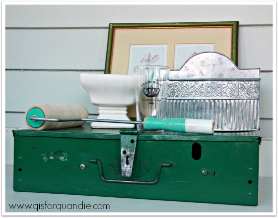
Today I’m sharing some true trash to treasure projects (my favorite kind) with you.

trash to treasure

  Last summer a lovely gal named Jen purchased a pretty yellow dresser from me via craigslist.  She wasn’t sure how she would get it home, so Mr. Q and I offered to deliver it for her and in exchange she gave me an old dresser that she found in her garage when she bought her house.  By the way, I also featured her darling house on Q.

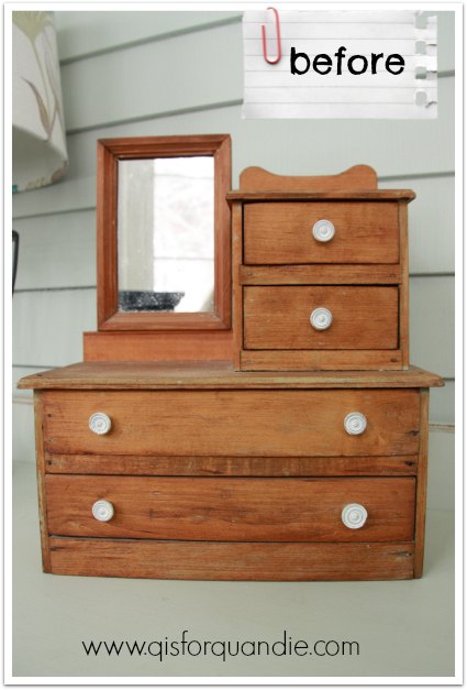
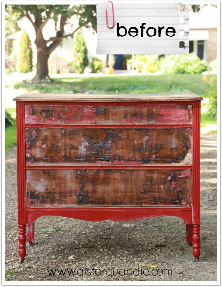
The dresser in question was in pretty rough shape.  The former owner had started stripping the paint, but never finished.  Once I got it home and inspected it more closely, I realized that both of the lower drawers were fairly shot and had bottoms that were warped beyond repair.  Don’t get me wrong, I’m not complaining, it was FREE after all!

t to t before

Now, I’m going to make a confession, sometimes I have trouble thinking outside the box.  I have tried to work on developing this ability, but it does not come naturally to me.  This dresser is a case in point.  After realizing the drawers were shot, I threw a drop cloth over it and started using it as a painting bench.  It was six months later before it occurred to me that I could just remove the drawers and work without them.  Duh, right?  I know.  Now you all know my dirty secret, I’m not really as creative as I appear online.

Removing the drawers entirely meant I needed to have a new ‘bottom’ added to the dresser, so of course I called on my miracle handyman/neighbor Ken.  My first thought was to just add some fiber board and paint it, but then I remembered a stash of old bead board I have.  I knew they would lend the perfect vintage look!  Ken went above and beyond, as he always does, and notched the ends so that they fit into place perfectly.  He also removed all of the support pieces for the middle drawer.

t to t inside before

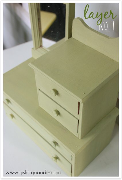
I had completed the stripping job on the top of the dresser last summer, and I knew I was just going to wax it with some Cece Caldwell aging cream, so I decided I would also leave the bead board unpainted as well.

Here is the top after the application of wax.  Isn’t that veneer pretty?

t to t top

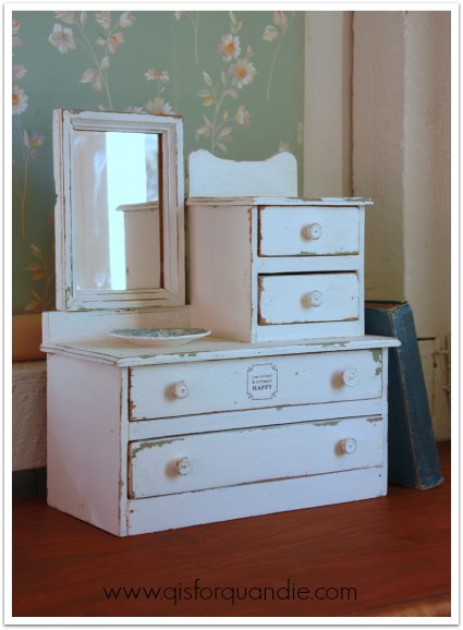
That left me with two decisions to make.  Whether to paint over the red or not, and what color to paint the inside.  I’d had several people tell me how much they loved the look of the half-stripped red paint on the dresser.  It was basically pre-distressed without any work from me.  I’ve had mixed results trying to sell red pieces though.  Oh, how I wish this dresser were green or blue instead.  But, the red was just too delicious to cover up.  So I sanded it a little, waxed it and called it good.

Next I pulled out my Fusion samples and painted the inside in their Laurentien.  This was the perfect application for Fusion paint because it doesn’t require a top coat.  Have you ever had to wax the inside of something like this?  It pretty much is one of my least favorite things to do.  You feel like you practically have to crawl inside the thing to get that wax worked in.  In addition to not needing wax, the Laurentien also covered in one coat!  Eureka!  How fab is that?

interior painted in Fusion Laurentien

I have always been a fan of the red/turquoise combo, how about you?

trash to treasure dresser

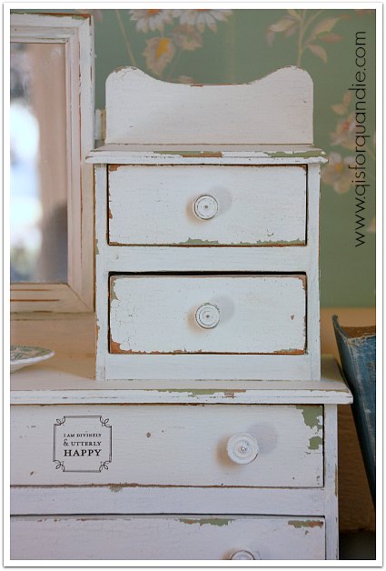
I added simple glass knobs from Hobby Lobby to the drawer.

glass knob

By the way, have you noticed anything about my photos so far?  Yep!  I’m back in the photo cottage!

trash to treasure dresser

We are having an amazing March warm-up here in the Twin Cities.  The snow is gone, we’ve had brilliant sunshine and temps in the 60’s.  It is a spring miracle.  Woo hoo!

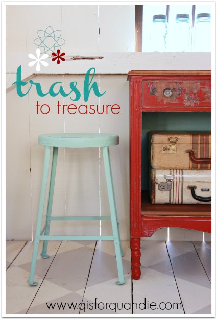
As I was setting the dresser up in the photo cottage, I decided I needed to add a little something more to the staging.  So I grabbed one of the metal industrial stools that nnK found for me (they were throwing them in the trash at the school where she works, so of course my number one spotter grabbed them for me).  I wiped it down with a damp paper towel and then painted on two coats of Laurentien.  After the paint was dry, I sanded the edges for a distressed look.

metal stool in Fusion Laurentien

And that was it.  It was truly that simple.  No mixing, no measuring, no prepping, no waxing.

Now, you know me.  I love my chippy, distressed finishes.  Nothing will ever replace my MMS milk paint for giving me that look.  But it is a challenge to work with some times, and the results are always somewhat unpredictable.  Plus, it’s not always the right paint for every project.  I can see Fusion taking the place of chalk paint for me though.  Especially on projects like both of these.  It does take a little more elbow grease to distress than chalk paint, but I like not having to wax.  I should also mention that it flows off your brush like dream.  With chalk paint I always feel like I really have to work the paint with lots of passes with the brush.

Furthermore, I am totally loving this color, Laurentien.  I initially thought it would be too bright to use on anything of size, but I it totally works on both of these pieces.  I don’t know that I would ever paint an entire dresser in this color, but it works well for adding a pop of color.

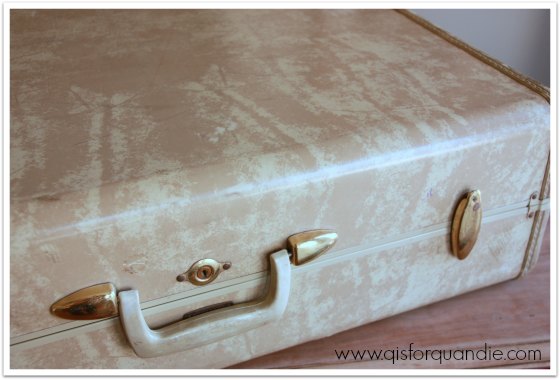
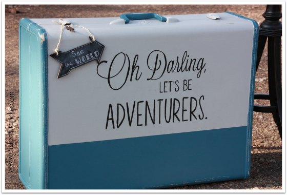
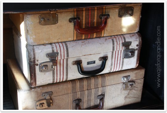
 I’ve staged the dresser with some vintage suitcases and a pile of 50’s tablecloths inside, but you could also use some locker baskets or a wicker basket.  Some wooden fruit crates would be great as well.  You could also just fill it with stacked quilts, or even stacks of fabric if you have a sewing room or stacks of towels in a bathroom.

trash to treasure dresser

Quirky pieces like this add a ton of character to your home.  No one else will have one just like it.  And of course this is for sale.  Anyone interested?

Linking up with The Painted Drawer Inspiration Friday.

P.S.  A quick note.  Although the Fusion people sent me free samples of their products to try out, there were no strings attached.  They just asked me to try it.  All opinions in this post are my own and I am not being paid to provide them.

mission possible.

One of my blog followers, Janice from Fred and Bessie’s, was kind enough to pass my info on to Homestead House Paint Co and they offered to send me some of their new Fusion paint to try!  It was like Christmas when a box filled with paint and other goodies arrived on my doorstep!  However, my sister and niece were here visiting, so I didn’t feel like I could say “hey, go entertain yourselves, I’m going to paint something.”  So, instead I suggested that we all head to a local thrift store and each of us pick something out to paint.  Their mission, should they choose to accept it, was to pick something ugly and turn it into something fabulous with Fusion paint.

fusion thrift finds

Debbie is holding two cutting boards (that were mine), a little wooden handled container and a counter top paper towel holder.  She and I also purchased some glass jars.  Kris picked out some hideous framed ‘art’ and a large silver glass platter.  Pretty much looks like a pile of tacky stuff from the thrift store, right?

fusion thrift finds before

Debbie wins the contest for spending the least amount of money at $3.75.  I came in second, spending $4.75 and Kris spent a whopping $9.20!

After we hauled our items home, we pulled out the Fusion paint and got to work.  Debbie was really drawn to the saturated hues of the Renfrew Blue and Ceramic.

fusion Renfrew

I really wasn’t sure about the bold teal blue of the Renfrew when it first went on.  But look how cute this turned out!  Debbie is going to use it on the counter in her bathroom.  She painted it with 2 coats of Renfrew Blue, then she used sandpaper to distress.

fusion trug after 2

She used the Ceramic on her glass jar and got some interesting results when she sanded it.  The sanding brought out a little more yellow in the color.  We both really liked that effect.

fusion jar after

Kris decided to simply remove the tacky prints from her two picture frames, paint them and then stencil the glass.  She used Champness on one frame, and Seaside on the other.  She used acrylic craft paint for the stenciling.  Stenciling on glass is a bit tricky.  The paint tends to slide around a bit more and not give a crisp result, and she wasn’t happy with that.  I think this one will look great hanging over the sink in her apartment though.

fusion french market sign

Kris also embraced her inner Jackson Pollock when it came to the glass plate she painted.  She painted two coats of Sterling, a very pale, silvery grey, first.  Then she used the colors that both my sister and I used on our pieces to splatter on top.  She’s going to use this plate on her coffee table.  The Fusion paint left a finish that was smooth as silk on the glass, by the way.

fusion painted plate

As for me, I painted both of my cutting boards using Fusion’s Bedford, which is a very nice greige.  I used two coats of paint, and then added my stencils using acrylic craft paint.  Once mostly dry (after about an hour or so), I sanded vigorously.  I felt like both of these benefited from some serious distressing.

fusion cutting boards after

As for my jar, I painted it with my favorite color, a beautiful turquoise shade called Laurentien.

fusion Laurentian

Since I had the paint out and ready to go, I decided to see how it worked with metal as well.  I grabbed a plain metal tin that I had on hand and slapped on two coats of paint.  Once dry, I added a couple of rub-ons.

fusion Laurentian 2

So, in the end our pile of thrift store goodies went from this:

fusion thrift finds before

to this:

fusion after

We accomplished all of it in an evening.  My sister and niece don’t have any special painting skills.  They are both ‘crafty’ people, but neither of them has any experience with using milk paint or chalk paint.  They didn’t require any special instructions from me to use this product.  So, if you are looking for a paint that is easy to use straight from the can, Fusion is for you.  If you are also looking for a paint to use on surfaces other than wood such as glass or metal, Fusion is a good choice.  I plan some more in-depth testing with Fusion over the coming weeks, so stay tuned to learn more.

If you are local to the Twin Cities, you can find Fusion at Farmhouse Inspired in Hudson or the Porch and Atelier in Buffalo.  Check it out!

chalk it up.

A while back my friend Sue told me she’d seen a new Martha Stewart product.  It’s a liquid chalk dauber that you can use with stencils on a chalkboard.  This sounded just perfect for me since I don’t have great skills when it comes to free-handing a chalkboard design.  Sue was kind enough to share a coupon for 40% off at JoAnn Etc with me, so I popped over there and purchased one (please note that this post is not sponsored in any way, I am just sharing my experience of this product with you).

chalk liquid

The directions were pretty minimal.  They just said to be sure and prime your chalkboard for best results.  Have you ever primed a chalkboard?  If not, it simply means to rub chalk all over it and then wipe it off.  You only have to do this to a freshly painted chalkboard that has never been used before.  Mine wasn’t new, but I primed it again anyway just to be on the safe side.

chalk it up title

My ‘Family and Friends’ stencil fit the chalkboard perfectly, so I just taped it in place and was ready to start chalking.

chalk stencil

I started out stippling the paint on with an up and down daubing motion, similar to the technique I use when stenciling.  I didn’t really like how the texture of the stippling looked (on the ‘F” below), so then I tried using a sweeping motion instead (on the rest of the letters).

chalk look

And honestly, that looked even worse, so I went back to stippling with the rest of the design.  Once the stencil was removed, I just wasn’t impressed.  I tried to salvage things by filling in some of the letters with actual chalk.

chalk stencil close up

chalk board 1

Hmmmm.  I have to be honest.  I’m not loving this at all.  It looks messy and it certainly doesn’t look chalked.  It looks more like a bad paint job.

chalk 2

It doesn’t look quite as bad from a distance, and it helps even more if you squint your eyes just a little.

chalkboard on wall

OK, well, I’m grasping at straws here.  It totally does not meet my standards.

I’m sure part of the problem lies with me and my technique, I went online to look for more instructions or even just some tips on how to use the product.  I found a youtube video, and it recommended ‘pouncing’ the liquid chalk on much like I did.  It also suggested wiping a little of the liquid off first, which I did not do.  That might have helped.   In the end, I think part of the problem is also the stencil I’m using.  It wasn’t designed for use with a product like this.  Using a stencil with skinnier lettering might work better (such as those made by Martha Stewart specifically for her liquid chalk).

Luckily, this product can be ‘erased’ with a damp sponge.  I’m going to test that out next, and then head back to the drawing board with this product.

scrapping the Danube.

While my sister was visiting last week, she and I went on a weekend-long scrapbook retreat.  I know scrapping isn’t for everyone.  Plus a lot of people have gone totally digital with their pictures.  But I am still an old fashioned scrapper.  I like to play with paper, scissors and glue.  I love pretty papers in gorgeous colors, with different textures and patterns.  For me scrapbooking is just another creative outlet.

So Debbie and I spent three full days focused on scrapping, and although I didn’t quite finish with all of the pics from my Danube river cruise last November, I did get quite a lot done.

Danube scrapbook pg 1

I tried something new this time around with my photos.  I printed all of them on matte photo paper and I love the results.  It may not be everyone’s cup of tea.  The most frequent comment I heard was that they don’t look like snapshots anymore, which is sort of true.  They may not look like snapshots, but yes, all of the pictures shown on these scrapbook pages are my own (or my sister’s).  I added titles to some of them (like the one above on the left) using picmonkey.  I print all of my photos myself on an inexpensive HP printer.  I just find it easier to print my my own, but I’m sure it’s not cost effective.  I like to be able to determine what size photo I want, and plan my page layout a little in my head as I go.

scrapbook 5

I try to hang onto things like the key cards from our hotel in Budapest (above) to add to my pages.

I also try to add a few vintage touches to my pages, like this fragment from a vintage French dictionary with the definition of the verb dormir, to sleep, on my hotel page.

scrapbook 11

You can see that my favorite shade of aqua plays a big role in my scrapbooking as well as my furniture transformations.

Danube scrapbook pg 3

I’m still cutting up vintage books too.  If you are wondering, the ‘tin pins’, such as the “see the world” pin below, are from October Afternoon.

scrapbook 6

I often use pages from a 1963 etiquette book for my background.  This next page has a section about proper behavior in public while sightseeing.  The photo itself was taken at the Thurn & Taxis palace in Regensburg, Germany.

Danube scrapbook pg 7

My pages tend to be a bit less cluttered than some.  I like leaving some room for the eye to rest.  I’m also trying not to overwhelm my photos on the page.

Danube scrapbook pg 8

I took over 1,200 photos on this trip, but when I first got home and went through them I felt like I only had a handful of good pictures.  We had some dreary weather, plus it got dark so early every day.  The lighting just wasn’t optimal.  However, after I started monkeying around with my photos (in pickmonkey, of course), I realized that I could work with the lighting instead of against it.  In the end, these photos of Vienna that I printed in black and white are some of my favorites.  I scrapped them on a grey background and added some pops of bright pink.

scrapbook vienna

The brads I used (that’s what those round things are below, for those of you not familiar with the term) are from My Mind’s Eye.

scrapbook details

I use a lot of different techniques on my pages.  For instance, on this next page I painted the chipboard letters that say “Altstadt” (which means Old Town in German, by the way) and I used a rubber stamp with ink for the cursive writing that is behind the paper on the bottom right of the page.  The photos on this page were taken in Melk, Austria.

Danube scrapbook pg 4

One of my favorite techniques is to paint the chipboard, and then add a rubber stamp with some pretty french writing on top like I did on the arrow on this page.

scrapbook Vienna

Here is a close up.

scrapbook chipboard closeup

I also like to use these vintage looking ‘slide’ frames to focus your attention on a particular part of a photo, like this picture of Mr. Q and my sister with Melk Abbey in the background.  I’m also using the frame to help disguise some ugly construction equipment that was behind them.

scrapbook slide

I used another slide on this page of photos from the Castle Hill district in Budapest.

Danube scrapbook pg 9

I hope you weren’t entirely bored with a post on scrapbooking!  I just had to share what I’ve been up to, especially since spending time scrapbooking means that I’m not spending time painting furniture.

If you are wondering about any of the elements on my pages that I didn’t identify, feel free to post a comment asking about them.

As for future travel, we’re thinking maybe Belgium for our next trip.  Specifically Bruges and Ghent.

cafe-scene-BRUGGES_BELGIUM_1_grande
photo from http://www.barloga.com

Looks gorgeous, right?  Has anyone been there?  Have any tips for me?

But first, I have to save up some money, which means I’d better get back to painting furniture pronto!

storage with style.

I’m painting more metal boxes.  It’s so quick and easy, and I love the results.  I picked up a couple of them while thrifting recently.

painted boxes collage

I painted the larger one in Annie Sloan’s Duck Egg, and the smaller in her Florence.

painted boxes 1

Then I doctored them up with some more rub-ons.  The numbers are Tim Holtz, and the faux vintage labels are 7 Gypsies.  I just adore the one I used on the top of the smaller box.

wild cherry box

And I added some pretty October Afternoon scrapbook paper inside.

painted box inside

And the French labels on the bigger box are kind of fab as well.

painted box french label

I doctored up the top of the bigger box also.

painted duck egg box top

I don’t know about you, but I prefer storing things in pretty containers.  These boxes would be perfect for storing all kinds of things; craft supplies, tax records (gack!), your make up, old photos.  Both of these boxes have keys, so you could always lock up your most precious belongings, whatever they might be.

storage with style

Here are some tips for you if you plan to paint some metal boxes of your own.  First of all, sand lightly before you paint.  I know that chalk paint aficionado’s say you don’t have to, but it just takes a minute and it helps remove any residues that might affect the paint.  Next, water your chalk paint down.  Way down.  You won’t get the brush strokes if your paint is really thinned out.  Take a closer look at my photos.  I watered down the Florence, but didn’t water down the Duck Egg.  You can see brush strokes in the Duck Egg, but none in the Florence.  That did mean that I needed two coats of Florence, and only one of Duck Egg, but I think it’s worth it to get rid of those brush strokes.  Especially on metal.  Next time I’ll be sure to water down all of my colors.

I finished by sanding and then adding clear wax.  I followed the clear wax with some dark wax on the smaller box.  Then I added the rub-ons.

Makes for a simple project you can handle in an afternoon.  But if you don’t want to tackle it yourself, these lovely boxes will be available at my sale in June unless someone snaps them up sooner.

painted suitcase class.

As promised, it’s time to plan a Painted Suitcase class!

painted suitcase class

I love a good painted suitcase and have done quite a few.  My all time favorite was my travel quote suitcase.

travel quote suitcase

That one was a little time consuming to do.  I printed the wording on paper, then used white transfer paper to trace the design onto the suitcase.  Then I painted in the lettering by hand.  It sounds tricky, but isn’t too bad if you have a steady hand and the right paintbrush.

But there are a lot of other options if you don’t trust your ability to pull that off.  This suitcase was painted black with MMS milk paint, and then I added the wording using a stencil.  Much quicker and nearly as fab.

painted suitcase 3

These next two suitcases were also painted using milk paint, and then stenciled.

painted suitcase 4

If you aren’t a fan of stencils or wording on your suitcase, you can always go old-school with a simple stripe.

carriage house dress form

Another fun option is to turn your suitcase into a chalkboard.  That way you can change up your message whenever you like.

painted suitcase 2

painted suitcases 1

All of these options and more are possible at my upcoming painted suitcase class!

To see more painted suitcase inspiration, check out my pinterest board.

Here are the details:

When:  Saturday, March 28 at 10 a.m. (class will last approx. 4 hours, but may go longer if we are waiting for pieces to dry)

Where:  Casa Q (that’s my house, which is in Oakdale near the intersection of hway 36 and 120)

What:  The goal of this class is to send you home with a fully finished painted vintage suitcase.  In the process, you will learn about both milk paint and chalk paint, plus the many different top coats that are available for them.  You’ll learn which pieces do well with milk paint, and which ones are better off with chalk paint, as well as how those products with react with different pre-existing finishes.  You’ll also learn some stenciling tips as well as some chalkboard tips.  Also, this just in, I have been provided with some samples of the new line of mineral paint from Homestead House (they make the Miss Mustard Seed milk paint) called Fusion.  I will be inviting you all to play around with this paint a little during class, and I’ll be sending each person home with a free sample size jar of the paint.

Included:  a vintage suitcase plus all supplies necessary to re-fab it, snacks and beverages.

Cost:  $115 per person

I only have suitcases for a maximum of 5 students, and I need a minimum of 3 to hold the class.

If you are interested, please send me an email at oakdalecarriagehouse@gmail.com to hold your spot!


thrift store unicorns.

Every time I go into a thrift store, I check the luggage aisle.  I’m looking for fabulous vintage luggage, but usually I find tacky 80’s and 90’s luggage instead.  I’ve heard mythical stories from those who have found great vintage luggage at Goodwill or other thrift stores, but it has never happened for me.

Then, it happened.  A vintage Samsonite.  Right there in the luggage aisle.  Not only that, but it was half-off day!  I grabbed that suitcase and proudly hauled it over to the cart I was sharing with my friend Meggan with a huge grin on my face.  “Look!”, I proclaimed, “it’s a miracle!” and she said “It’s a thrift store unicorn!”

thrift store unicorn

I also picked up a few other goodies that day.  Another metal box to paint, some MCM glassware, a cute vintage watering can, a cast iron door stop and more.  I always grab decent lampshades when I see them.  This one was in great shape and only 75 cents.  How do you pass that up?

The next day Meggan emailed me.  She had spotted a pair of vintage suitcases on Craigslist.  Not only that, but they were in my neighborhood and in the right price range!  It was like a unicorn trifecta.

craigslist suitcases

Mr. Q and I promptly ran over and picked them up.

And then, a couple of days later, Meggan texted me from Goodwill.  She had spotted yet another thrift store unicorn!  A vintage Samsonite, and she was willing to nab it for me.  Woo hoo!  She is now a bonafide unicorn hunter.

My collection of vintage suitcases is growing.  Some vintage suitcases are totally meant to be left alone.  Like these three.

vintage suitcases

I use these as props in my furniture photos, and also just as decoration in my home.

Meggan has this stack of vintage luggage at her house, and these are also perfect as is.

meggan's vintage suitcases

But the suitcases that I have been stockpiling are destined to be painted.  Potentially even by you!

Stay tuned later in the week when I announce my upcoming Painted Suitcase class!