a showdown between milk paint and Fusion paint.

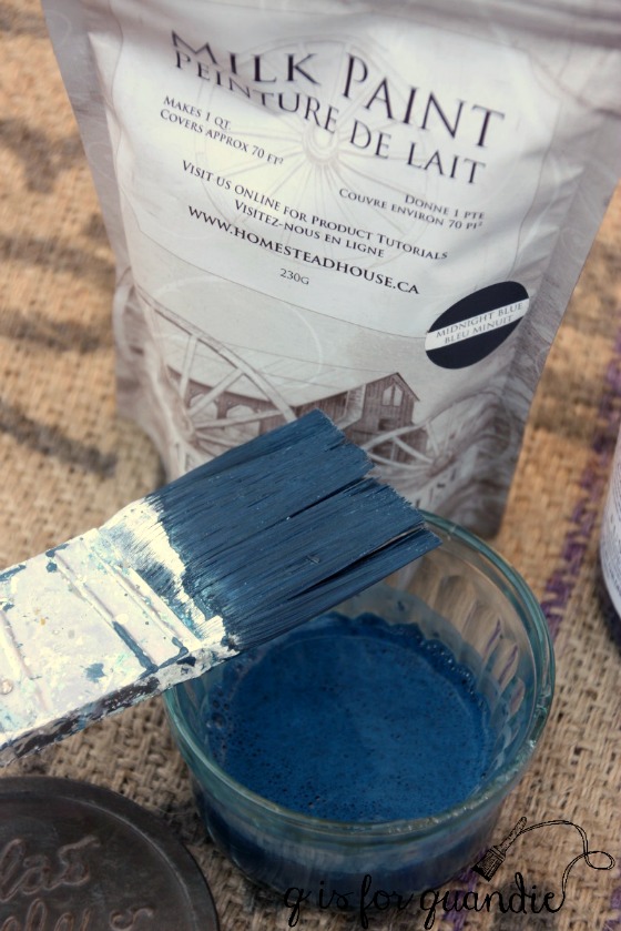
Did you know that the Canadian paint company that manufactures Miss Mustard Seed milk paint, Homestead House Paint Co., also makes Fusion paint?  Not only that, but they also have a full line of milk paint that is not packaged with the Miss Mustard Seed branding.  It is manufactured with the same ingredients and is pretty much the same exact stuff, except it comes in different colors (you check out those colors here).  As it turns out, a lot of the Fusion paint colors started out as Homestead House milk paint colors.

Recently the Homestead House people offered to send me some samples of their milk paint to play around with.  I asked them to send me some of their Midnight Blue milk paint specifically so that I could compare it with the Midnight Blue Fusion paint.  And thus, this blog post was born.  A show down between milk paint and Fusion paint.  Which one is better?

milk-paint-title

Before I move on with the detailed comparison, I’m going to give you the answer to that question.  It’s sort of like reading the last page of the book first, but who doesn’t do that every now and then?  And the answer is: ‘neither’, or ‘both’, or ‘it depends on what you like’.

So let’s compare, shall we?

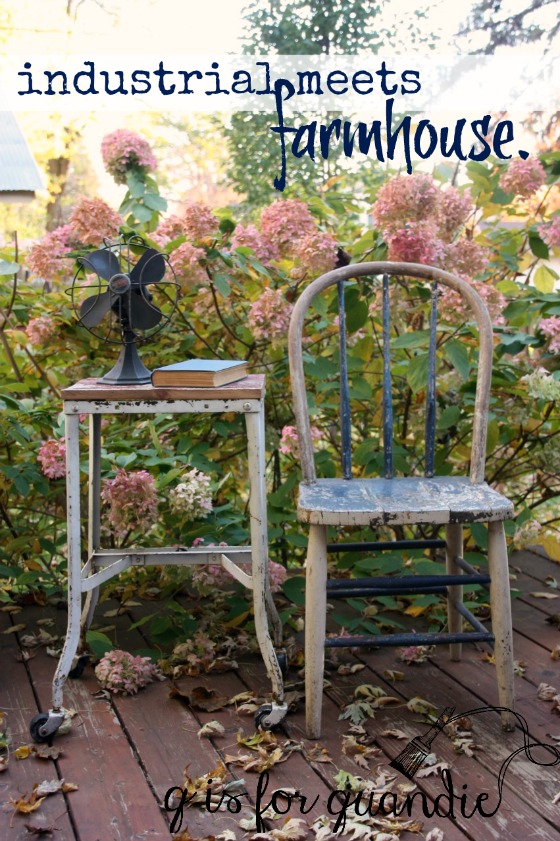
I happened to have a pair of chairs that I snagged curbside for free last spring at the White Bear Lake Trash to Treasure day.

chairs-before

Painting one with Fusion paint and one with Homestead House milk paint is a great way to compare the qualities of these two types of paint side by side and in the same color.

midnight-blue-fusion-paint

Right off the bat we have a big difference between the two products.  The Fusion paint is ready to go right out of the jar, the milk paint powder has to be mixed with water.  I’ve spoken with some painters who don’t like having to mix milk paint themselves, but I kind of enjoy it in a ‘making mud pies’ sort of way.  It feels a little like a science experiment to me.  Mix powder and water and it makes paint, kinda cool, right?  For the Midnight Blue I used a little more water than powder since it’s a nice dark color.  With lighter colors I go with more of a one to one ratio of water to paint.  I mixed my paint before starting to prep my chairs to give it some time for the color pigments to dissolve and blend well.

midnight-blue-milk-paint

To keep a level playing field for this experiment, I did the same amount of prep on both chairs.  Very little.  I removed the seats and then I didn’t bother with sanding them, I just wiped them down with a damp cloth.  This is not the recommended procedure for either paint.  The recommended prep work is to sand lightly to give your surface more paint gripping power, then wipe down.  I skipped the sanding because I wanted to encourage chipping on the milk painted chair, and also because I was feeling a little lazy.

I started with the Fusion chair.  Painting with Fusion is fairly straightforward.  Just dip your brush and paint it on.  Here it is after the first coat of paint.  You’ll have to excuse the purple-ish look, it was a bright sunny day when I took these photos and there was a little too much reflection coming from the wet paint.  As you’ll see later, this is really a navy blue.

fusion-paint-coat-1

I almost could have gotten away with just one coat of the Fusion paint except for a few spots that didn’t quite have enough coverage.

While that dried I painted the milk paint chair (ditto the above regarding the purplish look, too much glare).  Right away I noticed the difference in applying the two kinds of paint.  The Fusion paint feels heavier on the brush and takes just a little more effort to brush on.  The milk paint is very light and almost watery by comparison.  This makes it really easy to paint on.  But it also tends to get a little drippy.  It’s easy to just keep an eye out for drips and wipe them away with a pass of the brush though.

milk-paint-coat-1

Once I had the first coat of paint on the milk paint chair, I went back to add a quick second coat to the Fusion chair.  Unfortunately it wasn’t quite yet dry.  It does take just a bit longer for the Fusion to dry.  This is another quality that I love about milk paint, it dries very quickly often allowing me to complete painting projects requiring two coats of paint in one evening after work.

Since the Fusion chair wasn’t quite dry yet, I took a quick break and dug out some fabric for recovering the chair seats.  I cut the fabric to fit and ran a quick hot iron over it to smooth out any creases.  In the time it took to do that, the paint was dry and it was time for a second coat on each chair.

I’ve learned that it is much easier to distress Fusion paint shortly after applying it.  The longer you wait, the more the paint cures and the more durable it becomes.  This is great for long term durability, but can be frustrating if you want to purposely distress your piece and you didn’t get to it right away.

So as soon as the paint was dry, I used a sanding block to lightly distress areas on the Fusion chair that would normally show some wear and tear over time such as the edges.  I did not sand the flat surfaces at all.  I then used a very small amount of wax on a cloth to darken up any spots of fresh wood that were revealed by the sanding.  This not only protects that bare wood, but it darkens it up and makes it look more naturally distressed instead of looking freshly sanded.  It just took a quick minute to do, I didn’t thoroughly wax the whole chair by any means.

fusion-distressed

Next I turned to the milk paint chair.  I was really happy to see that it had some spots where the paint was already flaking up.  I wanted to see some chipping and in my opinion this is where milk paint really shines.  I ran some sand paper over the entire chair (including flat surfaces) and did get some paint off, but I wanted more chipping so I used one of my favorite secret tips, masking tape.  Imagine using masking tape to de-lint your black dress pants, it’s the same idea.  Press the tape onto the surface and then pull it off.  Voila!  Chipping!

Once done with that I ran my shop-vac over the chair to remove any remaining dust or paint chips.

And now we’ve come to the moment in time where I admit that there is one more step required for the milk paint chair that is not necessary with Fusion paint.  A top coat.

I opted to use hemp oil as my top coat.  It’s a little easier to apply than wax and I like the way it darkens up the Midnight Blue a bit more than wax would.

milk-paint-distressed

At this point I think the difference in the final look between the two paints is pretty obvious.

The milk paint finish looks more genuinely aged.  I know this chippy look doesn’t appeal to everyone, but personally I love it.  For me, nothing compares to the chippy look you can get with milk paint.  But as I think I’ve pointed out, it’s just a tad more work to use milk paint rather than Fusion paint.

milk-paint-chair

Is it worth the extra work?  I think that depends on the piece.  Some pieces really come alive with a chippy milk paint finish, while others are better off with a more solid Fusion finish.

Another thing to consider is that the Fusion finish is more durable and washable than a milk paint finish.  If you’re painting kitchen cabinets, you’re definitely better off with Fusion paint.

fusion-paint-chair

So, which one is better?  Neither.  Both.  Depends on what you like.  For me personally I prefer the chippy milk paint finish.  When I’m painting pieces to keep for myself I almost always choose milk paint.

How about you, do you have a preference?

the koningsdam.

The short cruise I took to the Bahamas last week was aboard the newest Holland America ship, the Koningsdam.  Did you know that Holland America is owned by Carnival Corporation?  As are Princess, Cunard, Seabourn and several others including, of course, Carnival.

I’ve sailed on Royal Caribbean, Princess, Carnival, Celebrity, Norwegian, Viking, and this was my 2nd cruise on a Holland America ship.  I guess much like with paint, I am not loyal to any one brand.  Also, much like paint, I can’t choose just one as a favorite.  They each have their place depending on what qualities you are looking for.

I have to say that of all the cruise lines I’ve been on, I feel like Holland America is the most … well … sedate.  Princess runs a close second.  If you are looking for a party at sea, stick with Carnival or Royal Caribbean.  But if you want a little more subdued and classy atmosphere, go with Celebrity, Princess or Holland America.

If I had to pick just one word to describe this ship I would have to go with ‘cultured’.  For one thing, there were lots of European passengers on board and overall the ship had a very European flavor right down to its Captain, Emiel de Vries from the Netherlands.  His accent was fun to listen to every day over the loud speaker.  There were many times when we were surrounded on deck by people speaking various foreign languages.  The ship had just crossed over from Europe, so many passengers had come along for the ride and stayed on board to see the Bahamas.  It was fun chatting with the many Dutch passengers and asking for advice on what to see when we go to Amsterdam next year.

In addition to that European feel, the ship was also filled with some truly gorgeous art.  The stairwell that was just outside our cabin had some pretty unique pieces at every landing.  This set of six was my favorite.

OLYMPUS DIGITAL CAMERA

I’m afraid I didn’t do a very good job of capturing them.  From straight on at more of a distance they looked like traditional Dutch portraits.

OLYMPUS DIGITAL CAMERA

But as you got closer to them you could see that they were actually made up of hundreds of tiny photos and other items that were held in place with stick pins.

OLYMPUS DIGITAL CAMERA

Totally amazing.

They had several pieces that used some fairly unique mediums such as this pair that used colorful matchbox cars.

OLYMPUS DIGITAL CAMERA

Those aren’t just photos of matchbox cars, they are actual matchbox cars under glass.

OLYMPUS DIGITAL CAMERA

That’s some pretty impressive upcycling, don’t you think?

And who else remembers the floppy disk?

This next landing had a trio of portraits drawn on old maps.

OLYMPUS DIGITAL CAMERA

You just can’t go wrong with an old map of Paris, right?

OLYMPUS DIGITAL CAMERA

Another stairwell held some more surreal pieces.  My palms got a little sweaty every time I passed by this one.

OLYMPUS DIGITAL CAMERA

If you are puzzled as to why, you aren’t looking closely enough.  Look again.

Don’t you want to just snatch that little girl off of that swing?

This last piece that I’m going to share was truly breathtaking.  It’s a cello made into a ship.

It was a bit hard to capture due to the combination of the glass case and my striped shirt.  Apparently I still haven’t learned not to wear stripes when taking photos.

But I hope you can still get a feel for how amazing this piece was.

 By the way, remember I said I would report back on how well the Holland America promo photo of the stateroom reflected reality?  Here is their official photo …

koningsdam-room

I didn’t get a photo of the room myself, but here is one that my sister took …

stateroom

The promo photo is not entirely misleading, but it does appear to be missing that wall this side of the beds.  See it there in Debbie’s photo on the right?  I’m also fairly sure that they used smaller pillows in the promo photo to make the beds appear bigger.  This jumps out at me because the back set of pillows on our beds were wider than the bed itself (you can easily see that in Debbie’s photo).  We were constantly knocking stuff off our nightstands with the pillows.  The narrower pillows in the promo photo make the beds look wider than they really are.  Also, that space between the foot of the bed and the TV wall was quite narrow which is more obvious in Debbie’s photo.  Finally, the promo photo makes the room seem quite a bit deeper than it really was.  That desk looks so much further away in the promo photo.  A trick of the camera lens I’m sure.  And sadly, we didn’t get a room with those pretty shades of green, we got grey and blue, a color scheme that seems quite drab by comparison.

Three of us in this tiny room was a challenge.  When the couch was pulled out into a bed, we had to climb over it to get to the balcony.  You know those old sliding puzzles where you had to move one piece to make room to move another piece, then shuffle a third piece to get to the piece you really needed to move?  Moving around in this room was a lot like that.

But a small room is part of the package with a cruise.  Unless you are independently wealthy and can afford a suite.  But if you are claustrophobic, a cruise may not be the right choice for you!

Be sure to check back next week.  I’ll be comparing milk paint to Fusion paint!  See you then.

out of the loop.

There is just something about heading off on a tropical cruise two weeks before Thanksgiving.  Prior to leaving on my trip, I was really getting in the seasonal spirit.  I was decorating for fall and thinking ahead to Christmas.  I even ordered a new Christmas tree (you’ll see it in a couple of weeks).  My vintage ornament collection has grown to the point where I need a bigger tree.

But then I flew off to Florida and cruised around the Bahamas for a bit.  It was sunny and 80+ degrees nearly every day.

OLYMPUS DIGITAL CAMERA

I was surrounded by blue skies and crystal clear turquoise water.  I drank tropical drinks on restaurant patios and strolled barefoot along beautiful beaches.

half-moon-cay-beach

I didn’t need a jacket.  I went through an entire can of sunscreen.

OLYMPUS DIGITAL CAMERA

I sat on the balcony with a glass of wine and a good book  and I didn’t really need that blanket, it’s just there for looks.

OLYMPUS DIGITAL CAMERA

And then I came home.  What do you mean Thanksgiving is next week?  How is that possible?  I’m so disoriented!

Isn’t it still summer?

OLYMPUS DIGITAL CAMERA

I checked a few of my favorite blogs when I got home and oh my gosh, they are already writing about Christmas decorations.

While I was gone all of the remaining leaves have fallen from the trees and the branches are all bare.

I feel so out of the loop.  Like a train that has run off the tracks.  I should be sharing a beautiful Thanksgiving table or how to make your own wreath out of dried hydrangeas.

Instead all I have to share are photos from my tropical vacation and I don’t feel the slightest bit like getting out the Christmas stuff.

OLYMPUS DIGITAL CAMERA

So I hope you’ll indulge me for just a bit while I try to adjust and get back in the loop.  Perhaps I’ll come up with some sort of more seasonal post for next week, but in the meantime I hope you enjoyed a few tropical photos today!

a girl getaway.

Hey everybody!  I scheduled this post a couple of days ago, because today I am sitting on the beach in Ft. Lauderdale!

girl-getaway

I’ll be spending a couple of days on the beach here followed by a quick 4 day cruise to the Bahamas.

I’m sure I’ve mentioned before that my mom is a travel agent.  And by the way, my mom just had her 76th birthday, but she is still working.  She has just cut back her hours from full time this year.  She mainly works for the perks.

A while back she mentioned to me that she and her co-worker had booked a short cruise on the newest Holland America ship, the Koningsdam.  They wanted to check out the new ship so that they could better represent it for future clients.

koningsdam

After she told me about this, I mentioned to my sister that maybe we should think about joining them.  Debbie was up for it, so we booked a cabin.

Mr. Q is not fond of Caribbean cruises, so he stayed home to man the fort.

After Debbie and I booked our boring but affordable interior cabin, I happened to mention the trip to my friend Terri and she asked if she could join us.  My travel agent, a.k.a. my mom, got busy and switched us from an inside cabin to a veranda cabin with room for three (Terri gets that couch by the sliding glass doors).

koningsdam-room

Looks positively spacious, doesn’t it?  We’ll see if it really looks like this in person when we board the ship on Wednesday.  Somehow I doubt it, but I’m excited about the balcony.  I don’t usually splurge on a cabin with a balcony but split three ways this cabin was cheaper than the inside cabin was for just Debbie and I.

This trip is going to be all about kicking back and relaxing.  I’ve loaded up my Kindle with several good books, I’ve packed a bunch of sunscreen, and I have budgeted for plenty of ‘boat drinks’ which I plan to sip on while sitting by the pool on board the ship.

koningsdam-pool

I won’t bother with WiFi or anything like that while at sea, so you won’t be hearing from me for the rest of the week.

But I plan to be back next week with a recap of my trip.  I’ll be sure to let you know if our cabin looked anything like that promotional photo!

altered paint brushes.

For a while there I was searching out old gunky paint brushes at garage sales.  They are harder to find than you would think.  Possibly because most people who have these old brushes think they should be destined for the trash heap, not sold at a garage sale.  But every once in a while you find those really frugal people who are selling every last thing, including old paint brushes.

So over the course of a year or so I accumulated a few old paint brushes.

crusty-brushes

I wanted to hang them on the wall in the Q Branch (a.k.a. my study), and I did do that with some of them.

q-branch-brushes

But I had a few left over and for a while the extras resided in the blue Structo truck.

truckload-of-brushes

But I decided to sell the Structo truck at my recent sale.  Gasp!  I know, right?  I actually had a few vintage trucks and I can’t keep them all or I would technically qualify as a hoarder.  I have to admit, it was a little hard parting with this one.  That blue was the perfect color.  But in the end I loved my aqua truck more, so the blue one went.

And the extra paint brushes had to go as well.

But first I decided to doctor them up with a few rub-on’s.

This one was my favorite.

altered-brush-1

But really they all turned out pretty fab.

altered-brushes

They ended up at the Carriage House sale.

altered-brushes-on-the-wall

And from there they all went to new homes!

altered-paint-brushesIf you happen to be someone who purchased one of my altered brushes I’d love to know what you did with it.  Did you hang it on the wall?

a pair of union jack tables.

I’m still working with the pile of freebies that my friend Terri sent my way when her uncle passed away.  This pair of end tables was among the items she gave me.

british-tables-before

They are very traditional and they have that 80’s sort of finish.  Just check out those shiny tops!

I kept passing them over in favor of other projects, mainly because I just wasn’t all that inspired by them.  I debated painting them a bright color, or just painting them black.  But in the end I couldn’t help wanting to give them each a union jack.

union-jack-side-tables

I’ve done a few union jack pieces in the past.  Every time I do one I’m reminded of how much measuring and taping there is, and how many steps it takes.  Paint a base color, wait for it to dry.  Tape and paint the white layer, wait for it to dry.  Tape and paint the 3rd layer, wait for it to dry.  You get the idea.  It’s a great project for evenings after work though because each step doesn’t take long, but you need that drying time in between.  I painted these over the course of last week.

But every time I do one of these, I’m also reminded of how much I love them.  I’m not even the tiniest bit British (well, maybe a tiny bit, I think my maternal grandfather had some ancestors that came from England), but there is just something about the design of the union jack that appeals to me.

As you can see, I chose to forgo the traditional red, white and blue in favor of shades of grey.  It tones down the design a little, and it will be easier for the future potential buyer to work neutral shades into their existing space. The base color is one of Fusion’s new colors called Putty.  The white layer is their new Raw Silk.  The 3rd color is a combination of Putty and another Fusion white called Champlain.

british-table-corner

I like to use the Fusion paint when working with taped lines and multiple colors on one surface for two reasons.  First of all, Fusion paint won’t pull off with the tape like milk paint will (as long as your surface is prepped with some sanding/cleaning and you are sure to wait for the paint to be fully dry before taping over it).  And second, you don’t have to add wax with Fusion.  With chalk paint, I find that adding the wax topcoat tends to drag the other colors into the white.  This wouldn’t have been as big a problem with these grey tones, but if you’re using red it is definitely an issue.

I included the magazine with crisp whites and greys in this next photo to help you see that the Fusion colors I used are warmer versions of white and grey.

british-table-top-2

By the way, looking at how shiny those tops were, you might be wondering how well the paint did adhere as I was using the tape.  I debated using a coat of Fusion’s Ultra Grip on just the tops, but in the end I didn’t.  Instead I sanded them really well to rough them up.  I also gave each paint color a full 24 hours or so to dry before using tape on it.  I used the yellow Frog tape (for delicate and freshly painted surfaces) and I had absolutely no issues with paint pulling off on the tape.

After I made the decision to add the union jack to the table tops, I realized that I had the perfect replacement knobs.  It’s hard to see in the photos, but these knobs say “Regent Clockworks London” on them.

british-table-knobs

Unfortunately I only had two of them.  I had purchased them at World Market so I checked on line to see if I could buy two more, no dice.  Then I went to my local World Market to look for them, again, denied.  Argh.

I’m going to have to come up with two similar, but not matching knobs for the second table.

It seemed appropriate to stage my photos with my Perfect English Farmhouse book and an English ironstone tea set.

british-table

english-ironstone

I think a paint job was exactly what these tables needed to give them a little more personality.

union-jack-table-in-fall

What do you think?

a-pair-ofunion-jack-tables-2

These tables are for sale.  For more info, be sure to check out my ‘available for local sale’ tab.

happy halloween.

happy-halloween

This year I’ll be observing Halloween in my favorite way;  staying home, wearing comfy fleece, and watching Hitchcock’s The Birds.  I would love to say that I’ll also be handing out candy to darling little kids in costumes when they come to my door, but historically we only get two or three ‘trick or treaters’ at our house.

But meanwhile I thought I would share a quick chair makeover with you.  The legs of this chair were sticking up out of my car with that haul of stuff I showed you last week.  Here’s how it looked when I pulled it out of the car.

halloween-chair-before

I needed another chair to keep in my home office a.k.a. the Q Branch so that when my sister comes over she has somewhere to sit if we’re surfing the web.

Although it was gloomy and grey this past weekend, the temperature on Saturday morning was in the low 50’s.  It felt plenty warm enough outside to paint, at least for a tough Minnesotan like me 😉

I know that some paints require a minimum temperature of 60 or so, but not milk paint.  I checked with the Homestead House people and they said that I can apply milk paint in temps right down to freezing.  It will work perfectly well, but may take just a tad longer to dry in colder temps.  How handy in my climate!

So I headed out into the carriage house and painted three coats of a mix of Miss Mustard Seed whites (Linen, Ironstone and Grain Sack) on the chair.  As is the case on most pieces I paint for myself, I would have been thrilled with tons of chippy-ness but that didn’t quite happen.

white-chair

I hope that it will wear more with use over time.  Fingers crossed.

I had a little paint left over while working on this project, so I pulled out a step stool that I picked up at another garage sale this summer.  This is the only ‘before’ photo I could find.

stool-before

  It was already painted white but was a chippy mess.  Especially on the top, I’d say about 80% of the paint was missing from the top.  If you look closely you can also see that the paint was totally peeling away underneath.  One of my tricks with pieces like this is to scrape off the peeling paint, give it a good sanding and then just add a fresh coat or two of milk paint on top of the existing paint.  I don’t fully paint it, I try to leave the wear on the edges alone.  But the fresh white paint gives it a cleaner look.  Shabby rather than grungy.

painted-stool

The stencil just adds that little extra something.

I thought it would be fun to throw in my Happy Halloween pillow and share these pieces with you today.  I don’t intend to keep the chair and the stool together as a pair, but they would work well together, wouldn’t they?

happy-halloween

I snagged the pillow from the $1 aisle at Target (although it cost $3).  It was the last one they had at my store when I grabbed it several weeks ago.  I am betting they went really fast at that price.

happy-halloween-pillow

So, how do you like to spend Halloween?  Painting with milk paint outdoors?  Out prowling the streets with the kiddos?  Living it up at a costume party?  Or like me, warm and cozy at home with some hot apple cider and a classic horror film?

getting creative.

You might think that you’re about to read a blog post about some fun and creative project.  But no, I’m actually going to tell you about my window repair which wasn’t much fun but we did have to get a little creative in the end.

Remember way back to the summer of 2015 when I told you that I was making over my dining room?  Yeah, it’s still not quite done.  It’s almost done, but not quite.  One of the big hold ups was the windows.

As a reminder here is how they looked before …

window-before

They don’t look so bad in this photo, but if you look closer you can see that trim needs new paint and the window on the right doesn’t have a screen.

I’ve mentioned before that my dining room was an addition built by the previous owner of my home.  The windows are a bit wonky.  They are sort of just cobbled into place and aren’t centered between the two 6″ x 6″ posts that are on either side.  Over time the storm/screen combos and the outside trim boards had started to rot.  Then this spring a bird decided that pecking away at those soft spots was a super fun hobby.  He pecked huge holes in a couple of the trim boards (sorry, I didn’t get a photo of that).  In addition that right side storm/screen had completely fallen apart.  At that point we knew we had to stop procrastinating and deal with the problem.  Plus re-doing these windows entirely, centering them and maybe even eliminating that big trim piece down the center would be a nice improvement so why not just get ‘er done.

In early summer we ‘hired’ (it was just a verbal agreement) a handyman who’d done some work for us before to replace the windows.  He had a busy summer though and thus forgot all about our small window job.  About mid-August I started to panic when I realized he wasn’t going to get to us and we needed another solution.  So we called Renewal by Andersen.

Now before I go further, full disclosure, Mr. Q worked for Andersen Corp. for almost 30 years.  We have been fully brainwashed to believe they are the best windows on the planet.  They also aren’t cheap.  We expected that.  However, when the quote to replace two windows came in at over $6,400 dollars I believe I snorted coffee out through my nose.

Let’s see … new windows or a trip to Belgium next year?  Which is it going to be? That’s a no-brainer, right?

We could have kept shopping around for a cheaper solution, but any way you cut it, replacing custom sized windows and re-building the cobbled together framing was not going to be cheap.

If you’ve read my blog for very long, I’m wondering if you can already guess who came to our rescue.  Ken!  Of course!  With his Ken-do attitude.

Since the windows themselves were still fully functional, it was really just the trim and screens that needed work.  Ken got busy and re-built screens to fit our windows.  He used parts of the existing screen framing and added new pieces where necessary.  Then he replaced the rotted exterior trim with new boards and I painted them to match the existing trim.

windows-exterior

Of course, the repairs that Ken did aren’t going to improve our r-value like new Andersen windows would have (although he did add some new insulation to the surrounding framing).  But I did the math, I estimated that it would have taken well over 30 years to save enough money on our heating bill to pay for those $6,400 windows!

In the Q household a trip to Belgium trumps high quality windows every time and unfortunately we can’t afford both.  When Mr. Q and I are sitting in the old folks home reflecting back on our life are we going to regret not spending money on quality windows?  Or are we going to remember how much we enjoyed that trip?

Once the repair work was done, I could focus on the last step, paint.  If you check back to that ‘before’ photo above, the inside trim was painted in a gold-ish color.  As part of my campaign to make my dining room seem lighter, I repainted the trim white.

white-window

And by the way, I used one of Fusion’s new colors called Raw Silk (the same color I used on the pumpkin I posted on Monday).  This is the first time I’ve used Fusion paint on trim work.  It occurred to me that it was the perfect product for the job.  Once cured it should be waterproof.

You see, I’m planning a little winter window garden for this spot so ‘waterproof’ would be a good thing.  I found this amazing giant wood tool box at a sale this summer.

winter-window-garden-2

 I stenciled it with a french garden stencil and I’ve added some re-potted white geraniums and some lavender plants that I want to over-winter.

winter-window-garden

Whether or not these plants will do well over the winter is yet to be seen, but I figured it was worth a shot.  This window faces south and gets great light.

Although I put everything in the window for my photos, I then took it all back out again.  I want to give the Fusion paint that chance to cure before adding heavy items.  I’ll put everything back in a couple of weeks.  But just to give you an idea of how it will look …

dining-room-window

What’s left in the dining room?  Stripping wallpaper on either side of the window (yep, that’s wallpaper on those walls), painting those white, and then coming up with something amazing for the opposite wall.  I’m still working on that plan.  It may take another year, we’ll see.

But in the meantime, which would you pick?  Fancy new windows or a trip to Belgium?  Who’s with me on that one?


industrial meets farmhouse.

A while back I was headed home on my lunch hour (I live very close to my day job office) and I happened to see a garage sale sign.  Cue squealing brake noise.

I remembered having stopped at a sale on the same street a year or so ago, and if this was the same house they had some great stuff!

Sure enough, it was.  And once again, they had some great stuff.

I came home with a carload of fabulous finds.  I shared this photo on my Facebook page at the time.  Lucky I drive a convertible!

car

One of the items I picked up at that sale was this metal base (that’s it in the front passenger seat too).

metal-base-before

I think this was probably the base to an old typewriter stand.  It likely had a wood top with drop leaves on either side.  I was really drawn to the chippy paint and to these cool industrial looking wheels.

metal-base-wheel

I knew Ken would make short work out of cutting a new top for it out of some scrap barn wood that I had lying around.

barnwood

Sure enough, I came home from work on Monday to find the finished product waiting for me in the carriage house.

I only had to do one more thing.  The newly cut raw edges of the barn wood looked pretty fresh.

barnwood-raw-edge

We can’t have that!  So I rubbed some antiquing wax into those fresh cuts to ‘dirty’ them up a bit.

barnwood-edges-with-wax

So shabby industrial metal base meets farmhouse salvaged barn wood.

industrial-meets-farmhouse

I’m showing this little stand used as a small side table, but I also think it would make a great plant stand.  I’m also thinking about using it at Christmas as a tree stand.  I could put a small tabletop sized tree on it.

industrial-meets-farmhouse-title

What do you think?

white is the new orange.

Forget about ‘orange is the new black’, this year white is the new orange.  Well, I suppose it’s been coming for a while, not just this year.  But these days it’s all about the white pumpkin.  Or perhaps the heirloom pumpkin in shades of grey or blue.

I hesitated about jumping on the pumpkin bandwagon this month, but then I saw this paper mache pumpkin at Target in the $1 aisle (although technically I think it cost $3).

pumpkin-before-paper

It made me think of my painted hatboxes, so I decided to try the same technique on it.

I first painted the pumpkin with two coats of Fusion paint in one of their new colors, Raw Silk.  Then I used Fusion’s transfer gel and added a Paris Opera graphic.

pumpkin-after

You can see that I didn’t get a perfect transfer of my graphic, but I’m OK with that.  It just makes it look a little tattered which is a good thing in my book.  I finished my pumpkin off with a little raffia tied around the stem.

It’s a not-so-traditional fall decoration that is perfect for me.

For now I’ve added it to my doll bed centerpiece along with a ‘hello fall’ banner and my whisk brooms in cages.

pumpkin-centerpiece

It adds just the right seasonal touch to my dining room table.