Happy Wednesday! It’s time for the next segment from my series about our May trip.
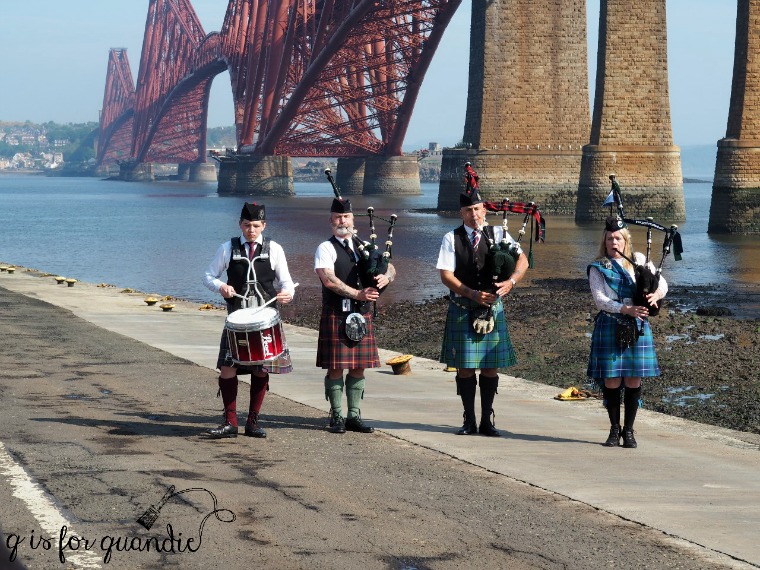
Edinburgh, Scotland is another spot in Europe where your ship is a distance away from the city centre. Large cruise ships will anchor near the Firth of Forth Bridge (which, let’s face it, is just fun to say).

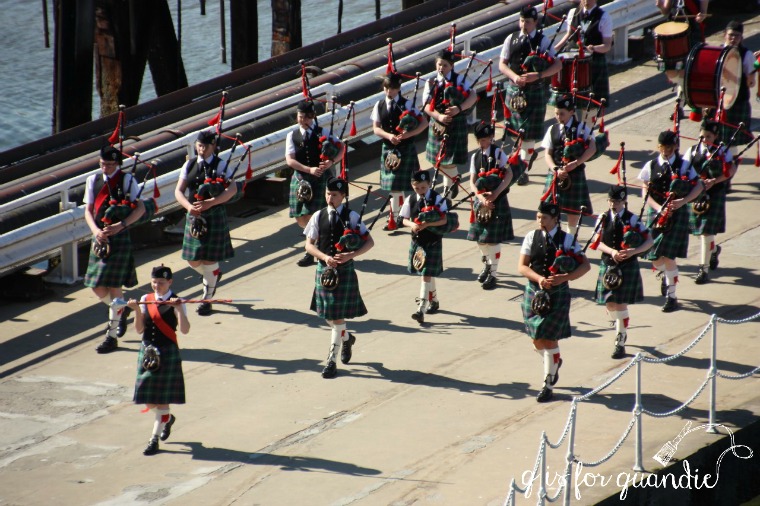
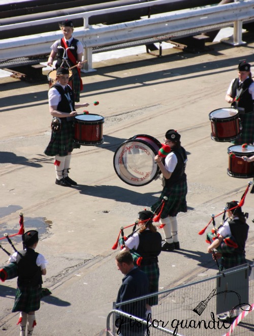
You’ll take a tender (a small boat) to the pier in South Queensferry (and maybe you’ll be greeted by some awesome bagpipers like we were). From there, you need to find transportation into Edinburgh.
This is a port where Mr. Q and I decided to fly by the seat of our pants, sort of. We didn’t have a specific plan for getting into Edinburgh from South Queensferry. The ship offered an ‘Edinburgh on your own’ shore excursion option for $69 per person. It included a bus ride into the historic district at a specified time, about 5 hours to explore the city on your own, and then a return trip by bus at a specified time. That seemed like a pretty steep price for what was basically a shuttle service with no flexibility at all.
So I followed a hunch that I had based on lots of travel experience, that there would be some sort of independent shuttle service that would be much cheaper. And I was right. As soon as we walked off the pier we were met by a sign for a shuttle service to Edinburgh that cost £10 (or around $13) per person round trip. Plus the shuttle departed and returned every half hour up until 5 pm. You could time your stay to suit your wishes.
Wowza, right? The ship was charging a whopping $56 more per person for less flexibility. This sort of thing is a regular occurrence on cruise ships. If you ever take a cruise, just be aware of this and know that there are usually lots of options outside of the ship sponsored shore excursions.
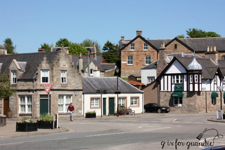
Mr. Q and I hopped on the shuttle and after about 30 minutes or so it dropped us off in the heart of Edinburgh, just behind Edinburgh Castle.
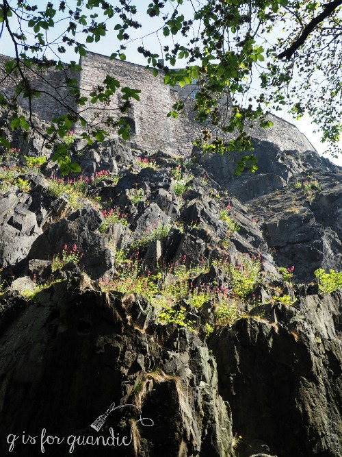
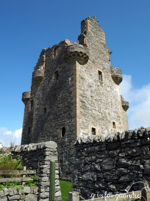
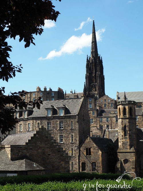
Edinburgh castle sits on top of the remains of an extinct volcano. There has been some sort of settlement on this spot since the Bronze Age, which totally makes sense because it’s a very defensible position.
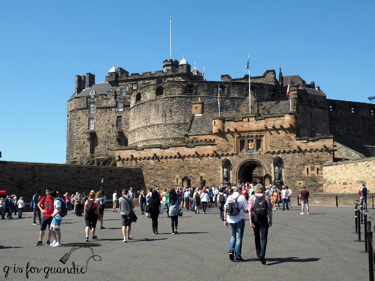
We walked around to the front and then up the hill to the Castle only to discover that it was completely overrun with tourist groups, people following guides holding up those flags so their followers could keep up. We managed to make our way all the way up to the entrance of the castle and then we looked at each other and we both said “nope, not doing it.” We just couldn’t convince ourselves to battle our way through the crowd to see the Castle (the most visited tourist attraction in Scotland).
So we turned around and headed down the Royal Mile only to find that was where the rest of the tourists were!
I haven’t mentioned it yet, but Edinburgh was having unusually warm, sunny weather while we were there. It was full sun and in the lower 80’s. We thought we had come prepared for Scottish weather with our rain jackets, umbrellas and scarves. As it turned out we weren’t prepared for lower 80’s at all. We had no sunscreen, no hats, no shorts.
I suspect the gorgeous weather brought everyone out to enjoy the sunshine, tourists and locals alike.
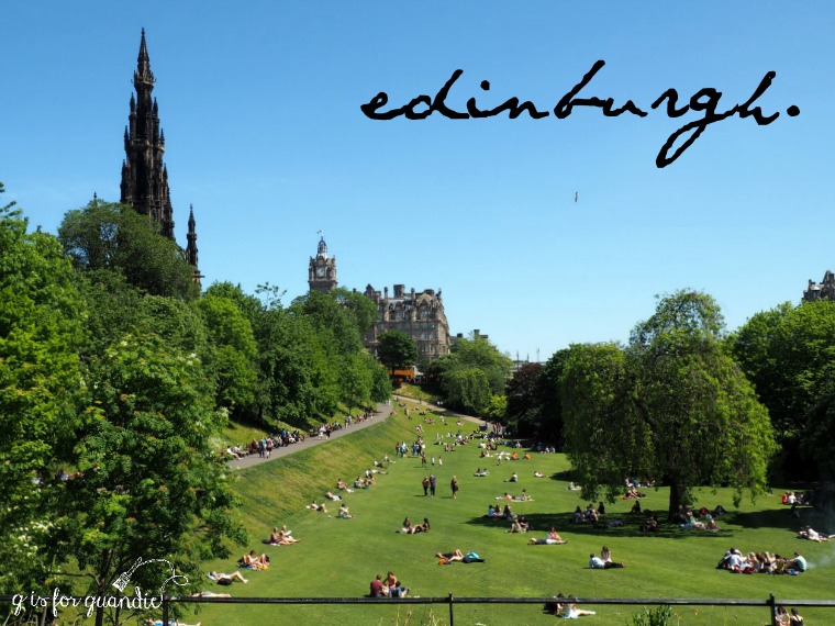
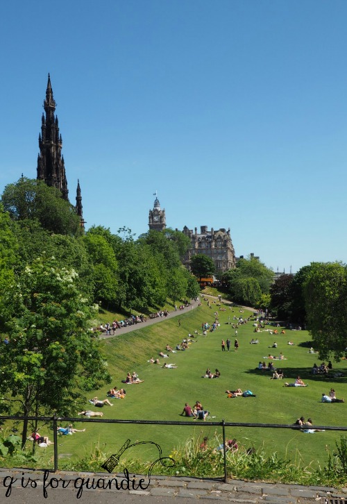
We had a little more than an hour to kill before our planned Book Lovers Tour, so we decided to get out of the sun and away from the crowds by heading into the Scottish National Gallery. This photo is taken while standing at the entrance to the National Gallery looking out on Princes Street Garden. As you can see, people were out in droves enjoying the park as well.
We didn’t have time to see as much of the museum as we would have liked, but did see some beautiful artwork and enjoyed the peaceful atmosphere inside.
Next we headed towards the Writers’ Museum to take the Book Lovers Tour with Allan Foster.

Allan led us around the historic center of Edinburgh while sharing stories about famous Scottish authors like Arthur Conan Doyle, Alexander McCall Smith and Robert Burns. He showed us the coffee shop where J.K. Rowling wrote portions of her Harry Potter books. None of the locations were particularly fascinating on their own, but Allan was a great story teller and that’s what made the tour so fascinating.
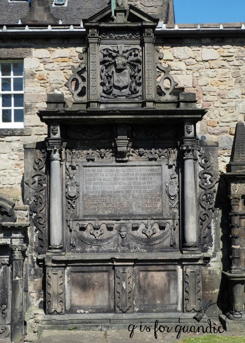
The tour concluded at the famous Greyfriars Cemetery, supposedly the most haunted spot in Edinburgh. Considering Edinburgh must be a pretty haunted place, that’s saying a lot.
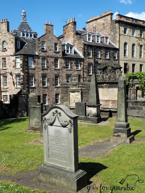
I’ve seen lots of photos online of a misty, spooky Grefriars, but all of my photos have blue sky and sunshine. Not quite as atmospheric! It’s a bit more difficult to imagine spooky ghosts under these conditions.
After checking out the cemetery we found a kiosk selling bottled water, which we badly needed. We were hot, sweaty and worn out, so we made our way back to the designated spot for catching the next shuttle back to the pier.
We really just barely scratched the surface of this uniquely beautiful city. This is definitely a spot that I would like to return to someday and see much more in depth. Maybe we could even brave the crowds and head into the castle next time.
But for now we say goodbye to Edinburgh. Next Wednesday we head to Newcastle upon Tyne, England. Be sure to check back to read all about the final port of call on our trip and the fabulous Beamish open air museum!