craving some green.

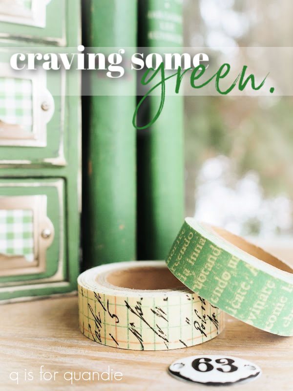
I know I’m a month early for St. Patrick’s Day, but I just didn’t want to wait that long to share this little project.  Hopefully I’ll find something else to paint green between now and then.

In the meantime, you may remember that I picked up this … um, I don’t know what to call it … little cupboard thingie? … while thrifting recently.

I’m sure many of you were wondering what in the world I was thinking.  I have to admit, I was wondering that when I got it home too.  What was I thinking?  These cheap little things are a dime a dozen, why would I spend my time on it?

But in the end I thought, if nothing else, it would just be a fun little project to work on.  And sure enough, it was.

I started by using a small flat saw to cut off those knobs.

I knew I would be replacing them with library card catalogue style pulls, and they were glued in place so I didn’t want to risk doing damage trying to force them off any other way.

Next I scuff sanded the whole thing a bit so I wouldn’t see shadows left by the raised areas of the hand-painted birdhouses under the new paint.  After cleaning it, I gave it a coat of Dixie Belle’s Midnight Sky.  That’s because I was originally thinking I’d paint it black.

But once I had the black on, I thought that seemed like a rather boring choice.  It’s just a small, inexpensive item, why not go bold?  Maybe it’s all of that white snow we’re surrounded with here, but I’ve been craving a bit of green lately.  So I pulled out one of my favorite shades, In a Pickle milk paint from Sweet Pickins.

I mixed some up and painted over the black.

In my opinion, the layer of chalk style paint was not a wasted step though.  This little cupboard had a shiny, plastic-y sort of finish on it.  Milk paint would not have adhered to it very well at all.  That can be OK, if you want a chippy finish (or if you add a bonding agent).  But it could have possibly chipped a lot, and I didn’t really want that.
So, that brings me to today’s q tip; if you want to use milk paint over a shiny pre-existing finish but you don’t want unpredictable and potentially excessive chipping, start with a base coat of chalk style paint.

As you can see on my piece, once you distress the edges you will see both the original color and the base coat color under your milk paint so choose your colors accordingly.

After distressing, and then adding a coat of clear wax, I added those card catalogue pulls.  My friend Sue found a pile of these at a garage sale for me.

Next up I added slips of green and white gingham scrapbook paper to the pulls, and also lined the drawers with it.
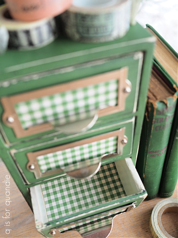
This piece makes another great place to store one’s washi tape.
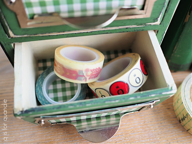
Or your Tim Holtz metal number plate thingies.

Or a million other small things that need to be rounded up.
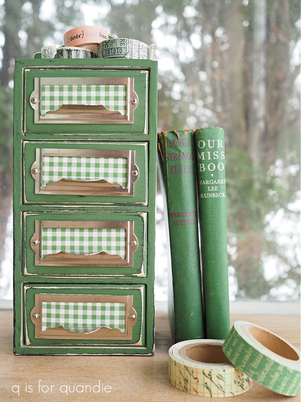
I’m in love with this green and white gingham, especially for spring.

What do you think?  Would you bother with such a project?  Spending time and the cost of supplies to make over an item with little value?  Just for the fun of it?  Leave a comment and let me know.

diy apothecary bottles.

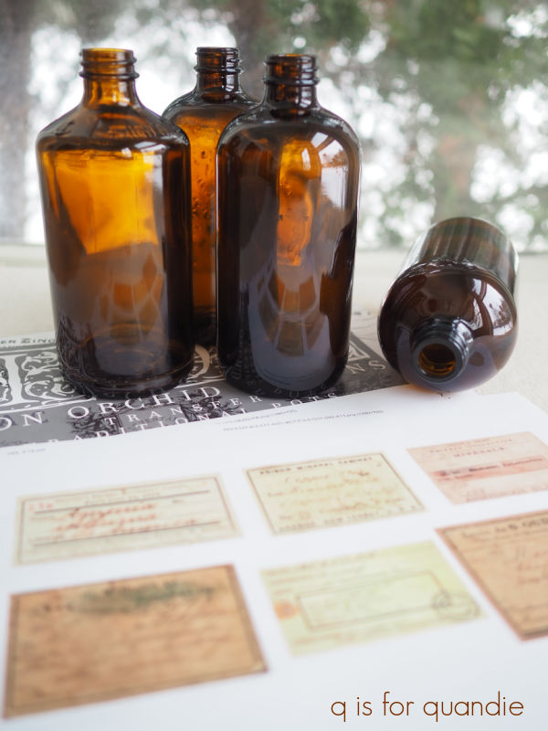
My friend Sue popped by the other day with some thrift finds for me.  I’d told her all about the dark academia themed window we were putting together at the shop (fyi, if you want to see how it turned out, check out the Reclaiming Beautiful Facebook page), so when she saw these amber Kombucha bottles she thought they would be a fun addition.

She suggested that I use some of the white I.O.D. Traditional Pots transfers on them.

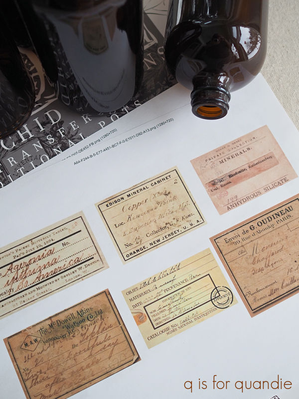
But I was reminded of a video I’d watched from Canterbury Cottage (that Sue had also sent to me) where she printed out apothecary jar labels and applied them to bottles.  The video even has convenient links to the .pdf for printing out the labels (find that here).

So I thought I’d go half and half.  There were 8 bottles total, so four got white transfers and four got labels.

First up I washed all of them in hot, soapy water and let them dry.  Then it was super simple to apply the white transfers to four of them.

The white transfers have definitely improved over time.  When they first came out, I wasn’t a fan.  They had more of that filmy halo around them.  But I think these look really good.

There certainly is still some halo, and you can see it in that close up photo.  But to the naked eye it’s pretty insignificant.

People always ask if I seal transfers when applying them to glass, and I do not.  They stick like gangbusters to glass.  In fact, I usually warn people to make sure you’ve got your placement just right before allowing the transfer to touch the glass because it will get sucked down onto the glass like a magnet.

As for wear, they will be fine if handled gently.  You can hand wash them with soapy water, but don’t scrub on the transfer.  For that matter, when you get sick of them you can scrape the transfer off using a razor blade.

For the next four bottles, I added those apothecary labels using Mod Podge.

Personally, I prefer working with the matte version.  You all know I’m not a big fan of shine.  I also think that in this case it gives those paper labels a more authentic look.

I had printed the labels out on your basic printer paper.  Once I had them cut out, I brushed a thin layer of Mod Podge on the back of the label and applied it to the jar.  In contrast to those white transfers, you can easily slide the label around on the glass until you have it on there straight.  Once I had it in place, I smoothed it down with my finger to remove any air bubbles and then added another layer of Mod Podge over the top of the label.

I then carefully wiped away any excess Mod Podge around the edge of the label using a damp paper towel.

And that’s it.  Super simple.  I just had to let them dry.

Unlike the bottles with the transfers, these labels would not hold up well if you got them wet.  So I would not advise washing these other than possibly wiping them down with a dust rag now and then.

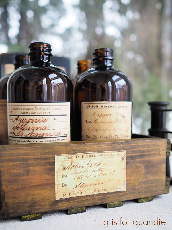
That being said, they really did turn out kind of fabulous, don’t you think?

Once I was done adding labels to all of my bottles, I thought it might be fun to update this little wooden crate to hold them.

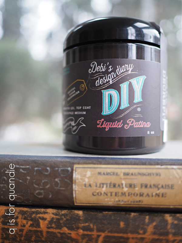
This was a super simple project.  I scuff sanded the wood, wiped it down with a damp cloth and then stained it using DIY Liquid Patina in Dark & Decrepit.

I have to admit, I haven’t found a lot of uses for this product.  I experimented with it over paint and didn’t really like that look.  However, it worked perfectly for this.  I just applied it with a rag, and then wiped away the excess with the same rag.  I did have to use a q tip to get into some of the corners, but that wasn’t difficult.

It dried quite quickly, and once dry I added some more decoupaged apothecary labels to the sides.

Easy peasy.

Unfortunately, I did not get these finished in time to take them in to the shop this week.  And in other news, my sister and I are flying out to visit our mom on Saturday, so I won’t be around to take them in for a couple of weeks.  But eventually they will make their way into Reclaiming Beautiful.

In the meantime, which style is your favorite?  The white transfer, or the labels?  Personally I’m digging those labels.  They look so authentic to me.

Posts will be hit or miss over the next two weeks while I’m off at mom’s, but I’ll be back before you know it so be sure to stay tuned.

a mid-winter thrift haul.

My friend Sue and I headed out for a little thrifting again last week.  It was a cold but sunny day, perfect for an outing in early February.

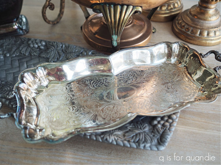
I came home with quite the haul.  I found a few metal items, a copper chafing dish, a pewter tray, some gold candlesticks and some silver pieces.

My favorite is the little footed tray.

I decided to give it a bit of a polish before taking it in to the shop.

I don’t normally polish my silver, I kind of prefer the tarnished look.  But this tray was a bit grungy so I decided to give it a go.  Now it’s shiny and clean.

These little trays are perfect as soap dishes in the bathroom.  You could fit matching liquid soap and lotion bottles on it too.  Or you could use it in the kitchen for olive oil and spices, like this one that I thrifted last April.

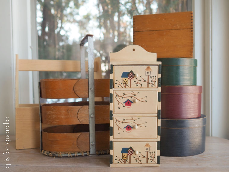
I also brought home a pile of wooden items that all went into the ‘to be painted’ stash.

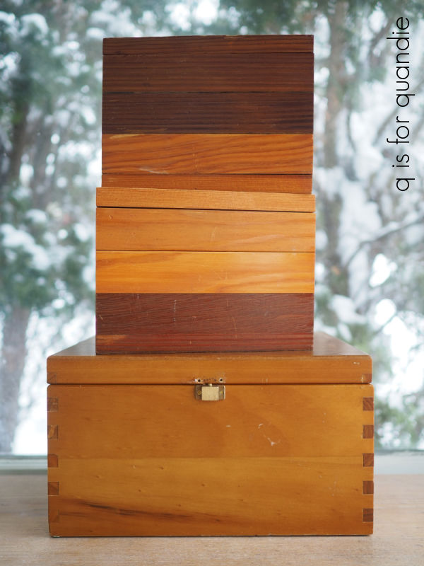
I always enjoy painting stacking boxes like these.

These were particularly nice quality wooden ones.  It seems like burgundy and forest green might be coming back into fashion lately, but I still don’t like them.  You know my motto, never say never.  In a year or two I might be painting things burgundy, but for now I wanted to give these a more neutral theme.

So I painted them in Dixie Belle’s French Linen, Sawmill Gravy and Drop Cloth (bottom to top).  Then I added some re.design with prima transfers from both their Classic Vintage Labels and the new Middy French Labels.

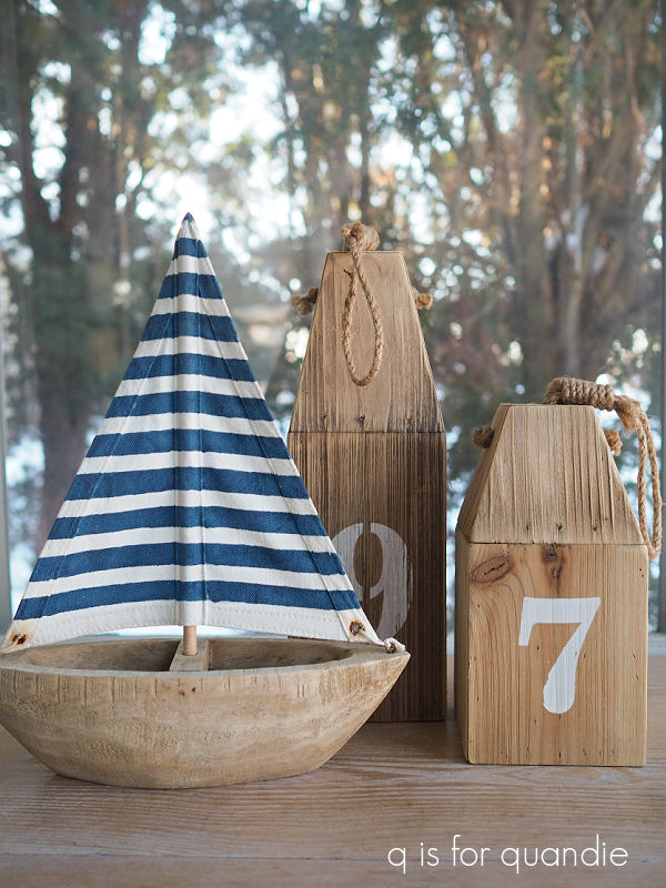
When you’re out thrifting, don’t forget to consider the out of season stuff.

I snapped up these nautical items, but will hang onto them until summer and then bring them to the shop.  I do also plan to repaint those buoys.

I found quite a bit of glassware while we were out too.

I certainly wasn’t looking for glassware, but I was specifically on the hunt for items that I thought fit Dark Academia style.  Have you heard of it?  I’ve seen it mentioned here and there lately.  Here is how Wayfair describes it, “Dark academia interior design embraces dark colors, rich textures, and vintage-inspired decor. Dimly lit rooms with flickering candles, alcoves full of intrigue, and an eclectic collection of knick-knacks are not at all out of place.”

Reclaiming Beautiful (the shop where I sell items on consignment) is planning a dark academia themed window display this week, so I needed some stuff that would work for that.

I thought that I could makeover some of the glassware to have that dark academia feel starting with the cloche.  I painted the base in Dixie Belle’s Midnight Sky, and then added some I.O.D. transfers.

The bee is from their Brocante transfer, and the wording on the glass is from Label Ephemera.

I also added some I.O.D. wording to the glass vessel in the front of my haul photo.

That’s from the Traditional Pots transfer.

Last up were these 4 glass vases.  Funnily enough, I found all four of them at 3 different thrift stores but they all happen to match.  It makes me wonder of these are vases used by a flower delivery service or something like that.

I chose them because I like the shape and size of them, and because I knew these transfers from the I.O.D. Brocante set would fit them perfectly.

There are 4 different versions of this transfer in the Brocante set, so a different one for each of my glass vases.

My favorite dark academia find of the day has to be this Nefertiti bust.

She is perfect for that design aesthetic!

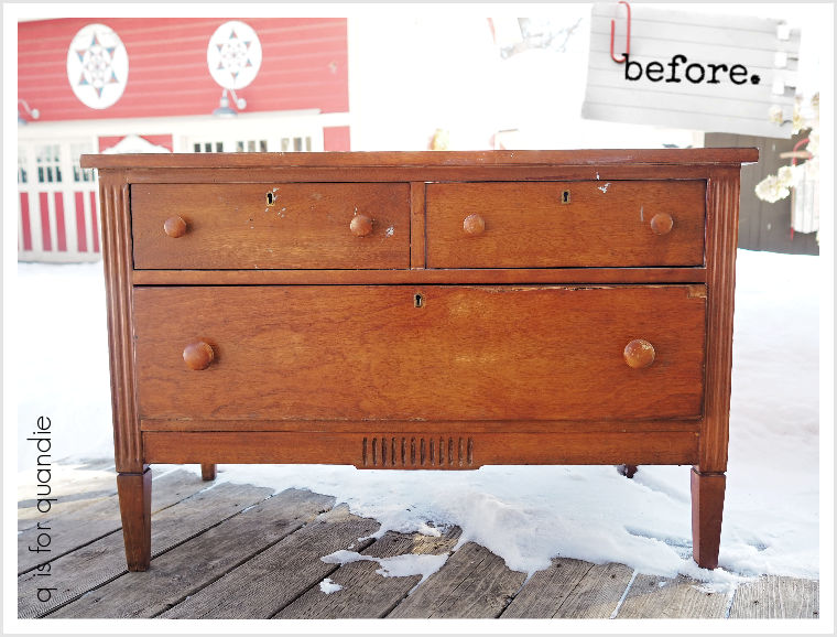
I don’t often find furniture that I want at the Goodwill, the stuff there is usually either cheaply made or badly damaged.  But I did find this small dresser this time around.

I think this is going to be perfect for another Wallcutz stencil project that I’m planning.  You’ll just have to stay tuned for that one.

I really wasn’t able to pick a ‘find of the day’ favorite this time around.  Nothing totally jumped out at me as the best item.  Instead I will end this post with the item I almost put back on the shelf.

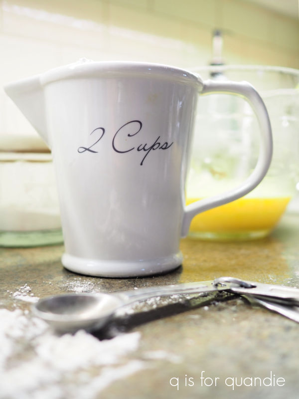
Sue picked up that 500 Gr. measuring cup and handed it to me.  Initially I thought it was one of those World Market knock offs.  I actually have one of those that we use all the time in our kitchen …

So I wasn’t sure I wanted to spend a whopping $9.50 on another.  But I decided what the hell, might as well, and I brought it home.

However, my World Market version is clearly marked “World Market” on the bottom, and this thrifted one has this mark …

So, hmmmm, it appears to be the genuine article.

Now, do I keep it?  Or sell it?  Decisions, decisions.


mistakes were made.

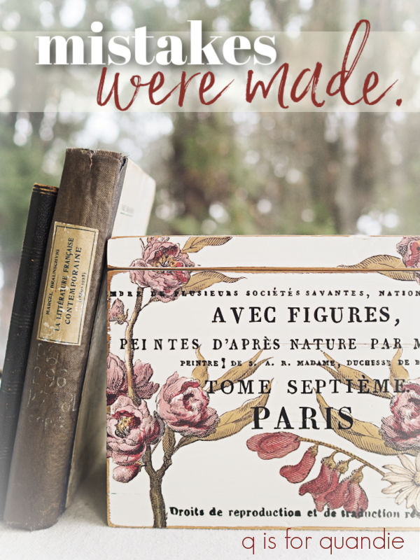
I picked up a pair of wooden boxes while thrifting a week or so ago.

After sanding and cleaning them, I painted them with Dixie Belle’s Endless Shore, which is from their Silk paint line (ie. an acrylic paint with a built in primer and top coat).

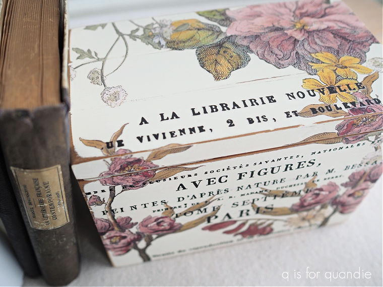
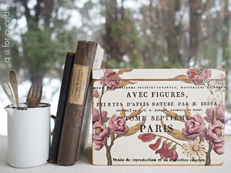
I pulled out I.O.D.’s Floral Anthology transfer to decorate box no. 1.

After applying the florals, I added some French wording from the I.O.D. Label Ephemera transfer.

Full disclosure, I have only the vaguest idea of what these words mean so it could be total nonsense.  But it looks good to an English speaker.

After decorating the first box, I was about to do something similar with box no. 2.  But then I remembered a customer who once told me that she wished I didn’t put French words on everything!  So, I decided to go in a slightly different direction on the second box.

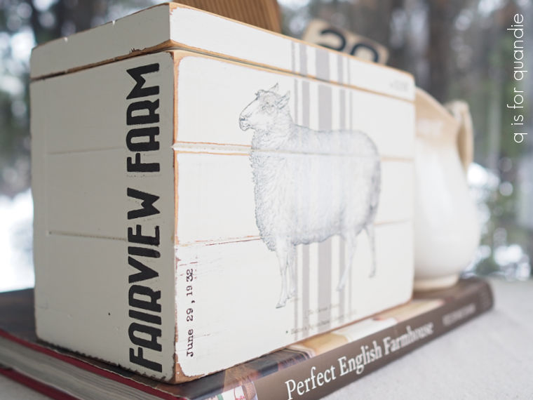
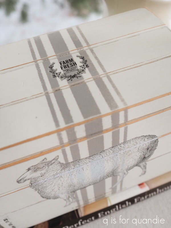
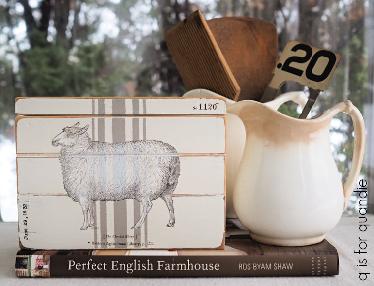
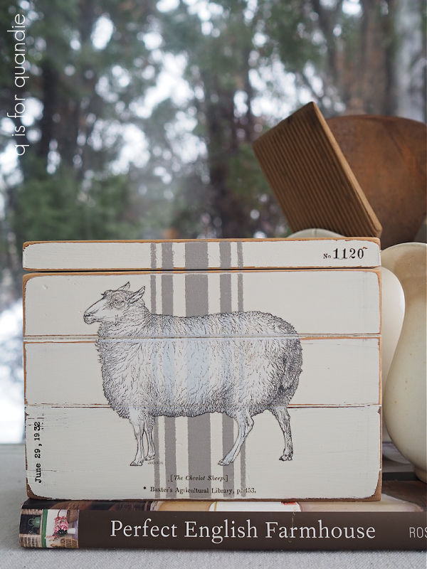
I first added some grain sack stripes using Dixie Belle’s French Linen.  Then I added the sheep from the I.O.D. Brocante transfer.  The little “No. 1120” and the date in the corners are from a Tim Holtz transfer.

I also added a farm name to the side of the box from the Everyday Farmhouse transfer from re.design with prima.

Finally, I applied one of the re.design with prima knob transfers to the top of the box.

I didn’t paint the insides of either box for a couple of reasons.  First of all, they aren’t real roomy inside and getting in there with a brush would have been a pain.  Second, they are clean inside, so they didn’t really need to be painted.

So far, so good, right?

But this is where I made my mistake.  As you can see in the photos, I distressed the edges of my boxes quite a bit.  Although the Silk paint has that built in topcoat, the transfer still needs some sort of sealer.  In addition, because I sanded the edges down to the bare wood, the Silk paint finish is compromised and will benefit from some protection on those edges as well.  Unfortunately, I decided to topcoat with Dixie Belle’s flat clear coat.  As I’ve learned in the past, sometimes a water based sealer will draw tannins out of the wood.

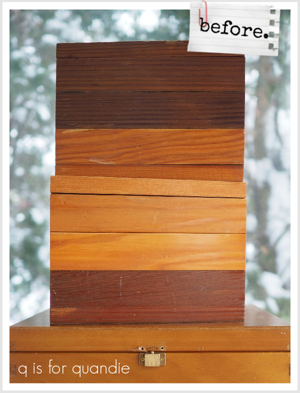
Honestly, I should have known better.  Look back at that ‘before’ photo, this wood was very orange-y red.  The Silk paint has a built-in stain blocking primer, and it was working quite well up until I added that flat clear coat.  All of the preceding photos were taken before the clear coat was added.

But about 24 hours after adding that clear coat, the boxes started to show bleed thru.

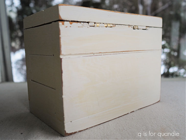
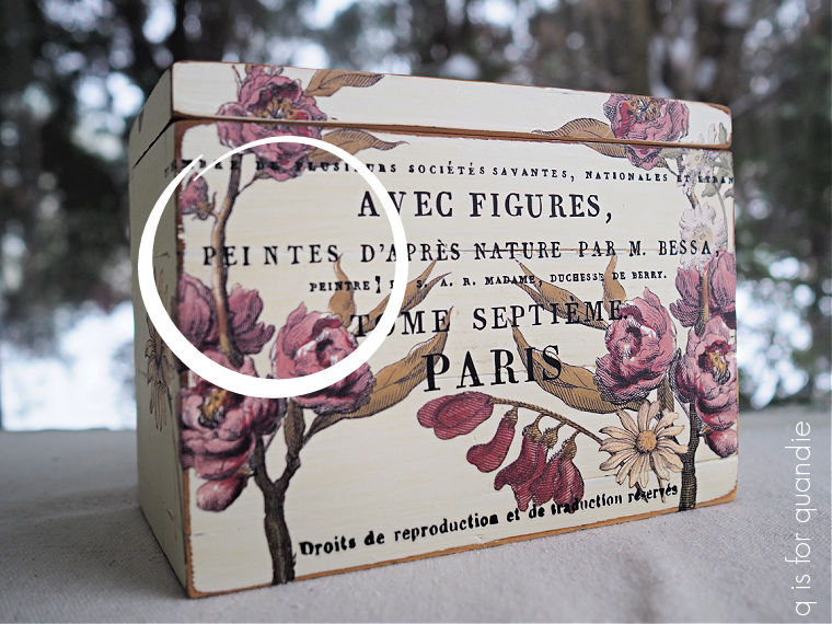
It’s much more obvious on the back of the boxes, but if you’re familiar with the look of bleed thru you can see it on the front as well.  Especially in the area I’ve circled below.

Also, FYI, the bleed thru continued to worsen over time.  Be forewarned, that can happen with bleed thru.  It has been about two weeks since I finished these and they seem to have stopped getting worse now.

If I could go back and start over I would opt to give these boxes a coat of Dixie Belle’s B.O.S.S., followed by their chalk style paint in Drop Cloth, and then a top coat of clear wax after applying the transfers.

But I can’t go back in time, so now what?

If these were pieces of furniture there is no way I would feel good about selling them ‘as is’, but these boxes?  Maybe?  I don’t know, what would you do?  Leave a comment and let me know!

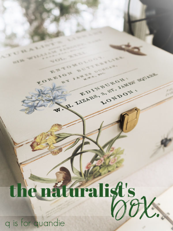
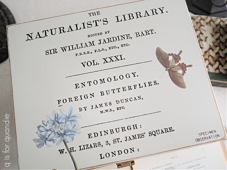
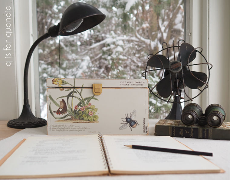
the naturalist’s box.

My picker, Sue, found this box for me.

As you can see above, the top half of the latch wasn’t attached.  However, it was inside the box so I was able to re-attach it as you’ll see in a minute.

After sanding and cleaning the box, I painted it in two coats of Dixie Belle’s Sawmill Gravy.

I have to say, after painting the other two boxes from my thrift haul in their Silk paint (an acrylic paint, and you’ll see the results of that in a coming post), I think I prefer working with the chalk style paint on these sorts of items.  It adheres better, it distresses more easily, and since I will be adding transfers that have to be sealed anyway the fact of the built-in topcoat in the Silk paint is irrelevant.

That brings me to the fun part, adding bits and pieces of transfers.

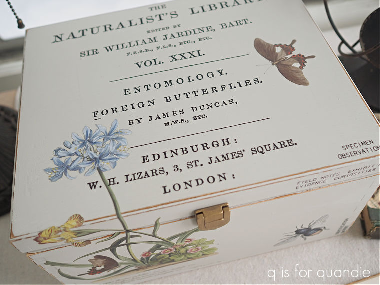
The wording on the top is from the I.O.D. Label Ephemera transfer.

The floral bit on the front that flows up onto the top is from the I.O.D. Brocante transfer.

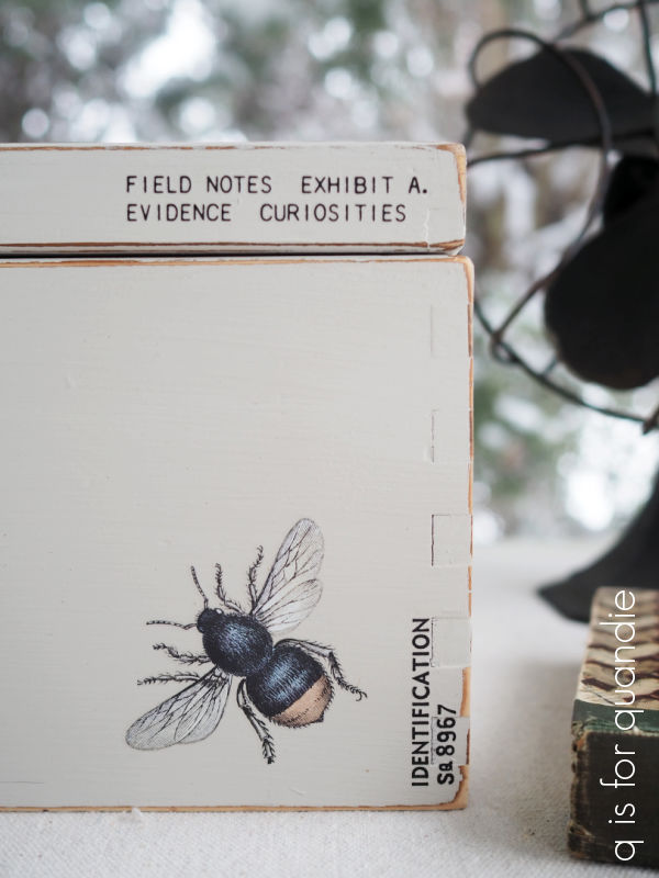
As are the bee and the butterfly (on the top).

That smaller wording is all from a Tim Holtz transfer called Specimen.

After sealing the box with some of Dixie Belle’s flat clear coat, I reattached the original latch.

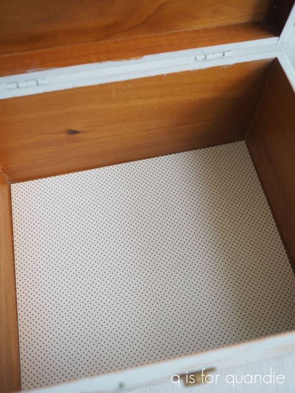
I then lined the inside of the box with some scrapbook paper and called it good.

Now it’s ready to hold some field notes, specimens, curiosities or evidence … or whatever one wants to keep inside a box.

If you are local and have need of a box to store your specimens in … wait, that sounds gross … but you know what I mean … be sure to check my ‘available for local sale‘ page as this box is for sale.

Thank you to Dixie Belle Paint Co for providing the paint and sealer used on this box.

faux enamelware.

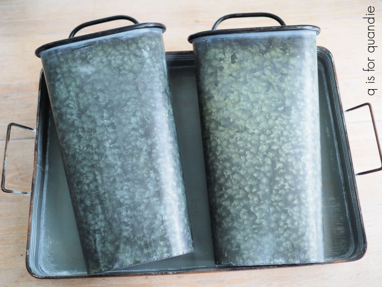
Remember the galvanized hanging bucket thingies (I don’t really know what to call them) that I found while thrifting a week or so ago?

They have a black rolled rim and handle, so I thought that if I painted the galvanized part white they would look just like vintage enamelware.

One of my readers suggested I leave them as is and just add a transfer to the front, and I did consider it.  After all, I do like the look of galvanized stuff.  But these had that blotchy look that feels a little faux to me.  In addition, my ‘before’ photo doesn’t really show how dark they were.  I knew I wanted to dress them up with some transfers, and the black wording of most transfers doesn’t show up very well on the darker galvanized stuff.  Here’s an example of that.

It can create kind of a cool aged look, but I wanted to go for that enamelware look with these.

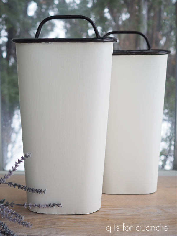
So I washed them first, and then painted them in Dixie Belle Silk paint in Endless Shore.

They really do look like classic enamelware now, don’t they?  Although not quite as shiny.

Next I started thinking about which transfer I wanted to use on them.  I considered going with more color and adding some I.O.D. florals, but then I decided to stick with the black and white theme.

You might be surprised to learn that I used transfers from two different companies on these.

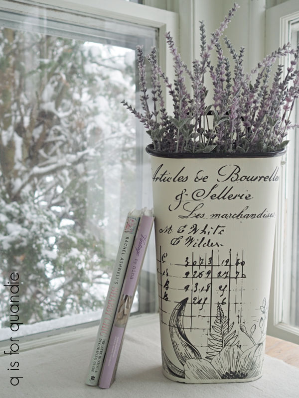
The one on the right has a portion of the I.O.D. Astoria transfer on it, with some wording from the re.design with prima Paris Letter added above it.  The one on the left has a portion of the Lovely Ledger transfer from re.design with prima on it.  All three of these transfers combine beautifully.

My next challenge was to try and think of things to put in them.  Of course, you could always go with the classic florals.

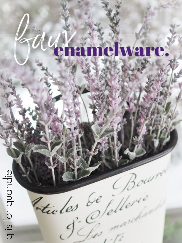
This silk lavender stems came from Hobby Lobby a few years back.

Since the bucket itself is rather neutral in color and style, you could change them up seasonally and it would still work.

When you see evergreens like these, do you think they are strictly for Christmas, or would you leave them out until Spring?

I’d love to get some feedback from you guys on that.  Are you sick of evergreens and ready to see them go by the end of December, or do you leave them out until the end of February?  Leave a comment and let me know.

You could also put a small glass vase inside for the water, and fill these with real flowers.

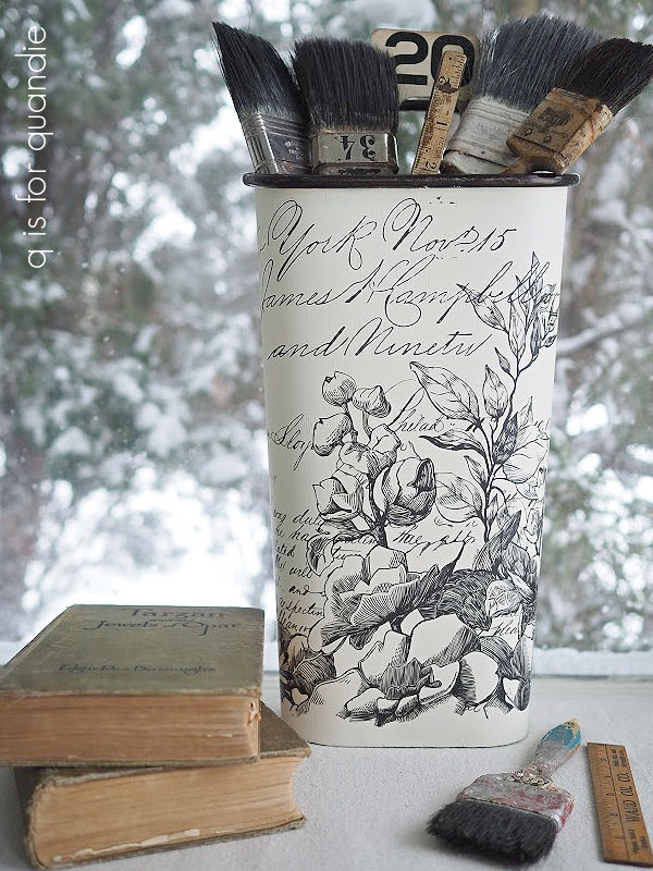
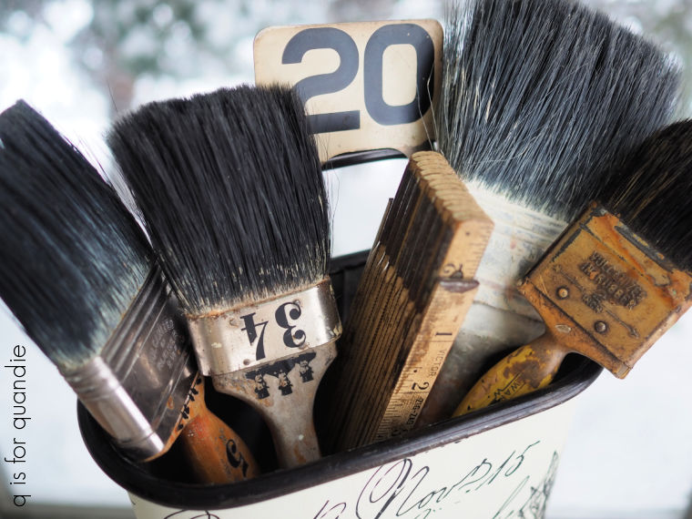
But I wanted to try and think outside the box a bit.  How about filling them with old altered paint brushes?

Definitely unexpected.

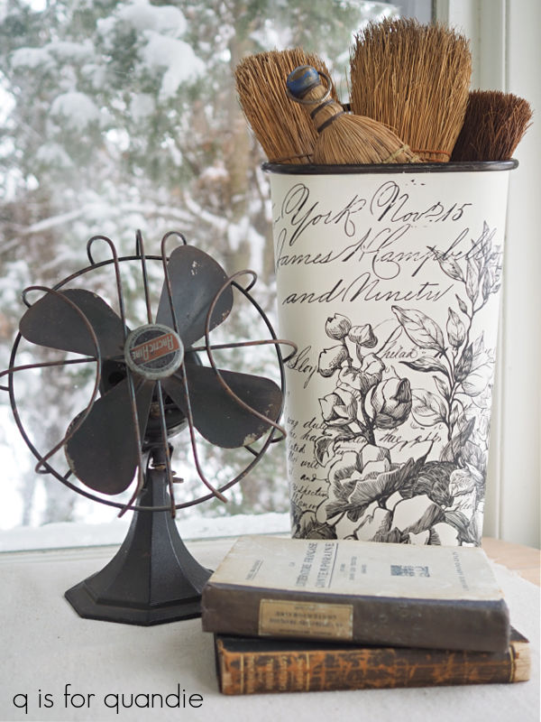
You could also fill one with your non-collection of whisk brooms.

Or am I the only one with things like whisk brooms and gunky old paint brushes lying around?

How about you, what would you put in one of these buckets?  Leave a comment and let me know.

Meanwhile, I’ll be taking these into the shop later this week so if any of you locals are interested, you’ll have to head to Stillwater later this week and do a little shopping.

a thrifty tuesday.

My friend Sue and I hadn’t been out thrifting since … um, well … gosh!  Could it really have been October?  I think it may have been that long.  The holidays just got in the way I guess.  Well, the holidays plus my trips to Disney World in October and then Puerto Vallarta at the end of November.

But Sue and I finally made it out again this past Tuesday and I was reminded that I need to make a point of going more often.

I didn’t bring home a massive haul, but I did find a few things that I thought would be fun to share with you guys.

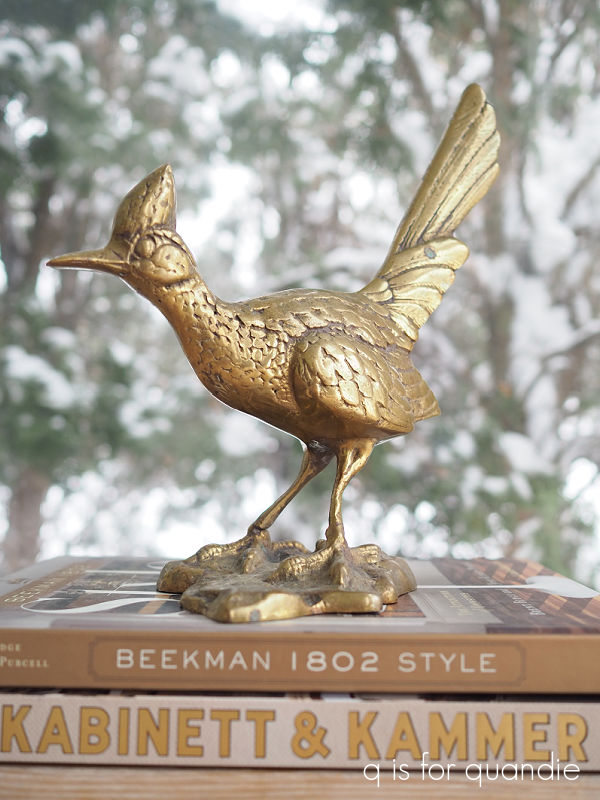
First up is this brass road runner.

He reminded me of the brass pheasants that I picked up at a garage sale last summer, remember them?

Ahhh, and remember when the grass was green and not buried under three feet of snow, and I could take pictures outside on the deck?  Those were the days.

But I digress.

I also brought home this copper pitcher.

Copper continues to be a good seller for me, so when I see nice pieces I grab them.

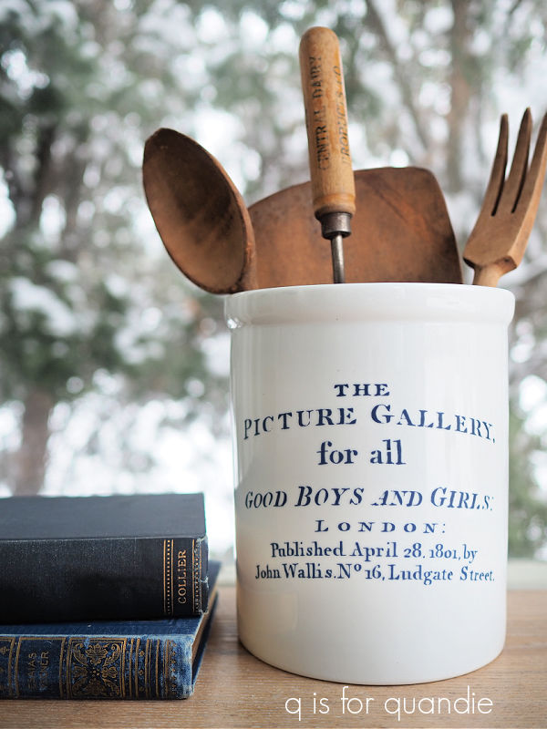
I also continue to pick up white cannisters so that I can add the blue I.O.D. Traditional Pots transfers to them.

I’m pretty much down the the last couple of blue transfers.  I sure do wish they would come out with more of these!

If you’ve always wanted to win a golden globe, this next item would be right up your alley.

This globe is a bit smaller than your typical globe, it would be perfect for desktop décor.

I threw this marble cake stand into my cart as well.

I did a search after I got home and found that it’s from Target’s Project 62 line.  It’s solid marble and has a great mid-mod vibe.

Speaking of a mid-mod vibe, I just couldn’t resist this set of 4 shallow bowls.

I think that green is just gorgeous.

I picked up the metal egg basket in anticipation of Easter.

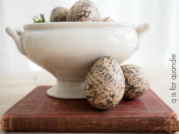
I think I’ll paint the wooden handles, and then I want to come up with some sort of fun egg project for filling up the basket.  Maybe I’ll stamp some papier-mâché eggs like my former co-worker Jodie did.

I shared her project with you back in 2018.

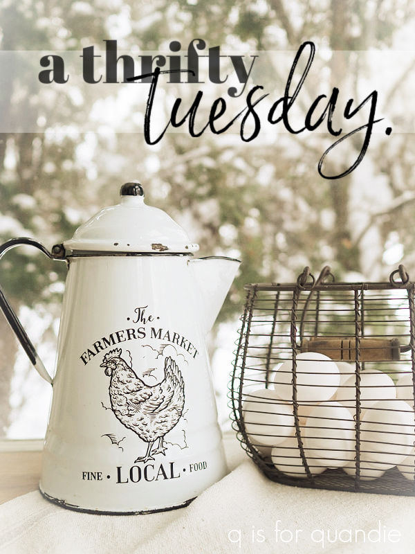
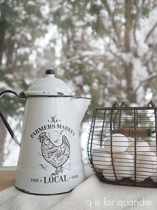
And speaking of Jodie, the enamelware coffee pot actually came from her as well.  She was going to take it to Goodwill, but offered it to me first.  I just added the Farmers Market transfer, which is from the Dixie Belle On the Farm transfer.

Last up, I grabbed a few things that will make fun small makeover projects.

I’m debating painting those galvanized hanging bins.  They have a nice thick black rim, so I thought I might paint them white to look like enamelware.  What do you think?

Then there are these boxes.

Sue brought me the larger box, and I thrifted the two smaller wooden boxes.

It will be fun to paint these up and add some transfers, much like I did a while back with this box.

So be sure to stay tuned for that!


thrifty wednesday.

Somehow ‘thrifty wednesday’ just doesn’t have the same ring to it as ‘thrifty thursday’.  None the less, Wednesday is the day our local Goodwill stores offer a senior discount, and since I’m older than 55 (really, only slightly, I swear), I qualify.  And so does my friend Sue.  So now that we are both retired, we schedule our thrifting get togethers for Wednesdays.

Sue and I headed out on a gloriously beautiful fall day last Wednesday and I came home with a nice little pile of goodies, so I thought I’d share my finds with you guys.

Actually, looking back, very few of these things were actually from Goodwill.  We went to two different Goodwill stores, and I only purchased one thing at each.

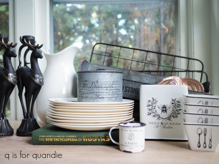
I found this set of 10 pretty vintage Grapevine pattern plates at the first Goodwill.

They definitely have a mid-century vibe, don’t they?  And maybe a little bit of a fall harvest sort of feel to them.

At the 2nd Goodwill I found this set of three copper molds.

The rest of the items are from various other stops we made; an estate sale, a garage sale and Turn Style (which is a consignment shop).

The estate sale was first, and let me tell you … the poor people running this sale must have put hours and hours into getting everything priced and set up.  There was so much to look at.  The living room was lined wall to wall with big folding tables and every possible inch of that room was full of just the Christmas stuff.

Apparently the former occupant of the home also collected anything, and everything, that had a giraffe on it.  There were giraffe purses, giraffe towels, giraffe throw pillows, giraffe luggage, giraffe china … and an entire bedroom was filled wall to wall with giraffe figurines of every kind.  Seriously, like easily 100’s of them.  I should have surreptitiously taken a photo to share with you guys, but I didn’t think of that.

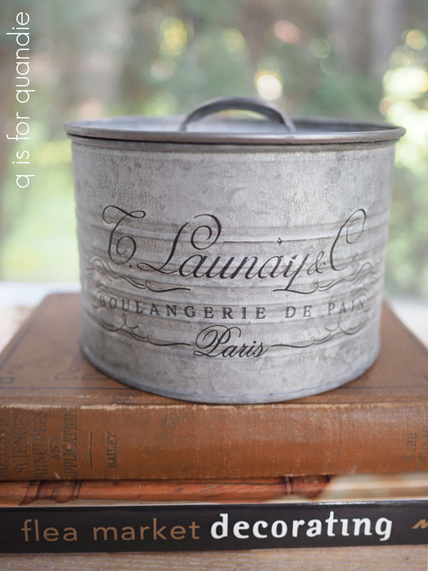
There wasn’t really much in the way of vintage items though, and I didn’t really need a giraffe figurine.  Still, I did grab a couple of fun items including this little galvanized container with a lid.

As you can see, I’ve already added a Classic Vintage Label transfer to it.

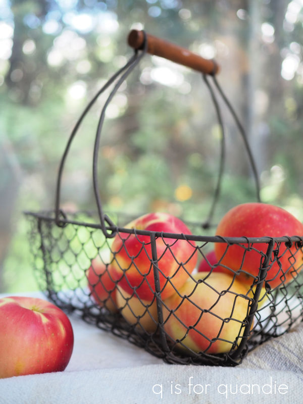
I also grabbed this cute little wire basket.

I try to purchase good baskets when I see them at a reasonable price.  You never know when you’ll want to put together a gift basket so it’s nice to have a stash of baskets handy.

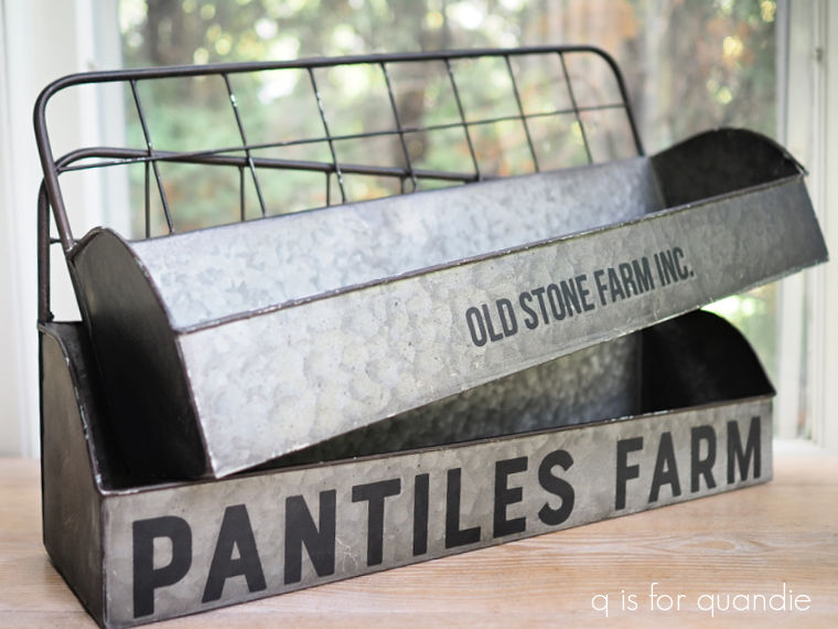
I also bought these two galvanized bin thingies at the estate sale.

I added the Everyday Farmhouse transfers to the fronts of them after I got them home.  They still had their Hobby Lobby stickers on the bottom, so I know these are just inexpensive reproduction sort of items.  The addition of the wording gives them a more authentic feel though.

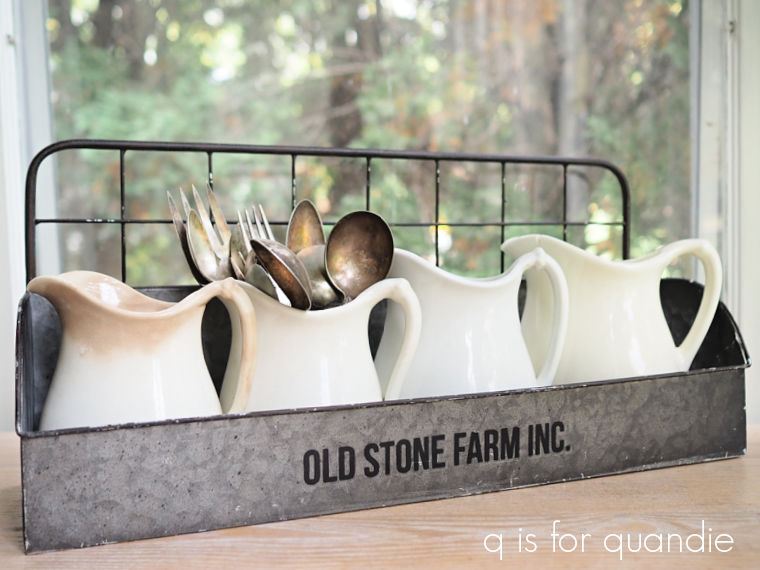
I like the idea of filling them up with some ironstone pitchers …

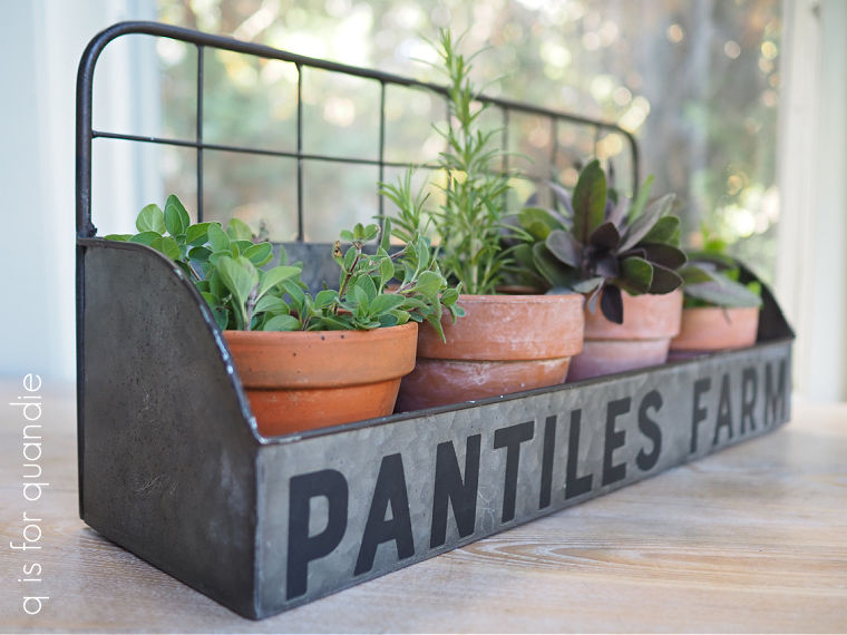
or how about a quartet of potted herbs?

You could hang one in the bathroom and fill it with rolled up wash cloths, or maybe toiletries.  You could fill one with jars of spices in the kitchen.  There are so many different ways you could use them.

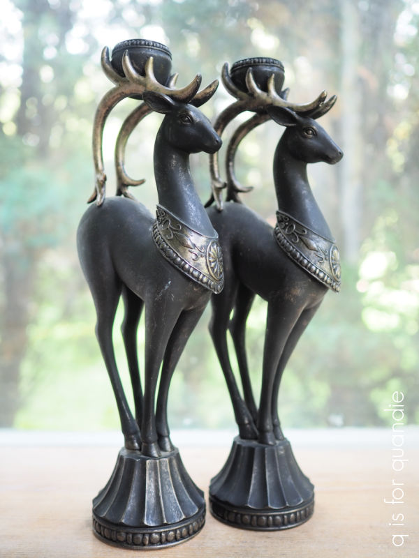
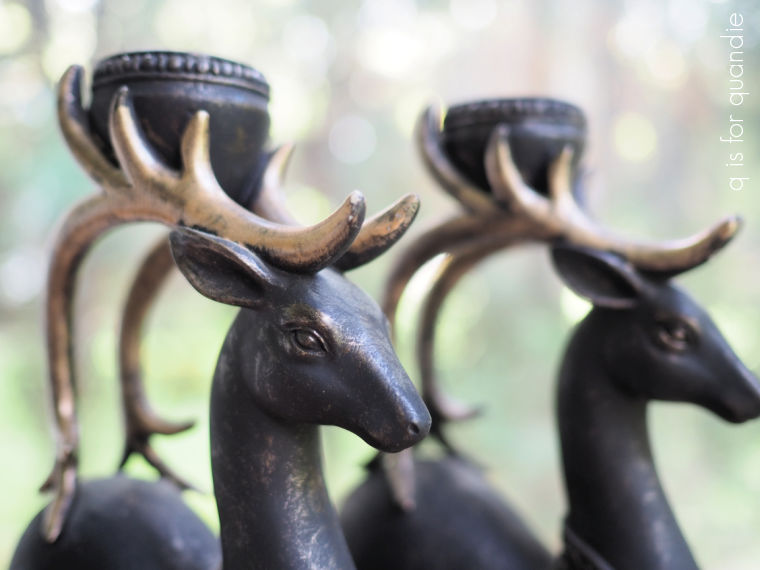
After the estate sale, we stopped off at a garage sale that was a few blocks away and I scored these fabulous candle holders.

I just think they are so elegant looking.

I’ll be putting them in the pile of stuff that I’m bringing in to the shop for Christmas.

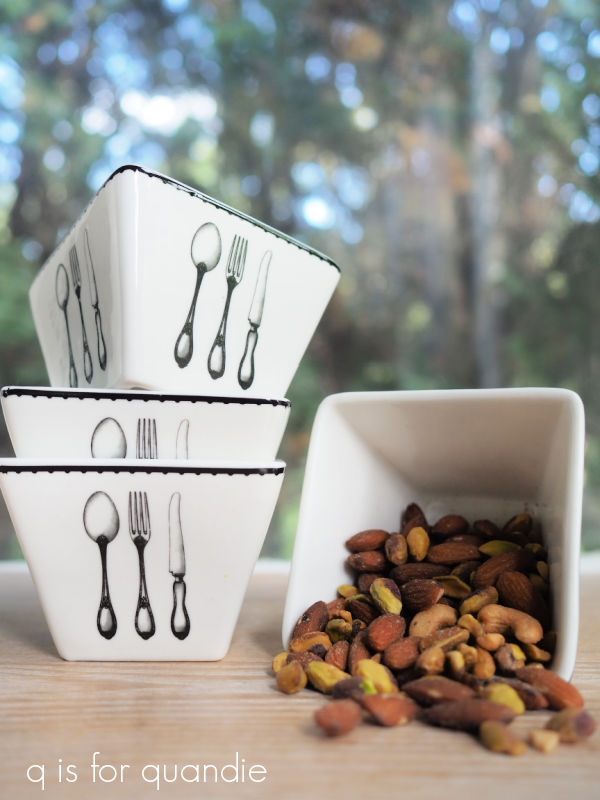
I purchased a couple of items that I’m keeping myself from Turn Style.  The other day I had some former co-workers over for drinks and I realized that I was in need of some cute, small bowls for nuts on my charcuterie tray.  So I grabbed this set for $7.50 …

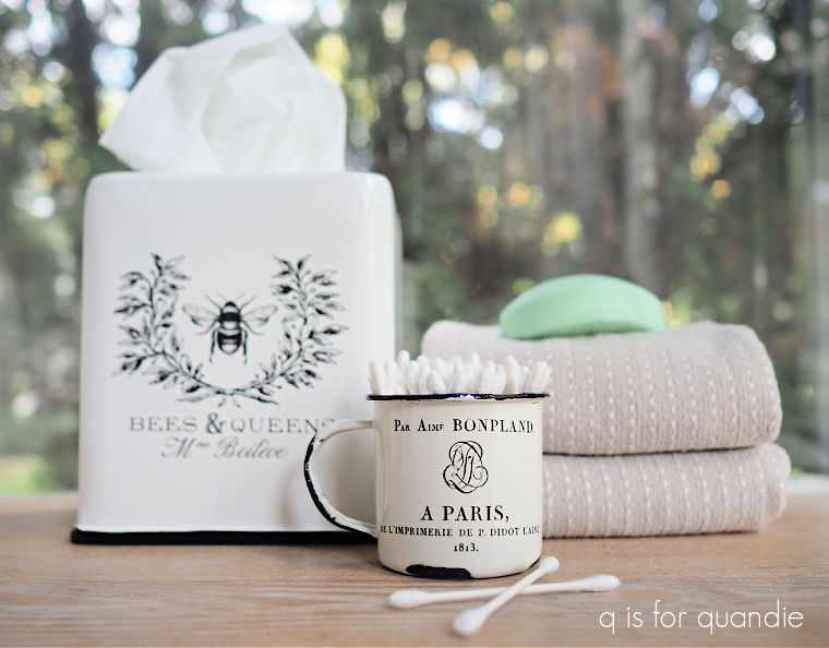
And I’ve been on the lookout for a kleenex box cover that was more my style than the one we currently have.

I found this one for $4.25 at Turn Style.  And of course, I added the Classic Vintage Label transfer to it, it was originally plain.  It’s actually from the Hearth & Hand collection at Target where it costs $14.99 new, so I think I got a bargain.

Oh, and I almost forgot the little enamelware cup.

That was from the estate sale, and I added the wording from the I.O.D. Traditional Pots transfer.

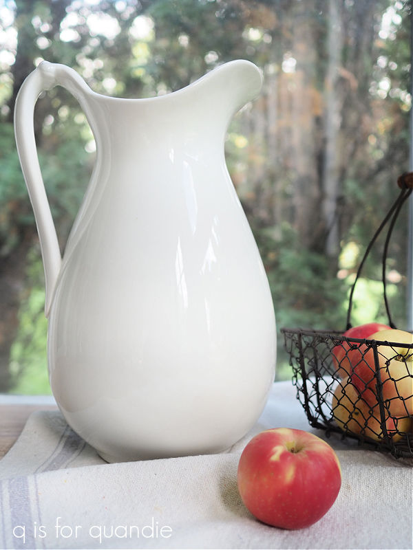
When Sue picked me up for our thrifty outing, she had a few goodies in the car for me as well including this tall ironstone pitcher …

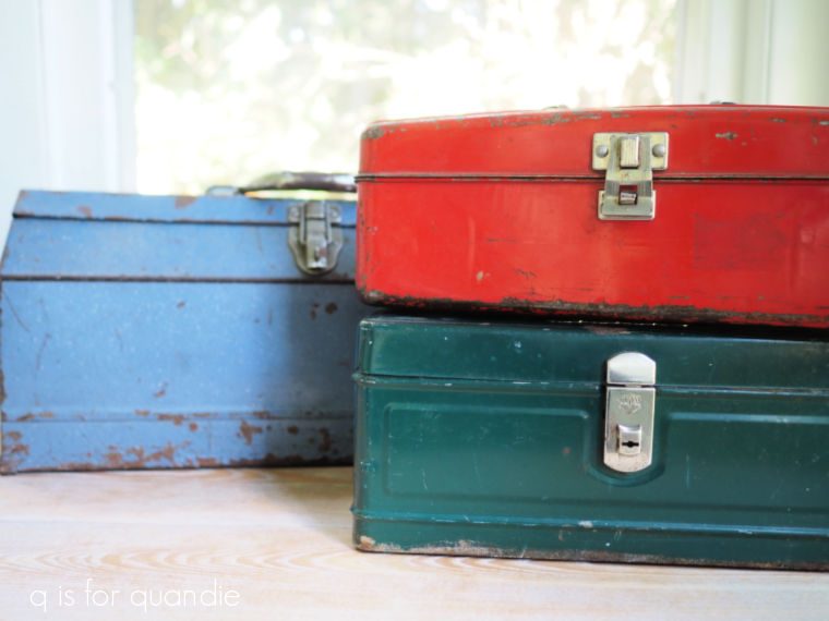
and a green toolbox.

The red tacklebox and the blue toolbox were from the garage sale.

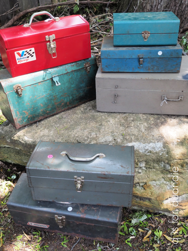
I spent a warm day last week out in the backyard washing up a bunch of toolboxes with some Dawn dish soap and the garden hose, so you should be seeing some painted toolboxes here in the coming weeks.  Later this week I’ll be sharing my latest wallcutz project with you too.  So be sure to stay tuned!

a cherubic thrift haul.

For those of you who also frequent garage sales or thrift stores, let me ask you this; do you often find that sometimes a theme seems to emerge on any given day?

For example, there was the time I came home from a neighborhood garage sale with a jumble of chairs.

I once decided that a grouping of chairs should be called a ‘jumble’, sort of like a school of fish or a murder of crows.

And then earlier this summer I found tons of toolboxes one day.

I wasn’t particularly looking for chairs or toolboxes on those occasions, but there they were.

Well, a couple of weeks ago when my friend Sue and I went thrifting another theme seemed to emerge.

Cherubs!

They were everywhere.

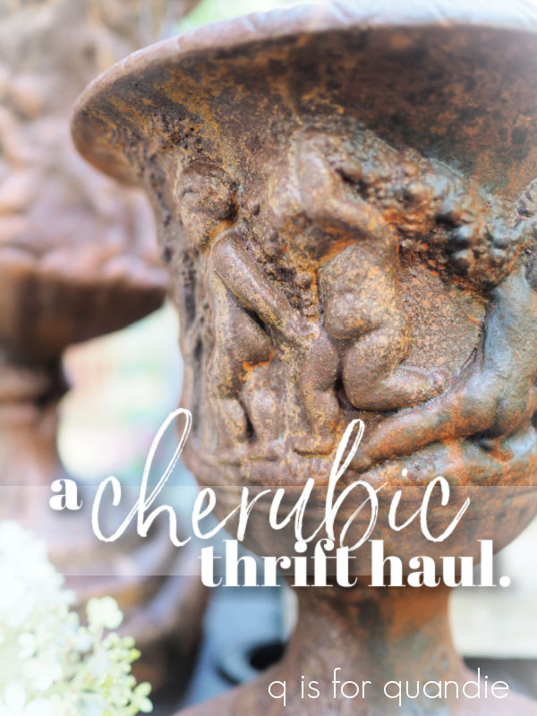
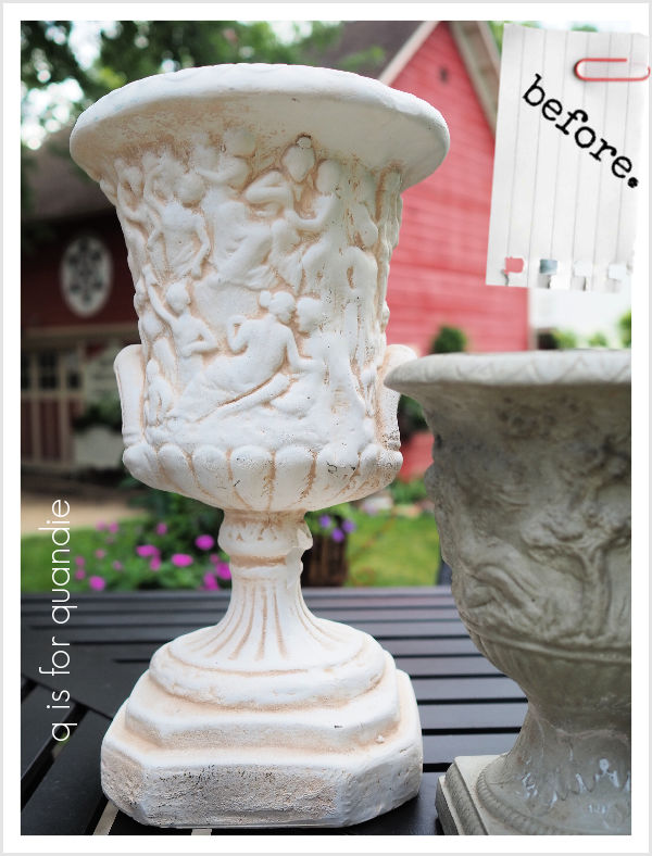
First it was the tall urn that I found at Goodwill.

Well, OK, probably best not to look too closely at what’s happening on that urn, I don’t think those are cherubs after all.

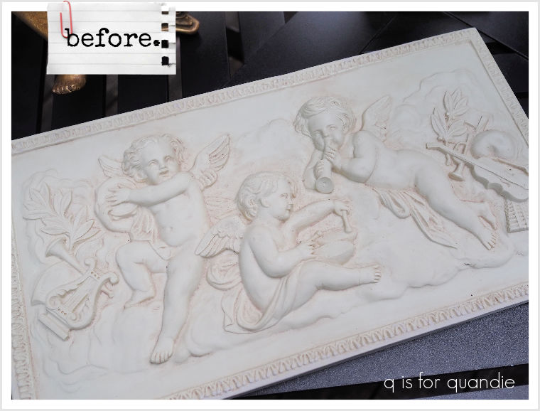
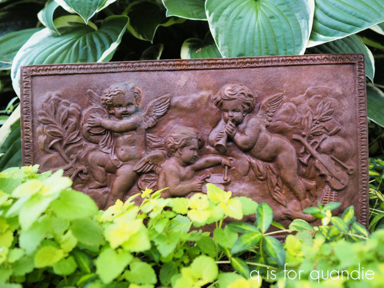
However, I also found a plaque at Goodwill that definitely has cherubs.

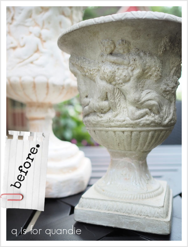
The shorter urn was from Turnstyle, and also definitely cherubic.

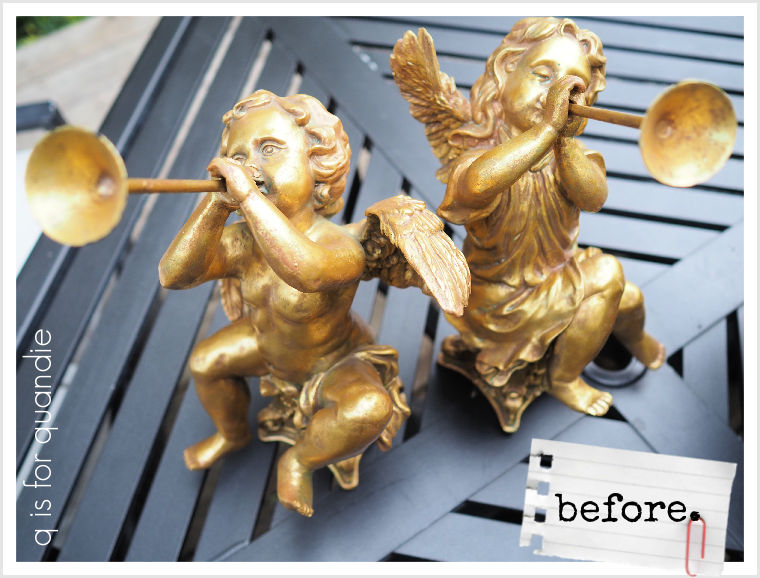
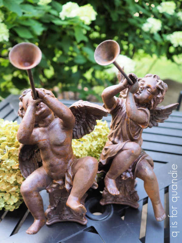
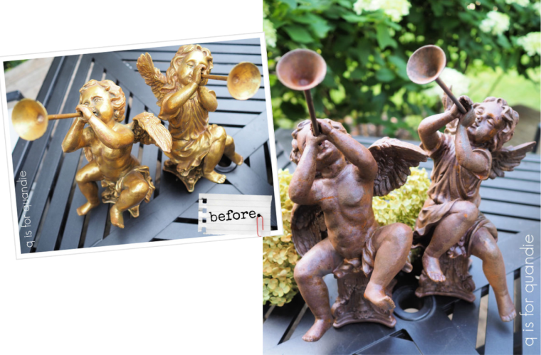
And finally we have the golden cherubs, and they were also from Turnstyle.

I have an embarrassing confession to make regarding these.  I paid $14 each for them at Turnstyle, and when I got them home and was cleaning them up, I turned them over to find the original Marshall’s tag for $12.99 each.

I’m fairly sure I’m going to lose my status as an expert thrifter for that one … not that I have ever claimed to be an expert.  Clearly I’m not.

You’d think I learned my lesson from the last time I purchased an item at Goodwill that still had a Marshall’s tag on it.  That time the clerk at Goodwill charged me the Marshall’s price, which was quite a bit higher than the Goodwill price.  And I didn’t notice that one until I’d gotten home either.

But I don’t really feel too bad about it, they have turned out pretty cool as you’ll see in a minute and were worth every penny of that $28.

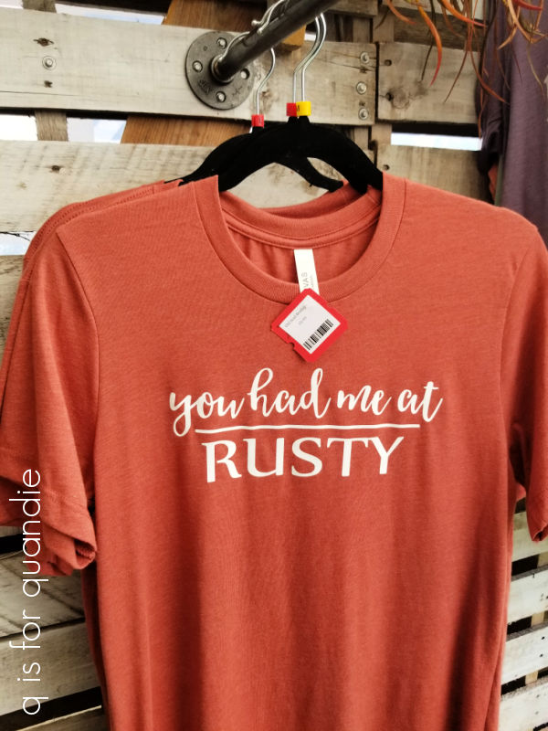
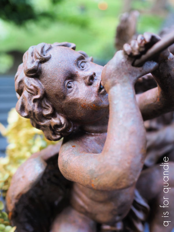
I had one thing in mind when purchasing all of these cherubic pieces, rust!

(if only I’d gotten the shirt!)

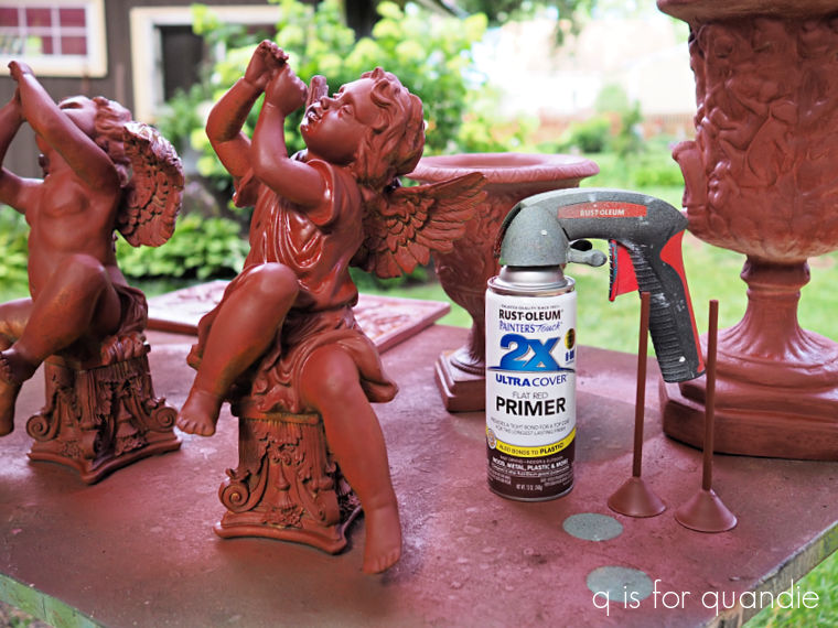
So I cleaned them all and then gave them a coat of flat red primer spray paint.

I could have used the Dixie Belle Prime Start, but that has to be brushed on and with all of the nooks and crannies in these piece, spray was just easier.

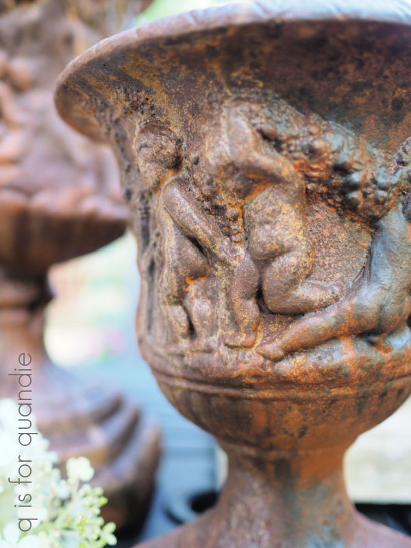
Next I pulled out the Dixie Belle Iron patina paint and gave them all two coats.  Yes, the Iron paint does get brushed on, but I recommend stippling it on with dabbing motions to avoid getting any brushstrokes which will become more obvious as the green spray will settle in those.  In addition, I find that you don’t have to be too particular regarding coverage with this technique.  Any spots missed with the Iron paint will barely be noticeable with that primer red base color, or they can be easily touched up.  While the 2nd coat was still wet, I sprayed everything with the green spray to create rust.

After waiting a day or so for the rust to fully materialize, I realized that I’d missed a few spots on the undersides of several of the pieces.  So I flipped them all over and dabbed more Iron paint on those areas and sprayed again.

After another day I still felt like there wasn’t enough rust for my taste, so I tried a little experiment with the two urns.  I’d noticed that the rusty pieces I’ve placed in my garden tend to get more rusty after they get a little rain.  So I decided to use my Dixie Belle Continuous Mister Bottle to spray them with a fine mist of water.

That totally did the trick.

When I’m leaving my rusty pieces outside, I typically don’t seal them.  I have several planters, and some iron garden furniture, that I’ve used the patina paint on and then left outside … even in the winter … and they hold up just fine, although of course they do continue to get rustier over time.

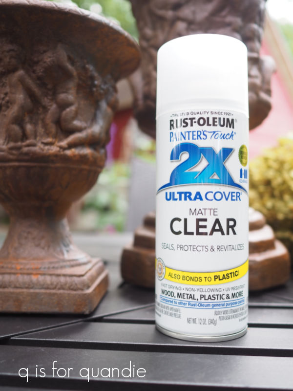
However, in this case I was bringing these into the shop and I didn’t want them to damage other items they might come into contact with so I gave them a couple of coats of Rust-oleum Matte Clear coat.

I find that the matte finish of this spray clear coat doesn’t alter the texture of the rusty patina quite as much as a glossier finish, although it does still change it a little.

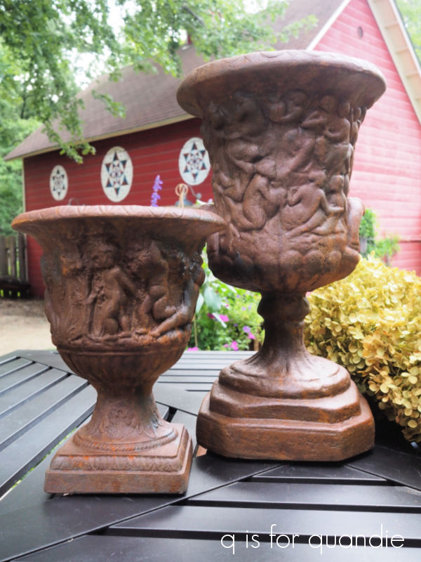
So here is how those urns turned out.

And here is the plaque …

As for the golden cherubs, I think they would be perfect for Christmas décor, but the gold was a little too precious for me.  Now that I’ve made them rusty, they have an earthier feel.

I can see these added to a Christmas planter outside, but they could be used inside as well.  Maybe as part of a table-scape.

So tell me, which do you prefer?  Rusty or golden?

I’ll probably hang onto these cherubs until the Christmas season, unless one of you locals want to snatch them up now.  If so, check out my ‘available for local sale‘ page for more details.
You’ve probably noticed that I only had small projects to share with you this week.  Well, that’s because I’ve been hard at work behind the scenes painting the potting shed.  Phew!  I forgot how much work such things can be, and this one required A LOT of prep.  Luckily my friend Annie came over to help me, which motivated me to get ‘er done.  I’m hoping to share the completed shed next week, so be sure to stay tuned!
thrift find makeovers.

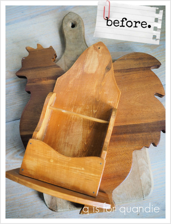
Whenever I’m out thrifting I’m always on the lookout for simple wood items that I can give new life to with paint.

I’ll readily admit that none of these are spectacular finds, certainly nothing to write home about.  But all three were fun makeovers.

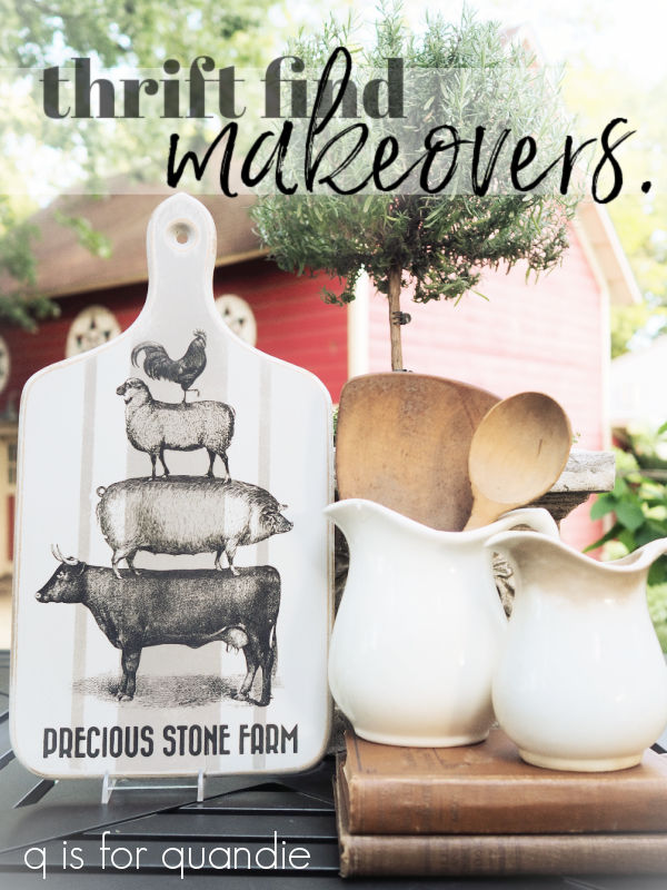
Let’s start with the basic cutting board.  After sanding it down and cleaning it with a grease cutting cleaner, I painted it with Dixie Belle’s Sawmill Gravy, and then added some grain sack style stripes using their French Linen.  Once dry, I sanded to distress and then added the farm animal transfer from Dixie Belle’s On the Farm transfer set.

The “Precious Stone Farm” wording is from re.design with prima’s Everyday Farmhouse transfer set.

I just love how it turned out, so cute.  It’s no longer food safe, but would make great decor.

Next up is the rooster shaped cutting board.  Once again, I prepped as usual and then painted it with two coats of the Sawmill Gravy.  Then I pulled out some scraps from the I.O.D. Floral Anthology transfer and pieced them in around the edges of the rooster.

Finally, I added some wording from their Label Ephemera transfer and now he’s a funky french floral rooster.  Again, no longer food safe, but perfect for decorating the kitchen counter top.

By the way, I top-coated both of these pieces with clear wax.

Last up is … well … I really don’t know what to call this thing.  I’m thinking it was originally a napkin, or paper guest towel holder, maybe?  Do you have any idea what this might have been used for?

Well, regardless, I painted it in Sawmill Gravy and then I decided to do a little experimenting with stamping once again.  Take note that I did not use any kind of sealer over the paint before stamping, and this is a chalk style paint.

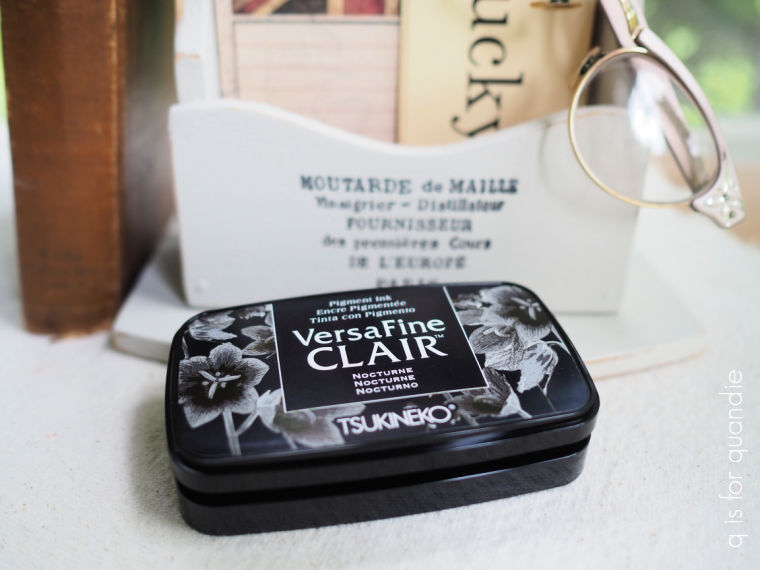
The last time I tried stamping on paint I wasn’t terribly happy with the results.  But a couple of my readers gave me some tips including Teri B. who specifically recommended VersaFine Clair ink for stamping over paint.

So I went out and purchased some from my local craft store (I can’t remember, it was either Hobby Lobby or Michaels).

First up, I have to say that no matter how good the ink, nothing can help if you’re a clumsy stamper … which apparently I am.  On my first go around, after applying the stamp semi-perfectly, I then dropped it right back down on my surface.  Ugh.  So I wiped it back as much as I could, re-painted with the Sawmill Gravy and then gave it another go.

The 2nd time around I ended up not liking the stamp I chose (and by the way, all of these stamps are from the I.O.D. Crockery set), so once again I wiped it off using a damp cloth.

At that point it occurred to me that I rather liked the washed out look I achieved when wiping off the ink right away so I took a quick photo to share with you.  At some point I may want to use this technique on another project.  But for this piece I once again painted back over it with the Sawmill Gravy.

I will say that this is one of the benefits of stamping over paint, you can re-do it multiple times at no extra cost.

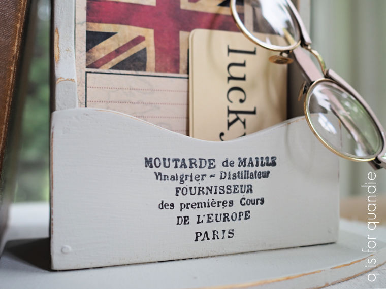
The third time is sort of the charm with this one.

I say ‘sort of’ for a few reasons.  I didn’t apply even pressure to the stamp, and I also managed to smear the ink just a little bit by accidentally brushing over it with my hand.

But those are pretty fine details, and unless you are an uber-perfectionist (which may, or may not, apply to me) this is good enough.  And really, if you’re an uber-perfectionist, stamping probably just isn’t for you.

I also achieved decent results with the stamp at the bottom too.

Teri was definitely right, the VersaFine Clair ink is the way to go if you’re stamping over chalk paint.

After 24 hours, the ink appeared to be dry enough to add a top coat over it without fear of smearing, but I chose to hold off on adding a coat of clear wax.

Why?  Well, I may keep this piece to corral some flashcards and maybe a pair of readers or two and I’m not sure I love this look.  I may decide to give it an entirely different look next, so I’m holding off on waxing in case I decide to paint over it one more time.

After working on all three of these thrift find makeovers, I have to say that I still think transfers deliver a lot more punch than stamps.  But of course, you can only use a transfer one time, while stamps can be used over and over.  So tell me, what do you think?  Do you prefer transfers or stamps?  Leave a comment and let me know.