Last week I spent some time helping my neighbor, nnK, paint her parent’s kitchen cabinets. They live out in Amery, Wisconsin on Lake Wapogasset … or as I like to call it, Lake Pop-a-gasket.
We headed out there last Friday afternoon to add a few finishing touches, and we were done so quickly that we had a little extra time to kill before dinner so nnK and I checked out a few of the shops in town including Acme Junk Co.

I’d only been to this shop once before in their previous location, so I’d been wanting to check out this spot for a while now.
We headed down to the basement level first. They had a very clever license plate treatment on the stairs.
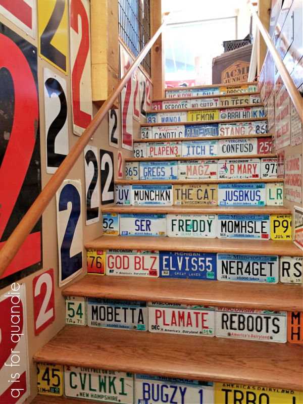
How long do you suppose it takes to accumulate that many vanity license plates?
The lower level seemed to be mainly small booth spaces that I assume were rented by various different vendors.

Each little space had its own personality. We had to laugh in one of the spaces that was devoted to paintings of naked women and vintage Playboys. I didn’t take photos of that one to share with you guys, for obvious reasons.
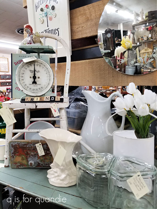
There were some spaces that harkened back to my shabby chic days.
And some spaces that had a little bit more of a vintage industrial sort of style.

Overall the basement felt more like your typical antique mall, not what I would necessarily call a junk shop.
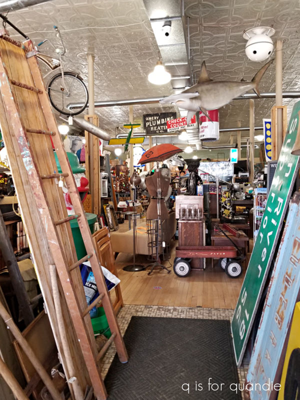
The main level of the store was much ‘junkier’, and I mean that in the most complimentary way.

They definitely had some cool stuff, including several really amazing antique dress forms.
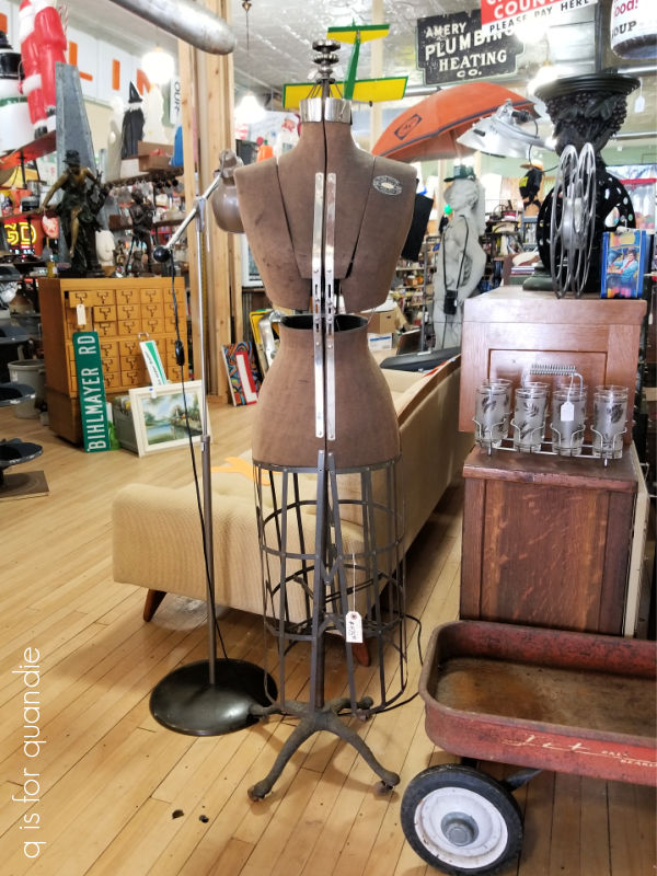
At $475, this was way out of my price range as were the others in the shop unfortunately.
There were also lots of old typewriters, and clearly someone has gotten tired of bored children banging away on the keys while they wait for their parents to be done shopping.

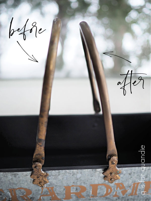
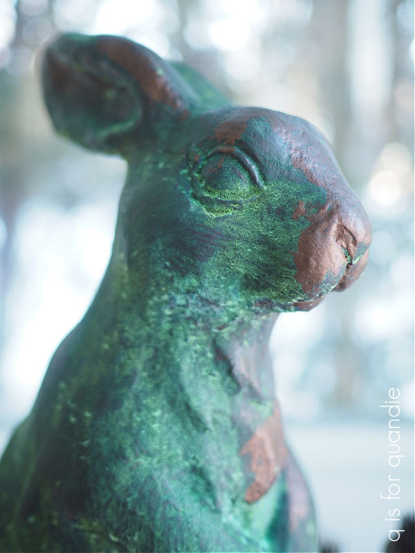
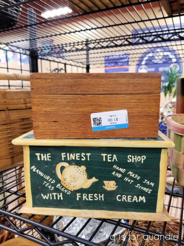
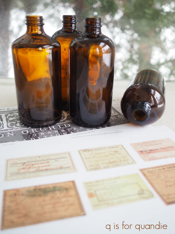
This next one was particularly cool.

They certainly had some unique finds, hammerhead shark anyone?
I really liked this set of three cobalt blue apothecary bottles.

I thought $43 for all three was a decent price, but I don’t really have this color anywhere in my own décor so I couldn’t think where I would put them.
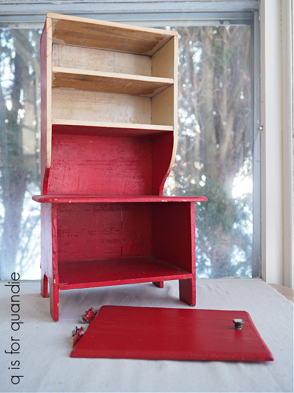
I was also extremely tempted by this large wooden toolbox.

It was a little pricey at $95, but I would have been willing to pay that for it if I’d had just the right spot for it. Ultimately though, I realized that I’d want to add some wording to it and I wasn’t sure that I should mess with the original patina. So I left it behind.
At this point you might be wondering, what did I buy?
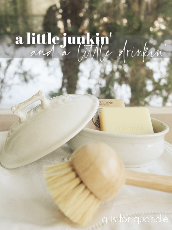
First up, I purchased this little ironstone covered soap dish.

It’s rare to find ironstone at reasonable prices in our area (at least in my experience), and this one was $18.
I love the mark on the bottom.

I’m really trying to pare down my ironstone non-collection these days, but then I come across an item like this and I decide why not?
I’ve saved find of the day status for this guy though …

You may remember that I once had a planets and stars themed ornament just like this, only it was a pretty shade of blue.
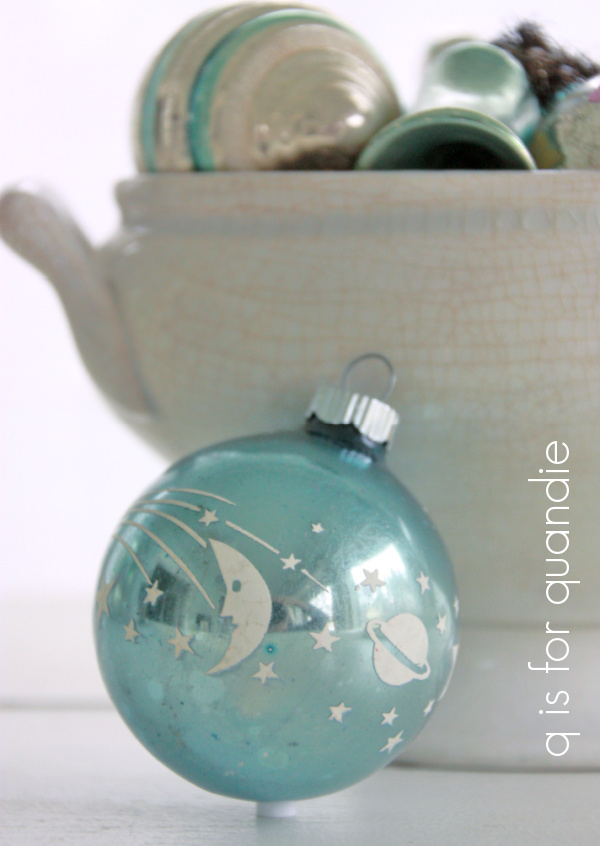
And I broke it!
One of my generous readers had sent me a replacement that is red with glittery gold stars and planets (thanks again for that Melissa!).

But still, when I saw the silver one I had to have it. As a bonus, it was only $2. Definitely a bargain.
I’m still keeping an eye out for one in that pretty shade of blue, maybe one day I’ll find it.
That was it for my purchases at Acme Junk Co. We did stop at a couple of other shops in Amery including Ruby Mae’s Treasures and Bittersweet Homestead Boutique. Ruby Mae’s had some great vintage furniture pieces and is definitely worth a visit. Bittersweet Homestead has more of a gift shop vibe with lots of seasonal items, candles, soaps, dip mixes and that sort of thing. So if any of you locals are looking for a fun afternoon shopping trip, I can recommend heading to Amery.
We capped off our day with the Friday night fish fry at a quintessential Wisconsin supper club.

If you aren’t familiar with the Wisconsin supper club culture, there are a few things that make a genuine supper club. Here is how Kevin Pang from the Chicago Tribune describes them …
“A Wisconsin supper club is an independently owned, fine-dining destination restaurant, typically in a picturesque locale on the edge of town. The menu comes from yesteryear, void of pretense and decidedly non-froufrou — prime rib, broiled white fish, shrimp cocktail — with enough complimentary sides and trimmings to satisfy a second meal. A relish tray should begin the meal, and three hours later, is bookended with house-made bread pudding or cheesecake. On Fridays they should serve an all-you-can-eat fish fry. A band might be performing. Mixed cocktails such as Manhattans and brandy old-fashioneds are preferred over wine or beer. If you leave hungry, you have not dined in a supper club.”
This one definitely had the location down. A picturesque locale on the edge of town.

I’ve only been to a handful of supper clubs, but they have all been lakeside. By the way, as a sidebar, there were people out ice fishing on that lake while we were there. In April. I definitely wouldn’t have chanced it.
Most supper clubs feel like a blast from the past when you walk in.

OK, yes, we were the first people to arrive for dinner. It was early, but we were hungry from a day of painting and shopping. Most of those tables were occupied by the time we left.
Naturally, I had to order the iconic supper club drink, a brandy old-fashioned.

Since we were there on a Friday, everyone else at our table had the fish fry. I’m not a big fish eater though, so I opted for the prime rib. However, the conversation around the table was entertaining, and that drink was mighty tasty, so I completely forgot to get a photo of my dinner. Suffice to say, it was delicious and we definitely did not leave hungry.
Speaking of leaving, I’m heading off to spend some time with my mom later this week. I’d been hoping to get out there 3 or 4 times this winter, but other life stuff has been making it difficult to schedule. But I finally found a semi-open time frame, and was able to use my Delta Skymiles for a free ticket, so off I go.
I’ve scheduled just a couple of posts in advance, so I’m not abandoning you all together. So I hope you’ll stay tuned!